For those of you who are older than 30, you might remember the grand old days of HGTV before it was just about house flipping and House Hunters, House Hunters International and House Hunters Renovations. Long ago there were some great shows on HGTV – ones that you would actually stay home to watch. Now the more popular shows are Rehab Addict and Property Brothers – ever even watched those? (OK, I confess – I love Nicole and those twins!)
Recently HGTV debuted a new show that I am not only actually watching, but am loving. It’s fabulous!! The show, “Fixer Upper,” is filmed in Texas – mostly in Waco. It’s the brainchild of the popular blogger, shop owner and renovator Joanna Stevens Gaines and her realtor, renovator husband Chip Gaines. You might read her blog “Magnolia” and know all about Joanna already. But – if not, I don’t want you to miss out on a great new HGTV show and talent.
I really like their work – and have found there is so much to learn from their renovations. The problem is that television shows move so fast, you can’t quite take it all in – at least I can’t without pausing and stopping it as it is being shown.
The great thing is that on Joanna’s web site – they recap each renovation with lots of pictures for you to study at your leisure. I was so excited to find the before and after photographs and couldn’t wait to share them with you.
Joanna Stevens Gaines – sits outside her new house on Magnolia Farms.
All photography by Molly Winn HERE.
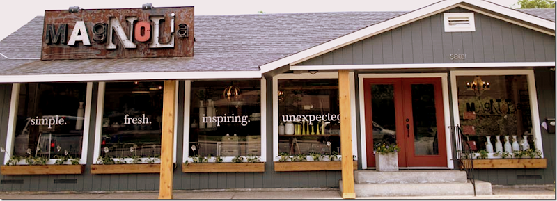
Joanna’s shop in Waco – also called Magnolia
I’m glad that HGTV is finally reaching into blogland for new TV stars. There are so many talented designers out there and Joanna is one that certainly deserves her own show. But how do you get a show on HGTV?
Joanna and Chip Gaines, with their four children, live outside Waco in an old farmhouse they just finished renovating. On her popular blog, Joanna would post videos which eventually caught the eye of a production company. She’s a natural in front of the camera, stunningly beautiful, funny, casual, and most important - very talented. Chip is a rugged, Texas cowboy and together they present a humorous front.
The production company produced a pilot for HGTV who bought 12 shows – so far they are approximately half way into their season. The show is such a success that more episodes have been ordered. Each week – their audience has been growing larger and larger as word of mouth spreads the news.
Joanna must be a major Type A personality. How she has time to be a mother to 4 young children, run a shop, blog, renovate houses, and produce a show for HGTV – is beyond me. It exhausts me just thinking about it!
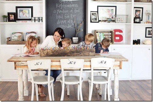
Joanna with her four children.
The premise of their show, Fixer Upper, is this: Joanna and Chip show a prospective homeowner three houses, one of which will be bought and renovated by the Gaines. After the house is decided upon and bought, Joanna and Chip present a plan for the renovation on their budget.
In general, the premise is sound, but there are a few things that leave you scratching your head.
Typically the renovation budget doesn’t cover the entire house and you are left wondering about the rooms not redone - are those rooms finished later after the show? What about the tight budget? Sometimes the entire upstairs will be left untouched.
Also – to create drama - the owner is given a choice of renovations. For example, would the homeowner rather get a new master bathroom or a new circular driveway. Amazingly the couple chose the driveway??? What? There are always decisions like this that don’t make too much sense, but hey – that’s TV.
Chip and Joanna in front of HGTV’s cameras for their new hit show Fixer Upper.
There is even more fake drama – each week, either the renovation is behind schedule or over budget and Joanna has to make a frantic call to the owners for more money – which they usually miraculously have. These fake dramas are scripted and are so, well - fake – HGTV would be better just dropping the manufactured drama. Everyone sees through it. HGTV should respect the intelligence of their audience and stop treating us like imbeciles. The real conflicts found in renovations are always better than the fake ones – and we can learn from true reality!
Still despite these few complaints – the show is a true winner because the renovations are remarkable and always done on a budget that most of us can relate to. One thing that helps the budget is that real estate seems so reasonable in Waco – we should all move there asap! Joanna and Chip do great work – and it shows. The renovations are mind boggling! In addition, Joanna’s design aesthetic is attractive and universally appealing. Each week the show gets better and better. These two are going to be household names soon – like Nate Berkus before them.
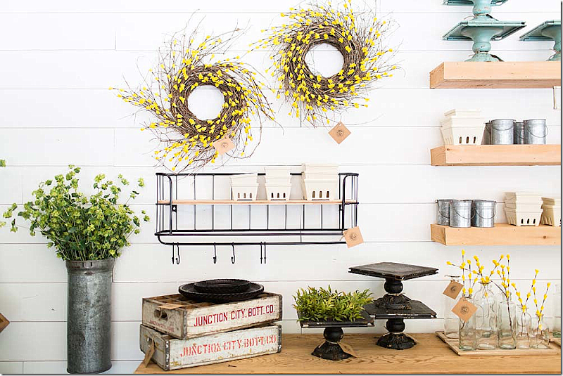
Vignette of things for sale online from Joanna’s shop Magnolia HERE.
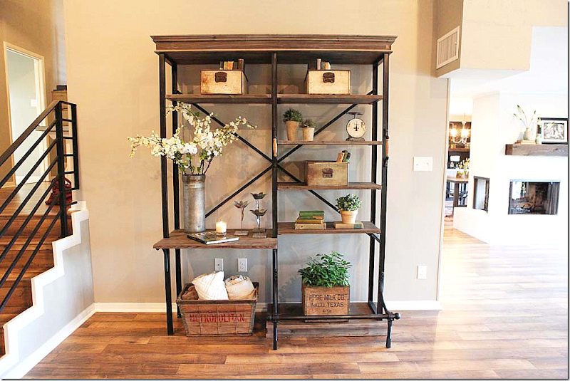
Joanna has a very casual style – a mix of farmhouse and industrial. She loves shiplap on walls, white slipcovers and dark accents. Her designs are a study in contrast between white and black. She uses lots of vintage pieces, some antiques – but mostly old repurposed items from thrift shops mixed in with new repros from Home Goods or Restoration Hardware.
After the house is renovated – there is the dramatic final reveal. Joanna stages the new house with furniture purchased from her shop and around town. It’s not clear if the homeowners keep the furniture or return it – but, hopefully they keep it! A few reveals have been a mix of Joanna’s staging and the homeowners own furniture.
The homeowners who have been on the show have been very lucky. They seem to have gotten great deals. If you live in the Waco area and need a new house, you should contact the Gaines to see if you can get on the show. I would do it in a heartbeat!!
Today - I thought I would show a few renovations from the show so far – and talk about them. There is a lot to be learned here – especially if you are on a budget – or if you like the more casual decorating style.
Episode One:
The first house renovated has been one of the best. I was floored by the results of the renovation and rewound the final reveal a 1,000 times. The house is a nice size - 2600 sq ft and it was built in the 1930s. But, it was tagged for demolition and was a filthy mess. The homeowners bought it for $24,000. Yes. You read that right – $24,000. Joanna and Chip spent six weeks renovating it, which is a miracle in itself.
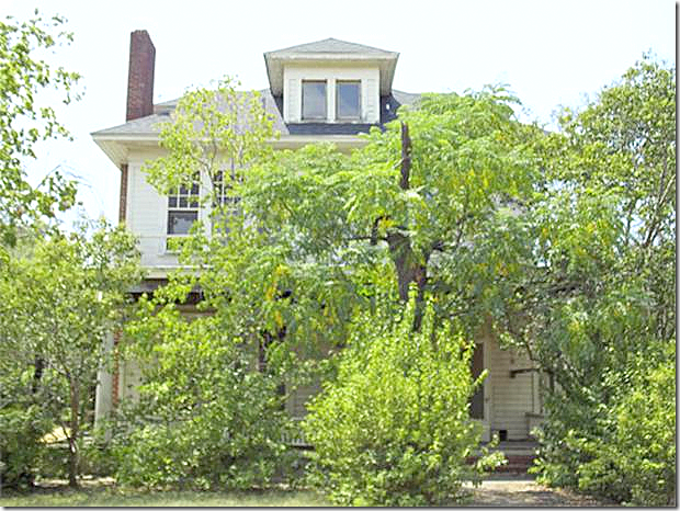
Before:
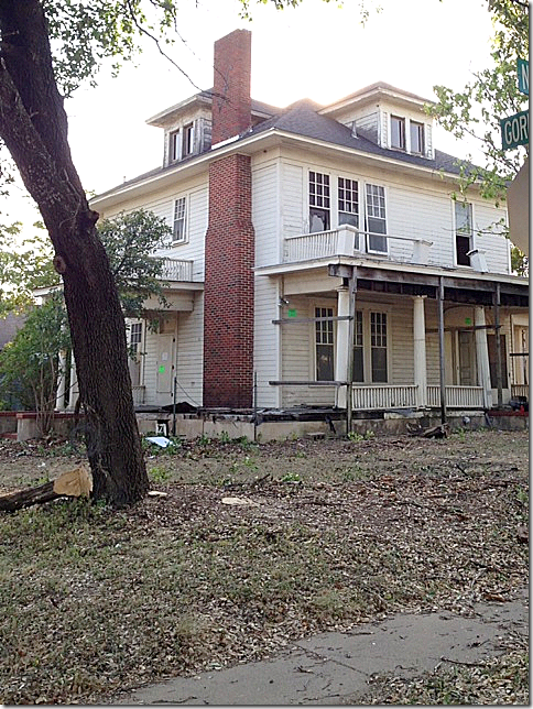
Here is how the house looked – you could barely see it through the foliage. The first thing the Gaines did was to remove all the overgrown landscaping.
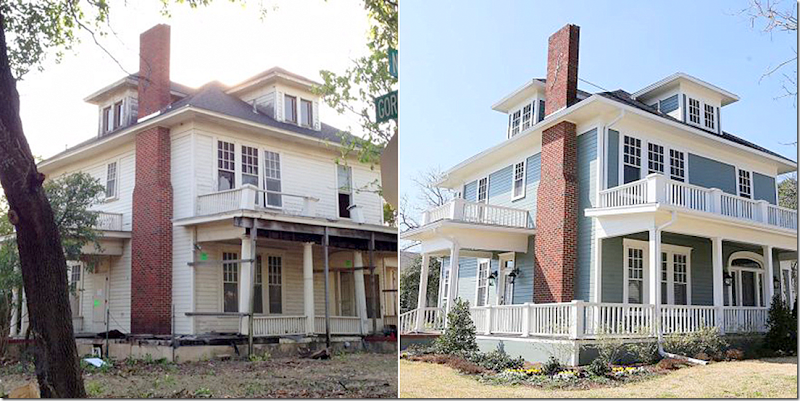
And this is what they found. The porch and balcony were both unstable so they were removed and replaced.
And here is how it looks today. Isn’t this incredible? The new porch was extended. The house retains its original windows, which are beautiful. The house was painted gray with white trim – making it look so hip despite its age. New landscaping enhances the curb appeal – notice the extra wide sidewalk – as wide as the front steps. I love this detail.
Another view – before and after
Inside – the stairs are original – they were just painted and repaired, as needed. Joanna added the trendy lantern. Walls are a soft gray, with white trim, and extra dark wood floors.
Before: the wallpaper was falling off – and you could see the shiplap behind the paper. Joanna wanted to keep the shiplap in all the rooms, but could only use it in the living room for some reason. She kept all the French doors.
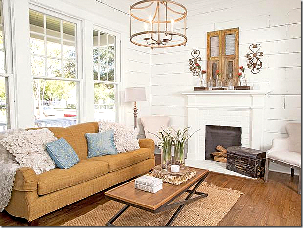
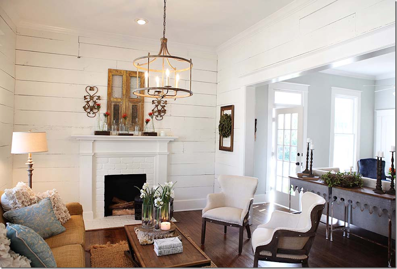
And here is the new living room – with the wood walls and restored fireplace.
Here you can see into the family room. Notice the two consoles behind the sofa. This is great idea. Sometimes less expensive consoles are rather small and not very wide- but by placing two next to each other – you get a much better scale without spending a fortune. These tables are just $275 and are sold at Magnolia – as is most of the items found in this house.
Here is the kitchen before – it was totally gutted and opened up to the family room.
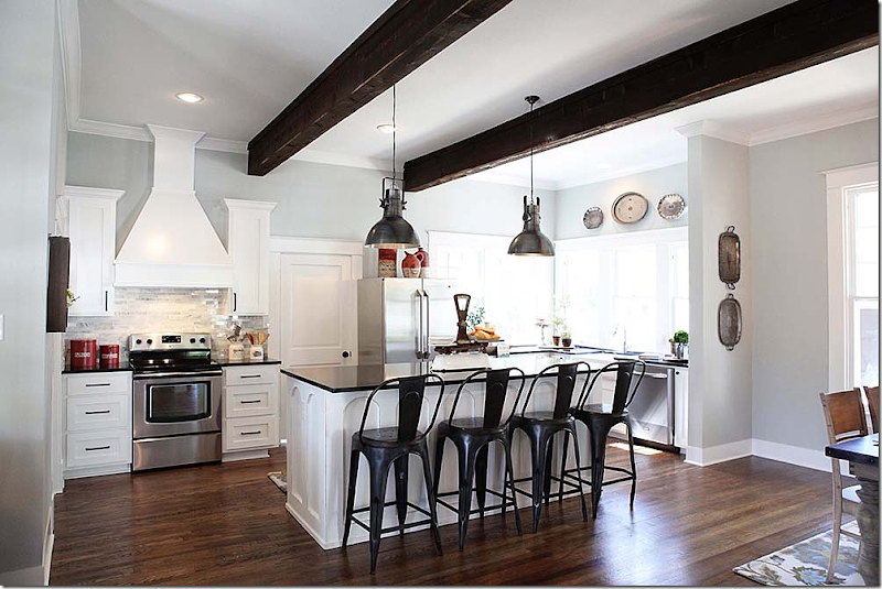
The kitchen today – with light blue/gray walls and white trim. They built the island and banquette out of the old shiplap found in the house. Notice the arches carved into the sides of the island.
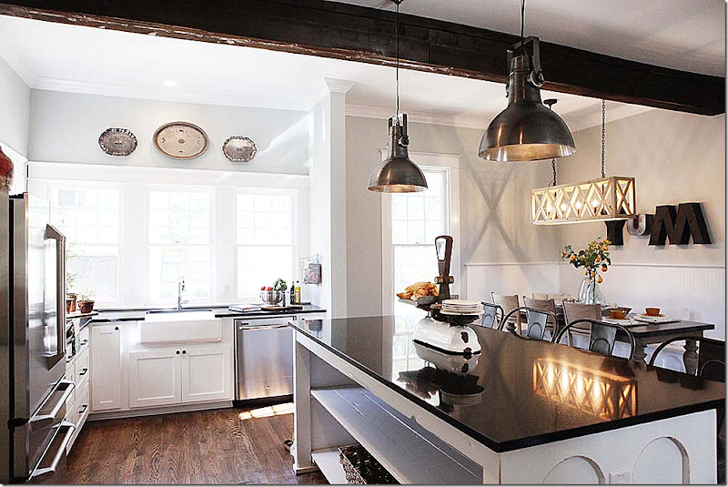
Another view of the kitchen – notice how the island is open at the back – another great idea. Joanna likes to use bold letters as art. Remember – this house was $24,000. If I recall correctly – the reno budget was around $100,000. Amazing.
I was hooked on Fixer Upper after this episode – I loved Joanna’s style and couldn’t wait for the next week’s show! Here it was:
Episode Two:
This was really one for the books.
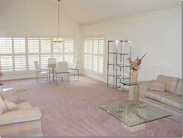
This house was built in the early 70s. A soft contemporary – it was stuck in a time warp. By the foyer – there was an atrium which was a sticking point with buyers – no one wanted this house! Here you can see the slanting steps from the foyer leading into the two story living room/dining room. The atrium is open on all sides – long live the 70s!!!!
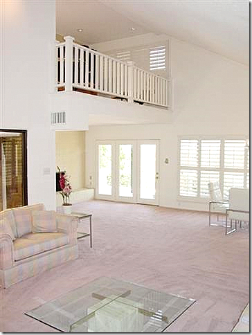
The two story living room – with the atrium to the left. How many houses are there like this – built in the 60s and 70s - that no one wants to buy? Looking at this – it seems impossible that this house could become a warm, cozy house. Before, it was a cold, lifeless, time warp – there is no texture, no interesting focal point, nothing that would attract a new homeowner – or not?
The dining area – connected to the living room – on a sea of pink carpet. The new homeowners realized the house had good points – it’s size and openness and they liked the contemporary design. The Gaines came up with a great renovation that addressed the bad features – the vast coldness, the lack of texture, and the atrium.
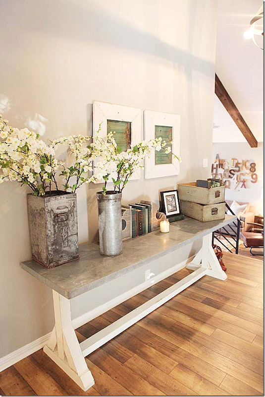
After: All the pink carpet was removed and dark hardwoods were laid – which immediately changed the feel of the house. Here – the foyer – leads down to the atrium and living/dining room. Gone is the 70s with a warm vignette created by Joanna. The house was cold and lacked any coziness. There was no contrast – no textures – and Joanna wanted to add both of these elements to the house, which she did.
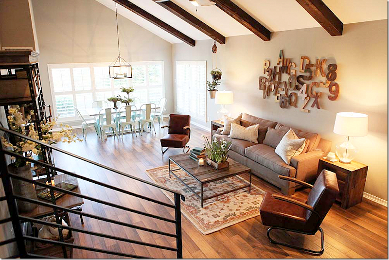
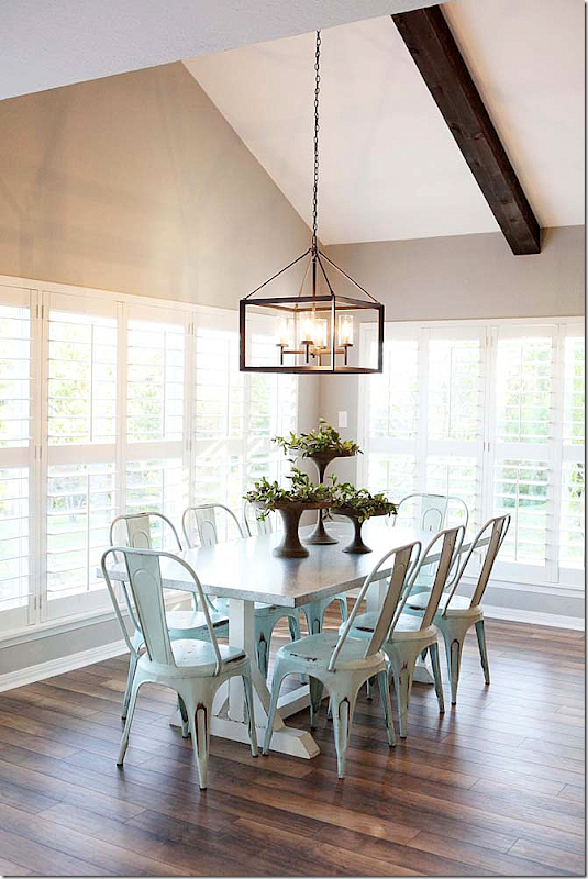
And here is the living/dining room today – what a huge difference!!! Joanna chose contemporary and trendy furniture and mixed it with warm vintage pieces. The wood beams add more warmth to the room and bring the ceiling down a bit to a more human scale. The Gaines added a new contemporary styled railing – in black iron - for more warmth and contrast. Before, there was no railing – 70s style.
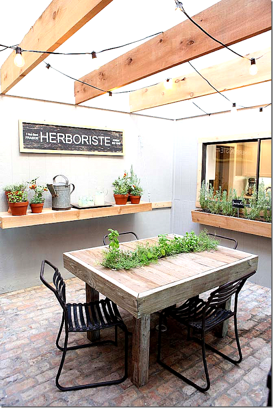
After – the new atrium. In the cold, lifeless atrium – Joanna added brick floor for warmth and wood beams and shelves. The low beams gave the room a “ceiling” and made it feel cozy. The eyesore became a focal point and the owners favorite part of their new house!
Joanna closed off the windows of the atrium that opened to the foyer and back wall. This is another great idea when you have an atrium that opens to all rooms in the house. By closing off some of the walls, it isn’t such a focal point. Atriums from the 60, 70 and 80s can be dealt with like this, which I think is a great solution that Joanna came up with.
By removing the window from the atrium that faced the living room here – it provided more wall space and less modernity. Also, notice how much detail the railing adds to the space – there was no rail before. Joanna also squared off the steps – where before they angled down into the living room. Another cosmetic change that took away ugly touches of the 70s but left the good aspects – the clean lines, the openness.
Joanna kept the wood shutters but added a trendy table and chairs in the dining room.
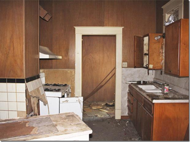
The 70s kitchen – before. Notice how the kitchen countertop leads into an eating countertop and then into a wet bar.
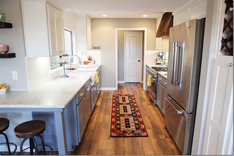
The kitchen looks totally new – but Joanna used the same cabinets, along with the new marble countertop and subway tile backsplash. She connected the kitchen countertop with the breakfast bar in the corner. Again, the wood floor provides warmth – as does the blue cabinet paint. If this was me – I would have taken out the two upper cabinets next to the sink for a cleaner, more updated look – but hey, that’s just me. The window above the sink looks into the atrium. It’s amazing that with a few cosmetic changes – mostly paint and wood floors – all signs of the 70s are gone.
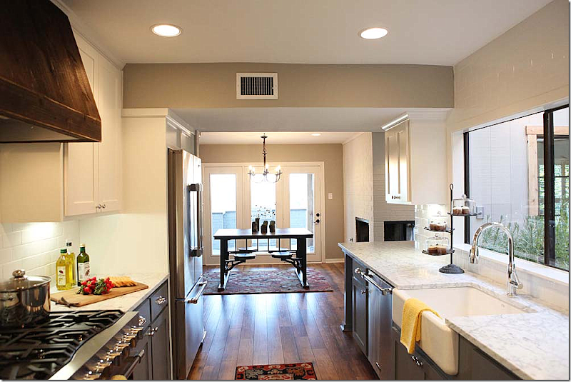
The other direction. By adding new appliances and countertop and farm sink – she was able to completely change the look of the kitchen – but keep the costs down by using the same footprint. By building an upper cabinet and adding a side of plywood – the refrigerator now looks like a luxe built in.
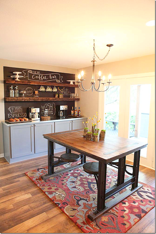
The breakfast room cabinet became a darling coffee bar.
Episode Four:
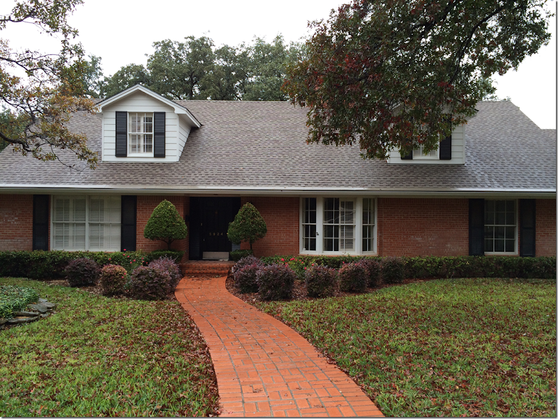
This couple wanted a view of the lake in Waco – and a country French vibe. The Gaines showed them 3 houses and they picked this ranchburger. A country French house? It’s a ranch! But Joanna promised them she could make this house like French - European. The owners agreed because the view was incredible – and that sold them on the house – but they were skeptical the Gaines could make it look country French.
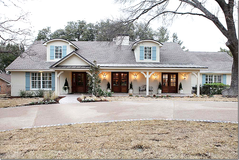
And – here it is. I thought that Joanna really did change this ranchburger into a country French house just by adding a few elements. Here’s how she did it. First – she painted the brick a creamy color. She added a porch with a tin roof and wood columns. She demolished the bay window and instead installed two French door – stained dark – that lead out to the front porch. She arched the upper windows and added French blue wood shutters – the arched dormers really made a huge difference in the façade. And finally – they added a large curved driveway.
If you have a ranch house – and want a more updated façade – these are wonderful steps to take to change the look of the house. It’s so pretty and updated now!
ok – now, if this was MY house – I would have used gravel instead of stamped concrete. The gravel driveway would have really given the house an even more French vibe, but - that’s just me!
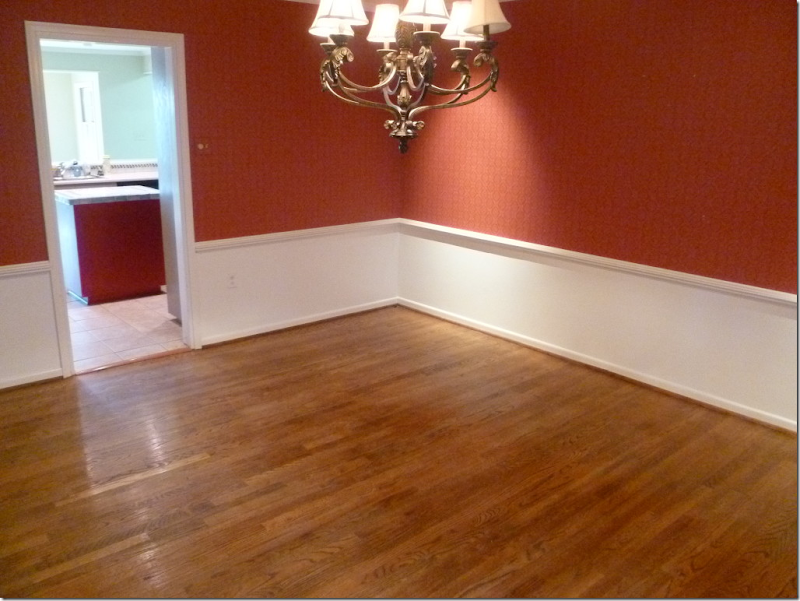
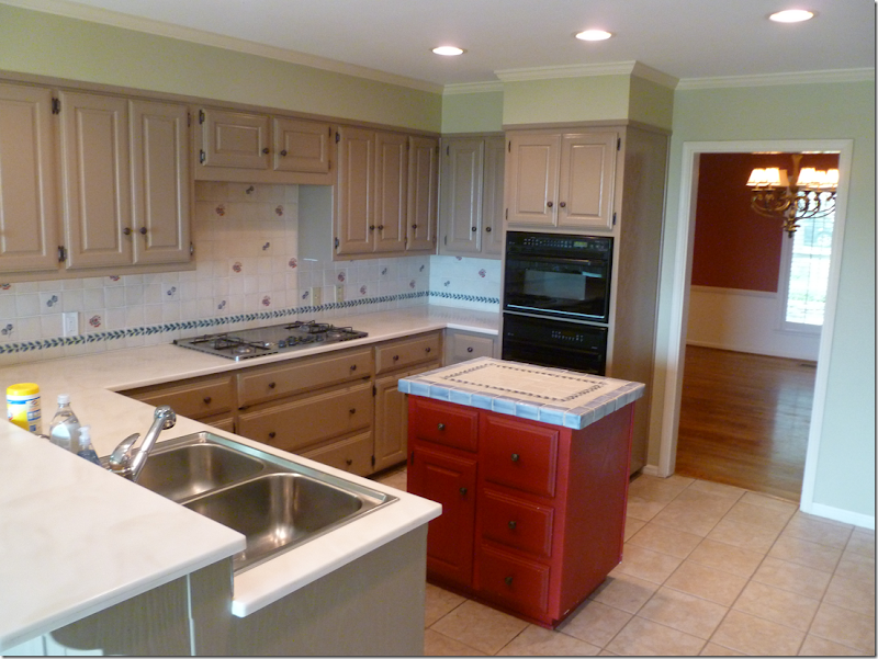
Before – the house had a typical floor plan that is found all over Texas. When you walk in the front door – to the right is the living room and then there is a smaller dining room that leads to the kitchen. Also, from the front foyer – the family room is at the back of the house – next to the kitchen. Here is the dining room leading to the kitchen – before.
Before: The nice, but dated kitchen – is right off the dining room.
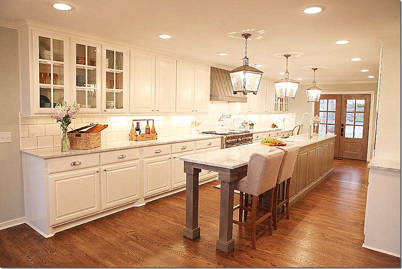
In order to update the house – Joanna moved the dining room into the living room. She then extended the kitchen all the way to the front of the house – where the dining room once was. This wall on the right of the kitchen was demolished so that the kitchen extended to the front window.
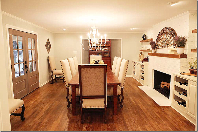
AFTER: And here is the formal living room today – turned into a wine/dining room. The window was removed to put in the French doors leading to the front balcony. Joanna then added the built ins to house the owners wine collection.
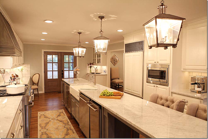
And – here is the new renovated kitchen. The wall between the old dining room and kitchen was removed – and a large island was placed in the long room. Three lanterns span the island. At the end of the room – the old bay window in the dining room was removed to make room for the new French door that leads to the front porch.
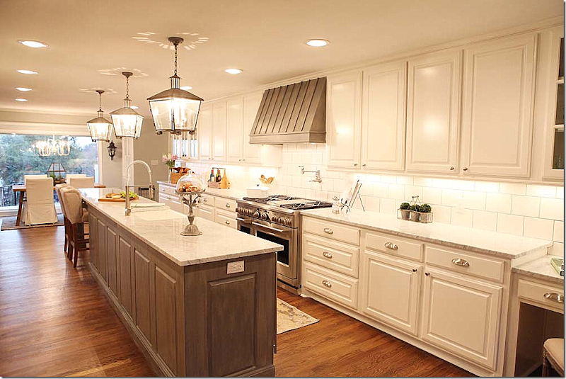
And looking the other direction to the breakfast room. The family room is off to the left.
For the typical ranchburger – this is a great new floor plan. Many people turn the old dining room into a study or a useless sitting room. But here – by extending the kitchen into that space – you create a large, functional kitchen. I love what Joanna did with this house. The new kitchen is beautiful.
And looking at the front wall of the kitchen. You can see into the wine/dining room through the opening.
Now, if this was ME – (Joanna probably wants to strangle me, thank God she’s not reading this!) – I would have placed the refrigerator on the back wall for ease. I would have hidden it behind cabinet doors or maybe even armoire doors for effect. To me – the refrigerator seems too out of the way around the long island. But…that’s just me!
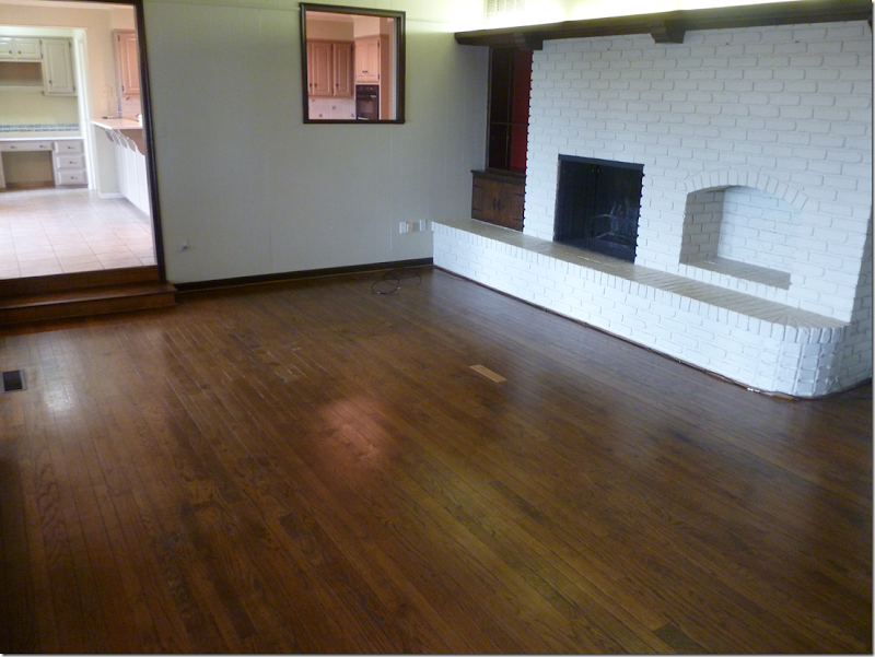
Before: Here is the family room before it was renovated. Joanna removed the wall between the kitchen and den to make the room more accessible and open.
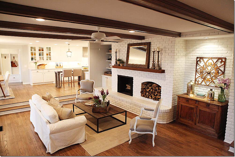
AFTER: Here is how the room looks today – open to the new kitchen and breakfast room. I love how she remodeled this ranchburger floor plan. She really gave me new ideas and I hope you got some too!!
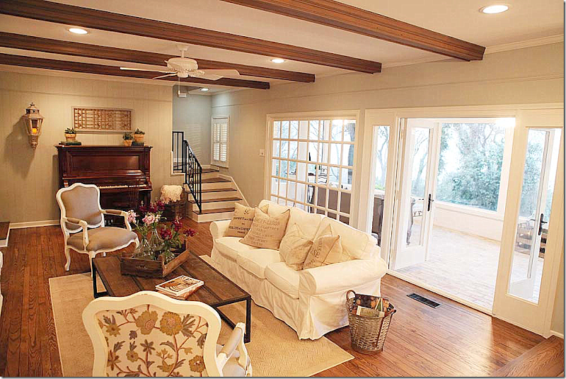
And looking the other direction out the back porch. The back patio room was also renovated with new brick flooring. Joanna uses brick flooring a lot – it’s a surface I forget about, but it has such warmth and can be either French looking or industrial – either way. I like how she uses the washed out finish, too. Makes it look like old repurposed brick. Joanna gets it from Design SuperStore HERE and it’s called Old Chicago Brick.
Anything you find in the houses that you want more information on – just call Magnolia and they can answer your questions.
Office Phone: 254.235.6111 Fax: 254.235-4642
Shop Phone: 254-235-0603
Magnolia Farms:
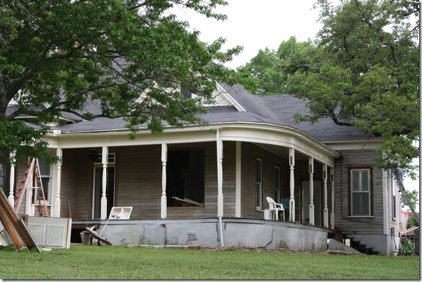
The Gaines recently moved into their new house – here’s a before picture of their farm house.
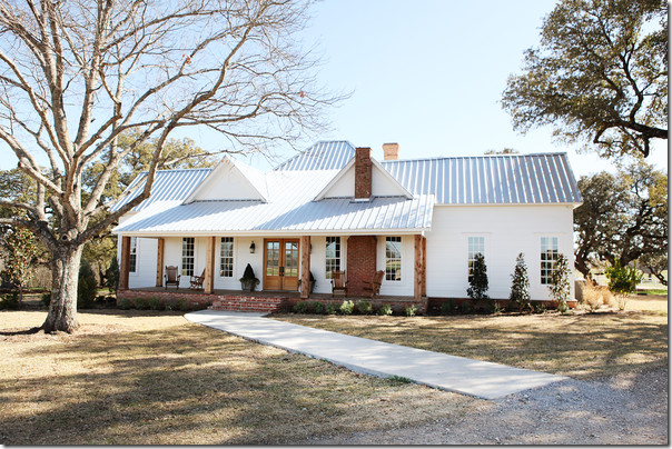
And amazingly – here is what it looks like now – with a new bedroom added on to the right side. Wow.
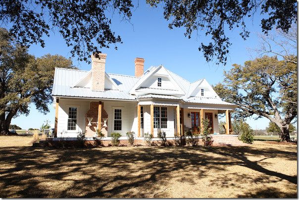
And the other side – after.
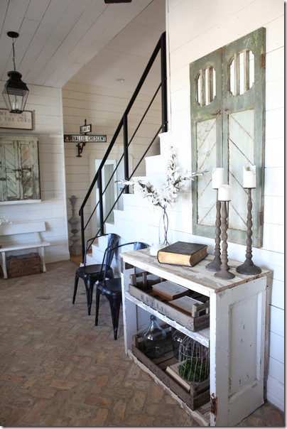
Inside, Joanna used her favorite brick floors in the entry, along with white shiplap walls and ceiling. The brick floor and shiplap walls are two of her trademarks. But – by adding the black railing – she adds a touch of industrial chic to the mix, bringing the house into this century.
The living room/dining room/kitchen – using Joanna’s trademark of white with black contrasts, and signage décor.
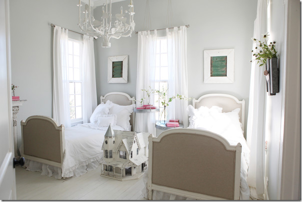
My favorite is the girls bedroom with its country French flavor and painted white floors.
To see more of their farmhouse, go HERE.
To purchase items seen in these pictures from Magnolia, go HERE.
And to watch Fixer Upper on HGTV, tune in on Thursday nights at 10pm C - check with HGTV.com for more times.
A huge thank you to Joanna and Chip Gaines!!!
Congratulations on your fabulous new show – and I hope many seasons with HGTV will follow!


