A few months ago, I showed photographs from The Gray Door antiques shop. The owner, Donna Temple Brown, had recently moved her shop to Ferndale in Houston – taking over the property formerly owned by veteran antique dealer Laurence Anderson.
Anderson’s husband, Bill Anderson, is the architect who is responsible for many of the contemporary townhouses built in the Ferndale area, a chic cross section of homes and shops. Anderson designed a combination house and antique store for his wife. The shop was on the ground level, and their home was above – a modern day version of living above the store.
After many years on Ferndale, the Andersons sold their property and Brown moved in. At this time in her life – the thought of commuting to work by taking an elevator down one flight was too appealing to turn down.
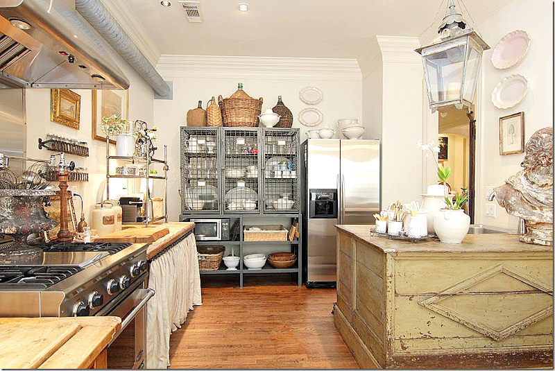
But, there were issues. Donna loved her own townhouse, which had been photographed for many fine design magazines and books. Her “unfurnished” kitchen was an inspiration for many other designers. Her own furnishings came from her shop and her décor was a wonderful advertisement for her business. The question was could she make the much more contemporary living space on Ferndale work with her antiques?

Donna Brown’s old townhouse which she sold. Her kitchen was an inspiration for many.

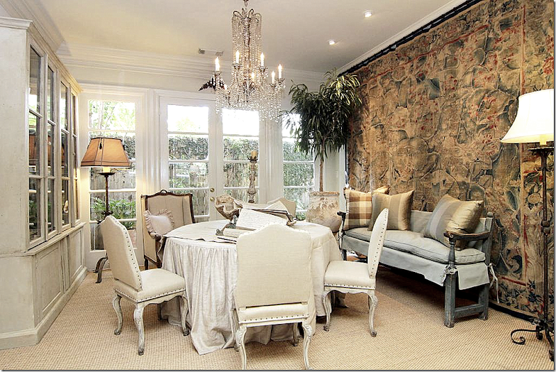
In her old townhouse – the family room was in a separate room from the living room and dining room.

Donna Brown’s former townhouse – the tapestry was the focal point in the living/dining room. More about the tapestry later.

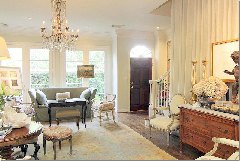
The living room in her former townhouse.
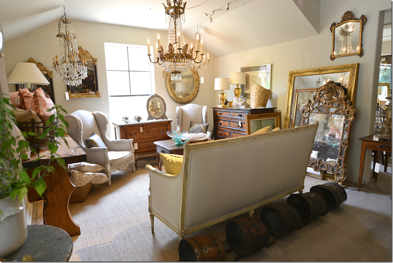
Then, there was Donna’s shop - The Gray Door. She had recently moved it to the trendy Alabama Design District after years spent on West Gray. Her new shop on W. Alabama was large – with enough space to easily show off the oversized French armoires and consoles she is known for. Could she make the smaller sales floor on Ferndale work?
Still – the lure of Ferndale with its zero commute was too strong to ignore. Once she made th decision - all her concerns evaporated. With a modest renovation of the living space, she turned the contemporary architecture into a chic gallery that is simply gorgeous. Below, she reconfigured the sales floor and incorporated the garage into the shop – greatly enlarging it. She discovered that her clients preferred the new shop where they could imagine how the antiques would look in their own houses.

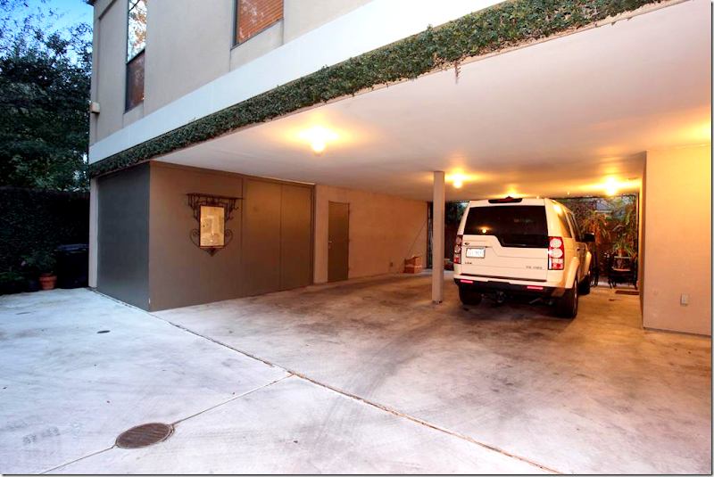
BEFORE: At the back of the house was a two car garage. Donna decided to incorporate this space into the shop, which greatly increased the sales floor.

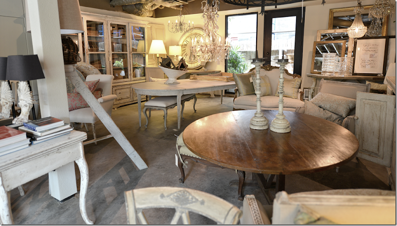
AFTER - The Gray Door today: this area of the new shop was once the garage.
In all, its been the best move Donna has made. In the morning she comes down to the shop, coffee in hand, while still in her robe, and often is still at her desk working when her assistant Darcy arrives to open up. The benefits of the lack of a commute in traffic cursed Houston can’t be stressed enough. It has to be enormously beneficial on keeping Brown’s blood pressure in check.

A few choice pieces in shop right now – the painted cabinet is a great size. The station clock is beyond fabulous. Need a tall chandelier?
Recently, the magazine Antique Shops and Designers showcased the new living spaces with beautiful photographs taken by Jack Thompson. Donna asked me to also come photograph her house – but she wanted me to include the BEFORE photos so that readers could get ideas for their own renovations.

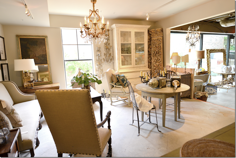
AFTER: The Gray Door. The old shop used to end where the opening is. Donna enclosed the garage, put in a bank of floor-to-ceiling windows and cut an opening in the back wall. Great sofa and chair, trumeau, and notice the pair of sconces next to the window! To die for!!!
Today, I have gathered the BEFORE photographs from the upstairs living space. AND, I have a collection of my own photographs that I took last week. So, please enjoy the BEFORE and AFTER photos from the house above The Gray Door!

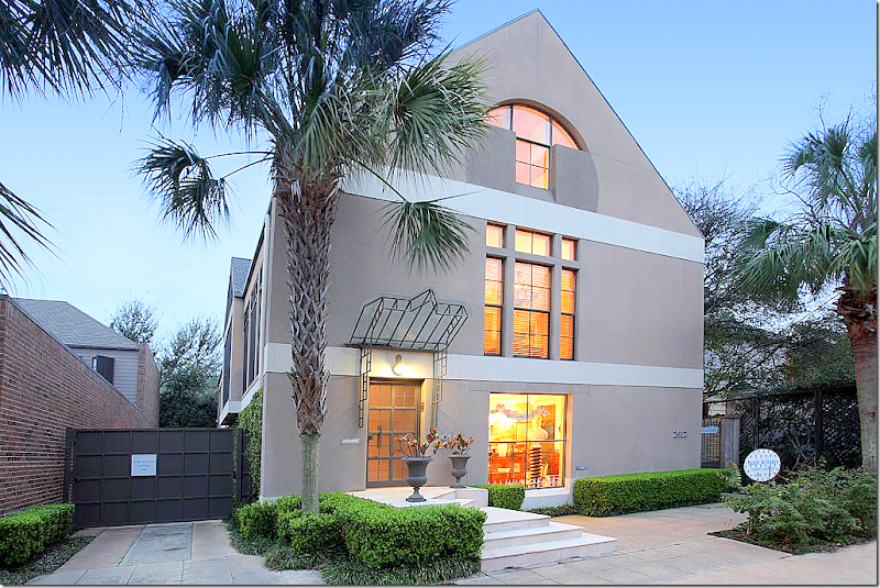
BEFORE: The three story townhouse that Donna Temple Brown bought. Before, Made In France, a French antique shop, was on the ground floor. Above, shop owner Laurence and Bill Anderson (the architect of the house) lived on the 2nd and third floors.
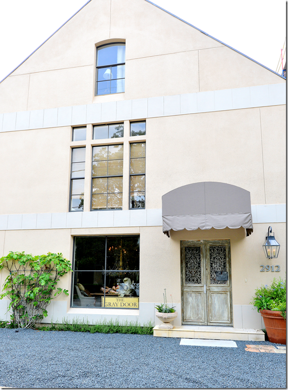
Today – the city required that Donna provide two parking spaces at the front of the shop. In order to do so, she had to move the front door to the private HOUSE which is seen on the left, up the stone steps, under the pretty glass awning. The entrance to the SHOP was at the very right – off to the side. To open up the shop, Donna moved its door to the front, instead of the side.

AFTER: Donna brought her two antique doors and placed them to the right of the shop, under an awning. She also replaced the third floor window, making it much less contemporary looking. The gravel front drive of the store now has room for the parking that the city required.

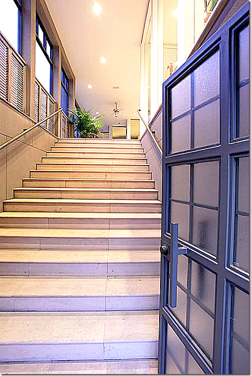
BEFORE: The front door to the house opened to a stone staircase – that led up to the large screened in porch. Since the door had to be moved to the side – this staircase had to be totally reconfigured.

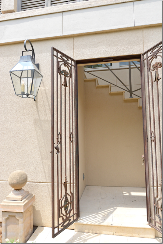
AFTER: The front door to the house is now at the side of the building, located through iron gates.

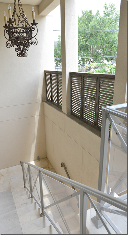
AFTER: Looking down from the porch to the stairwell – which now is U shaped because the door had to be moved.

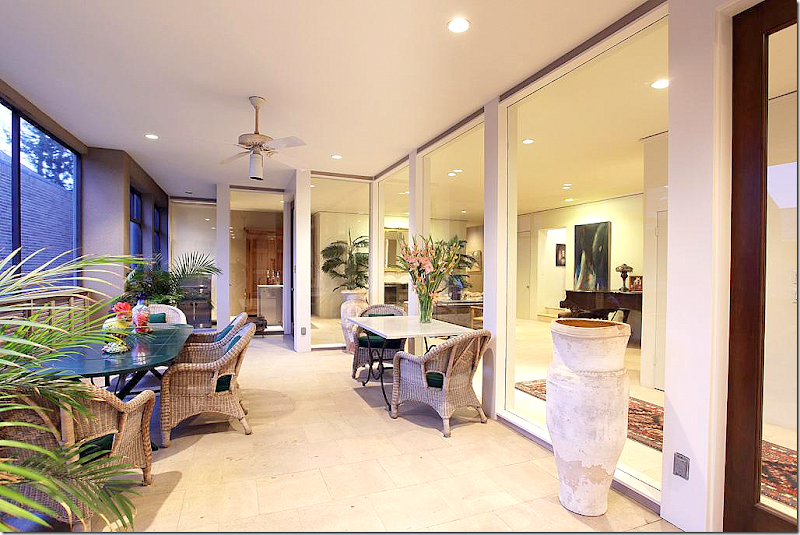
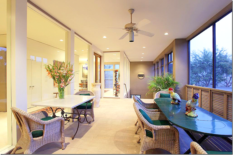
BEFORE: The screened in porch runs the length of the townhouse. On the right side is the living room and dining room, with the kitchen in between the two rooms. The floor is the same as that in the house: matte limestone – set without grout. The floor is very French looking – which is an aesthetic detail leftover from Laurence Anderson who is from France.

BEFORE: Looking the other direction towards the stairwell.

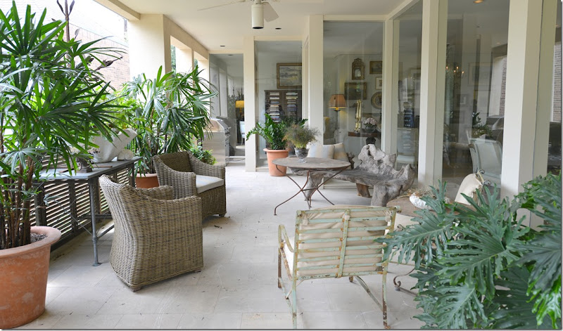
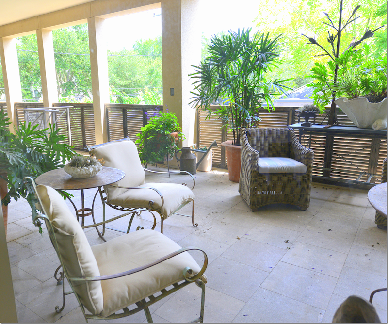
AFTER: Donna filled the porch with an assortment of her antique pieces – like the faux bois bench and iron table and chairs. She also used wicker and plants to soften the space. Donna removed the screens to open the space up more to the breezes. She uses this as another room in her townhouse – drinks and desserts are served here at parties.

AFTER: Looking out towards the treetops. With the screens removed, it really feels like you are in a treehouse in this open air balcony.

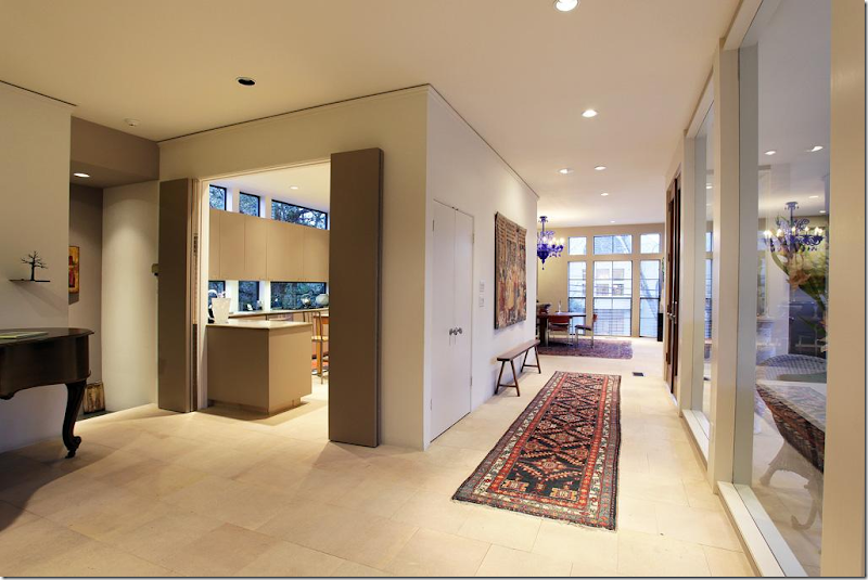
BEFORE: The front door opens up from the balcony onto the entry. The door faces a wall which is actually the back of the kitchen. The dining room is to the right.

BEFORE: Here you can see the kitchen on the other side of the wall that faces the front door. The dining room is on one side of the kitchen and the living room is on the other. The master bedroom is entered through the living room.

BEFORE: Looking the other direction towards the living room.

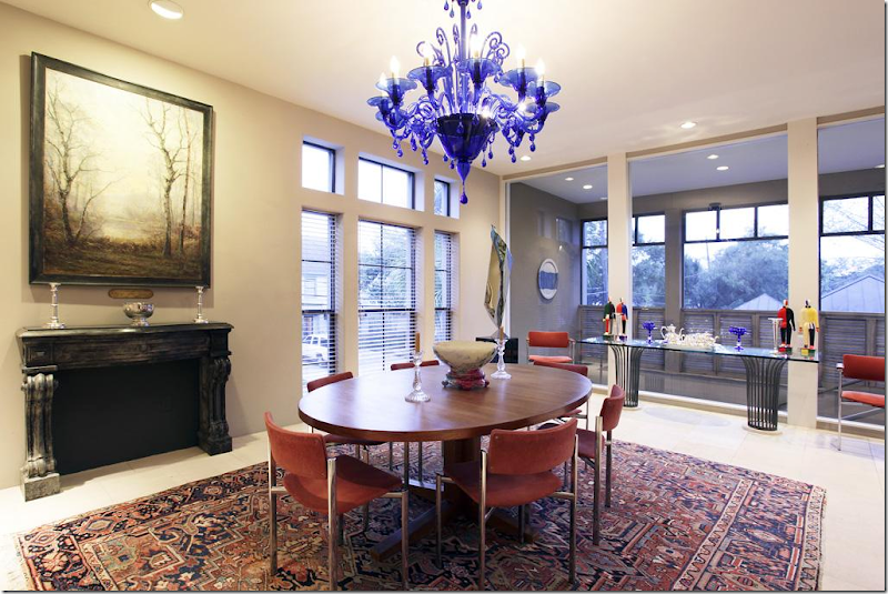
BEFORE: The dining room. Although Laurence is an French antique dealer, she decorated her house in more of a mix of antiques and contemporary. Her dining room was surprisingly more modern than one would think judging by what she sells at her shop! The dining room window overlooks the stairs portion of the balcony.
AND AFTER:

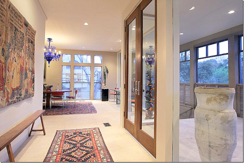
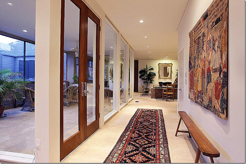
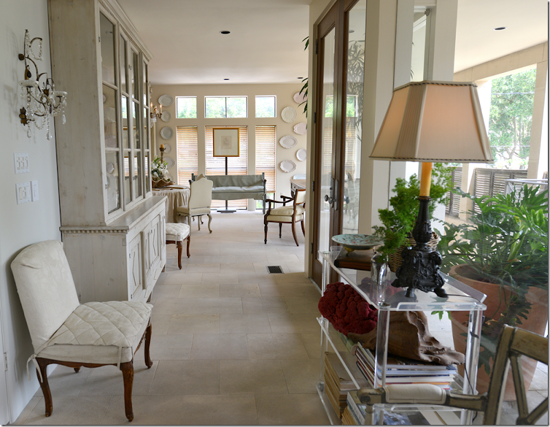
AFTER: The entry hall. Donna placed a painted piece on the large front wall and flanked it with crystal sconces and antique chairs. Across is a Lucite shelf. At the end of the hall is the dining room.
The floors are matte limestone set without grout. Donna painted the walls a shade that exactly matches the limestone.

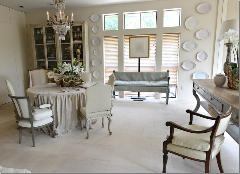
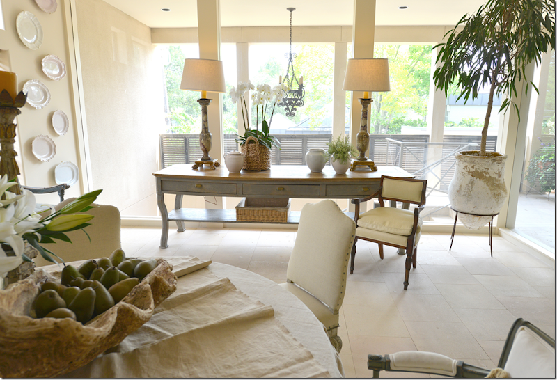
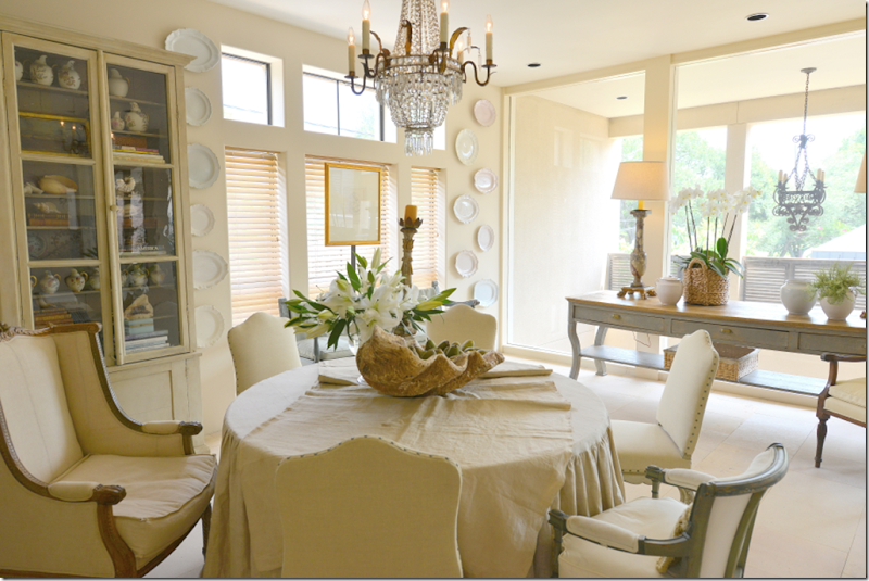
AFTER: The dining room. Donna’s linen skirted table is surrounded by a mix of antique chairs.

Against the dining room window that overlooks the balcony’s staircase is a long, painted gray console.

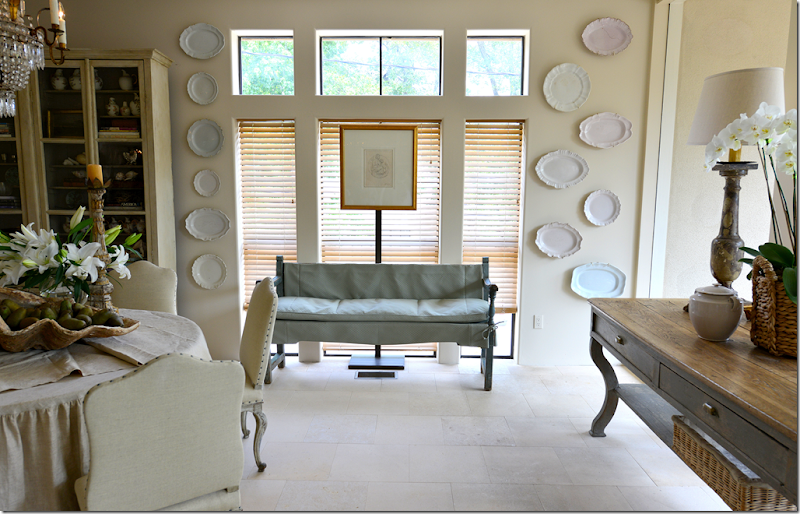
Donna placed a bench, slipped in an light aqua blue linen, in front of the window. Behind it is a gilt framed print that many might remember from Donna’s former townhouse. Flanking the bench is her large collection of ironstone platters and plates.

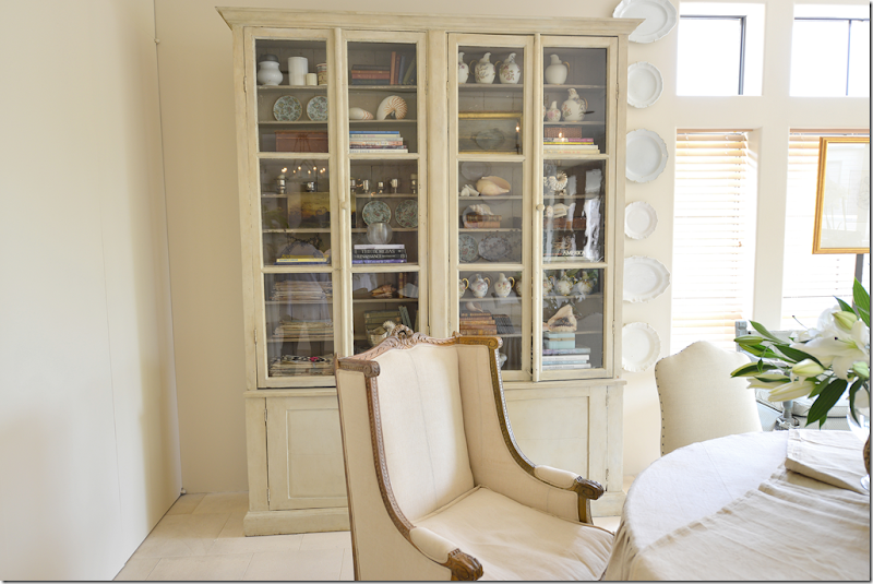
Donna filled this painted cabinet with her various collections. The room is large enough that when she needs to, she brings in another round table to double the amount of seating. Also – along the back wall is a series of storage behind hidden doors. Donna has plans to remove the doors and renovate this area, by doing so she will gain a needed few inches in height. She wants to display her large tapestry here, but right now – the tapestry is a few inches too tall! By removing the doors – she will gain the needed space. Remember her beautiful tapestry from her former townhouse? Here it is:

BEFORE: The tapestry. Once she completes Phase II of her renovation, there will be enough height to hang it in her new townhouse. This chandelier, one of a pair, is now in her living room.

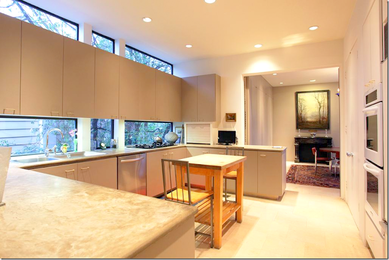
BEFORE: Donna kept the footprints of the kitchen – the biggest change came by removing the upper cabinets and taking off the bottom cabinet doors. The countertops are concrete, which she loved!

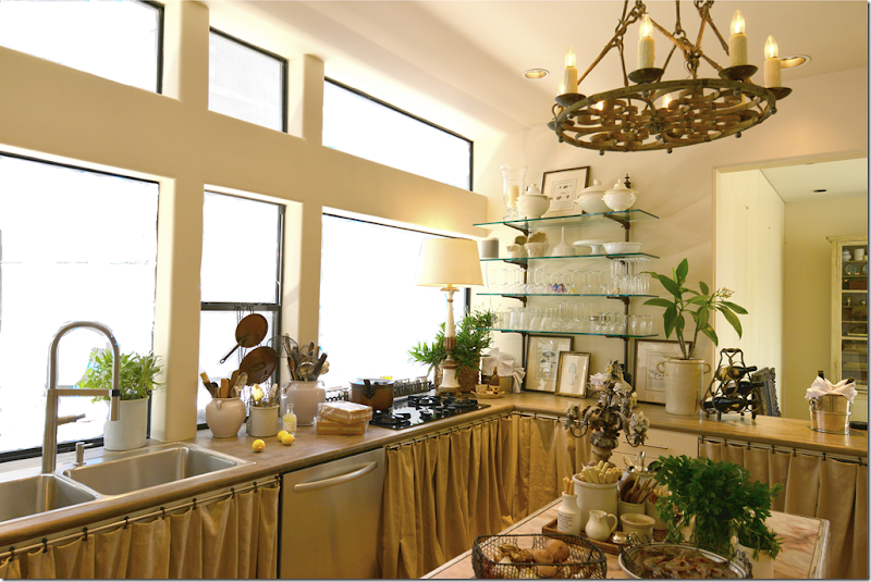
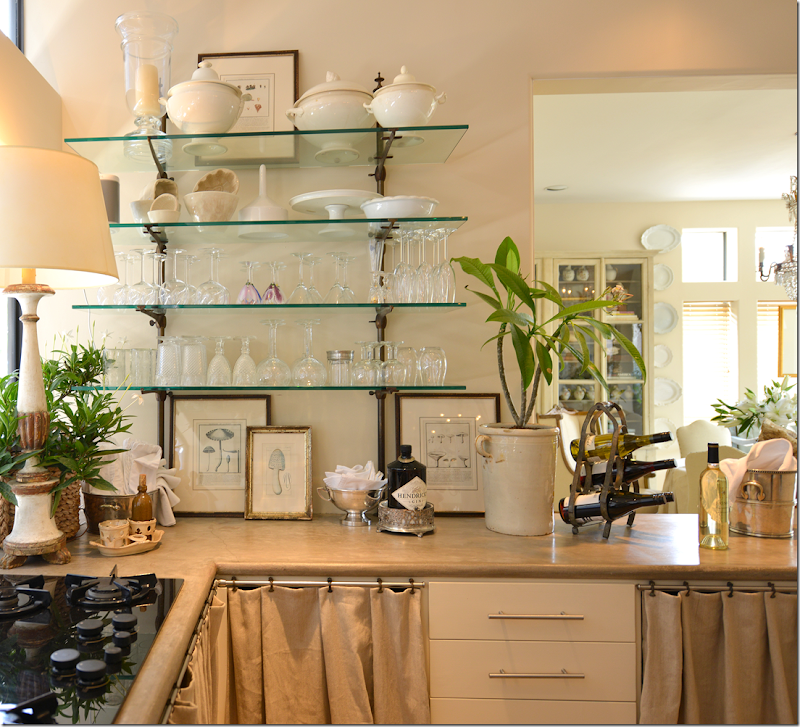
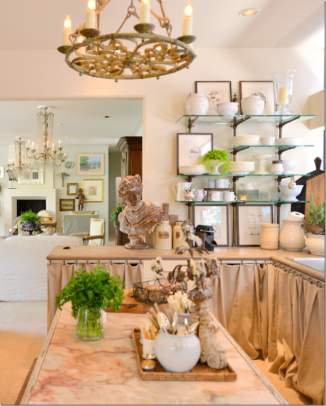
AFTER: Donna removed the upper cabinets and designed the remaining windows to mimic the windows in the neighboring dining room. Linen curtains cover the bottom cabinets. She also put a marble topped table in the middle to use as an island. Antique light fixture and shelves on the walls that hold glasses and plates.

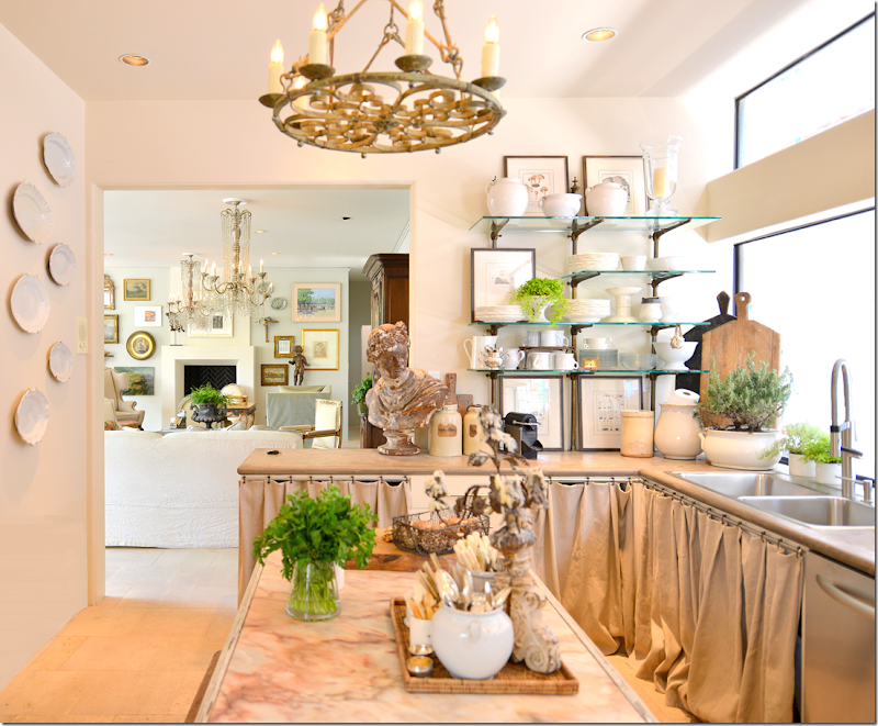
Looking towards the living room. Donna has a real gift for styling kitchens and bathrooms and I really want her to help me with mine!!!

She kept this bank of drawers for utensils.

So cute! I want to take off my bottom cabinet doors too. I love this look so much!

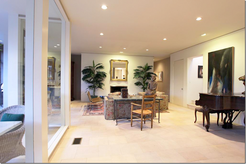
BEFORE: The living room is on the other side of the kitchen. It is very spacious. Here is how Laurence Anderson decorated it – with a piano and a seating area around the fireplace. On the right by the piano are the stairs that lead to the guest bedrooms on the third floor. And the powder bathroom is on the right of the fireplace wall.

BEFORE: The seating area. She used a mix of classic and contemporary furnishings. Towards the back right, where the armoire is – is the door to the master bedroom. AND – there is a wet bar in front of the glass door – which Donna removed in order to open up that area.

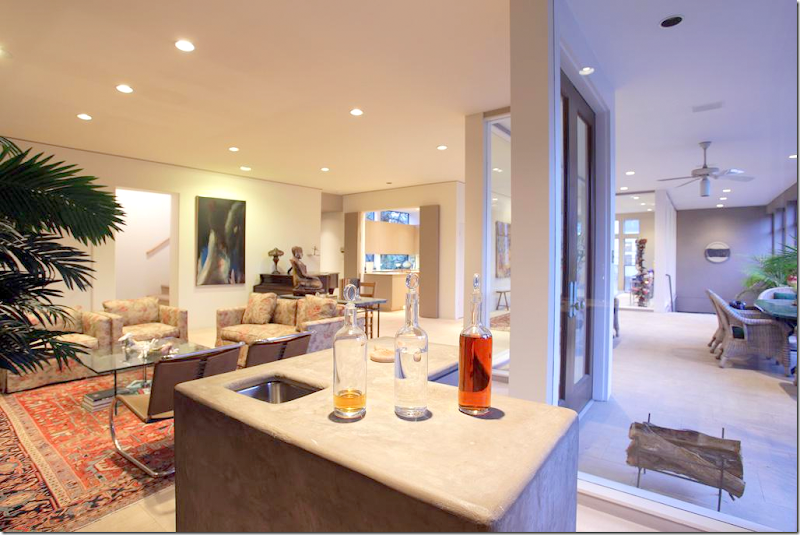
BEFORE: The wet bar which was freestanding in front of the balcony windows. You can see the stairs that lead up to the guest rooms and the kitchen is at the far right.

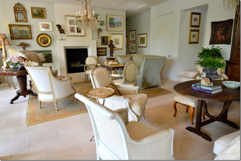
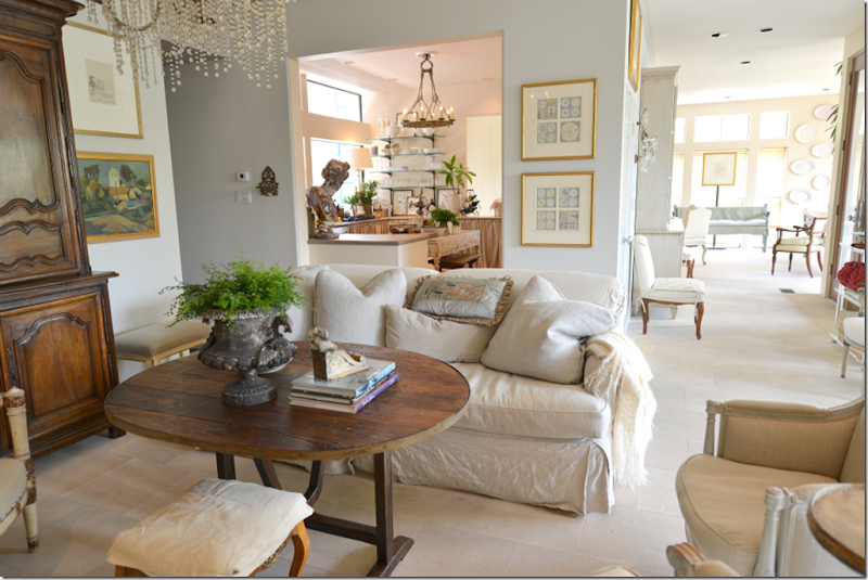
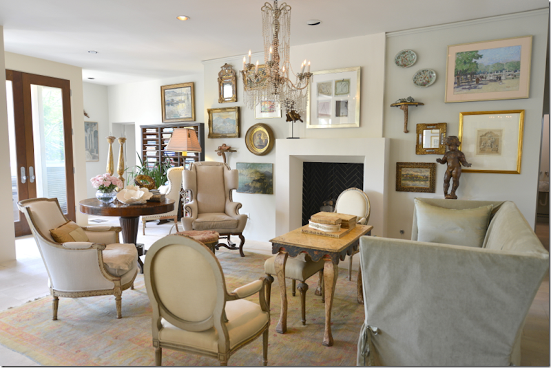
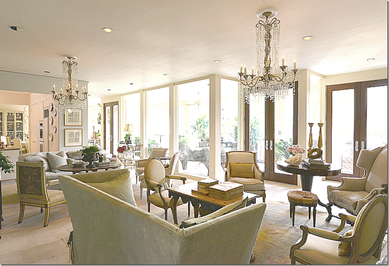
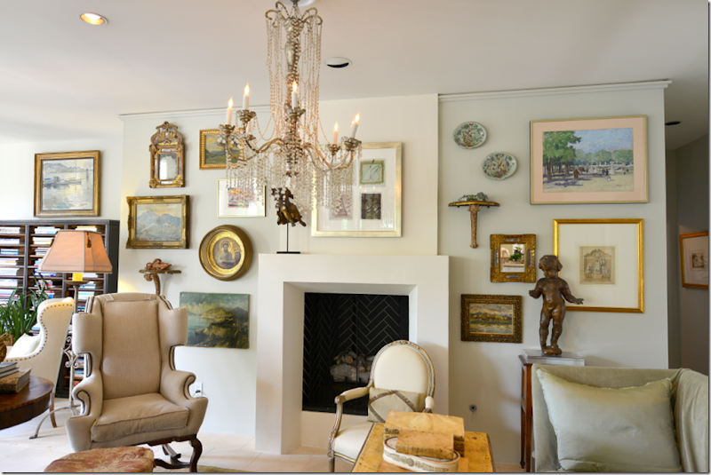
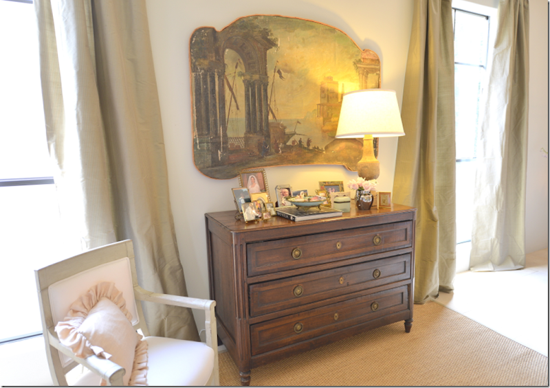
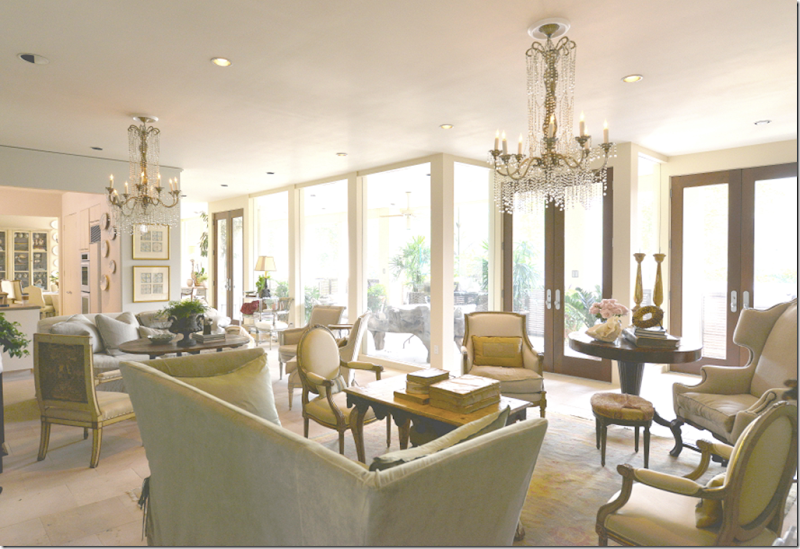
AFTER: Donna has two seating areas in the living room – one near the kitchen and one around the fireplace. She put in a new firebox and mantel. Against the back wall she hung all the artwork. The two magnificent chandeliers hang over the seating areas. The larger area is defined by an area rug. While all the walls match the limestone – the back fireplace wall is different - it’s a soft, barely aqua color.

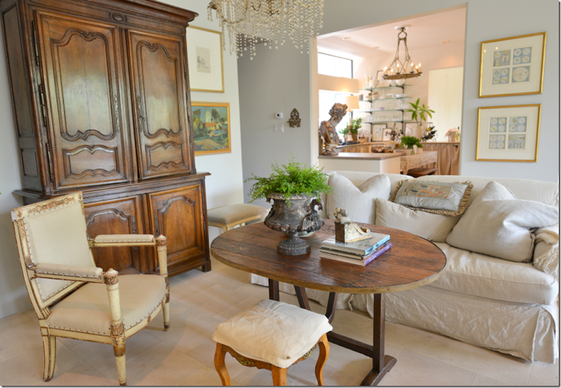
Here is the smaller seating area – you can see into the kitchen and the entry hall and the dining room beyond.

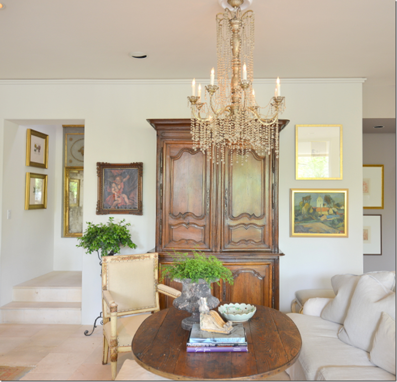
Closeup of the beautiful chandelier and armoire. Donna told me that she particularly is attracted to chandeliers and art. These are what she tends to collect. Her shop always has a selection of wonderful chandeliers.

The second seating group – next to the kitchen. This sofa is slipcovered in a khaki fabric. Instead of a coffee table – Donna used a wine tasting table.

The larger seating area has an assortment of antique chairs. The second chandelier hangs over this area.

Looking back from the living room towards the porch and entry hall.
I can’t tell you how pretty this house is! It’s just beautiful. Each piece is like art, each chair, each table. It’s a neutral palette, so serene.

One of the prettiest parts of the décor is the gallery wall. It is filled with art in antique frames and prints in gilt frames. Hanging is a small mirror and a round oil. There are also a few sconces and plates. This is how a gallery wall should be!! They are trendy – and I’ve seen them all over the internet – but few look this fabulous. Donna made this the focal point of the living room and I can’t tell you how beautiful it is!!!

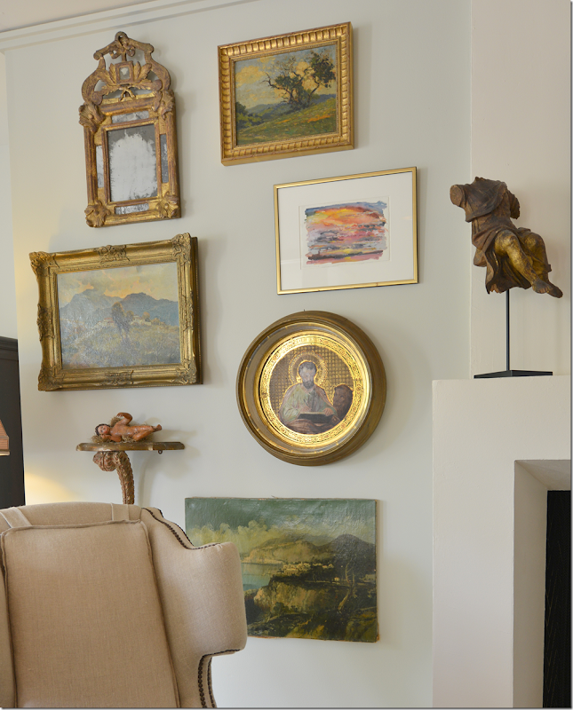
Here’s a closeup of one side of the gallery wall. I love the round painting – and the unframed oil, and the mirror! Perfection!

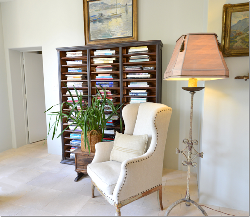
And where there was once the freestanding wet bar, Donna has placed an antique bookcase that once held documents. The master bedroom is through the door.

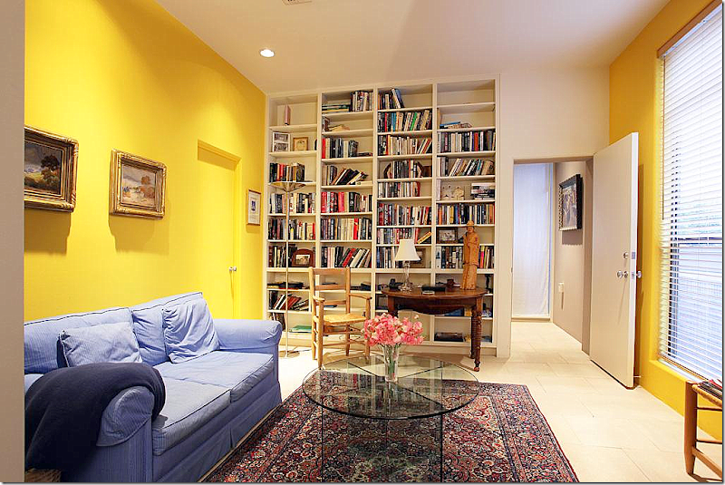
BEFORE: The master bedroom was divided into two rooms – a study and a bedroom. It was painted bright yellow – as you can see.

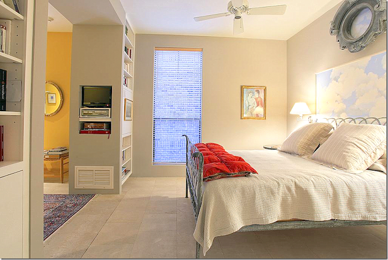
BEFORE: The small area where the bed was. Donna removed these two bookcases to make one large bedroom.

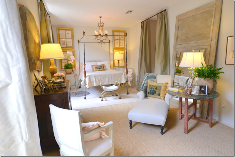
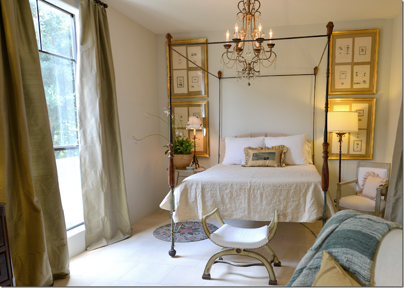
AFTER: Now – the bedroom is one large room. And it is so pretty!! Silk curtains hang at the windows and another pair hang at the opening to the master bathroom. The bedroom is so romantic and very Italian in feel, although it is filled with French furniture. Against one wall, Donna placed a large mirror on the floor – and centered an antique chaise in front of it, along with a side table.

Looking from the back of the bedroom to the shelves. There is a small desk in front of the shelves and Donna hung several paintings there.

Between the two windows is this wonderful painting that you may remember from the family room in her former townhouse. This painting is one of my favorites!!

The iron bed is surrounded by four gilt framed prints. The limestone is continued through the bedroom and bathroom. And there is a chandelier hanging over the bed – of course!

BEFORE: On the other side of the living room is the powder room. Originally there was a contemporary sink made of concrete and blue tiles.

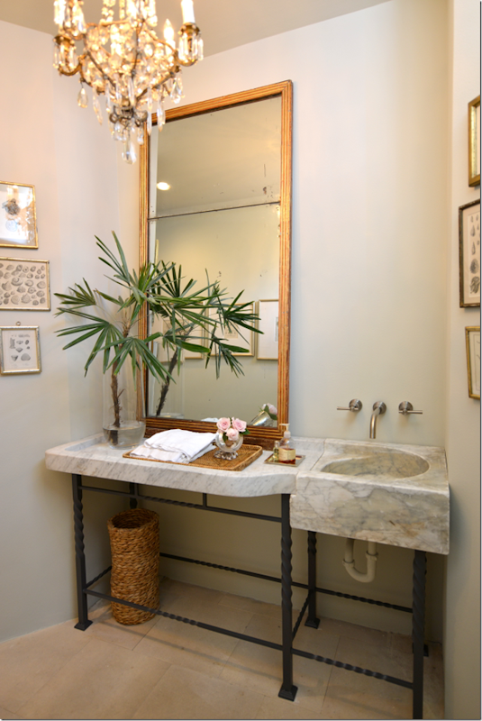
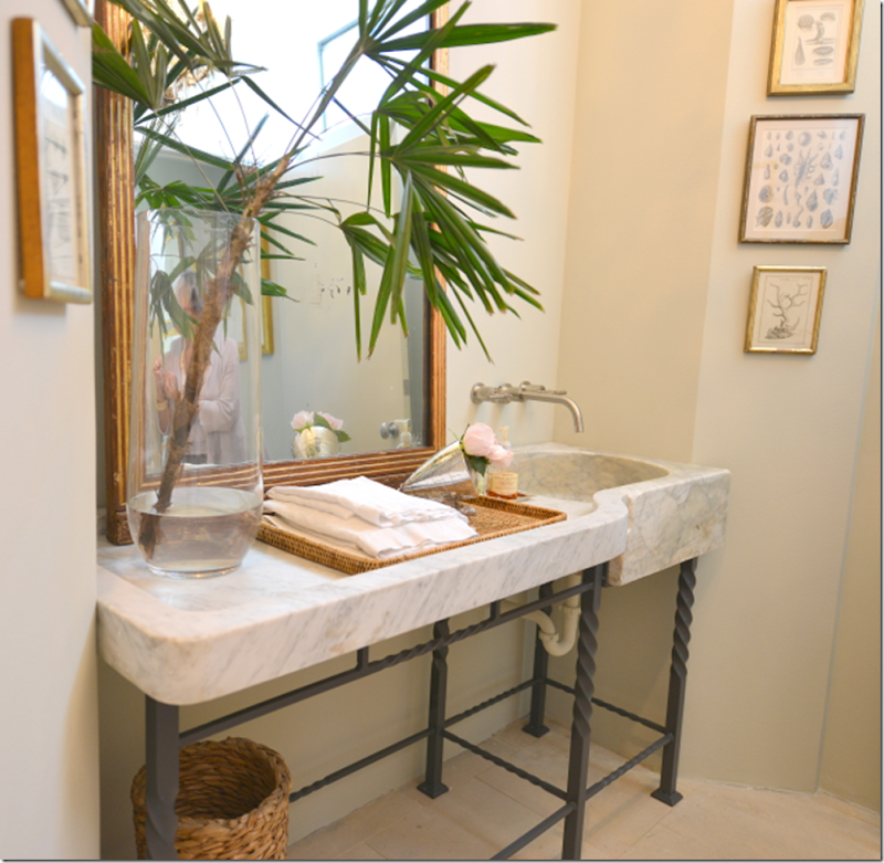
AFTER: Donna used this large sink on a stand in the powder room. Made of marble – it is incredible!! She added a crystal chandelier and a wonderful antique mirror.

Another view – originally Donna thought this sink would be in the kitchen, but it just wasn’t big enough, so she used it here instead.

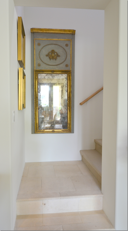
Upstairs there is a large study, along with two guest rooms. On the stairs, there is a beautiful antique mirror.

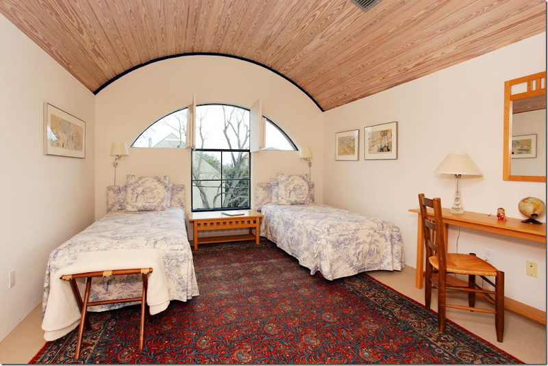
BEFORE: The guest room with the arched wood roof and the large window that Donna removed.

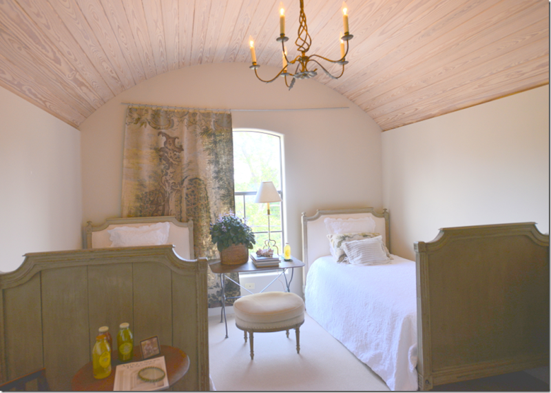
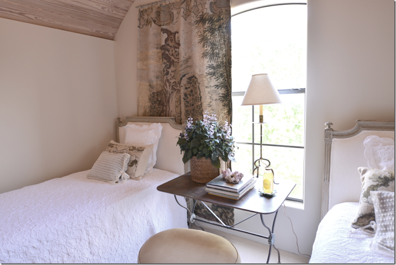
AFTER: The smaller window is a big improvement in this cozy guest room. Two French beds with a metal garden table between them. At the window is a tapestry that is painted, not sewn.

The guest room, where Donna’s grown children come to stay is romantic with the unusual ceiling. I thought it looked like a state room on a ship, but Donna said, a friend says it is like being inside a jewelry box. One day she would love to put silk on the walls to make it really look like a jewelry box.
Our tour was now over – we had spent a few hours going through the townhouse, discussing all the changes that Donna had made and all the changes she still wanted to make. Honestly, I was so impressed with her home, which was a surprise. I had loved Donna’s former townhouse and had wondered if I would like this new space as much? It was a true revelation that the new place was actually so much – MORE.

More sophisticated and more chic, for starters. More special. The old house was beautiful, no doubt, but townhouses like that are found on every street inside the loop. This new house – with the shop below – is more urban, more at home in NYC than in sprawling Houston.

The new space far exceeds the old townhouse in every single way. It’s amazing. It’s so timeless, so classic – and another lesson that shows that using antiques never date. The décor will always look as good as it does today.
To visit the store, get directions and times from the web site, The Gray Door HERE.
A huge thank you to Donna Brown! Thank you so much for your hospitality – I had the BEST time!!!Joni

