It’s that time of year again, when Houston’s front yards are filled with the bright colors of the azaleas that just love our soil (ha!) The River Oaks Garden Club hosts the annual Azalea Trail and each year they sweat it out that the sensitive blooms will be in full show during the weekend which was picked a year ahead of time. But, the Azalea Trail is all worth it, regardless if the flowers are in bloom or not. The highlight of the Azalea Trail is wandering the 14 acres of Ima Hogg’s estate, Bayou Bend, named appropriately for its location at the bayou’s bend, when its thousands of azalea bushes are hopefully ablaze.
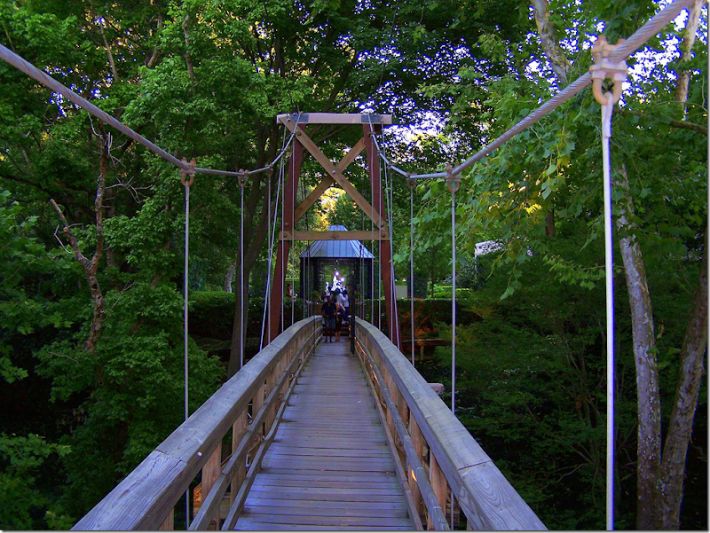
The charming drawbridge that takes you over the bayou to Bayou Bend – the highlight of the Azalea Trail.
Bayou Bend, the 1927 John Staub designed house that Ima Hogg and her two brothers lived in. The Hogg brothers actually helped to develop River Oaks, still today Houston’s toniest neighborhood. Their house was one of the first built there.
The Butterfly Garden is the crowd favorite.
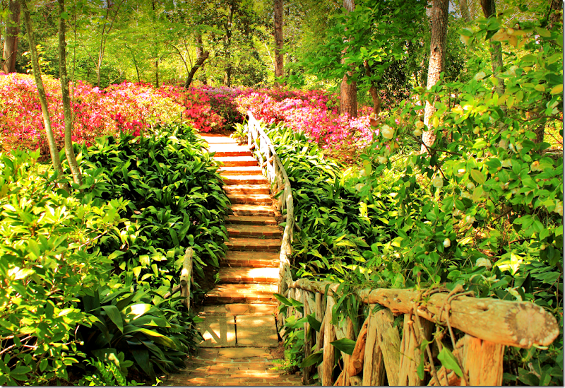
Some of the acreage is formal gardens, while others were deliberately kept natural.
If you have never visited the Azalea Trail or Bayou Bend, you should!!
Besides the tour of Bayou Bend, each year the Azalea Trail visits a handful of carefully chosen houses and gardens. This year – one of the houses on the Trail is designed by Lucas/Eilers Design Associates
Lucas/Eilers Design Associates
The firm, made up of Sandra Lucas and Sarah Eilers, is the well known talented team who have designed a plethora of interiors here in Houston and throughout the United States. The duo have won numerous ASID awards for their work and they have been published in many magazines and books throughout the years. Their house on this years Azalea Trail is particularly attractive because of its interiors, as well as its architecture and landscaping.
All photographs by Carl Mayfield
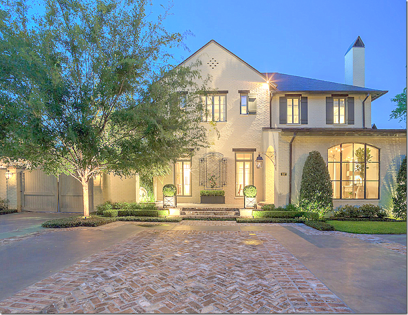
This house, on this year’s Azalea Trail, was designed by Sandy Lucas of Lucas Eilers. It was once a classic Georgian that was taken down to its studs in a total renovation. Because the lot sits on a picturesque golf course – the garage must be front loading. Notice how you can barely tell that the garage is on the left, with its carriage-like doors. And notice the brick detailing on the driveway which again takes the focus away from the garage. The door is off center – the hanging lantern alerts guests to its location.
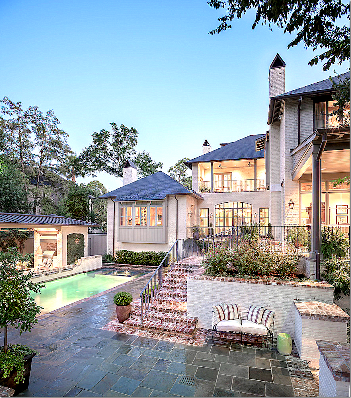
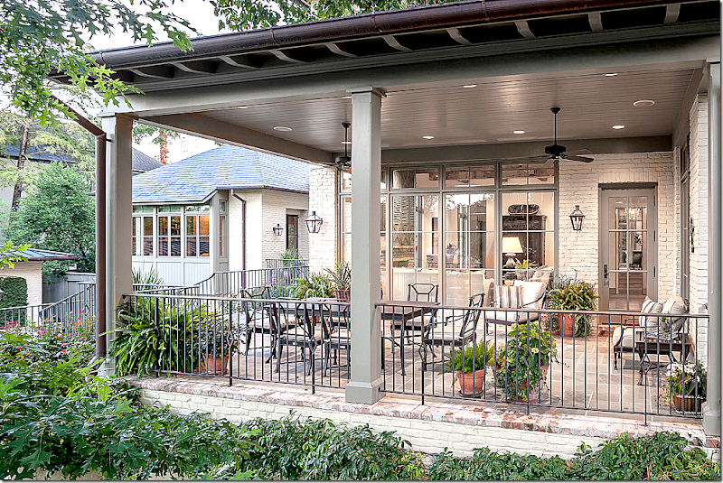
The back terraces down to the golf course – through a series of landings and porches. The brick stairs mix beautifully with the slate paving.
The covered porch off the family and breakfast rooms.
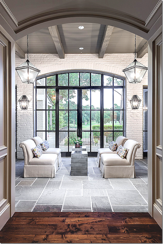
The entry hall – which I just love. Arched steel double doors open to a stone floor hall. Just beautiful.
The main hall with the beautiful view of the golf course. Expansive views like this are almost nonexistent in central Houston. Notice how this hallway has painted white brick and gray beamed ceiling – which adds texture and interest. Lanterns, sconces and chairs create a symmetrical seating area.
Another view of the main hallway with the stairway hall beyond.
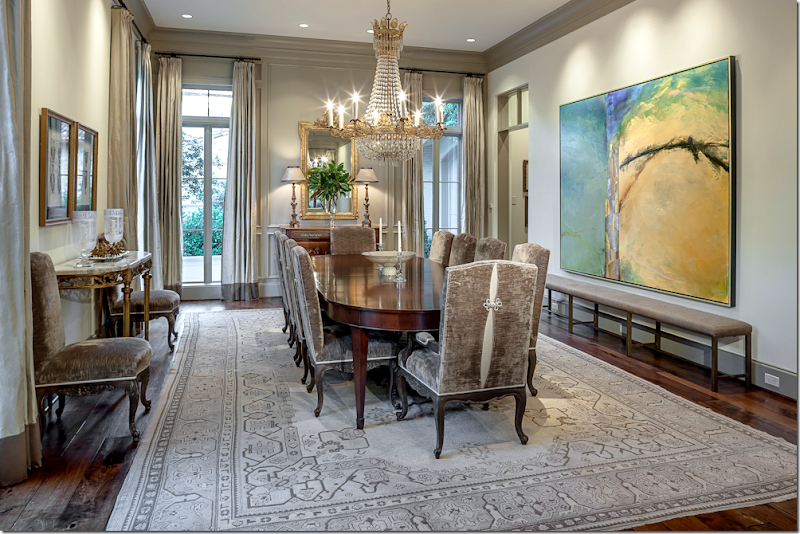
The dining room is elegant in gray – with a gray rug, while the contemporary art work provides a shot of color. Notice the curtains – the dark band of gray at the hem –is a nice detail.
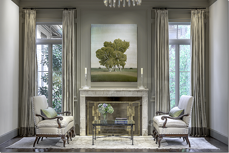
In the living room, the same curtains provide a design continuity. Love the antique settees and the painting. Notice the contemporary firescreen.
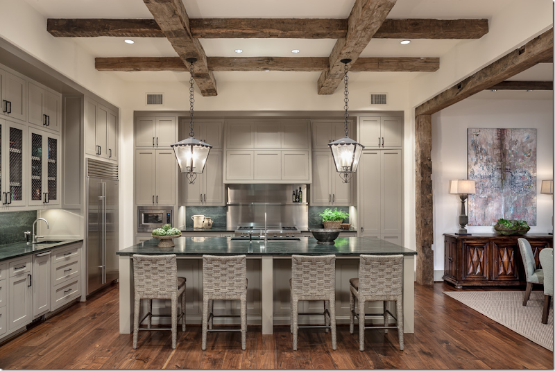
Off the family room is the kitchen in a taupe/gray. Ceiling beams are repeated in beams that line the opening. Love the double lanterns.
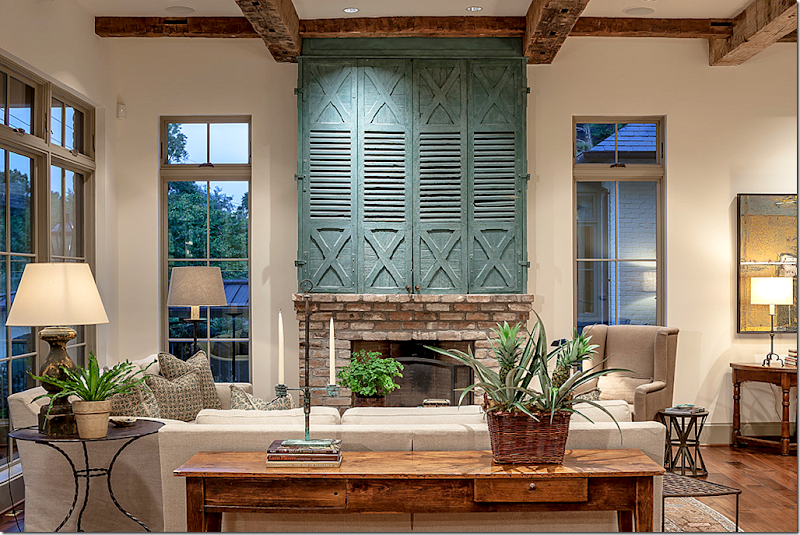
Off the kitchen is the family room with its focal point antique shutter above the fireplace. Behind the shutter – is the flatscreen.
Looking back towards the breakfast room and kitchen.
And the master bedroom with wood beamed ceiling.
Darling window seat in the master bedroom which sits behind the damask curtains. Notice the header beam in the alcove.
Lucas Eilers was also featured in the new Tuscan Style.
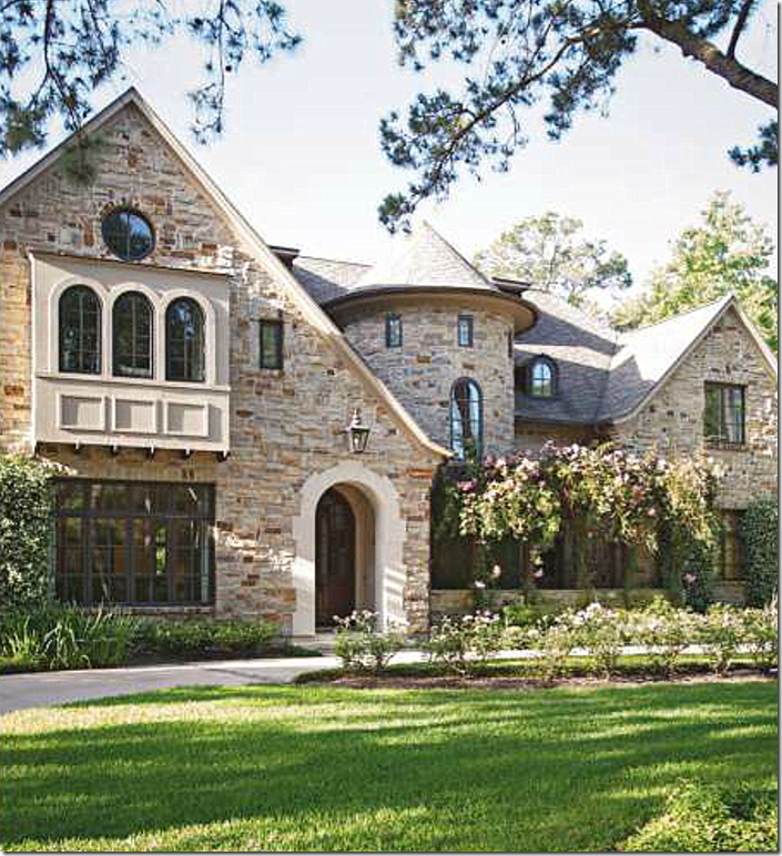
The large stone house with a turret is also located in Houston.
The music room has light blue gray walls and taupe upholstered furniture. Notice the coffered ceiling.
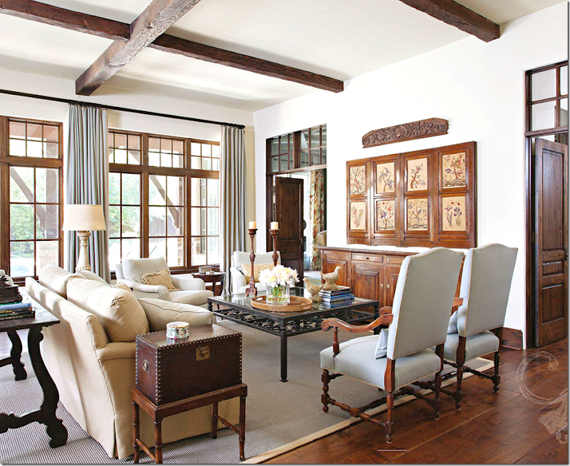
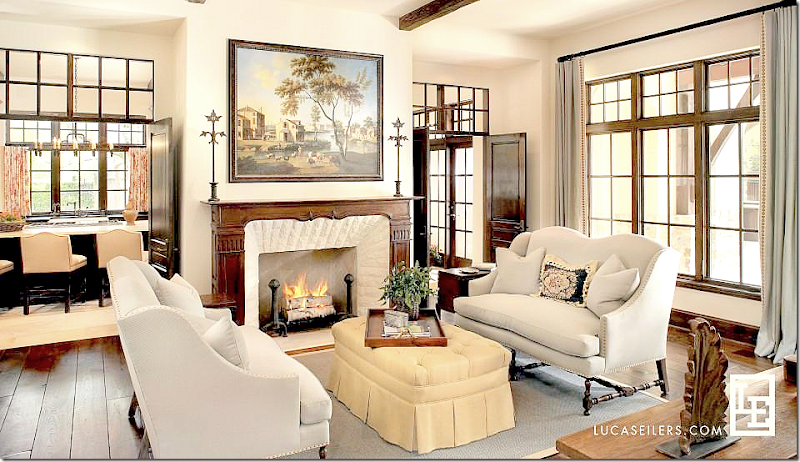
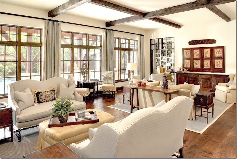
My favorite room is the family room – I just LOVE the wood screen which, yes, hides the flatscreen. I am beginning to think my flatscreen must be the worst eyesore!!! Notice the wood doors that flank the console – with the charming transoms above. Beautiful furniture arrangement with tall chairs providing needed height, along with matching club chairs.
NOTE: In a family room with lots of chairs and sofas – you need high and low heights. Imagine if all the chairs and sofas in this room were exactly the same height. It would be so boring. Instead, the designer chose the two antique styled chairs to give the room that needed height – which brings the room alive. And in another designer trick – notice the wood element above the screen. The screen is not quite tall enough – so what to do? Add this piece above it to fool the eye. A row of plates would have solved the problem too.
The other side of the room has two settees that flank the fireplace. The kitchen is beyond.
While the room is casual, it is still elegant. It’s obvious it was professionally decorated – the curtains alone give it the finished touch. Can’t afford a decorator? Save and then splurge on custom made curtains. Nothing will say – luxe and good design more than a custom made window treatment.
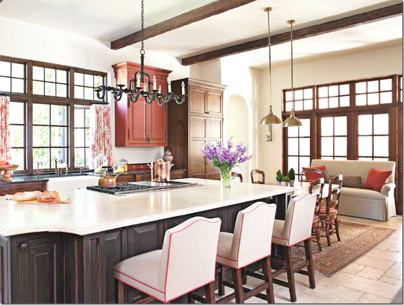
The kitchen has pops of red – in the cabinet, the curtains and the trim on the barstools.
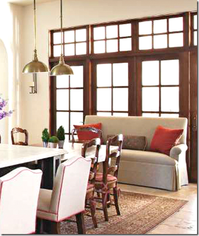
A love seat – with red velvet pillows – helps fill out the expansive breakfast room.
NOTE: large rooms need lots of furniture to fill them up. If you don’t want a lot of furniture – don’t buy a house with large rooms. Nothing says – unfinished and cold more than a room that doesn’t have the proper amount of furniture in it.
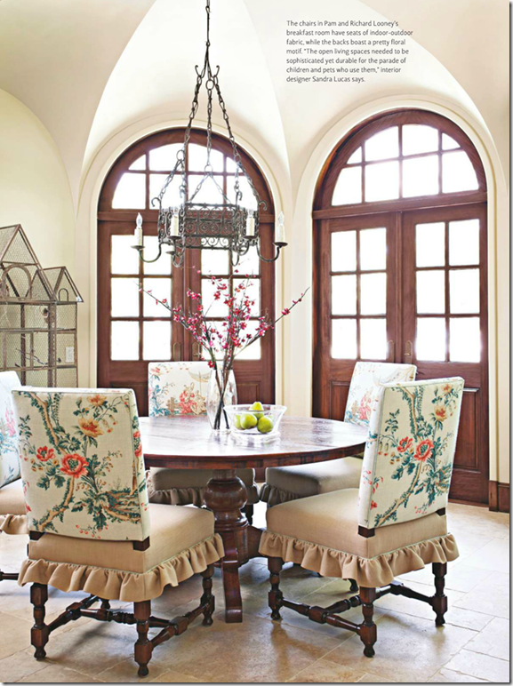
A second breakfast room – is charming with its round table and mix of fabrics on the chairs.
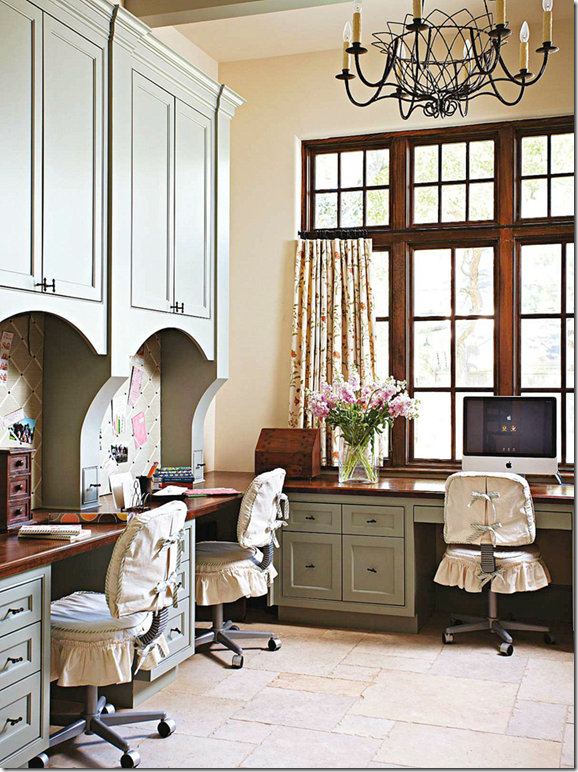
So cute! A computer room.
NOTE: OK. What to do with ugly computer chairs. If you client insists on using them – take note here. Cute slips help to hide the industrial nature of the chairs. They almost look like antiques! Almost!!!!
The tall ceiling of the master bedroom needed two lighting fixtures. Don’t be afraid to use two when needed. I love the tapestry over the fireplace instead of a framed painting.
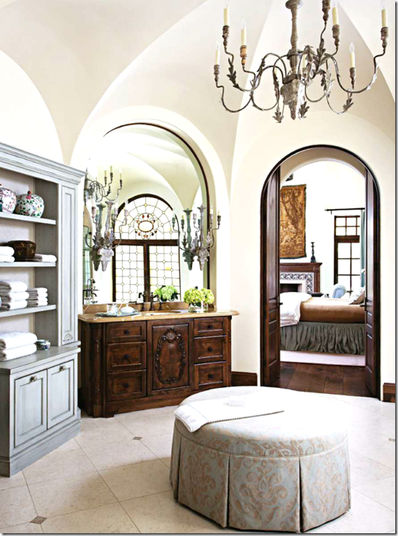
Groined ceiling in the bathroom.
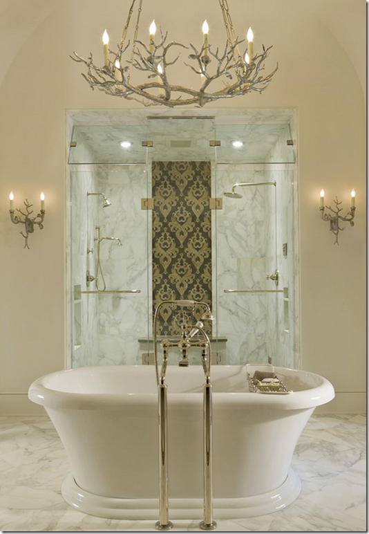
Lucas/Eilers have won many, many ASID awards. This one below is a personal favorite:
An ASID award went to this bathroom – with a tub and marble-enclosed double shower behind it. Absolutely amazing. ASID awarded it the winning Bathroom Design for 2011. And I can see why. That shower is incredible!
Below is another award:
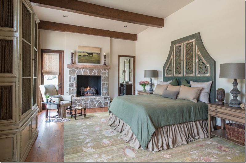
This house won an ASID award for Residential, Large – Sustainable Design. It is on a ranch in Cat Springs, Texas. I love the unusual headboard.
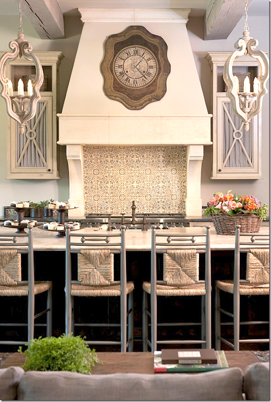
And another ASID winner – I love the clock in the range hood.
A special thanks to Sandy Lucas and Sarah Eilers for sharing this look at their portfolio.
To contact them:
1502 AUGUSTA DRIVE, SUITE 220, HOUSTON, TX 77057 · (713) 784-9423
To visit their web site – go HERE.
And, for more information about this year’s Azalea Trail – go HERE.


