Today, I’m going to leave Wilton House for now (Part 3 is coming) – to look at some French decor in Houston that I saw! I can’t pass up a house with pretty antiques, especially French ones! Enjoy!!!
Built in 2004, the house was put up for sale and updated, although it was quite beautiful to begin with.
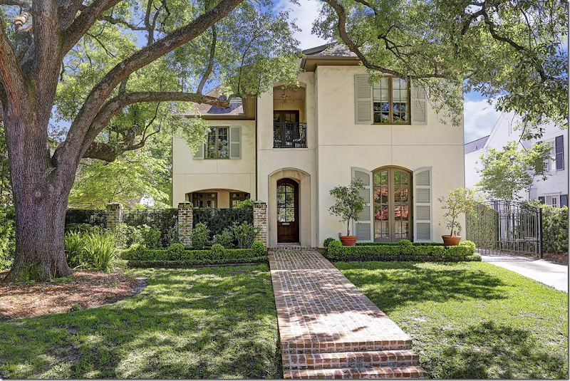
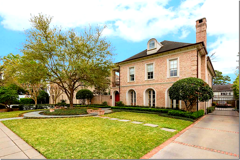
Today: New landscaping, box beds, and shutters painted a light green. The front courtyard is now hidden behind vines and the gravel parking area was grassed over.
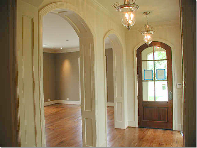
Before: The dining room is located off the front door, with a row of lanterns in the foyer hall.
Before: Looking the other direction, there is a fireplace, which is so wonderful in a dining room.
Today: Antique rugs warm up the space.
Filled with French antiques, twin crystal chandeliers. The brown mantel was painted white.
The front hall leads to the family room. At the left is a side courtyard.
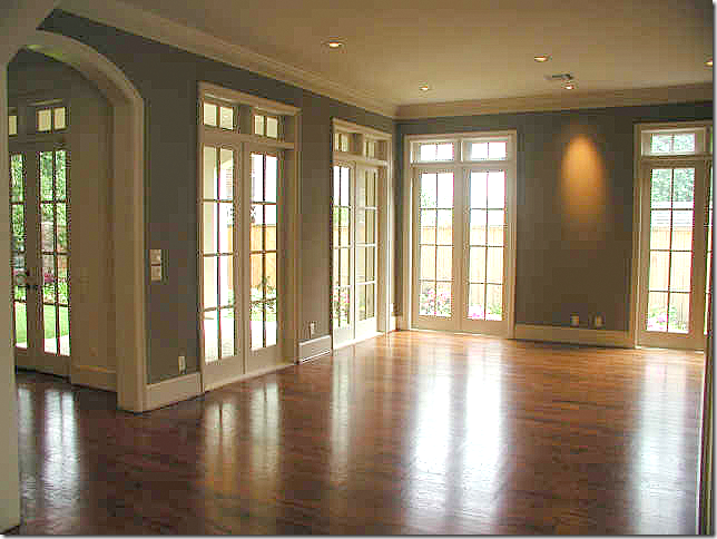
Before: The foyer ends at the family room.
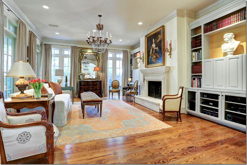
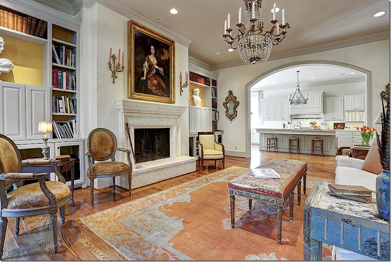
Today: The family room! LOVE LOVE LOVE!!!! I just love this!!!! Can you tell? OK. Nothing beats pretty French furniture, especially like this, when it’s not decorated, it just IS. Love the symmetry of the bookshelves, with the matching busts and the bright yellow background. Love the crystal chandelier. The painting. Love the bench instead of a coffee table.
The view toward the other direction.
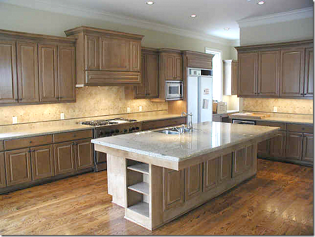
Before: Sea of brown cabinets and yellow granite. So boring.
Ahhhh. Much better. Pretty cream cabinets with a stone topped island. Iron chandelier and checked linen curtains add more interest with texture.
New farm sink with skirt. Love. Arch doorways.
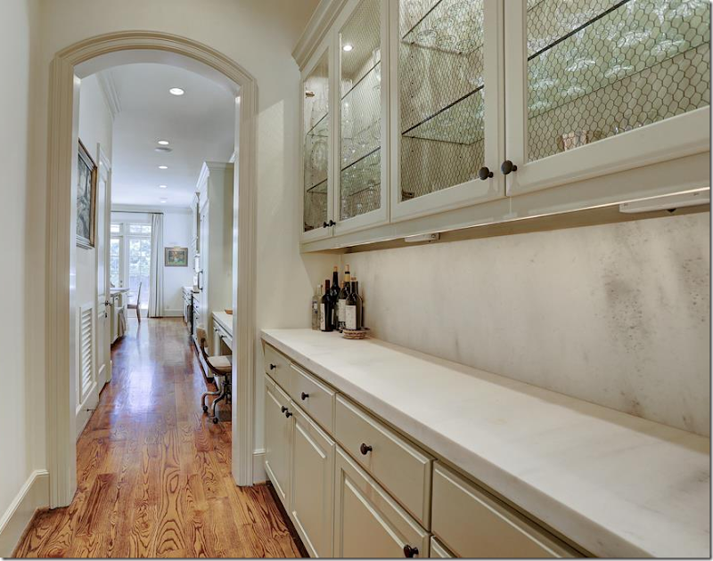
Butler’s Pantry with limestone counters.
Beautiful stairs. Landing with antique rug and chest.
BEFORE: The master bedroom.
Today: The bedroom is a mix of old and new.
Today: Bathroom with linen curtains and crystal chandelier.
Study on second floor – with antique French leather chairs. LOVE!!! Crystal chandelier. French tea table. The husband must hate seagrass. It’s unusual these days not to see any seagrass at all in a Houston house of this style. But so many husbands refuse to have it.
BEFORE: Backyard.
After: The patio, furnished.
After: At the front courtyard, instead of grass, there is now a brick terrace with a fountain enclosed by box. So beautiful!!!! So Houston.
Even the side yard which is typical neglected is landscaped with a lemon trees, box, and brick beds.
This house is for sale, to see the listing, go HERE.
This next house is located in River Oaks, Houston’s most exclusive neighborhood. Built in 2000, it’s a bit more than 5600 sq. ft. The house was sold in 2007 and now it is for sale again.
Today: The exterior has remained the same. Why change? It was perfect before! Beautiful landscaping, with an interesting circular bed built around the tree.
Before: You walk into the courtyard, to the front door that is actually on the side – like a Charleston House. Lanterns are lined up along the walkway. Mahogany doors and windows.
Before: A slate terrace with a balcony that overlooks it.
Before: Across the brick wall is a fountain.
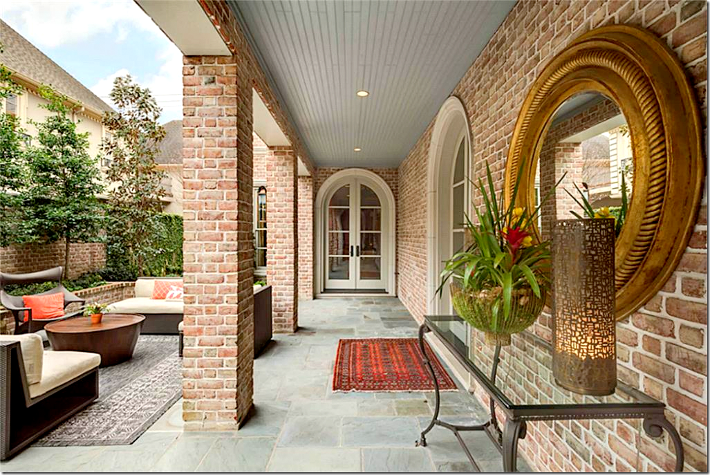
Today: The terrace has subtle changes that give a clue to what is inside. The lanterns are gone, the doors are painted white, and the area is furnished in bright colors and metals.
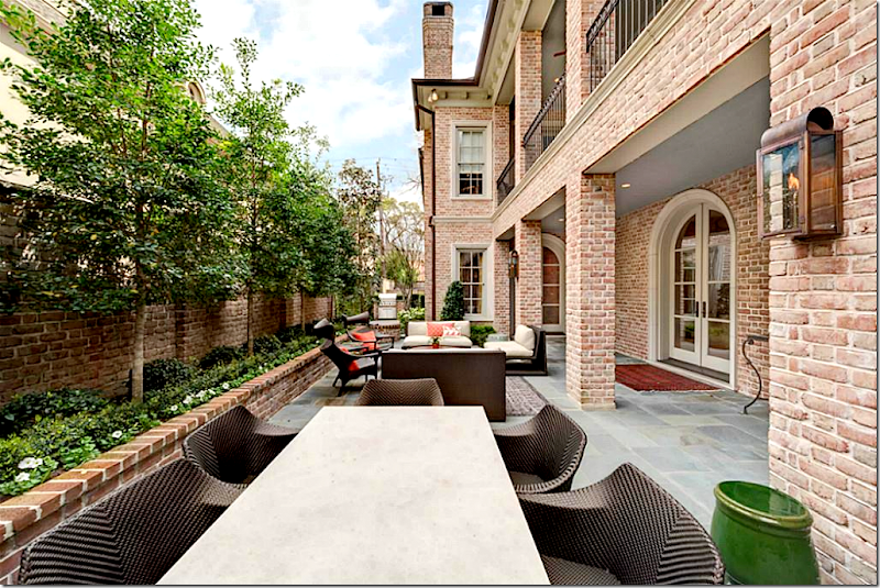
Today: Sofas and dining table turn the terrace into an outside living room.
Today: The view off the balcony to the terrace.
Then: Stone floors, French styled iron bannister, cream walls – the house is very elegant, very quiet. Ready for today? Really?
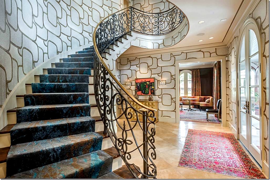
Today: A trendy, graphic wallpaper covers the three floor stairwell. The paper sets the tone for the entire house: contemporary, fun, hip, young, trendy! Of course it’s not everyone’s style, but it’s what the younger set wants and there are lots of surprises inside.
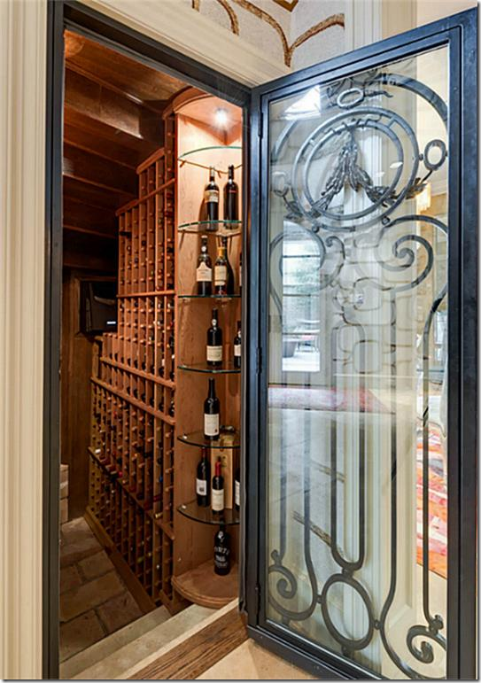
Today: The door under the stairs leads to the wine cellar.
Another view of the stairs with the marble-like runner.
Before: Elegant and chic – the large living room has silk curtains and tailored back to back sofas.
Before: A muted rug sits underneath both seating areas. Notice the stone Louis XV mantel.
Today: The living room has berry lacquered walls with an large rug in pinks, oranges, and purples. Greek Key wallpaper on the ceiling. Beautiful art nouveau sconces. I like the mix of French antiques with the contemporary pieces.
Today: Turquoise and blue are mixed in with the orange. The room must be so romantic at night!
Before: French chairs, handpainted wallpaper.
Today: The wallpaper was used again which is a surprise, but it is so pretty, it’s a great decision.
To bring up the fun – a contemporary rug and light fixture were added. Notice the difference in the curtains. The former ones were panels without pleats. Today there are stiff, ironed in pleats which make them more contemporary.
Then: The family room with a French armoire in the niche for the TV. Yellow walls.
Today: The media room is rather traditional – the deep peach painted shelves, lit, add the biggest punch. All the blue and white plays off the peach color perfectly.
Today: The view into the kitchen.
Today: And a look towards the courtyard and foyer. The wallpaper is never far from view. It truly sets the feel for the entire house.
Before: Skirted vanity. I love the hanging gilt antiques. So pretty!
Today: Black paper, new vanity. Black walls are so trendy today.
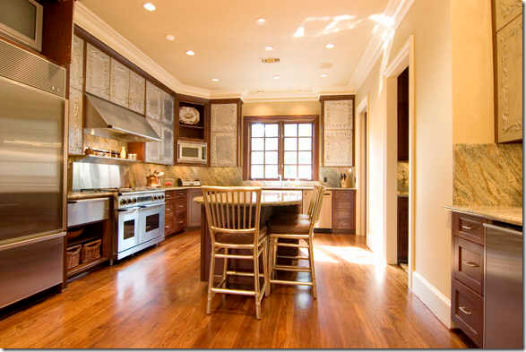
Before: The kitchen has interesting metal cabinet doors. Not sure where they are from?
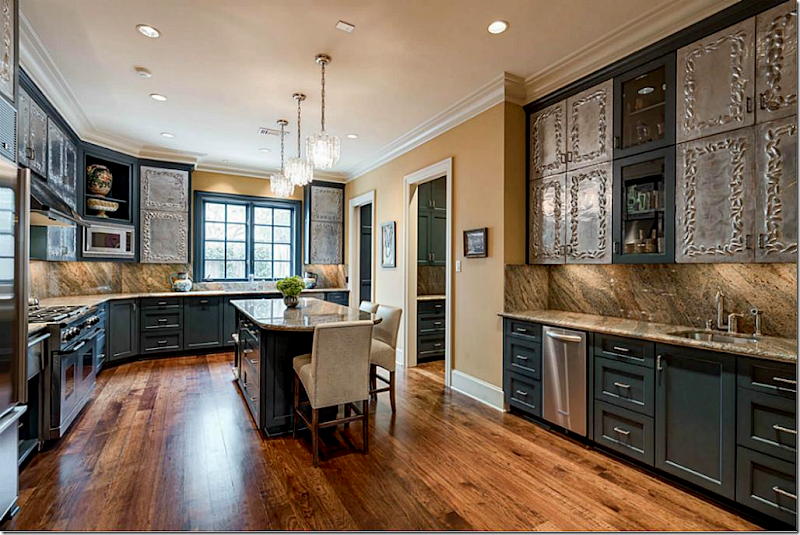
Today: the new owners kept the unusual doors – and painted the cabinets dark gray which looks much better with the granite. They also added three contemporary pendants over the island.
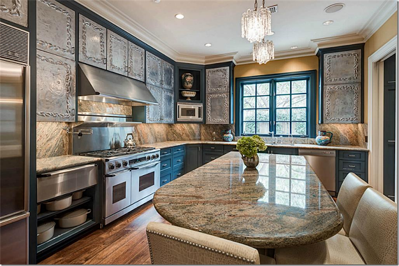
A closer view of the kitchen with the new stools which also are improvement.
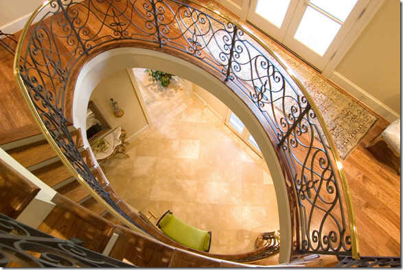
Then: the stairhall reaches up three floors.
Today: the second floor landing. I”m dying to know if the new owners will kept the paper. Interesting light fixture.
Then: pretty master bedroom with canopy bed.
Today: Traditional room with French armoire and beautiful textile on the bed. Beautiful light fixture. Even though this room is traditional, it fits right in with the vibe of the house. Interesting!
Then: There is a Hers/His master bathroom, which I LOVE!!!! Hers is beautiful and very feminine.
Then: His is masculine, of course. Love the toilet door.
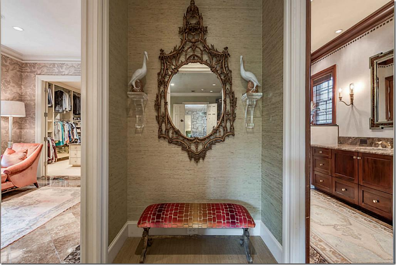
Today: The niche between the two baths is decorated with a mirror.
Today: Love Her bath, with the putty silk wallpaper, peach chair, rug, Sputnik. So pretty! Love!
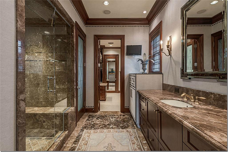
Today: His side was brightened up with cream walls.
Then: Very French blue and white toile guest room.
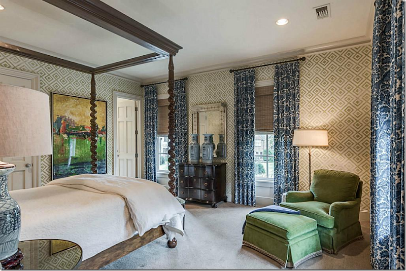
Today: The guest room is fabulous in green and navy – my favorite combo. Love the curtain fabric, the bed. Love!!!
Today: the library with two desks and skin print carpet.
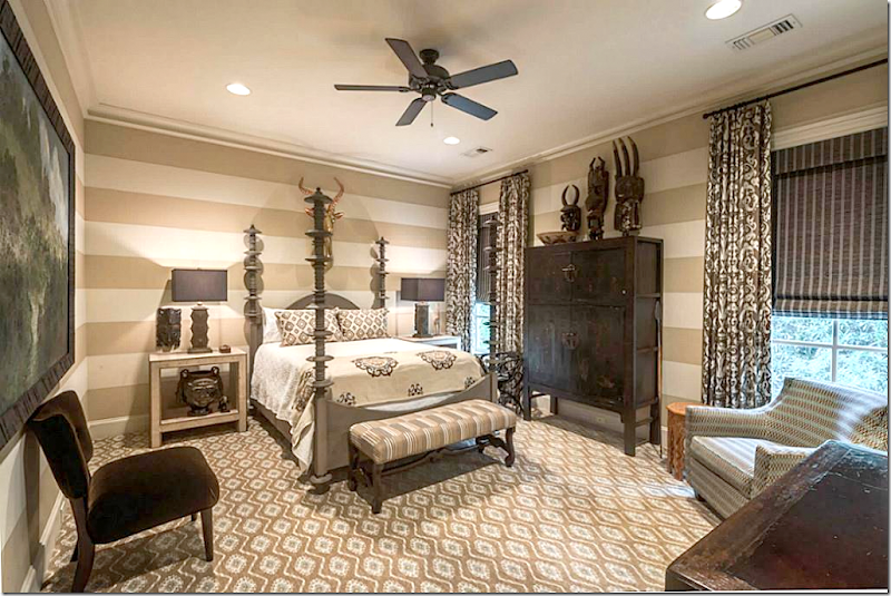
Today: The second guest room is another stunner with printed carpet, stripe walls, love the armoire.
I can’t tell you how many houses I see on HAR where the guest rooms are such throwaways, I don’t even show them. Here, they are both fabulous – like smaller master suites. Very nice.
I’m so curious as to who decorated it. I have an idea, but hate to guess. Very well done, exciting, fun, and today.The house is for sale, see the listing HERE.
Finally, this house in Tanglewood is really interesting because it has been sold a few times and we can see how the decor and architecture has dramatically changed through the years – it’s almost like a course in design through the years.
In 2003, the house has 5 bedrooms, master down, and 2 large ones upstairs. It was built in 1956 and was 6800 sq. ft. on almost an acre lot.
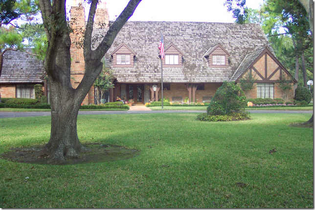
In 2007, it sold again, the exterior remains basically the same.
In 2013, the house came on the market having been totally renovated downstairs with architectural elements from Chateau Domingue. It was quite a change. Outside, the landscape was cleaned up and edited with rows of box added. The trim was painted a lighter color.
And today, on the market once again, the front remains the same. I do wonder if the new owners will paint the brick to change it up a bit as that is such a trend in Houston these days?
2003: The living room is very traditional with reproduction French furniture, yellow walls and red and blue accents. I have a feeling this decor was probably from the 1990s or even the late 80s. Very nice.
In 2007, the decor was totally updated with red walls that were so in, though mostly in Houston dining rooms at the time.
2013: The downstairs was renovated – there is a new antique mantel from Chateau Domingue, the curtains are gone, and the living room becomes the dining room, which is typical in older Houston homes. A country French table and chairs were added, along with larger furniture pieces. At the left is the new entry with limestone floors.
Today: The foyer, filled with antiques. The trim was painted white on the door to lighten up the room. There is a new door with new sidelights.
Today: The room has now been changed back to a living room. Filled with antiques, the room looks inviting and chic.
2003: The dining room with pink walls continues the pretty scheme Laura Ashley look from the 80s and 90s.
2007: New chandelier, blue walls to play off the red walls in the living room, and traditional furniture.
2013: The dining room becomes a pool room which leads to the kitchen.
Today: The dining room has a French table and chairs in velvet.
2003: Past the foyer is the family room with a pitched ceiling, flagstone floor and paneling. Very rustic with lots of charm. Love this room as is!
2007: The walls are now a vivid yellow with hidden lights in the beams. Not a great look.
2007: Through the doors is the kitchen.
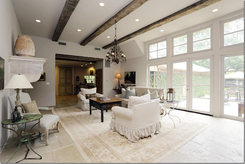
2013: Huge changes in this room. A wall of windows and French door was added leading out to the back yard. New limestone floor replaces the flags. The pitched roof is raised with antique beams – which I love. And a new fireplace is installed. The room is stunning. The kitchen is now opened to this room.
2007: Chateau Domingue mantel is smashing. Antique doors to the right. The stairs are now closed off to this room which is better – less is more. Very tasteful.
Today: The look is updated with a skin rug, mohair sofa, striped chairs, lantern, and horns. Though very similar in style to 2013, this is a bit more sophisticated, more today. I love this room! Love the French antiques, the old chest, the old tables, just gorgeous!
Today: The view to the back and kitchen. Flanking the armoire on the right are two benches in periwinkle, a color that pops up in each room.
2003: The kitchen is so charming with the plank cabinets and stove hood.
2007. Much the same, more edited.
2007: The breakfast room. Well…
2013: The kitchen is completely new with cabinets and a wonderful antique island. Tiles from Chateau Domingue. Large range. Lanterns, love the one hanging on the wall. Love the new window. And love that there is no crown molding or base molding. Again, fabulous room.
 2013: The view to the breakfast room and onto the dining room (used as a pool room.) The island is so great.
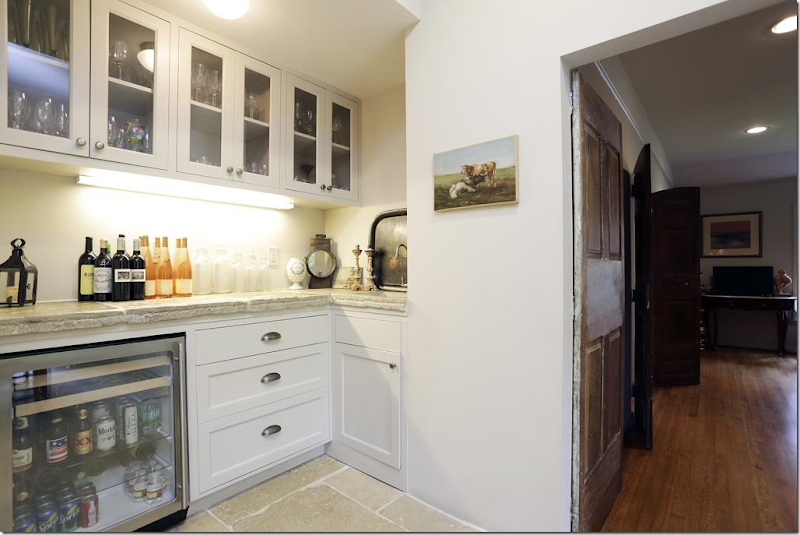
2013: Antique cabinet doors were built into the wall to create a pantry. Another new window was added by the table.
2007: Across the breakfast table is a bar. Notice the antique door leading to the pool room. Love all the great Chateau Domingue additions to the renovation.
Today: There is a new island and a new buffet. Notice the refrigerator is off in its own niche to keep the lower profile in the main area. No lanterns. A bit more edited for today, the kitchen is still wonderful.
Today: The table is now placed in front of the built in cabinet.
Today: Chairs create a sitting area. This new setting makes more sense with the table closer to the kitchen. Notice the antique doors to the right of the table.
Notice there is another matching set of doors on the threshold.
Love that lamp! A small rug anchors the seating area.
2007. The powder room with pretty marble and window.
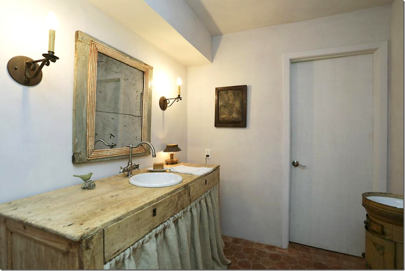
2013: Powder room – the room was closed off with a door. French tile floor was added. Love the authentic French floor. Old pine console turned into vanity with linen skirt. So pretty. Perfect!
2016: The room was made a bit more dressy. New Venetian mirror. The skirt was removed.
2003: The master bedroom, downstairs, with country French decor.
2007: Updated with a sleigh bed. Didn’t everyone have a bed just like this?
2013: The master bedroom wasn’t updated with the family room and kitchen, but they did add new curtains.
2016: All in white, you can actually see the pretty windows now!
2003: Master bath.
2013: Master bathroom was totally gutted. New tub, vanity, shower, and French tiled floor.
2013: Shower and large pine towel holder.
2016: Edited for today, simpler. Less is more!
2016: Bedroom downstairs, cute with periwinkle, pink and beige.
2016: Bathroom, updated.
2003: Early view of yard before it was landscaped again.
2003: The pool.
2007: The backyard has changed some through the years. Here the trim on the house is dark brown and there is a large bed that now divides the pool from the terrace.
2007: Looking messy and unkempt.
2013: Newly painted beige trim and much editing of the beds. New fence around the pool. I know you have to have one but I just hate the way they look. But…it’s a necessity with babies.
2013: And with the new family room overlooking the backyard, new landscaping, the brick terrace was removed, as was the wall that divided the yard, but the baby fence now divides the yard.
Today, the baby gates are gone and everything is much cleaner, edited, pretty. I wonder if there is a prettier way to baby proof a pool? I know there are tops you can put over the surface.
Today: the brick terrace was replaced with a smoother surface.This house is for sale, see the listing HERE.
So interesting to see all the changes from one family to the next to the next! I love seeing all the changes in decor through the years. This is one of the nicest neighborhoods in Houston and it’s interesting how the decorating got more luxe with each owner. I think that is typical throughout the United States. We are just more into our homes now and we spend much more on our furnishings today.Hope you enjoyed these houses!
The middle house had so many interesting light fixtures, here’s more if you are in the market! HERE.
Want more French looks?
French apartment furnishings HERE
French apartment ideas on sale HERE.


