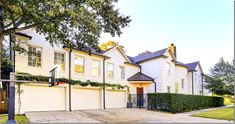
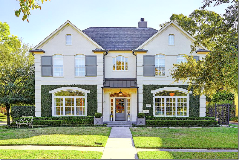
Today I have a special house to share with you. While perusing properties for sale on HAR, I came across a brand new listing with a charming façade. The attraction to this two story, white house was strong and immediate. It is located on a corner lot in Southside Place, Texas – a tiny town surrounded by Houston - where only 1,700+ residents live on 9 short blocks. Most of the older, one story homes that were built in the 30s and 40s, have now been torn down to make room for the large, two-story MacMansions.
Southside Place’s close proximity to the Texas Medical Center and Houston’s downtown and the museum area make it a much sought out neighborhood. Families are drawn to the excellent nearby elementary school and its wonderful park. Having its own police force and fire department makes Southside Place an incredibly safe place to live. Just don’t go over the 30 mph speed limit – Southside Place is famous for enforcing it.
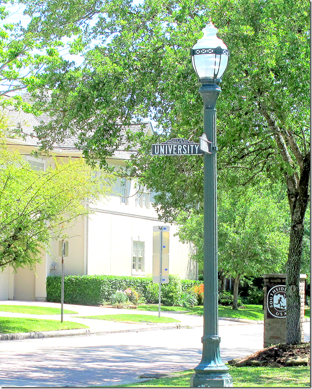
Visitors to Southside Place are greeted by stone pillars and unique black & white street signs, along with antique looking street lights.
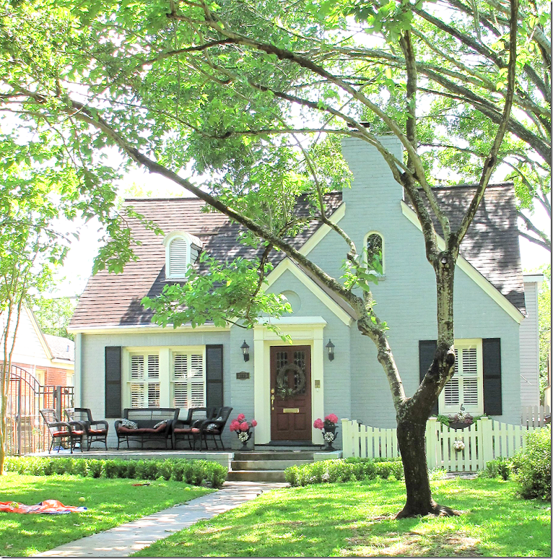
An original bungalow – a rarity in Southside Place. People who live in the older houses have renovated them – restoring their quaint curb appeal.
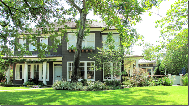
Many of the newer houses in Southside Place were designed by noted architects. This house is one of my favorites - I love how they painted their front door and gates a light blue which pops against the dark brown shingles.
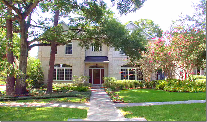
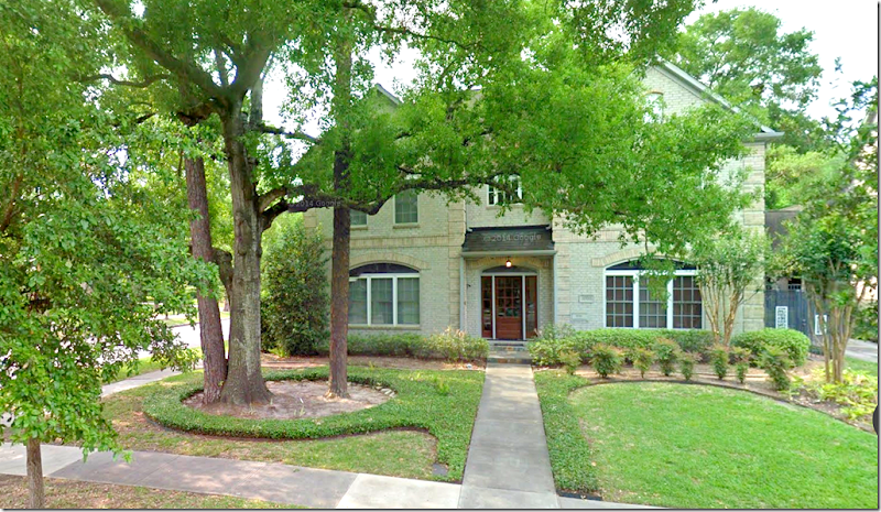
But, there is also a fair share of houses like this one above - well built in the 1990’s – pretty, but without a wow factor curb appeal. This is the house that caught my eye – before it renovated!
A few years ago, a family with 3 young boys bought this house and turned it from plain to fabulous, inside and out. They took a house with typical “builder’s grade” finishes and made it chic and youthful – more fitting for their age.
While there is nothing “wrong” with the house above, the new owner saw a blank canvas, knowing she could turn this house into one with great curb appeal.
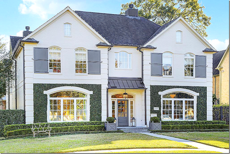
The new owner made most of the design choices herself, along with the help of a few professionals. She has great taste and it shows. Here’s what that house looks like today:
Yes! This is the same house! Hard to believe, I know. Now – if you drove by this house, wouldn’t you want to stop and go inside for a look? I would. This is the kind of house I would drive by at dusk trying to steal a glimpse through the windows. The changes the new owner made are almost all cosmetic – but together, they are so effective!!! I love the curb appeal!!
OK – Let’s look at the changes in detail. First, the landscaping. I’m going to assume the trees in front were sick, I doubt they would have been allowed to remove healthy trees. Once the trees were gone – the yard becomes more expansive. The large, winding beds were removed and were replaced with three straight rows of clipped box. Next – a fresh coat of crisp white paint covers the non descript beige brick.
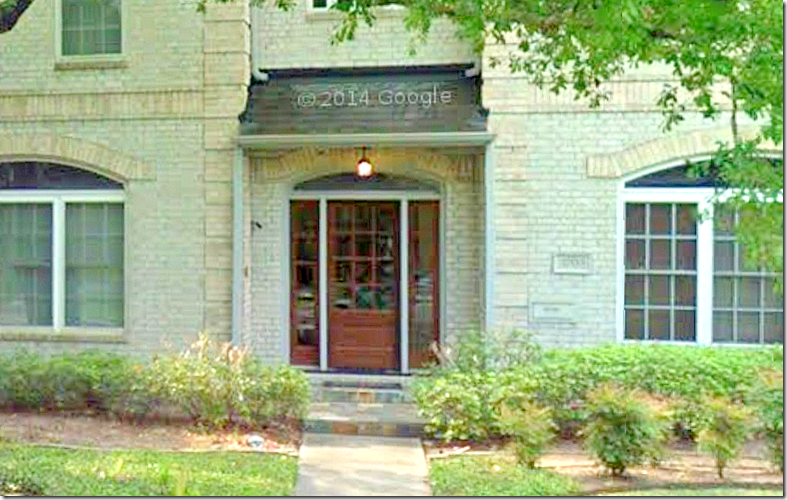
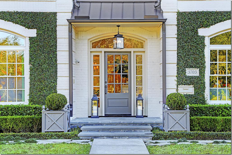
Along with the box, ivy was trained up the walls – clipped inside the classical styled stucco quoins. The ivy makes the arched brick detail above the window pop - what was once not noticed before is now a charming architectural element. A major change was the roof over the front door – it was replaced with a standing seam metal roof, the kind usually found on small, country houses. Here – it just adds more charm. The front door got a new coat of white and gray paint. Before you could barely even see the door – now it is a focal point with its trendy lantern hanging in front of it. On the porch are several more lanterns and two gray painted wooden Versailles style planter boxes. And finally - custom made French style shutters add the finishing touch!Wow! If you are looking to update your own façade – use this house for ideas. Again, boxwoods, a fresh coat of paint, 4 shutters, and a small standing seam metal roof took this house from dull to fab!!! I’m sure I’m missing some other changes – see if you can find those.
The front door, before – barely noticeable. Sorry that these before pictures are such bad photos.
And, after. The owner added a new slate porch and slate steps with a stone path that runs along the front of the box beds. Notice she painted the gutters grey instead of white – and notice that they look like the lip-liner on this newly beautifully made up face.
The house is on a corner lot and has a rare-for-Southside Place – three car garage! Nice! Notice the roof over the back door is another standing seam metal one.
Ready to go inside?
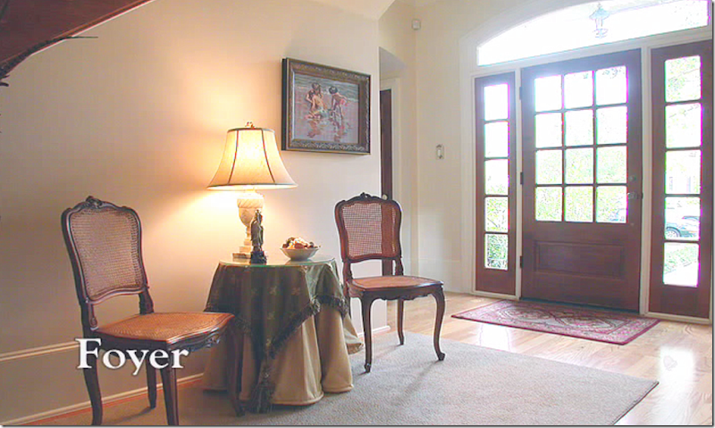
Before. The house is very large with six bedrooms and 6.5 baths and is 5700+ sq. ft. It also has a bedroom/bathroom downstairs which is unusual for a house in this area. Here, the foyer shows beige walls and light colored hardwood floors.
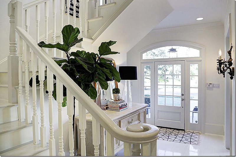
How do you make this foyer and staircase and hall more chic, trendy and age appropriate for a young family? Go light! The owner painted the walls and wood floors – white, using Farrow and Ball paint throughout.
And, here is the foyer today. White floors and white walls, along with a white staircase takes this house from the 90s to this new century. I love this!!!
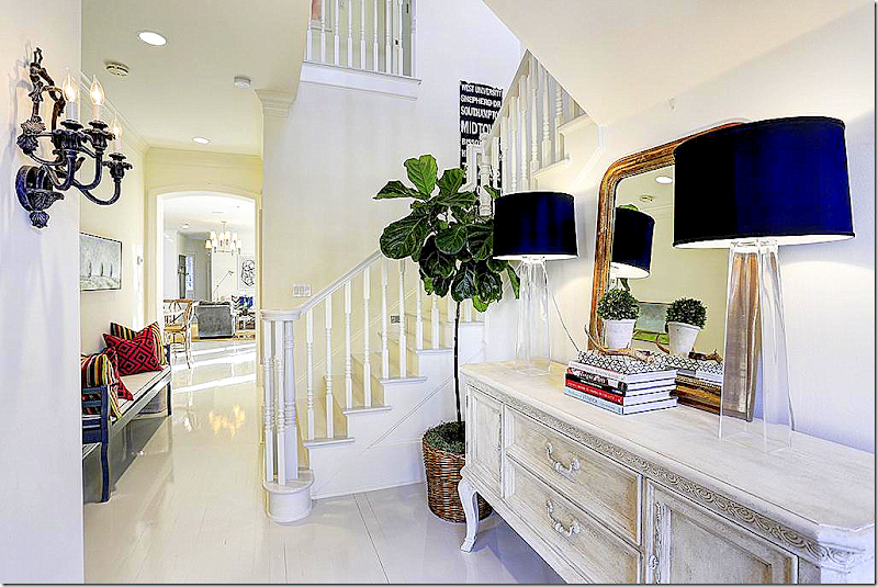
And looking the other direction, past the main staircase and hall into the family living area towards the back of the house. An antique styled chest is also given an coat of white paint. A pair of subway signs were commissioned to reflect Houston’s streets. You can order these custom designed HERE.
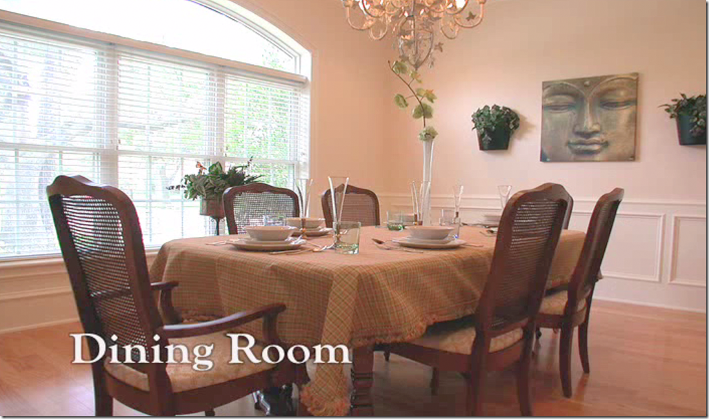
BEFORE: the dining room in boring beige.
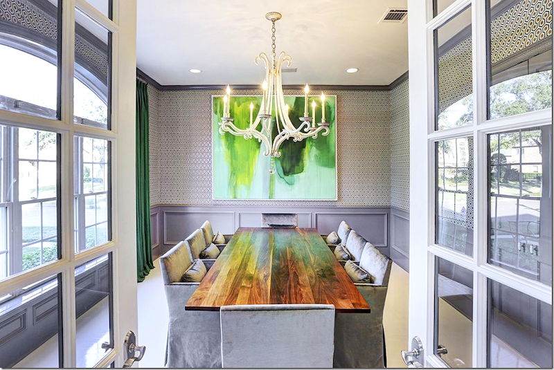
And now – through French doors, painted trendy gray – the now contemporary styled dining room was wallpapered in Cole & Sons David Hicks paper. Love the gray mixed with the white.
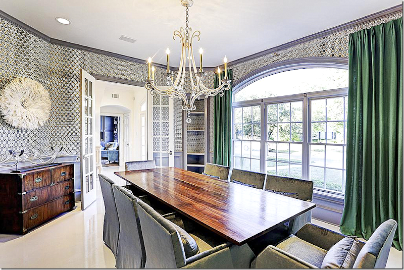
Another view – shows the green curtains mixed with the Hicks paper.
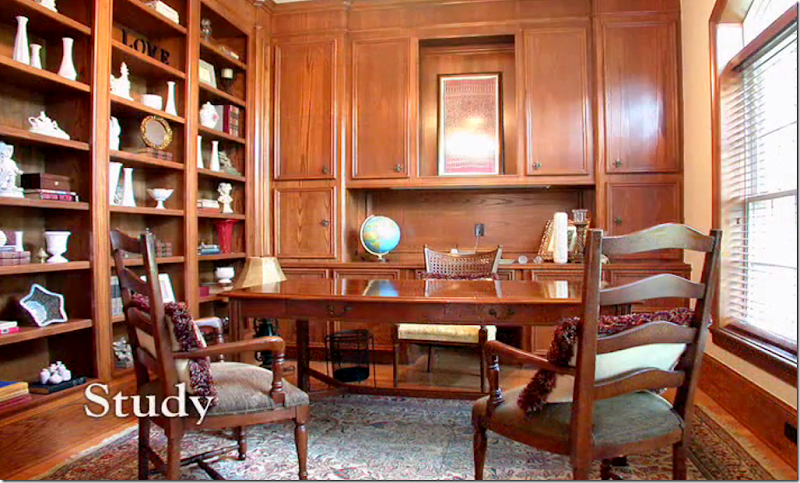
Before: Across the main hall on the right side is the boring looking wood paneled study. There is another study upstairs too.
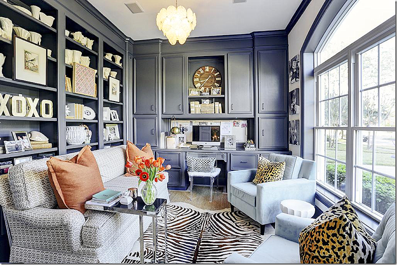
And today! Gray painted paneling is mixed with white painted walls and ceiling - warming up this exciting looking study. A faux zebra is mixed with a seagrass rug and printed fabrics.
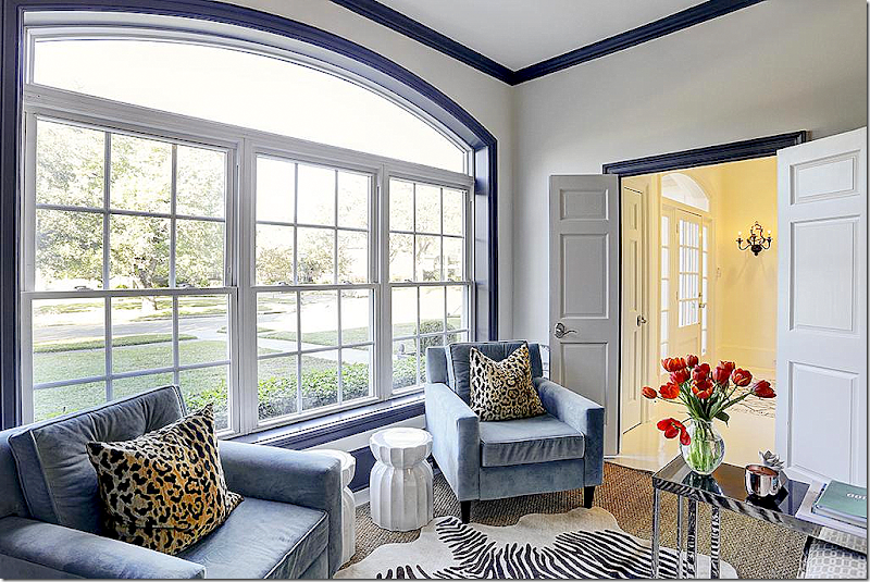
The view from the study out towards the front yard.
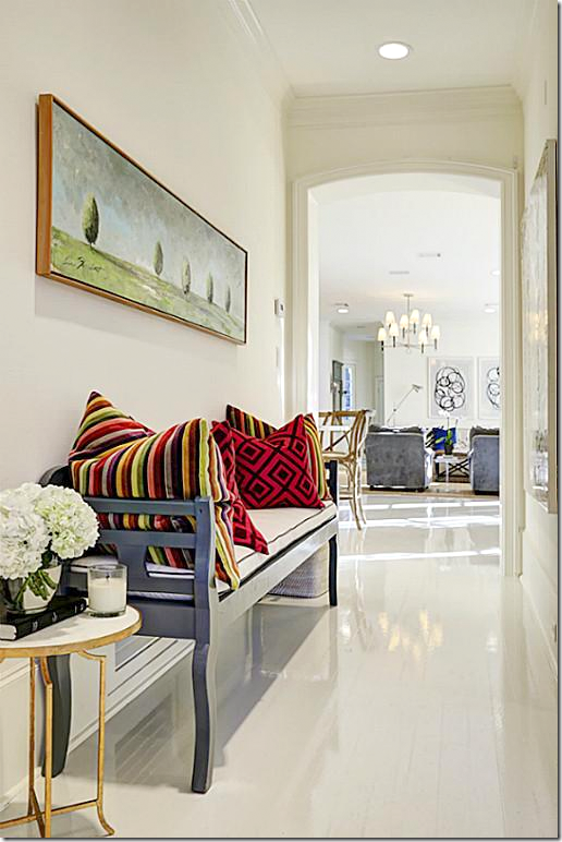
The main hall – here a gray painted bench with more David Hicks fabric on pillows. Beyond is the family room and kitchen. I love this floor and this makes me want to paint mine!!!!!
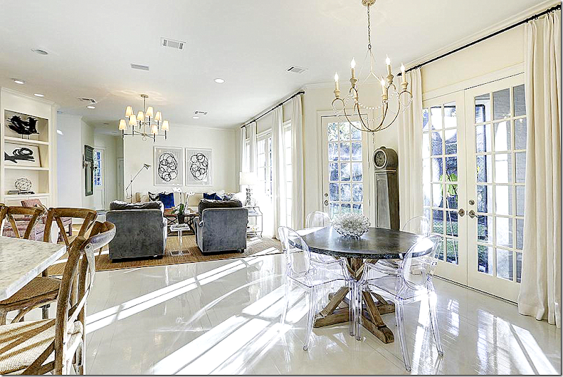
Here, the family room and breakfast room overlook the back yard through French doors. Past the family room is the back door that leads to the garage and driveway.
Before: the kitchen is stained wood and granite.
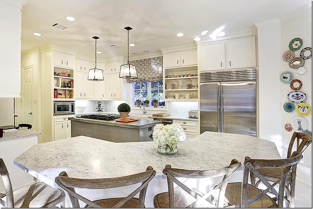
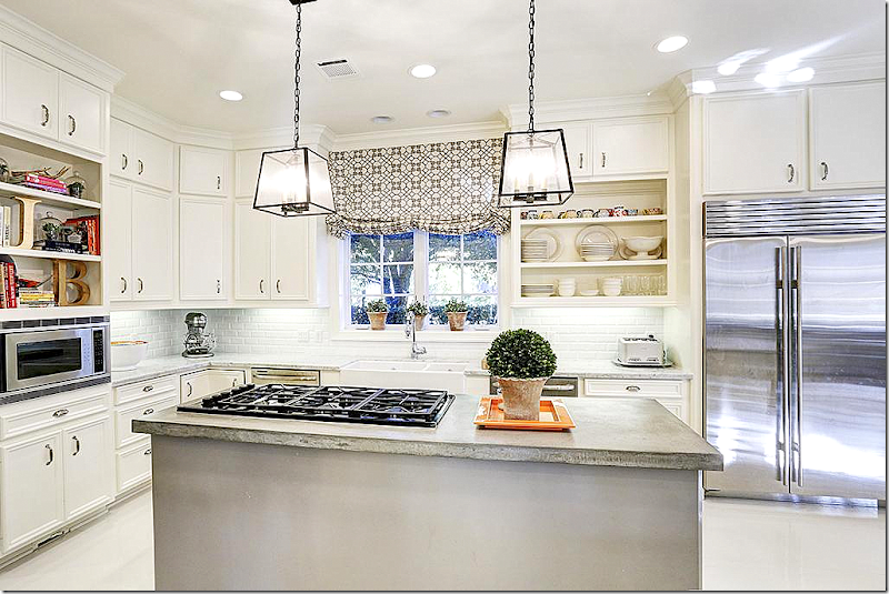
And, here is the kitchen today! So bright and beautiful. White honed marble is mixed with a concrete topped island. This looks so different, it is amazing. Love the pendant lights.
Double farm sink and two dishwashers are perfect for a large family. There is also a butler’s pantry that leads to the dining room.
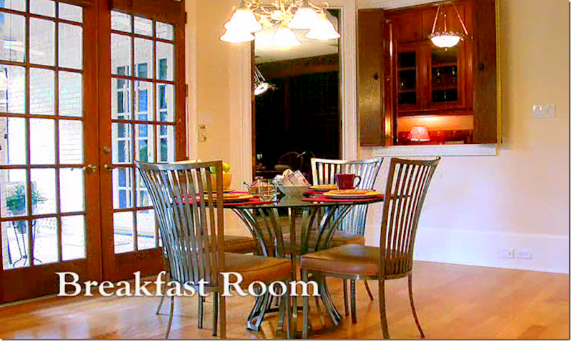
Before: the breakfast area that overlooks the wine room and wet bar. Entrance to the wine room is through here and through the front study. A screened porch is off to the left.
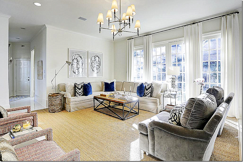
The large family room is past the kitchen and breakfast area. The French doors lead to the back yard. Past this room is the garage, the mud room, and the downstairs bedroom/bath.
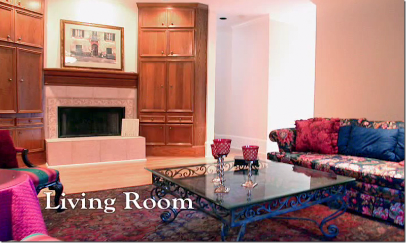
Before: here is the view of the fireplace in the family room.
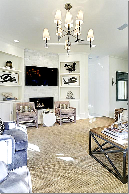
And today – how the fireplace looks renovated. Behind the bookcase is the back stairway.
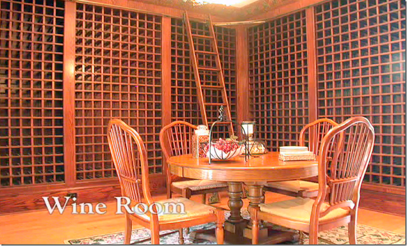
Before: off the front study and the breakfast room is the wine room. Before there was too much wood.
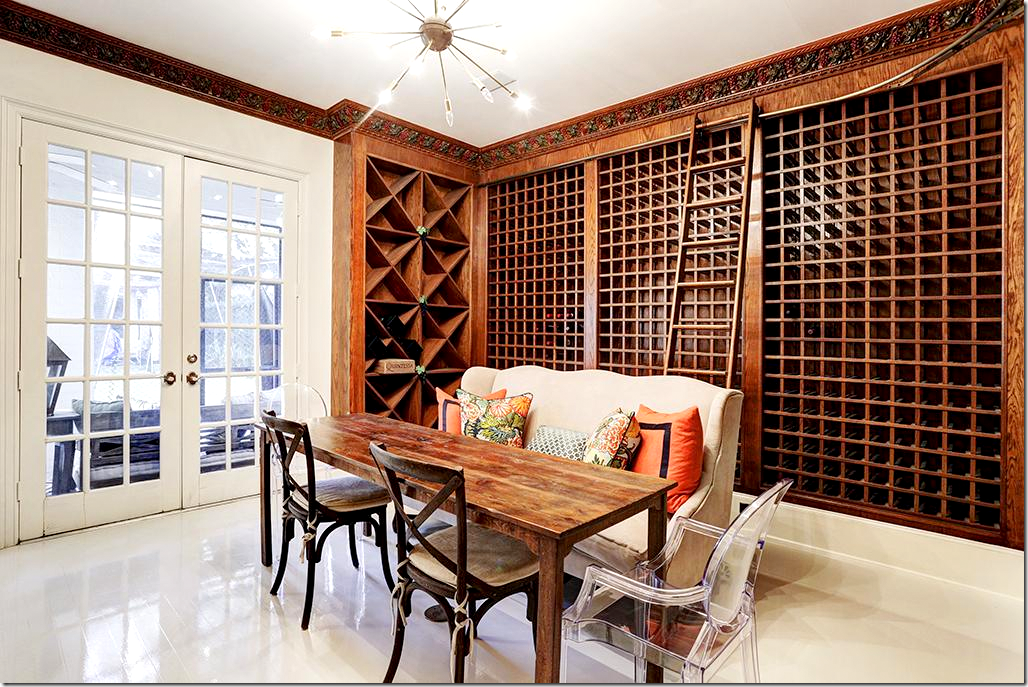
And today – with the white painted hardwoods, the wine room is cozy, and a fun place for a dinner party. The sputnik style light fixture lends a trendy contemporary touch. The French doors lead to the backyard and screened porch.
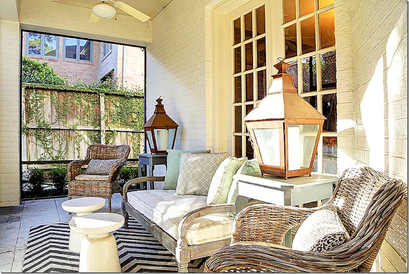
The screened porch off the wine room and breakfast area. I love how she decorated this! So cute!!!
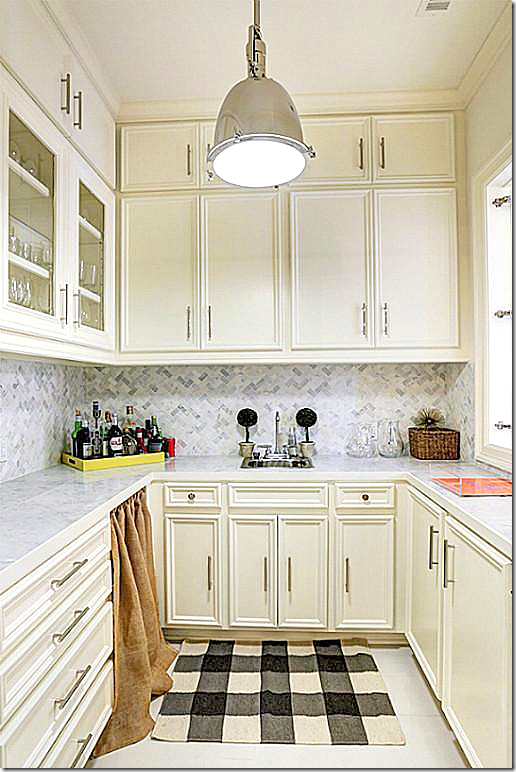
And, leading off the wine room, overlooking the breakfast area is the wet bar – now bright with white paint, new hardware, and new marble counters.
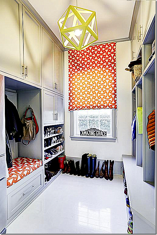
Off the garage is the mud room with cubbies for the members of the family. Love how the owner added touches of orange throughout the house – to make the white and gray pop. Love the fun light fixture.
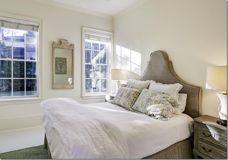
The extra 6th bedroom – downstairs. A real treat, especially great for in laws and baby sitters.
And here is the front staircase – leading upstairs to a cozy window seat that overlooks the front yard. Through the door is the master bedroom study.
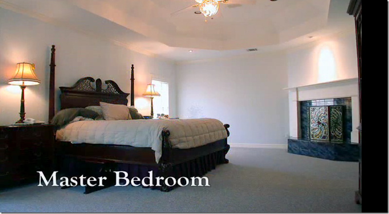
Before: the master bedroom, large and again, rather boring.
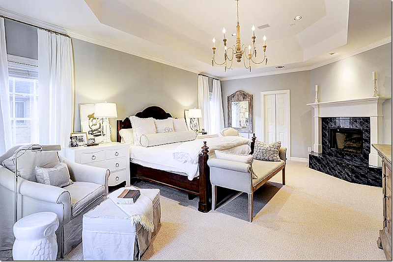
Today, the master is bright and cheery.
Another view – the owner knows that large bedrooms require lots of chairs and benches to fill them up, otherwise they can look so empty. The doorway now leads to the study, which is nice for quiet adult TV time.
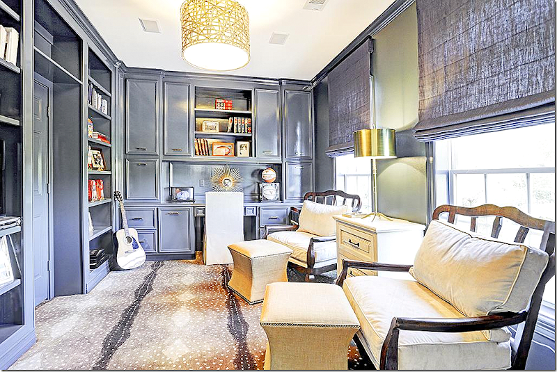
Off the master is the 2nd study – love the carpet!!!
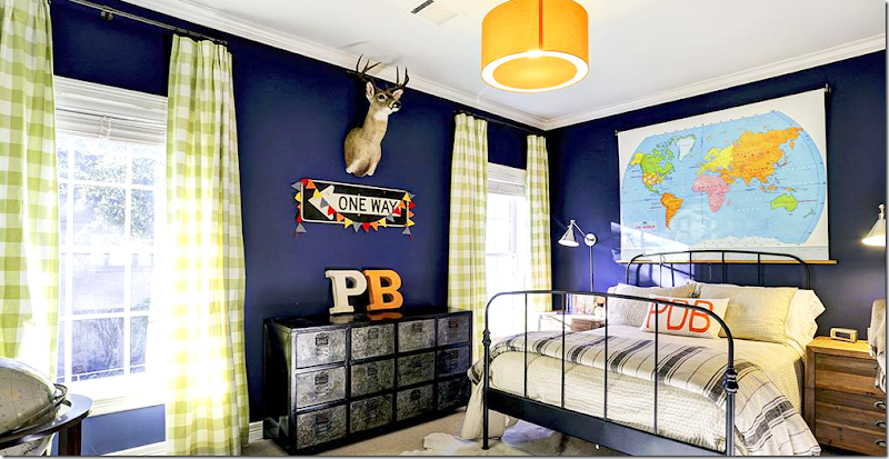
Each son’s room is furnished differently. My favorite is this one in blues and greens.
This bedroom is so cute too! Love the painted ceiling.
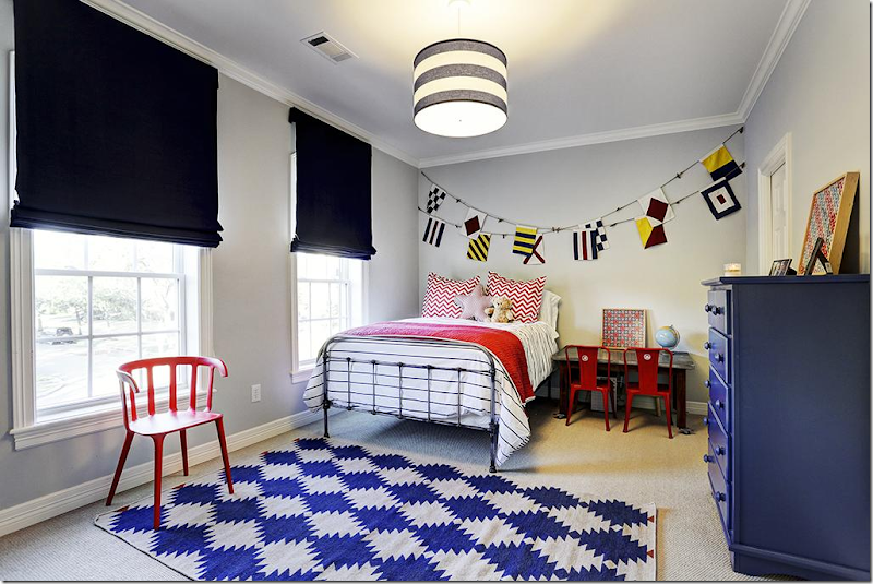
And another bedroom – in navy and red and black. The owner really has such a good eye for décor! Love the flags.
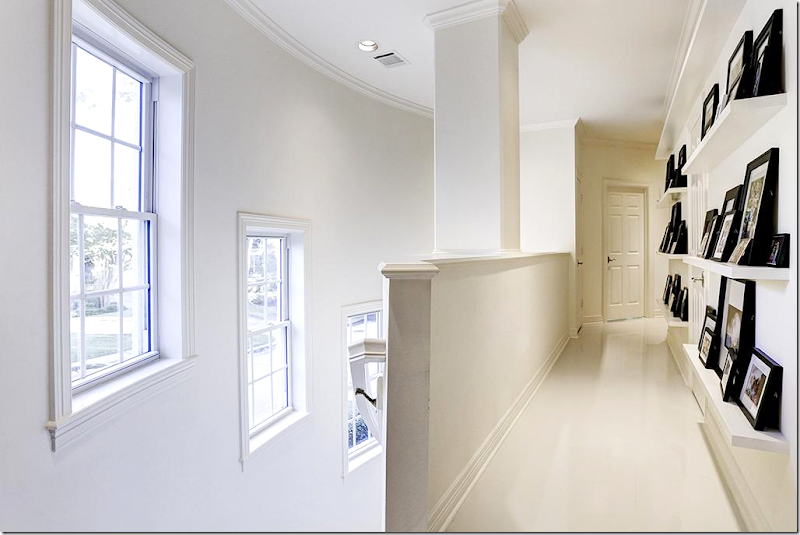
Here are the back stairs with the curving wall that overlooks the side of the house. To keep the hall from being boring – the owner turned it into a gallery showing family photos. The gallery remains neat looking because she used identical frames to unite the photographs. Such a great idea to copy!
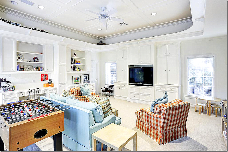
The upstairs game room. OK – this is another great idea. You know those tray ceilings that no one knows what to do with? The owner added three electric trains that run along the perimeter of the ceiling! Brilliant!!!
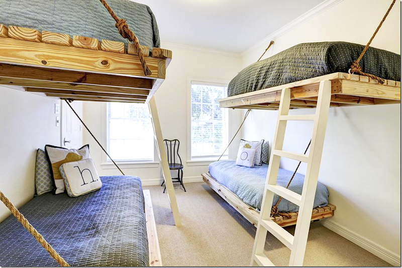
And – in the last bedroom, the owner added bunk beds for when the kids have sleepovers - another great idea, if you have the extra bedroom.
So many great ideas! I love what the owners did to this house, updating dark and plain interiors – turning the house into a bright and cheerful place for a young family. There are lots of contemporary furnishings and accents that mix with traditional choices and antiques. This mix keeps the house from being too trendy, but just being just chic enough. I’ve taken so many ideas from this house and I hope you have too!
A huge thank you to the homeowner and her agent: Kristine Martinez.If you wish to see this house – you better hurry. I have a feeling it won’t be on the market for long. To contact the agent or to see the listing, please go HERE.

