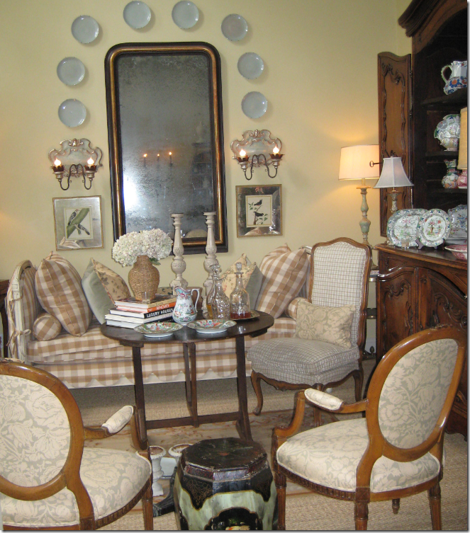
 I bought a new camera. For the blog. That’s nothing new in my life these days. Ever since I started Cote de Texas I’ve become obsessed with two things I never even knew existed before: writing and photography. Suddenly, these two activities are the most important things in my life and I seriously never did either before. But, writing and photography go hand in hand with blogging, so I, to be even the least bit successful at this, knew I needed to hone up on both these skills - and fast. As for the writing, it is what it is. In the past two years, I have discovered that I actually enjoy the writing part of blogging, all the more surprising because I positively loathed English in school. But here I am – just typing away at all hours of the day and night. A few weeks ago I got an anonymous negative comment, never a pleasant thing, telling me my grammar was awful. My offense? I had written: “without any regards to” instead of the grammatically correct “without any regard to.” Negative comments are often so mean, so rude, and yes, sometimes, so valid – that they truly bother me to the core. Yet, the valid negative comment does serve a purpose – it gives you a chance to reassess, to reevaluate, to honestly address the issue at hand. When I received the grammar complaint – I went straight to the Internet, of course, to check out my knowledge (or lack of it) of proper English grammar. I had been proved wrong about the usage of “regards vs. regard” – how many other errors was I making? On the Internet, I found a web site that offers multiple tests online to check one’s writing abilities - the exact kind of tests my high school daughter is taking in high school right now. I am happy to announce that I actually did quite good (or is it “well?”) on my tests. While nowhere near perfect, my scores would probably have earned me low As and Bs in a classroom. So, with my writing skills properly tested, that leaves my photography skills to assess– except there is no test on the Internet for that ability. The only measure one has is against other bloggers.
 “Winter Tree” by Back Porch Musings
For example, Pat who writes Back Porch Musings is one such blogger whose photography skills are a giant cut above the norm. Day after day, she consistently shows off fabulous images she takes at her Lake Ozark vacation house along with those taken on the road traveling to and from her own version of Paradise. Whether her photographs are of flowers with the “bokah” effect, her ever-changing interiors, or the beautiful view from her illustrious porch – Pat never disappoints. For an amateur photographer, she is quite remarkable.

“Peonies” by Back Porch Musings. To see more images like this, be sure to visit the blog Backporch Musings here.
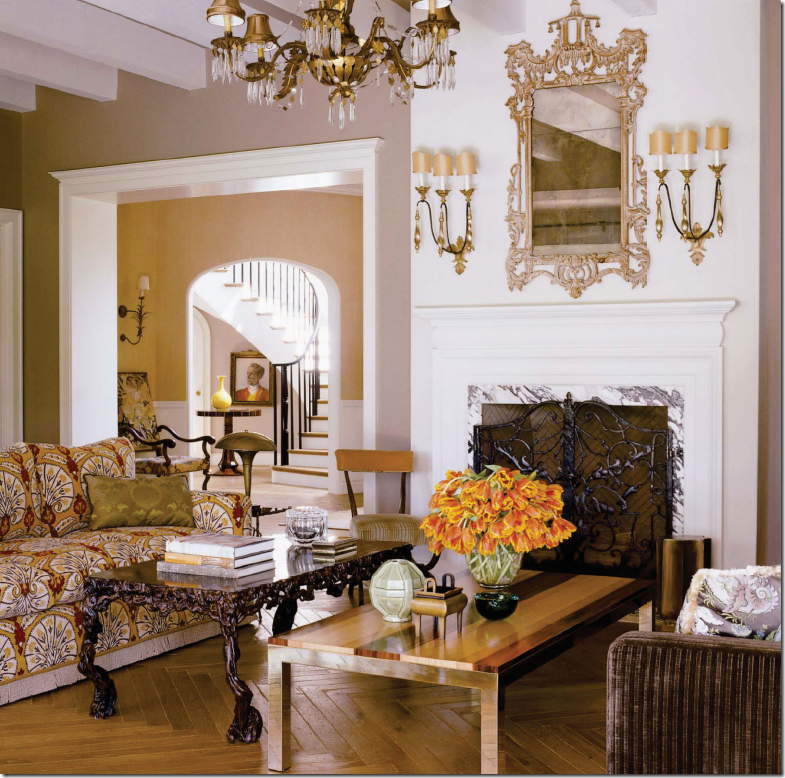
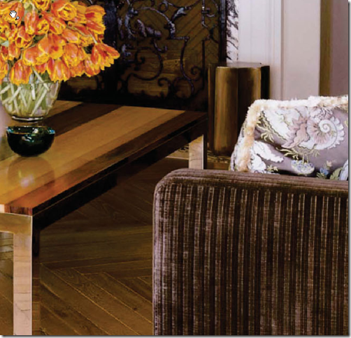
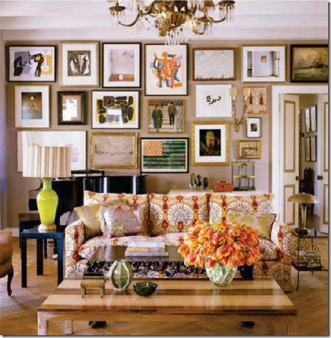
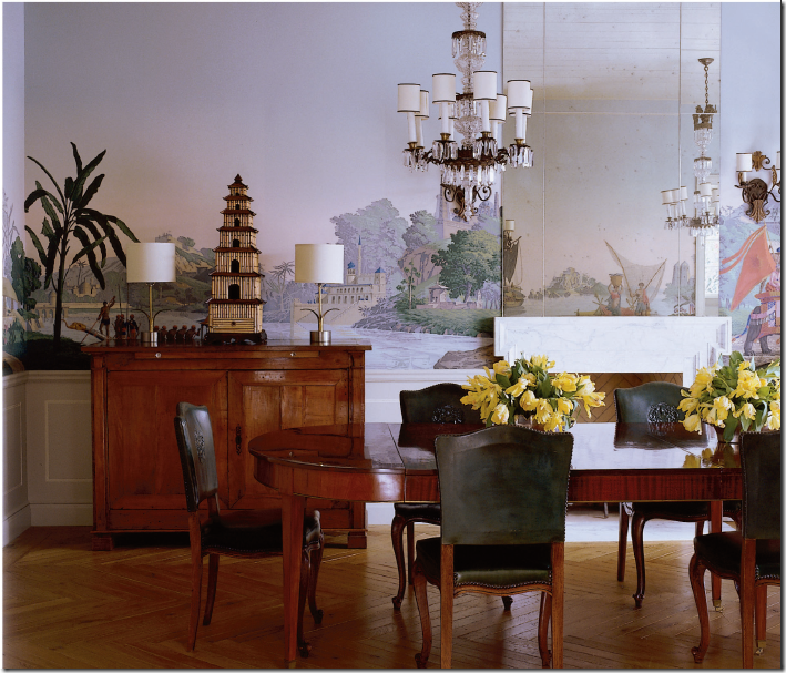
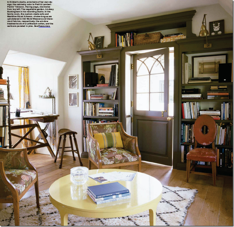
Besides being inspired by other bloggers, the professional photographers really make my heart skip a beat. Pictures of interiors are truly mandatory for a design blog and the desire to create one’s own professional looking photographs is especially strong.

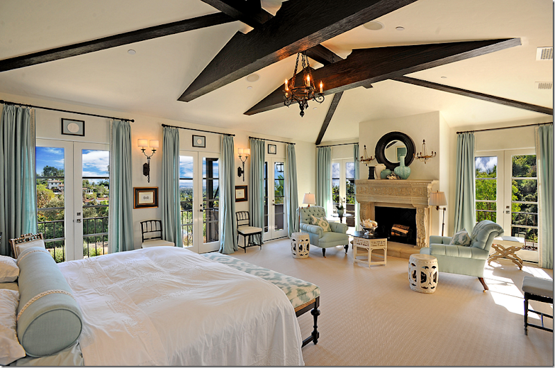
A photograph of a Los Angeles bedroom really sets the bar high. How does an amateur go about duplicating this quality?

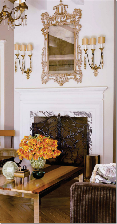
Or this professional photograph from the same house in L.A.?

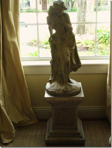
When I started this blog over two years ago, I thought I was a better photographer that I now know I am. I was naive which is a nice way of saying stupid. Very. I took “arty" pictures of my house for my newly launched blog and was quite proud of this particular image of a statue - even commissioning the artist Annechovie to immortalize it in a painting – how pretentious!!! This grainy, out of focus, poorly lit photograph barely deserves to even be shown on the blog, much less hung on the wall - framed. It was taken with a simple Sony DSC P150 camera – one that I used to take pictures of my interior design work. Without the blog, I would probably still be happily using this camera.

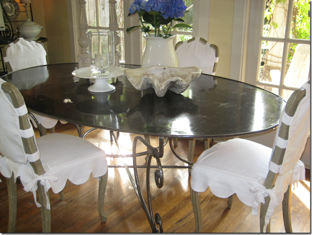
After a few months blogging with my Sony, I realized I needed a new camera to take better pictures and decided to try the Canon camera my daughter used. This image my breakfast room was shot with my new Canon SD1000. I don’t see too much improvement over the Sony digital, to be honest. The Canon SD1000 lasts only a short while. It just wasn’t up to the job, I’m afraid.

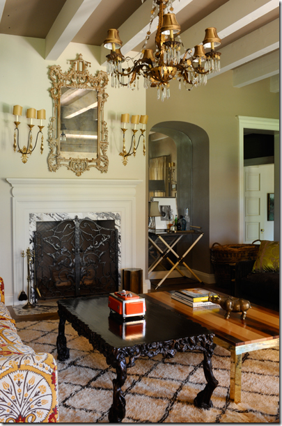
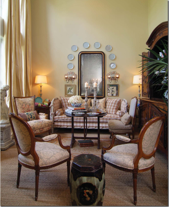
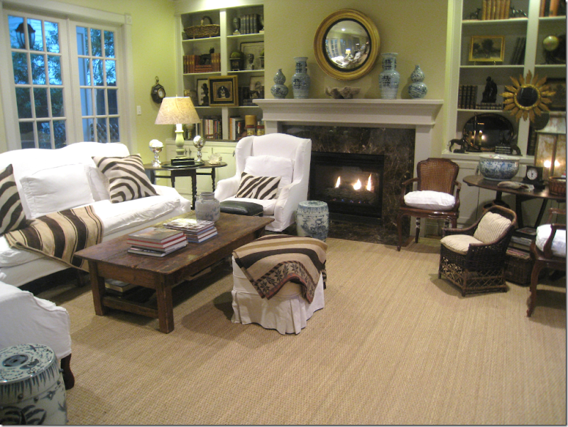
PROFESSIONAL PHOTOGRAPH: Around the time I bought my first Canon point and shoot digital, my house was photographed by a professional for the magazine Houston House and Home. This image really hit home for me – it outlines all my flaws as a photographer. I had never been able to take a picture of my living room with both the left and right wall showing. How did he do it? The lens, the elusive wide angle lens, I learned that day, was the key - along with a much better camera. I was told that a wide angle lens like this could cost more than $20,000. and to take beautiful photographs like this, the quality of the lens was much more important than the quality of the camera. Well, a lens in that price range was definitely out of the question – but surely somehow I could take better, clearer pictures with a wider view.

MY PHOTOGRAPH: My camera from the same spot as the professional picture above – you can see how the left side of the room is missing in my photo – the lens just isn’t wide enough. Notice too how much fine detail is missing from my photograph – compared to the professional one. Mine looks dull and out of focus, amongst other sins.

MY PHOTOGRAPH: In early 2008, I discovered that Canon made one point and shoot digital camera with a 28 mm wide angle lens: the SD870IS. Of course, I was game to try it out – so I sent the Canon SD1000 out to pasture. And sure enough – you can plainly see here – I did get a much wider view from this new camera. Notice that both the left and right wall are now showing. But again, the quality of the picture can’t compare to the professional one taken of the same view. This camera, the Canon SD870IS lasted a long time with Cote de Texas. The 28 mm wide angle lens was much better than my first two point and shoot cameras – and I learned how to take better pictures as time passed on.

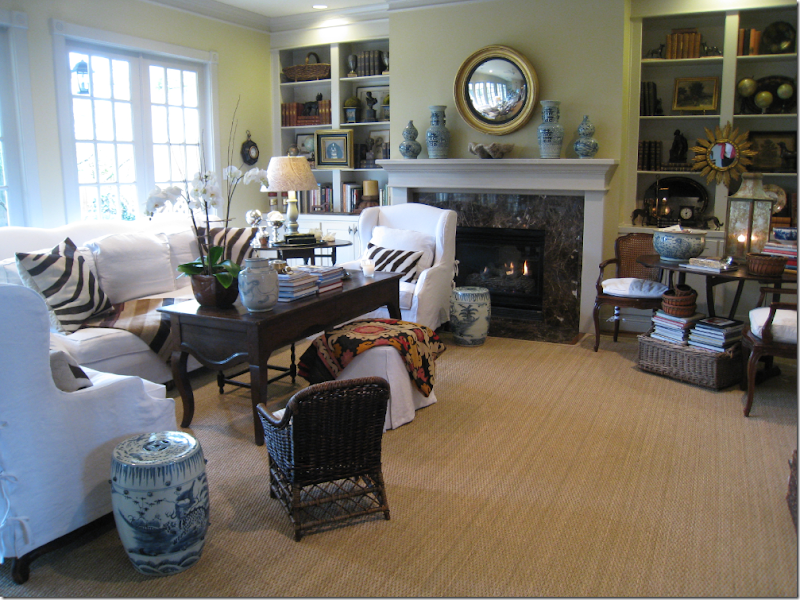
As the year 2008 rolled by, the images do look better – even with an automatic, this photo is a vast improvement. Here, my family room as it looked with the old coffee table in 2008.

And in early 2009 – there is still more improvement. This picture is much clearer and sharper than those taken in 2008. Actually this has less to do with my growing photographic abilities than with the fact that I discovered I could “fix” the images through my computer. With Photoshop, I could make the photos appear brighter and have more contrast, along with other “fixes.”

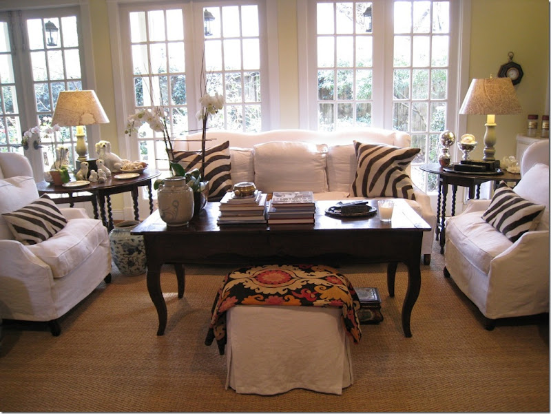
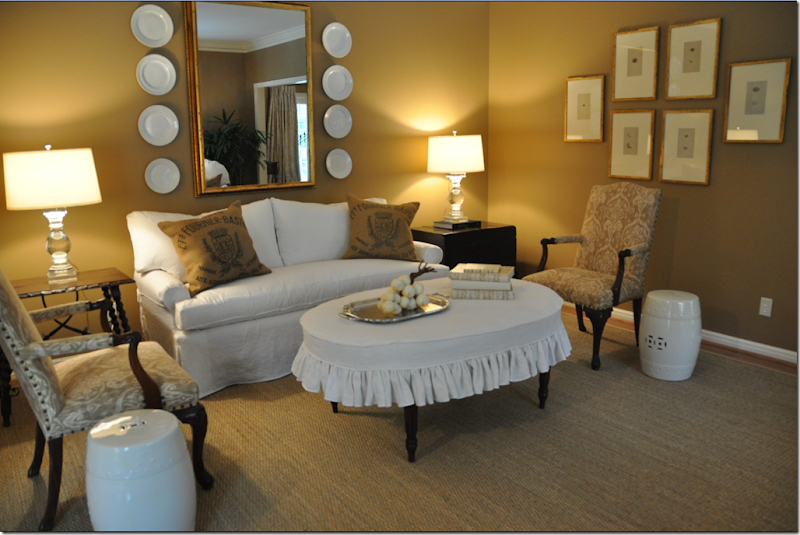
Another day, another angle. It’s amusing to look at photos taken just a few months ago at how different things are even then. The tablescape on the left is totally different today than in this picture. But the real point is – that little automatic Canon sure takes a great picture! In actuality, this was a calm before the storm. The battle of Cote de Texas vs. The Cameras was about to erupt.

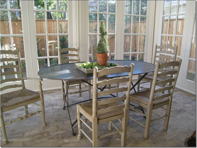
MY PHOTOGRAPH: Things are just fine with the Canon – until I take the pictures of the Octagon House, the Provence House and the Conservatory House during the West University Home Tour of 2009. This picture of the breakfast room in the Conservatory House launches the first battle. For all of 2008 – I had thought my little Canon was taking wide angle views. It wasn’t until I saw a picture of this exact shot in the real estate section – taken by a professional – that I realized how much of the “view” I was losing with my “wide angle” lens.

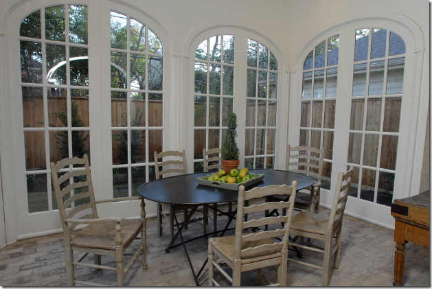
PROFESSIONAL PHOTOGRAPH: Though the professional and I had both stood in almost the exact same place – you can see from this image how much of the view is cut out of my picture. Each picture of the house that the professional took showed a much wider view than mine – don’t worry, I checked. This sent me into a what I call frantic “impulse” camera buying. You see – by this time, I had been blogging for almost two years and the photographs I took became more and more important to me. The fact that there were people out there that could take wider shots and better photographs of the same room drove me crazy. I didn’t do enough due diligence, I know that now, but within a few days I became convinced that the only hope for me was the new Canon G10. Yep – THIS Canon G10 was going to be the one – the one camera that would get me that great, wide shot with all the detailing. Amazon was even kind enough to send it overnight to my house before I had any chance to change my mind.

The New Canon G1o: Liberty Post, a favorite blog whose own photographs I greatly admire, wrote that the G10 was her dream camera. I teasingly bragged that I had just bought one! (Hey Patti – want to buy it now, real cheap?) The famous G10 was delivered – and it took some adjusting to get used to it. Even though it was another point and shoot automatic, there was still a learning curve. Here is my first attempt with the famous G10 – not great! That night I entertained Mr. Slipper Socks Man (barefooted!) and my dog Georgie with my camera skills. What legs!!! Georgie has been terrified of cameras ever since the Houston House and Home photoshoot. Every time I pull out the camera she runs for protection from Ben.

I took this picture with the Canon G10 for a magazine I’ve written a few articles for. (More information coming on that soon.) I do think I am beginning to get the hang of the new camera with this picture - it looks good to me. But, I am still waiting for a chance to really put the G10 to work – a nice, big house would do the trick.

I finally get a chance to really take the G10 out for a test ride. Interior designer/architect Maria Tracy emails me to come visit her recently completed showhouse, The Tile House. I leap at the chance to photograph it for Cote de Texas. The images are good, I’m happy. Could be better for sure, but I’m not a pro I tell myself.

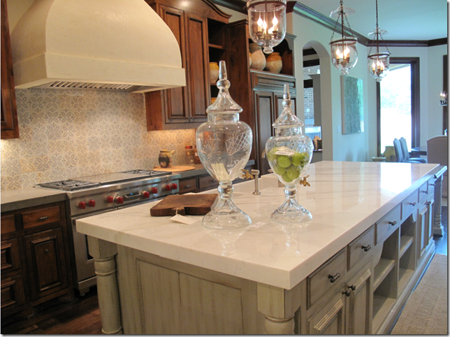
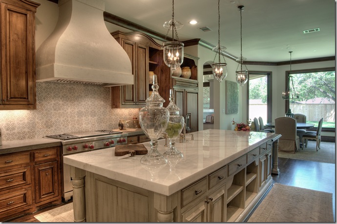
MY KITCHEN SHOT: I take this photograph of The Tile House’s kitchen – it looks great I think - clear, sharp with nice wide angle lens action. I’m pleased with the pictures of The Tile House, until Maria emails me the professionally photographed pictures of the same angle. Below:

THE PROFESSIONAL KITCHEN SHOT
This photograph sends me into an immediate tailspin. Taken from almost the same exact spot as mine – notice how you can actually see all of the breakfast room here, notice how you can even see the top of the cabinets and the stove’s hood in this picture, notice how much clearer and sharper this picture is than mine. I am crestfallen. The quality of my kitchen shot can’t compare to this. Yes, my photo is wonderful, I know. But I want more than wonderful - I want THIS. Is it asking too much to want perfection? Here I was thinking that the Canon G10 had this fabulous wide angle lens and YES, it IS wider than most, if not all, point and shoot cameras. But – it’s not wide enough for me. I want THIS! In order to take fabulous interiors for you, the reader, – I need to show you the entire room, not just a part of the room. I am doing this for YOU!!!! What to do, what to do?????? Maybe I need a bigger wide angle lens????
The problem with point and shoots is you can’t change their lens, but you CAN add a lens on top of the built in one. So, that’s the ticket I think. A wide angle lens ADAPTOR! This is a lens that you just screw onto your present camera, and viola. This adaptor I am convinced is going to salvage the dreck that G10 is (it really isn’t I know – it’s just not THIS!) I pretend I don’t read in the reviews of the wide angle lens adaptor that there is something called “barrel distortion” and “vignetting” with these converter lenses. Nope, I didn’t just read that, I convince myself. Besides - there is one person who writes a review swearing how wonderful this adaptor lens is. So, as you might guess, Amazon delivers this heralded wide angle lens adaptor for the Canon G10 - overnight.

It doesn’t take me long to discover exactly what is meant by “ barrel distortion” and “vignetting” – notice how out of focus this picture is around the edges. The only focused part is in the middle of the picture. Yes – the adaptor lens make the image much wider, but all the wider parts are totally distorted! Anyone out there want to buy an adaptor wide angle lens? By now, I am about to throw in the towel. I’ve lost the war, I concede. Three cameras and an extra lens later, I still can’t take a decent picture to save my life. Back to the drawing board.

Outside, the barrel distortion with the wide angle lens adaptor is even more obvious and horrible.
A brief talk with my daughter who took a year of photography convinces me I need to step up to yet another camera. Not a point and shoot, I’m done with those she tells me. I need a SLR, whatever that means. I try to take my time and not rush into anything like before. A few weeks of intensive study on the Internet leads me to believe a Nikon D90 digital SLR is my ticket to becoming the next Ansel Adams. Sure. I know. That’s pretty hysterical. But I think, if only I had THE right camera, things would be different. And to be sure, there is some truth to that. You can see clearly the difference a wide angle lens makes. With a proper wide angle lens, bigger than the 28 mm that the point and shoot Canon G10 offers, I will be able to finally take better interiors and show you the entire room. And hopefully, at the same time, the photos will be clear, in focus, sharp and show great detail. The Nikon D90 promises to be the one – it takes fully automatic pictures – perfect for me, or I can focus it if I want. I can also play around with apertures and shutter speeds, if I choose too – God help me!
Though the change from a point and shoot to the DSLR scares me to death, I am going to try it, I decide. I’m up to the challenge and what do I have to lose at this point? To justify all the expenditure, I decide to finance the new camera by selling the other ones and I might even come out ahead, if I can find a sucker – I mean, a buyer. Hello, Craig’s List! The big day arrives, the DSLR comes, I take a few practice shots – hey, this is easy!!!!!! I run over to my favorite antique store, M. Naeve, to show it off. What better place to take gorgeous pictures of their gorgeous antiques? I’m shooting away and Margaret remarks on the size of the camera – it’s huge, and heavy, really really clunky. I proudly shrug off the comments and act like I’ve had the camera for ages and ages. Just taking a few shots for clients, that’s all, I tell her. Sounds good to me. I’m positive people don’t bother Annie Liebovitz about the size of HER camera, especially while she’s at work!

No, that’s not a sex toy – get your mind out of the gutter – that’s my new Nikon D90 with one hell of a long lens on it! I’m in love. I look so professional taking pictures with this baby. I need to go show off. So, after I run to M. Naeve to show off, I stop by The Garden Gate to show off just a little bit more – snap snap snapping away. Oh – the joy of it all!!!!

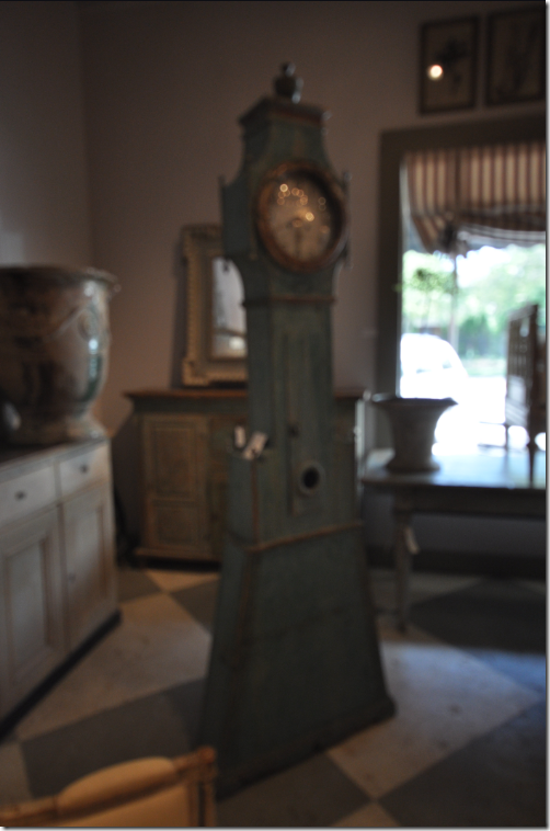
I mean, really – could there BE a more gorgeous picture than this???? An entire day’s worth of photographs at M. Naeve and the Garden Gate, and this one is probably the best of the bunch. Oy vey. Well, it IS a gorgeous clock to be sure. Can you tell? All my photos looked just like this, dark, totally out of focus – and on an automatic setting to boot. Help. Me. Someone.

There is hope though, of course. The Tanglewood House living room and bedroom pictures were taken with the new Nikon D90 and I was by and large pleased with the results. Although, I did notice something I hadn’t before – all the newly extra sharp pictures lose a lot of that sharpness when transferred from my computer to the blog to your computer. In other words, no matter how crisp or in focus an image looks on my computer, when it gets posted to the Internet and lands on your monitor, it loses a lot of detail and clarity. But still, the results are much better now. It’s just that they are so much better, so much clearer and so much sharper on my computer that I wish you could see it! Stop by to look if you are in the neighborhood, I’ll be glad to show you in person!!!

Hehehe – another day, the same thing, over and over again. Pee-Wee Herman sleeping on the couch – protecting Georgie from the big bad camera. I think I’m getting the hang of the SLR camera. Once I really feel comfortable with it, I can get an extra wide angle lens to add to it, or a special lens for extreme close up shots of roses and hydrangeas or roaches and mosquitoes – take your pick. There are lenses for long shots – say I want to stalk someone’s house from the car, no problem now, just whip out the proper lens and I’m in business and hopefully not in jail.

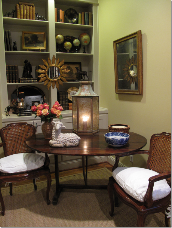
And finally, the new lantern captured by the Nikon D90. Remember to open the browser window fully to see the entire shot.
This image is so clear and sharp – I’m thrilled with the detail. Learning to use the SLR camera with all its various lenses and options has taken a while, but I think the results will be worth it in the end. Is this THE camera? I think so. I hope it lasts much longer than the Canon SD870IS did. I know it will last longer than the D10 – that one was a disaster. In all, it’s been a labor of love, like the blog itself, learning to take better pictures to make Cote de Texas better and more beautiful – for you and for me. Of this I’m sure, without Cote de Texas, I would still be using my original Sony digital and I would be very happy with it. I didn’t know any better back then and I was perfectly fine with it. Back then I also stupidly said “in regards to” and took out of focus pictures – which was all good enough for me, but now I have the responsibility of the blog, and the grammar and the images have to be a cut above. Looking at other blogs – like Back Porch Musings and The Liberty Post with their beautiful photographs, encourages me to try to be better at it. Hopefully, I will continue to grow as a “photographer,” and who knows, I might even take a course on it! Online, of course. You don’t REALLY think I could go back and sit in a classroom again, do you?

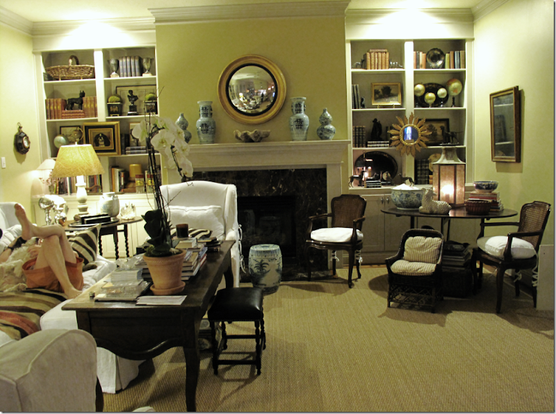
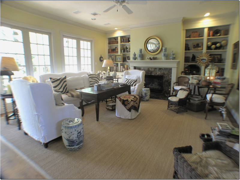
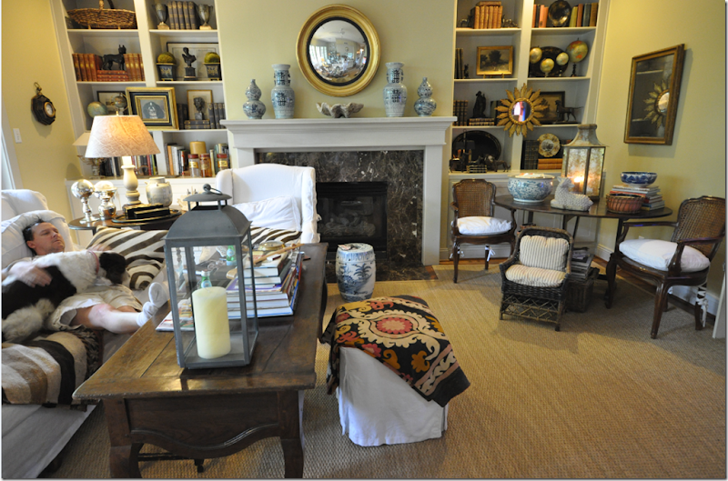
P.S. I should have taken a new picture of the family room today. Toby Worthington, commenter extraordinaire, made me change my mantel around. The order of my urns drove him crazy – so I changed it to humor him (photo above shows the urns arranged the way Toby wants them – I aim to please.) AND, the zebra rug finally moved downstairs from the guest room to the family room. I would snap a new picture right now, but well, frankly I have enough pictures of Ben ruining my “art” – there’s no way I could get him to move off that sofa right now and take all his “work materials” with him. Let me know if you want me to rearrange anything in my house for you – like Toby did – I’ll be happy to oblige.

