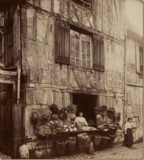
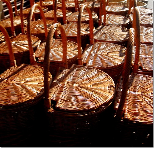
 This picture was taken at the turn of the century in France – look at all those baskets! I wonder if any of them are still around today?
I am SO excited about announcing a new giveaway today, especially because the giveaway is a French product and of course, I love anything from France. When I first started this blog, I proudly stated I was going to talk about French design. In fact – my first blog story in May, 2007, which was also my shortest, and didn’t even include a picture, is all about French design! Here’s my very first blog story for your reading enjoyment. It’s tres embarrassing!
Welcome to my new, and first, blog! I am an interior designer in Houston, Texas who lives, lusts, and covets anything French (except men!) Not all of my clients (in fact most) feel the same about French Design that I do. Subsequently I am forced to design in styles that aren't personally what I would choose to live with. But, c'est la vie. I am planning to use this blog to indulge my love of French antiques, French furniture, and anything else pertaining to France! I also plan to showcase French design in Houston, so if you share my love of French and live on the gulf coast, you probably will find things you love here.
I am going to start with my own life, my house and the French antiques I've bought for it. I also plan to write about how my obsession with French antiques began.
Please leave me a comment if you have one.
I love that last line “please leave me a comment if you have one.” As if anyone besides my bestie Lisa was reading the blog! I did live up to one promise – to talk about how my obsession with French antiques began. On my mother’s birthday a few years back, I wrote about her and her influence on me as a true lover of French antiques. Read that story HERE.
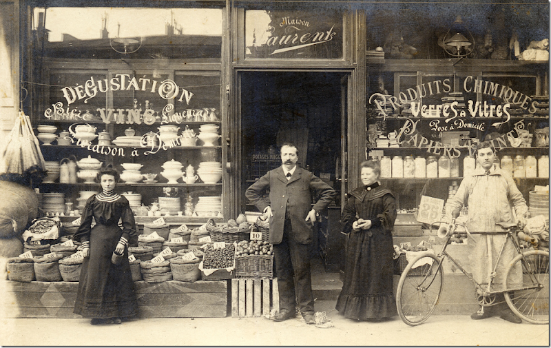 I am not sure what they are selling here – Wine Tasting and Chemicals? But, I’d love to own every white dish in the left window. Amazing! French Ironstone. Notice the bicyclist's outfit! Such a happy bunch!
Proudly proclaiming Cote de Texas an all-French blog was a bit fanciful. Writing about a place you have visited only once, and a long time ago at that, seems a little strange I suppose. It’s not that I don’t want to go back to France for a holiday, or that I can’t – my husband would gladly go (well, make that reluctantly go) - it’s just the thought of being stuck in a metal tube some miles above the ocean for seven or eight hours doesn’t thrill me anymore. I’m not scared of flying, per se, I can and do fly on occasion. It’s just not something I want to do, or enjoy doing, so I avoid it if I can. If France was a two hour flight or an eight hour drive awa, I would be there all the time – but it’s not, of course So, for now, in order to write a “French blog” I have to rely on my dimming memories and fantasies of France, and travel visually through the pictures I find here and there on the internet and in magazines and books.
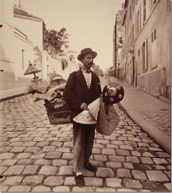 This charmingly dressed Frenchman is selling paper lampshades on Lepic Street – circa 1900. He looks like a character out of a Hollywood movie. Notice the basket he carries to store his wares in.
Though I had initially planned to write mainly on French design, thankfully, over time, I have broadened my topics and I now write about more general design than just French. But, you can’t change spots, and my spots are definitely Francois. So, while searching for photographs to illustrate this story, you can imagine how thrilled I was to stumble upon a cache of almost 100 photographs of France, taken by Eugene Atget at the turn of the century! These pictures starkly illustrate how deeply good design is a part of every Frenchman, regardless of class or wealth. Take for instance the poor street salesman pictured above – with his cheap paper shades – he is dressed in something so charming, so stylish, it almost looks staged. Wearing a hat and striped cotton shirt with a small, rounded collar and thin bow tie, espadrilles and baggy blue pants – you wonder, would any other countryman dress this way, in any decade? And in the other photograph – the stacks and stacks of wonderfully shaped white ironstone – so plain a product, yet its fanciful curves sets it apart, as everything French does. Their architecture, the glorious buildings that the French live with day in and day out, yet they still refuse to take the beauty for granted. Instead, their buildings are revered and respected, preserved for future generations to enjoy. Here, we tear our old buildings down, driven by real estate greed. Still, try to copy their architecture and it comes off looking forced and phony as if only France is allowed its true beauty. Why does French architecture and design only look right in France and anywhere else, it’s a comical poseur. Why the French? Why do they always get everything so visually correct?

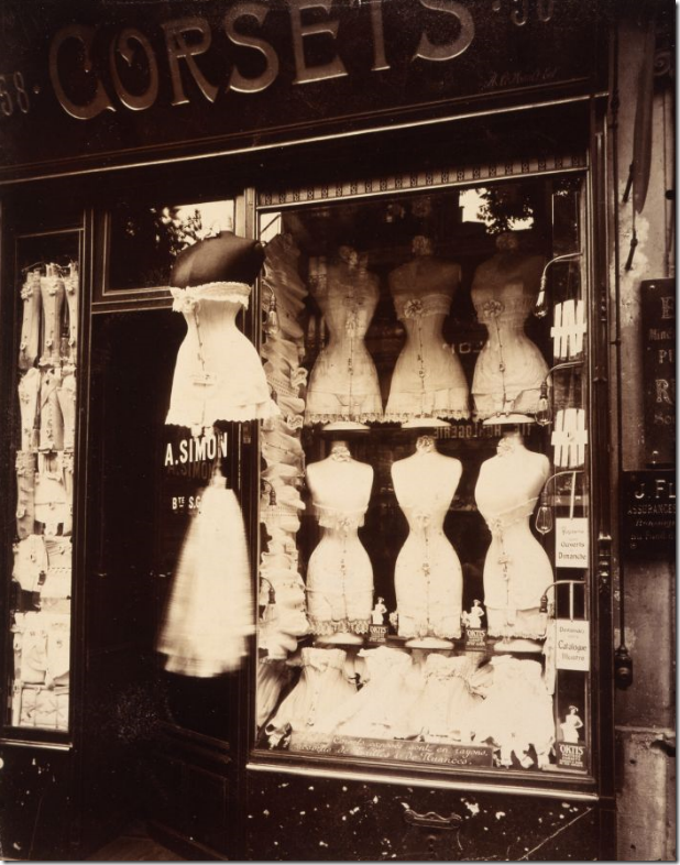 A Corset shop in 1912. Thankfully we don’t have to wear these anymore!!!! Notice the beautiful fabric roses and scalloped lace linings. And notice too, that the mannequins have such tiny waists.
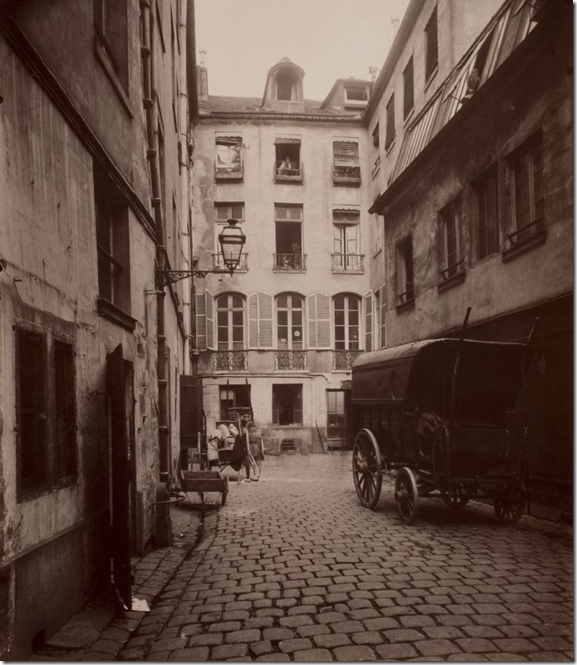 The old Hotel Buffon. I love this streetscape with the coveted lantern – which today sells for a few $1,000! Cobblestone streets are so much more charming than paved ones. In Ft. Worth, there is one long street that runs through the town; the city has removed the pavement and uncovered the old cobbles. Just one problem - Ft. Worth doesn’t look like Paris! Why are the French cobblestones so quaint, yet ours just look primitive or backward?
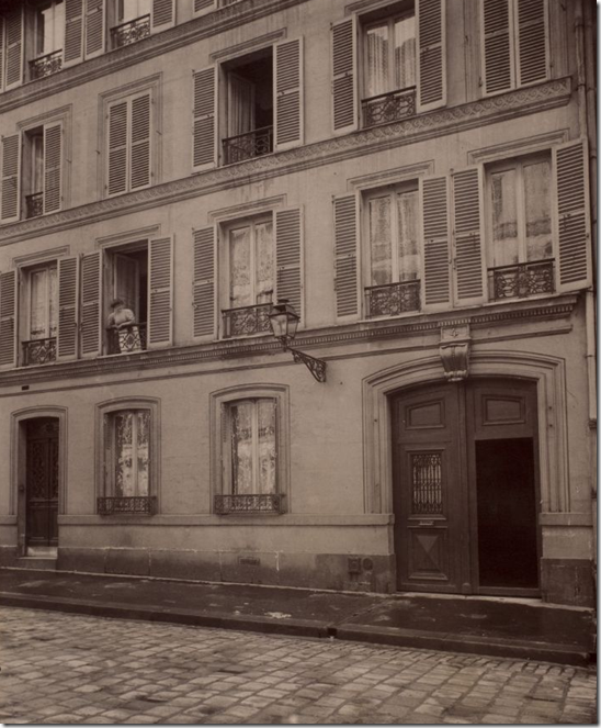 Another charming French street with another street lantern and the highly desired shutters that antique lovers collect. In district after district, the streets are lined with stone buildings like this – one more beautiful than the next. Why does no other city look like Paris? What is it about the French that makes them, as a nation, desire to live surrounded by beauty, while most everyone else settles for ugliness? Compare our towering, neon billboards, our modern skyscrapers with their dehumanizing scale, our suburbs filled with front loading garages that have replaced the front door, our endless shopping centers one more unattractive than the next? Why do we not demand or expect to live in beauty like the French?
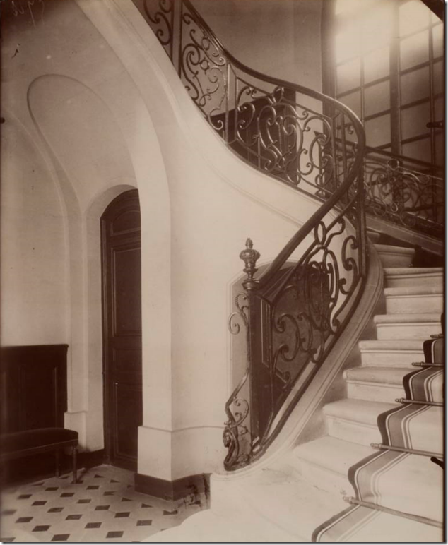 A marble floored lobby in 1910 – probably in an apartment building. So beautiful: the iron railing, the stone steps, the striped runner, the arched doors!
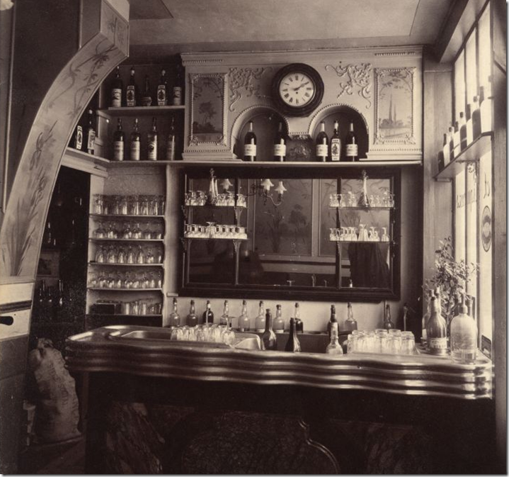 I love this picture of a “wine” merchant in 1910. What a pretty spot to spend a hour or so – unlike our beer joints! The bar is so interesting – the undulating counter – so different! Notice too, the clock, it looks just like my clock I bought at Round Top – that promptly crashed to the floor an hour after hanging it.
In color, a pink building looks all the more appealing. Today, things are the same in France as they have always have. Things might improve, but they don’t change. This could be yet another photograph from the turn of the century, except it was taken this year. The hanging lantern with its scrolled iron post looks as antique as the building. Why are our street lights so unappealing? Why did we let that happen instead of having pretty lanterns, that one detail that sets France’s streets apart? In my home town of West University – all the streetlights have recently been changed out to create some charm to our little neighborhood. But why did we ever settle for the ugly, bug-like lights for years and years before?
Two old storefronts painted bright red – Antiques and Decor. Is there any better shopping?
So Beautiful! An outdoor cafe awaits its customers. The modern car is the only clue this isn’t a vintage photograph. Where are the metal tables and chairs that fill our cafes here? Why are their French chairs always so charming, so beautiful - with their rush seats and curved lines?
Shutters, antiques, and hanging lanterns. Heaven on earth!
How can you resist anything in this country? The French understand design so well – here at home, we have only small pockets of it: The French Quarter, Charleston, Georgetown? What is your favorite charming neighborhood or city? Mine would be the French Quarter, no question.
Everything olives. I suppose those are tiny olive trees! Is there any fruit we pay such homage to? Do we have any shops with potted apple trees or fig trees lined outside in perfect whitewashed clay pots? And baskets, always baskets that add texture and beauty. Rubbermaid is our wicker. Vinyl is our rattan. We need to bring the charming basket back into our lives and banish the molded plastic!
A simple straw basket holds a French maiden’s yarn.
A Frenchman, dressed for the part in striped shirt and beret, makes baskets on the street.
The French use baskets for everything – at markets they hold fruits and nuts and beans. Don’t you wish we had markets like this everywhere? Why do we not demand beauty in our everyday lives?
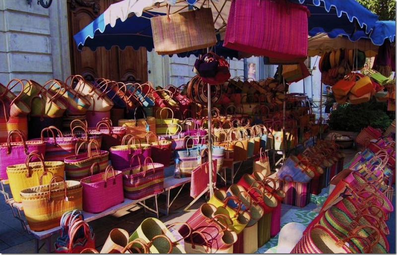
Provence: These French baskets are so cute and colorful. These totes are actually made in the former French colonies Madagascar and Morocco. How much chicer is it to carry a straw tote to market than to drag a paper bag around? Of course it is! It’s French!!!!
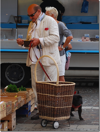 Shopping for dinner – in a linen suit and a scarf with a red handkerchief peeking out. Even the dog has his own scarf. The Frenchman’s traditional rolling basket is just the right accessory to complete his look. Have I given you enough hints what the giveaway is already???? Have you guessed? No, it’s not a trip to France, but it’s a touch of France to bring some chic into your life!
THE GIVEAWAY:
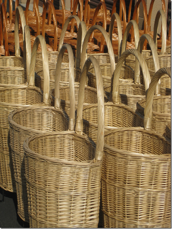
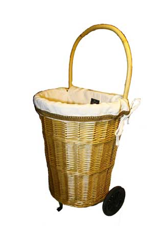
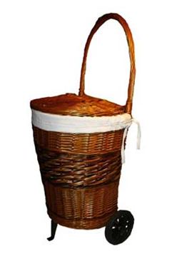
The giveaway: A French made rolling shopping cart! Isn’t this the cutest thing???!!!! I am so excited to be offering this giveaway today! The baskets are made in the Burgundy region of France by a third generation basketry and caning family. They are beautifully finished and available in honey (natural) or smoke (two tone brown lidded). If you are the winner – you can pick which color you want.
Baskets and the French have a long history – documented to have started back in the 11th century. Baskets in France are used for a variety of purposes: harvesting grapes (each wine region has its own basket shape and name,) olive picking, lavender gathering, toting glasses and wines bottles, picnics, bread making, carrying fish and eggs, chicken raising, wine storage, stowing clean and soiled laundry – and on and on. France has also gone green and baskets are used in place of plastic bags. This year, on January 1, a new law went into effect banning the distribution of plastic bags – a move that the French people overwhelmingly support. Most French carry their own bags and baskets while shopping. And many cars have two or three baskets stored in the trunk, ready for any impromptu shopping trip.
The open lighter colored cart is in front, the darker, lidded cart is in back – if you are the winner, you have your pick!
French Basketeer is the company who is hosting this wonderful giveaway. They sell various authentic French baskets, carts and totes. French Basketeer was established in 2008, importing its baskets directly from the former French colonies of Madagascar and Morocco, where the baskets are made under the Fair Trade and Fair Wage treaty. The giveaway – the rolling baskets - is made in France – by a 3rd generation basketry and caning family.
The darker carts – these are lidded.
In addition to the baskets and carts, French Basketeer offers reusable organic cotton net bags to use instead of plastic and paper bags. And, they carry doggy waste bags, tall kitchen bags, lawn & leaf and kitchen waste. bags French Basketeer products can be purchased online HERE, at select California farmers’ markets and at specialty retailers nationwide.
For today’s giveaway – there are actually TWO gifts. The First Place winner will receive the shopping cart – in the color of their choice. The Second Place winner will receive a tote bag – whichever one they choose.
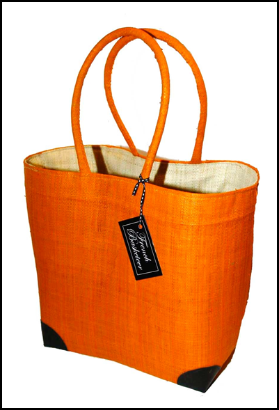
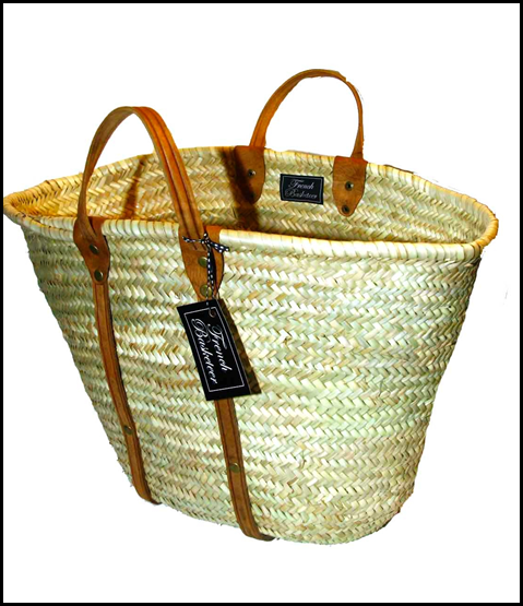
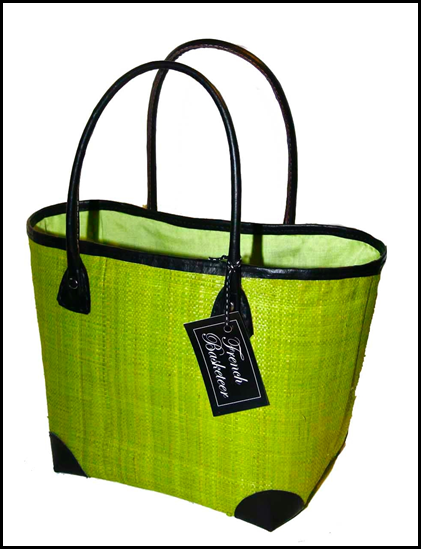
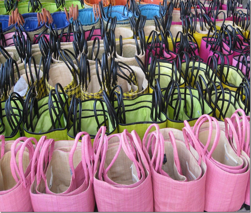
French Basketeer’s traditional French totes! So cute!! These are their summer colors. There are also winter colors.
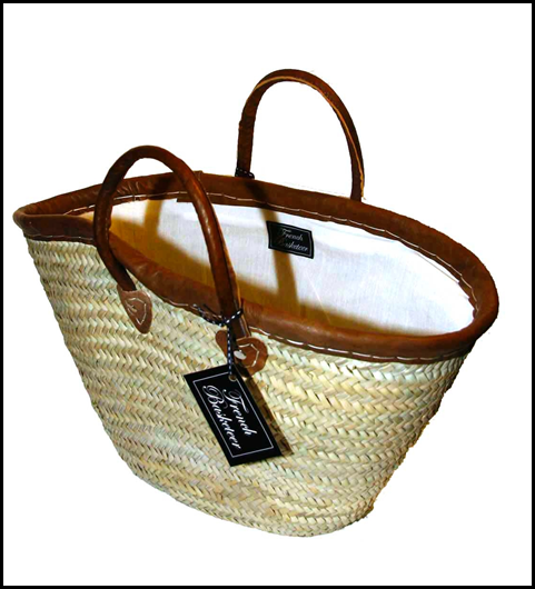
Here are a few of my favorite totes French Basketeer sells:
I might just have to get this tote – it’s my favorite! It reminds me of a patterned sisal rug!
This would be so cute for the UT football games! Love it!
Perfect for the beach or big design projects. You can order linings that zip up to close the tote – which is a great feature.
The different totes come in different sizes – small, medium, and large!
I’m having trouble finding a favorite color – I love the lime, the hot pink, and the orange. I also like the rust. This version is cute with the extra trim on top and on the corners.
Another great summer look. The second place winner can choose whichever tote they like!
Here, the shopping cart was styled by the company’s owner for Christmas. Romantic Homes magazine just finished a photoshoot at French Basketeer’s house – it will be in the March issue. I can’t wait to see it!
The shopping cart – filled with freshly bought flowers – so beautiful.
French Basketeer spotted their totes being used as dog carriers – here you can see the zipped lining up close.
This chic shopper uses her bright yellow French Basketeer tote instead of a shopping bag.
Small, medium, and large!
![[purp+flo.jpg]](https://blogger.googleusercontent.com/img/b/R29vZ2xl/AVvXsEjhG0tctKO-OUpNNIAoYLgn4m7SPRIgIrpceKxEJVwWFzvLbO06LbuEeZmZvSBZ4Mgg-iJvp9xym_px0EQffgKuJBO1RsGFt4Z3XHegfoF3KVnK_3np1IRbj3Gy24wYcD33aJPG93keLXU/s1600/purp+flo.jpg)
I love the way the flowers look in the totes.
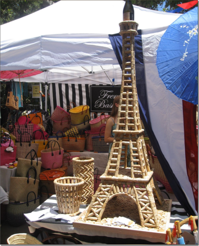
Heaven! On weekends, French Basketeer can be found at outdoor shows. For the French Festival – a huge Eiffel Tower made out of wine corks was a big hit.
 The willow, or osier as the French call it, is shown here as it is harvested. This is the color of the brown tote – it’s natural, there is no dye used to make the rolling cart brown!
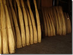 Here are bundles of the blanc osier used for the lighter colored rolling carts.
Rules for the giveaway:
All you have to do is go to the French Basketeer web site HERE and pick out the color of the Rolling Cart you would want if you win – either the white “honey” or the brown “smoke.” Remember the brown/smoke is lidded, the white/honey has an open top. AND, while you are at the web site – decide which tote you would want if you win Second Place. Be sure to state size, if applicable. THEN - Come back to the comments section and leave me a comment telling me what your choices for First and Second place are. Be sure to leave your name and email address! Very important!!! NO ANONYMOUS COMMENTS CAN WIN!!!! I have to be able to email you if you are the winner!!!!!
First Place: This white rolling cart, without the lid, is called “Honey” colored.
This brown rolling cart with the lid is called “smoke.” You have your choice of either one.
Second Place: Small, Medium, Large and a few Extra Large: Be sure to tell me which size you want!
The French Basketeer web site is HERE.
Check out their blog HERE.
The contest runs until Thursday night at 11:59 pm. I’ll announce the winners in the comment section shortly after that. Good luck! And a HUGE thank you to The French Basketeer for their generous donation!!! Thank you!!!!!
OK - CONTEST IS CLOSED!!!!! NO MORE COMMENTS PLEASE! WE HAVE A WINNER:
FIRST PLACE IS THE DECORINA BLOG, BEEP BEEP (she's a part time truckdriver!) yea!!!!
SECOND PLACE IS THE RUTHIE'S RENEWED TREASURES BLOG!!!!
OK = CONTACT ME YOU TWO AND CONGRATULATIONS.
Joni

![[IMG_1236.JPG]](https://blogger.googleusercontent.com/img/b/R29vZ2xl/AVvXsEifwA3BgOC9DwkJMg3YDENFoZ0FM4mApxGRyGM_iE6QM0dhoVZOqtmiqOW32LH61ysGamSdZLi_QkB2zSgf_QkeNDys-CFAkShHrrmA6DbbHBjkdR1r5oeWWxMMoX1DRxyLPNExamtliqA/s1600/IMG_1236.JPG)
![[IMG_1355.JPG]](https://blogger.googleusercontent.com/img/b/R29vZ2xl/AVvXsEhLw50vf1NC3MsQ8Yrxp8ry2j7XcPVjNuVQOAO2NTGY1byVPSK0CcU_bZ5R7WVF2HRFGxFhBoz23VTR-JZumbgvfYnJPdYqsvadoeFvkXRwjHt495tcqjdkrX8s2R9pPNmkKMUkZ6Mmukc/s1600/IMG_1355.JPG)


![[IMG_3275.JPG]](https://blogger.googleusercontent.com/img/b/R29vZ2xl/AVvXsEg4m6wggpG0qmdUg_0g60gdU-JAsfh17k-zBDOy4FvFt1A2edlQp-T_XHWrPz-EqjrUEKUHMRfxeB2dKedLHecq4LXVVC-wUOChkpM5apzW4vmhqY0uPtrSwy-yeHOt4dLz6p_uwpbk2jg/s1600/IMG_3275.JPG)
![[IMG_1235.JPG]](https://blogger.googleusercontent.com/img/b/R29vZ2xl/AVvXsEjAOI2FdwHEq8sMGnB2KXVPim8gjtrno09UMW_ENJwL3Xn0bYHXMStHRtKMsP3w37q1ptqL6WnUhvtMnOTNxSRlw_dwjbigfCW8msbXAFukjp516YaSV4q1Tn4c2kuJE1NdIuJSsGqFYyM/s1600/IMG_1235.JPG)

![[IMG_2931.JPG]](https://blogger.googleusercontent.com/img/b/R29vZ2xl/AVvXsEh9mf0MUDjqf-n7CWfCLbCQrD8glPodCQznS6DpFH7cjIAgPyK5vB_nzG09B1qW-J7s_Zv9Jx5RA52WQ3jqwT9hnfu41umv_DPeVK9pIPwh4Jq21sQLTQaPnGsQ49izgRfWtVyC6wfEjI4/s1600/IMG_2931.JPG)
![[IMG_2909.JPG]](https://blogger.googleusercontent.com/img/b/R29vZ2xl/AVvXsEi1CCnBCUy07p7-JgQWhTYmqQ6ooSrnpjmWnpv0fEsVdgz3Jty20MrmChv5PBBba0G85cVCJGN7aaSsG7onxBJApePu7_Mjw0beAd1WSNB1dE0DL7hDxFhiYp80jwWfrB5fNlNqJCWpZKk/s1600/IMG_2909.JPG)




![[somethings+gotta+give_cote+de+texas.png]](https://blogger.googleusercontent.com/img/b/R29vZ2xl/AVvXsEj2FM8-y2Fn5QF6WQddCDU4cadqASHKvZ4RntrNoiayaR49VToS3LieC8wYkbw-Mm5GvUi6hePvyGmBrA3UfiH_qXxrALHxYJbRIXgjTi1aZ2R2wxjDB3oD0wAkyltQTO59Y5gYF0hwTkHq/s1600/somethings+gotta+give_cote+de+texas.png)