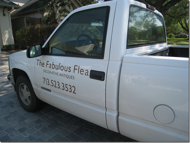
Like they say, all good things must come to an end. I was shocked and so sad to hear from Mary, the owner of The Fabulous Flea, who emailed me tonight to inform me that the final antique sale at her house/shop will be this April 20 – 22. Awww! What a loss this will be!
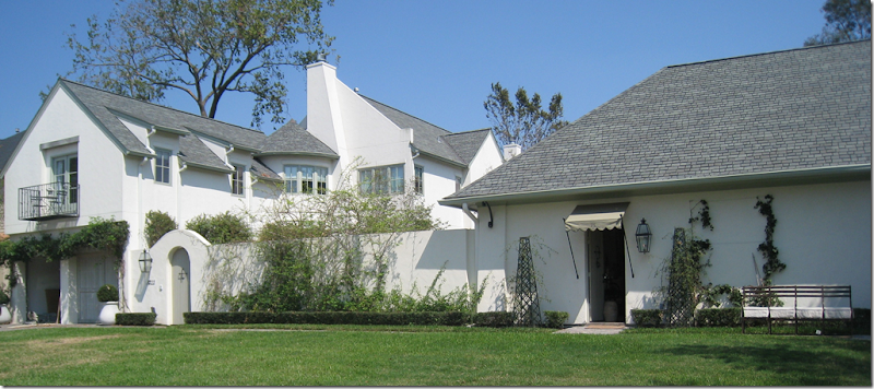 The Compound: the house is on the left, the shop is on the right. In between, behind the stucco wall is the pool and pool house.
Mary, who lives in this gorgeous compound designed by noted Houston architect Kurt Aichler, also informed me that her house is on the market. Gulp. Quick, can someone loan me some money???? Seriously? This is my DREAM house! I truly have dreams of this house in my sleep! If ever I wish I was a rich interior designer, this is the day. Mary said she will continue selling antiques on the internet and at trade shows, but for now, the days of selling antiques out of her shop are over after her last spring show next weekend. Mary shared why she is selling: “I am coming to learn that the journey for me with the home is much more about the creating of the space, then living in it for a lifetime......Once completed and enjoyed, I am ready to let go and sink my teeth into something new, it has been that way with every house that I have lived in, and lucky for me, my husband is willing to go with the flow....”
Now, if only Mr. Slipper Socks Man would go with the flow and BUY me this house!!!! I don’t ask for much. I did ask him for this, though. He did love it. He did ask me if I had gone insane. hehe. Yes. Insane for one of the most perfect houses in Houston! Who will buy it? What lucky family will get to live here? I wonder…will they appreciate it? I hope so.
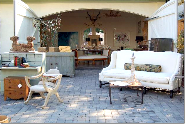
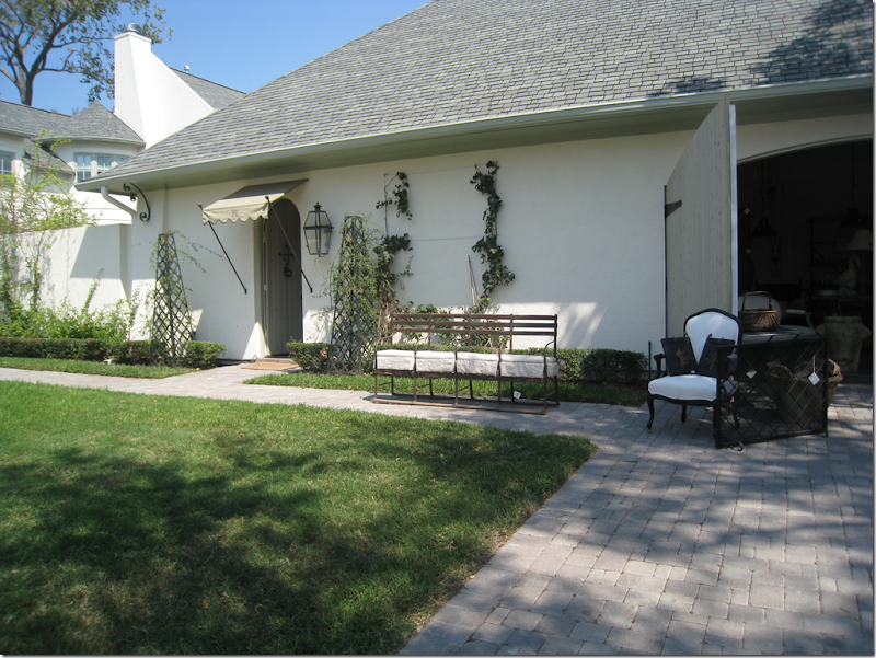 The Fab Flea shop –two rooms - one indoors and one barn-like space in the garage. Kurt Aichler truly outdid himself with this house. It’s name is perfect: Fabulous.
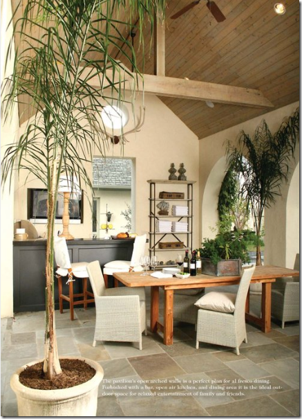
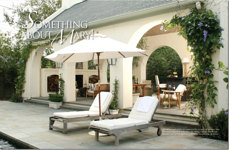 The pool house, open air, with fireplace and kitchen area. This picture was taken from a story in the local magazine Antique Shops and Interiors. Photography by James Farmer.
The pool house set for dinner. I adore Mary’s aesthetic. You can see the Fab Flea shop through the doorway. I love the flat screen TV behind the bar!
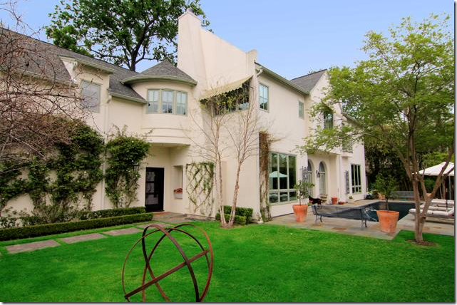 From the HAR web site: Behind the stucco walls, the house is to the left, while the pool house is to the right. An office is located in the upstairs turret. Downstairs, the living room, dining room, and family room are on an enfilade, one room after another.
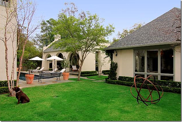 From HAR: The building on the right is the Fabulous Flea shop. The pool house is seen behind it.
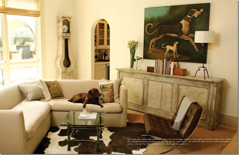 The family room, as featured in Antique Shops and Designers magazine.
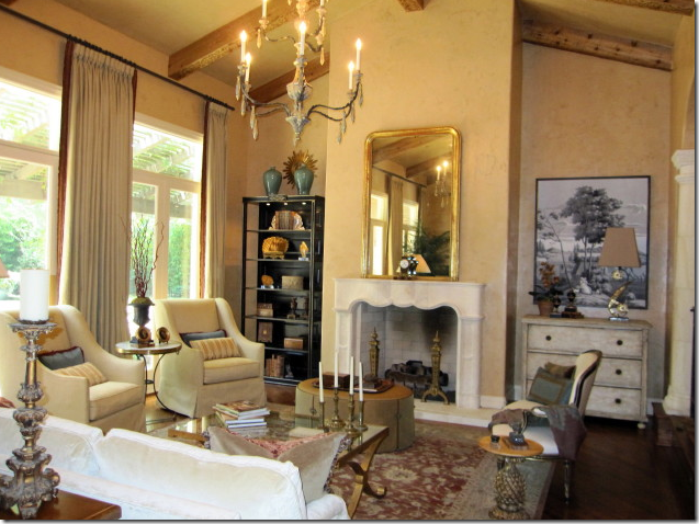
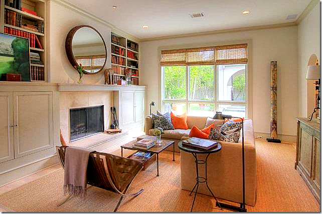 The same family room, today, featured on HAR. Mary has updated the room with new pillows and rearranged furniture. You can see the pool and pool house through the windows.
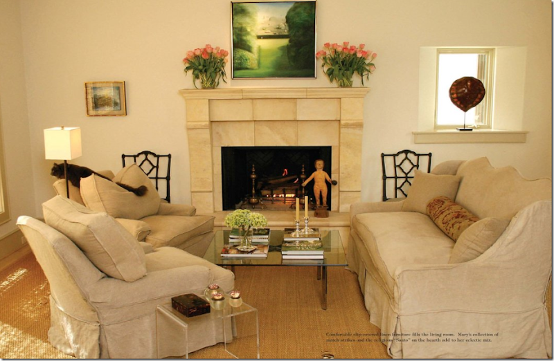 The living room as shown in Antique Shops and Designers magazine: slipcovers, linen, and seagrass – Houston style decorating.
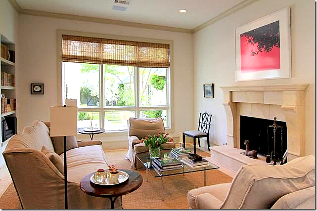 And today, as featured on HAR. Mary has again rearranged the furniture and changed out art work and accessories. Both the living room and family room over look the pool and pool house.
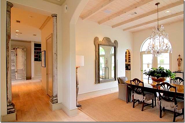 The dining room, never seen before, on HAR. The kitchen is past the columns to the left and the family room is on the right. I love the ceiling treatment and the wide baseboards. To the left of the long gallery hall, through a series of French doors, is a courtyard.
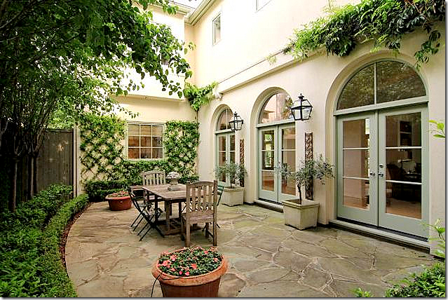 The courtyard to the left of the house. Through the doors are the long hall leading off the living room, dining room, and family room. The kitchen is seen through the window.
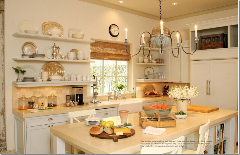 The kitchen shown in Antique Shops and Designers magazine. I LOVE Mary’s kitchen: farm sink, open shelving, and the antique chandelier is to die for!

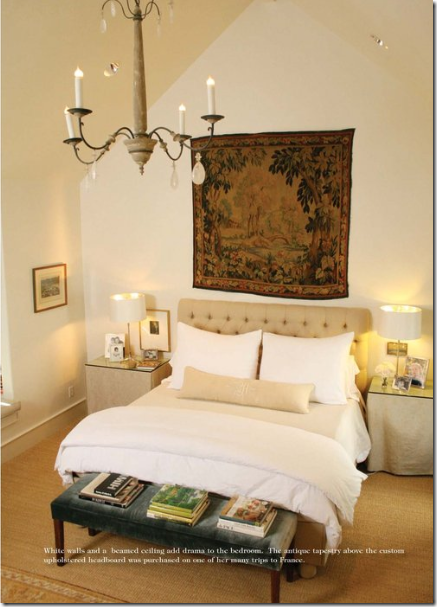
The master bedroom with a vaulted ceiling and rock crystal chandelier.
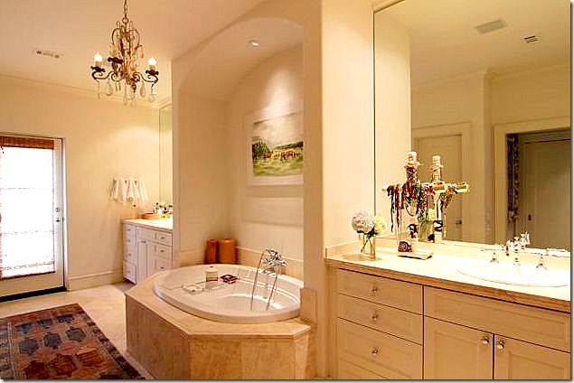 From HAR: The master bathroom. Mary has wonderful hanging fixtures throughout the house.
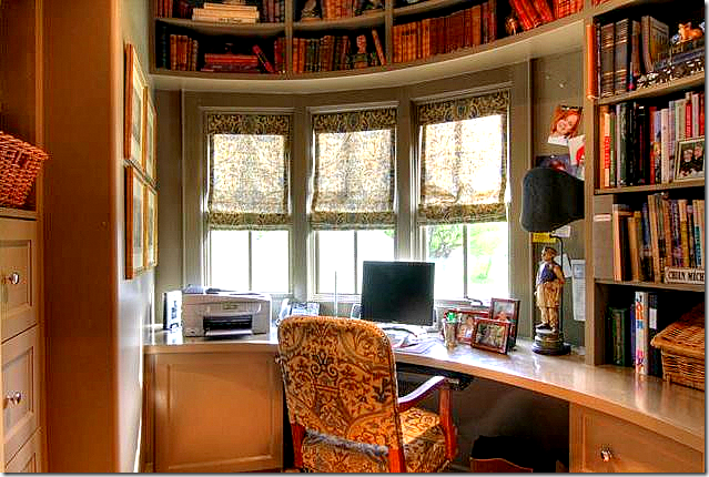 The office in the upstairs turret overlooking the pool.
Looking into the garage/barn space of the Fabulous Flea, ready for its final sale. The authentic carriage doors are wonderful.
.

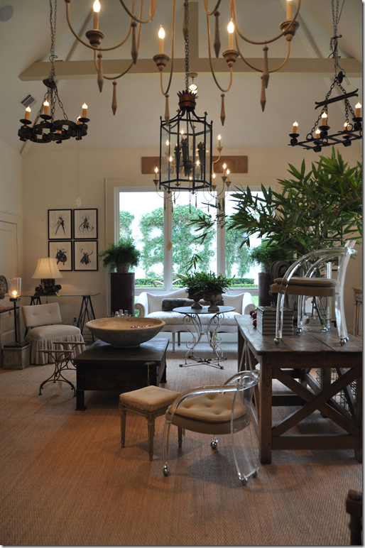
The left side of the shop: The ceiling is vaulted and Mary always has a great assortment of chandeliers.
These sliding wood barn doors connect the two rooms in the Fab Flea shop. The garage area also has a vaulted ceiling.
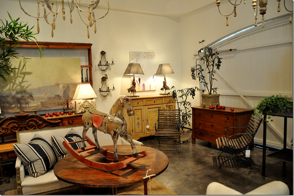
The final Fab Flea sale will be held this April 20 – 22, 2010.
Studio doors will be open
April 20-21 9:00am - 4:00pm
April 22 9:00am - 2:00pm
Along with the antiques will be the art work and jewelry by Jonie Jacomini Herring and a collection of Oushak rugs by Necati.
For information on HAR about this property, please go HERE.
For information on the upcoming and final Fab Flea sale, go HERE.
To read the article and see the pictures of the Fabulous Flea home in the Antique Shops and Designers magazine, go HERE.
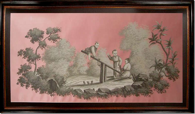
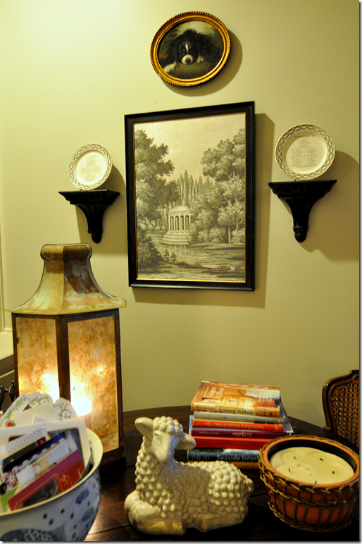
Finally: Don’t forget to enter the Cote de Texas giveaway with Jardins du Jour. To win this painting, go HERE.
And – be sure to listen to the new Skirted Roundtable with Scot Meacham Wood HERE.

