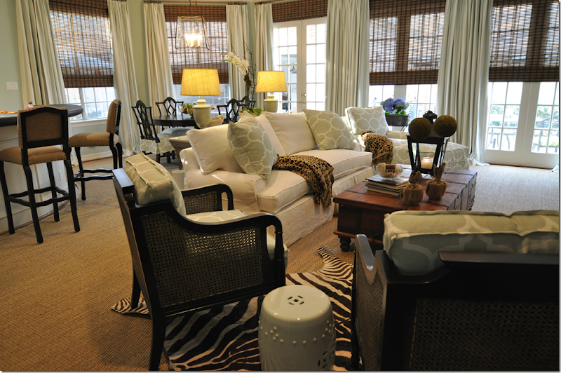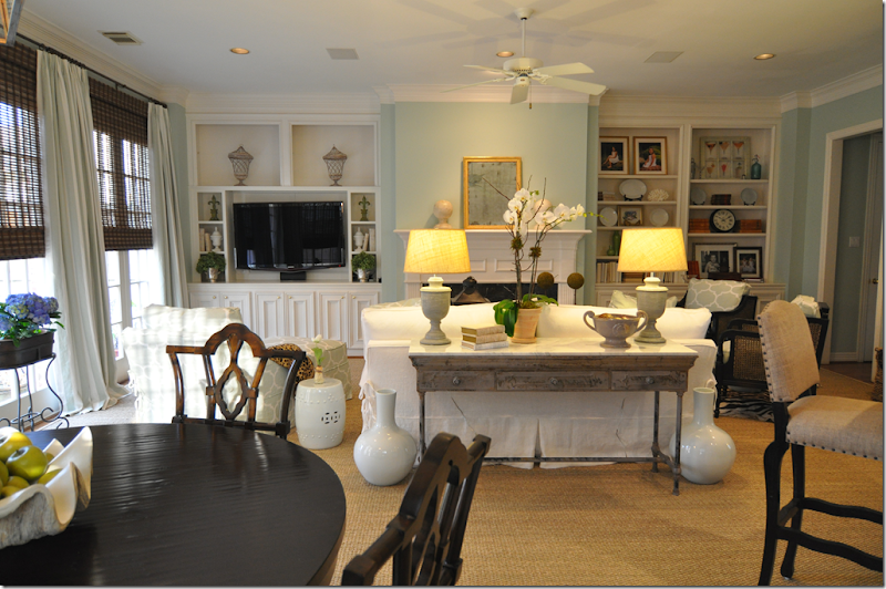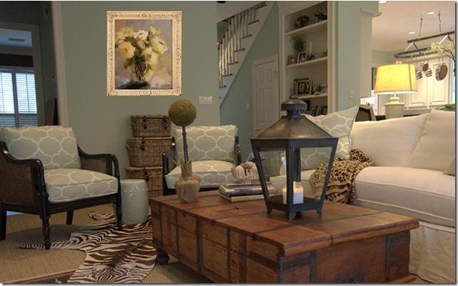
A few months ago, I showed pictures from a design job I had recently completed at my across–the-street neighbor’s house. The project was a complete redesign of her formerly yellow and red decor which I updated in soft aquas and fabrics, mostly using Karvet’s Windsor Smith linens.

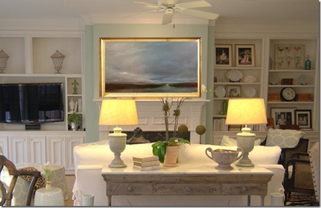
This view shows the fireplace. We bought an antique mirror from Tara Shaw and flanked it with two white washed wood pieces from Pottery Barn.
 Along this side wall, I temporarily stacked three wicker baskets until the client finds a antique she likes, hopefully a Mora clock. Looking at these photographs I realize that the only furniture we reused from the owner was her coffee table which I felt fit in with the new decor. The remainder of her older furniture was divided between an upstairs playroom and the garage - to be sold.
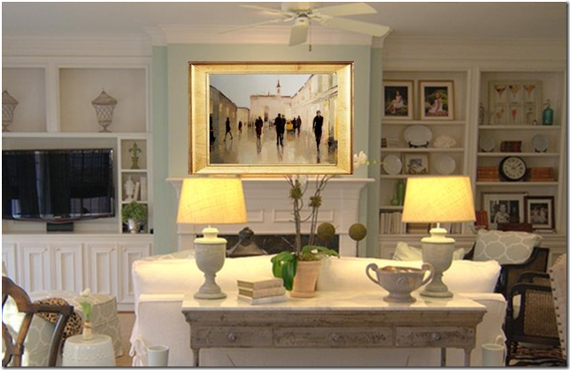
After I posted these pictures of the project, I received word that another blog had also posted these same pictures!! This other blog The Artful Lifestyle used Photoshop to show how a painting would look on the fireplace instead of the Tara Shaw mirror. Additionally, they photoshopped more art work above the trio of baskets. Hmmm. Was this helpful critiquing? Constructive criticism? The blog, it turned out, is written by two women from Atlanta who own an art gallery – Huff Harrington Fine Art - where they sell fine art. Additionally, they have a prominent online website where they also sell the art.
 The Photoshopped Picture
This is one of the photoshopped pictures that The Artful Lifestyle created showing my client’s mantel with a painting from their stable of artists. I particularly liked this painting by Doug Foltz that they chose! The photoshopped picture looks so real - it actually seems like the painting is really on the mantel instead of the Tara Shaw mirror!

And here is another Photoshopped picture showing a painting by Lorraine Christie, which I also liked.
I must really have a tough skin to find amusement in all of this. After all, The Artful Lifestyle was basically saying they disliked the antique mirror I had chosen for my client and would have rather seen art work there! Not only did they THINK this, they actually wrote an entire blog story about it and photoshopped all these pictures to prove their point!!!!! Instead of crying over their constructive criticism, I put my fragile ego and insecurities aside and chose to see this in the true, fun spirit, in which it was written. And, to be even more generous and jovial, I wanted to be sure that everyone would read their article so I advertised the story on the left hand side of my blog saying “NEW BLOG STORY WORTH READING” and linked it back to their blog. That’s when all the real fun started – for them!

Another photoshopped picture: Here’s what The Artful Lifestyle recommended for the side wall. I must say, I do love this painting by Angela Nesbit!
Apparently after I advertised their blog story, The Artful Lifestyle blog was flooded with readers from who had clicked on to read it. The owners of Huff Harrington Fine Art, Meg Harrington and Ann Huff, were thrilled with their new blog traffic and tried to think of a way to say “thank you” for all their new readers. Like I’ve said a million and one times, bloggers are some of the nicest people in the world. So, that is how it happened that last week, while I was just sitting outside on my porch, internet surfing, as usual, the doorbell rang. There stood the sweaty UPS man struggling with a HUGE package addressed to Cote de Texas. Por moi? Hmmm…. Unexpected HUGE packages tend to send a certain thrill down my spine and I got even more excited when I opened it: a framed print from Huff Harrington Fine Art – along with a long, typed explanation. The art work was their “thank you” for the blog link and extra traffic. WOW!
You know how the old saying goes, it’s not the gift itself, but the thought behind it? Listen to how much thought Huff Harrington/The Artful Lifestyle put into their gift. Amazing. Get comfortable, it’s a long story.
The Story:

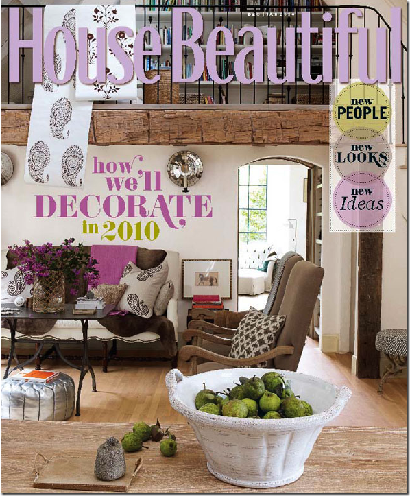
Remember this cover of House Beautiful showing Jill Brinson’s home? Remember how I fell in love this house – seriously in love, like enough to leave Mr. Slipper Socks Man for? (Does anyone else understand leaving a man for a house?) I was so crazy about this house that when we interviewed the editor in chief Stephen Drucker on The Skirted Roundtable, I drilled him about the cover story, hungry for more juicy details. I was a goner, totally and irrevocably obsessed with this house. But I wasn’t the only one. Visual Vamp was also enthralled with it, enough so that she redid her living room to emulate this cover. Below is Valorie’s photoshopped picture of her living room reinterpreted as Jill Brinson’s.

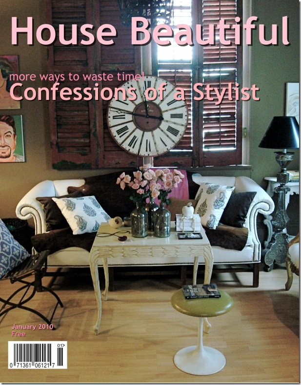
Visual Vamp’s Fake House Beautiful Cover
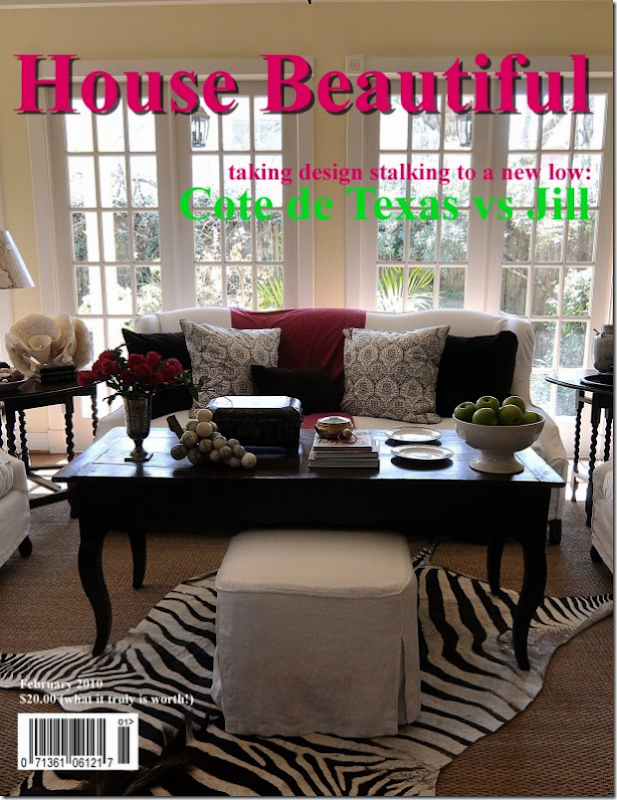
This is the fake cover story that Valorie of Visual Vamp did on her blog, imitating the House Beautiful story. I think that Valorie’s faux cover truly captures the original cover story. When I saw what Valorie had done, I was deep green with envy, to say the least. I wanted to copy the House Beautiful cover too! Before I started, I asked Valorie if she would mind if I blatantly stole her blog idea. Of course she didn’t so I stayed up the night redecorating my own family room ala Jill Brinson. Interestingly, neither Valorie nor I thought to ask Jill if she minded!!!!! Here’s what I came up with:`

This is my faux cover story of House Beautiful showing my own family room – trying to look like Jill Brnison’s. Of course, I wrote all about my folly on the blog HERE. So, you are probably asking yourself, exactly what does THIS have to do with the Huff Harrington Fine Art’s gift to me? I told you this was a long story!!! Relax, I’m getting to the punch line, I promise!!!

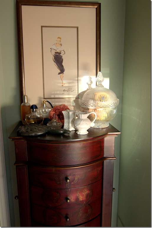
Here is the point: If you look closely at the cover, next to the sofa, there is a small framed print of a horse. The horse print is the work of one of Huff Harrington’s artists: Georges Nasri. The two owners of Huff Harrington Fine Art, Meg and Ann, knew how much I adored Jill Brinson’s house, so they thought I would probably love to own something that Jill Brinson loved too – like, for example, her Georges Nasri print. But, as they explained, instead of a horse, they thought I would appreciate something more feminine, more ME, so they chose another Nasri piece. I TOLD you how much thought they put into this gift! Wouldn’t you just love to have such thoughtful and considerate friends as Meg and Anne????? As their long, typed message said, they chose a print for me from one of Nasri’s works of “fashionable women who are sophisticated and oozing with a certain je ne sais quoi.” Apparently, Nasri’s works sell quickly, so they held onto this particular print and then had it framed. They said I should hang it in my dressing room (a new room that they think I should create after I kick Mr. Slipper Socks Man out to the guest room!) Are they mind readers too????? Instead of that, I hung the charming and utterly delightful print over my jewelry cabinet in my bathroom. It’s perfect for that spot!

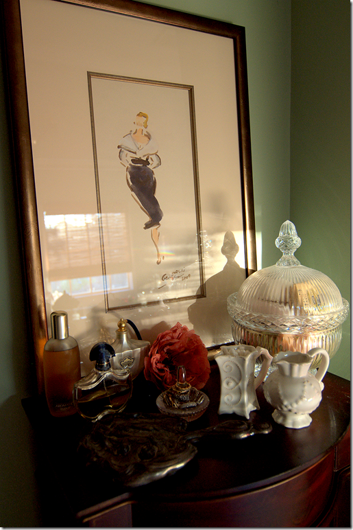
And, here is the framed Georges Nasri print from Huff Harrington Fine Art. I absolutely love it - it’s perfect for this spot! I think Meg and Ann were completely right in choosing this print for me instead of one from the equine series like Jill’s. This is more “me” than a horse! I actually had to fight Elisabeth for it though. I must say, this is probably even more my daughter than me! She was drooling over this!!!
 And here’s a close up. Sorry about the glare. The space is so small, it was impossible to take a shot from farther back.
As I am now starting my fourth year in blogging, I must say, the experience has been nothing but fabulous. I never imagined all the fun I would have – meeting people from all over the world, online and in person. Everyone - the readers, the bloggers, the vendors, the designers – everyone has been so supportive, thoughtful, loyal and kind. I could never express in words how truly satisfying all these experiences have been. Sometimes it takes the sincerity of someone like Meg and Ann of Huff Harrington Fine Art to make you stop and relish it all. I only hope I’ve been worthy.
To visit the website of Huff Harrington Fine Art, go HERE.
To visit their blog, The Artful Lifestyle, and read the original story about my client’s art work, go HERE.
Reminder: the new Skirted Roundtable is now up with Lee Stanton, noted antiquarian. To listen, go HERE.

