COTE DE TEXAS

NEW GIVEAWAY–HARRISON HOWARD CHINOISERIE PRINT!!!!!

207 comments


Chinoiserie.   OK.   Don’t laugh.  Every time I try to say the word OUTLOUD on the Skirted Roundtable, Megan cracks up laughing.  Shin-wah-zer-eh.  I think.

Definition of CHINOISERIE

a style in art (as in decoration) reflecting Chinese qualities or motifs; also : an object or decoration in this style

Origin of CHINOISERIE

French, from chinois Chinese, from Chine China

First Known Use: 1883


The origin of Chinoiserie dates back to the 1600-1700s when imports from China and Japan were extremely popular (not much has changed in the world.)   At that time, owners of fancy houses sought out oriental lacquer, silk and porcelains brought back on ships from the mysterious Far East.     This much beloved art form, most associated with Louis XV,  peaked during the fanciful Rococo period: 1740 – 1770.    One of the earliest and most famous painters in this style was Jean-Baptiste Pillement, whose engravings still inspire today.   Scalamandre’s famous Pillement toile inspired by the artist is one example of his longevity.   Interest in Pillement’s drawings helped to sweep Chinoiserie through the upper classes.   Upscale mansions and castles had entire rooms dedicated to Chinoiserie design.  Whimsical Chinoiserie follies and pagodas were built in gardens throughout Europe and Russia.   Chinoiserie eventually lost popularity when Neoclassicism came into favor in response to Rococo’s frilly, feminine romanticism.


00618601

A rare and beautiful example of Chinoiserie:   This red lacquered chest from Paris, dates to 1740.  Gorgeous.


image

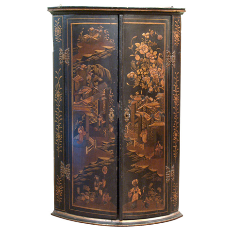
This beautiful corner cabinet is a period piece.  I love these when  used in a kitchen or powder room.  Babs Watkins once used these in the upper corners of a kitchen in Houston.  It was stunning.


image

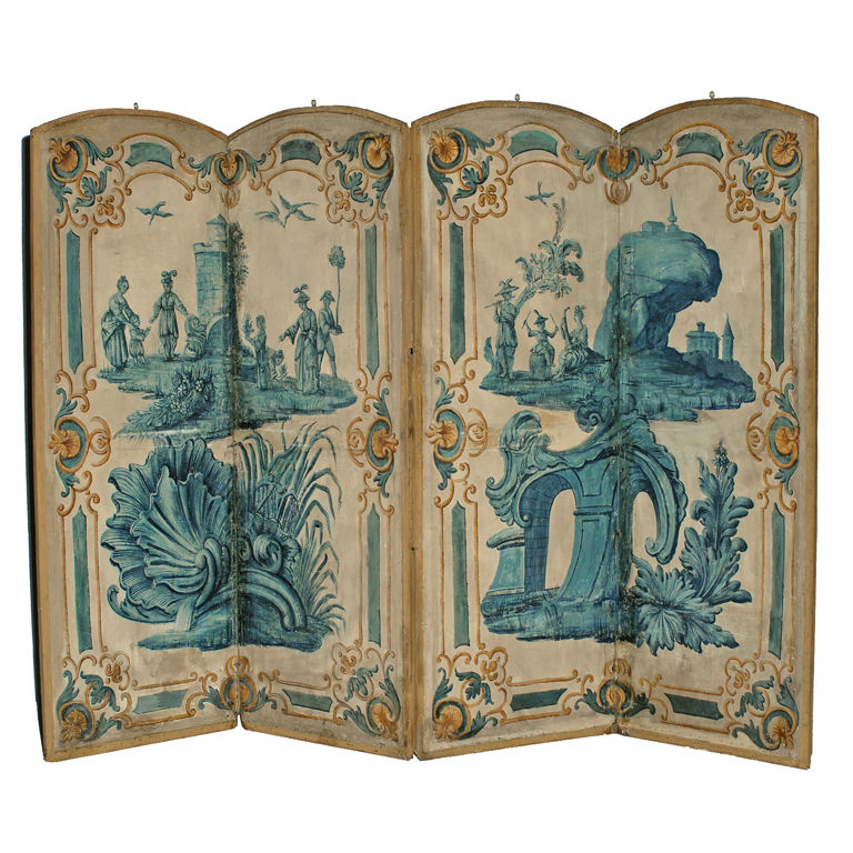
A screen from the Chinoiserie period. 1st Dibs. 


image

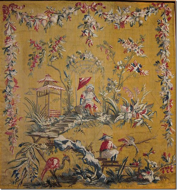
An museum owed original tapestry by Jean-Baptiste Pillement.   Beautiful!!!!!


image

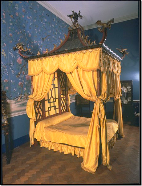
One of the more famous examples of a Chinoiserie interior is the Chinese Bedroom at Badminton House, Gloucestershire. The bedroom was completed in 1794, but in 1921, it was dismantled and sold off in pieces at Christie’s.    Another bed was built in the 1920s to replace the original, sold one.    Today the Victoria and Albert museum has recreated the famous bedroom.


image

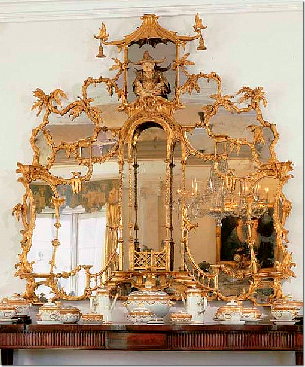
The original Badminton Chinese bedroom mirror – bought by Doris Duke in 1965 and sold at Christie’s after her passing.   The mirror used in the Victoria and Albert museum is not this one – but similar. 


image

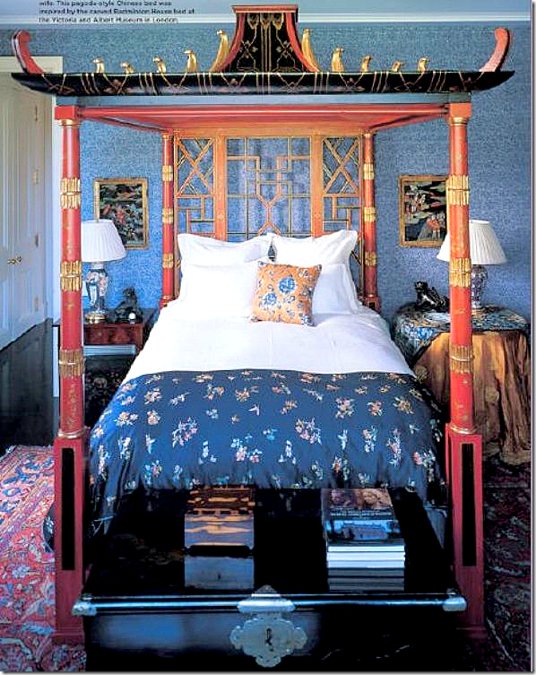
Interior designer Michael Smith recreated his own version of the Badminton bedroom with this pagoda styled bed. 


image

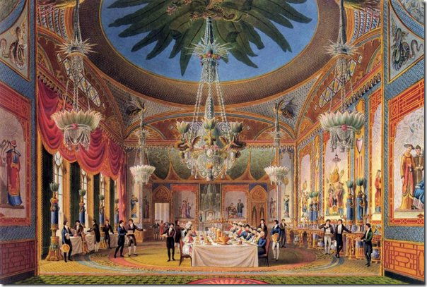
Another lavish example of Chinoiserie interior design is the Royal Pavilion at Brighton Palace, built for King George IV while he was still the Prince Regent.  While the exterior of the whimsical and exotic castle is Indian inspired, the main rooms inside are pure Chinoiserie.   Here the Banqueting Hall is shown in a painting.   Notice the large Chinoiserie figures painted along the walls. 


image

On the more famous of the Chinoiserie follies is the Great Pagoda located in Kew Gardens.  Built in 1762, there are 10 stories in the structure, each with its own Chinese styled roof.   The structure was reopened to the public in 2006. 


image

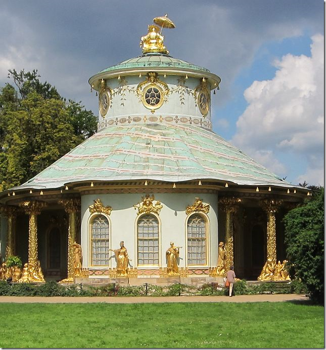
Built for Frederick II, the Potsdam Chinese Tea House is on the more important examples of Chinoiserie.  Notice the charming figure on the rooftop.


image

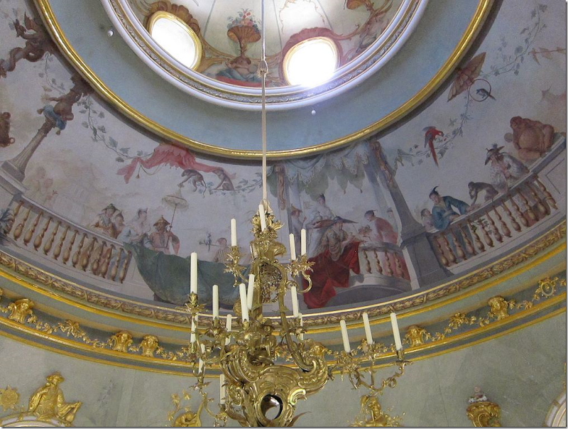
A look at the gorgeous paintings in the rotunda of the Potsdam Chinese House. 


follie

Many of the original follies are no longer standing.   Some were designed, but never built.   In the 1990s, Michael and Dodo Cunningham-Reid bought 500 acres as a game sanctuary on the shores of Lake Naivasha, Kenya and built this nine story pagoda.  Originally, they lived there, but it now available to rent on holiday.   Amazing!


image

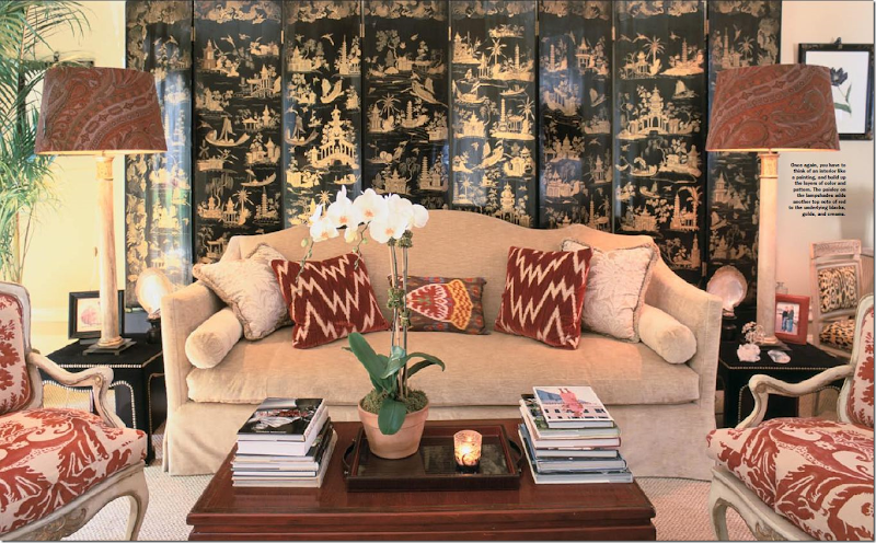
Today, Chinoiserie still influences interior design.   Alessandra Branca uses touches of it in many of her designs.  Here, in her NYC pied-a-terre, a large lacquered screen adds an element of Chinoiserie.    The low coffee table is also Oriental. 


image

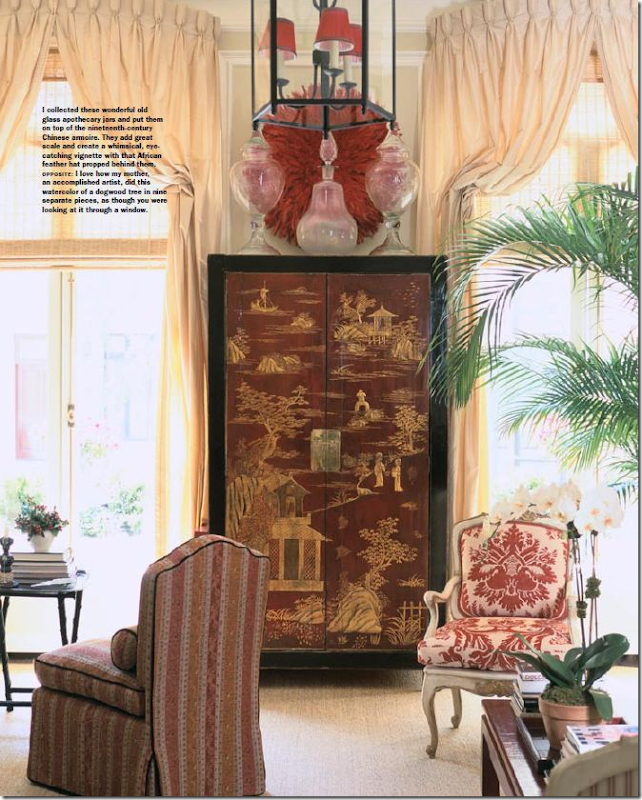
In the same room, Branca uses a large 19th century Chinese armoire. 


image

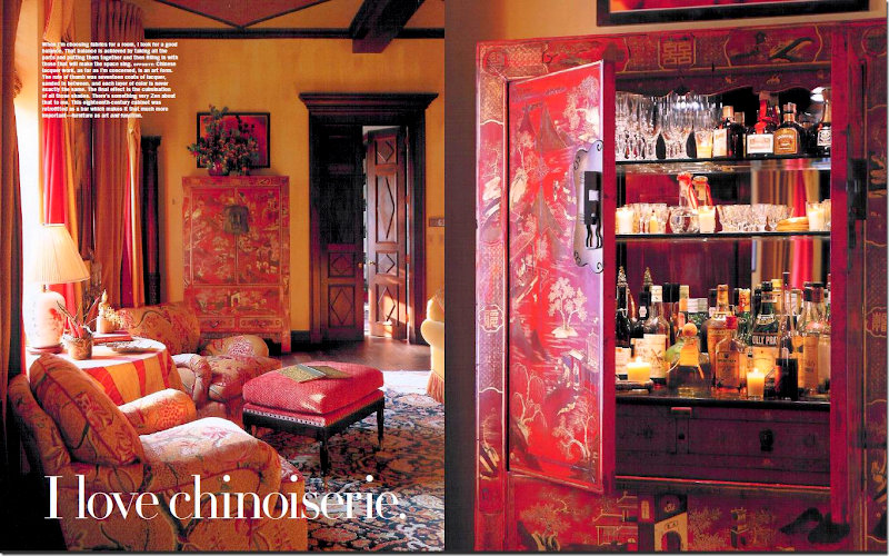
Here, in another apartment, an 18th century armoire is retrofitted into a bar.   In the caption Branca describes the lacquering technique:  17 layers of lacquer, each a slightly different color, are added, after first being sanded.   What a gorgeous bar!


image

Here, Henrietta Spencer-Churchill uses a screen featuring the art work of Pillement. 


image

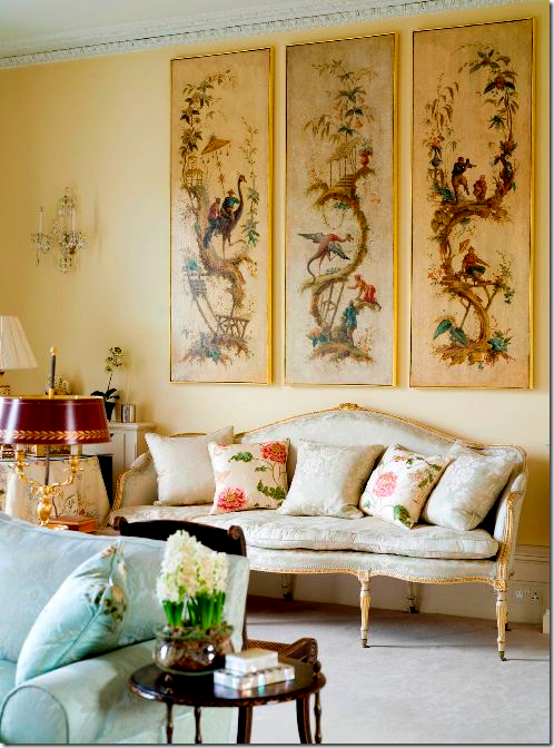
Here, one of a framed series of works by Jean-Baptiste Pillement.   Pillement is the best known artist of the Chinoiserie period and continues to be the most influential today.   Born in 1728, his work helped to spread the Rococo style throughout Europe.    His early art was mostly romantic landscapes and he quickly caught the eye of royalty such as Maria Theresa, Marie Antoinette, King Pedro III, and the King of Poland, whom he worked for, sometimes painting entire rooms.     He is most famous for his Chinoiserie drawings which  were also used on porcelains and potteries and tapestries.  He was quite prolific, and lived to be one month shy of 80.  


image 

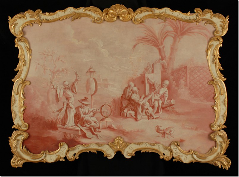
An original work of art by Pillement. 


image

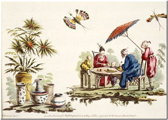
An another. 


image

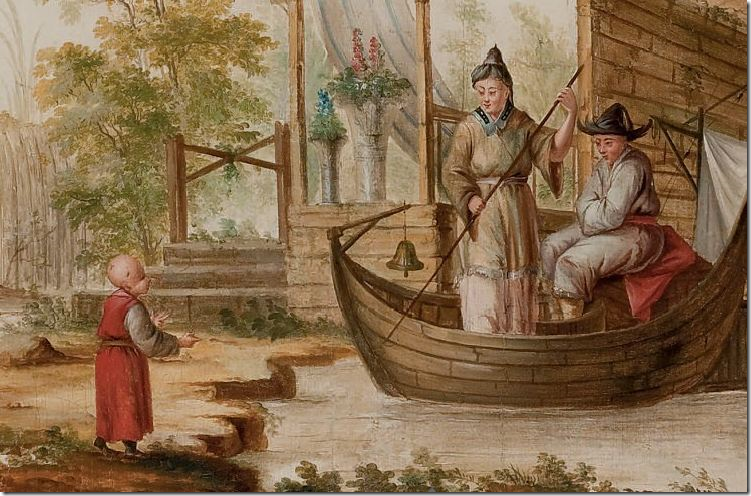
Here is a detailed close up of the previous painting.


image

Pillement is still relevant today – his influence is wide.  Scalamandre’s most popular toile, Pillement, is based on his work.  Here, a bedroom by Alessandra Branca is wallpapered and curtained in Pillement Toile.


image

Interior Designer Phillip Sides also used the beautiful flowing Pillement Toile in this bedroom.


image

Schloss Niederweiden – painted entirely by Pillement!


image

Thomas Corrigan used original works by Pillement in this incredible living room at his French estate.


*******************************

OK OK OK – I KNOW this is a giveaway.   I’m getting to the juicy part now!!!!!


image


image

One of my favorite prints by Harrison Howard is “The Fisherman.”


One artist today highly influenced by Pillement is Harrison Howard.   The son of a famous artist himself, Howard works out of San Diego where he paints the most wonderful, imaginative works of art.   Earlier in his career, he created murals, works of art and screens for the private houses of the rich and famous.  Some of the finest interior designers have hired him to create custom murals along with series of art works.    Today, his focus is more on smaller paintings, although he still takes on commissions.   I first saw Howard’s work on The Peak of Chic blog HERE and being that we are both the same age and both have only children of the same age,  Harrison and I  became prolific email friends.   Throughout countless discussions on design, child rearing and college choices, I had my eye on his wonderful art.  It took me a while to decide exactly which one I wanted, but I finally picked out four of his famous Chinoserie prints.   His art work entices.   At first glance, it appears to be serious work until you look closely at the details and realize how whimsical they  are:   an Oriental beekeeper – working underwater amid all the corals AND blue and white porcelains, his basket filled with shells but no fish!    Howard states that Pillement is an important influence in his work and that is easily seen, though Howard’s work seems more suited for today.   His technique and ability is formidable.   His imagination and talent fills up the canvas – leaving one wondering how does he conjure up these images????  Where do these ideas come from?   They are so fanciful, so innovative – so charming.   I gush.  

Harrison Howard has a wonderful web site, set up for easy perusal of his many works of art.   This week Howard is offering a 25% discount on all his limited prints.   AND, Cote de Texas readers have the chance to win a print of their choice!!!! 


image

Another personal favorite – “The Astronomer”


 THE GIVEAWAY – DETAILS:

To enter this giveaway – all you have to do is go to www.harrisonhoward.com and pick out a print you like best.  Come back to the comment section and let me know what you  picked!  I will choose a winner this Friday at 11:59 p.m. – so hurry up!!!!   


image

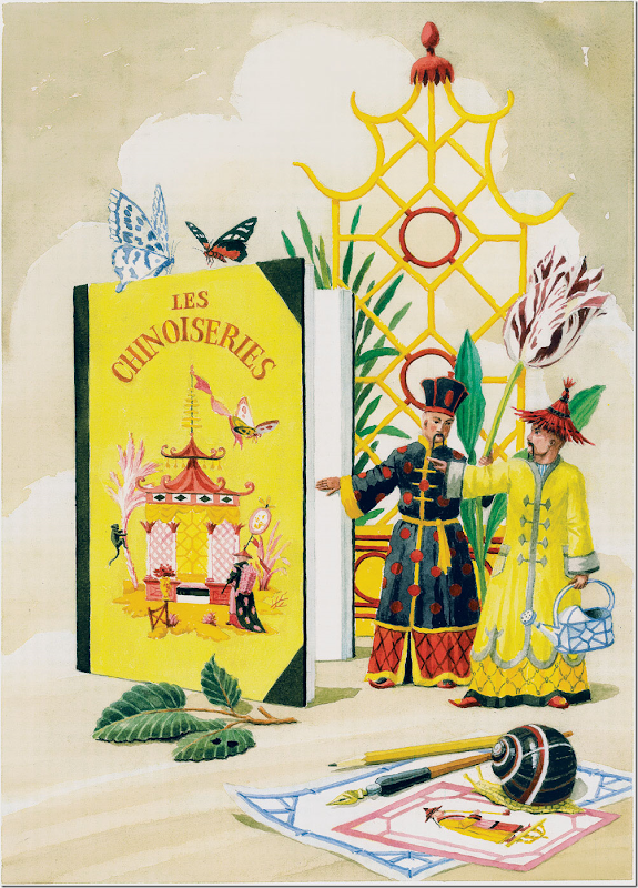
OMG!!!!   I could just die over how much I love this!!!!!  Notice the prints under the pens!    The characters walking out of the book – coming to life!!!  Whoa!  How does he think up these scenes??!!!

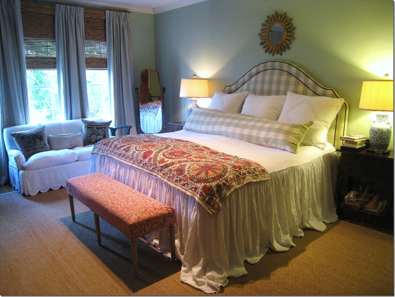
MY BEDROOM WITH MY OWN FOUR HARRISON HOWARD PRINTS:


image

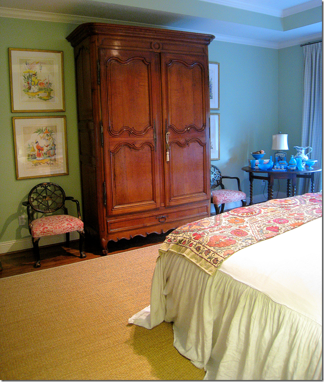
My bedroom – facing the bed is an armoire where I wanted to hang the Howard prints.


image

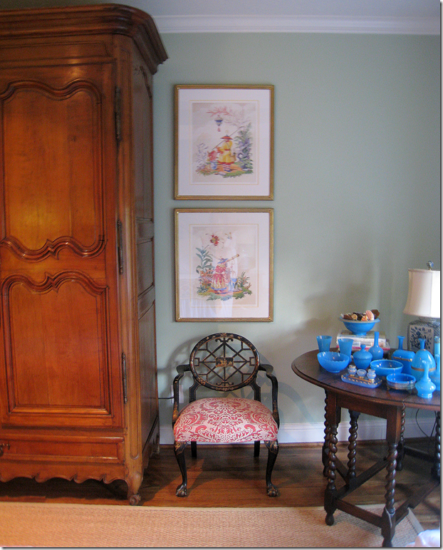
On the opposite wall- besides the armoire, are the four prints, two on each side.  It’s impossible to get a picture of all four together!


image

Looking at the other side.

***********************************************

REMEMBER:   To enter the giveaway for the Harrison Howard print, go to the website www.Harrisonhoward.com and pick out your favorite print.  Come back here and tell me which one you want in the comment section.   You have until midnight Friday – so hurry!!!!  AND remember also – that all prints are now on sale at 25% off.


And, Harrison – a huge thank you for your generosity!!!!!!!   Thank you so very very much!!!

David Easton and the Center Table

60 comments


image


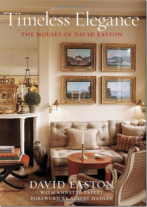
This week Linda, Megan and I were thrilled to interview noted architect and interior designer David Easton on The Skirted Roundtable.  Never having heard him speak before, and only having read his interview on the NY Social Diary HERE – we didn’t know quite what to expect.   Our interest was piqued when just before we started, his assistant wondered if we did any editing!  Mr. Easton was a delight and a total surprise.  Expecting someone dour and serious, he was mostly fun and he certainly likes to tease.   Engaging and warm, he turned the tables around by asking us questions about our ourselves.   We talked a lot about science fiction – something he is obsessed with – and what he thinks the future will be like.   He doesn’t see much hope for the cabriole leg, unfortunately.   We did manage to fit in some discussion of interior design and his new book which is a compilation of his most noted and favorite projects.    I recently wrote about one house – his own country estate Balderbrae which was sold a few years ago.   While talking about Balderbrae, the subject of his space planning came up and how he likes to design a large main living space which many times encompasses a dining area.  Easton is enthralled with one room living which includes the office in it.   When designing the interiors for these spaces – he tends to use a center table to divide the seating areas.   

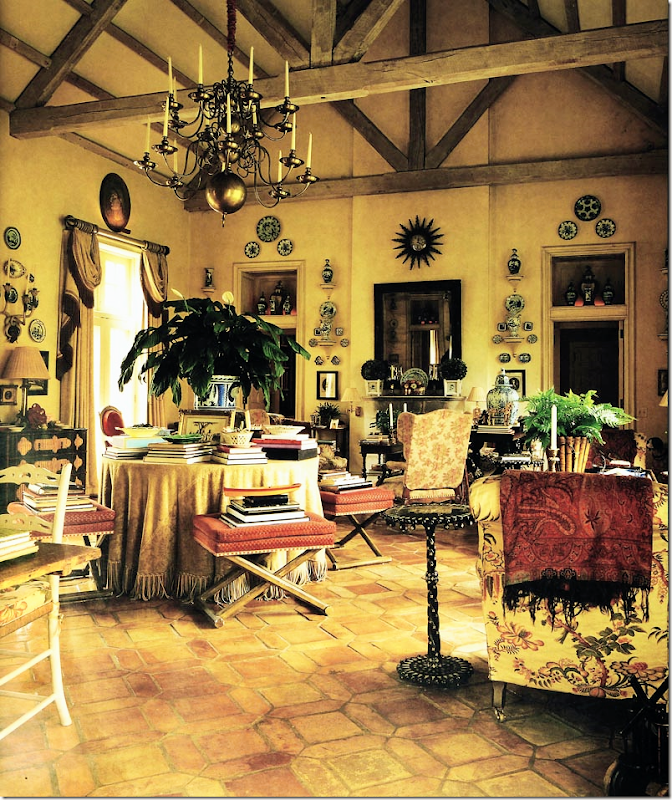
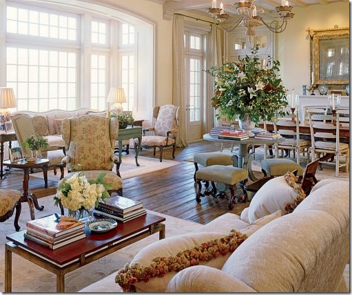
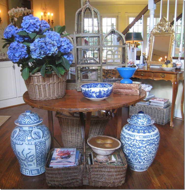
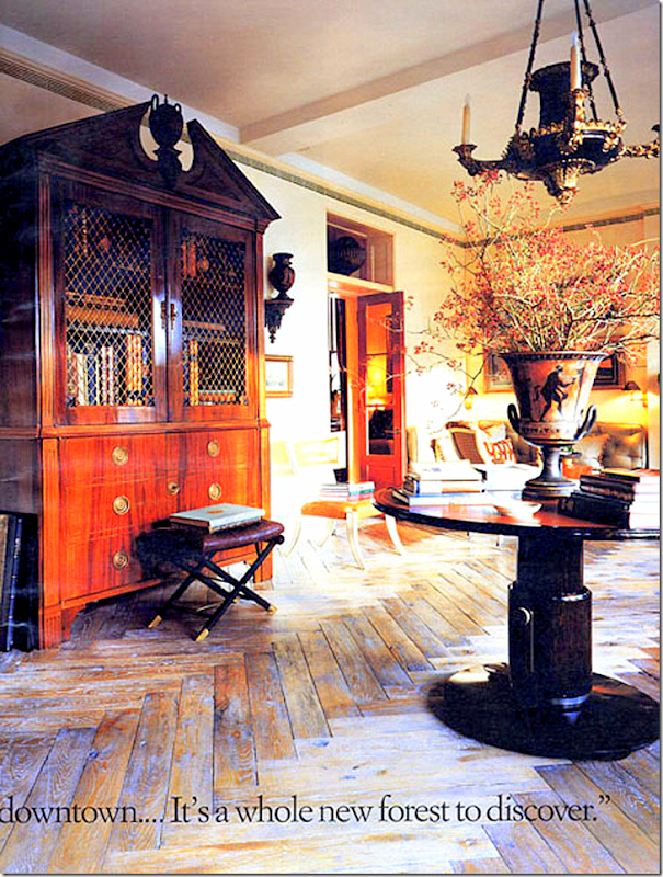
I love a center table, whether in the living room or the foyer.   The center table is wonderful in a cluttered design – piled high with masses of books and accessories.   I have one in my entry hall and its tablescape changes on a whim.   For years a large birdcage stood in the center of it, now an overscaled urn takes its place.    The center table has long been a decorating tool.  Finding images of contemporary interiors with center tables was not as easy as the more traditional designs.   The table can be round or hexagonal, but square is rarely a chosen option.   The table is often bare though skirted is a popular choice.   In our interview, Easton freely admitted that he often chooses to use the center table and is quite fond of it.    Though his rooms are very large, the center table can be used in smaller rooms where an off-center placement may be preferable.  

Below are some examples of how to use this popular decorating element – the center table.   Enjoy!


image

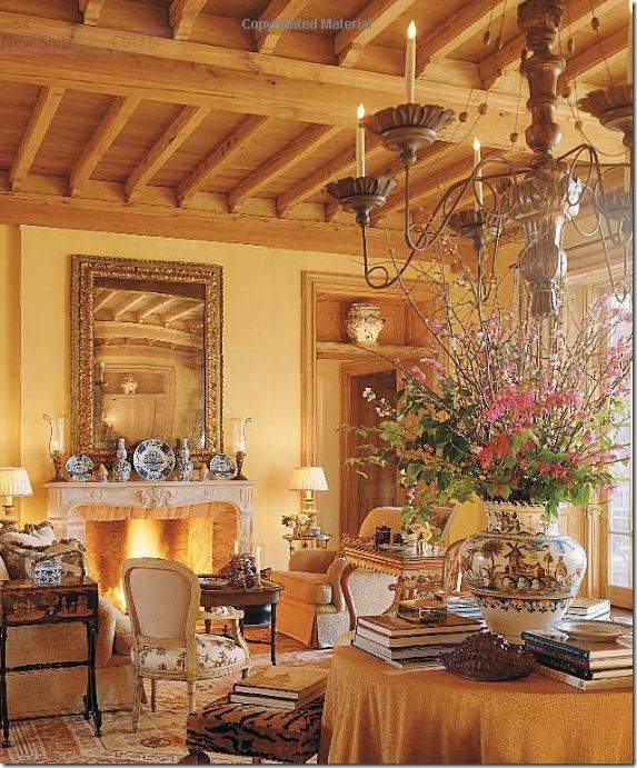
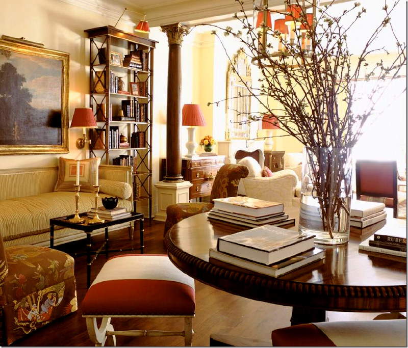
Balderbrae – the one room living and dining space combined with fireplaces on both sides.  Easton uses a skirted table here to divide the room into the seating and eating area.   He usually surrounds the center table with stools and masses of books.


image

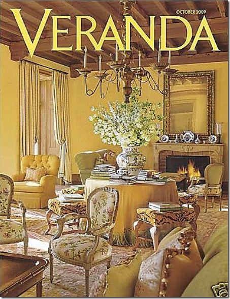
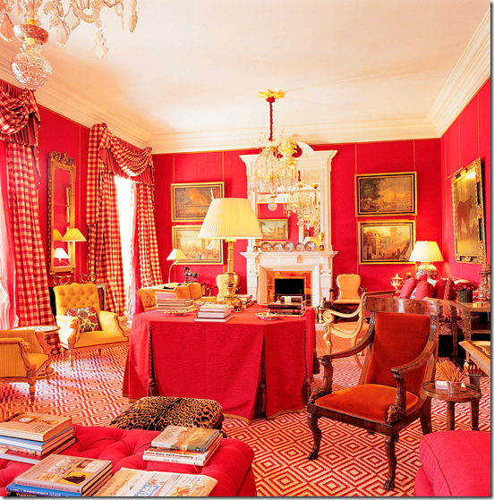
This Easton house in Dallas shows a skirted table surrounded by tiger skinned stools.  Again, it is piled high with books.   Also notice the cubbies above the doors are the same as at Balderbrae.


veranda1

Same house, looking the other way – here you can see there is a fireplace at both ends of the room, just like at Balderbrae.


image

This garden room is divided by a skirted table.   Notice the pair of French chairs with a lacquered back – how pretty!


P1180429

In his own NYC apartment, an antique wood table divides the room.  Easton says that one room living is his favorite kind:  he even likes to include the office in the living space.  Here you can see his and his partner’s desk back to back.


image

And, looking the other way at this NYC apartment.  Notice the cubby above the door!  What a pretty door to use on the interior, instead of just an exterior.


image

Here, Easton uses another antique table to divide the living spaces.  This room is very dressy, not the casually French inspired rooms he does so well a la Balderbrae.


image

In Colorado – a round center table divides living spaces and dining spaces. 


image

The same room – looking at the other side.  Notice there are two fireplaces here also.   And, instead of the cubby above the door, there is a transom.   Easton recognizes that doors look better reaching up to just a foot or two below the ceiling – but in high ceilinged rooms this can be a problem.   He fills in the extra foot or so with either a cubby, a transom, a painting or a collection of plates.   As I tell him in the interview – Easton is a master at furniture placement.  Never is anything out of place, nor “wrong” – no bad fabrics choices or pillows or accessory, everything is always perfect.  


image

At a beach house, this center table is a less dressy choice.  Shells and books share the tabletop.


OTHER DESIGNERS:

image

Charles Faudree:   Other designers share Easton’s love of the center table.  Charles Faudree from Tulsa has a similar aesthetic to Easton.   Easton’s partner, the artist Jimmy Steinmeyer, also hails from Tulsa and he has illustrated all of Faudree’s books.    Faudree, like Easton, has used the one room living space plan.   Several of his own custom designed houses have employed two fireplaces with a center table dividing the living and dining spaces.   Here, two fireplaces face each other in a very large living/dining room.    A painted square table divides the two areas – one of the few times a square shape is used.   This room is also perfection – Faudree is every bit the master at interior design that Easton is.   The room reminds me of Balderbrae!


image

Faudree:    The center table doesn’t always have to be used in a large room.  In this small study, a center gate leg table is used to divide the room.    I think the table makes the room look so much more cozy and inviting!


image

Alessandra Branca, the Italian interior designer from Chicago, loves to use center tables in her designs.   Here an antique wood table piled high with books divides a living room.

image

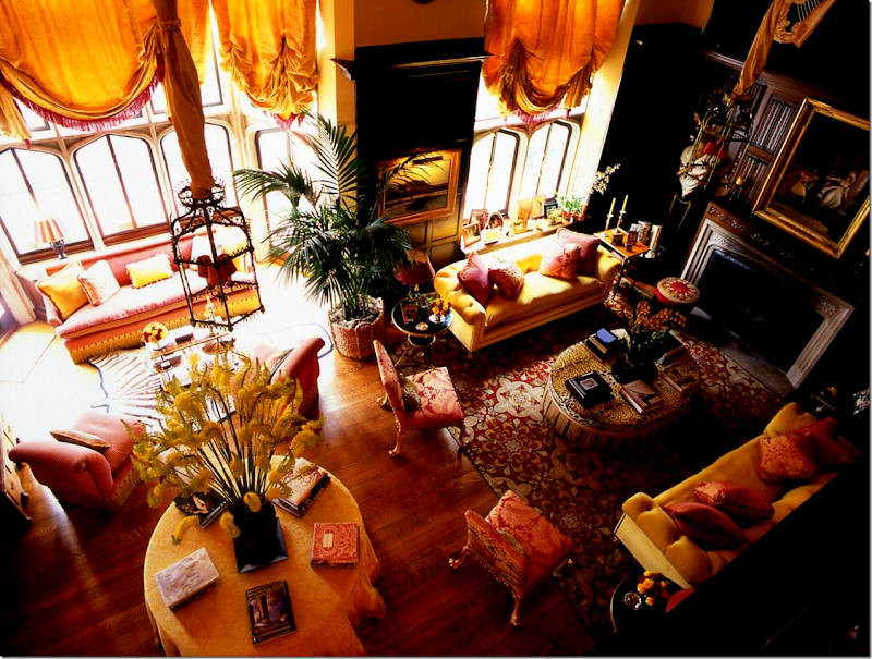
Branca:  Looking down from a second floor, a round yellow skirted table divides this expansive living room. 


image

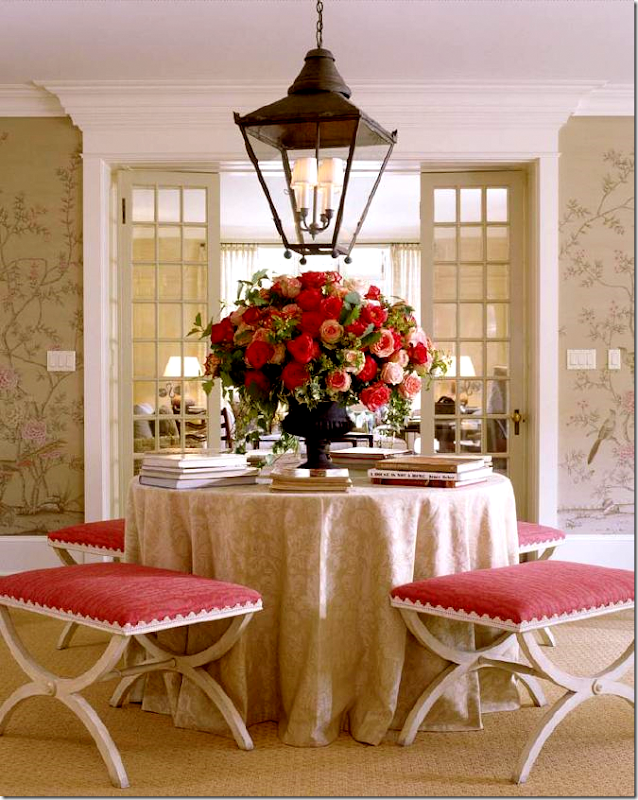
Branca:  Too beautiful.  Those stools !!!!  Whoa.   Here a muted fabric covers a skirted table – lit by a large outdoor type of lantern.  Gorgeous hand painted wallpaper wraps the room.   This is like eye candy – your mouth waters just looking at it!!!


image

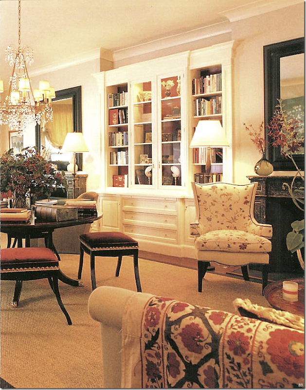
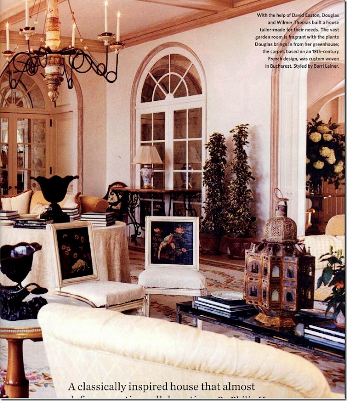
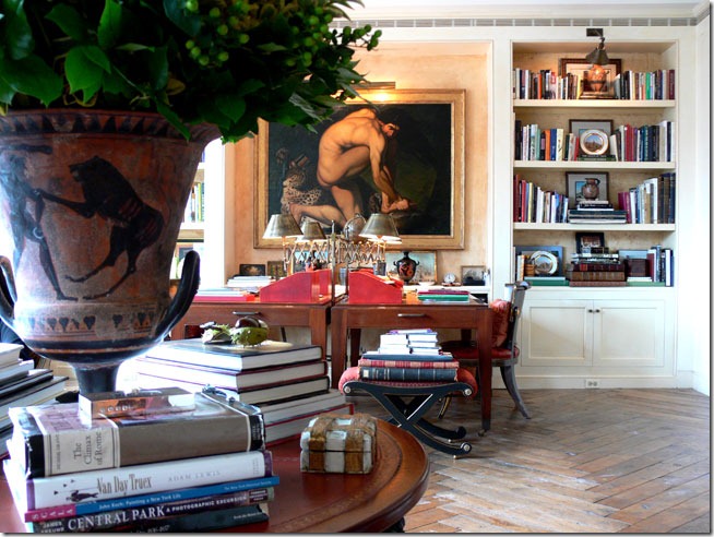
Branca:   In a large space, a wood table divides it.   Here, Branca used a crystal chandelier over the table.   I love the way she uses trim on her stools – here and above.    She is one of my favorite designers – I love everything she does.


image

Branca:  Here, Alessandra designed a penthouse suite in a L.A. hotel.   She used a large, painted round table to divide the living space.   Stools surround it.  Book this room for me!  
 

image

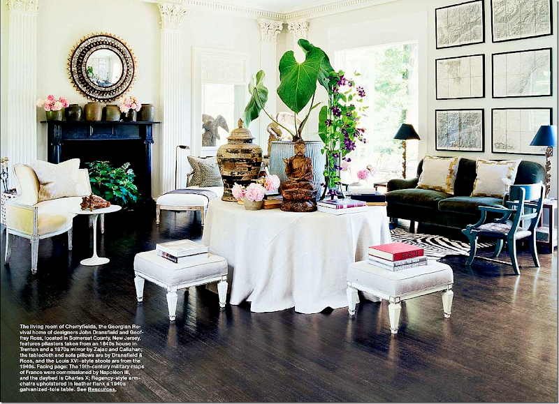
John Dransfield and Geoffrey Ross use a large, casually skirted table to divide the living room in their country house.   Their style is much more eclectic and less formal than Easton, Faudree and Branca, yet the use of the center table looks perfect.   Notice the gorgeous columns and  molding!


Snap322

Vicente Wolf:   in one of my personal favorites from his portfolio, Wolf uses a gorgeous antique table to divide a large living room.    Here, the table is topped with accessories, not books, and a sturdy, upholstered ottoman grounds the setting. 


whealon1

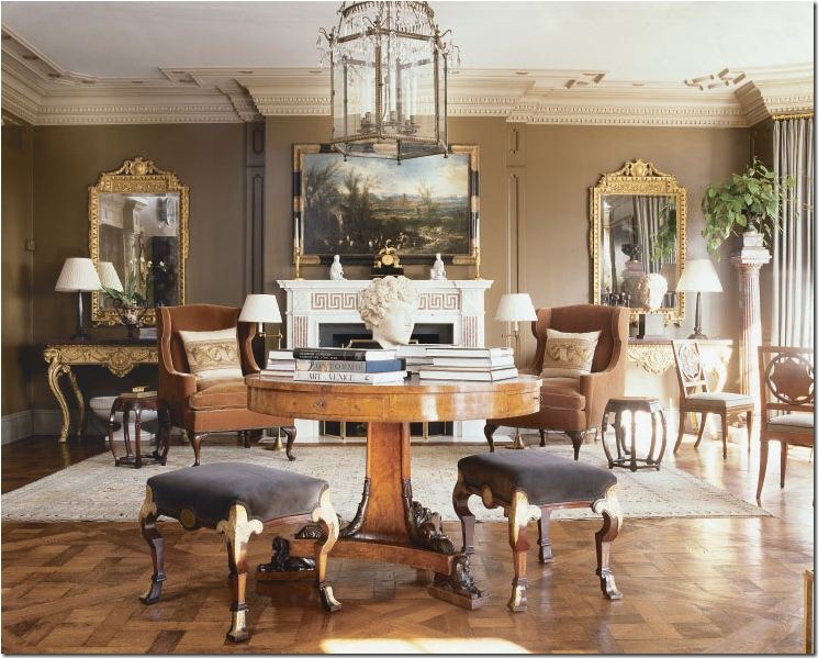
Timothy Whealon:    Whealon uses an antique table, surrounded by antique stools in a dressy apartment.   A large lantern hangs over the setting.   Placing a light fixture over the center table is a wonderful choice – and should be considered if at all possible.


ireland6

Kathryn Ireland:  In her own California home, a skirted table stands in her living room – acting as a division between the entrance and the room’s interior.   Ireland changes the table’s covers frequently. 


image

John Stefanidis:  Stefanidis used a large octagon shaped skirted table to divide areas in a very dressy family room.   Classic.   I don’t care for the lone lamp on the table – I think something bulkier might have been better.  I know,  I know – who am I to question the fabulous Stefanidis?!!!  What chutzpa!   It’s OK, he knows I love him.   Completely!  In fact, his book – Living By Design - remains one of my favorite all time design books.

OTHER CHOICES:

image

Jeffrey Bilhuber:    Some designers prefer to use a back to back sofa to divide a large living space.


image

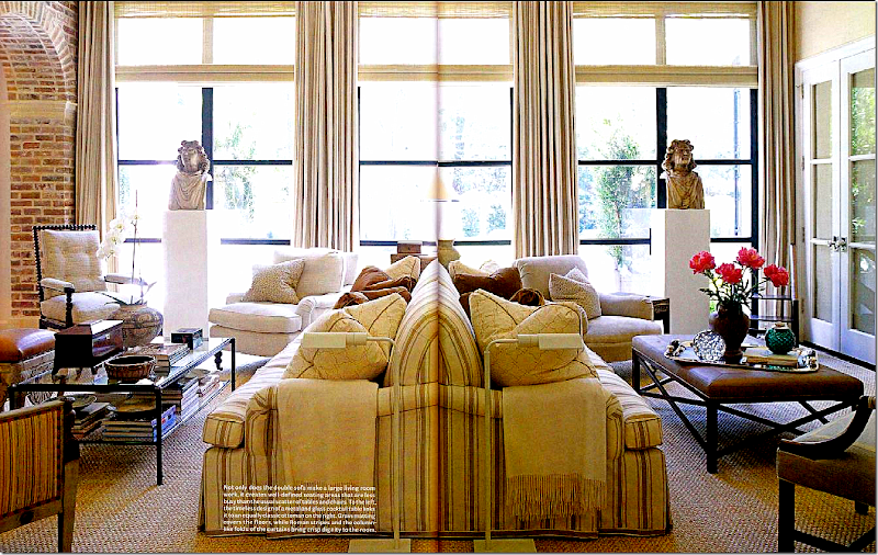
J. Randall Powers:   Randy used a back to back sofa in this large family room in Houston (this picture is distorted in the middle!)   The casual striped linen fabric tones down the room, making it less dressy.  What great pillows!  So large!!!   This room is just perfection – I love, love, love it.    The window treatments are wonderful – I love the busts. 


image

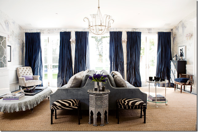
Windsor Smith:  Windsor is a designer who often employs the back to back sofa.   She designed several versions of it for her furniture line.  Here in a dreamy living room – the velvet covered sofa takes center stage.   I love the curtains here and the touch of zebra.


image

Windsor Smith:   Windsor does more contemporary designing too – not as often, but she does do it.  Here she changed the lines and details on the sofa to reflect the Hollywood Glam vibe of the room.


image

Windsor Smith:   Her white slipcovered back to back sofa with the “butter pats” hem edge is her most famous.   Here, a beach house is the perfect location for the back to back sofa – which faces a fireplace. 


image

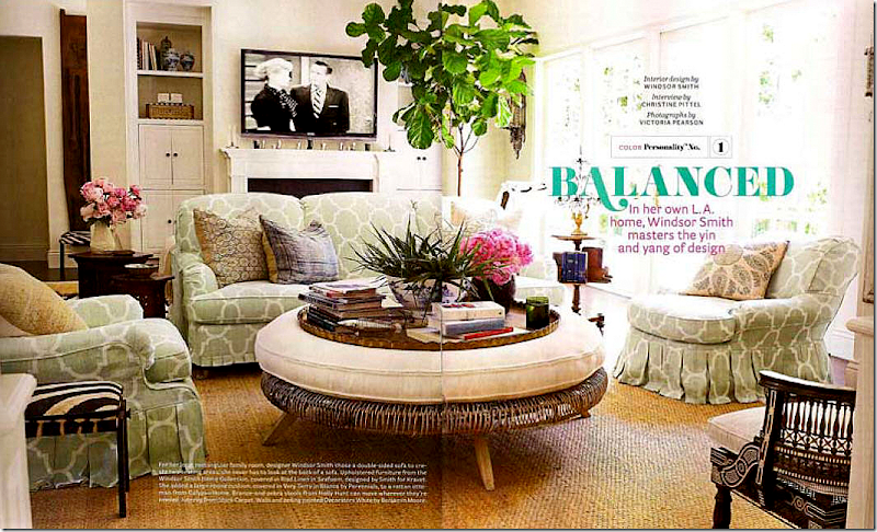
Windsor Smith:   In her new home, a back to back sofa in her own Kravet fabric, again has the butter pats hem.   Here, the sofa faces a conversation area on one side and the tv and fireplace on the other.  See below:


5346239

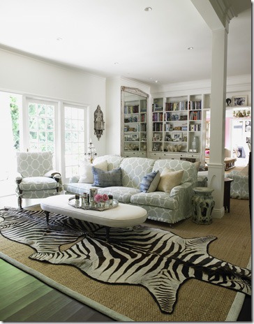
Windsor Smith:   The other side of the her family room.   Great double zebra rug!


image

Windsor Smith:   In her former living room, the white slipcovered back to back sofa rests along side the fireplace.    The walls are such a great shade of barely there pink.   Notice how she placed the chandelier right above the double sofa.    This house was so beautiful – it makes me sad to see the old pictures of it!


Which do you prefer for dividing a large room?   A center table or a back to back sofa????

image

Joni Webb:   An earlier version of my center table – with the bird cage.   This looks so much better than it does now!   Oh well.  Things change, not always for the better.


image

For holidays, I use the center table for overflow seating!  Last year I had six at this table.


image

The year before I only needed four extra chairs.  Our family is growing!  We’re having a big wedding this March when my nephew Jeffry gets married. 


image

To order David Easton’s new book, which I highly recommend if you are a fan, click on the name of the book below:


image

And remember to listen to this week’s Skirted Roundtable with Mr. David Easton!  It’s an interesting one!!   HERE.


AND FINALLY, FOR YOUR CONSIDERATION:


yellowstone


A special invitation for Cote de Texas readers:

On November 11, Jill Brown of Brown HERE will be hosting an event and auction at her shop benefiting the Yellowstone Academy.  Yellowstone is a private, not for profit, faith based school started in 2001 for children living in extreme poverty.   Opening their doors with just 64 children, the school now serves 320 students and goes up to the 7th grade.  Their amazing student profile is:

  1. 100% of admissions are from low-income families
  2. 87% of students are living in poverty or extreme poverty
  3. Median family annual income is $8,088
  4. 93% live in single parent households
  5. 95% of  students are African American; 5% are Other.

What an amazing success story!   Instead of talking about it, these people actually have accomplished something wonderful for the community.  

Jill has been a great friend to Cote de Texas – she hosted our largest ever giveaway this year when she donated a lantern from Brown and now  for this benefit, she is setting aside 30 tickets for readers of this blog – at $40/person and $60/couple.   The auction will feature great items from Jill’s store such as high and low chandeliers, lights, furniture and more.   If you would like to attend the event or feel motivated to donate to the school, please click HERE for all the information. 

As always, thank you Jill for all your support.


A video starring the students of Yellowstone Academy!