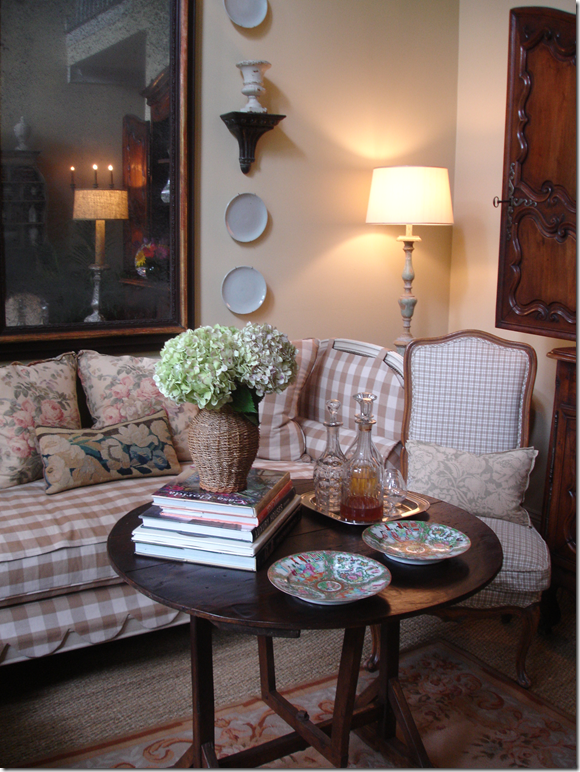
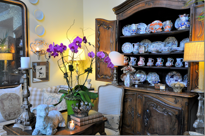
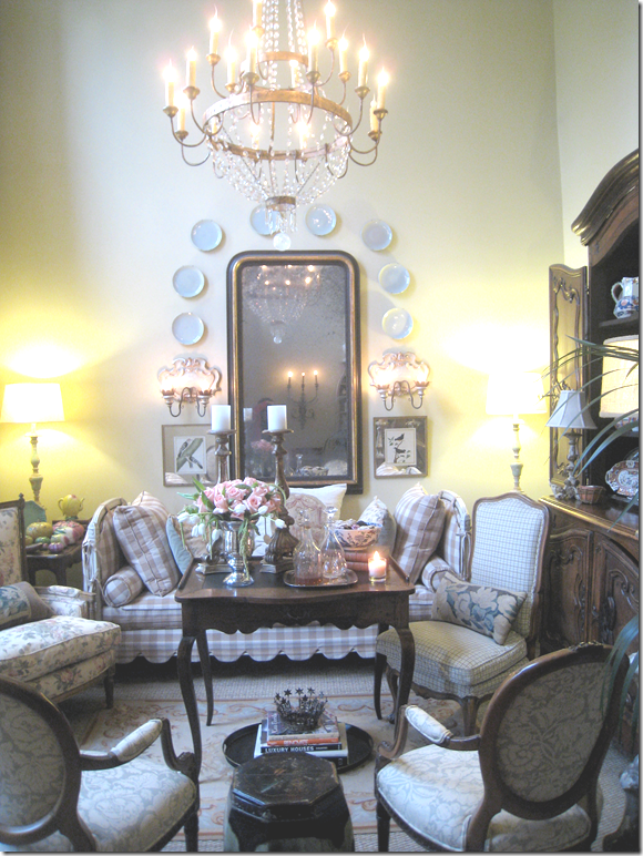
Three years ago (hard to believe it’s been so long!) I wrote a blog story called Evolution of a Room HERE, detailing the history and all the changes my poor living room had been through. This room is one of my least favorite in the house. It’s ceilings are 1990s high without any real purpose or architectural reasoning. It’s the first room you see when you enter the front door, so, I have always tried to keep it looking tidy and attractive, always putting out fresh flowers. But, in truth, I have never once sat in this room in 17 years. Never have I sat there just to read a magazine or a book, or to pet the dogs, or watch the activity outside on our family filled street. I’ve thought if I could somehow change the room around, I would use it for more than just a furniture showroom – perhaps putting in a flatscreen would draw us there. My ultimate dream would be to turn it into a library, where shelves lining the blank walls would reach up to the tall ceiling. I surely can use the shelf space and the library would certainly pay for its portion of the mortgage. But, until I undertake such a huge endeavor, I continue to decorate the room over and over again seeking the perfect combination of coziness, warmth and a casual elegance. It all started with a picture of a living room in a long forgotten magazine – though it probably was Southern Accents - some twenty years ago.
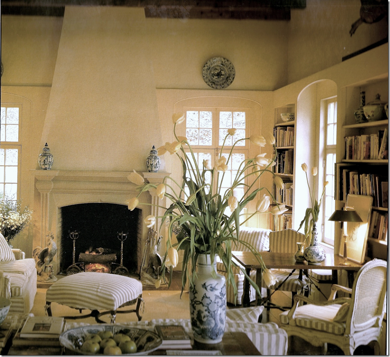
We had just moved to Ft. Worth, Texas – into a small but cute new house when this living room designed by Atlanta designer Dan Carithers caught my eye. I was crazy for this room and must confess I still am, all these years later. The style looks very similar to one I still employ – the linen slip covers, the wood antiques, the painted finishes, blue and white porcelains, and piles of books. It’s a slightly cluttered look, casual, welcoming and sophisticated – and obviously classic. I tried to copy this look in my own living room:
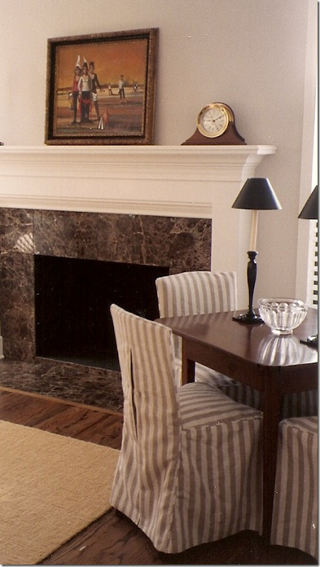
My oh so young Ben (before he was a Mr. Slipper Socks fuddy-duddy), with our beagle Reggie, in our Ft. Worth living room. All the furniture was upholstered in this linen stripe. There was a large wicker chair and ottoman and the two French chairs that were once my mother’s mother’s. The painting above, on loan by my parents, is by Herb Mears, a noted Houston artist – who is the father of the noted Houston architect, Kirby Mears! I wish I hadn’t used a flash so you could really see how beautiful this painting is!
Instead of seagrass, I used a coir rug over the hardwoods. I slipcovered four chairs around a wood table. I remember I loved that dark brown marble so much, we also used in our Houston house. We lived in Ft. Worth for about a year and a half, then moved back to Houston to the house we now live in.
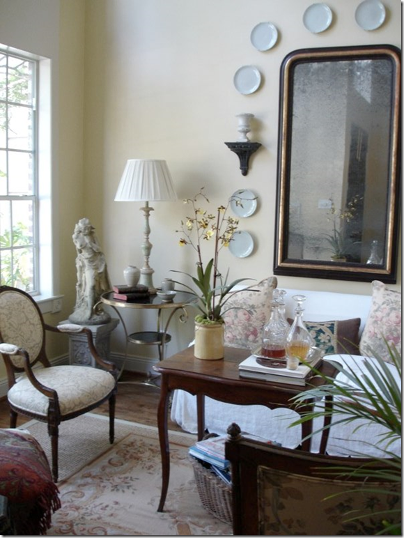
OK. Now, don’t laugh. These pictures get REALLY, REALLY embarrassing. Once we moved into our Houston house, the Dan Carithers living room never really looked that good here. The sofa was too large, for one thing, and I tried to cozy it all up in an Englishy-cluttered manner. But…..well, I was young and poor.
Here’s another big change – the coir rug became a kilim. An Indian bedspread was a fake slipcover and I added this large bamboo shelving unit I found at Shabby Slips. OY! I do notice that I have by this time bought the lamps I still have, the mirror is all still here, as are all the chairs that I use today.
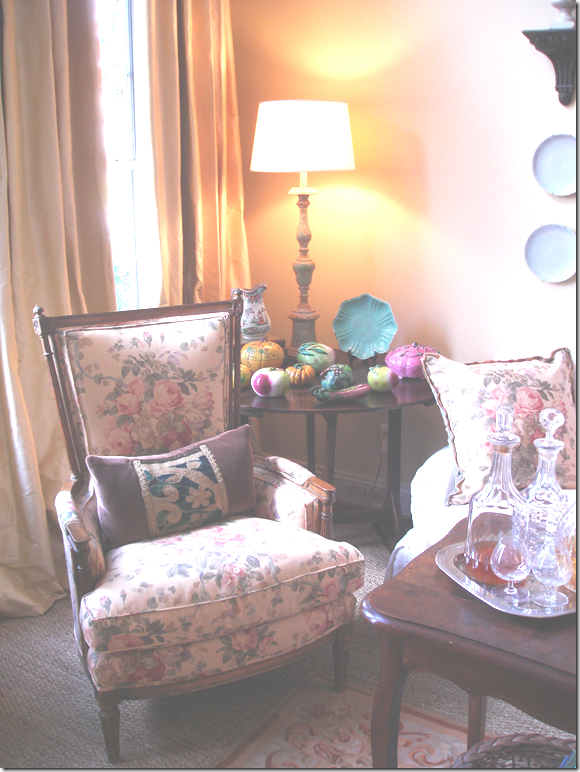
Big changes. So, the taupe stripes are now completely gone. I bought this small sofa from a friend and had it slipped in white linen. All the chairs and pillows were covered in different Bennison Fabrics. I added the celadon plates around the mirror – that are still there today. And, I layered a soft needlepoint rug over seagrass.
The next big change were curtains. Finally. Because the ceilings were so tall, curtains were always just out of my reach. I finally bit the bullet. The curtains really made the biggest transformation to the living and dining rooms both, making them both look sort of professionally decorated.
I moved the slipcovered sofa upstairs because it was always too small for this room and added a checked covered day bed from Tara Shaw.
Next, I bought this large buffet a deux from Tara Shaw which I filled up with Masonware. I was so proud to have bought this on my own without any help from Ben or family! It was strictly from my interior design business, when I still had clients!! It’s been a slow year for me.
Finally, I bought this antique chandelier – also from Tara Shaw – thank God for Tara! The chandelier really completed the room and I thought it would stay like this until we moved out, if ever. Unfortunately, I decided my kitchen needed updating. Never forget, that when you change one thing in your house – you may be starting a game of dominos. That’s what happened to me…
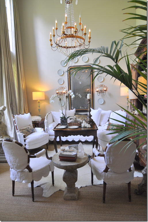
The new white marble countertops caused everything in my house to fall terribly out of sync. The muted yellow walls clashed terribly with the new countertops. Since all the rooms downstairs are open to one another, all the walls had to be repainted. This process of change has taken me a few years to finish. All the walls were first painted a taupish-gray color which was great for the kitchen and family room, but the dining room and living room looked terrible. The silk yellow pinstripe curtains in both these rooms had to go. But replacing them was such a huge undertaking because then – all the fabrics would have to be changed too. I couldn’t face facts for a long time. Finally, I just couldn’t take living with my rooms half gray and half yellow. And yes, those colors do look good together – just not in the two shades I had! Once I admitted to myself that it really had to all change, I was excited because truthfully, I was tired of the twee Benninson fabric in different colors and prints. I wanted an all-over look with just one fabric and no patterns. So….here is what the living room looks like today – and be nice!!! hahah! No, really, you can be honest in your comments, I can take it. I’m a big girl. Sometimes.
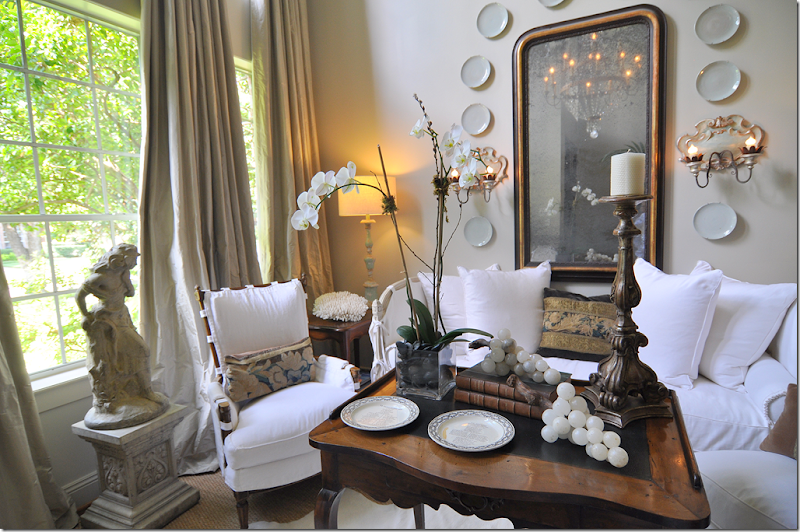
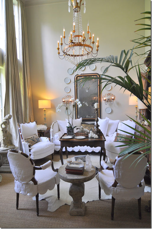
Here is the new look. Everything was slipcovered in a soft, off-white linen. The needlepoint rug was replaced with a large white cowhide layered over the seagrass. Between the two French chairs, I added a concrete table. My two big collections I used to have – the colorful Chinese altarfruit and the English Masonware - were moved out. And the biggest change, after the gray paint, was the new curtains in a taupe gray silk matte taffeta.
The change turned out to be major. When you walk in, all the white and gray really grabs your eye. To anchor the white, I used chocolate velvet pillows with either metallic tape or Dutch tapestry sewn on.
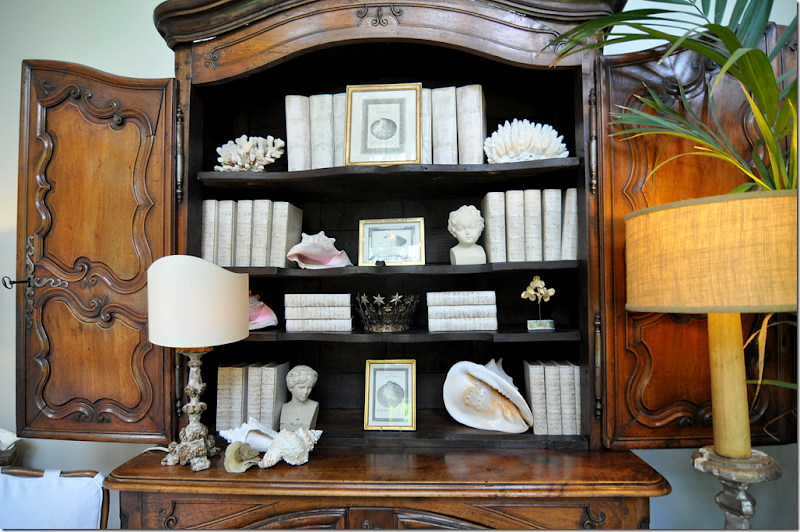
Looking this way, you can see how I changed the Buffet a deux from the colorful Masonware to all white books and shells and old prints.
A close up of the slipcover treatment. On the French chairs and the day bed, I used large scallops. On this smaller French chair shown here, I used tightly placed ballet ties. All pieces have tabs to let the wood show through.
A close up of the shelves. If I ever want even less clutter, I could just keep the doors closed.
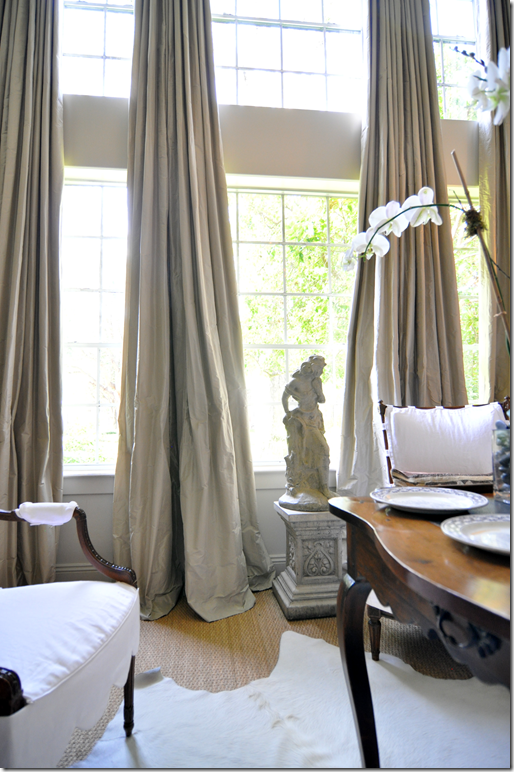
A closer look at the curtains. I used 2 widths per panel of the gray taffeta and I used a lining and a blackout lining to provide a certain heaviness for draping. There are no pleats ironed in, instead the drapes fall softly from the rings. There is a 2-3 inch puddle on the floors. With silks in particular, I like a short puddle, otherwise I think it looks skimpy. Monica of Custom Creations ( 832-443-1931) did all my curtains for me. I kept my concrete lady standing on a column right in the middle of the window.
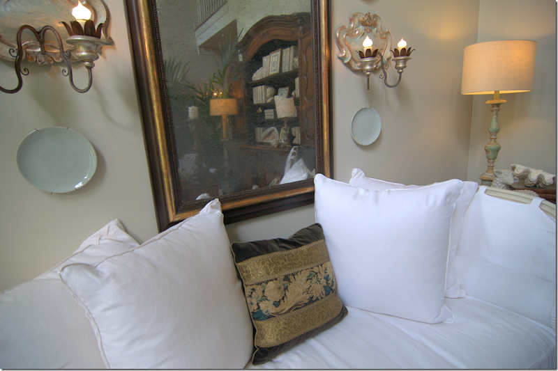
Closeup of the brown velvet pillow with tapestry and tape from Maison Maison HERE. I saw the picture of this pillow on their web site and viola! the next day it was mailed to my house I love internet shopping!
So, that’s it. I think its amazing how much new slipcovers change totally change the look of a room. I can’t sing their praises enough. It’s also amazing how just changing out countertops can set off a domino effect throughout an entire house!! Be prepared for when you change one thing that it might lead to a total remodeling. Of course, my dining room needed some changing too. But, I’ll save that for another day!
If you didn’t read it the first time around, check out Evolution of a Room, Part 1 HERE.
The Evolution of a Room–Part II
West University House Tour #2
Remember the West University Home Tour this past spring? I was hoping to show you all the houses on the wwatour, but unfortunately, I won’t be able to because several are up for publication. The first house from the tour that I showed was Heidi Dugan’s house designed by Ginger Barber HERE. The comments about Heidi’s house were overwhelmingly positive. Thank you all for that. I always appreciate all the comments you leave – I know it takes extra effort and for that I am most thankful.
Today’s house from the tour is different than Heidi’s in one key way. Heidi’s house is new, custom built for her. Today’s house, built in 1940, is original to the neighborhood, which is unusual for West University where many houses are torn down and new, larger houses are built on the small lots. Today’s house, is also unique because its lot size is much larger than the norm and it is located in one of the prettiest sections of West U. Most houses on this street are original: to tear down one of these beauties is almost a sin.
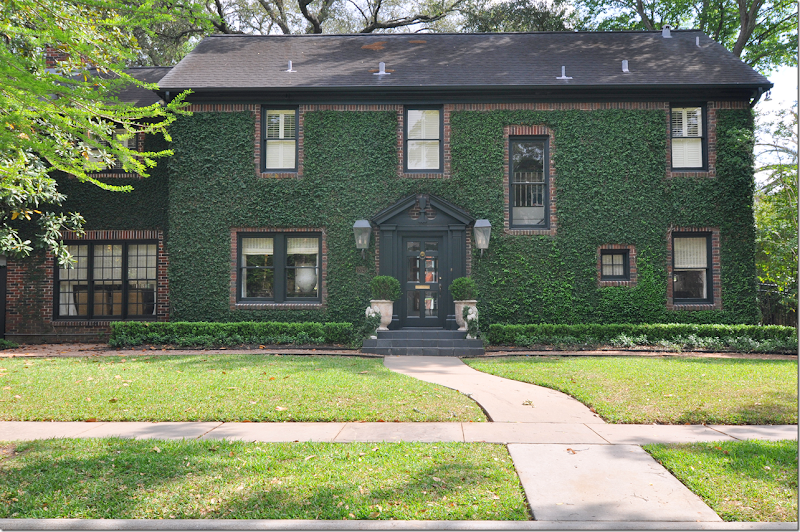
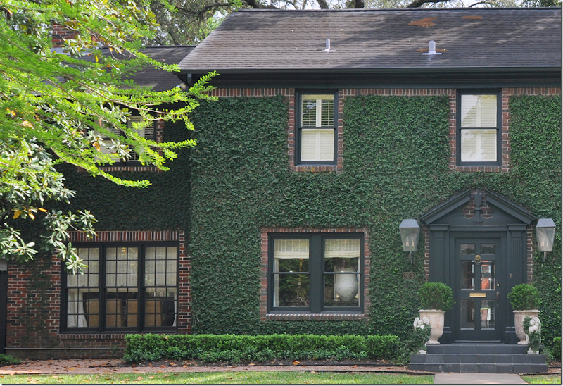
The house’s beauty starts with its curb appeal. It has a brick clad facade that is now entirely covered in romantic ivy. Inside, the appeal continues. The owner, interior designer Mary Jane Gallagher, lives here with her husband and children. Mary Jane has a definite style and the entire house is her canvas. She describes the décor as “casual elegance.” The biggest surprise is found out back. Several years ago, the Gallaghers hired noted architect Kurt Aichler who built a “casita” in the backyard. The casita really sets the house apart – its main room is two stories tall with a balcony that overlooks the first floor.
I am crazy about this house – I love everything here, the design, the furnishings, the accessories. I swear, give me a suitcase and I could move in here today without taking a thing from my own house! Enjoy!!!
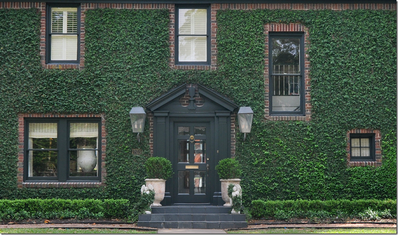
You can tell that a designer had a hand in this house before even stepping foot inside. I love the way the black slate steps are repeated with the black painted Georgian door and the window trim. The ivy is neatly clipped around the windows – emphasizing the red brick. On the front porch with matching lanterns are two concrete angels and two French pots filled with box. The landscaping is all green, rows of box extend from one end to the other. Driving by this house, you would definitely slow down and try to look inside, it’s curb appeal is undeniable.
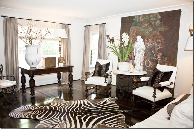
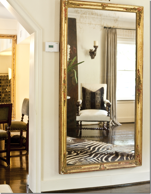
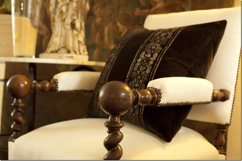
Mary Jane’s style starts at the first room – the living room. The floors are stained a dark brown/black. The plaster walls are a soft white. The décor is a study in brown and white. There is no clutter or small accessories, instead there are several large pieces placed around the room commanding attention. The rug, a zebra skin, is the only pattern here. A large painting, flanked by iron sconces, rests on the floor, standing behind two antique chairs covered in white linen. The pillows are brown velvet with antique metallic trim. The sofa is slipped in white linen.
Looking the other way at the front window, textured blinds hang behind the curtain panels. A large dark stained table stands in the front window along with a tall pot and an even taller gilt lamp.
Closeup of the statue in front of the large painting. The peeling paint adds to its appeal.
On the opposite wall of the large painting and two antique chairs, a tall gilt mirror reflecting the vignette.
A close up of the velvet pillows with the metallic trim.
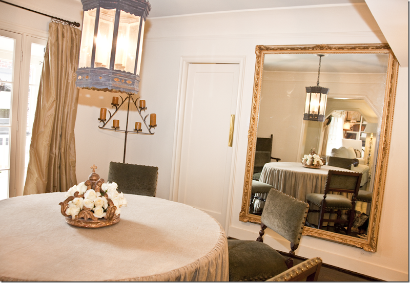
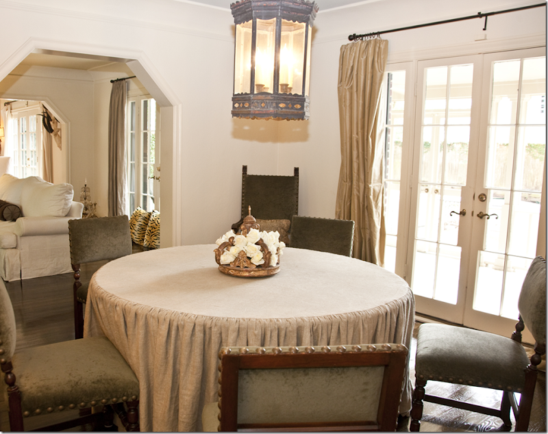
The dining room is between the kitchen and the living room, with views to the backyard and the casita. The table is a round, gathered skirt made of linen. The antique chairs have nail heads and are covered in green velvet.
On the dining room table sits a gilt crown holding white roses.
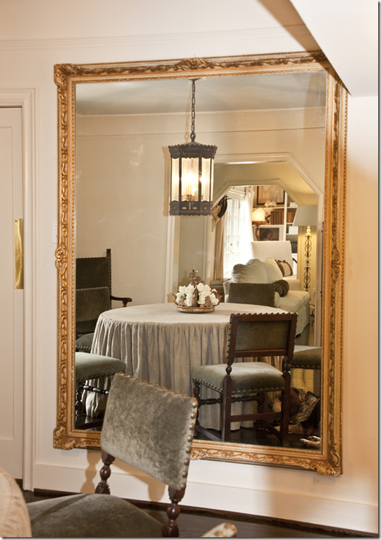
The entire room is reflected in another oversized gilt framed mirror with views of the living room and the nearby family room.
Large French doors open to the back yard. Through the arches is the living room and next is the family room.
In this close up of the façade, the living room is easily seen where the large pot sits in the window. The room on the extreme left side of the house is the family room.
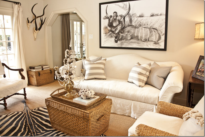
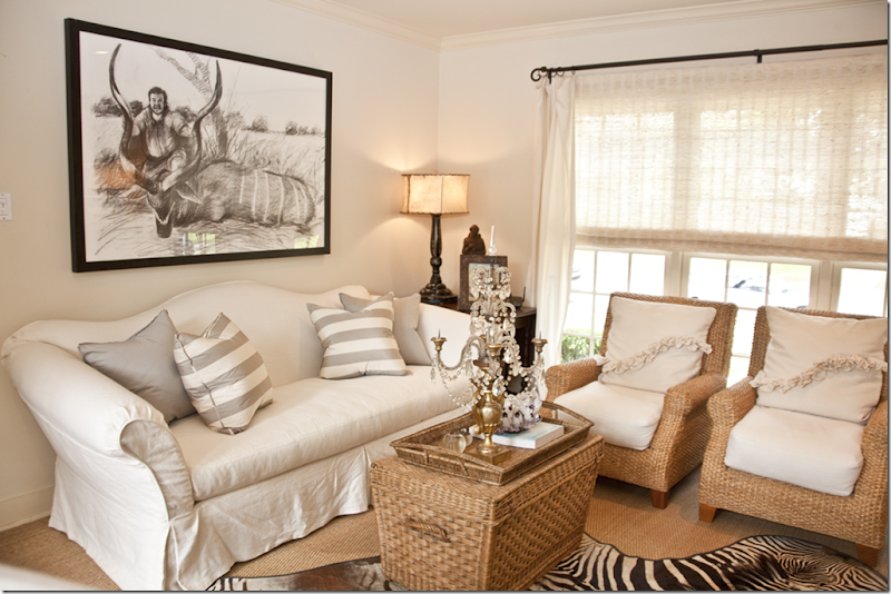
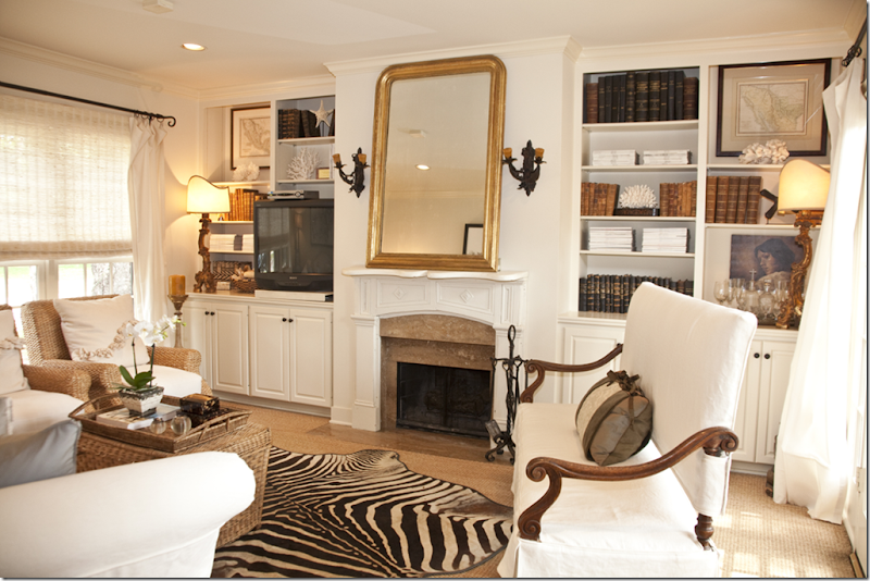
The family room sits next to the living room. Furnished in similar colors and style to the living room, the decor flows from room to room.
Here, a white slipped sofa with a beautifully curved back is mixed with wicker and crystals and gilt. The large window with the textured blinds and flowing white sheers overlooks the front yard. A zebra rug sits on top of the seagrass. I love the gray and white striped pillows.
I love the oversized accessories Mary Jane has placed around the house, like this sculpture that sits next to the chinoiserie lamp in the family room.
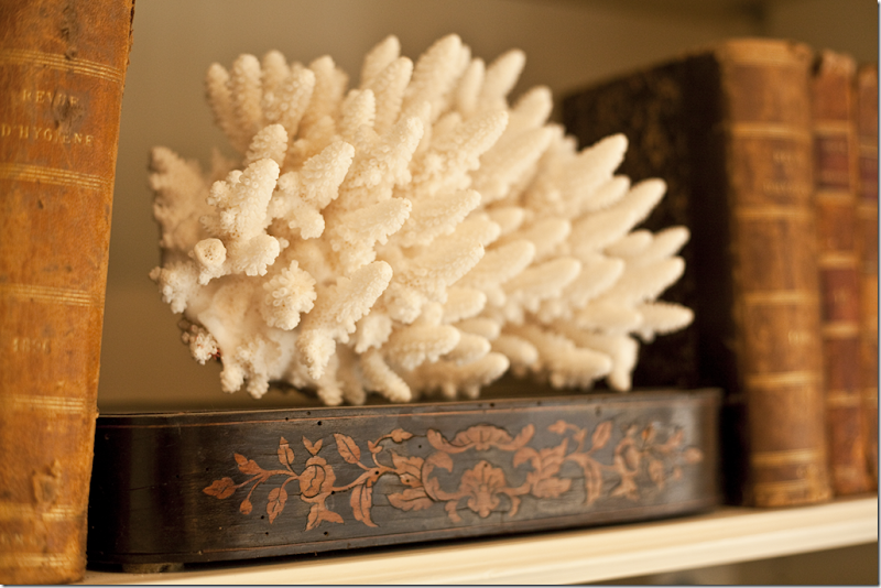
A fireplace sits in between built in shelves filled with antique books, coral, glassware, and framed maps. I love the gilt lamps. A large Louis Philippe mirror reflects the sofa. In front of the back windows sits an antique slipcovered settee.
I love the way Mary Jane accessorized her shelves with a mix of antique books and coral.
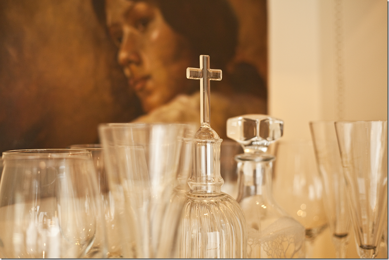
Closeup of a collection of glassware found in the shelves in the family room.
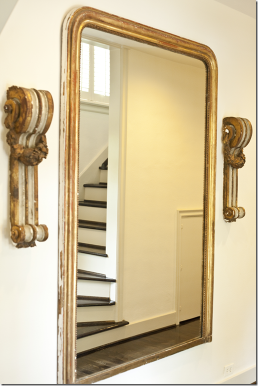
Here is a glimpse of the stairs leading up to where all the bedrooms are located. Another large gilt Louis Philippe is flanked by two antique architectural elements.
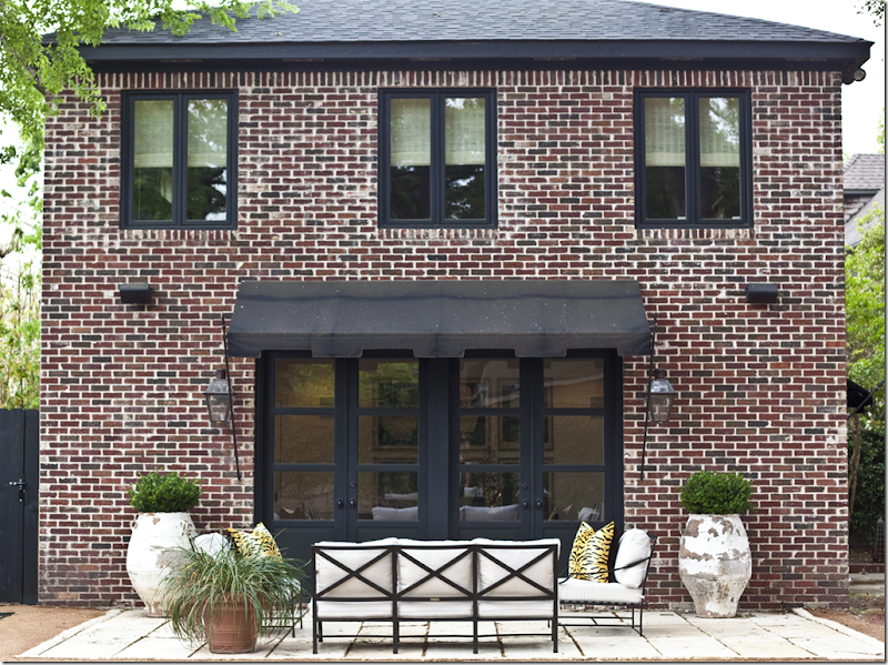
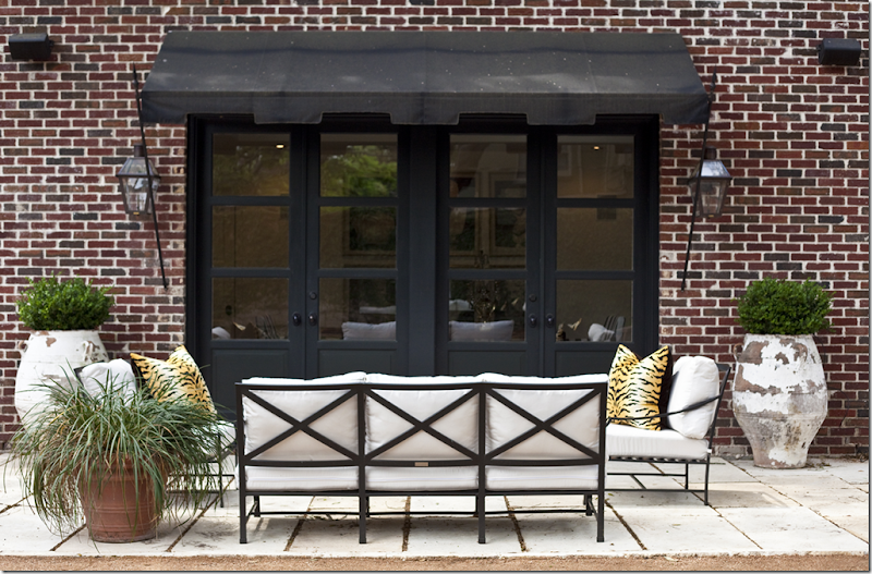
The casita – designed by architect Kurt Aichler. It looks like a miniature version of the “big” house – with the red brick, the black windows and doors – and large box filled pots.
I adore the awnings!!! More box woods and lanterns.
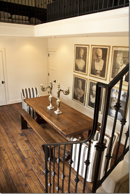
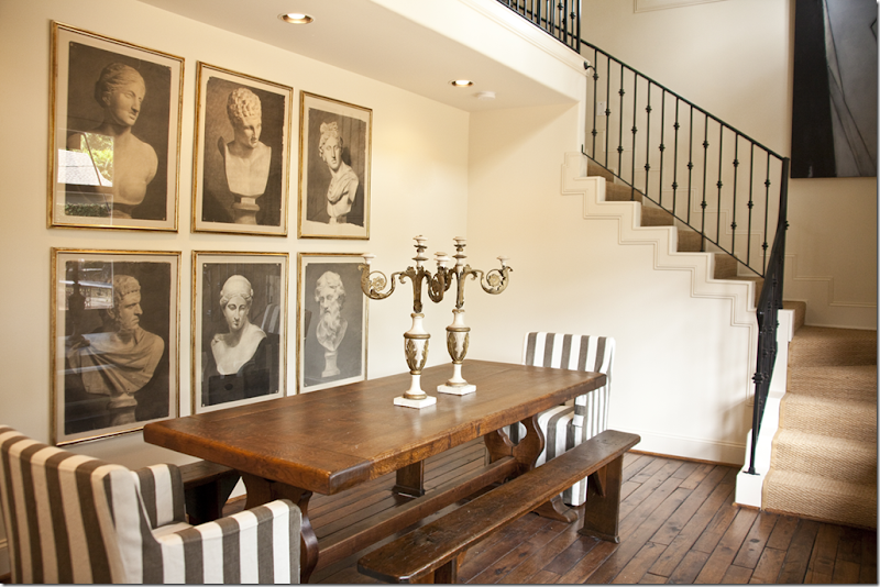
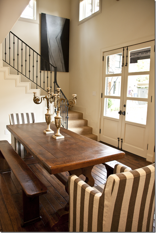
Inside the casita, the main room is set up as a dining room with a long wood table and benches, perfect for entertaining. Upstairs is a guest room.
A set of black and white photographs of busts hung close together act as one large piece of art. Love those photos!!!!
The seagrass covered stairs with iron balcony lead to a landing which overlooks the entire room below. I really love the French doors with panes that don’t go all the way to the floor.
I hope you have enjoyed the Gallaghers house as much as I did! I am so crazy about Mary Jane’s style. I love the way the rooms flow together aesthetically – the white walls, the dark floors, the large accessories, the white slipcovers and the dark velvet fabrics. The only pattern found throughout is stripes – the zebra stripes and the stripes in the pillows in the different rooms, including the casita. I don’t know this, but I would assume the Gallaghers like to entertain a lot which is why they use the casita’s main room as a dining area. I would probably use it as a second living area – since I NEVER entertain!
Mary Jane and I exchanged emails and I am hoping that she will allow me to show more of her design work in the near future. I am dying to see the houses that she has designed!!!! A huge thank you to Mary Jane for letting me show these pictures. Thanks again Mary Jane!
To contact Mary Jane, her email address is gallagher503@sbcglobal.net

