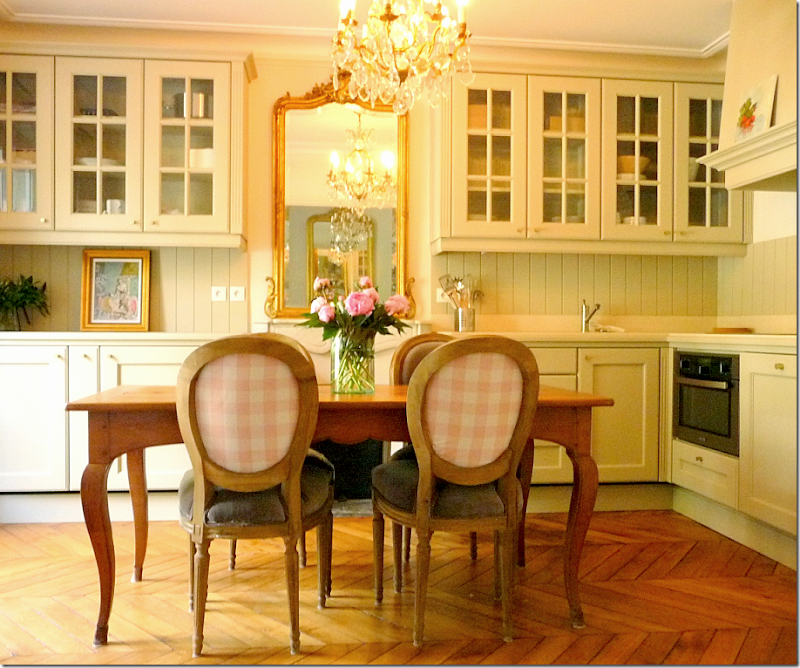
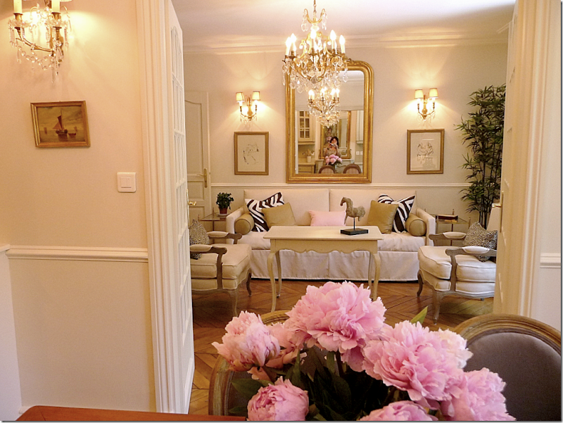
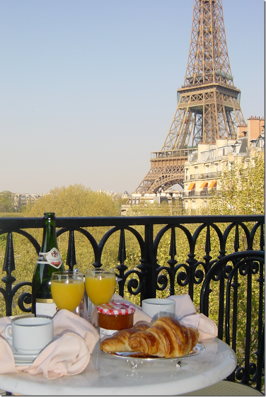
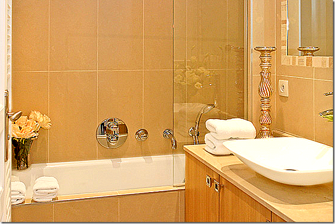
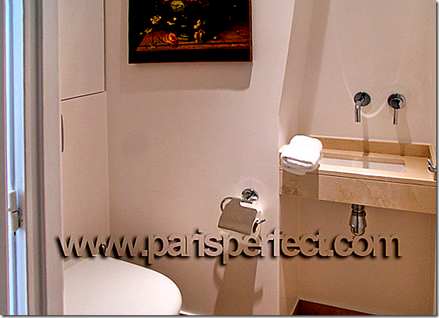
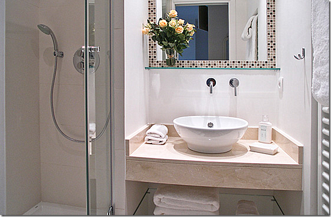
I started off the Readers Kitchens Series with this darling compact kitchen in Paris, France. The owners of this apartment live in Atlanta and are partners of Huff Harrington Fine Art HERE. When they aren’t in Paris, the apartment is available to rent from Paris Perfect HERE. Some people prefer to rent apartments when traveling in Paris as opposed to staying in a hotel room and Paris Perfect has many apartments in their inventory for short term lease. You can stay from one week to as long as you like, your choice.
The view from the kitchen/dining room into the living room.
All the Parisian apartments for lease are hand picked by Paris Perfect. They have to be first class, with all the amenities – and they must be aesthetically pleasing. After I ran the story on this Parisian kitchen, the owners of Paris Perfect contacted me. They have a beautiful web site and an interesting blog – and together we picked out a few apartments to show here – those with before and after pictures which illustrate what care goes into the furnishing and decoration of Paris Perfect apartments. The sizes of their apartments run from studios to five bedrooms.
To start out, the first story is of a renovation of a Paris Perfect apartment just recently completed. All Paris Perfect apartments are named after wines and this apartment is The Merlot! The apartment was actually remodeled twice. First are the Before Pictures, next the After Pictures- 1st Remodel, then the final After Pictures – 2nd Remodel. Enjoy!
The Merlot Apartment
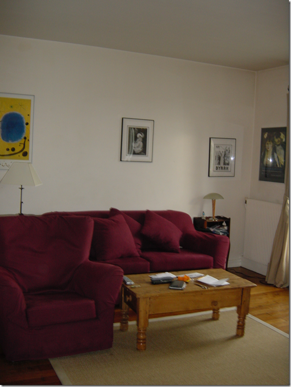
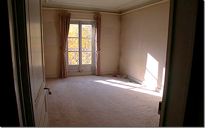
BEFORE: The day the owners viewed the apartment it looked like this. Owned by a French lawyer who was being transferred to New York, the apartment was clean but lacked charm. The space seemed ho-hum until they saw the view of the Eiffel Tower off the Juliet balcony. Three months later, they had moved in and begun the first remodel of the apartment.
BEFORE: Another view.
AFTER: Remodel #1
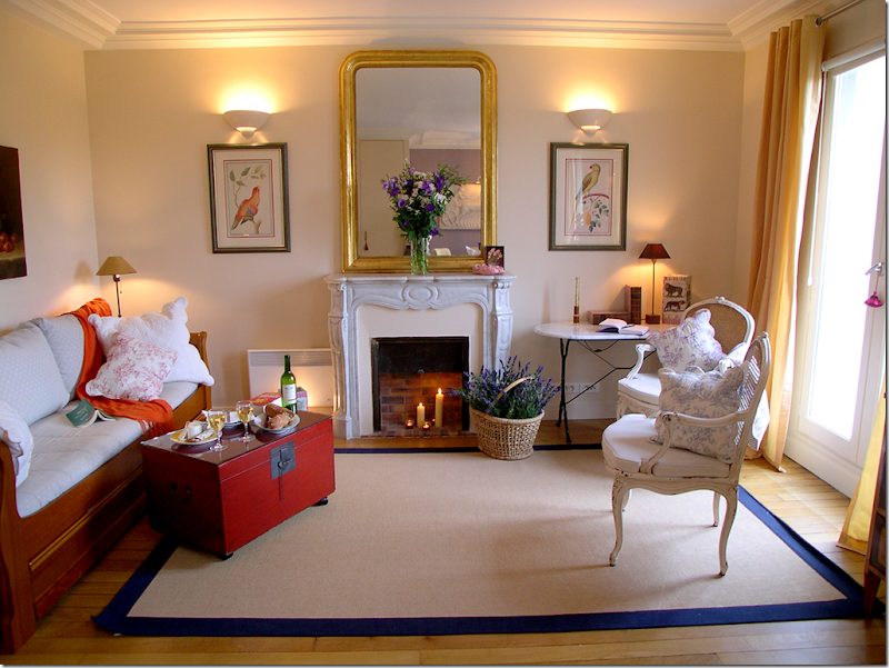
The owners put in this beautiful antique marble fireplace mantel with an antique Louis Philippe above it and flanking sconces. They bought the mantel at the famous Puces Flea Market in Paris. The wall of cabinets on the left side of the fireplace were removed, making the fireplace the focal point of the room. A day bed takes the place of a sofa and the coffee table is a red Oriental chest.
AFTER: Remodel #2
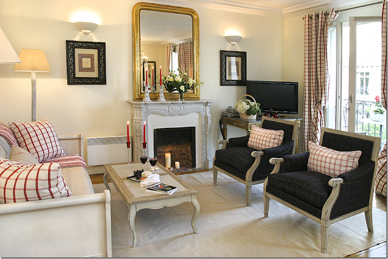
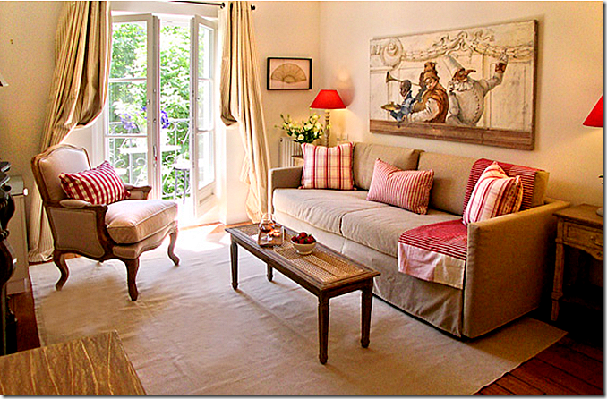
After living in the apartment for a few years, the owners bought these two gray flannel chairs from Andrew Martin in London and decided to update the furnishings once again. Dark woods were exchanged for a soft Swedish gray – including the daybed. A coffee table was added , along with a creamy dhurri. New curtains in fresh red and white checks were added, along with matching pillows. The TV sits on a beautiful antique Napoleon II library table with gilt wood and a marble top that came from Normandy . What a difference these changes made!
AFTER: Remodel #2
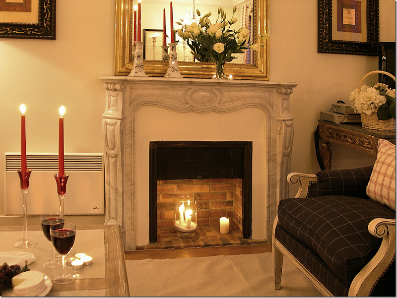
The night view of the fireplace. So romantic! A plus is air conditioning was added throughout the apartment – a real rarity in Paris!
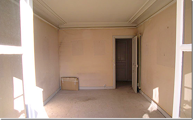
BEFORE:
Looking at the two front French doors with iron balconies – on the right side is the dining room.
AFTER: Remodel #1
Sorry, this picture is blurry. The owners placed a large antique chest and mirror between the two front windows.
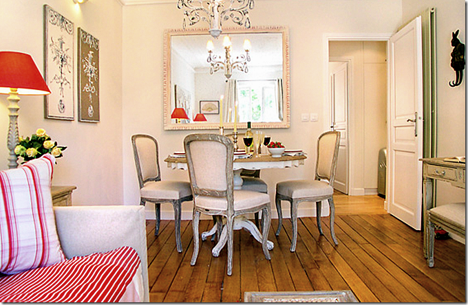
AFTER: Remodel #2
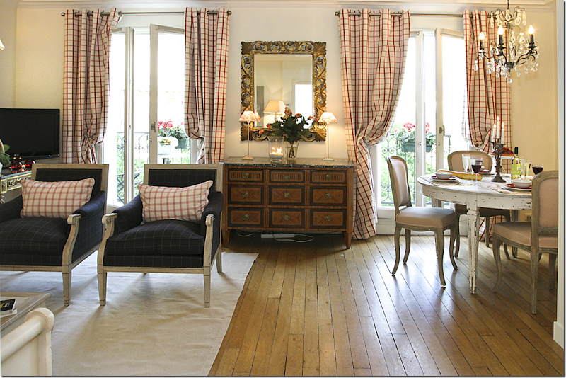
The chest and mirror remain. But new furniture was added and existing furniture was repainted. The antique chest was bought in Normandy at an auction house. Later it was discovered to be owned by friends who were downsizing. So beautiful!!!
AFTER: Remodel #1
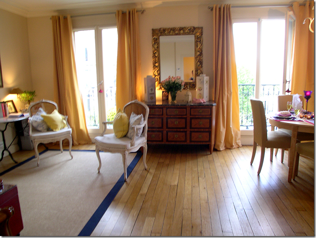
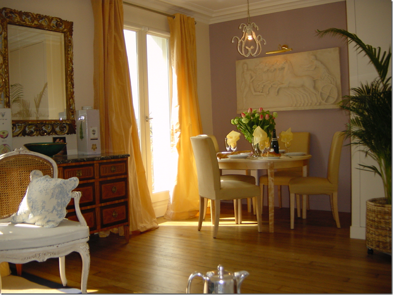
The owners painted the back wall a soft lilac to contrast with the yellow silk curtains and chairs. A new small light fixture was added over the dining room table.
AFTER: Remodel #2
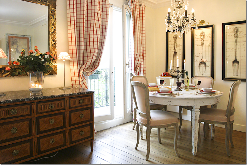
The lilac wall was painted white to match the other walls. The dining room table is fauxed a soft Swedish gray/white and new French chairs were exchanged for the large Parson chairs. A crystal chandelier was added for sparkle. Oversized art work was added to make the area appear larger. I love the curtains – they are so charming and French! The fabric came from the Marche St. Pierre in Montmartre.
AFTER: Remodel #2
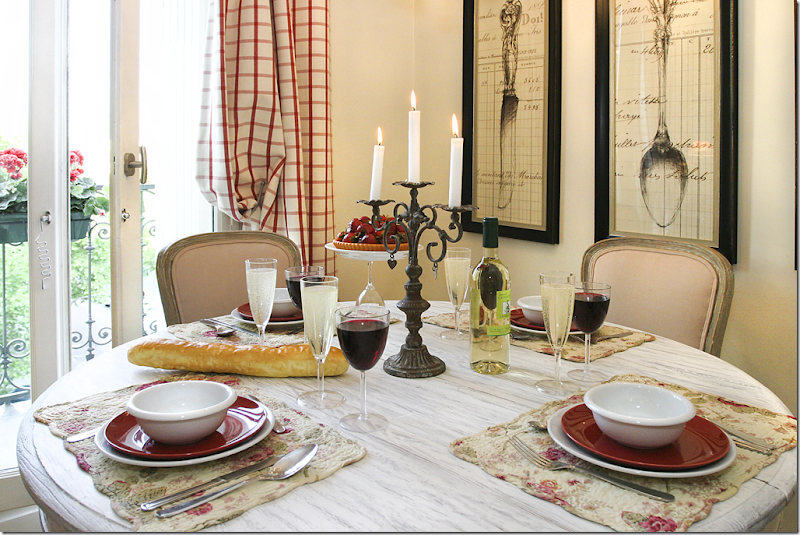
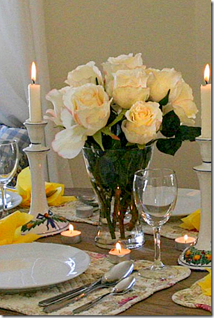
The table is set for dinner. All Paris Perfect apartments come equipped with dishes and kitchen utensils.
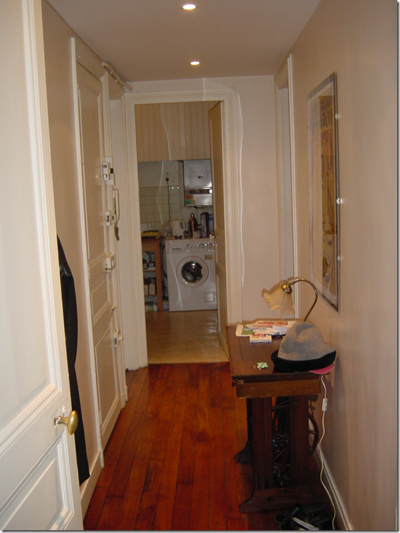
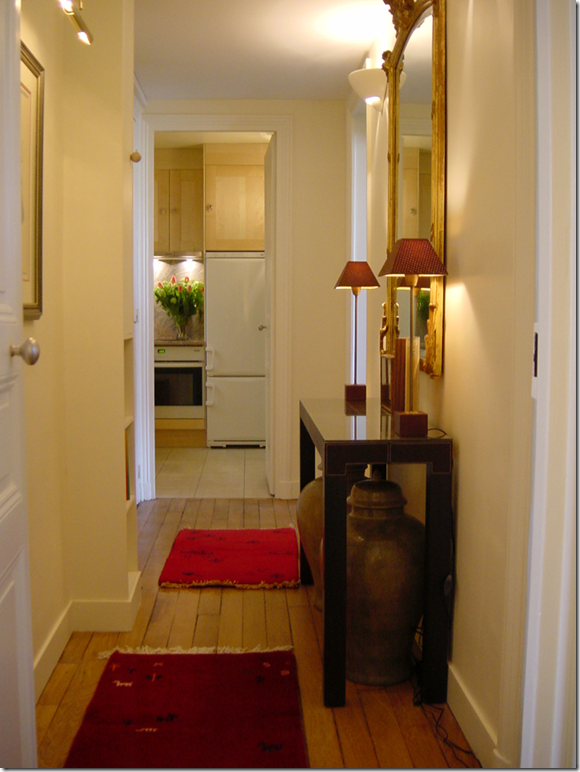
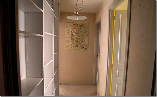
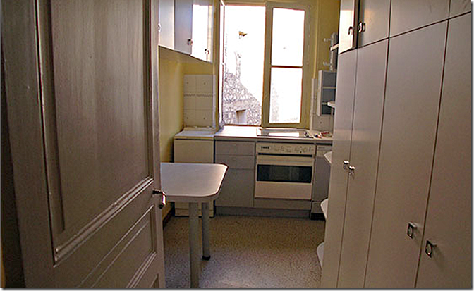
BEFORE: The hallway leading into the kitchen. At that time, the washer/dryer was in the kitchen, but has since been moved.
AFTER: Remodel #1 and #2
Lighting was added to brighten up the hallway, as well as a console table and a mirror. In the kitchen, a large refrigerator is now in place of the washer/dryer.
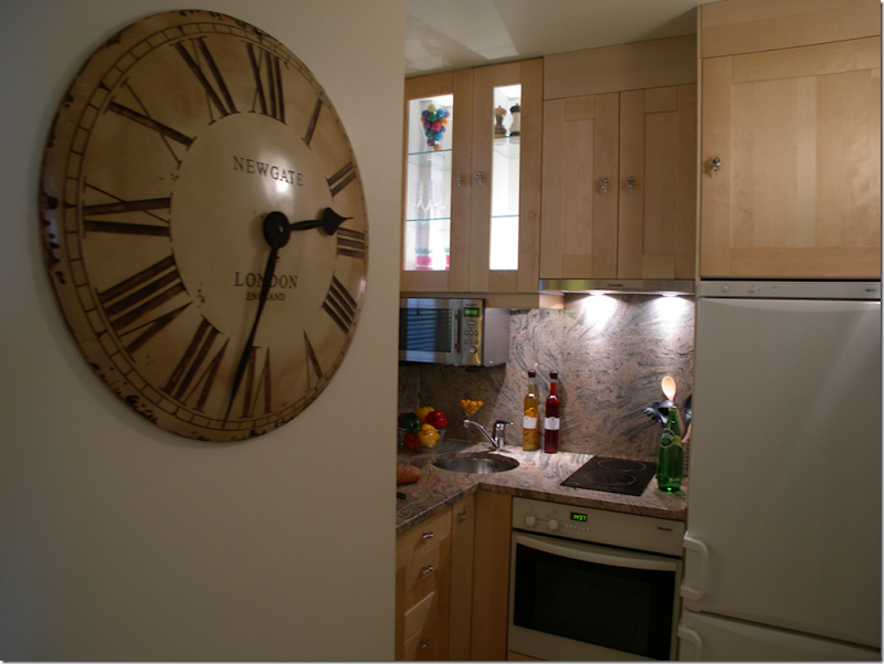
AFTER: Remodel #1 and #2
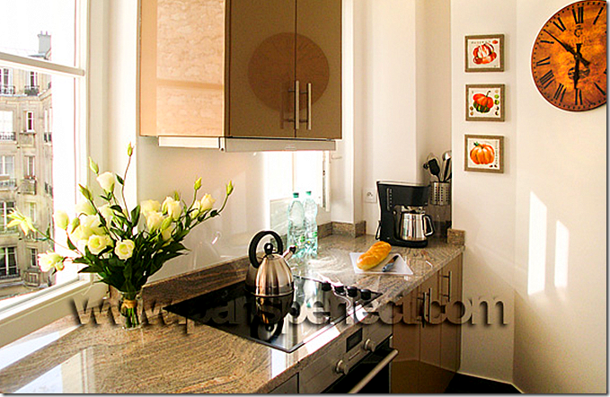
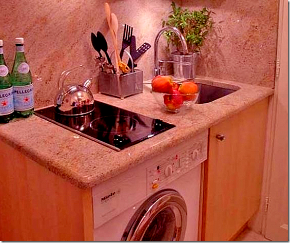
The washer was moved to the bathroom and a dryer was also installed. The granite is a favorite of the owners – all pink and gray.
AFTER: Remodel #1 and #2
Another view of the small, but functional kitchen. And no – I have no idea how you can wash anything in that small sink – but there is a dishwasher for pots and pans!
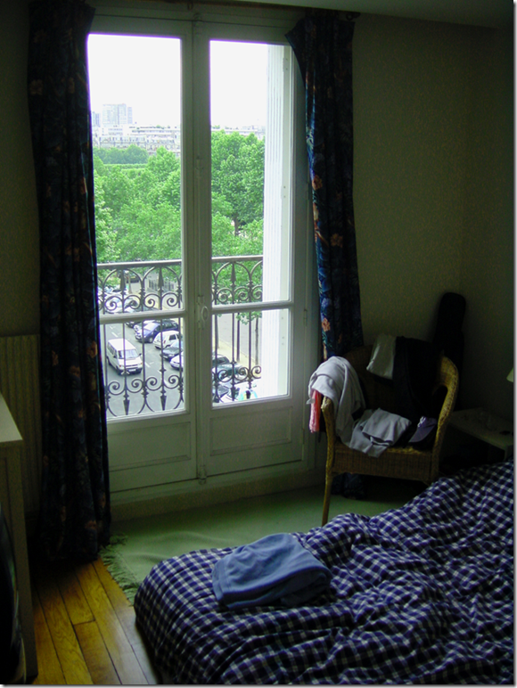
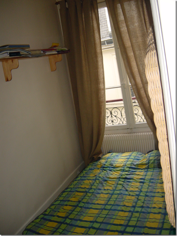
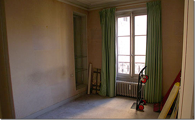
BEFORE: The mattresses in both bedrooms were on the floor a-la college dorm living. What a pretty balcony!
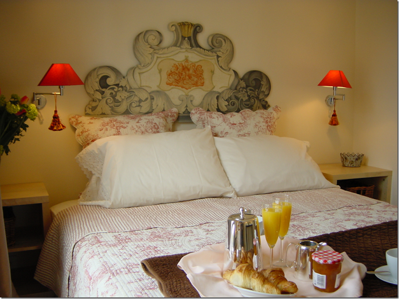
AFTER: Remodel #1
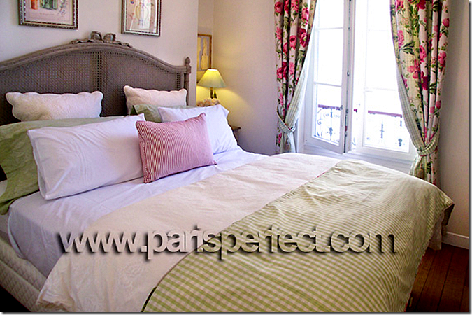
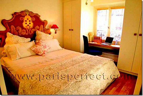
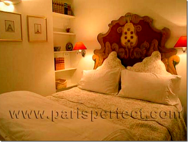
The owners used a Venetian styled headboard with French linens in the master bedroom.
AFTER: Remodel #2
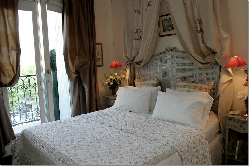
A new French caned headboard in limed white was added, along with new linens and curtains. And a canopy with embroidered fabric was placed over the bed. It’s much more French looking in here now.
BEFORE: Bedroom #2 – more mattresses on the floor.
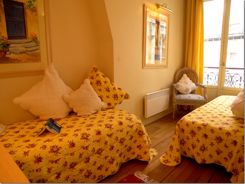
AFTER: Remodel #1 and #2
Cute French bedding was added along with bed frames to the second bedroom.
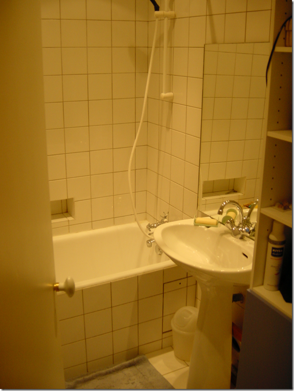
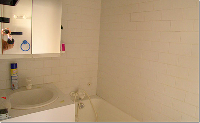
BEFORE: There was one bathroom before the second was added by the owners. They moved walls and converted it into larger bathroom with a step in shower.
AFTER: Remodel #1 and #2
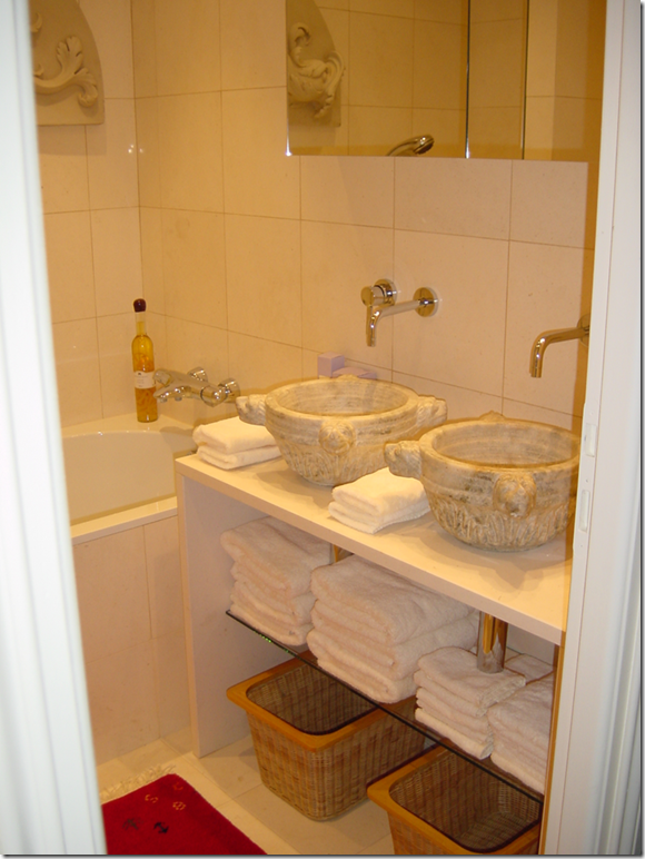
The antique marble bowls were found in London and were modified for the sinks. The counter is Pierre de Calisa limestone.
AFTER: Remodel #1 and #2
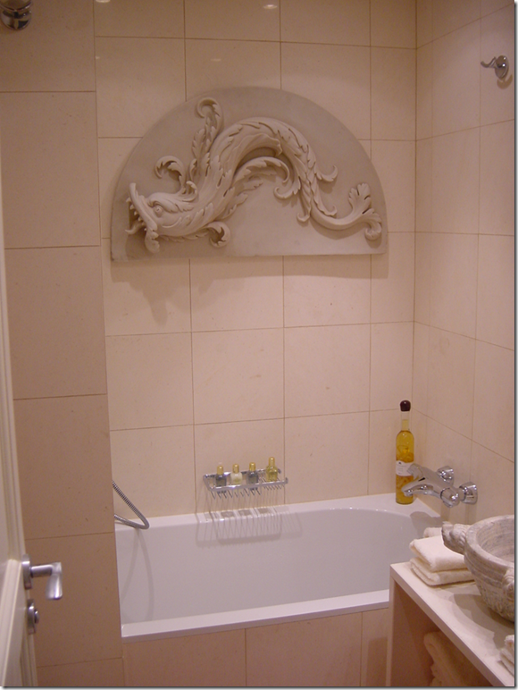
There is now a fixed shower head on the left, along with a flex head. The frieze is a copy of an antique one. Inside a new cupboard is the washer and dryer.
AFTER: Remodel #1 and #2
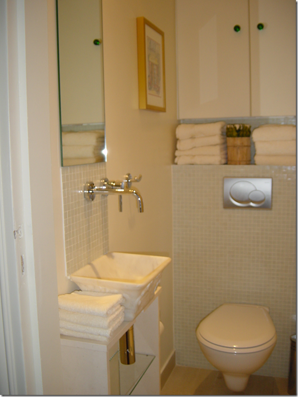
A simple toilet room was transformed into a full bathroom after walls were moved. The sink is Italian marble and the tiles are pale green mosaics.
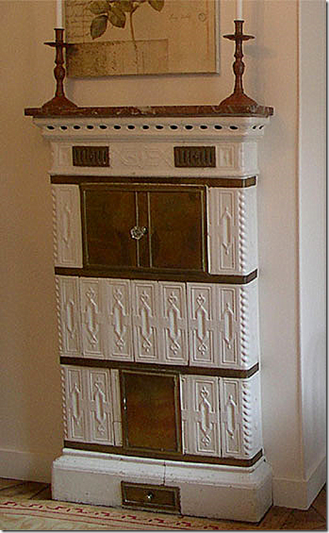
Original porcelain fireplace
The owners found this original porcelain fireplace in the living room which was used for heating and as a stove. The husband half of the owners sold it for $50 to a junkman. The wife has never forgiven him. The husband, a French cardiac surgeon, said the stove reminded him of his days working in the pathology lab and never realized it was a wonderful piece of history. I wouldn’t have forgiven him either! What was he thinking”?
View outside the dining room balcony!
Night time view of the Eiffel Tower all lit up. Amazing. What a beautiful apartment this is after the two remodels. To lease it, contact Paris Perfect.
The Calvados:
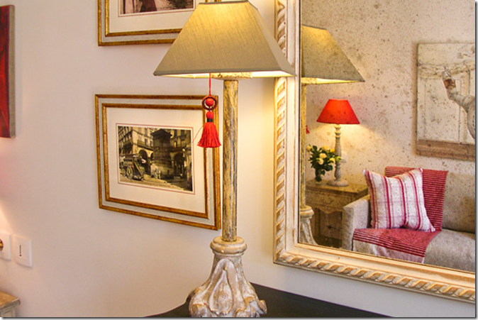
The Calvados apartment HERE was also recently remodeled and added to the Paris Perfect inventory. Paris Perfect helped the owners remodel it after it was purchased. Here, the mirror reflects the living room.
BEFORE: The living room wood floors were hidden under carpet.
AFTER: And today, the living room and dining room over look a French balcony with views of the Eiffel Tower.
An antique mantel was added for a focal point. The fireplace is faux, only. A desk was added along one wall.
BEFORE: Looking the opposite way in the living room.
TODAY: The dining room has a limed wood table and chairs. A chandelier was added. Red lampshades add accent color to the room. This is a really cute apartment now!
BEFORE: the main hall – more carpet.
AFTER: The main hall now – with one of 2 1/2 bathrooms, now at the end.
BEFORE: The kitchen really needed a complete overhaul.
AFTER: Granite countertops and all new appliances and cabinetry.
BEFORE: The one bedroom over looks the courtyard.
AFTER: So cute! Love the linens. New alcoves hold the nightstands.
AFTER: another view of the bedroom.
BEFORE: one of the bathrooms.
AFTER: completely remodeled. So different and beautiful!
BEFORE: Scary!!!!
AFTER: The powder room.
AFTER: Another full bathroom is a real luxury in a one bedroom apartment. Perfect for couples.
The Pomeral:
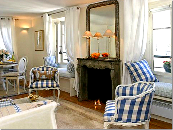
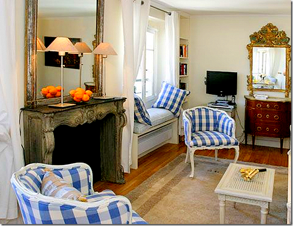
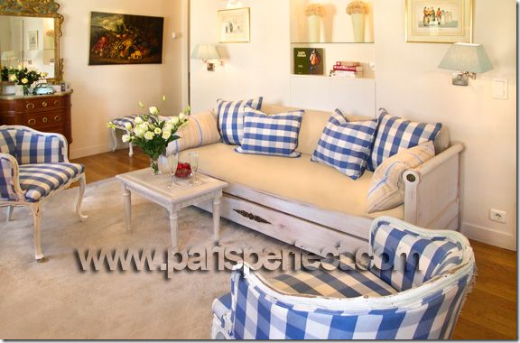
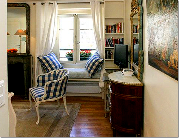
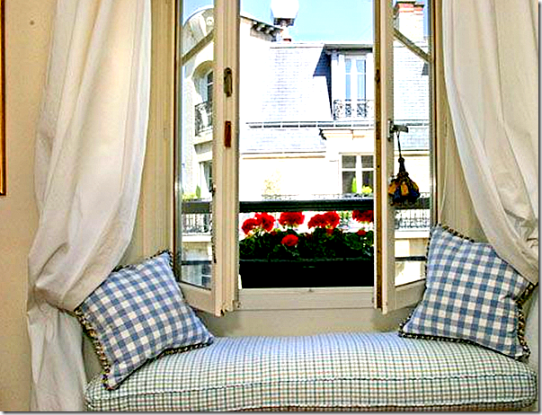
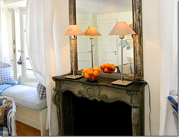
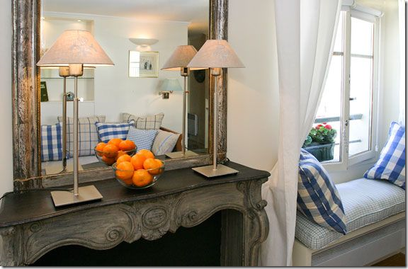
Looking at all the apartments available at Paris Perfect, this one, The Pomerol, really caught my eye. I love the bright blue and white checked fabrics and the matching window seats flanking the fireplace. There is another window seat in the dining area.
A beautiful chest and antique mirror add to the luxe feel of this space.
The day bed adds extra sleeping area to this one bedroom apartment.
So cute!!!!
This is where I would sit each day and night. Love it.
Close up the antique marble fireplace.
The sofa is reflected in then mirror.
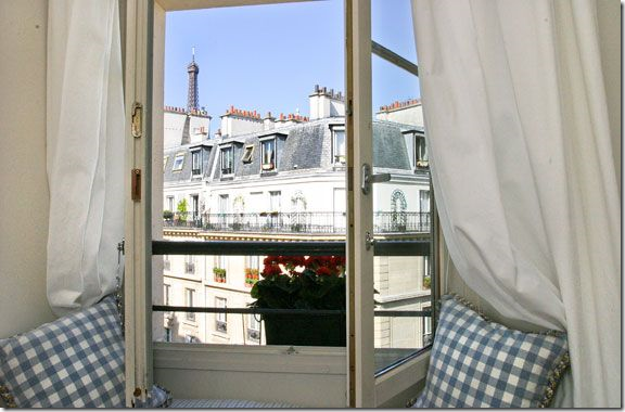
The Eiffel Tower is seen from this window seat.
At night, there is a view of the lit Eiffel Tower. So romantic.
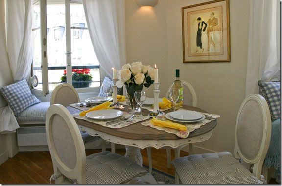
The darling dining area! Sooo cute! I just love this apartment.
The table is set with white dishes that come with the apartment.
The granite counter kitchen doubles as the laundry room.
In the bedroom, there is a large Venetian styled headboard and as a special treat – there is a view of the Eiffel Tower from the bedroom too.
So cozy!
The completely updated bathroom. OK, book me! I’m off!! (I wish)
Thanks to Paris Perfect for sharing these pictures. Be sure to visit their web site HERE to look at all their apartments. You may find one that you would really love to rent!
A Perfect Paris Apartment from Paris Perfect
New Living Room Redo
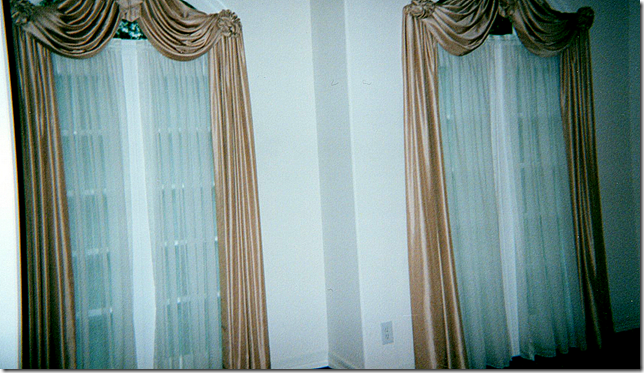
Here’s a redo of a living room I recently completed for a long-time client – one of my first. I always say I probably wouldn’t even be doing interior design if it wasn’t for this client who pushed me and gave me the confidence to keep at it. The client moved into this house around ten years ago and at the time we recovered some of her furniture from her old house for her new living room. A few months ago she called wanting to update her look by removing her red striped wallpaper and putting slipcovers on her furniture. Here is what her living room looked like when she bought the house:
Naturally the first thing to go were these curtains and the sheers.
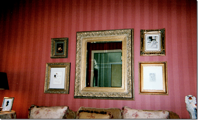
I don’t have many pictures of the living room as it looked after she moved in, just these few cropped ones. We papered the room in a Colefax and Fowler red stripe. Directly across from the living room is the dining room which we papered in a light yellow damask. Both rooms have custom cut seagrass. Here, above the sofa is a collection of prints and a mirror that came from her old house. Besides the wallpaper, we only ordered some pillows and a chair and a few tables.
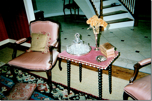
Across from the sofa we recovered two French chairs in a red silk check. I found this antique table with bobble fringe and a red velvet top. The owner had the rug which we layered over the seagrass – and a square ottoman/coffee table was placed over both.
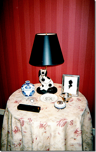
We had a skirted table and some pillows made out of Bennison’s Musk Rose. The homeowner has a large collection of Staffordshire dogs, some of which were made into lamps. These are the only pictures I could find – I wish you could see the whole room, but still, it obviously really needed updating. Here’s how it turned out:
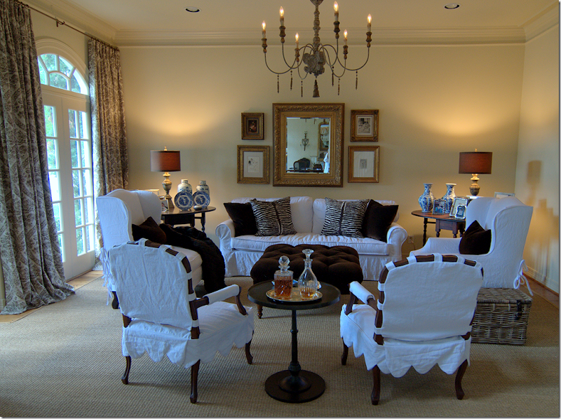
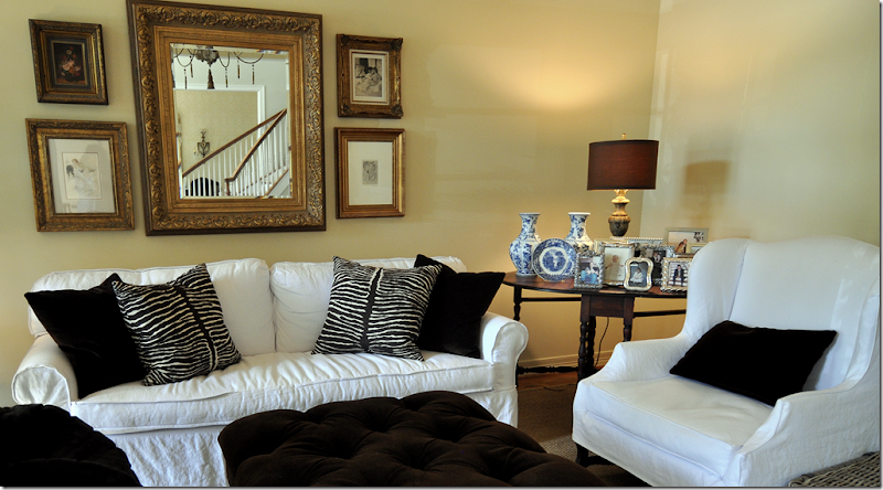
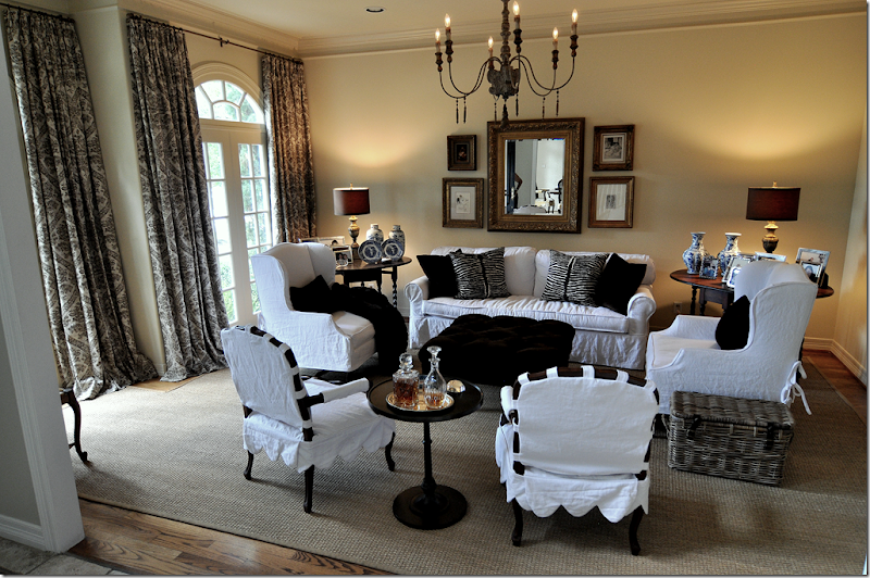
First, the red wallpaper was removed. Then in order to keep continuity, the walls were painted a soft ivory, Pratt and Lambert Ceylon Ivory, the same color as the molding in the dining room. Next, we pulled up the rug and removed the two mismatched chairs flanking the sofa.
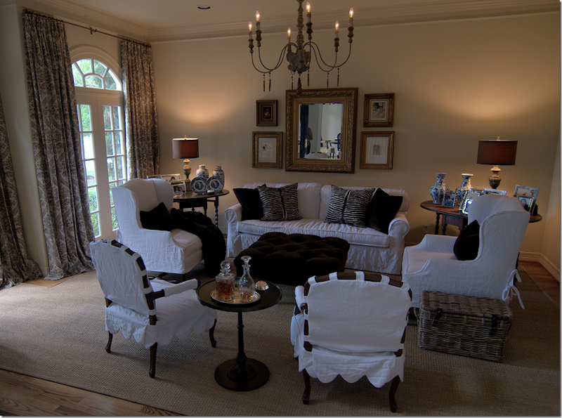
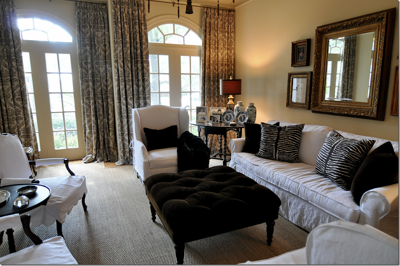
Two new matching side chairs were bought at Hein Lam and slipped in white linen from Glicks. We picked these tall wing chairs with French Os de Mouton legs because the room really needed some varied height. Then we slipcovered her sofa which was formerly in a coffee colored chenille. The sofa was also updated at that time – instead of three cushions, we changed it to two back cushions and one bottom cushion.
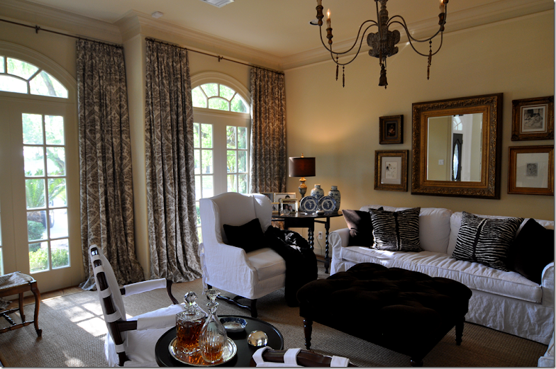
Next we reupholstered her ottoman and had it tufted in a dark chocolate velvet. The pillows are in the same fabric, plus there is the Brunschwig and Fils animal print. The lamps and chandelier came from Aidan Gray, whom I am thrilled to announce will soon be a Cote de Texas sponsor!! The two French chairs, formerly in red check, were sent out for slipcovers with a scalloped detail. The homeowner found the dark iron table at Pottery Barn. The family really uses this room – the kids do homework and read in here - and before, there was a large French washing basket for all their books and papers. I changed it out for a more updated and closed Kooboo basket – it’s neater with a top than looking at a pile of school books and magazines.
We got rid of the dreaded skirted table and brought down another vintage gate leg table she was using in her upstairs study. The homeowner loves the prints and mirror, so they stayed above her sofa, as did all her framed photographs – but believe it or not, I did remove over half of them.
The biggest change was when I convinced the homeowner she really needed curtains to soften it all up – and she finally agreed. But, it wasn’t easy to convince her. The linen fabric is a brown damask on an ivory ground from Pindler and Pindler - very, very reasonable. And last, we added a faux mink throw.
I cant’ tell you what a huge difference it made - it looks like a completely new room with all the red wallpaper and red and cream fabrics gone. The white is so fresh and the room looks much younger. Everything was a compromise between us – I probably would have just hung a lone round mirror over the sofa instead of all the prints, but those are the homeowners favorite things. I wanted to add a green tree, but that was vetoed. So were urns on pedestals to flank the doorway. Everything was bought with a strict budget in mind. The only real extravagance were the two chairs, but at least they were on sale. All the fabrics were extremely reasonable, as were the lamps and chandelier from Aidan Gray. Only the Brunschwig fabric was pricey but we needed just one yard. As always, Monica from Custom Creations by Monica did the curtains. Next we are going to update her family room – and finally get rid of her leather sofa!!!

