“Antiques and Shabby French Chic Decor to Romance your Home & Garden”
One of Cote de Texas sponsors, French Garden House, is offering a BIG giveaway today! When choosing sponsors for the blog, I’ve tried to provide those that I think tie in with the blog and French Garden House certainly does. They offer almost everything you could want in designing and furnishing a house and garden, especially if you are a lover of great French design.
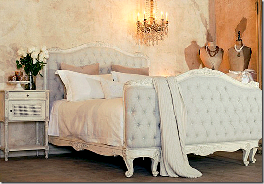
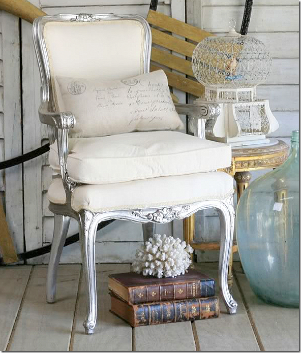
They sell beautiful antique and reproduction French furniture and accessories.
They sell new and vintage jewelry, including these rhinestone beauties.
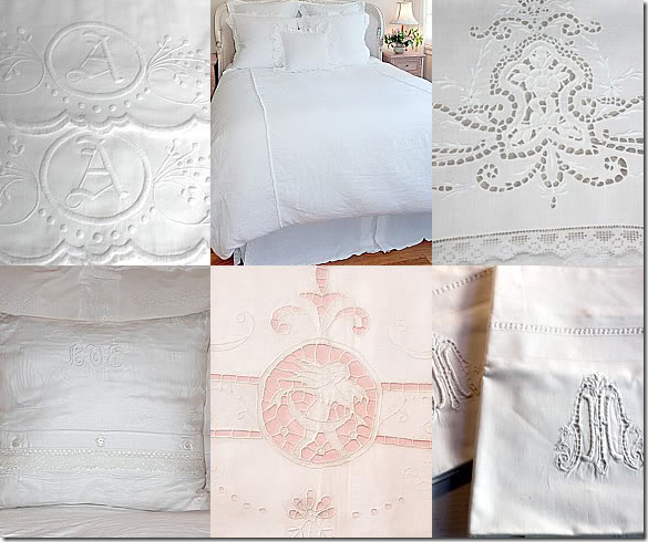
French Garden House has several lines of linen, new….
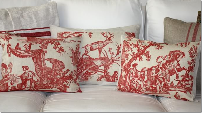
and old – like these pillows made of vintage fabrics.
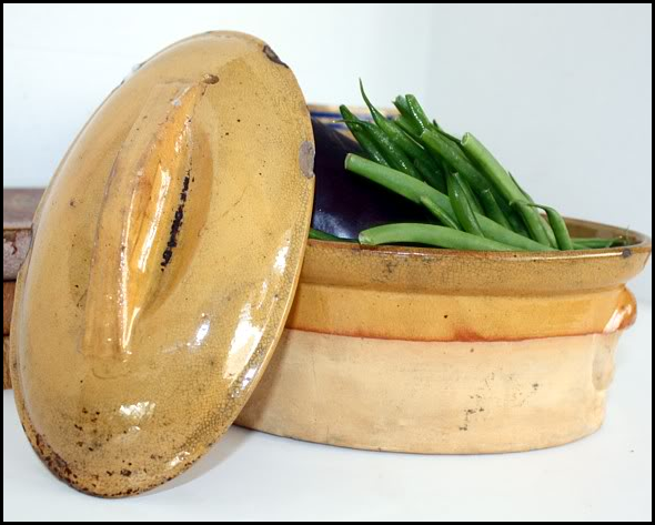
They have goods for the kitchen – like this beautiful line of Frenchware. Love this!
And, of course, there are all kinds of things for the garden and the terrace. I love the table!
There are tons and tons of French antique accessories available, and….
They carry gorgeous reproductions of French antiques, such as Tara Shaw’s Maison line.
Now, you are probably wondering, what’s the giveaway?
The winner will receive a $250 GIFT CERTIFICATE from French Garden House.
With the certificate, you can pick out anything you like!!! No more winning something you really don’t want. This time you can win EXACTLY what you desire!!
HOW TO ENTER:
Simply go French Garden House’s web site HERE and pick out what you want to win with your $250 gift certificate. Then, come back to the blog’s comment section and tell me what you want.
That’s it!
Now, don’t give yourself a heart attack. I won’t hold you to what you pick out. If you win and decide you want something different than what you originally picked out, don’t worry – you can change your mind when you win! No problem!!
AND if you want something that costs more than $250, you could always use the gift certificate for a price reduction. Just something to think about….
The contest runs until Saturday night at 11:59 p.m.
NOW, GO TO THE WEB SITE HERE AND PICK OUT WHAT YOU WANT!!!!
And finally, a huge thank you to French Garden House for this wonderful giveaway!!
FRENCH GARDEN HOUSE–BIG GIVEAWAY!!!
READERS KITCHEN SERIES #5
Continuing with the series Readers Kitchen, today we have a newly remodeled one to show. Enjoy!
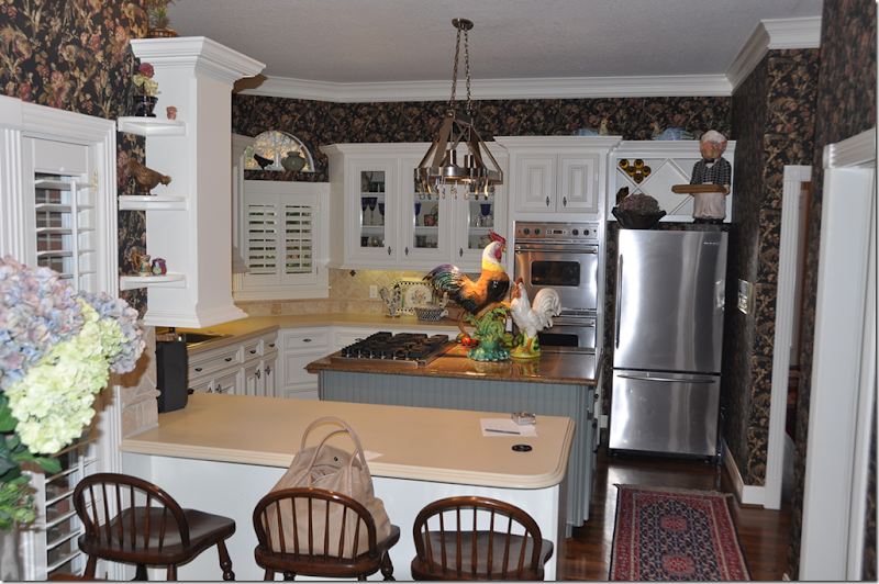
BEFORE: This kitchen had lots going on creating a busy looking design. Elements that added to the business include: dark wallpaper, ivory countertops mixed with the dark stone topped island, and a collection of brightly colored roosters. More business comes from the angled wall – with three arched windows. While the wallpaper seems dated, I do like the painted beadboard island and the tumbled tile backsplash. But, the homeowner wanted something totally different – something quieter and more sophisticated.
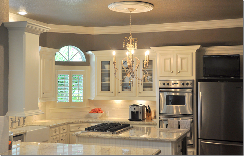
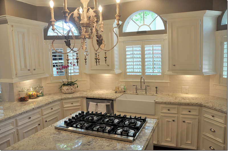
AFTER: Wow, it’s hard to believe it’s the same space. It looks so sophisticated now. The different countertops were replaced with granite. I love this light colored granite. It’s a great substitute for those who desire the white marble look but want the ease of granite. Granite is one of nature’s hardest stones, so it really takes a beating in a hard working kitchen. The backsplash was replaced with a cream colored subway tile, simplified from all the different sized tumbled tile of before.
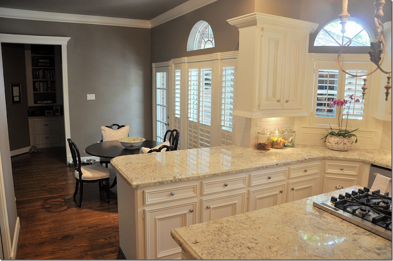
In this view, you can see the angled wall with the three arched windows. All the appliances were stainless before, so those didn’t need to be changed. Nor did the cabinetry. Not changing out these two things was a huge savings in the overall cost of the remodeling. The biggest change after the countertops is the dark painted walls, replacing the even darker wallpaper.
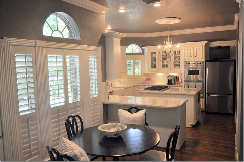
Looking from the breakfast room, another change is the wine rack above the refrigerator was removed and a flatscreen was placed there instead. Over the island, a wooden Italian styled chandelier was added. This one looks like it might have come from Aidan Gray – they make a number of these in several different styles. With all the roosters gone, the kitchen is sleeker looking and less country.
Another big change was the addition of the farm sink with a new plumbing fixture. New pulls – a combination of round and bin pulls were added. In this picture, you can see the granite up close.
Along the back wall, the butlers panty was updated with the granite and subway tile.
This view shows the adjoining breakfast room.
A few last changes are the counter was extended in between the kitchen and breakfast room, allowing for bar stools and the row of small shelves next to the counter was removed – further streamlining the look.
This kitchen was certainly usable and not that dated in the before picture. The main problem was the dark wallpaper which made it seem like it was designed in another decade. The homeowners probably could have just replaced the wallpaper and called it a day, but they went a step further and replaced the Corian with granite and the tumbled tiles were replaced with subway ones. These changes made a huge difference in the design. Luckily, the appliances and the cabinetry didn’t need replacing, which kept costs down. The only changes to the cabinetry were the removal of the wine rack and the small shelves that ran up the wall in between the breakfast room and kitchen. The sink was a costly change, but again it really updated the kitchen and ties it in with the beadboard island. Finally a trendy light fixture is an unexpected touch, yet it adds to the new look of sophistication in this once busy, but now much quieter kitchen!
A huge thank you to the homeowner who graciously agreed to share her new, beautiful kitchen with us!
More Readers Kooboo Chairs:
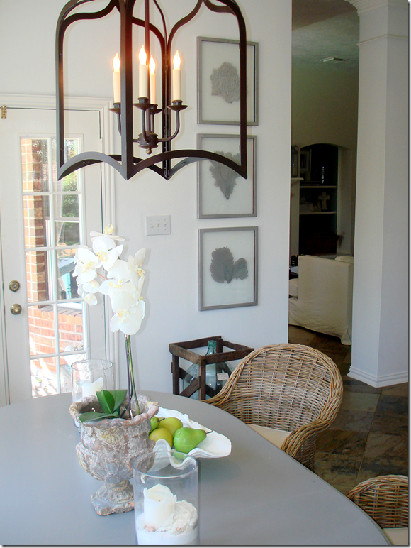
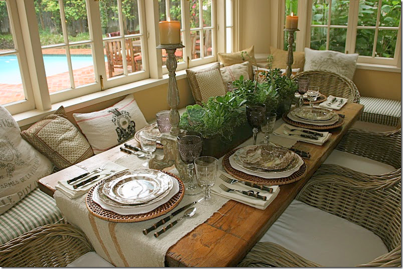
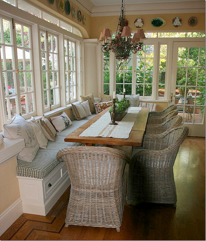
I still get pictures from homeowners showing off their Kooboo wicker chairs. Not that I blame them! I like to show mine off too. Below, are two homeowners with their newly purchased Cost Plus World Market Kooboo chairs:
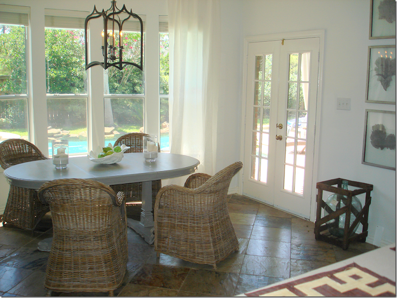
This homeowner used four Kooboo chairs around a gray painted table. I love the lantern mixed with it and the soft linen curtains. It’s such a mixture of textures, which creates the interest.
Looking the other way – I love the set of framed leaves.
Delores Arabian who writes the wonderful blog Vignette Design recently bought her Kooboo chairs for her breakfast room. I love the way she styled her table with the linen runner. Sooo pretty!!!!
Her house is so beautiful. She’s lucky to own two – this, her main home and her vineyard home in Sonoma. Delores is really talented and her houses show this. Her blog is very interesting – highlighting her two different lifestyles – one in the city and one in the country. If you don’t read it, you should HERE.


