Last January, I showed the story entitled “Incredible Renovation” – about a Houston house, actually located in the suburb town of Sugarland, Texas. This 20 year old foreclosure had never been updated when the current owner, a single, empty-nester bought it. She made a few, key renovation decisions that drastically changed the look of the house: most notably, new hardwoods were laid everywhere, but the bedrooms, and a new kitchen island was built. Additionally, she retiled her bathroom, closed up a door leading from the dining room to the kitchen, removed some built-ins, and painted. The renovation took three weeks to complete – or 20 days to be exact. The transformation is astounding. So astounding, in fact, this story received over 200 comments!!!! I think it may hold the record for the most commented story ever on Cote de Texas.
When it was published, I sat back and listened to the pings of my computer’s email alert. The pings kept coming and coming and coming. I was stunned at how fast you commented and at how many of you felt the need to comment on the story. Of course, it wasn’t without controversy. What would the comment section on Cote de Texas be without controversy? Some of you refused to believe this renovation was done in just 20 days. Others argued why it was believable. It went back and forth between believers and non believers. There was even a thread on Garden Web where they discussed whether the owner did all the work herself!!! No, she didn’t perform any of the labor, but she also didn’t have a contractor or an interior designer. All the design decisions were made by her and a posse of close friends. The owner contracted all the laborers herself.
So, how was it all completed in such a short amount of time? The homeowner planned the renovation before she even closed on the house. She started purchasing items she knew she would need even before the house was hers. Once she gained entrance to it, all the tradesmen were ready to go – and many worked around the clock, late into the night. In the end, she moved in within a month of closing to a completely redone, fresh and beautiful new house.
The story caught the eye of magazine stylist extraordinaire Bonnie Broten. Bonnie freelances – producing stories for many of the titles you read, including all those owned by Meredith. Bonnie emailed me and said she had to have this house. True to her word, she came to Houston this summer, along with photographer Bill Bolin to style the house and take pictures. The story is in this month’s Renovation Style – The Before and After Issue. Also in this issue is New Hampshire blogger – For Love of A House. I thought it would be interesting to revisit this renovation story and show you all the pictures Bill took. Most ended up in the magazine, but not all did. There have been some decorating changes during the past year that I thought you also be interested in seeing. And if you are new to Cote de Texas, to read the original Incredible Renovation story – go HERE. Enjoy!!!
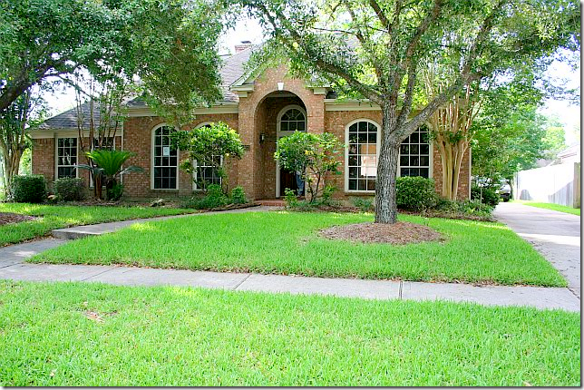
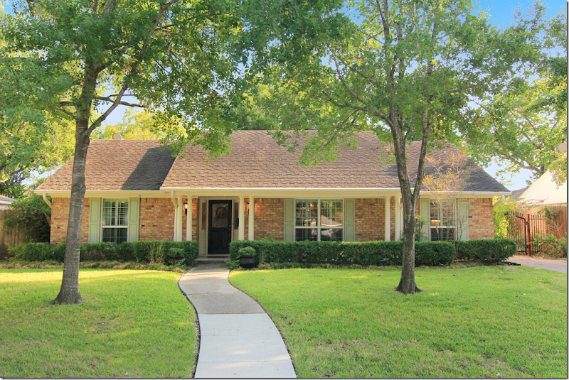
BEFORE: Twenty years old, the house had never been remodeled. The landscaping needed refreshing and pruning.
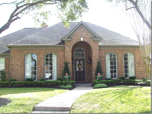
AFTER: The new homeowner opted for beds of box for a much neater look. Overgrown bushes were removed, and new trim paint in a dark khaki was painted over the former white.
BEFORE: Upon entering, through French doors with a transom, the study had carpet and a wall of built-ins. These built-ins were quickly removed and hardwood floors were laid The ceiling fan was another casualty.
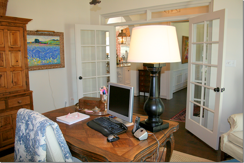
AFTER: Looking through the French door, the room is now the office for the homeowner who works from her house.
Looking through the French doors into the office. Antique furniture takes the place of the built-ins. The homeowner loves to go to Round Top where many of her accessories were collected over time. An iron light fixture takes the place of the ceiling fan.
·
RENOVATION STYLE: These photographs for the magazine were taken by Bill Bolin and styled and produced by Bonnie Broten. Changes include – a more substantial slipcovered desk chair and a new lamp. Of course, the shelves were also tweeked for the photograph. In this photo, you can see her linen curtains with their blue and white ribbon trim. Bill and Bonnie are quite a team – they are very professional and talented. Notice the beautiful lighting – with the sun streaming through the windows.
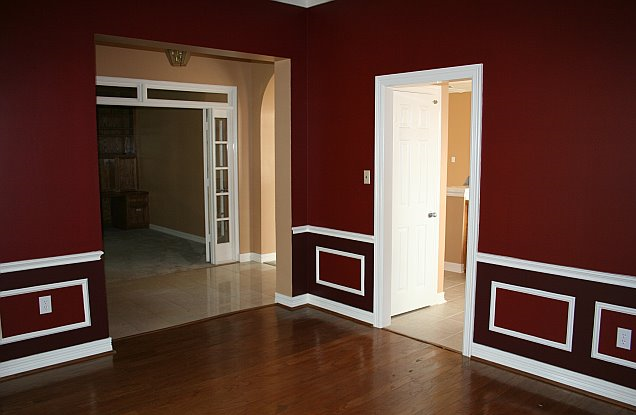
BEFORE: Across the entry hall is the dining room. Here you can see the old tile that was in the kitchen and hallway, which was replaced with hardwoods. The door to the kitchen was closed off to make more counter space in the kitchen.
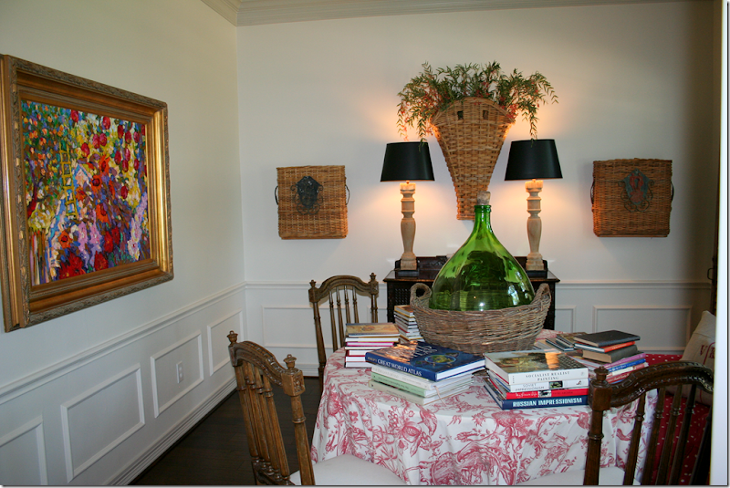
AFTER: It’s amazing what a coat of white paint can do for a room! The homeowner uses this room as a library. At the time this was taken, the chandelier hadn’t been hung.
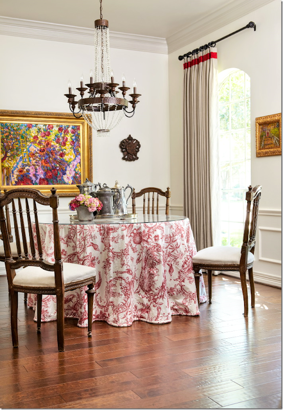
RENOVATION STYLE: I’m not sure if Bonnie or the homeowner moved the books, but for this photo for the magazine, the ‘library’ is all dining room! A beautiful chandelier now hangs over the table and here, you can see her linen curtains with a red trim. As you might imagine, the homeowner told the magazine that red is her favorite color.
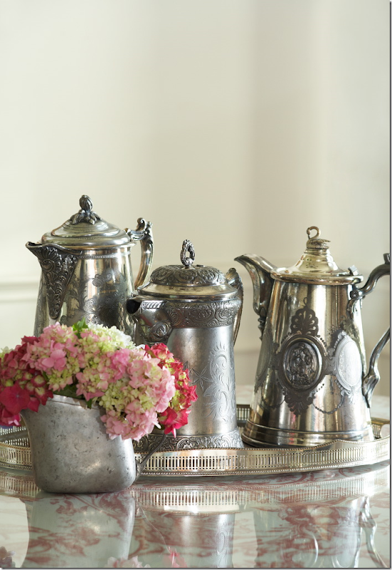
RENOVATION STYLE: Magazines always take “detail” shots – here the centerpiece in the dining room ended up as the first photograph shown in the story.
RENOVATION STYLE: This cabinet in the dining room once had no legs – the homeowner had her carpenter add them!! Inside is a collection of antique and hotel silver. So pretty!!
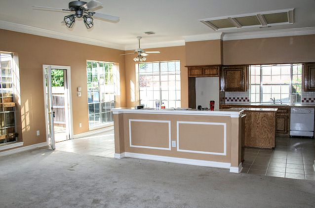
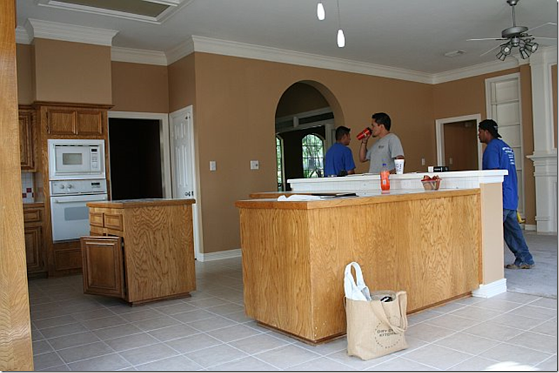
BEFORE: By far, the biggest change was in the family room – kitchen. The carpet and tile was replaced with hardwoods. The kitchen island and bar were replaced with one big island and new stainless appliances were bought one weekend at Lowe’s during a sale. The ceiling fans were also removed, as was the fluorescent light box.
AFTER: The new island is simply smashing. No other word for it. New Giallo Ornamental granite takes the place of Corian. The two lanterns, bought at market in Dallas add so much to the new atmosphere. They are just gorgeous. Notice that new crown molding was added on top of the cabinets to give them a more substantial look. The cabinets are original to the house.
BEFORE: Looking towards the family room over the old counter – the shelves flanking the fireplace were removed to make the area cleaner looking. Access to the bedrooms are through the doors.
AFTER: Looking towards the family room. New bin pulls from Lowe’s were added to the cabinets.
BEFORE: Here you can see the old door leading to the dining room – and the old pantry door on its right. The island and bar were not yet removed.
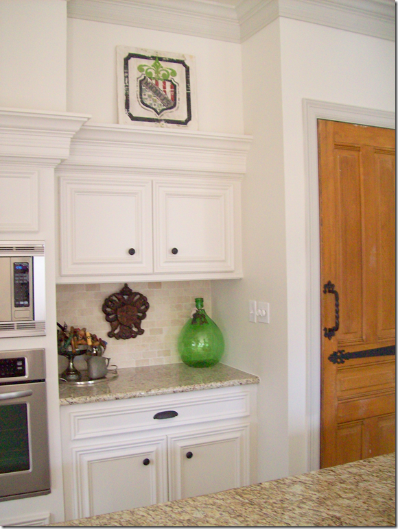
AFTER: The door from the dining room to the kitchen was closed off, adding more counterspace. The pantry door was changed out for an old door with hardware purchased at Atkins Architectural Antiques in Houston. Seagrass runner in the kitchen was added, as were textured bamboo shades at the kitchen garden window. Notice the crown molding allows for the homeowner to display trays and antique bread boards over the cabinets. The removal of the dining room door and the addition of the island were two huge improvements to the kitchen layout. The homeowner spent a large portion of her budget on the island – but she says it was worth it, and I agree. It’s fabulous.
When this house was first shown, a number of the comments concerned the gas stove – people wondered how was it added in so short a time. The homeowner answered with this: “There was already gas in the house so they were able to drop a line down from the attic into a cabinet. Then they dug a trench for the gas line in the concrete slab from the cabinet to the island, ran the line and then patched the trench. The island was built over the gas connection.” Simple!!!
Looking towards the front door and entry hall, with the office past the French doors.
Close up of the added cabinet where the dining room door was.
RENOVATION STYLE: The magazine’s only picture of the kitchen. Notice how they got the glimpse of the toile curtains into this view. Bonnie rearranged the trays and bread boards and pared down all her kitchen accessories. Styling this one shot probably took over two hours!!! Each photograph takes so long to get ready for. I was disappointed that there wasn’t a picture of the family room and kitchen together to give the readers the idea of the entire space, but the editors didn’t call for that view. When a house is photographed, the magazine editors have outlined before exactly what shots are to be taken from which spot. They judge this by using the preliminary photographs sent into the magazine by the scout. Any variation on this would have to be approved at the time by the editors. There are no surprises during photoshoots. The photographer can’t say – gee this would be a great shot. His photos are all predetermined.
RENOVATION STYLE: This detail shot of the bar with the homeowner’s collection of corkscrews didn’t make the final cut into the magazine story, although I’m sure Bonnie spent a lone time organizing the corkscrews just right.
RENOVATION STYLE: This view of the vintage pantry door didn’t make the magazine either. I love this closeup view of the hardware on the door – and of the corbel holding up the granite countertop.
AFTER: The breakfast room has a wooden chandelier in place of the ceiling fan. The toile curtains came from the homeowner’s former house and fit the windows perfectly.
RENOVATION STYLE: This picture was styled with an antique tablecloth the homeowner bought in a Paris flea market! I love this view of the scrolled iron legs on the table underneath the cloth. Again, Bonnie styled it perfectly with sunny sunflowers and rattan covered glasses. Confession – that’s my white ironstone pot that the flowers are in!!! Bonnie borrowed it for this shot. Notice how the camera is at knee level, rather than eye level. That’s what a tripod is great for. I’m just learning to use mine more. And again, the sun is miraculously streaming through the window. The photograph probably timed the photos to catch the sun in each room. This beautiful photograph was a full page in the magazine – but most of the floor was cropped out.
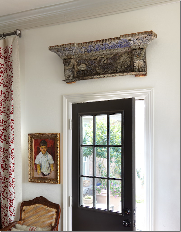
RENOVATION STYLE: This shot made the magazine – a detail showing the back door with the antique architectural fragment over it. When this was shown in the magazine, the picture was cropped – showing only part of the door and the fragment. I love the entire picture much better with the touch of toile and the chair showing.
AFTER: The family room. Many people commented on the large lamps. The homeowner loves to make lamps out of balustrades. But maybe she listened to the comments, because these two lamps were moved.
Another view showing the fireplace without the built in shelves and with the new brick surround. The fireplace is painted a darker shade of gray – to highlight it. (Paint colors listed at the end of the story.) I love that plate cabinet – it perfectly fits that small space! At this time, the TV was above the fireplace.
AFTER: Looking from the kitchen towards the family room. Here you can see the sconces flanking the fireplace. A new ceiling fan was added over this area – it is Houston after all!!!
RENOVATION STYLE: I was so surprised to see the new furniture arrangement, but I have to say it is much better – more open – without the sofa blocking the room off. The TV is now gone which may have influenced the rearranging of the room. There is now a painting over the fireplace and a darling oval footstool. A shutter was added behind the table on the left. Love the new family room arrangement.
RENOVATION STYLE: From this view, you can see the tall lamps were moved to the antique chest behind the sofa. They do look better there, I think. So pretty!
RENOVATION STYLE: This photograph was an entire page in the magazine! It is a beautiful vignette shot.
RENOVATION STYLE: This detail photo of the vintage selzer bottles did not make the magazine.
BEFORE: The bedroom was painted the same red as the dining room, while the bathroom was painted blue.
AFTER: Fresh paint and new carpet are the only changes in this large bedroom/sitting room.
RENOVATION STYLE: The bedroom taken at a much prettier angle. Love the slipcovered headboard and the large monogrammed pillows. But those lamps are my favorite. Gorgeous – silver candlesticks – they are just so wonderful!!!
AFTER: This view of the bedroom out the window that overlooks the back terrace. Pretty layered window coverings – linen curtains and bamboo shades.
RENOVATION STYLE: This picture of the same vignette taken closer up looks so much better. It really takes a professional to take pictures of houses. The homeowner took all the Before and After shots herself. Again, beautiful styling by Bonnie. I wonder if she even changed the paintings out to the side of the chair? This picture was a full page in the magazine, but it was cropped showing just the left chair and the left side of the table.
AFTER: The sitting room – I wish I could see the armoire!
RENOVATION STYLE: Here, a chest is now the coffee table and one lamp was removed for this picture. Alas, this photograph wasn’t used in the magazine story. Notice the Santa is missing from the side table – which is gone too! And notice Renovation Style magazine is seen in the basket. Hmmmm.
BEFORE: The carpeted master bathroom – needed remodeling.
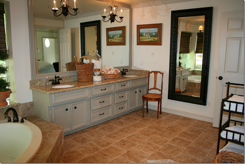
AFTER: The bathroom – was retiled, the cabinets were painted and reworked, new fixtures and knobs were added, and the shower door was removed. Sconces were added to the mirror which was also framed in wood.
RENOVATION STYLE: This picture looks so much prettier than the After one. I don’t know if it’s the lighting or the addition of the rug – but it really looks great. Not sure if Bonnie brought the rug, or the homeowner added it herself. Love the blue and white vase. Such pretty styling. Half of this picture made it into the magazine – which is a shame, because the entire picture is so pretty I think. Notice how Bill captured the hanging shelf with towels and plants in the mirror’s reflection.
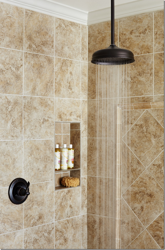
AFTER: A view of the newly tiled tub – and the shower with the door removed – that made such a huge difference. Love the shades and the chandelier.
RENOVATION STYLE: Water running from the overhead faucet – this didn’t make it into the magazine.
RENOVATION STYLE: This detailed shot didn’t make it either. I can only imagine how long Bonnie worked on this to make it perfect! Each shot is styled several different ways before a perfect photo is decided upon. Such a waste it wasn’t used.
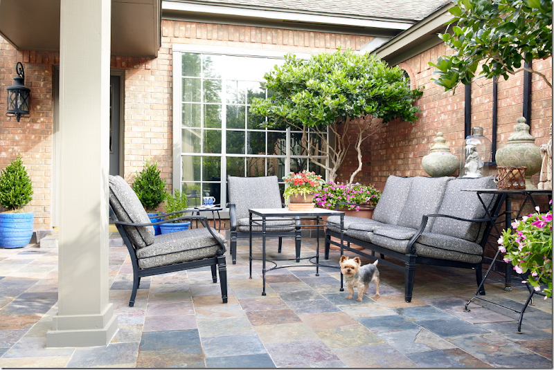
BEFORE: The house was a foreclosure – and it had been run down and vandalized – before it was sold to the homeowner. The back yard was a real mess.
RENOVATION STYLE: The new terrace, after. Hard to believe it’s the same space. The family room and master bedroom both look out onto this area. Darling dog – I wonder how hard that was to catch him like that? This photograph did make the magazine at least!!
I hope you enjoyed looking back at this Incredible Renovation story one more time. I thought it would be interesting to see how the house looks today – and how it was styled for a magazine. I was really surprised how many photographs didn’t make it in the magazine – and how those that were are cropped. I was disappointed that the view of the kitchen and the family room wasn’t shown – how they relate to one another. I think that is such a beautiful shot!!! Below are some of the paint colors. For many more sources of furniture and fabrics, etc. see the magazine. Also, if you are interested, the magazine shows a floor plan.
A huge thank you to the homeowner and to Bonnie Broten and Bill Bolin for allowing me to use these gorgeous photographs.
From the homeowner:
· Paint Colors – (all Sherwin Williams satin finish)
· Kitchen Cabinets and Walls -- Shoji White (SW 7040)
· Trim – Worldly Gray – (SW 7043)
· Fireplace – Intellectual Gray (SW 7045)
· Front and Back door – Urbane Bronze (SW 7048)
· Exterior Trim – Anonymous (SW7046)
· Fabric: I bought the drapery fabric at High Fashion – I have no idea the name or manufacturer (sorry). It was at least 5 years ago.
· Lanterns: They are 25 high x 14.5 wide plus the half circle hanger (7 inches) that attaches to the chain. The 25 includes the finial like thing above the actual lantern.
INCREDIBLE RENOVATION–PART II
Total Renovation for a 1960’s Houston Ranchburger
This 60s era house for sale in Houston is a total renovation – completely updated – and all done on a budget. The owner is a reader who sent in the HAR listing, thinking others might be interested in seeing the befores and afters. Or course! There’s nothing better than looking at terrible before pictures next to wonderful afters!! Additionally, there are tons of ideas here to incorporate into your own house if you are currently updating - you might want to grab and a pen and some paper to take notes. This ranchburger was built in 1962 and is typical for houses built in Houston during that era. Thousands were built here with this same exact floor plan. In fact, my own nephew and niece just bought a house with almost this same layout – built in the exact same decade. This Briarbend house is considered small by today’s standards, just under 2,000 sq ft. with 3 bedrooms and 2 bathrooms. But, growing up in the 60s – we all lived in houses with this same square footage and thought our houses were quite large. It’s a real statement of our times that unless a house is 4,000 sq. ft and more, it is thought to be a smaller starter home. If you live in Houston, the house is zoned to Briargrove Elementary – one of the best elementary schools in the city. The price was recently lowered to $465,000 and the listing can be found HERE. Enjoy!!
From the outside, there is no doubt the house was built in the 60’s. It’s also obvious that the floor plan consists of a living room and dining room located to the right of the front door. Past the entry hall will be the family room and the kitchen will be to the right of it. This floor plan was built all over Houston during the 50s on through to the 80s.
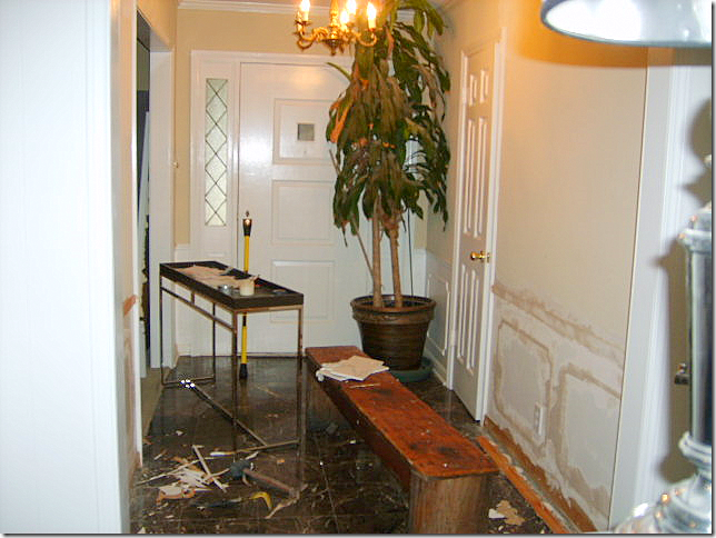
BEFORE: The entry hall. Molding was removed from the walls. Not sure what the floor was – but it looks like a marble tile.
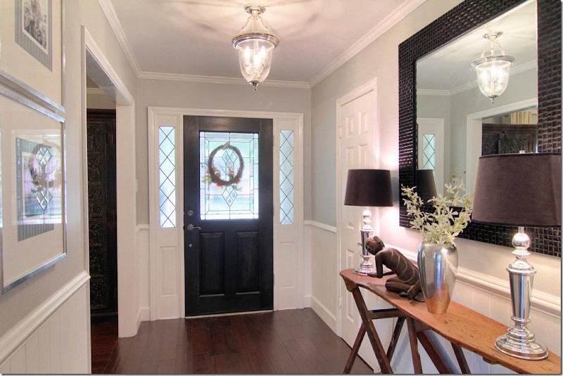
The entry hall. New hardwoods were laid in the entry, dining room, study and all the bedrooms. Beadboard was installed under the wainscot molding – which is a great alternative to new sheetrock – plus it adds a nice texture. New front door and lantern. Notice the antique wooden ironing board that is used as a console. What a cute idea!!! Pretty gray painted walls are offset by bright white molding and beadboard.
All paint colors are listed at the end of this post.
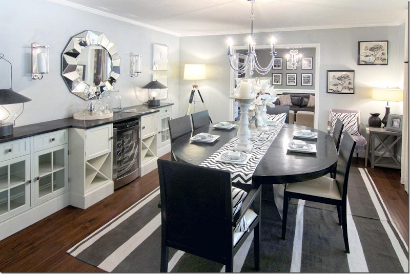
To the right of the entry hall is the living room, then the dining room. Most couples today are switching these two rooms – as shown here. The dining room is now located in the larger living room and the former dining room becomes a study or a small sitting room. Love those black lanterns on the console to the left. That looks like a wine refrigerator – which if you are lacking a bar – is good idea placed between cabinets. One piece of granite or wood tops the assorted built-ins making them look more substantial.
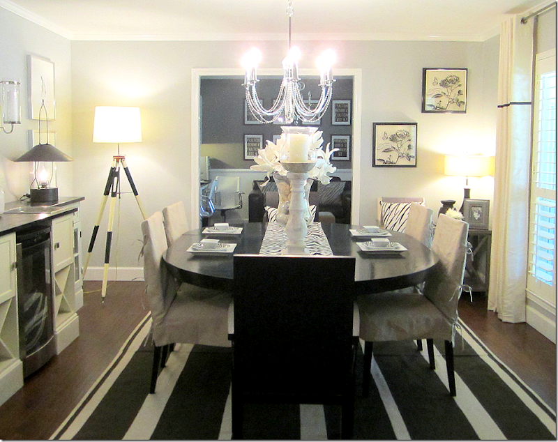
This view shows the windows – which are all new and all with plantation shutters. Simple drapes with a black trim have grommets – a nice contemporary, youthful look. Here, the modern chairs are slipped for a less contemporary look, adding the linen color and texture – which I prefer.
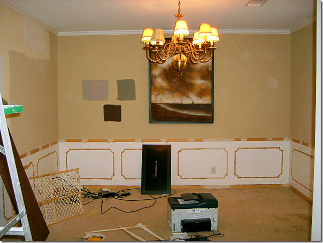
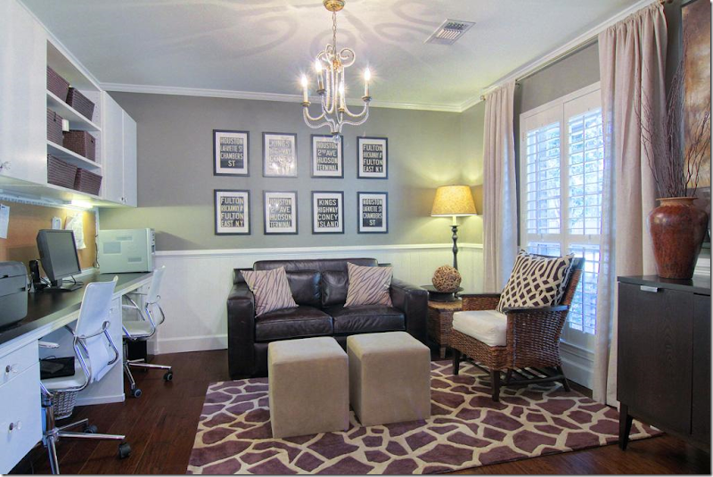
The former dining room, now a study. Again, the molding was removed from the walls.
The former dining room is now a study, complete with new built-ins. All new windows with plantation shutters are found throughout the house. Again, once the molding was removed, beadboard was added to the walls below the wainscot molding. Notice the one large pillow with expensive KWID fabric. If you can’t afford curtains or upholstery out of a favorite fabric – opt for a few large pillows. You get a lot of mileage out of a few yards of pricey fabric. Clear gray walls mixed with white molding.
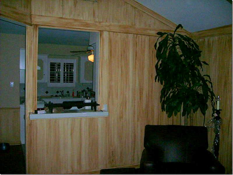
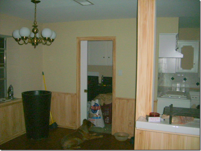
BEFORE: The family room looks into the kitchen via a pass-through. The walls have 60s yellow paneling. Just awful.
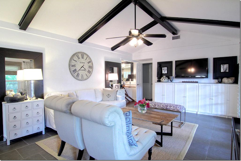
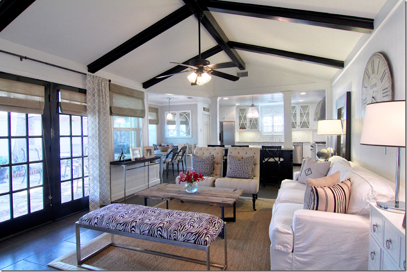
AFTER: WOW!!!!! The family room is located past the living and dining rooms – and overlooks the back yard through new French doors. The flooring is a 20X20 porcelain tile instead of hardwoods, which lends a more contemporary look – especially with the white grout. The wall between this room and the kitchen was removed – opening up the area and giving it a much more 2000s feel. The columns are probably load bearing – yet they add a substantial looking touch. I love this room – how open and fresh it looks. Most of the rooms are painted gray with white trim – but this room looks like it is all white. Matching end tables flank a contemporary styled slipcovered sofa. A Belgian inspired coffee table adds some needed texture, as does the seagrass rug. Love the large clock over the sofa and the painted black beams really add punch. Even the ceiling fan looks good with its black blades. (taking notes Brooke? – that’s my niece who is moving into their similar house next month!!)
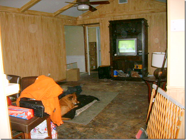
BEFORE: Looking the opposite direction. What is that flooring material? This couple really had a vision!!
Looking the other way – you can see the entry hall with the antique ironing board at the left. Through the open door are the bedrooms. Newly installed built ins anchor the flat screen tv – it almost disappears when flanked by two large black framed prints - another great idea. Notice how behind each end table is a floor to ceiling mirror – I believe these came from Ikea, if not, Ikea has very similar ones for under $100 – a steal. They really give a lot of look for the money when two are used this way. I’m not sure if the owner removed the paneling or painted over it. Either way is fine. For clocks like this – look to Wisteria, Ballard Designs and Restoration Hardware – another big look easy on the budget.
This view shows the new French doors leading into the backyard. Painted black – they add pop to the all white room. Here, you can see the breakfast room. The mirror in the breakfast room mimics the x motif in the kitchen overhead cabinets.
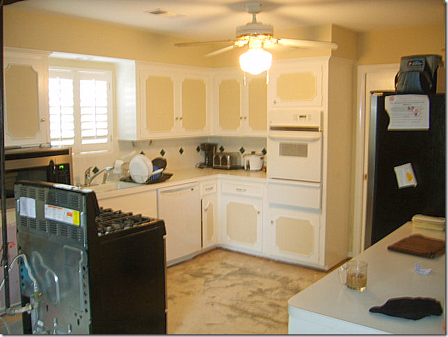
BEFORE: The kitchen was totally redone – even the appliances were moved.
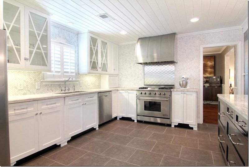
AFTER: Another huge WOW!! This kitchen is fabulous and is full of ideas. First, notice the beadboard on the ceiling – it really adds great texture – I love how they used beadboard throughout the house. Again, it is a very inexpensive material with a great look. These are all new cabinets – but adding feet to existing cabinets is always a great idea if you have the space for it. The fur down was removed – giving a more streamlined look. Carrara marble mosiac tile is used as the backsplash and is installed all the way to the ceiling in a herringbone pattern – what a great luxe look. It’s beyond fabulous!!!!! Notice the tile was extended all the way to the doorway. There are very few upper cabinets – another great, modern look. The few upper cabinets there are, all have an X motif. Kashmir valley granite was used on the counters as an alternative to white marble. Carrara would have been good economical choice too. Notice that the cabinets dividing the kitchen from the family room are painted dark gray for contrast. Great stainless hood and quilted stainless backsplash behind the range makes this a focal point of the room. Here, the oven and stove were combined. The refrigerator was moved across the room – to the left of the sink. (You can see it in the above picture of the living room.) The cabinet pulls are from Restoration Hardware and the cabinet latches are from Cliffside Industries. Through the door on the right is the study and dining room.
BEFORE: The breakfast room, off the laundry room.
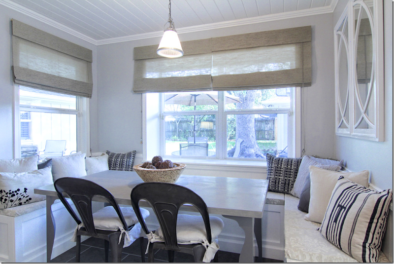
AFTER: Beadboard ceiling is carried in here from the kitchen. U shaped banquette was built for seating. Such a cute room – the banquette really makes a huge difference and is another great idea. Wonderful gray table and industrial looking chairs.
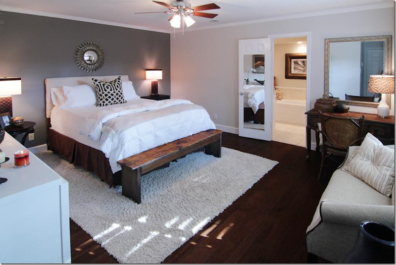
The master bedroom had hardwoods – nice and dark, love that. Can’t make them too dark. Hardwoods today should be dark as can be – or light as can be. No more middle of the road. Notice one gray wall is painted much darker – an accent wall. There’s another KWID pillow – notice what a statement it makes.
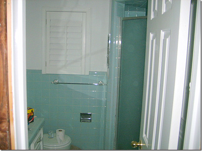
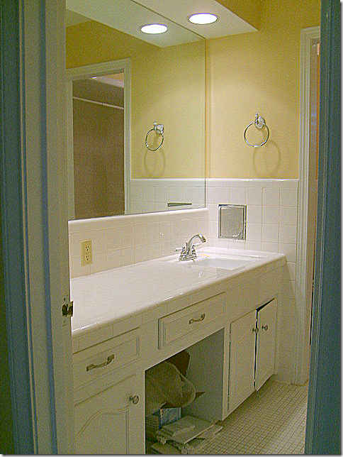
BEFORE: Master bathroom – all in 60s styled green tile.
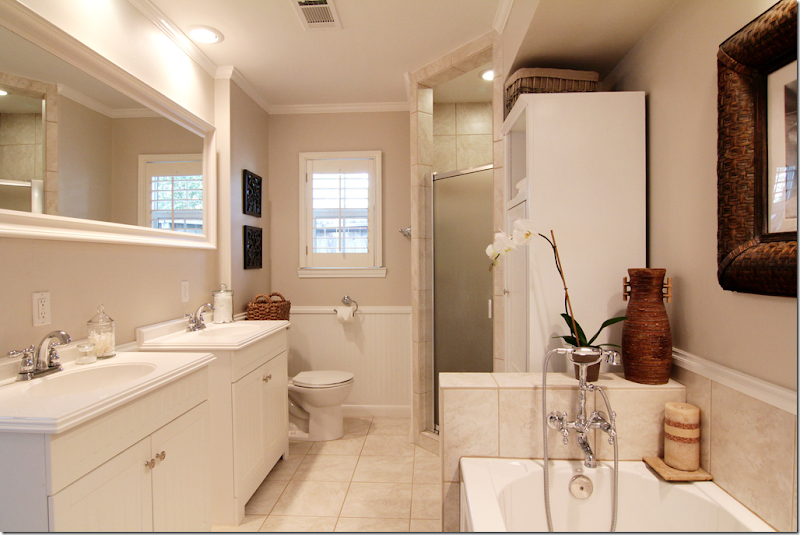
Beadboard replaced the green tile. Two new sink cabinets – easy to install as opposed to built ins. Look to Ikea for similar cabinets. It looks like the bathroom was enlarged to twice its former size, with a new tub added. Beautiful plumbing fixture in the bathroom – adds “jewelry” to the bath. Plumbing fixtures are a great place to splurge – the prettier the better.
BEFORE: 2nd bathroom.
New built in cabinet hold two large sinks with great faucets. Carrara marble tile used on counter and floors. Great lights add sparkle for a kids bath that doubles as the powder room.
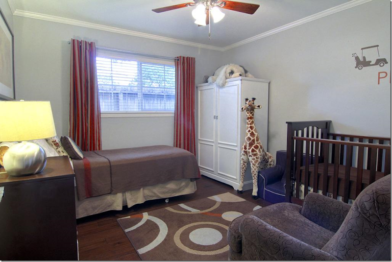
Bedroom #2 is the little boy’s room – with a darling giraffe! Again, the curtains have the grommet ring for a more modern look. Inexpensive area rug adds big color punch.
Bedroom #3 – the guest room. All the bedrooms and halls have the newly installed dark hardwood floors. If you can opt out of carpet in favor of hardwoods – do it. You never have to replace hardwoods, but you’ll be replacing your carpet every 5 to 10 years. Trust me. If you have pets – all the more reason to get hardwoods. Figure the added cost of hardwoods over carpet and divide in by 30 years x 12. You’ll be shocked how cheap it will be over the life of a mortgage to upgrade to hardwoods.
The large back yard has a newly laid flagstone terrace with French doors leading into the family room.
Nice shady backyard. When you move into a mature neighborhood – you are blessed with large trees!!! That’s a plus over moving to a new neighborhood with tiny trees.
And finally, the Briarbend neighborhood park is for your use if you move into this house!
PAINT COLORS: The main colors in the kitchen/family/bath/breakfast/foyer are Benjamin Moore's Chantilly Lace (white) and Stonington Gray. In the office they are Restoration Hardware's Slate and Benjamin Moore Chantilly Lace. The Master has Restoration Hardware Slate and Ash.
I hope you’ve enjoyed this renovated ranchburger and I hope you were able to get a few or a lot of ideas if you are currently remodeling. I really loved the kitchen – with all the tiled walls. That was stunning. I also loved the beadboard everywhere, especially on the ceiling in the kitchen and breakfast room! What was your favorite element they added?
A huge thank you to the homeowners for showing their house. For more information – go HERE.

