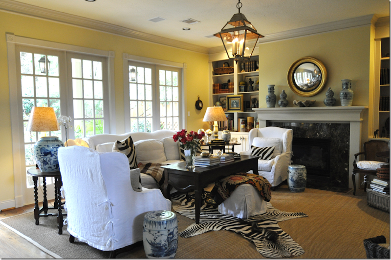
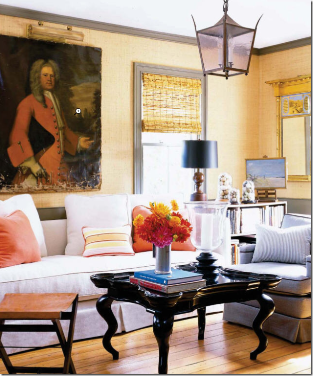
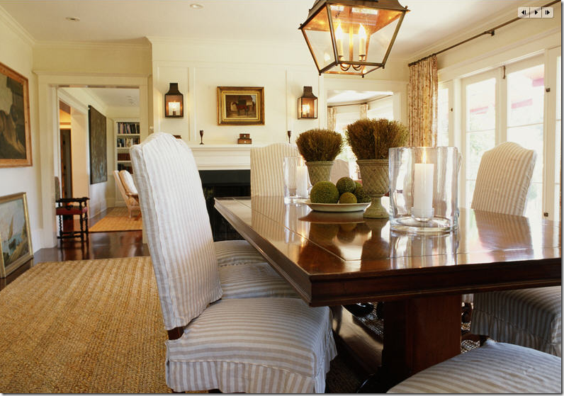
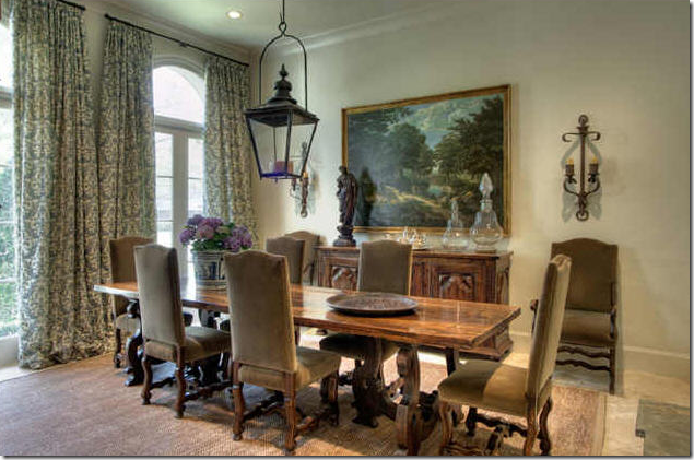
It’s easy to find lists of the Top Ten most overdone trends, or the Top Ten list of things that are “out” – but finding positive Top Ten lists of design elements is a little harder to do, which is exactly why I decided to post my own Top Ten list of favorites. What are the things that I like to see in a room? What adds something essential to the decor that I admire? What makes a room wonderful? What are the ten things that together create a great look? First on my list, my number one item, is linen. A natural fabric, linen sets the mood for the kind of decorating that I like, casual, friendly, warm, cozy, and inviting. Linen fabrics relax a room – they say sit down, put your feet up, grab a book – and don’t worry about ruining anything, you can’t hurt me. A room full of silk, chenille or velvet doesn’t quite say that. To me, linen’s wrinkled, rumpled appearance expresses the way I want to live – casually and comfortably. When you take linen and sew it up into slipcovers (#2 on the list) you have perfection! And what better surface is there to put linen slipcovered furniture on than seagrass (#3)? These three elements - linen, slipcovers and seagrass, go hand in hand and it’s impossible for me to separate them. Of course, you can always layer a dressier rug or a zebra or cowhide over seagrass to add some glam or contrast, just as you can put velvet pillows on a linen sofa to dress it up a bit. These details can make a room overly casual or casually elegant – the choice is yours. To further complete a room, I like to add curtains (#4) because generally, a room doesn’t feel finished without them. There are certainly exceptions, but in most cases, curtains add an important decorative element be it softness, glamour or breeziness. Always keep in mind that decorating a room is adding layers of elements one by one. Each element brings something important to a room, and without each layer it becomes difficult to imagine the finished room. The fifth element on the Top Ten list that I think should always be in a room is a light fixture. Although my house is full of can or recessed lights – I wish I could remove them out one by one. Sixteen years ago, when we moved in here, I thought can lights were the height of chic. Today, they are basically useless. The truth is, we never turn on our overhead lights, instead the house is now lit with a combination of hanging fixtures, sconces, and lamps. These three give off a soft glow as opposed to the blaring spotlights that come from overheads. Even on dimmers, recessed lights can be so cold and unforgiving.
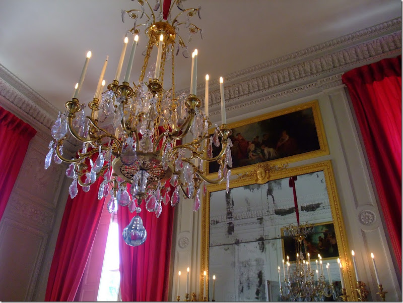
Marie Antoinette’s Petit Trianon: A chandelier reflected in a mirror doubles the light given off. The crystals look like icicles – and the pink silk showing through the prisms is just so beautiful!
Reading Rose Tarlow’s book, The Private House, years ago really reinforced my dislike of recessed lighting. She never uses cans and thinks they make a ceiling look like Swiss cheese with all their holes everywhere (please don’t ever invite Tarlow to my house – it looks like a mouse’s banquet on my ceiling!) But, Tarlow of course is right – is she ever not? Except for the kitchen or bathroom, you really don’t need overhead lighting at all. Hanging fixtures, sconces and lamps – besides adding enough light for any task, add beauty to a room. Imagine a side table next to a sofa without lamps? How bare would that seem? Or imagine a dining table with a chandelier – it would seem unbalanced. Hanging fixtures don’t have to be crystal chandeliers, in fact right now I am in love with lanterns – especially those meant for the outside. Lamps fashioned from old urns or an aged balustrade add character – you don’t have to have lamps made only from priceless porcelain vases. And today, there are a myriad of sconces available on the market from rustic to dressy – they fit every decor.
As for my own house, I was slow to change. I only started acquiring my hanging fixtures in the last ten years. But with each fixture I have added, the difference it has made to my house has been remarkable. Adding my last one – a lantern – to my family room made such a big impact on the room, I wonder what took me so long to change it? The trend today is definitely leaning in the fixtures direction. More and more design magazines feature rooms with hanging fixtures and the variety on the market now is wide and varied. You don’t have to spend a fortune on a fixture to get a great look – Curry and Co. and Aidan Gray for instance have wonderful reproductions of the trendy Italian candlestick chandelier for a fraction that the antique stores charge. Lanterns meant for the outside have the same look as the antiques you see everywhere, but they don’t have the same price tag. With high cost no longer a deterring factor, more and more people are turning to hanging fixtures. If you have been resistant to changing from recessed lighting to chandeliers – take the plunge. Pick one room and install a fixture, a few lamps, a sconce or two – and see if you don’t prefer the style and atmosphere they bring as opposed to the can lights. I have all the the faith that you too will see how much lighting fixtures add to the finished look of a room.
My family room – taking down the ceiling fan and putting up the lantern changed the look of my room, I think, for the better. To me the difference is huge. It makes me wonder why I waited over 15 years to hang something here.
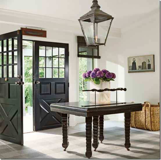 ENTRY HALL AND STAIRS: In entry halls, lanterns are always wonderful to use- especially like here, over a hall table where you can hang a larger lantern than one that is hung over an empty space. No is going to bump their hand on this fixture. What a gorgeous lantern! This looks like an antique or at least an reproduction of one. I love how the lantern and the door are black, as is the table and the shades – all contrasting with the bright white walls. So beautiful and inviting!!
This entry hall is stunningly beautiful – simple yet elegant. A headless sculpture on a Plexiglas stand is the eye candy at the end of the view. An antique chair grounds the vignette. But, the chandelier is the jewelry here. The French empire antique could not be more perfect – hard to imagine this entry hall with the chandelier. Design by Renea Abbott.
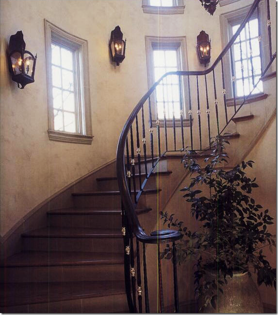
A series of lanterns go up a staircase – which is a wonderful way to light the way.
In the Octagon House, Tami Owen used an extra large Italian styled chandelier to light the stairwell. These chandeliers are gaining in popularity and seem to be everywhere today – Aidan Gray can’t keep them in stock.
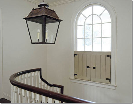
An oversized lantern is another great way to light a stairwell.
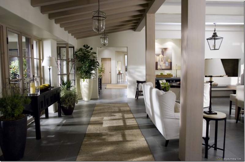
In The Holiday movie house – the hallway is lit with a series of glass bell jar lanterns. Series of light fixtures makes great statements down hallways.
LIVING ROOMS: white linen slipcovers and a big lantern says it all to me! I adore this room!!
 Charles Faudree at his personal best – a room filled with French antiques mostly covered in cotton checks and stripes which help to relax the priceless furniture. An extra large Italian wooden chandelier hangs low over a huge living room/dining room. The fixture is large enough that it doesn’t get lost in this sized room – proportion is always something to consider.
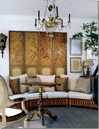 This casual setting with its white linen slipcovered rattan sofa gets dressed up with an antique crystal chandelier.
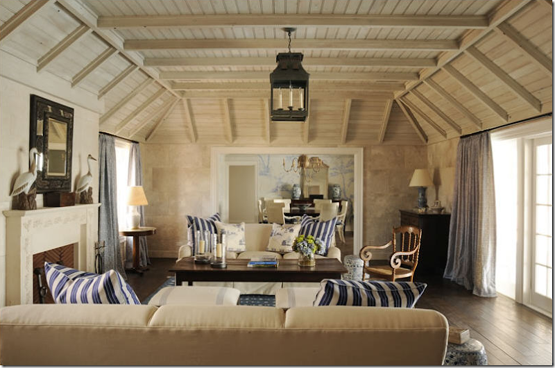
A large black lantern hangs over a casual living room.
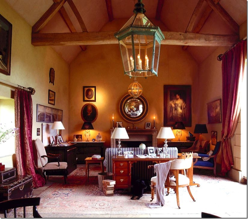
In an old English country house, two large lanterns hang over the living area. The painted green lantern is a true show stopper.

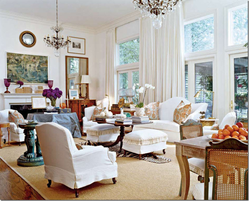 So far this living room has made every Top Ten post: linen, slipcovers, seagrass, curtains and now chandeliers! I’m curious to see if it makes it for all ten elements! The designer chose crystal chandeliers instead of the more expected lanterns to dress up the space up a bit. In a larger room, sometimes two fixtures are better than one.
This beautiful beach house has it all: a large reproduction antique lantern, a ceiling fan, and six pairs of lamps!! I am crazy about this living room – I love the layered effect of all the accessories and furnishings – it’s so casual, warm and inviting.
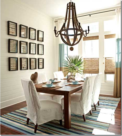
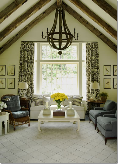 The famous wine barrel chandelier by Bobo’s Intriguing Objects. Restoration Hardware is now carrying this fixtured. It’s a hugely popular choice these days.
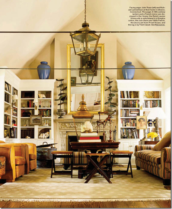
This large brass lantern is reflected in the mirror making it appear there are two. Another large lantern sits at the center table. For extra light, sconces were installed on the bookcases.
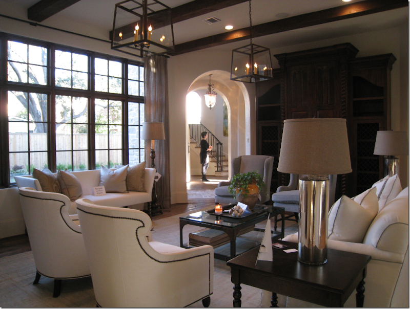
In the Octagon House, Tami Owen used a pair of glass and iron lanterns – available at Brown in Houston. I think these fixtures complete the room – especially since two were used. In the entry, a bell jar lantern was used.

In this Swedish inspired house, two crystal chandeliers were used along with crystal sconces. In Swedish decor – crystal chandeliers are very popular.
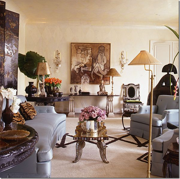
In this eclectic living room – with no overhead lighting – an assortment of lamps and sconces do the job. I can only imagine how beautiful this room looks at night softly lit by the lamps.
In this vignette, Gerrie Bremermann uses a combination of a crystal chandelier, sconces, and lamps to light this living room. It’s a safe bet to say Bremermann loathes recessed lighting just as much as Rose Tarlow does.

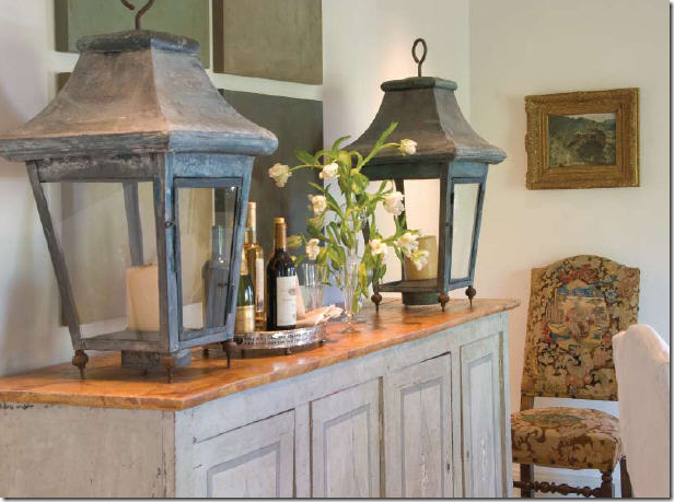 Wisteria owners Shannon and Andrew Newsom use oversized antique lanterns to accessorize their living area. Though these are not electrified – you could have them fitted out to be – thus making them more functional. Aren’t they gorgeous! What a statement they make!
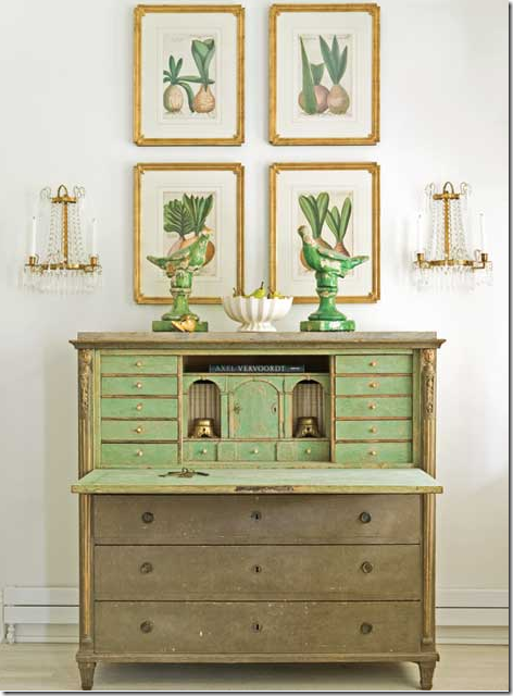 In my favorite vignette of the year – the Tone on Tone owners used crystal Empire styled sconces in their living room.
 In a cotton striped tented room, beautiful crystal and iron sconces wear cute red shades which help tone down their dressiness.


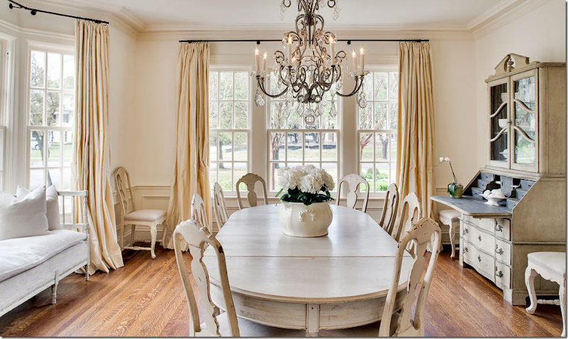
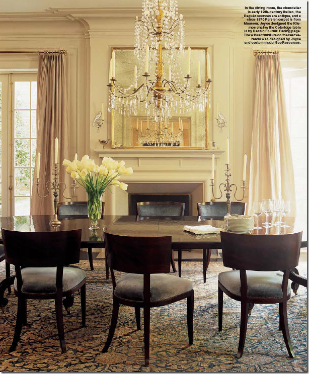 DINING ROOMS: By far, the most common place to find chandeliers is in the dining room. Here, a gorgeous gilt wood and crystal 19th century Italian chandelier hangs over a table surrounded by more contemporary chairs than one would expect, which causes the visual interest here. This chandelier is beyond beautiful. Today, my favorites are the ones that pair gilt wood and crystals, just like this one does. Kerry Joyce, designer.
Gray furniture and gray paneling is perfectly paired with a crystal and iron chandelier.
Phoebe Howard. This charming chandelier reminds me of Cinderella’s pumpkin coach!
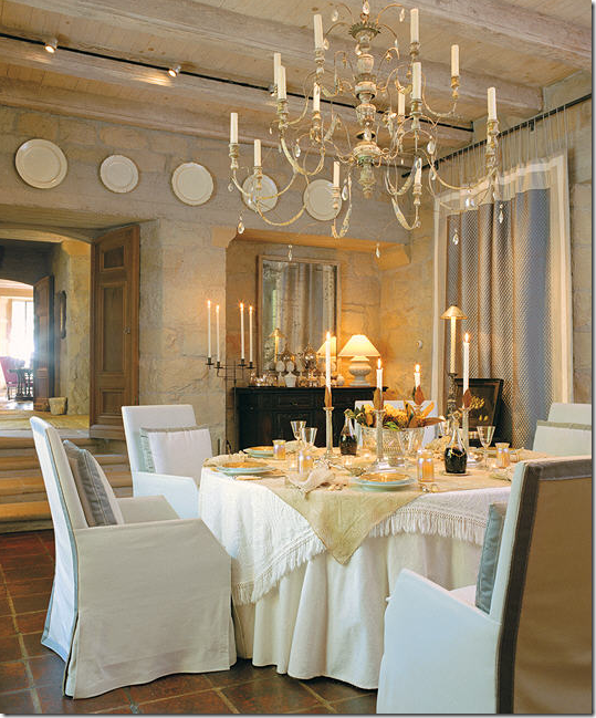 The master: John Saladino at home at Villa Dilemma. His chandelier is not electrified. Notice too the master actually has overhead spots! I’m shocked! (And just a little disappointed too, but I forgive him!) This wooden Italian chandelier is one of the prettiest ones I have ever seen – only Saladino would have it, of course!
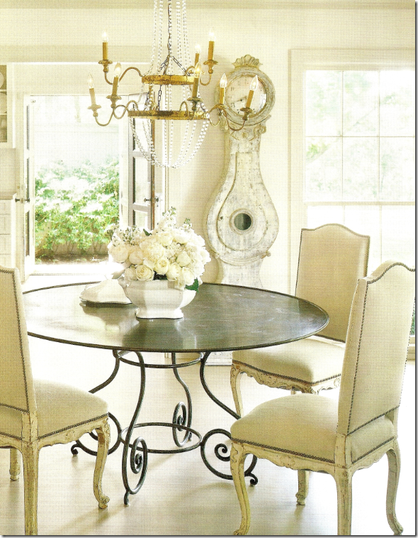
Babs Watkins paired a steel table and French chairs with a contemporary styled flower crystal chandelier. Isn’t that floral arrangement in the silver dish heavenly? No one is Houston does it better than Babs. This picture is probably from ten years ago, yet notice how current it looks with the steel windows – she was always ahead of her time!
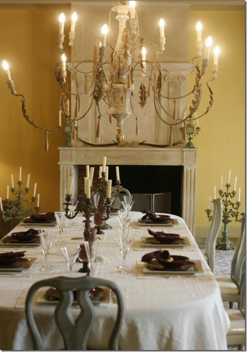 An Italian wood chandelier – so beautiful! They always bring so such beauty to a room which accounts for their current popularity.
An iron and crystal chandelier with matching sconces. So French!
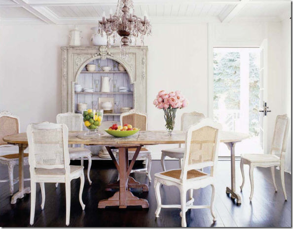
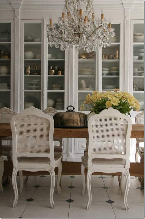
Painted chairs, natural wood table, dark hardwoods and a crystal chandelier. Who could ask for anything more?
 Wisteria’s Shannon and Andrew Newsom’s dining room – one of my all time favorite images! I love everything about this space. But it surely wouldn’t be quite as gorgeous without the lovely chandelier. Jane Moore, designer.
Although this ceiling looks like Swiss Cheese, according to Rose Tarlow, Peter Dunham used lanterns for both the hanging and wall fixtures.
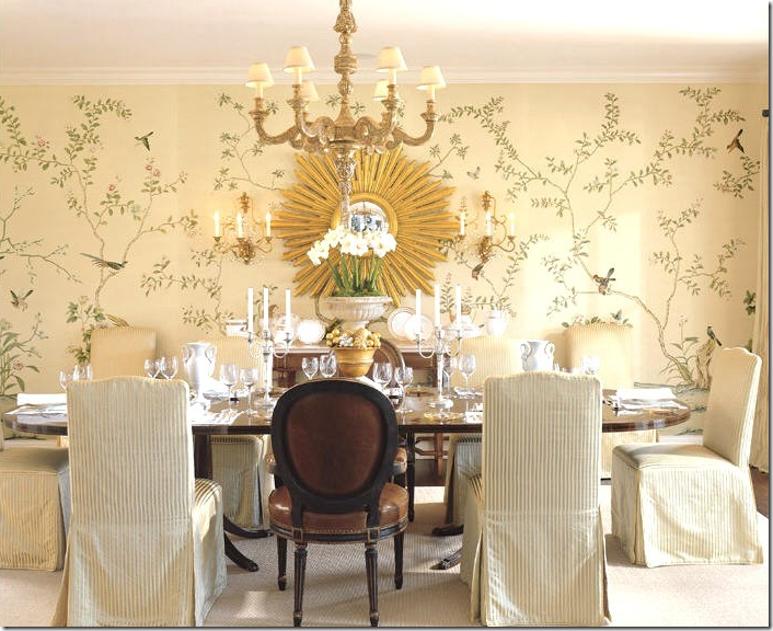
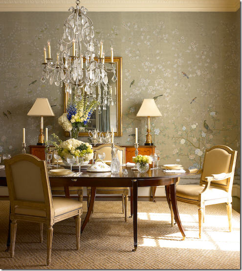
A gilt wood chandelier and gilded sconces are mixed in this fancy dining room with hand painted wallpaper. The slipcovers and the odd chairs bring a bit of casual playfulness to the room.
 The more than fabulous Dan Marty used a pagoda styled lantern this dining room. The yellow is striking against the red chairs.
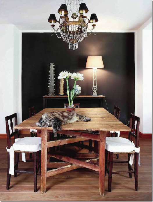 I love this room – a study in contrasts – one black wall stands out among the white ones. The rough luxe table and chairs contrast with the very dressy empire styled antique chandelier. The one lamp is asymmetrically balanced out. I have no idea who the designer is, but he is fabulous, IMO! To read all about the Rough Luxe design movement – go here.
I know it’s only half shown, but I couldn’t resist showing this beautiful room with its Versailles parquet floor and enfilade of rooms. If I was designing a house today – I would love an enfilade styled houses just like this!
This newly designed chandelier with matching sconces is one of my favorites from the Decorative Center. While I usually prefer antiques, these are more than beautiful – designed by David Iatesta.
Another example of a great juxtaposition between the rustic and the refined. In this farmhouse in Fredericksburg, Texas – an antique crystal chandelier gives the kitchen sparkle against all the hard surfaces.
Pam Pierce used an oversized antique lantern in this Houston house. Lit by candlelight – it’s probably not used that much as I spy a Swiss Cheese ceiling – what a shame! Notice how wonderfully perfect Pierce designed the curtains – with the arched doors – she takes them over the arch, right up the ceiling, extending the visual line thus making the ceiling appear taller.
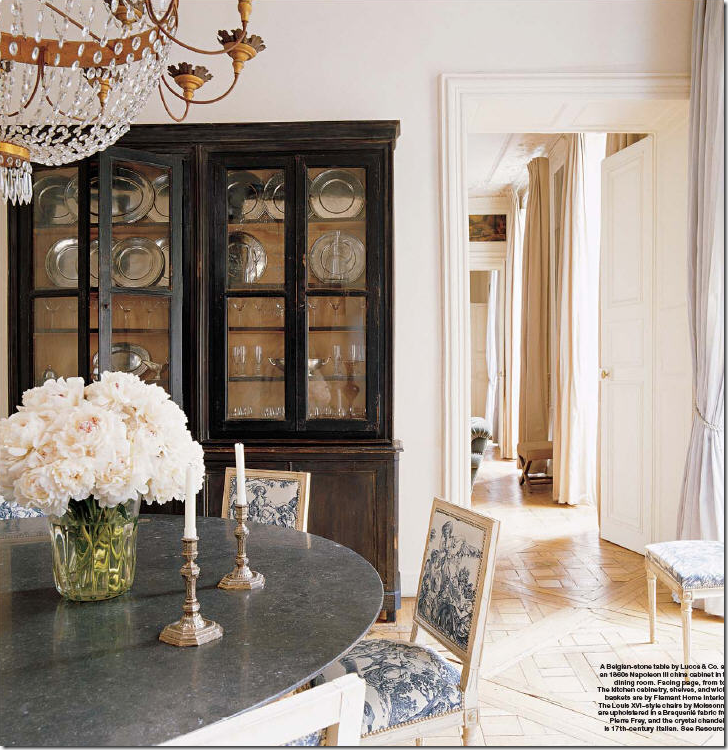
Belgian design: painted and limed woods with crystal chandeliers. This says it all in a nutshell.
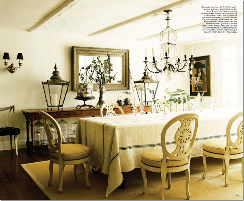
This dining room in a country house is so visually interesting. The owners paired a fancy crystal chandelier with a simple table cloth which dresses it down. Sconces provide extra lighting. But it’s those lanterns, not wired, that grab all the attention – antique or copies, who cares? They are fabulous!! One comment from the peanut gallery, the mirror should have been hung vertically, the ceiling would look two feet higher!
As traditional as it gets, but the lamps on the console are a more unusual choice. Here one would expect to see a pair of sconces in a room so “decorated.” I like the lamp choice and especially how the shades mimic the color of the chair leather. The sisal carpet also dresses down the room a notch and makes it look younger, not granny.
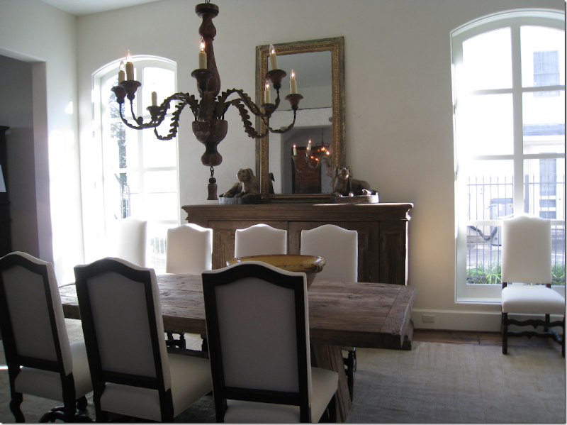
In the Provence House, Ginger Barber used a wood chandelier mixed with a wonderful rough edged table and Os de Mouton chairs. The scale of the chandelier is perfect – in fact Barber’s whole design is perfect here.
One more time - the Swedish inspired dining room in Dallas, Texas! I fell in love with this room – and wondered how beautiful it must look at night with the chandelier softly lit – it’s brightness controlled by dimmers. The light fixture is vital to this room’s design – its sparkle plays against all the matte finishes of the woods.
Washington DC great, Darryl Carter’s dining room is a study in high contrast: dark woods play against white walls and floors. The painted barn door is the focal point to be sure, but the Baroque style chandelier in black iron is very effective too. What a gorgeous room – hard to imagine how it would look with the light fixture!
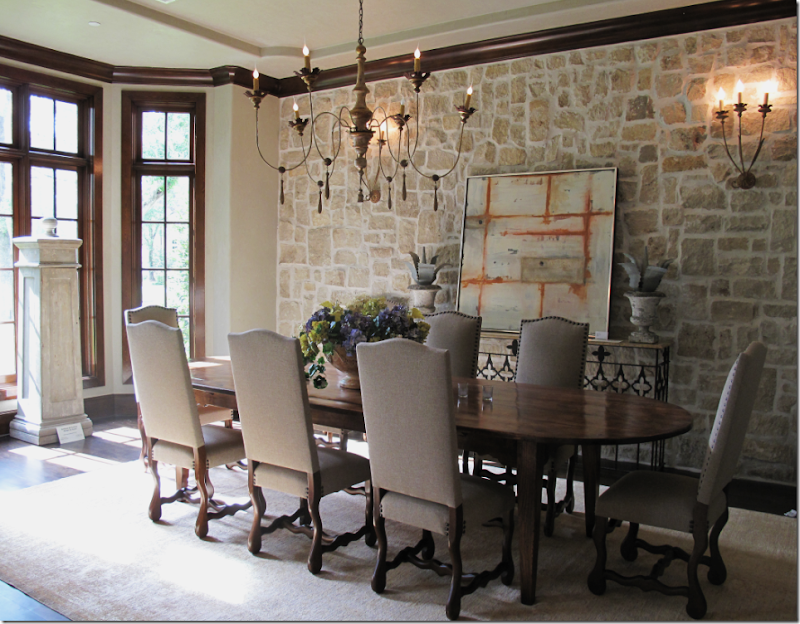
In the Tile House, Maria Tracy used an Italian wood chandelier with matching sconces – their lightness and femininity is juxtaposed against the roughness of the stone and the massive wood table.
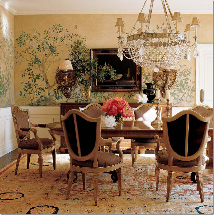 In a seemingly traditional dining room, the designer plays with the scale of the light fixture. It’s sheer size becomes the focal point, even over the gorgeous hand painted silk wallpaper. The sconces too are oversized.
The wine barrel chandelier shows up in the beach house – perfectly scaled for the room’s size.
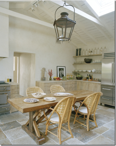
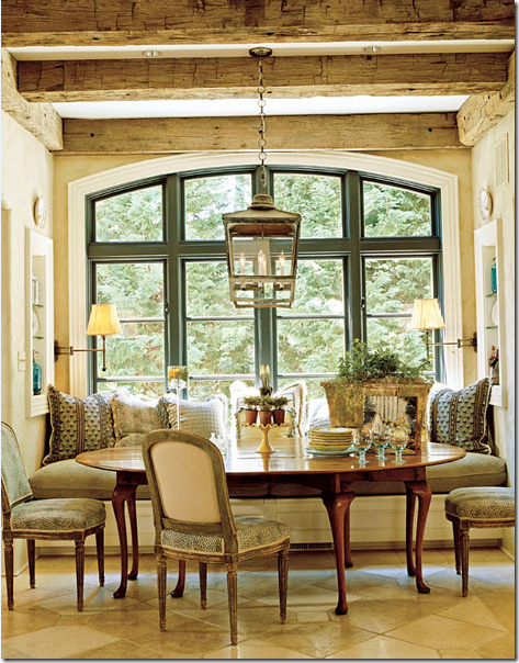 BREAKFAST ROOMS AND KITCHENS: What a gorgeous breakfast nook with it’s beamed ceiling, beautiful window, and antique table and chairs. Yet, even with all the impressive architecture of the space – the lantern steals the show.
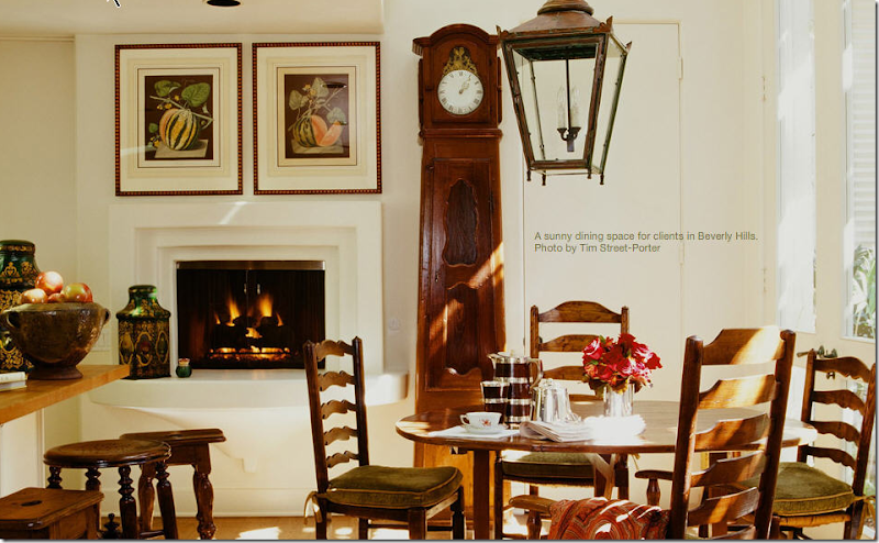
LA designer Martyn Lawrence Bullard used a lantern in this breakfast home in Beverly Hills. I love the way it looks against the tall clock.
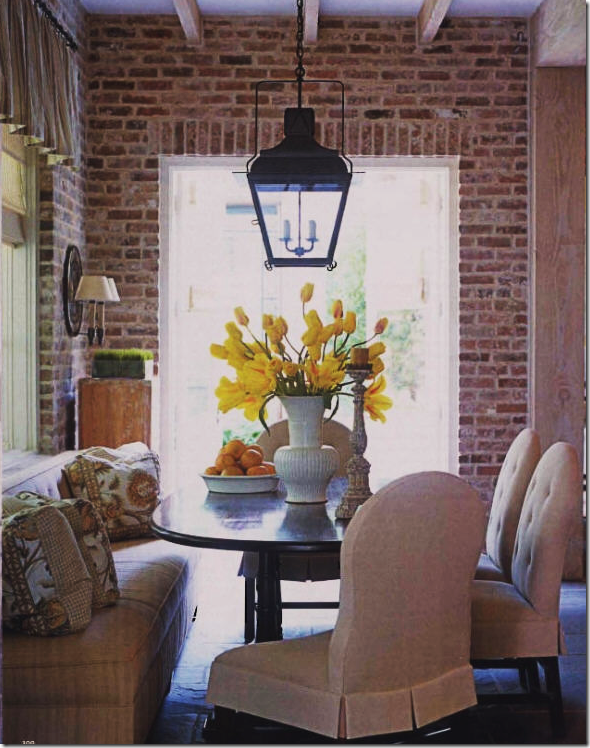 A lantern was used in this Houston breakfast room – along with a banquette. Aren’t those chairs gorgeous? I love their scale. Randy Powers – one of Houston’s best did this house for the owners of Visual Comfort aka Circa Lighting.

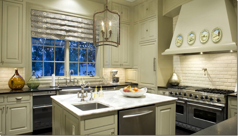
The owners of Baltimore’s Tone on Tone used these smashing green pendants for lighting in their kitchen. The kitchen is one place in the house where a few strategically placed recessed lights may be needed.
I love this lantern over the white marble island. Pretty kitchen, located in Austin, Texas.
John Saladino’s breakfast room at Villa Dilemma – again, a crystal chandelier plays against all the rough, stone walls and the beautiful steel windows. Notice how the steel display case mimics the window – just beautiful! Seeing this house in person is on my bucket list.
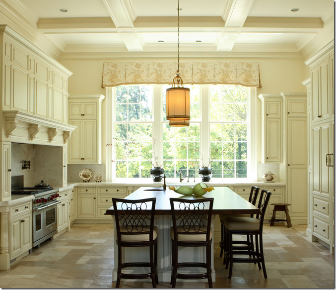 From Things That Inspire HERE, this wonderfully symmetrical layout is highlighted by these pendant lights over the huge island.
 This French inspired kitchen has an original French antique lantern above. Strictly for looks though, it’s not electrified, although any good lighting store can turn an old lantern like this into a usable one.
Though this kitchen also has spotlights, the lantern has been electrified – I love the way this room looks!

If two are better, how about three? The movie house in The Holiday – featured a large kitchen/living/dining area – lit up by lanterns. As with all Nancy Meyers movies, the house had a starring role. Her new movie due out this Christmas promises to star another wonderful house!
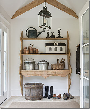
The mud room off the kitchen at Tone On Tone owner’s house is lit with this black lantern. I think it makes the room – it adds just the right touch.
BEDROOMS: Bedrooms usually have ceiling fans instead of light fixtures and finding images of rooms without them was hard -but I did find a few. Here a lantern hangs over a wine tasting table, which prevents someone from bumping their head on it!
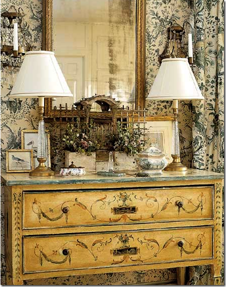 In this beautiful bedroom vignette, by Bobbi Smith, she used an assortment of lighting options beside overheads: lamps and crystal sconces.
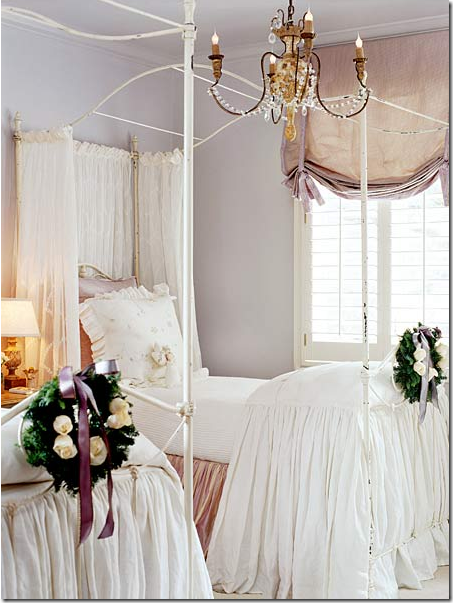 Pam Pierce used a beautiful antique gilt wood and crystal chandelier in this beyond dreamy bedroom.

In this bedroom wallpapered in a Scalamandre toile – Phillip Sides used lamps and wall sconces for lighting.
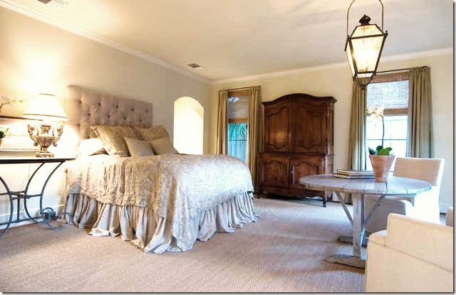
And again, another lantern over another table – I love this bedroom and the furniture arrangement. For large cavernous bedrooms, this is a great way to fill out the space – float a sofa, a table and add a chair in the empty space in front of the bed.
BATHROOMS SUITES: John Saladino in his powder room at Villa Dilemma used a wonderful lamp for lighting, instead of recessed cans.
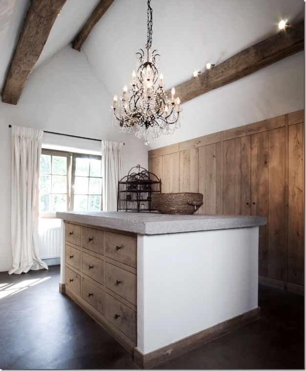
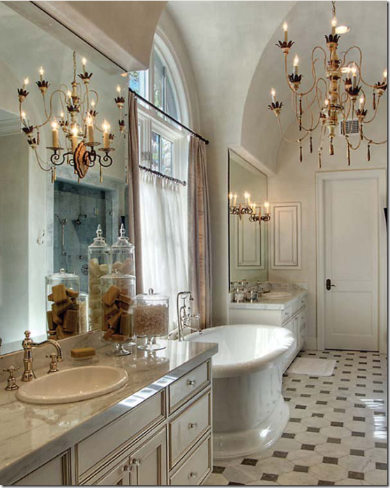
In a bathroom/closet combination in Belgium, a large crystal chandelier turns what is usually a boring space into something spectacular. Though I do think the spots are a huge detraction!

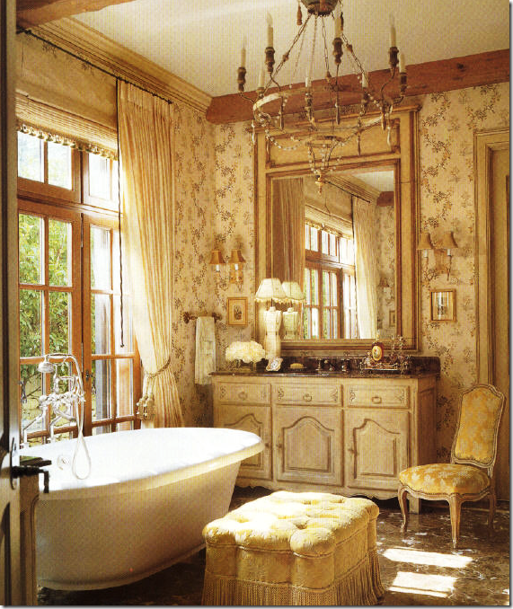 In this bathroom, a beautiful wooden Italian chandelier fits right in with the decor of the room. Sconces are used too.
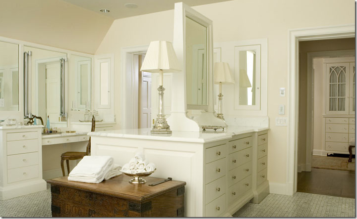 In this master suite, the large lamps become a statement. I love to use lamps in bathrooms and kitchens both.
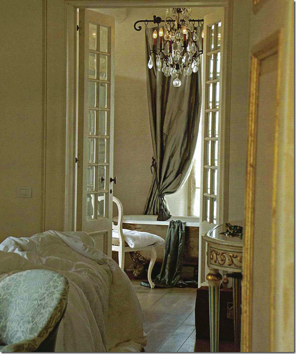 Greet from Belgian Pearls showed this picture from a gorgeous Tuscan hotel – what a bathroom! Besides the gorgeous silk curtains, the chandelier is the perfect finishing touch.

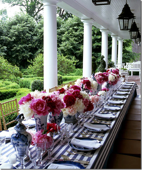 This image is so gorgeous – a party table set with a line of pink and white peonies in blue and white vases atop a blue and white striped tablecloth. The lanterns mimic the line of columns. What a porch, what a tablescape!
And last, this stone poolhouse in Houston was designed by Pam Pierce – do you understand yet how fabulous Pierce is? This pool house was put together from a building that came from France via Chateau Domingue. The lanterns are hung flanking the front opening. But notice the beautiful chandelier inside – hung expertly by Pierce so that it can be seen from the outside. The table underneath with its large bowl of hydrangeas finishes the vignette. Pierce realized that the view from the outside was just as important as the inside view. That’s the mark of a great designer.
Tune in for Top Ten Design Elements #6 – coming soon to Cote de Texas!!

