A few months ago, a reader emailed me asking if I would like to tour her house. She said her friends had encouraged her to contact me, saying I would really love it. And I have to say, they were completely correct! Located in a close-in, gated community in Houston, the house was around 15 years old when the current owners bought it - then totally gutted it. Before, it had been a rather bland traditional with large, nicely proportioned rooms. But, the decorative elements were all wrong for Kay, the current owner. Upon meeting the quiet and somewhat shy Kay, it is quickly apparent she is highly intelligent. Although not schooled in design, she undertook the massive project with more knowledge than many who are. Her exquisite taste drove the renovation. The house was stripped bare of all its superfluous details. Today the house is sophisticated and elegant with classically correct moldings and trims, executed by expert tradesmen. Kay read “The Theory of Moldings” before the renovation, and it shows. No detail was too small to be overlooked. The window placement and stair rail were executed with mathematical precision. The floor plan is near perfection – it would be hard to imagine changing a thing. Throughout the house there is a continuity of color and décor. White rooms flow together from one to another, evoking a quiet, museum like atmosphere. The repetitive design theme is one of the more alluring aspects of the house. There are three teenage boys, each with their own bedroom and bathroom – yet the decorative choices for each are the same. Their baths all have the same marble, tiles and plumbing fixtures. Their bedding is the same. Why choose different elements, when the first choice is so perfect?
If the architecture is the star, the hardware by Nanz is the supporting cast. The surfaces are alive, allowing a patina to develop, aging the handles and pulls. Some hardware is burnished brass, others are burnished nickel. In the kitchen, cabinets open with knobs made out of silver, a luxurious and beautiful choice rarely seen. The house is clutter free – scattered about here and there are leggy slipcovered antique sofas and chairs – allowing one to see the house itself instead of its contents. But, this is not to say that Kay doesn’t collect. Her library is filled with almost every design book ever published and her cabinets are laden with gorgeous antique place settings. Creamware is another much collected item – her pieces made me green with envy. It’s been a few months since I visited with Kay and since then the house was put on the market. Some of these photographs are from the professional real estate brochure and some are from before the renovation – most are mine. Enjoy!
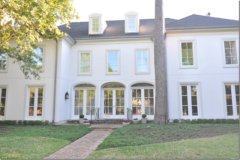
BEFORE: Built in 1993, the house was hidden behind the landscaping.
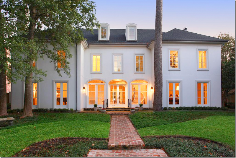
AFTER: Now, you can appreciate the clean lines and perfect symmetry of the façade. All the windows were replaced and the shutters were removed. The entire front entrance, with its three sets of French doors, was also changed.
The large foyer with staircase is in the middle section behind the three French doors. To the left is the living room and to the right is the dining room. Past the foyer, large double doors open onto the family room. The house is 7,500 sq. ft. with six bedrooms and bathrooms and 2 powder rooms. There is an elevator which reaches the third floor, seen here behind the dormer windows.
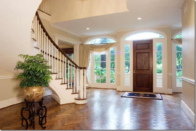
Before: The layout of the house was nice, but typical, with its large foyer and public rooms. Those drapes!
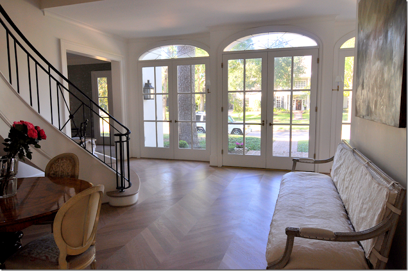
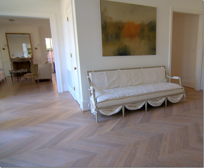
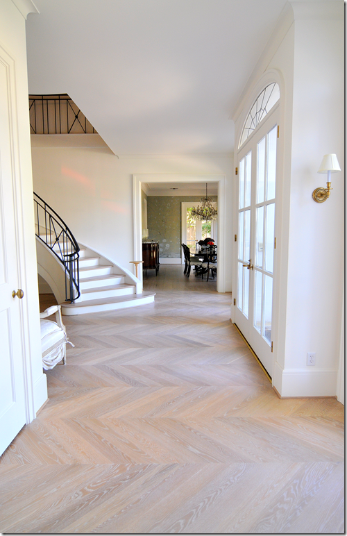
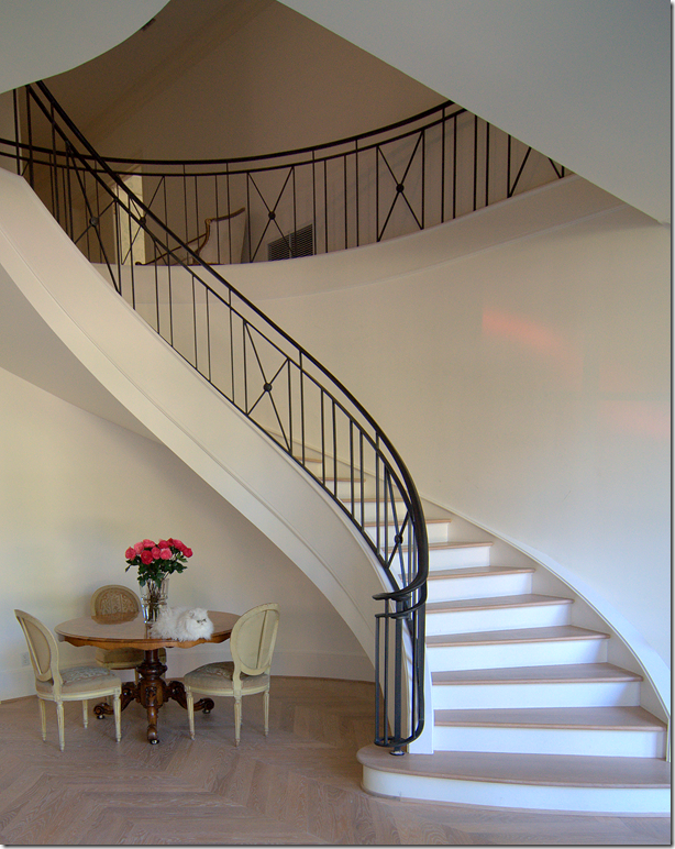
AFTER: The staircase was completely replaced, as were all the windows and doors and floor. Today the hardwood floor is Carlyle 8” wide, old growth planks, done in a natural Belgian finish.
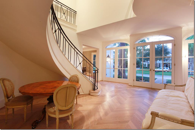
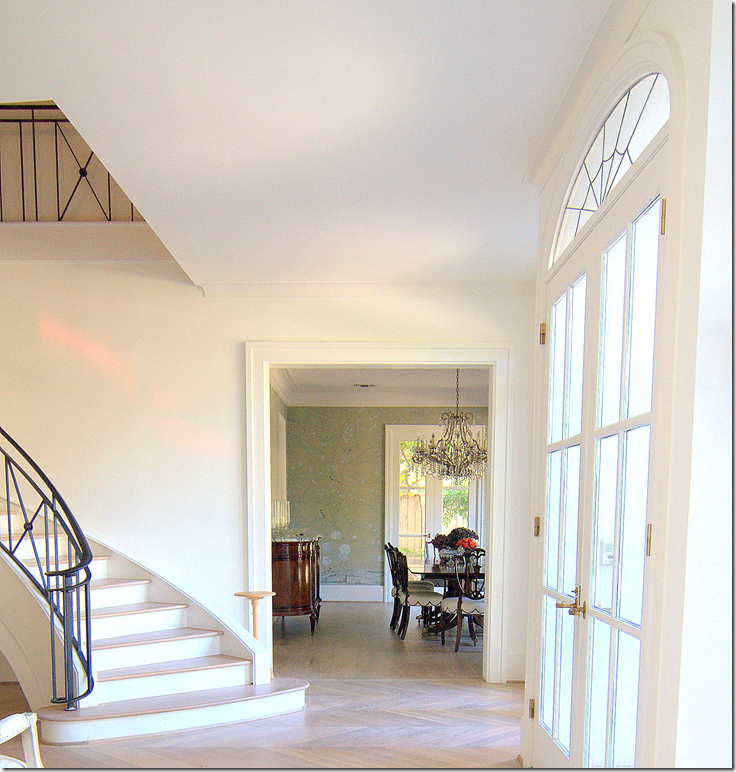
The elegant floating staircase is the focal point of the foyer. The staircase is inspired by one Kay had seen in a hotel in Argentina.
To the right of the staircase is the dining room, to the left is the living room. Past this table are double doors that lead into the family room.
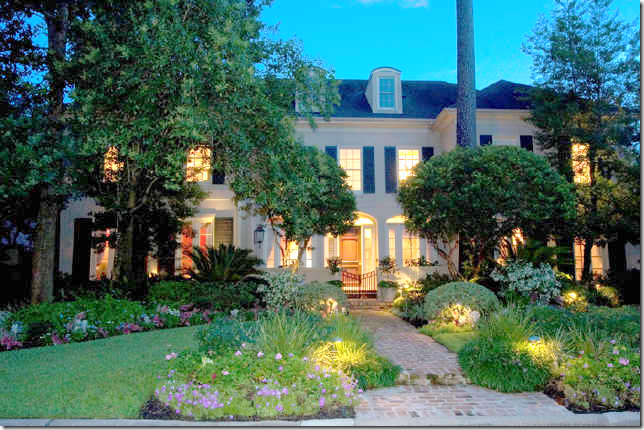
The view at dusk.
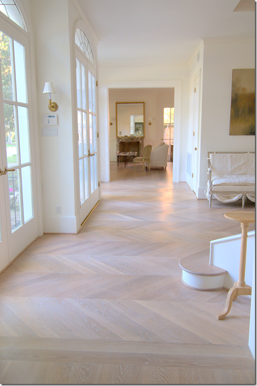
The front door is slightly indented from the French doors on its left and right. Here you can see the living room which sits at the end of the front hall. This hall runs from there to the living room.
The French settee is slipcovered. I love the detailing at the bottom. To the right of the settee is the back hall that leads to the powder room and the library.
BEFORE: The Living Room. Its cabinets were replaced with French windows which lets in more light. The fireplace was also replaced. The library is through the double doors on the right.
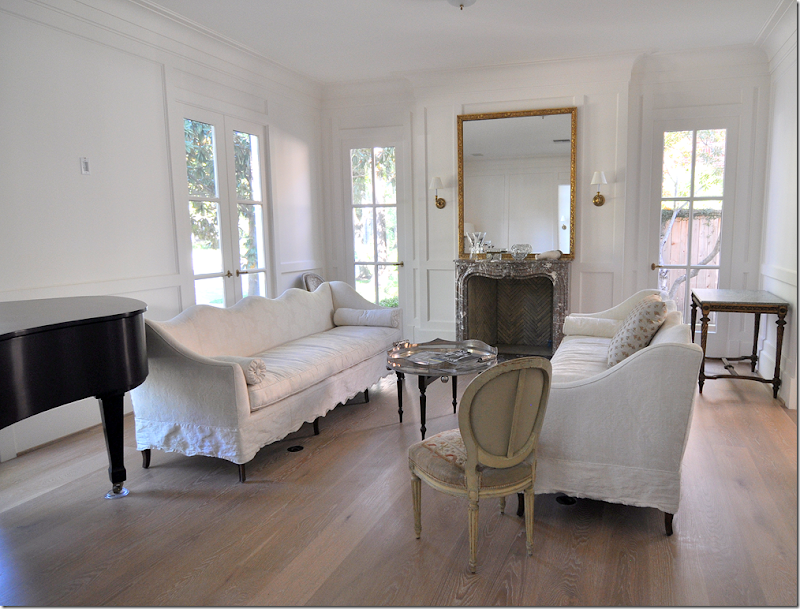
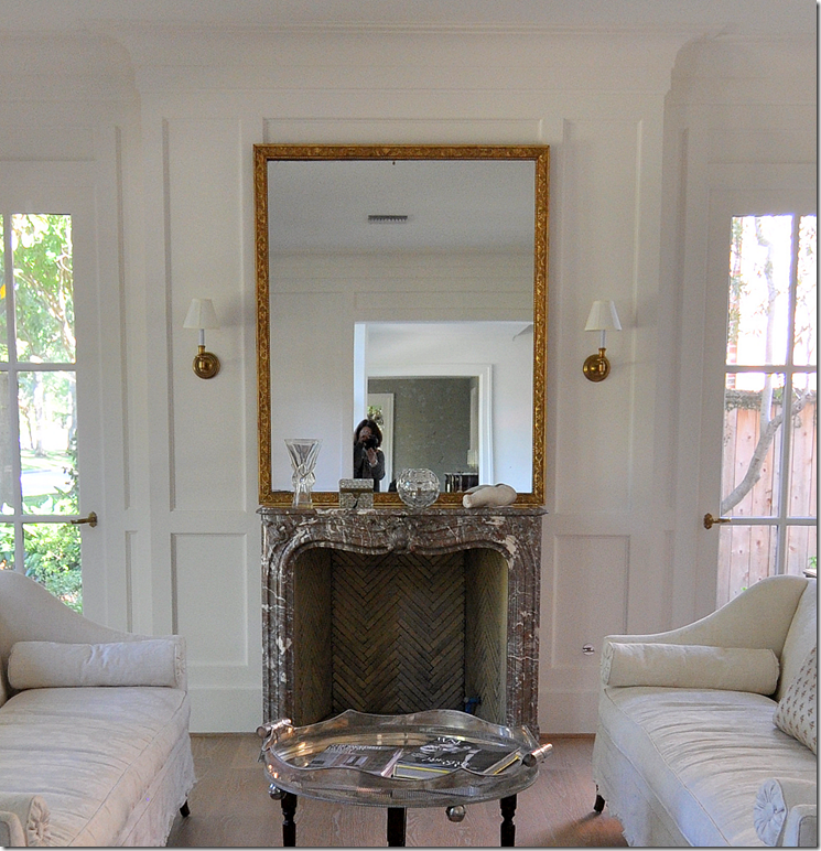
AFTER: The Living Room today. The fireplace, from a John Staub house in River Oaks is a French antique made of Bresia marble. The firebox is ISOKern. The walls are paneled and painted in a dead flat white oil. Amazingly beautiful.
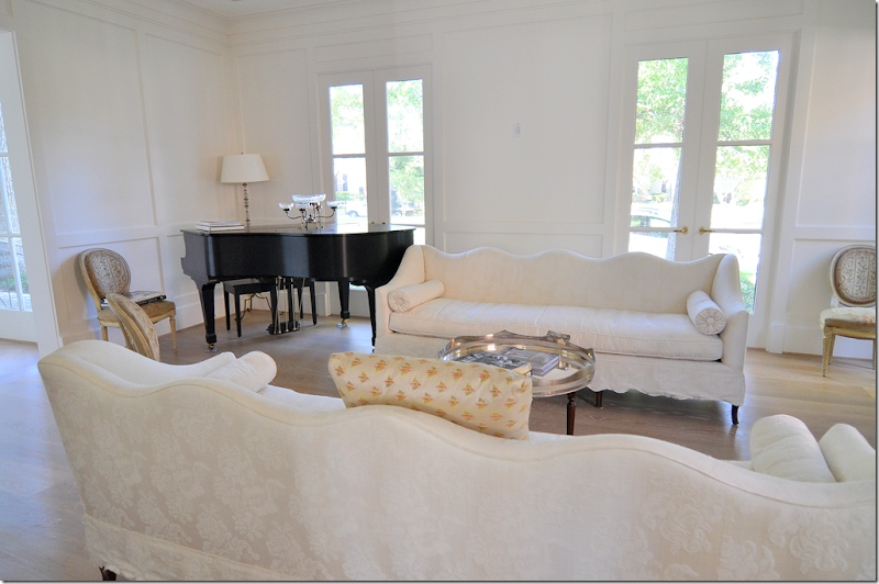
One sofa is antique, the other is a custom copy. They are both slipped in an elegant white damask. The scalloping on the sofa’s back is repeated in the hem. All the windows let in light from each direction. As Kay says – the house is about light and subtle color. Beside white, soft aqua is the second color found about.
A close up of the fireplace – notice the beautiful firebox, a feature rarely ever seen.
BEFORE: The library was paneled and rather boring.
After: The Library. This room is Kay’s private domain. French styled bookshelves ring the room. Each section has a pull out shelf. The paneling is also painted in a flat oil.
At dusk. The French doors overlook the patio and the swimming pool in the back yard
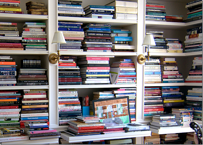
The owner has collected almost every design book published! I see so many titles I recognize. “Paris Interiors” looks well read! Totally swoon worthy.
The long front hall, from the living room – looking into the dining room.
Almost at the dining room. I love how the light from the street is reflected back into the house as pink stripes along the stair wall!
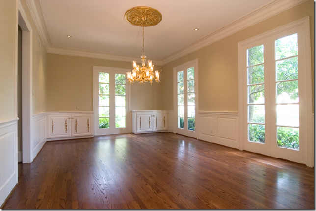
BEFORE: The Dining Room: The cabinets and moldings were removed. The one door to the kitchen became two doors on each end of the wall. All the windows were replaced with those with a slimmer profile and fewer panes.
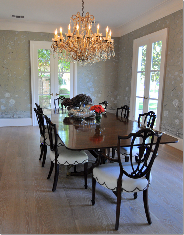
AFTER: The DeGournay hand painted wallpaper was custom colored in a soft grayish celadon which matches the blue green gray eyes of Kay’s white cats.
I love the scalloped nailhead trim on the chairs. The gorgeous dreamy chandelier is antique from Kay O’Toole.
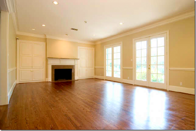
BEFORE: The family room windows overlook the swimming pool.
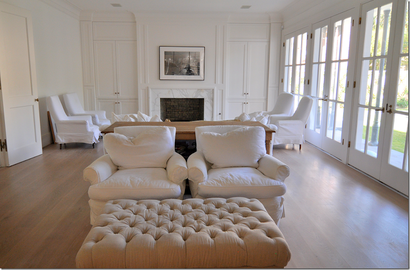
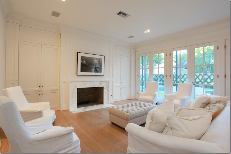
AFTER: The Family Room is off the foyer, to the left through double doors. New cabinets and fireplace with Calacutta Ora marble. The two French doors were replaced with a wall of doors in the 2 over 3 panes. The room is divided into two sitting areas with matching tufted ottomans. The kitchen and breakfast room open onto this room through large French doors.
The flatscreen hides behind the cabinet.
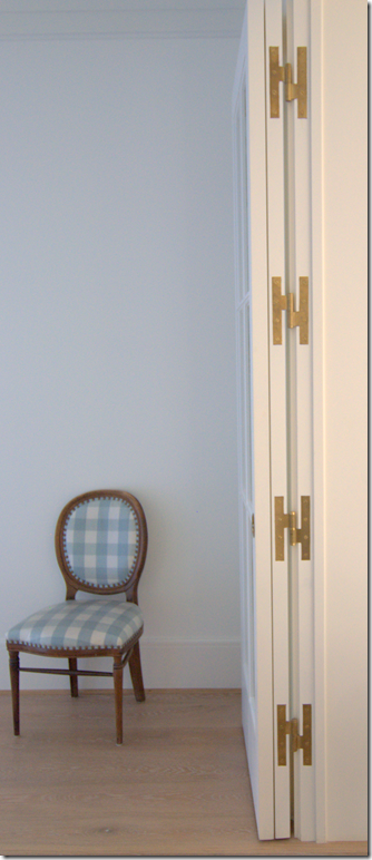
Between the family room and kitchen area, French doors fold back flat. All the hardware was custom made to order from Nanz. Notice the beautiful H hinges in the door.
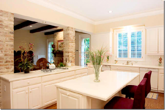
BEFORE: The kitchen and breakfast room was divided by brick columns that were removed. This entire area was completely gutted and taken back to the studs.
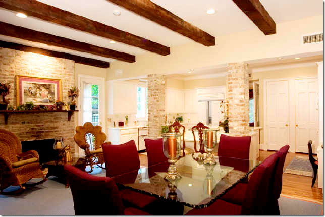
BEFORE: The Breakfast Room - the beams, bricks and fireplace lend a country vibe. All these elements were removed, including the fireplace!
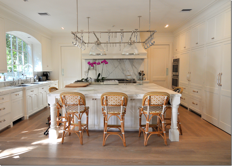
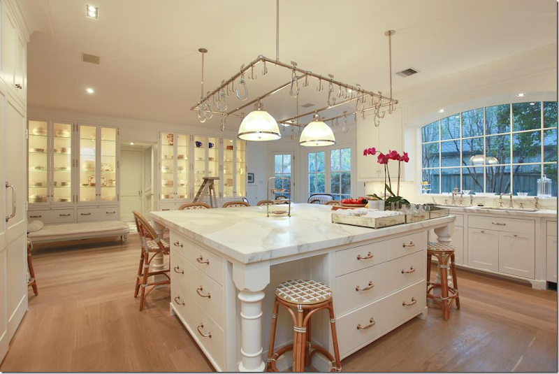
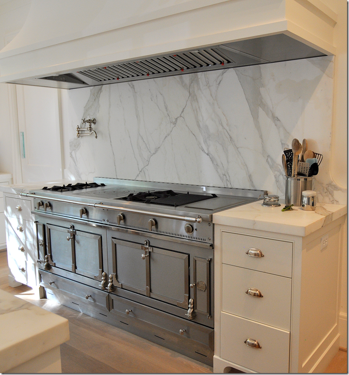
AFTER: The kitchen island, with seating for 8, is topped with a gorgeous Calacutta Ora marble slab. Included here is 2 sinks and 2 dishwashers, 2 Wolf ovens and a range. The subzeros hide behind cabinet doors. The marble slab behind the range along the back wall is a focal point, as is the fabulous pot rack. On either side of the range along the back wall are the two doors leading to the dining room
Notice the silver hardware – it is just stunning. Here you can see into the family room on the left and the breakfast room area on the right.
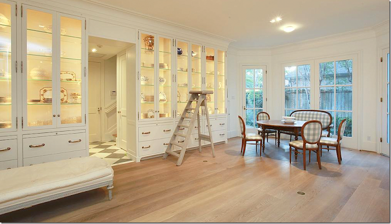
A row of lighted cabinets in the breakfast room area hold collections of creamware and antique place settings. Two sinks sit side by side under the arched window.
What can I say? The marble is incredible.
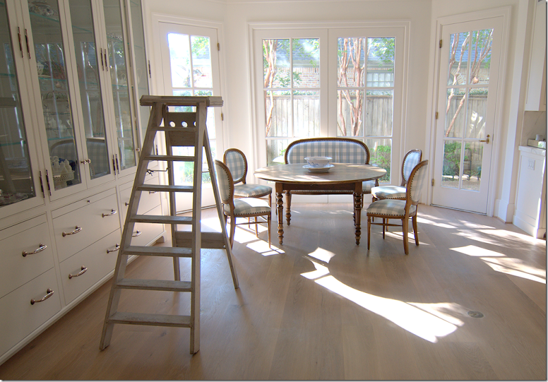
The fireplace was removed and replaced with a bay window. An antique style French library ladder sits in front of the cabinets for ease.
Charming antique French table and check covered chairs in aqua, the second color found in the house.
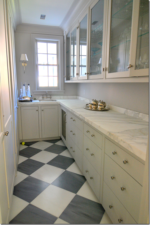
An antique French day bed sits in front of the cabinets. In the middle, is the back hall that leads to the back stairs, butler’s pantry and garage.
A close up of one of the display cabinets, fitted with sapphire glass shelves. Pull out shelves come in handy when setting the table. The silver knobs, handles, and hinges are left to patina instead of polishing.
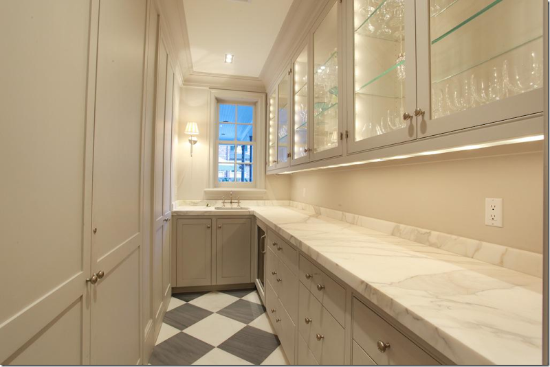
The Paris Ceramics gray and white marble floor is a rare pattern found in the mostly white house.
At dusk, more gorgeous Calacutta Ora marble countertops.
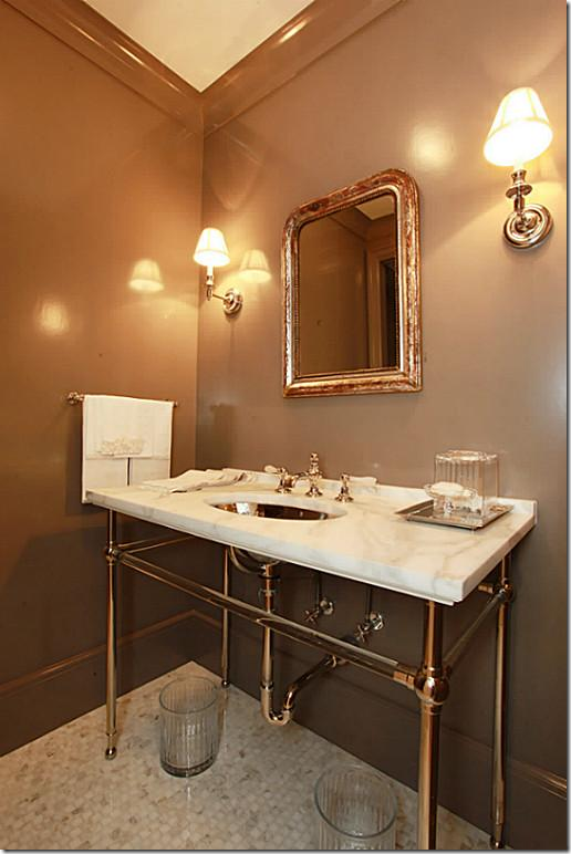
The powder room is off the library back hall, next to the elevator. The Waterworks crystal wash stand has a Calacutta Ora marble countertop, along with a hammered French nickel sink. Notice the marble mosaic tiled floor and gray-brown lacquered walls.
BEFORE: The bedroom suite was completely redone.
BEFORE: This all became part of the master suite.
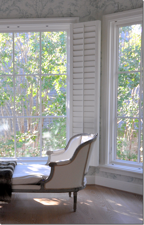
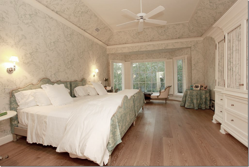
AFTER: The Master Suite. Double doors lead into the European styled master bedroom suite on the second floor. The new bay window sits atop the matching breakfast bay window downstairs. The room is wallpapered in Scalamandre’s Oriental toile in soft aqua. The 8” old growth hardwood floors are continued upstairs. The ceiling was raised and coffered.
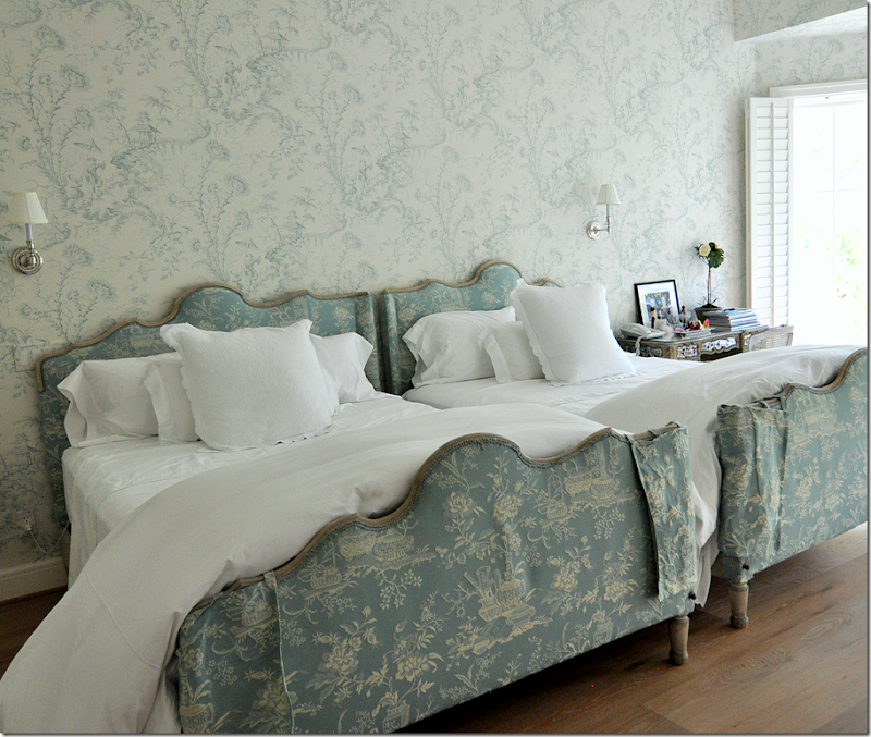
Matching antique French bedframes have a scalloped head and footboard. The footboards wear cute little corner slips to guard against the cat’s claws!! I love how the duvets are extra long and fluffy – note: order king for a double bed to get this effect. It’s so much more luxurious!
Across from the bed, a wallpapered jib door to the left of the built in cabinet leads to the bathroom and closets.
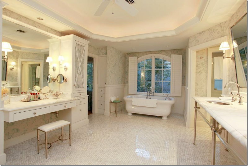
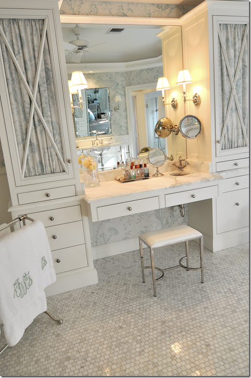
The same elements in the powder room are repeated in the master bathroom: Waterworks crystal marble vanity with hammered nickel sinks and Etiole faucets. There is an exposed Etiole thermostatic shower. Kay’s vanity to the left has its own tiny hammered nickel sink. The floor is Calacutta Ora mosaic tiles.
There are His and Hers private water closets in the suite. Against the back wall, the linen cabinet is lined in Scalamandre Oriental toile.
Across from the sink vanities, is Kay’s makeup area with its own tiny sink. It sits between two linen towers with lined fabric doors.
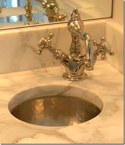
A close up of Kay’s tiny hammered nickel sink and corner faucet. So cute!!
The freestanding bath sits under an arched window.
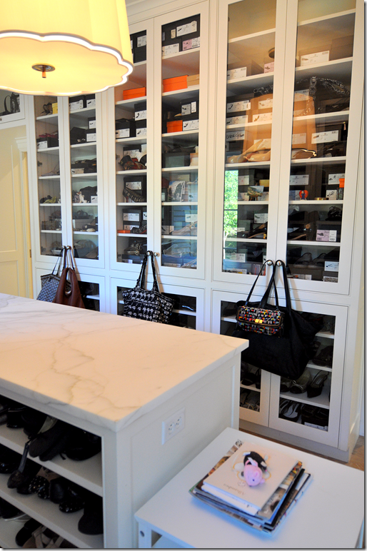
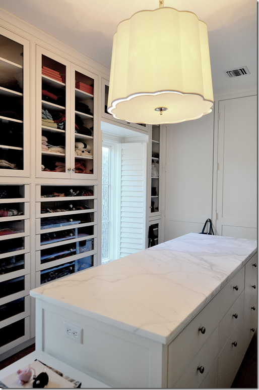
Kay’s closet is all behind glass and wood doors.
Her center island is topped with Calacutta Ora marble. I wonder if there is any Calacutta marble left in the world???!
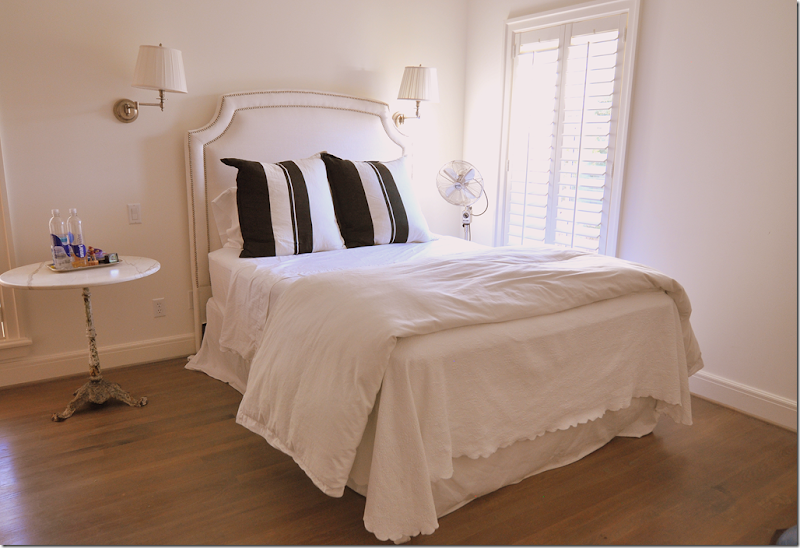
The three teenage boys each have their own bedroom and bathroom – all on the second floor. Each has a built in desk and their black and white bedding is also the same – providing more of the continuity seen throughout the house.
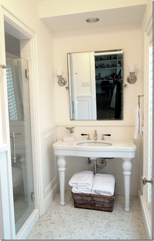
Their bathrooms have washstands and mosaic tiled floors.
Their showers have an Etoile thermostatic rain shower system with white subway tiles. To dream – I want this!! I want this!!!
The second floor laundry room has its own marble countertop. Wait – this isn’t Calacutta Ora! Shock!!! Actually, here, and in the third floor bathroom, the marble is Imperial Danby.
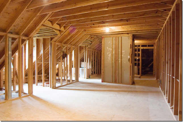
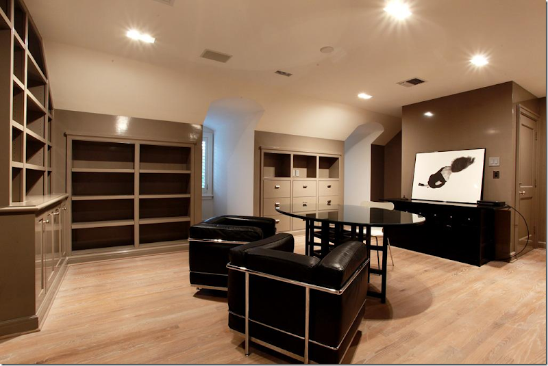
BEFORE: The third floor wasn’t finished. Today, it has a study and 2 huge storage closets, along with a bathroom. The elevator goes up to the third floor, which is a huge luxury when you have packed luggage.
Today, the third floor is finished out with lacquered book shelves – this would make another fabulous library – if you needed it!!
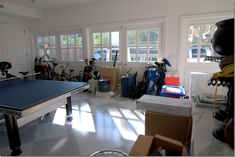
The 3 car garage is so cool. The doors were removed and replaced with carriage house styled double doors. The floor is painted in large gray and white squares. The garage now doubles as a sports haven for the boys and their friends.
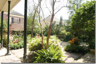
BEFORE: The back yard was a landscaping mess.
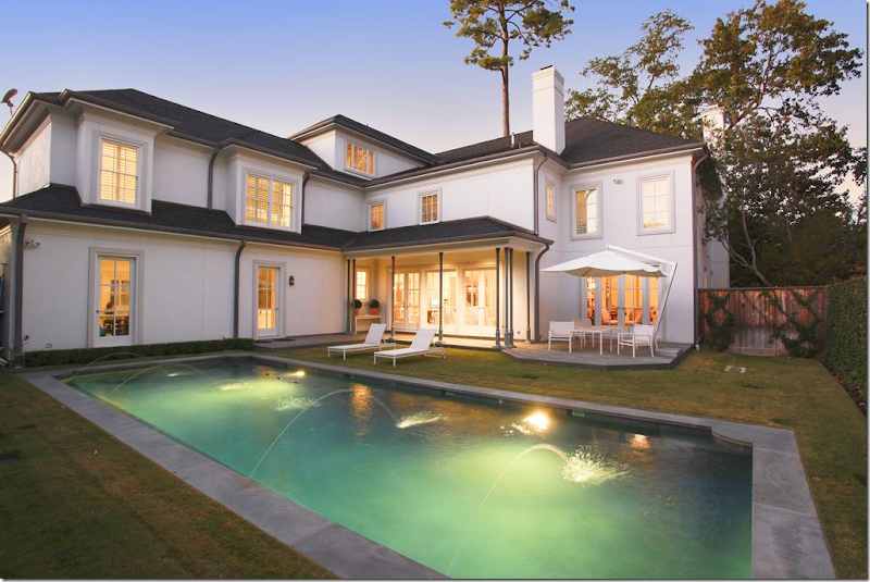
Today, seen at dusk, the back yard has a pool set simply in the grass, European styled. Surrounding it are vine covered fences. Here you can see the layout of the house – the garage is on the left. In the corner is the family room and at the far right is the library.
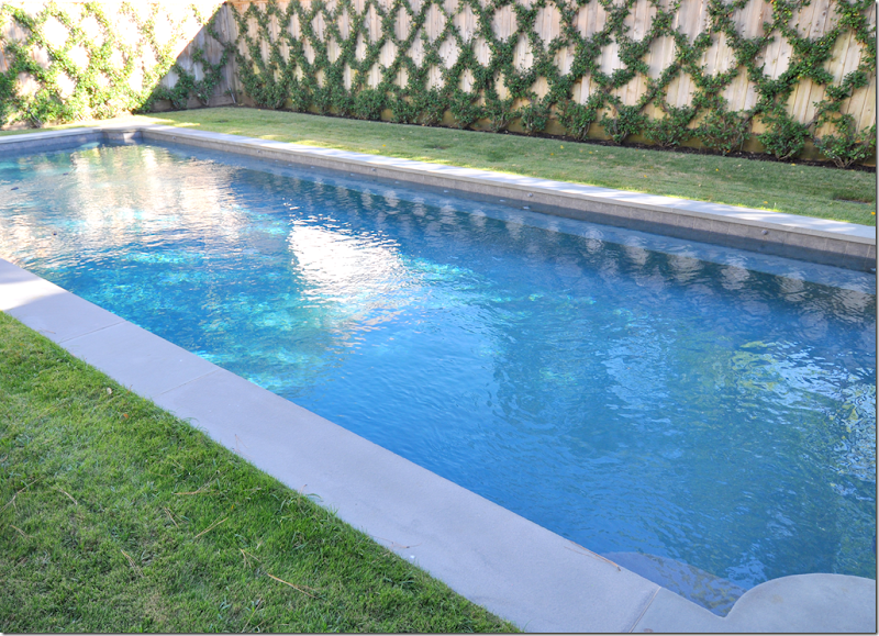
And, finally, the swimming pool is vivid blue when seen during the day. Dreamy.
I hope you have enjoyed this second installment of the Readers’ Houses Series! A huge thank you to Kay and her family for welcoming us in for an in depth look into their beautiful house. (I just had to show this photograph again – I think the foyer is so gorgeous!!)
To see the HAR listing, go HERE.
And remember to send in your own house for the Readers’ Houses Series. Don’t be shy. Not all houses are as fabulous as the first two have been. In fact, I’m hoping to get a lot of small, redone on a budget houses. AND, the Readers’ Kitchens Series is still going strong. If you have sent in your kitchen – don’t worry, I’ll get to it. I have a lot of kitchens still left to show. And if you haven’t sent in your kitchen, do. I hope to show these two series into 2013!!


