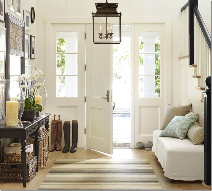
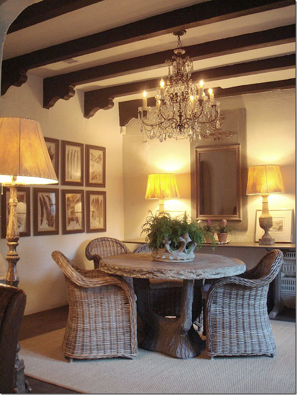
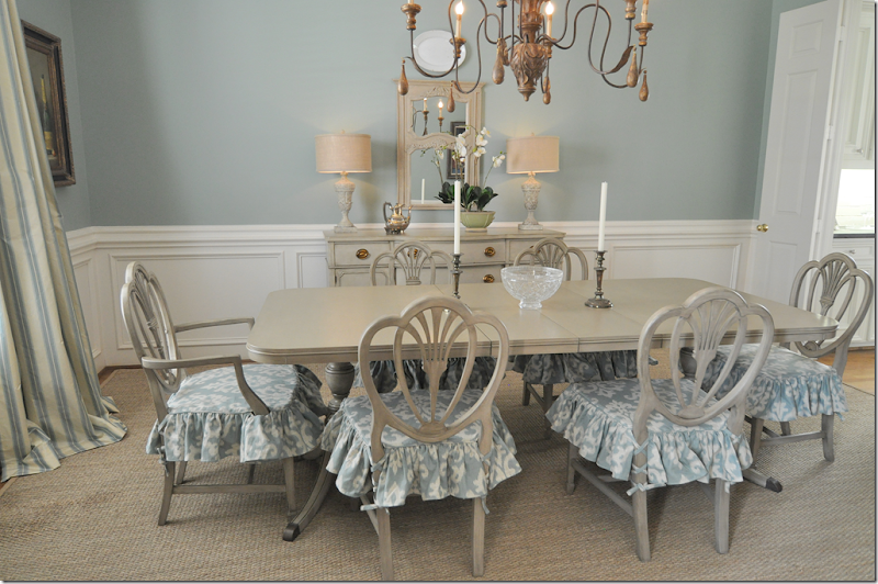
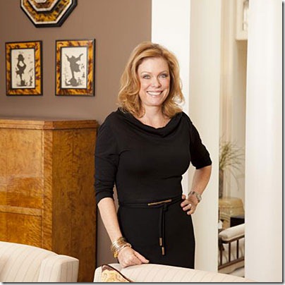
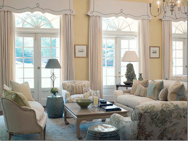
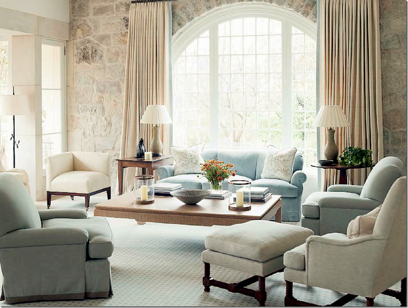
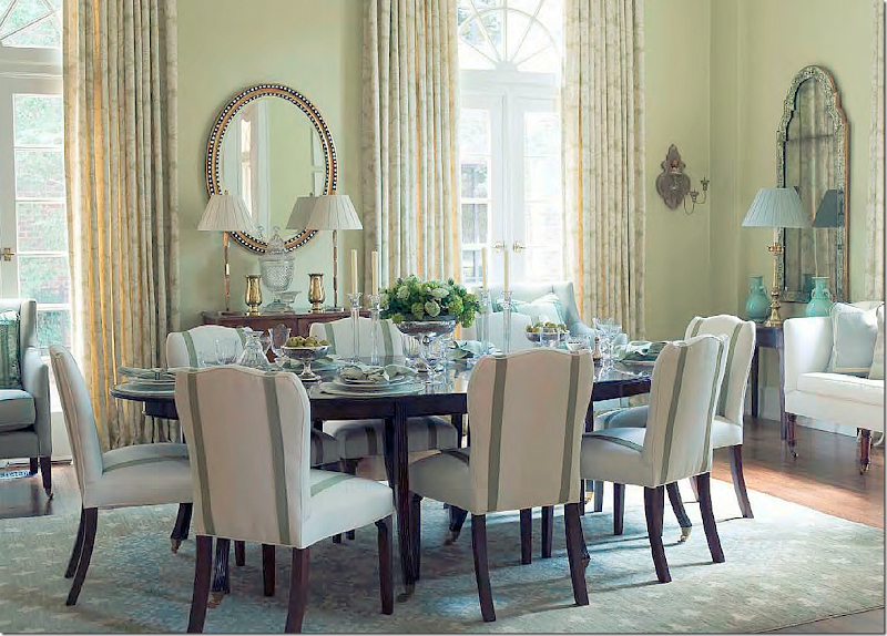
I get a lot of emails from readers asking questions, so I’m starting a new series called “Dear Miss Cote de Texas.” No promises, but if I get some questions that I feel others can benefit from the answer, I will post them. Anonymously, of course.
So, today, our first Reader Question asks:
Thanks to your blog, I've been keeping myself quite happy until now. This most recent blog on Pamela Pierce really got to me. I utterly hate my house now. I have two large love seats. Everything is custom. The fabric is also on the window in the kitchen and it's a print. It's got a reddish color in it and one wall in there is that reddish color. I hate it. I NEVER should have done that. It has to go NOW! I want everything light. What am I going to do? Where do I begin? The walls? The slipcovers? The skirt for the dining room table? I have to find a fabric. I'm not in a great financial position. I'm not working. I retired early because of a disability. I never planned to stop working in my 50's! I also never expected to be looking at beautiful pictures of Southern homes the way I do. Who knew? Let me know what you think. Here's what I think:
All I want to do is fix this house. It is making me miserable. I know you understand but I'm sure you never would have been in this situation because your house is so gorgeous (snort!!!) I used to love my bedroom but now I'm sick of that too. Everything needs to be changed. My bedroom set is beautiful but I'm so tired of it.
If you can, please tell me anything you can that might give me a starting point, like a nice color to paint or what kind of linen would be good for slip covers or how much fabric might I need for two love seats (the basic type) with two cushions on the seat and two cushions on the back and rolled arms, very comfortable by the way. They are perfect for slip covers. I wish you were available as a consulting decorator. That's not possible, is it? How much do you charge? Talk about a dream come true .... I cannot wait to make the change. Thank you, Joni, for enriching my life in the way that you have.
OK, so I didn’t REALLY need to add how much I’ve enriched her life!!! It actually sounds like I have driven her crazy. And poor Pam Pierce – so many people love her work!!! I can totally relate, I’m her biggest fan. This reader’s email is one that I’ve received from quite a few readers, so I thought I might tackle her question first:
What do you do when you have a house full of furniture and fabrics that you no longer like? And especially, what do you do when you don’t have a big budget to work with? The budget here is key. If you are stuck in a houseful of reds and blues and yellows and you want a lighter, more up to date look – AND you have a large budget: hire a decorator! The decorator will steer you in the right direction. He/she will stop you from making costly errors. The decorator will have more sources and more experience in dealing with total makeovers. If you can afford a designer – you should go that route.
If your budget doesn’t allow for a decorator, there are several steps you can take to turn your house from one with dated colors and fabrics to one with a new look that should take you into the next decade.
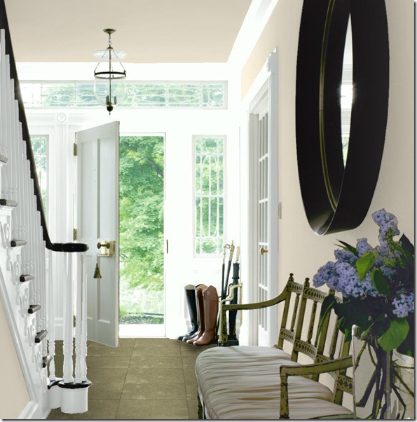
Pamela Pierce Design, Photography by Peter Vitale
First, study pictures of what you like. As simple as this sounds, and as often as it is repeated, it really is a good exercise. Go on Pinterest and collect images of looks you like, rooms that appeal to you, and colors that move you. Once you have amassed a collection of pictures – look at them together and try to ascertain a pattern. Are the walls all gray or white? Or are the walls painted a bright color or wallpapered? This should get you started on what look you really want for your house.
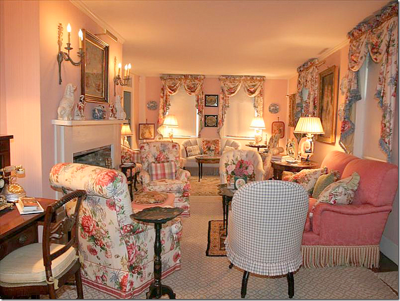
Pam Pierce Designs
For this particular question, the reader is implying she definitely is interested in a lighter look. She names Pam Pierce, so I’m assuming she likes the “Houston look” – linen slipcovers, seagrass, white walls, and Swedish and French antiques. But how do you move from dark colors, reds and blues, to white - on a budget?
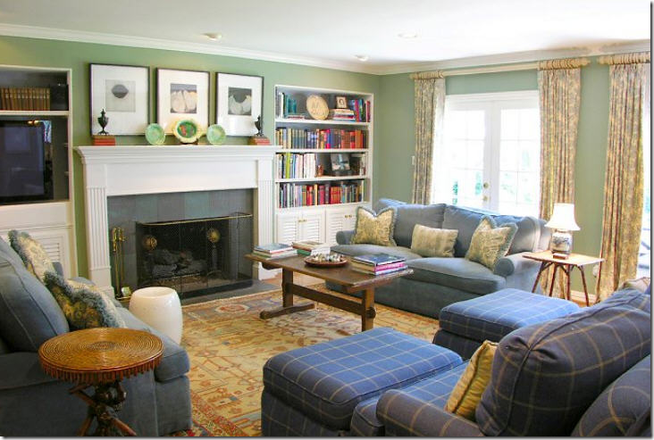
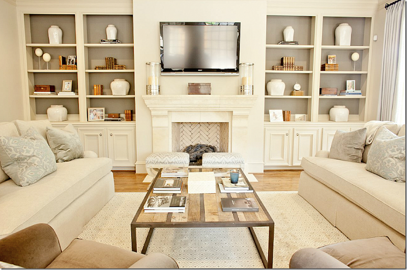
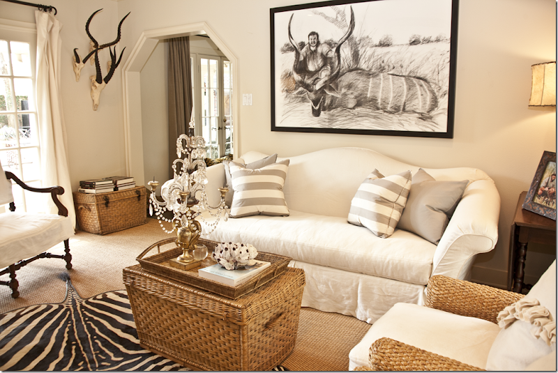
How do you get from this look to this look without breaking the bank:
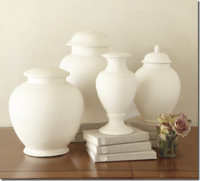
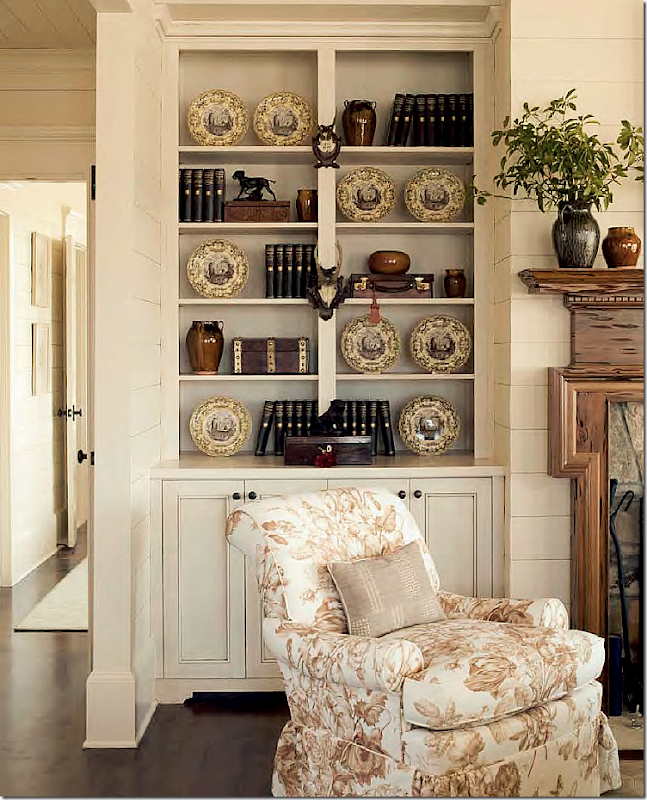
The first thing I would do if I wanted to change everything, on a budget, is paint. This way – you could live with what you have now, but the new, light walls would set the background for changes to come. Paint over those red walls in the dining room, the dark taupe or brown walls in the family room. Choose a warm gray as opposed to a blue gray, a warm white, or a light celadon or blue. Do what Munger did here – paint the bookshelves a darker color to highlight your books. I love the repetition of color and shapes in these bookshelves. You could get a similar look by going to places like Home Source and Pier I – look for large, white items with interesting, but simple, shapes.
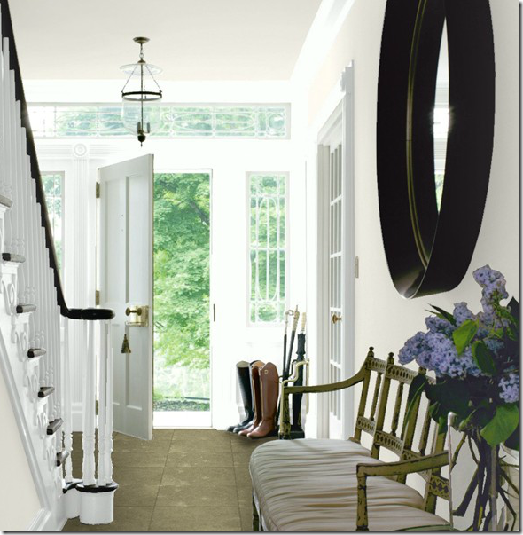
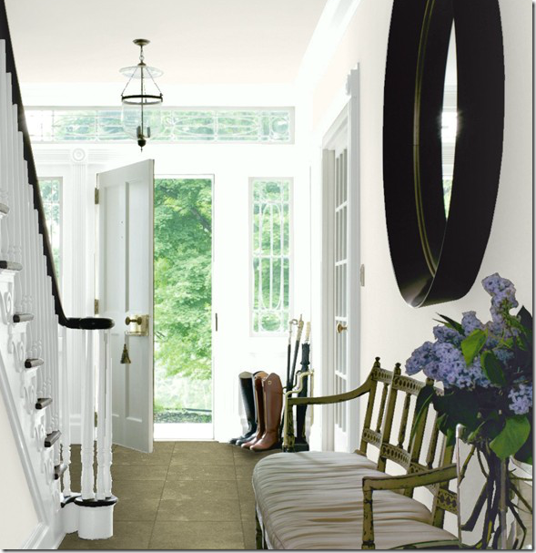
Here a few of my favorite Pratt and Lambert colors:
China White
Brevity
Mirage Gray
Feathered Gray
With new paint, editing, and a sea of white slips with simple curtain panels, this room could be completely updated.
After the walls are painted – remove all accessories that bring out the wrong color. Take away the red plates, books, and lacquered trays that went so well with the older décor. Remove the smallest of the smalls. Today’s look means bigger, yet fewer accessories laying about.
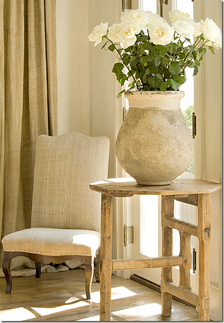
While most high end Houston designers use French olive jars, large and small, their price is out of the reach of many.
Instead, substitute white ironstone in place of the antique olive jars. Ironstone, vintage and antique, is very price friendly. Buy a set of white ironstone plates to hang on the walls instead of paintings. Try EBay for a great price.
Ballard Designs has a collection of these four shapes by Suzanne Kasler. Two or four sets would fill out a double bookcase, when mixed with books.
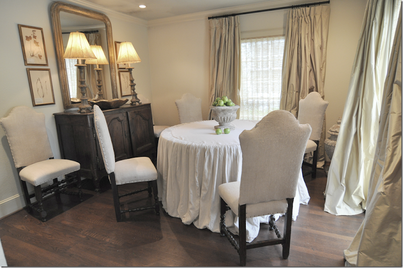
Once the walls are painted and the small and colorful accessories are removed, take down small and large oil paintings that don’t match the décor you are after. It’s better to have blank walls than paintings that don’t quite seem right. Try your hand at making herbariums, like these shown here, or search for a reasonable Louis Philippe antique mirror. These mirrors are quite reasonable compared to other antique ones – and they look wonderful behind a sofa or atop a console.
Ginger Barber Design
With the backdrop cleaned up and edited, I would next replace the rugs you have with seagrass. If the budget doesn’t allow for custom cut seagrass, buy the largest one that will fit your room on the internet or through a catalogue. Striped rugs are an alternative. Consider layering a zebra or cowhide rug atop the seagrass. Ikea has cowhides for extra cheap. Or try buying a zebra rug on EBay. I did – and it was a great price.
Ginger Barber Design
Once your walls are painted, your accessories and paintings are edited, your seagrass is laid, start thinking about replacing the furniture. Today’s reader says she has two custom love seats that are high quality that she wants to slipcover. The problem with slipcovering is that it is NOT cheap! First, your old fabric has to be removed and then the sofa is reupholstered in muslin, and THEN, the slipcover must be made. You can always buy inexpensive linen to keep down costs, but if I were you – I would sell my sofas, and buy one or two sofas from Ikea in white. You can later always buy a nicer slipcover for the sofa in Belgian linen from Bemz. If your budget is not so limited, then think about remaking your sofas with new cushions and slipcovers. You don’t have to have white slips – you can have linen colored slips made or even light blue or aqua.
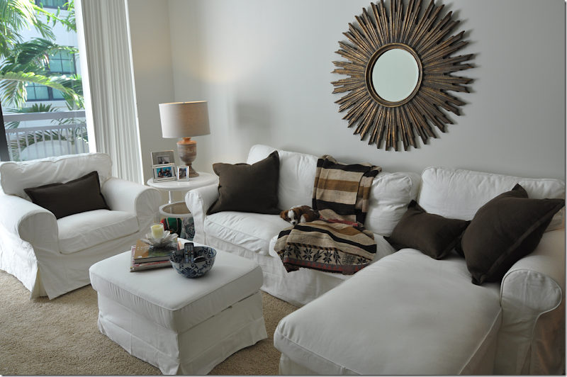
My daughter’s first college apartment – with her Ikea sofa. She added the chair and the chaise and the ottoman. All these pieces were around $1,000. Amazing. And they look great. We added dark brown linen pillows from Restoration Hardware and a large sunburst mirror from Wisteria.
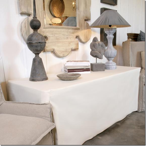
Now that you have white or linen colored sofas and chairs – think about your other furniture. Cover a dated console with a slipcover, add several large accessories on top.
or use as a bar, as seen below. I found these pictures on www.Joyus.com.
Dated end tables or coffee tables can be sold and baskets can be used in their place.
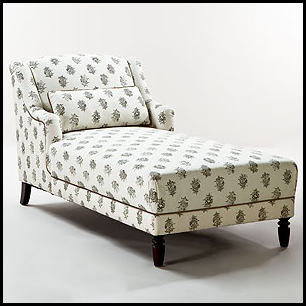
Shop at stores like World Market for a rare bargain, like this cute chaise for $449.
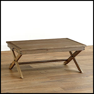
Or this coffee table, a copy of a popular design for only $199.00
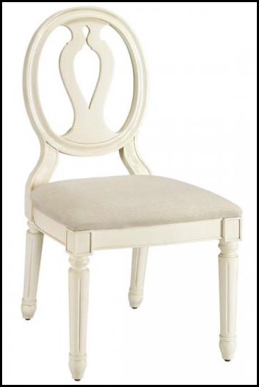
Martha Stewart has a Swedish line through Home Decorators. These chairs are only $169.00.
This darling chair from Home Decorators – is only $199.00.
Add a light fixture at some point during the redecorating. After discontinuing their great lantern, Pottery Barn just introduced this new, wonderful one – for just $399. The size is nice and big enough for a family room. Beautiful.
Don’t forget about the Kooboo chairs, which are a great way to add texture to a room. I’d rather have a few Kooboo chairs in a room than an outdated chair with bad upholstery. Buy a round table with a skirt from Ballard Designs. This would be much cheaper than replacing it with a new table. The bad news though is World Market and Pottery Barn are no longer selling the Kooboo chairs. Why? So stupid. I know World Market was selling them like crazy. They are still available from wholesale companies and on the internet. If you find a source, let us know. Hopefully World Market will refresh their supplies for the summer??
Consider this settee, only $449 from World Market, instead of chairs around a dining table. Or this would be great as accent seating in the family room or entry hall.
Ballard skirted tables come in all sizes and there are a myriad of fabrics, including ikats and burlaps. This is a great alternative for the dining room, especially if your table is dated.
Consider painting Grandma’s dining room furniture. I painted this reddish brown suite of furniture for a client and it came out beautifully. It’s worth painting rather than replacing especially if your furniture is well made. Shop around – some tradesman will repaint furniture for next to nothing.
Finally, these steps, taken one by one, as budget permits, should bring your room up to date, and within budget. I think if you make the changes in the order I listed, the changes will be subtle, yet effective. By the time you get the slips on your sofa, you should be well on your way. Hope this helps answer your question!!
If you have a question for Cote de Texas, consider asking it. If I can answer it – you might see your answer here.
DEAR MISS COTE DE TEXAS…
THE SKIRTED ROUNDTABLE INTERVIEW
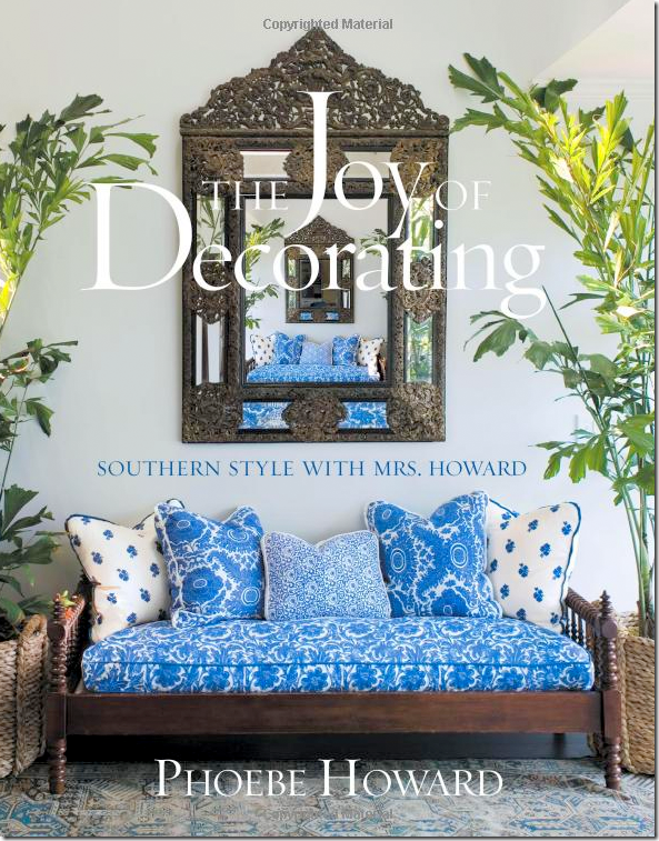
Take a moment, really an hour!, to listen to this week’s Skirted Roundtable interview with interior design maven, Phoebe Howard. Mrs. Howard joins Linda, Megan and me to discuss design, business, and her new book – The Joy of Decorating. She has a most unusual story to tell about how she ended up in the business – it might surprise you to learn how long she’s been an designer. I was, for sure!
One thing I’ve learned since we’ve been interviewing these power house designers is just how driven, Type A personalities, they all are. Mrs. Howard is no exception. Her schedule is back breaking – I have no idea how she finds time to brush her teeth in the morning, she is that busy. And, on top of that – her husband is also an interior designer, so she truly lives the life 24/7.
Besides all her duties, somehow Mrs. Howard found time to write a beautiful design book. It isn’t just pretty pictures, the words are worth reading. Still, the images are some of the prettiest in the industry. No one does pretty as well as Mrs. Howard does. Page after page, each room is more beautiful than the next and this is no exaggeration.
I especially love this room because I have one of those rare yellow and black transferware plates (that’s all I could find!)
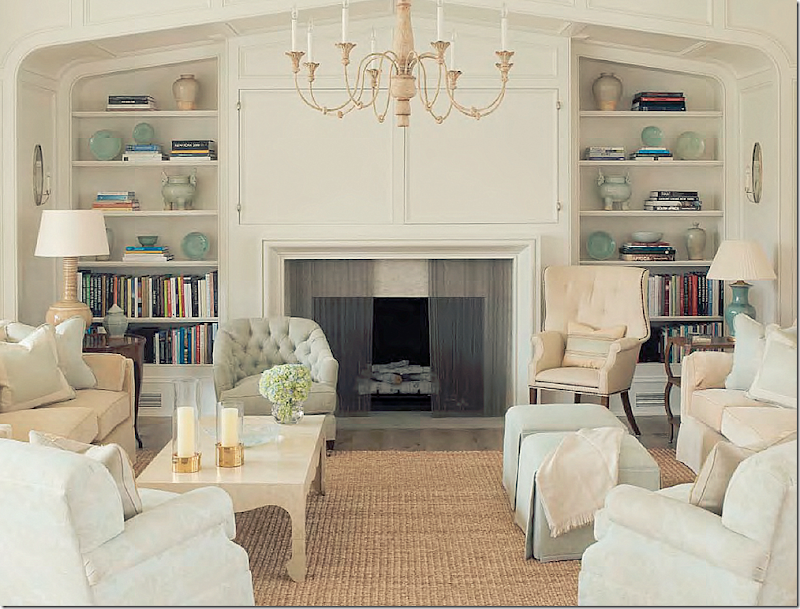
Although the cover of her book is navy and white, Phoebe tells us she prefers this type of color scheme the best – light creams, blues and greens all blended together.
I love how she usually adds one printed fabric in a sea of solids.
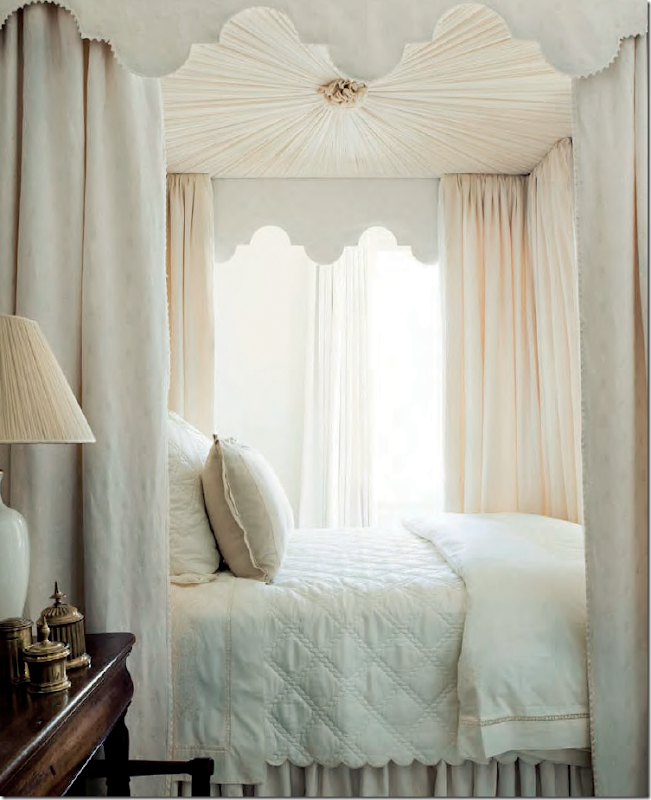
Her bedrooms are especially soothing.
Mrs. Howard discusses how her decorating style is different than her husband’s. There’s a bit of a rivalry between them and it’s fun to hear her talk about their two aesthetics.
The book is available here and on the Skirted Roundtable web site. NOTE: While the book is cheaper on Amazon, it does NOT include Mrs. Howard’s paint chart!! The paint chart is only available when you order the book from our web sites or from Mrs. Howard’s web site. The paint chart is really an invaluable tool. It includes all her favorite colors and which company they come from. It’s a handy addition for the decorator or the homeowner. For me – the paint chart has been worth the price of the book! I find myself referring to it over and over again.
To listen to the Skirted Roundtable interview with Phoebe Howard, please go HERE. As always, we truly appreciate you taking time out of your busy day to listen.
Cote de Texas Readers Houses Series
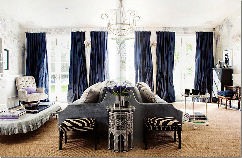
Windsor Smith is one of my favorite designers. She is incredibly talented and she’s been influencing young designers around the country with her youthful and eclectic looks – part classic and part modern, dressy – yet casual at the same time. Here she mixes velvet and silk with a linen slipped ottoman; trendy zebra skins mix with traditional hand painted wallpaper.
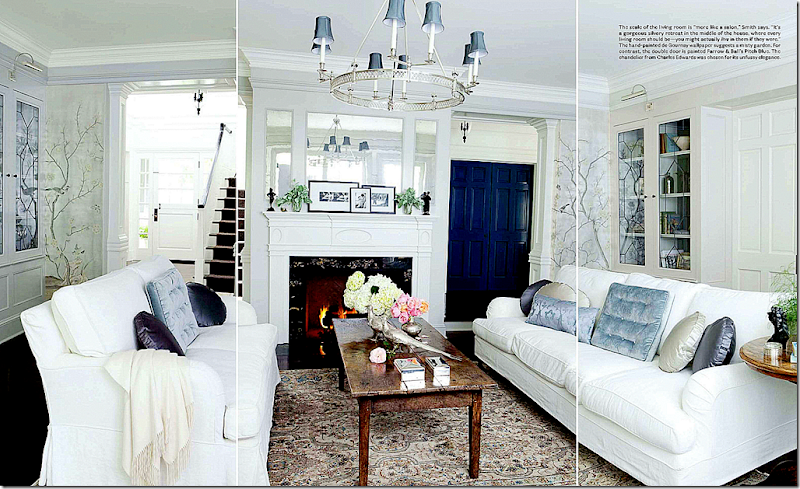
I love her slipcovers – here she dresses down another living room with hand painted wallpaper by using casual white linen slipcovered sofas.
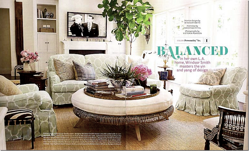
She has her own fabric and furniture line. Kravet sells her beautiful fabrics – which she recently updated – adding hot pink, green, black and brown to the colorways. The new colorsways are luscious. Here is a room I designed using Windsor’s fabrics – the stripe and the print.
One of Windsor’s trademarks is the trim on her slipped sofas – she calls it a butter pat. See the bottom edge – a short pleat that resembles, well, a pat of butter.
And here, again, the butter pat – on her back to back sofa, at her own house. She also likes to do longer pleats.
And here, on a chair from her own line – the butter pat trim again.
In her own kitchen, the longer pleats.
When choosing the houses to show today for the Readers Houses Series – I found two in the files that resembled each other and most interesting, both pay homage to Windsor Smith. I’m not sure if the owners were trying to emulate Windsor, but they certainly did.
And so, two new Reader’s Houses!! Enjoy!
HOUSE #1
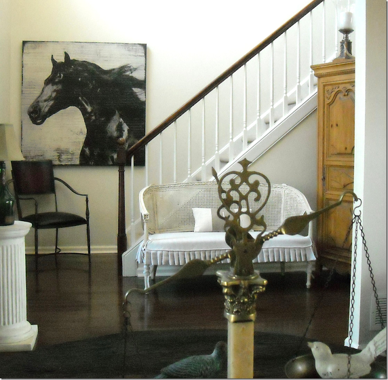
The first house is located in a suburban development outside of Philadelphia. It is just 15 years old – but needed renovation, as it had been neglected when the owners bought it last year. It’s two stories with a basement, so the renovation was quite overwhelming to its new owners. All the changes were done on a strict budget. While some changes will have to wait until later, some just couldn’t wait. Like the floors. All the carpet was replaced with hardwoods. Tile went down in the kitchen and powder room floors. New lighting came from Craigslist. The kitchen was so dirty – it all had to go. An Amish carpenter was hired to make all the new beautiful custom cabinets. While the owner wanted a farm sink and white marble countertops – she went with a more cost effective granite hoping to save money for white marble later. Curtains were made with cheesecloth. She restained furniture herself and then began her own business offering her services to clients through her blog.
.
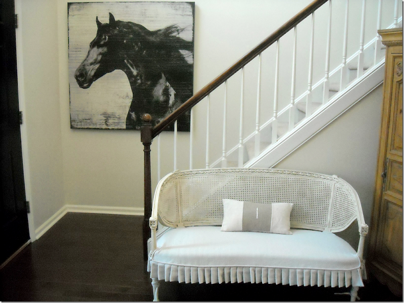
In the entry, white walls, dark hardwoods and contrasting white linen – inspired by Windsor Smith? Love the horse painting and her black painted door! The homeowner redid this settee herself. Here’s how it once looked:
Much prettier with the new skirt.
The living room looks over the entry hall.
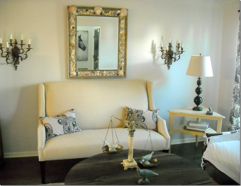
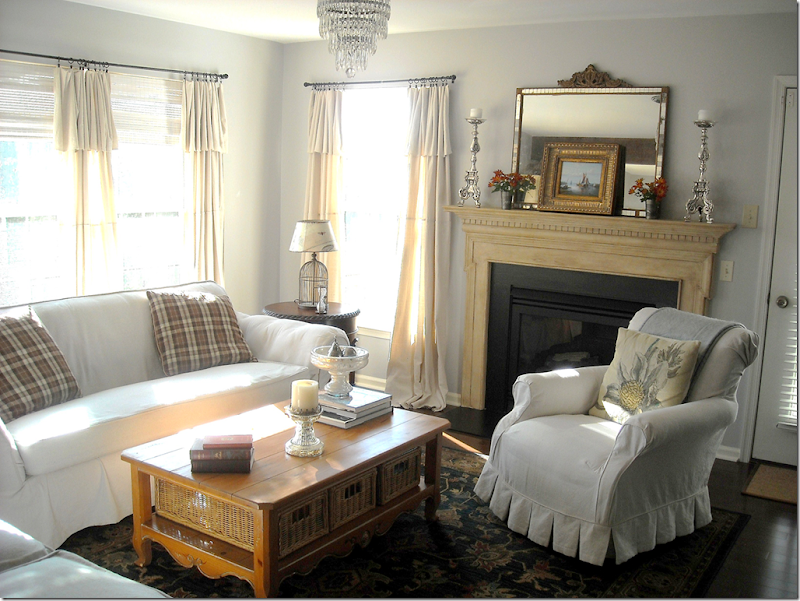
The living room continues the black and white theme – with toile curtains and two antique settees. This one, is slipped in white linens.
While this high, wingback settee is upholstered in a cream color.
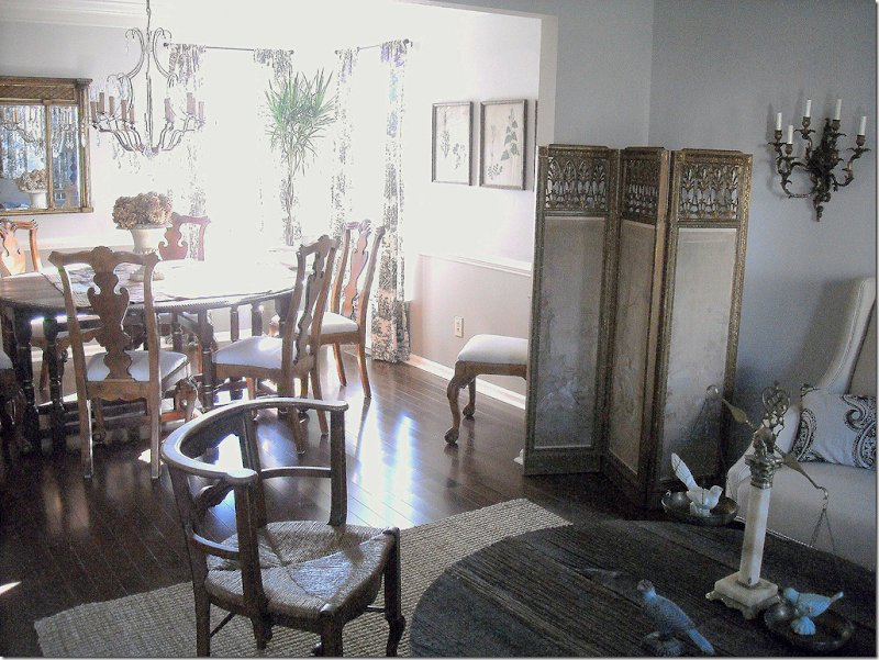
The dining room is right next to the living room.
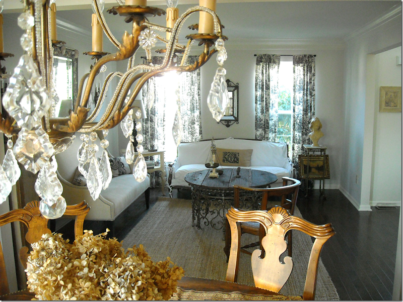
Looking from the dining room into the living room. The dark hardwoods are so pretty and rich looking!
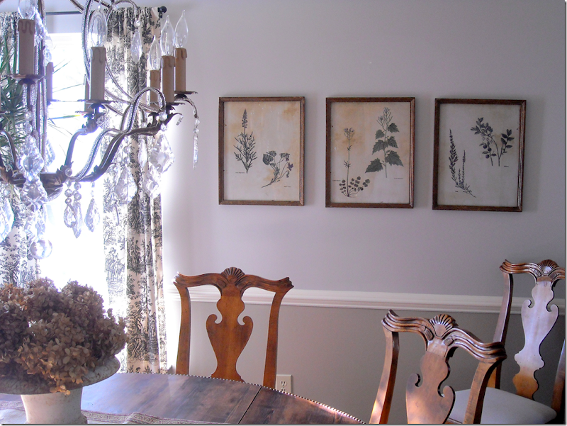
The toile curtains are continued into this area. Love the botanicals. The chair backs are so pretty.
The family room is next to the breakfast room and kitchen. Here, Windsor-inspired short pleats on the slipcovered chair. Darling chandelier and pretty mantel!
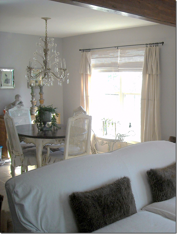
A large wooden beam separates the two areas.
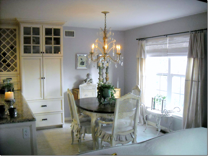
Tile floors run from the breakfast room to the new kitchen. Cute slips on the breakfast room chairs. Another pretty chandelier.
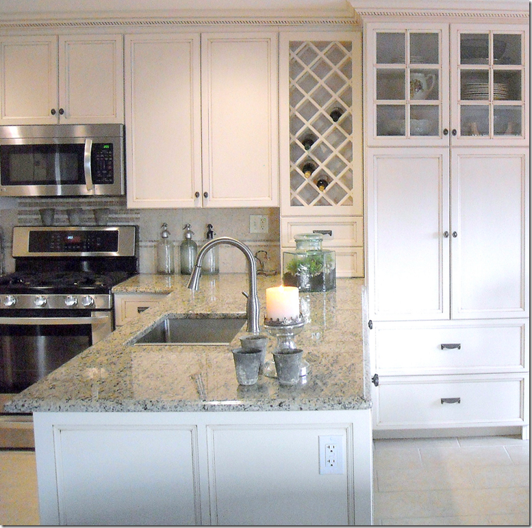
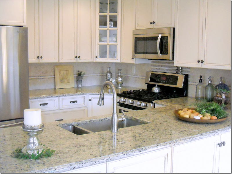
The new kitchen with cabinets custom made by an Amish carpenter – how lucky is that? Living in Pennsylvania does have its advantages – where else can you hire an Amish carpenter?? Granite countertops and tumbled stone backsplash.
All new stainless appliances.
The corners were angled instead of put in at a 90 degree angle. This is a great way to access extra cabinet space that would otherwise go unused. The upper corner cabinet is fronted with glass.
To contact the homeowner about furniture refinishing, go HERE. And a huge thank you for sharing your beautiful house with us!!
HOUSE #2
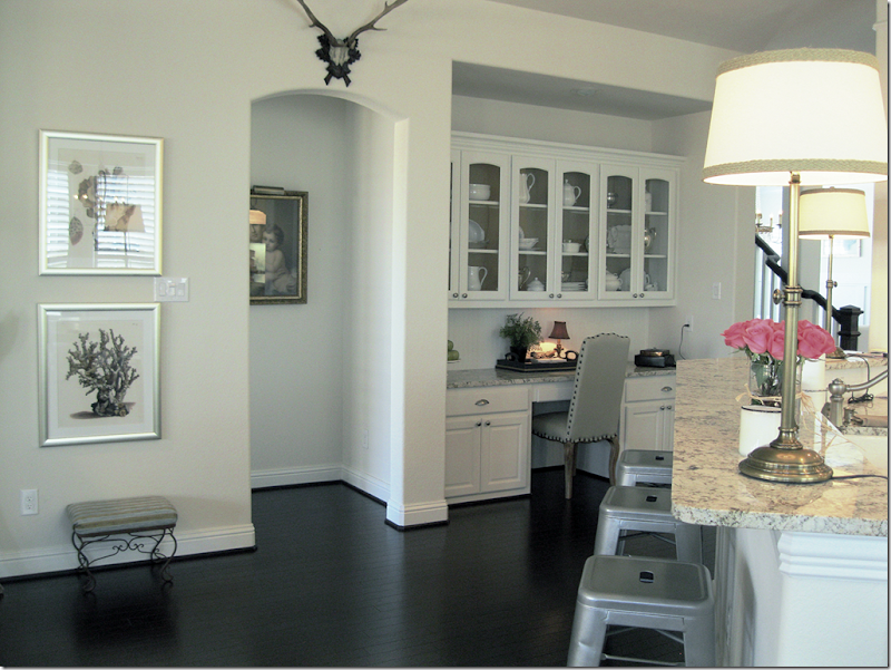
The next reader’s house is located nearer to me – in Dallas, Texas. The owner writes that she and her husband built their house about 2 years ago and have been furnishing it with ideas she gets from the blogs. As you will see, she also has gotten inspiration from Windsor Smith.
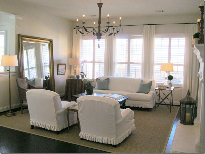
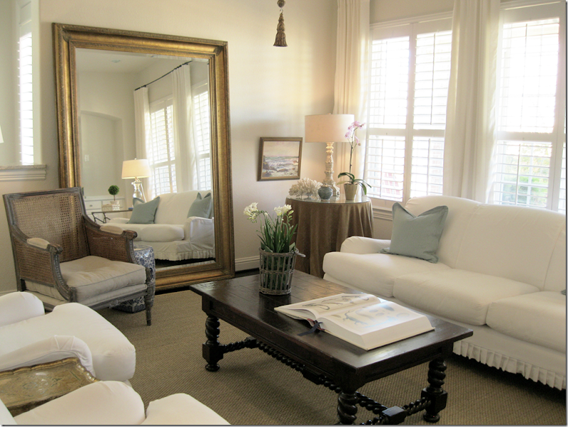
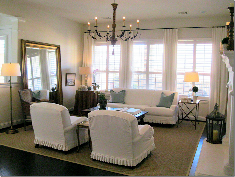
White walls and again, gorgeous dark, dark hardwoods which give a high contrast look to this house located in Dallas, Texas. Using Windsor as inspiration, the chairs and sofa are trimmed in “butter pat” pleats. To soften the wall of windows and shutters, the homeowner used curtain panels between each window – this is how a large window should usually be covered – rather than just using a panel at each end. A large mirror reflects the beautiful fireplace. Darling chandelier!!
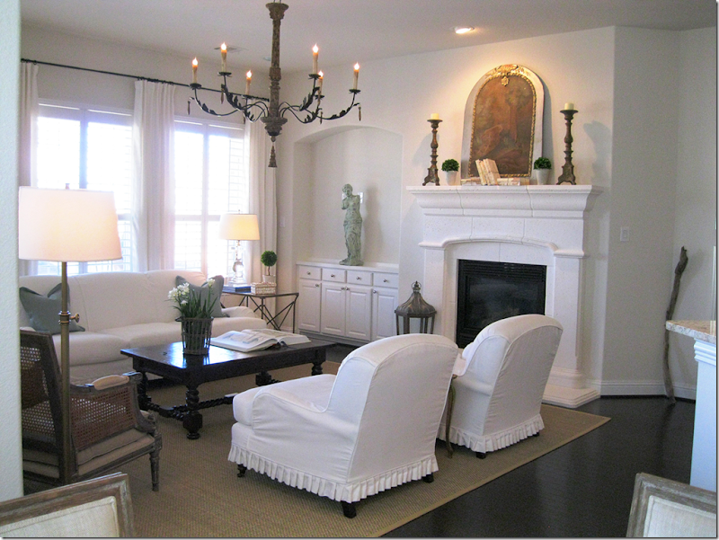
Looking the other direction at the pretty fireplace mantel, all in white. The homeowner says she saved money by not custom cutting the seagrass – instead she bought it in a standard size. Good choice because this size does fit the room quite nicely. The kitchen is to the right of this room.
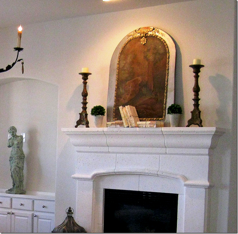
Love the painting with its oval top. Love the way the homeowner accessorized the mantel. Very pretty!
Great chair from Wisteria. Pretty lamp and coffee table. The blue of the pillows is a pretty accent color. This room reminds me of the Windsor Smith living room – shown before – with white slips and blue pillows.
A closeup look at the Windsor inspired butter pat pleats.
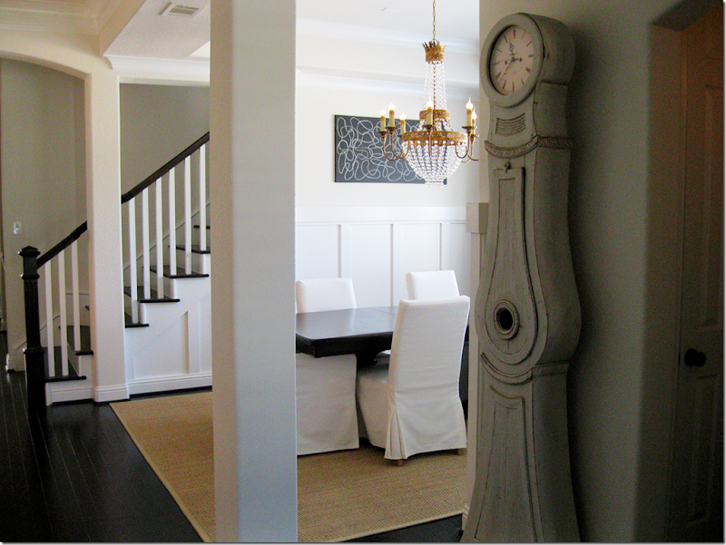
In the entry, a beautiful antique Swedish Mora clock stands next to the dining room.
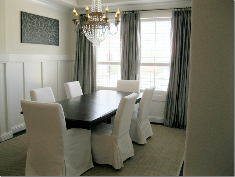
The dining room has beautiful silk curtains in gray, and a gorgeous chandelier! I love her light fixtures. Notice the high wainscot. It adds so much to the room and is a great idea.
Past the dining room and stairs, looking towards the kitchen – great industrial style stools and nail heads accented desk chair. I love the dark floors that both these homeowners have. They are so rich looking. And – I don’t see any dust or footprints on them, either!! ha!
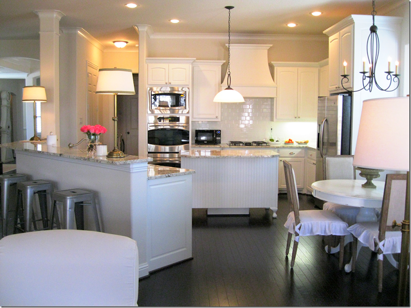
The kitchen and breakfast room, located off the living area. Instead of white marble, the homeowner chose a white and gray granite – it’s a really pretty one. Hopefully, she’ll share the name with us. Stainless appliances – and white subway tiles, all classic choices. White slips cover the French styled chairs.
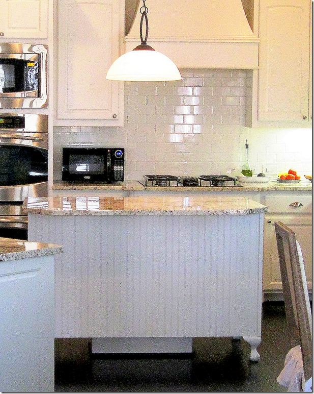
Look at the beadboard island with its darling feet. So cute!
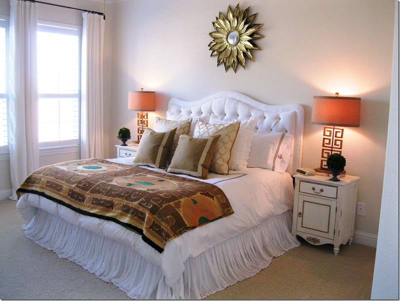
The master bedroom is white with pops of earth toned colors. The trendy lamp’s orange shades pick up the colors found in the suzani. Beautiful tufted headboard and ruffled bedding. Darling.
And another thank you to this homeowner for sharing her beautiful house with us.
I really enjoyed seeing how two women - from opposite sides of the country, both found inspiration from the same source – Windsor Smith’s Butter Pat trim - and claimed it for their own. You can find inspiration from so many places today – books, magazines, blogs, Pinterest (especially!) and designers’ web sites. I love how both homeowners used light walls and dark hardwoods with white slipcovers. While their houses should look alike because of these same elements – they don’t. House #1 seems more traditional, while House #2 seems a bit more contemporary and slightly more dressy. Do you have a designer who inspired you in such a way that you can point to that inspiration in your house?
I’ve written before how 20 years ago, I was inspired by Dan Carither’s room – and bought an entire room full of furniture upholstered in this exact same linen stripe – which I still love today.
Who has inspired you in your own home?
NOTE: If you have sent in pictures of your house or kitchen and it hasn’t been shown yet, please have patience. I try to weave an interesting (hopefully!!) story around your pictures so I can’t promise exactly when yours will be shown. Hopefully, I’ll get to them soon. If you haven’t sent in your pictures, but would like to – please do!! I hope to run this series for a long time, so it’s never too late.

