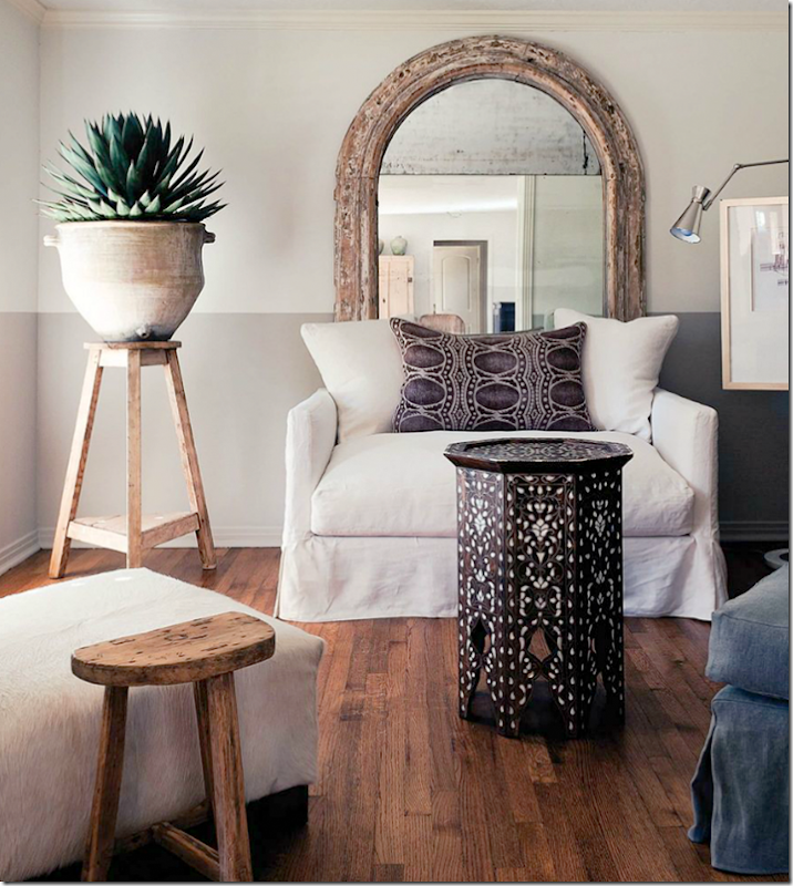
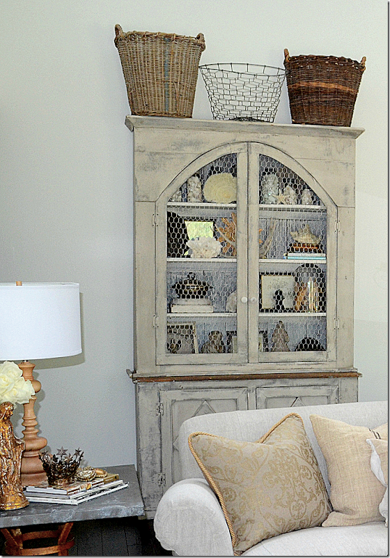
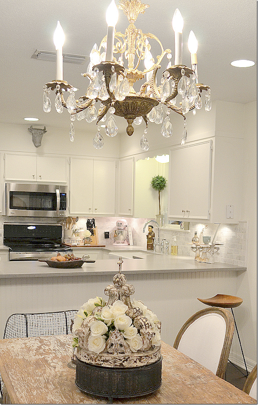
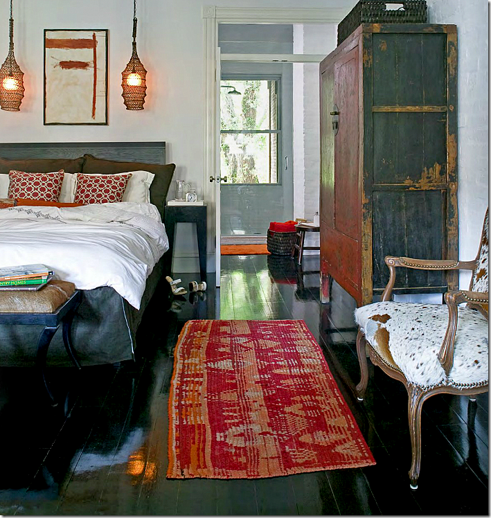
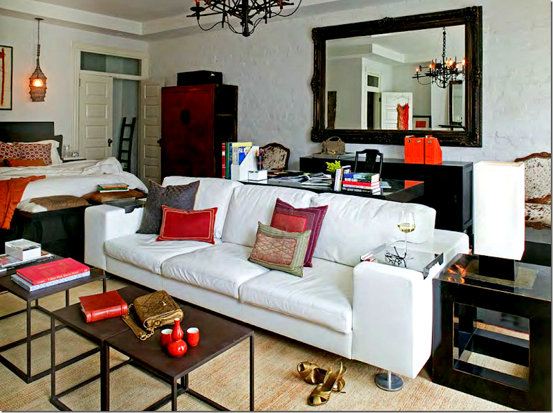
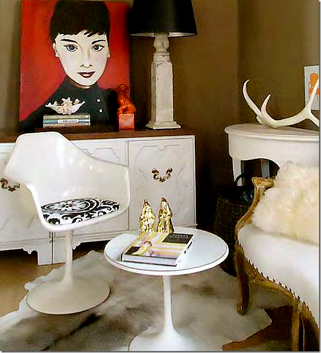
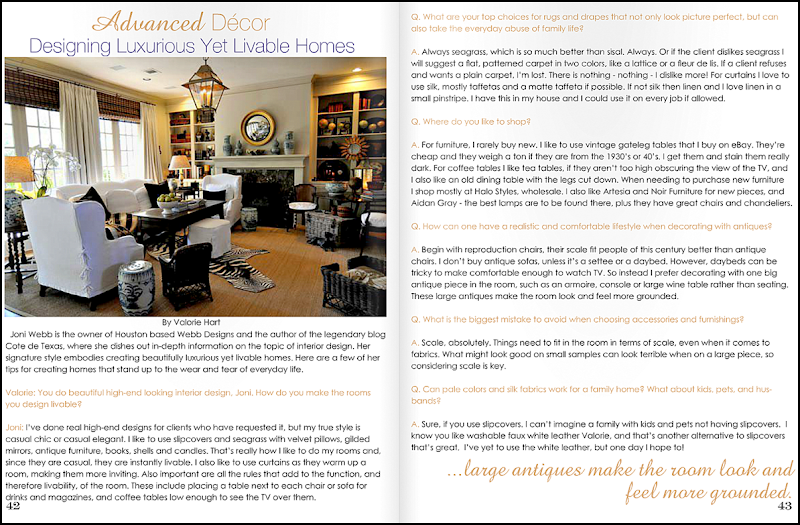
Interior designer Megan Megas’ house – her interiors are an inspiration for the reader’s own house.
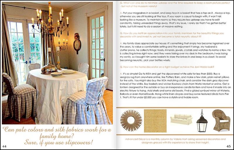
Megas’ dining room – the reader is looking for chairs like these.
I got an email from a long time Cote de Texas reader who told me how hooked she was on Megan Megas’ house – featured here and in the magazine Antique Shops & Designers HERE. Megas is Pam Pierce’s long time assistant who is now taking on her own design jobs. The reader, Toni (like Joni!) – really loves Megas’ aesthetic – particularly the eclectic mix of contemporary and old with textural and organic pieces. She sent along a picture of her living room to show me – and – wow! I really loved what she has done with it and asked her to submit more pictures. So, here is the reader, Toni’s house, located in a smaller Texas town:
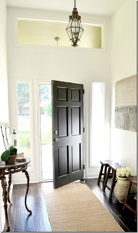
Beautiful dark hardwoods, a black front door and a lantern great you.
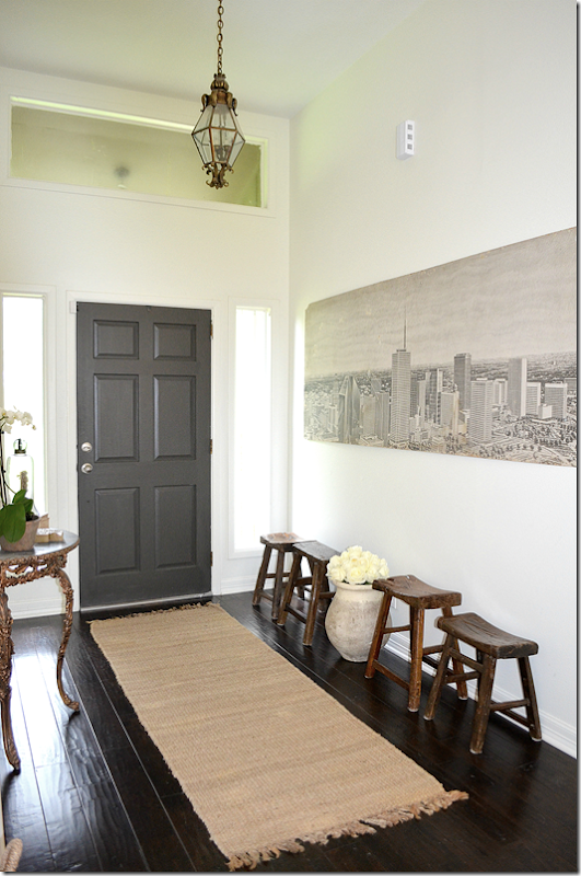
Against one wall is an old vintage print of Houston that Toni bought from Hong @ Hien Lam! This print was left in the warehouse when the Lams bought it – there were originally two of them. Now, why didn’t I ever notice the print??? Toni says she’s wanted it for 3 years and finally got the nerve to ask Hong about it. I love the beige rug against the hardwoods and the collection of stools.
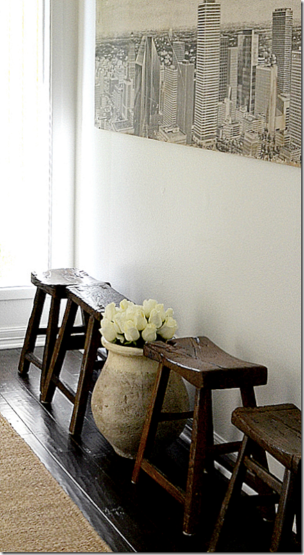
Close up of the print. Toni says it’s her pride and joy.
I love the large French olive oil jar. I want one so badly! She bought this one from Hien Lam Home.
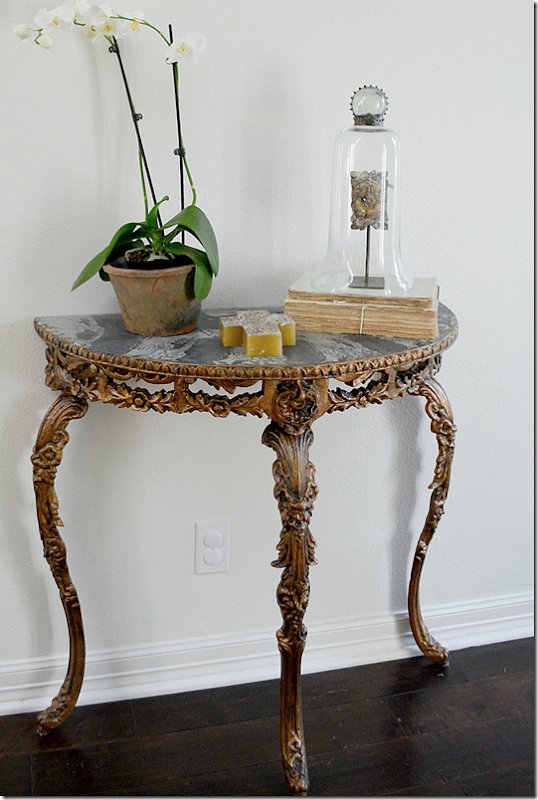
Across the benches is this beautiful marble topped table – the architectural fragment under the cloche comes from The Two Lucys at MAI, Houston.
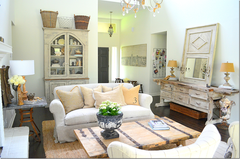
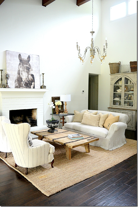
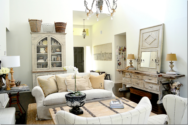
Walking into the living area – the ceiling is vaulted, double height with tall windows and beams. There is a fireplace on the left side and a large dresser and trumeau that anchors the room on the right side. Isn’t this smashing?!!!! This is the picture Toni first sent me when I went nuts over her house! I love the mix with all the textures – the antiques and the vintage pieces, the light woods and all her accessories. The light from the tall windows near the ceiling moves around the room and makes it look different at certain times of the day. On this day – the sun was bright and the house was particularly bright.
Now – how old do you think Toni is to have amassed such a nice collection of beautiful furniture that looks so wonderful? Would you believe she is only 28 years old???? That’s right! She is 28 and is a stay at home with her 2 children – 3 years and 1 year. Now…what were we saying about ageism?????
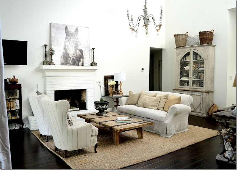
Her sofa is slipped with a beautiful waterfall skirt – and is in a linen, made by Hien Lam, of course! Love the coffee table and the rug and how the colors of both are repeated in the assortment of pillows. Across, the two wing chairs in a striped fabric add a dressy touch. Hien Lam upholstered or slipped all the furniture in the house.
Notice the difference in the light from the previous picture? Such a great atmospheric touch. The fireplace is painted white bricks.
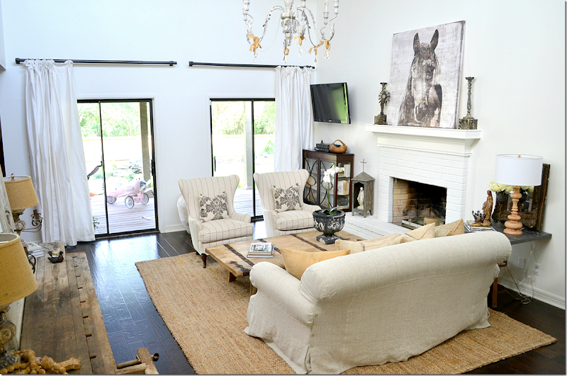
And looking towards the back. Toni has ordered new, thin curtain rods, but they aren’t here yet – so she said to not look at these! OK, we won’t! I love her pillows – especially those in the wing chairs – so cute.
In this picture - you can see the tall windows that let in the light – and the dark wood beams on the vaulted ceiling. I love that #3 pillow – it really catches the eye.
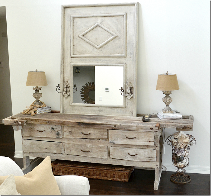
This piece came from her parent’s ranch – I love it with all its wonky drawers. The trumeau was made by James Farmer according to Toni’s design. James is the go-to furniture man in Houston. He can make anything look older and better. Plus he can make things – like this mirror. He made the lamps in my own family room, btw. Contact James through his facebook page and he’ll get back with you! I love the trumeau he made. Reflected in the mirror is the hall leading to the bedrooms – where the sunburst mirror hangs.
The jar is also from Marburger Farms in Round Top. The brown cabinet under the flatscreen is Toni’s grandmother’s piece.
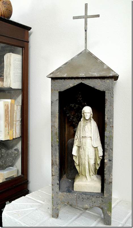
The altar sits on the painted brick fireplace hearth.
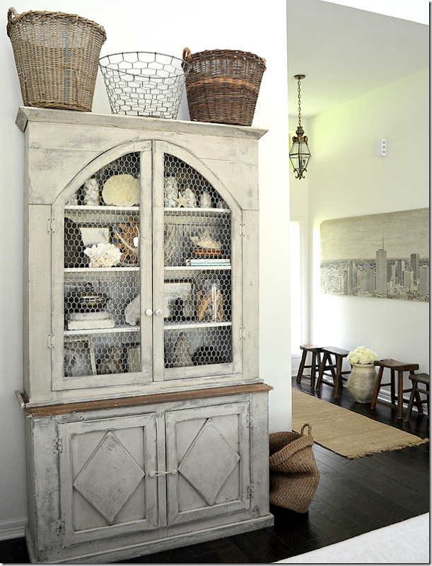
This hutch was black until James Farmer transformed it and turned it into a gray Swedish fauxtique! Like that word I just made up?
Inside the hutch is a collection of shells and crowns and books.
The industrial styled table next to the sofa came from the Round Top antique show – at Marburger Farms.
Love the sconces that James added to the trumeau for that authentic looking touch.
The dining room connects through the living room.
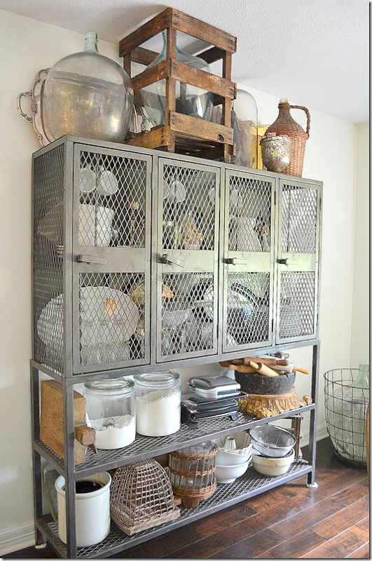
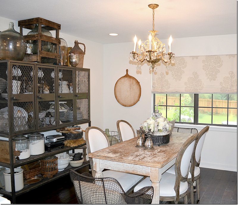
The dining room is next to both the living room and the kitchen. Against the back wall are fabulous lockers that Toni designed a metal base for them to sit on top of. Inside the lockers are: ironstone, antique silver pitchers, old glassware, antique cutting boards, rolling pins from Bill Gardner as well as new canisters and appliances.
The lockers sits atop the custom base Toni designed for them – such a great looking piece!!! And what a clever idea!
Toni’s mother bought the table at an antique store 20 years ago for $45. Steal! The French chairs are from Restoration Hardware and Toni really doesn’t like them – she says she wants chairs like Megan Megas (pictured at the top of the story) – and is curious if anyone knows where she can find them? Did you look at Thompson Hanson? I know that Artesia Collections carries them too. Love the print shade.
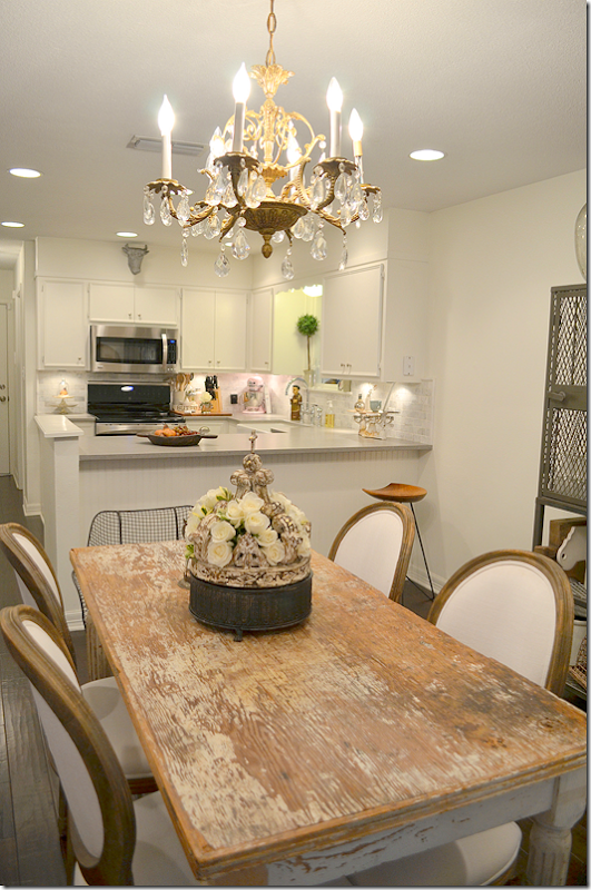
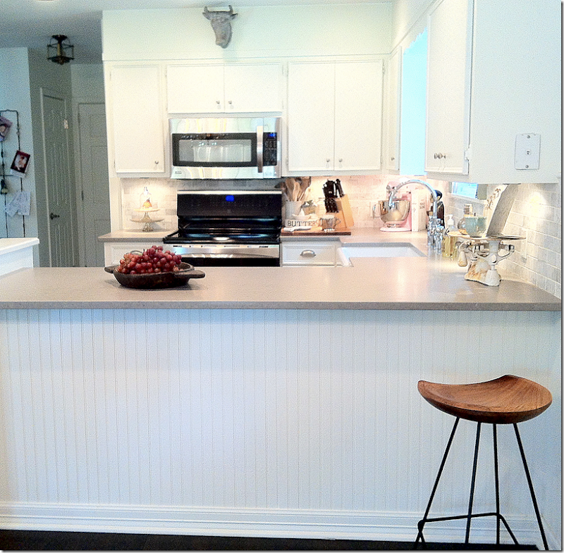
The kitchen is separated from the dining room by a beadboard covered counter.
The flower filled crown came from San Miguel Allende.
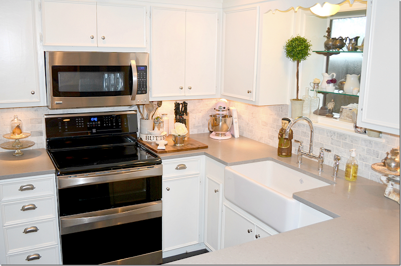
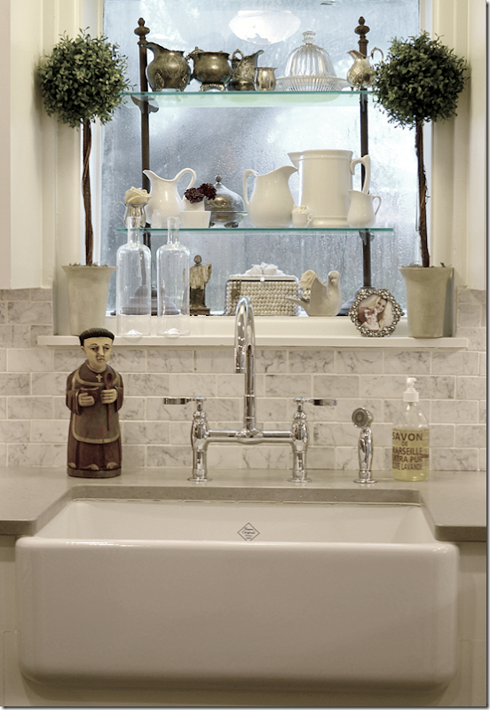
Toni remodeled the kitchen with Cesar stone countertops – in lieu of the concrete ones she really wanted, but didn’t think they would clean up easily with two babies. She picked the honed Cesar stone and she said it’s hard to clean up anyway! Always go with your heart!!! Farm sink, bin pulls, and Carrera marble backsplash.
The beadboard bar – here you can see how the kitchen connects back to the entry hall.
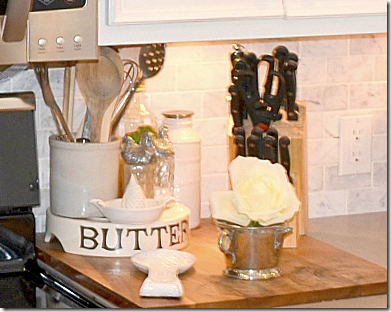
To order a butter plate like Toni’s go the left side of the blog – after the ads – and you’ll see where you can order one!! I love them!!
Tony found San Pasquale, the patron saint of food, in Santa Fe. Beautiful farm sink and polished nickel faucet. Such rainy days in Texas.
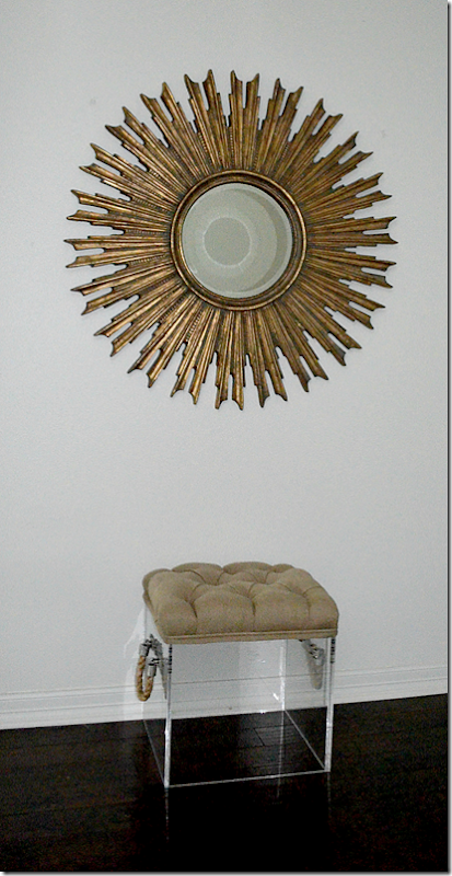
Leading from the kitchen back to the entry and living room into the bedroom hall and this vignette – a Lucite stool and large sunburst mirror.
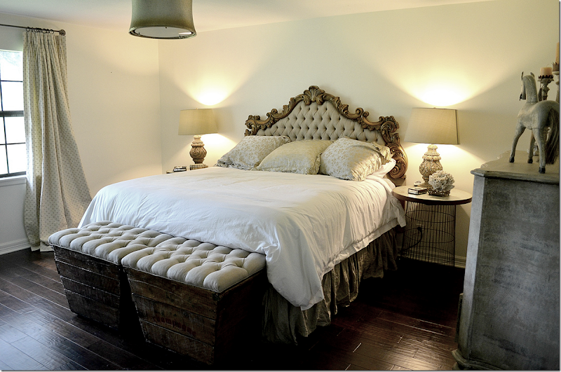
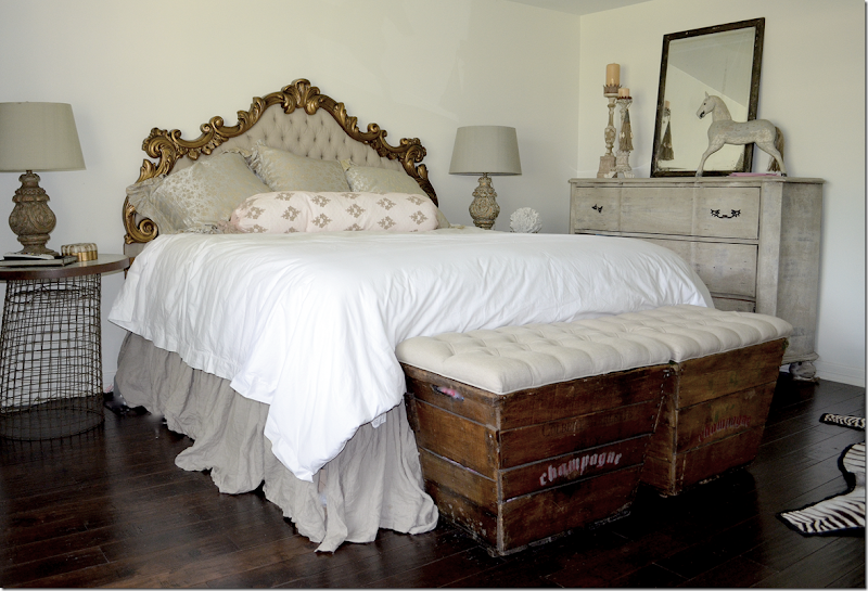
The master bedroom is dominated by Toni’s grandmother’s vintage headboard – originally it was blue velvet, but Toni changed it to natural linen. The ottoman-champagne crates at the foot of the bed are from Judith McClellan. The Clint Eastwood photograph is much loved and much hated by various members of her extended family. It comes off and on the wall at different times.
Without the photograph – better or not?
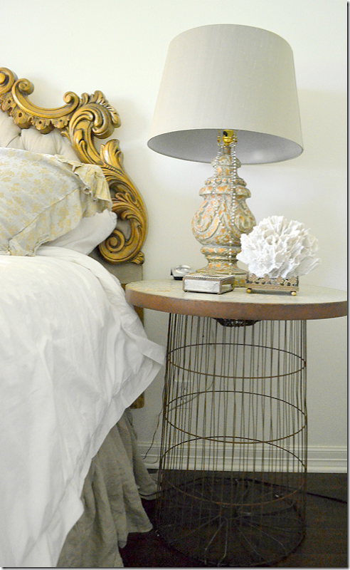
The bedside tables are old wire trash cans with galvanized tops made by Vieux in Houston.
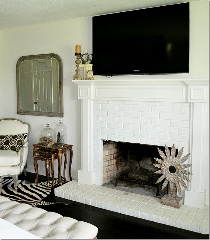
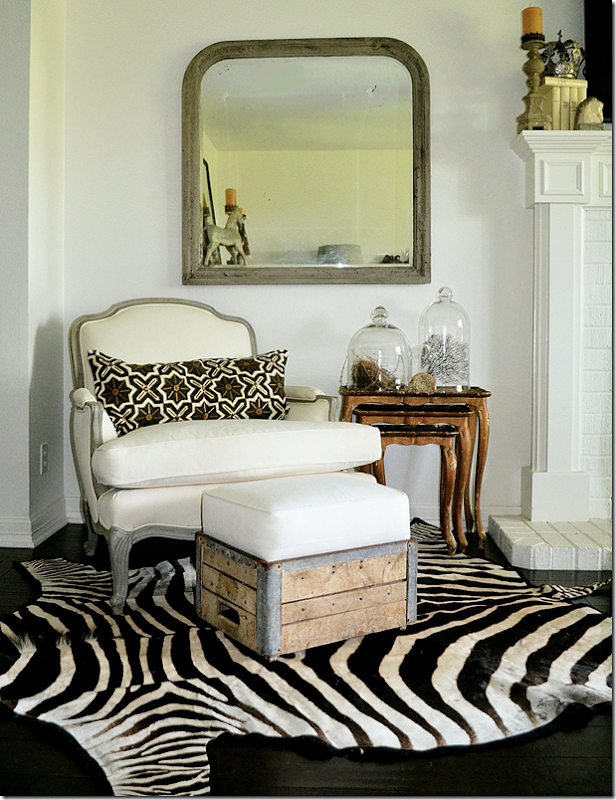
Across from the bed is another fireplace with a chair and ottoman and zebra rug.
The chest is another product by James Farmer. Toni said she lost her phone and the only two numbers she cared about losing were James and Hien’s phone numbers!
The painted fireplace across from the bed.
The seating area with the zebra accent rug.
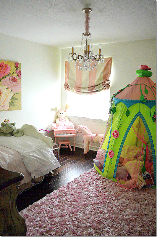
The oldest daughter’s room in pink of course. James Farmer did the fancy chest for her room. Such a pretty painting.
She has the cutest tent – love the pink and white striped shade.
The nursery is in whites and grays.
And finally, Toni says about her house: “It’s still a work in progress. I once told my hubby, to me picking the right things for this house are like finding a significant other, you have to make a connection with it, it’s going in your home, you have to look at it every day. If you don’t love it, it’s got no business there.”
As good a design philosophy as any!
Thanks so much to Toni for graciously opening her house to us! If her house is this great when she is 28, I can’t wait to see it when she is 48!

