A few months ago I showed Yolanda Foster’s gorgeous Malibu house – that is currently for sale. HERE. Yolanda is famous for her role on The Real Housewives of Beverly Hills on Bravo TV.
OK. OK. Bravo TV is such a guilty pleasure for me! I’ve shown a few of the Housewives’ houses lately because some of their houses are better than the show itself. One Bravo TV house I showed was in Architectural Digest a month or so later. HERE. But, just judging by their 90210 zip code alone, the houses of the Beverly Hills Housewives are the crème of the Bravo network. Naturally.
The Beverly Hills Housewives – Lisa Vanderpump is 4th from the left. Yolanda Foster is 5th from the left.
I’ve wanted to show this particular Housewife’s house for a few years now, but always held off because the décor is not really my aesthetic – it’s more like Barbie on speed with Rhinestones and Sequins. Still, there is something about the house that grabs my attention each time it is shown on an episode. It belongs to Lisa Vanderpump, a veteran Beverly Hills Housewife.
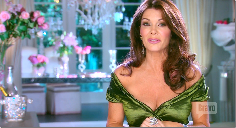
Vanderpump is a younger Barbara Cartland, the Queen of English romance authors. Lisa’s nickname, after all, is Pinkie - because there isn’t a shade of pink that she doesn’t love. Well, she IS an English Rose, born and bred, and pink does look best against Lisa’s peaches and cream (helped by oodles of plastic surgery) complexion. Besides pink, there isn’t a crystal or diamond or sparkly bit of bling that Lisa doesn’t love.
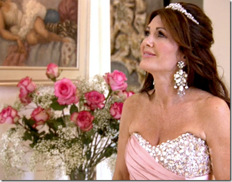
Lisa in her sequins and diamonds and tiara and pinks and flowers. The only thing missing is her little dog Giggy.
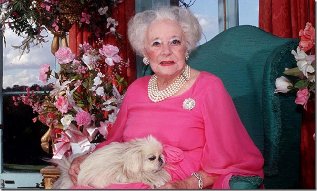
And famous English romance writer Barbara Cartland surrounded by her roses and pink and jewelry and dog. Uncanny, I know.
In case you never heard of her – Lisa Vanderpump and her husband Ken Todd - moved to L.A. after making millions in the restaurant, club, and bar business in Europe. Currently they own several establishments in L.A. – Villa Blanca, Sur, and their newest venture PUMP. Judging by the number of her Hermes Birkin bags alone, they seem to have made a fortune selling liquor and food. Who knew it was so lucrative?
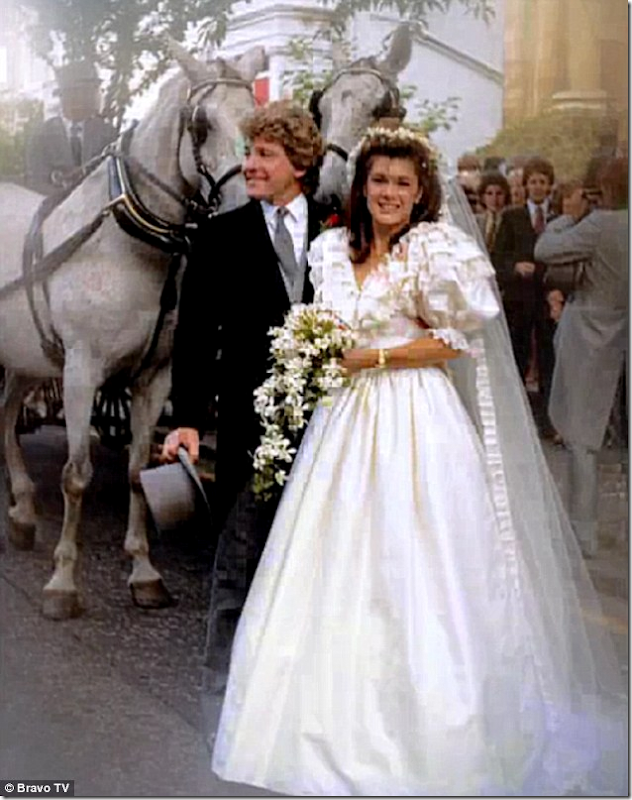
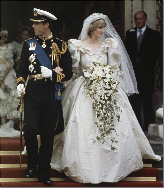
The English Pink Rose at her wedding in 1982. Does the dress look familiar? Of course Lisa would be a total Diana follower – after all her step grandmother was Barbara Cartland! Being the complete Anglophile that Lisa is – she completely copied Princess Diana’s dress, down to the row of ruffles.
Diana wed just a year before Lisa, and the two dresses are very similar, which is no surprise knowing Lisa. Today, Lisa, the 54 year old mother of two, would probably choose a sleeveless sheath style dress covered in sequins and crystals.
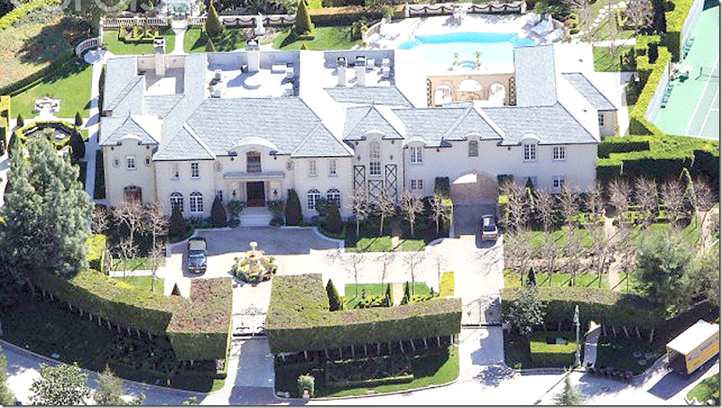
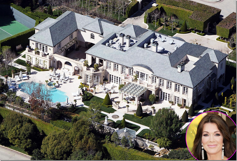
When Real Housewives of Beverly Hills started filming – Lisa and Ken lived here, in a gated community, in this 17,000 sq. ft. mansion. It was on 2 acres, but the house and tennis court took up the majority of the space.
Here is the façade – a total goop of every Frenchifried cliché there is – and this is just the front of the building.
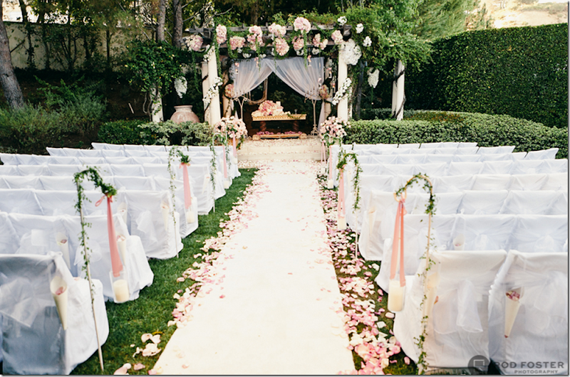
And, the back. Lisa’s daughter was married there in a profusion of pink roses – it was the last event filmed for Bravo at their large house. My favorite part of the house is the garage – which is reached by driving through an arched opening to a motor court. On the other side of the courtyard it opens to the back yard.
Pandora’s wedding ceremony took place in a secret garden in Lisa’s back yard.
After Pandora’s wedding, the Frenchifried house was listed by Mauricio, the husband of yet another Beverly Hill’s housewife and uncle to Paris Hilton, for around $29,000,000.
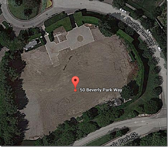
A year later, while being remodeled, the Frenchifried house caught on fire and was torn down to the cement foundation.
An aerial view of all that is left – the driveway and the trimmed bushes that surrounded the property.
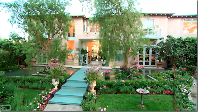
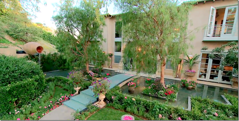
After the house sold, the fun begins. At first, it wasn’t totally obvious that Lisa had moved to a new house. She used all the same furniture and thus, the interiors had a very similar look in tight shots. But – it became apparent there was a new house being used for the show when guests arrived to the house. Suddenly, Lisa lived in a house surrounded by a beautiful moat. In fact, her entire front yard was a large fountain which forced guests to cross over it using a blue wood bridge.
The effect was stunning, and totally Lisa flamboyant. Looking up the real estate listing for the new house produced photos that were totally different than the house Lisa now lived in. Obviously, they had spent months and mounds of money turning a contemporary house into the eclectic mix of antique and romantic modern that the house now is.
The original house was quite a stunner. So much so that it was published in a book. It was designed by the famed architectural firm Abramson Teiger of Culver City, California whose projects have been published numerous times in prestigious architectural publications and books. First rate for sure, the firm has been awarded many AIA mentions. Nothing about this particular house was faux Frenchifried or Anglophiled. The house was elegantly contemporary – and nothing less.
Designed for an interior decorator, it is set on a gorgeous lot that overlooks a largely empty canyon. It’s as if the house is located in the country and not a major city. The road to the property is gated and private.
The finest of elements were used such as walnut hardwood floors and Yorkstone tiles imported from England, along with French polished Ebony wood paneling and steel windows. The lot is two acres and has a swimming pool, a swan pond, and a separate guest house.
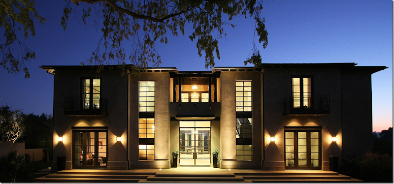
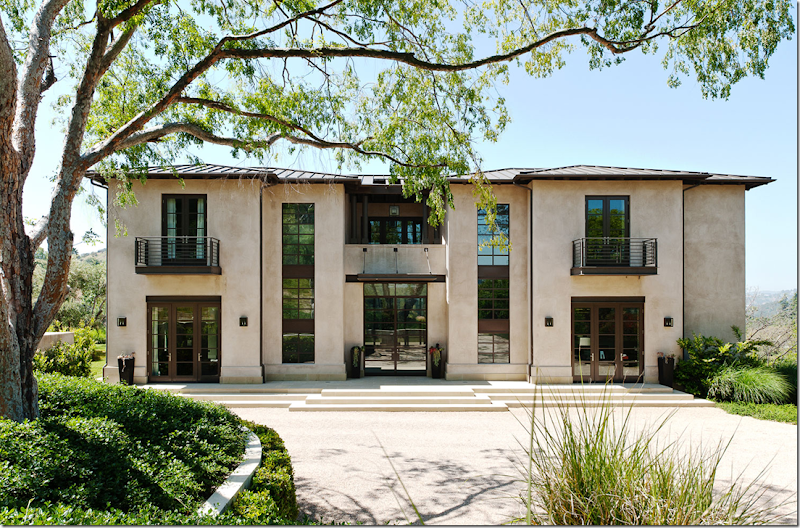
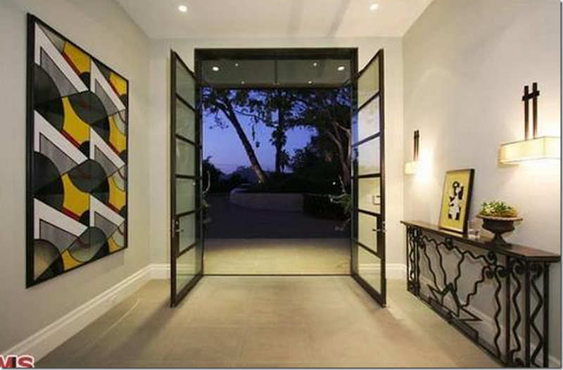
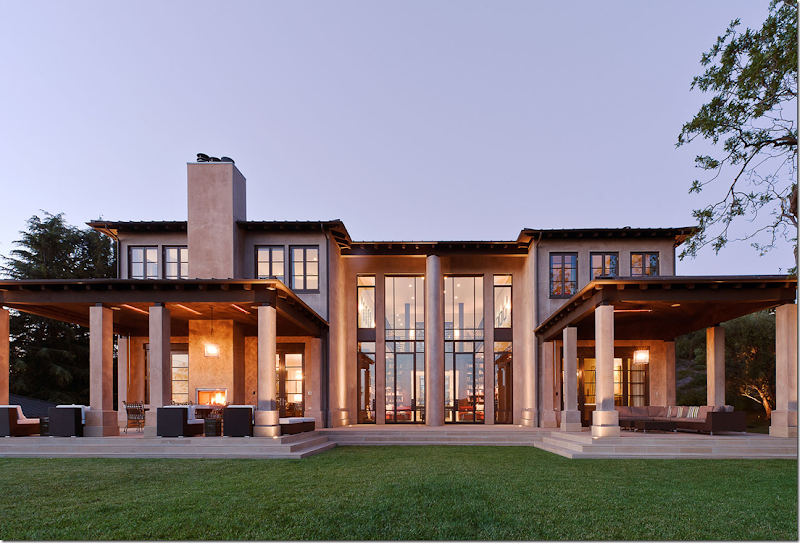
Here is the house as it was designed originally – seen at dusk.
And during the day. As you can see, the front yard is a large parking area – stark with not much landscaping. It looks almost like a commercial building, not a home. The house is so contemporary, it seems impossible to imagine the Queen of Pink lives here. What possessed her to buy it?
I mean, this is a woman who doesn’t leave home without her alopecia inflicted dog, Giggy, dressed up in a matching outfit. The new house just doesn’t look like her at all.
Some of Giggy’s outfits. Since her dog has alopecia, he has to keep his skin covered. Actually, Giggy has quite a following and has raised a lot of money for alopecia!!
Not Giggy of course because this dog has lots of fur – but obviously it’s another one of Lisa’s numerous dogs. This one was dyed her favorite color – pink!
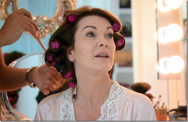
I mean – this is a woman whose rollers are pink!!!
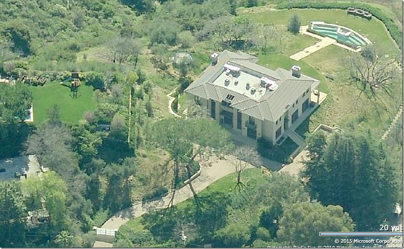
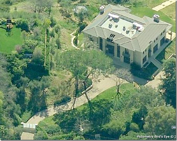
BEFORE: Here is an aerial view of the house with the gate at the end of the drive. Behind the house – is the large yard that slopes down to stairs that lead to a large pool.
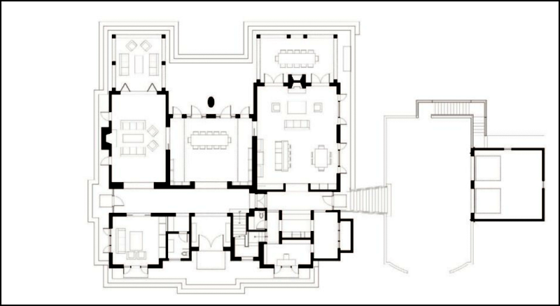
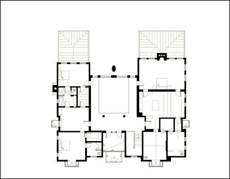
BEFORE: Here is the original floorplan. The two story center room is shown as a dining room, but actually it is a library. Lisa used the front room at the left as her dining room.
The biggest change was the addition – Lisa added a two story addition on the right side of the house – from the existing house to the driveway. It became a new breakfast room and pool table room – downstairs, and an extra large bedroom suite and new closet and bathroom for Lisa, upstairs.
And the upper floor – before. Lisa totally reconfigured the master bedroom/bathroom – of course! Where the addition is on the right side of the house – she added on a room for just their bed, and enlarged the closet and bathroom for herself. Ken got the old closet and bathroom.
The concrete parking lot front yard.
So – let’s start the comparison, room by room. First – the award winning house designed by famed architects Abramson Teiger vs. the house today, as renovated by Lisa Vanderpump. I don’t know who the architect for the additions are.
BEFORE: At the beginning of the driveway, the architects designed a contemporary - Shoji screen gate in white. And below is how the gate looks today:
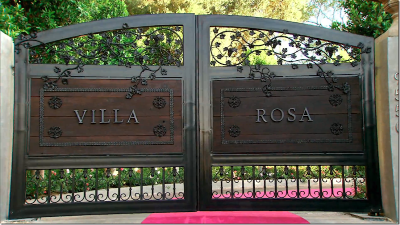
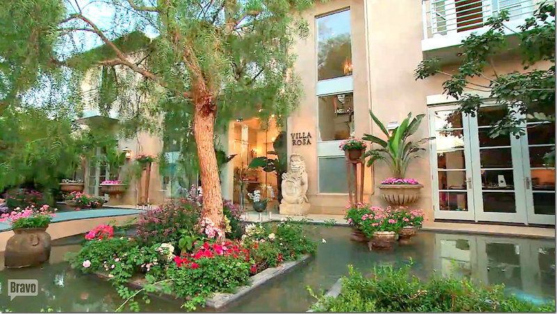
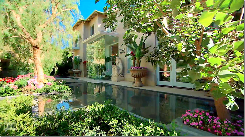
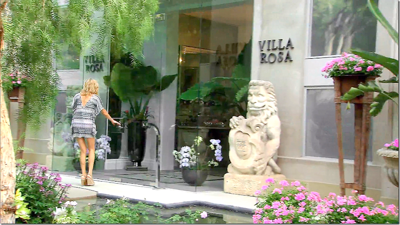
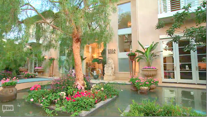
Here are the new wood and iron gates that Lisa designed and had built. Being from England, Lisa always names her houses. This house is called – yes, Villa Rosa.
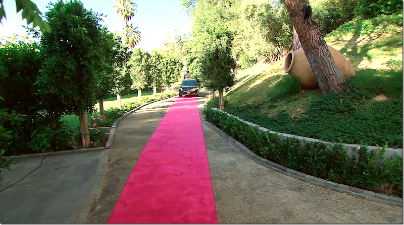
The winding road ready for the Pink Carpet arrival for a dinner party.
BEFORE: The façade as it looked when the house was bought by Lisa and Ken. Starkly contemporary.
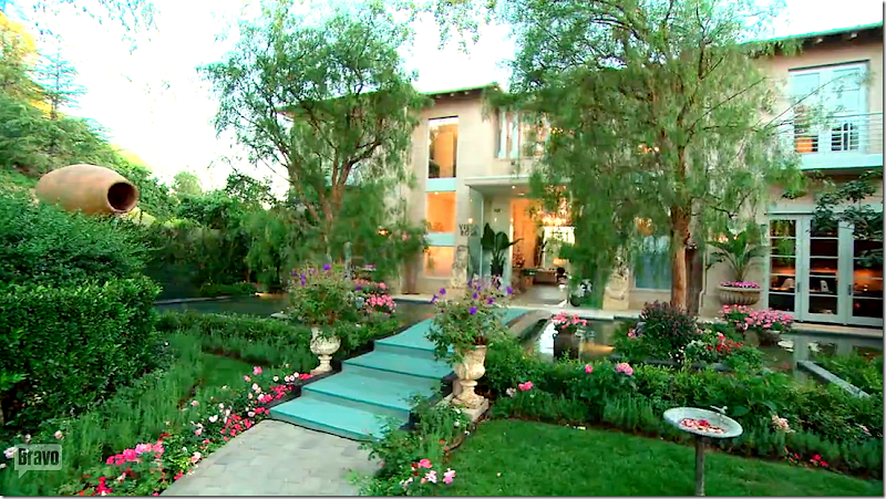
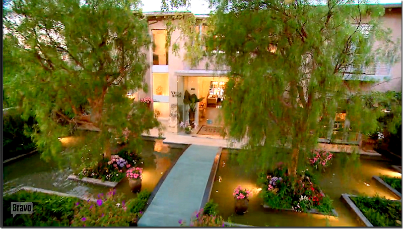
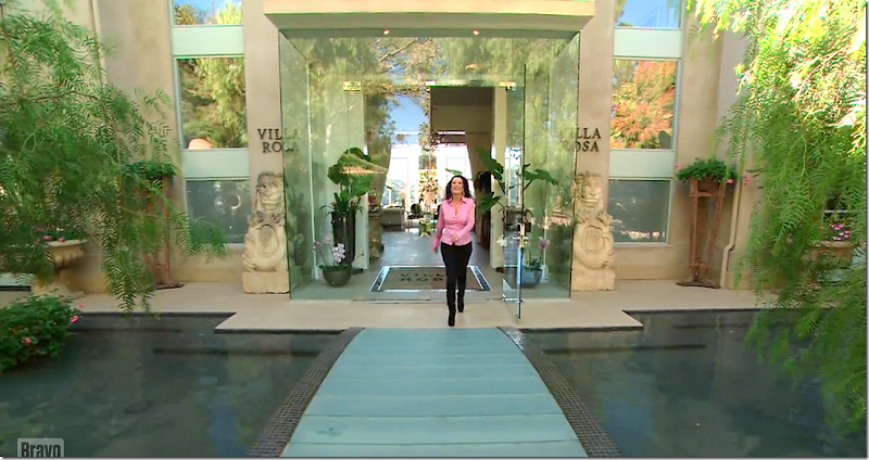
TODAY: The concrete was totally removed. A large fountain was created that leads up to the front of the façade. Inside the fountain – two islands were created and two eucalyptus trees were planted there, along with flowers. A blue painted wood bridge carries visitors to the front door.
The fountain has to be the most romantic thing ever! Lisa also painted the steel windows a soft blue which reflects the color of the fountain.
Here – you can see where the addition is. The window on the second floor at the very right is new construction.
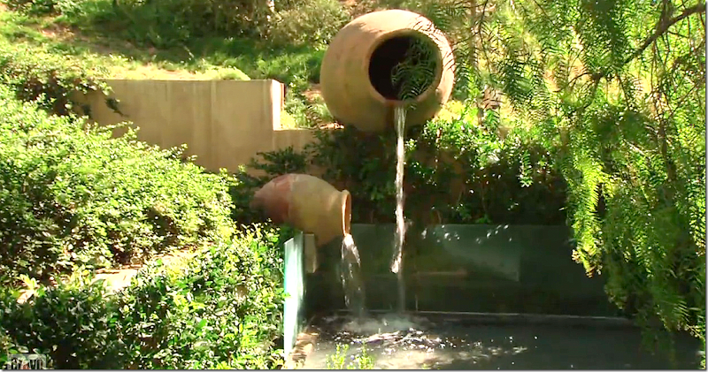
At the left side of the fountain – the water flows through the two large terracotta vessels placed on their sides.
Besides the fountain – the second biggest change was the addition of a glass enclosed foyer that was built outside the front door. You can see the foyer here – with its one story roof. All plate glass, the foyer adds a contemporary touch to the façade which has been considerably softened by the addition of the fountain and landscaping.
A closer view of the glass enclosed foyer – this is my favorite part of the renovation, after the fountain.
At dusk, the fountain lights are turned on for more atmosphere – and to allow the fountain to be seen, even in the dark.
Two large vases flanking the bridge hold even more flowers.
The terracotta pots from which the water flows. The dining room overlooks this part of the fountain – and makes for a beautiful view from the inside.
Lisa comes out of the glass foyer to greet visitors.
Notice where the front door key goes – instead of a key though, it’s a card placed in the chrome stand at the right. More branding – “Villa Rosa” signs on each side of the glass foyer.
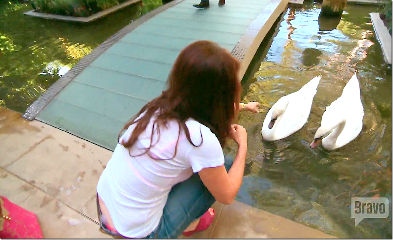
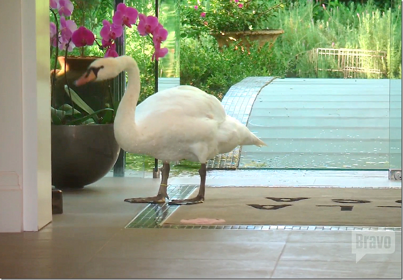
Of course there are swans – Lisa feeds Hanky and Panky.
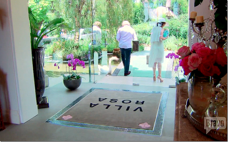
The view from inside the glass foyer – looking out.
Inset into the glass foyer’s stone floor is a rug, with yet more branding. OK – that’s four signs “Villa Rosa” so far. I think guests got the message at the front gate. Lisa always keeps the glass foyer stocked with plants and orchids.
Hanky comes into the house to play.
BEFORE: There was no glass foyer. When Lisa moved in – she removed the glass doors – and opened the foyer wider to extend it to the new glass foyer that was added.
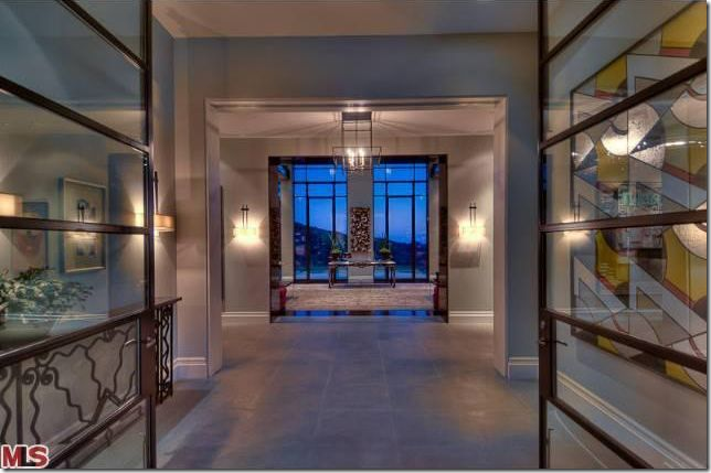
BEFORE: The view from the front door through to the library and its vast canyon views.
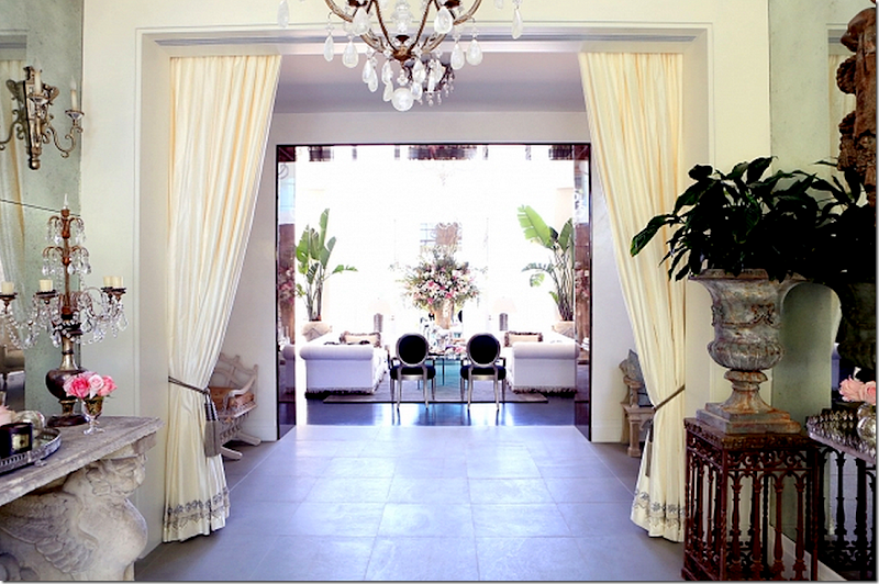
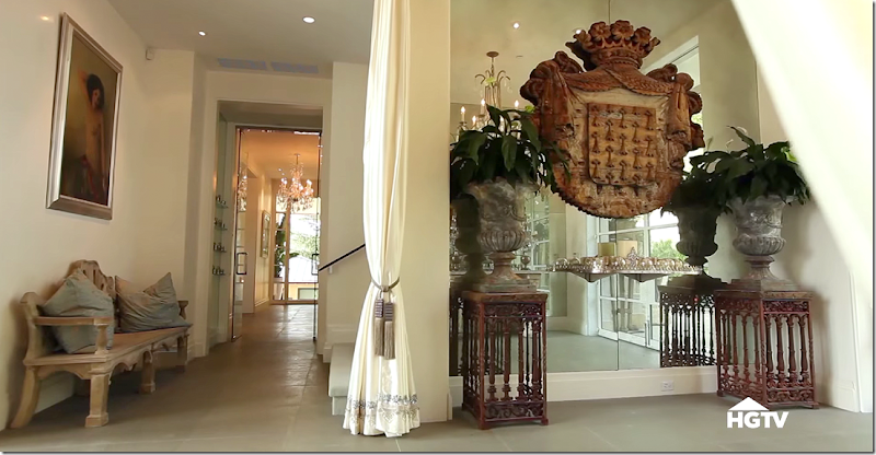
AFTER: Past the new glass foyer, is the original foyer shown here. Lisa added white porteries to divide the entrance from the center hall.
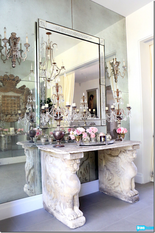
On the left side of the entrance is this stone console and Venetian mirror and sconces. Behind Lisa installed a wall of antique mirror.
And on the right side are vases and an antique medallion, along with a silver console. To the left is the hallway that leads to the kitchen and family room and the stairway.
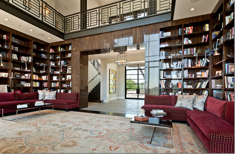
BEFORE: After the house was first built, the architects had it published in a book. This main room is in the middle of the house between the living room and family room. It is supposed to be the dining room/library. Two stories tall, a balcony with an iron railing runs around the room.
Another view towards the front door. The floor is walnut hardwood and the walls are ebony.
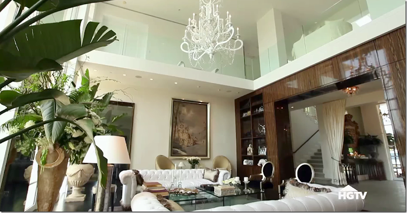
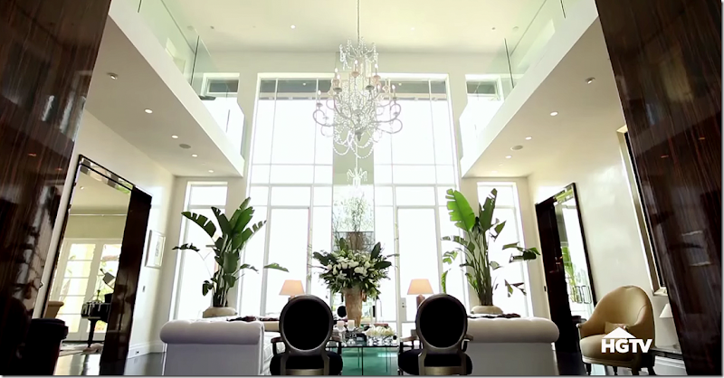
TODAY: This room looks completely different. First Lisa removed most of the paneling and shelving, but left the Ebony wood shelves that flank the main entrance. She also left paneling at the door thresholds. But, by far, the biggest change was the iron railing was removed and was replaced with clear glass panes – adding to the look found in the new glass foyer.
She made the doorways between the rooms smaller on the left and right side of the room.
The steel windows throughout the house were painted white – instead of black. And she added a mirror to the wall between the two windows.
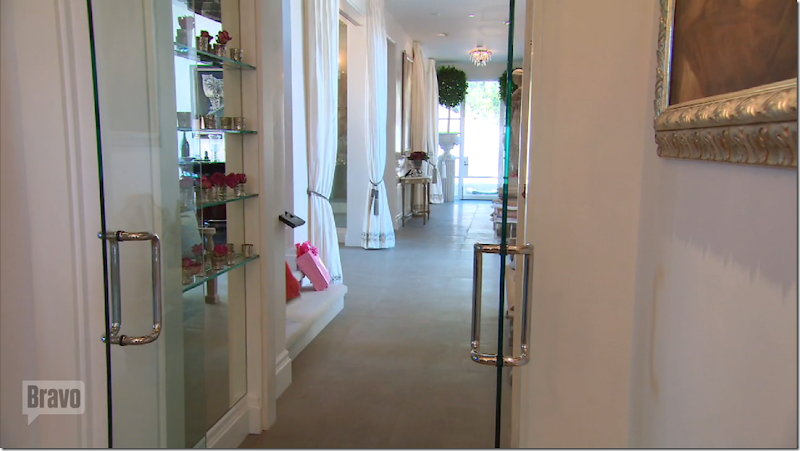
The openings between the family room and living room – from the library were made smaller. Also – here, leading to the family room, Lisa added a glass door that looks like the glass foyer with its chrome hardware.
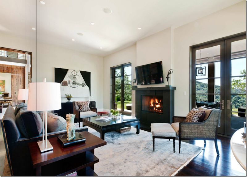
BEFORE: To the left of the library is the living room – with its own terrace. Very pretty.
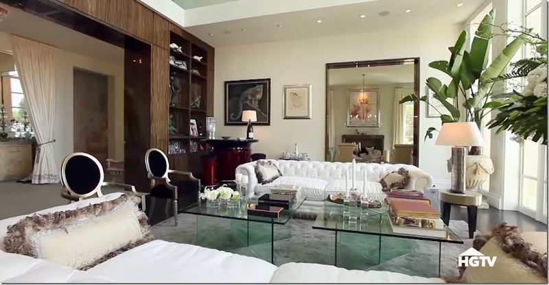
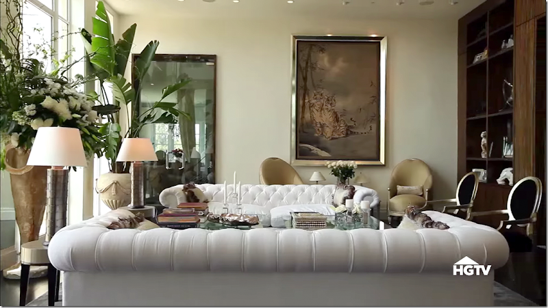
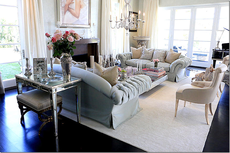
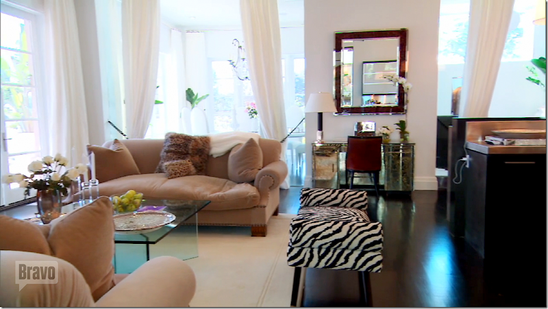
AFTER: The windows were painted white and the hardwoods were stained black, but otherwise the room looks much the same. Of course Lisa’s furniture is quite over the top – with her Marilyn Monroe painting and chandelier hanging low over the table and all her mirrored consoles and tables.
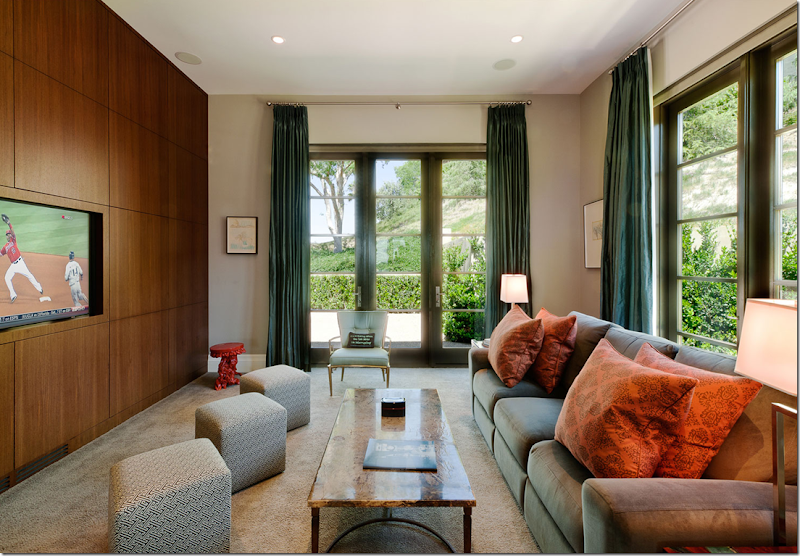
BEFORE: Across from the living room at the front side of the house is the media room. The wall of hidden cabinets is quite contemporary. The furniture is from the early 1990s – so it seems a bit dated today.
BEFORE: And another view looking towards the center hall and living room. Notice the contemporary light fixture in the hall.
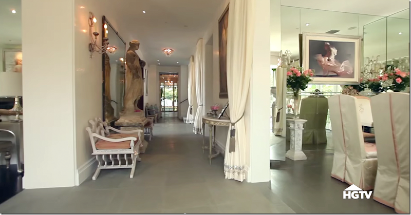
TODAY: Here is the same room – to the right, now a dining room. The hall and dining room has the imported English stone floor which I love. It’s such a beautiful shade of gray/celadon. A set of porteries was also added to the doorway, just like they are at the foyer – seen further down the hall. The wall of paneled wood cabinets is now removed, replaced by a mirrored wall.
Again, the windows were painted white and her fancy furniture makes the room look so very much different. This room overlooks the terracotta vases pouring water into the fountain.
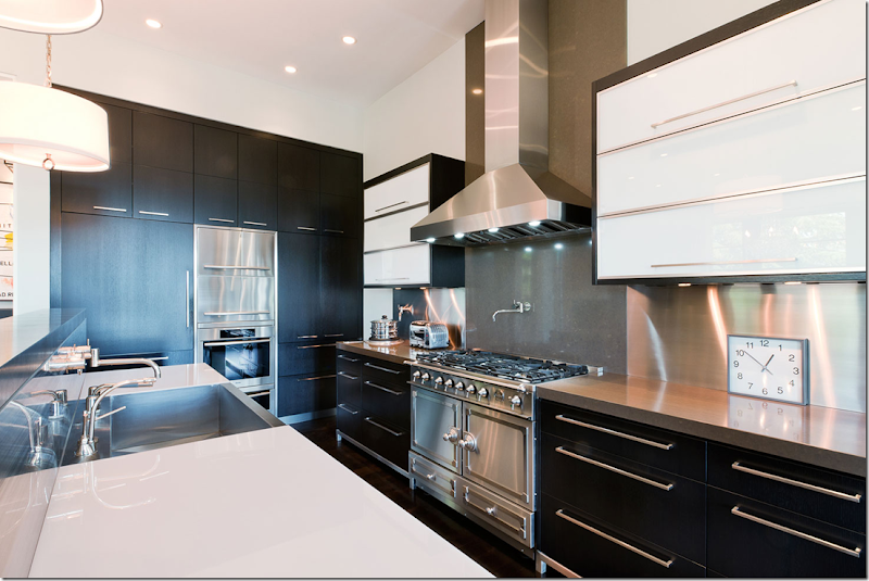
BEFORE: On the other side of the library, at the right side of the house is the large kitchen and family room and breakfast room. Here, the modern kitchen in black cabinets. To the left is the central hall with a built in contemporary styled cabinet and modern light fixture. Lisa kept that console.
BEFORE: Across from the kitchen is the breakfast room. Today – the addition is where the windows are – the wall is pushed out to make room for the pool table and new breakfast room.
BEFORE: The kitchen has a fabulous range and wonderful cabinets. In fact – Lisa kept much of the kitchen intact.
BEFORE: The family room on the other side of the kitchen – next to the living room. The terrace overlooks the back yard.
AFTER: Lisa placed the same glass type doors found in the new glass foyer – here in the central hall that leads to the kitchen and family room.
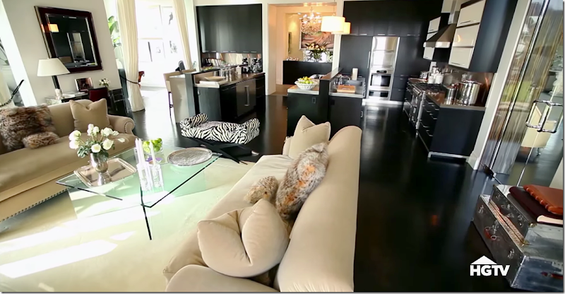
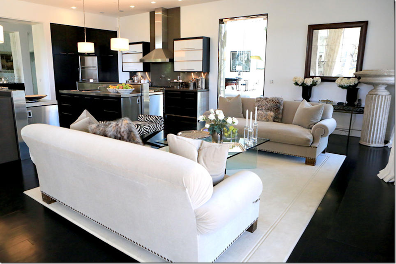
AFTER: While Lisa kept the kitchen intact mostly –she added another section of cabinets where the breakfast room used to be. You can see here to the left of the kitchen that she doubled its size by adding more cabinets and countertops. In front of the room is the family room.
You can see the added footage of the new addition where the porteries are. That entire side is new.
This view shows the additional kitchen cabinetry. To the right is the new area of the house past the porteries.
Here is the addition – the breakfast room was moved here, along with the pool table.
The family room – looking toward the living room and kitchen. I love this area of the house – the stark contrast between the light walls and dark floors. This house is quite change for Lisa from her usual French style. Downstairs, that is!
And looking the other direction – toward the addition through the white curtains.
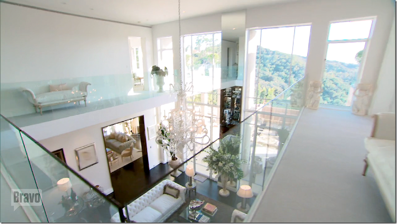
Upstairs, the bedrooms lead off the area above the library – with the new glass panes which replaced the iron railing. Again, the glass repeats the look of the glass foyer. While her furnishings aren’t my aesthetic, too many mirrors and vases and frothiness – I must say that I love the changes she made to the house, bringing it down from stark modern to warm contemporary – and making it look fresh and new again. I’m not a fan of mirrored walls – but I love these glass walls instead of all the iron.
One place where Lisa kept the iron railings, was on the stairs – where she painted them white instead. I suppose this might have been for the expense of it – but to rebuild the stairs using the glass panes instead of the railings would have been gorgeous.
Another view of the stairs.
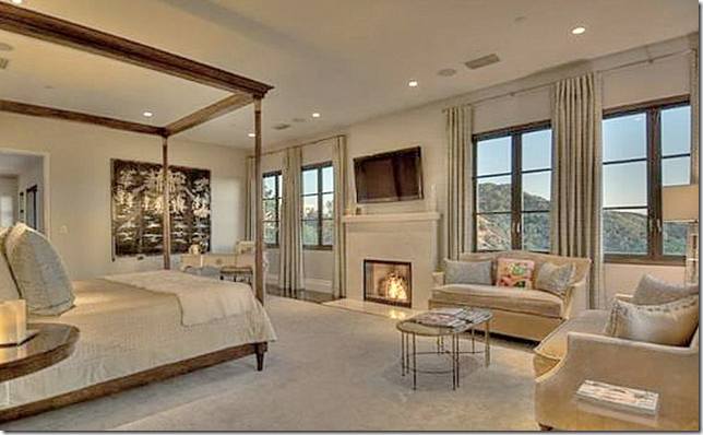
BEFORE: The master bedroom. This room is considerably smaller here because Lisa added onto this side of the house, which is a huge change.
BEFORE: Another huge change is Lisa added upper terraces to both of the roofs of the covered terraces on the first floor. Before – you couldn’t access the top of the terraces, but today – there are being accessed through new French doors which replaced the windows.
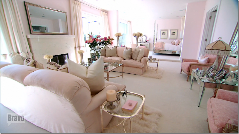
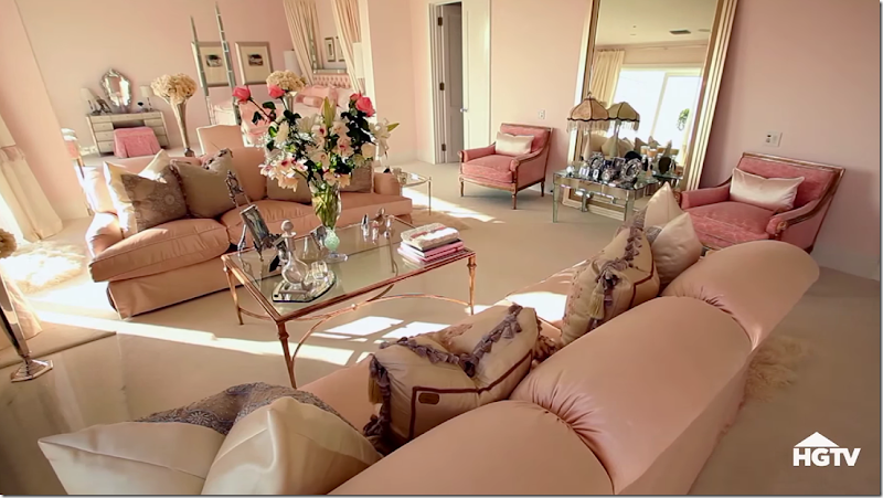
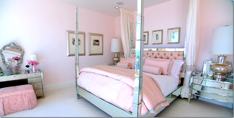
TODAY: The master bedroom is much larger since it was added onto on this side. The bed sits in the new addition. Of course the room is Lisa pink and is a confection of Frenchifried. The TV is actually the mirror above the fireplace. Windows on each side of the fireplace were replaced with French doors that lead out to the new terrace.
Another view of the sitting area of the bedroom suite.
And her bed – which sits in the new added onto area.
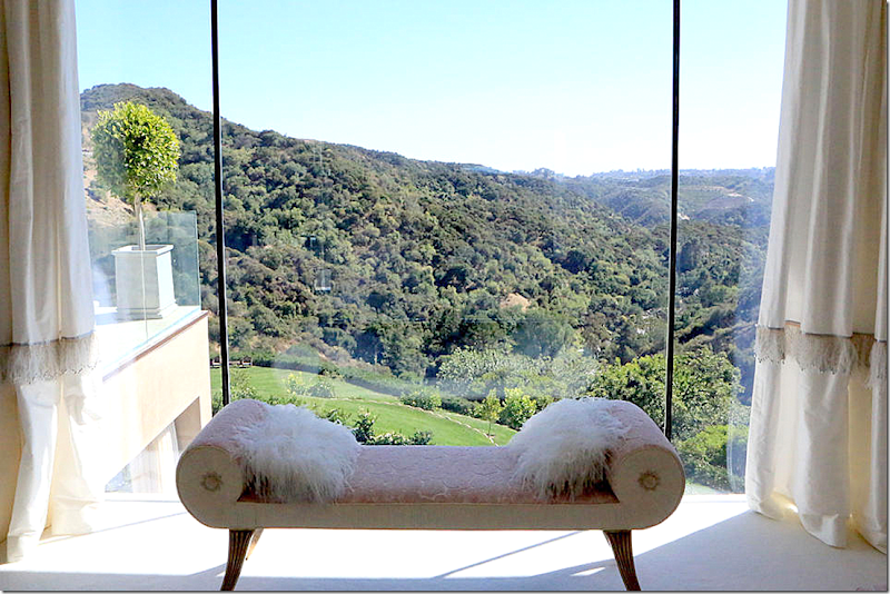
The view from the bed. Lisa said they bought the house because of the view – and it is amazing. To the left – you can see the new terrace from the bedroom.
The terrace off the master bedroom – before this area was just the roof the terrace from the first floor. Now, with the new see through glass pane railings – the terraces are extra rooms. So gorgeous!!!!!
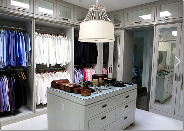
BEFORE: The master closet. This closet and original bathroom are now Ken’s. Lisa’s closet and bath are in the new addition, and then some!
AFTER: Ken’s closet now. It looks like they removed some of the closet doors – why? And the room was painted and freshened up – but basically Ken makes do with the old.
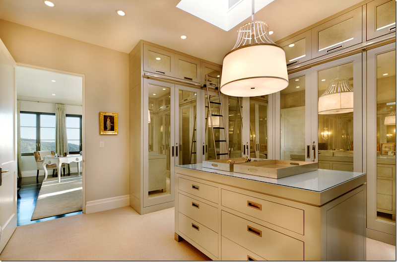
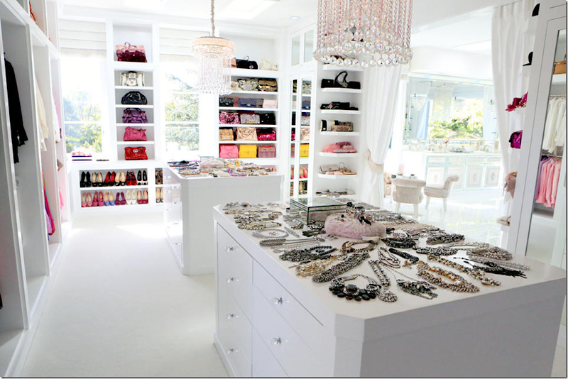
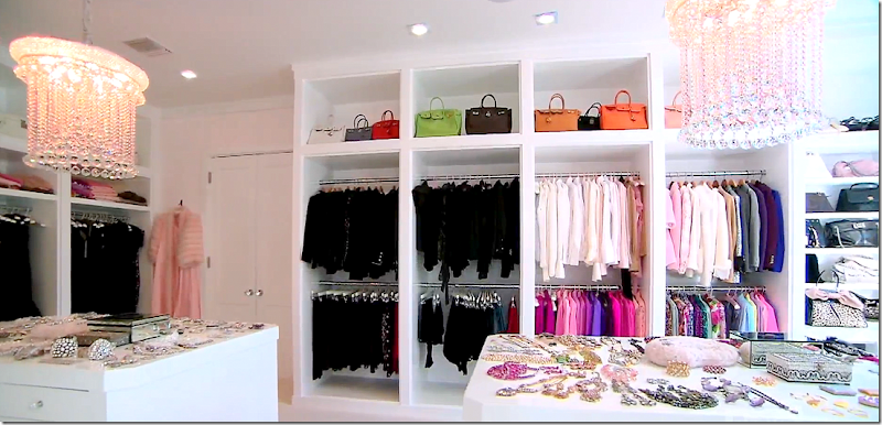
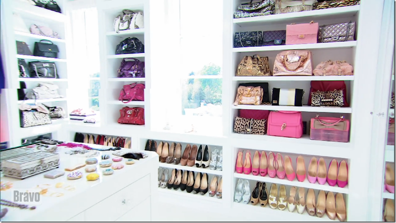
AFTER: Lisa’s closet. Which is amazing. Totally.
Everything is color coordinated. All Lisa’s shirts are custom made.
And some of her shoes and purses.
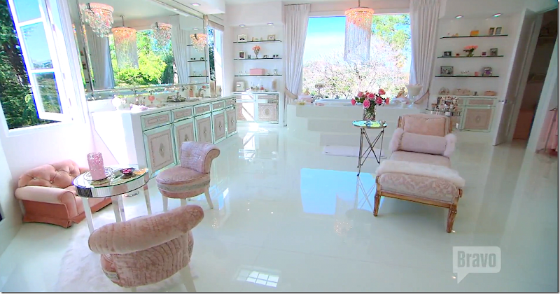
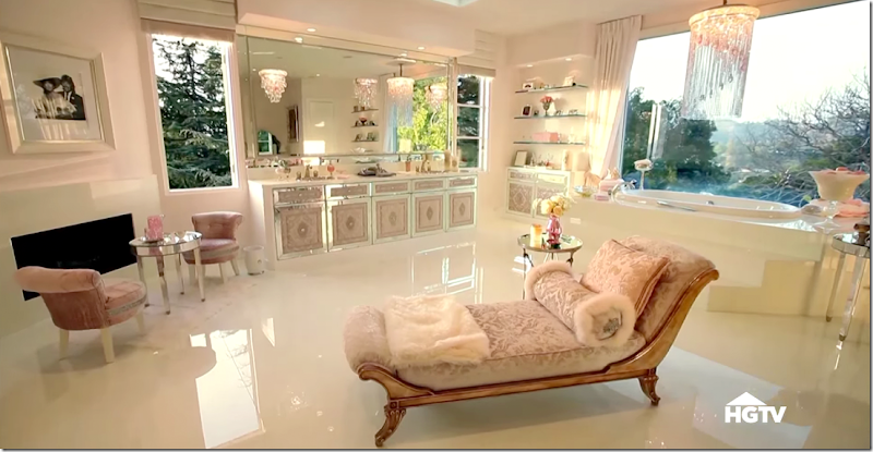
The bathroom – this area is part of the new addition.
There is even a fireplace.
The Back Yard
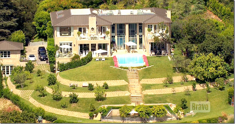
BEFORE: With the two story library in the middle – the two terraces.
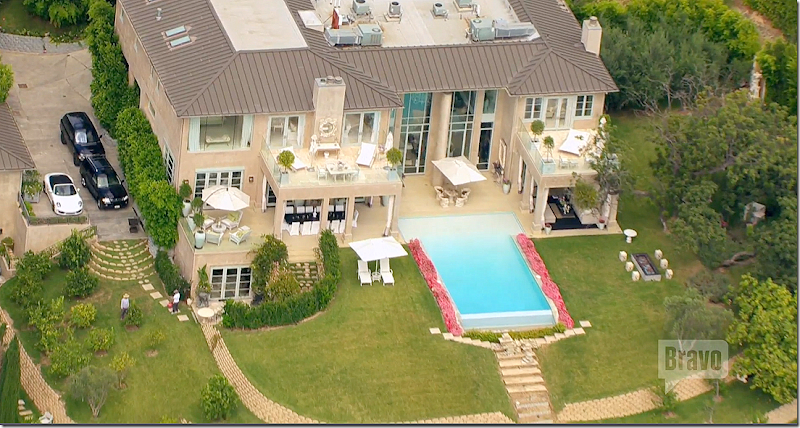
TODAY: A new swimming pool was built between the two terraces. And – upstairs, the tops of the terraces were turned into terraces themselves. Each downstairs terrace now has a chandelier.
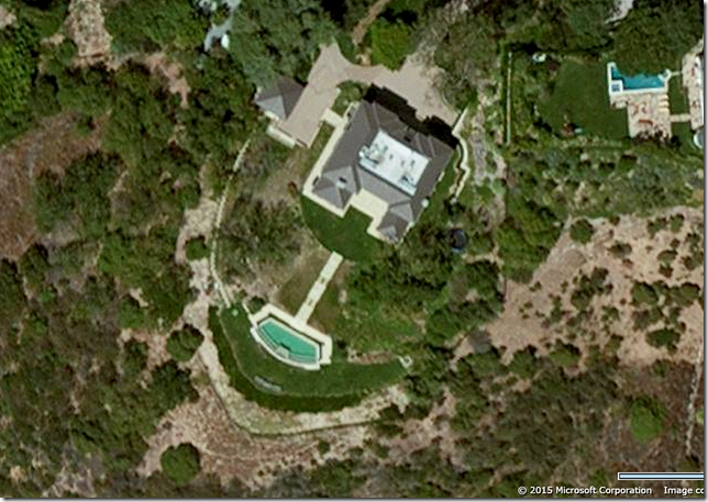
BEFORE: In this google map view – you can see how the house was before the addition on the left side was built. The addition took up the green grass area next to the driveway.
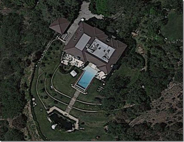
TODAY: This show how all the space on the left between the house and the driveway is now part of the house. The two story addition allowed for a bigger family room and a master bedroom and bath.
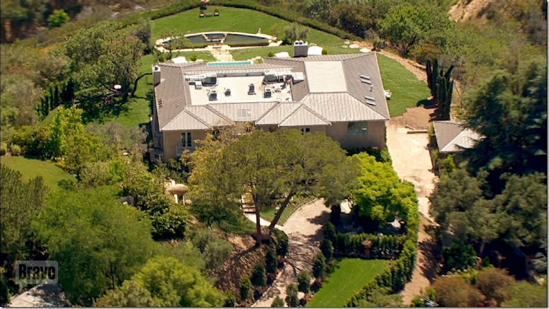
AFTER: Here you can see how the former swimming is now a pond for Lisa’s swans. And you can really see the addition here – on the left side of the house. All the area past the left terrace is the new addition. The large window past the left upper terrace is Lisa’s bedroom – you can see her mirrored bed through the window. When the addition was built – since it was on a slope, there is now a basement room, which you can see here at the left, under the first floor addition. That room is hidden behind a row of bushes. I have no clue what that room is. Lisa added another terrace that is accessible from the first floor family addition. To the left of the house is the guest house and garage.
A bit clearer of the new basement room. Looks like they were getting ready for a Housewives party.
BEFORE: the aerial view of the house before the addition was added.
TODAY: the front of the house after the addition was added on the right side. You can tell by the roof how wide the addition is.
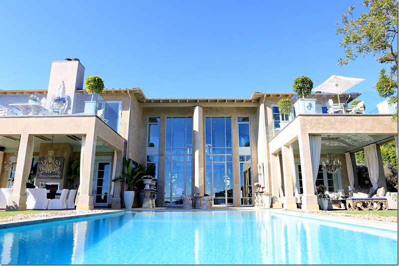
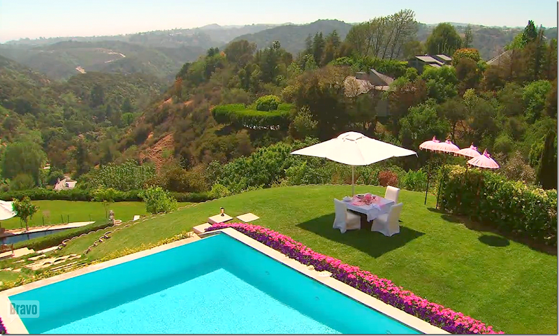
The view from the pool. Whoa.
BEFORE: The terraces – without the center pool and the terraces above. It does seem rather plain. I like it so much better today.
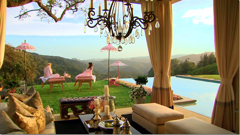
TODAY: The terrace with porteries and chandelier. Lisa and Brandi are getting massages outside by the pool. Boy – those days are so over!! Lisa has moved on from Brandi.
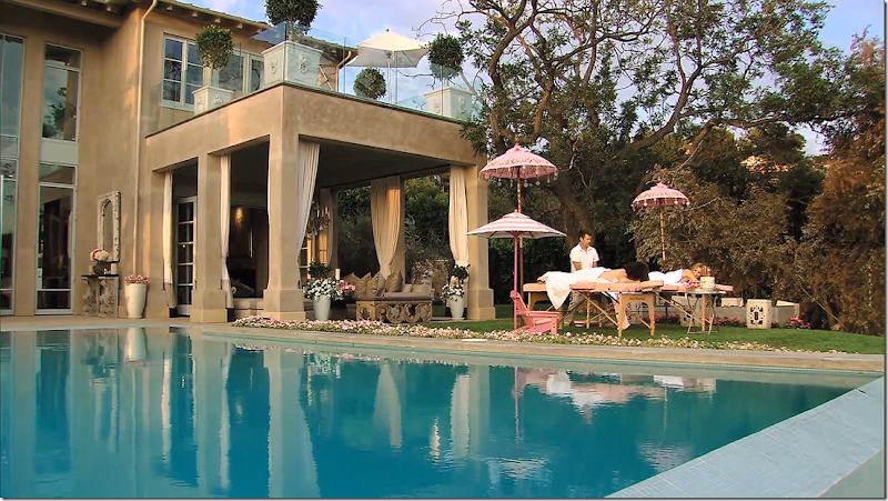
Another view of the terrace - and the massages. Those umbrellas are beyond adorable.
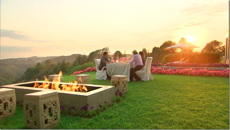
And – an evening meal outside by the swimming pool and fire pit.
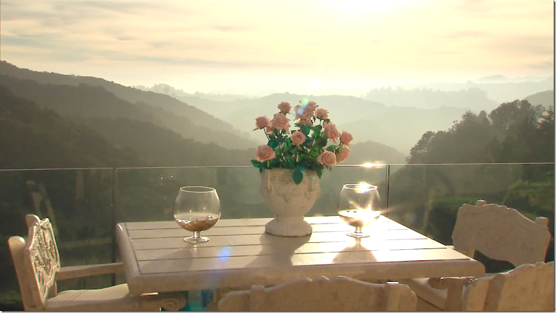
Another early morning view – just gorgeous.
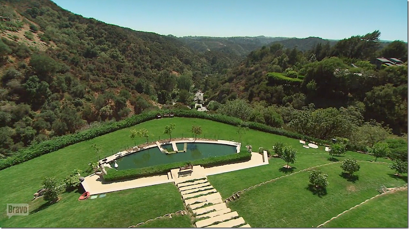
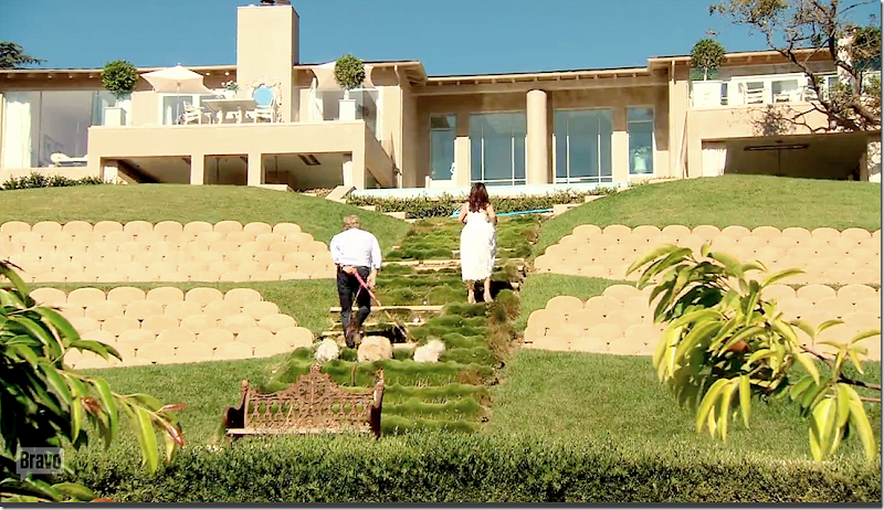
The view down to the former swimming pool – now the swan pond.
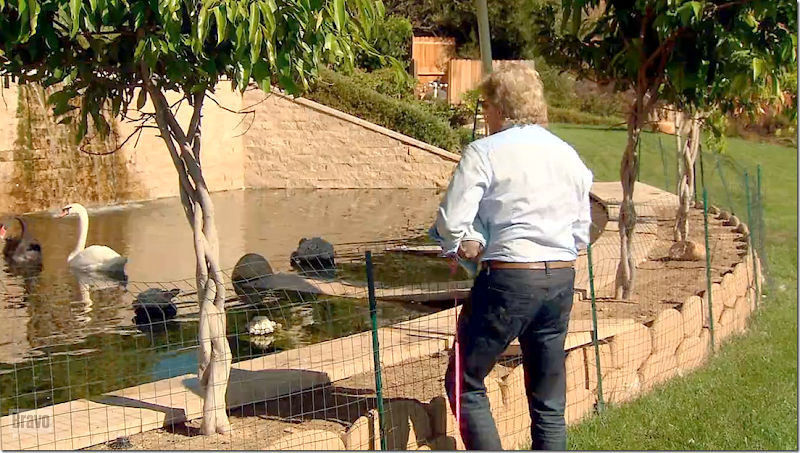
Ken Todd, Lisa’s husband feeding the black and white swans – the former swimming pool, now a pond.
And the long climb back up from the swan pond, past the retaining walls. No wonder Lisa moved the pool up by the house! This climb might be fine for a young family, but for empty nesters in their 50s and 60s – it’s a bit much!
I hope you’ve enjoyed seeing how to turn a starkly modern house into a soft contemporary romantic vision!
Thank you Lisa for sharing your house with us!
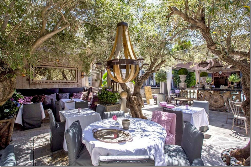
If you are in L.A. – be sure to visit one of Lisa Vandercamp’s restaurants – like the newest one shown above, PUMP. HERE.
And, check out her new line of home accessories. HERE.


