Recently I was sent pictures from an interior designer, Stacy Jacobi, who specializes in flipping houses. Stacy has moved 12 times in 12 years – each time updating the new house for her family. She also renovates and decorates for clients.
The pictures today are from a house her family lived in after she totally renovated it. It was purchased for $550,000 and a year later, it sold for over $1,100,000! Wow!
The renovation was not a total redo – she reused cabinets in the kitchens and bathrooms, but she installed a new striking, custom iron banister that became the focal point of the redo. The house was a dated, soft contemporary with cream tiled floors and soaring ceilings. Stacy installed hardwood floors and marble countertops and subway tiles and fabulous light fixtures to turn the house into an updated warm and friendly family house. It’s an amazing transformation – from modern to cozy.
Describing the style of this house – Stacy calls it: “New England modern with a hint of Hollywood went to the farm!”
Here is the house – clapboard with lots of windows on a small hill.
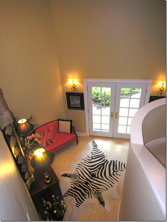
BEFORE: The front door and entry hall. To the right is the original staircase with its solid rail. Cream tile floor throughout.
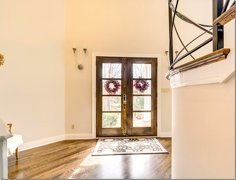
AFTER: Stacy installed new front doors with a more modern look than the previous French doors. New sconces from Aidan Gray. To the right – you can see the new iron railing that was built by an artisan. One of the biggest changes is the dark hardwood floor that replaced the stone tiles. The hardwood makes a huge difference throughout the house, turning the house from modern to warm.
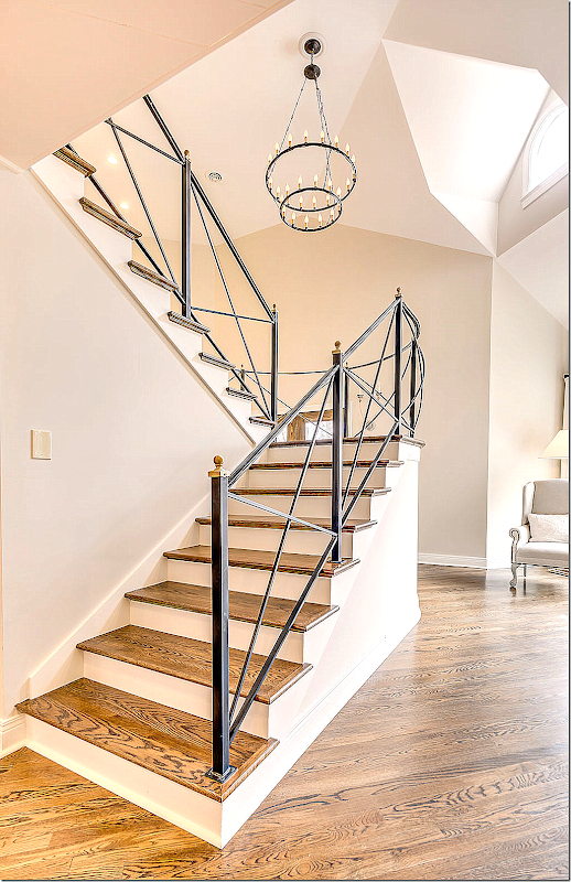
A look at the gorgeous staircase with its new iron railing. Fabulous! An iron chandelier hangs over the stair – tying them together aesthetically.
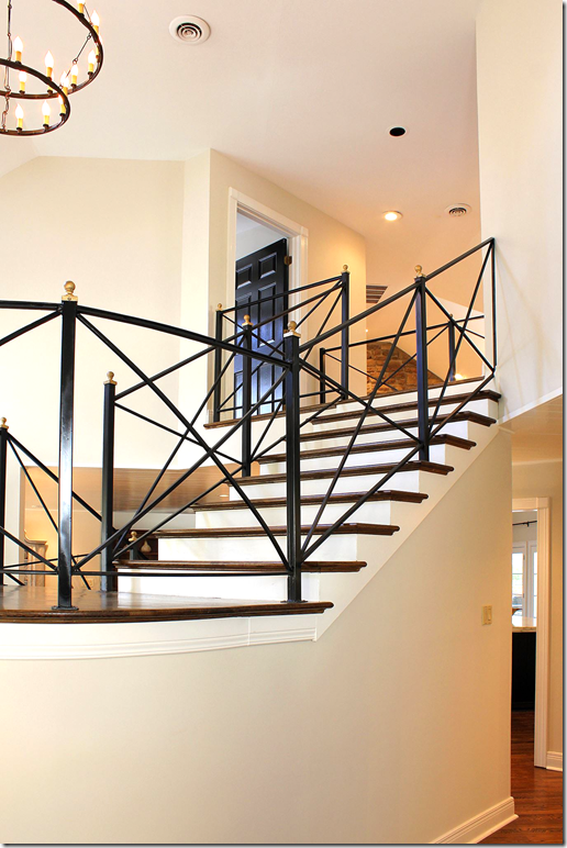
Another view of the staircase, updated with new railing.
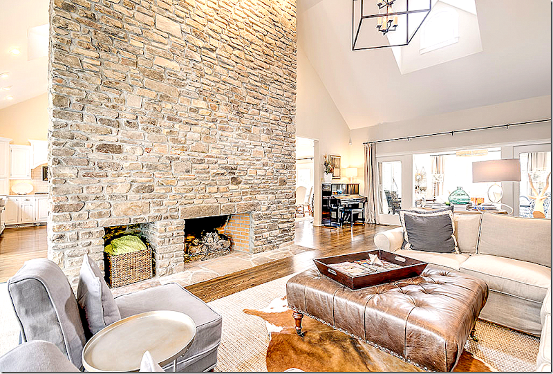
Past the entry hall is the large family room. The stone fireplace reaches to the ceiling. At the end of the family room is a smaller TV room, through French doors. The kitchen and dining room and entry hall are on the other side of the fireplace.
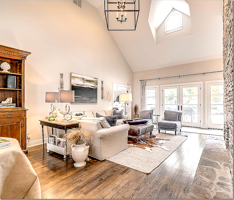
Looking the other direction of the family room – towards the outside. Stacy loves to layer cowhides over seagrass.
Between the family room and the TV room – Stacy added a burlap covered skirted table which acts as a hall table room divider.
In the TV room – Stacy painted the shiplap walls and ceiling the same color. Love the Carlton V fabric on the slipper chairs. Because the TV room has a porch-like feel, Stacy installed limestone floors instead of hardwoods here.
Stacy found the sunburst mirror at Home Depot of all places. Designed by Martha Stewart it cost $39, the kind of a steal of a deal that Stacy loves.
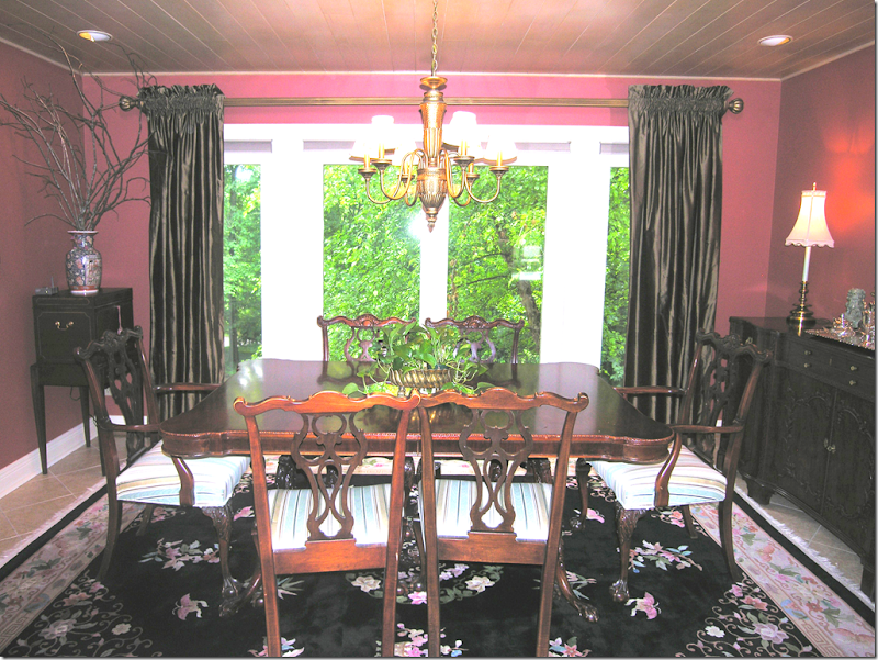
BEFORE: The dining room. Painted red, Stacy says that she doesn’t care for red, never has had a red room and doesn’t wear red clothes or red lipstick!
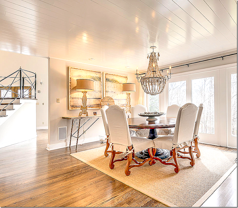
Since Stacy doesn’t like red, the dining room had to be repainted. It is now Benjamin Moore Natural Crème, flat, on the walls and White Dove high gloss on the wood ceilings. The chandelier is from Low Country Originals and is made with hand strung oyster shells!
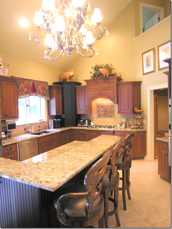
BEFORE: The kitchen had dark cabinets that were in good condition – so Stacy just painted them. But the island bi-level top had to go!
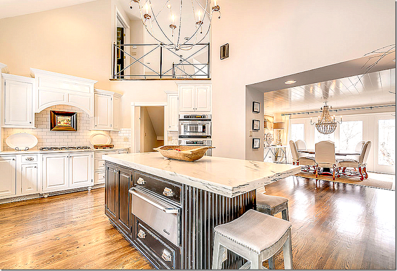
Wow! What a difference cream paint makes. Stacy replaced the backsplash with cost friendly subway tile with a dark grout. Notice the new island countertop – one level with white marble. Again, the hardwoods make a huge difference.
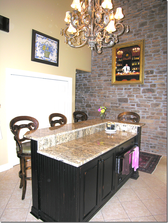
BEFORE: The island with the high low top. The stone wall is the opposite side of the family room’s fireplace. The pantry behind the island was removed – and the area was opened up to the dining room.
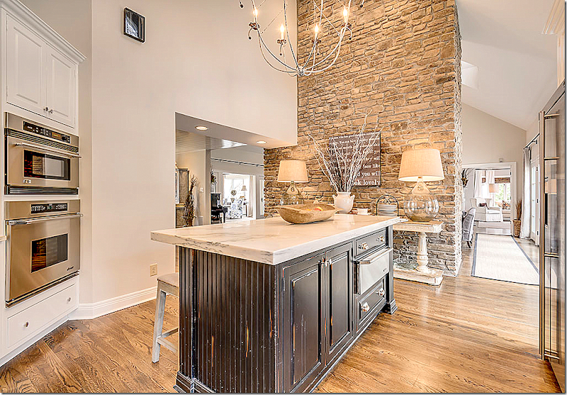
Another view of the island and the stone wall – with a beautiful console table and lamps that look great against the stone. I love vignettes like that – with pairs of lamps. I have quite a few of those myself! haha!! Here you can see how the wall was opened up to the dining room when the pantry was removed. On the right, past the family room behind the stone wall is the master bedroom.
In this view you can see the adjacent dining room, off the foyer where the pantry was removed. So much better being opened like that. At the top is the new iron railing, along with the iron chandelier that ties in with it.
Stacy used shiny hardware with the creamy cabinets and installed a trendy farmsink. Love the dark gray grout used with the subway tile. That small amount of contrast adds so much! And notice the light installed above the sink. Love that!
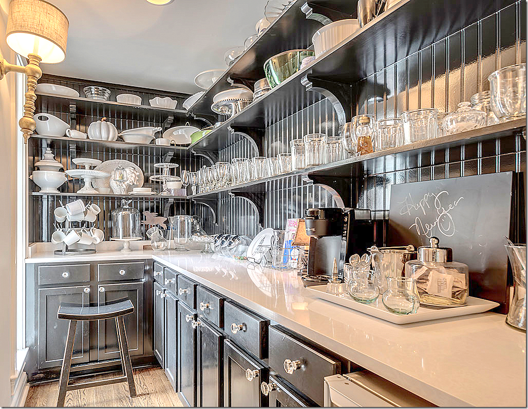
The butler’s pantry/coffee bar was installed in what was once a half bath! Love this space painted in black with white countertops and open shelving!!!
The wet bar has new hardware and countertops. Love the wood ceiling!
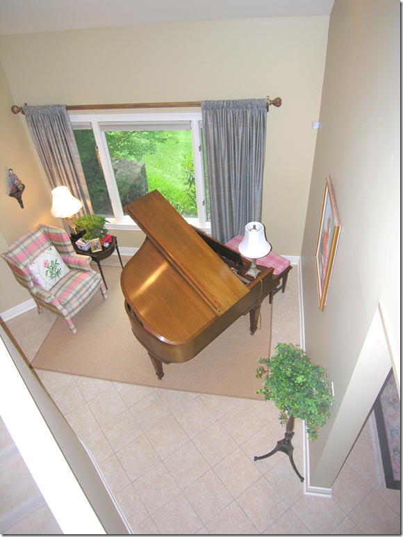
BEFORE: Music room with tile floor.
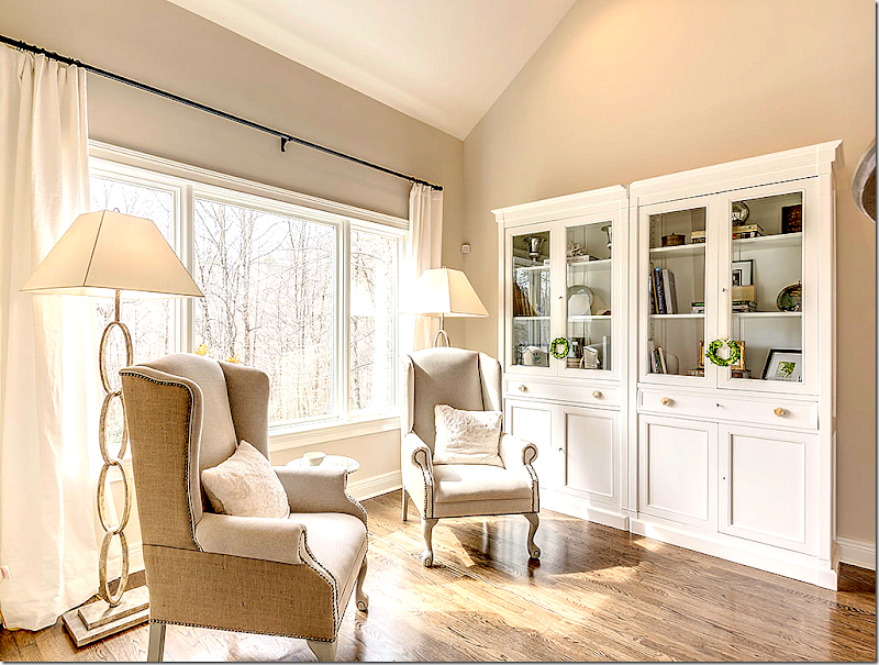
Today, with hardwoods, the room looks so different – configured as a library/reading room with two comfy wing chairs and chic brass standing lamps.
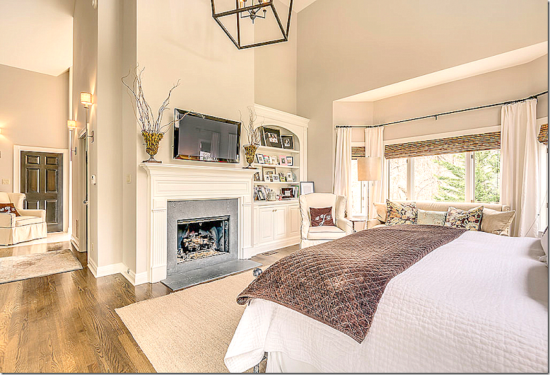
The master bedroom has high ceilings and is painted Benjamin Moore’s London Fog, one of Stacy’s favorite colors. The bed is distressed metal.
And looking the other direction – at the fireplace.
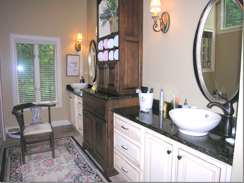
BEFORE: dark countertops and bowl sinks (I really don’t like to use these!) are two elements that Stacy changed.
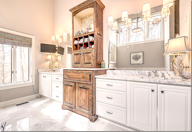
New marble countertops with inset sinks, new mirrors, sconces, and marble floors updated the bathroom. The dark cabinet was distressed.
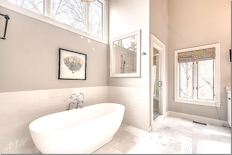
New bath and subway tile. The window of glass blocks was replaced with plate glass.
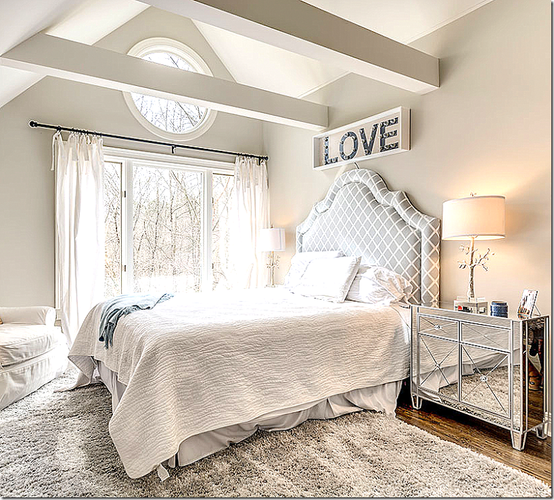
Stacy has three teenage daughters who each have their own style of decorating.
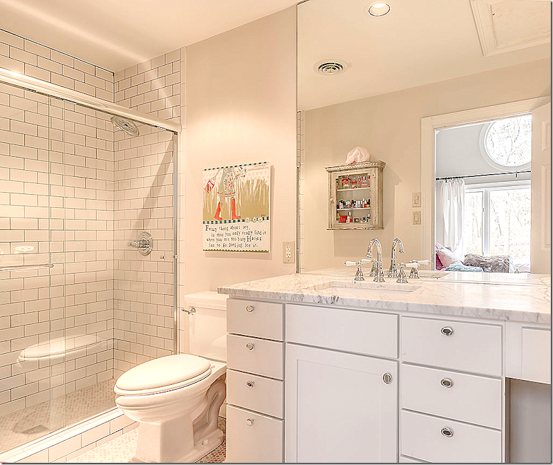
Updated baths with glass showers and white subway tiles with gray group. New marble countertops make the baths look so fresh.
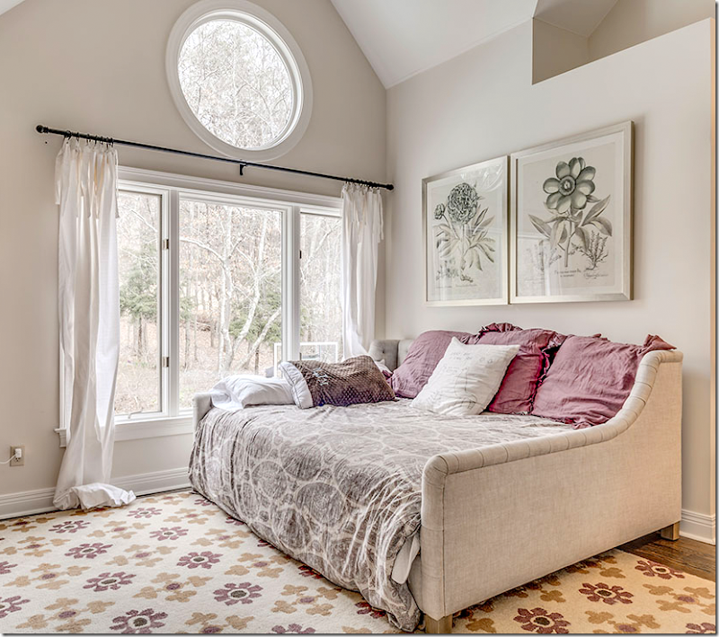
Cute room in grays.
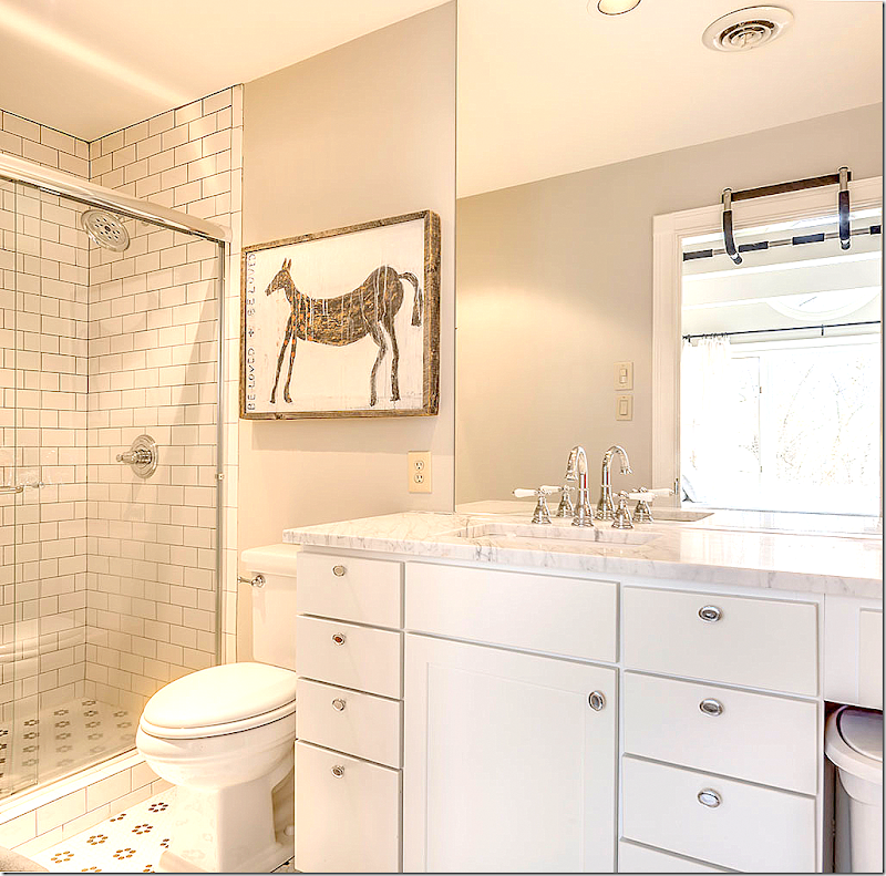
Another bathroom with marble and tiled floors.
Darling bunkroom! Love this!!
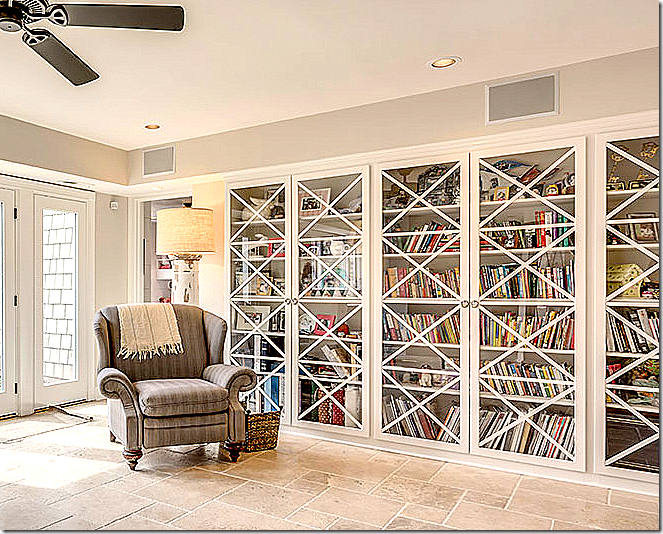
The daughters’ library - with updated doors and stone floors.
I love this house – the way Stacy took a dated, soft contemporary with soaring ceilings and high porthole windows – and by adding warm hardwoods, using creamy paint, designing custom iron railings and installing light fixtures – she turned her house into a cozy, welcoming home! Amazing!!!!
Stacy has a blog with lots more pictures of her work. Go HERE to read it.
For many more pictures of renovations – go HERE.
To contact Stacy Jacobi – go HERE!
And finally, a huge thank you to Stacy!

