COTE DE TEXAS: Search results for Do don’t curtains
Showing posts sorted by relevance for query Do don’t curtains. Sort by date Show all posts

Cote de Texas VS Anonymous

424 comments

One of the most discussed and frustrating aspects of this blog has been the Comment Section.  Judging by the numbers of people who read the blog (over 88,000 per month) by far, the great majority of you never leave a comment nor even read the Comment Section.  But, there is a small group of people who do frequently comment – loyal readers all, some of whom leave a comment on every single blog story.    After last week’s story – where over 150 comments were left – some of which were quite rude – I received many emails asking about what can be done to stop the rudeness and the bullying. 
So, I thought I would tackle this discussion once and for all and hopefully, we can all move on from it.
There are several ways to leave a comment – some readers are registered with either a gmail account or their registered name.  But for those without a gmail account, the easiest way to leave is a comment is by being “anonymous.”
Many of these anons will actually sign their name at the end of their comment so that we will know who they are.  But,  there are others who sign in as Anonymous, leave no name and they remain truly Anonymous by choice.
And there in lies the problem. 
Most of those who are Anon are great commenters.  They are respectful and kind, leaving words of encouragement, thanks, and appreciation.  But, there are the very few Anons who aren’t respectful nor kind, nor thankful, nor appreciative.   These few Anons can be downright mean, condescending, and ugly.   They are rude to homeowners and guest designers who are nice enough to show their houses on the blog and they are rude to me – about my house, my family, and my aesthetic.  The truth is, they don’t really bother ME.  My skin is thick and I can take the criticism from them, but, it’s the homeowners and guest designers that are disrespected here which truly bothers me and other readers. 
Understand this - there is only a handful of Anons that are the issue. 
Many have asked  – why do I allow it to continue?  The answer is there is no simple solution.  If I banned Anonymous comments, I would ban an awful lot of totally innocent people who just don’t happen to have a gmail account or who don’t wish to leave their name.   To ban all of the many innocent people who post under Anonymous just because of the very few troublesome Anons is just not fair.  
I could moderate the comments – in other words - not allow any comments to be posted on the blog until I have read them first.  I have been reluctant to do this for this reason:   If I got only a few comments – moderating would be an easy task.  But, usually the comments average at least 50 a story and sometimes as many 150 and even over 200.   Moderating a busy Comment Section would be a full time job, which I just don’t have the extra time to do. 
Another solution would be to just delete the nasty comments after they are posted – but by the time I would catch them, many have seen the comment and responded to it, thus rendering the deletion moot.   Again, if I got only a few comments a day, deleting would be a viable choice.  But then, there would be accusations of censorship.
And there is this – as bad as the few nasty Anons can be – they are also smart and quite humorous at times.  Many times they have good suggestions and they can be quite entertaining. Sometimes they say things or complain about something that we probably all agree with, but won’t say aloud.   As much as I would love the nasty Anons to disappear altogether, they do challenge me and keep me honest and in check.  They have a BS detector and when it is directed at me – it can be quite valuable.   But other times – when they are rude to guest decorators and homeowners – I want to round them up and give them a spanking or wash their mouths out with soap!
 I have also been asked why I don’t just block these mean Anons or why I haven’t “outed” them if I know who they are, since I have hinted at this for a while.   First, I can’t block individual people.   Second,  I do have a way of tracking who visits the blog and who leaves comments – through their IP Address.  So, if I know who they are, why not “out” them?    Because while I am convinced I know their correct identity, IP addresses are not infallible and there is a chance I could be wrong.   That’s why. 
The nasty Anons can be like schoolyard bullies – once they get our attention, they start to show off and can misbehave, badly.    Yet, most days, these same few obnoxious Anons can be quite well behaved.  They usually tend to get rambunctious when I show a house by a young or unknown designer – and then all hell breaks loose.   These two or three or four Anons will post comment after comment after comment – enraging everyone with their words.  Sparring with them only spurs them on and makes them leave even more comments.   It’s best not to engage them, not to answer them.  Like the playground bully, if you don’t interact with them, they will go somewhere else to get the reaction they crave.   Still, I admit, I am the most guilty of this interaction and answer them too much.   Usually, I just want to set the record straight or I want to defend the guest designer and homeowner.
Why am I talking about this at all?   Like I previously said,  all the mean commenting by a few Anons came to a head  last week.   I showed a house done by a relatively new local designer.  I LOVED the house.  LOVED it.  And most of you did too.  But, the few mean Anons really outdid themselves.   Over 150 comments were left – most of which was everyone arguing with these Anons.  Enough is enough.
I ask ONE thing of all commenters.  If there is a guest designer or a homeowner on the blog – PLEASE be respectful.   Imagine that you are touring the house with the designer or homeowner – don’t leave a comment that you wouldn’t say to their face on that home tour.   That’s all I ask!! 
I don’t mind, and I even encourage you to ask questions about the design process.   By doing so, we can all learn something.   I only ask that you be respectful.    There’s a nice way and a rude way to ask a question or to state an opinion.  


image

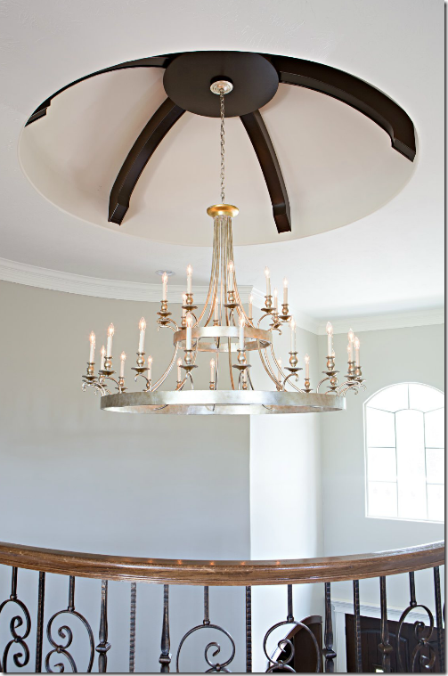
For example –last week there were questions asked about the dark beams in the entry hall ceiling dome.   Some readers asked why the beams were added and why they were so dark.  The homeowner was gracious enough to answer these questions. 
She wrote:
 As for why the ceiling beams are dark...we actually contemplated making them a weathered lighter wood vs the dark that they are, but if you come to visit you will immediately agree and understand why we choose the darker wood...we have large double wood front doors in the same color scheme as well as other accents in the home such as the family room fireplace mantel and kitchen island that are the same.”

The questions and comments about the beams were valid.  I don’t mind AT ALL when people question design decisions that we can all learn from.   And this was a perfect example of that.   The question was asked and answered – both respectfully.

image
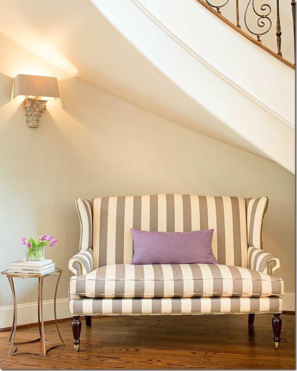
There were also comments about the settee in the entry hall – some wondered if there was enough head room for a person to sit there.  Again, the homeowner answered:

“For the settee, you will not hit your head sitting on it unless you are a giant ;) Amanda did a wonderful job making this a home, that we now love, to raise our family in.”

 Again, question asked and answered, respectfully.

image
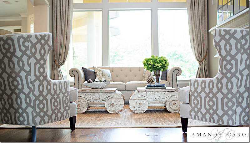
Things got out of hand over the  discussion about the use of Restoration Hardware’s  “capital” tables versus antique ones – which Ginger Barber had used in a similar way – as I showed in a picture.   The Anons really hated that the designer had used Restoration Hardware furniture.  Here are a few of the comments about the RH tables:

“Yes, they are expensive, shockingly so for what they are. For the same money, the homeowner could have bought a more timeless piece rather than one that in a few years will be declared passe' like all of the other junk being hawked by RH at the moment. Perhaps the owner wanted RH. That piece of information has not be established. If, however, the young decorator recommended it, then the homeowner got poor advice. Now if one wanted to put a moat in their living room so that children can run around playing on it, then the capitals might have been the right idea.”
 
Again the homeowner kindly answered:
 
“My husband and I are in our early 30's and when we traveled we were still saving money to pay for school instead of collecting antiques as I wish. We also have two young children who still love to do cartwheels, draw on furniture, and play sword fights so I'm sure if we had antiques displayed they would be in crumbles in a matter of seconds ;)”

Though the question about the tables WAS a valid one, the Anon was very rude, yet, still the homeowner politely  answered.  The discussion about RH didn’t stop with her answer.  It went on and on with rude comments made about her children.    It did get me thinking though – is it true that if “the young designer recommended ‘RH' tables, then the homeowner got poor advice?”
Really - why - I thought?  Is it poor advice to recommend Restoration Hardware furniture to a client?  I had a real problem with that.  First, those RH tables are solid and functional, while the ones that Barber used, the true antiques, don’t seem nearly as functional as coffee tables, nor as safe for young children to be around. 

I commented:
“ I buy a lot of things from RH and so do Big Named Designers. You don't like those tables, I get that. Ok I do.   The owners do. That's why people's houses look different.”

Well, Anon didn’t like that answer one bit!!!
 He challenged me: 

“Name one "big name designer" that would put their name on anything currently in the RH catalog? Name one! You can't.”

So, I answered:
“Oh, I certainly can. I was told about this house where the source for the sofas was RH. I can't say who it was - call me a liar. I wouldn't have said it without having proof.”

So, he called me a liar because I didn’t want to the name the “Big Name Designer.”  Actually  - I was given pictures of a house designed by a “Big Name Designer” where the sofas were indeed from RH.  I just didn’t feel right about naming the designer, since he hadn’t sent me the pictures himself.  But, that wasn’t good enough for Anon.

He told me:  

“Indeed you can't name one or you would. So we are to trust your say so here because you are desperate to make a point. If you truly know a "Big Name Designer" as you referred to them who uses RH, please tell us who that designer is or don't make up convenient truths..”

A few people stuck up for me (thank you!) and talked about a house that was just shown in House Beautiful where indeed a “Big Name Designer” had used Restoration Hardware.  Even that wasn’t good enough for Anon.  He raised the bar higher.  Even though he said I couldn’t name one “Big Name Designer” who would ever put their name on something from RH – Shubel’s was an exception for a myriad of reasons that he cited below: 

“The Stephen Shubel house was lovely, but what you failed to mention and what is evident from the pictures is that Shubel did not use catalog and on line sources exclusively. He has used a bare minimum of these pieces in rooms where they are sat amongst finer pieces of furniture, beautiful wall coverings, fabric and rugs. Therein lies the difference. For instance, he pairs beautifully the Crate and Barrel dining chairs, with a pair of antique chairs and the West Elm cube benches draped in simple linen are featured in front of a beautiful window treatment as well as wall treatment. This is both a clever and wonderful way to incorporate pieces that a homeowner has selected not only for style but to minimize cost. What Shubel did not do is deliver a truck load of exclusively catalog and online sources and say "job done."

But – the truth is - neither did THIS designer.  She mixed in things both new and things old that the clients had, like their mirror and the dining room table.  It wasn’t all bought from a catalogue, nor was it all bought from RH.  And the homeowner didn’t want antiques. 
Still, I thought more about this issue.  I know a lot of designers DO use Restoration Hardware.  I know I do, but I’m not a “Big Name Designer.”  So I decided to look at House Beautiful’s recent issues and see exactly if other designers used RH or do they only use custom furniture - hand made pieces designed only for their client, along with priceless antiques.   Because – let’s face it – unless it’s handmade or custom or antique – it comes from a catalogue on a truck and most companies now take orders online.
And, let me say this – I was surprised how easy it was to find Restoration Hardware pieces in House Beautiful stories, also in Elle Décor and Architectural Digest.    I even found the dreaded “capital” tables!
So, Anon, here are just a few “Big Name Designers” who readily put their name on items from Restoration Hardware.


You may remember this beautiful house shown in House Beautiful last September.  Designed by the “Big Name Designer” Benjamin Dhong, the house is located in San Francisco and is owned by a single Englishman who wears bespoke suits and drives an Aston Martin.  Dhong says he loves contrasts and he likes houses that mix the high with the low.  He finds rooms filled with only expensive and pretty things to be “vulgar.”    Yet, his designs – even with a plethora of online sources – look exceeding luxe. 

The dining room is a mix of high and low – as are all these rooms.  Here, pricey wallpaper hangs on the walls, while carpet remnants!! stitched together cover the floor.  Vintage chairs from Tara Shaw sit with a Knoll table top and Julian Chichester table base.

The table? Antique?  Nah – it’s just Oly Studio – a company defined by its online accessibility.

Let’s take this room.  The guest room.  The bed is new, made to look like a Chippendale design – from Ceylon et Cie.  The carpet?  Inexpensive seagrass.  The table?  Inexpensive catalogue Jonathan Adler.  The wallpaper – the most expensive there is – De Gournay.  The chair?  Yep!  The dreaded Restoration Hardware. 


Another picture of the glorious guest room. 


The living room in the house has expensive wallcovering and a Starke rug.


And along one side of the living room, there is a Tara Shaw repro Swedish chair hidden underneath a – horrors! –Z Gallerie throw!  (I actually bought that same throw for my niece’s bedroom.)


And, here, the main seating area of the dressy living room,  is the slipcovered Restoration Hardware sofa with two copies of the famous Egg chair.  Gosh! Restoration Hardware in the living room?????  NO!!!!!!!!!!!!!!!

Antique chair is mixed with a desk from – Restoration Hardware!


Oh lord!!!!!!  Oh no!!!!!!!  The dreaded Restoration Hardware “Capital” table.  I had to laugh when I saw this picture.  This table – which the nasty Anons ridiculed to death – shown here in House Beautiful, in a house designed by the uber chic Benjamin Dhong – a highly regarded and respected “Big Name Designer” – well, well, well.  And two RH chairs flank the Capital table.   In the breakfast room, there are chairs from Design Within Reach.  The rug?  West Elm. 
Hmmm.  Did Dhong just order a truck load of furniture from catalogues and have it delivered?  Well yes.  But he did add some expensive wall treatments and art work in the mix, along with a few pricey vintage pieces – all easily affordable to the bespoked dressed Englishman.  Maybe a family, not quite as liquid, could start out with the basics and add to it over the years?    Is that a lazy designer – who provides a good solid base for the family to grow into as children age and bank accounts grow?   For shame, Anon!!!

Another view of the family room and the Capital table and chair from RH.  I think Anon owes last week’s designer and homeowner an apology.  Don’t you????


image
Here is the living room shown last week with two of the RH Capital tables – which I love.  Will the homeowners and designer add more to the room as time goes by?  Maybe or maybe not.  They might like the room just as it is now, or they may want to add a pricey antique chair or table in here one day.  I like the room just as it is.

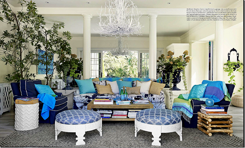
And another house:
image
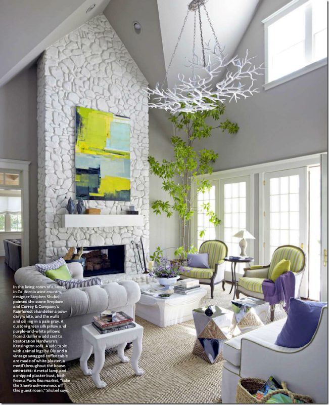
This month House Beautiful showed two houses with Restoration Hardware merchandise, but one was not designed by a “Big Name Designer” – and I already showed it a few weeks ago.  The second house WAS designed by the VERY “big name designer” Stephen Shubel which was discussed earlier by a commenter.  The house is on a few acres in the Sonoma wine country.    According the Shubel, the owner found cheaper versions of furniture he had picked out.  Much was bought online and from catalogues.  NO!!!!!!  What a LAZY designer!!!!  The chandelier here is from Curry and Company – the same company that our guest designer, Amanda Carol, used in her designs.  The sofa – Restoration Hardware.  The white table by Oly Studio is a homage to one by John Dickinson – which Shubel probably wanted, but  this was a cheaper version of that.  While the original table probably cost over  $8000, the copy is so much cheaper.  Do you really need the original to get the same look?  Shubel obviously didn’t think so.  Hmmm.  Really?   Use a copy instead of the original?   What BAD advice Shubel gave these homeowners!!!  They should ask for a refund!!

image
Another view of the living room – shows Restoration Hardware’s copy of a French chair – upholstered in both a print and a plain fabric.  Wow!  Just what Amanda Carol did with HER client’s chairs.  Amazing.  Pillows are both custom and Z Galleries.  Mirror tables from West Elm.  Actually – there is nothing antique or pricey in this room at all.  It’s all new and mostly inexpensive.   Much was ordered from catalogues and came delivered on a truck.  And yet- here is the house, shown in prestigious House Beautiful.

image
Dining room chairs are a mix of vintage and Aidan Gray.  Chandelier – Oly Studio.


image
The guest room has bedding by Z Gallerie and nightstands from Aidan Gray.  The stools are 19th century – the only pricey item in the room.


image
The master bedroom has stools from  Wisteria and the bed is from, yes, Restoration Hardware.  Mixed with a Stark rug, the room looks more custom than catalogue – yet besides the rug it IS all catalogue.  So lazy.  Such bad advice!  Why did House  Beautiful even publish this house???? 
I hope you realize I am using sarcasm here.

image
In the garage turned into pool house – Serena and Lilly ottomans mix with the Restoration Hardware sofa and Shades of Light chandelier.
So, is Shubel a lazy designer for turning to catalogues and online stores?  No!  But our guest designer was called that for doing the same exact thing.  Go figure.


And yet another:
image
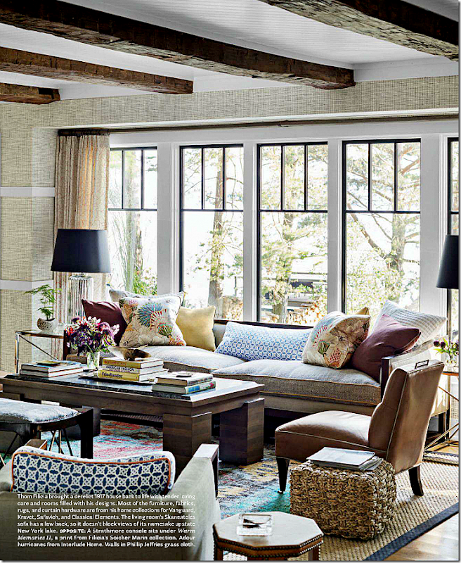
In House Beautiful last November “Big Name Designer” Thom Filicia showed off his lake house.  Most was decorated using his own very reasonably priced furniture line – for Vanguard.

image
But he filled in places with Restoration Hardware – like this light fixture, which I love!


image
And this light fixture.  He also used a RH mirror over the fireplace.

And yet, another example:
image
In November 2011, “Big Name Decorators” and hot duo Parrish Chilcoat and Joe Lucas used Restoration Hardware’s leather chair in this living room owned by a professional hockey player. 

image
For his outdoor living space, Restoration Hardware provided all the seating, except for the Ikea deck chair.  Ikea??!!!


6a00e554d7b82788330133f4ea9773970b
My favorite blogger and designer Brooke Giannetti of Velvet and Linen chose Restoration Hardware curtains in this house she decorated. 

6a00e554d7b82788330133f4ea9f88970b
and in the living room too  -  Restoration Hardware curtains.

6a00e554d7b82788330133f4ea9986970b


And in the fabulous dining room – Restoration Hardware chairs  - hosts in leather.  Gorgeous!   Don’t the basket lights make the room?


image
And in this dining room shown  last week – the host chairs remind me of the ones Brooke chose.  Beautiful!
 
And so, I think we can put to bed the comments about ordering from catalogues and Restoration Hardware – and whether “Big Name Designers” order from   RH too.  They do.  I can’t tell you how many times Restoration Hardware was sourced in all the major magazines.  It doesn’t mean you are lazy or unimaginative to use sources like these.   If you like the Capital table – then order it! 
And one last point on this subject – an Anon wrote in making fun of me for calling it a Capital Table instead of Capitel.   I looked up Capitel – there is no such word in the English dictionary – it is Spanish.  But, under Capital, you will find:
 

Definition of CAPITAL

the uppermost member of a column or pilaster crowning the shaft and taking the weight of the entablature


Just saying.

And then, there was this comment from Jamie:
 
“Amanda is a great designer. People forget when looking at a designer’s work that the client has the ultimate say.  As designers we don't get everything we want for a client's home.   We compromise. Many clients don't like antiques, so we compromise. Or they decide that they want draperies but those are expensive so woven shades under the draperies aren't worth it.   So we compromise.    That's how it goes.”

Anonymous used this minor point about shades to put me and my aesthetic down, by responding:

“Jami, woven shades under draperies is an invention of this blog. You are not likely to see this treatment in many places in other parts of the country except Texas. I personally can't think of a better way to ruin the look of expensive fabric and beautiful windows than to put those cheap looking shades under them. Ask yourself a question and truly answer it honestly. Would you really use these hideous shades had you not first seen them here?”

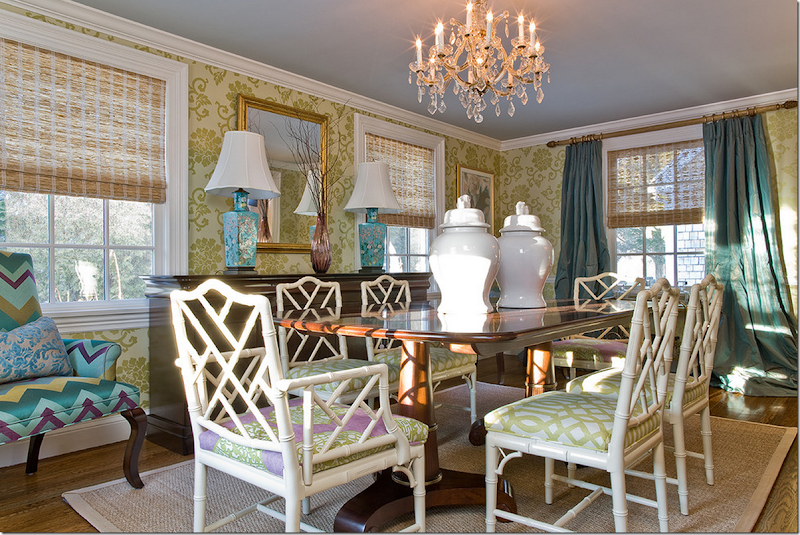
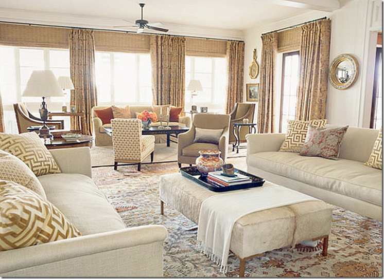
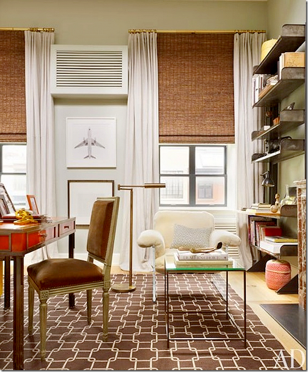
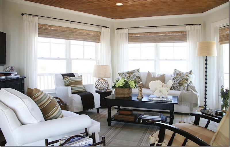
The comment is of course directed against me since I like textured or bamboo shades under curtains in certain circumstances.   His comment made me laugh – as IF I invented using bamboo shades under curtains – or as IF they are only used in Texas.  “Hideous” shades.   True, I do like to use shades – I like that look – but even more, I like to use to shades to hide imperfections in windows, such as short windows, or unbalanced ones.  And I like to use shades to cover the “dead space” between the rod and the fabric. 
bedroom 029
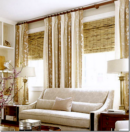
For instance in my bedroom – I used a long shade to hide the fact that there is really only one very short and very long window here.  Instead, now it looks like there are three  perfectly balanced and proportionally placed windows.  By placing the rod at the molding, the window appears taller and the room, in turn, appears taller.  It’s a smooth, clean line.

 image
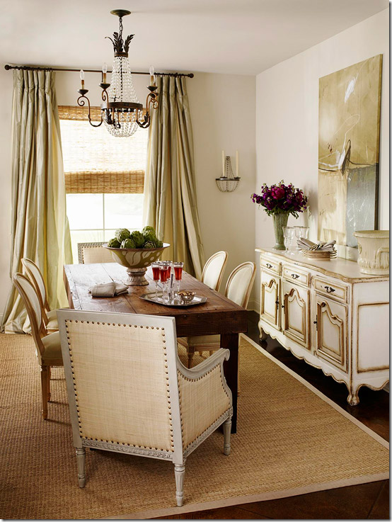
Notice these windows – to make them appear taller, the rod was placed at the ceiling.  Yet, there is the dead space between the rod and the window that tells you how tall the windows truly are – your eye is not fooled.  If they had raised the shades up to the rod – you truly wouldn’t be able to tell how short the window really is.  And this is just a messy look – to me.  By raising the blind you would get a cleaner, less fussy, look.

image
Again- the dead spot.  How much more graceful and pretty the window would be if the shade was raised to the rod to cover the dead spot.  No one is fooled that the window is taller than it is.  Still, a very pretty room!
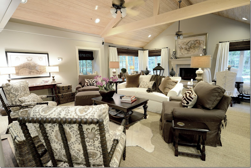

udelson068
For this client, I used the shades to bring the windows up higher than they actually are.  By placing the rods and curtains higher than the window frame and then adding the shade, it fools the eye that the window is taller.  Additionally, I like the contrast of the dark shade against the ivory fabric. 

DSC_2429
Sometimes, like in my family room, I use shades just because I like the look of the shade and how it adds to the color scheme and brings needed texture to the room.

image
Sometimes, like in my living room, I don’t use shades at all. 

Still, the Anon got me thinking – am I really the only person who uses these hideous, cheap looking shades?  Or are they only found in Texas?

image
I looked around for “Big Name” Houston designers who use shades – and had trouble finding any.   Here, though, Jane Moore used very expensive and beautiful Conrad shades under silk curtains.  Hideous?  No.

6a00e554d7b8278833016764f2fe79970b
This picture shows a beautiful living room, NOT in Texas, with shades and curtains. 


image
In a Chicago townhouse, Alessandra Branca used bamboo shades and curtains.


image
And in an apartment in Rome, Italy, she used shades and curtains.


image
In this beautiful bedroom, Conrad shades used under curtains – again, not in Texas.


image
In California, shades and curtains.


image
More luxe Conrad shades and silk curtains.

image
“Big Name Designer” Suzanne Kasler used shades and curtains in this living room.


 image
And Nate Berkus used shades and curtains.


image
Love this look in a Charleston house, though I would have raised the shade above the molding.

image
And again in California – curtains and  shades.  So hideous, I know!


image
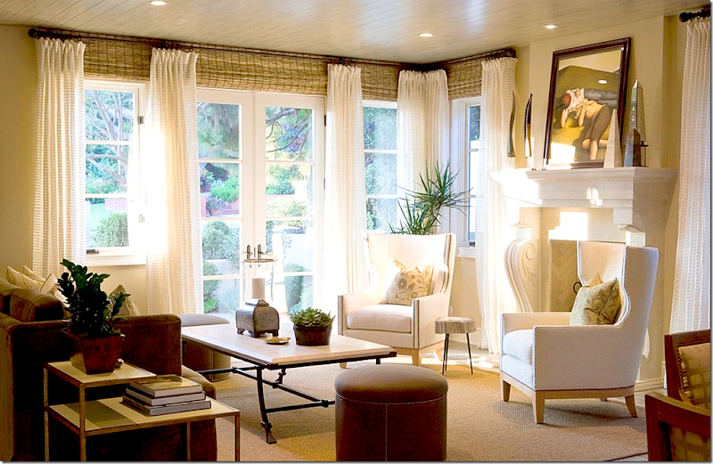
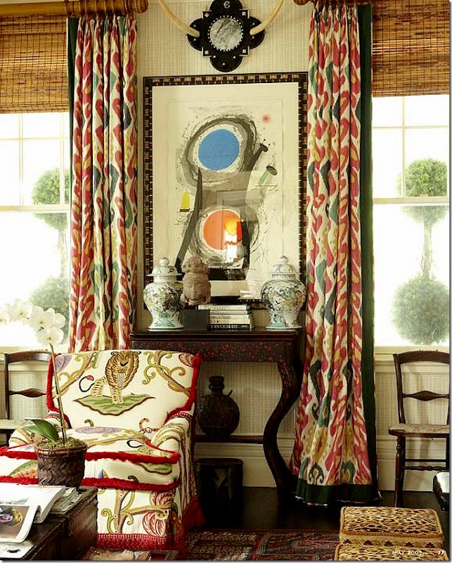
I love the ikat curtains mixed with bamboo blinds here.  I love the texture they add.


image
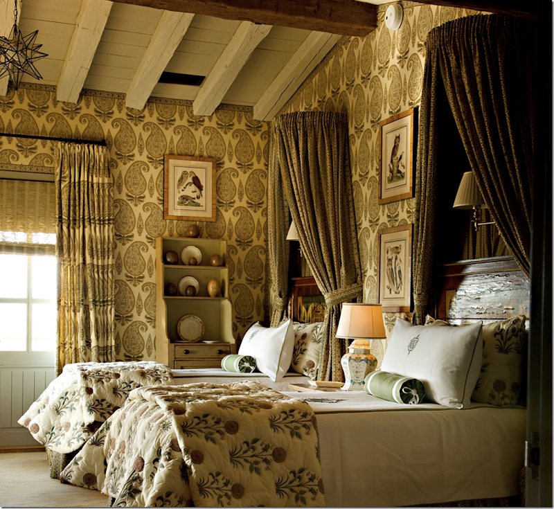
And here, paisley mixed with Conrad shades.

 
image
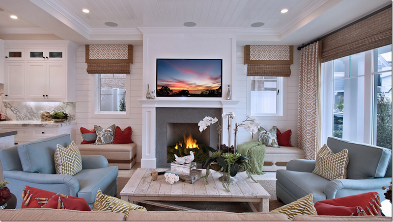
 And in this family room – curtains and shades – not in Texas and not hideous.
Would the anon apologize for his comment?  I doubt it.
 Last week, when I begged that the Anons please be respectful, this is answer I got back:

“Joni, no apologies required. If one is not ready for prime time, one should not publish their designs. It's really that simple. You insult your readers by requesting that they ignore some of the obvious mistakes. You have a sophisticated readership, both homeowner and professional and to require that we dish out praise where it is not warranted is simply hypocritical and disingenuous at best. I won't do it, so sue me!!”

To this I say – not everything I show will be ready for “prime time.”  Many houses, including mine and my client’s are not ready for House Beautiful or Architectural Digest, but they are pretty enough to be shown on a BLOG.  This is a BLOG, not a magazine.  It is FREE.  If you had to pay to look at houses shown here, then you might have a point. 
I am constantly asked by readers – why do you only show expensive houses?  Why not show houses that we normal people live in?  And – I do try to do that – as often as I can.   I don’t show houses to insult the sophisticated reader.   I show houses that all readers – sophisticated, wealthy, older, younger, or unsophisticated – can enjoy.  Not all readers are the same and not all readers will enjoy each and every house. 
Additionally, I don’t ask that you dish out praise, whether it is warranted or not.  I encourage your questions about design choices.   I only ask ONE thing – that you be respectful of the guest designers and homeowners.   That’s all I have ever asked of you.    Notice I am not included in that description. 
I hope we can all move on and try to be respectful to each other from now on.  I hope I have answered all your questions about  this subject, but feel free to ask them if I haven’t.  Like I said previously – even the Anons add to the discourse.   I don’t want to silence them or ban them because everyone, even them, bring some positive aspects to the comment section.  I only ask that they be respectful.   Is that too much?


Curtains - Top Ten #4

228 comments
image

Number four on the list of the Top Ten Design Elements that I love in a house are curtains. After linen, slipcovers, and seagrass – curtains bring so much to a room that they should always be considered when designing a house. Curtains add romance, texture and softness. They can also add jolts of needed color. They bring coziness and warmth to a room or sometimes they add a beachy breeziness. Curtains are tricky though – they need to be done right, executed perfectly, or it’s better to not bother with them at all. Nothing takes away more from a beautifully decorated room than cheaply constructed curtains – limp, skimpy, too short, too long, over embellished – you name it – it can be a disaster. A lot of people don’t care for curtains at all – they call them dust collectors, outdated, an unnecessary expense, or something “my granny had.” One of the harder parts of my job is talking clients into putting up curtains – the list of excuses can be endless: I have beautiful windows, I don’t want to cover them up, or I love my view – I don’t want to block it. Another popular excuse is this: I don’t need curtains, I already have plantation shutters (or horrors) mini blinds.

For all the reasons not to get curtains, I can argue against each point – curtains do not need to block beautiful windows or views - they can frame them. They don’t need to look like your granny’s curtains, we can update the look. And as I often have to argue - curtains can look beautiful layered against shutters or blinds. In the end, what curtains bring to a finished project is sometimes hard to elucidate. Oft times I can only say – trust me, you will love them – against strong skepticism. I really never worry too much about the outcome though, because it’s usually well received and clients are mostly surprised how much they do love them.

After years of ordering curtains for clients, I have a formula that I usually follow and it works well for me. To illustrate which window coverings look great, I’ve collected pictures of curtains that I like and don’t like which show the difference between the good and the not so good. My absolute love of curtains is actually relatively new – it came rather late in my life. I didn’t realize the importance of curtains in decorating or what a difference they truly made until I started designing houses for other people. Even in my own house, I lived without any curtains for years, and still have yet to hang them in my family room, though that is just a laziness on my part which one day I will rectify. When our long awaited curtains in the living and dining room were hung, my husband who is usually quite silent on matters of the house (except for ceiling fans, of course) remarked what a difference they made: “It’s so much cozier in here.” And I had to agree, it was – much more so. And sophisticated too. I have no idea why I waited so long to finally hang my own curtains, after all, I had ordered dozens and dozens of panels for perfect strangers, why not for myself? But living without them for years and then finally getting to enjoy their beauty only made my resolve stronger to be more assertive and convincing when broaching the subject with clients. After all, I know too well the difference between having curtains and not having curtains – and I will never go back to bare windows again.


CURTAIN PANELS – PLAIN FABRIC:


image

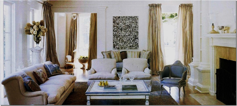
I consider Gerrie Bremermann to be the Queen of Panels – her own curtain formula was once printed in a magazine which I promptly confiscated for my own. Bremermann prefers to use three widths of fabric for each panel, a luxury few can afford. But three widths is so stunning, so full, so luscious – I would rather use more of a lesser quality of fabric than less of more expensive one. These taffeta silk panels are so perfect! Billowy, with a trimmed leading edge, the curtains are oft copied by homeowners – and who can blame them? They are stunning and perfect for a living room, dining room or master bedroom.


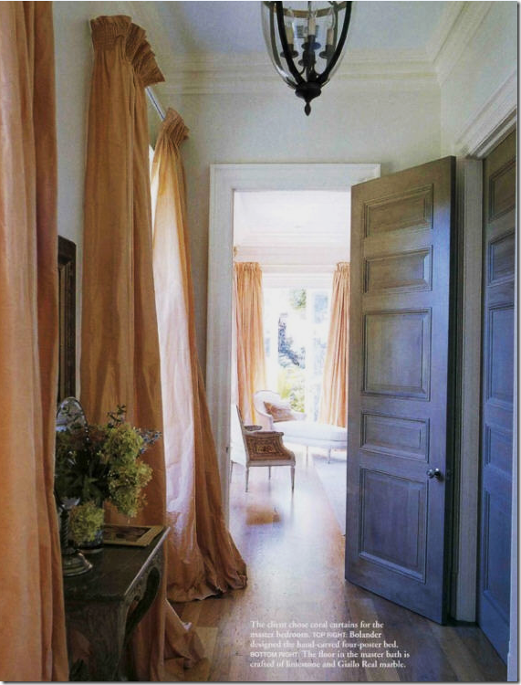
image Lars Bolander is another designer whose adroitness with panels I have long admired. Here, he uses taffeta on rods with no rings. The attention is meant to be wholly focused on the draping alone – not the hardware. Bolander lines his curtains with either bump or blackout – notice the sunlight does not come through the silk – washing out the color. I always line and interline my curtains, always, unless of course I am using a sheer, see-through fabric.


image

Here Bolander again used silk taffeta with no rings. It appears he used a smocked rod pocket with heading. Huge puddling of curtains has gone out of favor in past years, but I still prefer a 3 to 4” slight puddle to my panels. Bolander’s appear to be about 8 inches.


image

I love curtains that are free flowing without ironed in pleats which is how I always order mine. These panels are pinch pleated at the bottom. I usually pinch pleat mine at the top. And, I’m not a cornice person usually either – I prefer plain panels but sometimes a cornice is necessary. To understand what curtains bring to a decor – imagine this vignette without the material behind it. Wouldn’t it be rather cold looking and seem that something was “missing” without the curtains?


image

Suzanne Kasler dressed up these silk panels with trim on the leading edge and brass rods.


image

Houston designer Lisa Epley used panels with her arched French doors – sometimes the perfect solution to deal with arches is just to ignore them.


image

Houston interior designer Renea Abbott handles a similar window in the same fashion, here with gray and cream striped silk fabric.


image

Simple panels, but full and unstructured, in a fabric that matches the darker stripe in the wallpaper. Very elegant with a masculine feel.


image

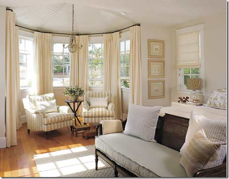
Bay windows are hard to work with – here the designer chose to mount the curtains outside the window seat – framing the view. The leading edge is taped in a darker color. These panels have pleats ironed in, a look I usually don’t care for, but notice how the pleats mimic the stripes in the chair fabric. In this instance, ironed in pleats was the absolute correct choice. Just beautiful.


image

Another bay window, handled in a similar manner. Since there is no window seat, I think I would have placed panels between each window, treating the area as three separate windows instead of one. By doing so, there would not have been such a wide white space stuck in the middle of a gold room.


imageI prefer to handle bay windows like this – with a panel between each window. It makes for less of a large expanse of windows, especially when the trim is painted a different color than the walls.


image

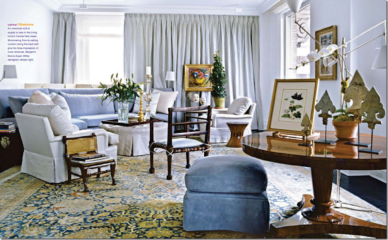
In this gorgeous NY apartment, Vicente Wolf chose to drape the windows – something that is often omitted in highrises. By using the wonderful light blue silk fabric, the apartment appears cozy and homey – not sleek and contemporary. It is possible that this wall had “problem windows” – which was solved by the length of the fabric. The curtains actually act as a wall here – notice the painting appears to be hanging on the curtains itself. Beautiful interior design.


image

How to tackle a double height room, with double windows? Full panels are hung straight down from the molding accentuating the glorious height of the room. Yet, notice the designer used a plain linen in the same color as the wall – a printed fabric would have overpowered the room. From Southern Accents – this living room is one of my favorites this year. And, so far it has all four of the elements: linen, slipcovers, seagrass, and curtains. I wonder how many it will end up with – all 10? Stay tuned to find out!


image

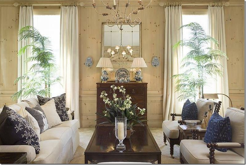
Atlanta interior designer Phoebe Howard also used plain panels hanging down from the molding in this high ceilinged room. Her fabric though plain, is lighter than the limed pine paneling. A beautiful room from Mrs. Howard.


image

In her NY getaway apartment with high ceilings, Chicago interior designer Alessandra Branca used goblet pleats on an semi circle rod which gives the curtains their canopy effect. Branca repeatedly uses Italian Stringing, a method of holding back curtains without any obvious visual means.


image

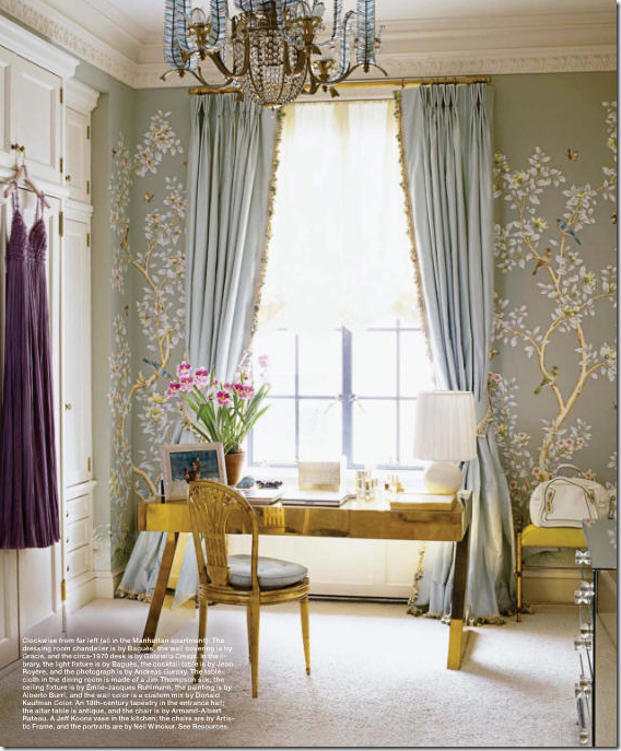
In a NY dressing room, delicate hand painted silk wallcovering is paired with even prettier silk curtains – trimmed from the leading edge down to the hem. A plain unobtrusive shade blocks the sun’s glare. These curtains are held open with tie-backs.


image

Tone On Tone owner, owner Loi Thai uses a simple rod pocket treatment and no rings for his curtains. Notice how the rod is placed a foot past the window trim which allows the panels to actually cover the walls, not the window, thus preserving all the view and the sunlight. Clients that insist they don’t want curtains because they will block the view need to be reassured the panels can be hung clearing the windows.


image

When the ceiling is low, hang the rod directly under the molding thus elongating the line and giving a more vertical feel to the room. These rods were also placed to clear the window and save the view. A trim placed on the leading edge dresses up the panels just a touch.


image

Golden walls in a cluttered room – just my style! Though the curtains are simple, muted, and blend with the wall color, the room would actually feel so bare without them. I ADORE this room!


image

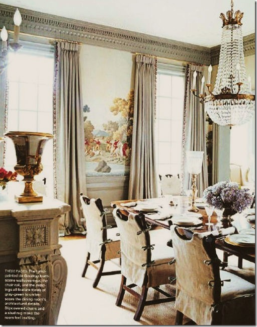
Gray silk taffeta with sheer shades – so French and so pretty.


image

In her own home Suzanne Kasler used taffeta, and added a deep taupe band the bottom of the panels. This is a good technique when reusing curtains if they are too short – just add a coordinating fabric band to the hem to make them longer.


image

Gerrie Bremermann used white taffeta to blend with the white linen on the slips and the walls.


image

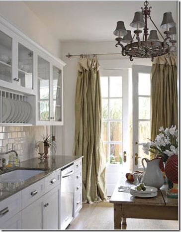
In New Orleans, silk panels hang in the kitchen!!! Why keep silk panels only in the dressier parts of the house?


image

DON’T: Don’t EVER accept curtains that are too short. You should NOT be able to see the sun coming through the floor and the panels. This usually can be adjusted during installation by lowering the pins. If not, they need to be returned to the workroom and corrected.


SHOTS OF COLOR:


image

Martyn Lawrence Ballard’s living room has red drapes that add all the drama in the room. Impossible to imagine the room without these curtains that provide the shots of color.


imageNate Berkus’ Chicago apartment – imagine this room without the blue panels – wouldn’t quite have the same punch as it does now.


image

This New Orleans dining room used taffeta panels in a beautiful apricot shade, reminding me of Gerrie Bremermann’s room with the same colored curtains.


image

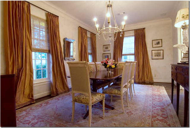
This dining room in Houston was also inspired by Gerrie Bremermann’s dining room. The panels were dressed up with tape on the hem – perfect length, imho.


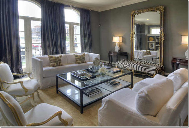
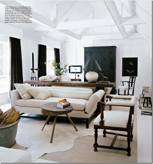
image Washington DC interior designer Darryl Carter used deep chocolate panels to contrast with his signature white fabrics and dark woods. The contrast of the curtains truly gives the room its punch.


image

Uber talented Miles Redd paired exquisite De Gournay wallpaper with a trendy suzani and luscious green silk panels with a Greek key trim. This shade of spring green is the new, hot color!


image One of Michael Smith’s first national splashes was with this living room and the gorgeous saffron curtains. Let me repeat, gorgeous!


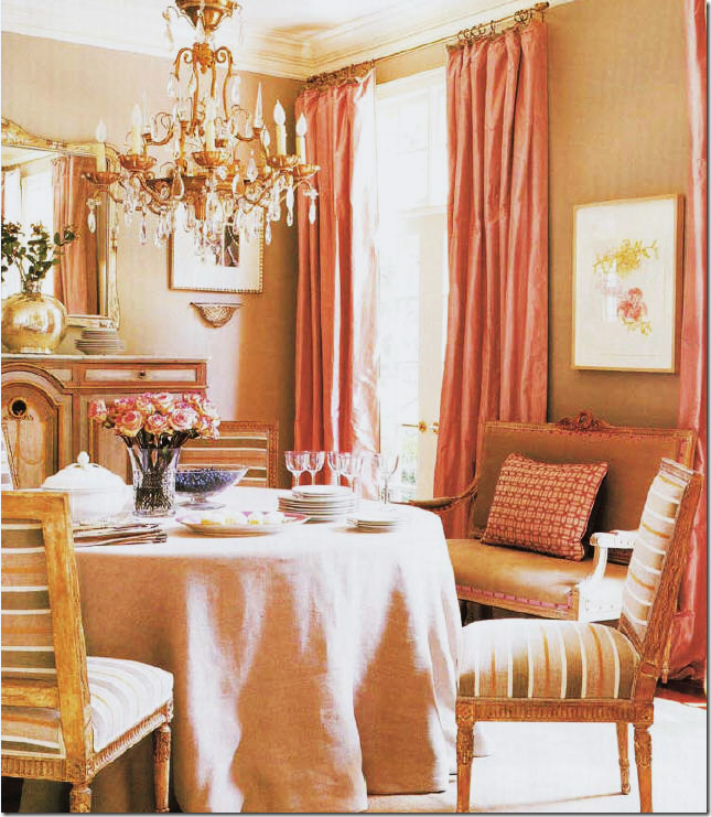
image Suzanne Kasler’s dining room is beige with warm pink silk taffeta panels. The unusual color scheme came from the stripes in the chair fabric.


image

Michael Smith paired green silk with blue silk lining in this living room. Many designers use two fabrics when making curtains – the lining will usually be a less expensive fabric, but here Smith used the same blue silk found in his design scheme. Using a fabric, like a small check, as a lining is nice when there is a large of expanse of curtains showing through the windows. This will let house stalkers see pretty fabric instead of white lining!


image

DON’T: Do you understand now why I like plain panels? Whoa. Less is definitely more. First I will say this – using swags and jabots should be left for very tall elegant windows, not rooms with 8’ tall ceilings. Second, the construction of swags and jabots is a very learned skill, not something for a beginner to try out. It takes a true craftsman to effectively work with all the folds and pleats. In this picture you can see how amateurish the final product is.


image

Much better – swags and jabots in a tall ceilinged room somewhere in Houston, done by the King of Swags and Jabots of this generation – Mario Buatta. Even still, only the dressiest and most elegant of rooms should get this treatment.


image

DON’T: In this high ceilinged the room, the designer wasn’t sure how to add curtains. It is a problem wall of windows with small upper windows – do you ignore them? The first issue here is the fabric with the dark colors, the heaviness against the cool white walls. The second issue is the fussiness of the treatment, the valance, the trim, the gathered panels. Thirdly, – the “no rod” rod look really draws the eye to all the problems here! What to do? In this room, I would have put a rod all the way to the ceiling, just under the rafters – one long rod that went from the left to the right. Then, I would have done plain long panels in a soft fabric, flowing freely to the floor. The fabric would be a match in color to the walls – which would mean I would lighten up all the other fabrics in the room while I was at it! What a beautiful room – totally ruined by a misguided window treatment.


image

DO: How to handle high ceilinged white rooms, simple panels hung from the ceiling, ignoring the arches. Notice the difference between this room and the room above – here the curtains add just a texture, a breeziness – they do not command all the attention.


CURTAINS MADE OF PRINTED FABRIC:


image

I love curtains made of printed fabrics – toiles included. This oriental toile from Colefax and Fowler covers the walls and the windows. You might think this is too busy, but for a sitting room or morning room, it looks wonderful to me! This is actually one of my favorite toiles.


image

In this high ceilinged living room - the arched transom is left bare which tends to cut the window wall in half – I think the curtains are prettier when they hang from the top molding. Working with plaid can be tricky. I once used a large pattern like this but the fabric was defective, causing the lines to not be straight. Of course, the entire job had to be redone at a great personal expense.


image

Red and white curtains done by Houston interior designer Carol Glasser in her former family room. This picture, over a decade old, shows burlap chairs long before the current trend!!


image

The English Country Manor look – done to perfection by David Easton in his former bedroom. In the more exclusive country houses throughout the British Isles, printed fabrics for curtains are the norm.


image

Curtains that match the wallpaper is a nice designer touch. When ordering wallpaper, always check to see if there is a matching fabric, it makes such a nice finished look to use both in the same room.


image

Phoebe Howard used two panels hung from the top molding. Her formula calls for softly ironed in pleats and no puddle – her curtains just barely touch the floor with no break. Myself, I prefer a 3 inch puddle so that you can actually pick up the hem of the panel, step back, and let it fall softly into place. Ms. Howard of course doesn’t agree which is probably why she is so successful!


image

Striped panels frame the view. If a client doesn’t want to block the view or the window – when hanging the panels, place the end brackets about a foot past the window instead of closer in. This way, the fabric actually rests on the wall and not the window, thus saving the view! This needs to be figured in before the curtains are ordered so that there is enough material to cover the windows if the curtains are to be closed. If the panels are actually stationary, no extra yardage will be needed.


image

Eric Cohler used a wonderful cotton ikat fabric in this living room/dining room. I love the blue paired with the dark browns. The ikat panels are purely decorative, the sheers actually pull across the window to cut the glare. Again, I am not sure why the curtains were not pulled up the ceiling, instead there is about 3 inches of wall space showing, why? Perhaps the curtains were not tall enough, or a mistake happened in measuring. This is a showhouse, not a personal home.


image

I love these simple cotton checked curtains used in a family room. So fresh and pretty! There are no ironed in pleats which give the curtains movement and fluidity instead of looking like two stone columns of fabric.


image A great looking kitchen is softened with toile panels. I love patterned fabric curtains in the kitchen.


image

A pink Carlton V ikat is used everywhere – love it!


image

Toile walls and curtains in Spain. This is what I call very romantic looking curtains! Beautiful!


image

DON’T: This month’s Traditional Home showed a home with an owner who can’t quite decide what fabric she likes better. Curtains should be one fabric. Two is just too much. This looks positively silly. Notice even on the quilt a second fabric is sewn onto its body. Oy.


CURTAIN PANELS PAIRED WITH BLINDS:


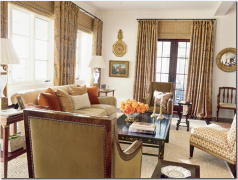
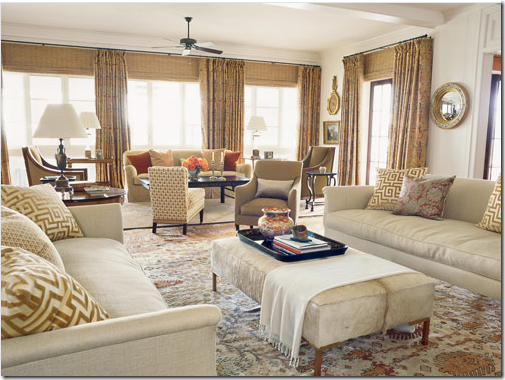
image I love to use blinds, especially woven ones, with drapery panels. This is a good example of that. Here Suzanne Kasler handles this room beautifully – the blinds add a texture to the room that is especially visually pleasing and even necessary. Kasler takes the major colors from the curtain fabric and makes pillows out of them for extra color pop. One chair wears an accent fabric, the rest are neutrals. The sisal rug calms the room. I love this – it’s elegant yet friendly and inviting and not stuffy. See more of the room below:


imageThe other side of the above room. In this section a rug replaces the sisal, providing extra pattern to the area where the curtains are absent. Look how pretty that wall of windows is with the four panels instead of just two, and the addition of the textured blinds finishes it all off. Beautiful!

A word about this curtain installation job. What looks like an easy job of hanging curtains was actually quite difficult. Suzanne Kasler’s thought process: The windows are short in this room. In order to camouflage the problem windows – Kasler places the rods as close to the molding as possible – yet the beam prohibits her from bringing them to the very top. The tops of curtains should always, if possible, all be at the same height. Therefore, all the rods are placed about 6 inches from the ceiling to be uniform. Then in order to make the windows appear taller, she brings the blinds to the top of the rods – hiding the wall space between the short windows and the curtain rod – making it appear the windows are taller and more elegant. Kasler thus creates a vertical line to the room by raising the eye up to the higher rods. Perfection! Hanging curtains is never an easy job and a good installer is worth his weight in gold. He is as important as the workroom.


image

Here, perfectly done – panels hung from the ceiling with tortoise shell blinds.


image

Perfection again- the panels meet the molding. The blinds hide the wall space between the top of the window and the curtain rod. This is called an outside mount.


image

Another beautiful window treatment with curtains and outside mounted blinds attached at a good height.


image

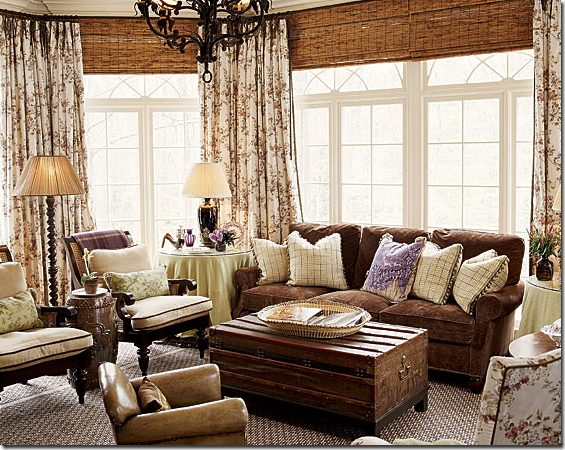
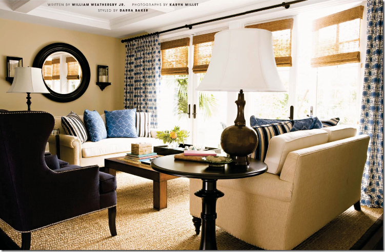
These shades were mounted inside the frame (inside mount) probably because they are doors instead of windows. You don’t get as clean a line with an inside mount. Very pretty room. I love to mix printed fabric curtains with textured shades in rooms where all the upholstery is solid fabrics – just like here. The shades and patterned fabric add warmth, coziness, visual interest, and texture.


image In this Italian styled apartment, Alessandra Branca again uses Italian Stringing to great effect, adding the tortoise shell blinds for extra texture.


image

Love this! An older photograph – looking remarkably fresh.


image

Very pretty window treatments by Suzanne Rheinstein.


image

In the Bennison House, the curtains are of course, Bennison – paired with tortoise shell blinds.


image

The linen striped Bennison panels are hung from very simple rods with tiny rings.


image

DON’T: In an actual house found on the internet: notice the differences – first, this owner should have used a bronze rod for less contrast. Second, the rod should have been placed at the ceiling. Third, there should be just one blind, outside mounted, placed right under the rod – for a more cohesive, smoother look. The way this treatment is installed – you have the contrast of the trim color vs the wall color fighting with each other. One outside mounted shade placed at the ceiling line would have been so much prettier and simpler.


image

DON’T: Real house: this is a problem window – the arched transom really adds nothing to the design of the window – I would have ordered just one long blind and put it right under the ceiling rod – and raised it just to the top of the door for access in and out. Instead, there is too much going on in this window. Too many different window sizes, too many little shades, and the curtains are just a tad too short – this should have been fixed during the installation – the drapery pins could have been moved up just a bit. It’s not easy folks!

An open question to mass builders of Mac Mansions: Why do you install lots of little windows like these? What’s with the arched windows everywhere? I understand Palladian windows, but these sir, are no Palladian windows. Why bother pretending they are? Wouldn’t just a taller French door been so much prettier here than the short door given the Palladian treatment? Just a question.


image

DON’T: Real house: the same designer as above almost gets it right this time. The blinds and drapes are placed perfectly – but, but, but – if you are going to lower your textured shades – add a lining to them so you don’t get the invisible shade look from the glare! And don’t put the shades down at all different heights. The designer could have bought just one long shade with a blackout lining – why buy three, unless it was to save the money of a custom shade. If possible – one shade is better than three little ones. And one more detail that should drive a good interior designer to distraction – notice how the two middle panels “break” at the floor – yet the right panel just barely meets the floor. Which was the intended length – the breaking length or the just barely touching length? A good installer might have been able to correct this. If not – it should have gone back to the workroom for correcting. I wonder, did the designer not notice this? And just one other detail – notice that the panel widths are not uniform – the width of the middle panels are doubled, yet the right and left are single. Why? The panels really should be the same width if at all possible otherwise it might look unbalanced.
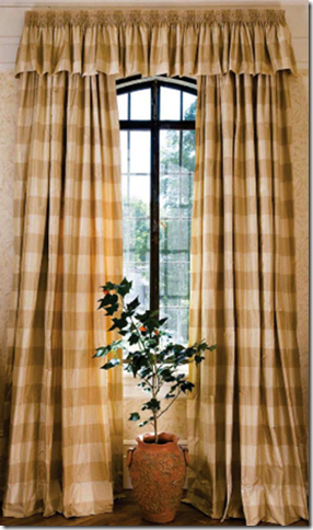
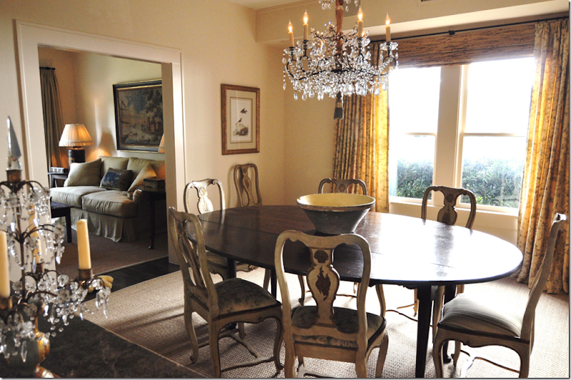


image

DONT: Why wasn’t the blind brought up the curtain rod? Why leave six inches of wall space showing? For what? And notice how tightly the curtain pleats were tacked or ironed in. These look immobile, like two columns made of concrete. The panels should be looser so you can almost make out the fabric’s pattern. Quite unattractive and I’m sure it cost a fortune.


image

DO: From the internet: a real house – notice how nicely they mounted the blind – all the way to the top and then they used an outside mount. Chelsea Editions embroidered panels – this designer got it right, exactly.


CORNICES AND VALANCES:

image

One of my favorite trendy and cluttered NY apartments, Alex Papachrisitidis used a valance made of Pierre Frey fabric. Cornices and valances are great to use where there is a large expanse of window – the cornice acts a bridge to the panels.


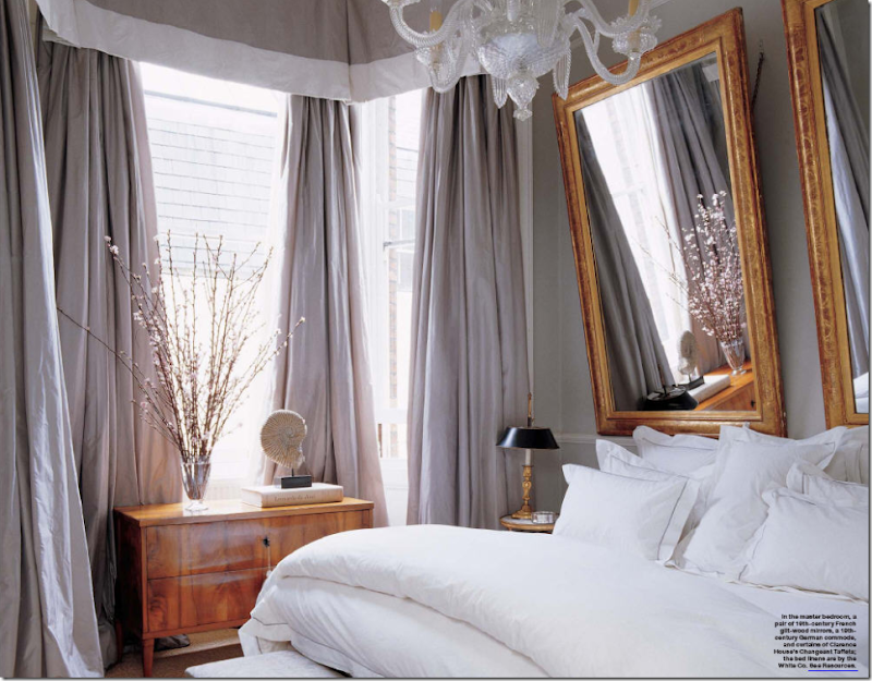
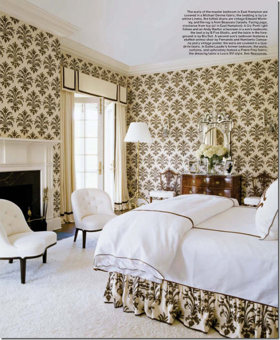
imageA soft valance with a wide white band and luscious, full, blowsy taffeta panels. The two mirrors for headboards are to die for. Notice how the Biedermeier chest picks up the same warm tones of the mirror – and how beautiful it looks against the cool tones of the icy blue silk. Absolutely romantic AND gorgeous!!!!!!!!!!!! NOTE: to hang mirrors to reflect downward, instead of upward – use a chain. You can see the chain used here that causes the mirror to lean forward. This is a perfect way to hang a mirror above a mantel. If the mirror is hung normally, you will get a reflection of the ceiling. This way, you get the reflection of the room itself.


image

This living room/dining room by Beverly Jacomini, from Houston, has Bennison fabric curtains with scalloped valances. I adore this room!


image Indienne hand blocked fabric is made into panels with a valance and was also used for the upholstery. Phoebe Howard


image Soft smocked valances are aired with full panels in this beautiful room. I love the mural and the rug made into an ottoman. These curtains really make a statement and add so much to the room – exactly what curtains should do!

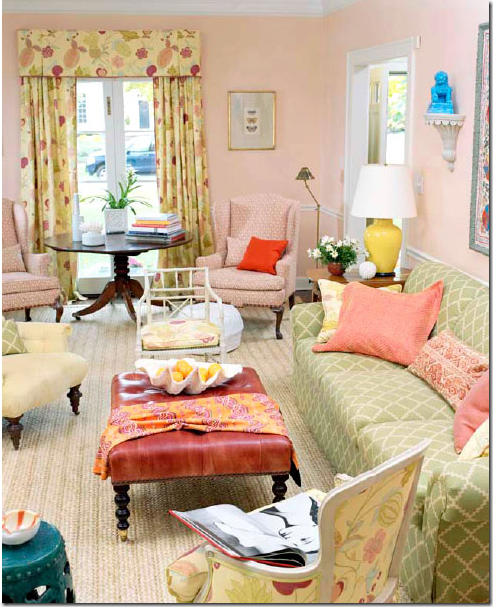

image

In a soft muted bedroom, ruffled valances are made of fabric that matches the walls – Phoebe Howard, of course!


image

Alessandra Branca used a gathered valance for the window and a smooth tailored valance over the bed.


image A beautiful, colorful, fun living room for a young family with curtains made out of my favorite Raoul Textiles fabric in yellow. Timothy Whealon.


image

A warm pink printed fabric is paired with a shaped cornice – love this!


image Blog favorite, Michael Devine’s fabric was matched with a valance crisply piped in black trim. So pretty!


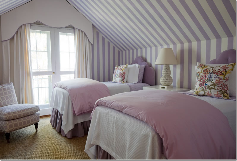
image A tricky attic window problem was solved with this cornice treatment, outlined in lavender.


image

Miles Redd used a shaped valance outlined in blue in this Farrow and Ball wallpaper bedroom. The antique clock and bench are so beautiful.


image

In France, antique styled cornices in scalloped wood is used with white linen panels. The scallop motif is picked up in the bedcover too.


image

DON’T: Don’t forget the panels! I really think cornices and valances without the curtain panel are silly looking, what’s the point? Taking a second look – I see now that there actually are sheer cafe curtains which would explain the valances. But, using sheer, white cafe curtains still looks unbalanced against the bold, striped valance. The designer should have used one of the gold fabrics instead, imho!! I love the lantern though!


SHEER FABRIC:


image

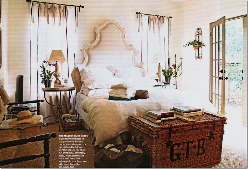
Sally Wheat’s house. Sally used tie top sheer linen panels throughout her house, none are lined, of course! Available at Indulge Decor here. Love this room!!!


image

Cynthia Davis who owns Indulge Decor in Houston uses similar sheer, tie top panels in her bedroom. She also designs and sells the highly scalloped upholstered headboard at her store here.


image

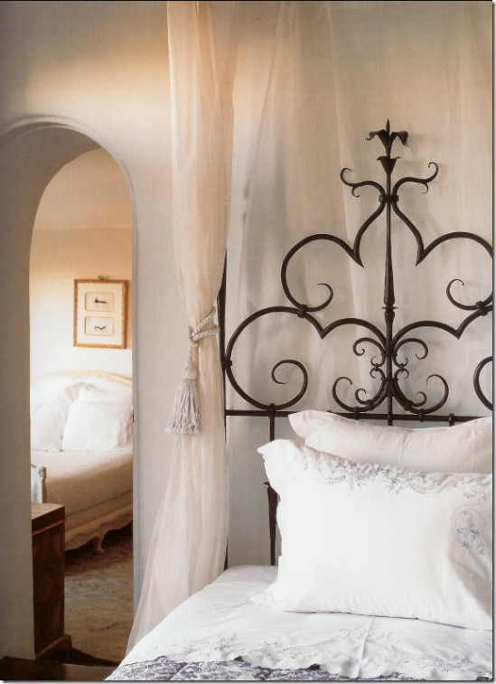
Beautiful sheer curtains divide the bed from the room and the wall in this picture from the gorgeous book, Santa Barbara Living, by new blogger Diane Dorrans Saeks here.


image

When not to line fabrics – when using sheer, see through linens – as is used here in a French mas.


PORTIERES:


image

Panels of Bennison fabric hang between the bedroom and sitting room – I love using fabric instead of doors.


image

Brooke from Velvet and Linen added portieres to her bathroom after she took down the wall between it and her bedroom. This room first made me fall in love with Brooke!


image

Blog favorite Lauren Ross added heavy linen portieres between her breakfast room and great room.


image

Plum pink silk is paired with khaki in this portiere that adds just a touch of romance. Truly, not much is more romantic than fabric doors!


image

Houston interior designer Pam Pierce used portieres to cover her bookshelves, what is a great idea if you want to soften a book laden room.


image

Renea Abbott uses curtains to soften an outdoor room in California.


image

Sheer portieres divide this French bedroom from the bath area. John Saladino used this technique in a Villa di Lemma guestroom.


CANOPIES: A ROOM WITHIN A ROOM

image

Draped canopies are wonderful when used in large, cavernous bedrooms – they create a smaller room within a room. Here Phoebe Howard used a beautifully shaped canopy in all white – gorgeous!


image

Canopies are not for women only: Michael Smith used his own fabric for his bed’s canopy.


image

Sheer fabric used without a top treatment in Phoebe Howard’s famous pink bedroom.


image

Michael Smith used a subtle striped fabric with this canopy in a room wallpapered in De Gournay.


image

Charlotte Moss created one of the most beautiful Kips Bay rooms ever! A nod to Pauline de Rothschild, the bed floated in the room with three different blue and white fabrics, all designed by Moss.


image

For her daughter, Katie Ridder designed a half canopy over the window. So cute!


image

In a very small room, Alessandra Branca went large – a canopy and curtains made of bold chartreuse and cream stripes.


image

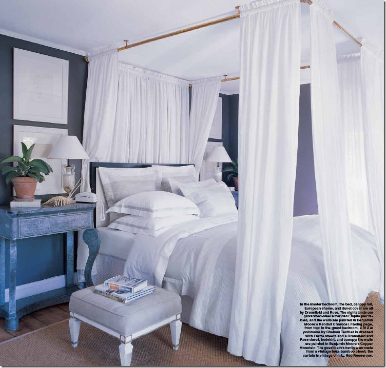
What if you don’t have a four poster bed? No problem! This canopy was created by hanging brass rods from the ceiling. BUT: beware – panels on canopies should be the right length, just as on windows. These are just too short.


SHADES:

image

Slouch or London Roman shades – heavy linen is gathered in folds in this bay window. Notice how wonderfully thick the bottom cushion was made – perfection!


image

More tailored Roman shades flank the bed, while panels are used in the other windows. Tailored and lovely.


image

Alessandra Branca uses Roman shades made out of striped taffeta silk. The chandelier and chairs are so beautiful – the entire dining nook is!


image

In New Orleans, these silk taffeta shades are so luxurious – they are sexy!!!


image

DON’T: when using a material that is see through, it’s always better to line the fabric, imo – otherwise you get this effect which takes away from the gorgeous folds and fabrics.


BURLAP AND DROP CLOTHS:


image

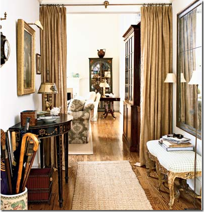
Attractive curtains don’t have to cost a fortune – using the ultra trendy burlap or lowly painters drop cloths will save you a bundle, but you will still have a very chic looking room. Here antiques are mixed with burlap portieres.


image

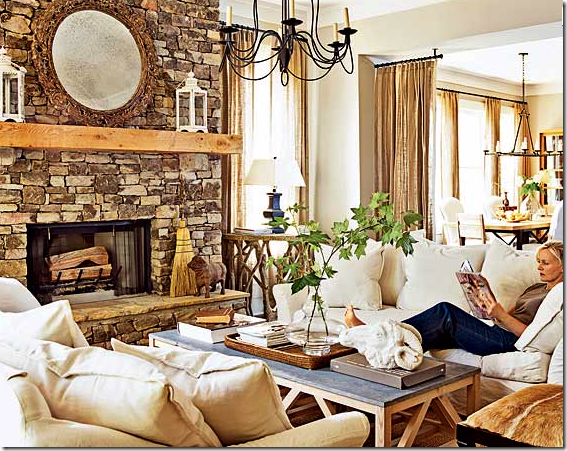
Here, burlap was used at the windows and as portieres between the living room and dining room, below:


image

The dining room with the burlap panels – since burlap is so inexpensive, use three widths instead of one – it will look so much fuller!


image

The very beautiful AND talented Layla Palmer from the famous (and soon to be more famous) The Lettered Cottage designed her breakfast room first using burlap curtains. That didn’t last long – things do change quickly around the cottage. Here she changed to drop cloths paired with tortoise shell blinds. As always, everything Layla does is darling.


image


And blogger Judy at Gracious Southern Living went a step further with her drop cloths – she added a black band at the hem which dresses them up. Drop cloths are really inexpensive – so why not double up when making panels, that way you will have very full looking curtains. Great job Judy!


COTE DE TEXAS CURTAINS:

image

In my bedroom, I have one long, short, cheap, ugly, horrible looking metal window! Mr. Slippers Socks Man PROMISED me when we moved in this house that we slowly replace all our windows with beautiful wood ones. To date, 15 years later, only two windows have been replaced – and this isn’t one of them. So, in order to make my lowly window look a little more impressive, I was lucky enough to inherit a true tortoise shell shade from friend that happened to fit my window exactly. I pulled it up to the ceiling and added four panels to give the illusion that my window is actually three separate units. It does look somewhat better this way, I think.


image

In my guest room, I used silk panels from Restoration Hardware and paired them with blinds from Target, which is a great place to get inexpensive blinds, but order them online, the choices are much greater.


westu 099


It’s hard to see exactly – but at The Tanglewood House – there were French doors with two smaller flanking windows – I bought three blinds – raised them above the door and added panels of a heavy patterned linen fabric – nice because all the room is upholstered in solids!


image In my living room – I have six windows – it’s not quite double height, but the room is still very tall. To disguise all the cheap windows I put four long panels of a silk ticking fabric in pale gold. The curtains drastically changed the look of the room – warming it up, making it feel cozy, and still adding an air of sophistication, forever convincing me that it’s almost always better to have curtains than not.


image

For this client, I used tiny pinstriped silk panels, double width, with simple bronzed rods.


image

In the Tanglewood House, the client already had plantation shutters, so I layered the heavy linen toile over them. The only window in the room – it is quite small, so we pulled the rod out past the regular 6” allowing the fabric to sit on the wall, making the window seem wider and taller. The actual window ends just about where the panel starts. MIMI – come visit me!!!


image

In this bedroom, done a budget with everything from Pottery Barn – I bought fabric by the yard from PB to make the curtains, then paired them with Target shades.


image


For this client I used seafoam silk taffeta and added a scalloped trim down the edges for an extra detailing. Farrow and Ball wallpaper and Chelsea Editions fabrics.


Cote de Texas Curtain Formula:


This is the formula I mostly use. If you take this to your seamstress and she follows it exactly, you should have a set of curtains you will be proud of and love!


1. Use either two or three widths of fabric depending on the size of the window. Always err on the wider amount. A small window will probably take two widths just fine. Do NOT go by standard measurements – or else you will end up with one width of fabric panels, which will look skimpy and cheap. It’s better to use an inexpensive linen than to skimp on an expensive silk! Consider using the more expensive fabric on a pillow instead – curtains require a lot of fabric!!!! Double width on a regular height room is approximately 12 yards of fabric.

2. Have the seamstress add wide hems on the leading edges and at the bottom. This way, the lining on the side will be sure not to show.

3. Be sure to order NO IRONED OR TACKED IN pleats!!! Very important – or else you will end up with two stone concrete columns of fabric.

4. Always use lining and interlining unless you are using a sheer. I use either bump or blackout linings. If the fabric is dense, bump may be all that is required, but the blackout lining adds so much. First it creates a heavy weight which makes the curtains drape better and second, the sun doesn’t come through blackout lining – especially important when using silk and see through fabrics. Tip: I also ALWAYS use blackout lining when making skirted tables and bedskirts for the same reasons: weight, draping, and sun rays coming through. I like to see the fabric, I don’t like to see through the fabric!

5. Measure the curtains from the top molding or ceiling to elongate the line.

6. If adding blinds – use outside mount and place the blinds right under the rod.

7. You don’t need to splurge on expensive rods – the thinner the better is fine in most cases. If you don’t like finials get a rod that attaches directly to the wall.

8. Go easy on the embellishments: contrasting tape is great on valances and in transitional settings. Trim is nice down the edges or the hem, but use a light touch – too much becomes goopy fast!

9. Don’t make your drapes too short. If you want them just “kissing” the floor, be sure you have a great workroom , measurer, and installer, this is very difficult to get exactly right. I usually order a 3” puddle which allows me to grab the hem, step back, and let the curtain fall gracefully in place. You might prefer just a slight ‘break” in your hem. Be sure to discuss the proper length with the measurer so there are no surprises. It’s always easier to fix a too long hem - a too short hem can be a disaster!


In Houston, I use Monica Hancock to measure and work with the workroom on all my curtains, bedding and softgoods. She also sells textured blinds at a great price. We use Bennie Davis to install everything – he is truly the best in the business!!!! To contact Monica call 832-443-1931. She will schedule Bennie for you too.


image

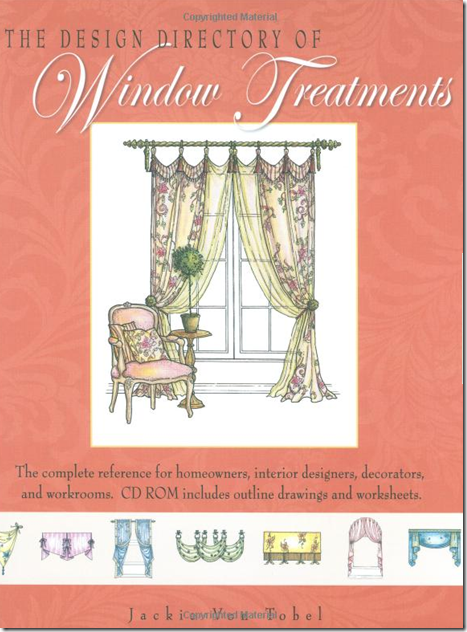
A great source for window treatment information is the book by blogger Jackie von Tobel. Jackie wrote and illustrated the definitive book on window treatments – order it here. And fyi: Jackie has a new book on bedding coming out soon (available for preorder here) along with a fabric line she designed! OMG – that girl is a dynamo.


Watch for the next installment of Top Ten Design Elements – Five coming soon to a blog near you!