Today, we have yet ANOTHER great Before & After story, compliments of CdT sponsor Huff Harrington, the online art/decor/antique store.
Usually the redos we see from Huff Harrington are from France where they have a house in Provence and an apartment or two in Paris which are used as home base for their “France Buying Trips” guests HERE.
Today, the Before & After comes from partner Meg Harrington and her husband Scott. They were faced with being an empty nester and living in a very beautiful, but very large house that measured 6,000 sq. ft.
Above, Meg’s former, too-large house in the Brookhaven neighborhood. Such a beautiful house!!! This house was originally a ranch, but before moving into it, Meg had renovated it, turning it into a two story French chateau. I’m sure the decision to move from such a pretty house was not easily made. But, 6000 sq. ft. is really big for just two people (their two daughters were college aged.)
Faced with the prospect of just the two of them living there alone, Meg and Scott put it to paper – what rooms did they actually spend any time in?
They were shocked to realize how much of their house was left unused. In the end, there were only four rooms on their list: the kitchen, the family room, the master bedroom, and their beloved covered porch.
NOTE: I can REALLY relate to their predicament. Can you? When you become an empty nester and it’s just you and your husband, you start thinking about wasted space. Most of my house sometimes feels like a storage unit - albeit a very attractive one – filled with the furniture and accessories collected during a long marriage that fills rooms with doors which mostly stay shut.
Before: If they were to move, the Harringtons preferred to stay in the same close-in neighborhood, so they were thrilled when they spotted this Brookhaven gem, a 1930s cottage that was half the size of the current house.
Another before shot. Meg immediately called the same team that she worked with on their former house: Architect Linda MacArthur and builder, Michael Ladisic.
Together they decided on what rooms they would use in the new house and what rooms to forgo. A living room/dining room were the first “no-go’s.” Instead, they chose to have just a family room and a casual dining space with room for their piano. There would be a kitchen and a butler’s pantry, along with a porch for outdoor living.
During: The biggest change to the facade is when the master bedroom, above the garage was enlarged. Originally, they planned to have an even larger space, but underground utilities drove them back to the drafting table. Today, the master suite is on the main level, above the garage, with another guest room that was added on the second floor above the master bedroom.
Here, you can see the new bedroom added above the enlarged master bedroom. There are new garage doors coming. Duh. I know you knew that!
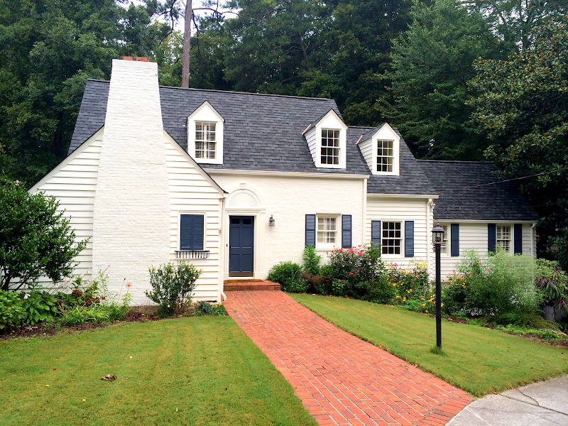
AFTER: Wow! Soooo beautiful! Really adorable! OK, that’s not a word to use for a house, but it is just adorable!!! LOVE.
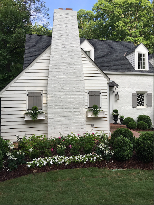
First, the exterior was painted a white-white, Sherwin Williams’s Alabaster (which is one of the blog’s most favorite whites, for good reason as you can see!) and SW Pavestone on the shutters. The entire house is painted in Alabaster. Let’s start at the left side: a new faux window shutter was added to the left of the fireplace for symmetry. Underneath are window boxes.
At the front door, there is a new lantern and a new green door with a black awning above (much needed to keep rain off waiting guests.) The awning’s railing is curved – French inspired. To the right of the door is a new diamond window pane - for a focal point. All new French inspired wood shutters replace the typical ones that were there before. The old lamp post in the front yard was removed. And over the garage, three new dormers were added during the addition, which look fabulous and add so much to the facade. There are new attractive carriage doors, along with a pergola above and to the right, a swinging double door. There is new black ironwork on the doors and shutters that adds an authentic bit of detailing. And finally, I assume that is a new roof since the upstairs was expanded.
AFTER: A wider view from the street. At the front, to the left of the front door, is the family room, with its pitched ceiling. To the right of the front door is the dining room, and over the garage is the master bedroom suite, which was enlarged with another bedroom added on above it. On the second floor are three bedrooms for guests and their two daughters. At the basement level, there is a large living area.
The front door is painted Benjamin Moore Wythe Blue.
And the shutters are Sherwin Williams Pavestone.
INSPIRATION FOR THE GARDEN:
Meg used lots of photos from the internet to find inspiration for the new house. Here, she liked the Giannetti’s Ojai garden with their white roses HERE.
And Meg liked Tone on Tone’s front porch and white garden HERE. Her house has the same red brick walkway.
AFTER: New landscaping. New sod was installed, as were new beds and gravel paths.
Along the house, she added gravel pathways to reach the garden. Leanne Shaw of The Queen Bee planted the boxes to match the flowerbeds.
Pink peonies and white flowers – mixed with tiny boxwoods.
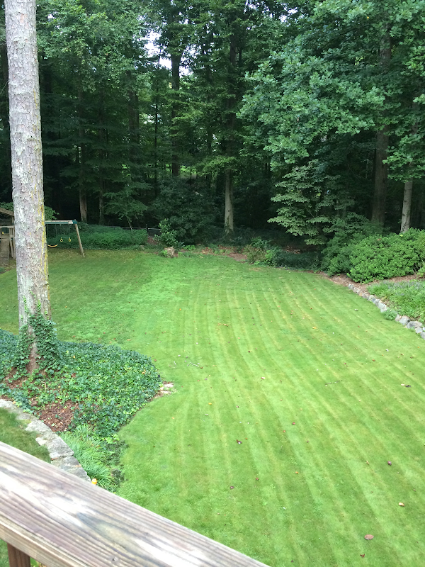
BEFORE: A summer view of backyard that was a sea of grass. Meg wanted to create areas to sit outside and a place for a firepit on cold nights.
BEFORE: Winter view. Getting ready to add some landscaping.
AFTER: New beds of hydrangeas and azaleas next to pea gravel seating areas. Further back is the new firepit surrounded by hanging lights for the nighttime.
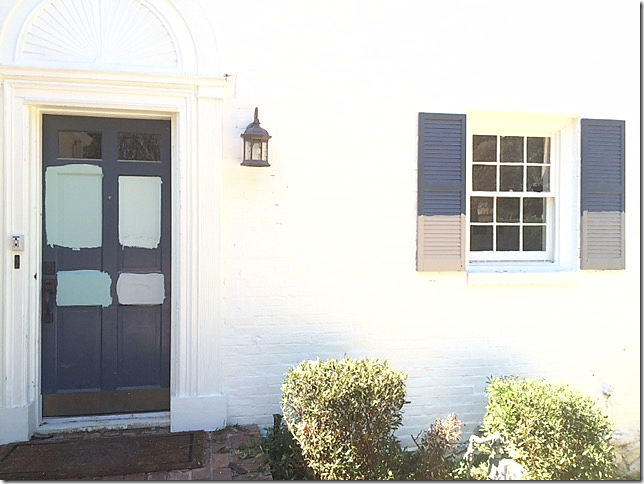
BEFORE: The blue front door was attractive with its trim, but it had no overhang.
INSPIRATION FOR THE FRONT DOOR:
The color of this front door, the urns, and the lanterns – all were an inspiration for Meg.
She also liked the color of this door and the look of it.
This awning gave her an inspiration for how to keep guests dry on a rainy day.
During: Trying out paint samples. The Wyeth Blue on the left was an immediate winner. It’s amazing how much the new lantern, diamond paned window, new shutters, and awning change the look of the front porch.
AFTER: The new Wyeth Blue front door and black awning. Even though the trim was attractive, the door needed the protective awning, so the trim had to go. Urns and lantern complete the welcoming look.
The lantern is Bevalo, Governor model.
BEFORE: When you walk into the front door, the pretty stairs run lengthwise. To the left is the family room, which used to be the formal living room. And to the right, now, is the dining room, which used to be the family room! Understand?
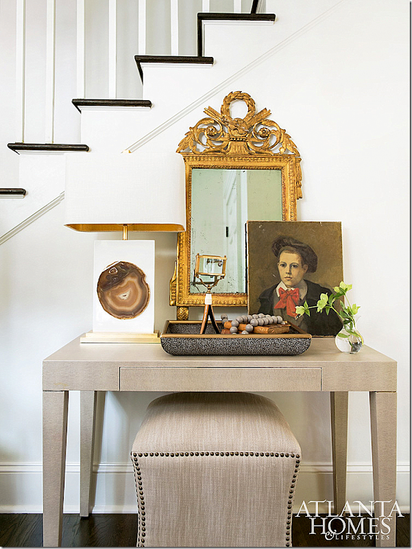
AFTER: Meg decorated her house with help from the designers Sam and Martha Douglas at Huff Harrington. She used this console with an antique mirror and portrait, mixed with a contemporary stool and lamp.
The Family Room:
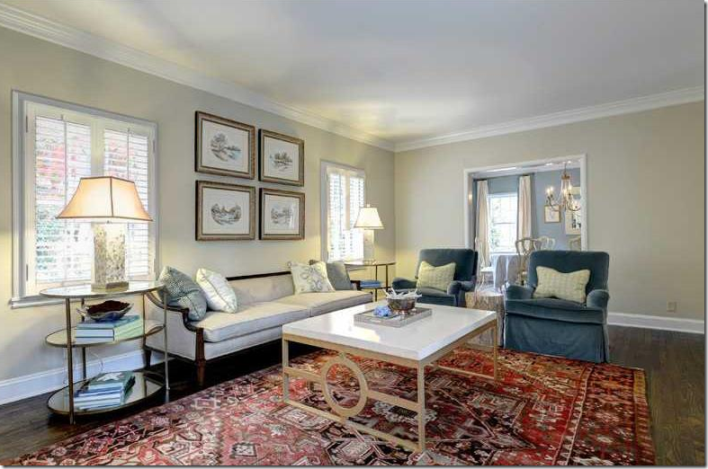
BEFORE: To the left of the front door is the formal living room with a fireplace and adjoining dining room. Meg decided to make this her family room and do away with a dressy living room.
BEFORE: The living room, looking the other direction. The dining room is seen here. Meg has turned this dining room into the kitchen !!!! Just wait!!!! It’s fabulous!!!
BEFORE: The living room’s ceiling was able to be raised, since there was nothing above it. Meg left the cabinets and shelves, but added white marble around the hearth. The raised ceiling made a huge difference in the room, as did the shiplap she installed.
INSPIRATION FOR THE LIVING ROOM:
This was one picture – with shiplap on the ceiling and a lantern – that inspired Meg. She wanted shiplap EVERYWHERE in the house, along with lots of art and books. For continuity, shipwap was placed on all the downstairs walls, and each room was painted Alabaster by SW.
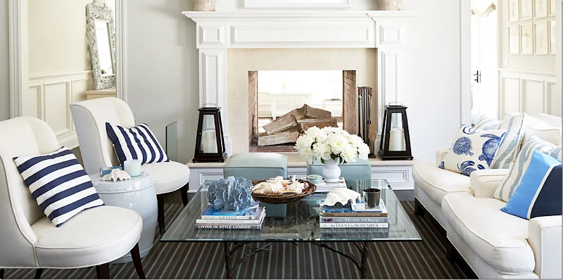
And this was another inspiration, dark floors with lanterns and with light upholstery.
This is what her family room looks like today:
AFTER: And isn’t this fabulous!!??!!!!! Shiplap on the walls. The cabinets are the same, mixed with new limestone on the fireplace. The vaulted ceiling makes a huge difference. Meg added two antique lanterns she found in Paris.
And where’s the TV? Hiding behind the shiplap over the mantel! French chairs in checks add a great mix with the contemporary tables and lamps. The floors are original, stained a dark, dark brown – which I love!
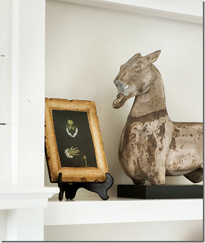
AFTER: A close up of the shelves. Meg found the hardware on the TV cabinet in France. Just perfect!!!
The shelves are filled with antiques and accessories – mostly from Huff-Harrington, of course!
Love the tiny antique antler stool beneath the table with more antlers! The shiplap is fabulous and thanks to Fixer Upper, it’s so on trend today.
A view of the French chairs, looking around to the entry’s staircase.
The Kitchen:
BEFORE: The formal dining room leads off the living room, and the door goes out to the back porch. To the right is the kitchen. This is all changed today.
BEFORE: The dining room becomes the kitchen!!!! Along the back wall, a large custom steel window will overlook the new screened porch. The kitchen to the right of the dining room becomes the butler’s pantry.
During: The new raised roof and the dining room is being turned into the new kitchen.
INSPIRATIONS FOR THE KITCHEN:
There were several things that Meg wanted in her new kitchen and first on that list was a white kitchen with dark hardwood floors.
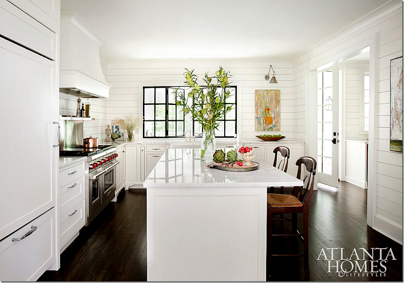
This picture was an original inspiration for the kitchen. All white kitchen with shaker cabinets, open shelves with no upper cabinets, and steel windows.
This was on the must list. A Wolf range.
Meg wanted a glass refrigerator, but her family vetoed it! I love it!!! Also I love a Smeg refrigerator.
Another must was a steel window that would open to the screened in porch.
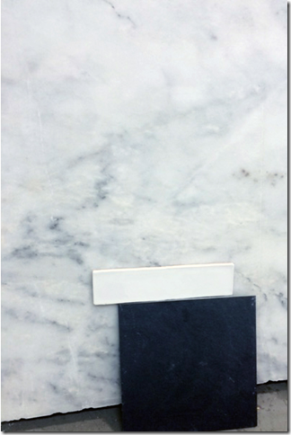
Meg chose Avalon marble from Turkey for both the kitchen and the butler’s pantry.
AFTER: The all white kitchen with shaker cabinets and open shelving. The island is large for meals and a spot for paying bills. This way, precious space wasn’t wasted on a designated office for Meg. The printer and fax are kept hidden away in a cabinet in the butler’s pantry next door. The marble is polished and there is a Wolf range and farm sink. Shiplap runs along all the walls.
A close up of the steel window that opens to the porch. Art work plays an important role in the kitchen with lights that highlight it.
The Butler’s Pantry:
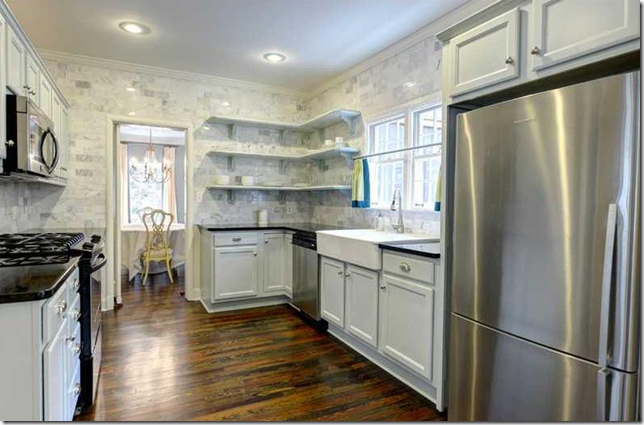
BEFORE: The kitchen was small and Meg thought it would make a better butler’s pantry. Here is how it looked before – all in marble tile.
BEFORE: The kitchen, looking towards the former family room/breakfast room.
INSPIRATION FOR THE BUTLER’S PANTRY:
Meg wanted it simple and she wanted it to flow seamlessly with the kitchen’s decor.
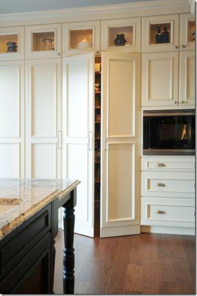
Against one wall, she wanted closet space and cabinets for the pantry, storage, and to hide office equipment.
AFTER: The butler’s pantry with the sink and ice maker on the left and cabinets and storage on the right. Shelves instead of hanging cabinets and shiplap – just like in the kitchen. Through the door is the new casual dining room. Not seen is the door that leads to the porch.
AFTER: The view to the dining room.
The Dining Room:
BEFORE: The dining room was a combination family room/breakfast room.
Another view. The master bedroom is to the left of this room. To the right is the entry hall and the butler’s pantry.
INSPIRATION FOR THE DINING ROOM:
Meg liked this picture, with an antique table and crystal chandelier – and she used it as an inspiration for her casual dining room.
AFTER: French chairs and an antique French armoire mix with an antique chandelier from Sweden that was Meg’s mother’s find. On the other side of this room, not seen, is their piano. Again, the room has a casual feel because of the shiplap, but the dark floors and beautiful antiques give it a sense of importance.
Beautiful wood windows look out at the heavily wooded back yard. To the right is the double doors that lead to the master bedroom. Living all on one floor is good idea for the empty nesters.
BEFORE: The master bedroom – with a wonderful vaulted ceiling. This area was going to be much larger, but underground utilities made the architect have to change the blueprints. Instead, the room was only slightly enlarged and a guest room was added above it, causing them to lose the high ceiling. Meg says it was a difficult few days, but having been through a major renovation before, she knew to expect there were going to be issues.
Before, the guest suite was going to be in the basement, so this actually worked out for the best. Silver linings!
During: The master bedroom being enlarged.
AFTER: The bedroom is all neutrals, with a thick rug added for softness underneath. The walls are lined in shiplap.
INSPIRATION FOR MASTER BATHROOM:
This photograph really inspired Meg – she loved the dark tiles mixed with the white shiplap. Meg says that she had a few specific requests for her bathroom: polished nickel hardware and a tub for her husband. He requested airjets and she found a Kohler tub that fit the bill. She also wanted rectangular sinks.
The Master Bathroom:
White marble and shiplap walls mix with the dark tile. The art work ties it all in. Casual chic. Love it.
The tile is Black Blizzard slate.
Daughter’s Room:
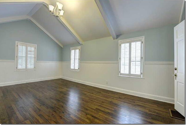
BEFORE: One of the three bedroom upstairs.
AFTER: Dark floors and light blue walls make a perfect room for Meg’s daughter. Do you like the art work? Meg’s daughter is an incredible artist! I was shocked at how talented she is!!!! Check out her work HERE. And she is only 18!!! Meg! You didn’t say a word!!!! I would be kvelling all over!!!
AFTER: A French settee and peach curtains add a sophistication. So pretty.
READING NOOK INSPIRATION:
While Meg uses a Kindle now, she still loves her books and wanted to create a small reading nook upstairs. Something like this one from the movie The Holiday. But, she says, it is probably a bit too messy for her taste.
AFTER: Here is what Meg created for her library. A wall of shelves and a comfy chair and art work from Huff Harrington, of course.
The Covered Porch:
Before: The porch was rather small and had no fireplace, which was a must for the Harringtons.
BEFORE: The porch looked like an add on and didn’t match the white cottage.
BEFORE: The stairs lead up to the main level, as there is a basement.
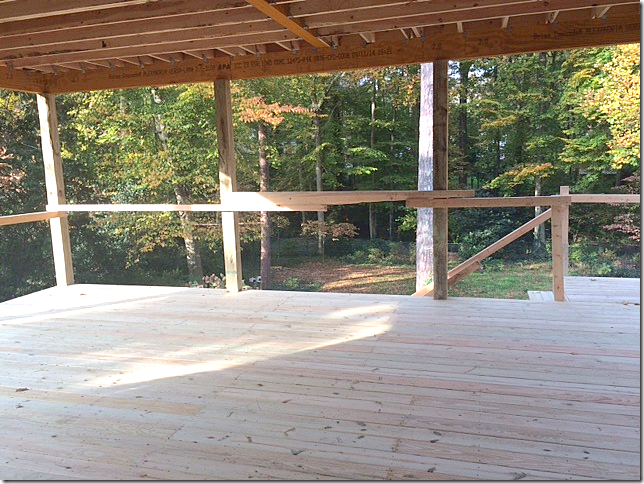
During: The existing structure totally was removed, to make room for the new large porch which will fit in with the design of the house.
During: The porch is a large square. You can already see how much bigger it will be.
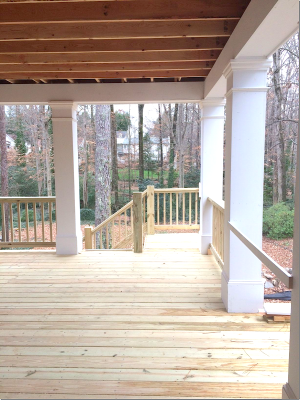
During: Beautiful, cottage style columns and railings that blend in with the architecture instead of looking like an addition as before.
AFTER: With the large steel window that opens from the new kitchen, the all white porch is filled with rattan and rustic furniture, along with antiques. Notice the shutters on the window. Charming twig and green painted rocking chair.
White brick mantel mixed with gray slate.
Close up into the kitchen window.
From Instagram: The stylists from Atlanta Home magazine work their magic. Notice above the fireplace, there is shiplap that hides the flatscreen!! And notice the shutters that close off the porch to rain and wind, if needed.
And finally, darling Meg!!! A huge thank you for letting us into “The Nest.” There are so many great ideas for those of us who are empty nesters or facing it soon. Yikes!!!
To shop the room, be sure to visit Huff Harrington HERE.
And to learn more about Huff Harrington’s trips to France, go HERE.
And finally:
Like the Hamptons? See more of the look! HERE.


