COTE DE TEXAS

Jewelry, Generosity and Blogging

56 comments


image


Over  a year ago, I found a new blog – Karen Sugarman Designs.   You can see  my original visit was in April, 2008 – there’s my comment to Karen.    Sugarman’s blog was intriguing and caught my attention:   an interior designer who specialized in restoring historic properties in Boston suddenly found herself living in Arizona.   Not especially versed in doing interior design Arizona style, she decided to dabble in couture jewelry design.   Her blog is a unique marriage of the two arts – she uses interiors to illustrate the inspiration behind her jewelry designs.


image

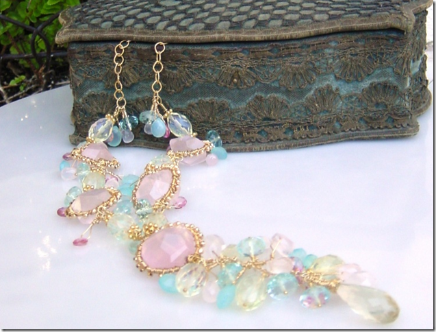
Sugarman’s “Dreamy Elegance” necklace in pinks and blues.


image

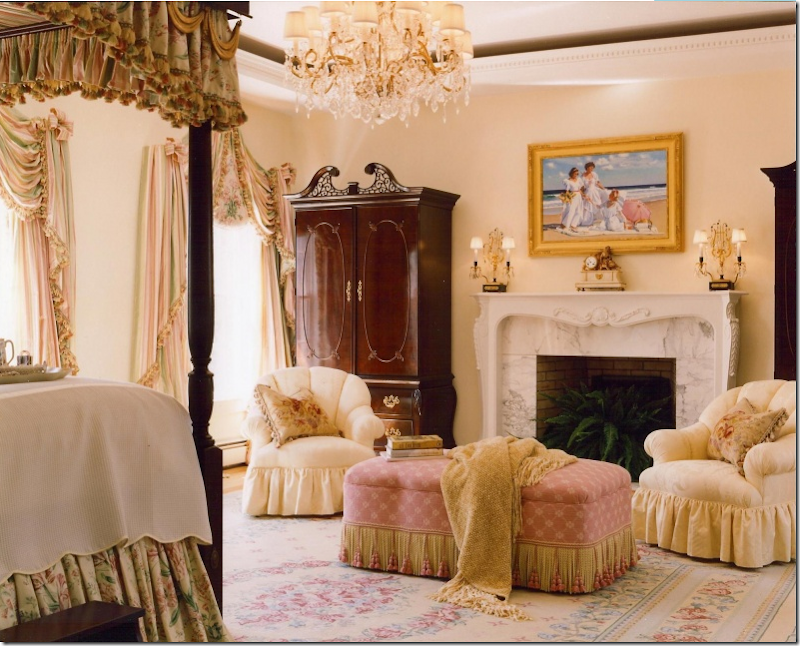
The inspiration for the Dreamy Elegance necklace was the beautiful, feminine bedroom in pinks and blues.


 image

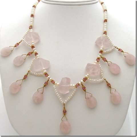
The Tuileries Collection is based on a necklace designed using pearls from Marie Antoinette.   Here pink quartz and pearls were used.


image

The vignette from the room that inspired the pink quartz Tuileries Collection necklace.


image 

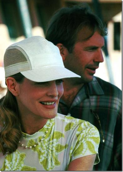
Rene Russo and Kevin Costner in 1996’s Tin Cup:   her station pearl necklace started a world wide beading craze.


I felt an instant kinship with Karen – we had similar backgrounds, though in reverse.   Before I practiced interior design full-time, I also designed jewelry.   It all started with a  movie –  Tin Cup.     After the Kevin Costner film came out in 1996, the pearl necklace that Rene Russo wore throughout the film became more talked about than the movie – much to the dismay of the producers.  The “Tin Cup” necklace became one of the most sought out designs in pearl necklaces, indeed in necklaces in general.   The design was simple -  staggered or stationed pearls knotted an inch apart on a silk cord.   Everyone wanted one.    The necklace’s designer Wendy Brigode shot to instant fame.    A few months after Russo wore her necklace in Tin Cup, another stylist put her in the same necklace for the movie Ransom – without Russo informing anyone that she had worn the exact necklace in her previous, as yet unreleased film.   Brigode, the designer, claimed to be horrified by Russo’s reticence in divulging the truth about the repeated piece of jewelry.  Regardless, the necklace was forever known as The Tin Cup.



image Later that year, Russo starred in Ransom, wearing the same Tin Cup necklace.


The simple, yet classic station pearl necklace started a craze among women everyone – how hard could it be to knot pearls on a silk cord?  Trust me  - it’s exceedingly hard to get perfect knots, perfectly placed – it was a skill I never mastered no matter how hard I tried.  The Tin Cup necklace started a beading craze in America – and to meet the demand, beads were cut in every size and shape and out of every stone imaginable.  Bead Shows were hot, hot, hot and I, a fledging interior designer with lots of time on my hands dove into the jewelry business heart first, because truly it was one of my stupider moves in life.  I spent a small fortune on stones and beads and created lots and lots of necklaces and matching earrings.   I sold them mostly through friends and family – my sister Cathy was my best salesperson.  But Cathy, gorgeous and charismatic (two attributes I surely don’t share) can sell anything – just ask her about her studded-sewn on-bandana-sweatshirts she sold in the early 80s  (she made a mint on that haute couture item.)  


image

An original Wendy Brigode Tin Cup necklace in gray pearls sold on ebay for pennies!!!


My jewelry was also sold in a few shops – most notably More Than You Can Imagine, an upscale resale shop in Houston.    I’m not sure how much I ended up spending on my jewelry business, I certainly didn’t make a profit.   It was hugely labor intensive because after a few years of stringing everything myself – along with Mr. Slipper Socks Man’s help (he could actually knot better than I ever could!) – I hired someone to make all my designs.  In the end, she was far more talented than me – and I just bought the stones I liked, handed them over to her and she whipped it all up for me, charging me plenty to do so.   I then had to sell all the product and give the stores a percent of the action – it was a small-time financial disaster.   Although my sister Cathy and I had tons of fun at the bead shows buying all the stones, after four or five years I gladly gave it up just as my interior design business was really taking off.   Running two businesses is not fun.  But I had some beautiful jewelry when it was all over, and so did my sister and my mother and we still wear a few of the better looking items.  


image 

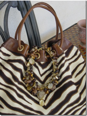
A necklace from Karen Sugarman, inspired by this zebra print.


So, as you can imagine, reading Karen Sugarman’s blog was hugely nostalgic for me.    But her route in business is the opposite of mine.  She went from interior design to jewelry design.    And then, to be sure, Sugarman has a great talent for designing and making jewelry that I never did.  Trust me,  I can spot someone with a true beading ability a mile away.   Truthfully, some of her designs stunned me – they were that beautiful.   Like this one:


image

This necklace was inspired by one Sugarman had bought in Paris.  She felt she could design it better, prettier – and she did.


image

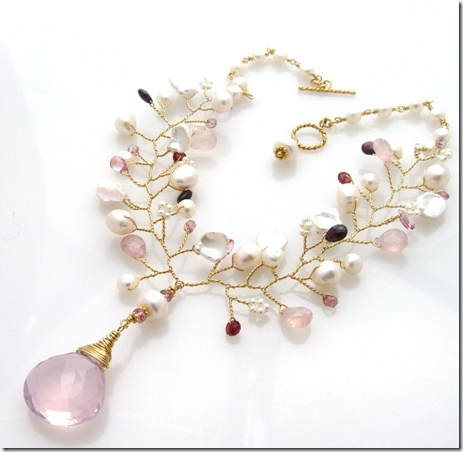
Another necklace I am crazy in love with is this one from her Flora Collection – it might be one of the prettier necklaces I’ve seen!  Isn’t it gorgeous?


image

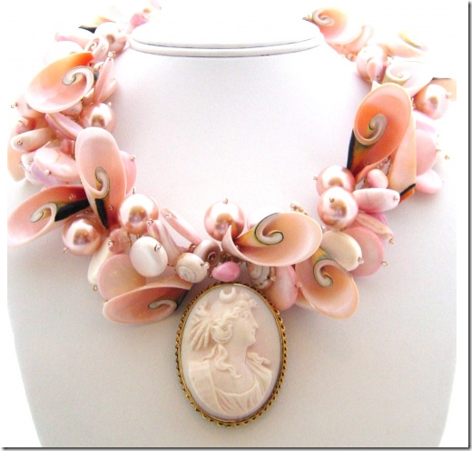
This necklace is from the Back Bay Collection.   Truly a special piece – shells and pearls and a cameo.  I adore it!


image

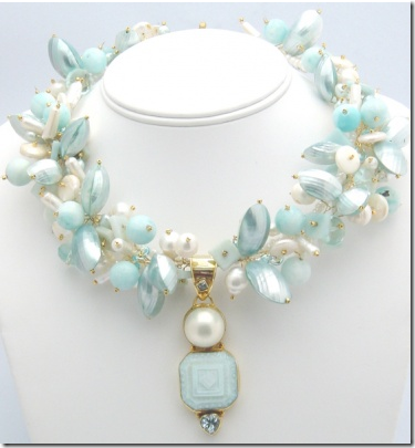
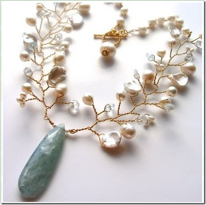
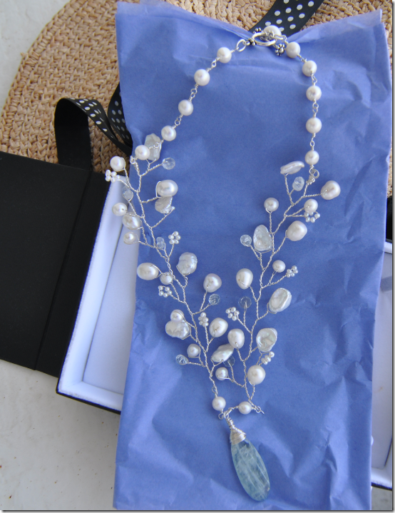
And then there was this necklace – freshwater pearls and aquamarine.    I was in lust when I saw this after Karen blogged about – read my comment to her:


 image

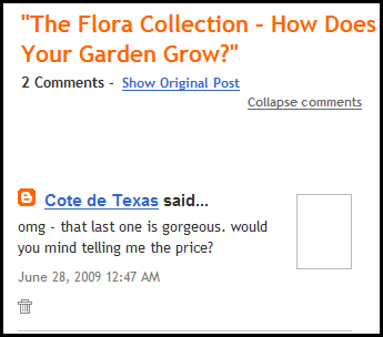
In June I wondered how much this necklace was – it was just too pretty to pass up.   This comment started a dialogue with Karen.


image

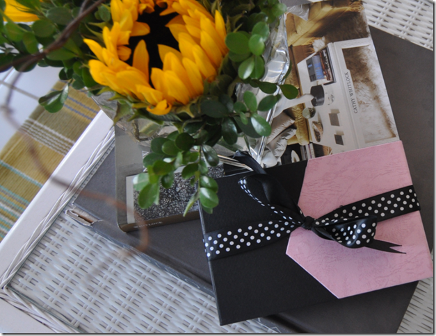
And then, the other day, I came in from the beach and found this cute pink and black box waiting for me. 


image

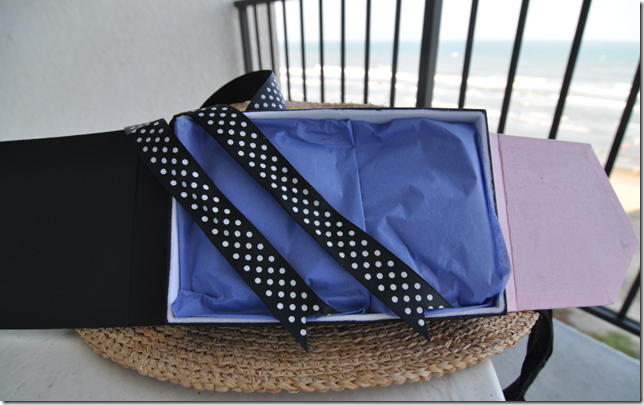
Wrapped in pretty periwinkle paper, ala John Saladino.


image

YES!!!!!!!!!!!!!!!!!!!!!!!!!!!


image

Which I promptly had my 18 year old daughter try on for me – she makes a much prettier model than moi  (though she wants to steal it from me, she says.)   Isn’t this gorgeous?!!!!!  I could scream I am so excited!    I tried it on last night for my friend Julie and she could not get over how beautiful it is!  It truly is a work of art.     Karen’s generosity staggers me – I’ll be grateful to her forever.   Yes, I am embarrassed to admit, this necklace was a gift from Karen!   I’ve said it before – I’ve met the nicest people ever on the blogosphere.  Thank you again, Karen, from the bottom of my heart.


image

The very sweet Karen Sugarman, quite beautiful herself.


image

Be sure to visit her web site and see all her designs – there are many different collections and pieces that I didn’t show here, so don’t miss one of them.   And Karen actually has two blogs – one on the web site and one on the blogosphere here,  so take your pick.    One of my favorite stories on the blogsss is this one:   http://karensugarmandesigns.blogspot.com/2009/06/social-networking-and-six-degrees-of.html


AND:    All Cote de Texas readers get a 25% discount on anything they order from Karen Sugarman Designs.   Simply go to the web page – at the top of the Home Page will be a Cote de Texas tab.  Click on that tab before you begin shopping.  The code is:  Texas.    The discount will show up automatically then.   Thank you Karen for such a great discount!

The Wheats, The Stalking Continues – Part II

114 comments

 image

Sally Wheat lets me back inside!


One of the most popular stories on my blog has been “Stalking the Wheats” where last year I wrote about a beautiful house that I stalked on my daily Starbucks route.   The story of this house, a mixture of Belgian styling with lots of trendy pops, was a huge hit with everyone.   Their gray kitchen in particular was admired.  Even today, I still get emails asking for the color of Sally’s cabinets (Benjamin  Moore’s Fieldstone.)      The Wheats’ house did not go unnoticed by people in the media either.   Several magazine scouts that read my blog took an immediate interest in the house and finally  -  it was approved for a photo shoot with Country Home magazine.   As we all know, that magazine folded, just shortly before the photographs were to be taken.   But, all was not lost.   The editor of Houston House and Home, the top local design magazine here, contacted me about photographing the house - which  Sally very excitedly agreed to.  The photo shoot was set for earlier this summer.  The only thing  that was particularly nerve wracking about the entire shoot was Linda Barth, the editor, had asked me to write the cover story!   YIKES!    She promised it would be easy – she wanted a similar story to the original “Stalking the Wheats” – and so I agreed.    Most exciting of all, I would actually get paid for writing the story, which is a first – to be sure!  Everyone knows blogging is truly a labor of love, we don’t get reimbursed by some big blogging boss out in cyberspace.

The Houston House and Home photo shoot happened over a month ago.  I had not been back inside the Wheats’ house since the first story, and I was very pleasantly surprised at all the wonderful changes that have taken place.  Sally, like all interior designers, isn’t one to sit by and let her house just “be.”  It’s constantly in flux as pieces go in and out and from room to room.  The biggest change was in the living room; oh, I almost gasped when I saw it – it was so beautiful.    It’s been pure torture to have all these wonderful photographs that I took that day and not to be able to show them, but we (Sally, Linda and I) decided it would be better to have my new pictures timed to come out at the same time that the magazine issue came out.    The Houston House and Home with Sally Wheat’s house on the cover arrived in the stores this week, so, today – here are my updated pictures of the house!     The magazine is online – if you don’t live in Houston, you’ll still be able to read the story.   And for fun, be sure to read my original story here to see what changes Sally has made since we first visited in April of 2008.


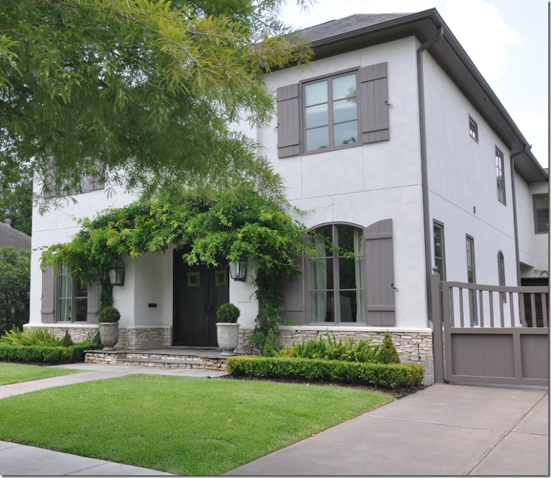
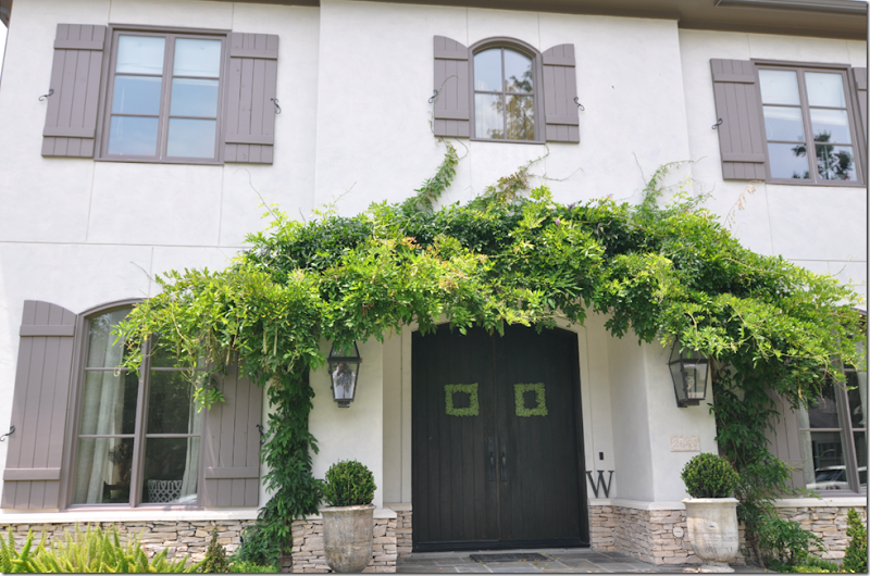
image  The evergreen wisteria has really grown since last year, but all in all the exterior was same, except for different pots at the front door.


image

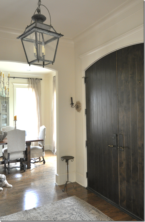
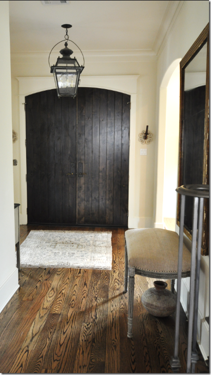
The front door is dark brown planked wood with small sconces flanking it.   Above is the lantern from Chateau Domingue.


image

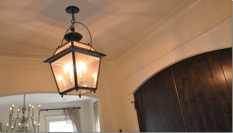
Sally and I are very different in that she doesn’t like any lights on in her house during the day!  I am the complete opposite – I love all my chandeliers blazing all day long and I keep my sconces on 24/7 (after years of fighting with Mr. Slipper Socks Man over this!)   Here, I turned on the lantern and the dining room fixture.    She really doesn’t like them on – not for electricity issues – she just thinks the house looks better in natural light only.   A thought:  do you?  Which you do like, lights on during the day or off?   


image

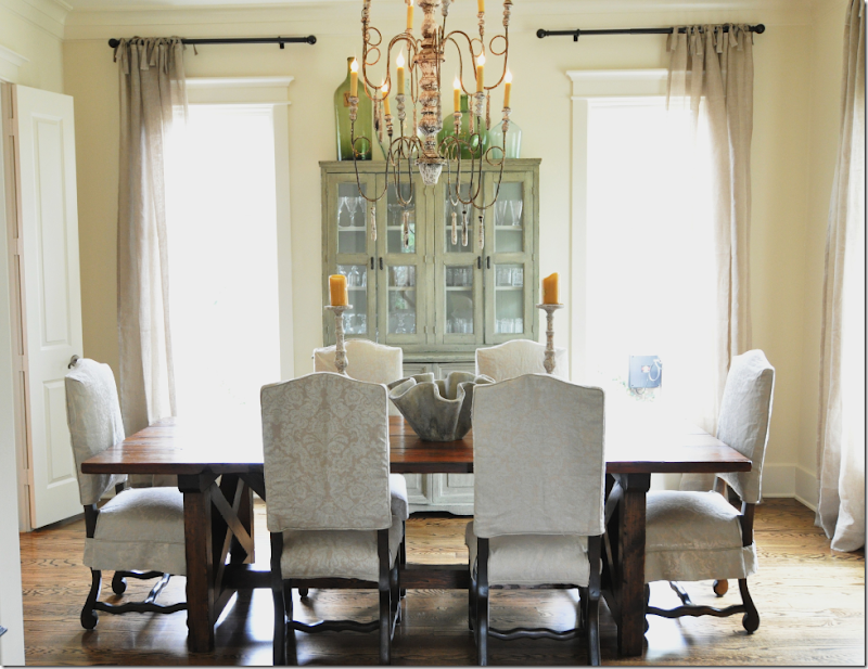
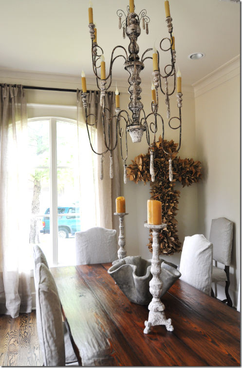
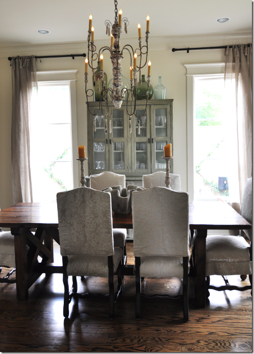
The biggest change in the dining room was the breakfront – it was formerly in the living room.  The mirror that was previously where the breakfront is now moved to the living room!     Sally had the dining table custom made to  match one she had seen in World of Interiors magazine.  Os de Mouton chairs are slipcovered in a muted damask.   The curtains, from Indulge in Houston,  are very breezy and are unlined linen with top ties. 


image Another new addition to the dining room is the large cross made out of dried leaves.  I love her wooden Italian chandelier and  her choice of accessories for the table.


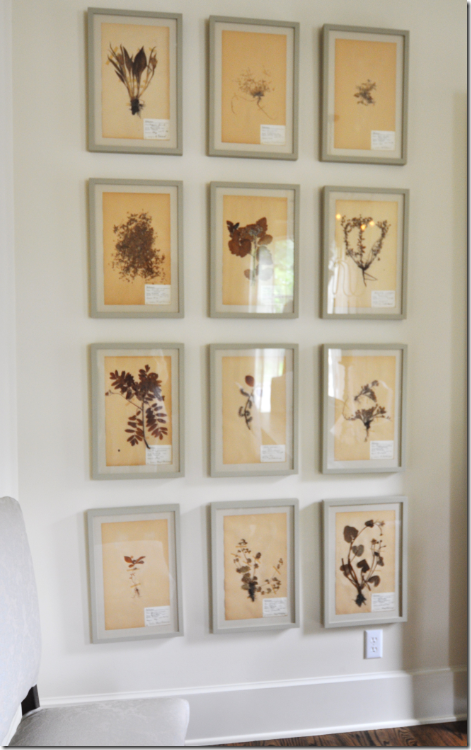
image One small wall in the dining room is completely filled with this set of botanicals. 


image

Here you can really fully see the chandelier.    The dining room is to the right of the front door, so now, we’ll go the living room at the left of the front door.


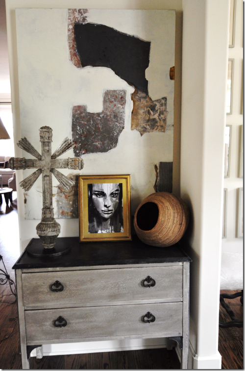
image Facing the front door, this vignette is between the living room and dining room and it shows Sally’s style – a mixture of antique and modern.


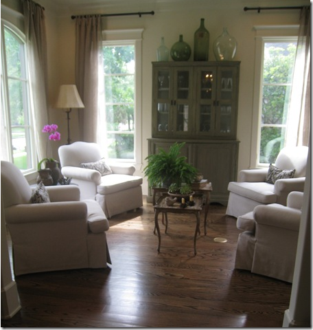
image BEFORE:  The living room had four arm chairs surrounding a small Italian table.  The breakfront now in the dining room was in this room last year.  At the time, Sally still hadn’t purchased her seagrass – it was on the way.  


image

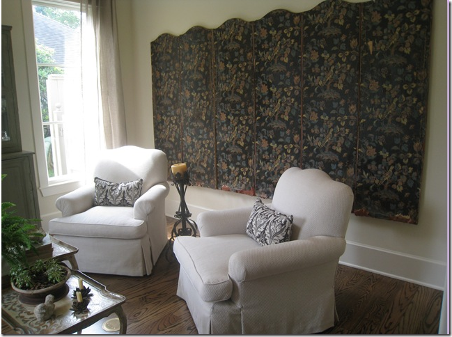
BEFORE:  Against the back wall of the living room was this magnificent screen from Thompson Hansen.  When I was stalking the Wheats, I could see this screen from my car, and it used to really make me want to go inside and see the rest of the house!


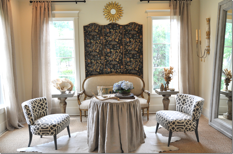
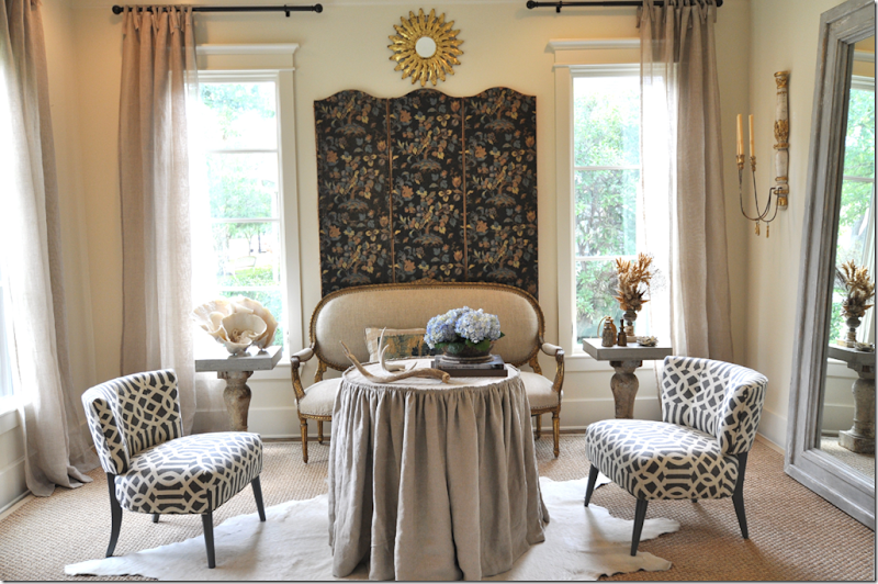
image TODAY:  C’est magnifique!    What a change!   I gasped when I first saw this room – it is just beautiful.  Sally moved the screen (and removed some extra panels from it) behind an antique gilt framed French settee.  She added a linen skirted table and a seagrass rug is layered with a white calf skin on top.  Two vintage chairs that are not a pair are covered in Kelly Wearstler’s Imperial Trellis.   This setting made the cover of Houston House and Home.


image

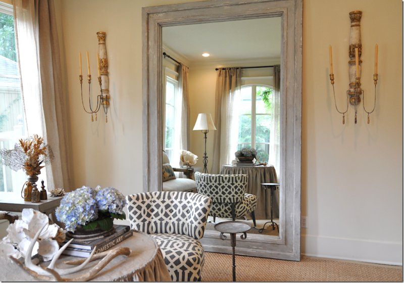
On the right wall is the large mirror that was once in the dining room.  It is now flanked by two antique sconces. 


image

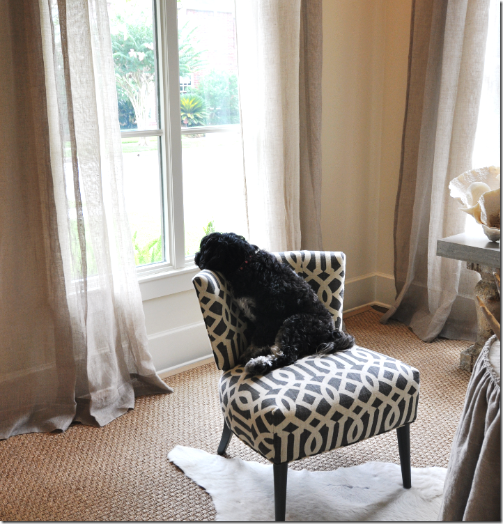
Perfect perch for the pooch!


image

I love the way the room is reflected in this shot.   I hate to leave here!  It’s so pretty!


image Walking down the center hall to the family room/kitchen, you pass the stairs on the left.


image

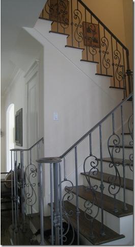
Here we pass the iron stairs that were painted to resemble pewter – next is the family room.  This picture is from last year - I forgot to take one of the stairs this time!


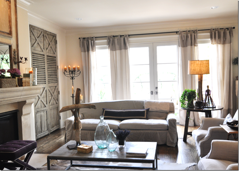
image The family room – all lit up for the photo shoot.  I think the candles look so pretty.   This room is much the same as it was last year, just the mantlescape has changed and the coffee table accessories – I actually like both much better now.


image

The two matching sofas are slipped in linen, long and lean – Belgian style.  There are two armchairs and a cow hide rug underneath. 


image

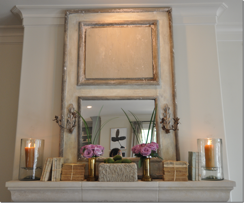
The mantle now has old books – without covers, the trendiest of the trendy, and lilac roses.  I think this looks so beautiful!  The light above was driving Sally crazy – she couldn’t wait to turn it out.  I happen to like it on myself – too funny.   Notice moi in the mirror.   hehe


image

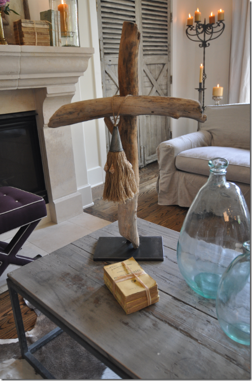
Love the coffee table – Sally makes the driftwood art herself with wood she collects at her beach house on Boliver.   She sells the items at her antique booth at Antiques and Interiors on Dunlavy here. 


image

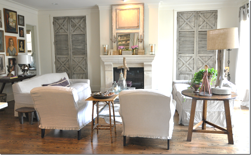
The TV hides behind one of the antique shutters Sally bought and had repainted.  Originally the house plans called for open shelving here which Sally had changed before the house was completed.    The shutters are now the beautiful focal point in the family room. 


image

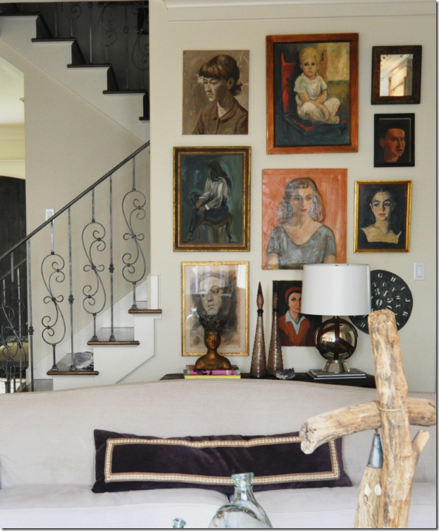
Behind the sofa on the left are the stairs and the portrait wall – filled with anonymous women – several of whom actually resemble the dark haired Sally!   The collection of portraits has grown over the past year. 


image

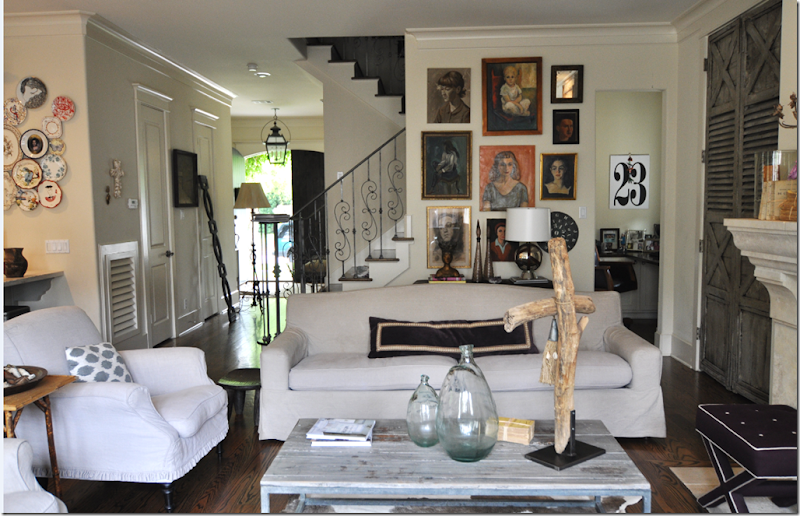
A wide view of the family room – on the very left is the kitchen and on the very right, under the stairs, is the computer office hideaway.   In the hallway by the front door are things being moved around for the photoshoot.    Madeline Weinrib pillows on the chairs.


image

To the right of the family room is the breakfast room and then the kitchen.   The doorway leads to the back stairs which go to the playroom.


image

Closeup of the vignette between the family room and the breakfast room.


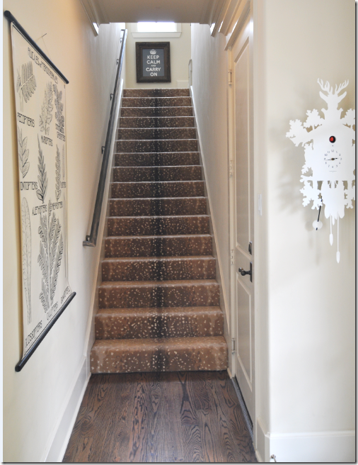
imageThe back stairs up to the playroom.  I really like this carpet.    Sally loves trends as much as I do – can you count the trends in this picture? 


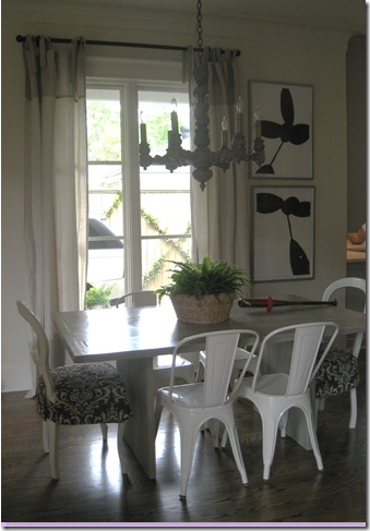
imageBEFORE:   The breakfast room as it was – French host chairs and an antique chandelier. 


image

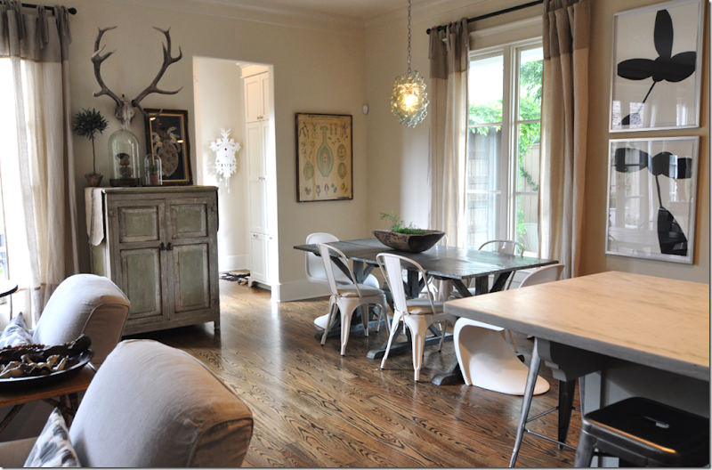
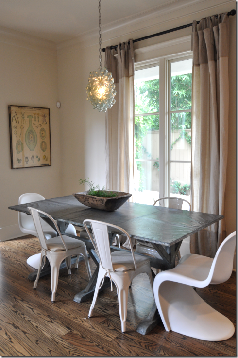
AFTER:  Everything has changed except the Tolix side chairs – the zinc table is new as are the Pantone chairs.  The lighting fixture was replaced with something more modern from Indulge Maison Decor.  Sally loves to mix the new with old, the modern with the antique, the industrial chic with the Belgian chic. 


image

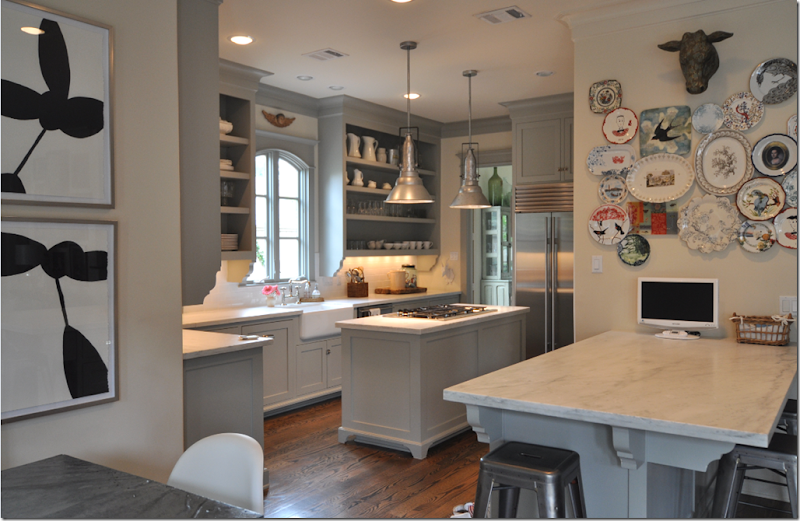
Leading into Sally’s kitchen  - the plate wall over the marble buffet is new since last year’s visit.  


image

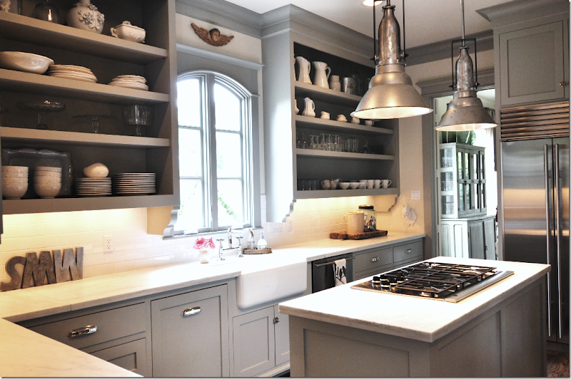
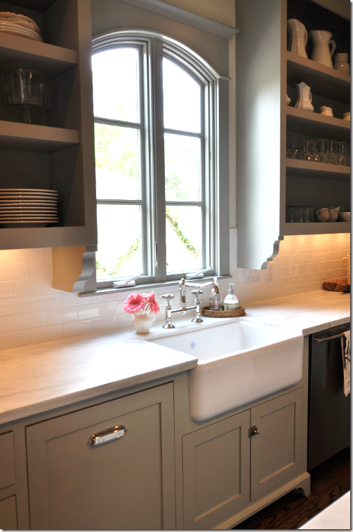
Sally’s kitchen was such a hit last year – everyone loved it!  The gray cabinet paint color is Fieldstone by Benjamin Moore.  The lighting fixtures came from Brown in Houston – aren’t they fabulous?
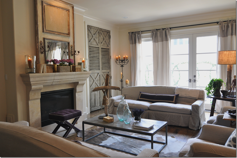


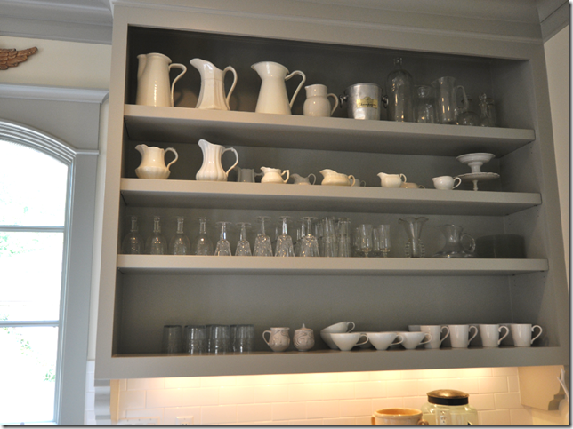
image Sally’s cabinets are open and show off her white dishes and crystal.


image

I love her casement window and the Shaws sink with the polished nickel faucet.   Love her cabinetry and hardware too.   Let’s go upstairs now.


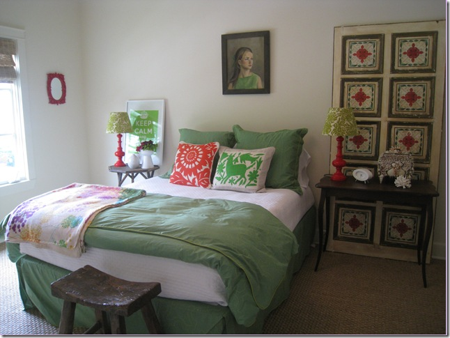
image BEFORE:  Sally’s guest room before – actually this color is so “in” right now – I’m almost surprised she changed it all out.  But she did. 


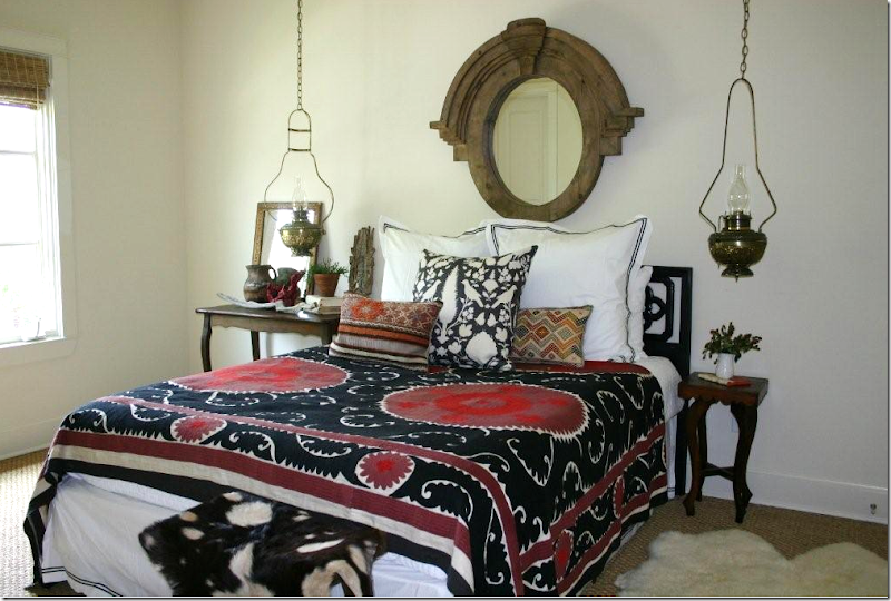
image AFTER:  The new guest room is all black and red – with a vintage suzani the focal point.  I love the hanging lanterns!  Upstairs is all wall-to-wall seagrass, my favorite.


image

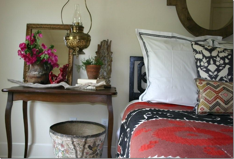
Cute side table vignette in the guest room.


image

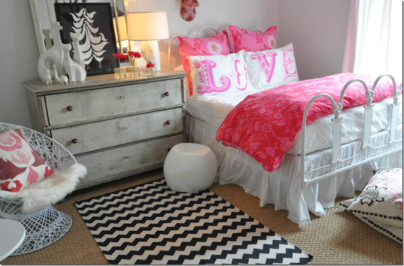
Since last year, Sally has added some new touches to her daughter’s room, like the Madeline Weinrib rug.


image

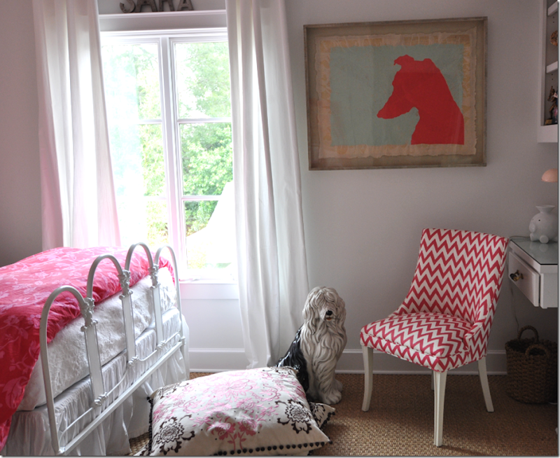
Sara’s vintage chairs wears a Rubie Green fabric, isn’t it the cutest?   Sally loves to buy vintage chairs and redo them with paint and fabric.


image

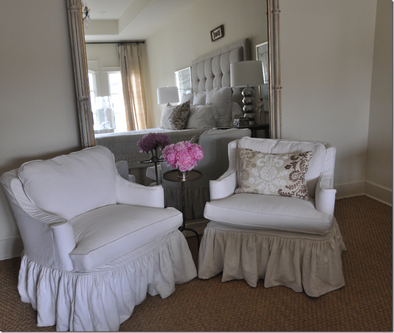
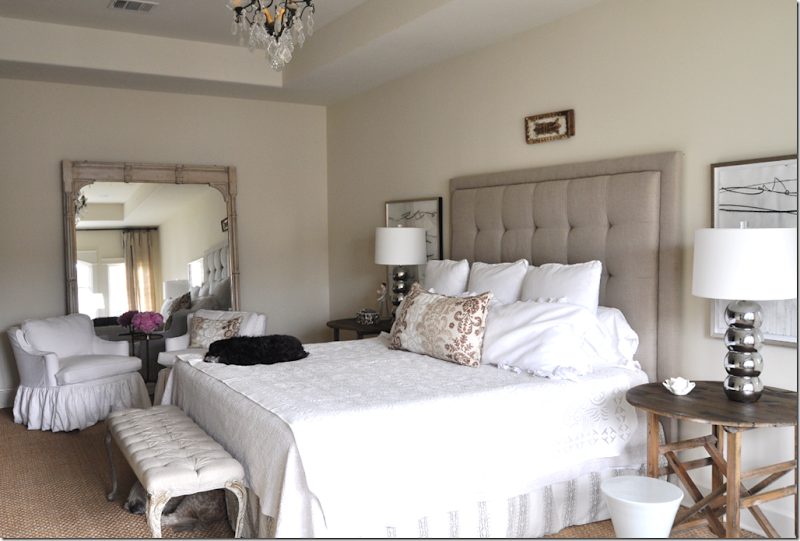
The master bedroom now has two vintage chairs, slipped in white, in front of a large antique mirror. 


image

Tired puppies from the long day of photoshooting.  Large tufted headboard and antique bench. 


image

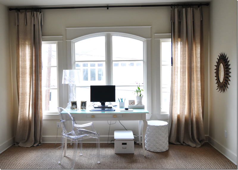
Against the windows on the right side of the master bedroom is a large white desk and a ghost chair.   Unlined linen curtains.  For pictures of her bathroom, see the photos from last year. 


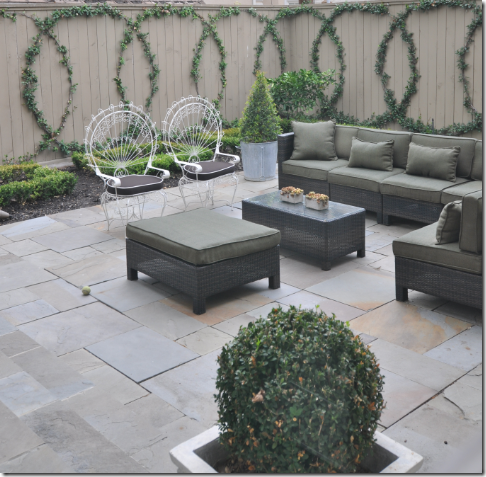
imageAll of Sally’s backyard furniture was damaged in Hurricane Ike, so the back patio is completely new this year! 


image

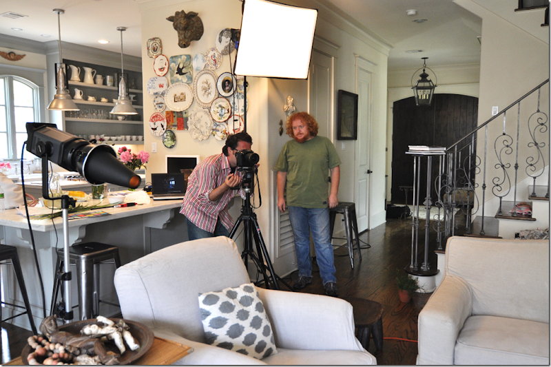
What a photo shoot looks like – the stylist checks the shot while the photographer waits patiently nearby for the OK!!   The editor is nowhere in site – probably out looking for the sun.  The angle of the sun is important – how the light comes through certain windows can make or break a shot.  They were excited to get sunrays in the cover shot of the living room below:


image

The afternoon sunlight was streaming through the left windows in the cover shot.  Really, this is just an excuse to show this picture one more time!!!!!


To read last year’s Stalking the Wheats, go here.   And to read the story about Sally’s house in Houston House and Home online, go here.   If you live in Houston, be sure to pick up the magazine this month.    And if you would like to learn more about moi,  read the Editor’s Note – on page 8 – online too.    Linda Barth has always been extremely nice to me and I want to sincerely thank her so much for her support and confidence in this little blogger.    And a huge thank you to Sally Wheat for all your hospitality and friendship!