This reader has a two part question for Miss Cote de Texas!!
The first question:
Hope you are well! I have two design centered questions as I am a young 30 year old who is just starting to come into my own when it comes to interior design. First question is on books...I have built-ins in my family room that are the most intimidating thing I have ever seen...seriously, I have a huge fear of filling them. I am going to start looking around for random accessories to fill in but I need some good books (and lots of them) to use as fillers. Do you have any Houston local or online resources that are good to purchase random books from?
First, let’s tackle how to style bookcases to give you some ideas and then I’ll tell you where you can find some books. Here are a few of my all-time favorite bookshelves:

Suzanne Kasler does beautiful styling in bookshelves. Notice how she used a blue background to make her shelves pop. Gorgeous. The shelves are also trimmed in gold. She filled the shelves mostly with sets of leather books. While, these books are probably antiques, you can buy sets of books, like vintage encyclopedias to mimic the look. The sets don’t have to be antique. Her sets mainly have gold lettering. And notice how she hangs prints and mirrors over the shelves. Additionally, she added in antique tea caddies and boxes to mix with the books.

Suzanne Kasler again. Here she uses only books, mostly antique ones – singles and sets of books. The caramel colored book bindings are so beautiful. Since you are starting out, you could slowly start to collect antique books. Watch eBay for sales. I once bought a pallet of antique books from England on eBay. I used the books on client installations. Buying a large box of antique books was very cheap – I think they averaged out at around $6 a piece! For one client’s large bookcase – we used about 30 of those books plus blue and white porcelains only. The effect was really great. There are so many inexpensive blue and white vases around at places like Pier One and Home Goods – you could buy enough of them to make an impact when mixed with books.

Another favorite bookshelf is this one styled by Charles Faudree for a house in the Caribbean. This is a highly stylized bookcase, the books are covered in 3 different papers and then are mixed with coral on pedestals and sponges. A bookcase like this is great to match your décor in the family room.

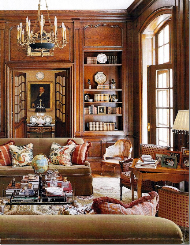
This bookshelf is a mixture of antique books and antique objects, such as plates and busts and trays. Notice how the art work is placed in a z formation: right, left, right, which is a great place to start with an empty bookshelf. Place one decorative piece at the top shelf on the right, then the next shelf, place it on the left, and so on, working down in a zig zag pattern. Fill in with books around the objects. This is a fairly fail-proof way to accessorize shelves.

Houstonian Tami Owen created these shelves and I just love them. She used the caramel colored antique books – in sets and singletons. She mixed in a few pieces of water gilded antiques which look so great with the books. Her shelves are very symmetric – two olive jars are matched with two olive jars. Two boxes are balanced on neighboring shelves. She also left out a few shelves in order to use taller objects, which creates interest. Symmetry is another foolproof way to stylize shelves if you are feeling overwhelmed about the task!

Here is a close up of her shelves so you can study how she placed the books and object symmetrically.

How about adding color to the back of your shelves? Here Linda Merrill from Surroundings painted the shelves aqua, making the objects pop. If your shelves are painted, you don’t need nearly as much filler. I love how Linda added the musical instrument. Old violins and trumpets, etc. are beautiful to decorate around and perhaps you could find one or two on eBay for not much money!

Here Martha Stewart used orange to match her décor. On the shelves white objects such as coral, ironstone and vases really pop. Again, you don’t need to fill out shelves with lots of objects when the back shelf is painted.

Another favorite of mine comes from Classic Casual Home. I love the way these shelves are styled – with lots of breathing room. Again, you don’t have to fill up your shelves. Here, you can see how pretty it looks with fewer, but larger objects such as the blue and white oriental jars and baskets of shells. Notice the lights above the shelves – another way to dress bookcases up and be functional at the same time!

A black painted shelf uses cream objects and books to pop. Here a mixture of creamy colored beads, fossils, vases and art work looks wonderful with books. Notice the black books for accent, placed between the white covered books.

Houstonian Julie Dodson used just a few antique books mixed with Florentine trays, crowns and vases. The trays were popular in the 50s and 60s and can be easily found in many antique and vintage shops. I love the way gold mixes with the antique books – sometime to remember when starting out on your shelves.

Grant Gibson used antique books placed in small stacks and hung an oval portrait over it. The back of the shelves is lined in beadboard. Simplicity at its best!

Mary McDonald was one of the first to use vases to fill up shelves. Notice how she painted the shelves the same color as the canopy. She then used a variety of vases in the tones found throughout the room. Vases are a great way to fill up shelves. You can find them in places like Pier One and Cost Plus for a song – and it’s a fabulous look.

Here, Houstonians Munger Interiors painted the bookshelves to match the color of the chair fabric and then they added a few antique books mixed with sets of white vases to pop. Think about painting the shelves the same color as your sofa or your accent pillows to tie it all together.

Aqua shelves mixed with framed photographs and white vases. Try not to use a lot of small photographs or tiny objects – it will must make your shelves look cluttered and messy. Using larger accessories makes much more of an impact.

Like this: If you want to use personal photographs – blow them up. Here the photos look like works of art. The caramel colored frames mimics the color of the feedback pillows which mixes well with white.

This homeowner covered all her books in white paper and then wrote the titles in ink to find a particular book. If you already had a lot of colorful books, this is good idea. But, since you are starting out – you could choose the color of your bindings and keep them in a similar tone.

Like this: Cream colored books mixed with brass objects and green bottles. If you go shopping for books in vintage stores – look for one color in book jackets. Notice how some books are placed flat – used to raise the brass objects higher to fill out the aqua shelves.

You’re young – why not go colorful? Line your shelves with a chevron paper. Notice the brass library lights above the shelves. And notice how the shelves in the middle have larger heights to create visual interest.

Here is a close up – the designer used warm colors and silver against the black and white paper.
I love how Ginny Magher did these shelves - mixed with antiques and leather books. It’s just perfect!

Phoebe Howard mixes dark books – one set broken up – with a set of yellow transferware. Look for one set of books at a vintage store or on eBay – and use those to fill out your shelves. This is my favorite transferware pattern. I only have one of these plates – the only one I’ve ever seen. Love the way these shelves look.

Phoebe Howard – a more contemporary design – but still using the caramel colored antique books, prints and white vases which pop against the brown painted shelves. Look for old law books – they can sometimes simulate caramel colored antique books.

I love how Brooke Giannetti styles her shelves. Here she used vellum books and art work. If vellum books are out of your budget – find vintage books with cream colored covers for the same effect.

Here Brooke mixed caramel colored antique books along with pottery and fencing masks! Scour vintage shops for unusual objects – pairs are great to buy for impact.

Here Brooke styled her own bookshelves with shells and old books – all in creamy shades. Shells are great to collect for shelves, plus they aren’t too pricey.

The same room, the shelves are now filled with caramel colored antique books – a trumeau hangs over the shelves.

Cream vases and pots mixed with books turned around to tone down the vivid color of the book spines. If you already had a large collection of colorful books, turning the spine to the back is one way to achieve a more neutral look. But, good luck ever finding a book!

Think about installing beadboard on the back of your shelves adding texture. Here, gray and white and brown mixed together make a striking display.

Houstonian antique dealer Kay O’Toole used antique books mixed with her design books. She used a symmetrical design to style her shelves, again, a foolproof way to display books and accessories.

I styled my shelves with Tara Shaw’s white books, coral, and gilt pieces. I usually use the more symmetrical styling technique.
Where to get books in Houston? Half Price Books! Whenever I need books for a client – I buy their Box of Books. It comes with new, hardcovers sans the paper jacket, and the last time I bought it, it was only $25. If you want older books, try eBay. I searched today on there for encyclopedias and leather books and found plenty of both. Buy a set of vintage leather bound, plain encyclopedias to fill up your shelves.

For example, this set was only $135 on eBay. You could use just a few books on each shelf mixed with white vases and have some art work mixed in and your shelves could be fabulous for not much cost.
Ideas to style shelves with, mixed in with books:

Crowns are a great way to add gold to shelves – these are from the Cote de Texas sponsor Eleanor Brown Boutique.

Restoration Hardware sells great globes which look really good with dark books.

Buy two of these from Wisteria and remove the upper shelf to make a big statement. The two of the could be focal point of your bookcase.

Buy one or two sunburst mirrors for a touch of gilt mixed with books –Wisteria.

Blue and white always looks good, especially against white shelves. Wisteria. But, blue and white is easy to fake, price wise. Try Cost Plus, Marshalls, and Pier One for cheaper vases.

Ballard designs sells these. You could use all the colors and shapes mixed together like Mary McDonald did – and it would look fabulous.

Ballard and Eleanor Brown sells santos, which are also good in shelves.

From Ballard, these are great vases to create a more stylized grouping. But one or two sets of each shape and mix with a vintage set of books or encyclopedias.

Gilt tassles from Ballard.

Use these capitals from Ballards as stages for objects.

Faux antique books from Pier One, much cheaper than the real thing.

Buy two or three sets of these from Pier One, mixed with painted shelves and brown books, placed symmetrically. Should be perfect!
Hopefully, this should give you plenty of ideas to get started!
Now, on to your second question:
My second question is on transferware dishes, I would love to start collecting them and am drawn to either blue and white or just plain white ironstone. I have always heard you can find some great deals on ebay, but I am stumped as to how to find good pieces. I am starting off from scratch with zero knowledge. With the blue and white, they all appear to be different shades. Is there a certain kind that I should be looking for? Pattern? Year made? Enlighten me!

Carol Glasser’s collection of blue and white transferware. N0tice how her transferware is mostly all light blue.

My sister’s collection of blue and white transferware and yellow ware. Again, her plates and platters are all light blue and white.

My old yellow dining room, with blue and white transferware and brown and white transfer plates hanging on the wall.
![image_thumb[69]](http://lh6.ggpht.com/-k6DSM09xae4/UMlwFIv0CaI/AAAAAAABpBU/jcT_BrZH7Wk/s1600-h/image_thumb693.png "image_thumb[69]")
My breakfast room - with blue and white transferware platters hanging on the wall, along with white ironstone on the baker’s rack.

My old entry hall with my collection of purple and white or mulberry transferware.
Transferware comes in all colors – but the blue & white is by far the most popular. I started collecting blue and white transferware after I saw Carol Glasser’s fabulous collection all those years ago in Veranda magazine. I have blue and white and a large set of brown and white plates that I got in Austin for cheap, cheap! I also have a collection of red and white pieces and some black and white and the purple or mulberry transferware. I also separated my collection by color, but you can mix all the colors together and it looks great too.

If I was starting out today to collect transferware, I would probably buy it all on eBay. Another good place is the Round Top antiques fare. When buying on eBay just be sure your buyer has a good rating and has been doing it for a while. I wouldn’t buy from someone who has just started out and doesn’t have much history on eBay. I’ve bought a lot of antiques on eBay and have only rarely been sorry. But, at those few times, eBay stepped in and repaid me. It’s a great place to find bargains. I usually don’t bid and use the “Buy Now” option because I don’t ever seem to be around at the last second of the auction where you can lose what you want. But, it you do use the bidding option – you can get really great bargains!!! Another way to buy is to place a bid at the top price you would pay. If you win, you don’t have to pay as much as long as no one has bid behind you. As far the color of the blue – I prefer the more muted color of blue like this plate shown above.

I don’t care for the darker, denser blue and white and never collected it.

And I really don’t care for Flow Blue – which is where the pattern is blurry. This is how all the transferware started out, but once the potters learned to not blur the lines, some people still preferred this look, so it was continually manufactured. To me, I like the crisp patterns with romantic or architectural scenes. Truthfully, I also paid more attention to the price than the scene!! There are certain rare patterns that some people collect like Texana. You will pay much more for such special scenes – avoid this! The scenes don’t make that much of a difference when grouped together – it’s just the effect that matters most (to me at least!)

A scalloped plate with a romantic scene in red and white is a particularly pretty plate. The red and blue transferware plates look pretty together.

Another scalloped platter in brown and white with a romantic landscape. So pretty!

I also tried to buy only 19th century transferware. Later plates like this from Johnson Brothers are from the 20th century and aren’t nearly as pretty IMO. The plates themselves aren’t as fine, nor is the scene.

You can tell the approximate age from the markings on the back. “Made In England” means the plate was made after 1887. “England” dates it to 1875. “Detergent proof” or “Ovenproof” means the mid 20th century. Below is a list of markings to help guide you to be sure you are getting 19th century. After a while you should be able to tell immediately an 19th century plate from a 20th century one.
1. 22 carat (after the 1930s)
2. Bone China (20th century. About 1915 and after)
3. Copyright (or ©) (1858 to the turn of the century)
4. Copyright Reserved (1877 onward)
5. Detergent proof (ca. 1944 to present)
6. Dishwasher proof (1955)
7. England (appears on marks postdating 1875, generally after 1891)
8. Hand-painted (after 1935)
9. Ltd. (1880 and after; usually signifies 20th century)
10. Made expressly for (1927 to the present)
11. Made in England (1887 and after)
12. Ovenproof (1930s to the present)
13. Patent applied for (1902 to the present)
14. Patented (1900 to the present)
15. “Pattern name” (after 1810)
16. Permanent colours (ca. 1960)
17. Published by (1830 – 1840)
18. Registry mark, diamond-shaped, with Rd in the center(1842-1883)
19. “Rd” or “Rd No” (from 1884 to the present day)
20. Round or oval garter marks (after 1840)
21. Royal (after 1850)
22. Semi-vitreous (s-v) (after 1901)
23. Trademark (after 1862)
24. Underglaze (1903 to 1945)
25. Victorian quarter arms (after 1837)
26. Warranted (1890s)
I hope this answers both your questions!!!
If you have design questions for Miss Cote de Texas, email me at mrballbox329@aol.com
If you have emailed me a question and I haven’t answered it – I am trying to get to them all. If you are in a hurry and need an answer asap, just let me know and I’ll email your answer quicker! Thanks again!!!