I’ve written about David Easton’s former country house, Balderbrae, a few times, maybe too many to count. OKAY – three at last count! Make it four today.
Something in a new magazine caught me eye – and there it is, again, Balderbrae!
But first, do you blame me for writing about such a wonderful house? The garden-filled estate where Easton and his partner - the lauded artist James Steinmeyer – spent their weekends at for over two decades. It was much admired, long before the pair were ever involved.
The main, rustic, shingled house that now stands on 5+ acres of land, was actually built by Easton, but the older and smaller stone cottage that sits opposite it was designed by famous gardener & author Louise Beebe Wilder in the early 1920s.
Wilder had built the two room stone cottage, with its center breezeway, as a sort of afterthought to her garden. She wrote an entire book on her work at Balderbrae, see above. It is an highly acclaimed, classic book on gardening – but I found it drearily boring. You can access it, for free, HERE. Hopefully you will enjoy it more than me (although that wouldn’t be too hard.)
The property during Wilder’s day was much larger, totaling over 500 acres which abutted a state park. After her death in 1938, the estate and garden were mostly forgotten until Easton and Steinmeyer happened upon it. Entranced, Easton took one look at the cottage and its low, stone wall and saw that he could build a larger house on the other side of the wall. A sort of lanterne, the windows would be laid out so that looking from the cottage, one would see through the house’s French doors out towards the back parkland. The main section of the new house would be the exact same width as the original cottage, with two chimneys on each side, just as the cottage. A much welcomed swimming pool would be placed between the two structures.
Several key elements of the garden remained from Wilder: there were fountains and pergolas, but mostly there was her book and a landscaping plat and Easton and Steinmeyer set out to recreate her vision:
A drawing of Wilder’s garden plan.
The house that Easton built, who is both an interior designer and architect, was a sort of laboratory, based on a long held belief that man really needed only one room to live in. Although the house does have more than one room, the living room and dining room are all in one large, high ceilinged space. The room is anchored by identical fireplaces at each end and further, behind doors, on the right is the kitchen and on the left is the master bedroom.

After the house was completed, Easton went to town, filling it up with masses and masses of furniture, antiques, blue and white porcelains, sunburst mirrors, and pedestals on all the walls. The very nature of his design called for symmetry, and although at first glance it might seem cluttered, everything was carefully placed in a balanced, symmetrical way, which probably is one of the reasons the house is so pleasing.
Over the years, the house’s design spawned others inspired by it. One house that comes to mind is owned by famed designer Penelope Bianchi, whose French manse in Montecito is based on her love of Easton’s one room concept, anchored by a round center table dividing the two areas:

Penelope Bianchi’s gorgeous Montecito house: twin fireplaces, French doors on both sides of the room, and niches above the doors are just a few of the elements shared by both houses.
LOVE her house!! And her!!!
Easton himself was his own biggest fan. He utilized his one room design with a center table for his clients such as this one, obviously modeled after Balderbrae:

An Easton designed house in Dallas, inspired by his Balderbrae.
During Easton’s engaging interview on the Skirted Roundtable HERE, he talked about Balderbrae, surprisingly without much nostalgia. After more than two decades, the trip from NYC to Suffern had gotten old. The couple would have to leave at 3 am on Mondays to make it back to the city and it just became all too much. At the time, they had bought land in Canada that David swore would be quicker to get to, and they were going to build there. Instead, today, Easton has shuttered his NYC office and moved to Tulsa where Steinmeyer grew up. They live in a modern house that they renovated and travel the world. Apparently, they are thrilled with their new life. And no, it is not a one room house like Balderbrae.
Easton & Steinmeyer’s new home in Tulsa, Oklahoma
But what of Balderbrae and all its furnishings? Most were sold at auction at Doyles for a final total of $1,607,140.00. But, some of their favorites were held back and placed in storage. Years later, in Tulsa, Steinmeyer said it was like Christmas, as they opened long unseen, priceless antiques.
A few objects sold at auction:
The middle mirror was quite a pricey auction piece.
I love the medallions Easton used in the house.
After Easton sold Balderbrae, the new owners didn’t change much, if anything. They even kept the same wallpapers and curtains that Easton had put up all those years before. When a few years later, the new owners also decided to sell the house, the real estate photographs revealed a bland design compared to Easton’s. It was heartbreaking to see what had happened to the classic, much beloved Balderbrae.
I wrote about the new decor with the snarkiest of titles “What a Mess: Balderbrae Then And Now!!!!” Included were the exclamation marks.
The couple relisted it and had the house styled for the newer photos. It looked much better, but still…it wasn’t Easton’s warm yellow room filled with blue and white and gold.
Which brings us up to today.
It happens that I opened my new House Beautiful and was looking at this room and I thought, jeez, those high niches above the door reminds me of …. no, it can’t be!!!
BALDERBRAE!!!
Now, say this out loud the same way MANDERLEY was said in the movie Rebecca.
But yes, it was Balderbrae in the new House Beautiful – looking so completely different than its earliest days, bathed in warm Provencal yellow.
First, a quick look back – The Way We Were:
James Steinmeyer painted this aerial view of his house, Balderbrae. It shows Easton’s new house at the back with its two wings – the outdoor loggias. Joining the old to the new are the wisteria covered pergolas. The original cottage sits out front.
Another view – on its side, labeled. Cars pull up to the entry court and through a Dutch door, they enter the porch, or loggia. Notice, the one large living room with its twin fireplaces is the exact size of the original cottage, which also has twin fireplaces in the same position as the main house.
Originally, the cottage was divided with one room on each side and a breezeway in the middle – you entered the garden through the cottage. Seen here in a painting from Wilder’s book about Balderbrae you can see the breezeway in the cottage and the well head, and then past it, the semi circle fountain in front.
One of the original semi circular fountain as seen when Easton lived here.
An beautiful overview of the estate. The original cottage is out front. The pool was added by Easton between his main house at the back and Wilder’s cottage. The wings that are placed out front to the left and right of the main house are the outdoor living and dining loggias.
The brick and shingle house. Easton wanted the house to look as if it was from the Hudson valley - all American, not French nor English. And he wanted it to mimic the stone cottage, which it does. The center section of the new house is stone and is the exact same size as the original cottage across from it. Today, the new house looks like an old, restored farmhouse.
The roses bloomed for only four weeks – during the rest of the year, greenery was the mainstay of the garden.
For the last real estate portfolio, the house was free of the Easton awnings which makes the transoms above the French doors move obvious. Green shutters. The photo was taken in spring – so nothing was blooming, yet. Despite this, it still looks quite lovely – beautiful. I love this photograph of the house.
On the left is the living room loggia and on the right is the dining room loggia, right off the kitchen. In the middle of the roof is the clock tower – a detail I love!! Topping it all off is an old fashioned weather vane.
Finally, notice on the loggias’ roofs – the roses have climbed on the trellises placed there. The newest owners have since removed those trellises which you will see later on.

Real Estate photos – the original cottage, now known as the Guest Cottage.
Unfortunately, the real estate photos of the cottage are not great, but they are all I can find.
The front side of the original cottage. When Easton & Steinmeyer moved in, the garden had been neglected and overgrown for over 50 years. Once the pair moved out, the garden looked as if it was neglected again. You can see this by the leggy boxwoods.
Real Estate Photo: The view of the original cottage as seen from the main house. On each side of the pool are the original pergolas.
Real Estate Photo shows the pergola today. Must be beautiful when it blooms.
When Easton & Steinmeyer first moved in, they invited House Beautiful to photograph Balderbrae, which landed them the cover story. Below is the 1991 cover of that magazine: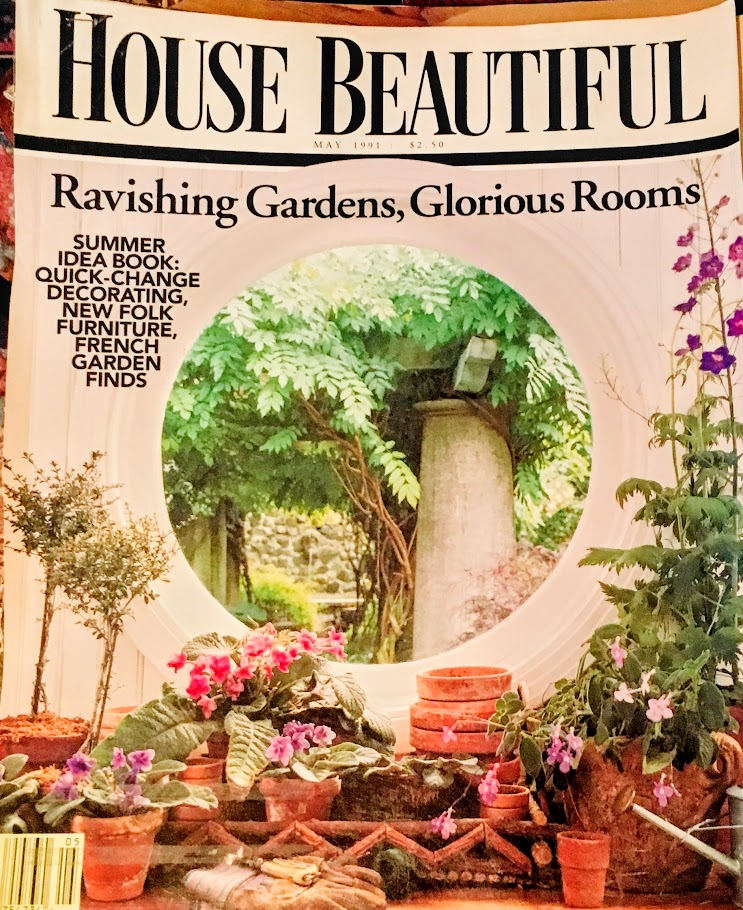 Here is a view from the living room loggia, looking through the window out to the pergola.Laura from Pinterest found this magazine and was kind enough to scan the entire story.From the 1991 House Beautiful photoshoot – a view of the pool and the pergola that is located on both sides of the pool. Notice the stone steps that climb up to the pergola.So pretty!!!From the 1991 House Beautiful magazine – walking through the pergola, the half fountain is at the end.The same view, today.To enter, cars park on the side driveway and go through the green gate to the dining loggia. There, a door leads to the foyer and kitchen.
The green gate/Dutch door that leads to the dining loggia and center courtyard. You can see into the living loggia. Photo from Easton’s book.To order this book, click on the photo.
From the 1991 House Beautiful cover story: Old magazine scan showing the dining loggia set for a dinner party. These chairs were in the 2007 Doyle’s Auction and eight were sold for $20,400! The estimation had been $4 to 6,000.
And from Easton’s book “Timeless Elegance,” a photo of the dining room loggia. Through the porthole you can see the large column from the pergola. And at the very right, the original cottage.
Real Estate portfolio: The new owner’s dining terrace, obviously not decorated nearly as beautiful as Easton. But honestly – what big shoes the new owners stepped into!
It looks like Easton left the cabinet at the end of the loggia for the new owners, along with all the lanterns shown here.
From the 1991 House Beautiful cover shoot: The living room loggia. Although this room was later redecorated and edited, much of this furniture remained and was sold at the Doyle’s auction.
The same loggia, rearranged for another photoshoot. Notice the fabric on the furniture, Pierre Frey’s Toiles de Nantes – did this decor inspire Mark Sikes and Danielle Rollins and Sarah Bartholomew?

Another photo with the Lee Jofa fabrics. The fireplace is unique to this loggia, the dining loggia doesn’t have one.
Real Estate Photo: Love the huge TV. Ugh!! The new owner’s decor.
Another view of the new owners loggia. I love the sewing machine. You never know when the urge to sew a new outfit is going to strike you! Through those windows is the master bathroom!!
The photos of the great room at Balderbrae always read more bright yellow than I’m sure it was. I desperately tried to tone it down in photoshop but it made no difference at all. Vive le sol!
Regardless, the beauty of the room leaves one breathless. It’s all so perfectly designed and decorated. I love symmetry, so this is like heaven to me. Everything is matched except a chair or two – and that is like the cherry on top, the bit of surprise when you are not expecting it. The blue and white looks calm next to the yellow. Notice the small table next to the chair, front right. From Geoffrey Bennison, this pair was a star at the Doyle’s auction, yet to the surprise of everyone – they didn’t sell.
Finally – notice the great height of the room, 25+ feet. It gives the room such a grand feel!!
I love this view with the center table. The large vase with the stems is another favorite. And all the magazines and books are piled high on the stools. I can just hear the photographer saying to David: “No!! Leave them!!! Don’t move a thing!”
Notice the doors with the deep niches above. These niches are exactly what I recognized in the newly published house in this month’s House Beautiful.

A close up of the fireplace with chairs now wearing newer fabrics.
House Beautiful 1991: A rare photo and another poor scan from the old magazine: the dining area. I don’t remember seeing any other photograph of the dining area with its matching fireplace.
Truly, how yellow were the walls? This photograph comes from Easton book “Timeless Elegance” and it shows the great room with much lighter walls. Were the walls always this light, or were they repainted later, after the more well known photographs were taken? Notice the bay window – the view is of the back, toward the allee of trees and the park.
Here is how the room looked during the latest real estate photographs from the new owners. The walls look the same color as shown above. Easton’s curtains remained, as did these medallions.
Real Estate Photos from new owners: A rare view from the living room’s bay window looking out to the parkland.
House Beautiful 1991: The entry into the house and kitchen through the garden gate. I’ve never seen this photograph – showing what looks like a brown and white wallpaper and lots of English antiques. Charming.
House Beautiful 1991: A view into the kitchen filled with hanging baskets and masonware and majolica. Of course, the fireplace is an extra treat, there are 8 on the estate. The wallpaper is carried through from the entry into here. The island is decorated with a pair of lamps.
Later, the new owners kept the old wallpaper and curtains and probably the same old appliances and pot rack. More than 20 years later, I would think a small renovation would be in order.
From the new owner’s Real Estate photos: This room was never seen during Easton’s time, that I know of. Past the living room is this room, a library, which leads to the master bedroom.

Scanned from the 1991 House Beautiful, the master bedroom looks much like it did throughout the Easton ownership – save for a few new fabrics, here and there. His lantern, which was copied from one Easton had seen before, was once painted red.
The most often seen photograph of the master bedroom. The mirror was designed and sold by Easton. The lantern has been repainted here.
The ceiling in here is also over 25’ which must create a fabulous space! Oh, to see it as it was here!!!
For Lee Jofa, a photoshoot showing off new Easton fabrics.
From Real Estate photos – the new owners master bedroom, which showed there were hardwoods here – something that was a surprise to me. I thought all the rooms had the terra cotta tiles. They did keep the lantern.
The original curtains were also kept, not the newer ones with the Lee Jofa fabrics, which is shame, because they were so pretty.
The original curtains were also kept, not the newer ones with the Lee Jofa fabrics, which is shame, because they were so pretty.
One interesting photo from real estate are these of the master bath – which looks out through the French doors onto the living room loggia. Not much privacy. I’m going to assume this wallpaper was from Easton.

A recent surprise gift from David Easton on Instagram showing this old photo of the original cottage. Look how cute the two chairs are. Inside you can see the bedroom with the floral chair and curtains.
And from the 1991 House Beautiful, a view of the bedroom in the cottage, which I adore.
And from the real estate photos. The new owners kept the Easton curtains, again.
But can someone tell me WHAT is in the mirror reflection??!?!?!
And here is the other room in the cottage, the living area as seen during the new owners.
Once Easton and Steinmeyer moved out and sold the house, the new owners had to decorate a beloved house. How do you compete with David Easton if you are just a normal person? And how could your furnishings compete with those that were sold on auction for over a million dollars?And really, how could you compete with David Easton’s aesthetic?Those owners recently sold Balderbrae to brand new owners who obviously wanted to claim Balderbrae for their own. They hired a top notch, big name design firm -Thomas Jayne is a classically trained designer with a master’s degree from the U of Delaware and fellowships at the Metropolitan Museum of Art and the J. Paul Getty Museum.I first noticed Thomas Jayne in a magazine showing his New Orleans’ French Quarter house. A second home, the salon is covered in a custom DeGournay mural depicting early New Orleans. It is a hard to forget space:The salon with the custom mural.
The mural shows early New Orleans with a steamship lumbering up the Mississippi.
Jayne’s favorite childhood book was the inspiration for the mural. LOVE!!
The sitting room in Thomas Jayne’s small New Orleans house. Above the daybed is a trio of German carnival figures.
Another project by Thomas Jayne that I love, along with every other blogger, was the New Orleans Garden District house he decorated for author Julia Reed:
I’m obsessed with this house and especially this chandelier. Notice the black molding which is set off by the dark mantel. Love this so much!!So, drawing from my knowledge of Thomas Jayne – seeing that he has renovated and designed Balderbrae for the new owners, I was so anxious to share it with you ---- ready?
With the new owners, the landscaping has been brought back to how it was when Easton and Steinmeyer lived here. The same garden elements remain, as do the green shutters. Did the shutters set the new design theme, inside the house? hmmm.I noticed that the roof on the loggias was improved on. See below, the roof line was once all trellis for the roses to grow on. Look:
BEFORE: There was a trellis ON the roof’s shingles to encourage the roses to grow over the loggia, but it has been removed and I think it looks a lot better cleaned up.
TODAY: Another view from Instagram of this corner of the yard.Moving inside:
When I first glanced at this photo in House Beautiful, it didn’t immediately scream “Balderbrae!! Balderbrae!!” But a quick glance at the niches above the twin doors and another quick glance at the floor’s terracotta tiles and I think I screamed so loud that I scared Mr.Slippersocksman right off his sofa/perch/bed. I went into a sort of shock, unable to even turn the page. After all, this is one of my favorite houses, ever, and those beautiful yellow walls were now a light mint, sort of green. Actually it is Farrow & Ball’s “Green Blue.” Mixed in was lots of burgundy leather.Thomas Jayne headed the project, but his senior designer William Cullum was behind the decor. Cullum said the wall color is so unexpected and has such a presence in the room that there is not much furniture needed. I wonder though – couldn’t you say the same about the presence of the bright yellow in Easton’s over-the-top cluttered room?I mean, are these the same rooms? Architecturally yes, but decoratively, no. Is Easton’s design stuck in a time zone of 1990s while Jayne’s decor is more suited to the millennium generation? The masses of plates and pedestals, the dozens of books and accent chairs, it looks a bit messy today compared to Jayne’s highly edited room. While we are now in the new social media era, the owners are actually grandparents which is a surprise given the decor. I imagine them as ultra sophisticated New York natives.The green/blue paint is everywhere. There are no breaks for molding. The sofas wear two fabrics which is unusual. The rug was custom created from an Indian chintz. Antique stools. Les Indiennes fabric. Burgundy leather.Nothing is as expected. Nothing. There is not one thing chosen in this room that might be what any other designer would choose. There is no chance that this decor would be mistaken for another. It is unique and a one of a kind design.Cullum is very aware of the provenance of the house and is respectful, too. But he says that there was such a long passage of time between when Easton lived here and had his Doyle’s Auction and when it was sold two times which allowed him to bring the house into the current time frame.
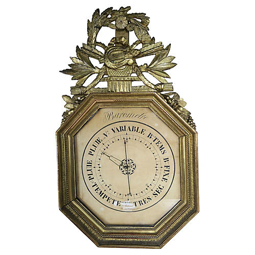
The skirted table is an exercise in editing. While others might be compelled to over accessorize the center table, not here. There are just two birds and an oversized plate. The sheer linen curtains with no rod, just finials are exquisite and are my favorite decorative element in this room. Jayne saw curtains like this in a 19th century painting which was the spark. I shouldn’t say curtains – these are actually swags & jabots without the panels.And I love the pieces of contemporary art work flanking the French door.The lanterns are not French, nor are they English – which is usually what lanterns are or are reproductions of. Instead, they are vintage German, from the 20s. German?The loggia is another huge change from Easton. The shiplap is painted like Pik-Up-Stiks. It’s so fun and bright and a wonderful folly. Again, it is totally unexpected and is nothing that I have seen before and probably will never see again.Totally unique.The master bathroom is through the French doors.And a behind-the-scenes photo of the photoshoot showing the dining loggia, which has the same painted shiplap. The dining table and chairs look contemporary, and of course, nothing I have seen before. Behind are antique urns which ARE something I have seen before!!!The flowers are ready for staging – I wish there was a photograph of the dining loggia, camera ready.The kitchen got a big makeover with a new hearth surrounding of Moroccan tiles from Mosaic House in the Egyptian Revival style. Notice the red and blue colors bring in the colors from the main room. The frieze is papyrus plants styled on a tomb painting at the NY Metropolitan of Art. Notice how the dining room chairs look so good against the tiles.The wife is an artist who paints mythological figures and she is also an Egyptophile which accounts for the fireplace.In the kitchen, there are new wood countertops, and most likely all new cabinetry and appliances.This foyer leads to the master bedroom. The paper further reflects the wife’s interests – with bugs. The curtain tie backs were custom made with Tiffany style scarabs. Egypt, again.The light fixture is original from David Easton, just painted a new color.A closeup of the Tiffany inspired glass scarab and the bugs on the wallpaper in the bedroom foyer.Today, the bedroom looks the closest to what it did during Easton’s time.The bed is modern and actually from Room and Board but everything else is a nod to Easton. The two armchairs look like they are Easton’s and the mirror made me look twice. Smaller than Easton’s, it has a similar distinctive shape. While Easton’s was new, this mirror is from the 1700s. The lantern has remained here since Easton and Steinmeyer left. The rugs are antique and add to the cacophony of pattern and color in the room.And, notice the medallion above the bed, which is also original to Easton. The wall behind the bed is painted blue to frame the medallion and bed, making them appear larger and taller. The room is over 25’ high, even a 10’ tall bed would be dwarfed.Notice also how the blue paint frame stops at the same line of the curtain rods and the top of the bookcase, bringing the eye upwards and bringing a much needed symmetry to all the disparate heights in the room.Library stairs add access to the high shelves. The unusual bedside lamps were sold at the Doyle Auction and bought by Thomas Jayne. Over ten years later, the lamps were brought back to Balderbrae by Jayne.Which brings us back to Balderbrae. I suppose this is the last story I will ever do on this house ---- sniff. I’m sure these owners will be here for a long time so I doubt I will be doing another story about new owners anytime soon.I can appreciate the new decor, but I have to be honest. I would have moved in the Easton house without changing much at all.I hope you have enjoyed seeing this house decorated by two masters in the field.WANT TO GET THE BALDEBRAE LOOK? BAROMETER HERE
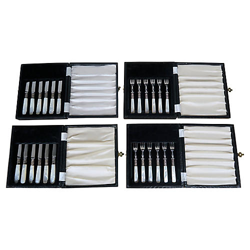
 24 PIECE VINTAGE KNIVES AND FORKS. SO PRETTY! HEREGOOD FOR SHELVES OR TABLE TOP ACCESSORIZING HERE
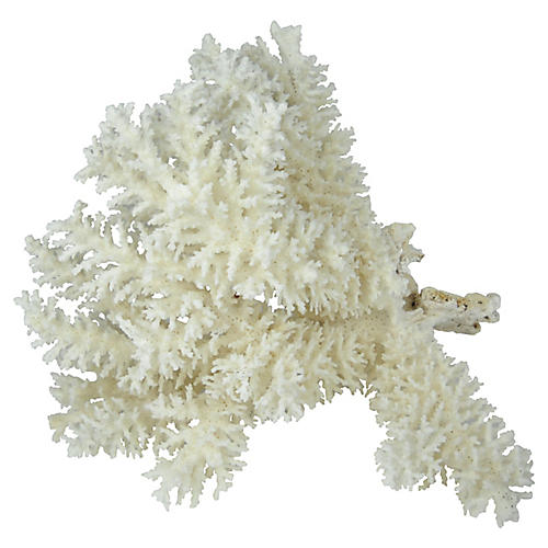
VINTAGE CORAL HERE
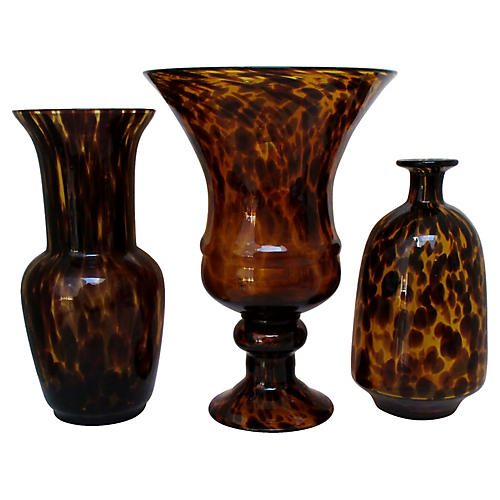
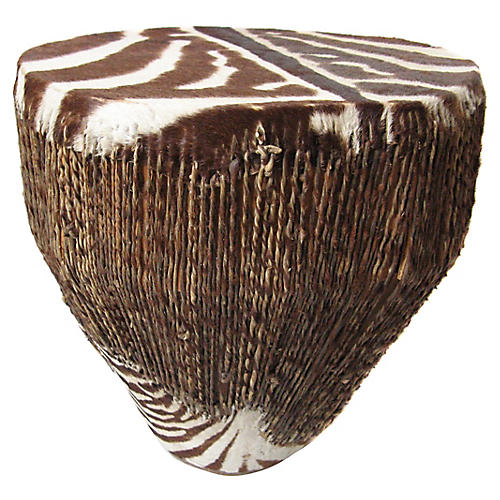
TORTOISE SHELL GLASS HEREZEBRA DRUM, SMALL SIDE TABLE HEREVINTAGE HANGING GLOBES HERESHELVES OR TABLE TOP ACCESSORIZING HERE
LOVE HERE
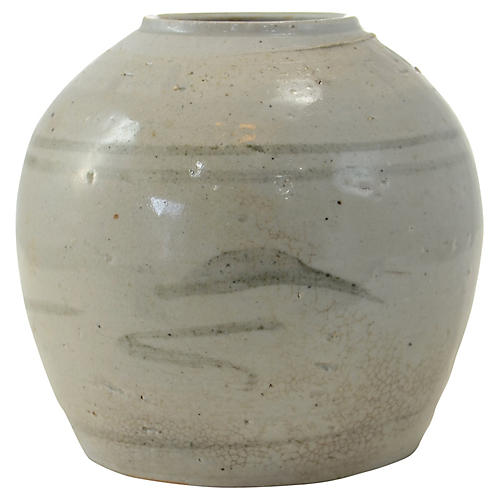
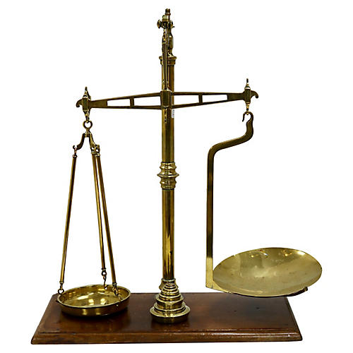
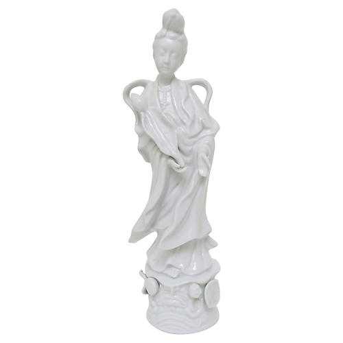
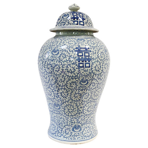
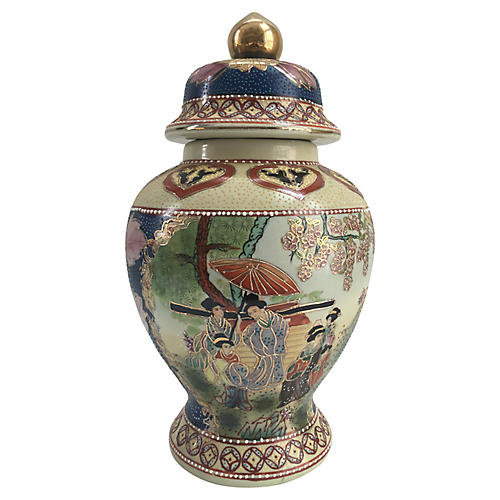
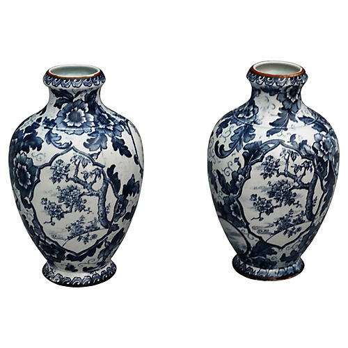
VINTAGE SCALES HERECORAL HERECHINOISERIE HEREBLUE & WHITE HEREVINTAGE SATSUMA HEREPEDASTALS HERE
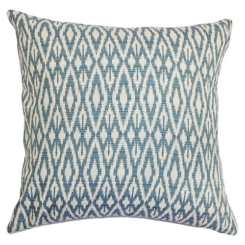
PILLOW HERE
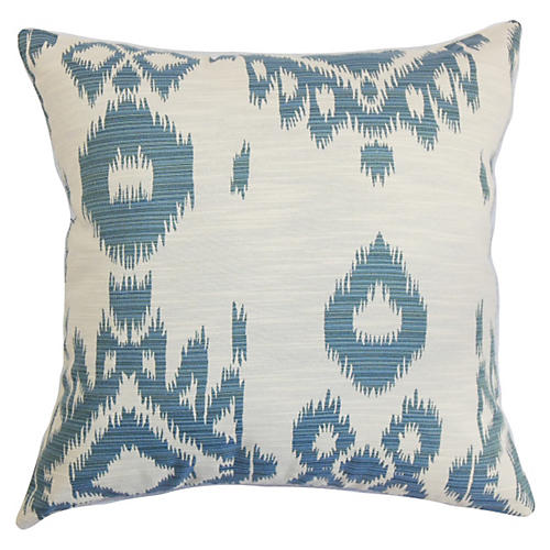
ANOTHER HERE
AND ANOTHER HERESWAN HERE
CLAM, LOVE! HERE
VINTAGE HOTEL BELL HERE
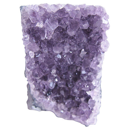
LOVE AMYSTHETH HERE
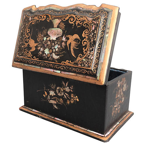
CHINOISERIE BOX HERE
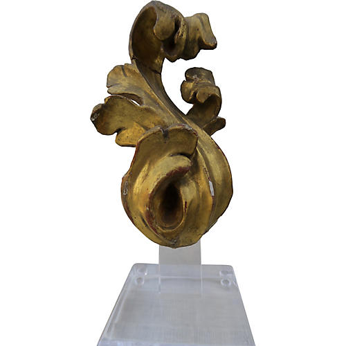
PEDASTAL GILT HERE



 PAIRS
PAIRS 