A short while ago, a Houston interior designer and blogger Amanda Carol of Amanda Carol At Home contacted me about a job she is currently working on. It’s not yet totally finished, but she wanted to share pictures of what she has accomplished so far. The house is located in The Woodlands, a verdant suburb north of town. Amanda lives there too and it is where she started designing just a few years ago. I really love what she has done with the house – a pretty two story newer construction with an open floor plan. Before, the house was painted a dark and dreary taupe - and now it is very bright and stylish and sophisticated! See if you agree!
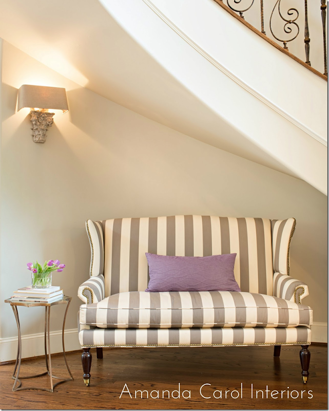
The newly redone rooms start at the entry hall. Amanda chose this wonderful striped settee to sit under a beautiful curved staircase. Above, is a sconce from Aidan Gray. I just used these myself and I love them! It looks especially good here, I think. A small gold table and lilac pillow provide the accents. The walls in the house were a dark taupe and the first thing Amanda did was repaint downstairs and upstairs in the lighter Benjamin Moore Revere Pewter. This paint is a gray that color expert Maria Killam recommends.
Photographs by Laurie Perez - she is really talented, btw. I first saw the work she did for Sally Wheat.
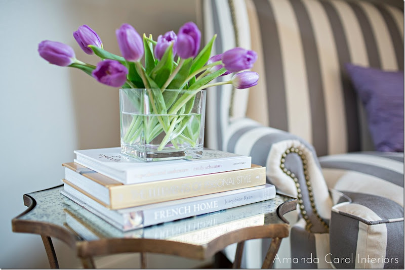
The top of the table is an antiqued mirror. Amanda accessorized it with books and flowers. You could also use antique books here.
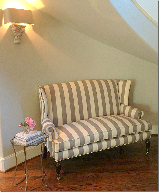
And a second view of the entry hall.
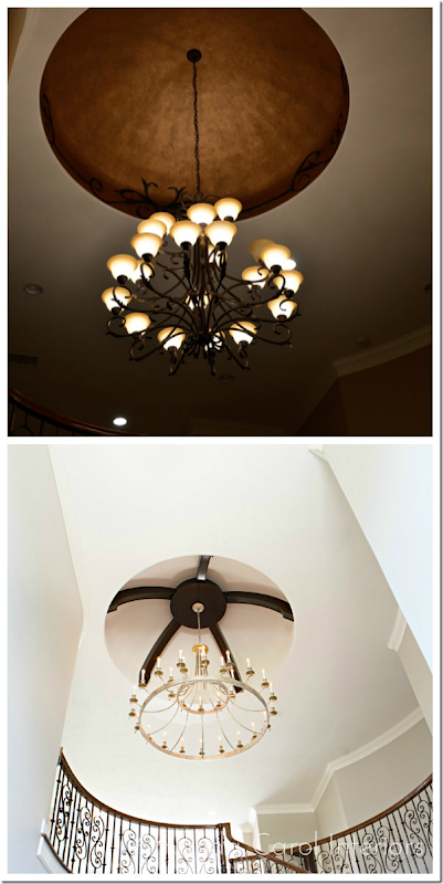
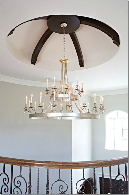
Also in the entry, up above is a dome that was faux painted copper with vines along the edge. In the before picture you can see the dark color the house was painted before. Amanda painted out the faux copper and installed beams in the dome, along with a new brass chandelier replacing the builder grade one that was there before. Huge change for the better!
And a shot of the entry hall ceiling.
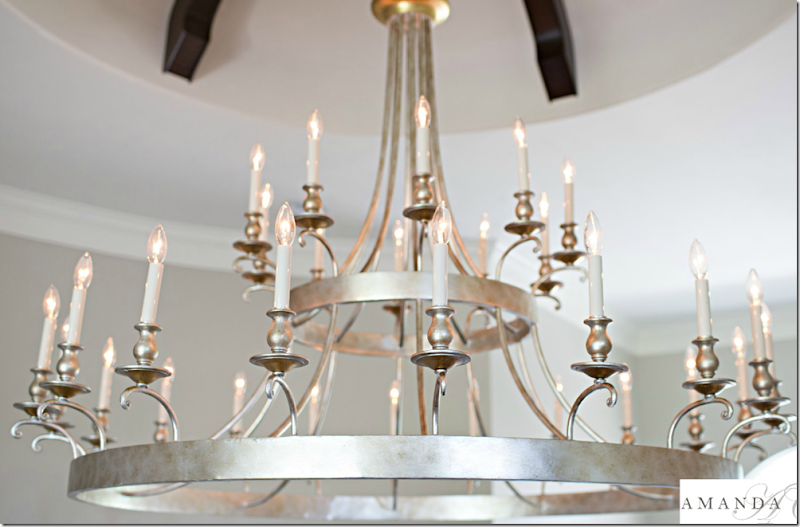
A close up of the chandelier. All the lighting fixtures came from Curry and Co.
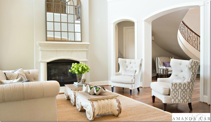
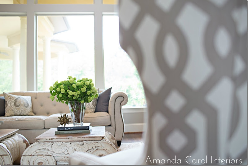
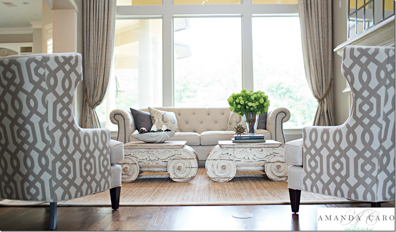
The living room is done in soft linens – with a trellis pattern on the chairs. My favorite part is the capital coffee tables from Restoration Hardware – those are soooo fabulous!!!! Especially the two of them together – love those! Soft curtains frame the view.
And looking the other direction toward the entry hall. You can see busier patterned fabric is on the back of the chairs only, which is a great idea. It gives a bit of pattern without being too much. The room has a high ceiling – so the mirror is extra large, which is good proportionally.
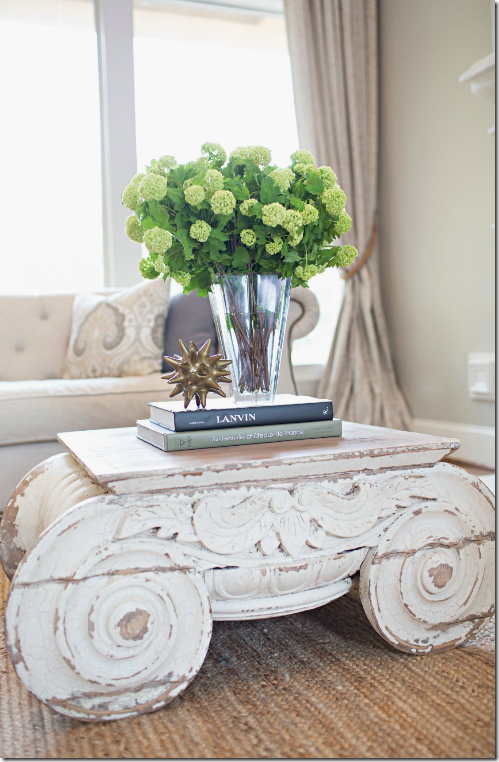
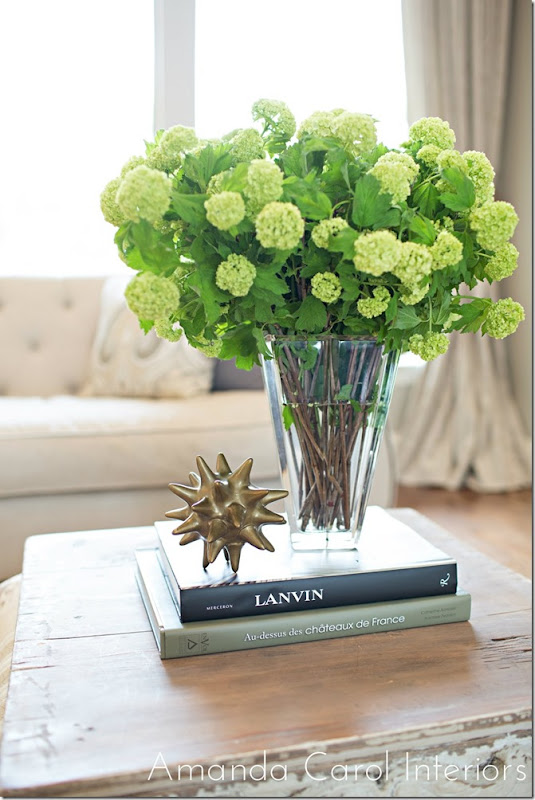
Close up of one of the tables. This reminds me of the antique capitals in the townhouse that Ginger Barber designed.
In this photograph from Ginger’s client’s living room – she used two antique capitals. Finding capitals that are the right size and the right price can be really hard – so it makes the Restoration Hardware tables a great alternative. Except of course, the RH tables aren’t cheap! And two of them….oy!!! It would be worth it to find them on sale if you need two. But they are fabulous. This is first time I’ve seen them used in a house, I’d love to “borrow” the idea!!
Tufted linen sofa with nailheads and gray and paisley print pillows.
Accessories are kept to a minimum which keeps the house from looking cluttered.
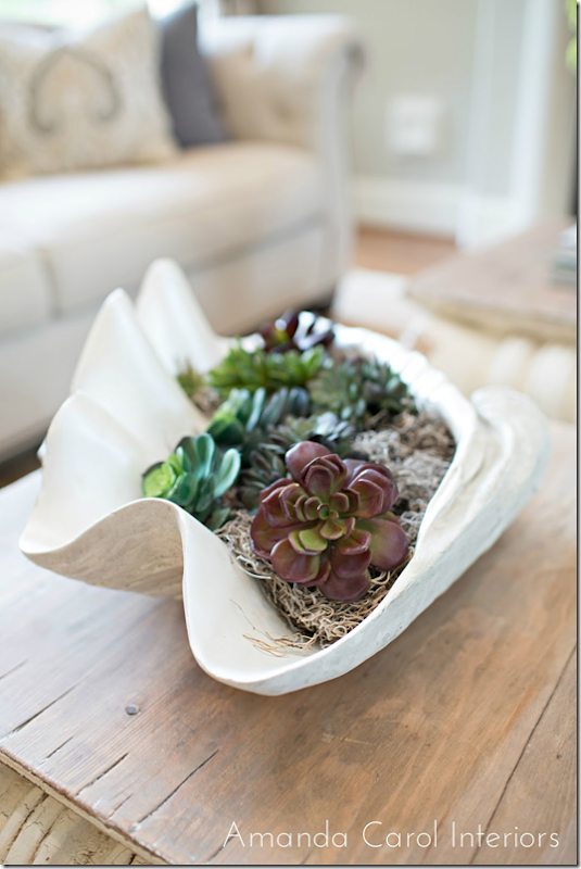
On the other table a large clam shell filled with succulents and moss.
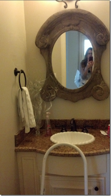
Before picture of the powder room – typical builder grade selections. That dark granite looks dated all of all sudden.
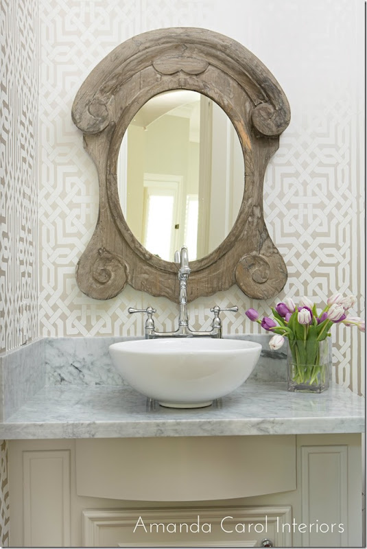
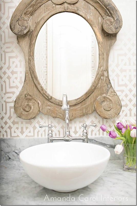
Amanda chose a Schumacher trellis patterned wallpaper – which links the space to the living room. The granite is replaced with marble and the sink is also replaced with a fab faucet.
French window styled mirror.
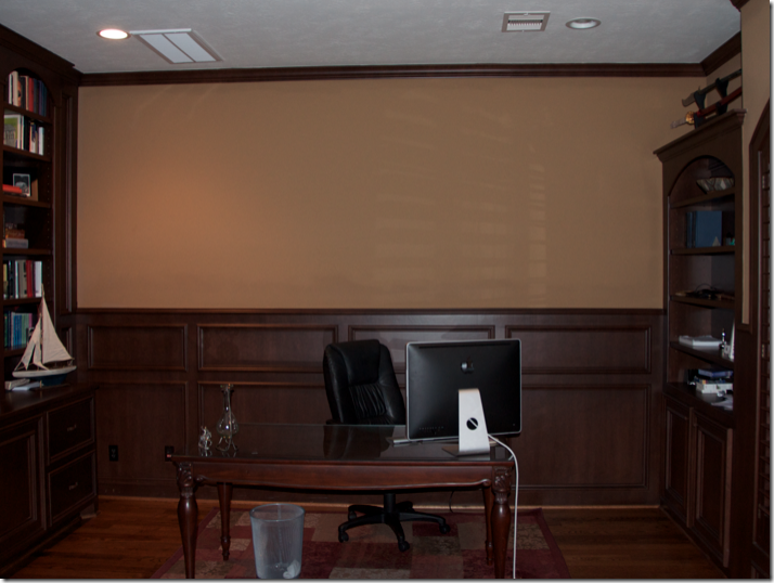
A before shot of the study with the dark taupe walls that the entire house was painted in. So dreary!
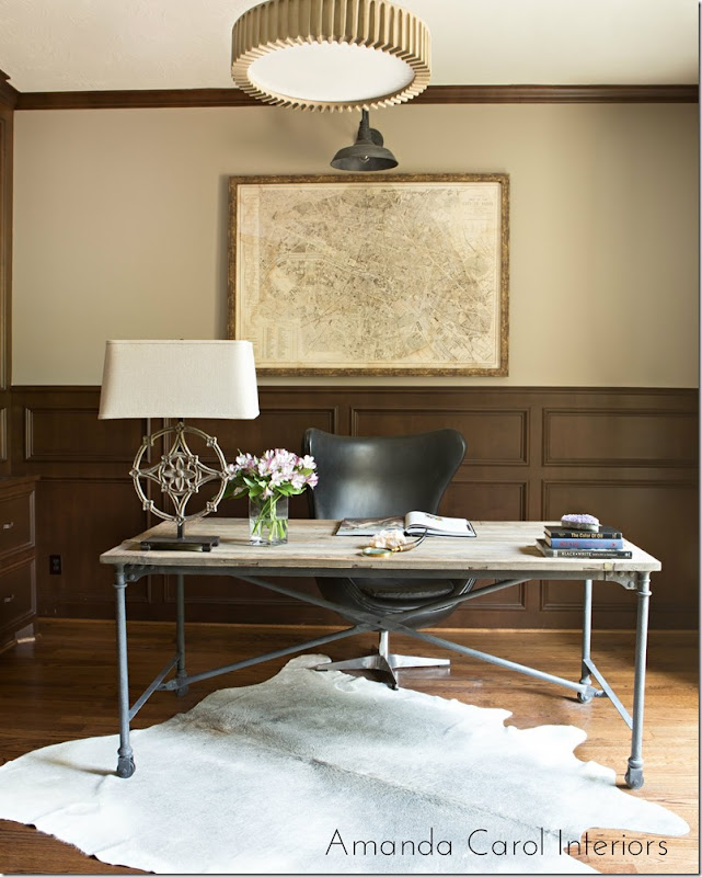
Today, the room is alive and eclectic with a mix of contemporary and stylish furniture. A great industrial styled desk and chair sit atop a cowhide rug. The antique styled map is a good counterpoint to the modern feel of the room. The paint on the wall makes all the difference. I really like the light fixtures – especially the one over the map.
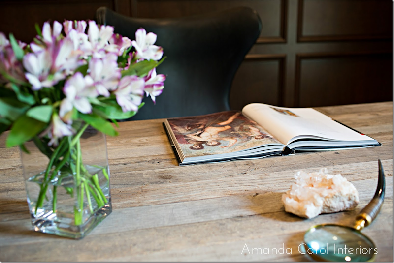
Desk top accessories.
Before – the dining room is the same dark taupe found throughout. Here, the only item that remained is the wood table. The large mirror moved to over the living room fireplace.
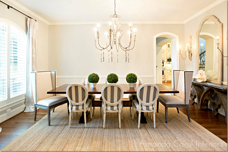
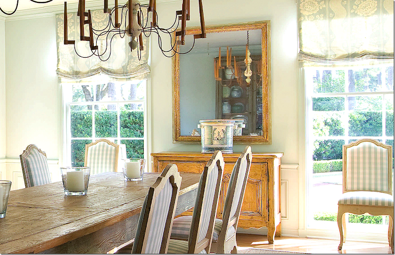
And today, the room I love the most – the dining room – SOO PRETTY! The French chairs are striped in the same fabric as the settee in the adjoining entry hall. Two tall nailhead chairs accent the host and hostess positions. Plus, the height of the two chairs adds interest. The curtain fabric is linen with a quiet pattern in white. Along the wall is the zinc top Aidan Gray console – love it! And the large chandelier has just the correct proportions.
I love the French chairs with the striped fabric – just love it!
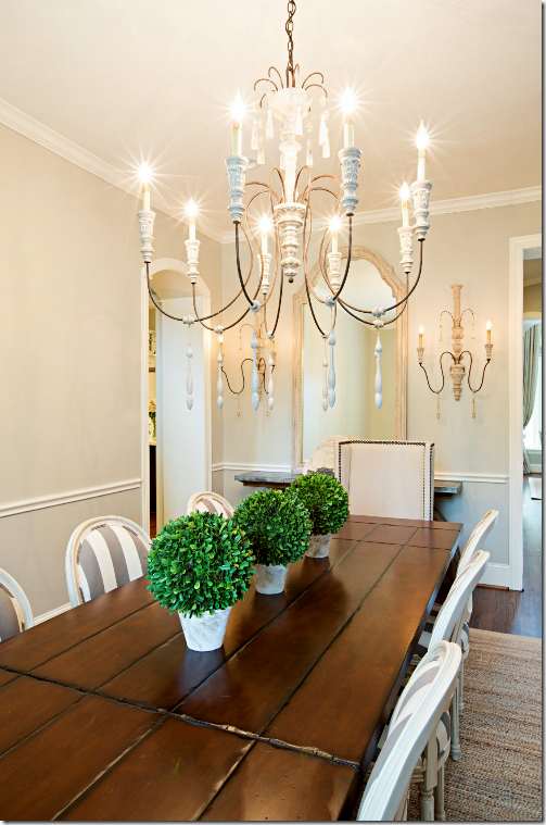
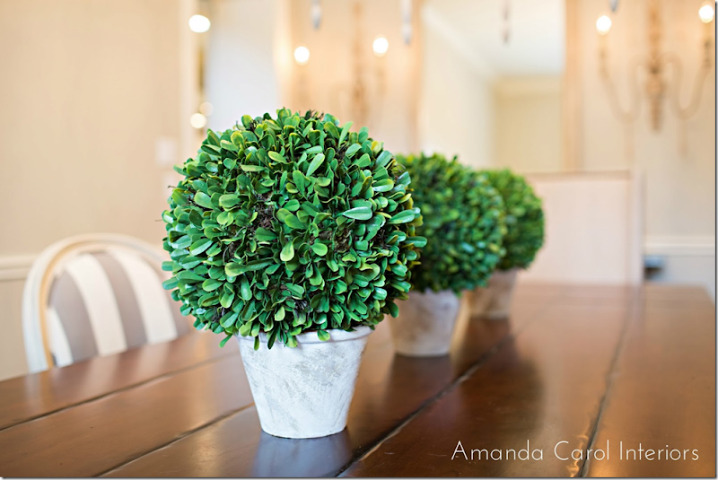
Three botanicals sit on the long table. This reminds me of Carol Glasser’s dining room with the row of simple candles. You don’t have to do the expected candlesticks with a bowl in the middle on a long dining table.
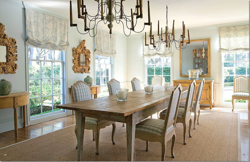
Carol Glasser’s table – three simple candlesticks reminds of the three pots on Amanda’s table.
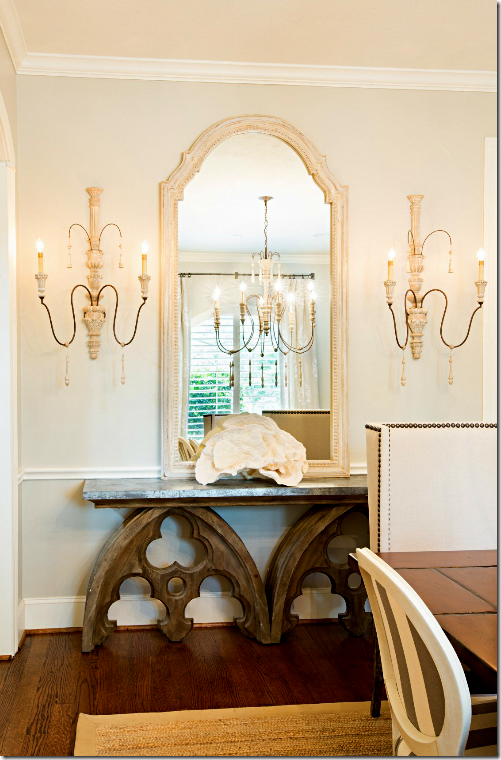
Against the side wall is the console with a large rose coral, tall mirror and two pretty sconces.
I love all the changes Amanda did in this room – and in the house. Before it was so dark and out of style. Today it is fresh and bright and stylish. From the dining room..
…to the living room room with the great capital tables and chairs…
..to the pretty welcoming entry. These three main areas are all open to each other and they blend together so well. By using linens and classic patterned fabrics in the same color range – nothing is jarring. Instead, the updated house is now stylish and sophisticated.
A huge thank you to Amanda Carol for sharing her latest projects. To see her portfolio and to read her blog, please go HERE.
Before & After–From Dark and Dreary to Bright and Stylish.
CAROL GLASSER’S NEW HOUSE!
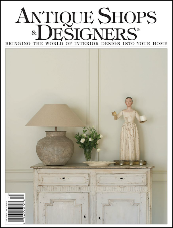
The newest issue of my fav magazine “Antique Shops and Designers” is now out and online with gorgeous photographs of interior designer Carol Glasser’s new house! Whoa! Who misses Southern Accents when you can read this magazine????? To die for!
I know you know how much I LOVE Glasser’s aesthetic – and have for the past 25 or so years. Her former house was shown multiple times – tweaked just a little bit for each photoshoot – and then she totally redid it, only to move right afterwards. I could have DIED! I loved that house. And it’s killed me to watch it come up for sale a few times since…each time just a little bit more expensive…and each time more out of my price range. Oh well. The one that got away.
Carol’s been in her new house for quite a while now – and I’ve been patiently waiting for someone to photograph it – Veranda? House Beautiful? Come on guys! Leave it to our Antique Shops and Designers to get the scoop!!! Love them so much!
Her new house is so different from the last one. First, it’s bigger. Much. There’s a proper dining room finally, something she really didn’t have in the last one. The living room is expansive, but warm and cozy and WELCOMING! There’s a large entry hall and a gorgeous study (which isn’t photographed here, but shows up on her web site) – and there’s a fabulous kitchen, even more fab than her last her one, if that is possible.
What I love about the house is it isn’t the Houston Look. At all. It’s totes different. Colorful. There’s soothing aqua blues which run through the house – punched by persimmon and peachy yellow. There’s pattern everywhere – linens with large prints and overscaled wallpaper. The color combinations of the blue & orange are so refreshing. And there’s green. Her bedroom is bathed in it. Some rooms are painted but many are white – with a beautiful stucco finish.
It’s scrumptious. It’s elegant without being hands-off. There’s no dressiness to it, but it’s refined. And edited. Not as cluttered as her last house, but not sparse either. It’s just the proper balance. The woman has taste. More taste than anyone should be allowed in one lifetime. It’s a house to study and drool over and learn from and get inspiration from and throw out all your old preconceived notions of what a house with French and Swedish and English antiques should look like.
I love the fabric choices. Some are familiar, but others less so. Checks and prints and stripes – all from the best houses, nothing is low end here, I’m afraid to say. There’s no proud hi-low here, but who cares? Sometimes you just want to see the best fabrics somewhere else besides in the decorative centers.
A huge thank you to the group from Antique Shops and Designers. We’ve been waiting!!!
Photographed by Fran Brennan
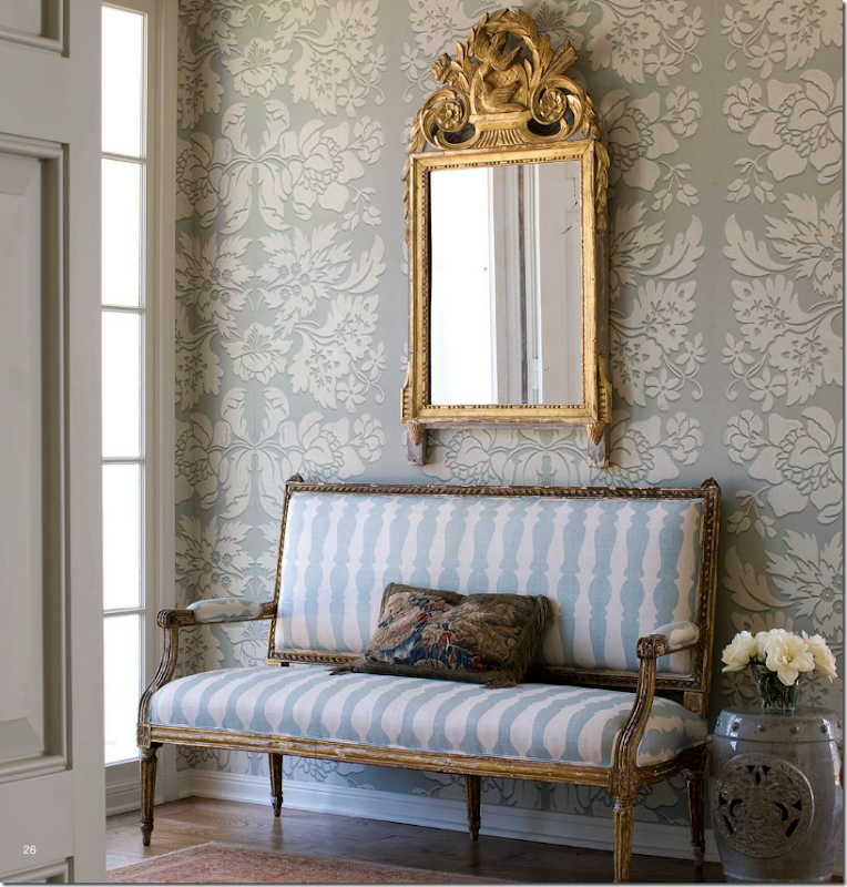
The entry – has a beautiful aqua and white overscaled wallpaper. With an antique mirror and French gilt settee. Now…the pictures on the web site are slightly different, so I want to show those…
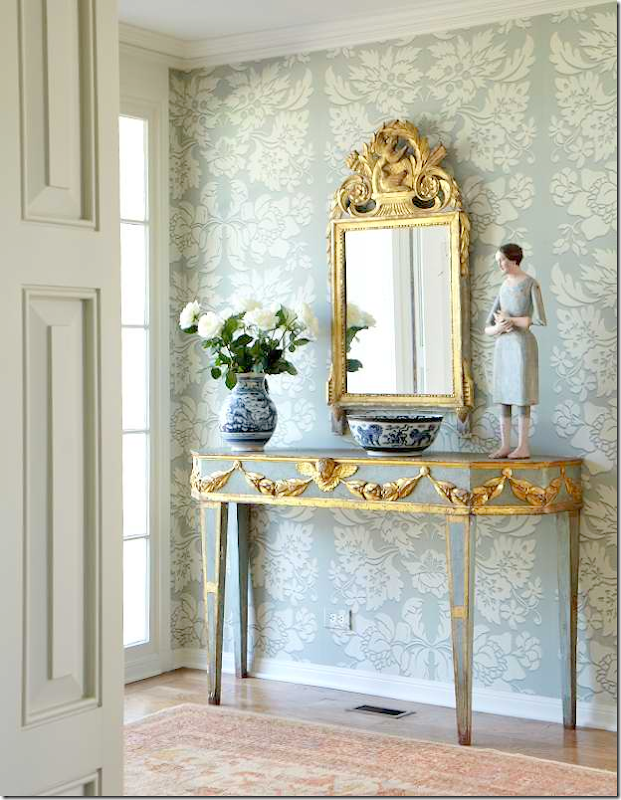
I think this might be how the entry actually looks. I kind of hope so because that console table is one of my favorites ever. It’s gorgeous.
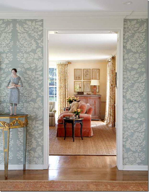
And in another photograph from her web site – you can see the console is here too – looking into the living room. Hold on – we’ll get there!
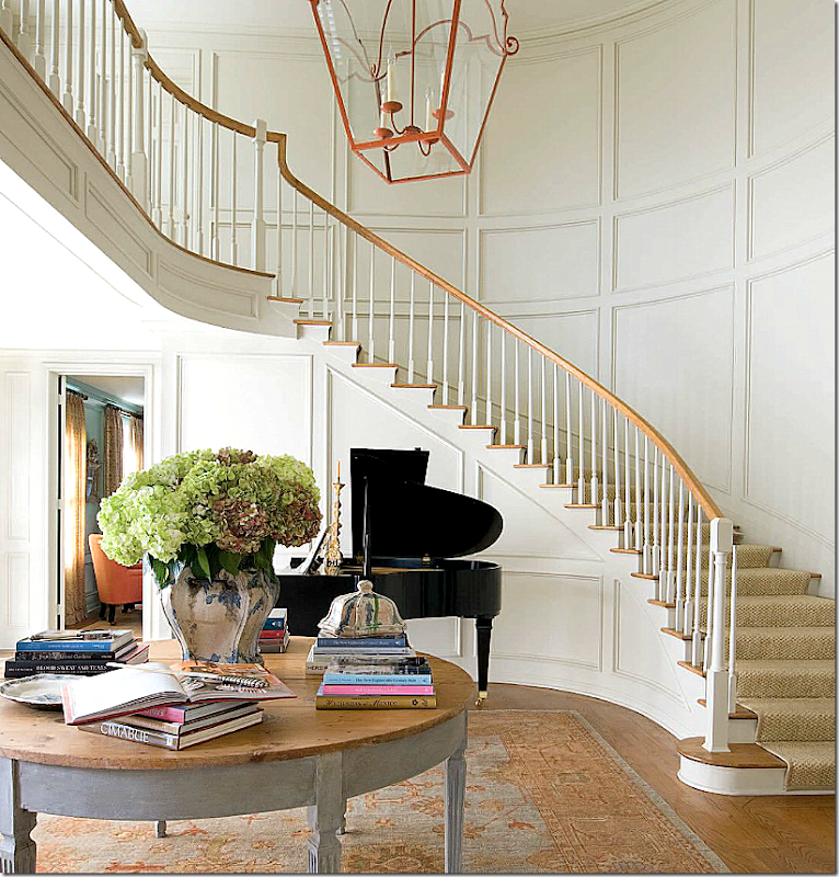
The wallpapered entry leads to a larger stair hall with another antique Oushak rug that picks up the two color tones that run throughout the house – the aqua blues and the peachy oranges.
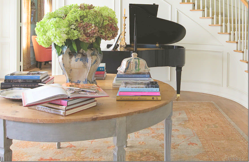
An antique painted Swedish demilune is used as a library table. I love seeing what she is reading these days! The study is seen through the door on the left.
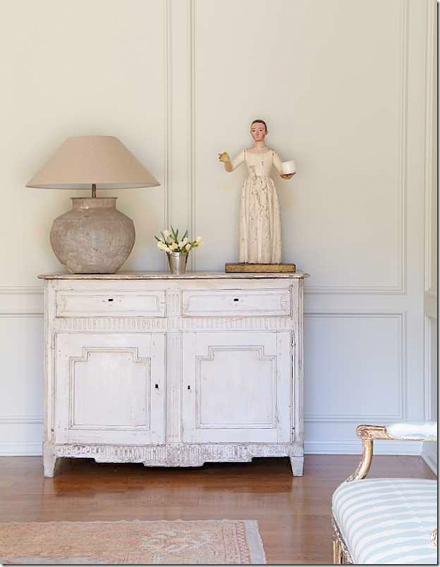
Along one wall of the stair hall is a painted antique with a Santos. Here – you can see where the bench is usually along this wall. This is from Glasser’s web site.
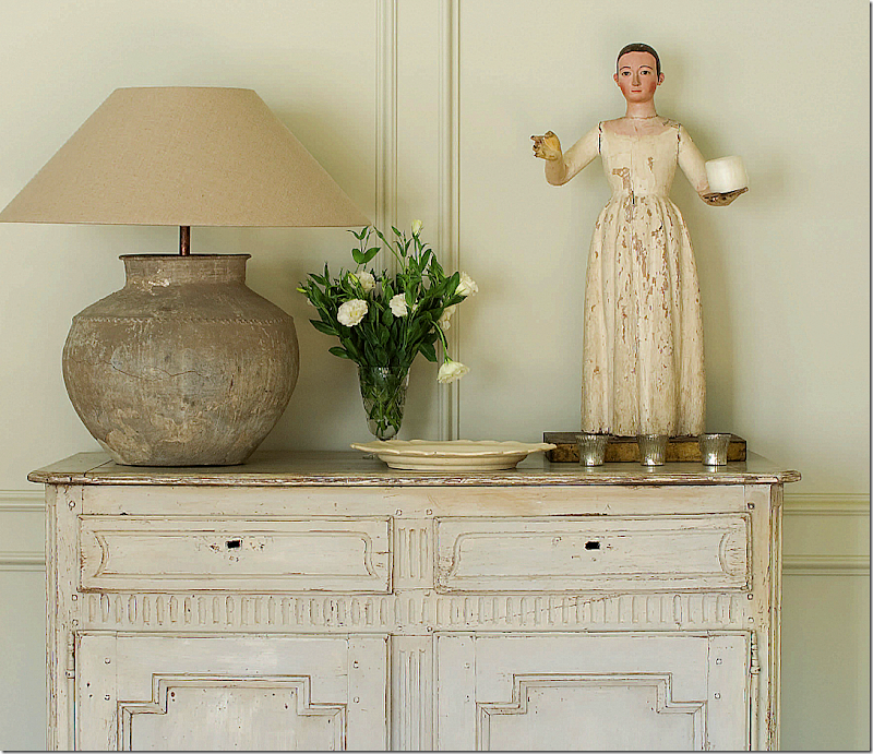
And a close up of her tablescapes – simple, not cluttered. That lamp!!
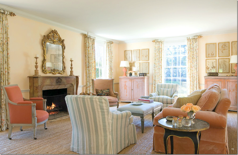
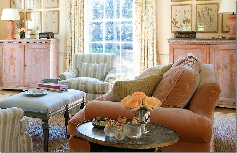
Off the entry hall is the living room – warm and cozy in persimmon and aqua. I remember the first time I saw this on her web site, I gasped! I really thought she was going to go in the monochrome direction – all grays and whites – and this just made my eyes pop. It is so gorgeous. Flanking the window are two Swedish red cabinets symmetrically sited with herbiers and matching lamps. The walls are soft yellowish peach. Instead of the expected seagrass (after all Carol brought seagrass to Houston!) – is a more chunky textured rug.
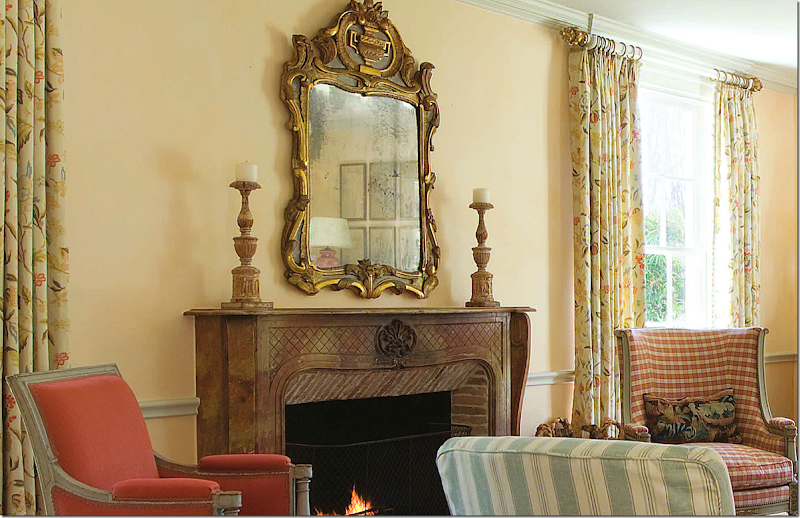
Another beautiful mirror. This house is loaded with mirrors – one prettier than the next. I love the aqua and white striped slipped chair next to the brighter oranges. Elegant candlesticks on the mantel – and nothing else.
And that velvet sofa!!!!! LOVE.
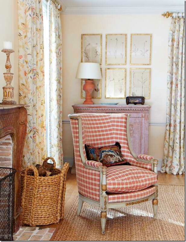
From her web site – a close up of the beautiful painted French antique chair in checks. OK – everything HERE is an antique! No need to keep saying it.
And this – OMG! – a tufted settee in a linen stripe with beautiful pillows, sitting under more herbiers. Who needs oil paintings when you have mirrors and herbiers?
Not shown in the magazine is the library with the same colors – aqua and persimmon.
Wish we could see more – those chairs!!!!! That mirror!!! That rug!!! That desk!!!
The dining room is all aqua – painted walls and checked fabric. Matching mirrors, demi lunes and candle lit chandeliers.
In the mirror you can see a cabinet filled with blue and white pieces. Wish we could see more. Love those chairs.
A close up of the mirrors and the linen print at the windows. Love the touch of green in the vases.
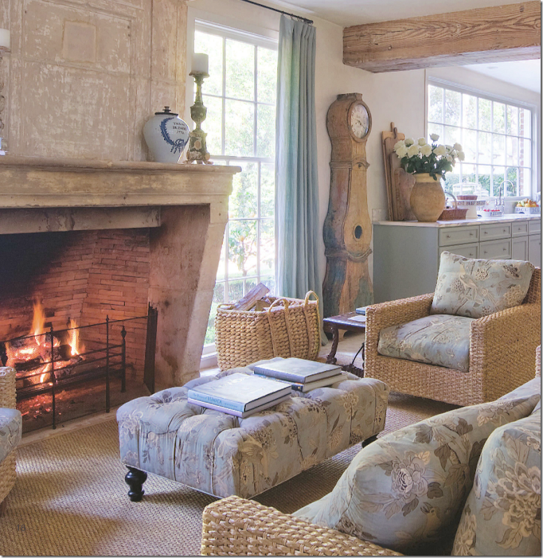
The kitchen/sitting area is reminiscent of Carol’s former house, but I have to say – I like this better!! Never thought I would say that!! That mantel! The floors! This really does look so French.
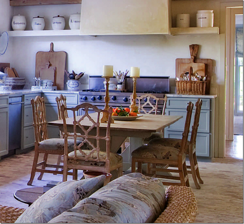
Love the table with the painted base. And I LOVE the chairs!!!
Looking towards the sitting area with the fabulous cabinet and lamps.
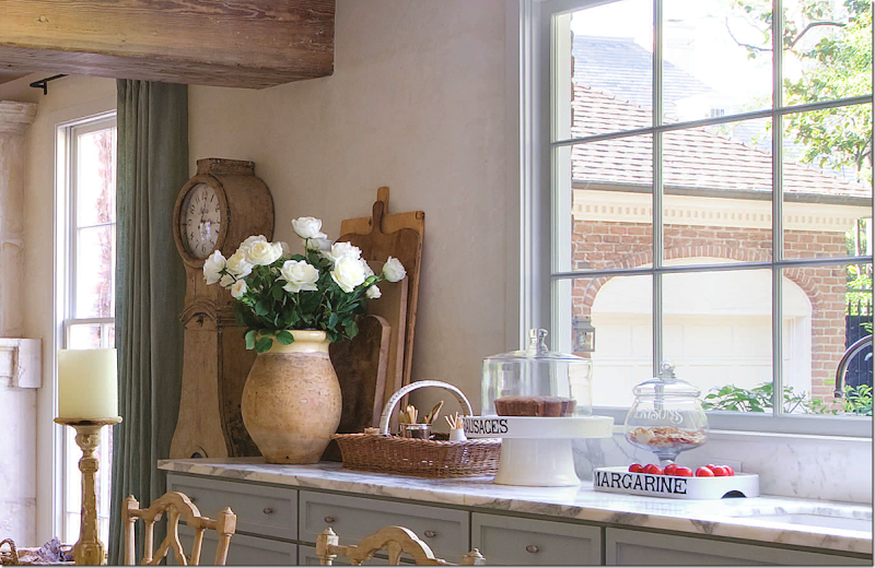
No upper cabinets – those were removed and a large window was installed instead. White marble countertops. I love that the kitchen isn’t too faux. Some of the kitchens today are just too much. This strikes a perfect balance. And she has the perfect confit pot for roses, of course.
And looking towards the range and stucco hood. Through the door you can glimpse the dining room.
Carol used an aqua Bennison print, Songbird, on all her pieces here. Love this fabric so much. Of course it’s Bennison – she was one of the first in Houston to use it!
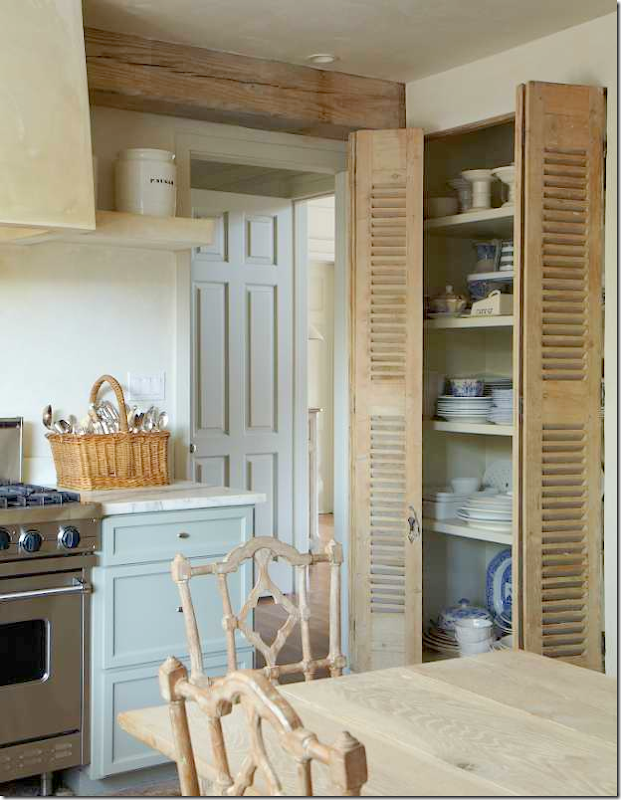
Antique doors lead to the pantry where she keeps her dishes – since the upper cabinets are missing. Great idea. I love how all the wood tones are in the same family in this room. And through the same door where the dining room is – you can glimpse the stair hall.
The family room is casual in white slips and blues. Across from the sofa is a large console filled with a few more Santos. Outside is the large back yard. A ceiling fan???? This is for her husband, I’m positive. This is Houston. You can’t imagine how hot it gets here.
Close up of her tablescapes – filled with books and small Santos.
Notice how tailored these slips are. You wouldn’t know they were slips if they weren’t in white.
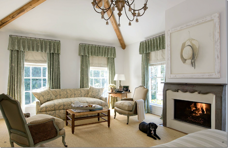
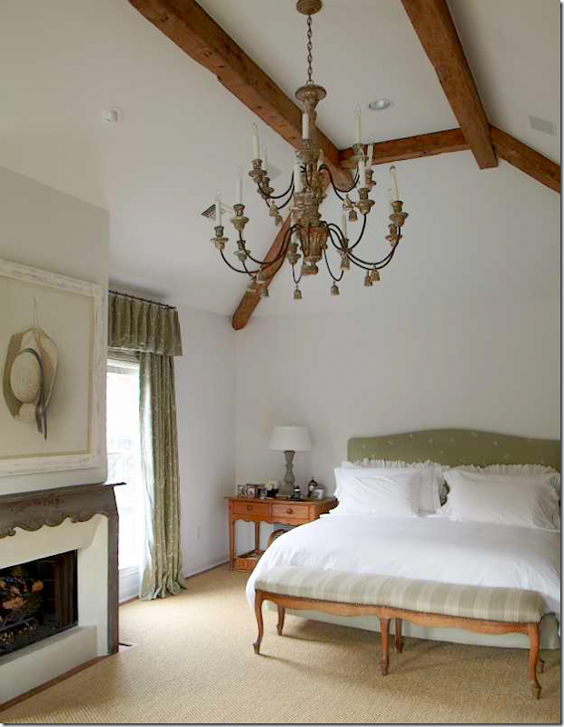
Carol’s bedroom is a big change from her last one. That bedroom was all one Bennison fabric – Roses – but this time she went for a collection of different fabrics in greens and creams.
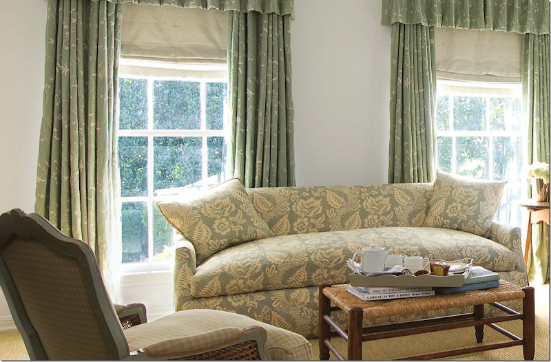
I love the sofa fabric – mixed with a yellow and cream check.
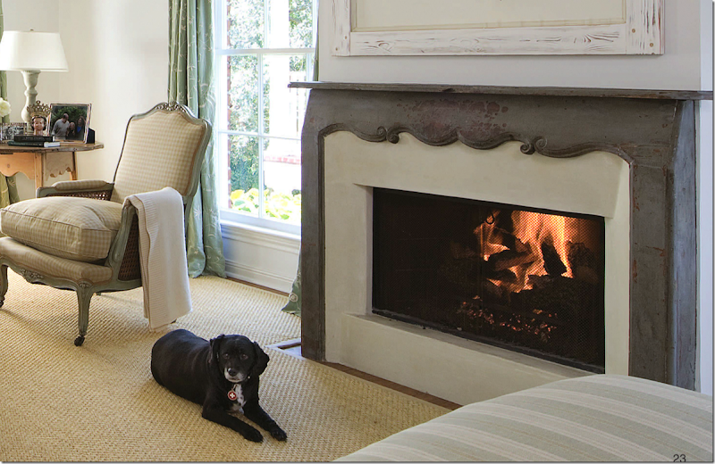
Close up of the mantel – so cute! Cute dog too! I recognize these chairs from the last house. I really don’t recognize a lot of furniture though. It’s a much larger house, so there are a lot of new pieces – many Swedish pieces mixed in with her English and French antiques.
From her web site – you can see her bed, dressed in white. That chandelier is so pretty and I love the French bench in stripes.
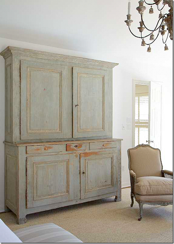
Also from her web site – the master bedroom with the Swedish? painted armoire. Might be French – not sure.
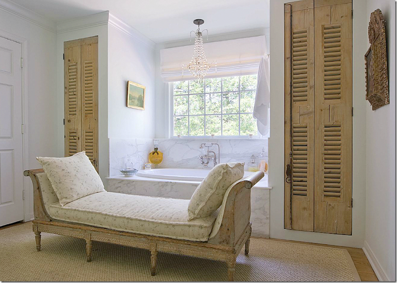
And finally, her master bath with a beautiful day bed in linen. Marble tub and crystal chandelier. That might be first crystal chandy I’ve seen her do in her own house? More antique shutter doors add warmth, as does the seagrass rug. Looks more like a room than a bathroom.
What can I say? I’m in love! I wish she would write a book showing all her work. The houses are rarely published and it would be such a treat if she would. Come on Carol! Please????
Of course there is much more to this issue than Carol Glasser’s house.
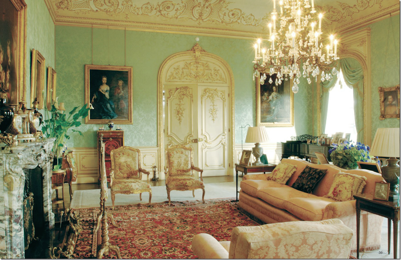
There’s a wonderful story on the house where Downton Abbey is filmed – with luscious photographs of the rooms we all love. Can’t wait for Season Four!! But, poor Matthew. I’m going to miss him.
And there’s a photoshoot of Jill Brown’s wonderful house. She’s the owner of BROWN in Houston, THE place to buy lighting fixtures and all kinds of antiques. HERE.
And there’s this story about a palace in Venice – redone with a contemporary twist!
Great stories and beautiful advertisements (my favorite part of the magazine!)
To read the latest Antique Shops and Designers – go HERE.
As always, a huge thank you to the staff at AS&D for letting me show your beautiful photographs.

