I can't do a series on beach houses without discussing my favorite beach house ever (or my favorite movie house ever, because they are both the same) - the house from the movie "Something's Gotta Give." For those of you who haven't heard of this movie because you have been living on the moon for the past five years or you have been kidnapped by the Taliban and are wearing a burka - the movie stars Diane Keaton and Jack Nicholson and a Hamptons house where most of the action takes place. In fact, the house should take top billing over Keaton and Nicholson. Years later, it's not the script that stands out, it's the Hamptons house itself. Never before has any movie house created such adulation. Countless numbers of kitchens were built copying the movie's kitchen. Scores of newspaper and magazine articles were written about the house. Google the subject and copycat house after copycat house pops up on the screen. Architectural Digest states that their article on the Hamptons house is their subscribers' all-time favorite piece. A Victorian Hagan cover for Elle Decor that looks very similar to the movie house was one of their best sellers ever. And for me, personally, the biggest Google Search topic that lands strangers onto my blog is "Something's Gotta Give" (and for those of you who've never been to my blog before today but came here to read about this house after a Google search - welcome!).
The first time I ever heard about the house was the night the movie premiered. A client of mine called me breathless, "go see this movie, I want my house to look EXACTLY like the house in the movie I just saw!" Little did I realize that night how many other people throughout the nation would feel exactly the same. Periodically I get questions from bloggers in my email about the house which was designed by set decorator Beth Rubino: " I want my house to look just like this - how would you do that?" or this, "Do you know where I can get a blue and white striped rug like that one?" and even this "You said the dining room chair fabric is Bennison, but you are wrong! It's Lee Jofa!" Yes, it's true, I confess right here for all to snicker, I DID once say it was a Bennison fabric, but I've been corrected by an over zealous fanatic. The dining room chair fabric is Lee Jofa - a gorgeous linen. And I should know, I ordered the samples for a potential client who, of course, loved the house. And yes, I have written about this house on my blog a few times before, quite a few times in fact. But, I'm not the only blogger who's written about the house ad nauseam, Linda Merrill of Surroundings has too. She even sourced many pieces of the furniture in the house. To read all of Linda's fabulous posts on the Something's Gotta Give house go here!
So what's left to discuss about the Something's Gotta Give house? I don't know, but I'll figure out SOMETHING to talk about. Like I said, I can't do a series about beach houses and not talk about it!!! But first, a disclaimer, although the Something's Gotta Give house is located on the beach in the Hamptons, of course, it is not a beach house in the typical sense of the label. Yes, it has colors taken from the ocean, the blues of the water, the creams of the sand, the tans of the pebbles - and yes, the home is warm and inviting, cozy and friendly like a beach house should be, it is something else too. Elegant. Elegant in a way that says, don't sit around here all day in your bathing suit in the middle of the living room. And elegant in the way that some care is needed to keep the house up other than just a light cleaning every summer season or so like you do in a beach house. This is a house that actually could be located anywhere, not just at the water. And perhaps that is part of it's universal appeal for people around the country, not just for those that do live on the ocean.
So if you are one of those who loves this house and is thinking about moving or redecorating and want to incorporate the look of this house into your own, or even if you are just interested in knowing how, read on. There are steps you can take to copy the look of this house, this style, and make it your own. First, there are several design elements here that are essential to replicate the look. What are the most important elements of this design? What would you have to have in your space to get the feeling, the look of the Hamptons House?
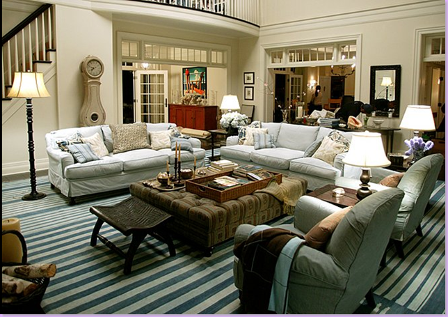
Contrast is the number one key design element in the house. The walls are light - not quite white, but with just a hint of warmth in the shade. The light walls contrast with the very dark hardwood floors. Light vs dark is vital to this design. Take this design element further: the dark wood furniture contrast with the light colored upholstered furniture. The only dark upholstered piece is the ottoman/coffee table which anchors the large seating group. More contrast: the dark wicker furniture against it's light striped upholstery fabric. More contrast: the dark hardwood floor against the light blue and white rug. More contrast: the white balusters against the dark stair rails. More contrast: dark lamp bases against white shades. It's all about contrast in the Hamptons House: light vs. dark.
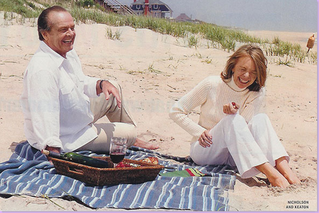
The second most important element in the design, after contrast, is the blue and white rug. Nothing quite says Something's Gotta Give more than the blue and white striped rug. Again, this is such an important element that at the beach scene pictured above, the rug is represented by a blue and white striped towel. It can't be stressed enough the importance of the rug in the design. To duplicate this look in your space, there would have to be a blue and white dhurri - otherwise, it would just be a pretty room. The rug is key to the design. So much so, that the owners of the Aspen Rug Company have profited greatly by the success of this movie. Before the movies' release, they stocked dhurris, but they did not carry any blue and white striped ones. After receiving several hundred enquiries, they fortuitously made up about 60 Something's Gotta Give rugs and took to the decor message boards to advertise this fact. Today, they have several different versions of the rugs available and The Aspen Rug Company remains the best place to buy the Something's Gotta Give dhurri. A design element that spurns on such business is obviously a very important element.
You now know the two most important, basic design elements of the house #1 contrast: dark floors (which can be either hardwoods or slate or even painted concrete - the important element would be dark brown or black floor) with light, flat wall paint, and #2 the blue and white rug, so what comes next? The architecture plays an important role, though it is not always possible to recreate it. But, if you were building a house with the Hamptons House style as your goal, what architectural elements should be included? First would be french doors with true wood divided panes. These doors are prominent in the design. And above each french door, a transom should be included. In the living room, notice how the transoms play a role in dividing the space between rooms. Notice also, how even where there are no doors present, there are transoms between each room. The row of transoms between the rooms becomes an important design element that is very linear in quality, and this quality is repeated in the balusters next to the transoms and in the balcony above the transoms.
Another architectural element that should be faithfully copied is the staircase and the balcony railings. Wood, not iron should be used. The balusters should be white, the risers white, and the handrails, along with the treads, should be dark wood. Anything else will comprise the architectural design and would take the house off on a totally different look.
What about the furnishings? How to emulate the furnishing and get the effect of the Hamptons House? Again, the important element is contrast. In the living room, the furniture is all dark wood. Antiques really aren't necessary in this design. The tables can or can not be antiques and the effect would be the same, though of course, the more well made the furniture, the more interesting. The lamps have dark bases with light shades. The couches and chairs take center stage in this living room. The upholstery should be cushy, down filled, and slipcovered, not overscaled, but comfortably sized. And note, though many people believe the slipcovers are white, they are actually light blue with darker blue piping. Personally, I would prefer white slipcovers in here and would suggest you do that. The director felt that Erica would not have chosen white because it was the too common or safe choice. Either light blue or white will work in the design. The important detail is that the sofas be slipcovered, that the wood legs be exposed, that the look is casual not stuffy, comfortable not stiff. The slipcovers should be cotton, denim or linen - nothing else would be acceptable to achieve this look. The sofas have classic English saddle arms, which is a softer profile than a large rolled arm. In the center, the large, square, tufted, and dark ottoman could be substituted with a square, wood coffeetable and the effect would be same.
And one very important element is looming over it all: the Swedish Mora clock with its sensuous curves that contrasts with all the vertical lines of the transoms and the stair rails. Though not absolutely essential to the design, the Mora clock is certainly almost as famous as the blue and white dhurri in the Hamptons House.
This picture above shows more important design details to consider: all the windows have curtains that are the color of the walls. The curtains appear to be either linen or cotton or even a sheer wool, but what's important is that the fabric be matte with no sheen - which means no silk! A simple dark, wood or metal rod with small rings was used throughout the house. Any other drapery treatment would distract. The curtains should be duplicated as closely as possibly. After the curtains, bookcases filled with books play an important role. Lots and lots of books, not knickknacks, in the shelves, add visual weight and help anchor the room. Books are warm and add to the coziness of the design. Next, the dark wicker chairs with their striped fabric add more texture and warmth to the design. When recreating the look of the house, try to add some pieces of dark wicker and an odd basket or two. If you look around the room, though not cluttered per se, the room is inviting and welcoming and the accessories add to this feeling. Books are piled everywhere, on every table top and underneath them too. Candles and candlesticks are scattered about as are shells. There are soft throws over the chair arms and cushy pillows everywhere - all soft and cozy. There's not one accessory that stands out, not one "look at me" oversized urn or bust, but instead there's a layering of smaller accessories that build on each other and together, as a whole, they add to the appeal of the room.
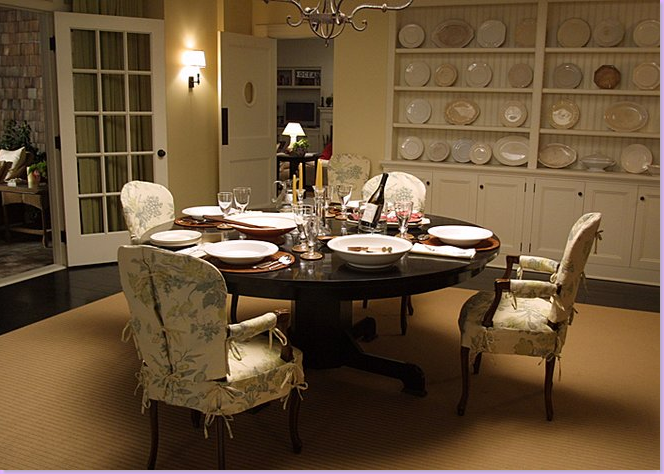
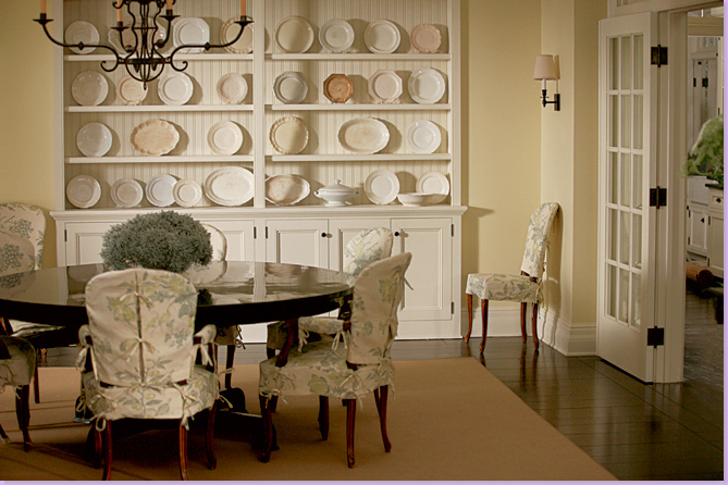
Moving into the dining room, the look is softer, the colors more muted, the contrasts less important than in the living room. This large room has a seagrass or sisal rug covering almost the entire floor. This takes away from the important contrast element found in other rooms. The color of the natural rug becomes an important shade in this room. In the center is a large 70" round table. Now, of course a rectangular table could be substituted, but the roundness of this table, with no hard, pointed edges further adds to the softness and femininity of the room. The stand outs here are the slipcovered chairs. In order to copy this design, the chairs should be remain as they are here. The dark wood arm chairs have a large, rounded back, which again, adds to the soft, flowing feeling of the room. And most important to recreate here are the slipcovers with their dressmaker details. The slips should be made as closely to these as possible, with the arm slips and the skirts, and with fabric ties holding them in place. The fabric can be substituted, but the Lee Jofa fabric used is perfect. Linen would be the only acceptable material for its propensity to wrinkle. And the fabric's muted colors work so wonderfully in here to continue the muted tones of the ironstone collection. This plate collection is the next important element in the dining room to include.
Here the plate collection is housed in a built in with a beadboard back, but a freestanding cream painted hutch would be acceptable. If a hutch was substituted, then a wainscot of beadboard could be added to the room to bring in that important texture here. What is so wonderful about the collection of plates is that they are not all white or cream but rather a range of tones from tan to white. Although, a collection of just one tone would be acceptable, this mixture is just beautiful. In the dining room, you can see one other element that is repeated throughout the house: the iron sconce. The single candle with its dark iron base and light shade again plays up the constant theme of high contrast. A large iron chandelier finishes off the design elements in this room. With movie goers, many people state the dining room is one of their favorite rooms in the house, which is easy to see, with it's soft, ethereal, atmosphere.
But, it's the Hamptons House kitchen that has garned the most buzz, the most adulation. The movie is responsible for starting a trend that swept through the states: the SGG kitchen. People freeze frame the DVD at the kitchen scene and bring the DVD into meetings with architects and interior designers to show them exactly what they want. Newspaper articles have been written about people and their SGG kitchens.
But what exactly is it that makes it so appealing? At the heart of the kitchen is it's country appeal. This is not a slick, shiny kitchen with highly carved, fancy cabinets. It's a kitchen that might be found in another era, with the emphasis on might. How can you recreate the kitchen? Again, it's the contrast that's important, the contrast between the dark floors, the white cabinets, the black, soapstone countertops (though in the actual movie, painted wood substituted for soapstone), and white subway tiles. Large, commercial sized stainless appliances were used. The upper cabinets have glass doors and are supported by large brackets and the bottom cabinets have bracketed feet. The hardware used is the old fashioned bin type pulls and most importantly the hinges are visible! No longer are hidden hinges an asset. And there are not one, but two large islands in the design. Pendant lights over the counters and an oversized, round clock are the finishing touches.
To recreate the kitchen is really not hard. Soapstone can be substituted with honed black granite or even tile, the important detail is that the countertops have a black, dull finish. Cabinets must be white and the floor must be dark. The appliances can only be stainless, but they don't have to be so big or so industrial feeling. Upper cabinets should have glass insets, but it isn't necessary to all be that way. The white subway tile could be substituted with another shape, the important element would be white and shiny. Not every cabinet has to be bracketed underneath - one or two would be sufficient. And lastly, one large island would certainly be enough instead of two.
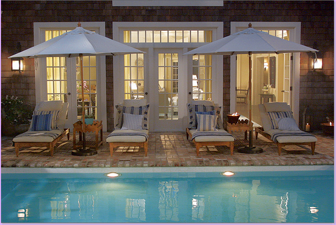
This exterior shot further shows the important design elements of the Hamptons House. The wood shingles, the white trim work, the paned French doors with the important transoms above. The furniture, as inside, is inviting and cozy - the lounges almost look like beds piled high with cushions and pillows in, of course, the blue and white stripe design element that is so vital to the look. Add to the stripes, the cream colored market umbrellas and the color scheme of the living room is carried outside to the patio. Lastly, the accessories become important: lanterns, both electric and candlelit are used and scalloped edged side tables add layered details.
There are very few bedroom shots from the movie - this one is probably the best. Again, we have the cream walls, the dark hardwoods, the seagrass - all easily recreated. A plain upholstered headboard in a khaki denim fabric is used as is a white scalloped mattelese bedspread and white hotel sheets. Crystals lamps with white shades add to the layering. One side table is a round mirrored Oly Studio table, the other wood, with candles of course.

This shot taken by Linda Merrill of Surroundings from the actual movie shows the fireplace with the white wood mantle and more bookcases. The side chair and ottoman is Hanna from Oly Studio with a Rose Tarlow side table. The bedroom is muted and soft - more in keeping with the dining room than the living room or kitchen.
And Erica at her desk in her bedroom. As the director says - why wouldn't she have her desk in her bedroom? Nothing else is going on in there! The desk is a wood classic and antique looking. Again, lots of flowers and again, the linen drapes that blend with the paint color.
So, now that you have the recipe for how to emulate the design elements of the movie, let's look at people who have already tried to copy certain rooms from the Hamptons House. Are they successful? Did they bring in their own personalities to the rooms? Are the rooms better or worse for their personal input?
This kitchen from New Old House Magazine proclaims itself to be a reproduction of the SGG kitchen and it is quite a near perfect one at that. And gorgeous to boot! What elements did they copy? Dark hardwoods, white cabinets, black countertops, glass front upper cabinets, upper brackets and lower footed details, white subway tiles, hinges and bin pull hardware, stainless appliances, and a large center island with pendants. The owners added their own touches: beadboard to the built in hutch, plate rack over the stove hood, and they painted the walls a barely there blue. This kitchen is a great Hamptons House reproduction. While I would have used another barstool, probably a slipcovered chair in a white linen with scalloped details, the chair choice is all theirs. Great job, A+
Correction: this kitchen actually belongs with the house shown below in Maine titled "Something Gotta Live" - I'll add it to the house below, also.
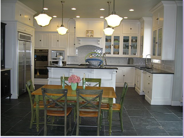
This kitchen was taken off of a web photo sharing site. This homeowner proudly proclaims this is her Something's Gotta Give kitchen. How does it rate? She gets good marks for high contrast elements - although her floors are black slate and not hardwoods, the proper contrast is there. More important contrasts: white cabinets, black countertops with shiny black granite - although the shiny black granite should have honed. With the shiny white subway tile, there's no contrast between those two surfaces texturally. Stainless appliances, pendant lighting (though I wouldn't have put two more pendants over the dining table,) bin pulls, glass cabinets. I don't see any brackets except under the hood and there's just a cooktop range which mean you have to add built in ovens which adds to an endless parade of appliances. The dining room table is all wrong for the room in every way - the light colored wood, the green painted wood, these two colors are distracting and the size of the table seems too small for the space. Grade: B
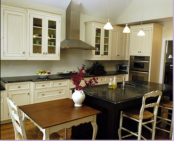
This copycat Something's Gotta Give kitchen garnered a lot of national press, though I think it really misses the mark compared with the two others we've just seen. The shiny marble is awful. The island is painted black which is really a departure. Not sure if that's a table or another island to the left, but that has nothing to do with the look of the SGG kitchen. The floors are too light to provide the important contrast. The hardware is a miss, as are the appliances. There are pendant lights and glass fronted cabinets, but the cabinets don't have that country farm feeling to them. No brackets on top or bottom cabinets. While this is a pretty kitchen itself, it's a failure as an imitator. Grade: F (I'm a strict teacher!)
This kitchen bills itself as a copy of the SGG kitchen. Nice contrast between the hardwoods and the cabinets. Nice hardware. Black countertops, but they look shiny. No brackets on bottom cabinets, but they are there on the top stove hood. No pendant lights, but there is a clock. Hinges and bin pull hardware. White appliances!!! Oh no!!!!! The bar stools are really wrong. Nice ceiling. Overall pretty kitchen, but really doesn't have the "look." Grade: C-
House Beautiful touts this as a Something's Gotta Give kitchen in Las Vegas, of all places! Good start: matte countertops, bin pull hardware but no visible hinges, stainless steel range and hood - a real plus!, large island, dark hardwoods (but could be darker), white subway tiles, pendant lights, glass fronted cabinets with brackets. Personally I don't care for the blinds, but overall this is a very faithful reproduction and I can see Diane and Jack cooking pancakes in this kitchen in the middle of the night. Grade: A-
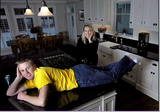
Another kitchen that received national press for being a Something's Gotta Give recreation. The elements: dark hardwoods, black countertops, although they are too shiny and dressy to appear country at all, bin pulls and exposed hinges hardware, pendant lights (again too contemporary), no glass doors or top brackets. Not sure about the appliances. Very pretty kitchen, but there is too much of a contemporary element to make this authentic. The owner should have gone with either one style and stuck with it, instead she has a mish mash. Grade: D.
How about owners that tried to copy the ENTIRE Something's Gotta Give house? Yes! This couple (probably just the wife, I'd be willing to bet) loved the Hamptons House so much, they built their own home and furnished it in what they think is an exact copy:
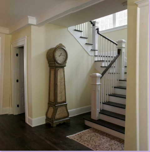
The entry hall: let's judge the elements, the contrast is good - very dark hardwoods, light creamy walls. Off to a good start. The stairway is right on the money. White risers and balusters, dark treads and handrails. They even tried to copy the Mora clock! While this is pretty for this couple, it's not an antique and it's not a Mora clock. I wonder why they didn't get the authentic Mora clock - there are plenty of reproductions out on the market. Grade B+
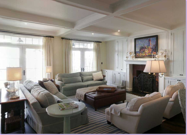
The living room - wow! Pretty good actually, though of course I have lots of comments. The sofas are the right blue and even piped, but NO slipcovers which really ruins it. And the fabric looks like ultrasuede to me. Didn't I tell you it had to be cotton, or linen???? ONLY??? These sofas are really, really ugly. I hate those lumbar pillows - they don't have the casual feel of the pillows in the original room. And what's with those arm protectors from the 50's? The white side table is all wrong - too high and too white. The square dark ottoman is nice as is the rug which is extremely important in recreating the look. Also nice - the windows with the transoms and the light curtains, both extremely important elements. Even the art work is an attempt to emulate the original SGG home. The lamps though are clear and their shades are way too small. All in all, it's very obvious that a sincere attempt to copy the house was made. It's attractive, but the sofas and chairs are cheap looking and totally miss the mark, as does the side table. Grade C.
A close up. Those sofas, are sooo fuggggglllly. The ultra suede is just awful. A nice linen or cotton slipcover would have been so much better - these just look old fashioned. The lumbars add to the horribleness. Compare the stiff ultra suede upholstered sofa with the original, cotton, down cushioned slipcovered one with all the loose pillows from the movie, below. No comparison. Also note, there are no transoms dividing the room - wouldn't transoms in the hallway have been such a great addition?
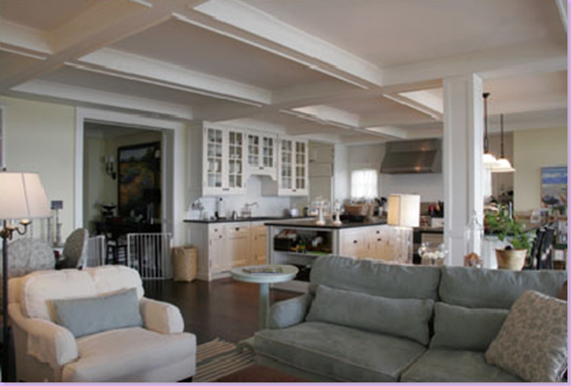
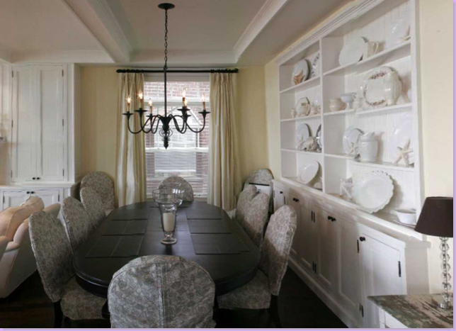
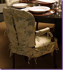
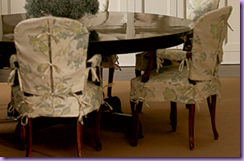
The dining room: again, a nice attempt. The built in with the beadboard is very authentic, even the way they placed the white dishes is nice. But the table is too large and it is cramped here - you don't get that nice open feel. Too many chairs for the space. I see they tried to duplicate the slipcovers - but they did it all wrong - there are no dressmaker details, and the fabric looks cheap. Compare this chair to the original chairs below, with their charming arm detailing, the dressmaker details, the closure ties, the beautiful printed linen fabric - no comparison. This really shows the importance of quality fabric and expert workmanship. Grade: C-
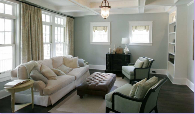
The formal living room - the sofa is somewhat better. Again, nice windows and curtains and hardware (though what are those things in the small windows - awful!!?), nice ottoman, chairs, but it's just all so boring. There's no layering, no tables except for one, the chairs are too contemporary for the rest of the room, there are no accessories, no lamps, the bookcases look bare, even the rug isn't enough - it's way too small. The room needs more. Like this: OK, I just wanted and excuse to the get the real room back in here! Grade: C-
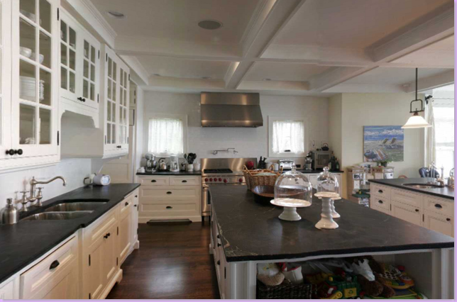
The kitchen: good contrast - dark hardwoods, white cabinets, soapstone counters (the first one to have the real thing!) brackets on bottom and top cabinets, glass fronted cabinets, subway tiles, exposed hinges and bin pull hardware, large island, stainless appliances with an actual Wolf stove, pendant lights - all in all a wonderful copy. But boy - how cluttered! Instead of cookbooks in the island shelves, it looks like they store shoes there! And the back counter has every small appliance out for display. Overall though, it's perfect. A+
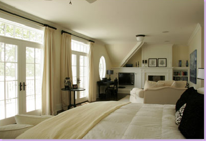
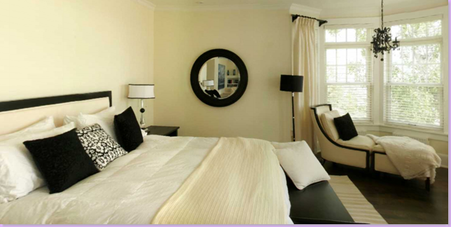
The bedroom is just alright. It seems very creamy, almost yellowy. The headboard is high contrast where as in Erica's bedroom, it's not. Too many harsh black accents. This misses the softness of the SGG bedroom completely. Not bad, but nothing like the original bedroom. Grade: C-
Below, the original bedroom with its off white walls and off white furniture and books. The copied bedroom is missing the quiet elegance of the real SGG room.

Another SGG House: This house bel0w was designed by James Radin who is Nancy Meyer's (the director and producer of SGG) interior designer. Meyers asked Radin to help on the movie with the set design. Here is a house he designed that was published in House Beautiful where Radin said this was his version of the SGG house. Although it is only an interpretation, it's interesting to see his work:
A much more restrained blue and white rug. Much more elegant than the original SGG home. Much more sparse. Very nice, very pretty but really not much like the original home at all.
The bedroom has much more of the feel of the SGG house than the living room. The dark hardwoods are just visible under the creamy area rug which creates a nice contrast. Though not an upholstered bed per se, this is much prettier than the original SGG bed and one that I would chose also. Nice upholstered chairs, though not sure how they would keep these from getting dirty without slips. Perhaps they do have slips made for them in real life.
The kitchen: all the correct design elements except one: the black countertops are white carrara marble! And this is exactly how I love it! I adore this kitchen!!!! Except for that bank of appliances on the right. Fabulous choice of bar stools, couldn't get much better.
Interior designer T. Keller Donovan told House Beautiful he designed this room for a client who loved the decor in Something's Gotta Give. Not exactly what the room looked like at all. Poor woman. I hope she wasn't disappointed, I would have been.
In this magazine based out of Maine, we have another interpretation of the Something's Gotta Give house. Nice contrast between floors and walls, but where is the striped rug??????? Forget it! With the absence of such an important design element, there's no hope to recreate the look. The only resemblance to the original living room is a slipcovered blue sofa - and a messy sofa at that with huge rolled arms. The original sofa had neat, English saddle arms. Nice coffee table, but the bookshelves are way too sparse. The slipper chairs seem out of place and scale here. No curtains and no transoms. Again, a transom between the two rooms would have been nice. Grade: D
This is just Shabby Chic, not the low keyed elegance of Something's Gotta Give.
The dining room: the table is too light, the chairs are not slipcovered, they are too contemporary, the built in shelf is nice even with the yellow plates. The floors are dark and the contrast with the walls is correct. Grade: C
Correction: The kitchen, which I inadvertently pictured in a story above from the magazine The New Old House, should have been shown with the entire house from the Maine Home and Design Magazine. My mistake! The kitchen, as I stated before, is an excellent reproduction of the SGG kitchen. Every element is correct and beautiful, especially since the owners added their own design features. Grade A+
Here's the rug! Sort of! Green and white striped rug in the bedroom. A very very Shabby Chic bedroom. Grade: D-

The editor of Elle Decor told Linda Merrill of Surroundings that this Victoria Hagan designed cover in 2002 was their biggest seller EVER. It is rumored that the set decorators for Something's Gotta Give toured this house and based the Hamptons House on this home. True? Maybe. It certainly has the elements. The room resembles the original SGG house somewhat with it's high ceilings and balcony overlooking it. The striped rug, of course is a definite similarity. The book cases are similar, just the over all feel of the room is very similar.
Another view of the inspiration house: the contrast is much sharper in this house. The white furniture and white walls and the blue and white rug are much crisper and more dramatic than in the SGG home. Yes, I can understand how this was a jumping off point for the set decorators. Do you see it?
Another view of the great room taken from the balcony.
Here's another house by Hagan that could have been an inspiration too. In fact, this one resembles the SGG more to me than the previous one! Since this house was published two years after the movie premiered, perhaps Hagan herself was also influenced by the SGG movie? Anything's possible. This home is located on Nantucket.
Imagine this room with the blue and white striped rug. If this house were in a movie, would Americans have gone as crazy over this house as the Something's Gotta Give house?
One more view. Imagine the walls and curtains with a just a little more color.
The stairs are correct!
The kitchen is a good match in every element. Now THESE are proper bar stools! I love these pendant lights and the plank wood ceiling. Just beautiful.
If you have made it to the end, congratulations! I've hoped you've enjoyed this in-depth look at the Something's Gotta Give house! Be sure to visit Linda Merrill for her extensive writings on the house. I swear, this is the last time I will write about the house, that is until I find another 'look alike." OK, I am exhausted!!




I love the house as everyone, but do not like the idea of copie it.
ReplyDeleteInspiration is great but copies usually ends as cheaps versions.
Wow, what a post!! Yes, I've been designing that type of kitchen since the movie came out. You are absolutely right. It changed a trend in kitchen design from very formal (think Enkeboll moldings) to a relaxed traditional feeling, almost what used to be considered more Shaker inspired, but, with just a few, simple, moldings, sort of emerging as a redefinition of traditional...and always white. The kitchen desperately needed to relax, in my opinion. The previous popular look was easily contrived in its execution.
ReplyDeleteGreat post!
WHAT a complete post,so wonderful...move over Vernanda,HB,SA,et al, there's a new kid in town,and she doesn't require sleep! You keep raising the bar on blogging (we need to redefine the word for you!) Lovin'Joni ....
ReplyDeleteWhew--another outstanding post!! I loved SGG the movie and thought Erica's house was beautiful. Thanks for pointing out details. I love looking at all of these rooms through your eyes.
ReplyDeleteYou must be exhausted. That was incredible. I read some where that the house was actually a 'set' and just the outside shots were taken of someone's beach house. Is it true?
ReplyDeleteI've learned so much from this post. WOW! Quite an "in depth" study, Mrs. Joni. YOU get an A++!!!
ReplyDeleteJoni, seriously when do you have the time to do all this? Thank God you do, I love reading every post and seeing every picture (one of the reasons why I love your blog the most is the amount of pictures). I, like everyone else saw this movie and declared it to be my beach house, when I get one, my husband got a little scared. Once again you nail it with the right and wrong (maybe not wrong just not right) of trying to copy this house. I think all of them are great and hope the owners are enjoying living in such lovely homes. Thank you 100x over. A+++ for you.
ReplyDeleteGreat post! I am another who fell in love with that home. Another movie home that I love is the one in "What Lies Beneath".
ReplyDeleteI agree that the copy house just doesn't have the same feeling at all. It looks forced and it's just not the owner's natural style.
Joni = This is fantastic. I'm meeting with an architect in August about building our retirement home an dI'm definitely going to go in this direction. The most outstanding feature for me, are the transom windows. I love, love, love transoms. The ones I remember from the houses of my childhood were are all functional, meaning they opened (down) and let the air flow. The transoms windows in Abraham Lincoln's home in Springfield, Illinois have unusual transoms that open outwards.
ReplyDeleteThanks so much for this very inspiring post.
- Suzanne, the Farmer's Wife
oh my goodness! Joni, the research that went into this is incredible. Awesome post and I loved seeing the different takes on the house!
ReplyDeleteIncredible, as always. It was fun to see which interpretations worked and which were off the mark.
ReplyDeleteWow , I adore that house and all houses are better off even trying to duplicate it, copy is such a bad idea , to be inspired is a better option, you made some wonderful points and shared a great lesson , where did you get the photos of the house with the lumbar pillows , that is a Toronto house ,it is a really fantastic house I love its exterior .
ReplyDeleteWonderful read as always.
I didn't realize how closely my kitchen swinging door matches the one from the movie , in which I was trying to duplicate, all but the circle window , which I am glad I do not have , I think that house has amazing details and I think most people forget that details make a house beautiful, without it it is a series of boxes, I hope people continue to add details from this SGG inspiring house.
Arm caps ew! my MIL still has those , I have tried to get rid of them , there's no fixing that .
Cheers,
Chris
Okay, you are truly amazing... I LOVE all of your detailed comments and resources. You have really struck a chord with ALL of your readers- not only because everyone was so style-influenced by this movie set but also because you backed up each movie still with real home shots. Who needs a design blog when we have you!
ReplyDeletePS- I sent 2 emails to the address on your blog profile... wonder if you received them? Thanks!!!
I do remember that house as the star of the movie - and even went to see the movie TWICE in one day (first and only time I've ever done that - 1st with a girlfriend and then with husband later that night 'cause it was so GOOD and funny!)
ReplyDeleteThat house was the stuff of dreams - I especially like her bedroom with the desk in the huge window. That and the kitchen/dining area. On my second viewing of the film, I kept trying to get a blueprint in my mind of how that house was laid out since some houses are interior shots only and then the exterior doesn't begin to match the footprint you see inside.
While I LOVE that house, it would never work for me. It would work for who I might like to be but I'd never make it in such white colors all the time. But I sure would like to be a guest there! :) Okay, I could live in that kitchen, sleep on the island...oh yes ma'am, I could!
Although this home has been featured in hundreds of places, I never tire of its review and you do it so very well Joni!
ReplyDeleteCount me as another one who loved the house too! I think the kitchen was also my favorite room with the dining room as a second!!! Loved seeing all the copycat rooms and your critque on them :o) Fabulous eye candy as always!!!!
ReplyDelete~Des
This is my all time favorite house, of course, like a million other people. LOL But what is so amazing is this post and you!!!!!
ReplyDeleteOMG, it is your all time best. Thankyou for all the work that went into it. Do you ever sleep? I don't understand why a publisher hasn't grabbed you. It's the best thing in blog world!!!!!!!!!!!!
Bravo! another fantastic post and learning experience all in one! I agree with Karina, the very first comment. To be inspired and take from certain elements of a room/house is one thing...but a bad copy of many elements really does in most cases look cheap and off the mark! Love the SGG dining room!
ReplyDeleteWOW! I feel like I just got a generous education.
ReplyDeleteThank you and A+.
Dee
Joni:
ReplyDeleteThese shots are great and I loved them in the movie as well. Where can I find Bistro chairs as fantastic as these?.... I also appreciate your commentary... Fay
this is an incredible post! this is the ultimate resource, hands down for anyone wanting to replicate the SGG look.
ReplyDeleteyou did an amazing job...wow!!!
xo
the time and effort that you put into these posts astounds me! you are my blogging hero :)
ReplyDeleteI love seeing all of the copy-cats, that is too funny, and just a little strange. although, I distinctly remember being 14 years old and pausing the Diane Keaton version of "Father of the Bride" to get a better look at that house. I think that movie is responsible for my interest in design.
One more thing -- I took a picture of the hideous Italianate house and others on the same street. Look for it on my blog next week!
All that money for design school and here is a talented educator willing to dish it for free. You have a gift and we are the lucky recipients! Thank you for your "best of show". I have the pleasure of knowing R.Kenton Nelson who's art was featured in this movie and adds so much to the set. Thank you again, Ginny
ReplyDeleteAmazing,amazing,amazing - the houses and you!What an incredible post -thank you. I am trying to print it for future reference. You really have found your calling, Joni.You are so thorough and articulate, and have such a good eye for what is "right".Thanks for your visit to hill country house - I will try to post more often and as alway, appreciate your support and encouraging words! Of course you can come visit - maybe before next summer!!
ReplyDeleteOh, I love this house too, just like the rest of the world. I posted a couple of the DR pics last week as inspirations. I'm contemplating painting my DR a soft blue (which is not like that DR at all, but I love the soft blue). I'm still mulling it over and even though I have almost none of the elements in that DR, I do have the dark floors, creamware, seagrass rug, dark furniture & iron chandy, so I just might pull it off. No slipcovered chairs or light and airy panels, so I'll just have to work with what I have.
ReplyDeleteI don't think I want you to come and look though if I ever do this, LOL. My representation would be a VERY loose translation of this look. I do love, love it though. I think it takes LOT of money to pull this off!
Great post!
RHoda
OK - I'M trying something different. Usually I read the comments through email and then respond through email - so to be different, I thought I would respond here like most bloggers. But - wait - how do I go back to the top and respond to everyone? ok, never mind - maybe I'll go back to my old way of responding in email??? Sometimes I feel like people think I don't respond at all because I don't respond here in the comment section. huh????
ReplyDeleteAnyway - thanks as always for your comments - they make the work worthwhile - that's for sure. If no one responded, what would be the point? This post did take a lot longer than most because it required so much time to research and find the homes and then there was a lot of writing, but I didn't have any appts. yestereday and I've wanted to do this one for a long time, so it was the perfect day and night....
What I didn't say at the end and I should have was that the houses where they tried to copy the movie faithfully would have been better to just interpret. The Maine house is actually a pretty house that I would love to own myself - but I was grading how closely their house came to the original. Different criteria.
It proves in the end, it's better to just take the main elements and add them to your own rather than have a poor version of something wonderful.
For me - I wouldn't try to copy it exactly at all, but I would do dark floors, light walls, transoms, THE rug, and slipcovered furniture - that's probably how far I would go - anything more would look so copy cat and totally miss.
Thanks again for all your great comments and the great grades you gave me!!! It means the world to me, seriously.
Joni
Good grief girl, I should know better than to come by for a quick blog peek, your posts are like complete book chapters. Another great and insightful post that I will need to return to for an in depth read! Love this look.
ReplyDeleteA beach series, where have I been? Guess I was out of town. Better see what I missed.
Thanks for your kind blog birthday wishes...glad I am two months younger so I can learn from your amazing older blogger wisdom.
xox
Melissa
Breathtaking posting! Brillant -- and insightful -- and funny! You had better be saving up all of your postings to start a decor book! ((imagine a stern glance in your direction ...... tapping foot ...... waiting ..... waiting ......)) And it would be an instant Buy for me! I do love SGG house too! Another wonderful home in the movies -- "Practical Magic" .....
ReplyDeleteJan at Rosemary Cottage who literally holds her breath (and turns blue) waiting for another glorious posting from Cote de Texas!
WOW! Joni, you take the cake....anything that comes after one of your posts just seems a poor immitation. What a great post and you made it unique even if this house has been shown many times. Bravo! I was interested all the way to the end. :)
ReplyDeletewow .. i have been reading you for a few months and am struck to write a comment. you are amazing and have single handedly piqued my interest in design....i am a lawyer and thinking about a whole new career life since i wait so avidly for your new posts each week. love love love your blog. hope you find a way to make money doing this blogging. you are very talented! dee
ReplyDeleteI love this post, Joni! Wow!
ReplyDeleteCan I put an order in now for Part 2: "The Holiday"?
=) Catherine
I think I just drooled. That house is amazing, what is it with cottages like this (ha! Cottage! The kitchen is the size of my whole house!) that make you melt? My hubby and I are going to re-do our kitchen soon and I've been looking for ideas on how to do the counters and cabinets...I going to go with white and black now, that's just too stunning! Amazing post, now I really need to watch this movie!
ReplyDeleteExcellent post, Joni. I wish you lived around the corner so you could give me all of your pointers! Such an eye.
ReplyDeleteSara
What a brilliant post! Your attention to detail is fabulous. It must have taken you at least 8 hours to research and write this post.
ReplyDeleteI first saw SGG in the theater. At the begining I followed the movie and was enjoying it. Then the location moved to the house and that was the end of the storyline for me. I only concentrated on the house. :)
We LOVE this look! It never goes out of style. The kitchen is our favorite (you can talk about this all you want Joni - we won't tire of it!!)
ReplyDeleteWe can't figure out where the guests are going to sit at in the complete Hampton re-do house - aughhhh! Could it be any more crowded?? Can we have18" of walking space at least????
Thanks for the fun post!
Karla & Karrie
Hi Joni:
ReplyDeleteAnother great post! I loved how you compared the original to the wannabe's & could not agree with you more. For the record, I love, love, love the last kitchen! I've been trying to do that for sometime to my own--perhaps my next house. Oh, please keep writing on this house your are so good at it-- A+!
What a fun post! I learned so much about the SGG house...and it all adds up to the small details that make up the big picture. Thanks!
ReplyDeleteThanks so much for the detailed post and pictures. I, too, loved this house and really appreciate the still pictures that I've saved for inspiration. I'm thinking I need to buy this movie. I wish I'd had all this detailed info when I built my house. I would've done a much better job.
ReplyDeleteThis is your true talent, Joni. As you said to m21, you're not imaginative, but you excel at at copying. I admire that you know yourself so well.
ReplyDeleteJeez - I'm exhausted and half the pics came from my site in the first place! Ok, that's an overstatement, but many did. I was wondering why the SGTG hit-o-meter was spiking today! Thanks for the shout out, Joni!
ReplyDeleteAnd to Cathy - I've done posts on "The Holiday" on my movie set decor blog www.silverscreensurroundings.
blogspot.com
Check it out and feel free to email me with other movie sets you'd like to see!
Linda from ::Surroundings::
I thought I'd let the dictionary speak for me!
ReplyDelete"Thorough"
thor·ough - adjective
1. Exhaustively complete: a thorough search.
2. Painstakingly accurate or careful: thorough research.
3. Absolute; utter: a thorough pleasure.
Tired of the SGG house? Never! I especially love the kitchen.
ReplyDeleteWhat I love about your blog is how much I LEARN. You're a great and generous teacher. Thank you!
omg! we readers should be paying for your posts! This is my favorite post of all time! I loved this movie sooo much when i saw it, I bought the dvd right away and have since watched the movie every few months. I even bought the real table cloth used on the set when they were dining on a small round table. It came from a certified hollywood set seller off of ebay and I actually got a certificate that came with the tablecloth. A treasure I will keep forever. I love Jack Nicholson and will watch anything he's in! He just represents total coolness....
ReplyDeleteWow, who new so many people still go nuts for a movie several years old! The Set Decorators Society of America is proud of Academy Award nominated member, Beth Rubino who was featured on our website and in our Magazine "Set Decor" back in 2002 as well as 2007 for "American Gangster". For more information on Beth and other set decorators go to:
ReplyDeletehttp://www.setdecorators.org/incEngine/?content=cm&cm=hotofftheset&article_id=1052159540&closeupon=1052159535
or www.setdecor.com (easier to remember!)
Fabulous post, as usual! I learned two new things. The first is that I never noticed the light vs. dark contrasts in the SGG house and the second thing is that the soapstone kitchen countertops in the movie are actually painted!! My kitchen has (hold your breath) varnished pine countertops with cheap white wood cabinets. No budget for a kitchen overhaul right now, so I'm tempted to paint my countertops black to get the look, though everyone will know they're not soapstone!
ReplyDeleteThat is a great entry and I love the house , like everyone else. I would only change the chairs: I abhor slip covers on chairs. I also like that it was not overfurnished for the movie. Sometimes in these perfect rooms every surface is so covered with "stuff" that there's hardly a space left to put down your book or a glass of wine.
ReplyDeleteMY all time to-die-for movie house is in "The French Lieutenant Woman", at the very end when Jeremy Irons finally finds Meryl Streep under a reversed name, supposedly in Scotland, I think. I believe it's also the set for the cast's last party Does anyone know where it is? I would love to see pictures of it.
I am cracking up over your grades and comments. Too funny! I guess it goes to show how difficult it is to really capture the look and feel you want, even with a professional designer in some cases.
ReplyDeleteI'm one of the millions who watched SGG at least three times just to see the interiors. So of course I was thrilled to study every photo and read everything you had to say about the rooms in this post. Thanks! I loved it! -Julia
really, joni, you've just outdone yourself here. doesn't matter how many times i've seen the pictures, your commentary was fresh, funny and insightful. please keep up the excellent work!
ReplyDeleteI want a white kitchen! Your post is amazing and helpful. Where would I get french bistro chairs? You should start an on-line business...I would be first in line
ReplyDeleteJoni,
ReplyDeleteThanks so much for mentioning our Beach House Rug! I do want to correct that the actual name of my company is "Aspen Carpet Designs". Our main business is custom designed hand-knotted wool area rugs, but since SGG came out, we do a good business with the cotton striped dhurries.
The original rug was more than one rug sewn together. It was auctioned on ebay a couple of years ago (as were many of the movie set interior items) for charity and I snagged a photo of the rug by itself that they used in the auction. I had already designed my version, so it was interesting to see the actual rug. It looks like three distinct rugs that were sewn together for the movie.
Oh I have always loved that house! Copying it seems kind of strange to me, though... shouldn't your home reflect YOU, and not some movie set?
ReplyDeleteThat said, I loved seeing all the copies, and my favorite was the Victoria Hagan home on Nantucket -- gorgeous!
Thanks for such an entertaining and informative post!
xoxo,
Mary
Joni-
ReplyDeleteYou certainly are something! One of my favorite movies and homes and of course actors! Love your point of view!
Patricia
What a fun post.. I bet you are tired after that.. I loved all the pictures and am totally inspired to watch the movie again!
ReplyDeleteHappy Weekend!
Trina
So, this is my first visit to your blog. I am blown away with your research and dedication to this post and your readers. Great Post! I enjoyed my visit, thanks for sharing. dana
ReplyDeleteLoved that movie! Great set!
ReplyDeleteI so love that movie, and who cold forget the Hamptons House they used. Thanks for all that images. I fell in love with that white kitchen years ago and still blown away to see it now.
ReplyDeleteJoni, love your blog! This was another outstanding post. i think the kitchen featured in the movie is lovely but all the white kitchens with the subway tile and white cabinets are becoming quite formulaic. Surely there must be other ways to interpret a timeless look..
ReplyDeleteAlso waiting for the next in the series of your top designers...
Joni, Thank you so much for sharing your time and talent! I love interior design (your look especially!) but have such an undeveloped eye. Your blog keeps me encouraged, enthusiastic and most importantly teaches me so much! I can't tell you how much you inspire me!
ReplyDeleteJoni,
ReplyDeleteNote to self ~ When you read one of Joni's post comment immediately after reading because it takes forevah to get back to the comment section LOL!
What an extensive post. You really nailed the main elements to replicate the SGG house. My friends cottage that I posted on my blog gets the most hits. She loved the movie and incorporated some of the movie sets ideas into her own cottage. They weren't going for a duplication but she got the contrast down pat.
Thanks for all you great work here on you blog. It is always so informative.
Hugs,
Sue
What fun reading this. Had no idea of the house from the movie had such fans...although I do remember drooling over that kitchen.
ReplyDeleteLove your blog. I'm adding you to my blog roll.
Hi Joni :)
ReplyDeleteI loved this post! You were right on with all your critiques :)
rue
Joni,
ReplyDeleteGreat Post! That house is one of my all time favorites...it was just perfect. phew, girl...thanks for all the hard work you put into this post. Coming back later to read some more, or again.
xo Lidy
oh wow......wow....dreamy...what a post...you are such a legend !!! Thanks so much....now go and take a holiday after that.....I need to go back and read it all over again....just lovely....thank you !
ReplyDeleteHi Joni
ReplyDeleteWe returned from the lake, yesterday. I'm so happy I came by here this afternoon! Another wonderful post.
I love your critiques and grades. Amazing!
I'm taking elements from the Something's Gotta Give kitchen, to use in the kitchen at the lake. That kitchen is an extension of the main room/living room whatever. Tiny little area, we walk passed to get to the rest of the condo. We're getting bids for flooring and will go dark, wood or bamboo, perhaps, throughout the condo. Maybe I can get it to work! It will be fun to try!
Thanks for your time and talents!
Pat
Joni-
ReplyDeleteYou are queen bee! How in the world do you do this (awesome) again and again!? I am blown away!
I hope you back these blog posts up somewhere in the event that you fill your blogspace on blogger!?
What a thorough overview... loved every bit. And you know I like Victoria Hagan!!!
Erika
i quickly scanned the pics on this post once before, and tonight came back to read the text. and omg, joni- that is one incredibly detailed and researched post! you know what i think when i see interiors in movies or magazines? i see "pretty" or "not pretty"- i could never, ever, ever, tell you anything more specific- like what the counters were made of, or whether there was a rose tarlow table used.
ReplyDeleteamazing! my hat is off to you!
I loved Diane Keaton's fashion style in that film - I want her stylist!
ReplyDeleteWould you believe that it is NOT POSSIBLE to get honed black countertops in Morocco? The stone is imported in shiny slabs and they don't have the machinery to hone it afterwards - very depressing. We are going to have to settle on shiny, which I am not fond of at all:-(
I love these kitchens, but the counters are a problem. Soapstone & honed black granite are extremely difficult to keep up. I am not just talking about the fact that crumbs show, but the fact that soapstone needs to be oiled regularly and dings and honed granite looks horrible (like you have permanent wipes in the counter). Is there a good low maintenance alternative to honed granite or soapstone? Please help me!
ReplyDeletePatty,
ReplyDeleteI love my soapstone countertops and hardly ever oil them. They're for using, not taking pictures of. But if I do want to take a picture, they can be oiled, and look best done with beeswax. Dings can also be easily sanded out.
I was surprised to see how nice the brick fireplace surrounds look. It seems like most are designed in black or white slate, marble, or limestone these days.
ReplyDeleteHi my first time here.
ReplyDeleteI love, love SGG. I can watch it over and over again. I was so in awe of the Decor of the set. It makes me want to Hamptons type home, put can't afford such luxury.
Enjoyed the pictures. And some made attempts were just that.
I have a small Townhouse, and like the 1940's style, but incorporate some shabby elements.
Ciao
Glenda
I just love your amazing blog. The photos are incredible. I still have the article featuring your own home bookmarked.
ReplyDeleteAny suggestions as to where I could find the coffee table shown in the Maine spread. I have been through every store I can think of in search of the perfect table and it continues to elude me.
Great post, I along with the gazillion others loved this movie and the HOUSE !!
ReplyDeleteThanks,
Kathy :)
ps going back to look again LOL
What a great tutorial, Joni. You're really teaching me how to pay attention to all the details.
ReplyDelete-Lana
Hi Joni, I am a relatively new reader and like all the others, I love the SSG house and love your blog! You are truly, truly talented. Very creative and very smart. But, I gotta disagree with you on the A+ kitchen. I know the basic elements are there, but there's just something intangible that ISN'T there. It's just too sterile. I would LIVE in the SSG kitchen. I would literally sleep on the floor. But the copycat kitchen makes me want to run the other way. Okay, I know that's harsh, but I had to get it out. Thanks for allowing me to vent. :)
ReplyDeleteWhat can I add that hasn't been said? You know I respect you, and am so thankful for your support, kindness, humor, and expertise. This post is brilliant on so many levels, including an excellent essay on the influence of decor in movies, a subject close to my heart. Like you, I'd love to have many major elements of these rooms, but not a carbon copy. I'd love to hire you Joni to work with me on my house! Have a great beach vacation with your loved ones...xo xo xo
ReplyDeleteI absolutely died the first time I saw this house in the movie. Thanks so much for the amazingly detailed post!
ReplyDeleteNow you all know why she goes to $tarbuck$ 4-5 times a day. She's all hopped up when she writes these fantastic posts! Joni, get the double shot over rocks with an energy packet. It's called a Molotov Coctail. You'll only need to go once. Hah!
ReplyDeleteFreakazoidically fabulous post, Joni!!!! You are just the MASTER of your world (and ours!) Libby
ReplyDeleteJoni, the HUGE photo of the all white Kitchen...I can't stop myself from drooling over it .....I can't believe this post! You've done it again:)
ReplyDeleteKaren
I'm the owner of the kitchen you rated "B" from a "photo sharing site." I didn't really "proudly proclaim" my kitchen as a SGG reproduction, I just titled the thread I posted my photos in that, because it was an inspiration and people on the forum I did so use a simple description to show what you might be seeing.
ReplyDeleteAlso, just a few corrections. I have a range, not a rangetop, as you said (you must not have looked at all the photos) and five total ovens. (And, yes, one doesn't match.) Also my granite IS honed, not shiny. (I hate shiny.)
I agree about the green-wood table. It's from our old home and doesn't fit at all, but it's someplace to sit and eat until we can afford one I really want.
I wasn't going for a recreation of SGG, it was just something I was inspired by. I'm far from a professional--I've never done anything like this before--and designed/selected everything myself. I'm just a house junkie and the SGG set is one of my favorite looks, even if we're in Oklahoma and nowhere near the beach.
The backs of the cabinets are all beadboard (they're also a soft green, not white like the exterior and shelves, which is hard to see in photos) and have interior lights and the glass is old-fashioned the-name-is-escaping-me-now, with the little bubbles/dots.
It was also totally undecorated when I took those pics ... A few months after we moved in, and when our little one was still colicy. We'd barely managed to unpack boxes.
It was a budget kitchen, too. The whole house was just over half a million ... Something no one in the Hamptons can claim. :-)
All House Pics: http://finishedkitchens.blogspot.com/2007/06/susanandmarkws-kitchen.html
Anon: Hi - boy I'm glad I gave you a B!!!! a lot of people made worse grades. My critique really wasn't personal - I didn't mean it to be and I didn't mean it to be mean at all! It was strictly with a critical eye of recreating the SGG kitchen - how to do it successfully. In hindsight, I may have been too harsh in my criticisms - but it is a blog, meant to instruct in interior design and entertain also. I apologize to you if I upset you. Actually, I'm shocked at the price of your home. It certainly looks twice the amount. And I am amazed at how good it looks without any professional help - it's far superior to many that did have professional help. I did see your pictures with the room finished, but you couldn't see the kitchen good in those. With the link now everyone can see for themselves how you did fix up the family room. Again - I am sorry if my critique comes off harsh. I don't even realize it becuase as an interior decorator, you have to be harsh with clients every day - and I think you do get immune to the results of that harshness. Again, please accept my apologies if I offended you! and will you please email me?
ReplyDeletethanks,
Joni
I'm the self-done SGG-inspired kitchen owner (again) and I wasn't offended at all ... Heck, I'm shocked someone thought it was worth mentioning. I just wanted to correct a few things that weren't accurate.
ReplyDeleteI wasn't upset at all, even if you gave it an "F," I mean everyone has different likes/dislike--that's what makes it interesting and I did post it online (at another forum) so I asked for people's comments.
There are a bunch of pictures of just the kitchen in those links, as that was my "pride and joy" room (again, I love to cook).
-Susan W.
Anon: oh great!!! ok - I was worried about that. thanks for letting me know.
ReplyDeleteJoni
What great insight I got from this long, long posting......then reading al. 87 comments. Whew-!!
ReplyDeleteYou do such a terrific job....even noted what a true Texan manner you have to handle your mistakes when pointed out with grace. Thanks-!!
Hi Joni
ReplyDeleteI have just watched the movie again and have re-read your post. Amazing post, your're amazing. This post is a classic sure to live in the posting archives forever!!! I can't get enough of this home. It is so attractive and comfortable. I think that the architecture is perfect. The living room is double height. All the rooms are large in size, but don't feel overscale. The artwork, slipcovers, books, area carpets on dark wood floors and all the layered details make it very interesting. The artwork used is really amazing. The credits at the end of the movie for the artwork were as long as the other credits. I love the kitchen with 2 islands, so perfect for large families and entertaining. All in all I would give your post an A+++++++.
wonderful information! thanks for the time you put into this.
ReplyDeletenot sure if i missed this anywhere, since there was so much written, but can anyone give advise re: the brand/color/finish of the painted kitchen cabinets?
No - I'm sorry, I just don't know!!!!! so sorry!
ReplyDeleteHi Cote de Texas,
ReplyDeleteI was on the set and can help with a few things. The cabinets were custom built by the set crews - those guys are amazing. Most importantly, the painted wood "soapstone" countertops were definitely not black - sorry - they were a soft, dark, gray-green, just like natural soapstone, which comes in the charcoal, but usually greenish. Not black, though in some photos they appear black. I grew up on the East End of Long Island, these old "Butler's Pantry" kitchens were the standard in the old houses. This was an amazing set, the proportions were perfect. People cried when the set was demolished!
I am new to your site, but crazed for this house from the day I saw the movie. Does anyone have a lead on the blue color of Erica's bedroom and a sample or name for the light blue slipcover fabric on the living room sofas?
ReplyDeleteJ - email me!!!!!!!!!!!!
ReplyDeleteHi, I am new to your blog. Congratulations on a fantastic informative incredibly detailed and thoroughly researched blog. I have added it as one of my favs. I stumbled across your blog when I was surfing google imgages for vintage french bar stools and found this post. SGG is one of my all time favourite movies. We live two hours from Paris and go up to Le Grand Colbert each year for my birthday in January and it is really really special. The Hamptons House is amazing and other than the design elements that you pointed out it has great space and flow. It is warm and comfortably loved and lived in which is an element which is personal and hard to create. If you are ever in France on a buying trip we should catch up. I regularly go to an antique trade fair at Le Mans which just has to be seen to be believed but my best finds have always been on ebay. PM me. Corina
ReplyDeleteHaving recently seen pictures of your dumpy kitchen and the tacky dishes sitting all over the counters which say "butter", "cheese", etc., reading your critique of those kitchens which have tried to duplicate the feel of the SGG kitchen is truly laughable. Had I not become a fairly regular reader of your blog, this would have been my last visit. Your arrogance speaks volumns and it is clear from pictures of your own humble abode that you have yet much to learn.
ReplyDeleteTo ANON 11/14 8:26:
ReplyDeleteVERY, VERY UNCOOL.
I don't recall reading anywhere in Joni's post her proclaiming her own kitchen to be better than anyone else's. Furthermore, the post was an OBJECTIVE comparison, with the intention of HELPING her readers achieve something. Your nasty, mean spirited comments are totally unnecessary and "SPEAK VOLUMES" about YOUR character. But, wait, that's right, your hiding. Go figure. Joni is a wonderful, knowledgeable, kind hearted woman and designer. Who are you?
Joni, I know you don't need me fighting your battles for you, but I just couldn't help it. That was too mean.
Anon - tacky criticism of my own kitchen aside, which I KNOW IS QUITE dumpy, thank you very much and I actually stated that when I showed it - there is nothing special about my kitchen,except the sink, thank you very much!
ReplyDeletebut getting to your point. I will say this = i wrote this a while ago when my readership was much much smaller and i didn't have to worry about offending anyone at all. i attempted to show how to copy the sgg house - what elements to copy to make it look just like it. i used real examples and tried to show what worked and what didn't and why. i tried to be brutally honest, but i can see it sounds a little harsh. today i would never have been that honest again. i just don't go there - rarely. i can only think of one time when i wrote something really negative lately. i just try not to now. but being a designer, i see things that i like and i don't like - that's why i work as a designer - to help others make better choices in their homes. this post was just a continuation of that. but still - i wouldn't be this harsh about sofas i didn't like today. live and learn.
Kitchen furniture need to be simple and light. Easier choice but, it's always difficult to choose the right one.
ReplyDeleteoutdoor furniture
It can't get any better than this.
ReplyDeleteHere is a site that I think made the rugs for the movie set. Notice the same ending ticker stripes in the blue striped rug matches the movie's rug!
ReplyDeletehttp://www.maharajatent.com/INDIAN%20DHURRIE%20RUGS.htm
I have used one of these images on this post: http://themed-dreams.tumblr.com/post/3906287549
ReplyDelete(with link to here of course)
Thanks!
I really enjoyed reading about the architectural and decorative details you noticed in the set.
ReplyDeleteHowever, it was quite uncomfortable to see elements of people's personal living spaces "critiqued" with words like: "really, really ugly," "horribleness," and "awful." And is "fuggggglllly" a technical term used in your design firm? Would that word be used in an email to a client?
It is not fair to compare a person's private living spaces to a movie set which is styled and lit by professional set decorators and lighting teams to create an artistic illusion. The set designers who worked on "SGG" created everything to speak to the fictional character Diane Keaton was playing. Do you expect us to then fill our bookshelves with the same Broadway playbills hand-selected by the set decorators? Should we all go out and purchase the EXACT Swedish Mora Clock shown in the film? (I am sorry, but you actually critiqued one homeowner, saying "I wonder why they didn't get the authentic Mora clock....")
All that is intended by this message is that we inject a little sensitivity to this public forum. As it would happen, I too am planning to build a home heavily inspired by "SGG" and the architectural details explained in your post were truly helpful.
Many thanks for your sensitivity towards the homeowner who did react to your post about their home. Both of you were very gracious - really wonderful to read those messages.
Beautiful house. All you need know is one of those ergonomic chairsergonomic chairs to make your back more comfy.
ReplyDeleteThis is well-known for long term service life and enduring performance. All these features make it an ideal choice for commercial applications. Its materials are completely dent and scratch resistant and give extraordinary look to the building. Most of the people select metal roofing for their homes as it is naturally fire resistant in nature and designed to give perfect protection.roofs fort worth, tx
ReplyDeleteThe mattelase (?sp) bedspread is not white. I stopped the movie and compared the white-white things to bedding. It is a natural color with white design. I cannot find this jacquard 2-tone anywhere. Also, the bedding is a linen fabric like the linen wrinkly summer shirts. It is also a natural color, as is the bedskirt. Cant find that anywhere either! Ive been searching for days online. The headboard fabric has a natural weave texture to it. The walls in her bedroom look like a very pale sea green/blue. When I look at the mattelase coverlets in stores, the fabric is stiff. If you notice how the coverlet in the movie moves, it is very soft like a bedspread. Any help would be appreciated. I see hardly anyone posts here anymore.
ReplyDeleteWhat an amazing house is this. I like the interior design and you did it excellently. It was my pleasure to read and take a peek at the photos. I had a great time. Thank you.
ReplyDeleteIndeed it is better to choose a beach house which is near to railway station or bus stand or airport. It will minimize your travel time when you will leave for your home after staying in beach house.
ReplyDeleteThis is one heck of a site and the best posts, I will bookmark you.
ReplyDeleteThis comment has been removed by the author.
ReplyDeleteSt. Barts, Luxe Bohemian Lifestyle launched its first store at Ferry Rd Markets, Gold Coast in the year 2010. The company came with its second store, Brisbane James St. Store within a span of only an year. Aimed at designer homewares and Designer Cushions , the company also offers a wide range of antique furniture. With whitewash furniture being its specialty, Luxe Bohemian Lifestyle store aims at collecting and designing unique pieces.
ReplyDeleteThank you for sharing in this article
ReplyDeleteI can learn a lot and could also be a reference
I hope to read the next your article updates
vimax extender
The first time I ever heard about the house was the night the movie premiered. A client of mine called me breathless, "go see this movie, I want my house to look EXACTLY like the house in the movie I just saw!"
ReplyDeleteTriple and strong scented candles
luxury scented candles
I am working to create a similar look. I painted my entire family room, dining room and foyer, Linen White by Benjamin Moore. Absolutely love it. I have the fireplace and bookshelves on both sides painted the same and a full wall of french doors. I am loving it. I put in seagrass custom cut around the fireplace. I know I want 2 linen slipcover chairs and gosh am I READY to order them. But after months of looking on Quatrine, Restoration Hardware, Horchow, etc. websites. I am just don't know what way to go. Any suggestions you could offer on 2 chairs you would recommend? I was thinking maybe the Modern Milan chair by Quatrine? I want desperately to hit 'buy' on something just need some help. Thanks Mary
ReplyDeleteCan somebody help me? I'm looking for SGG house's floor plan. I've tried it in Google, but it gave a lot of options. Thanks :)
ReplyDeleteI've never been to the Hamptons, but it certainly looks like a very luxurious place. Thanks for all the wonderful inspiration!
ReplyDeleteJoni, what a fabulous post this is and a pleasure reading. Can you please help me! I am about to paint my living/dining rooms and would love to do them in a paint colour that would give them the look of the SGG dining room - what a beautiful dreamy creamy colour! If you had to give it a guess of a Benjamin Moore, Sherwin Williams or Behr colour, what would you suggest?
ReplyDeleteVIMAX CANADA adalah produk herbal alami yang sangat efektif dan berhasiat untuk mengatasi masalah pria dewasa...
ReplyDeleteCara membedakan Vimax Asli dan vimax palsu, klik Ciri Ciri Vimax Asli dapatkan vimax asli di agen resmi
saya suka artikel anda, informasi yang bagus bagi saya
Pretty nice post. I just stumbled upon the blog and wished to say that I’ve truly enjoyed browsing the blog posts.workstations ft lauderdale
ReplyDeleteFavorite post having such an fantastic and useful informative content. Miami Luxury Condos For Sale
ReplyDeleteIt is a pretty good post. This post contains useful information which helps us a lot. I visit your website often and share with my friends.Jacksonville office furniture
ReplyDeleteNice Post keep updating like this,
ReplyDeleteLatest Telugu Cinema News
Watch Online Telugu Movies
Telugu Latest Film News
Really good post, this will help me a lot in the future
ReplyDeleteTerrazzo Tile | Terrasso Repair
تقدم شركة ركن الابداع افضل خدمات نقل الاثاث فى خميس مشيط وابها مع توفير فنى متخصص فى الفك والتركيب
ReplyDeleteكما نوفر افضل فنيين نقل الاثاث وايضاً افضل سيارات النقل
للتواصل يرجى الاتصال بنا على 0536992261
شركة نقل اثاث بابها وبخميس مشيط
شركة نقل اثاث بابها
شركة نقل اثاث بخميس مشيط
شركة تنظيف موكيت بالرياضlevel
ReplyDeleteشركة رش مبيدات بالرياض
افضل شركة رش دفان بالرياض
شركة مكافحة النمل الابيض بالرياض
شركة مكافحة فئران بالرياض
شركة مكافحة الحمام بالرياض
شركة مكافحة الصراصير بالرياض
شركة مكافحة النمل الاسود بالرياض
شركة مكافحة الناموس بالرياض
شركة مكافحة الهاموش بالرياض
https://www.nileriyadh.com/%d8%b4%d8%b1%d9%83%d8%a9-%d8%aa%d9%86%d8%b8%d9%8a%d9%81-%d9%85%d9%88%d9%83%d9%8a%d8%aa-%d8%a8%d8%a7%d9%84%d8%b1%d9%8a%d8%a7%d8%b6/
تعتمد ركن الذهبيه للخدمات المنزلية فى تقديم خدمات تنظيف وصيانة المكيفات على المصدقيه والامانة فــــ تقديم الخدمة
شركة تنظيف مكيفات بالرياض
Just admiring your work and wondering how you managed this blog so well. It’s so remarkable that I can't afford to not go through this valuable information whenever I surf the internet!
ReplyDeleteparc esta condominium
ReplyDeleteشركة نقل اثاث بالرياض
شركة نقل اثاث من الرياض الي الامارات
شركة نقل اثاث من الرياض الي الاردن
شركة تنظيف بالرياض
شركة كشف تسربات المياه بالرياض
ReplyDeleteشركة نقل اثاث من الرياض الي الاردن
شركة نقل اثاث من الرياض الي الامارات
The worst post I’ve ever read on one of my favorite films. Sticklers for perfection or exact reproduction are quite uninspiring. Every single photograph of every home inspired by this film is simply lovely to me.
ReplyDeleteThanks for sharing this great article! That is very interesting I love reading and I am always searching for informative information like this. If you want any query about houses please visit now. bygga hus pris
ReplyDeleteYour post is providing some really good information. I liked its essence and enjoyed reading it. Keep sharing such important posts about this blog and its much more helpful for us .
ReplyDeleteZBook 17 G3
I have read your blog it is very helpful for me. I want to say thanks to you. I have bookmark your site for future updates. Rain gutter maintenance
ReplyDeleteMost of the time I don’t make comments on websites, but I'd like to say that this article really forced me to do so. Really nice post! in British Columbia
ReplyDelete