It’s always fun to find new designers, especially ones that share the same aesthetic that you do. I never had seen Christopher Maya’s work before, but apparently he’s had a long and very successful career. I try to keep up with designers, young and more established, and thought I had done a good job at that, but apparently, not good enough! I’ll have to try harder in the future. It was this living room below that caught my eye . I think it’s just beautiful!
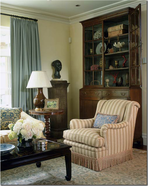
I found this apartment in New York Spaces, March issue, and just fell in love with it. The designer, Christopher Maya, from NYC, used deep pink as an accent color and it really pops what could have been another typical beige space. Instead, pulling the pink color from the Bennison print on the arm chair, the room looks young and fresh. Apparently the owners of the space had inherited a house full of antique furniture and accessories, such as the collection of porcelains on the shelves, and they wanted the look to be family friendly instead of stuffy. Maya certainly obliged.
TO LOVE:
Bennison Fabric (if you can only afford it! Too expensive, but worth every penny.)
Deep pinks mixed with beige – a youthful alternative to red mixed with beige.
Deep cushions on the sofas and chairs, filled with down, plumped to a high crown (much maintenance, but looks great when no one sits on it!)
Seagrass in a pattern – slightly more dressy than the typical pattern.
Curtains that hide the wall space between windows. Instead of just two panels, Maya installed four which adds richness, luxury, and interest.
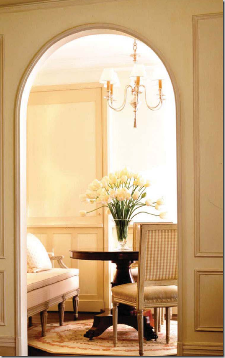
In the dining room, Maya used painted Louis XVI chairs and settee.
TO LOVE:
Using a check fabric on the back of wood framed chairs – taking a page from history when the French put the more expensive silk or embroidered fabric on the front of the chair and the less expensive, not seen, cotton checked fabric on the back.
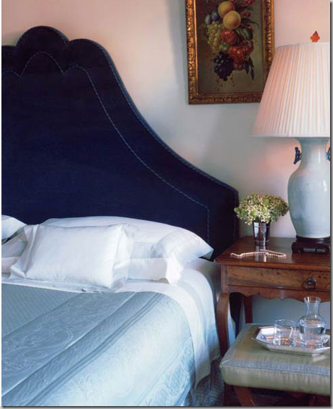
In the bedroom, Maya designed an upholstered headboard to mix with a collection of fruitwood French antiques. The side table is just beautiful.
TO LOVE: An exaggerated headboard design mixed with a luxurious sapphire velvet.
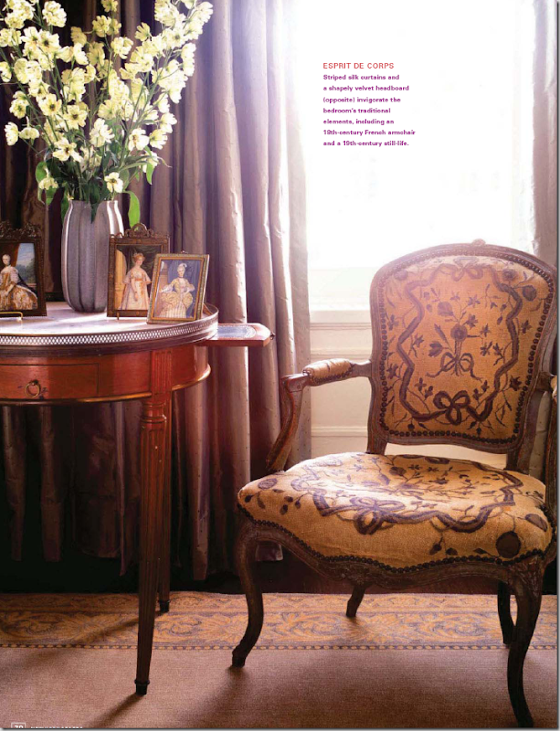
In the bedroom again, more 18th century French antiques – the gallery top table is really special. I love the collection of period portraits in antique frames.
TO LOVE:
Beautiful striped silk taffeta curtains.
Christopher Maya has a large portfolio on his web site, filled with all his other projects, mostly in New York. In this large house in upstate New York, Maya mixed blues and greens in the family room.
In another living area in the same house, he mixed the blues with beige. The patterned rug in this room is wonderful.
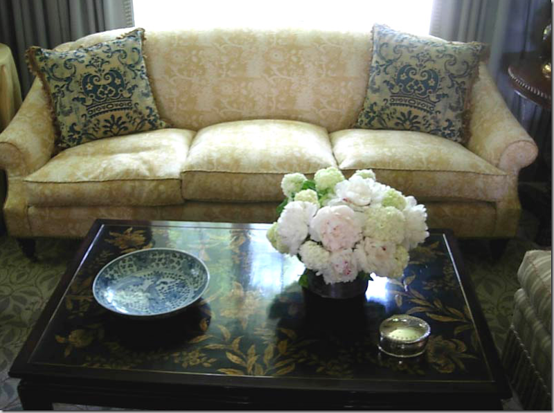
Close up of the chinoiserie styled coffee table and Fortuny inspired fabric pillows.
In this informal living area of the same house, Maya matches reds with khakis. I love the checked fabric on the sofa. The red is picked up again in both the antique chest and in the lamps. Maya added flat trim to the hems of sofa and chairs for additional interest.
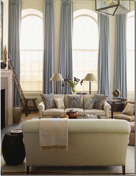
Other rooms I really loved in Maya’s portfolio include this two store living area. Here Maya used ice blues and creams. I love how curtains are so important to his design aesthetic. Just beautiful!
Wonderful view of the same room.
In this bedroom, the curtains, again, are the focal point. In order to hide the AC unit, Maya used textured blinds along with the fabric panels. The shaped valance is a great way to hide the space between the curtain rod and the window, making the eye see the two small windows as one large unit.
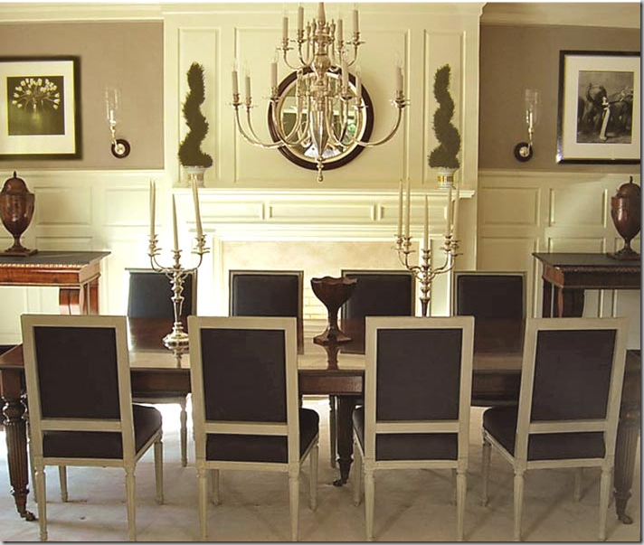
A symmetrical dining room – painted Louis XVI chairs paired in dark brown leather, give the room a masculine feeling.
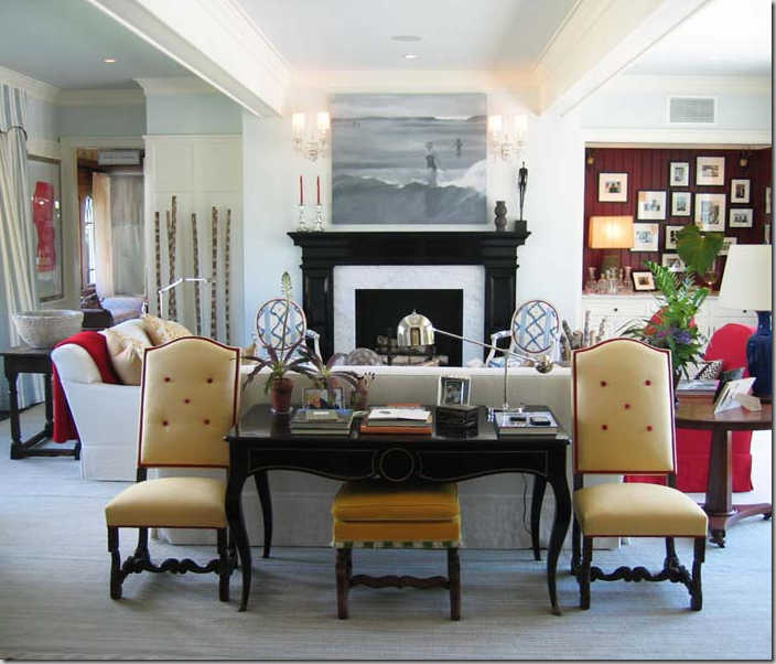
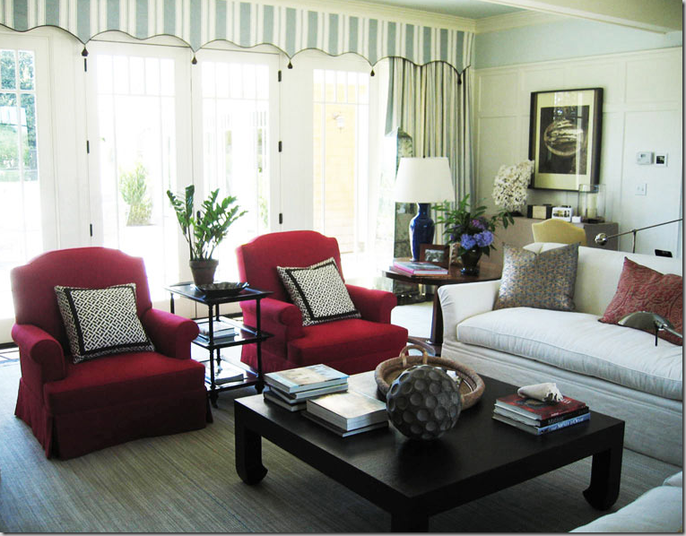
Maya has done several show houses – here in this Hamptons Showhouse, Maya mixed blues, red, and yellows with black accents.
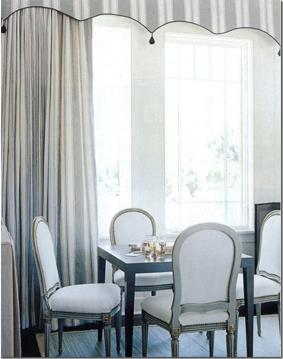
Here in another view of the Showhouse, the striped valance curtains add a summery look to this beach house.
Another view of the Hamptons Showcase room – painted French chairs surround a more contemporary styled table. Notice the detail of the valance treatment.
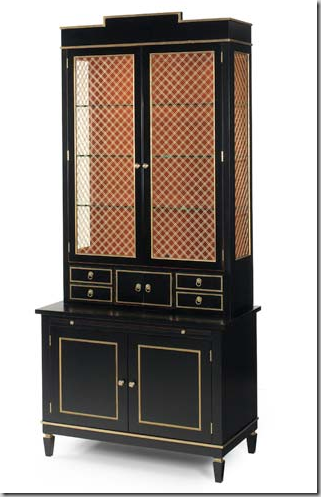
Maya designed this beautiful secretary that EJ Victor sells. This design shows up in his rooms in different finishes. Available through Robert Allen showrooms.
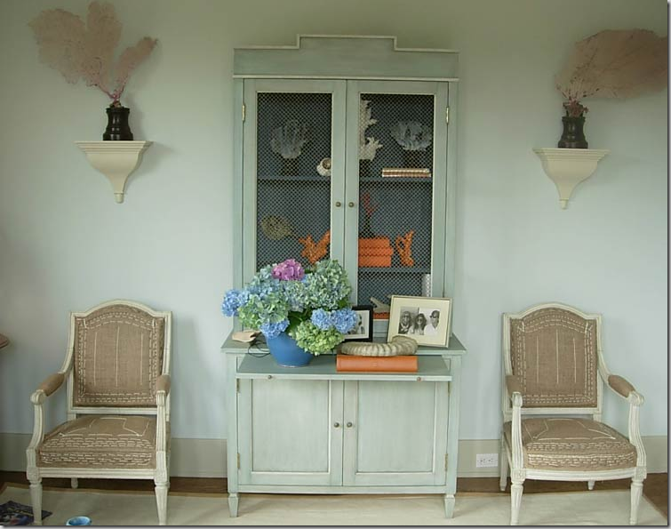
Here, the same secretary, painted blue for a summery feel.
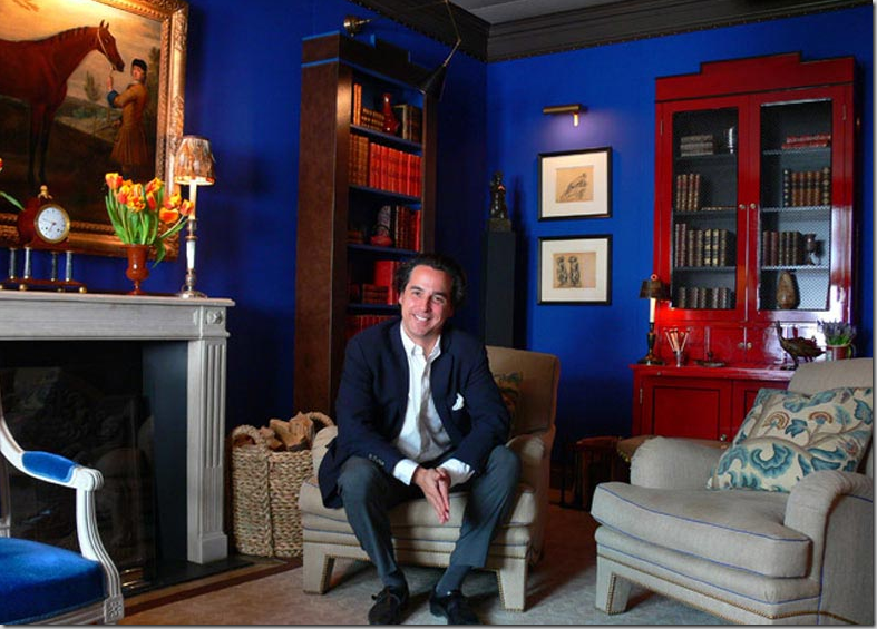
And at Kips Bay Showhouse, handsome Christopher Maya sits in the room he designed. Here the secretary shows up in red lacquer. He also designed and sells the bookcase.
To see more of Christopher Maya’s portfolio, be sure to visit his web site here.






Oh.. I love Christopher's style. Especially his fabric selection. very tasteful.. I am learning a lot from your blog. One of your fan from Downunder.
ReplyDeleteJulie
What I love the most is that I feel his work has an "old soul" world about it. I can only imagine his childhood must have had a strong influence.
ReplyDeleteI love how grand the rooms feel, yet at the same time, I could see children jumping on sofas and having a fun time playing hide and seek.
He's a cutie patooty! Great classic clean style with a kick...nice subtle fabric choices.
ReplyDeleteI am glad to learn about this designer. I was not familiar with him but I am impressed with his work. I like his take on traditional style with a little twist. As always, thanks for the new info!
ReplyDeleteOh, Darn! We've inherited a house full of fabulous antiques - what SHALL we DO??! ;)
ReplyDeleteThe pics are swoon-worthy! Joni, I think my pendulum is swinging back towards neutrals - but with the right amount of pop a la the Hampton Showcase house - D-I-Vine!
Joni, you put such thought and love in every post. I am amazed at the time you must spend. THANK YOU! I noticed you did not use a single photo that I used, when I did my post on him. I just love his style.
ReplyDeleteBeautiful work. I love the top room. Thanks for the intro.
ReplyDeleteClean but comfy, which is always a juggling act, but Christopher certainly achieves it. As always Joni, thank you for sharing the new designing trends and designers with us!
ReplyDeleteLove Maya's work! Never have nor will be fond of pink or red however he certainly does work his magic with it. Ahhhhhh, think my favourite of what you posted has to be the blue 'n green room(s).
ReplyDeleteSuperb!
To Love: Joni and her blog. Notice the way she always shows us beautiful new designs, and she also points out why it's a beautiful design. I enjoyed this post so much. As usual, with your posts, I had to look at each picture at least twice. Such beauiful fabrics. Thank you for sharing Christopher's work. laurie
ReplyDeleteJoni, you know it takes awhile for your photos to load up..... but it's always entirely worth it. For some reason the bottom photos load first. So, I'm looking at the photos from the bottom up and I say to myself, "Timeless". Imagine my surprise when I get to the top photo and the title of the magazine article is "Timeless". Which only goes to show you that his message shines through loud and clear.
ReplyDelete- Suzanne
I like that it's all very masculine but still very pretty. I didn't realize he was the designer of that last room, I have it in my clipping files!
ReplyDeleteIt's funny - I saved that picture from the SHamptons Show House too. I loved the collection of primary colors he used - and I wonder if that's soon to make a resurgence? What do you think?
ReplyDeletebeautiful! I love the symmetrical dining room with the brown leather chairs. He use an eclectic mix of materials and styles, that really pull together.
ReplyDeleteSaved every one of those images...just beautiful! His mix is outstanding; thanks Joni!
ReplyDeleteMichelle
***** Beauuuutifully DELICIOUS, Joni~~~ then again, "real" style, which MUST INCLUDE the true L*U*X*U*R*Y of sumptuous COMFORT, allllways IS!!! The gentleman is a winner!!! Many warm thanks for this oh-so-special feast so early this Tuesday morning!!! Blessings n' hugs, Linda
ReplyDeleteJoni, thank you for discovering Christopher's work. He is so talented. The way he gave a young fresh look to the inherited antiques home was genius! Love all of the photos, and your pointing out the unique details.
ReplyDeleteWhat a great design find! People with two-story living spaces can really be inspired by his window treatments.
ReplyDeleteNow, here is a designer deserving of accolades!
ReplyDeleteExcellent work.
Fantastic! An entire post of eye candy. They always are!
ReplyDeleteBeautiful. Thank you for sharing his talent with us. I loved this post.
ReplyDeleteOh my, my favorite is the living room with blue drapes. So gorgeous! Thanks for the inspiration!
ReplyDeleteThanks for this peek at a designer I too was unfamiliar with... I'll be back when I have more time to study and I'll definitely take a look at his website.
ReplyDeleteJoni,
ReplyDeleteI so admire how you think. You really dig deep and look at each and every element. I'd love to go to a show house with you. I'd bet we would spend and entire day!
Oh, and the "French Life" post! My goodness! I'm swooning!
I love Maya's use of ice blues and creams, and how you have described the pictures Joni!!!
ReplyDeleteYessssssssssss!
ReplyDeleteI have loved him for so long! Had no idea that he designed some pieces for EJ.....that secretary makes my heart palpitate. Sooooo gorgeous!!
Thanks for profiling such a great designer. (and look how cute he is!!)
What I love is the dramatic feel of the windows with the drapery! His look is a bit too traditional for my taste but it's beautiful. I love the blue and cream as well!
ReplyDeleteStriped silk taffeta curtains .. .
ReplyDeletealways seem to call out to the Scarlett in me!
JJjj
Great post. I recognize the two story living area and the showhouse--both were featured within the past year, probably in House Beautiful, but may have been Traditional Home.
ReplyDeleteI really, really like Maya's style. In fact, I am going to go back and analyze it closer, especially with the 'elements' broken down by you. It is not casual, but not stuffy and formal; a great balance of the more casual elements like sisal, the best of fabrics, and beautiful furniture and accessories.
ReplyDeleteThe picture of the double height living room with the beautiful wool sateen curtains in ice blue actually had such an impact on me that I went to the design center to see the fabric for myself. It was much more robin's egg in person. I had never looked at fabric from that line before (the name is escaping me), and I ended up finding a great linen for my headboard from the same line - the perfect shade of blue that I had been looking for.
I wish I had that picture of the tulips seen through the archway for my post this week!
I absolutely love it all! Fabulous! I love knowing who is behind that secretary - seeing it in red lacquer melts my heart... quite possibly a sign that i have a sickness.
ReplyDeleteXO
e
Thanks for the introduction to Christopher Maya :-) Of all the rooms you posted, I think I like the symmetrical dining room best. Although those LONG blue curtains in the 2-storey living room are gorgeous too!!
ReplyDeleteI really like his use of wainscoting -- interesting that it goes almost all the way up to the ceiling in the Hamptons Showhouse, but there's a bit of blue wall between it and the ceiling.
Kelly @ DesignTies
"To Love".. ALL of this post! I especially like the mix of blues and greens...so soothing..yet not too cool... Thanks for another wonderful introduction!
ReplyDeleteAnd he's cute, too!
ReplyDeleteAnd oh the Bennison fabric....my absolute favourite!
The 1st living room in the 1st pic had me with the barely glimpse of the cherry pink ottoman!
ReplyDeleteVery, very neat, Joni. And do I spy a secretary that looks surprisingly like the breakfront I have??? Black with wire on the doors??? I love the crown he put on his piece!
ReplyDeleteI think my favorite room is the LR with the blues and creams... love the color and shape of the painted demilune table he used. That room is like a fine painting... the colors are subtle but are chosen to perfectly accent each other. That lamp for one! The pillows. Actually all of it! :-)
XO,
Sheila
Joni, I was looking at two different pics. The ones I like best are the living room shot with the blue and cream (that has that tall secretary and the lamp that matches it), but I'm wild over the demilune table in the picture just before that. Great color on that table!
ReplyDeleteXO,
Sheila :-)
I love the informal room with the checked sofa and pops of red so much. I would love to find a hard copy of it for my clipping file. I'm plotting a do-over of my living room and that looks kid-friendly and yet still polished and stylish.
ReplyDeleteOoooo, that's so FRESH! I like, I like! (I am a bit worried about the leg on the gallery table, however - is it the photo or is the table leg folding under??)
ReplyDeleteThese rooms could have been taken from houses in Mayfair or Belgravia in London! :) I love the subtle use of color with a surprise dash of bold here and there. Fun, fun.
Send me the Family Room with pale blues and greens...and the blue secretary.
ReplyDeleteStunning! That headboard is nothing short of spectacular, and the living room in the fifth photo is gorgeous! (However, I must admit that the little Roman shades above the window seat look very slouchy and poorly-made. A shame! It's distracting in an otherwise perfect room!)
ReplyDeleteJoni, I want that glossy white paneling in my dining room xo Ali
ReplyDeleteI really do like the freshness of the pink popping out against the neutral backdrop in the first pic. I also like the blue and green room. All these rooms look so comfy and serene. Must be the lighter color bases he uses in all these rooms. Thanks Joni!
ReplyDeletei am such a dope, i guess when you comment on the feed-emails, nothing happens.
ReplyDeletei did leave a comment when this first came out.
anyway, love dining room.
xx
Beautifully decorated room.
ReplyDeleteHi Guys!I'm once more present with the latest information in connection with your deep interest in call girls. As always I've brought new team of teenager call girls ready to satiate your hunger of female companionship. Just click the links for guidance.
ReplyDeleteMumbai call girls
Call girls in Mumbai
Thane Escorts
kolkata escort
call girls in park street
escorts in park street
mumbai call girl
russian escorts in mumbai
Escorts in Chembur
-----------------------------------------------------------------