
Ever since House Beautiful’s December issue came out, I’ve been slightly obsessed with the cover story’s house – to say the least. It’s been a long time since one house has really excited me as much as this one and for me, that’s saying something. Since starting this blog, I’ve been exposed to a barrage of design – and to tell you the truth, not a lot in the magazines has thrilled me lately. I’ve thought about this and wondered – is it just me? It used to be that I would get a magazine and sit down with it and read most of its stories. I’d spend a few hours, maybe even days, thoroughly digesting an issue before carefully storing it away. But lately it seems I go through the magazines so much quicker – I rarely find an issue that takes me more than a day to absorb. Some magazines, I just flip through and toss on the spot. Others never even make it off the rack and into my house. These days, if a house in a magazine doesn’t grab me right away, I don’t waste time on it – after all, I can always go to the internet and jump from blog to blog to blog and spend hours reading all about someone’s charming cottage in a tiny town in Sweden that will never be published, or follow the ups and downs of a house being built in Australia, or even become engrossed in the saga of a bathroom redo somewhere in Alabama. With each quality magazine that is now gone – wonderful ones like Southern Accents and Country Home and Cottage Living – the pressure seems to build on those left. It’s as if I expect The Big Three to come up to the plate and really deliver a knockout punch each month. Am I expecting too much? Am I jaded?
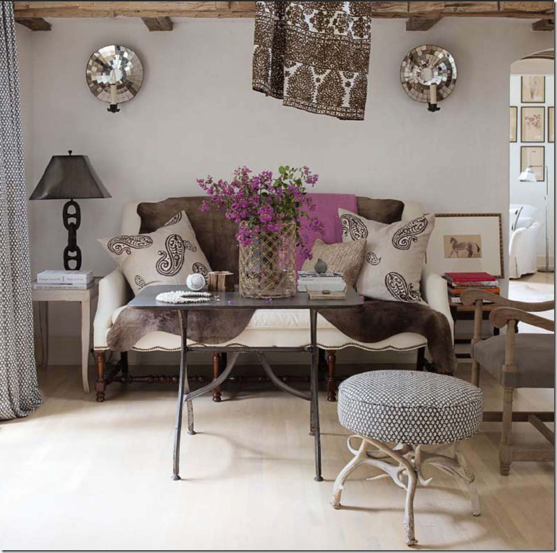 Close up of Brinson’s living room.
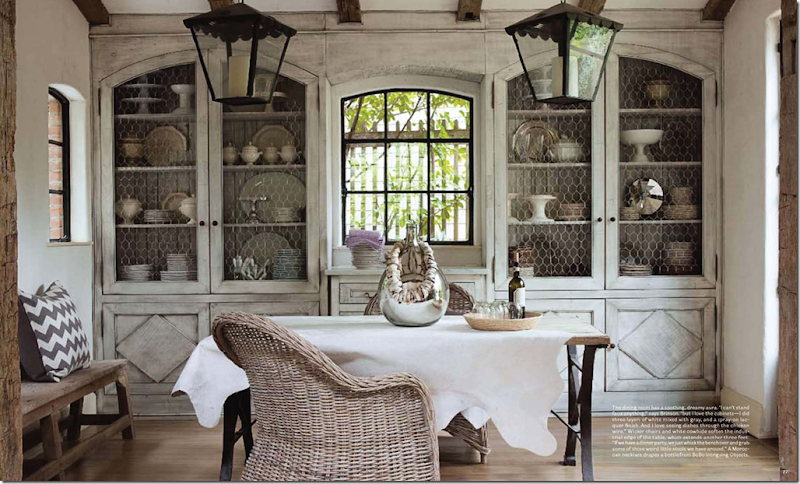
But then a magazine like House Beautiful’s December arrives and it just kills me. Two months later and the issue is still on my dashboard. If there was ever a better magazine issue – I haven’t seen it. I can barely even make it past the cover story. Every time I try to move forward, I go back to that house in Atlanta with its flowerless green garden. The pictures! Those huge, gorgeous pictures! Why every magazine hasn’t followed Editor Stephen Drucker’s lead is beyond me. He takes us to the front door and out the back – and everywhere else in between. But, he had a lot to work with. The house is fabulous, Belgium meets France on the way to Sweden via the downtown commercial district. Sigh. There’s no point in fantasizing about it really. It’s so unique there’s not another like it to be found anywhere. It’s not like you could casually say to your partner one Sunday – let’s find a house like THIS and move. There IS no house like THIS. I suppose you could find a old cottage somewhere and rip out a bunch of decrepit windows and replace them with huge steel ones. But then, what about those ceilings – those tall, beamed ceilings – how would you replicate the loft?! And if such a house did actually exist, would it have as wonderful a kitchen – one that even I would spend my days cooking up meals in there that would make Mr. Slippers Socks Man a contented one, for once. Perhaps the dining room could be copied – a carpenter could build identical cabinets with the arched doors and chicken wire. But you would still need the windows, the beams, the lanterns, the white dishes – and the cowhide on the table and the wicker chairs. It’s nice. The owner, the designer, the stylist – Jill Brinson – she’s something.
Brinson is the Creative Director of Ballard Designs and she does interior design, she just designs – anything, everything. A stylist extraordinaire. There is nothing in her house that just “happens” to be there. It’s all planned and thought out – though probably not even consciously. Styling for her is like breathing. Oh, to be that talented! What a gift from God!
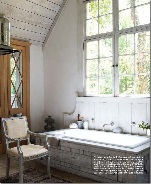
The house was totally gutted and remodeled by the Brinsons. The kitchen became the dining room, the dining room became the kitchen so that it would lead directly to the flowerless green garden. In the bathroom above, Jill wanted her tub to look like a trough with the faucet coming directly from the wall. I love how the backsplash is made of wood, yet shaped like a marble slab.
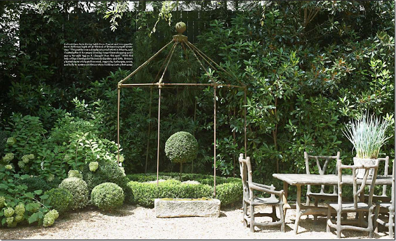
The green garden. It if flowers – it better flower green.
This house has invaded my brain. I wanted to take an hour on The Skirted Roundtable to talk about it – picture by picture, but I’m afraid Linda and Megan weren’t quite as “touched” by the fever as I was. But still, when Editor in Chief Stephen Drucker sat down at the table, it was all I could do to talk about anything BUT the house! I’m not crazy, I promise you. But haven’t you ever fallen madly and crazily in love? Did anyone else feel this way about this house – am I the only one?
The House Beautiful cover with mi amour on the cover. Is anyone else out there as obsessed with the Brinson’s house as I am? Was there anyone else who kept this issue in their car for two months – just in case they needed inspiration at a red light? So, imagine my surprise and utter delight when I saw a blog with a magazine cover that looked like Jill’s living room.
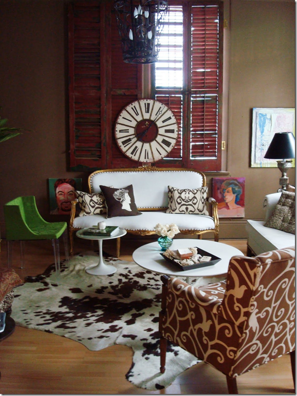 Valorie aka The Visual Vamp’s living room.
Valorie of the blog Visual Vamp – is obviously as love sick as I am. She spent a few days of her precious time trying to recreate the Brinson cover photo in her own home. There was something in the cover that reminded Vamp of her own house – an original Shotgun off Magazine Street in New Orleans. I can see why Vamp saw the similarities: her white sofa is reminiscent of Jill’s. Vamp owned two brown cowhides, just like Jill. With a little tweaking and a lot of styling – Vamp decided to go for it – she would style her living room to look like the cover story. Could she? Above is the Vamp’s living room before Jill Brinson. She flittered around and gathered her styling tools – and ended up with her version of the House Beautiful cover:
![[HB+Fake+2.jpg]](https://blogger.googleusercontent.com/img/b/R29vZ2xl/AVvXsEhZGMrgft2S2HJ_LKxHA3JojX397fPa30Nnp4FQF0lJWUsEobbJ9dEfgrQ9ilp7-TDtEHvygeq4cKBwYqqqioSGW41xQZaT1ZCW7fA8g3DAeXYRMsoNYEyTC3-rp2sW2SUPXtkBEvTTqAuY/s1600/HB+Fake+2.jpg)
Viola! Here is Vamp’s living room restyled ala Jill Brinson. Pretty good I think! She put her brown cowhide on the white leather sofa, just like Jill did. Vamp added two paisley pillows, just like Jill did. Vamp changed out her coffee table for a tea table. While Jill has a black metal table, the scale of the two tables is the same. Vamp added the hot pink throw and the pink flowers, just like Jill. Then she took a picture of her newly restyled living room, photoshopped it onto a fake House Beautiful magazine cover and there is it. Visual Vamp does Jill Brinson. When I saw this, I almost had a heart attack, I was so excited and jealous at the same time. Me too, me too, I cried! After all, my sofa is very similar to Jill’s (that’s about the only thing though.) I rushed off an email to Vamp: “ok, I’m throwing down the gauntlet (really, what does that mean?) – I’m going to restyle my family room like you did. Do you mind?” Of course in blogland, it helps to have manners and ask such things like, do you mind if blatantly copy your idea? Vamp didn’t care if I copied her idea, in fact she rushed an email back to me in two seconds with these words in the subject line” DO IT!!!!!! Who am I to refuse?
Seriously though – how was I going to get this room to look like this:
The shape of our sofas are very similar, and the height of our coffee tables are the same. That’s it!! After assessing the situation – I was ready to call it a day and hand the gauntlet back to Vamp and let her keep the damn gauntlet. But, it ate at me. Thinking about how much fun Vamp had had – how great she had made her living room look, how cute the fake magazine cover was, I got motivated again. Alright, I need the pillows. Jill’s fabulous pillows came from “Two Girls In Avignon” (how cute is that name?!) But, how far did I really want to take this game? Would I seriously order two pillows for a fun photoshoot? And I didn’t own a brown cowhide rug like Jill and Vamp did. Should I really go buy one at Ikea just for a picture? They cost a $100. Ridiculous. But, I did have brown velvet pillows that had recently replaced the zebra Oly ones:
Then I had a brainstorm. The antique store Neal and Co. carries Les Indiennes fabric, maybe I could go there and borrow some fabric and wrap it around a pillow! All of a sudden I had a plan. Go beg some fabric from Cindy Neal. The brown velvet pillows can then take the place of the brown cowhide.
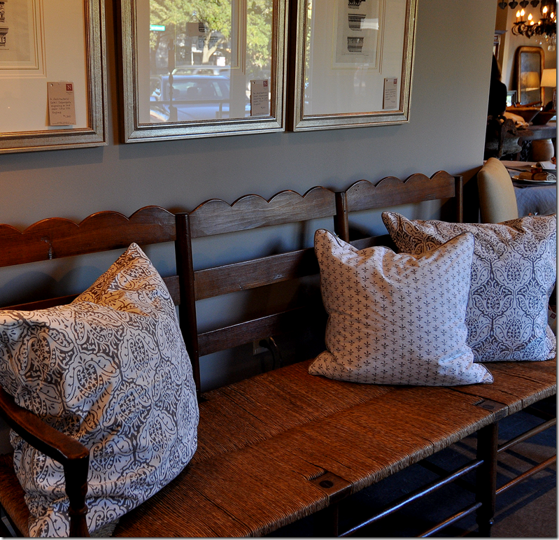
Neal and Co. – What a bench, filled with Les Indiennes fabric pillows.
At Neal and Co. I was excited to learn that not only did they carry Les Indiennes fabric, but they had made up pillows in several different fabrics. While it’s not a paisley per se – it does have the “look” of one – so Cindy let me take a few out on approval. Yes! Late last night while all my family was sound asleep, I was styling the family room like some crazed maniac. At one point Ben came down for water and found the room a complete mess and asked simply - “what are you doing?” “Nothing.” I wonder what he would have thought had I told him I was trying to copy the cover of House Beautiful! Perfectly normal, I know!!! Especially at 3:00 in the morning. Well, I’m sure the Vamp understands. For the pink throw – I had gotten a shawl in that shade as a Christmas gift and thought it was a genius idea. Except it photographed a dull coral, not pink. And for flowers – I thought I’d just use my pink orchid. But it didn’t photograph good either. I dragged my suzani on the sofa along with the Les Indiennes pillows, using the brown velvet ones in place of the brown cowhide. It didn’t really look that great – certainly didn’t look much like Jill’s at all and I was prepared to pronounce Vamp the winner in the Plagiarize Jill Brinson contest – with just us two contestants. Oh well. That was fun, but a major disappointment. See what I mean:
No – it really didn’t look all that great. I know Jill didn’t have a zebra rug either, but I didn’t have the energy to move it. You can hardly even see the pillows with the orchid overtaking the photo. The suzani looked alright –but it just didn’t look like the cover picture. And taking pictures at night does not capture the room at its prettiest. Oh well, tomorrow is another day! And, tomorrow I found I just couldn’t let it alone. I was first in line at Joanne’s this sunny Sunday morning buying a few yards of hot pink acrylic suede. And while I’m at it, I’ll buy some pink roses to match. And some green apples. If I am going to do this, I am going to at least try to do it right. Here’s what I came up with today:
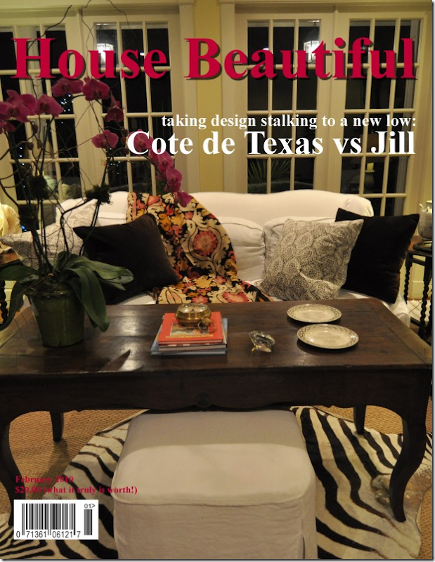
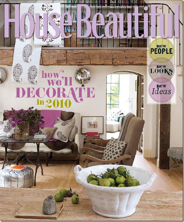 One more time – here’s the original cover picture of Jill Brinson’s living room.
And my finished cover – completely different I know, but I’m kind of liking it!
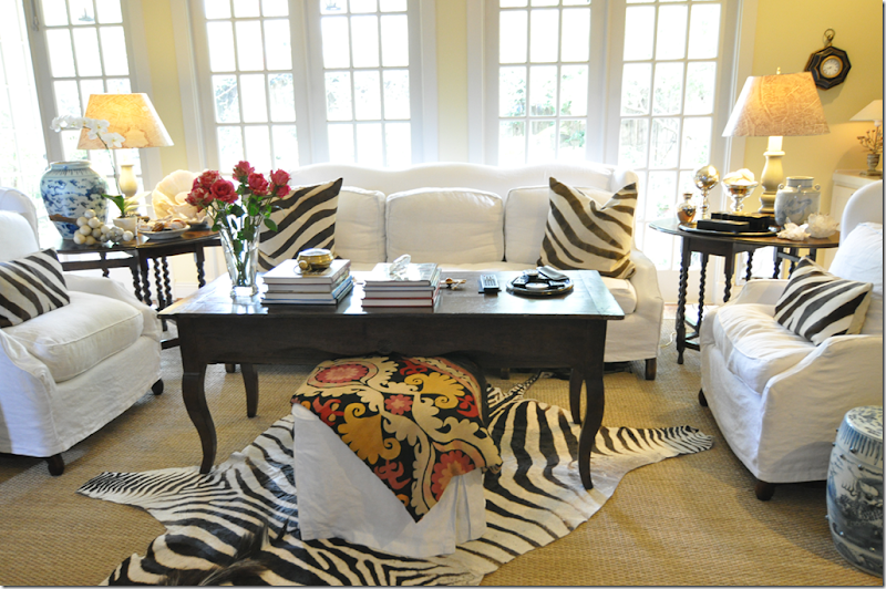
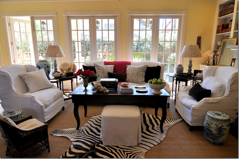
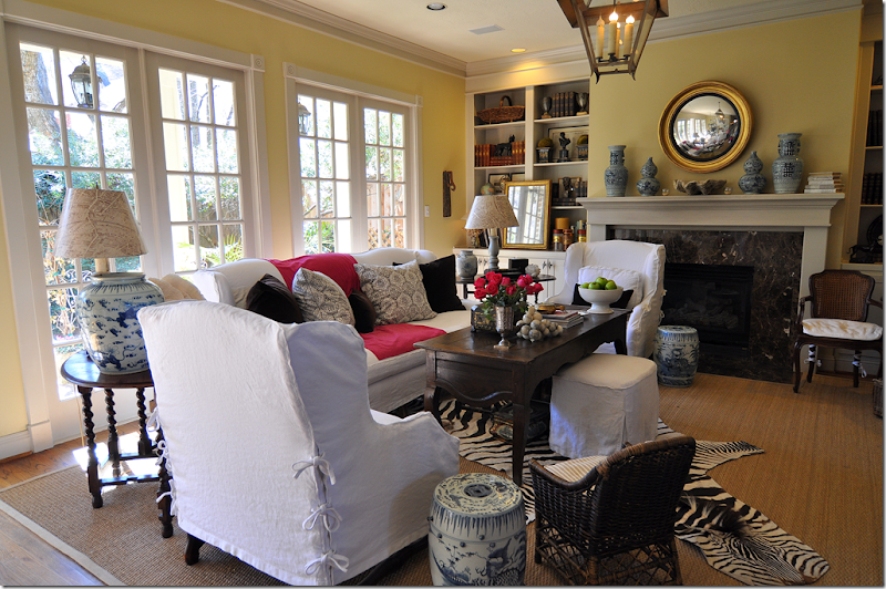
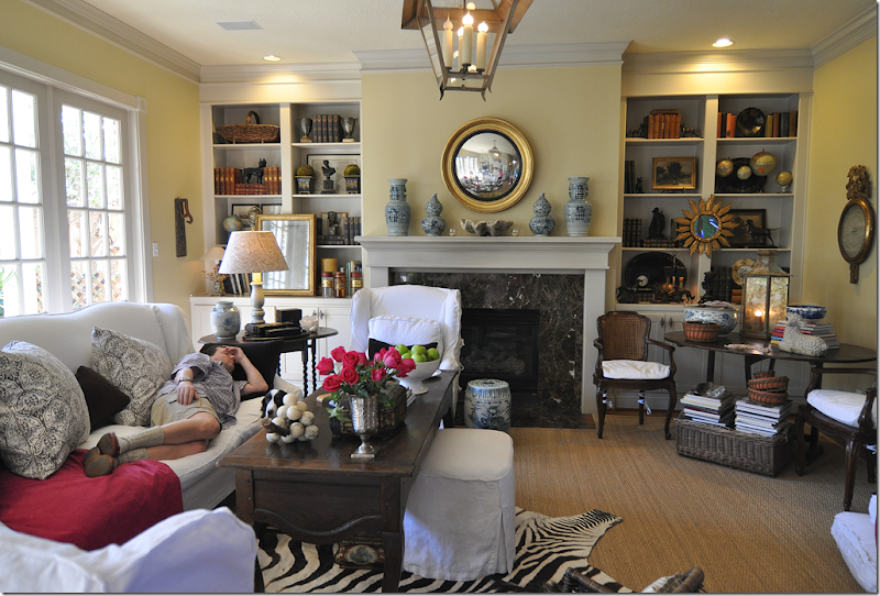
Here is what it my room really looks like now:
In Jill’s room, the throw is more lavender than pink, but I thought pink would look better in my house. And the more I thought about it, the less I really cared if it really looked like Jill’s or not. In truth, I was starting to like the Les Indiennes pillows. I had never gotten used to the plain brown velvet pillows – and I think these add a nice pop. And by a strange stroke of fortuitous luck, I had Hien Lam make me an extra set of pillows in hot pink linen, which I think I can add a few into this mix if I want to get rid of the pink throw.
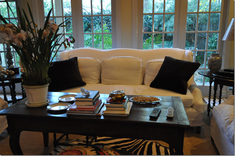
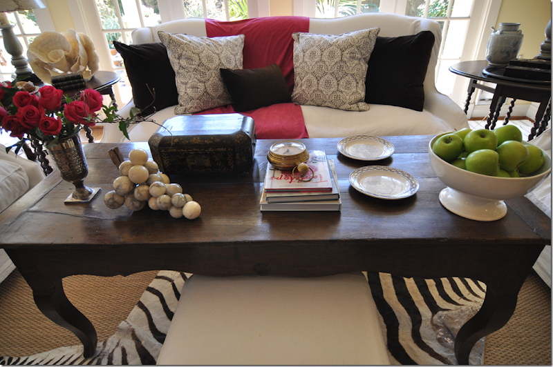
Here’s a closeup of the newly styled coffee table. Usually this table is jumble of Ben’s magazines and books and coin catalogues. It’s never nice and neat and styled. Today, I got him a basket to keep under the coffee table – for all his “very important reading materials” and hopefully I can keep the tabletop looking halfway decent from now on. I love the way the green apples look in the ironstone bowl. And the alabaster grapes are a favorite. My lacquer sewing box was the first “expensive” antique I bought years and years ago with money I had saved up for the HADA antiques show. For it’s entire life it’s been in the same place in the entry hall, but now I think it deserves a new home. The plates are French transferware.
A different angle – I think I’ll look for a “real” throw in this color. This one is just a piece of fabric from Joanne’s. Or, I might bring in one of my pink linen pillows instead. I am so excited by the changes, all very subtle – just a few pillows truly, but I think it makes a huge difference. It was all an exercise – a fun project to have a little competition with Vamp - but out of that, I’ve gotten a new, fresh look. And along the way, I think I may now finally be able to put my obsession with Jill Brinson away for awhile. I know that every time I see my new pillows, I’ll think of her wonderful, unique house in Atlanta – and instead of being jealous of it, I will see it as inspiration for future projects. And what did Mr. Slippers Socks Man say about the changes?
When he first came down later this morning, after I was through taking the pictures – he asked “can I sit down now?” and then “are you putting it all back, this looks so stupid.” How nice! After I explained that no, I wasn’t putting it back the way it was, I showed him his new basket for all his junk, I mean, coin catalogues. He buys gold coins just like Glenn Beck. And then he plopped down, despite it looking so stupid, and made himself at home. Him and those slippers socks. Oy. And extra points if you can find Georgie – in her camo colored coat.
In the end – I had so much fun styling my room to look like Jill’s. It didn’t come out looking like hers at all but I actually learned a lot by doing this. Taking a few key elements from another room that you truly love might be all you need to spruce up your own room. And the few changes you make, might make you love your own room, all over again!
If anyone out there is a huge fan of Jill Brinson and wants to join Vamp and me in this styling contest – please do!!!!! We would love to see your results! To get your own magazine cover, go HERE. To visit to Jill Sharp Brinson’s web site – go HERE. To read Visual Vamp’s story of her restyling, go HERE.
AND IN OTHER NEWS:
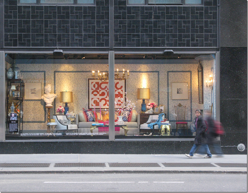
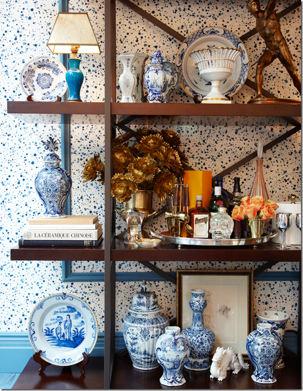
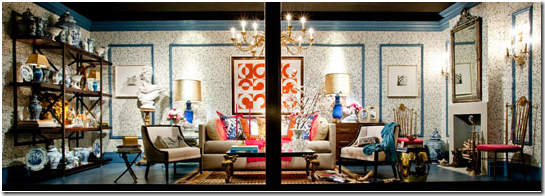
Don’t forget to vote in the Bloomingdales Big Window Challenge!!!! Please think about voting for Eddie Ross and Elle Decor’s window. This is how Eddie’s window looks from the street. It’s an amazing room, anchored by fabulous blue and white splatter wallpaper set inside blue molding. There are two other contestants, but we’re pulling for Eddie here. To see all three rooms – go HERE.
I love how Eddie filled the shelves with blue and white porcelains! It’s so beautiful! Eddie is such a great talent and his window is the best of all three, in my opinion.
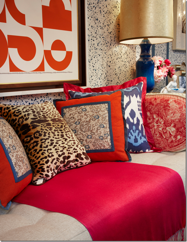
I could have used that pink throw today in my room! I love the toile, ikat and leopard all mixed together.
Be sure to vote TWICE a day for Eddie Ross – through this Thursday. For more information on how to vote, go HERE. Eddie needs us all!!!
AND, one more reminder, Grant Gibson is at The Skirted Roundtable this week. To listen to this hot designer talk about design, go HERE!


this cover really caught my attention also. I think what made me gasp was the color combination. Love that hot lavender pink. I like the way you restyled your room. I too think the brown velvet pillows by themselves were a little plain. I know you have mentioned repainting your rooms. I think you could paint them in the cocoa color Brinson used on her chairs and that would make your room very delectable and more like hers. I think it would really warm it up and give it a pop with your white slipcovers.
ReplyDeleteThank you so much Joni! we need all the support we could get! we love your house and the Vamp's too!
ReplyDeletexo
Eddie + Jaithan!
P.S. I like the suzani. I think you could put the paisley pillows on the chairs and put your hot pink linen ones on the sofa with the suzani and the velvet ones. Rindy
ReplyDeleteYou have made my evening so enjoyable. The contest between you and the Vamp was very creative and immensely entertaining. I actually liked your room. Do you plan on repainting your family room? If so, what color are you thinking about using?
ReplyDeleteI totally agree with you on the lack-lusterness of most of the remaining shelter magazines (so ... no it isn't just you). I have never been let down by Southern Accent but occasionally some of the other shelter magazines would be a disappointment ever now and then. Let's hope things improve with time.
I do, however, like this house in the current magazine ... especially the dining room.
You know, real committment is when Mr. SS comes down and 3 am and finds you vaulting your own ceiling with a sledge hammer... but seriously, I really love it. I love that HB story, as well-- the dining room, esp. And the bathtub. Yummy. I'm all for more of these inspired re-dos!
ReplyDeleteAnd I spent HOURS (hours) today trying to find some sort of shelf similar to the one in Eddie's window that I could afford. I'm stalking it (and voting!)
I love your new look especially the Les Indiennes cushions and how you styled your table. I think if you wanted to move more in the direction of Jill's house, then changing your wall colour and removing the rugs (maybe just the hide) would help. BUT, I love what you did and it's a great lesson for your readers!
ReplyDelete(Thanks for stopping by my blog the other day, Joni)
Fantastic Post! I could to love the Brinson Home. Great Issue, so unique and special! You did an amazing job! House Beautiful is one of the better magaizines out there! Glad I found your blog, off to browse..Maria, The Agoura Anitque Mart
ReplyDeleteI guess I'm in good company. I cut that out of my December magazine to keep as well. And, tell Mr. Slipper Socks that we kind of like the new styling. I hope that he grows to love it too. Changing things up without spending a lot of money is always a good exercise.
ReplyDeleteWhat a fun post this was, you totally had me laughing at you making the cover of House Beautiful! Although you really could, I actually love your living room! I couldn't agree with you more about being disappointed in shelter magazines, especially when I end up seeing the same room turn up in multiple magazines, there are just too many beautiful rooms I find on a daily basis in the blog world, why aren't they showcasing them? (Totally been voting for Eddie, his window is yummy!!)
ReplyDeleteI could not agree with you more about magazines lately. House Beautiful is a great magazine. I did love Jill Brinsons Home. I to get alot of inspiration from blogging. I voted for eddie! lulu
ReplyDeleteOkay Joni, I'll confess. That HB issue has been in my bathroom for 2months! (yes, I am a bathroom reader-OMG, I can't believe I just put that in writing). Love J.B. home, and I love anything you do to your home. Your living room looks beautiful (Mr. S.S. & G. add to that "lived-in" look). I have always coveted that coffee table, and it does look so great with your arrangement on top. I can't remember if you've told us - is that a cut-down dining table? laurie
ReplyDeleteHa, Joni, you make me laugh with the "finishing touch" ala Mr. Slipper Socks! In the end, no matter how perfectly we design our rooms, the human element has to be factored in, darn it.
ReplyDeleteI love your changes- it looked great before- but also after. So much fun to read your antics.
Hi Joni,
ReplyDeleteI always look forward to your posts. I had a really good laugh at this one. Men, for the most part are the same. If I've done something different at home, hubby will have no qualms in saying if he likes something or not. If he can't stand looking at something I will move it. I think that is what you call compromise!!! Love your new look in your lounge room, and while I admit to not liking (okay hating) mission brown, I really like the fabric of Les Indiennes. I think it really lifts the dark brown velvet cushions and gives it pop! I especially love the Les Indiennes cushion in your wing-backed chair. Actually I really, really love your wing-backed chairs. (One day!) Also really liked how you styled your coffee table, it looks really good. I also agree with you the magazines are not what they used to be, unless I am getting fussy. I will stand there and flip through them and something will have to really take my eye for me to buy them now....we pay a lot of money for the American ones that we get here now in Australia, nearly $13.00 so I have to make sure I really love what is in there. Don't worry Joni, I get fixated on people's houses in magazines. I will carry them around for ages. Hubby calls them my 'bibles'. Since being on the internet I have tried to find more pictures of homes I really like but usually I don't have much luck and I've said to you before how a lot of magazines don't have enough pictures of the layout of the rooms etc., I like to have an idea of the layout. Anyway better go. Take care and hope you and your family are well.
Janine
XXOO
Tasmania, Australia
Joni, you crack me up....as does your hubby!!! Y'all are too cute!
ReplyDeleteI love your "new" living room. I hope you are going to keep it! It looks fresh...and I like your pop of color!
What a fun post!!! Merci~
Joni, a very fun project I would say!! If you keep featuring Mr Slipper Socks in your columns, you will both be a superstar couple!! What would we call you as a couple, hmmmm Cote de Slippers, Jonislipa! Anyway great job!!
ReplyDelete[b]Компания GPS-Group предлагает:[/b]
ReplyDelete- GPS навигация(для транспорта, КПК, мобильных телефонов).
- Навигаторы(для охоты, рыбалки, путешествий(туристические, автомобильные)).
- Любая модель навигатора Garmin под заказ! Доставка в ваш город бесплатно!
- Установка програмного обеспечения и картографии на ваш навигатор.
- Системы контроля передвижных объектов. Gps логгеры и треккеры для отслеживания текущего местонахождения и пройденого пути(сидя на работе вы всегда будете в курсе где находится ваш автомобиль, родные или близкие люди).
- Оптимизация затрат по транспорту.
- Дистанционное управление автомобилем(блокировка двигателя).
- Отслеживание и просмотр места нахождения транспорта в режиме реального времени, просмотр пройденого маршрута.
- Датчики для контроля уровня и расхода топлива(позволяют отслеживать объем и места заправок, возможных сливов/недозаливов топлива; вести учет расхода топлива для всего автопарка не по установленным нормам, а по реальному расходу). Датчики включеного/отключеного зажигания и т.д.
[url=http://gps-group.hdd1.ru]Узнать подробнее…[/url]
http://gps-group.hdd1.ru
Love, love, love the new look in your room! I really like the pop of pink in there and the new pillows too. I also like the lime green added in by the apples!
ReplyDeleteYou go girls!! I loved both of your rooms, just as much as jill's. I wish I were not so lazy... I have the white sofa and even the old ceder wood in my living room... maybe I will give this a try. Thanks
ReplyDeleteJoni,
ReplyDeleteI emailed Valorie after she did her post that I was going to direct my husband to the Visual Vamp blog next time he had choice words for me on "why are you changing things AGAIN?" I'm adding Cote de Texas to my list because I've definitely gotten the "this looks so stupid" comment so many times I can't count them. Have a great week.
lol...love the new freshened look- it's very "spring" and pretty....you are hysterical....love how Mr Slipper Socks man is sleeping, while Georgie is thinking the day Sammy Jo and I don't go with the decor , we're sunk!
ReplyDeleteYou have WAY more energy than I do! I'm going to ask for Starbuck's Gift Cards for my Birthday...Anyway, you could style your living room 10,000 different ways and it would always look great. House Beautiful is amazing, AND it reminds me of my mother as she always had a copy next to her reading chair for years.I buy them three at a time:one for car, one for kitchen, one for bedroom.AND, Dan collects gold coins too-he is recovering from an attic fall and spent Sunday happily on his bed counting his coins, while I flipped through HB.
ReplyDeleteJoni, I love the way you write and present your blog. When I saw that you had a new post I got my cup of coffee because I knew I would sit down and enjoy every word. I DID!! I saw the vamp's styling and she did an amazing job. You did too!! I like the idea of the pink linen pillows in place of the fabric. I really like the pop of pink and your coffee table looks so interesting with all its gorgeous items. I think this post is going to inspire a lot of people to look at their rooms differently and maybe try their hand at something new. I love the way you keep it real with Mr Slipper Socks. Leave it to family to keep us down to earth. Kathysue
ReplyDeleteOff to vote twice for sweet Eddie!!!
Great post! I loved that issue too, and who wouldn't want to plagiarize those gorgeous rooms?!
ReplyDeleteYou're living room is simply lovely and I'm always thrilled to see what you have up your sleeve.
Kat :)
yes, yes, yes, and...YES
ReplyDeleteso great joni! style plagiarism is the highest form of flattery
:)
That was fun! The first cover photo of your redo was the best, loved the Les Indiennes fabric pillows; but the pink throw does not work. Regards, Betty B
ReplyDeleteFirst let me say, I really admire a woman who will talk openingly about an obsession. Because of posts like this one, I am so glad to be blogging because it is such a thrill to have found "my people".
ReplyDeleteSecondly, ahem...Mr.Slipper Socks, although you are so very cute, saying the "stupid" word is a bit like calling the kettle black. Please look down. Even though, I would never want you to give up your footwear because it's part of your "cute-appeal" and you are now famous, and therefore can not ever be or look stupid-right? :) Leave the design & decorating up to the one who really knows a thing or two about that! And, last of all, Joni, I really enjoy how you dissect a room and teach us all something in the process. Thanks!
I love your new pillows! They look great!! And I can't wait to see the pink ones too!
ReplyDeleteSally
Like the new look 7 the old look. Having fun is what this blogging adventure is all about right?
ReplyDeleteHave fun, it looks like you girls are having a deco ball!
Leslie
Joni! Yes, yes! You know I love that hot pink. {Almost finished painting my entry "Razzle Dazzle" pink!} Definitely add your pink linen pillows - that would be beautiful!
ReplyDeletebravo joni!
ReplyDeletea dreary winter monday is brightened with your humor, inspiration and shared loves.
LOL: "what are you doing?..."nothing"
"this looks stupid" ahhhh, the humanity of it all
xo
debra
I had said it before and I'll say it again I enjoy your blog as much or more than any of the shelter mags however House Beautiful has certainly stepped up to plate as others have met their demise. I too have this issue sequestered in fact I fell asleep looking at it AGAIN night before last. I love the changes in your home but then I loved it before as well. Thanks for the memories Joni!
ReplyDeletei didn't even need you to convince me why this room was to love!!! i adore everything about it!!! mine is earthy tones w/ green mixed in and more of a 'purple fuschia' for the 'pop'. although i am just an everyday mama, famous only to my husband and chillies, your postings inspire me on my level and sshh, i have been accused of keeping an issue of ballards for over two yrs!
ReplyDeleteThey say a picture is worth a thousand words. Well, after seeing the picture of Mr. SS sprawled out on the sofa I am speechless. Such a classy post (sarcasm alert).
ReplyDeleteMy husband thinks I change things around a lot, he should be married to you. I like what you did but if you want to change it for a length of time I would change the wall color. When you do your kitchen walls think about carrying it over to the family room. That would really give you a new look. i did not see all the Ballards stuff in her house which is a good thing because while I like their tablecovers I am not a fan of their accessories, too much french wanna be and the quality is definitely not there. What homes in France are decorated with all those silly signs Bonjour etc!!
ReplyDeleteYour so funny....and talented,your room looks amazing!! I have felt like that in the past,Atlanta Bartlet's home does it to me,I dare not attempt to copy though,the results would be tragic!! All the best,Chrissy
ReplyDeleteI've just spent the most enjoyable time, here. Love the family room redo! The photo of Mr Slippersocks, lounging, is fun!
ReplyDeleteI've decided to subscribe to House Beautiful, after picking up a copy a couple of weeks ago. I used to subscribe and let it lapse. I love the new format. The large photos are fabulous, especially for those of us whose focusing mechanism isn't what it used to be.
Been sick with a bug since Thanksgiving, so my winter home improvement hasn't happened this year. Hope to get back into the groove soon.
Wonderful post!
Wow! I am exhausted just from reading this post...you are insane, I mean that in the best way. If the magazines had people as creative and fun as yourself on staff, then maybe they would stand a fighting chance!
ReplyDeletexx
I know! Jill Brinson's home is amazing!!!!
ReplyDeleteI like the simple changes you made to your home. It is amazing how you updated your room with just a couple a fabrics. Love it!
xo
Brooke
Inspiration at a red light!! LOL I knew I liked you. I love your new LR look...I think it could even take a deeper red...and those new pillows...how lovely!! Your room is amazing...a great palette to play with.
ReplyDeleteOn another note; I got some slipper socks for Christmas, and haven't hardly taken them off since...Mr. Slipper Socks has something there!!
Best,
Michelle
You are a hoot! You got me to spend too much time reading your blog this a.m. and I am packing up to head south for the winter, I have to GO!
ReplyDeleteJoni,
ReplyDeleteYou are hilarious! I was laughing out loud as I read this story. Thanks for always sharing fabulous info & design, and a good chuckle. Love your enthusiasm!
Love the changes, LOVE it!!! The pillows, the pops of dark pink, the restyled table- yum!! It feels so rich and comfortable. Hope you post more photos down the road- would love to see how you use the pink pillows and what kind of throw you find.
ReplyDeleteI read that magazine in a hurry - ya know flip through it and toss in the pile with all the other shelter mags vying for for my attention. But now here comes Joni's delitefully entertaining post and I see the magazine article in a whole new light. Thanks Joni for getting me out of my box!!!!
ReplyDeleteI think I might have actually met someone as crazy as I am!
ReplyDeleteGood thing we are not neighbors, we would be having midnight STYLE OUTS!
It is all about INSPIRATION - it is the constant state that I try to keep my brain in - truly!
I am humbled, once again...
Many, many thanks
ps/ when r u coming for a visit???!
Yes - I still have this issueof House Beautiful and it has been placedin my keep forever file. Loved it when I first saw it and admire this house even more after reading your blog story. Although I have often copied ideas from pictures I have not yet ventured in to copying an entire room. Your room turned out wonderful and it sounds like you had a lot of fun redocorating.
ReplyDeleteWhat fun Joni! You do have a passion and have a gift from God too! Love your changes.
ReplyDeleteRuthie
Thoroughly entertaining, Joni! Jill's backyard is photo perfect. I planted 58 boxwoods Saturday afternoon. Still have more to do. Moving forward with the "outdoor" rooms!
ReplyDeleteFYI - to see a feast for the eyes in color, visit Slim Paley's blog at slimpaley.com - particularly her post on Jan. 22 - "A Little Colour Therapy". Delightful! Thinking you will like it, too.
Love your take on Jill's room. What I have been wondering every since the mag came out is, what are the shriveled-up green things in Jill's white bowl? I know they are not crab apples. It is driving me crazy!
ReplyDeletexoxo,
nancy
This so clearly shows how many rewards one can get from just a few simple, inexpensive changes. Well done, Joni. Every room should have a little red.
ReplyDeleteI love how you record and reveal to us your process, its the most important part, isn't it? I mean we all revel in that final result, but our thrill is in the process. I love the outcome of your room- its more inspired than copied, as I think it should be. Well done as always!
ReplyDeleteyou are a mess and this is hysterical! I love the changes in your room -- funny how happy a little pillow can make us, huh?
ReplyDeleteI love your house "as is"... however the vamped-up version is fun... I miss the suzani, though.. I really think it adds sooo much worldliness..and color. I love this issue of HB.. bought an extra copy to have at my other place.. your posts have taught me much and sharpened my design eye.. I love your "not too serious" attitude. Fun!
ReplyDeleteLovely posting! I too gasped when I saw that lovely room on the cover of HB! Why? Because I do have the exact pair of mirrored sconces in my dining room! LOL! Yes -- I would do awful things to have those gorgeous wood beams in my living room! Yum! No wonder Ballard Designs have such wonderful rooms on their website and in their catalog! BTW -- You most certainly DO have the Heavens-Granted gift of styling! I see that every single time I look at the photos of your beautiful home!
ReplyDeleteJan at Rosemary Cottage (sighing with deep pea-green envy over such postings)
I bow down to you Joni!
ReplyDeleteYou are as crazy as I am!
Didn't you have fun?!!!!
Thanks for the huge shout out.
Love what you did in your Brinsonized room.
xo xo
PS Sorry my comment is so late - I've been working on the dining room!!!!
Is anyone as happy as I am to see nary a speck of earth tones?
ReplyDeleteLove your newly designed room! Especially with the Les Indiennes pillows! I was getting just as excited scrolling through to see the final outcome of your room! Your blog is always so funny & real, not to mention beautiful!!
ReplyDeleteWow, what fun that was. I am tired just reading your story. lad to know I am not the only one up in the middle of the night with an inspiration I just have to try. Sometimes being creative is just such a curse.
ReplyDeleteThis is so how I have felt over this home. I even added a throw to my sofa, except mines gray (my husband would die with pink, ha!). Love what you did to your place.
ReplyDeleteLove this posts and your new room!
ReplyDeleteJoni,
ReplyDeleteI loved this post and the idea behind it...thank you for the links...I made my own...magazine cover...and linked you on my blog.
Thanks for a fun morning.
Lee
I am taking a bloggy break, but couldn't resist this.
I was really turned off by the House Beautiful cover home, I guess it was really juvenile looking in my opinion. It reminded me of my college apartment. However, I love what you did to your living room! The pink throw on the sofa and the pillows look awesome.
ReplyDeleteHi Joni-
ReplyDeleteYes, I also love the Jill Brinson room/house. I've never tried rearranging to a specific room before -- looks like fun! -- but do find myself making subtle changes to my house in imitation of my latest favorite design book. In the past year I've channeled Mariette Himes Gomez's Rooms, Darryl Carter's The New Traditionalist, and I'm now on Axel Vervoordt's Timeless Interiors. My husband thinks I'm crazy, but I love it.
OH MY GOSH!!!!!
ReplyDeleteThat magazine is next to my bed. I study those photos every morning and every night. Sometimes, I've brought it to the kitchen table and in the family room as well. Jill's rooms are SO LOVELY!
I wonder if the family is going away on a vacation and needs someone to house sit? I will be the 1st to offer for FREE!
It would great fun to join the fray, but NOTHING in our living room is like the photo. By the time I could finish this make over, no one would be interested.
Enjoy your "new" room.
annie
p.s.
I think he's quite cute in his slipper socks...if his legs are so cold, why doesn't he just put on long pants?!
I love the new look of your den...keep it. My husband was always afraid to come home after a business trip because he never knew what he was going to bump into that wasn't there before.
ReplyDeleteI miss the shelter magazines but I have filled the void with blogs...or did excellent blogs like yours contribute to their demise in an already depressed advertising market?
I also fell in love with that house. My favorite room is the dining room with the beautiful cabinets and the wonderful wicker chairs. Just perfection! By the way please tell who won the basket contest. Or did I miss something?
ReplyDeleteMarion
I love the new look!!! The colors make everything come alive! Can't find Georgie.
ReplyDeleteThanks everyone!!!
ReplyDeletethe constest winners are listed on the blog - at the very end.
Decorina won the cart!!!!
I too have obsessed a bit over that issue. In fact, I curled up with it AGAIN last night. Makes sense that she works for Ballard - my favorite decor catalog of all time.
ReplyDeleteLOVE LOVE LOVE your version though! You don't want the same thing after all, you want the feel with your own unique "joniness" in the mix.
I get that magazine too, but I guess I wasn't nearly as obsessed over it as you are! Ha! girl, you've got too much time on your hands. And I know you read my balance post & could definitely relate to that. You're so funny. Well, good for you if you had fun & are keeping it awhile. I'm sure it won't stay like this long, you do love to change things.
ReplyDeleteYour Ben and his slipper socks are just too cute! My hubby love gold coins too.
Wonderful decor fun, energy and inspiration - to take a few elements from a room you like and recreate the look!
ReplyDeleteI often start the other way around, looking for room styles similar to mine first, but this has given me fresh perspective.
Thanks, and you blog beautifully!
This post had me laughing....I love it right down to the picture of your husband (mine would have had a very similar reaction)! I am not sure if I am as obsessed but we've been emailing about my kitchen remodel and I called the cabinet guy late last week to see if he could cut out a section of my cabinets and replace with chicken wire....so you tell me.....maybe I am borderline. I love your finished product, btw.
ReplyDeleteI too am obsessed with the issue of the Brinson house and I am plagerising too--I am copying the sink area of the bathroom. My brother is making the shelf unit that holds the sink--I had something else picked out and I kept looking at the pics of the issue and just wasn't satisfied with my choice. I changed everything--it came just in time because I would have had just an ordinary bathroom--now I will have something I'm really going to love.
ReplyDeleteJuliet
It does a body good...to know that YOU want a room to look like someone else's when WE all want ours to imitate YOURS! Anything you do to your home is lovely, Joni. I love the (new) pillows. Fun, fun post!!!
ReplyDeleteYour blog is such a delight and this post was particulary enjoyable... and comical :-)
ReplyDeleteWhere did you get your bull's eye mirror over your fireplace mantle?
I check your blog daily, thanks for all the great posts!
Style Beat blog is having a contest for this exact thing right now!! Enter!
ReplyDeleteLove how it all turned out, and Iike your pillows even better than the HB ones! You are such an inspiration. And you have such a good attitude about your hubby. After I spent two years and thousands of dollars on my living room, mine said, "I don't really like how this room turned out, and btw, get rid of that glass table--it's not very comfortable for my feet."
ReplyDelete1. OMG - Jill Brinson left you a comment and asked you to visit!
ReplyDelete2. I've noticed a lot of "Nursing Home Chic" in the shelter magazines lately. In Australia nursing homes are like retirement homes for the elderly and are usually in drab nicotine colours, a bit dowdy. I've noticed a lot of this in the shelter magazines lately, expensively decorated homes in drab nicotine yellow, greens, browns and gloomy wallpaper. Is this what you mean?
3. Joni, I prefer your old living room styling - it goes better with the yellow wall paint.
4. Yes, I spotted Georgie behind the marbles.
That was super fun, Joni! I loved seeing how it all unfolded. Thanks.
ReplyDelete..oh my yes...i understand...i began rearranging furniture at 3 am when i was ten...when i was sent to my room for punshishment it was always with this admonition..."and you cannot change the furniture around"... pure torture...only being told not to read could have been worse...i understand...i understand...
ReplyDeleteennistbp
ReplyDeletethat is hysterical!!!!!! i would have told him to move out! omg = his feet hurt???????????
tooo funny!!!!!
people, I am planning to paint my walls gray one of these days. they really aren't yellow, more like a taupey gold. hard to describe, like a light peanut butter maybe. the paint isn't with the yellows, more with the browns. but i do want to paint them. just being lazy.
i love it joni! nice job. Love the shot of Ben snoozing a la ss. I can't wait to see the walls painted gray ,awesome idea, I think that will complete it.
ReplyDeleteThank you for commenting on my new blog, Amy Meier Design! I have always been a fan of your blog and continue to be entertained. What a fun post today! I really loved the way you styled your bookcases.
ReplyDeleteJoni, You lucky duck. Jill invited you to come visit. Now, you get to see the room/house in person!!!!!! I have a few favorites A Traditional Home from September 2006. I also loved Ina Garten's kitchen barn. This was so much fun to read about, and realize that other people are just as obssesed as I am.
ReplyDeleteKaren
Thanks
Hi Joni, thank you for a visit to my blog, It is always an honor to see your name there. I know what you mean, most of the time polka dots are for childrens room but in researching I found so many other sophisticated versions to add to a grown up room, even the use of nailheads on furniture pieces. Thanks again for dropping by. I listened to the SRT discussion, what a delightful young man Grant is and extremely talented, Kathysue
ReplyDeleteAnother fun post Joni! You are so very entertaining---and talented. The HB cover was not my favorite--but I love it that it was yours. I'm glad we are all just a bit different in our taste when it comes to decorating.
ReplyDeleteI'm actually thinking about grays when we work on our house. Never thought I would go toward gray paint. Just shows you what exposure to other peoples' thoughts and photos can do!
Thank you for this post!
Joni,
ReplyDeleteEnjoyed reading your post. You have a great sense of humor, and also did a wonderful job recreating the HB cover.
Jenn
Atlanta
Ok, perhaps I'm the weird one, and although I agree that the Brinson house is beautifully STYLED where do you hang out with your eight closest friends when it's raining outside? Where's the sink into comfy chairs that you throw your leg over the arm and drink a glass of wine? I agree it's a cool looking house but all my friends won't fit at that dining table even though it's has some great design features. All I'm saying is that Joni, I'd prefer to hang out in your home anyday, pre or post your new accessory additions. Which, BTW I do like the new pillows.
ReplyDeleteI enjoyed reading about your obsession, you truly delight me with every post!
I also enjoyed reading your post although the Brinson house style is not to my liking. Am I the only one who had fun playing with the link you provided to make our own magazine cover from our own uploaded pics? What fun I have after a long day at work!
ReplyDeleteIt's beautiful!!! I love those pillows-- you should keep them. These little changes are so fresh looking. I think you were able to take somehing you admired and make it all yours! Just lovely (and fun to see!)
ReplyDeleteYou own that look! And for what it's worth....I like yours better than the "cover girl"!!!!
ReplyDeleteYou rock!
Love the pink!!! It looks awesome in your living room. Husbands...why do they even comment?? I get two responses from mine'hmmm" and what did it cost? I carried the House Beautiful with the belgian living room that had the red wing chairs on the cover in my purse for almost a year ... Crazy!
ReplyDeleteI could not agree more about the "quality" of the shelter magazines left in this economy -- House Beautiful is the holy grail in shelter mags! The Brinson home is among the very best HB has brought us -- I have been reading your blog and others for about 2 years now and I think the quality of the blogs is outpacing most of what's left of the shelter mags -- you are not jaded -- I share your feeling..thanks for a great blog!
ReplyDeleteJoni and the Vamp! I did laugh so hard this morning.....I can just see you at 3 am with magazine, pillows, and camera in hand....those of us who love stuff have been there! I hope you can talk Jill into a visit to the SRT! It would be fun!
ReplyDeleteThank you for another great post!
WELL DONE Joni! You did such a good job, I'm on muy way out of town and may need to try my own version when I get back! AND Mr. Slipper Socks Man...what does HE know anyway about decor. Same as my DH....NOTHING!!!! Too funny though, I laughed out loud!
ReplyDeleteDo you think I can get the 'look' with my gold/black sofa? heehee
xx
What a fun post!
ReplyDeleteLoved that color as well. You are such a cutie. Love your efforts and poor Mr. Slipper Socks. ;-) But it did look great!!
ReplyDeleteMy December House Beautiful never got delivered. I REALLY think my mail carrier lifts them. I miss one mag every single month!!!! Anyway, I have seen this spread (via the blogs) and I think you did a fabulous job!!!!
ReplyDeleteLike you, I have been bored with what I see lately in the mags. I spend more time on the blogs and I see more creative styling there too:)
I got to have coffee with Eloise this weekend...sorry you could not join us.
P.S> I see the dogs head right next to Mr. Slipper Socks.
So, the question really is: Did Mr. Slipper Socks get NEW slipper socks for Christmas?? Those are still looking pretty good for somebody who wears them so much! ;-)
ReplyDeleteI also loved the December HB - what grabbed me was the lavender/purple on the cover. It's so pretty contrasted with the linen and natural colors. Jill's house is definitely so pretty and unusual and perfectly styled!
I've got to say, though, you had me giggling right along with your 3 AM re-styling of your living room!!! I can totally see myself doing that too. And I would definitely get the same response from my husband!!
Love your room - before AND after.
I LOVE LOVE LOVE your blog! I've told all my friends about it. Thank you for sharing! One question... where can I find a zebra rug like yours (and Grant's, etc)??? I live in West U area too - but haven't been able to find one. Only thing I can find is via EBay by way of Africa and that just makes me nervous for some reason. Cheers!
ReplyDeleteI bought my zebra at Round Top from a vendor who sells things from Africa - two years ago she had a huge stack of them. this year she had two left - and I bought one of them for a client. she said she would not be able to ever get anymore - so if you see one - buy it!!! I did see some a while ago at Antiques and Interiors on Dunlavy - you could go there and talk to mona about getting one. be prepared to pay at least 1,000 though. maybe less. but they aren't cheap. I do love the cowhides, esp. the white ones. you can get those on ebay and ikea carries some, not plain white though. i think they are around $100 and are a great alternative to the zebra. or you could find a zebra printed cowhide too. try ebay - i've bought lots of things of ebay with only a very few problems over the years.
ReplyDelete[u][b]Xrumer[/b][/u]
ReplyDelete[b]Xrumer SEO Professionals
As Xrumer experts, we possess been using [url=http://www.xrumer-seo.com]Xrumer[/url] for the benefit of a sustained leisure now and grasp how to harness the massive power of Xrumer and go off it into a Banknotes machine.
We also provender the cheapest prices on the market. Assorted competitors devise cost 2x or square 3x and a destiny of the term 5x what we responsibility you. But we maintain in providing prominent service at a small affordable rate. The unbroken direct attention to of purchasing Xrumer blasts is because it is a cheaper alternative to buying Xrumer. So we plan to stifle that thought in rebuke and outfit you with the cheapest rate possible.
Not simply do we cause the unexcelled prices but our turnaround heyday after your Xrumer posting is super fast. We compel have your posting done to come you certain it.
We also produce you with a ample log of affluent posts on contrary forums. So that you can catch a glimpse of for yourself the power of Xrumer and how we get harnessed it to help your site.[/b]
[b]Search Engine Optimization
Using Xrumer you can think to realize thousands upon thousands of backlinks over the extent of your site. Scads of the forums that your Site you force be posted on oblige great PageRank. Having your link on these sites can categorically serve establish up some cover grade back links and as a matter of fact boost your Alexa Rating and Google PageRank rating owing to the roof.
This is making your site more and more popular. And with this inflate in celebrity as familiarly as PageRank you can keep in view to see your milieu definitely filthy gamy in those Search Mechanism Results.
Traffic
The amount of conveyance that can be obtained before harnessing the power of Xrumer is enormous. You are publishing your situation to tens of thousands of forums. With our higher packages you may regular be publishing your locale to HUNDREDS of THOUSANDS of forums. Ponder 1 brief on a all the rage forum disposition almost always cotton on to a leave 1000 or so views, with communicate 100 of those people visiting your site. Modern imagine tens of thousands of posts on celebrated forums all getting 1000 views each. Your shipping will go sometimes non-standard due to the roof.
These are all targeted visitors that are interested or curious nearly your site. Assume how many sales or leads you can execute with this great loads of targeted visitors. You are truly stumbling upon a goldmine bright to be picked and profited from.
Retain, Transport is Money.
[/b]
GO YOUR INFERIOR BLAST TODAY:
http://www.xrumer-seo.com
Your better half must be oh so patient with you. The room looks great. I need a nigh back deep sofa like yours. Slipcovers I love but doubt if they'd look so fine with my girls in and out. Thanks for sharing all the beautiful work.
ReplyDeleteI love your room but most of all I dream about your Suzani. Seriously, I don't care what goes in and out of style or what designers say, that Suzani is to me classic and something that would follow me throughout my life.
ReplyDelete- Suzanne
I loved Valorie's post, so it was fun to see you take on the challenge of remaking your room, too. Looks fabulous!
ReplyDeleteOh Joni, I saw this yesterday, but didn't have time to read it thoroughly so I came back today.
ReplyDeleteI sometimes do just that - if I have the "bones" of a favorite room I'll try to restyle it. Not as successful as you were but middle of the night is always good.
My husband is the opposite of Mr SS. Anything that I change is fab to him - just one of the reasons I love him.
BTW - you know those two zebra pillows that you retired from the living room? I seriously need those for my "restyle". Where are they from? I've got 2 zebra print chairs with black frames and they need balance on the sofa...
One thing about the room you love so much: I, too, only see three seats in that grouping in the second photo. I mean it looks terrific, but I need more room for people. I keep all my Ballard catalogs just to look through...and all my HB mags, too.
This comment has been removed by the author.
ReplyDeleteI too, go back to that issue of HB. Actually, I go back to the other HB issues as well - the other magazines I have are not worthy of my limited shelf space.
ReplyDeleteI love the makeover- how you took your inspiration room and made it to look like your own style using what you had for the most part. I know you're painting your walls soon, but there is something about pink and yellow contrast I have always loved!
GM Joni, I am voting everyday for our friend Eddie!! Just wanted to let I gave you a shout out on my blog today!! Thank you for allowing me to use your beautiful home in my post. You have been so supportive on this new journey for me in blogland, Kathysue
ReplyDeleteIt's like playing dress-up! How much fun Joni. Wonderful post.
ReplyDeletexo Lisa
Joni, You make decorating so much fun! It's not just about stuffy perfection, what's in or what's out, anymore.
ReplyDeleteI, too, have been loving this issue of HB. BTW, are you able to source Jill's mirrored sconces - they are fabulous!
Love your new look! -s
ReplyDeleteOver the last few months, I have been restyling my living room to copy Jill's as well!!! I will try to figure out how to email you a photo. I am very much an amateur though! Yours is gorgeous, especially with the Indiennes pillows.
ReplyDeleteAre those mirrored sconces Pottery Barn? It seems to easy...
I was just searching for the mirrored sconces- no luck. If anyone has any idea where they can be found, please share. Joni?
ReplyDeleteHave you ever thought of "Slipper Socks" as one of your sponsors, it would make a cute button.
ReplyDeletelove your place and all your stalking ways.
pve
I hear you, girl. I LOVED that house and I, too, have saved it in all its dog-eared (already) glory. I love the juxtapositions of the rugged-driftwoody and the elegant metal tones. And that Pink and Brown! To DIE for, the linen...all of it, yes yes and yes. THAT being said, YOUER style is much more one I'd like to come home to. It has much more punch, pizazz, and heart.... Love your blog!! ann@ housefinally.blogspot.com
ReplyDeleteYep, the magazine has dog-ears over here too. And now it will be extra treasured after reading about yours and Visual Vamp's styling adventures. You crack me up! But you also send a ton of inspiration. (You obviously can't do anything wrong. Every room you put together looks amazing!). I feel it is time to take a serious look at my own living room. And a cowhide will be moving in with us soon - for sure.
ReplyDeleteMuch fondness, xx Monika
Word has it that the pink throw in the Eddie Ross room is just an inexpensive faux pashmina, which can be bought on ebay for less than $10. (In case anyone wants to try out Sharp Style at home.)
ReplyDeleteI loved that article! Jill is so creative and thinks way beyond the norm! Love your new room, too! The pop of pink is perfect. What a great post!
ReplyDeletemarcie
I loved that article! Jill is so creative and thinks way beyond the norm! Love your new room, too! The pop of pink is perfect. What a great post!
ReplyDeletemarcie
What a great post, such inspiring pictures!
ReplyDeleteHope you are doing well and having a great New Year...
Aimee
I too loved, loved, LOVED this issue!!
ReplyDeleteAnd I am soooo glad to know I'm not the only person who looks at magazines at stop lights! I really thought I was the only crazy one out there, lol.
Tamra
You are right , this cover of house beautiful obsessed me and I feel the same as you about magazines , I don't see much inspiration in them these last months . I'd prefer to look around blogs to find beautiful pics , ideas, and international inspiration.
ReplyDeleteI love the way you living room looks after the redo . For me it is the best a mix of Jill Brinson's style and Your style , the perfect mix
I forget Joni, we missed you in Paris ...I hope Jackie will persuade you next time
ReplyDeleteWOW! awesome house with great interior designs specially i like that pillows. Thanks for sharing. Grate blog.
ReplyDeleteYour home is so pretty, looks like you had a lot of fun with this revamp, and it was certainly fun to read! I love both the before and after equally. And your sofa looks so much bigger with a grown man in it, lol!
ReplyDeleteyou crack me up. I wish you lived in Charlotte, we could be pals. But seriously, I love your room.
ReplyDeleteHi Joni!
ReplyDeleteOK....now I am waiting to see your house on the cover of the REAL HB! Such a great space. Always so much fun to see you post about your house.
I am always moving stuff around my house too. I can totally relate! Tim has learned just not to say a word.
Anonymous said...
ReplyDeleteI'm stuck at home this afternoon because of car trouble, but at least I can leisurely read your post again. Love it!
You're a mess, and I mean that in a good way!!
West U Andrea
Joni,
ReplyDeleteI laughed so hard reading this...how many times have we all been there, trying on a new look.
I love that you and the Vamp both had the same magazine article to inspire you and each brought in new fabrics and colors - yet your rooms are still both so different and very beautiful! Excellent post. Thank you!
Love that Georgie! That girl is waiting patiently for her ears to be scratched. Sigh. Aren't we all.
ReplyDeleteLOVE the new look.
Try the pink pillows in the spring. And photograph it to share. :)
Love this post, and, of course, the house.
ReplyDeleteWhat's been irking me is why, for the cover, they decided to shove the lovely ottoman to the wings, and put a silver moroccan pouf on the floor? And is that unrolled wallpaper coming over the balcony??? Seems best reserved for Anthropologie catalogues.
I guess the thought must have been that the pouf/wallpaper would sell more copies, but I love the house because it seems so real and livable, and for me, the cover undoes that a bit.
But unrolling paisley wallpaper over your windows would have added a bit to the styling. ;)
This comment has been removed by the author.
ReplyDeleteI know what you mean about experimenting with a room! Looks like you had a lot of fun with this project. Just my two cents, but I think your living room is fabulous as is and should be on the cover of the real HB sometime soon too!
ReplyDeleteJoni,
ReplyDeleteI know this is off topic for this post, but I just saw your note, thank you, and couldn't find your email. I hope you see this, but there is already close to 150 comments here. Holy Cow, I'm excited when I have more than 5! Anyway, do you think you could stalk D.B. and then maybe sneak in and pick up a plate or two for me??? I really want some and she has so many it's just not fair!!! Besides, they have been there since 2004 and she needs to change things up a bit, like you are. :) And, I have seen her kitchen! OMG, is it fabulous. I was actually going to do a whole post, but was in a hurry. Maybe next week.
Thanks,
~Rebecca
I adore you! I read your comments to my husband and we laugh! We love Mr. Slipper Socks too! You should start your own HGTV network! I agree about the magazines (actually cried when Southern Accents published its last issue - and even admitted doing so to my husband), agreed 100% with your top 10 favorite design elements, and just about everything else. Thank you Joni!
ReplyDeleteJoni - you are totally mad! I love Jill's house and yet I had no desire to recreate mine to look like hers. Which makes me conclude that you are bitten by the decor bug as serious as any I have seen. You are too funny - love the HB stalker covers. Now my secret desire is to meet Stephen Drucker and eat grilled cheese at the Grilled Cheese truck with him. He is my decor crush!
ReplyDeleteP.S. I might be coming to Houston on March 25-27th for work - would be so nice to meet you if you have a minute on the 27th - we could even do a quick Starbucks rendez-vous. Still waiting to see if my boss will approve the training - it is 2 days March 25-26 and David will come with me so we can have one day to wander Houston (he wants to find some good BBQ place!).
xo Terri
Dearest Joni,
ReplyDeleteI know I am the 138th person to leave you a comment, but please read just one more. I stopped buying magazines quite a few years ago, even my very favourite French magazines. I haven't enjoyed reading magazines for quite a while now like I used to, just like you I used to read magazines cover to cover and also coming from the magazine industry as well I looked at every magazine with interest. I used to read every single beautiful magazine there was and I still have most of them in my library.
But after reading your post tonight, (sorry, I've been away on holidays) I now know that the shift that I have been predicting for three or more years now has finally happened. I have been watching the changes for quite a while now and what the magazine industry is going through.
Either the stories are just not as good as they used to be or are we just wanting more and more each day. I'm not sure what it is yet.
I haven't seen a story in a magazine that has grabbed my heart for quite a while and I too get lost in the beautiful Swedish, French and American homes through my blogger friends sites.
We search out what we need and want and thanks to the internet and blogging there is so much more to see without needing magazines. I am certainly not wanting the magazine industry to end, just the opposite, the best loved ones will survive and blend with the changes and I do love them so.
To have an immediate response to a story or post via blogging is an amazing thing, when we did a story in magazine, not only did we do it three months before the on sale date, we never got the feedback that we bloggers get now. It's personal and it directs your next move.
This is going to be a very interesting year ahead.
xxxx Coty
You are a HOOT! I haven't read much of your blog before but all of these other blogs keep posting these beautiful pics from "Cote De Texas" so I thought I had better check it out. Seems you are quite the blog celebrity :)
ReplyDeleteThis post made me laugh out loud. Especially the husband parts. I can so relate. I have been caught in the act of rearranging in the middle of the night many times. They just don't get it, do they? :)
Anyway, I think it looks beautiful either way and will be adding you as a new favorite regular blog read. Thanks!
This house has invaded my brain also. When my friends come over, I say "Have you seen this house in House Beautiful?". They now roll their eyes at me because they have seen it a dozen times by me. I can't help it! Just beautiful!
ReplyDeleteI think you have just put someone at House Beautiful out of a job- they don't need anyone to design the cover next month!
ReplyDeleteLove that you can laugh about your styling adventures!!
Hello!
ReplyDeleteI didn't see where to contact you on your website and I have a quickie question for you. Could you possibly drop me an email at your convenience? One of my clients is listed in your sidebar and I am trying to fix her rss feeds. Thanks!
kathy at themoxiegirls.com
Joni! I love the house too. Can't get over the two bookcases (armoires) with chicken wire caging on the doors. I know that is not the technical name for it. What do you call that? Love the Les Indiennes pillows. Being French myself, I can appreciate a nod to the Old Country. Love your styling in your own space. Slipper Socks Man and Georgie (nestled behind grapes between coffee table and daddy) look comfy! As usual, thanks for sharing.
ReplyDeleteEnjoy your day.
www.agnesandco.com
Joni, thank you SO much for your sweet comment about our blog! We adore Jill Brinson's beautiful home too and are so honored that she has one of our paintings. All 5of us at the gallery are absolutely addicted to Cote de Texas and The Skirted Roundtable! If you're ever in Atlanta please stop by and say hello!
ReplyDelete~Ann, Meg, Linda, Sam, & Sarah
comment 2: I am sure that you get blog awards all the time but nonetheless, I gave you a Sunshine Award this morning. :-)
ReplyDeleteJoni, I think this is my favorite post ever by you. Thanks for letting us take a peek into your crazy, I mean normal mind--you totally crack me up and I adore you!
ReplyDeleteJoni, I do love that cover, and the more you talk about it, the more I love it! I think your redo looks marvelous, but then your room looked marvelous before, too. :) I enjoyed the whole story of your redo though -- you are too funny!!!
ReplyDeleteMy "Cover" is up! I am afraid it is not very good. My daughter was helping me with the cover and the baby was fussing, we were trying to hurry... But it was fun! Thanks
ReplyDeleteJoni,
ReplyDeleteYou must ignore my crazy earlier comment, I'm was certainly having a ""real seniors "M" moment"" last night after a very long and busy day with our household here in Australia going back to a normal routine after being away on holidays. "I missed the whole point of the post" I confess I only read the first paragraph.
It pays to read the whole story before I leave a comment, Silly me,
.....anyway what I should have said is, GREAT STYLING, GREAT COVER JONI and I'm sure we will be seeing your home on a real glossy cover soon.
x Coty
As a good friend and work colleague of HB "cover girl" Jill, I just love this post. Her house is admittedly AWESOME. Every room is just as stunning as the ones chosen for the magazine.
ReplyDeleteBut girls, if we keep this up I'm not going to be able to fit in the same room with her cause her head is going to be so big. Ha! Just kidding!! She's a talented gal who deserves lots of accolades.
Love you Jill and love the Joni plagiarized version too!!
Now I know not many people may agree, I just find Jills room just a teensie depressing.....there I said it, however your original room was so beautiful and inviting, I agree with Mr.Slipper Sox, and I know you gotta do what you gotta do, I just had to say it....I miss the suzani and just the other feeling of the room....having said that I do love your blog and enjoy always reading what you have to say, love Mr. Slipper Sox.......
ReplyDeleteLove the feedbags, but where did you have the ottoman slipcovered with the little ruffle. Love that even more
ReplyDeleteLoved that issue too! I usually keep mags for a month and then rip out and file away the things I like in my inspiration binders. But, this one is so good front to back that it's still intact sitting in the tray on my coffee table.
ReplyDeleteYour interpretation IS different, but I love it too! Those pillows you borrowed really belong in your room. You should buy them (or maybe she'll gift them?!)
HAHAHA Joni, you kill me. I don't comment all the time anymore but I still read all the time. This post kills me. You are so funny and smart. I just love you!!!!
ReplyDeleteI think the more design you see, the more it takes to impress you. It's like you build up a tolerance and at a certain point you just feel like "yeah, what else have you got?" But Jill's house slayed me, too. And honestly I'm lucky if there's a single picture in a shelter mag that grabs me, but this entire spread had be ga-ga.
ReplyDeleteI see you post about film sets. I've been dying to know some of the paint colors used by the set designer for the John Addams series.
ReplyDeleteHave you been inspired by the colors used in it? Would you share some of the names of those colors?
thanks!
Joni. You go girlfriend! :) I can see why and how you were obsessed with the article/space. You did such a great job on your own, and what fun! You are gifted for sure. Love, Love, Love all you do xo
ReplyDeleteJoni
ReplyDeleteI want to come to Houston just so I can visit your haunts!
Joni
ReplyDeleteI want to come to Houston just so I can visit your haunts!
Completely fabulous. You did a great job with this. I am obsessed with this cover too.
ReplyDeleteur style is absolutley stunning. Love it love it love it.
ReplyDeleteIt is so fun to do these little challenges! I'm into one of my own. I have a question about your couches/chairs. I am in love with their lines. Can you tell me where you purchased them from? Thanks!!!
ReplyDeleteLove this post! I revamped a kitchen in a former house based on one little tiny photo in an old Victoria magazine that I was absolutely obsessed with. I completely relate! In your post, I felt particularly inspired by the photo of Jill's dining area. The built in cabinets have great inspirational potential for me. I have a built-in UGLY cabinet in my current abode and it suddenly dawned on me that I can take out the UGLY glass that's there and replace it with chicken wire! And then paint the wood something "marvelous" ... and it'd totally redo the UGLY corner! So happy you shared that photo! :-)
ReplyDeleteI think you could put the paisley pillows on the chairs and put your hot pink linen ones on the sofa with the suzani and the velvet ones. Rindy
ReplyDeleteI just reread this and had forgotten how funny it is! Mr. Slipper socks!!! And Saturday Night Live could have fun with the covers….maybe you can free lance there…..but they would have to be bad (Which could be fun)! Not any copies as nice as yours and Ms. Vamp's!
ReplyDelete
ReplyDeletein home health care Atlanta
http://www.kostaprivatehomecare.com/
Please Click below website here & Get information about in home health care Atlanta.