COTE DE TEXAS: my designs
Showing posts with label my designs. Show all posts

My Design: The Eleria House

84 comments


image

The Dutch Door House with its Eleria curtains.

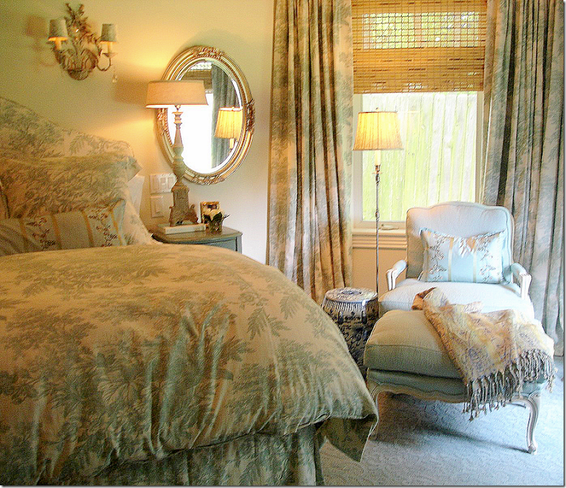
When I first toured “The Dutch Door House”  HERE (interiors by Lyndon West) I fell madly in love with the linen fabric in the master bedroom.   I begged the homeowner to find out whose fabric it was and she obliged, emailing later to say it was a Robert Allen fabric, Eleria HERE.  It turns out the Eleria is actually a very popular fabric, available in two colorways, Biscotti (above) and Green Tea.   I ordered the different colored samples and waited for the perfect client to use it.   I didn’t have to wait long.

A few months ago, a client of mine moved from her large, contemporary house in Bellaire to an inside the loop, traditional townhouse.   Years ago, she had hired another interior designer when she first moved into the Bellaire house.   But, some time later,  I stepped in to help with small redecorating jobs - a study, a powder bath, and a  master bedroom - each time trying to tone down the contemporary décor into something more traditional.    After moving to the townhouse this summer, my client wanted to continue the shift from contemporary to traditional.   When deciding what to take from the Bellaire house and what to sell – the decisions were easy:  her old chenille covered sofa and love seat had seen better days and her glass coffee table was too contemporary.   Her area rug was a beautiful wool patterned rug that, also, had seen better days and needed to be replaced.  The modern looking end tables would meet the same fate.   


image

BEFORE:  At the Bellaire house, the chenille sofa and love seat were showing their age, as was the rug. 

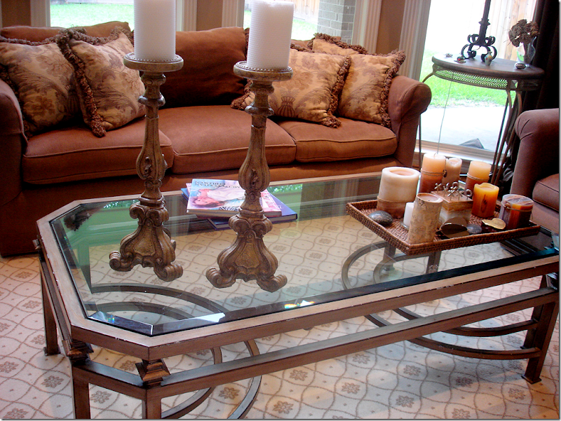
The glass coffee table was too contemporary, as were both end tables.   Everything in this picture was sold, except for the lamps and candlestick.


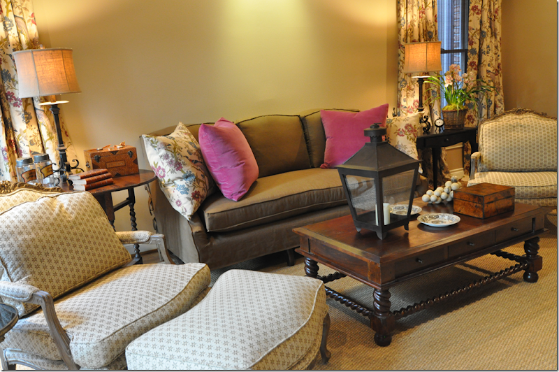
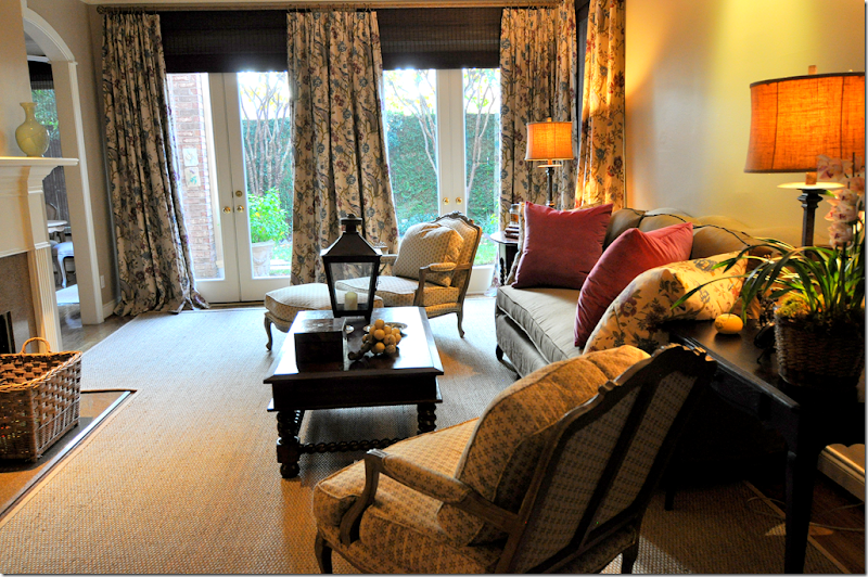
In deciding on a decorating scheme for the new townhouse, my client asked for warm and cozy, specifically, she wanted dark walls.  And, she wanted to plan everything around two bergeres she owned that were upholstered in a brown and cream print.   We decided on a dark taupe for the walls – Pratt and Lambert’s Toasted Wheat , a color I have used many times before.  For the Hien Lam  custom made slipcovered sofa, we used Pindler’s #1766 Vernon in Maple, a copper brown linen adding raspberry velvet pillows to pop color.   After much begging and pleading, my client agreed to curtains and textured shades.   We were on a tight budget and she didn’t want the extra expense of something that was not really essential.  But, I firmly believe that window treatments are important to a design scheme and most interiors look better with them.  The Eleria was the perfect choice for the curtains since we needed major yardage to cover all the windows and, for a linen, the price couldn’t be beat.  Because the breakfast room is open to the living room, we also covered its pretty bay window with the Eleria. We then chose a brown textured shade to hang behind the curtains.  

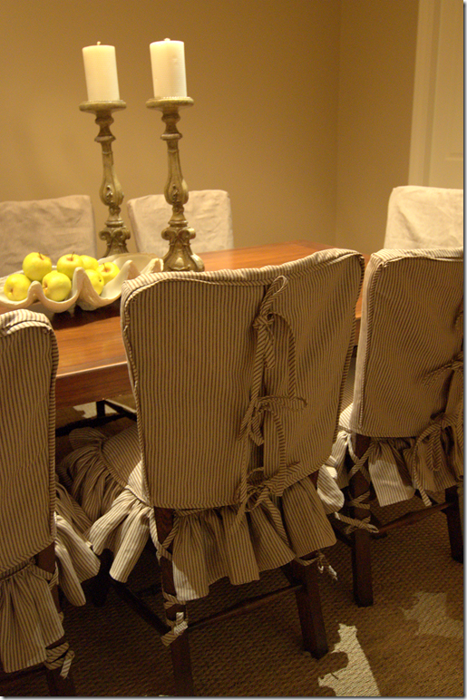
To end the last bit of contention – my client agreed to cover up her beautiful hardwoods with a custom cut seagrass rug that left just a few inches of the gleaming wood showing.  I know, I know.   But, if you want warm and cozy, nothing gives you that atmosphere more than seagrass.      In the dining room, I chose another Pindler and Pindler linen, a stripe, #1767 Casablanca in Truffle, to slipcover the rush seat chairs.  The dining room has no windows, so it needed some fabric to soften up all the hard edges of the wood table and chairs.   I purposely chose overly detailed slips to add just a bit of femininity.  Since we were on a strict budget, using all Pindler and Robert Allen fabrics helped tremendously to keep costs down.   There are a few things still to be decided on – a mirror or art work over the sofa, and a buffet in the dining room.  But for now, here’s the work in progress.


image

BEFORE:   This is how the townhouse looked when my client bought it.   The walls were a dark dusty rose and the curtains were a chintz.  Fortunately for her, the former homeowners took all the curtains with them – but left the costly rods and rings.  Now, all I had to do was convince my client that she needed to invest in window treatments, something many people think of as an unnecessary luxury.  Here you can see how pretty the room is – arches lead to the long entry hall and stairs.  The dining room is through the arch on the left of the fireplace.  The kitchen is through the other arch at the right of the fireplace.  Upstairs are two bedrooms and a study.   The third story is a large bedroom.


image

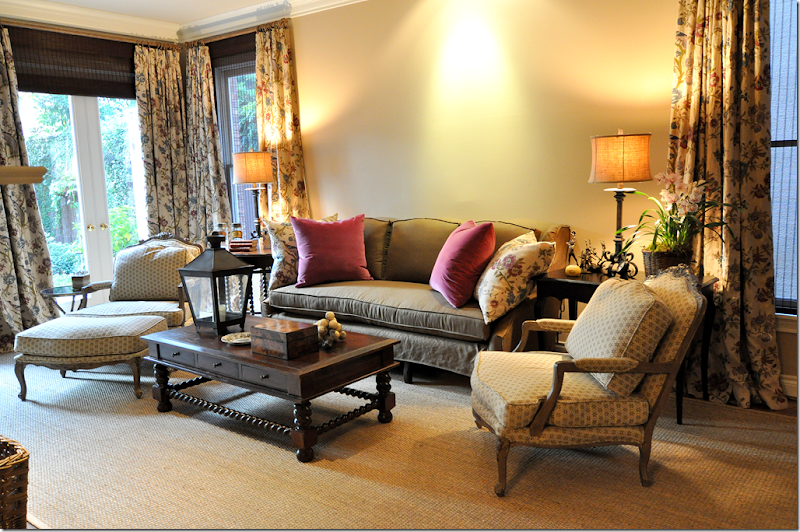
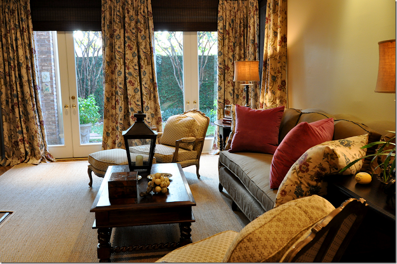
AFTER:   The custom slipcovered sofa has mutton legs and a triple arched back.  The fabric is a Pindler and Pindler brown linen.   The two bergeres were the homeowners and she wanted to work the entire scheme around their brown and cream upholstery.    Yet to be decided on is art work or a mirror to go behind the sofa.  


image

At the windows, we used 2 widths of fabric to create the full, lush look of the curtains.  One width just doesn’t give you that beautiful fullness. 

Curtains and shades by Custom Creations by Monica HERE


image

I bought the coffee table at an import store in the Rice Village.  The antique gateleg table was moved from the study, while the antique French desk on the right came from a Cote de Texas sponsor – Bonnie Neiman HERE.  To update her iron lamps, there are new burlap lampshades from Boxwood. 


image

You can see into the breakfast room on the right side of the fireplace.  


image

I brought out some oversized accessories to update the décor:  a lantern from Olivine and alabaster grapes.    The homeowner has some beautiful antique boxes inherited from the mother and grandmother which we also used.  To keep the room from looking cluttered, we stored away many smaller accessories. 


image

The dining room has no windows, so I covered the rush seat chairs in slips to make the room softer.  The Pindler linen stripe has the same colors as found in the living room to tie both rooms together.


image

The homeowner’s mother made the dining room table out of used bowling alley wood!   Still to be ordered is a buffet for the back wall. 


image

BEFORE:  the kitchen has a small bay window in the breakfast area. 


image

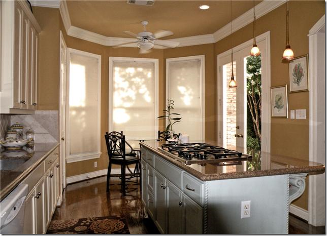
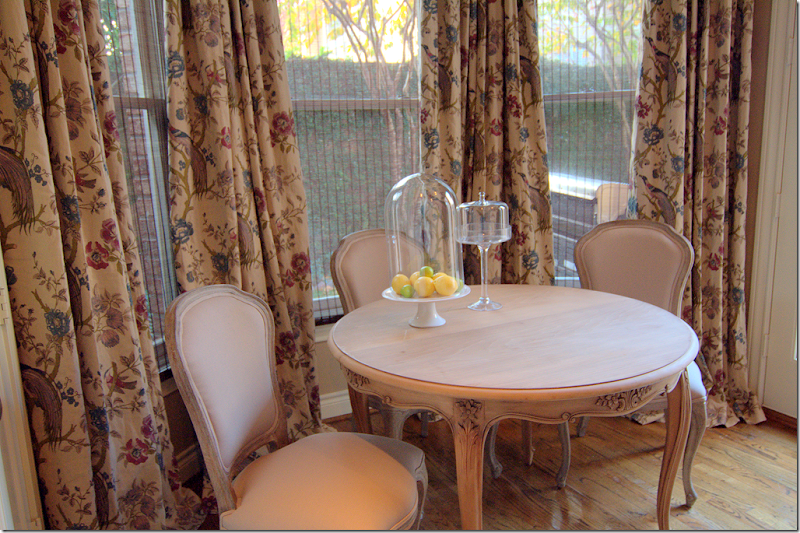
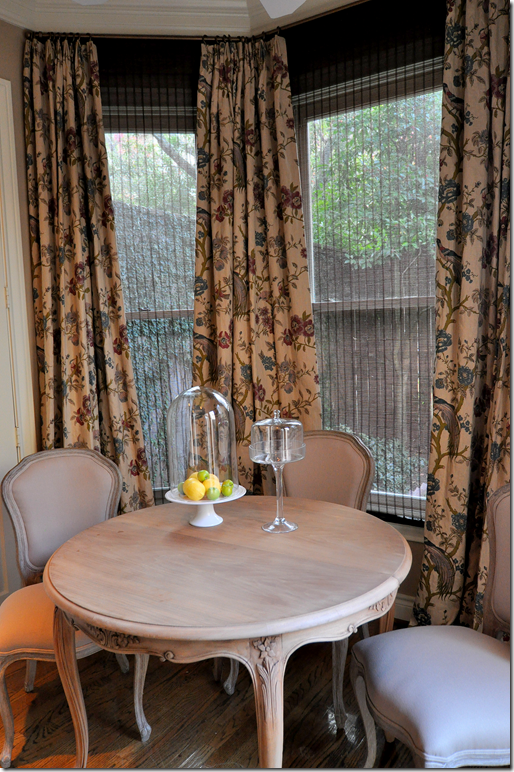
AFTER:  Since the breakfast room opens to the living area – we used the same Eleria fabric here.  The curtains dress up the area and make it seem more like a room, rather than a kitchen. 

The antique table came from Eloquence HERE.  The chairs are from Zentique.  Both, to the trade.


image

Lastly,  the round table opens up to a larger oval shape.  The glass cloche and cake stand came from Indulge.


FINALLY:

image

I want to take the time to personally thank all of you who so kindly donated to Woodbourne’s Christmas Wish List. 

For those who still wish to make a donation, there is time left do so.  Please go HERE to read the details.


A Teenager’s Bedroom

60 comments

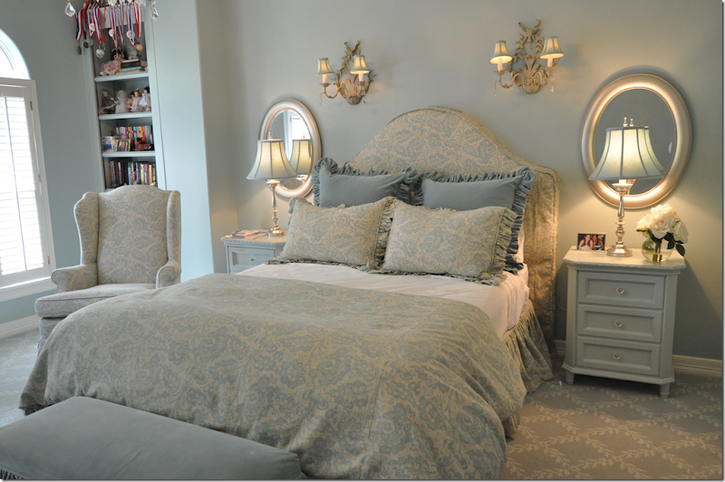
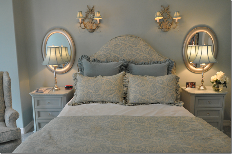
image    The inspiration bedroom – teenager Allie wanted a bedroom that looked similar to this.   Around four years ago,  I had designed this bedroom on a budget, using mostly Pottery Barn merchandise. 


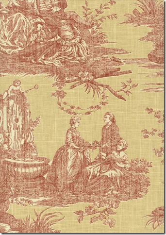
Recently, I went to a client’s house and remembered that I had never taken pictures of her Allie’s, her teenaged daughter, bedroom.   I worked on her bedroom a few years ago – this is the third bedroom I have decorated for the teenager.   The first bedroom was when she was just out of the toddler stage, leaving behind her decorated nursery.    I designed a room around a Waverly Toile in reds and golds.  I KNOW you remember the toile ????   Everyone and his brother had it, or a version of it, from Waverly.    I mixed it with, yes of course, red and cream checked fabrics.  She had a pine headboard from Pier One and a mosquito netting over the bed.  It was really a cute bedroom at the time.  Even her doll beds were fitted with miniature toile spreads.  That toile bedroom was supposed to last her until she left for college.  Sure!    Actually that bedroom was one of my first jobs as a designer.   


  image The famous Waverly toile  in the red and gold colorway.   Ugh!


After Allie and her parents moved to a new house, she continued to use the toile bedroom decor for a while, until she discovered Bombay Kids, when they opened a new store in the Rice Village.   Allie insisted we redecorate her room ala Bombay Kids.    Do you remember that awful crap they sold, pardon my French??   No wonder they went out of business!    It was all purples and zebras and faux Indian Maharajah chic.   I even had a skirted table made to match with a crystal beaded trim.  Beautiful.   Her carpet was a scrolled dark purple.  It was all God-awful and thankfully she outgrew it quickly.


image

Bombay Kids – Faux Maharajah Chic


A few years earlier, I had decorated a bedroom on a budget for a mutual friend using mostly all Pottery Barn merchandise.   Allie asked if I would recreate the bedroom, in feeling, for her.    The two rooms do look similar, but there are several different important design elements.   In the PB bedroom,  the curtains in a large bay window  were the focal point, but I absolutely could NOT persuade Allie’s mother to agree to curtains in her bedroom - a decision that still bothers me to this day.    Conversely, while I could not get the PB bedroom owner to buy a two toned patterned carpet, Allie’s mother happily did, and  the carpet adds so much to the room.   Another main difference was the fabric, of course,  and the wall color.  We used a creamy gray in the PB bedroom, but Allie wanted a soft aqua on her walls.   What Allie wants….


image

Allie’s bedroom, Version IV, if you count her nursery.

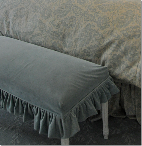
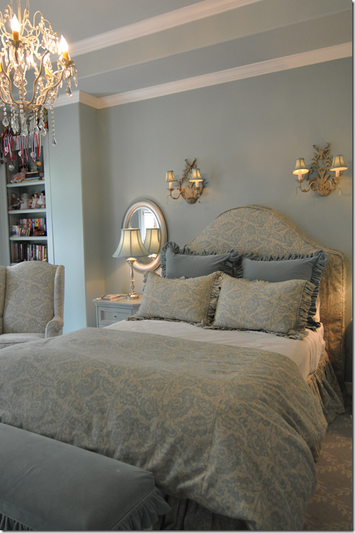
I used a Laura Ashley fabric from Kravet and a velvet for the pillows and the bench’s slipcover.   The Laura Ashley fabric, a linen-cotton, is Briston Seaglass LA1301.324 and is very, very inexpensive.    We had a strict budget for this room and nothing in it was too extravagant or expensive.    For instance, the cute, white end tables came from Target – the Shabby Chic line.   We paid next to nothing for them.    The large wing chair, a hand me down from her parents, has been in her room for years and has been recovered at least three times now. 


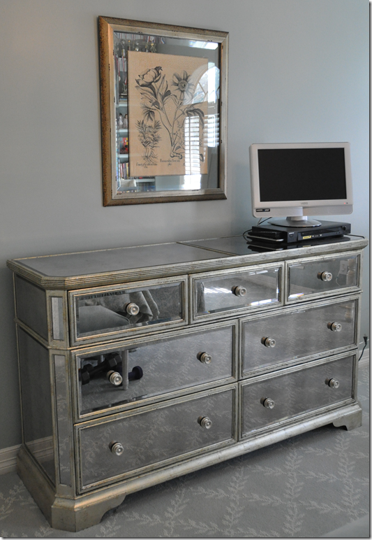
imageAcross from the bed is a mirrored chest from Z Gallerie.   We bought it on sale, but it’s usually $999. 


 image

We bought the bench from the Shabby Chic store in Austin and then made a slip cover for it out of the aqua velvet. 


image I luckily found six matching aqua lamp shades and two inexpensive lamps (but I can’t remember where they are from!)   Allie wanted sconces just like in the PB bedroom, and she also wanted the oval mirrors flanking the bed.  The sconces came from Indulge HERE.   Another item Allie insisted on was a crystal chandelier.  We bought this one online from one of those huge lighting stores and it was under $200.


image

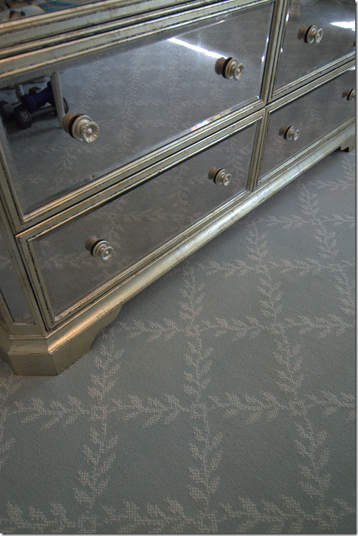
The carpet is a trellis pattern in white and aqua – again, it was very, very reasonable.   While not as inexpensive as plain pile carpet, the custom look is worth the minimal extra cost.  


image

Allie needed something to put all her invitations and pictures on, so I made her a bulletin board.   There was a large blank space between the bathroom and bedroom doors – and I had it made to fit that space.  It is 5’ tall!     If you look closely, you can see that it is tufted with buttons made out of the velvet fabric.  I added a small pleated ruffle to dress it up and soften the edges.   At first while it was still empty, the bulletin board looked odd – a huge blank piece of fabric hanging on the wall.  But,  Allie filled it up very fast.   It has really helped keep her room neat and clean looking.  Once she leaves for college,  her mother can either take it down or hang a few prints on it, framed or not. 


image

Here is the link for the Target Shabby Chic nightstands – HERE.    And here is the link for the  Z Gallerie mirrored chest – HERE.    I’m sorry to say, but I absolutely have no idea what the paint color is!  I”m sure it’s a Pratt and Lambert, but otherwise, I just can’t remember!!!


image And finally, the sheets came from Pottery Barn, from the Pearl Embroidered line.  HERE.   Houstonian upholsterer Hien Lam made the headboard from a sketch.  HERE.


SOLVING A DESIGN PROBLEM:

image Bookshelves for a large bedroom.


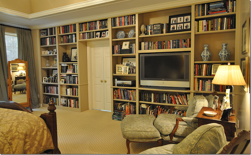
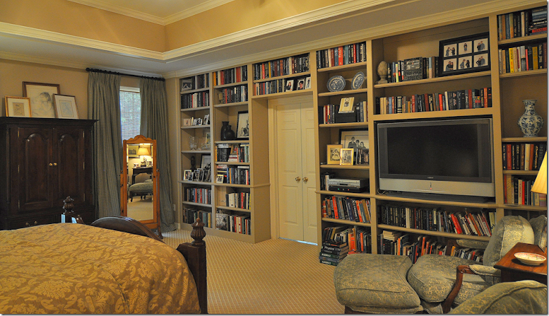
We’ve discussed this issue many time before – what to do about those oversized bedrooms - huge, echoing, cavernous spaces that leave you cold?  Alllie’s parents bedroom had that problem.  Even with a large bed, an armoire, and two chairs and ottoman in a sitting area, the room still felt empty.  What to do?   My clients are voracious readers – in fact the entire family is.  They have a million books, seriously, maybe even 2 million.   Once they moved into their new house, all the built in bookshelves in the family room were quickly filled up.   Next we added more shelves in the downstairs study.   On the large second floor landing, we built a large floor to ceiling bookcase.    Still, there were numerous leftover books needing to be shelved. The solution to the book problem and the empty bedroom problem was to add a floor to ceiling, wall to wall bookcase.  I designed these shelves along the wall where  the bathroom door is.    And yes, the door is not centered on the wall – but there was nothing I could do about that – and in the end, it looks fine just the way it is.     We finished this project over five years ago, and to do it again today, I would make the shelves thicker and fixed for a more up to date look.    Once the shelves were built, the atmosphere in the room changed dramatically.  It became a very cozy space – warm and friendly – despite its large size.     This is a solution I would offer to anyone looking to fill up an oversized bedroom.   Even if you don’t have a lot of books – you can always go to Half Priced Books and buy their Box of Books,  filled with new hardbacks for just $25 – a steal of a deal.   


image

Other things I did to cozy up the room was to add the two toned, trellis patterned carpet – in place of the cream Berber that was previously there.  The client’s furniture was all pine – so, we restained most of the pieces dark brown which also helped ground the room.   I added curtains and bamboo shades to the windows to further soften and warm up the room.   The client used  her own existing bedding in gold, while I brought in blue in the checked curtain fabric.    The now stained dark armoire was short for these extra tall ceilings, but rather than buying a new one, I layered a collection of drawings on top of it to fill in the blank space.    Looking at the room today, it’s hard to remember how it used to look before the bookshelves were added! 


NOTE:  THERE ARE THREE – YES, THREE – GIVEAWAYS COMING SOON!!!  BE SURE TO WATCH AND ENTER.  THE GIVEAWAYS ARE ALL REALLY GREAT ITEMS, I PROMISE YOU!!!!

Webb Design: The Albans House

253 comments

image

Last fall, my neighbor directly across the street approached me about decorating her house. What a job! Across the street – who can argue with that? I absolutely loathe taking jobs across town, and as I have gotten older, I am really not accepting work outside the loop – well, outside the beltway I guess. My days of traveling past the airport for work are over, especially now with the blog. I just don’t have the time to spend it fighting Houston’s horrendous traffic. So commuting by foot is definitely tempting – and I gladly accepted the job. My neighbor has two dogs, one senior citizen and one puppy (who once ran away and I had to chase after him for thirty minutes with no luck – even dangling What-A-Burger fried chicken as a bribe, which he scoffed at. Now there’s a new invisible fence around the perimeter of their front yard for the maniac bird dog – but, I digress.) So, with two dogs, two daughters under ten, and lots of entertaining, my client wanted – can you guess? Slipcovers! OK. OK. I am BEGGING my anti-slipcover stalker to just quit reading this now. It’s going to be all about slips from here on out. When you have two dogs and two children, slipcovers are truly the only way to go and yes, I have heard all about the miracle fabrics available, but I happen to prefer NATURAL fibers!

Besides slipcovers, my client also wanted seagrass. Of course! She lives in West University and everyone here either has or wants slipcovers and seagrass. This client was easy. And no, I’m not talking about her morals. She was easy to please and quick to make a decision, in other words – THE BEST KIND!!! Thank you God for small favors!!! I think we decided on the total overhaul of her downstairs in about 2 hours or less. And with a smile! So nice. AND, as if it couldn’t get any better, her husband is actually funny! Like funny ha-ha laugh out loud funny. Which is much better than the husband who hovers and wants to see all the bills and bids and proposals. I’ve been lucky lately, it seems I just keep getting the best clients in the world and my neighbors top that list. Besides the slips and seagrass, the client was firmly decided on white linen and aqua colored walls and black granite, and these were her only requests. She casually mentioned that she wanted a bold second fabric, not bold in color, but in design, something youthful. I knew what she was thinking about: Kelly Wearstler’s Imperial Trellis fabric – but please. Please! Enough of that. Let’s give other famous and fabulous interior designers-turned-fabric designers a chance.

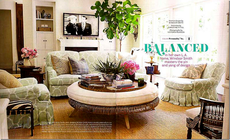
image Windsor Smith’s family room as seen in September’s House Beautiful. This picture served as an inspiration for me when designing the new project.

It just so happened that while we were planning the design, the September House Beautiful magazine featured Windsor Smith’s wonderful new house. Before Jill Brinson’s house, Windsor's was my favorite, especially the family room with her famous double sided sofa covered in her new pre-washed linen fabric from Kravet. I had seen the line at the Decorative Center and fell head over heels in love with it, bringing home samples of all the colorways. Once my client mentioned the “trellis” type fabric, I knew that Windsor’s Riad was going to be the one. And it was. Said nice client agreed immediately. And so, apparently, did every other client in the United States. After the publication of the House Beautiful story, Kravet had sold out of her fabric, thousands of yards of it. We had to patiently wait until December to finally get our order. Do you think I ever heard a complaint about the wait? No, I never did. And I never heard a compliant about the wait for the bamboo shades either.

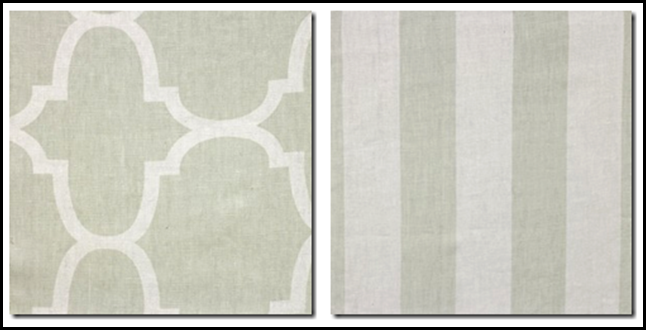
image Windsor Smith’s fabrics by Kravet – Riad on the left and Cap Deluca on the right. My client chose both fabrics, the stripe will be the curtains and the Riad will be used for the slipcovers.

While waiting for the fabrics to arrive, we were busy with a small kitchen redo – new matte black granite countertops, appliances, Shaw’s sink and a creamy subway tile backsplash was installed. In the living room turned study, we built a wall to wall computer desk for the girls with shelving. That room was painted a warm chocolate brown to offset all the seafoam paint throughout the downstairs. The dining room was redone too with new seafoam paint but in a deeper, more luxurious tone. In the family room, we reconfigured the built in shelves to hold a nice, huge flatscreen – allowing us to ditch the former faux-antique armoire hiding a large TV. Ah...I loved getting rid of that piece! And so did my client, of course – she’s nice and easy! And then we waited and waited and waited. Until today, when I finally installed the family room furniture and part of the dining room. Unfortunately the before pictures are missing from my computer for some reason. But to explain how it used to look, the downstairs was painted yellow, with deep red walls in the dining room. The fabrics were all reds and greens. The decor was typical West University 1990s, except now it’s now 2010. There were mini blinds on all the windows in the back and beautiful wood shutters on the front windows. The breakfast room is connected to the family room and there was a light oak colored table with matching chairs along with two iron bar stools. In the family room there was an assortment of brass lamps and a skirted table. Of course there was the Pottery Barn rattan chair and ottoman. That must be their most popular item ever! The many bookshelves held even more framed pictures. Thinking about the installation, last night I could hardly sleep, I was so excited. I really wasn’t worried about it, like I usually am. But, it’s been a few months since I’ve had a full install like this (times have slow for moi) so that added to the excitement. The truck was due at 11:00 am. I woke up at 10:15 am – I TOLD you I wasn’t nervous!

Here’s a look at the family room. Pictures of the kitchen and dining room to follow next week:

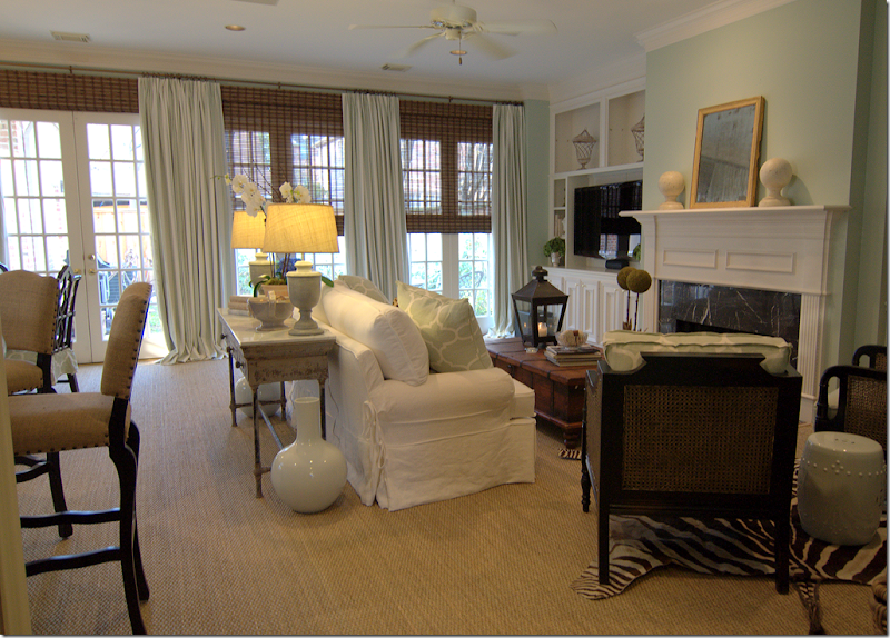
image The Family Room

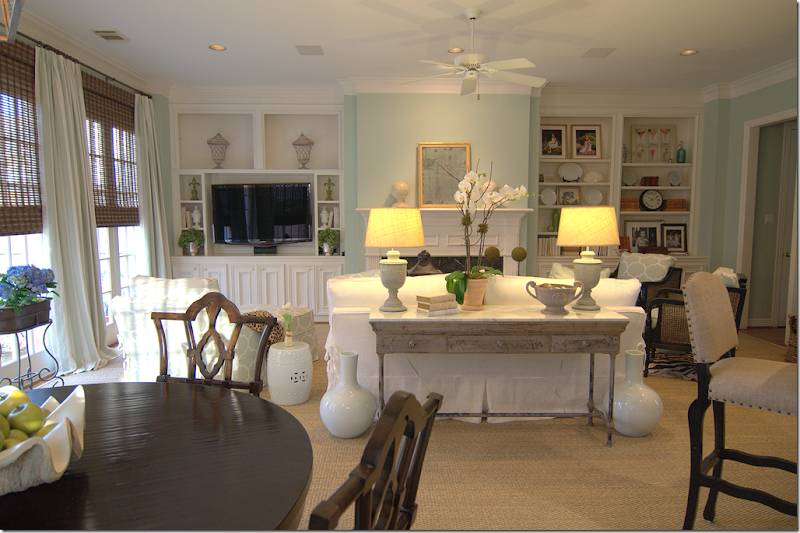
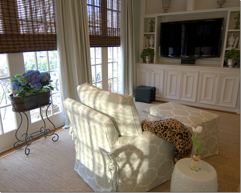
First we covered the entire room, including the breakfast area with seagrass, custom cut 3 inches around the perimeter. The client’s sofa was remade with two new back cushions and one bottom cushion. Her chair and ottoman were slipped in the Windsor Smith fabric, as were the two black caned chairs. The curtains are Windsor Smith’s striped fabric. All Windsor’s linens come prewashed. The kitchen is to the left, behind the curved bar. We replaced the countertops with a matte black granite that is highly textured. (To see the entire picture – be sure your browser is maximized!)

image

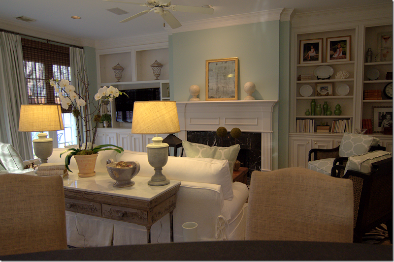
Looking towards the other direction, instead of having two end tables, we opted for a sofa table to put the lamps on. Bookcases flank the fireplace. Two white garden stools are used for drinks tables.

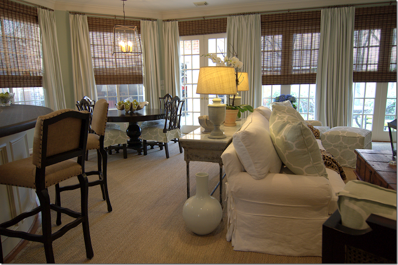
image Each window is covered with the Cap Deluca Windsor Smith fabric and bamboo blinds, which we raised to the ceiling for a cleaner look, extending the visual line and hiding that dead space between the window and the ceiling. The curtain rods are the smallest matte bronze rod and rings I can find. The curtains and blinds really made the biggest impact on the room. I know I say this all the time, but it’s true: curtains and blinds are so wonderful to cozy up a room. The blinds cut down on the sun’s glare and gave the room a soft glow.

image

The breakfast alcove.

The black wood table and chinoiserie inspired chairs came from Noir L.A. The Windsor Smith fabric was used to make slips for the chairs. I put two dozen faux green apples in a large clam shell on the tabletop. The knock-out in this area is the lantern from BROWN in Houston, the best lighting/decor store ever!!

A note about the design process: the client wanted two things – a black granite countertop in her kitchen and bar, and seafoam colored walls. At first we toyed with a Belgian inspired design, using limed woods and painted gray furniture. But with the black countertop and aqua walls, it seemed more natural to go with the black furniture. In the end, I’m really pleased with all the black accents – I think it grounds the room and is a good foil for the white and seafoam linens and paint.

image The view from the breakfast area. The lamps came from Ballard Designs and the shades are from Pottery Barn. The barstools from Noir L.A. are covered in burlap with nailhead trim. All the ceramics came from Legends of Asia.

image The view from the kitchen, looking over the bar and bar stools. The sofa table from GO Home Ltd. is metal with a white marble top. The mirror above the mantel is 19th century from Tara Shaw Antiques.

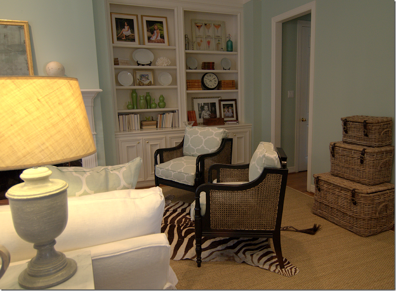
image I bought the zebra rug at Round Top. The cane chairs came from Furniture Classics LTD. The leopard throws are for when the dogs are lounging on the sofas, it will keep them from having to clean the slips all the time.

Note: I tried the photography tip from Michael J. Lee here. On this week’s Skirted Round Table, he advised taking pictures while sitting down.

image Looking towards the kitchen. Along that back wall, I used the set of 3 wicker baskets from Artesia there. Eventually, the client wants to find an antique for that spot, so until that happens, the baskets will do. The lantern is from Vintage Vagabond – which Olivine carries. The coffee table was the client’s.

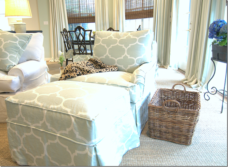
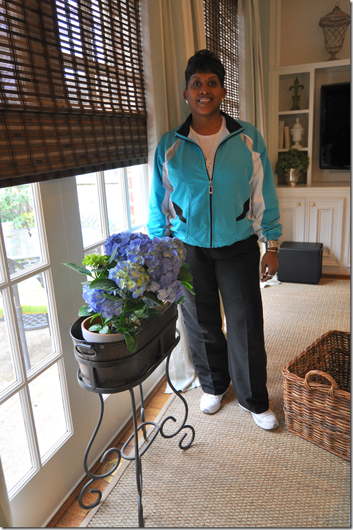
image The client’s chair and ottoman were first recovered in muslin and new cushions made, then they were slipped in Windsor Smith’s Riad fabric. The client owned that darling plant stand so I added the blue hydrangeas.

image Closeup of the slipcovered chair and ottoman. All the seams are 1/4 inch flange.

image

View of the right side of the family room.

imageOld Faithful: Custom Creations by Monica does all my soft goods – curtains, bedding, etc. We’ve worked together from my very first job to my last. To see Monica’s web site, go HERE.

image

Next week I’ll show the dining room and kitchen. I was too tired to style them tonight, plus the curtains weren’t installed yet!

Style Plagiarism!

166 comments

image Jill Brinson’s house: my latest obsession.

Ever since House Beautiful’s December issue came out, I’ve been slightly obsessed with the cover story’s house – to say the least. It’s been a long time since one house has really excited me as much as this one and for me, that’s saying something. Since starting this blog, I’ve been exposed to a barrage of design – and to tell you the truth, not a lot in the magazines has thrilled me lately. I’ve thought about this and wondered – is it just me? It used to be that I would get a magazine and sit down with it and read most of its stories. I’d spend a few hours, maybe even days, thoroughly digesting an issue before carefully storing it away. But lately it seems I go through the magazines so much quicker – I rarely find an issue that takes me more than a day to absorb. Some magazines, I just flip through and toss on the spot. Others never even make it off the rack and into my house. These days, if a house in a magazine doesn’t grab me right away, I don’t waste time on it – after all, I can always go to the internet and jump from blog to blog to blog and spend hours reading all about someone’s charming cottage in a tiny town in Sweden that will never be published, or follow the ups and downs of a house being built in Australia, or even become engrossed in the saga of a bathroom redo somewhere in Alabama. With each quality magazine that is now gone – wonderful ones like Southern Accents and Country Home and Cottage Living – the pressure seems to build on those left. It’s as if I expect The Big Three to come up to the plate and really deliver a knockout punch each month. Am I expecting too much? Am I jaded?
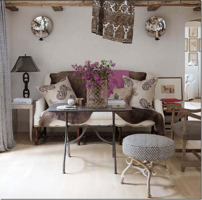
image Close up of Brinson’s living room.

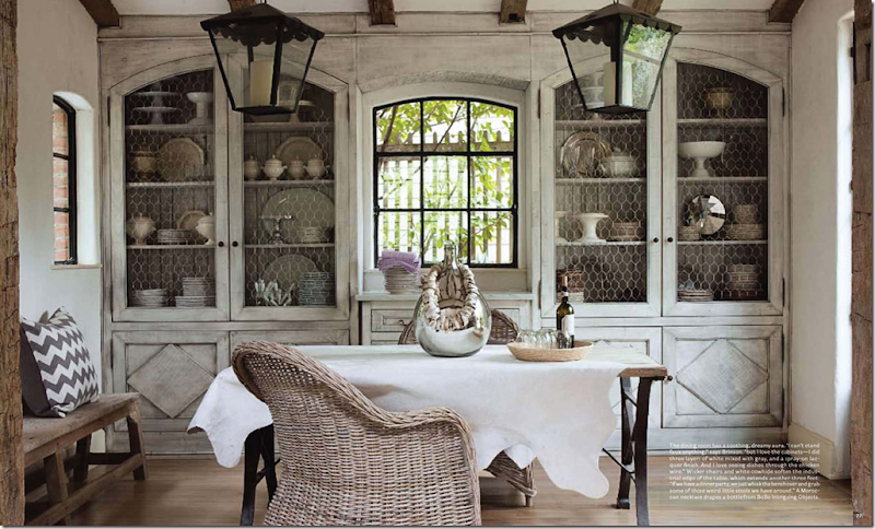
But then a magazine like House Beautiful’s December arrives and it just kills me. Two months later and the issue is still on my dashboard. If there was ever a better magazine issue – I haven’t seen it. I can barely even make it past the cover story. Every time I try to move forward, I go back to that house in Atlanta with its flowerless green garden. The pictures! Those huge, gorgeous pictures! Why every magazine hasn’t followed Editor Stephen Drucker’s lead is beyond me. He takes us to the front door and out the back – and everywhere else in between. But, he had a lot to work with. The house is fabulous, Belgium meets France on the way to Sweden via the downtown commercial district. Sigh. There’s no point in fantasizing about it really. It’s so unique there’s not another like it to be found anywhere. It’s not like you could casually say to your partner one Sunday – let’s find a house like THIS and move. There IS no house like THIS. I suppose you could find a old cottage somewhere and rip out a bunch of decrepit windows and replace them with huge steel ones. But then, what about those ceilings – those tall, beamed ceilings – how would you replicate the loft?! And if such a house did actually exist, would it have as wonderful a kitchen – one that even I would spend my days cooking up meals in there that would make Mr. Slippers Socks Man a contented one, for once. Perhaps the dining room could be copied – a carpenter could build identical cabinets with the arched doors and chicken wire. But you would still need the windows, the beams, the lanterns, the white dishes – and the cowhide on the table and the wicker chairs. It’s nice. The owner, the designer, the stylist – Jill Brinson – she’s something.
image

Brinson is the Creative Director of Ballard Designs and she does interior design, she just designs – anything, everything. A stylist extraordinaire. There is nothing in her house that just “happens” to be there. It’s all planned and thought out – though probably not even consciously. Styling for her is like breathing. Oh, to be that talented! What a gift from God!
image

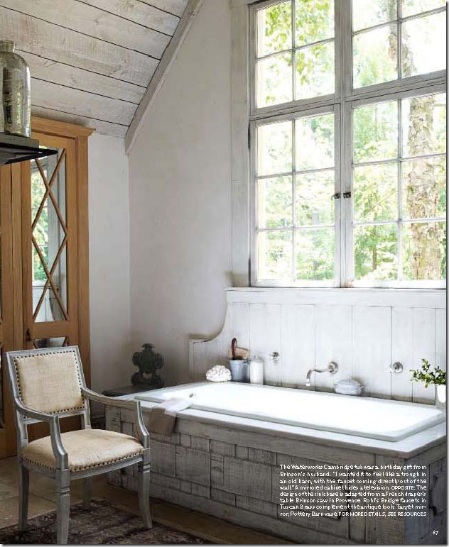
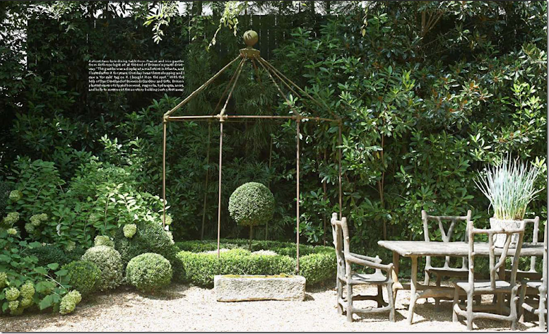
The house was totally gutted and remodeled by the Brinsons. The kitchen became the dining room, the dining room became the kitchen so that it would lead directly to the flowerless green garden. In the bathroom above, Jill wanted her tub to look like a trough with the faucet coming directly from the wall. I love how the backsplash is made of wood, yet shaped like a marble slab.
image

The green garden. It if flowers – it better flower green.

This house has invaded my brain. I wanted to take an hour on The Skirted Roundtable to talk about it – picture by picture, but I’m afraid Linda and Megan weren’t quite as “touched” by the fever as I was. But still, when Editor in Chief Stephen Drucker sat down at the table, it was all I could do to talk about anything BUT the house! I’m not crazy, I promise you. But haven’t you ever fallen madly and crazily in love? Did anyone else feel this way about this house – am I the only one?

image

The House Beautiful cover with mi amour on the cover. Is anyone else out there as obsessed with the Brinson’s house as I am? Was there anyone else who kept this issue in their car for two months – just in case they needed inspiration at a red light? So, imagine my surprise and utter delight when I saw a blog with a magazine cover that looked like Jill’s living room.
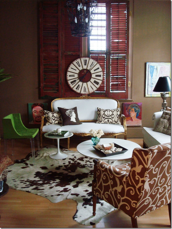
image Valorie aka The Visual Vamp’s living room.

Valorie of the blog Visual Vamp – is obviously as love sick as I am. She spent a few days of her precious time trying to recreate the Brinson cover photo in her own home. There was something in the cover that reminded Vamp of her own house – an original Shotgun off Magazine Street in New Orleans. I can see why Vamp saw the similarities: her white sofa is reminiscent of Jill’s. Vamp owned two brown cowhides, just like Jill. With a little tweaking and a lot of styling – Vamp decided to go for it – she would style her living room to look like the cover story. Could she? Above is the Vamp’s living room before Jill Brinson. She flittered around and gathered her styling tools – and ended up with her version of the House Beautiful cover:

[HB+Fake+2.jpg]

Viola! Here is Vamp’s living room restyled ala Jill Brinson. Pretty good I think! She put her brown cowhide on the white leather sofa, just like Jill did. Vamp added two paisley pillows, just like Jill did. Vamp changed out her coffee table for a tea table. While Jill has a black metal table, the scale of the two tables is the same. Vamp added the hot pink throw and the pink flowers, just like Jill. Then she took a picture of her newly restyled living room, photoshopped it onto a fake House Beautiful magazine cover and there is it. Visual Vamp does Jill Brinson. When I saw this, I almost had a heart attack, I was so excited and jealous at the same time. Me too, me too, I cried! After all, my sofa is very similar to Jill’s (that’s about the only thing though.) I rushed off an email to Vamp: “ok, I’m throwing down the gauntlet (really, what does that mean?) – I’m going to restyle my family room like you did. Do you mind?” Of course in blogland, it helps to have manners and ask such things like, do you mind if blatantly copy your idea? Vamp didn’t care if I copied her idea, in fact she rushed an email back to me in two seconds with these words in the subject line” DO IT!!!!!! Who am I to refuse?
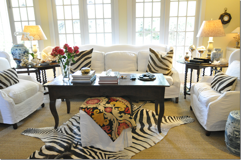
image

Seriously though – how was I going to get this room to look like this:

image

The shape of our sofas are very similar, and the height of our coffee tables are the same. That’s it!! After assessing the situation – I was ready to call it a day and hand the gauntlet back to Vamp and let her keep the damn gauntlet. But, it ate at me. Thinking about how much fun Vamp had had – how great she had made her living room look, how cute the fake magazine cover was, I got motivated again. Alright, I need the pillows. Jill’s fabulous pillows came from “Two Girls In Avignon” (how cute is that name?!) But, how far did I really want to take this game? Would I seriously order two pillows for a fun photoshoot? And I didn’t own a brown cowhide rug like Jill and Vamp did. Should I really go buy one at Ikea just for a picture? They cost a $100. Ridiculous. But, I did have brown velvet pillows that had recently replaced the zebra Oly ones:
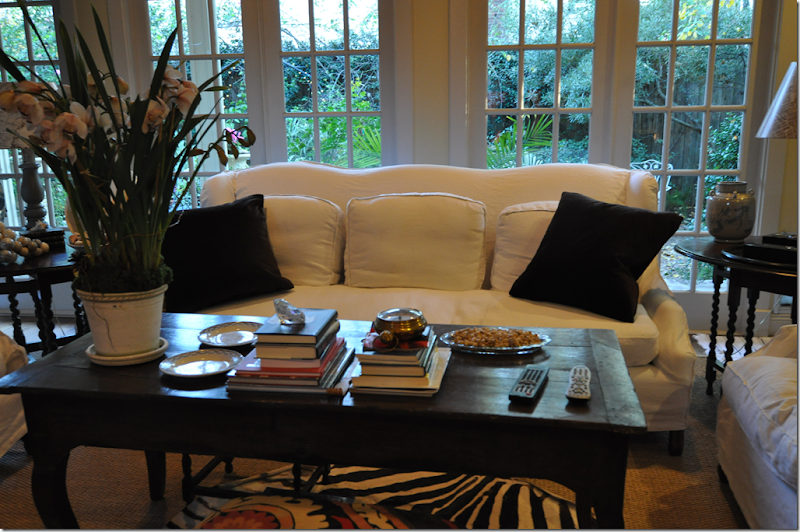
image

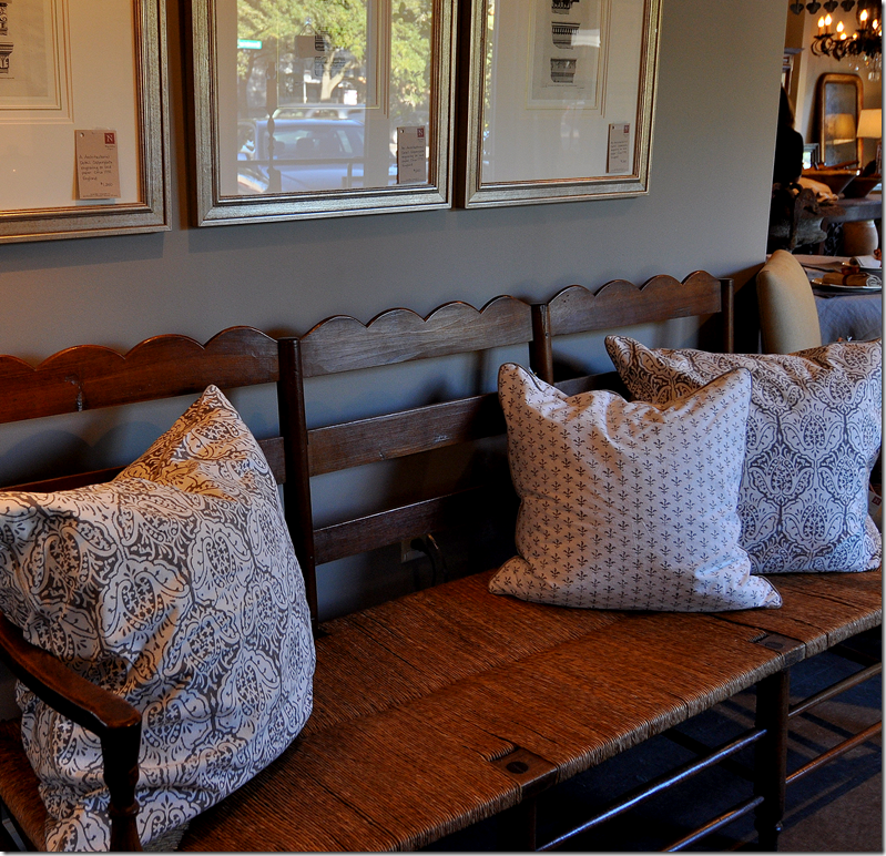
Then I had a brainstorm. The antique store Neal and Co. carries Les Indiennes fabric, maybe I could go there and borrow some fabric and wrap it around a pillow! All of a sudden I had a plan. Go beg some fabric from Cindy Neal. The brown velvet pillows can then take the place of the brown cowhide.
image

Neal and Co. – What a bench, filled with Les Indiennes fabric pillows.

At Neal and Co. I was excited to learn that not only did they carry Les Indiennes fabric, but they had made up pillows in several different fabrics. While it’s not a paisley per se – it does have the “look” of one – so Cindy let me take a few out on approval. Yes! Late last night while all my family was sound asleep, I was styling the family room like some crazed maniac. At one point Ben came down for water and found the room a complete mess and asked simply - “what are you doing?” “Nothing.” I wonder what he would have thought had I told him I was trying to copy the cover of House Beautiful! Perfectly normal, I know!!! Especially at 3:00 in the morning. Well, I’m sure the Vamp understands. For the pink throw – I had gotten a shawl in that shade as a Christmas gift and thought it was a genius idea. Except it photographed a dull coral, not pink. And for flowers – I thought I’d just use my pink orchid. But it didn’t photograph good either. I dragged my suzani on the sofa along with the Les Indiennes pillows, using the brown velvet ones in place of the brown cowhide. It didn’t really look that great – certainly didn’t look much like Jill’s at all and I was prepared to pronounce Vamp the winner in the Plagiarize Jill Brinson contest – with just us two contestants. Oh well. That was fun, but a major disappointment. See what I mean:
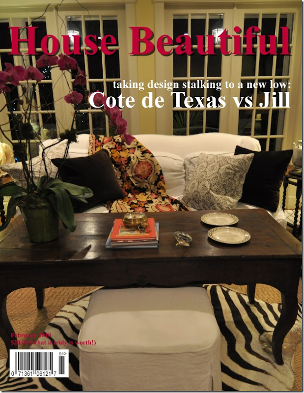
image

No – it really didn’t look all that great. I know Jill didn’t have a zebra rug either, but I didn’t have the energy to move it. You can hardly even see the pillows with the orchid overtaking the photo. The suzani looked alright –but it just didn’t look like the cover picture. And taking pictures at night does not capture the room at its prettiest. Oh well, tomorrow is another day! And, tomorrow I found I just couldn’t let it alone. I was first in line at Joanne’s this sunny Sunday morning buying a few yards of hot pink acrylic suede. And while I’m at it, I’ll buy some pink roses to match. And some green apples. If I am going to do this, I am going to at least try to do it right. Here’s what I came up with today:

image One more time – here’s the original cover picture of Jill Brinson’s living room.

image

And my finished cover – completely different I know, but I’m kind of liking it!

Here is what it my room really looks like now:
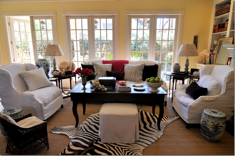
image

In Jill’s room, the throw is more lavender than pink, but I thought pink would look better in my house. And the more I thought about it, the less I really cared if it really looked like Jill’s or not. In truth, I was starting to like the Les Indiennes pillows. I had never gotten used to the plain brown velvet pillows – and I think these add a nice pop. And by a strange stroke of fortuitous luck, I had Hien Lam make me an extra set of pillows in hot pink linen, which I think I can add a few into this mix if I want to get rid of the pink throw.
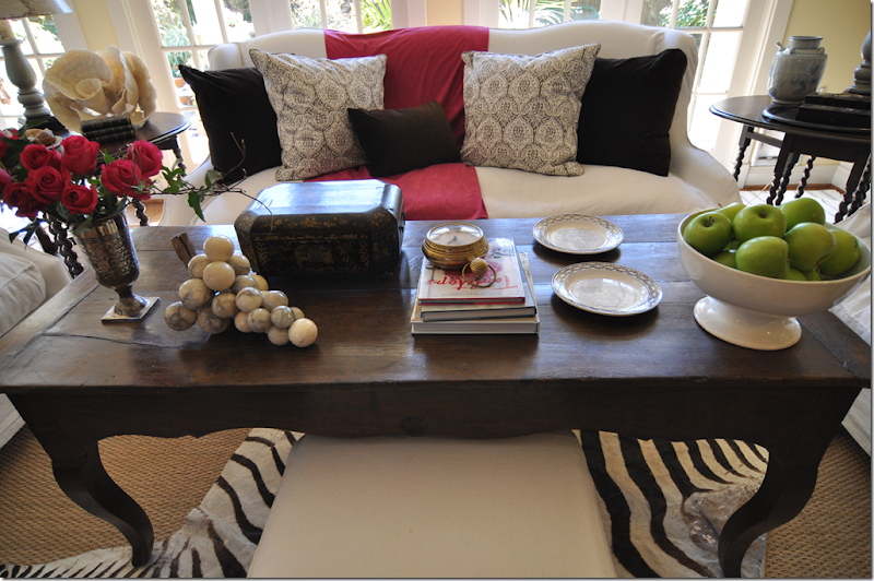
image

Here’s a closeup of the newly styled coffee table. Usually this table is jumble of Ben’s magazines and books and coin catalogues. It’s never nice and neat and styled. Today, I got him a basket to keep under the coffee table – for all his “very important reading materials” and hopefully I can keep the tabletop looking halfway decent from now on. I love the way the green apples look in the ironstone bowl. And the alabaster grapes are a favorite. My lacquer sewing box was the first “expensive” antique I bought years and years ago with money I had saved up for the HADA antiques show. For it’s entire life it’s been in the same place in the entry hall, but now I think it deserves a new home. The plates are French transferware.
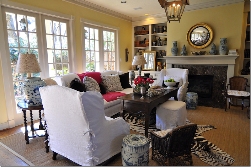
image

A different angle – I think I’ll look for a “real” throw in this color. This one is just a piece of fabric from Joanne’s. Or, I might bring in one of my pink linen pillows instead. I am so excited by the changes, all very subtle – just a few pillows truly, but I think it makes a huge difference. It was all an exercise – a fun project to have a little competition with Vamp - but out of that, I’ve gotten a new, fresh look. And along the way, I think I may now finally be able to put my obsession with Jill Brinson away for awhile. I know that every time I see my new pillows, I’ll think of her wonderful, unique house in Atlanta – and instead of being jealous of it, I will see it as inspiration for future projects. And what did Mr. Slippers Socks Man say about the changes?
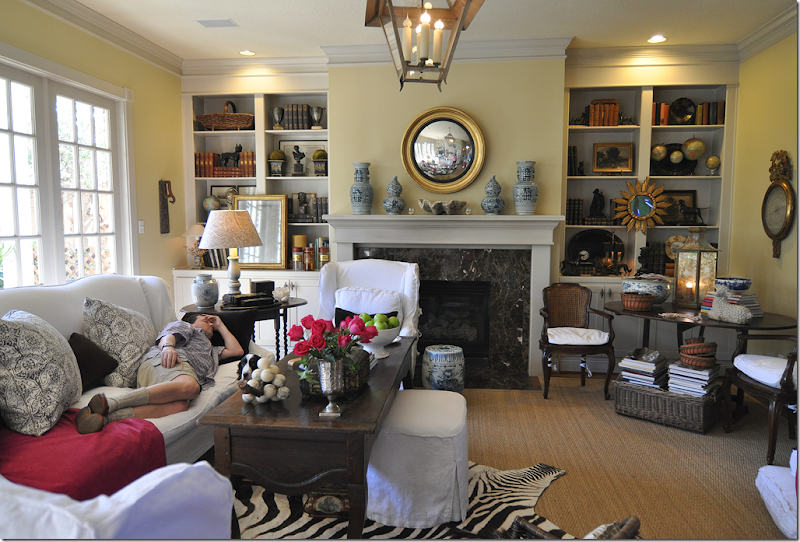
image

When he first came down later this morning, after I was through taking the pictures – he asked “can I sit down now?” and then “are you putting it all back, this looks so stupid.” How nice! After I explained that no, I wasn’t putting it back the way it was, I showed him his new basket for all his junk, I mean, coin catalogues. He buys gold coins just like Glenn Beck. And then he plopped down, despite it looking so stupid, and made himself at home. Him and those slippers socks. Oy. And extra points if you can find Georgie – in her camo colored coat.

image

In the end – I had so much fun styling my room to look like Jill’s. It didn’t come out looking like hers at all but I actually learned a lot by doing this. Taking a few key elements from another room that you truly love might be all you need to spruce up your own room. And the few changes you make, might make you love your own room, all over again!

If anyone out there is a huge fan of Jill Brinson and wants to join Vamp and me in this styling contest – please do!!!!! We would love to see your results! To get your own magazine cover, go HERE. To visit to Jill Sharp Brinson’s web site – go HERE. To read Visual Vamp’s story of her restyling, go HERE.

AND IN OTHER NEWS:
image

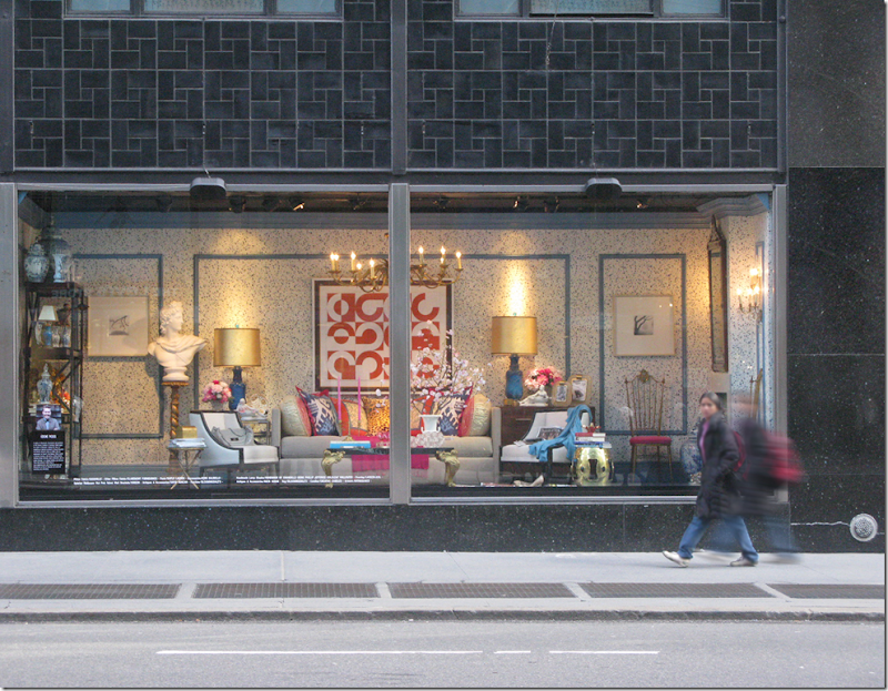
Don’t forget to vote in the Bloomingdales Big Window Challenge!!!! Please think about voting for Eddie Ross and Elle Decor’s window. This is how Eddie’s window looks from the street. It’s an amazing room, anchored by fabulous blue and white splatter wallpaper set inside blue molding. There are two other contestants, but we’re pulling for Eddie here. To see all three rooms – go HERE.
image

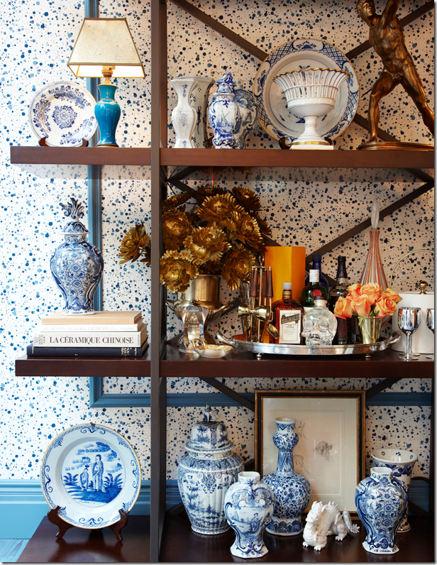
I love how Eddie filled the shelves with blue and white porcelains! It’s so beautiful! Eddie is such a great talent and his window is the best of all three, in my opinion.
image

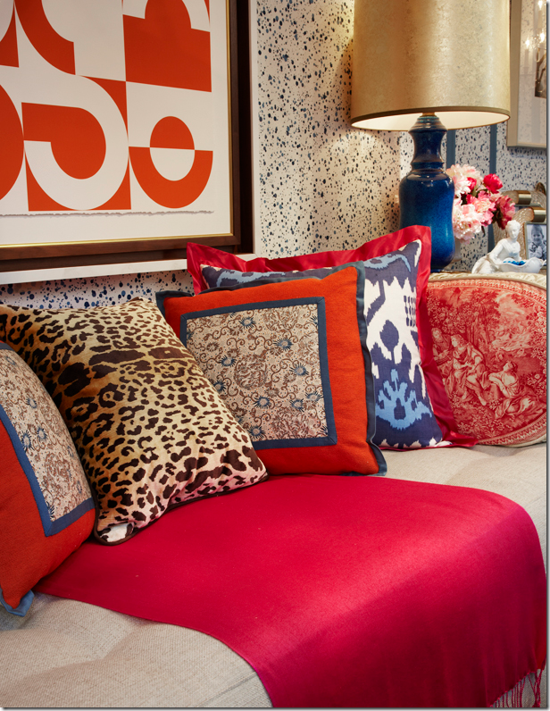
I could have used that pink throw today in my room! I love the toile, ikat and leopard all mixed together.
image

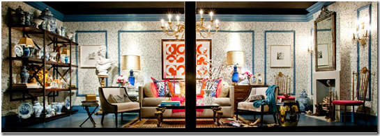
Be sure to vote TWICE a day for Eddie Ross – through this Thursday. For more information on how to vote, go HERE. Eddie needs us all!!!
image

AND, one more reminder, Grant Gibson is at The Skirted Roundtable this week. To listen to this hot designer talk about design, go HERE!