The ultimate in antique furniture: Marie Antoinette’s drawing room in the Petite Trianon. The chairs, the settees, the lanterns – are all so gorgeous – as is the pink and white fabric. The floor is Parquet de Versailles, a pattern that is still copied today. Install some Wi-Fi and I’d be quite happy here!
This year I have been compiling and posting a list of the Top Ten Design Elements that I think help create a beautiful room. These elements are what makes an interior interesting, exciting – a place that when you enter it, you have to stop and catch your breath from the sheer surprise and beauty of the room. Of course, this is a very personal list. All design aficionados have their own ideas of what they feel makes up a desirable and beautiful room. Perusing photographs of rooms that I love, a certain look or style is repeated over and over. These interiors are the ones that draw me in, time and time again: they are more casual, livable, cozy, inviting and warm. To date, the Cote de Texas Top Ten List of Design Elements includes:
Linen
Slipcovers
Seagrass
Curtains
Light fixtures
Wall decor
The item next added to the list is antiques. This is a complicated issue and somewhat misleading because the “antique” might actually be a reproduction. A reproduction can play as important a role in decor as a true antique because it is the shape and lines of the piece of furniture that give it its classic appeal, not necessarily its age. Adding to the confusion, the “antique” as a design element may not even be a piece of furniture, it can be an accent, an accessory, or even a building material, such as an aged limestone mantel, reclaimed wood floor, or stone wall. The appeal of an antique can come from either its patina or its shape. But a room, for me, is not complete, or as interesting, without some type of antique element included in its design.
Why antiques? When addressing what makes antiques important to a decor – in furniture, it might be its shape and the style. For instance, a pair of French bergeres with their sensuous lines add a classical touch. This look can be achieved through using an actual antique, or a reproduction or even an updated version of the antique. The important element to the room, thus, is the lines of the chair rather than its provenance. Conversely, if the antique element comes in the form of a building material – the aged floor or fireplace mantel – its the texture, the worn surfaces and the patina, that enhance the atmosphere. The fireplace mantel may be brand new, but if it is a good reproduction, it could achieve the same effect as if it was 200 years old. Not everyone can afford period antiques, but there are many companies that made great copies for those who want the graceful and sensual curves of a Louis XV chair or console but can’t afford the hefty price of the period piece, or even a reproduction of the piece that was made over 100 years ago.
Further, consider this when understanding why antiques are so important in design. One question a designer gets asked over and over again is, “I want to decorate my room, but I want it to last, I don’t want it to look dated or trendy in five or ten years.” I always say – impossible. Everything dates in ten years. Each decade is easily identified by its furniture styles and fabrics. The only way – the absolute only way to avoid having a totally passé look in ten years is to decorate using classical antique shapes: use Louis XV and XVI chairs, use antique English side tables with barley twist detailing, bring in antique consoles and cabinets. Simply said, the more antiques in your room, the less trendy it will be and the more current it will look for many years to come.
Below are examples of rooms that are decades old, yet look refreshingly new because of the use of antique elements and furniture:
![[elsiearmour.jpeg]](https://blogger.googleusercontent.com/img/b/R29vZ2xl/AVvXsEhIoMhwjExJ0DPImtTOheReQSrf2Sy2GzL-l15oUG7wJNzhSWEVW6QJ11BWeyEziZKR1aWWKySfs-V3vmqpGr9cOevJzZ-Fc109XP5s7sCutU_o6NAr0tg4n1YSvWNoyyZjaLzfuJkoEP0/s1600/elsiearmour.jpeg)
Elsie de Wolfe, 1909
This photograph was taken of a room designed by Elsie de Wolfe in 1909. Think about that for a minute – 1909, over 100 years ago. If this picture were in color, I’m not sure anyone would be able to accurately date the interiors. Look how “today” this room actually looks. All the French chairs, some dressy, some country, make it impossible to detect this room is as old as it truly is. The dining room chairs even wear “trendy” slipcovers” over their backs. Garden elements – the stone capitals – so prevalent in the 2000’s are here at the turn of the century. What makes this room so timeless? What makes this room look fresh today? Without a doubt, it’s the antiques – the classic shape of the furniture. The antiques, or the classically shaped chairs (for these chairs might have actually been new reproductions), keep this room timeless. The classically shaped chairs and tables and the rugs make it impossible to declare this room “out of style.”
![[dewolfe.jpeg]](https://blogger.googleusercontent.com/img/b/R29vZ2xl/AVvXsEir13uu-aE05esZHSYotyOmO36AZo7kNj4zwZvcHeSNhcNm9LgtrKGp1pVhbzwVAr5DBLr1VgS7fVGdEqDZMPSWpiIJeIacsIphdxNlBaSFn_DVcGR4K0BJwLnRv1Yd3C05A3Prls9uhhjp/s1600/dewolfe.jpeg)
Elsie de Wolfe at Versailles
Another timeless interior from Elsie de Wolf: this time the interior is her own house located in the shadow of Versailles. Again, the antiques – the chairs and the tables, the settees, the classic patterned Versailles parquet floor, the French doors, the marble mantel, the leopard prints - all keep this room from screaming one decade or another – or, even one century or another. Could you, if you had to, determine when this room was decorated? Gorgeous!
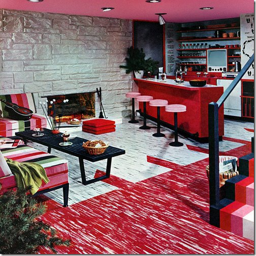
What Not To Do: This is the decor that most people grew up with in the 1950s and 1960s. While mid-century is desired by many today, this is a look that is best forgotten. Compare this decor with the decor below – both from the same time period:
Marian Hall - 1950
This room was also designed in the 1950s, by Marian Hall. This room is timeless, due of course to the use of classical shaped chairs and tables. These again may be antiques, period or reproductions – who can tell? Their lines and shapes are what is important. Though this room is 60 years old, even the colors are amazingly modern – the white walls, the olive greens and sages, the peaches and khakis. This one photograph proves my point more than any other – using antiques will keep your interiors from dating.
Again, What Not To Do: a typical interior that screams 1950s. I actually grew up with a fireplace just like that.
Nancy Lancaster, 1950s
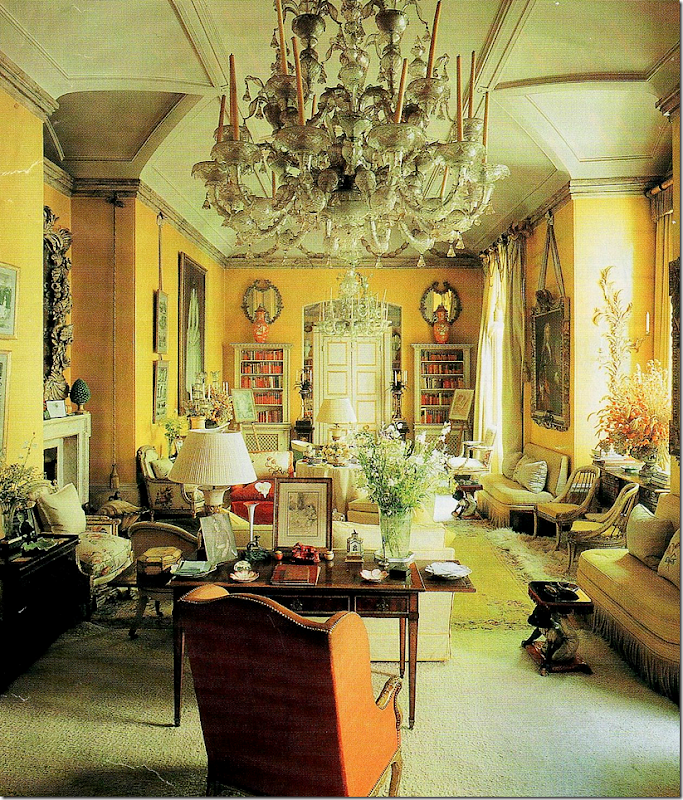
One of the more famous interiors in the history of interior design, the yellow drawing room by Nancy Lancaster which features both English and French antiques in a delightfully cluttered space. Again, utterly timeless – this space is not defined by any decade or style.
Nancy Lanscaster, 1950s
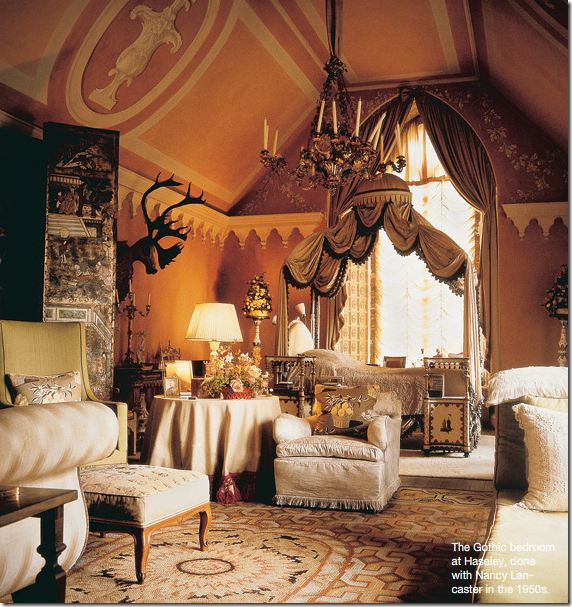
Another 1950’s decor by Nancy Lancaster – her bedroom at Haseley. I adore this room! Again, the antiques, the screen, the bed, the accessories, the rug, all make it timeless and classic.
Michael Taylor, 1950s
Even contemporary design can be timeless. This furniture is not antique, but the shapes and detailing come from the classic: the lamps resemble English barley twists, the side table with its fluting takes it looks from an antique column, the chairs are shaped like Louis XVIs. Here the contemporary furniture is based on the classical which makes it timeless itself. Does the trendy cowhide give you a clue to the decade this room was designed? Michael Taylor – 1950s. Amazing.
Michael Taylor, 1960s
Another design by Michael Taylor. Though most known for his later contemporary work, his earlier work from the 50s on, was more classic. Here – a sitting room is made timeless due to all the French antique furniture (though who is to say it is truly antique or reproductions?) I adore the slipper chairs with the zebra upholstery! Adding a classical element is the tapestry, the lamps, the hanging shelf, the rug – all most likely antiques, or reproductions. Remember: any item over 100 years old is officially an antique, regardless if the antique is actually a reproduction.
This room recently designed by Miles Redd reminds me of the room above by Michael Taylor. This room is timeless and could have been designed in any decade. The classic chairs and tables, lamps and chests give no clue as to the actually time this room was designed.
Another timeless design – what decade is this from? Coco Chanel’s French apartment from the 1950s. Notice the comparison to this room below:
Deandra Douglas’ estate - the antique table is similar to Coco Chanel’s. The antique tapestry resembles Chanel’s screen. Both rooms are similar in style, yet they were designed fifty years apart. Again, timeless, classic antiques always make an interior more interesting.
John Saladino
The Master at Using Antiques: One of John Saladino’s most famous designs is this apartment in New York City. Along the back wall, a mirror is layered against a hanging tapestry – a trademark of Saladino’s. The antiques are mixed with traditionally upholstered pieces. As always – it’s the beautiful antiques that Saladino chooses that make his interiors so stunning. For instance, the pair of chairs shown above are so strikingly gorgeous – how could anyone choose contemporary chairs over these? The painted detailing on the chairs, the shaped backs, the curved arms – these chairs add so much interest to the room, it’s hard to imagine the space without them. But….are these truly antiques or new? Remember – it’s not always the provenance that’s important. Sometimes it’s just the design.
John Saladino, Villa di Lemma
John Saladino’s own Villa di Lemma, again a mix of English, French, Italian and Spanish antiques. Each antique is so beautiful and special, one alone would be enough – but an entire room full of this caliber of antiques is stunning. Saladino’s interiors are always warm and welcoming, inviting and interesting. And it’s his use of antiques that create that perfect atmosphere he is so adept at.
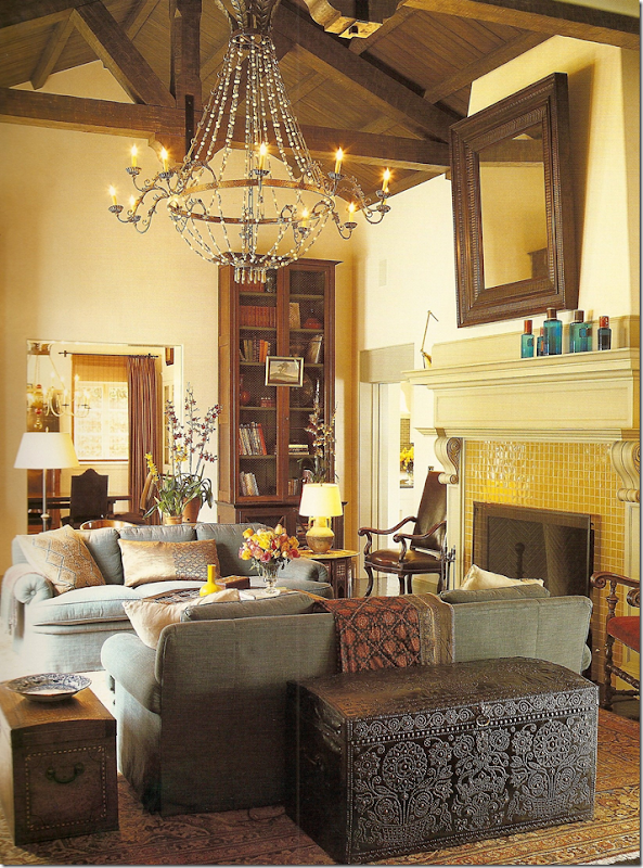
Another view of Saladino’s living room filled with beautiful antiques and contemporary art. Would this room look as beautiful filled with Italian contemporary furniture? The house itself looks like an antique castle but it is from this past century.
Jose Solis Betancourt
This room, designed recently by Jose Solis Betancourt is a combination of contemporary upholstery shapes mixed with antique side chairs and accessories. The mirror, the lamp, the art – are all antiques which makes the room classic and timeless, despites it contemporary feel. Imagine this space without the mirror, the lamp, the chairs - it would be cold and starkly modern. Instead the antiques lend the warmth and beauty. Betancourt studied under the master, John Saladino, and his influence here is very evident: the mirror layered over a hanging textile, the side chair with a waterfall skirt lending a slipcover appearance to it, the lilacs, the mix of new vs. old – is all so very Saladino.
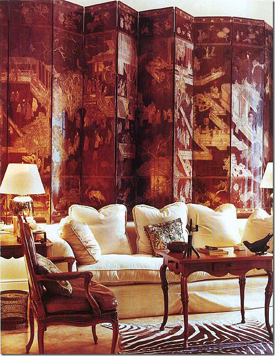 Rose Tarlow, an antiques specialist, decorated her apartment in London over 25 years ago – nothing has been changed since and it still looks as beautiful as the day she created it. The antiques of course give it its timeless appeal – the table, the chairs, the screen, the accessories – nothing dates.
Suzanne Rheinstein
This orangery designed by Suzanne Rheinstein almost twenty years ago, still looks fresh and stylish. Here the antiques are painted which make them slightly less dressy and serious. The classic Brunschwig and Fils chintz is timeless. Slipcovers and apple matting are trendy elements today, though they have been used for centuries in England. The painted screen and hatbox are colorful – not stuffy like antiques are perceived to be. Is this house in the countryside of England? It certainly looks like it, but actually it’s in Virginia. I would decorate a room just like this today and change little, if anything, about it. Rheinstein would disagree with me – she did totally redecorate this room, but I always liked this version more.
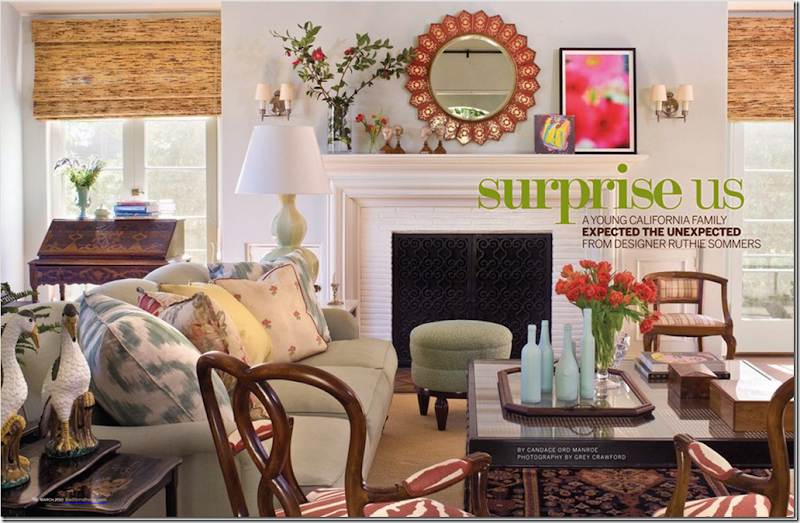
Here, a newly decorated living room from L.A.’s Ruthie Sommers. Classic fabrics – ikats and zebra prints, chintz and embroideries look new and fresh. Yet, the antique pieces are what provide the interest, the warmth: the chinoiserie side tables, the wood arm chairs, the desk, the accessories. This shows how a younger couple can decorate incorporating antiques and still get a hip look for today.
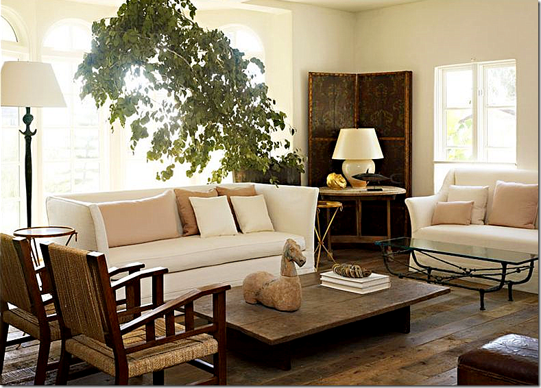
Antiques Don’t Have To Be Fancy: Rough Luxe, the new buzzword in design – mixes the rustic in a stylish way, it heralds the imperfect. Here, LA’s Atelier AM mixes an antique leather screen with chairs from the 30’s. The soft pastel silk pillows are juxtaposed against all the harsh edges. This look, taking its lead from the rustic and sparse Belgian design, is rapidly gaining in popularity. There is something honest about this look – stripped bare of all excesses and frills, its appealing in its simple approach. But don’t think it’s easy to design this way. It takes someone with a keen eye for design, for proportion, for color, to be able to put something together like this and have it been so pleasing.
Hot, hot, hot stylist and interior designer Jill Brinson’s Atlanta house has a Rough Luxe appeal. Her clever mixture of new with old, imperfect antiques, has its roots in Belgian styling. Totally personal – her house is filled with pieces picked for their lines, texture, and uniqueness. The antiques are not necessarily precious but that is the appeal.
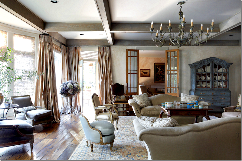
Antique Architectural Elements: Antiques that are important to a room can be structural. Here, antique flooring really adds to the look of this room. The walls, the ceiling, the windows give much atmosphere to this decor – without the structural elements the room would be much less interesting. It all looks so inviting, comfortable and warm due to the weathered patina of the architectural elements.
Antiques don’t always have to be furnishings. Here, the walls of the room are antique: the boiserie (paneling), the parquet flooring, the fireplace mantel, the windows. All the building materials are antique or are made to look antique, creating a room that is incredibly beautiful. This house, home to a famous Belgian fashion designer, is the height of timeless decorating. It is impossible to date this room – was it decorated in the 90s or the 70s ? Is the house new or a century old? Will the design looked dated in 20 more years? Of course not. This room is perfection and one of the prettiest designed rooms in recent memory.
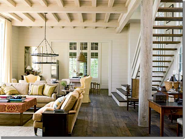
Architectural Elements Don’t Have To Be Old To Look Old: Here, in contrast to the above room, the building elements of this house are not antique, but are made to look old: the paneling, the ceiling, the windows. The rustic antiques, the tables, the stools, all add that warm touch to the room that you just can’t replicate with store bought furniture. So charming!
Unfortunately, we can’t all afford to live in glorious old houses like this. The appeal of this house is its patina and its architecture. The aged terra cotta tiled floor, the thick stucco walls, the arched windows and doors, the shutters - it’s all so romantic, even inviting though there is barely any furniture.
Faking Age With Antique Architectural Elements IS Possible: The owner of Chateau Domingue remodeled her house to make it look centuries old. All the patina was added using architectural salvage from her shop. The walls were once sheetrock but now they are clad in antique stone which was brought over from Europe. The flooring is also aged, brought over from Europe. New can be made to look old – and it is especially effective when the salvage is antique.
Another new kitchen made to look old. All the cabinets were removed and replaced with antique consoles and dressers. This kitchen is by Houstonian interior designer Jane Moore. Additionally, her furniture is also antique: the dining room table is Swedish, the upholstery pieces are antique frames. This is just so much more appealing than a contemporary kitchen with rows of cabinetry.
I love white rooms – I think they are wonderful, especially white rooms filled with white linen slipcovers. While this room is wonderfully designed, it not one I would choose for myself. Why? There are no antiques, no antique reproductions, nothing that warms up the room, makes it cozy looking and inviting – two things I need to see in a room to make it appeal to me. This room screams 2000’s. In 10 and 20 years, it will be dated and I assume, the decor will be long gone, changed by owners looking for something less obvious.
And another white room that does nothing for me emotionally, except leave me cold. One glance and it’s done with. There’s nothing to hold your interest – all the wood looks the same, an anemic pencil color, there is nothing romantic here. The art work is itself puzzling – one is left wondering when the movie is starting.
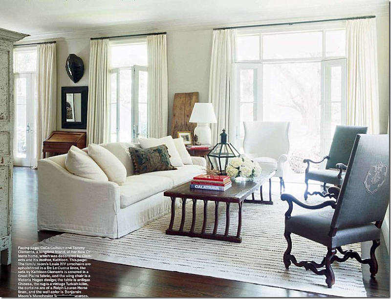 By contrast, this white room is everything the other two above aren’t. It’s interesting and warm, inviting. The two chairs are antique, as is the wonderful Chinese coffee table. These pieces, along with other accessories around the room make this space more timeless and less contemporary. Very beautiful.
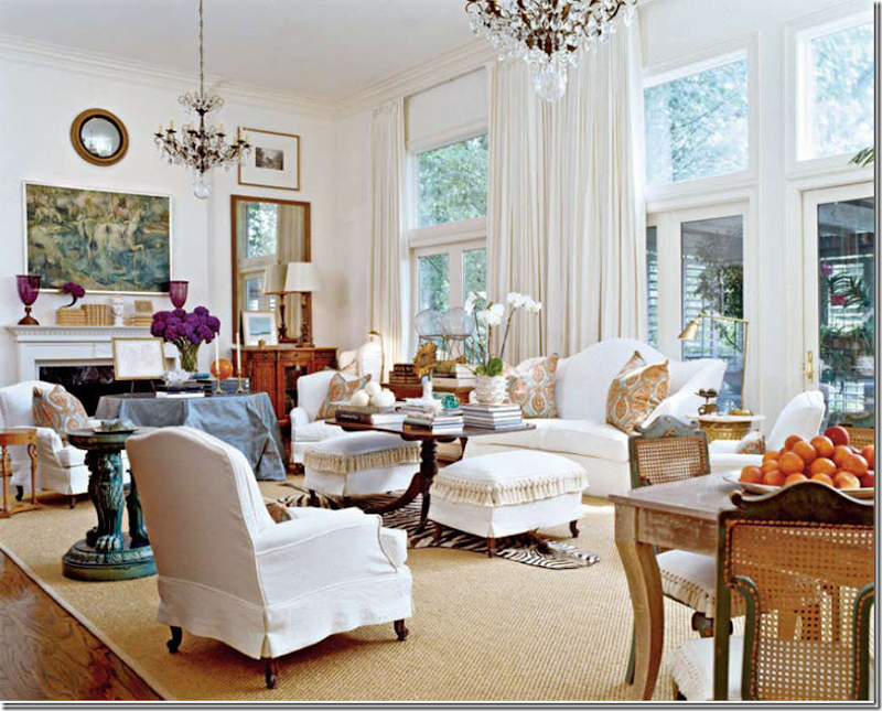
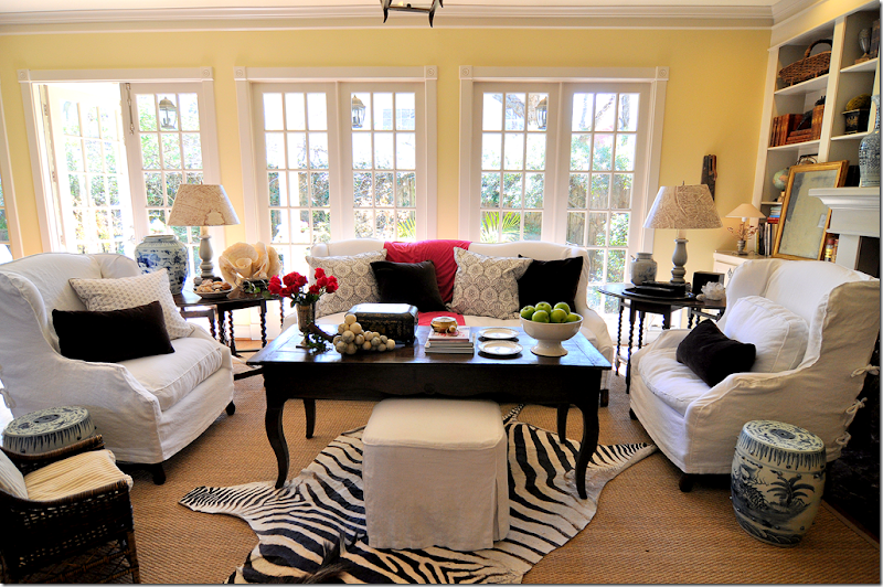
Another white room that appeals. This room is so interesting, so vibrant with all its layers and clutter. Your eye jumps from table to table to mirror to art work, to fabric to stacks of books and then it starts all over again – wondering what was missed on the first glance. The room is alive, it looks like someone actually lives here, drinks coffee here, reads a newspaper here, plays cards and eats a snack here. It’s cozy, it’s warm, it’s inviting – everything you would want in a room. It’s a large room made smaller by all the furniture. There are so many different textures – the seagrass, the zebra, the fringe, the silk taffeta, the smooth crystals, the soft curtains – it might be difficult to keep your hands to yourself and not caress all the different materials. This room is one of my favorite of last year and I have included it in each Top Ten Design Element yet: linen, slipcovers, seagrass, curtains, light fixture, wall decor – and now antiques. How far will it go – will it qualify for all Top Ten Elements? Stay tuned!
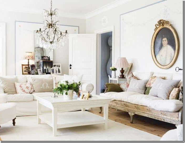
Another beautiful white room, warmed by the antiques – the antique sofa, the large, wonderful oval portrait and the Mora clock peeking in from the next room. Besides being all white, the room is also Swedish, another personal favorite of mine. Imagine this room without the antique sofa or portrait – it wouldn’t be quite same, would it?
This white room by Kay O’Toole is all antiques – of course - O’Toole is an antique dealer. The fabric on the chairs is old gray and white Fortuny. For years I lusted after this apartment – every single room was glamorous!
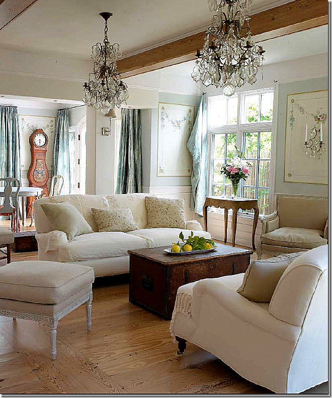
Another Swedish room, with an antique chest acting as a coffee table, antique tables, chairs, and Mora clock. The crystal sconces and chandeliers add an extra touch here. Again, the antiques warm the room with their patina, which then adds another layer that catches the eye when walking through the space.
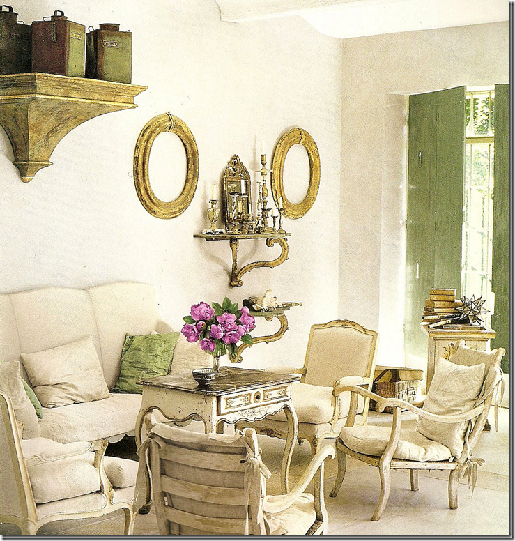
All white with a touch of green in the shutters and pillows. What a wonderful living room! The two empty gold frames add a touch of whimsy, while the furniture showcases country French at its best. I love the mix of chairs – two pairs, one is dressy, the other is wonderfully slouchy. These antiques are the opposite of the “don’t touch” antiques of yesterdays. Instead, these invite a lingering of the hand over the their smooth, painted woods. Beautiful!
Gerrie Bremermann designs an all white room using silk taffeta for curtains and lots of antiques. Living in New Orleans and owning her own antiques shop insures that Bremermann’s clients get large doses of patina in their rooms. Typical of a Bremermann room, the majority of antiques are French.
My own family room before I painted it gray. I advise clients to buy at least one antique piece of furniture for each room. This then becomes the anchor of the room. One can decorate around it, change fabrics and accessories, without having to ever replace the furniture. Here, my antique dough table is used as a coffee table. The two barley twist gate legs are from the 20s probably. They are so heavy, unlike new tables, plus I got them for a steal - $300 each from a dealer in Houston.
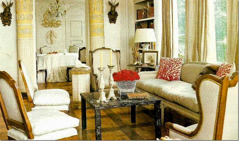
This all white/cream room is so feminine – thanks to the Swedish and French antiques. I love how the original upholstery is duplicated by the use of tiny nailheads that are usually covered by trim.
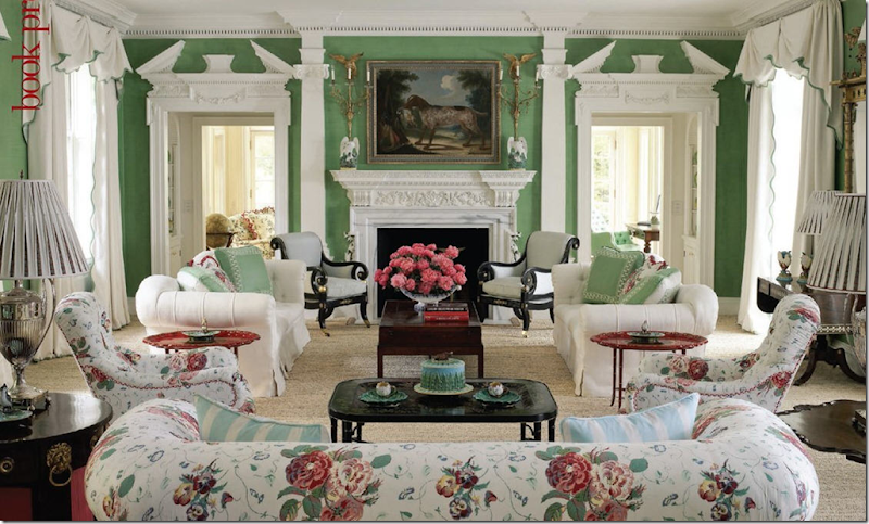
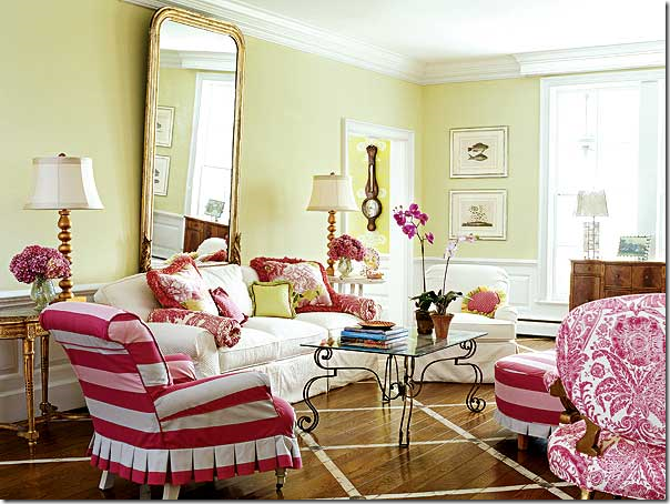
Color: This fabulously bright living room is timeless – due to the antique furniture and to the architecture of the room with all the moldings. The fabrics are classic chintz. When was this designed?
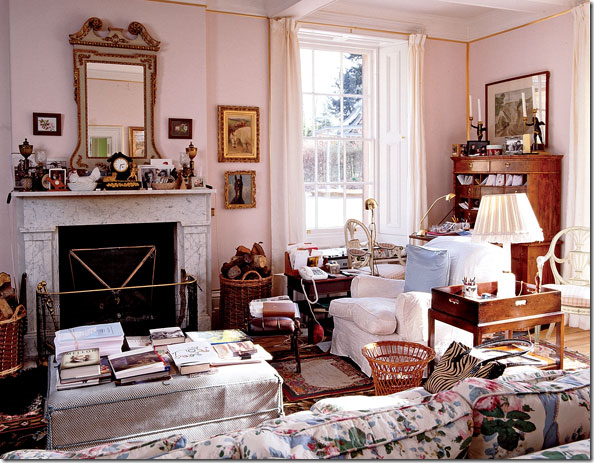 This sitting room reminds of the same room above – this is where the Dowager Duchess of Devonshire moved to after her husband died. It’s a smaller, much more cluttered and lived-in version of the Diamond and Baratta room above.
Michael Smith’s rooms are classic – always filled with wonderful antique furniture and accessories. This room is a personal favorite. Imagine if the chairs, the trunks, the desk were replaced with contemporary designs!
Charlotte Moss’ living room has beautiful matching consoles and antique chairs and tables. The rug! She has a wonderful eye for creating warm and inviting interiors using hand picked antiques.
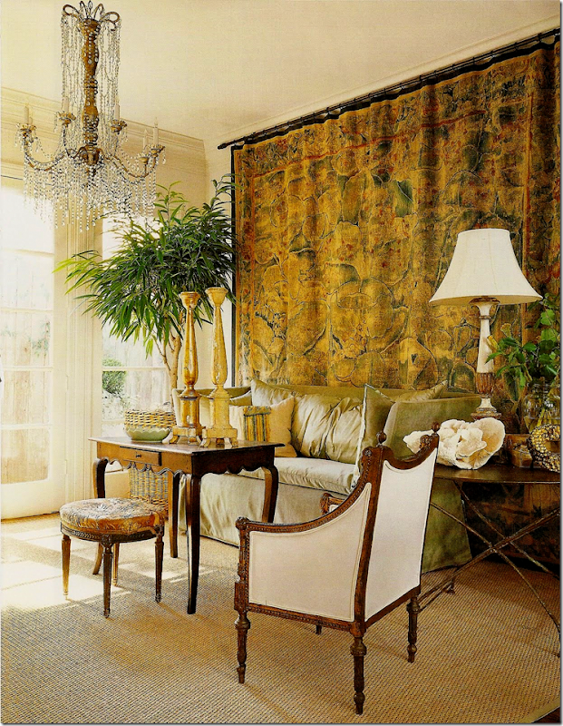 Everything here but the sofa is antique. The owner is antique dealer Donna Brown of The Gray Door in Houston. Her townhouse is fabulous! The chandelier and the tapestry are to die for.
Donna Brown’s kitchen and family room. She replaced a standard kitchen with antique elements such as this office file. I love the stool and the wine tasting table.
 Babs Watkins, Julie Baker and Eleanor Cummings all shared the design credit on this house. Without a doubt the antique furniture and accessories made this room beautiful. Hard to imagine what it would look like with contemporary furnishings.
The real deal: this country house in England is filled with English antiques.

Another mixture of contemporary and antique. The antiques make the room more interesting and add much needed texture.
I’ve always loved this room with the old French leather chairs and the antique tables. Nothing is too fine or unaffordable here which helps make the room that much more appealing.
Antiques can be fun – not stuffy. The large gilt Louis Philippe mirror is almost playful here in a room filled with lime green and hot pink.
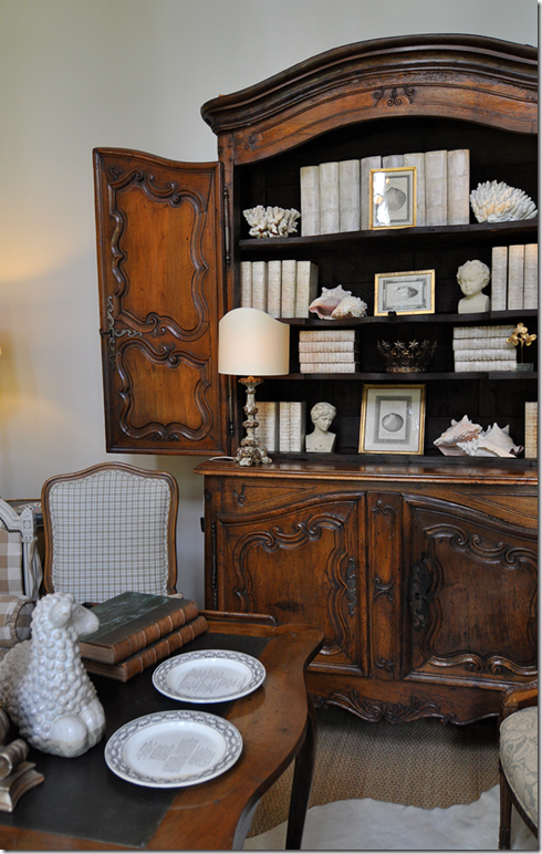
When starting out, try to buy one big piece of antique furniture for each room. If money is an issue, then save up instead of settling. I waited years and years (15 to be exact) to be able to afford a Buffet a Deux for my living room. I used funds from my business to pay for it myself so that my husband couldn’t interfere!! Now that I have this piece, it will always be in my house – somewhere – and hopefully in my daughter’s house one day.
One fabulous antique is all a room needs. The chairs could be new or old here, but it doesn’t matter when a such a fabulous antique like this armoire is present. The chandelier is quite exquisite too.
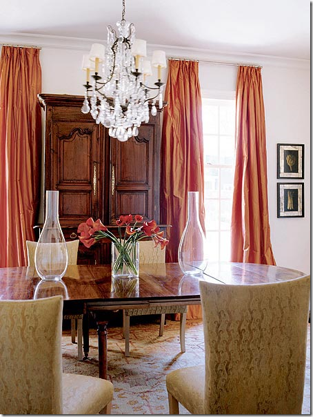 Mixing contemporary and the antique. Always try to buy one major antique for each room. It will stay with you for a lifetime. This armoire grounds the room, makes it seem more special, warm, less modern.
Gorgeous, gorgeous, gorgeous antique table and chairs. Beyond gorgeous.
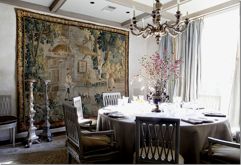
Another beautiful dining room with antique Swedish chairs and a fabulous tapestry. Here, the antique tapestry becomes the important piece of furniture. Perfection!
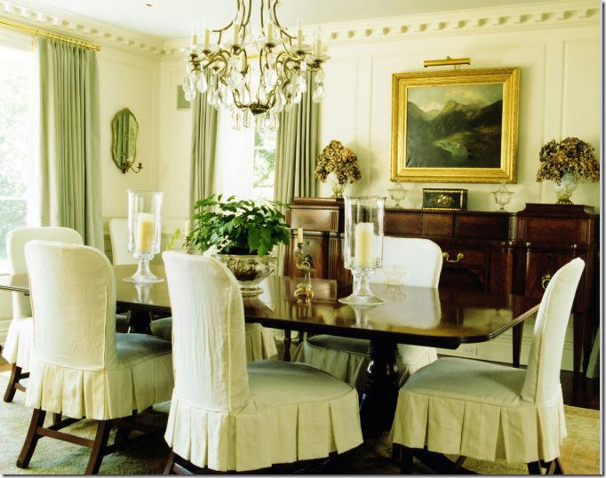
Granny’s dining room furniture made youthful by pleated slipcovers. If you don’t want all this brown, try painting your inherited dining room and buffet.
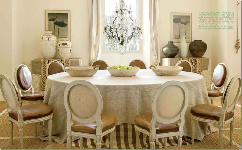 I adore this dining room with its large linen covered skirted table. But the antique leather French chairs make such a huge statement here.
Beautiful antique chairs, chandelier and Swedish chest mix with Bennison fabrics. The table may be old or new – it really doesn’t matter when so many gorgeous antiques are around.
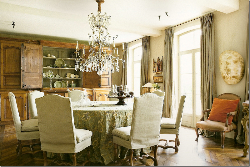
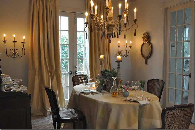
In my dining room, my breakfront is antique and is the anchoring piece. The chairs are vintage, not antique. The French barometer is antique, bought from 1st Dibs. But the chandelier – I don’t know if it is antique or not. I bought it from a friend who said it is, but I have my doubts. It doesn’t matter to me though, I really like it and it looks like an antique, which is good enough for me. The sconces are definitely new, but again, they have an antique look – it’s the style I was going after, not the provenance.

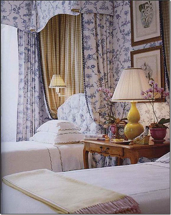
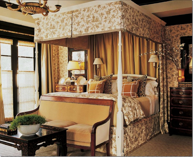 This bedroom by Randy Powers of Houston is a mixture of fine antiques and reproductions. The tea table is new, yet the side tables are antique, as are the mirrors and the accessories. The settee is antique, but the bed is new – repainted by Powers. I love this fabric, it’s one of my favorite toiles. The side tables add interest – being antique they are both different, yet look similar. Such a beautiful room.

In this bedroom, the antique table makes a huge statement. The fruitwood is so warm. It grounds all the white. Beautiful!
Suzanne Rheinstein designed this bedroom years and years ago – yet it still seems relevant for today. The antiques are beautiful, the bed, the chairs, the mirrors, the art work! I would love to have this bedroom – it’s gorgeous and timeless.
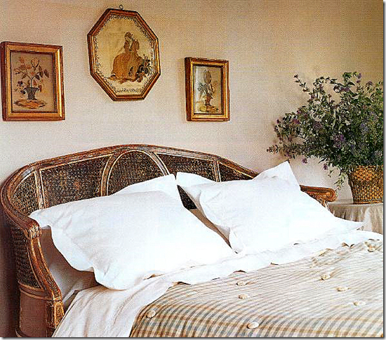
A headboard made of a settee – to die for! One of my favorites from a long time ago.
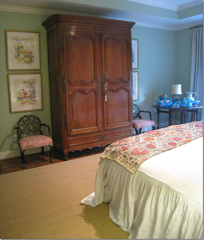
Again, one antique piece of furniture is enough: I bought this armoire for my bedroom and know that it will always have a place in my home. It makes the room.
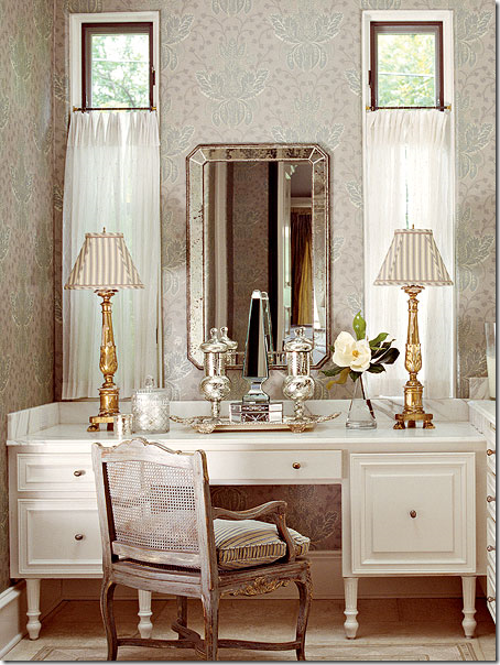
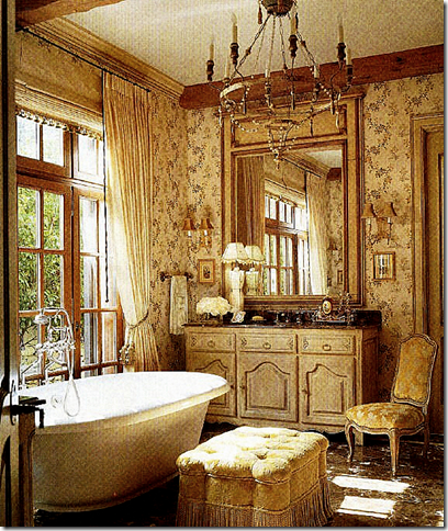 Antiques are important even in bathrooms: the enfilade is so much prettier than a built in cabinet. The antique chandelier is gorgeous. Powder rooms are also great places to add an antique or two.
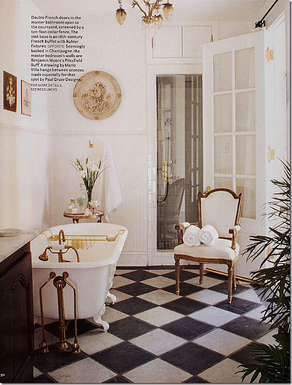
One important antique – the chair (or is it a new reproduction) adds much romance to this bathroom. The lamps are a better choice than bathroom styled sconces too.
The chair alone would add the perfect touch, but the cabinet, the tub, the hardware, the light fixture, the art work, all antiques, make this bathroom special.
There are now seven of the Top Ten Design Elements posted. Three more to go! Keep a look out for the remaining elements coming soon. As always, thank you for your continued support!


![image_thumb1[1] image_thumb1[1]](http://lh3.ggpht.com/_t8-Y4w1UKrc/TIIJE6KtjDI/AAAAAAAA30E/_zz_TPKHjZM/image_thumb112.png?imgmax=800)
![image_thumb3[1] image_thumb3[1]](https://blogger.googleusercontent.com/img/b/R29vZ2xl/AVvXsEhZHUMKU3EH8qOncQGSRsmsfqVh4vcoDPH8Mv7fd3VwbfBXwxQ-s-_cbRaXc9q3B0xVa50AIAWFG6VQ6wSCRl2w53GHZ30CGSM4aFvL56OYoS8QrlGZjP7ilBds9AVcQxGb7bdCM1J-WLwV/?imgmax=800)












so many divine rooms here, some quite grande - all beautiful! amazing thanx
ReplyDeleteThis comment has been removed by the author.
ReplyDeleteWhat an outstanding post, Joni. You are so right about adding at least one antique piece into each room.
ReplyDeleteI often find myself exploring the books you suggest and being a true booklover I have now ordered a signed copy of Lars Bolander's new book. Thank you!
Enjoy your weekend.
Ingela
My Mother taught me to appreciate antiques and I love the way they can enhance a room and make it a home.
ReplyDeleteSort of like pets, just no walking or house training, well sort of.
pve
A magristral lesson of interior design .... CHAPEAU!!!
ReplyDeleteRegards,
Cecilia
You had me at the first photo...now that mydear is a room. Can't you almost see those folks moving around in it in their velvets?
ReplyDeleteAnother wonderful post. The research is second to none.
Hi Joni!! I inherited a dark dining room all matchy set and my husband thinks I'd be crazy to paint it. Do you like having your dining room tablecloth to the floor? I think that would be a perfect way to lighten the look. Is it comfortable to eat at a skirted to-the-floor table? It looks so beautiful!! I love your style!
ReplyDeleteLeigh Ann
I have been waiting for a long time for the next installment of this series, and it was worth the wait! Beautiful post.
ReplyDeleteMy designer, like you, likes to use antiques in her designs. She and my architect insisted on an antique limestone mantel for my living room (which we have already selected), and she also wants to get an antique chandelier for my dining room as I already have a table, sideboard, and chairs that are excellent quality, but not antique. I love that style that is seen in a lot of these posts - gilded wood with crystal (genovese style). Let me know if you see one in your antique shopping ventures!
A most inspiring post. All of my very favorite Interior Designers are represented.
ReplyDeleteI would like to add a design element. Books.
I just went into the archives and read your post on skirted tables from 2008. Now I'm afraid :)! Heavy linen with a liner, no fringe...is that the least fussy looking option? I loved all the comments from that post,too! Another reason I love your blog...your readers are fun to learn from too!
ReplyDeleteyou amaze me over and over....I can't believe the Michael Taylor, 1950s, it looks straight out of House Beautiful 2010. I am a lover of all antiques too. Thanks. --Gretchen O.
ReplyDeleteHonestly, girl....I was gasping! You could SO put together a book: "Eye Candy and Its' Elements." These photos are just the cream of the crop!
ReplyDeletexoxo
P.S. ...and your commentaries are THE most important part of your new book. One antique per room: gotcha!
ReplyDeleteWhat a wonderful, intricately detailed post. You should publish it. I am thrilled to see all my favorite rooms in here -- I could never put my finger on WHY! Thank you so much!!
ReplyDeleteYou are dead on with antiques making a room timeless. You never disappoint, Joni!
ReplyDeletestunningly beautiful and thoughtful post, Joni. Please know that we really appreciate all the time, effort, and knowledge that went into this one. It was so nice to be able to go thru those images one by one and study them with you.
ReplyDeleteTerrific piece. Thank you so much! Donna
I've decided that YOU are the Top Eleventh Design Element of the World -
ReplyDeletewhat a gift these posts are to us, your oh! so loyal readers --
fondly ---Jill
Wow, I've been 'stalking' your blog for a while, you really are inspirational. Reading this post felt like an education! I was enthralled. It must have taken so much time so I wanted to mention I really appreciate you sharing your knowledge. Here in sleepy old Perth there really isn't any a great appreciation or understanding of antiques or history in design and architecture. Considering the federation of our state only happened 110years ago, I guess that explains it! We're only just barely antique ourselves! The net and blogs like yours give me great access to things that are hard to come by locally. Thank you so much!
ReplyDeleteThe rooms themselves are beautiful in every essence!
ReplyDeleteThank you Joni for such a wonderful informative and articulate post. -Brenda-
Amazing post. Thank you.
ReplyDeleteWhat an incredibly comprehensive post. Great thesis with the documentation to back it up - you get an A.
ReplyDeleteWonderful Post! Thank you, Thank you, Thank you!!!
ReplyDeleteLoved this post. I will be reading it over and over. Can't wait for the next three elements. Gorgeous rooms with classical design that have a personal touch, sometimes whimsical, adding a warm and inviting feel to come in and sit. Home designed by Watkins,Baker and Cummings is so welcoming. Love Saladino, Moore, O'Toole so many. The one you called beyond gorgeous, is just that, beyond gorgeous. And your rooms are so inviting and beautiful.
ReplyDeleteAnother favorite francophile of mine I haven't seen in your post is Diane Burn. She's been in Architectural Digest for many years as one of their top designers.
Again thank you for starting my day off with this beauty. You are the best!!!
Janice
Pemaquid
I can't remember seeing the picture with the oval table with linen skirt and brown leather chairs, will share where that came from?
ReplyDeleteYour Design Element posts have always been my favorites! I have them bookmarked and go back to them often. Thanks for yet another inspiring page to view!
ReplyDeleteI could hug you!!! What a wonderful way to enjoy coffee on this cool (gasp!) and crisp (gasp!) morning in DFW! Once again -- this posting only proves that you ARE the TOP Design element in MY list! Thanks for such a great posting -- so many ideas and fantastic photos! And do know what? I saw several elements in the photos (shapes of chairs or sofas or even arrangements) that would have worked nicely in the Oval Office!! LOL!
ReplyDeleteJan at Rosemary Cottage
Joni,
ReplyDeleteYour observations (as always) are spot-on. I think nothing adds character to a room like beautiful antiques. I can count on one hand the number of "new" pieces I have in my home, whereas the number of vintage and antique items would take all of our fingers and toes! You did a marvelous job of putting this idea into words and supporting it with amazing photographs. This post is definitely going in my favorites!!
Suzanne
Beautifully done...I will read it again and again.
ReplyDeleteEven today, when I shop for things my heart skips a beat when I come across something really old and special. That is what a wonderful antique or vintage piece can do!
kelley
While your thoughts are always beautifully laid out and supported with the perfect photograph I must take you to task when it comes to "forgetting" the 1950's photo. If you look closely you will see many popular trends used over and over today i.e. wall gallery, those wing chairs have been copied by a famous designer even today, blonde wood and a furniture arrangement that invites conversation. While not my style either I dont think you gave it the respect it deserves. After all, like those of us who grew up with that style, they are antiques now.
ReplyDeleteJob well done otherwise
Absolutely wonderful!! As an I.D. student I found this post inspiring and informative... and the collection of photos (from many of my favourite designers)~ beautiful!
ReplyDeleteI, too, love antiques and try to incorporate one into each room. Thank you for taking the time to write this!
Wishing you a lovely weekend!
xoxo, B
Another splendiferous Joni post!! Amazing.
ReplyDeleteI swoon over that rug in the Marian Hall photo. Hard to believe that room is from the 60's. But that's the point, right?!
Also, give me Nancy Lancaster's bedroom!!!
I love your bedroom, Joni! But aren't those gorgeous black chinoiserie chairs also antique? If they are reproductions, can you please tell me where I can find them?! Love them!
ReplyDeleteFantastic post as always, Joni. This is an amazing collection of images and I have to reread it after the market today. In so many areas of our lives, especially in our homes, incorporation of or reference to the classic & antique will never go out of style.
ReplyDeleteI can’t believe the amount of work you put into a post but it shows, stunning and through as always! I’m in love with Deandra Douglas’s estate I have this one in my files, and the rooms with barely any furniture that speak volumes are my favorite. Being an antique lover you actually helped to focus me somewhat on keeping a keep stylish and updated. Thank you for all your hard work, it’s fabulous!
ReplyDeleteJoni you continue to amaze me. All your post need to be compiled for a design textbook. Students could learn more from you than from classes at school. Thank you for always giving us the BEST!!!
ReplyDeleteI adore the chairs in your bedroom!
How are you and Ben doing without Lizzy?
I have poured over your other top design elements so many times. I have waited patiently for this one, and you did not disappoint. I agree wholeheartedly with every word. No one could say it or illustrate it better than you. This post is definitely bookmarked and I will quote you over and over to clients. I hope that is the ultimate compliment!
ReplyDeleteJoni, Joni, Joni, what a wonderfully written post. An absolute wealth of information!! You are so right about Antiques they make such a wonderful statement in a room. Loved this post, so informative and great images as examples, thankyou for all the time this post took to write. As a reader I so appreciate it. Have a wonderful 3day weekend. Kathysue
ReplyDeleteAmazing post! I could spend hours looking at all of these photographs. With each photo, I had a new favorite!
ReplyDeleteOne thing (out of many) that remains in my head is that incredible settee turned headboard. I love that.
Your rooms are every bit as gorgeous as the others.
Rhonda
Joni, you have completely outdone yourself w/this post. I learned so much from the photos you chose and your comments - truly feel like I just attended an amazing design course! I'm working on our house we moved in 2 months ago, and this post is just what I needed. I'm in a more modern phase right now, but adore vintage/antique elements. You are right,they bring the room to life. THANK YOU!!! I've got a new burst of creative energy!
ReplyDeletemy head is so full, my soul so warmed........you are SPOT-ON! again.
ReplyDeleteok, will try to be brief;
-i own a shop; new and old but mostly antique.
-so agree, that every room should have that special timeless antique that you saved for versus a quick "look" you may tire of
-but the antique trade is suffering. many factors are attributed to that but the up coming generations are more apt to go to pottery barn/RH/crate barrell for the look of the moment and be done with it.
-antiques take time to acquire
joni this is a story that should go national, it is a topic that is timely, an education that would appeal to all generations.
cheers!
debra
Dear Joni,
ReplyDeleteWhat a labor of love! So much inspiration here. I will look at it again and again.
Thank you!!!!
Jane
THis post was better than a good book! Thanks for the highlight of labor day weekend.
ReplyDeleteAny way that you would share the name of the toile used by Randy Powers? And the taupe colored buffalo check used in your living room or on the skirted dining room table? Pretty please?
Hope you have a terrific Labor Day! You've earned it with the out of this world posts!!!!!!!!
I discovered this blog while googling for examples of one important design element - window treatments. While I don't agree with all of your top ten, the discussion is a great exercise to have occasionally. What might be fun to know going forward is to ask your guests on SRT what their Top 10 are and compile a list to share with us at some time in the future. That could be fun and informative. The post on window treatments was very helpful by the way.
ReplyDeleteWow wow wow.
ReplyDeleteI'll say it again: wow.
I started out reading quite a few design blogs. Many of them were interesting but snarky -- designed to impress the reader with their "wit" more than to really educate or provide any substance. Funny how most of those blogs have gone by the wayside, but you, my dear Joni, continue to thrive, and continue to produce such incredibly beautiful and thought-provoking posts like this.
Thank you for all the time and effort you put into your blog. It is much appreciated.
Joni, What an amazing collection of photos. I can't live without my antiques. I love so many of these room. John Saladino and Jose Solice Bentancourt, Coco Chanel, and anything with a Swedish touch!
ReplyDeleteBeautiful, Beautiful,Beautiful. What more needs to be said. All of your images are so inspiring. I couldn't agree with you more about saving and buying that one special piece that will make the room. Thank you for all of your effort.
ReplyDeleteYou are so right! I am loving your list post! Thanks for a wonderful hour...
ReplyDeleteJoni, I totally agree with you, a room should exude personality and atmosphere. I am not a minimalist and I love antiques, I also wish they were part of each project I work on. Being Italian I am used to see antiques everywhere but it intrigues me also the juxtaposition of antiques and contemporary, when well edited it becomes stunning. There are also contemporary pieces that will never go out of style, think about the Knoll tulip chairs near an antique table, a whimsical chair like Fiocco in a classic decor and so on. Your post really got me going, I loved all those gorgeous rooms you were able to find instead of sleeping at night (Ha ha)!
ReplyDeleteThanks everyone for your comments. Like I said, this is so personal: one's ten items are never the same as the next person! even in my own family - we have our own favorites, not the same, different - but I love my sister and mother's houses just the same. they just don't love linen and seagrass and slipcovers like I do. but they love antiques - so that is something that unites.
ReplyDeletethanks again - and have a happy labor day!!!
Dear Miss Joni, I am a design idiot who just happened onto your blog. Thank you for doing such a wonderful job of educating and explaining different elements. I love that you present old with new; it really helps me understand the basics; unlike others who only seem to appreciate what is in vogue now. Thank you ever so much for all you do, and please, please, keep doing it! I am so grateful!
ReplyDeleteA standing ovation for you! Could this be your most massive post yet? I loved every delicious part of it. I adore the white room you mentioned as one of your favorites from last year.
ReplyDeleteOn another note - hope all is well as you send your daughter off to college. It won't happen in our house for 2 years but I can only imagine the mix of emotions it brings. (Thought of that when you mentioned the furniture you hope your daughter will have in her house one day)
Oh wow, thank you for such a gorgeous post and what fun to read and study!
ReplyDeleteVery nice post! I like you blog and will be back!!
ReplyDeleteSteve
Common Cents
http://www.commoncts.blogspot.com
Such a good eye, you have, Joni -- as well as the expert knowledge of what makes a room wonderful. And so timeless. Have a great weekend, -s
ReplyDeleteThis post could cause an overdose. And God will start singing....the sun rays will come through the clouds...I'm not kidding...this post was the best ever. xo
ReplyDeleteHello Joni,
ReplyDeleteWonderful post. I hope you are planning on writing a book, if not,why not. Antiques make a difference. Also each room you illustrated has wonderful inviting seating and textiles.
Best wishes,
BarbaraG
You are killing me, I want the rest of the list NOW!!! This truly illustrates that good design can and will last you a lifetime. Do it right and you only pay once.
ReplyDeleteI second what Jill Brinson said about you.
ReplyDeleteI love the fact that you were so knocked out out by her home in House Beautiful and that she now sings your blogging/editorial praises. What a compliment.
I never really understood the importance of the shape of chairs until I read this post on antiques and saw the chairs in the pictures. Many of the chairs are so timeless. Now I've got to get some!
ReplyDeleteDear Joni: You have done it again. You really summed it up with Marie Antoinette, Coco Chanel and your very own dining room (it is so intimate and cozy and stylish all at the same time) as some of your examples.
ReplyDeleteI've been lucky enough to inherit some antiques and almost-antiques that are meaningful to me because they are family pieces and have a personal history. They are the most special. The vintage pieces are just a continuation of that because most of the new furniture design and quality leaves me cold. Comfort is important too so my husband and I are compromising on that and an antique piece with the contemporary and practical can really make the differnce.
After reading and looking at this blog and want to go back the the hundreds of magazine clippings I have been saving over the years and really analyse what they have in common.
Thank you again. This was a great Sunday afternoon treat.
Dahlia
Joni,
ReplyDeleteI second Topaz. Your blog is by far my favorite.
I also hope your empty nest won't seem too empty, and best wishes to Elisabeth as she starts college!
Jane (Eric in Houston's mom)
Love the antiques! But I have to cry foul here, to compare the best of classical antique rooms to the weakest of mid-century modern rooms, not quite fair. After all, Bertoia, Eames and Saarinen are entering the realm of antiques, being in excess of **gasp** fifty years old and standing the test of time. Dulles International Airport continues to win acclaims as a fine example of International Style. Cheap knock offs are rarely going to look good over time. Pieces with integrity with good proportion will withstand the test of time.
ReplyDeletePaula ~ Mise en scène
OMG!This was soooo good it bears a second and third look! Thank you for all your awe-inspiring work on this post! I loved every word and picture. Can't wait for the remaining elements! God bless!
ReplyDeleteGood Grief! Ms. CDT has yet another world record post. In fact this one might have broken 2 worlds records: I'm checking the historical documents right now.
ReplyDeleteBut the thing is, whenever I see Nancy Lancaster's 1950s yellow room, I weep** so much I can never finish a post. Don't tell my children about that, let's just keep it our little secret.
**It's weeping for joy that we can live a world that produces such rooms.
Such beautiful rooms. I too believe an antique piece in decorating is a must-adds a bit of character. I'm such a fan of your blog...always a treat!
ReplyDeleteOMG, what a beautiful post! Gorgeous photos and wonderful commentary. It spoke directly to my soul. You have put into words exactly what I've been trying to achieve in my home. When everything is Asian Modern/Tropical modern all around me, it always seems like I'm marching to a different drummer. Thanks for the validation. I was dying with the beautiful chandeliers in the photos too. Thank you thank you thank you!
ReplyDeleteThis is a noteworthy post. Thank you for all of the effort invested as it so perfectly expresses many of my thoughts (not yet formed into sentences). I love some elements of modern design and objects. But without the added depth that antiques bring, rooms tend to be frigid and uninviting...simply too harsh. I am praying for the return of beautiful rooms with character and depth.
ReplyDeleteHi Joni,
ReplyDeleteYour post really spoke to me. I collect tons of antiques, but after following your blog the past year, I realize that I really don't know anything about decorating, the real success in my home is my obssession with everything antique. 30 years of collecting has landed me a pile of beautiful things. You definitely increase the odds of having a beautiful home with the use of antiques.
I wish you lived near me so you could take on another project....
I appreciate your wonderful blog! Thanks for posting on a holiday weekend for my reading pleasure!
Hi Joni, What a fabulous post. Its so informative and yet so affirming. I appreciate the principles you are teaching us about.
ReplyDeleteI agree about antique furniture and reflect on my buying history. Antiques aren't in vogue in Australia,so its refeshing to hear your point of view.
Joni, I love your top ten list...and antiques are really high on my list, too. I so agree about having at least one old piece that really makes a statement or anchors the room. Your barley twist tables are wonderful! They are so perfect in your room family room. You dining room is gorgeous, too! I love all the classic rooms you've shown...the timeless ones...like Marian Hall. I could read this post over and over...such great info and wonderful pics. Thanks for all the time you put into your beautiful posts.
ReplyDeleteSusan
Dear Joni
ReplyDeleteI have been dying to find out what would be next and it was beautiful.
Thank you for the time and effort you spend educating your readers and treating us to such glorious posts. So much appreciated.
Cherill in Adelaide, South Australia
CDT: Applause! Can you keep this post on your sidebar so we can go back to it...over and over. I agree and have always agreed. My mid-century friends are often admonished by me to add antiques to their rooms. Suddenly when we do this, you can see the furniture they love--things pop when you mix them with correct scale!
ReplyDeleteThanks for your great work,
Liz
Joni, Thank you for all of these examples. Antiques are timeless, and give a sense of permanence and character to our surroundings.
ReplyDeleteWhile all are very lovely, most people these days can't afford to live like this, and the interiors are impractical for families with children and dogs running through the house.
ReplyDeleteThis has to be my favorite post of ALL time. I wish it were a book for my coffe table. Simply over the top blogging here. Beautiful and educational, I read every single word, now I am going back to read it again. THANK YOU!! P.S. can you put it on your sidebar for future reading? I can't get enough
ReplyDeleteThank you Joni! I have learned SO MUCH from studying (I don't just read) your blog. Thanks to you, I can express to my designer the look that I am after. Plus you leave me hanging for the next installment, just like J.K. Rowling does! "This room is one of my favorite of last year and I have included it in each Top Ten Design Element yet: linen, slipcovers, seagrass, curtains, light fixture, wall decor – and now antiques. How far will it go – will it qualify for all Top Ten Elements? Stay tuned! "
ReplyDeleteI know this will sound silly but your blog has changed my life. I've been a vintage/antique dealer for about 15 years, having had an antique/garden store and now simply doing antique shows/booths. By reading and studying your blog (in the last 9 mo), your posts have inspired me to change & refine "my look". As a result my sales have increased 10 fold. Your blog is truely an educational experience and pleasure to read. - thank you.
ReplyDeleteJoni, what an absolutely amazing post! I agree with you on all levels. Antiques make a room and a home.
ReplyDeleteThe work you put into educating and entertaining us is much appreciated!
...oh joni!! this by far is the best post you have given to us (and you have given us many many wonderful posts!)... to me only one thing could make it better...for it to be an actual book that i could hold in my hands...turnng the pages oh so slowly...as read and reread your perfect comments...
ReplyDeleteA reaction from the other side of the big pond….This post was some piece of work, you have certainly excelled yourself, the longest post ever maybe and so very interesting. A big huge compliment!!
ReplyDeleteEspecially for me as it proves my theory why American interior design is so much more timeless compared to contemporary European design.
Like we have discussed the issue before; European versus US design; In Europe modernism is dominant and trends come and go really fast; in the US where traditional design is dominant, change is much more subtle, styles last longer. Peoples exhibit 1; the zebra rug/ pattern, it is being used in fine US interiors for decades ( see the timeless image of Michael Taylor’s room and Rose Tarlows’) and is still around.
Here in Europe, probably because we live amongst so much history and take that for granted, we seem to have developed a love to modernize, design for the sake of functionality and innovation. It seemed modernism was/is the way forward. Modernism was equal to prosperity and for a lot of people it still is.
I understand but for me that did not work! I study and follow the history of - and all things design US style. I was so born on the wrong continent.
Cannot wait to read the follow up posts on this exciting topic.
You are the best!
Ron in the Netherlands ( Empel Collections)
Joni, this is such a fabulous post that I know I will want to look at it many times! So many gorgeous rooms, and your point about the value of antiques in decorating, so well illustrated. I could take ideas form almost all of these beautiful rooms. Thank you , thank you, thank you!!!
ReplyDeleteOn eye candy overload! You just published a book here... Thank you for this post--I know that it took a considerable amount of time. I'm inspired to do research on Michael Taylor, as his work was incredibly talented, and remains current, per your notation.
ReplyDeleteA fabulous post!! You have outdone yourself! Many thanks.
ReplyDeleteJoni, absolutely the best post in the history of blogging from anyone or anywhere. I have reread it several times today. I do hope that one day you can put the top ten design elements in a book with your commentary. It would be a best seller.
ReplyDeleteWow! You have out done yourself with this post! You are so right about antiques...When my husband and I were 23 yrs old, engaged, living in a tiny but beautiful apartment in Boston we bought our first antiques - a small dining table, a cupboard, and an end table. It was the begining of a total love affair with antiques. We used to take vacations (before kids) centered around great antiquing destinations. We even bought pieces as anniversary presents for each other. In the 12 years we've been married my style had gone through some changes and I regret certain purchases for our home, but the ones I've never regretted our the antiques. They always work, even as their function and rooms change. The old dining table from the Boston apartment has served as a desk and now sits in our family room. Thanks for sharing all the wonderful images and insight. I wish I had read this post 12 years ago, I would have avoided a few mistakes. Sorry for such a long comment but you struck a cord! Tessa
ReplyDeleteThe time & research that you do for these very informative posts is just outstanding. Such a wealth of information and visual candy!! I don't have great antiques but I do have some in most my rooms and some I do truly treasure. We wandered around MAI today and I don't know how anyone furnishing a house wouldn't want a few of the lovely old pieces or at least, as you say, new one that appear old. Restoration in T & C is full of the new!
ReplyDeleteThank You! Thank You and Thank You again! Well done, very interesting, and as always educational. I keep telling you they don't teach this stuff at design school. I feel like I learn the "real" design stuff her on your blog. Keep it up, I will always be back.
ReplyDeleteWhat beautiful photos! I am fortunate to have some wonderful antiques and live in a simple farmhouse that shows them off in a marvelous way. While we will never live like the folks who own(ed) these rooms, I sure can enjoy looking and taking some inspiration for my own home for both beauty and comfort. Thank you for the gorgeous post!
ReplyDeleteLinda @ bushel and a pickle
Site Checking
ReplyDeletepuh...lease! gather it all up and publish this blog in a book!
ReplyDeleteAMAZING.
ReplyDeleteI hope one of the next three elements will somehow cover embroidery, or texture, or items with handmade or hand finished qualities. When I think about it, most of the decorative items I have added to my home, be it an antique basket, the sleeve from an embroidered robe (framed in my entryway), or a hand-carved box--are all handmade. What is it about the human touch in decor; the texture and warmth of an item made with care by human hands? I'm confusing myself with this suggestion, but I'm sure you already have it figured out. Looking forward to the rest of the series.
ReplyDeleteGreat post, Joni! That's why I'm never getting rid of my antiques, love them & they truly are the bones of a house. I'm so glad I was able to score some neat pieces that I still love and use. I may not put it all together like these pics show, but at least I don't have to start over with my furniture ever again. Antiques & reproductions will definitely stand the test of time.
ReplyDeleteI love the post.
ReplyDeleteI can't help but wonder, though, if the white slip covers (whether they are paired w/ antiques or not) are also going to look date stamped. I haven't seen any all white rooms in historic decor.
Is that ever a concern of yours when using white slips?
Joni
ReplyDeleteAs usual you have outdone yourself! What a wonderful post. It is amazing to see the early photos of homes in the 50's with antiques. Absolutely gorgeous!
xo
amanda
antique elements give a room timeless character... your post was a joy to read and to see such wonderful examples of people living with and loving things from the past thank you so much
ReplyDeleteDid you notice that only two rooms had standard ceilings ??? Almost everyone has tall ceilings, french doors, and wood or stone floor. Does this translate to a 70's ranch ? or a white box of an apartment ???
ReplyDeleteWhat do you think of " modern classics " ? True bentwood chairs ? Parson table ? Tulip chairs ? etc I think some of these have the strength of line to carry a room.
Great post. Thanks.
~ Christie
I refer back to the previous posts in this series from time to time....your research and examples never cease to amaze me! This post is no exception.
ReplyDeleteAlso, I've got a giveaway on my blog for the new Thom Filicia fabric. Would love for you to stop by!
Joni, your blog is head and shoulders above the rest. Your design knowledge, keen eye, writing style, and trove of pictures are unequaled in the blogesphere. Yours should go by a name other than "blog" as you are in a league all its own. Splendid, splendid work!
ReplyDeleteLove this post. I remember what an antique dealer told me, "if you want to sell an antique, it will likely hold its value....new furniture will just be used furniture." I love the Heather Chadduck room with the ticking striped sofa---from the late, lamented Cottage Living.
ReplyDeleteThis is one to return to over and over! What TIME you put into this post . . . how do you do it?
ReplyDeleteAntiques . . . this is how my mother decorated, and how I do as well. At least one in every room! If I could give just one bit of advice to young people just starting out: be patient and save for that timeless piece you'll have forever! Also, many antiques (at least where I live) are more affordable than what you find at Pottery Barn, etc.
Thank you, Joni!
Jennifer in PA
Such wonderful eye candy....I enjoyed viewing all the gorgeous rooms!
ReplyDeleteKristen
Well! I could just kiss you square on the lips right now :-) This is a fabulous post and one dear to my heart! You make so many good points about the longevity of antiques in design and this appears to be lost on many designers and homeowners alike.
ReplyDeletexo
Tricia
Avolli
No need for me to stay at a Holiday Inn to feel smarter! I get that way just reading your blog!
ReplyDeleteThanks again for an outstanding post, with relevant and thought provoking images and text.
This post changed my life (decorating-wise). I've always loved the classics but lately have been seduced by the "soft contemporary". What I want is the Belgium look that you warn is easy on the eyes but hard to achieve. Wonderful visuals - the timelessness of deWolf's 1905 design versus a 1960's era look. Therefore will abandon the trend and go for the timeless.
ReplyDeleteFantastique! Great post- Joni you are my idol!
ReplyDeleteIt's one thing to walk into a room and know that it is beautiful. It is quite something else to walk in and know why. You're ability to dissect the key elements is unsurpassed.
ReplyDeletexo Elizabeth
Loved each and every image you shared ... Saladino Rocks!!!!
ReplyDeleteThis was BRILLIANT!!! YOU are BRILLIANT!!! Seriously, this post was FULL of eye candy and food for thought. It's everything I've always thought and felt but you managed to communicate it in such a clear and orgainzed way. It's so nice because I've never quite been able to have a complete fix on how to get the results I want whwn it comes to decorating. I feel so much better now. Knowing that even making sure there is one antique in every room makes me feel like I finally have a chance at having my home look and feel the way I've always wanted it to. I feel like you've given me a gift! Thank you SO MUCH for this. I'm bookmarking this post and I know I'll come back to it for reference often.
ReplyDeleteIt was rather interesting for me to read that blog. Thanx for it. I like such themes and everything that is connected to them. I definitely want to read more on that blog soon.
ReplyDeleteHilary Simpson
escort utica ny
This is so true -- I'm not done reading this post yet; I need to savor every delicious photo over a glass of wine after I put the kids to bed -- but I had to jump down to the comments form. Traditional interiors seem to be getting the short end of the stick lately in shelter magazines, but you are so right -- it's the trendy, of-the-moment interiors that look the most date-stamped, whereas the interiors built around traditional antique furnishings 50 or even 100 years ago bear the test of time. Thanks for another photographic feast!
ReplyDeleteL'Shanah Tovah!
ReplyDeleteOh my goodness, the juxtaposition of that hideous red 50's room and Nancy Lancaster's divine yellow drawing room (which has to be one of my favorite rooms of ALL TIME!)... that juxtaposition was all you needed to make your point. But thank you so much for all the other gorgeous rooms. Reading this post made my morning. :)
ReplyDeleteYou post such GORGEOUS photos!
ReplyDeleteOh my...all the things I would have said + you said them with such flare! I feel the same and am so happy you voiced the feeling. I needed that. Saladino is a favorite...keep them post a comin...xx
ReplyDeleteI was wondering when you would finish your list! :-)
ReplyDeleteYou are so right about this. If you go to Half Price Books and look through old design books from 10-20 years ago, most of the rooms look so dated. The ones that do not have traditional and classic furniture pieces and colors.
Lovely post!
That Jane More kitchen speaks VOLUMES (with less.) Kitchen cabinetry, to me, is boring, boring, boring. Wonderful blog reading - THANKS!!! franki
ReplyDeleteOoh La La!
ReplyDeleteThe four-bedroom Sayles Ranch Guesthouse is a stunning retreat where we can bring our extended family to a wonderful visit to Abilene! I am imagining lounging in the Jacuzzi with a bottle of champagne with my wonderful husband. We can't wait to stay!
Joni, I LOVE these posts!! I'm excited for the last three elements. I told my husband what I think they are and can't wait to see if I'm right.
ReplyDeleteAnother TOUR DE FORCE post. Stunning. I swear, I am going to start praying for a book deal for you. Over the course of your blog, you have already written a book. Totally in love with Donna Brown's kitchen, and the one by Jane Moore. I'm putting one on my "Santa" list. xo Lidy
ReplyDeleteBravo!!! this has to be my favorite post . May i ask....how many hours did you spent researching and writing this post? such a treat for your redears. John Saladino is by far my favorite architect abd designer when it come to classic style with sunstance
ReplyDeleteBravo!!! this has to be my favorite post . May i ask....how many hours did you spent researching and writing this post? such a treat for your redears. John Saladino is by far my favorite architect abd designer when it come to classic style with sunstance
ReplyDeleteMy apology...first, terrible case of bad typing, then double posting....
ReplyDeleteThough slipcovers can be lovely in large rooms, not all of us have that luxury! Smaller rooms require leggier furniture, as well as less going on visually. Love some of the more monochromatic rooms, but all of those mixed patterns in others would overwhelm our little condo! :-)
ReplyDeleteHi,
ReplyDeleteI just stumbled onto your blog, and i want to tell you, i have learned more about design and decorating from reading your blog in one hour, than any place else online i have been. This is an amazing post. I'm so excited to learn from you. I love the way you use examples and point out the good and the not so good, and was so in awe of the photos of the timeless rooms... It's so right on... COOL! I can't wait to read all your posts.
Cindy
What a great post!
ReplyDeletethis is a good top ten!
ReplyDeleteLove this post and its beautiful, timeless interiors!
ReplyDeleteI so hate how streamlined,contemporary design has taken over. I'll take sumptuous, traditional rooms filled with antiques over midcentury modern looks anyday. Sadly, it's getting more and more difficult to find antique stores and vintage items at affordable prices. Yet,I am so inspired by this post, that my hunt will go on!
Dear author, you seem to think that mixing styles from a span of 300 years is the only way to go. I hope you realize that this is a very biased and a modern way of decorating. Modernism itself is a phenomenon related to our time.
ReplyDeleteOh, and those pieces are mostly 20th century reproductions. I prefer museum-quality collections and pure styles to these mish-mashes of styles and lines that do not belong together. Serious antique collectors do not decorate this way. Only hipster reporters and designers do.
you have a small dining table which is nice. looks lovely and luxurious.
ReplyDeleteThis is simply amazing.
ReplyDeleteCymax Makes Your Home Wonderful
This post is truly inspiring. I like your post and everything you share with us is current and very informative, I want to bookmark the page so I can return here from you that you have done a fantastic job ... office furniture Miami
ReplyDeleteThanks for sharing such good information about dining tables.
ReplyDeleteDining Tables