Since the economy has been so bad, I’ve been forced to moonlight as an author for a local design magazine. Shh! Don’t tell the editors that I am really not a writer at all! English was not my best subject in school – in fact, I’m not sure I ever had a “best” subject. School was never my favorite – the only thing it was good for was showing off new outfits and fantasizing about cute boys who never knew I existed. So, the fact that I am now listed in a magazine as a contributor makes me wonder about the judgment of the editors in charge. Just kidding, just kidding. Sort of. My latest contribution to Antique Shops and Designers (what a great title!) is a rather typical know-it-all list of how to update your decor, with a big before and after picture of a job I did.
NOTE: Please be sure your screen is set on maximum (double boxes in the upper right hand corner) so see the entire picture.
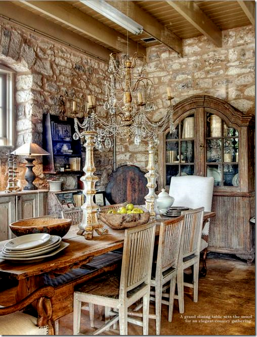 From the magazine: Julie Greenwood from Houston owns the Garten in Fredericksburg, Texas.
If you live in town – be sure to pick up the latest issue – it’s the best one yet. There is a large spread on interior designer Cathy Chapman’s house, which thrilled me. I’ve been stalking her River Oaks house for years and now I finally get to see inside of it! There’s another story about The Garten, the best antique shop in Fredericksburg, with Houston ties, of course. I wrote the story on the Old Braeswood house where Found For the Home’s owner lives. There’s more – a house in New Orleans, a house in the Heights, recipes, gardening, and beautiful ads. If you don’t live in town, the magazine is available online. This link HERE will take you directly to my article – which is the featured Last Page story each issue.
And, my favorite article from the magazine - Interior Designer Cathy Chapman’s house in River Oaks. FINALLY!!! After years of stalking her former house which was on my carpool route, she moved to this house and I’ve been dying to see the inside of it. It is totally worth the wait.
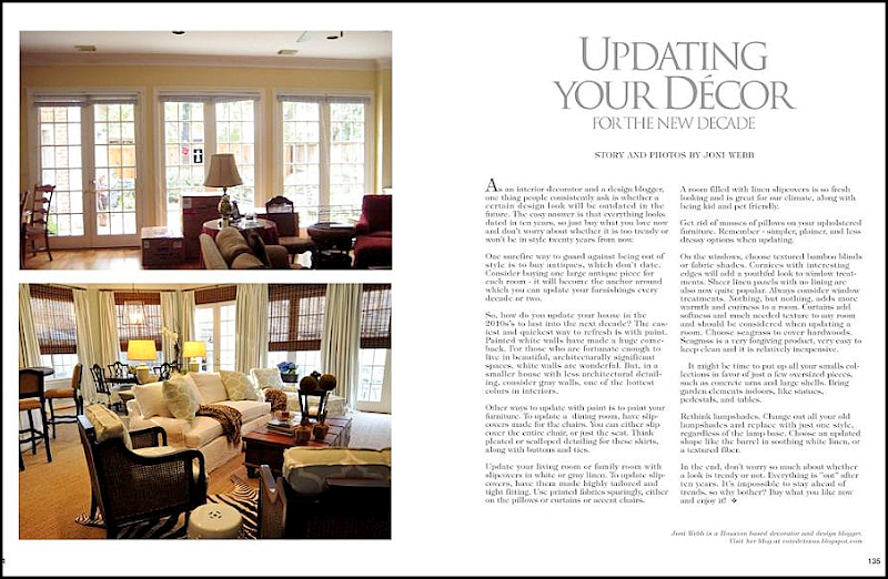
Today, I am reprinting my article for Antique Stores and Designers – along with photographs to illustrate it. It’s a list of ideas to update your decor, but it’s all to be taken with a big grain of salt. It’s easy to sit behind my laptop and swear that yellow is out while gray is in, but who am I to judge when my own curtains are yellow? And it’s one to say that fringe is out, but I still use it when called for. While an interior for the 2010 is fresh to the eye, there’s still nothing better than a house that has evolved over time, like all the great English country houses. In the end, this list is just a compilation of ideas to help guide you if you are thinking about making changes, either little or big.
My original article for Antique Shops and Designers – Read it online HERE.
UPDATING YOUR DECOR FOR THE NEW DECADE:
As an interior decorator and a design blogger, one thing people consistently ask about is whether a certain design look will be outdated in the future. The easy answer is that everything looks dated in ten years, so just buy what you love now and don't worry about whether it is too trendy or won't be in style twenty years from now. Most likely, it won’t. One surefire way to guard against being out of style is to buy antiques, which don't date. Consider buying one large antique piece for each room - it will become the anchor around which you can update your furnishings every decade or two.
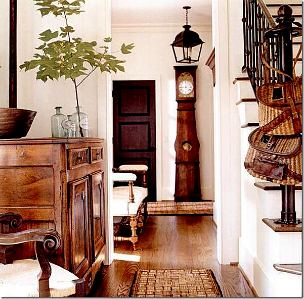
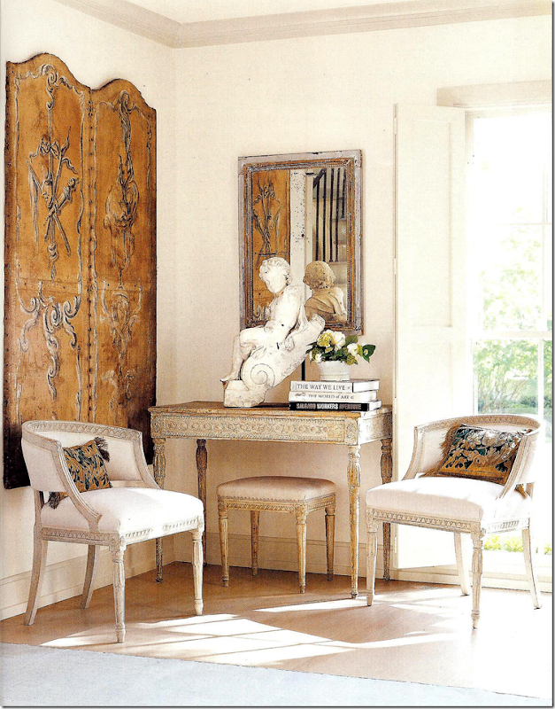
Buy one good antique for each room: this beautiful, stand-out French commode in an entry hall can move to any room in the future. It can go from the living room, to the kitchen, to the bedroom. A piece like this can act as an anchor in any room, for any decor and will last a lifetime.
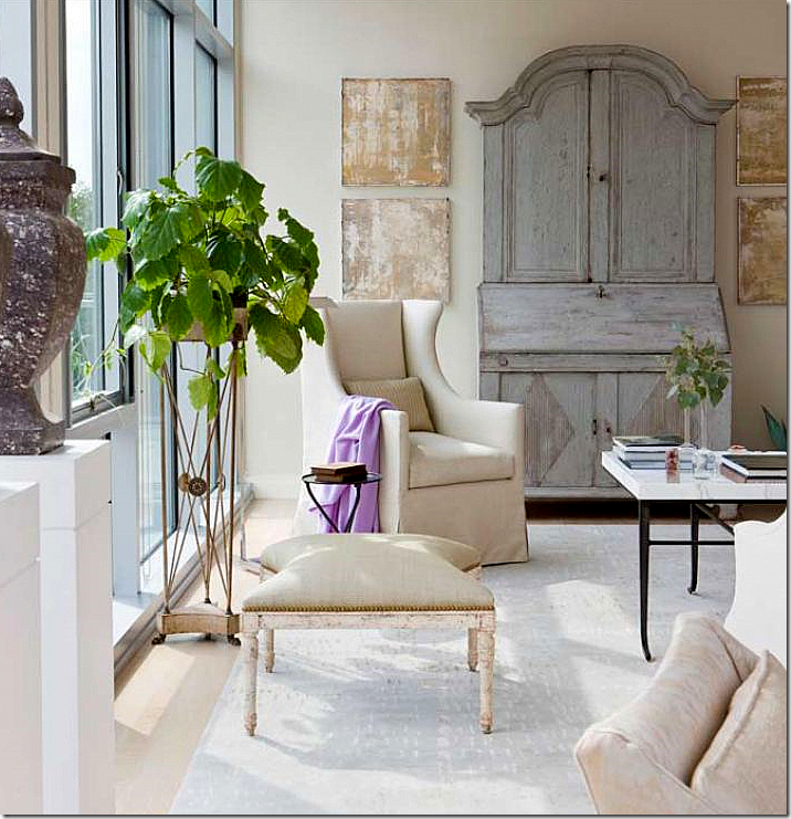 This antique Swedish desk is used in a contemporary highrise. When the owners want to change from contemporary decor, this piece will still star. Again, you can use this in a living room, a family room, a bedroom, or library.
So, how do you update your house in the 2010s’s to last into the next decade? The easiest and quickest way to refresh is with paint. Painted white walls have made a huge comeback, but are white walls for everyone? For those who are fortunate enough to live in beautiful, architecturally significant spaces, white walls are wonderful. But, in a smaller house with less architectural detailing, consider gray walls, one of the hottest colors in interiors. To further update with paint, consider painting all the woodwork the same color as the walls. And don’t forget the ceiling – paint the ceiling the same color as the walls, just have the painter halve the formula. Heavily fauxed paint jobs are also a thing of the past. Instead, use two paint colors that are very close in shade and tone when faux painting. This type of paint treatment adds subtle movement and texture to your walls and is much more sophisticated than the bolder techniques used in the 90s. Another paint treatment to consider is a stucco-like finish on interior walls.
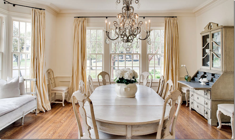
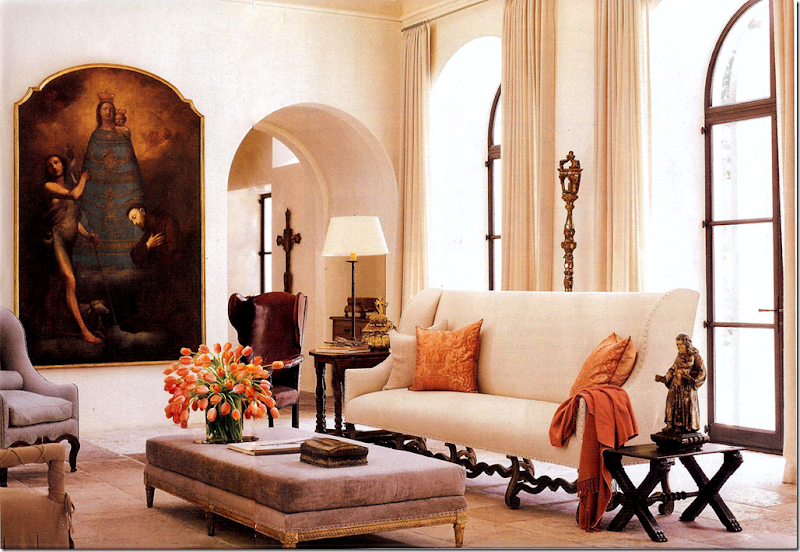
White walls are very popular today. They work especially well when the architecture is beautiful. Here, glorious windows in an extra large dining room add enough architectural interest to handle white walls. The trim is painted just a little darker than the walls – high contrasting trim seems out of date.
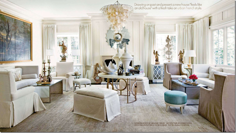
Another beautiful living space provides enough backdrop for white walls. In this interior, the contemporary furniture, mixed with antique accessories, further updates the room for the 2010s. Notice that all the woodwork and the ceiling are painted the same color as the walls. Bright white trim with darker walls seems dated today.
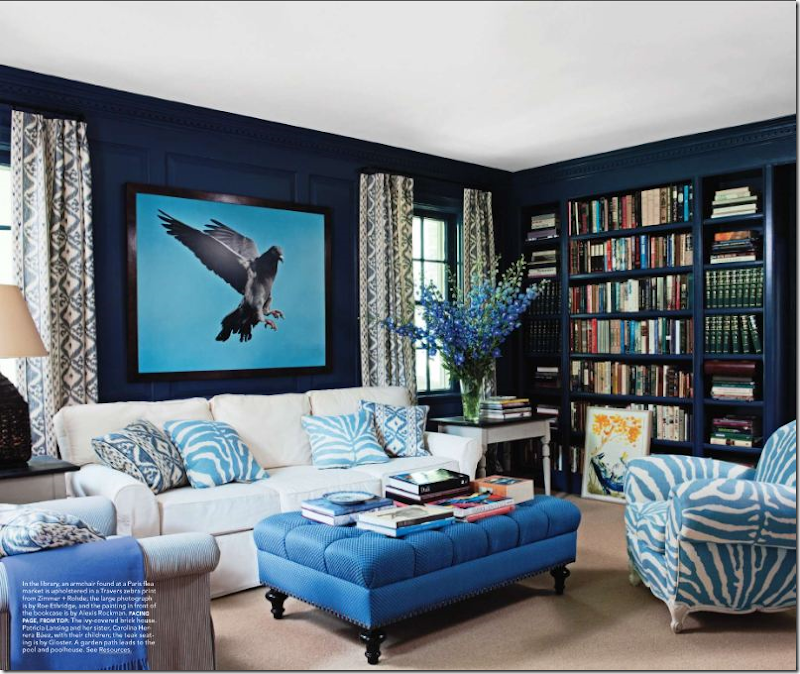 In a small room with just two small windows, the walls are painted a dramatic blue. Built in bookcases add more detail. Notice how the trim is painted blue like the walls. White trim would have like the 90s.
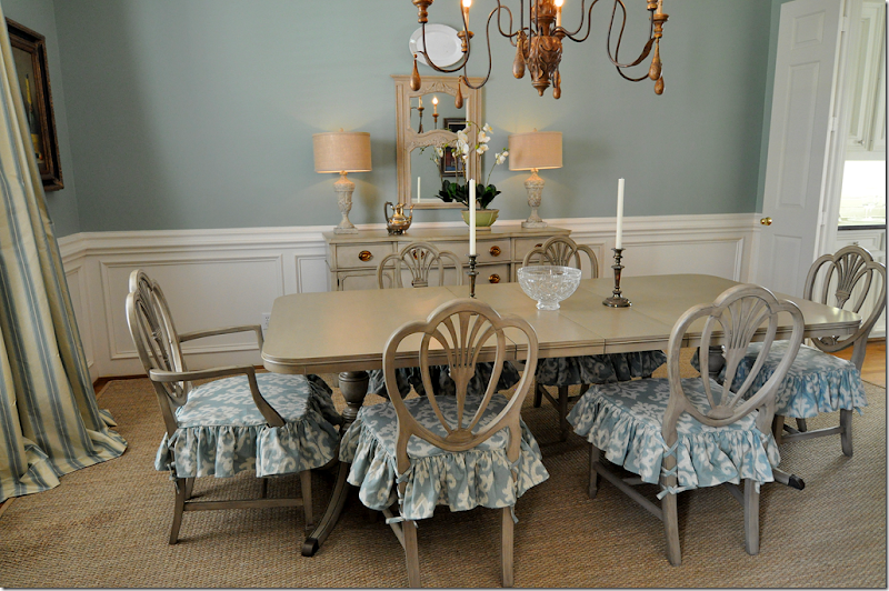
Other ways to update with paint is to paint your furniture. Much of the brown wood furniture of the last century looks dated today compared to the popular bleached, limed woods which originated out of Belgian. If you have inherited your grandmother’s mahogany stained dining room set, consider painting the table, the chairs, or both in grayish tones. To further update Granny's dining room set, have slipcovers made for the chairs. You can either slip the entire chair, or just the seat. Let the skirt fall down to the knees of the chair or to the floor. Think pleated or scalloped detailing for these skirts, along with buttons and ties. If you don’t have a dining room set and are on a strict budget, check in with neighborhood garage sales and buy an inexpensive table with a scratched up finish, then paint it whitish gray. The difference will be amazing and the light painted wood will take your dining room into the next decade.
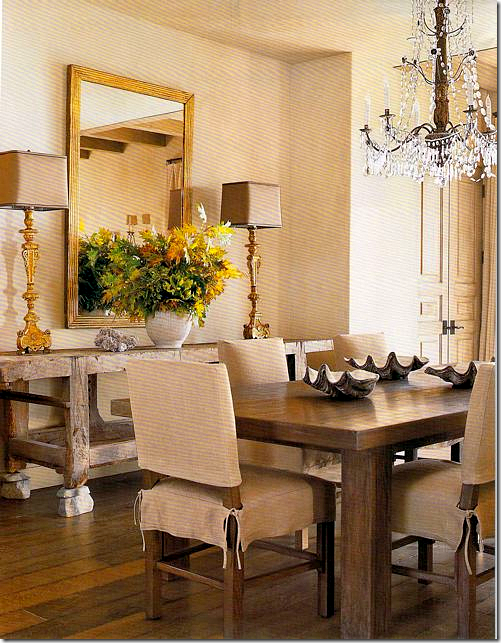
To update my client’s dining room suite – I had it painted in gray with a distressed finish. The difference the new paint job makes is remarkable. Instead of looking dowdy, the furniture is youthful, especially with the slipcovered seats.
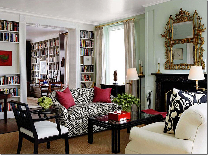
Update your living room or family room with slipcovers in white or gray linen. To update slipcovers, have them made highly tailored and tight fitting. Slipcovers of today are more fitted, not loose and wrinkled like the Shabby Chic look of the 90s. To unify a room of mismatched sofas and chairs, slipcover each piece alike in the same fabric with either linen or cotton. If you are really budget conscious, consider using painters drop cloth for the fabric. Use printed fabrics sparingly, either on the pillows or curtains or accent chairs. A room filled with linen slipcovers is so fresh looking and is great for our climate, along with being kid and pet friendly.
To update old and too fussy dining room furniture, consider slipcovering chairs in a casual fabric. There are an endless number of possibilities for slipcovering dining room chairs – the slip can go to the floor or just to the knees, it can be pleated or tailored, it can cover just the seat or the seat and the back.
Slipcovers of today do not have to be messy or sloppy. These sofas by Michael S. Smith are tailored and quite at home in this elegant room.
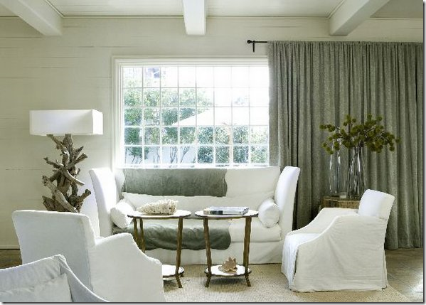 Tailored slipcovers work in a contemporary setting.
To update more, get rid of masses of pillows on your upholstered furniture. Instead, place just two large 26” pillows in deep colored velvet to pop the white linen. Be wary of trims on pillows - all the fussy fringes now look so out of style. Order throw pillows with a plain knife edge and an invisible zipper for cleaning purposes. Another updated edge is a small 1/2" or 1/4" flange. Remember - simpler, plainer, and less dressy options when updating.
Opt for fewer pillows in the future – 2 or 3 for a sofa is plenty. Go for bigger and plainer, with less trim. Choose a 24” or 26” pillow in a contrasting velvet to pop color. Use plain or flanged edges. Instead of fabric, use antique tapestry on pillows like those made by BViz HERE.
Updated pillows: large, without dressy fringe – used mainly for pops of colors.
Updated pillows: two large, plain pops of color balanced by printed fabric pillows on the chair – used to contrast sofa fabric. Great decor: the apartment is traditional architecture, yet the furniture is more contemporary.

On the windows, toss out metal and wooden blinds. Instead, choose textured bamboo blinds or fabric shades. Be sure to hang the blinds as high to the crown molding as possible to elongate the line. Next, layer fabric panels over the blinds. While plain panels hanging from tiny rings are trendy, cornices with interesting edges will add a youthful look to window treatments. Sheer linen panels with no lining are also now quite popular. Always consider window treatments : nothing, but nothing, adds more warmth and coziness to a room. It’s rare that an uncovered window is preferable to one with fabric panels and shades. Curtains add softness and much needed texture to any room and should be considered when updating a room. To further update window treatments, forget thick custom rods with elaborate finials. Instead think thin rods in a bronze finish with tiny rings – the less noticeable rod and ring is the look for the next decade.
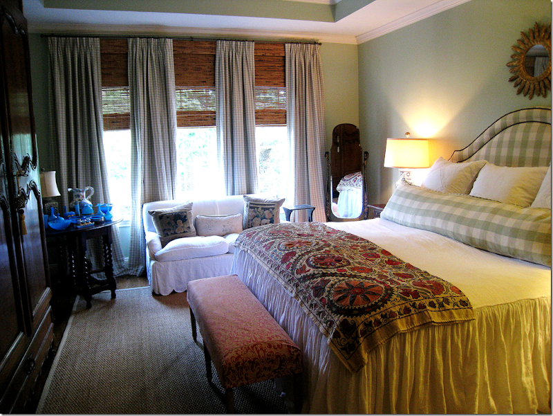 In my own bedroom, one short, wide, and ugly window now looks like three taller ones with the camouflage of the shade and four panels. The shades hide the wall space between the windows and the ceiling. I took the curtain rod right up to the crown molding (which should be repainted like the wall!!) thereby creating one long, lean line.
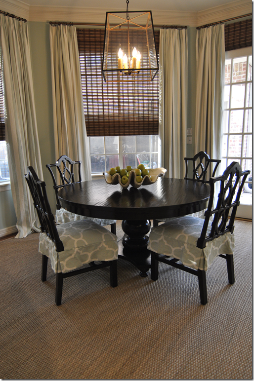 Curtains fall from the molding, shades are outside mounted – so that they also hang right under the molding. Again, the shades hide the wallspace between the windows and the ceiling. Very important detail.
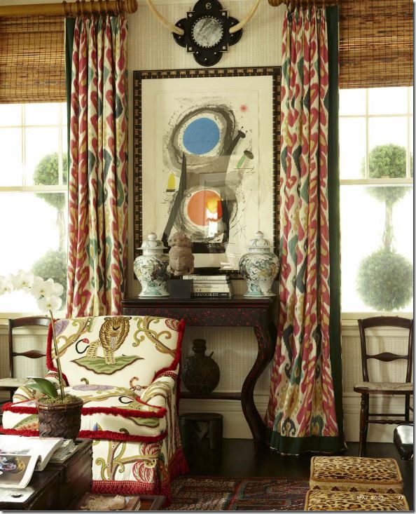
Beautiful ikat curtains paired with bamboo shades look great for the next decade.
Instead of using shades, update your windows with a tape trimmed cornice.
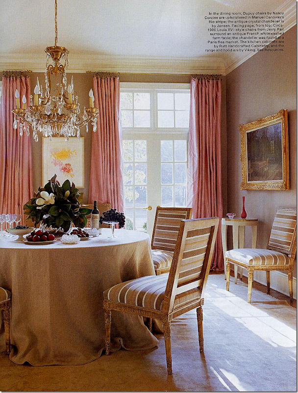
Suzanne Kasler’s former dining room has long been a favorite. The curtains are simple – but gorgeous - and add so much to the room. The tablecloth is also simple, yet the room is dressy enough for dining – with the gilt framed chairs. So much prettier than just a brown wood table with 10 brown wood chairs and matching server.
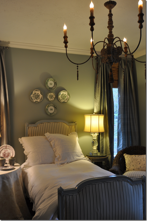 In my guest room, I saved money by using Restoration Hardware curtains and blinds from Target. Hung from the ceiling, the curtains almost look custom.
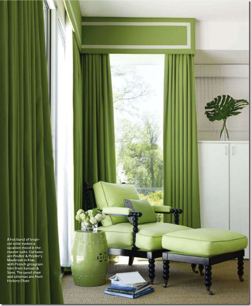 Tape trimmed cornice immediately updates decor – as does bobbin styled furniture.
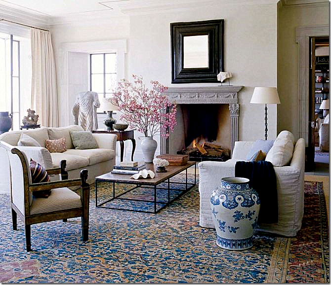
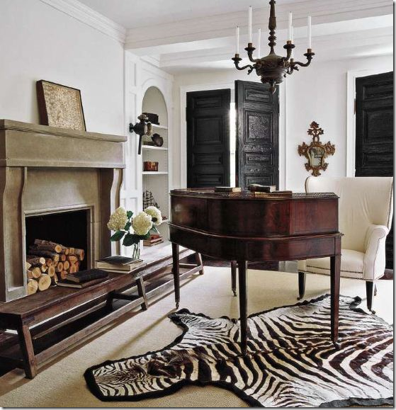
More updating tips: store away Granny's red and blue Oriental rugs. Instead, choose seagrass to cover hardwoods. Have the seagrass custom cut just 3 to 6 inches around the perimeter of the room, then layer the seagrass with a zebra skin, or a white cow skin rug. Seagrass is a very forgiving product, very easy to keep clean and it is relatively inexpensive. Natural fiber rugs add much needed texture and warmth to any room without adding loud pattern. Hate seagrass? Reconsider dhurris and flat weave rugs with graphic patterns in contrasting colors. These are fresh and new looking and are wonderful to use when aiming for a more modern look.
Seagrass is a versatile product – inexpensive, long wearing, and almost stain resistant. Always have it custom cut to fit around the perimeter of the room from 3” to 12.” Layer a skin, zebra or cow, over it – or layer an oriental or dhurri rug over it to accent a seating group.
Layer a cowhide over sisal or seagrass for a new look.

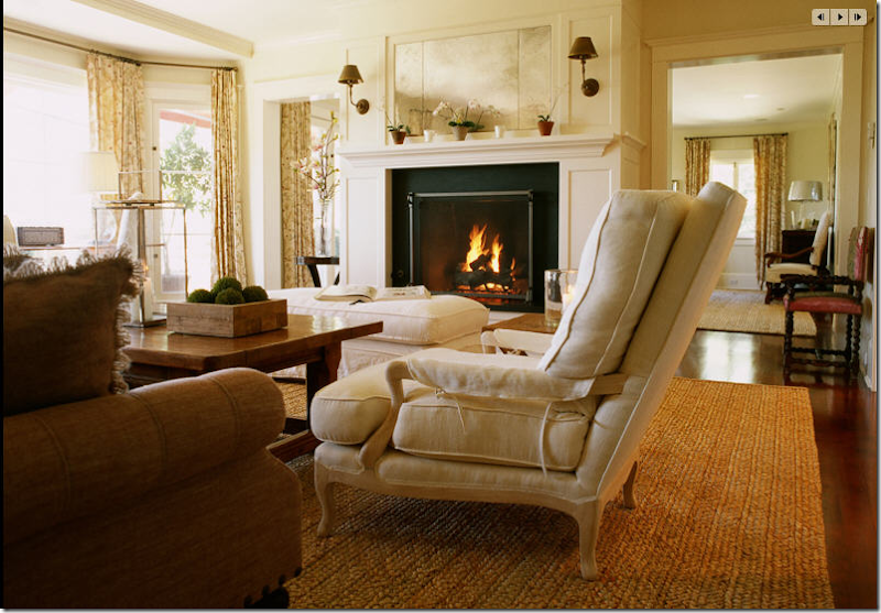 Besides seagrass, try other fiber rugs, such as apple matting – a thicker rug than seagrass.
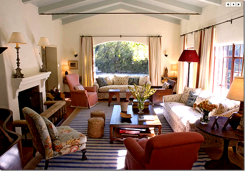 Striped dhurris aren’t for beach houses only – here a dhurri is layered over a seagrass.
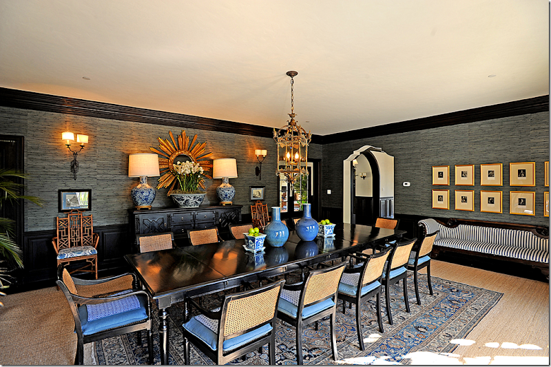 If you do inherit an oriental rug and want to use it, but the size is too small, try layering it over a seagrass to stretch it fit the room. Here, the seagrass also helps to tone down a more grown up vibe in the room.
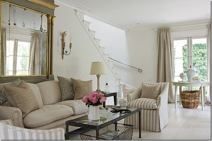 Think about painting or staining your floors white or off-white to update your decor and tie it in with white walls.
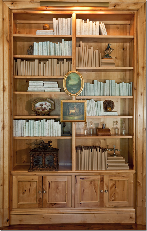
Rethink your accessories. It might be time to put up all your smalls collections in favor of just a few oversized pieces, such as concrete urns and large shells. Consider covering new books with craft paper for a quieter and unified appearance. Or just turn the spines to the back, letting the pages show instead. Bring garden elements indoors, like statues, pedestals, and tables. Update brown and white wicker with the newer, more fashionable Belgian gray wicker. In Houston, Thompson Hanson and Found For the Home both sell wonderful gray wicker chairs that work just as well in a dining or breakfast room as on a patio.
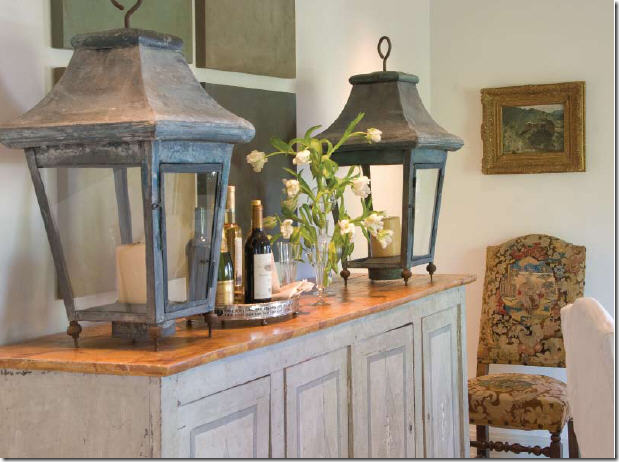 Rethink your small accessories and collections – instead put out a few oversized pieces, like these matching lanterns.
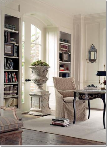
To update, bring concrete urns in from the outside.
Or, bring concrete busts in from outside. Use large books as accessories. Think one large item versus many smalls.
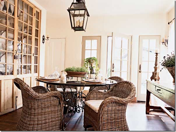 Gray wicker really updates a room – especially chairs like these, used in the family room or breakfast room.
Old books, including old books without their covers are great to use when updating accessories.
Books, especially new or paperbacked ones, covered in craft and wrapping paper is an updated look.
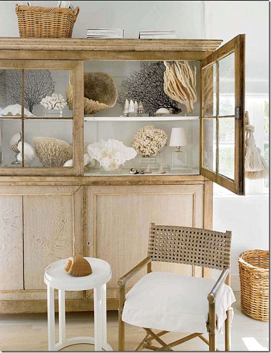 Large shells instead of precious porcelains look good on display. Lighter woods, Belgian style, will be around for a while.
Rethink lampshades. Change out all your old lampshades and replace with just one style, regardless of the lamp base. Choose an updated shape like the barrel in soothing white linen, or a textured fiber. Rethink ceiling fans in public spaces. Instead, hang an oversized lantern. If a19th century French lantern is out of your price range, go to Pottery Barn or Restoration Hardware and buy one of their outdoor lanterns and have it electrified. Hanging light fixtures and lamps add so much more atmosphere to a room than recessed cans. And always put dimmers on all lights throughout. Bright rooms are such a mood killer!!
Think lamps rather than recessed lighting. For an inexpensive update – change out all your lampshades to more modern shapes. Use one shade throughout the room for continuity.
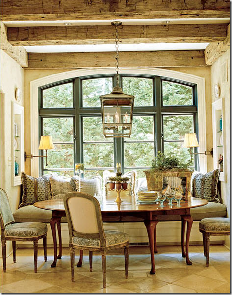
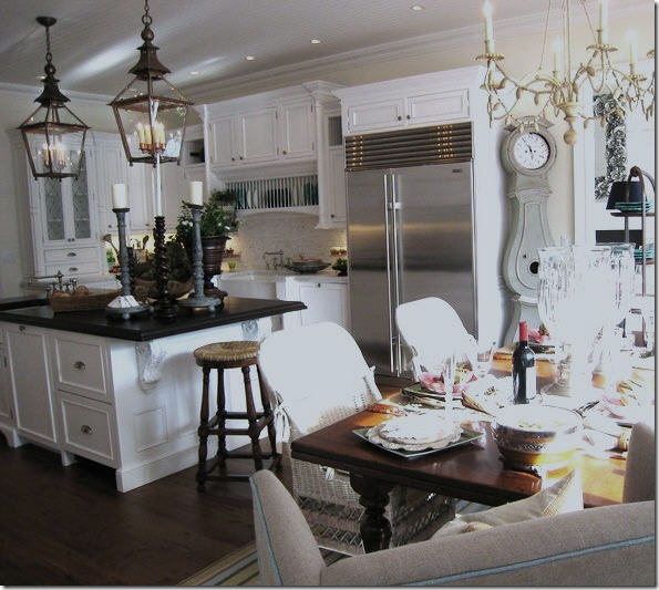
Lanterns immediately update a space, regardless if the interior is traditional or more contemporary.
If an antique lantern is out of your price range – look at lanterns designed for outdoor use, they are usually less expensive.
Use two lanterns over an island to make a huge splash.
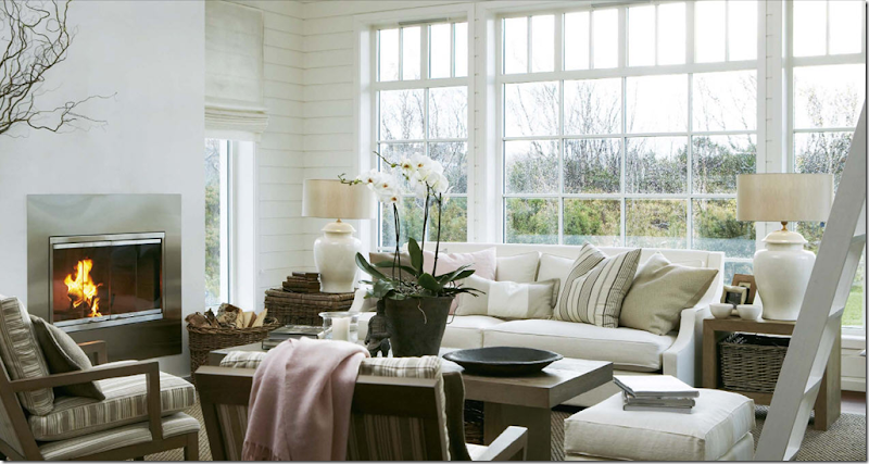 New lampshades in updated shapes will instantly change the look of your room.
Instead of hanging art work that you’ve inherited or never really liked, consider hanging mirrors. Chose an antique gilt framed mirror – or a reproduction in a limed wood - to instantly update. Hang a round mirror with a thick frame over a mantel. Carefully look over your framed prints and replace faded botanicals with ferns or green leaves. Hang white ironstone platters or creamware on walls in lieu of art. Rather than having one large art work over a sofa, hang a collection of prints all framed alike. Or hang a map – choose a large reproduction of an antique map of Paris or Rome - or opt for an oversized antique sign.
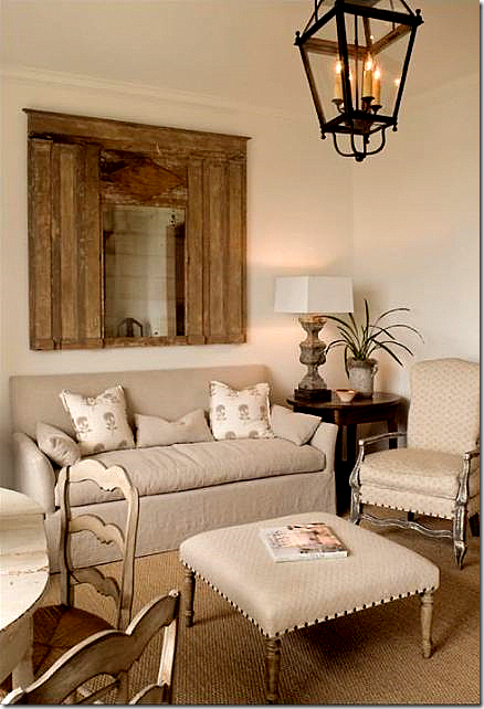 Instead of art work over a sofa, hang a mirror. Another look that is great for the next decade is nailhead trim on chairs and ottomans.
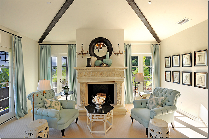
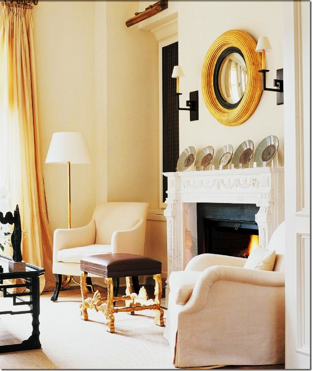 Choose a round mirror over a mantel rather than art work. Another updated look seen here – cushionless upholstery.
Hang a series of prints together to make one larger piece of art (put screen on largest view to see entire photo!)
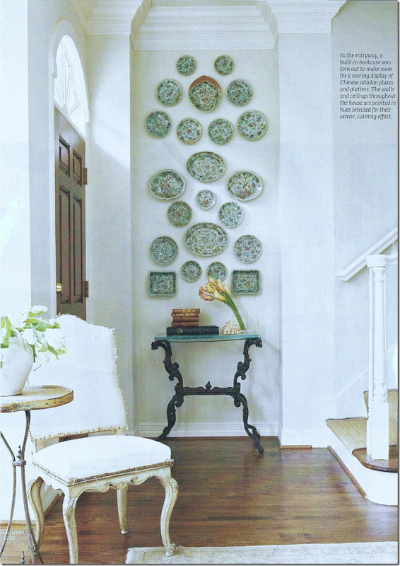 Hang a collection of plates – instead of prints.
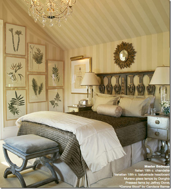 Instead of sweet botanicals, use framed ferns, leaves or dried herbs.
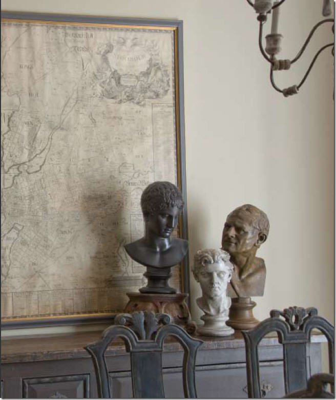 Oversized antique or reproduction maps are trendy now, but still look great.
 Even in a room filled with antiques, a large station clock looks new.
It’s time to move masses of framed family pictures to the bedroom or hallway. Or, remove all the framed old photographs and place them in a large bowl. It’s amazing how guests will actually thumb through a bowl of pictures, rather than look at an array of mismatched frames. Try it!

Don’t overlook interior doors. If your house has builder’s grade hollow core doors, paint them black in an eggshell finish which will elevate the door's importance and the black color is a great accent. Consider removing unattractive interior doors and replacing them with shuttered doors or portieres made of fabric or burlap. Hardware is another item that quickly dates. Replacing broken and tarnished hardware is like buying new jewelry for your house.
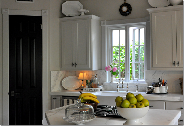
Paint inside doors black to make them more special and richer looking.
All my cheap, builders grade interior doors are painted black to make them look just a little nicer. I’m not fooling anyone – but the black does look nice.
In the end, don't worry so much about whether a look is trendy or not. Everything is "out" after ten years. Test this theory by reading a décor magazine from the early or even late 1990s to see how dated everything looks. It’s impossible to stay ahead of trends, so why bother? Buy what you like now and enjoy it!
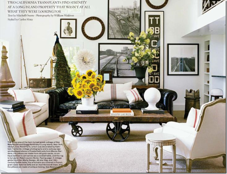
Overall Good Design for the Coming Decade:
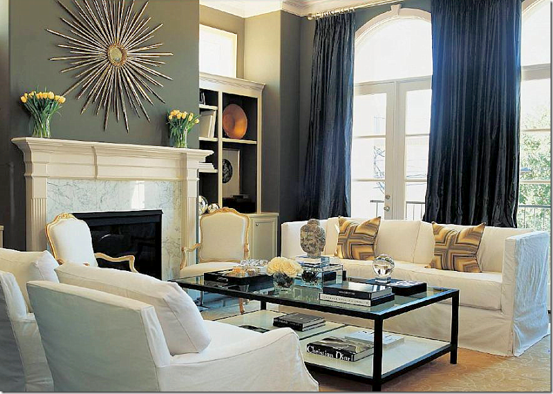 Updated decor for the 2010s by Houston interior designer Lisa Epley: Tailored slipcovers that unify the furniture, minimal pillows, simple, lush curtains, large accessories. Though contemporary, Epley brought in antiques to keep the room from feeling stark. This is timeless design that will be fresh for decades, not years.
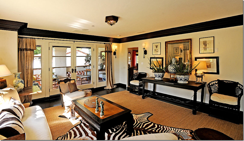
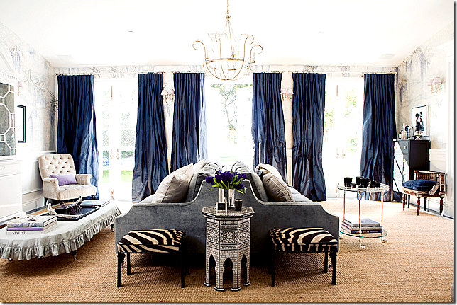
Here’s another all around updated room for the 2010s. I love the mix of velvet and linen with touches of zebra. The curtains are gorgeous – just a shade darker than the velvet. And I love the contemporary light fixture. The plain, inexpensive seagrass is perfect to ground the room and bring its dressiness down a notch. Just beautiful!
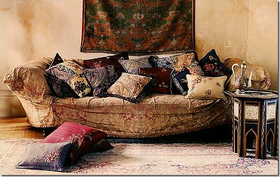
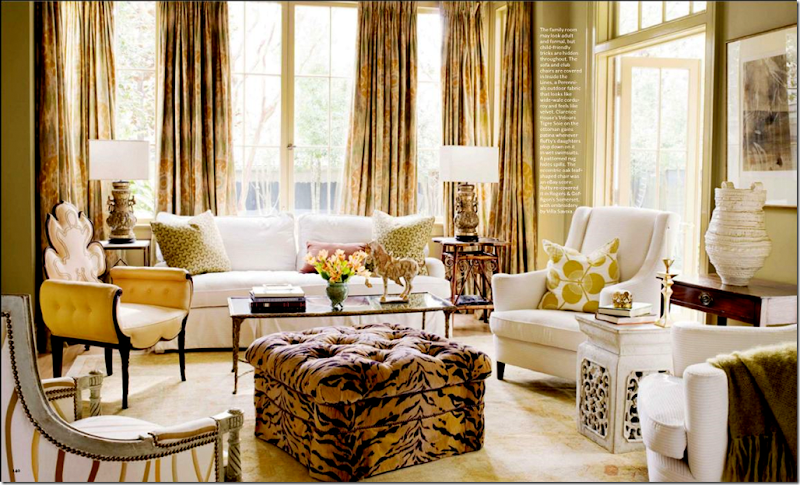 A living room, relaxed for this decade: tiger fabric, instead of zebra seems fresher here. Minimal but effective use of pillows. Wonderful ikat fabric on curtains brings in a little trend to keep the room looking youthful instead of stuffy. Cluttered, ethnic design interiors are a good alternative to the more contemporary look.
Gray walls, lanterns, gray wicker, cowhide, ironstone – ready for the next decade – and it couldn’t look any better than this!







Thank you for sharing this wealth of information! I love reading your posts!
ReplyDeleteI love the blue check slipcovers, the green wall with navy draperies, and the scalloped slipcover in your bedroom. Perfect!
Teresa
Tons of ideas to mull over! Thanks for the exquisite eye candy. The large vs. small accessories really makes a lot of sense. I can no longer tolerate clutter (or that HB cover!).
ReplyDeleteEllen
Wow Joni, what a comprehensive post. You did a fantastic job on the article!
ReplyDeleteGreat post, Joni! I am always cautious about trends, but probably too much so. I confess that I have just never embraced the white sofa icon. At least not since the 70's. I covered an old "Dagwood" style sofa with artist canvas for my very first house in 1979. Life is dynamic and so is decorating, so your advice about using and enjoying what you like is good.
ReplyDeleteWow Dude! You've shared so much great information and wonderful photos that this could have been multiple posts, so kudos to you!
ReplyDeleteI agree with so many things you suggested- especially updating lampshades- I recently pontificated on this myself as I think they are one of those things that we cease to see in our own homes as the years go by.
I have been thinking about repainting my dining room for quite some time now but keep putting it off...I think this was just the impetus I needed, so thanks for lighting the fire under my paint colour deck :)
PS. Loved the comment about "cute outfits" and boys at school- how true is that??!
I for one am so excited to see what the next decade has in store! I do think that creativity will be on the rise and really a boon for business and our souls.
ReplyDeleteYou always impress me with all that you share, from the images to your words. You certainly have a way, perhaps a book is in your future, "Design according to Cote de Texas."
pve
decor to adore!!!
ReplyDeletep.s.I took the plunge and did a post on "what is true french decor" .... eeeeekkkk ... nervous now
You always give us such a visual treat and this time you went above and beyond! Thank you for all the decorating tips, it's going to take me a while to go back through each one carefully and I do think that magazine picked the right person to write for, you’re amazing and always put your best foot forward.
ReplyDeleteThis is a magnificent post! I am going to have to make a cup of tea and read through it again. It always seems like people are looking for the next thing when we hit the even decades (2010, for example) - it seems like a turning point. It is kind of nervewracking to be doing a big design project at a turning point time!
ReplyDeleteEnjoyed that post and the beautiful photos!
ReplyDelete-Trish
That cover of HB was the clincher for not renewing. Love this post! Fantastic visuals and great commentary and suggestions.
ReplyDeleteWow - impressive amount of info! I think people will appreciate seeing all your creative ways to update without having to totally redo - that is of course the key to everything these days - using your creativity rather than your wallet. And I love it - makes people like you and your blog indispensable (and that's a good thing)!
ReplyDeleteThis is the best post! You are generous with your research and photos and advice. I thoroughly enjoyed reading and learning today. The new house I am moving into in 2 months is painted all white and I love it. Now I will think about a white Living Room! Can't wait!
ReplyDeleteJoanne
If anyone doesn't get the urge to fluff up with one or two of these terrific suggestions they are dead!
ReplyDeletewonderful post. I will be revisiting it several times. One thing that took my breath is the black door in your kitchen. Might have to try that...
ReplyDeleteWow! Thank you for all the time and effort you put into this piece. Truly useful information that I will refer back to often. I just moved into a new home and am having fun (and some challenges) decorating new spaces -- mostly with what I have already on hand. But your ideas will help me to add some freshness. The curtain placement information is particularly helpful to me in this home. Love the idea of seagrass, and putting pictures in a bowl. Thank you!!!
ReplyDeleteAlways love your views and amazing imagery! I love that you are writing for the magazine - they know talent when they see it!!!
ReplyDeleteonce again, I become absorbed in your posts like no other blog I read....keep doing what you do! I love your in depth, self deprecating, stylish and accessible design sensibility. Thanks for writing such a fun blog to read!!!!!
ReplyDeleteWhat a great post, Joni, keeping up seems so hard sometimes, but you have helped me to see what is out there and what I can easily change. I love the idea of buying a good antique for each room. Mine aren't good, but they are antiques and they have been around a long time and will continue to survive, I'm sure.
ReplyDeleteI listened to you talk to Rhoda on SRT yesterday, what fun! What a lovely person Rhoda is, inside and out!
Hugs, Cindy
Wonderful Post!!! However, I have never felt like my home was more outdated!! I'm in my early thirties and already out of style. Yellow walls etc. Here it is.. would love any advice on where to go.. maybe change the couch would be a good start. :) I even have the fringe pillows!
ReplyDeletehttp://bringingupmadison.blogspot.com/2010/09/show-us-where-you-live-living-rooms.html
You are simply a G.E.N.I.U.S with a fantastic eye for beautiful design. I love your posts and always learn something new. This one tops the bill. If only I had oodles of cash (and you by my side), I'd re-do my home. Alas, I can dream! Thanks for putting so much passion into what you do! Maureen
ReplyDeleteLOVED EVERY WORD AND PHOTO! Thank you for sharing all these tips! We can all have fresher homes for the fall, just by following the advice in this post! You are AMAZING!!
ReplyDeleteOh Joni! What a great post.
ReplyDeleteI picked up this gem of a magazine while "dining" at the Marburger food tent. I totally forgot how awful my pork wrap was because I was so absorbed in the articles. And then I saw your contribution. Made me feel like I was somehow in the know, ha ha! Thanks again for the great ideas, back to drool.
Beth
Joni - I've been contemplating painting my interior doors black for ages now. I think they add a real touch of glamour. Would you share with me the paint color, finish and manufacturer you used on your doors? Thanks so much.
ReplyDeleteGreat post - informative - beautiful pictures and ideas. Something for everyone's taste. You are a writer, an excellent writer!!! You know so many aspects of the business and you have an eye for beauty. You keep the reader's interest and I love your wit. It's obvious, we all just wait for your next post. Again,can't thank you enough for your great blog. Love it and love you!
ReplyDeleteJanice
Pemaquid
Great post. Informative, and beautiful pictures. You give us so many great ideas!
ReplyDeleteI enjoyed every single photo. I see some painting of doors in my immediate future !
ReplyDeleteOK Joni, I am planning to get an outdoor lantern for my diningroom after seeing this post. I love how you can pull images together to explain your ideas on what is current and what will be dated. Laughed when I saw the last image of HB's cover. I hated the look of that room.
ReplyDeleteI was wondering how you feel about toile patterns on drapes...do you feel that its ok to have the slipcovered furniture with neutral carpets (sisal or seagrass) and have a toile drapery? Maybe change out rods to small bronze iron/rings? Seems to me that I have not tired of toile~does it have a staying power in the land of pattern and print?
But wait -- what if I LIKE dark walls and white trim?
ReplyDeleteFantastic post, though, and as others have mentioned the black door idea is a keeper.
Never have commented before, but love your blog! This was my favorite post ever. So many great ideas. (Hated that House Beautiful cover--talk about overkill!) Keep up the good work.
ReplyDeleteGreat article--AS ALWAYS, I learned volumes and consolidated some observations into concepts. Thanks.
ReplyDelete"...buy what you love now and don't worry about whether it is too trendy or won't be in style twenty years from now."
ReplyDeleteExcellent advice! some great tips here...and as always, I love the images on your blog. Wish I could step into them!
you are one of the few blogs in which I actually READ other than just look at the pictures
ReplyDeletethanks !! you are great
Wow, what a gorgeous post. Thank You for taking the time to put this together!
ReplyDeleteThanks Joni for a great post as usual. I found it very interesting to read the comments on the the HB cover! Beautiful rooms for inspiration - it will take awhile for me to veer away from the beloved white....
ReplyDeleteNancy
JONI YOU ROCK!!
ReplyDeleteTHE TIME YOU PUT INTO YOUR POST SHOWS IT IS A LABOR OF LOVE. JUST WANTED YOU TO KNOW I APPRECIATE YOU AND LOOK FORWARD TO EACH AND EVERY POST. YOU ARE HANDS DOWN THE BEST BLOGGER OUT THERE!!!
Joni,
ReplyDeleteGreat tips and lovely images, as always. Congratulations on your gig with the magazine. You are so talented!
Agreed you rock! Amazing post! Right on the money! Victoria
ReplyDeleteI know a lot of people hated that HB cover. I loved it - I wonder why people either hated it or loved it. no in betweens at all!!!
ReplyDeleteTopaz - that's why I said take it with a grain of salt. white trim will always be in style and correct. i just said to paint it one color to update your look. no one used to paint out the trim in theh 80s and 90s. now they are doing it but you dont have to!!!
I, too , liked the blue and check slip cover and remember them from the 'zine, as my table is very similar and my slips are with a similar check, but red. The drapery hardware in that picture was great but was unfortunately custom so the decorator wrote to me. I have since redone them to also cover the back of the chair and they look less busy. I enjoyed your article in the magazine which I was able to get at marburger farm, and I always look forward to it. I even showed some of the pics to hubby and he liked also. I can't wait to go over the entire blog post in detail. thanks.
ReplyDeleteI loved the HB cover. I like to see variety in interiors---not always the same thing. I like the linen slipcover look AND the more colorful HB cover.
ReplyDeleteJoni -- I so enjoyed this post, as always, and I don't know how on earth you find time to get these posts done, as they are so comprehensive.
ReplyDeleteI like some of the trends you feature, some I don't. For instance, I think if see one more zebra skin, real or fake or zebra print, I am going to have a breakdown!
Don't you think that in the end, it is all a subjective decision? What looks good to me may not ring the chimes of the next reader. I am in the category of HATING that HB cover -- it looks like a color-blind person went to Goodwill and said, "I'll take it all!" But's that's just me --
Scribbler
I really really appreciate you stopping by my blog and giving me some tips. I'll take any thoughts you have!!! Boy my husband will be excited when he gets home and has to hang my mirror the other way!! I am on the look out for two tall lamps for the sideboard. I like my house, but I LOVE all the fresh light colors you talked about. I so want to be there, but I know it's going to take a little while. I LOVE your taste and the work you have done in your own home and others. I drool over your blog. You do an amazing job! :)
ReplyDeleteJoni! How DO you do this?!?!? So many fabulous pictures,and I love all of your own projects in the mix! (Especially your kitchen....LOVE!!!!)
ReplyDeleteA big congrats on your new writing career! And do NOT sell those editors short. They know a good thing when they see/read it!
Great post as always...
ReplyDeleteI can't see that kitchen with the two lantersn enough....love it.
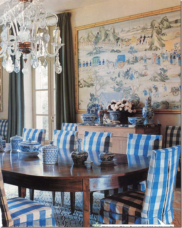
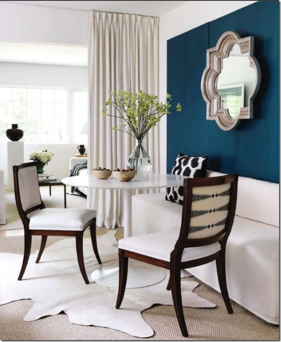
The diningroom with the bright blue buffalo print covers speaks to me and I'm not a blue person :)
We are in the process of painting all interior doors a semi=gloss black, so far I ADORE them, this I believe will be a dead giveaway to a 2010 look, normally I don't do trends but I loved the look in everyones home.
I have been painting trim the color of the walls for a few years now, started in the kids room, who needs white in there lol, liked the look so continued throughout the house.
I also have been painting my crown moulding the same as the wall color, saw on someone's blog it was a no no...but I like it.
How's Elisabeth liking school....???
I really enjoyed the Rhoda interview :)
All the best,
Kathy :)
ooppss forgot...you're a wonderful writer !!!!
ReplyDeleteKathy :)
I actually have a question - What kind of lantern/light fixture do you suggest for a family room that has 8" ceilings? I would love to replace the ugly fan in my family room - but don't know what to do since I have such low ceilings.
ReplyDeletelove these types of posts Joni.. so much info and love that you have strong opinions.. i loved that HB cover too for reasons I really couldn't put my finger on.. It's totally like nothing I would think I like but it just feels like such a disregard for everything that i love it..
ReplyDeletexxoxo
Absolutely love the lanterns over the kitchen island... Also like your idea of painting the inside builders doors black. I'm working on a color project now I'll suggest that to the client... Fay
ReplyDeleteThis has been one of your most helpful posts for me! I have been reading your blog for at least six months now as I am a new home owner of a house that is not really my "style". I have a Texas ranch style house built in the late 40's, and very little budget to work with. This is my first time to get to decorate a home and your blog is helping me to learn!
ReplyDeleteMaybe you have done this in the past, but I would love to see a post totally dedicated to lighting solutions. I am working through a dilemma right now as I have a wingback loveseat where my husband would like to have some reading light. There is no place for a floor lamp or a side table with a lamp, so it needs to be something mounted on the wall. I would love to see some ideas of wall mounted lighting. (This wall is exactly the size of the loveseat with a hall on one side and a door on the other. Hence the need for wall lighting!)
I would also love to see lighting ideas for kitchens with low ceilings (too low for a big lantern!).
Thanks again for a great blog. If I had the money and lived in Houston, I would hire you to help me for sure! (I'm in Bryan/College Station!)
This post has left me inspired to go with my gut and stick with what I love. Thanks so much for all the wonderful advice and also the fantastic images :o)
ReplyDeleteAngex
I love reading the 'Joni formula'! I think the magazine is brilliant to have you write for them! Fun article.
ReplyDeletejoan
Wow! You're wonderful. I will be rereading this post a few times I'm sure. Thank you so much.
ReplyDeleteThanks for such a well written in- depth look at updating our homes.
ReplyDeleteI enjoyed the HB cover. To me, it was similar to a trip to Anthropologie...inspiring.
For the budget minded, my recent post highlights some great trendy finds at a local Houston resale shop...hope you'll give it a look.
you make me feel REALLY OLD, I had white walls and painted white furniture in the mid 60's - and black walls and sisal in the 70's and my Mother slipcovered everything (and they really fit) what's left???
ReplyDeleteEven though you age me, I keep coming back to your blog! Keep up the good work.
* Such a FUN, INFORATIVE posting today, Joni!!! There were some spaces that I was literally drooooling over... (and, there were a few I didn't, like that LAST pic of the mag cover!)...
ReplyDelete...Annnd, what terriffic TIMING for this, too!!!
Many, many thanks for sharing your thoughts/feelings~~~ I always learn so much here... suggestions on "what to do" are as welcomed as "what NOT to do"!!!
Warmest,
Linda in AZ *
bellesmom1234@comcast.net
So much to love and great ideas for updating, I am ready, One room that stood out is the blue and gree bedtoom!
ReplyDeletexoxo
Karena
Art by Karena
Dear Joni, this is a terrific post!! With a lot of interesting tips! The bowl with the postcards an family pictures, the use of lanterns, the mirror instead of an artwork,...!! We all have learned a lot from this post!
ReplyDeleteTHANK YOU!!!
xx
Greet
What a wonderful post. Took me two sittings to get through it, and I love that! Great advice, so organized and well-written, and beautiful pictures. Thanks!
ReplyDeleteHere's the same coffee table from the cover photo of HB on the cover of a book published in April. Other elements of the room are different in this photo---beginning with a blue and white striped rug.
ReplyDeletehttp://www.amazon.com/Rooms-Inspire-City-Stylish-Interiors/dp/0847834301/ref=sr_1_fkmr2_1?ie=UTF8&qid=1286449788&sr=1-1-fkmr2
Started to read this and then had to run so saved it until this morning to really read and savor!! As usual your posts educate and inspire me. I agree with so much of what you said. I do think we are scaling back in all areas of design - less opulent. (But, isn;t that the current economical trend?) Another great post Joni!
ReplyDeletexx-Gina
Joni, thank you so much for all of the time, effort and talent you put into this post--and ALL your posts! This morning is the second time I have combed through this post, and you have really given me some ideas I can USE! Yesterday I put all my photos in a bowl, lol, and am getting ready to update a few doors with black.
ReplyDeleteBTW, those editors know a good thing when they see it...much luck and continued success to your writing career (as long as it doesn't interfere with this blog!). Thanks again for yet another great post!
The post appropriately ended with the admonition: "take what I say with a big grain of salt"
ReplyDeleteLast week's post on Betty Phillips would tend to counter balance a few of the up dated trends suggested here. Phillips clearly used much of the furnishings (fabric included) from her former home to her newest one. Do they look dated? They don't look dated because they are timeless pieces. The worst advice any decorator can give a client is to be constantly worried about trends. I would suggest to you that the client who painted her grandmother's dining room furniture will look back in a couple of years with much regret. I love painted furniture as much as anyone, but Hepplewhite chairs and a Regency dining table were never historically painted and don't look right no matter how well executed the painting was done. What was an heirloom for this client has now become something that looks picked up from a roadside yard sale. Very sad, indeed.
Joni, your posts are AMAZING! I got up from reading several times and pulled out stashes of fabric to try on windows, pillows,etc. You are so talented and I am so thankful that you put all of this time and effort into sharing your knowledge with us. As for the HB cover, I found myself wondering, if you walked into that same room in let's say, a $150,000 home and it did not have a designer name attatched to it, would you still like it or as a previous post stated does it look "Goodwill?" I think it is terrible (but those are not the colors I am drawn to)! :)
ReplyDeleteLexi
I have been reading your blog ever since I found you through Color Me Happy! Love both your blogs! This would be my first comment.
ReplyDeleteI love love love how you break it all down for us in such an easy way. Your taste is so wonderful. I am remodeling/redecorating our entire house and I, like you, don't want it to look too trendy and out date too fast. Gonna use what I love and the colors I love. PURPLE! At least 2 rooms will have some purple accents. Keep up the great work and good luck in your new ventures!
Belinda
Wonderful post, Joni. It was like going back to school. You covered so many important design issues. Your commentary and reasons for your opinions are all so well said, and of course as always illustrated beautifully. I will come back here time and time again. Great visuals to show clients.
ReplyDeleteI'm in Little Rock, and as much as I love it here, we are always a few steps behind on just about everything. Trends are just taking hold here normally about the same time that everyone else around the country is sick of them. Blogging has been an enormous help to me and my business in that realm. We are working with a client that I have just convinced her to paint all her interior doors black. Someone here said it is a trend of 2010. I can assure you she will be one of the very few if not only one that has done it in Little Rock. I can't wait to show her this. Thanks for another fabulous post. Mona
As always Joni...brilliant advice...I think I will be ditching the Oriental rugs....can't wait, have wanted to forever! xv
ReplyDeleteThat definitely was a very controversial HB. Personally, I liked the HB cover. It was like vintage meets modern (with the art work). It has sort of a cozy charm about it. I thought it was a very interesting mix and it works! Thanks so much for the post on the window treatments. That was very helpful information! Keep it coming!
ReplyDeleteJessica P.
I find it fascinating that different people see the cover photo from HB so differently. Some see it as tacky (I think) and others as brilliant design work. I have to say again--that I like it--I really do. All the elements work for me.
ReplyDeleteI would love to hear other comments.
Joni - like so many others have said, your posts are INCREDIBLE!! Great job, once again!
ReplyDeletei have to say that the cover of HB, in my opinion, seems like the "trend" might be shifting back to English pretty soon? Just a hunch bc a while back, there was a house featured in Trad Home (i think) that was English all the way...a GORGEOUS lake house in Birmingham. I do love English, but love French even more, so i hope that's not the case!
So sorry you've had to stalk Cathy's house for so long...i could have gotten you in a LONG time ago!!
-Jenny Johnston
loved reading this post and all these photos are so inspiring!
ReplyDeleteJoni my dear, you missed your calling as a teacher. Fantastic post!!!!!!
ReplyDeleteKnow that you love 'slips' so if you have time you may want to check out the blog: MUCH TO DO WITH NOTHING (by Kelly). She is an absolute sweetie and is very talented in the art of making slipcovers. (Please tell her 'mrsben' sent you.)
WISHING YOU A WONDERFUL DAY.
-Brenda-
My favorite post of all times! Thanks so much for sharing.
ReplyDeleteJoni, don't you think it's bizarre that there's a bare florescent light on the ceiling of the Julie Greenwood photo? (<:
ReplyDeletethis is amazing.
ReplyDeletei don't know why the rest of us bloggers continue to post design posts after this one!!!
ps come see my new shoes
It would be an interesting exercise to see how prominent Houston designers and/or designers from other parts of the country might tackle this question. The vast majority of the "keep up with the latest trend" theme is based in part on "casual design schemes" and the DIY viewer/homeowner. There is no magic written here. Perhaps Joni, Megan and Linda can asked this question to their next designer/guest. It would be interesting to make a comparison.
ReplyDeleteI think the paint colors may work in the light of Texas but in other parts of the country you need warmer colors- I like my persian rugs and don't care for the seagrass look so most of this article today was fun to read but not my cup of tea
ReplyDeletegreat post! wonderful images! thank you
ReplyDeleteThis is a terrific, generous post! I'm not interested in following all trends, nor am I in Texas.
ReplyDelete- I love my fine BROWN English and American antiques, and oriental rugs, mixed w/contemporary art
- I love color (the new Restoration Hardware makes me LONG for a shot of color-any color!)
- I also love to reread, share and see my books - covering them strikes me as ridiculous!
AND YET...
Your post is VERY helpful to me. I am about to move into a nearby 90 year old house that needs a complete redo. I don't want it to look like 1993.
You've given me plenty of ideas- about scale, curtains, lighting, layered flooring, restraint in use of pattern, etc that I can use to make it feel sufficiently current - while still using my favorite things and expressing my own taste. (and yes I'm a DIY type, with a little help from an architect sister) Thanks again Joni!
~Wendy, a fan in PA.
Thanks so much for this article. It's just what I need. It will keep me from buying things that will be dated soon. Sometimes, I look at the new trends and think I hate them and then a year later I love them.
ReplyDeleteRegarding grandma's dining room set, I really dislike them. It's good to see that something can be done with them besides giving them away.
Hi Joni, Your blog is a favorite of mine, and I absolutely love this post. Thank you so much. Thought I would be brave and send you the link to my beach house that is for sale in Watercolor Resort on Hwy 30A in Santa Rosa Beach, FL. Watercolor is such a special place and this house is very, very special to our family, and we hope it will be special to someone else's family soon. Thanks, Michelle
ReplyDeletehttp://www.emeraldcoasthomesonline.com/(zaaxwj55kwyvtu55ts0vcz45)/propertyDetails.aspx?mls=537330
Well, I don't know if you need anymore praise ..the comments say it all. Even if I don't agree with everything you said...get rid of my oriental rug that my husband and I picked out together and love every single day? But I have lots of ideas that I will use. I'm painting that little brown desk and I think I know the color. I'm not a grey person..it just says rainy days and depression to me; but a taupy-beige with some kind of white wash might work. I'll get used to that and then maybe tackle my dining table and old Ethan Allen hutch. I've got some ideas to salvage them. Thanks for keeping this old lady more up-to-date. I love your blog.
ReplyDeleteWhat a wonderful blog, you are such a talented designer and a great writer as well. Thanks for the great posts. I have a beautiful house to show you. www.484spruce.com
ReplyDeleteThese may be trends in Texas and coastal California, but many of the suggestions here don't work in the northeast, midwest or south. The brown bamboo shades are simply hideous when paired with beautiful silks or linens and make a room look under dressed. Joni, you do casual designs by your own admission in a climate that may call for some of these elements, but if you are speaking or writing for a national audience, you need to broaden your scope. We have seen other Houston designers on this site and on others and they would probably not make some of the same suggestions. Perhaps we should hear from a few other professionals before we throw out the baby with the bath water.
ReplyDeleteI'm a color person to, but Joni's proposal looks timeless and very elegant. By the way the kitchen in www.484spruce.com that anonymous showed is to die for. Joni if you have the time you should give us your insight. Thanks again for sharing your knowledge.
ReplyDeleteThis is a great article, and you had several original low-cost makeover ideas for do-it-yourselfers that I haven't seen anywhere else.
ReplyDeleteI must confess, I'm hopelessly addicted to mountains of throw pillows and tassel fringe, and white walls make me feel like I'm in an insane asylum or that scene from Fatal Attraction right before they find the bunny in the kitchen... I think it was a bunny?
But your best piece of advice is to follow your heart and choose to live with things you love in your own home rather than worry too much about what's in and what's out.
By the way, the black door trick looks fabulous in your home; I'm going to suggest that to one of my clients. And what is that gorgeous textile that is folded at the foot of your bed? Is it a quilt, some kind of tapestry, or some kind of throw? It's beautiful! Wish I could see a close-up!
Updating your home is great, it keeps a lot of people in business (especially decorators, painters, contractors,plumbers, building supply stores, etc) !!! So let's push those changes.
ReplyDeleteWhite painted trim IS classic. It never looks wrong. And if you update with all the ideas that have been detailed here, you too, will have a mass produced, trendy home.
Joni, I adore your style & love your blog! But you have a particular style that seems born out of copying, not necessarily creativity. And that's ok... but a good look at some of the greats shows us the reason why they are so great. They ignore trends and go with what is right for the house.
Joni I'm with youon the HB cover..I think it's the modern art sketches over the sofa that brings it home for me..but I could be happy in the morning in this room...at sleepytime..maybe not so much!
ReplyDeleteWonderful post, lots to ponder!
as always!
Kit
"Updating your home is great, it keeps a lot of people in business " - super agree with this . what a great post and photos . addition to this wind spinner are great and add attraction to your home
ReplyDeleteBeautiful, gorgeous, inspiring . . . your blog is fantastic, Joni! My son who is visiting from Vermont next week will be helping me paint the kitchen and dining area. The yellow on your walls is just what I've been looking for. Pretty please, I'd be honored to know what palette it's from.
ReplyDeleteOr, if you know what yellow Pamela Pierce used in her kitchen, that would do, winkie wink. Do you mind? Thank you.
There certainly are a amount of methods to acquire affordable coach products at coach factory outlet,it could possibly the most effective options.the most vital cause may be the reality that you simply can purchase genuine coach products at there.All people give the good comments for the coach factory online, and now the Coach outlet store provides many discount goods online.Coach bags enjoy high popularity throughout the world. I would like to share the coach factory outlet online with you. What are you waiting for? Just come to visit.
ReplyDeleteThere certainly are a amount of methods to acquire affordable coach products at coach factory outlet,it could possibly the most effective options.the most vital cause may be the reality that you simply can purchase genuine coach products at there.It is believed that you will like the products on the coach factory online. There are spacious sizes and different colors, styles and so on.in the market you definitely can find various colorways that are designed in as well as the high quality that applied in. For most of you would like to come. So just come to our coach factory outlet online store to choose one.
ReplyDeleteI love the high ceilings.
ReplyDeleteFebruary 27,2013 at 4:30 PM After much browsing, I discovered your blog.It was such a pleasure to read,and very informative.You cut the wheat from the chaff and simplify what could be confusing for someone looking for inspiration.Thankyou for sharing your knowledge and suggestions!I look forward to more.
ReplyDelete