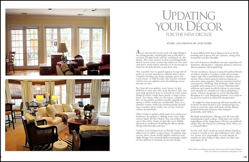
Since the economy has been so bad, I’ve been forced to moonlight as an author for a local design magazine. Shh! Don’t tell the editors that I am really not a writer at all! English was not my best subject in school – in fact, I’m not sure I ever had a “best” subject. School was never my favorite – the only thing it was good for was showing off new outfits and fantasizing about cute boys who never knew I existed. So, the fact that I am now listed in a magazine as a contributor makes me wonder about the judgment of the editors in charge. Just kidding, just kidding. Sort of. My latest contribution to Antique Shops and Designers (what a great title!) is a rather typical know-it-all list of how to update your decor, with a big before and after picture of a job I did.
NOTE: Please be sure your screen is set on maximum (double boxes in the upper right hand corner) so see the entire picture.
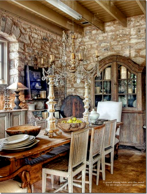 From the magazine: Julie Greenwood from Houston owns the Garten in Fredericksburg, Texas.
If you live in town – be sure to pick up the latest issue – it’s the best one yet. There is a large spread on interior designer Cathy Chapman’s house, which thrilled me. I’ve been stalking her River Oaks house for years and now I finally get to see inside of it! There’s another story about The Garten, the best antique shop in Fredericksburg, with Houston ties, of course. I wrote the story on the Old Braeswood house where Found For the Home’s owner lives. There’s more – a house in New Orleans, a house in the Heights, recipes, gardening, and beautiful ads. If you don’t live in town, the magazine is available online. This link HERE will take you directly to my article – which is the featured Last Page story each issue.
And, my favorite article from the magazine - Interior Designer Cathy Chapman’s house in River Oaks. FINALLY!!! After years of stalking her former house which was on my carpool route, she moved to this house and I’ve been dying to see the inside of it. It is totally worth the wait.
Today, I am reprinting my article for Antique Stores and Designers – along with photographs to illustrate it. It’s a list of ideas to update your decor, but it’s all to be taken with a big grain of salt. It’s easy to sit behind my laptop and swear that yellow is out while gray is in, but who am I to judge when my own curtains are yellow? And it’s one to say that fringe is out, but I still use it when called for. While an interior for the 2010 is fresh to the eye, there’s still nothing better than a house that has evolved over time, like all the great English country houses. In the end, this list is just a compilation of ideas to help guide you if you are thinking about making changes, either little or big.
My original article for Antique Shops and Designers – Read it online HERE.
UPDATING YOUR DECOR FOR THE NEW DECADE:
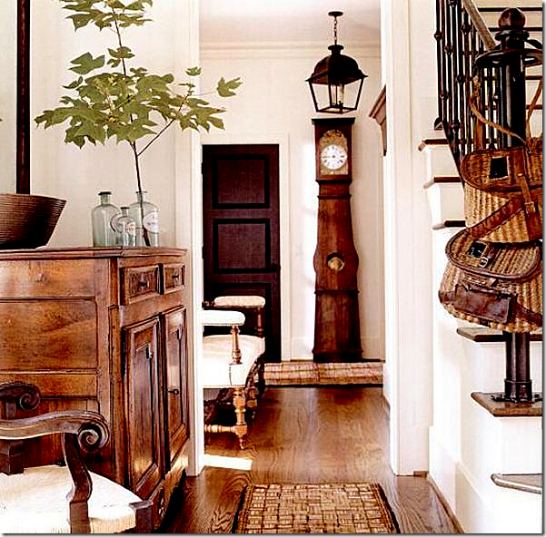
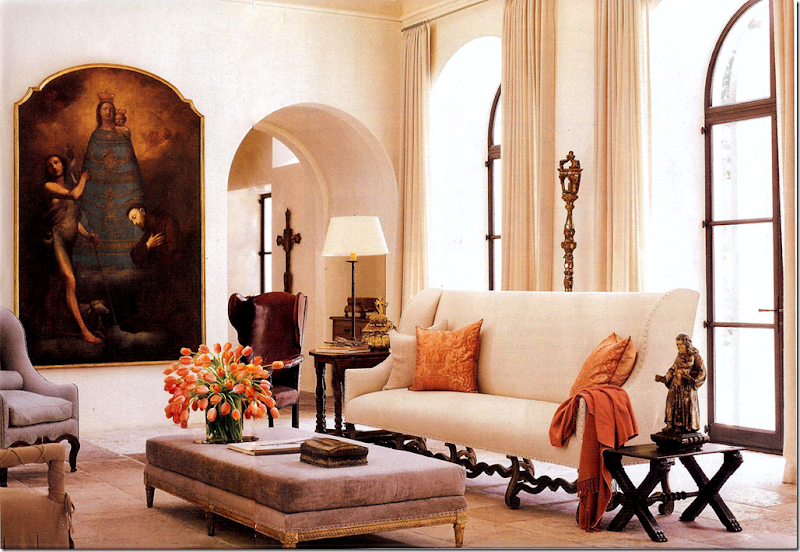
As an interior decorator and a design blogger, one thing people consistently ask about is whether a certain design look will be outdated in the future. The easy answer is that everything looks dated in ten years, so just buy what you love now and don't worry about whether it is too trendy or won't be in style twenty years from now. Most likely, it won’t. One surefire way to guard against being out of style is to buy antiques, which don't date. Consider buying one large antique piece for each room - it will become the anchor around which you can update your furnishings every decade or two.
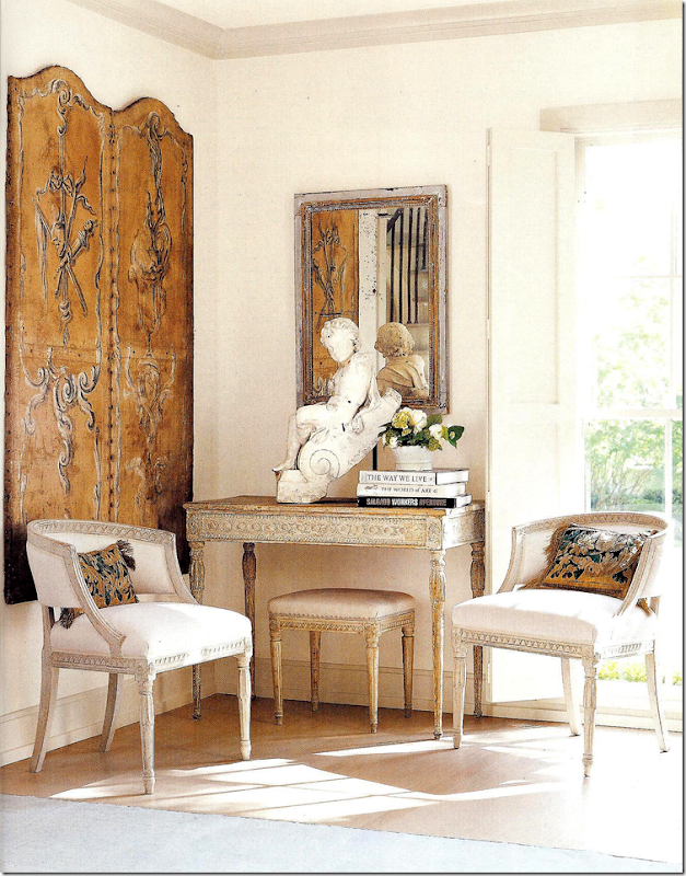
Buy one good antique for each room: this beautiful, stand-out French commode in an entry hall can move to any room in the future. It can go from the living room, to the kitchen, to the bedroom. A piece like this can act as an anchor in any room, for any decor and will last a lifetime.
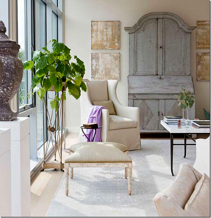 This antique Swedish desk is used in a contemporary highrise. When the owners want to change from contemporary decor, this piece will still star. Again, you can use this in a living room, a family room, a bedroom, or library.
So, how do you update your house in the 2010s’s to last into the next decade? The easiest and quickest way to refresh is with paint. Painted white walls have made a huge comeback, but are white walls for everyone? For those who are fortunate enough to live in beautiful, architecturally significant spaces, white walls are wonderful. But, in a smaller house with less architectural detailing, consider gray walls, one of the hottest colors in interiors. To further update with paint, consider painting all the woodwork the same color as the walls. And don’t forget the ceiling – paint the ceiling the same color as the walls, just have the painter halve the formula. Heavily fauxed paint jobs are also a thing of the past. Instead, use two paint colors that are very close in shade and tone when faux painting. This type of paint treatment adds subtle movement and texture to your walls and is much more sophisticated than the bolder techniques used in the 90s. Another paint treatment to consider is a stucco-like finish on interior walls.
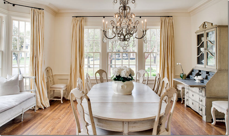
White walls are very popular today. They work especially well when the architecture is beautiful. Here, glorious windows in an extra large dining room add enough architectural interest to handle white walls. The trim is painted just a little darker than the walls – high contrasting trim seems out of date.
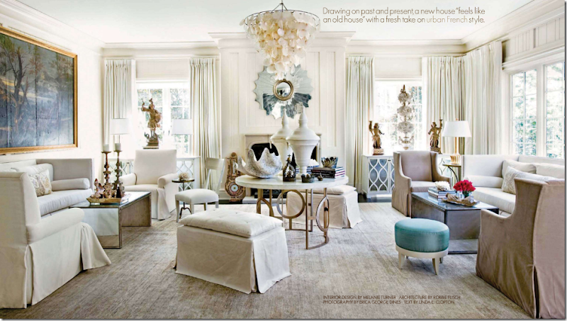
Another beautiful living space provides enough backdrop for white walls. In this interior, the contemporary furniture, mixed with antique accessories, further updates the room for the 2010s. Notice that all the woodwork and the ceiling are painted the same color as the walls. Bright white trim with darker walls seems dated today.
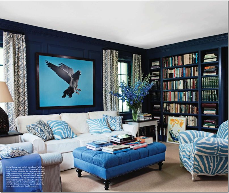 In a small room with just two small windows, the walls are painted a dramatic blue. Built in bookcases add more detail. Notice how the trim is painted blue like the walls. White trim would have like the 90s.
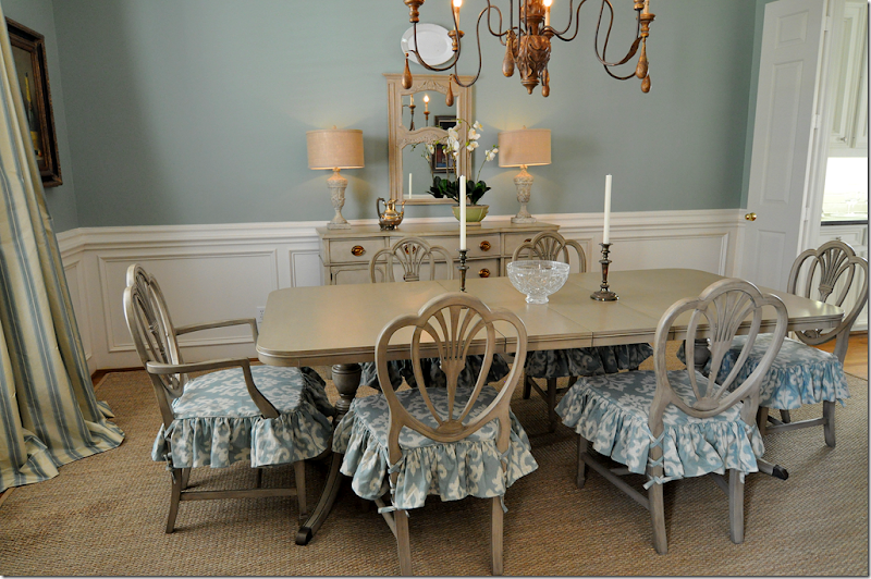
Other ways to update with paint is to paint your furniture. Much of the brown wood furniture of the last century looks dated today compared to the popular bleached, limed woods which originated out of Belgian. If you have inherited your grandmother’s mahogany stained dining room set, consider painting the table, the chairs, or both in grayish tones. To further update Granny's dining room set, have slipcovers made for the chairs. You can either slip the entire chair, or just the seat. Let the skirt fall down to the knees of the chair or to the floor. Think pleated or scalloped detailing for these skirts, along with buttons and ties. If you don’t have a dining room set and are on a strict budget, check in with neighborhood garage sales and buy an inexpensive table with a scratched up finish, then paint it whitish gray. The difference will be amazing and the light painted wood will take your dining room into the next decade.
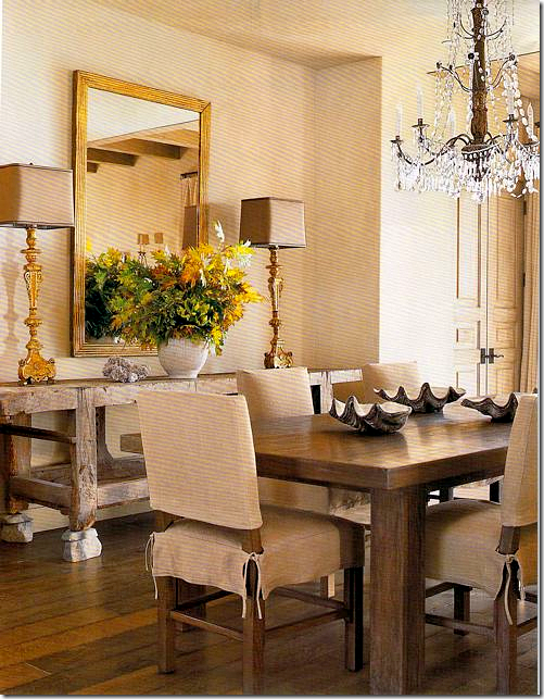
To update my client’s dining room suite – I had it painted in gray with a distressed finish. The difference the new paint job makes is remarkable. Instead of looking dowdy, the furniture is youthful, especially with the slipcovered seats.
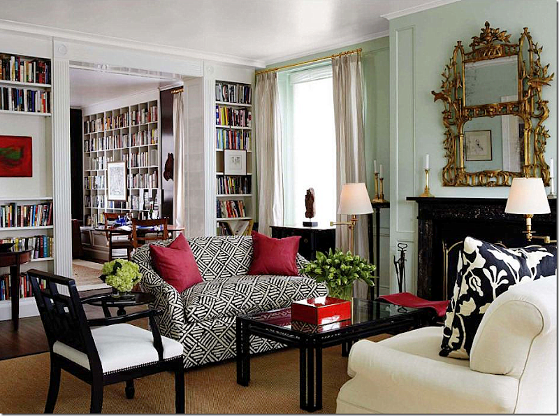
Update your living room or family room with slipcovers in white or gray linen. To update slipcovers, have them made highly tailored and tight fitting. Slipcovers of today are more fitted, not loose and wrinkled like the Shabby Chic look of the 90s. To unify a room of mismatched sofas and chairs, slipcover each piece alike in the same fabric with either linen or cotton. If you are really budget conscious, consider using painters drop cloth for the fabric. Use printed fabrics sparingly, either on the pillows or curtains or accent chairs. A room filled with linen slipcovers is so fresh looking and is great for our climate, along with being kid and pet friendly.
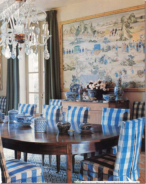
To update old and too fussy dining room furniture, consider slipcovering chairs in a casual fabric. There are an endless number of possibilities for slipcovering dining room chairs – the slip can go to the floor or just to the knees, it can be pleated or tailored, it can cover just the seat or the seat and the back.
Slipcovers of today do not have to be messy or sloppy. These sofas by Michael S. Smith are tailored and quite at home in this elegant room.
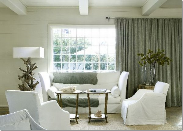 Tailored slipcovers work in a contemporary setting.
To update more, get rid of masses of pillows on your upholstered furniture. Instead, place just two large 26” pillows in deep colored velvet to pop the white linen. Be wary of trims on pillows - all the fussy fringes now look so out of style. Order throw pillows with a plain knife edge and an invisible zipper for cleaning purposes. Another updated edge is a small 1/2" or 1/4" flange. Remember - simpler, plainer, and less dressy options when updating.
Opt for fewer pillows in the future – 2 or 3 for a sofa is plenty. Go for bigger and plainer, with less trim. Choose a 24” or 26” pillow in a contrasting velvet to pop color. Use plain or flanged edges. Instead of fabric, use antique tapestry on pillows like those made by BViz HERE.
Updated pillows: large, without dressy fringe – used mainly for pops of colors.
Updated pillows: two large, plain pops of color balanced by printed fabric pillows on the chair – used to contrast sofa fabric. Great decor: the apartment is traditional architecture, yet the furniture is more contemporary.

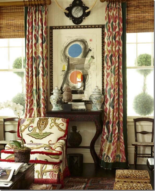
On the windows, toss out metal and wooden blinds. Instead, choose textured bamboo blinds or fabric shades. Be sure to hang the blinds as high to the crown molding as possible to elongate the line. Next, layer fabric panels over the blinds. While plain panels hanging from tiny rings are trendy, cornices with interesting edges will add a youthful look to window treatments. Sheer linen panels with no lining are also now quite popular. Always consider window treatments : nothing, but nothing, adds more warmth and coziness to a room. It’s rare that an uncovered window is preferable to one with fabric panels and shades. Curtains add softness and much needed texture to any room and should be considered when updating a room. To further update window treatments, forget thick custom rods with elaborate finials. Instead think thin rods in a bronze finish with tiny rings – the less noticeable rod and ring is the look for the next decade.
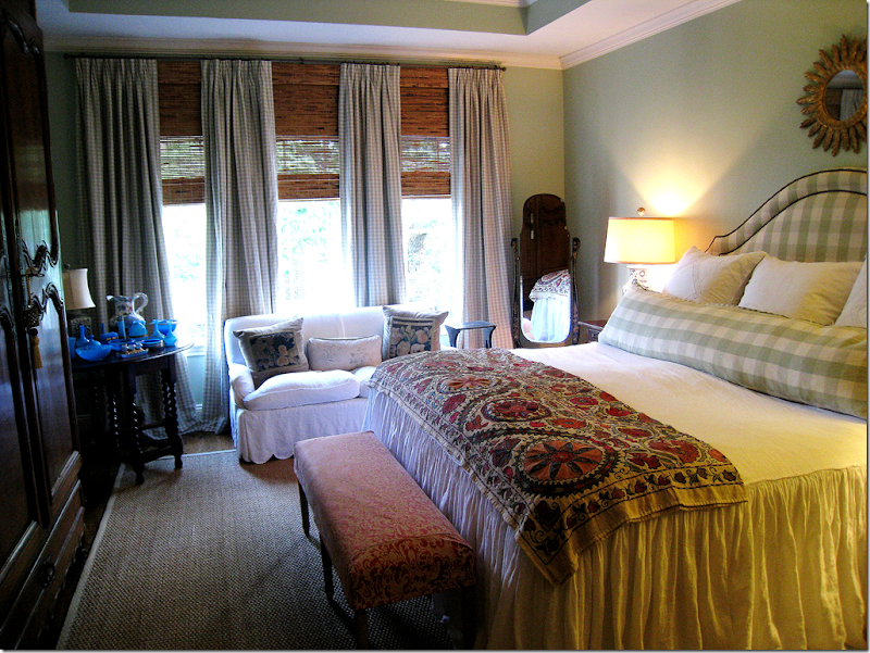 In my own bedroom, one short, wide, and ugly window now looks like three taller ones with the camouflage of the shade and four panels. The shades hide the wall space between the windows and the ceiling. I took the curtain rod right up to the crown molding (which should be repainted like the wall!!) thereby creating one long, lean line.
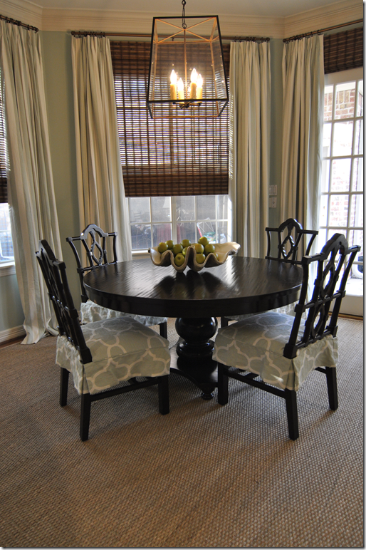 Curtains fall from the molding, shades are outside mounted – so that they also hang right under the molding. Again, the shades hide the wallspace between the windows and the ceiling. Very important detail.
Beautiful ikat curtains paired with bamboo shades look great for the next decade.
Instead of using shades, update your windows with a tape trimmed cornice.
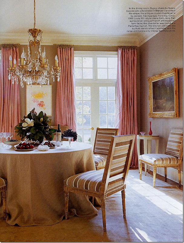
Suzanne Kasler’s former dining room has long been a favorite. The curtains are simple – but gorgeous - and add so much to the room. The tablecloth is also simple, yet the room is dressy enough for dining – with the gilt framed chairs. So much prettier than just a brown wood table with 10 brown wood chairs and matching server.
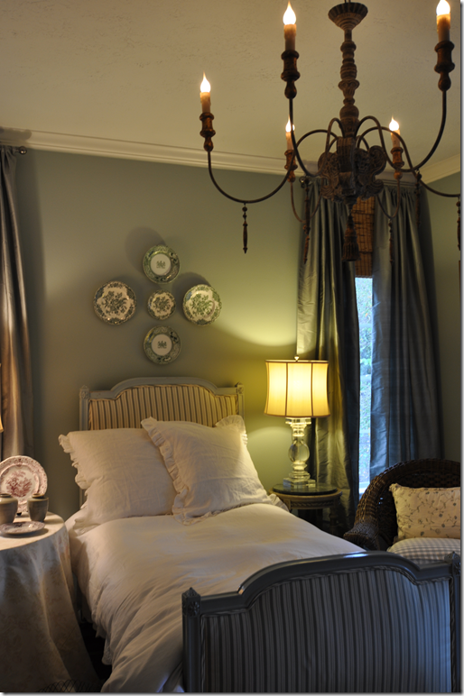 In my guest room, I saved money by using Restoration Hardware curtains and blinds from Target. Hung from the ceiling, the curtains almost look custom.
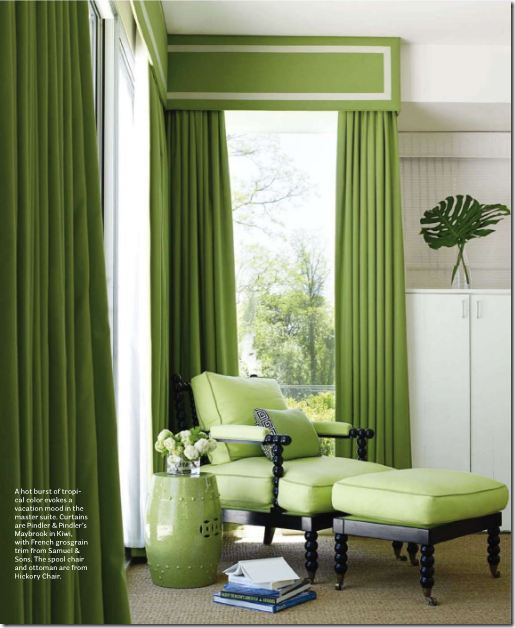 Tape trimmed cornice immediately updates decor – as does bobbin styled furniture.
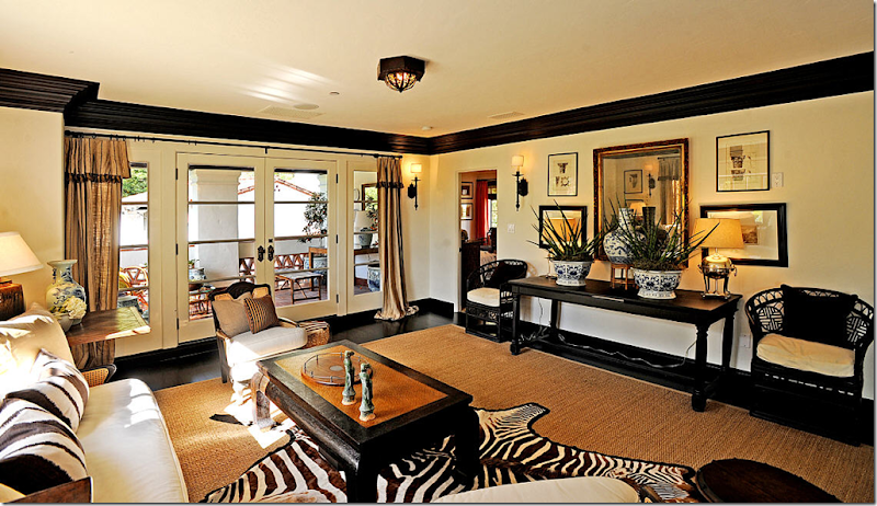
More updating tips: store away Granny's red and blue Oriental rugs. Instead, choose seagrass to cover hardwoods. Have the seagrass custom cut just 3 to 6 inches around the perimeter of the room, then layer the seagrass with a zebra skin, or a white cow skin rug. Seagrass is a very forgiving product, very easy to keep clean and it is relatively inexpensive. Natural fiber rugs add much needed texture and warmth to any room without adding loud pattern. Hate seagrass? Reconsider dhurris and flat weave rugs with graphic patterns in contrasting colors. These are fresh and new looking and are wonderful to use when aiming for a more modern look.
Seagrass is a versatile product – inexpensive, long wearing, and almost stain resistant. Always have it custom cut to fit around the perimeter of the room from 3” to 12.” Layer a skin, zebra or cow, over it – or layer an oriental or dhurri rug over it to accent a seating group.
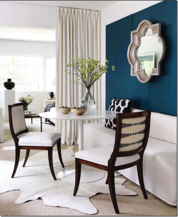
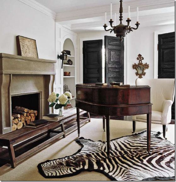
Layer a cowhide over sisal or seagrass for a new look.

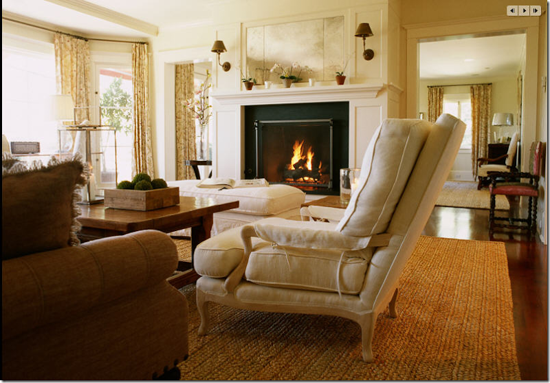 Besides seagrass, try other fiber rugs, such as apple matting – a thicker rug than seagrass.
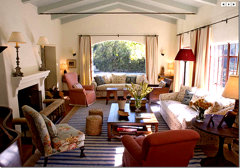 Striped dhurris aren’t for beach houses only – here a dhurri is layered over a seagrass.
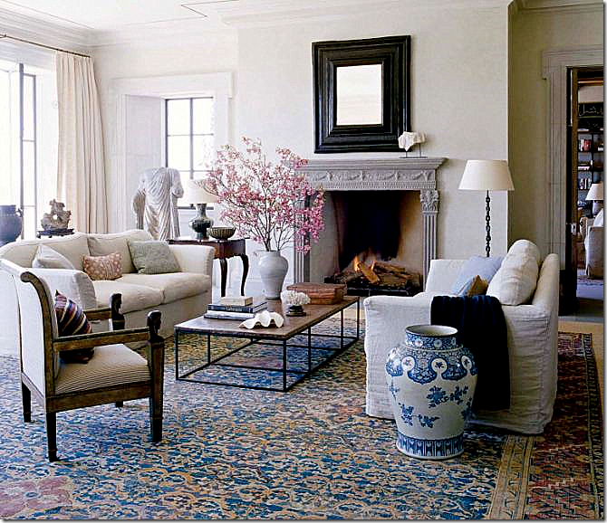
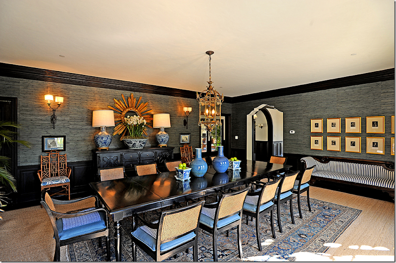 If you do inherit an oriental rug and want to use it, but the size is too small, try layering it over a seagrass to stretch it fit the room. Here, the seagrass also helps to tone down a more grown up vibe in the room.
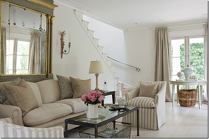 Think about painting or staining your floors white or off-white to update your decor and tie it in with white walls.
Rethink your accessories. It might be time to put up all your smalls collections in favor of just a few oversized pieces, such as concrete urns and large shells. Consider covering new books with craft paper for a quieter and unified appearance. Or just turn the spines to the back, letting the pages show instead. Bring garden elements indoors, like statues, pedestals, and tables. Update brown and white wicker with the newer, more fashionable Belgian gray wicker. In Houston, Thompson Hanson and Found For the Home both sell wonderful gray wicker chairs that work just as well in a dining or breakfast room as on a patio.
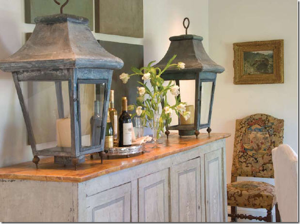 Rethink your small accessories and collections – instead put out a few oversized pieces, like these matching lanterns.
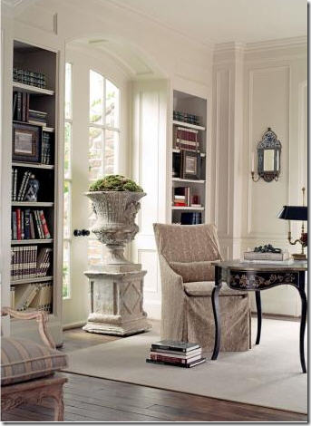
To update, bring concrete urns in from the outside.
Or, bring concrete busts in from outside. Use large books as accessories. Think one large item versus many smalls.
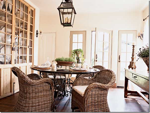 Gray wicker really updates a room – especially chairs like these, used in the family room or breakfast room.
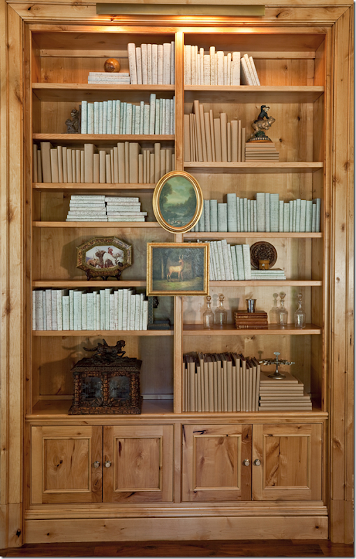
Old books, including old books without their covers are great to use when updating accessories.
Books, especially new or paperbacked ones, covered in craft and wrapping paper is an updated look.
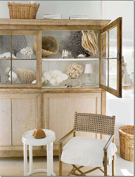 Large shells instead of precious porcelains look good on display. Lighter woods, Belgian style, will be around for a while.
Rethink lampshades. Change out all your old lampshades and replace with just one style, regardless of the lamp base. Choose an updated shape like the barrel in soothing white linen, or a textured fiber. Rethink ceiling fans in public spaces. Instead, hang an oversized lantern. If a19th century French lantern is out of your price range, go to Pottery Barn or Restoration Hardware and buy one of their outdoor lanterns and have it electrified. Hanging light fixtures and lamps add so much more atmosphere to a room than recessed cans. And always put dimmers on all lights throughout. Bright rooms are such a mood killer!!
Think lamps rather than recessed lighting. For an inexpensive update – change out all your lampshades to more modern shapes. Use one shade throughout the room for continuity.
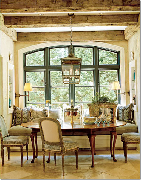
Lanterns immediately update a space, regardless if the interior is traditional or more contemporary.
If an antique lantern is out of your price range – look at lanterns designed for outdoor use, they are usually less expensive.
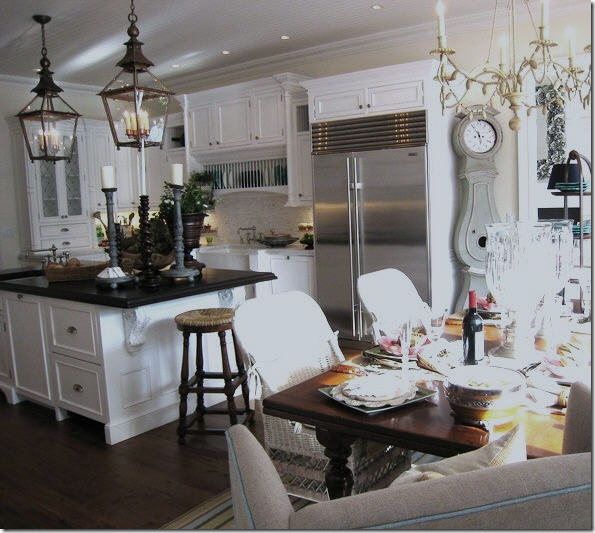
Use two lanterns over an island to make a huge splash.
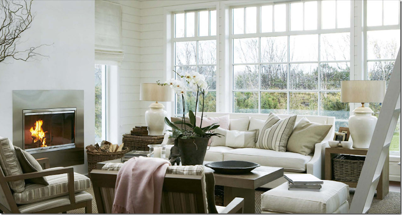 New lampshades in updated shapes will instantly change the look of your room.
Instead of hanging art work that you’ve inherited or never really liked, consider hanging mirrors. Chose an antique gilt framed mirror – or a reproduction in a limed wood - to instantly update. Hang a round mirror with a thick frame over a mantel. Carefully look over your framed prints and replace faded botanicals with ferns or green leaves. Hang white ironstone platters or creamware on walls in lieu of art. Rather than having one large art work over a sofa, hang a collection of prints all framed alike. Or hang a map – choose a large reproduction of an antique map of Paris or Rome - or opt for an oversized antique sign.
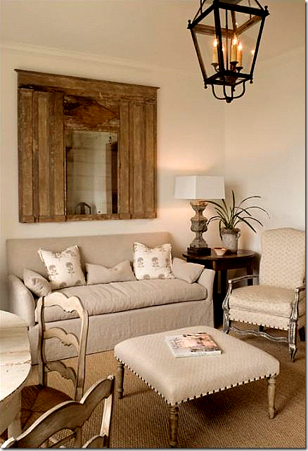 Instead of art work over a sofa, hang a mirror. Another look that is great for the next decade is nailhead trim on chairs and ottomans.
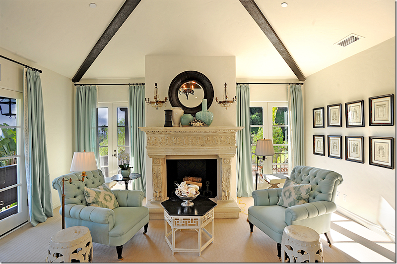
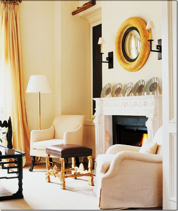 Choose a round mirror over a mantel rather than art work. Another updated look seen here – cushionless upholstery.
Hang a series of prints together to make one larger piece of art (put screen on largest view to see entire photo!)
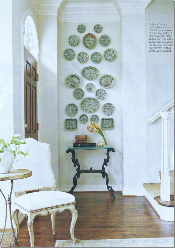 Hang a collection of plates – instead of prints.
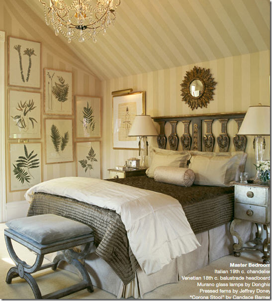 Instead of sweet botanicals, use framed ferns, leaves or dried herbs.
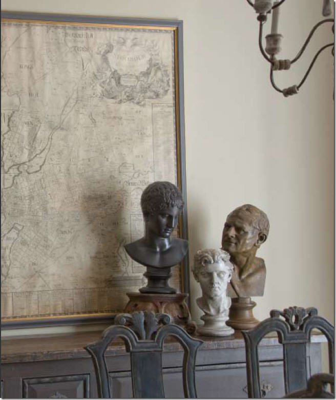 Oversized antique or reproduction maps are trendy now, but still look great.
 Even in a room filled with antiques, a large station clock looks new.
It’s time to move masses of framed family pictures to the bedroom or hallway. Or, remove all the framed old photographs and place them in a large bowl. It’s amazing how guests will actually thumb through a bowl of pictures, rather than look at an array of mismatched frames. Try it!

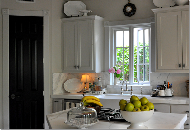
Don’t overlook interior doors. If your house has builder’s grade hollow core doors, paint them black in an eggshell finish which will elevate the door's importance and the black color is a great accent. Consider removing unattractive interior doors and replacing them with shuttered doors or portieres made of fabric or burlap. Hardware is another item that quickly dates. Replacing broken and tarnished hardware is like buying new jewelry for your house.
Paint inside doors black to make them more special and richer looking.
All my cheap, builders grade interior doors are painted black to make them look just a little nicer. I’m not fooling anyone – but the black does look nice.
In the end, don't worry so much about whether a look is trendy or not. Everything is "out" after ten years. Test this theory by reading a décor magazine from the early or even late 1990s to see how dated everything looks. It’s impossible to stay ahead of trends, so why bother? Buy what you like now and enjoy it!
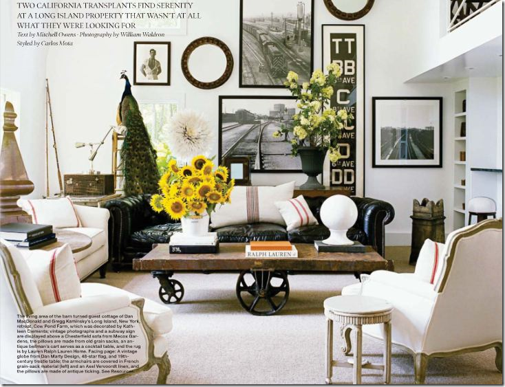
Overall Good Design for the Coming Decade:
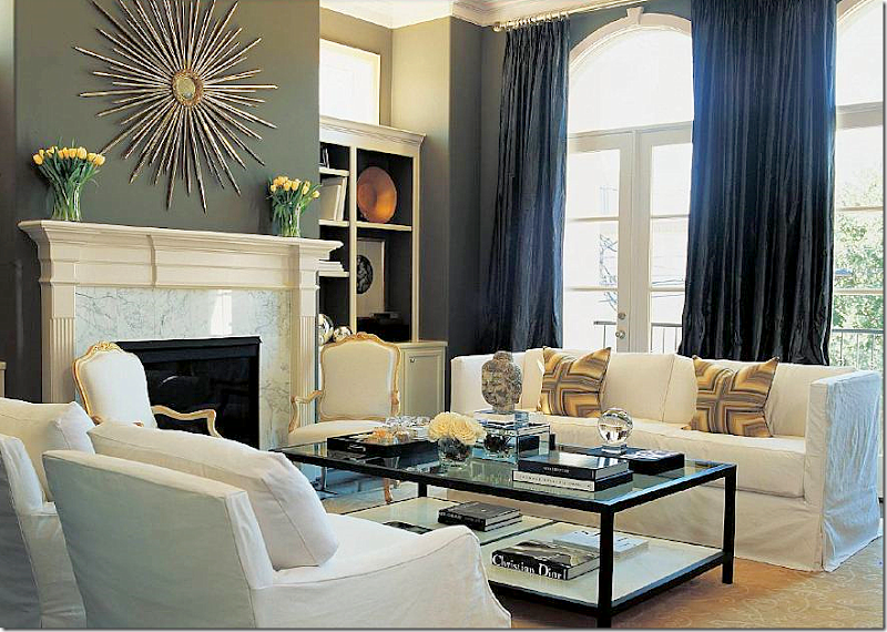 Updated decor for the 2010s by Houston interior designer Lisa Epley: Tailored slipcovers that unify the furniture, minimal pillows, simple, lush curtains, large accessories. Though contemporary, Epley brought in antiques to keep the room from feeling stark. This is timeless design that will be fresh for decades, not years.
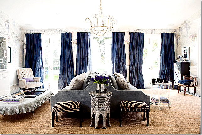
Here’s another all around updated room for the 2010s. I love the mix of velvet and linen with touches of zebra. The curtains are gorgeous – just a shade darker than the velvet. And I love the contemporary light fixture. The plain, inexpensive seagrass is perfect to ground the room and bring its dressiness down a notch. Just beautiful!
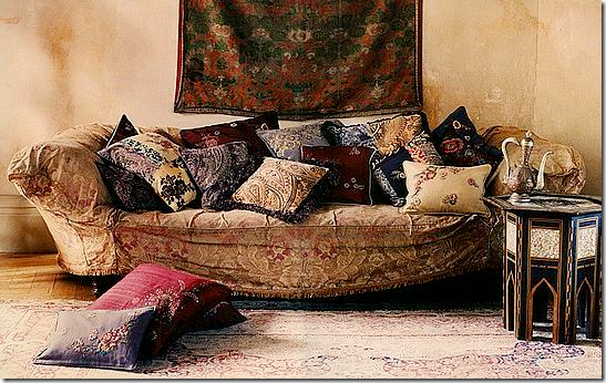
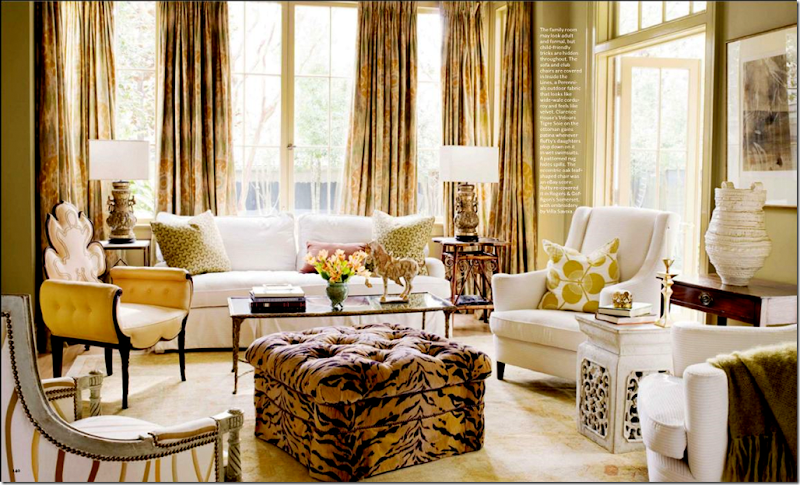 A living room, relaxed for this decade: tiger fabric, instead of zebra seems fresher here. Minimal but effective use of pillows. Wonderful ikat fabric on curtains brings in a little trend to keep the room looking youthful instead of stuffy. Cluttered, ethnic design interiors are a good alternative to the more contemporary look.
Gray walls, lanterns, gray wicker, cowhide, ironstone – ready for the next decade – and it couldn’t look any better than this!


