For the past few months, I’ve been collecting pictures of kitchens from readers. Some are new kitchens and some are total redos. I originally wanted to start the series with the Nantucket kitchen shown a few weeks ago, but that became more of a story on the architectural designer Nancy Fishelson HERE than on the reader’s kitchen. So, we will start today with a kitchen renovation – in Paris France.
Sally Wheat’s gray kitchen which started the kitchen craze.
Why show just kitchens, you may ask? The truth is, readers have been sending me pictures of their kitchens ever since I showed Sally Wheat’s now famous gray kitchen. For some reason (maybe because it is so pretty,) her kitchen really spoke to a lot of people. I can’t tell you how many emails I have gotten over the years with questions like “what color did Sally use?” Benjamin Moore Fieldstone. “Where did Sally get her pendant lights from?” BROWN in Houston. I’ve even shown readers kitchens that were remodeled using Sally’s kitchen as their inspiration. And then there was my own kitchen remodeling that I talked about for far too many times. It just seems like readers love to talk about kitchens and see pictures of kitchens. One day I’d like to do a series on living rooms and bedrooms too. Maybe later this year!! Finally, don’t worry if you have a kitchen you want to show but haven’t sent in your pictures just yet – you still have time. I have a lot of kitchens to show, so the series will last for quite a while. Sooooo, without any further ado, let’s start with the first kitchen!
Today’s kitchen is in Paris, France. The apartment was recently purchased and redone by an American couple who had been looking for a few years for a second home in the City of Lights. After a long search, this apartment, with a beautiful view of the Eiffel tower, was found. There was only one major problem with the place – the kitchen.
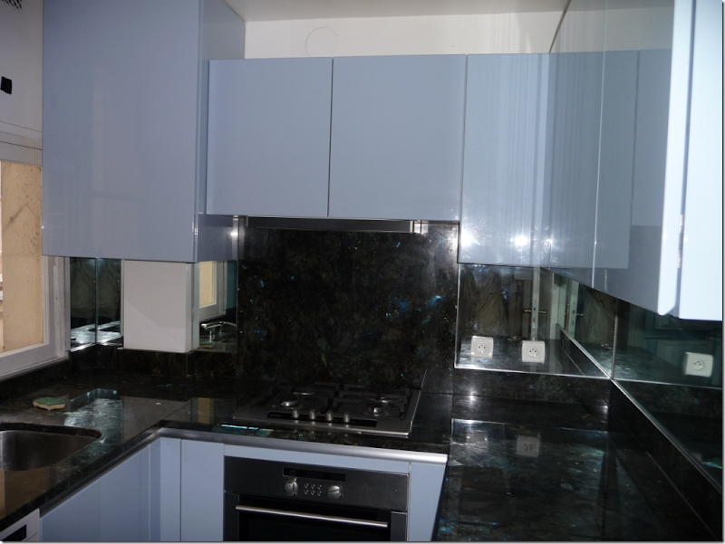
The original kitchen, as it looked on closing day, was located in the back of the apartment – far from the dining room. Though the kitchen was almost new, the style was far too modern for the owners. There was a view of the courtyard from the kitchen window – but why have a view of the courtyard, when you can have a view of the Eiffel Tower instead? The new owners decided to move the kitchen – into the dining room.
This is the courtyard view of the original kitchen. While charming, it’s not the Eiffel Tower.
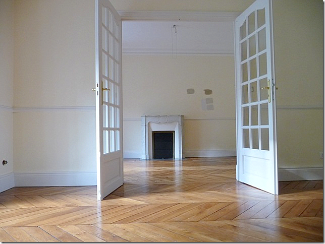
Here is the dining room, which the former owners used as a study.
And, here is what the dining room looked like when the new owners took over the apartment. The fireplace is the focal point – as is the view outside the Juliet balcony. The herringbone wood floors are so gorgeous and were a major selling point for the owners.
Here is a view through tall French doors from the living room into the dining room.
Since the modern kitchen had actually been recently installed, the contractor was able to give it another person so it wouldn’t be wasted. The old kitchen space was then turned into an extra bathroom. Here, is an early sketch of the new kitchen which was enlarged to start in the corner and continue through to the other side of the fireplace.
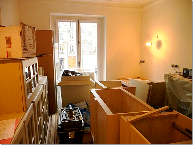
After many many months, the owner was told the kitchen was in. She immediately flew to Paris to discover it was in, but not in-stalled. Here’s the kitchen in boxes, just as it was left!
And then, after unpacking, it looked like this.
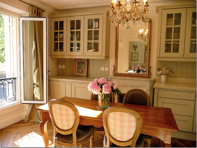
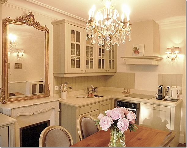
Today, the new kitchen installed in the dining room. At first it is hard to really see the kitchen, it blends in so well and looks like bookshelves. The chandelier and mirror further the illusion that this is just a dining room. Notice how the mirror reflects the living room’s mirror and chandelier. Also remember when hanging mirrors to reflect something worth seeing.
The view towards the street and the Eiffel Tower. The antique table, chairs, chandelier, sconces and mirror were all bought in France. On the back of the French chairs is a pink and white checked taffeta. So charming! Isn’t this just beautiful?!!! I would love a kitchen like this in my own second home in Paris!!!
Here is a view towards the cooktop and hood.
Looking from the dining room into the beautiful living room.
Looking from the living room into the dining room.
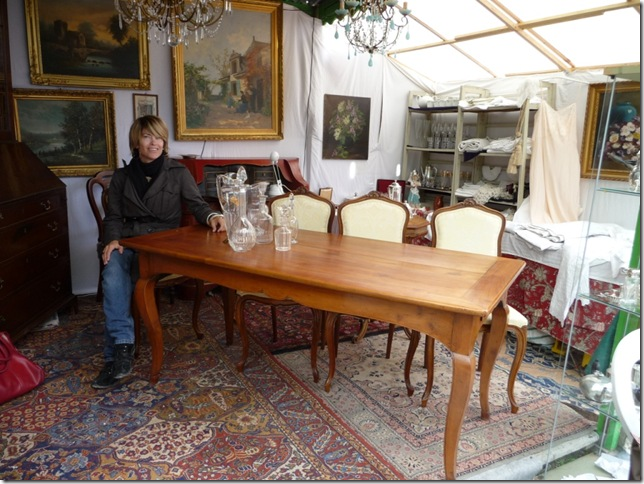
Here is a picture of the dining room table right before it was purchased in a Paris market. She is testing out the apron, being sure there is enough leg room under the table – there was.
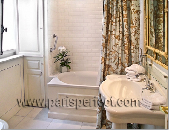
The new bathroom that was once the kitchen.
The owners of this beautiful French apartment are also partners in Huff Harrington Fine Art, Ltd, an art gallery in Atlanta, Georgia. The name may sound familiar to long-time Cote de Texas readers. Last year they photoshopped pictures of the art work they sell onto a picture of a family room I had recently designed. You can read the story on their blog – The Artful Lifestyle HERE and the story on my blog HERE.
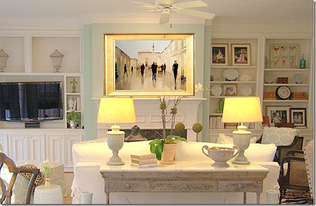
Here is one of Huff Harrington’s photoshopped pictures of one of the paintings on the mantel of my client’s house.
I hope you have enjoyed the first installment of readers kitchen. I think it’s a special one, being in France and owned by Americans! To read more about this apartment – articles are sprinkled throughout Huff Harrington’s blog HERE.
Remember, there is still time to send in your own kitchen.
This message is to those of you who subscribe to Cote de Texas by email. I get a question about this several times a week and thought I would discuss it here so that everyone will understand. I like to show big pictures on the blog. I think it looks better and you can see much more detail. Unfortunately, all that size does NOT fit on emails. If you get the blog in an email, the only way to really read it is to click over to the actual blog site on the internet. Do NOT attempt to read the blog on your email.
The easiest way to get to the blog from the email is to double click on the title. So, above, is a picture your email. When you got this email, you should have double clicked on the title “West University House Tour #2. This would have taken you directly to the internet blog Cote de Texas, which is where you should read the blog! Instead of reading it directly from the email, it will be much more enjoyable and much easier to read this way. You know you are at the internet blog site when you see the header below:
One other often asked question is about the pictures. Since the images are so large, they do take long to download. I realize this, but I would rather have the bigger, prettier images that take longer to load than the smaller pictures. So, I ask your patience in this. When you come to the blog, just give it 30 seconds to a minute to load – all the pictures should be up by then.
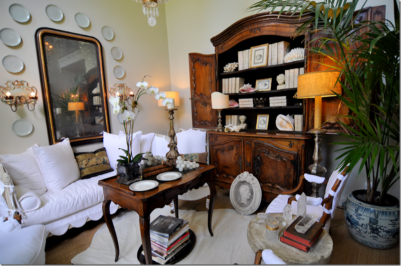
Finally, a HUGE thank you to all who commented on my newly redecorated living room. I got so many comments – mostly positive - that I was shocked. Even all the negative comments are welcomed because they came with good suggestions. Some suggested I should trade out the cow hide rug for a zebra one. I love that idea and may do it one day soon. Another repeated comment was to trade out the high tea table for a low ottoman. Well – my ceiling is so high, that I think the high tea table connects the floor to the ceiling – while a low ottoman would accentuate the height disparity. That’s my reasoning behind the table. Others liked my masonware better than my books and shells (my mother is included in this one!) I didn’t get rid of my masonware and it will probably be dragged out again in some other room. Right now it’s on vacation with all my blue and white transferware. More negative comments were from people who hate white slipcovers, especially white slipcovers with scallops. Well, like they say, that’s what makes horse racing. You either love the look or you positively hate it. I can’t change that. Still, the discussion is great because you learn something – from both the positive and the negative comments.
This past May, I started my fifth year of blogging, which is so hard for me to believe. What started out as a fun exercise for me and possibly, my best friend, has turned into something I never in a million years imagined or expected. I can’t tell you how much your reading this blog means to me. Without you, there would be no Cote de Texas. While I try to answer comments, I never seem to be able to answer all of them and it makes me feel so guilty. So, please, accept my sincere thank you here, for the time you take to read and to comment. From the bottom of my heart, I can never thank you enough.











This kitchen is "Delicious" as Martyn would say. So French and perfect. I am in love with the dining chairs with subtle pink plaid on back. LOVING!
ReplyDeleteI was going to write was designfabulous said. Exactly.
ReplyDeleteJoni, Thank you for the last five years of blogging! You certainly have enhanced my knowledge of decorating and designers. I so enjoy visiting your site. It's a pleasure to know you through your writing.
ReplyDeleteBlessings, Peggy
Jonie...I LOVE your new living room. The scallops really add so much to the sofa/daybed. I have a very similar tea table that Dave and I bought at the antique store that previously occupied the space Brown in now in...I cannot recall the name of the store....but mine is similar. David something or another??? (the antique store???)
ReplyDeleteYou can see it here....
http://3peanuts.blogspot.com/2010/09/my-little-office.html
There have been times when I have thought of swapping it out for something more current or trendy (like a tufted ottoman) but you know what...it is a very fine original antique and one of the first I ever bought with my own money. I think those pieces give our home a sense of history and evolution. I have walked into many homes in Houston that have the "whole seagrass, painted Gustavian, white slipcover" look and nothing looks like it has any history. While it looks beautiful, it looks too contrived, too perfect. I love that your home looks like things have been lovingly collected over time. I'd like to think that is how mine looks as well.
I also love the Paris kitchen...so pretty!!!!!
Lovely Joni....I hope you are enjoying your summer ....
ReplyDeleteLOVE your lvingroom....I have enjoyed all the transformations...love your style....
All the best,
Kathy :)
Love the Paris story, and the pink plaid chair backs (as the 20+ year owner of a pink sofa)....
ReplyDeleteOn your living room: The drapes are fantastic! Love the tea table especially and have been on the hunt for one. Don't toss it!
I can't tell--is there crown moulding?
Blogland is great fun, I look forward to reading yours, and I'm sure that all of us gasp and not have one negative thing to say if we saw it in person...
PS. Love the scallops!
First, I can't imagine anyone not loving your living room or your style but I guess not everyone has good taste (LOL)!
ReplyDeleteAs for the Paris apartment, it is stunning! I hope to visit Paris one day as my BIL is an international pilot for Delta (out of Atlanta) and he and my sister are in Paris several times a year....last year they went for Christmas! They always pose in front of the Eiffel Tower.
Can't wait to see your kitchen series.
XOXO!
Judy
P.S. Thanks for your large photos, I like to see each and every nook & cranny of your pictures!
Five years! Congratulations, Joni.
ReplyDeleteI feel as if we're good friends!!
That Paris kitchen is AMAZING. When we lived in Paris the kitchen space was just a narrow galley and we installed an IKEA kitchen with open shelving. I loved it...but this is spectacular.
ReplyDeleteI think the scalloped slipcovers are so elegant in a relaxed slip covered way! Thanks for all the fun entertainment you give us and please keep it up, Joni!
Yours is my very favorite blog! Thank you for sharing your home with us. And of course, we all love kitchens!
ReplyDeleteI was all set to comment on that fabulous Paris apartment redo (love the original herringbone floors) until I caught another glimpse of that gorgeous buffet a deux of yours! N wonder you want to open those doors...they are gorgeous on both sides!
ReplyDeleteCongratulations on 5 years of blogging. That's amazing! You've influenced and inspired so many of us over the years!
Blessings to you!
Linsey
Joni, Huge Congrats on blogging for 5 years! Wow! As one of your appreciative readers, it has been a huge blessing in my life! Thank you so much for all you share.
ReplyDeleteAs a blogger, I have a little idea of the time and effort that obviouly goes into each post you create. They are always so well written and so beautifully presented. The big pictures are totally worth the wait. Your blog is truly better than any shelter/decor magazine! Here's to another 5 years! Thanks you for bringing us all so much joy and inspiration!
XO
Joni,
ReplyDeleteCongratulations on 5 years of blogging. Make that 5 years of consistently posting the most beautiful, informative and interesting posts. You were the very first blog I ever read and my inspiration for starting my own blog. Leslie Sinclair in Houston told her sister, and my friend Heather Sinclair in SF about Cote de Texas. So when Heather sent me your link, I was hooked! I didn't know it was a blog even--just a site with the best eye candy and design inspiration ever. I couldn't wait to see what you posted each day! And I still can't! Today's Paris kitchen post took my breath away! Thank you again for 5 wonderful years! ~Delores
The Paris apartment is a real transformation with a beautiful result. I adore this kitchen.
ReplyDeleteHope you will be mature enough to take some of the great advice given you. While it is impossible to stand in your living room, it is possible to see the cutesy scallops and four chairs with exposed legs. Some things are not about taste, they are simply not the best design choice.
Chances are you are too stubborn to take the counsel of others no matter how wise. It might have been a wise decision to have one of your favorite Houston designers give you advice before embarking on this household project. I hope going forward the next five years will find you reaching out to a more sophisticated and accomplished group of designers to showcase on your blog. The grey, white, slips, seagrass, cowhide, etc. has become very boring.
The Paris kitchen is lovely and as you mentioned, the pink plaid fabric on the chair backs is charming. What caught my eye too, was the bathroom shower curtain fabric. Now that's my kind of shower curtain. Can't find that in Restoration Hardware. Still love your living room. You are brave and open-minded to put your home out there for everyone to criticize and my hat is off to you for taking the rude comments in stride. Happy fifth year of blogging to you.
ReplyDeleteDeborah
Okay, love the Paris apartment redo but is that kitchen sink really only the very odd, tee-tiny, 12 x 8 inches it appears to be in the photo?
ReplyDeleteI guess if you live in Paris who needs to cook and hence who needs to wash a dish.
That first kitchen is gorgeous. I also have a grey and white kitchen and love it. I would be honoured if you came and had a peek at it! http://5minutesjustforme.blogspot.com/2010/10/welcome-to-natashas-kitchen.html
ReplyDeleteI also love the big pictures you post on your blog as it saves me having to click on them to make them bigger.
It's surprising to hear that people leave such negative comments on other people's blogs, especially anonymous ones. I guess I was just raised by the motto, "if you haven't got anything nice to say don't say anything at all."
Best wishes and congratulations on 5 years of blogging.
Natasha
love your blog...look forward to it..it is better than a magazine...so many great ideas! your home is just wonderful!
ReplyDelete..i would live in that paris apartment without a single piece of furniture...
ReplyDeleteWhat a "feel good post"!!
ReplyDeleteThe thought of having that view for breakfast, lunch or dinner.....sigh.
Beautifully done, elegant, contemporary yet timeless.
Thank you Joni!
Beautiful Paris re-do! Excellent!
ReplyDeleteCongrats on 5 years! So happy to have been with you almost every step of the way...you are a ROCK STAR to me!! Thank you for one amazing post after another.
So love your comment, borrowed from Samuel Clements, regarding a difference of opinion makes a horserace. "ANONYMOUS" certainly does have an opinion, to be sure.
Please never forget: You are loved far and wide.
great job! the pictures are so beautiful, the room designer is great! beautiful rooms!
ReplyDeleteLove the Paris kitchen! As always, great inspiration.
ReplyDeleteCongratulations on your fifth anniversary. You have been on my blog roll since I started my blog almost two years ago. Keep up the great inspiration and beautiful posts.
Teresa
xoxo
Kitchen just seems to be the wrong word, being its so chic & elegant.
ReplyDeleteIf you do wish to change to a zebra in your living room, WS Home has the best of both worlds.
http://www.wshome.com/products/p4115/index.cfm?pkey=crugs%2Dcasual%2Dnatural
Ok, number 1...I love that they moved the kitchen to the dining room. The fireplace in the middle of the cabinets with the huge mirror over it is divine. There is not anything I don't like about that kitchen.
ReplyDeleteThen as for your own room...I loved it. I love the high tea table...keep it...I totally think the room needs it if you have a high ceiling. I think the cowhide rug is much better than zebra. Although I would not do an animal skin of any kind. I'd rather see a rug that an animal did not die for. But how can anyone NOT like the scalloped slipcovers....they are precious.
Love this kitchen series. I don't care about cooking but adore all things kitchen and never tire of kitchen redos.
The Paris kitchen is an absolute delight Joni!! Every feature is exquisite!
ReplyDeleteI was also thrilled to hear of the new owners as I love their site!
xoxo
Karena
Art by Karena
Exciting New $150 Giveaway from Dr Perricone! Come and Enter!
Such a lovely Paris apartment. I love how the kitchen is so integrated, but did you see that tiny sink?! Maybe I missed something.
ReplyDeleteLove your house. Happy blogiversary. I started 5 years ago in March! Not quite as popular as you...
xo Terri
First of all congratulations and thank you Joni for five years of your precious time, outstanding effort, and the resulting fabulous posts that have been such a pleasure and a joy to read. What you give to us all is always thoughtful, interesting and beautiful...your the best!
ReplyDeleteI'm absolutely in awe of the kitchen...it's so perfectly & quintessentially French. Moving the kitchen into the dining room was brilliant, the fireplace is a stunning feature...so Parisienne, very Gigi...love smart design like that!
The shot of your 'new' living room with the chandelier and the palm fronds peaking out is just lovely...so airy and bright, it's a very pretty space.
Here's to five more years (at least!) of beautiful blogging...
xo J~
I really, really love your posts. They are always beautiful, and, always there is something to learn.
ReplyDeleteWhat a fantastic make-over.
thank you.
french perfection! <3
ReplyDeleteashley
As beautiful as the Paris kitchen was, for me it isn't a place where one actually prepares meals.
ReplyDeleteCongratulations on 5 years of blogging. I always learn something new from your posts.
Joni: Your home evolution is one of my favorites. It's so nice to know that even designers and professional bloggers like you, have seen their homes go thru significant changes over the years. I cringe when I look back at old pictures in my house, but when I took them, I liked the room...alas, the curse of always wanting to change, update and improve I suppose! I'm also thrilled with the kitchen series...it couldn't come at a better time for me, as we are just starting the design process for a total tear-out of our kitchen and master bath. I'm anxiously awaiting the photos to come!
ReplyDeleteLove the kitchen...love your blog. I am always delighted when I see an email from Cote De Texas.
ReplyDeleteJoni...yours is SO MUCH MORE than a visual blog...it is a learning and loving display of "wonderful things." Truly, I treasure it. franki
ReplyDeleteNatasha in Oz, what an appropriate name.
ReplyDeleteWhen a blogger puts their own designs up for commentary one expects that they want the reactions of their readers - not a back rub.
I don't disagree with the principle behind your "motto"; however, I would prefer to say something to someone's face than behind their backs. There were numerous suggestions by many readers which would make an improvement in the living room. Perhaps as a "designer", Joni would have been well advised to get "professional" help on this one instead of doing it herself and preferably someone who has done work outside the city limits of Houston.
Beautiful! Absolutely beautiful!
ReplyDeleteCongratulations on 5 years of blogging! And we get the gift -another great post.
ReplyDeleteThanks for sharing the Paris kitchen. Oh how I want to go! And...where did they hide the fridge?
Fabulous!
A beautiful kitchen - so inspiring! The choice to relocate it was genius. Imagine a slew of bloggers going to Paris and renting the most beautiful apts. Then we could all go visit each others' rentals and then head to the flea markets.
ReplyDeleteYour new living room w/the slipcovers is beautiful too. I like the high table.
I've enjoyed every moment I've read your blog. You are a treasure!
oops - I was logged in under the wrong thing.
ReplyDeleteLove the Paris apt. Thank you for posting the photos and for your wonderful commentary. My favorite part--the pink plaid chair backs!!! Drool-worthy. I already left a post about your living room transformation, but I want to say again that I absolutely love it. My favorite part--the scallops!!
ReplyDeleteCongratulations of your five years of blogging! You are THE BEST!!!
Gorgeous apartment! The kitchen is breathtaking... but am I the only one who just could not live with the halogen hob not centered over the oven? It would really irritate me, I know I wouldn't be able to stand it! Such a shame as I love that kitchen!
ReplyDeleteall i can say is, wowza. WOWZA. Think you can let us know the colors they used? And source the GORGEOUS chocolate fabric on the chairs? Purty please????
ReplyDeleteReally appreciate your large pics. Helps these old eyes get every detail. Your blog is one of my favs with all the hard work you put into each piece. You educate, enlighten and entertain us all in one fell swoop. Thank you.
ReplyDeleteOh My Gosh! This is one of the most beautiful Kitchen/Living/Dining rooms EVER. I enjoyed this so much, I always love reading your posts...
ReplyDeleteCindy
This might be the only professional decor blog that "allows" negative comments. I think most blog owners/writers do not accept negative comments or they delete them, as we rarely see such commentary. I think if you are confident enough and have a tough skin that these kinds of comments might be helpful, to you and to your reading public. Like a dash of cayenne or pepper to the mix.
ReplyDeleteBut I also find it revealing that some of the more caustic remarks come from readers who prefer to remain "anonymous." Not all such readers give negative commentary, esp in today's post results so far. But there is at least one below the belt upward jab here.
Let me preface this by stating that never before have I commented on a blog. I feel compelled to do so now, because I am appalled that anyone would feel the need to make public, negative comments about your living room. Such behavior is further evidence of the rise of self-absorbtion, and the decline of civility in our society. I politely urge those rude individuals to closely examine the disproportionate size of their egos, and to contemplate a refresher on manners.
ReplyDeleteJoni~ the generosity you demonstrate in your willingness to share your beautiful home with us, is much appreciated.I discovered your delicious blog about a year ago, and my pulse quickens every time a new installment arrives in my inbox....Thank you!!!!
Joni,
ReplyDeleteI absolutely LOVE that Paris kitchen transformation! The old one was hideous! In the new one though, something kept bugging me, but it took a minute to figure out what. Then I realized; where's the sink? I "think" I finally saw it, but JEEZ Louise, that is one tee-niny sink! The oven looks very small too. I guess with all the great restaurants, they may not use that kitchen very much!
As for your own living room, I imagine you agonized over the changes you made ten times more than you would for someone else's house! It is lovely. I also have a tea height table in my living room. Folks are puzzled by it, but I love it so much I don't care. Keep doing the fantastic job you are doing!
ahhh, to live in Paris!! that kitchen is to-die-for!!
ReplyDeletelove you! love your blog! congratulations on FIVE years! wow! I have learned so much from reading your blog- thank you for the time and energy that you give to all of us.
xjoan
Joni:
ReplyDeleteOMD (as we like to say, Oh mon dieu!) we can’t thank you enough for featuring Ann’s kitchen in your fabulous blog. We are fans of yours from way back and admire everything you do, including all the hard work that you put in to researching your blogs, your fabulous taste and adorable sense of humor. Thank you, from the bottom of our hearts.
Ann and Meg from Huff Harrington Fine Art
http://theartfullifestyle.blogspot.com
www.huffharrington.com
The Paris kitchen is the prettiest I have ever seen, I think. It does appear that the kitchen sink is tiny and I don't see a refrigerator, is it one that fits under the counter with an integrated cupboard door perhaps? I love the idea that they used, though, it could easily be replicated.
ReplyDeleteYour living room is very elegant and so beautiful, I'm glad to know that you are remaining true to yourself and not bowing to others opinions. The tea table is right for that space for the reason you mentioned, but also, because it is so elegant.
Cindy
Joni, one reason you don't use your living room is very apparent when looking at the photograph you posted on this blog entry. There is no room to walk, it's an obstacle course. Not everything you own has to be displayed year round. There is enough "stuff" in this room, to cover all four seasons. I would urge you to remove some of it, open up the space and make it more welcoming. The people who post here who believe that observations are negative and critical most likely grew up in homes and played on sports teams that rewarded one just for "trying". It certainly accounts for the ballet shoes that tip toe on this site.
ReplyDeletewhat is the paint color on those cabinets? this is my favorite kitchen yet as far as color, mirror, chandy, etc. thanks for sharing!!!
ReplyDeletecammie churdar
Wow! When I win the lottery, I am going to rent this apartment for a month! It is absolutely divine. I love how they moved the kitchen and all of the wonderful details that were included--and oh, those chairs are show-stoppers!
ReplyDeleteJoni, You are fabulous to allow all of your readers to vicariously experience remodeling and design.
Thanks for a great 5 years.
Wow that's amazing 5 years! Thanks for all the time it takes for you to provide such magazine quality content Joni!
ReplyDeleteLove your living room! And that Paris kitchen - so beautiful!
xoxo
Maria
I have one question regarding this Paris apartment: Is it for sale? Because if it is, I WANT IT!!!! It is so gorgeous and fabulous. Very well designed!!!
ReplyDeleteCongratulations on five years of blogging.I enjoy every post and am so glad that I found you.
ReplyDeleteThis kitchen is an absolute fantasy complete with a view of the Eiffel Tower! I can imagine having my croissant and cafe au lait at that table every morning (more fantasy, no calories) and seeing the Eiffel Tower sparkle every night. Well, I can't have that so you help me make the most of what I have.
Thanks again.
Joni where does one begin in thanking you for all of your beautifully written and inspirational post. Your blog was one of my very first blogs that I readd and I was hooked from the onset!!! I think you have been the inspiration for many bloggers and have influenced the look and style of many blogs. But there is only one Cote de Texas and only one Joni!!! I hope you continue to enjoy inspiring us all and we get another 5 years of you and your wonderful blog!! xo Kathysue
ReplyDeletePS the kitchen is to die for, love the checked chairs,they just make the room for me, KS
I leave a comment as "anonymous" b/c I don't have another id- not hiding. Now, each blog has a distinct style, and readers either love it or not. If you don't love the style of Cote de Texas, why not quit following? I LOVE this blog and look forward to each post. I love white slips and sea grass. I appreciate all the work and time you put into each post. Keep up the good work! Sarah
ReplyDeleteOh my! The cabinetry is lovely and then you add the gorgeous antique pieces, that fit perfectly. It's perfect! In Paris, no less!
ReplyDeleteCheers!,
Barbara
It's beautiful....and in Paris!!!
ReplyDeleteCongratulations on your 5th blogging anniversary. That is an incredible accomplishment, especially given the complexity of your posts. I've told you this before, but it is worth mentioning again: subscribing to your blog is like taking the best design course...EVER!
xo
Brooke
Yes, Lewis and Maese thank you!!!! I could not think of it for the life of me. We have bought a few pieces there over the years too.
ReplyDeleteAnd thanks for the kind words on my living room/office. It has already changed quite a bit since those photos too.
The Paris kitchen is so charming. I love the chairs and the colors/pattern they chose. I've been trying to decide what to put in our kitchen with our new redo and this may be the answer.
ReplyDeleteYour living room is just lovely ~ so inviting with a hand in history and not stand offish. Not an easy task.
I always look forward to your posts {even though I don't often comment} Congrats on 5 years of entertaining and enriching our lives.
Jo
WOW....what a gorgeous home! Love the kitchen redo!! Joni, I also redid my kitchen with Sally's Fieldstone and I LOVE it....I get so many compliments. I can't send you pics because I am not done with it....maybe one day I will be able to send you some pics. Thank you for your inspirational blog...you are awesome!!
ReplyDeleteYour home is fully modern look. Perfect arrangement of each and every stuffs. The shape of every furniture is very simple but stylish. Your home is looks very beautiful with numerous stuffs.
ReplyDeleteRe: all the big, numerous pictures ... Sadly I lose about 40 percent as the iPad cannot seem to download it all. I love Cote de Texas but I wish the pages were smaller and downloadable via iPad so I don't miss so much and give up in frustration.
ReplyDeleteCongratulations on five fabulous years of blogging. No one does it better.
ReplyDeleteThe kitchen in Paris is so exquisite that I had to see the rest of the apartment at parisperfect.com. I was not disappointed. Who knows, maybe I will rent it for a week next April.
Happy 5th anniversary! Your post is one of my two favorites! You really should consider writing a book. Yes, you really are that good. To me, design styles are kind of like different genres of music. And we know that not everyone likes the same type music. I'm glad Joni that your skin is thick enough to take negative comments. What baffles me, however, are the rude ones & why those commenters would even read your blog much less comment when clearly they could spend their time elsewhere. Anyway...with all the controversy over the tall "tea" table in Joni's living room, did anyone notice the one in the living room of the lovely Paris apartment? And yes, I have one in my living room too (long before I even discovered Joni's blog). In other words, this is not just some weird design trend that Joni came up with.
ReplyDeleteNow on to the Paris kitchen. It is too gorgeous for words! I'd love to stay in this apartment when I visit Paris. I also noticed the teeny sink, and I guess that's a smooth top stove(?). Oh, and where's the fridge? I read some time ago that Europeans go to the market more frequently than Americans for fresh (like "farmers market" fresh) produce & baguettes of bread. So maybe big fridges are not necessary. At any rate, this kitchen would definitely work for me since I'm not a big (experienced) cook.
P.S.-Joni, that large photo in this post of your living room buffet is magazine-worthy.
Joni, another hit out of the park! Love the post! Love the blog! Happy anniversary~
ReplyDeleteIna Garten has a Paris Apt. and while I understand that she is definitely a semi professional chef, at least she has a sink. I have bar sinks in my home larger than this after thought. Otherwise, it's totally beautiful, but seemingly not functional.
ReplyDeleteHi Joni
ReplyDeleteYours is the first decor blog I ever stumbled upon - searching for cote d'ivoire furniture would you believe?! - and as far as I'm concerned the best ! But I agree about the pics. I love to read your blog on my iPad and it simply doesn't load properly. Of your pictures, less than half load and so I can't read the whole article. It means that I don't read your blog as much as I do others- I have to wait until I'm on my laptop (at work) :( x
All your living room needs is a few pictures of Rob Pattinson in it and I'm sure you would be in there all the time staring at his gorgeous face.
ReplyDeleteCongrats!!! Hope Hope Hope you have at least 5 more years of blogging in you!!!!!
ReplyDeleteKaren
OK, since I gave up, willingly, too, my island home, I think I DESERVE a Paris apartment.(smile; wonder if my husband will buy into this?! ha.) Love kitchens!!!! My favorite space in any home. And the little Paris apartment is so perfect. Nicely done.
ReplyDeleteHope you're enjoying a nice summer.
That's an amazing kitchen in any country!
ReplyDeleteCongratulations on your 5th anniversary. It's fun out here in blog land, isn't it? :-)
Karen
That's an amazing kitchen in any country!
ReplyDeleteCongratulations on your 5th anniversary. It's fun out here in blog land, isn't it? :-)
Karen
This is a WOW kitchen, congratulations on your 5th anniversary and we look forward to many more, thanks for shraing these fabulous pics!
ReplyDeleteAs I was reading this I was thinking 'this looks like a paris perfect apartment' and then I was delighted to see that I was right!
ReplyDeleteNot only do Paris Perfect renovate their Parisian apartments beautifully (looking through their site is delightful) but they provide the best service and support if you use them. They rescued me when an apartment we booked fell through last October, (I booked from Australia and wasn't sure how it would go) - a guide met us and showed us in, the cute apartment had a pretty table set with juice, wine and petit fours, there was a folder full of chatty advice on local bistros and shopping, as well as a trolley shopper for the markets!
It was so stress-free, and so much better than a hotel.
The kitchen was almost identical to the 'before' picture, even the view. Maybe I'll try and get this one next time..
amazing what a make over can do. Beautiful apartment in a beautiful city!
ReplyDeleteUsing texture, pattern and colour the rooms have been designed with real application in mind.It might be hard to pick a favourite!
ReplyDeleteHello Webmaster, I love it and really like it. Thanks to you too for sharing this with us.
ReplyDeleteI like the "before" pictures!
ReplyDelete