Here’s a redo of a living room I recently completed for a long-time client – one of my first. I always say I probably wouldn’t even be doing interior design if it wasn’t for this client who pushed me and gave me the confidence to keep at it. The client moved into this house around ten years ago and at the time we recovered some of her furniture from her old house for her new living room. A few months ago she called wanting to update her look by removing her red striped wallpaper and putting slipcovers on her furniture. Here is what her living room looked like when she bought the house:
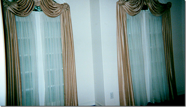
Naturally the first thing to go were these curtains and the sheers.
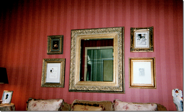
I don’t have many pictures of the living room as it looked after she moved in, just these few cropped ones. We papered the room in a Colefax and Fowler red stripe. Directly across from the living room is the dining room which we papered in a light yellow damask. Both rooms have custom cut seagrass. Here, above the sofa is a collection of prints and a mirror that came from her old house. Besides the wallpaper, we only ordered some pillows and a chair and a few tables.
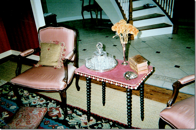
Across from the sofa we recovered two French chairs in a red silk check. I found this antique table with bobble fringe and a red velvet top. The owner had the rug which we layered over the seagrass – and a square ottoman/coffee table was placed over both.
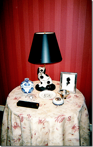
We had a skirted table and some pillows made out of Bennison’s Musk Rose. The homeowner has a large collection of Staffordshire dogs, some of which were made into lamps. These are the only pictures I could find – I wish you could see the whole room, but still, it obviously really needed updating. Here’s how it turned out:
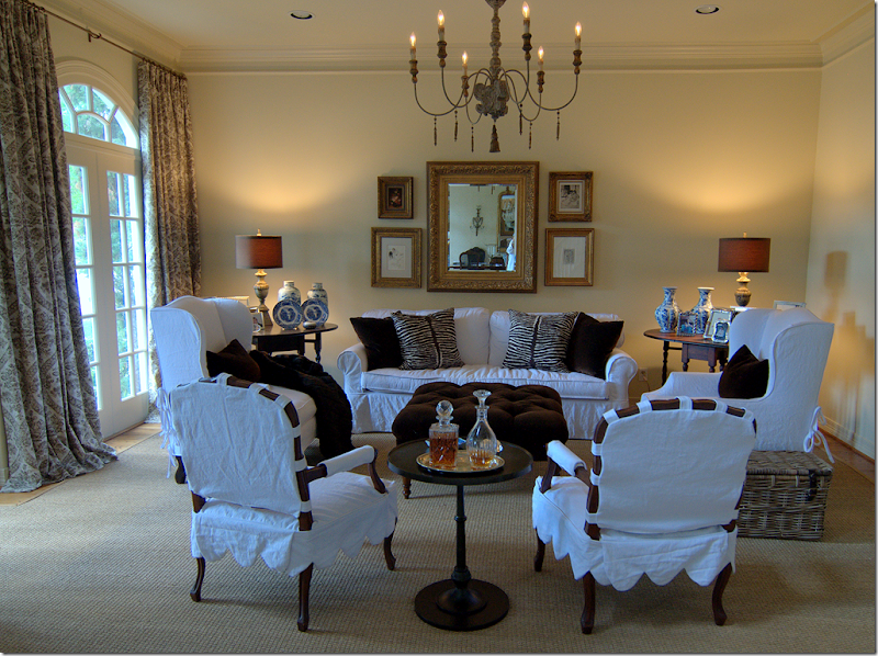
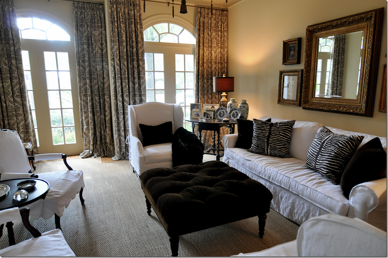
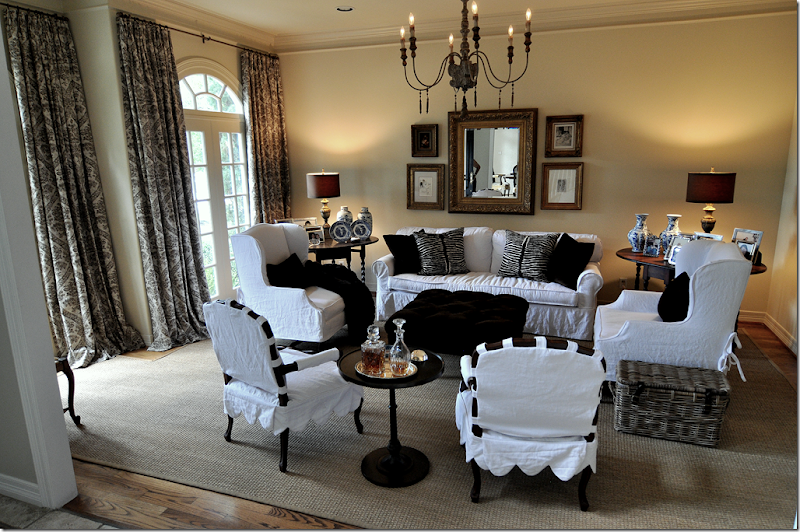
First, the red wallpaper was removed. Then in order to keep continuity, the walls were painted a soft ivory, Pratt and Lambert Ceylon Ivory, the same color as the molding in the dining room. Next, we pulled up the rug and removed the two mismatched chairs flanking the sofa.
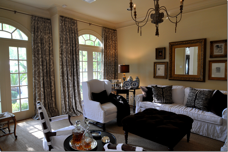
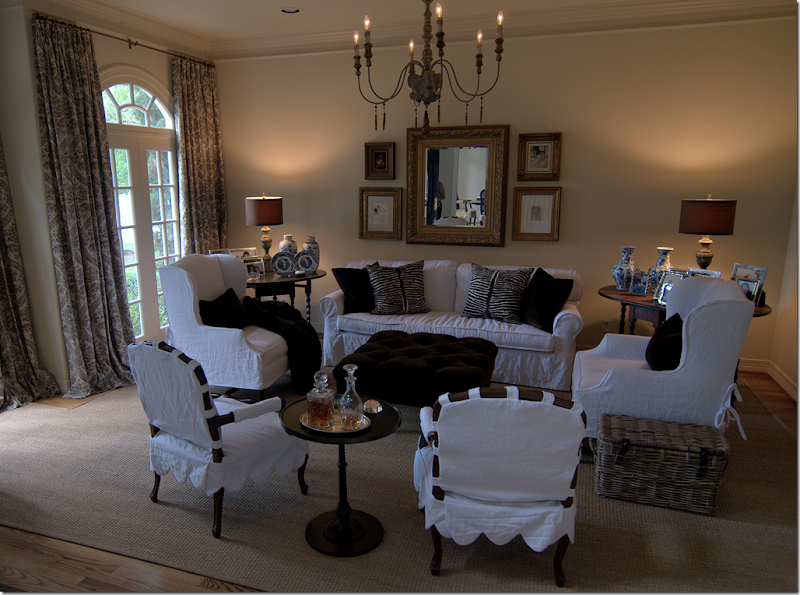
Two new matching side chairs were bought at Hein Lam and slipped in white linen from Glicks. We picked these tall wing chairs with French Os de Mouton legs because the room really needed some varied height. Then we slipcovered her sofa which was formerly in a coffee colored chenille. The sofa was also updated at that time – instead of three cushions, we changed it to two back cushions and one bottom cushion.
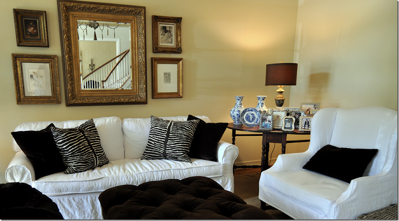
Next we reupholstered her ottoman and had it tufted in a dark chocolate velvet. The pillows are in the same fabric, plus there is the Brunschwig and Fils animal print. The lamps and chandelier came from Aidan Gray, whom I am thrilled to announce will soon be a Cote de Texas sponsor!! The two French chairs, formerly in red check, were sent out for slipcovers with a scalloped detail. The homeowner found the dark iron table at Pottery Barn. The family really uses this room – the kids do homework and read in here - and before, there was a large French washing basket for all their books and papers. I changed it out for a more updated and closed Kooboo basket – it’s neater with a top than looking at a pile of school books and magazines.
We got rid of the dreaded skirted table and brought down another vintage gate leg table she was using in her upstairs study. The homeowner loves the prints and mirror, so they stayed above her sofa, as did all her framed photographs – but believe it or not, I did remove over half of them.
The biggest change was when I convinced the homeowner she really needed curtains to soften it all up – and she finally agreed. But, it wasn’t easy to convince her. The linen fabric is a brown damask on an ivory ground from Pindler and Pindler - very, very reasonable. And last, we added a faux mink throw.
I cant’ tell you what a huge difference it made - it looks like a completely new room with all the red wallpaper and red and cream fabrics gone. The white is so fresh and the room looks much younger. Everything was a compromise between us – I probably would have just hung a lone round mirror over the sofa instead of all the prints, but those are the homeowners favorite things. I wanted to add a green tree, but that was vetoed. So were urns on pedestals to flank the doorway. Everything was bought with a strict budget in mind. The only real extravagance were the two chairs, but at least they were on sale. All the fabrics were extremely reasonable, as were the lamps and chandelier from Aidan Gray. Only the Brunschwig fabric was pricey but we needed just one yard. As always, Monica from Custom Creations by Monica did the curtains. Next we are going to update her family room – and finally get rid of her leather sofa!!!

Now that looks wonderful! What a great eye you have
ReplyDeleteJoni,
ReplyDeleteLove your style. Those chairs are fabulous with the detail of the ties.
And you are so right about drapes. I was never much a fan of drapes, but each time I see what a transformation it makes to rooms. Keep on educating me. Bravo on the redo. I know the owner must be pleased.
Love the fabric on the drapes.
ReplyDeleteWhat a lovely transformation! I wish I knew someone in the Boston area who could fabricate well tailored slipcovers such as the ones shown in your photos. Joni, you are an inspiration. Thank you for another great posting.
ReplyDeleteI really love those curtains! And I too wish I had someone in West Palm Beach to make slipcovers..I just don't know where to go?
ReplyDeleteYes, it was definitely time to update that room. haha! She must be thrilled!
I feel the curtains make the room. So glad the red walls are gone because I felt it just closed up the room. The room seems so light and open and I'm sure the owner must enjoy it immensely.
ReplyDeleteWow love love love it!! Everything about it is visually stunning but I love how inviting it is the most. The slipcovers, the goregous velvet ottoman, the drapes and the subtle print..of course the blue and white. It is total perfection....she must be thrilled!!!!
ReplyDeleteVery nicely done!
ReplyDeleteHave to admit I don't get this white or tan slipcover thing. I know it is in but to me the room which has beautiful things in it looks as though the owners have gone to the country for the summer and covered the furniture.
ReplyDeleteLoved seeing and hearing the process of making a room over with out starting from scratch.
Looking forward to the "next" room.
love the changes..the new designs completely update the living room...love the way the curtains look...and I personally like the mirror and art above the sofa..makes for a nice collection..slips look wonderful and comfy...
ReplyDeletebest,
maureen
I love it! So fresh and new. Where did you find the kooboo basket?
ReplyDeletelove the transformation. It reminds me of your sitting room.
ReplyDeleteHave a great weekend!
that chandy = <3
ReplyDeletewhere did you find that basket? we need one of those to hide our junk!
ashley
Wow!
ReplyDeleteAnd that chandelier...I wonder if they would ship one to Australia. Love that style, can't find it here.
As always, thank you Joni.
Lovely changes, Joni, on a very limited budget. Although I agree your additional ideas would have looked great, in the end it is their room. If they are happy, your job is well done.
ReplyDeleteGREAT JOB!!! And the total change is SO INSPIRING!! I am all for lightening up rooms these days! I know your client must be pinching herself!!!
ReplyDeleteWhat a difference the lighter colors and drapes make. It looks great. Nice work!
ReplyDeleteDeborah
I love the re-do. My house looks like the "before" pictures and I need to update it. But I love my Oriental rugs, Staffordshire, majolica, navy blue dining room, English bamboo furniture, etc. I'm looking for a way to integrate them into a newer, fresher setting. I've brought a few "new" old favorites - a sunburst mirror, zebra rug, and a small lucite "ghost" table. I'm starting to think outside of the traditional box. Maybe a blog about blending the old with the new is in order!
ReplyDeleteBanishing the red walls made a huge difference alone. I am sure she is thrilled with how it turned out. Love that chandy!
ReplyDeleteNow that's a facelift...I feel ten years younger, already. Love the light, airy feel to the room, and nothing beats slipcovers and seagrass for me. Have a wonderful weekend, Joni!!
ReplyDeleteGASP! That's amazing! Unbelievable difference. Talk about transformation... There is nothing not to love about this. I think the curtains totally completely finish it all off, and i love her animal print pillows added to the mix. The chandelier is perfect, it's all perfect. I like the idea of the urns too.
ReplyDeleteCindy
I am getting to the point where I recognize your style so clearly after only a few months of following the blog.
ReplyDeleteWhat a radical turnaround! Your client and her family must be thrilled! The curtains are my favorite element--and I have to say that I wish that you had won out with the urn and pedestal idea! :)
Wow! It's not the same room!!! No way!!! :-)
ReplyDeleteReally, this is inspiring. I love the way you design, Joni. It's not only so beautiful but you always keep comfort in mind. I love that part!
Have a great weekend!
xo
Luciane at HomeBunch.com
I have to agree with Katherine H. I've been updating my English country antique look for several years now, but not willing to throw out the oriental rugs, staffordshire, etc. I do love the mixture however, and have lightened my walls, upholstery on the furniture (not into slips :) less clutter, newer Belgian-inspired accessories, and a glass coffee table.
ReplyDeleteAside from that, the room is lovely...I especially love the curtains, chandelier and the two gatelegs. They truly make the room! Thanks for sharing your work, Joni. Have a great weekend!
Beautiful job! Lucky clients.
ReplyDeleteI can't tell from the pictures...are the solid pillows and animal print pillows in black or dark brown? The room looks so clean and clear and beautiful.
ReplyDeleteThank you
The room is lovely and fresh and young. I am always amazed at how time dates a room. What will we look at in 10 years and be sick of?
ReplyDeleteBeautiful job, Joni. Stunning room.
ReplyDeleteHave a great weekend.
Teresa
xoxo
Strangely it looks like a replication of Joni's living room. Why should that surprise anyone however since it's the only look Joni is capable of. I will say it's a fast improvement over the bordello decor but boring with all the white slipcovers. You can buy other fabrics in Texas, right?
ReplyDeletewow,wow....excellent job, those curtains certainly put the icing on the cake and made the room! Your right a little green would add but really what a beautiful room she's got.
ReplyDeleteJoni, I would imagine your client feels as if she can breathe a breath of fresh air in her new look. You are the queen of vignettes. I love how you can group so many items on a table and they don't look cluttered or even placed, they look like they evolved over time,that is a real talent. Much improved and how lucky that she hired YOU!! Kathysue
ReplyDeleteAaahhh, a breath of fresh air!
ReplyDeleteSo much better, Love it! To Ms Anonymous, yes we can buy other fabrics in Texas as in the wonderful drapier fabric Joni used.
ReplyDeleteIt does look much better now with the update.....but I will say this in as kind as can be, there is just not enough color to me. I would have maybe done the couch in the slipcover but some nice material in something else on the chairs would have brought something else into the room. To me there is just so much white in there. I do LOVE those curtains though, they hang so beautifully.
ReplyDeleteJoni, It looks beautiful! I have had red walls before and yes it really needed to be up dated. I love the white walls and the linen. It looks fresh and pretty. I am trying to talk my husband in to painting our living room this color. He wants to keep it the soft camel it is. I think he is winning.
ReplyDeleteI like the small gallery above couch
ReplyDeleteOne mirror would seem to generic to me
Curtains are beautiful
Love slipcover couch, but al the other chairs covered too?
Very pretty room!
Wow, what a difference! I'm not really one for slipcovered furniture but I like this. The room is cozy, classic and functional. I'm glad she talked you into taking on her project.
ReplyDeleteThere's a great lesson in here for all of us--less is more. I'm still loving those scalloped edges on the slipcovers.....and I hope the urns are on her "next year" list!
ReplyDeleteWhat a dramatic update. Nice job, thanks for sharing.
QUestion, Joni: Love this! But would you please tell me what diameter curtain rod you used? I like the light look of these rods. Are they 3/4 inch, or what? Also I like that the finial is small and understated. What brand are these and where do I get them?
ReplyDeleteMagical! Love how the curtains gently "puddle" on the floor. Thanks to the homeowner for sharing with us her beautiful new living room. xoxo
ReplyDeleteWhat an absolutley lovely makeover! I love the slipcovers too! I also love the pop of color the blue and white adds to this room. Just beautiful!
ReplyDeletelOVE, LOVE , LOVE!!!! JONI , IT'S GREAT WHEN YOU FEATURE THESE BEFORE AND AFTERS- I'M STILL IN THE RED/GOLD/GREEN PHASE....IT'S AMAZING HOW CALMING, ELEGANT YET VERSATILE THE "HOUSTON" LOOK IS.
ReplyDelete-LINDA,NY
There is something very peculiar about the living room windows. They are not in the same plane although they are side by side. Why would a builder do this? While the curtains hang beautifully, it is a distraction to see one window jutting out six or eight inches from the other. I have never seen this done before.
ReplyDeleteJoni, This is a beautiful transformation. I love everything and especially the gorgeous cutains.
ReplyDeletexo,
Sherry
How this proves your point about the effect of drapes!!!
ReplyDeleteLauren,
ReplyDeleteWhat a beautiful transformation. I love the slipped chairs and ottoman as a "coffee table". I'd guess the owners are thrilled. Great job.
Karen
Joni,
ReplyDeleteOops, sorry about calling you Lauren, its Friday and I must be tired. :-)
Karen
Hi Joni!
ReplyDeleteThis room is beautiful! It looks just like your living room and family room. The homeowners must be so thrilled with it!
I love everything about this room! It's absolutely beautiful and so you!! Thank you for sharing!
ReplyDeleteIt's always a treat to see your design work.
ReplyDeleteThis room may have been styled a little for you to take photos, but probably not much.
The compromises that you stated make this a home and individual to the homeowner.
It looks like a room that had a good designer, and a homeowner who listened and yet make her it own home. Beautiful.
To sum it up in one word....Refreshing!
ReplyDeleteBeautiful as always, Joni.
Beautiful! I've been lusting for an Aiden Gray chandelier like that for a very long time...I've searched for a cheaper copy, but no such luck...Ballard has a similar one now, but it just looks a bit fakey...I've thought maybe I could try to change it to my liking, but I'm really not a DIY girl...guess I'll have to keep saving. :)
ReplyDeleteGreat post as always.
Once again, Monica is my hero. I have made interlined draperies and they are a challenge. Big shout out to Monica's talent. I'm in the big minority. I prefer the red wallpaper...not bordello at all as someone wrote...but classic and elegant. Maybe Houston's tropical climate calls out for lighter colors. I actually think rooms with bold color are "cooling." I say that from experience after our 111 record last month!
ReplyDeleteWhat a difference! So fresh and young and timeless.
ReplyDeleteI'm loving the drapes and other brown accents to this room. ~Delores
Can you convince your client to spread out the mirror and pictures so they're flush with the edges of the couch? The collection looks all "smooshed" together and it throws off the scale of the arrangement.
ReplyDeleteI love the chandelier. I was so bummed to go to the Aidan Gray site and see that most things are back ordered until the end of October. I need one now. :)
Beautiful room! And your honest comments show how a collaboration can beat a solo effort. You were right about the curtains, she was right about the pieces over the sofa and the plant could have gone either way. Thanks for sharing!
ReplyDeleteI love the drapes and they make a huge difference! However, i am so tired of seeing you do everything in white linen slipcovers. Isn't there another fabric that will work as well? The rooms all look alike! I felt this same way with your living room. It now looks just like your den. This is not meant to be overly critical but really, isn't there another fabric that can replace all this white linen and give a room personality? You are so talented but everything looks alike. Spread your wings a bit.
ReplyDeleteJoni, what fun to see the evolution of this room. The new look is beautiful. Love the details on the slips. laurie
ReplyDeleteAnon. 1:44, a better idea still would be to put a vertical mirror over the sofa and then spread out the other prints. The mirror is too squatey for use above a sofa and a vertical mirror would add some height to the ceiling. It may be the angle of the photos, but one side looks even with the edge of the sofa, but the other side does not. Maybe the owner could cheat a bit and move the sofa. I would also like to know about the unusual windows that don't line up.
ReplyDeleteSpeaking of redundancy, this room is a study in "pairs". There are twos of almost everything in the room and the layout is practically identical to Joni's. This house can't possibly be in West University can it? No wayyyyy
ReplyDeleteCongrats! This is beautiful; I especially love the curtains, chandelier, lamps and blue/white porcelains. Those white slipcovers sure make a difference. Kudos for a wonderful update; the client must be very happy. (This is the inspiration I need to be rid of my red dining room. Yikes!)
ReplyDeleteyour client must be so pleased - this change made a world of difference in her pretty home. Your recommendations made a huge impact. you have such a wonderful sense of style :) Diane
ReplyDeleteI, too, would like to see your design talents and imagination show in your work rather than the repetition of the same trendy themes. This is a pretty room. I can't imagine what it is like to have to wash a sofa sized slipcover, or a whole room of slipcovers for that matter. Just saying.
ReplyDeleteThanks for all your nice comments!
ReplyDeleteok - the window situation. yes - the wall with the windows is not flat. one window juts out a few feet. it is like this exactly in the dining room which is a mirror room. also, the window on the left is flush against the wall which created even more problems. Why builders and architects don't think about issues like this is beyond me. it would be so much prettier to have two symmetrical windows. And yes, the room is designed symmetrically. I have written abouto this - I love symmetry in design.
White slipcovers. These are very popular in Houston. they just are. If a client asks for white slipcovers - I am not goign to talk them out of them simply because I have them and have done white slips before!!! This client asked specifically for white slipcovers and brown velvet pillows. should I say no because I have already done a room like that? Would Mary McDonald not use bright yellow and white plaid because she used it before. Not saying I am talented like Mary, but many designers use the same element over and over again. This client came to my house and liked the way it looked and asked specially for a similar look. I could have added pattern in the fabrics, but that isn't the look she was after. BUT, it is why i wanted pattern in her curtains - to add a little varieiy.
Do I do other looks besides white slipcovers? Yes. I do. The last living room I showed was a dakr brown linen - there was no white in the room at all. In fact, most of the rooms I have designed don't have white slips in them. its just that lately, it seems that is what the client wanted. And yes, while I have two french chairs like the clients - should I have told her she can't use her own french chairs because i have two just like hers? She came to me with those chairs - they were originally covered in a leopard chenille and were painted a light beige. When she moved, we stained them darker.
Is the room something that Charlotte Moss or Charles Faudree would do? No. I didn't have that kind of budget! If I did, we would have fabulous antiques in there and finer fabrics and accessories. We only used what she had except for adding the one small table and two chairs and lighting. Will I do white slipcovers in her family room? No. We'll probablyl use either grays or linen or browns.
And I don't like horizontal mirrors and I never use them. I like the height that a vertical mirror brings to any room.
Thanks again for all your kind words!!!!
Joni
Beautiful room Joni! LOVE the white slips... it definitely updates & freshens up the room. Lots of color in a room is passe & has been done too many times. I am all for peaceful rooms that you can truly relax in, and this is what the whites, seagrass, & slipcovers do.
ReplyDeleteAlso, could you PLEASE tell us where you got the Kooboo basket from?!
Kat
What a great transformation! The addition of the curtains and chandelier are brilliant. Love the paint color. And, I love the homeowner's mirror. Joni, I love the suggestions you made (but the homeowner vetoed). However, if she and her family are happy with the room (and I'm willing to bet that they are), them you served them well!
ReplyDeleteWOW, incredible and totally an awesome transformation. I was in awe until I got to your last statement and I am sitting here staring at my leather sofa....?
ReplyDeleteWhat a great transformation.
ReplyDeleteThose curtains are so beautiful, I am glad you were able to talk her into them.
I can not wait to see the family room.
I have gone back to look at Joni's new living room and have to say, this room is practically a replica of it. Is that really good design and good client advice (I see you have already placed the blame on her) Would you not counsel your client to do something a little different or perhaps she had brain freeze from reading your blog so often. The one thing you don't address is the repetitious use of pairs. How boring is that? I realize that you have to work with the hand you are dealt, but based on so much of your work, you could sleep walk this design in place and wake up and have time for two cups of coffee before the paint was dry and the curtains hung. Don't blame this design on your client. She needs educating, but we are assuming you are beyond that. I would suggest those French chairs you speak of in the animal print would still look stylish today given the right fabric to go with them. It is just to easy for you to call up Pindler and order 100 yds of fabric and wrap a room.Not at all fair to your client.
ReplyDeleteEnough!
ReplyDeleteAnon above ~ Joni is not blaming her client.
She made several suggestions that the client vetoed. Suggestions like greenery, urns, round mirror etc. That would have made her room look very different. The client wanted this look and Joni delivered.
It is an attractive room that will outlast the previous look and the client is happy. Get it? The client is happy.
Dee
PS. May I suggest that you post your living room.
Great job Joni - it didn't even look like the same room-really fresh and fab! have a great weekend! ;-)
ReplyDeleteGreat job Joni! Love love love those drapes!! They really do make the room imho. Vanna
ReplyDeleteI love the simple, comfortable elegance of the new room! Beautiful!
ReplyDeleteok, i probably should have explained the leather sofa comment.
ReplyDeleteshe has had it for 20 years. it is in such bad condition. it is ripped and stained - withstood 3 babies who are now in college. she recently had the back cushions sewn back on. i have nothing against a beautiful leather sofa. and who knows, maybe she'll get another one? it's just that hers has seen its better days!!!!
the kooboo baskets came from a wholesale company that i buy from. it's actually a set of three, small meg large - this is the medium size.
anon - how many times are you going to post today? i see you posted 4 already. slow day for you?
you do have a point. decorating is really not that hard. i don't think it is at all. i could have just as easliy pulled together 3 or 4 fabrics and made it all patternly, etc. it's not rocket science. designing hospitals and hotels is rocket science to me. not decorating a small living room. rooms where i have had done them in chenilles and silks are just as easy. now, if i had to design a series of built-ins or a kitchen, that is rocket science and kitchens take a particular skill i just don't have. i can do the finishes, but i could never design the kitchen with fancy cabinetry. that's why there are kitchen designers.
All I can say is "Ahhh".
ReplyDeleteYou designed a very calm beautiful room for you clients. I'm sure they are thrilled.
xo
Brooke
I just have to wonder what kind of axe anonymous has to grind with Joni? If he or she is so displeased, why bother to read the blog? Sounds mean spirited to me.
ReplyDeleteAnon. 8:10, actually Joni is blaming her client. The excuse for one more round of the Cote de Texas Joni look is "my client wanted it" with the further insult that she was on a limited budget. Well, it's interesting that the look just happened to be what Joni had already executed in her own living room. How convenient. It is possible to do a white living room with variations in fabrics, textures and textile designs and achieve a monochromatic look if that's what a client wants. For the same dollars there could have been a variety of beautiful fabrics all tonal except the decorator has a "hot line" to Duralee for white linen. Your attempt to justify only makes the poor design concept all the more evident. There are so many pairs of elements in this room that it cries to be shaken up a bit and please if you haven't noticed, put your glasses on and look at the layout of the room. It's exactly like Joni's as well. As I said earlier, there is nothing to see here that we haven't seen so many other times on this blog.Happily, we haven't paid for it. The client here unfortunately did.
ReplyDeleteTo Anon...it's so easy to hide behind a monitor...shame on you!
ReplyDeleteCome on, folks. Anon is making some valid points. Maybe this is a good time for Joni to post or reference prior posts of her projects that are different, ie. no slips and no seagrass. I am sure that there is another side to her design style.
ReplyDeleteAnon~
ReplyDeletePost it.
Dee
The room is stunning! It must be difficult to work around a client's personal desires and still have a professional looking finished product. You did this flawlessly.
ReplyDeleteAs a matter of fact, I was wondering if you do online consultations?
Perfection!
Andie
to those who have asked or are wondering, yes, the same anon has posted negatively about this room four or five times today. she really wants to stir up the discussion. ok. here is her latest post - with my own comments:
ReplyDeleteAnon. 8:10, actually Joni is blaming her client. The excuse for one more round of the Cote de Texas Joni look is "my client wanted it" with the further insult that she was on a limited budget.
WELL YES, MY CLIENT WANTED SLIPCOVERS. I TOLD YOU SHE CAME TO MY HOUSE AND ASKED FOR WHITE SLIPS AND BROWN PILLOWS LIKE I HAVE. SHOULD I HAVE SAID - NO!!! YOU CAN'T HAVE WHITE, LET ME DO TAUPE WITH ORANGE PILLOWS? MY CLIENT IS A JUDGE, SHE IS VERY INTELLIGENT, SHE KNOWS EXACTLY WHAT SHE WANTS. SORRY TO DISAPPOINT YOU! AND BEING ON A TIGHT BUDGET IS NOT INSULTING. WHY IS THAT INSULTING? I AM ALWLAYS ON A BUDGET - ARE YOU NOT????? IF SHE WASN'T ON A TIGHT BUDGET, I WOULD HAVE BOUGHT HER ALL NEW FURNITURE, PERHAPS ADDED A CHAISE OR A ANTIQUE SETTEE = WE WORKED WITH WHAT SHE HAD, SANS TWO CHAIRS. SHE'S NOT EMBARRASSED TO SAY SHE IS ON A BUDGET.
Well, it's interesting that the look just happened to be what Joni had already executed in her own living room. How convenient. It is possible to do a white living room with variations in fabrics, textures and textile designs and achieve a monochromatic look if that's what a client wants. For the same dollars there could have been a variety of beautiful fabrics all tonal except the decorator has a "hot line" to Duralee for white linen.
FIRST, I DON'T HAVE A HOT LINE TO DURALEE. I AM ASKED IN EMAILS REPEATEDLY WHAT LINEN I LIKE. I LIKE THAT DURALEE. EXCEPT FOR THIS CLIENT, SHE BOUGHT IT AT GLICKS AT A HUGE SAVINGS. WHAT DOES THAT HOTLINE STATEMENT EVEN MEAN? VERY WEIRD. AND IF YOU NOTICE, I ACTUALLY USED FOUR DIFFERENT FABRICS IN THE ROOM:
WHITE LINEN, BROWN VELVET, ANIMAL PRINT, BROWN DAMASK. NOT SURE HOW MANY MORE FABRICS YOU WANT ME TO USE? FOUR ISN'T ENOUGH? YES, I COULD HAVE REUPHOLSTERED HER CHAIRS IN THE DAMASK FOR INSTANCE, BUT THAT'S NOT THE LOOK MY CLIENT WANTED. MAYBE YOU SHOULD CALL HER AND TELL HER WHAT SHE SHOULD WANT?
Your attempt to justify only makes the poor design concept all the more evident. There are so many pairs of elements in this room that it cries to be shaken up a bit and please if you haven't noticed, put your glasses on and look at the layout of the room. It's exactly like Joni's as well.
YES. IN FACT THE FLOORPLANS OF OUR HOUSES ARE VERY SIMILAR. MOST HOUSES IN THESE AREAS ARE SIMILAR. I WOULD SUSPECT YOURS IS THE SAME IN YOUR CITY (WHICH I KNOW WHERE YOU LIVE BTW) BUT SO WHAT? SHE HAS A SOFA, TWO CHAIRS, AN OTTOMAN AND TWO CHAIRS. YES, I LIKE SYMMETRY - SO DOES MY CLIENT. AND IN MY OWN LIVING ROOM - I HAVE A LARGE FRENCH ARMOIRE AND A HIGH COFFEE TABLE - WHICH YOU PUT ME DOWN FOR IN NUMEROUS EMAILS. NOTICE MY CLIENT HAS THAT OTTOMAN YOU WANTED ME TO HAVE SOOOO BADLY. I DON'T HAVE MATCHING SIDE CHAIRS LIKE MY CLIENT. YES, WE BOTH HAVE MATCHING FRENCH CHAIRS. WE BOTH HAD THEM BEFORE WE WE EVEN KNEW EACH OTHER. SHOULD I HAVE ASKED HER TO TAKE HERS AWAY - JUST BECAUSE I HAVE THEM. SOO STUPID. REALLY.
As I said earlier, there is nothing to see here that we haven't seen so many other times on this blog.Happily, we haven't paid for it. The client here unfortunately did.
AHAHAH. ACTUALLY, SHE DIDN'T PAY ME ANYTHING. I DIDN'T CHARGE HER A PENNY FOR THE JOB. IF YOU MUST KNOW. SHE'S A FRIEND. I DID IT FOR FREE. WHOA. IMAGINE THAT. IF YOU WANT TO SEE ROOMS I HAVE DONE WITHOUT WHITE SLIPCOVERS - EMAIL ME. I'LL BE MORE THAN HAPPY TO SHOW THEM TO YOU!!!
THANKS!!!
a beautiful update! I bet your client is thrilled with the new space. It feels so fresh. I adore all the brown velvet! wonderful job Joni!
ReplyDeletehappy weekend, stay cool;)
joan
Your comment column is certainly worth a read today.
ReplyDeleteLove your unfiltered discussions.
It is a lovely fresh update from where the room was before and it certainly has created a comfortable and inviting feeling room that obviously reflects the clients tastes and wishes. Gotta say I also had to smile
looking at the wee pompoms around the small table in the before...used to love trimming with those hehehe
Joni,
ReplyDeletePlease, please, please don't feel like you need to respond to Anonymous. People who leave comments like that are only looking to pick a fight or tear someone down to make themselves feel better. I say simply delete his/her comments and don't let them see the light of day. And then hope that Anon finds a way to make themself feel better that doesn't involve unkind comments on a blog.
I think you are fabulously talented and your friend obviously admired your family room and wanted something similar for her own home. I say she is very lucky to have you as a friend -- and a decorator!
Now go delete Anon's comments and your reply to them and don't think another thing about them.
My mother always said that imitation is the truest form of flattery there is. The fact that your client has similar taste and loves what you did for her speaks to that. You do a beautiful job with your blog and share wonderful design posts. No need to justify or please everyone.
ReplyDeleteWow, Joni! You're right! Your comment section is quite fiesty! LOL! I never read the comments before until I read your last post about the kitchen redo (which was beautiful by the way) and I thought - now I'll read them, and woah!? Someone's a little jealous huh?
ReplyDeleteOk, so love this room. It's very definitely calmer than the room before, much more casual - but with a formal layout. Love that!
I love those french bergeres, and yes, love them in your house too - but who gives a Sh*t if you both have them? So do I, so does 100,000 other homes across the country! I think you're absolutely right, when I client tells you that they want something exactly - you don't look at them and say, NO! Especially when it's as beautiful as this.
You're an amazing talent Joni, and your client has a gorgeous room, I know she's proud of. I can't wait to see what else you've got in the works at this house - which I'm sure is STUNNING!!!! and I know you already do - just shrug it off. Some people just aren't having a good day unless they're pissing people off. (Or trying to).
xo,
A
Oh - I meant to add, that if you're giving away design time, I'll buy a house in Houston tomorrow!
ReplyDelete❤❤❤
ReplyDeleteJoni,
ReplyDeleteI have been following your blog for a very long time, and what I love the most, is how very talented a writer you are. You've taught us about so many design styles and provided beautiful reference photos for us all to enjoy.
When a friend wants your style repeated in their home, do it! You did it, and sure enough, it looks just like yours. I find it boring and without depth - but I'm not the client.
I hope to see more beautiful reference stories and design history stories that you've generously provided in the past.
Thanks! Hang in there!
Beautiful job, love the curtains! I agree with the client about the art staying, loved that too. 5 stars.
ReplyDeleteLove, love, LOVE the transformation! Congratulations to both of you.
ReplyDeleteSince you offered, Joni, I would actually love for you to post photos of rooms you've done without white slipcovers. Not because I don't love this room - I do! But because I am looking for ideas for myself and I know I won't be getting white slips, so I'm up for inspiration in other fabrics.
ReplyDeleteJoni,
ReplyDeleteI've learned so many great things about design since finding your blog two years ago. You've given me ideas that work in my budget and lifestyle. Keep blessing us and inspiring us with your talents. Sad that 'Anon' has such jealousy and desperation to be noticed. Leave her to herself.
Marvella
Wow! I am catching up on reading and commenting and cannot believe the high school nonsense of anon and some others. Joni, I am sure you are replying in defense of your client, which is noble and gracious, but don't bother with anon! We all see the immaturity of anons comments. Constructive and helpful ctitisism is one thing, but insults are another. Anyway, may I offer that I would be thrilled to have a client ask me to replicate my own room in her house? What flattery and validation!
ReplyDeleteDesign is subjective. And I must disagree with you on it being easy. You discredit yourself! Decorating is an art and you must have a talent for it. Only so much can be learned. And as an art, people see different things in it. So it's clear anon has an opinion. But, I would ask anon, do you bash Monet for always painting in the same technique?
Joni, I love your work and your blog! Bravo.
Joni,
ReplyDeleteI love your blog and think you are a huge talent. Keep up the good work, I've learned so much from you and many times I'll have something on my mind..and tadah it will be referenced in your blog. I agree that your clients room looks similar to yours but hey, its a great look - no wonder she wanted it. Keep teaching us. I look forward to many more beautiful/informative posts.Thanks so much!
Joni, Don't let Anon get you down!!! You are very talented and a kind person. What Pindler and Pinder fabric did you use on the drapes...love them!!!
ReplyDeleteThanks so much,
I want to slipcover everything in white and buy a big sea grass rug too!
ReplyDeletepve
REALLY lovely room -- fresh, charming and elegant -- an example of true Cote de Texas style! Many thanks for sharing this transformation!! Your client now has a welcoming, balanced, beautiful and updated room to share with family and friends -- the true litmus test of any design! And I am always thrilled that you use and name local talent, shops and resources too! Very Well done indeed!!
ReplyDeleteJoni, just a few clarifications need to be made to your latest rant:
ReplyDeleteFirst, I have never emailed you.
I have also never put down your armoire nor your coffee table. I happen to like both and said in your living room posts that I liked the tall coffee table but suggested that you remove some of the tall items from it.
I am sure in every city there are neighborhoods like West University where a builder uses a master foot print and takes off of that foot print several different floor plans and facade designs. I don't happen to live in one of those, however. My home was custom built and designed by an architect so fortunately my windows do line up. If you had used a metal rod with a return on it on the one window, perhaps that quirk would have been camouflaged. I am sure that this is a lovely home, but while some may think copying something that someone else has is a form of flattery, it's really lazy and lacks creativity. To also broadcast to your readers that this was the best you could do because of budget constraints is unprofessional.
And finally, if you are so certain you know where I live, why don't you email me. Otherwise, quit throwing that tired old line out for the sake of your readers.
Several posts have commented that they would like to see something you have done which doesn't include white slipcovers and seagrass. I never made that suggestion, but I think it's a good one. If it exists, please show us all those silks, damasks, etc. that you have worked with.
Joni,
ReplyDeleteI do love your work and the many styles you bring to your audience. While some one may not relate to a particular room or specific design elements, commenting in a civil way would seem so much more helpful and appropriate. We can all take differing points of view, but not insults.
Keep up the good work you do. BTW, I do love those chairs from Hein's and the drapes make the room special.
Joni, what a lovely job on transforming and updating this space! I think it is great. Well done!
ReplyDeleteApprently Anon has so much time on their hands they can go back to reread former blog posts. They sound like a very unhappy and mean spirited person. I just don't understand if they hate what you do so much then why spend the time reading and posting in your blog?
ReplyDeleteWe all have different tastes but there is always something new one can learn from different styles than our own. Although I don't have slips in my home or a French decor, I get other inspiration from furniture placement or accent pieces. It's always a interesting read and I thank you Joni.
I'm a different Anon than the other one...so I'd like to say it is a very well transformed room. The red was aweful (or outdted) and you made it very pretty on a limited budget. I'm sure the homeowner will fill in with additional pieces like youmentioned over time and make it even more beautiful. Your formula works!
ReplyDeleteJoni you did a beautiful job the room looks so up to date and refreshed and I love those curtains!!!!! I’m very impressed what you did on a budget it gives hope to the rest of us. I think some people forget that designers don’t get to walk into a job and do whatever they want and they shouldn’t since they aren’t the ones living in the home. I wonder what is wrong with symmetry/pairs? Without pairs you have a very chaotic room, pairs bring order. Ignore the person being catty since they obviously aren’t designers and have nothing better to do with their time. The room is beautiful and if you gave your client what she wanted and she’s happy then even better.
ReplyDeleteI loe the transformation in this room! You did a fabulous job! Don't let anon bother you...some people only can critize...
ReplyDeleteI too am anxious to see what you do with other colors. I am trying to re-do my living room & I have a leather sofa that I must work around. It is the one from Anthropologie. Any suggestions?
Barbara
It's as if someone covered the walls in graffiti with the name Joni, the room has you written all over it. Looks wonderful, so much lighter and brighter. What a mood changer. Great job!
ReplyDeleteAnonymous is entitled to her opinion, of course, but I'm not sure it was necessary to share that one. Anyway, I think it looks great, Joni! I love color, but in my home I find neutrals to be more tranquil. Can't wait to see the family room re-do. :-)
ReplyDeleteWELL!! This has been an interesting discussion!!
ReplyDeleteGlad I didn't miss it.
LOVE LOVE LOVE the draperies - the fabric is totally fabulous. MADE the room.
Good grief. There is constructive criticism and then there is just meanness. If you don't like the look, don't read the blog. But you'll miss the great design education that Joni provides. I'm sure this room is just what her friend wanted. It's funny, I have 3 sisters and often as not we show up wearing similar outfits and we all love each other's homes. We've "copied" things we like from each other and that's just fine. Friends often like the same things too.
ReplyDeleteOh my, what heated commentary here!What I will say (which is what I tell my children regularly) is that when someone is slinging insults the ONLY one who looks bad is the "slinger" him/herself. It is almost always a reflection of their own unhappiness.
ReplyDeleteAs for the room, I think it's a lovely transformation and I'm sure your client is thrilled!
Different Anon:
ReplyDeleteThe furniture is too bunched up, as is the art on the wall. You have too many big, awkward expanses of blank wall, and also awkward corners that you didn't seem to know quite what to do with.
You don't need to post every job you do. This one pleased your client, but it's not very good decorating, and deep down you know it. You should have kept this one to yourself.
I live in Lake Jackson. Is that too far for you to drive to do my living room like this because I love it? I would also do anything you recommended except get rid of the grand piano.
ReplyDeleteAnon. 7:15 good points but not likely to be well taken by the author who has grown accustomed to the flock of followers who can't think for themselves.
ReplyDeleteBunched together, boing, vacant walls, poorly scaled wall hangings, at least 5 pairs of design elements, you name it. I laugh at the comments about all of the education that some who comment seem to believe they get from this blog. Please someone show these photos to Parsons. It would be the start of a program/class on what "not to do".
This look is dated already given the multitude of times we have seen it displayed on this site. Who would want to duplicate it? Let's just say it's become the West University White Linen Wrap with a touch of muted textiles. Easily achievable at any discount fabric store with a good upholsterer. Unfortunately, many of the readers believe this is "fresh" design.
Not related to any of the above. Just wanted to say that two of the anonymouses above sound just like the ones that commented during the ASID discussion. Still haven't found a job, huh?
ReplyDeleteASID discussion????
ReplyDeleteWant to explain, anon. 9:12.
I know Joni hates ASID because she can't become a member. I know numerous members who have plenty of work to do. I am not in interior design on the retail side so I would have no need to become a member. And by the way, I stay very busy with my career. I don't recall a single discussion of this group on this website in years other than a story about a designer who was not allowed to work in Fla. without being a member of the local and state chapter. That was more than two years ago and highly doubtful that anyone other than one with elephant dna would remember. Grey must be your favorite color.
You don't need to post every job you do. This one pleased your client, but it's not very good decorating, and deep down you know it. You should have kept this one to yourself.
ReplyDeleteIT'S GREAT WHEN YOU FEATURE THESE BEFORE AND AFTERS- I'M STILL IN THE RED/GOLD/GREEN PHASE....IT'S AMAZING HOW CALMING, ELEGANT YET VERSATILE THE "HOUSTON" LOOK IS.
ReplyDeletereally great post.
ReplyDeleteWHOA! MY ONLY COMMENT IS TO ANON. ON BEHALF OF ALL CDT FOLLOWERS, WE CORDIALLY UN-INVITE YOU FROM VISITING THIS BLOG! FOR SOMEONE WHO APPARENTLY HAS AN ISSUE WITH JONI AND HER STYLE, YOU SURE VISIT THE SITE AN AWFUL LOT!
ReplyDeleteYOUR ANONYMOUS BULLY TACTICS ARE COWARDLY.
MY MOTHER ALWAYS SAID, "HURT PEOPLE, HURT PEOPLE"
Can I just say somethingn to the two anons - one woman - not an i.d. and one male (i believe) and an i.d.
ReplyDeletein my career - as best as I can remember, i have done 3 white slipcovered sofas. 2 sofas were mixed with chairs in patterned fabric. the only all white slipcovered room i have done is the one i showed yesterday. and as i have said, it was done like that because the owner wanted it all white like that.
i have been doing i.d. for about 10 years, self taught, though i did major in it at u.of texas/austin in 1972-76 - i didn't graduate, i changed schools at the last semester.
so, although you think I only do white slipcovers, I counted them - i have only done 3 white slipcovers for clients. ok?
i do though, happen to like that look - slips made out of white or khaki color, linen fabrics and curtains, seagrass, antiques mixed in. this is the look i personally like and champion. like i've said before - i don't show a lot of chenille type styling or Traditional Home magazine looks. There are other blogs that do, so I suggest you visit those blogs since you hate the look I like so much. Why torture yourself?
Joni
I will only say, that if THIS is BUDGET decorating, I wish that were MY budget . .and I am not "just starting out" either . . I love to look at this stuff, but sometimes the budget comments on some interior decor sites make me shake my head.
ReplyDeleteGreat job Joni!!!Continue to do what you love and are passionate about!! The Anons can go somewhere else, as there are thousands of blogs out there something for everyone.
ReplyDeletexoxo
Karena
Art by Karena
Dude, OMG! Go Lady Blah Blah on her ass and break all ten fingers on her knuckle dragging hands! I love you a million times over. I imagine Mr. Slipper Socks is going to earn his keep with his sympathetic ear this weekend.
ReplyDeleteI don't know who needs a Pamprin and a back rub more; me, you or the anon troll...
ps. jk, no violence(hate being pc but level of cluelessness striking today)A.
Dear Lord I'm exhausted from reading these comments! Joni, you are a trooper to put up with all this...
ReplyDeleteHoping you will stop by and see an amazing home I just posted.. exquisite collections you will appreciate - I promise!
jan
Wow- I love the fabulous job you did. I get so many great ideas from your blog. Thank you I am a huge fan of your.
ReplyDeleteJoni, a beautiful room for a satisfied client -- what could be better!
ReplyDeletePlease keep your sunny side up and continue to share from your creative oeuvre. Consider that for each person who sends you a scathing rant, many more enjoy your blog and come away inspired and grateful, whether they take the time to comment as much to you or not. May I say that I value your design eye and your gracious online persona. Best wishes!
Joni,
ReplyDeleteYou are a wonderful designer, blogger and resource. I think Mean ANON does not appreciate the amount of work it takes to put up the amazing posts you put up so consistently. Just as Veranda, Traditional Home, Country Living, etc. have their favorite design styles, so do you and there is nothing wrong with that. I think Mean ANON's issue with white slipcovers is that he/she can see nothing but GREEN.
You are awesome!!
Fabulous job Joni. It's surprising and often exhausting how hard we work to convince clients of change. I'm sure that your clients are thrilled with all of the changes. Can't wait to see what you do with the living room. Mona
ReplyDeleteJoni, I love it! I absolutely love it! You did an outstanding job, and I adore the Pindler drapes. They are gorgeous. I know your client must be thrilled with the new look.
ReplyDeleteI have been MIA due to Mr. Magpie being sick (he's finally better), and I have missed you SO much. You are one of my favorite reads, and I know I have to catch up on a lot. I will have be to sure and check out your lighting source. I might find something I didn't know I couldn't live without. Might be dangerous. ;-)
This room has the same clean look of my cousin's house on Martha's Vineyard. I could have moved in with him permanently. It was the most comfortable house I've ever visited, and it was featured in a bunch of magazines. You just can't beat understated elegance.
While I'm a clutter girl, I do have a great appreciation of rooms where the visual noise has been edited. That's why I love this design as well as your others.
I was just thinking about this... my sister had sisal carpets in her carriage house in Charleston years ago, and that's where I learned to love grass rugs. She also used some antique Persian rugs as well. We both love those. And I have had white slipcovers and love them. I know your client will really love hers.
Thank you for sharing this with us. Loved seeing what you did. Please thank your client for also being gracious in sharing her home with us. It's wonderful!
XO,
Sheila
ScottieL, Seeing GREEN, Seriously?
ReplyDeleteYou couldn't pay me to put this living room scheme in my home. Yes, I love white rooms, but ones with interest. Think touches of gold as in Louis Phillipe mirrors, fabulous piece of artwork, a variety of textiles in white or muted variations thereof. There is absolutely nothing I would personally take from this design even if as Joni said the design and execution services were free.
Just keep lapping up the mediocrity in design found on this blog and you too will have an all white living room with six or seven pairs of elements (not including the pair of pedestals Joni had hoped to flank the entry way with. You could teach the multiplication table from this living room.
Really Anon, you are a bit of an a**. Your comments are amusing to me because you get so very worked up you can't see straight. They're hilarious at this point. I just hope they aren't hurting Joni's feelings. I'm glad she leaves them up. It proves that she's a bigger person than you; the more you comment, the more you get worked up. Ha! You really make it sound like you have a personal vendetta. What is your fascination with this woman? Jealous much? I bet you don't have a beautiful successful blog. Or many friends for that matter.
ReplyDeleteDoing objects in pairs is classical and has been done by so many of the most famous designers through the decades. (Centuries really.) And the white slipcovers are pretty much a classic at this point. I know that I have wanted them for like 16 years and even though I don't have them yet, I still want them.
Many (most) decorator's have a "look." That's why you pick the one whose style you like to do your rooms. You need to find the decorator that you like and move on. Oh, that's right; you wouldn't have anything to do if you weren't ragging on this blog.
I think that CJ/Rick has an excellant idea. Joni, you should consider a new, graffiti line of wallpaper, kind of Cy Twomby style, with "Joni" written over and over. The colorways would all be neutral, of course, but in various combinations of whites, khakis, grays, and blacks. What do you think?
ReplyDeleteMean ANON,
ReplyDeleteUm...It is pretty clear you don't care for the room. The reference to seeing GREEN was the success of this blog and large fan following Joni has, which you seem to have trouble stomaching. Do you have a blog?
This looks exactly like your house Joni. This is making me hate white slip covers. The only good thing about this room are the drapes. There is none of the owner here...no personality. Sorry but I hate the whole thing.
ReplyDeleteI, too, am sorry because I don't understand this messy, wrinkled look. Maybe for a more casual room. And then, maybe just one piece of furniture. I agree that the drapery fabric is interesting. I wish it had been carried into the room somehow to break up the starkness.
ReplyDeleteReally?? Zebra, again???
ReplyDeleteBeautiful transformation! I would have to iron the slipcovers!
ReplyDeleteDear Joni,
ReplyDeleteThank you for your lovely blog- you have really taught me to appreciate the hard work that interior design entails, plus your amzing anecdotes, before and afters and fun "drive bys" of neighborhood homes are just delightful bonus to your already great blog.
sending you love from New York!!!
-linda
Joni,
ReplyDeleteI am a long time reader of your blog, and wanted to delurk. I love your blog, and have gotten so much inspiration for my own home. The comments from the same anonymous(and yes it's very obvious it's the same poster)are childish, and have mercy do they have nothing else to do, to devote so much time to your blog. (and do they realize you you know that it's the same person posting all those comments, and for that matter you know how often they visit your blog?) I think you are very talented, and also appreciate you sharing so much on your blog. Keep up the good work.
A Fan from the South
A lovely room! Peaceful, restful. I think a tree would be a perfect addition.
ReplyDeleteI have to agree with one of the comments (Kristi). . . Joni, why on earth do you take even a minute of your time to address mean anon here in the comments? In my opinion, you have reached too high a point in your career to do so. Either take a minute and delete, or ignore. And the rest of us should do likewise.
Jennifer
Happy to have found this, I remember loving the color of your new living room and was wondering if you could tell me the name/brand? Looks gorgeous!
ReplyDeleteThose curtains almost look framed, it's great.
ReplyDeleteLiving Room design ideas and photos. The largest collection of interior design and decorating ideas on the Internet, including kitchens and bathrooms. window well covers
ReplyDeleteThe cover was the first clue that this Veranda was going to be special.
ReplyDelete