Continuing on with the series, Readers Kitchens, I want to thank everyone who has sent in their pictures. If you still haven’t, don’t worry, you have plenty of time to do so. Judging from the number of admissions, the series will run for quite awhile. Also, if you have a new house or a recently redecorated one and are proud of it, send in those pictures too!
LECTURE TIME:
I want to take a moment to discuss the comment section, since it seems to be causing a lot of discussion lately. I am a rare bird in blogging, in that I do not moderate the comments. I do this for several reasons. The first is because there are usually a large number of comments – moderating them would cut down on the time they would be posted and it would really slow the process down. Secondly, I like the debate unmoderated comments sometimes cause. The comment section often becomes more interesting than the actual blog post.
When I post pictures of my own home, I am opening myself up to criticism. After four years, I have developed a thick skin and negative comments don’t bother me that much, although, a cruel comment can still sting, for sure. For instance, my own parents did not like my living room redo and even told me so in an email! It just goes to show that no one likes everything. Blogs with comment moderation tend to be all “Oh, I love that!” and they can be really tedious to read. Negative, yet constructive, comments that offer ideas and tips are always welcome. By contrast, it’s the comments that are just downright mean and vicious that sometimes can cross the line.
When a reader is featured on the blog, she/he is an invited guest, and I just ask that they be treated as such. A good way to judge if your comment is too negative is whether you would say the same thing to the homeowner’s face. If your comment is so critical that you would be embarrassed to say it out loud in real life, then maybe you need to tone it down just a bit. Remember, home owners aren’t used to having their houses put up for critiquing. The rude comments left here don’t offer any helpful criticism and they leave the homeowner bewildered and hurt. I just ask that you remember that these homeowners are people with families and friends who will all be reading your comments. By far, 99 percent of the comments left are interesting and civil. It’s just that 1 percent that can ruin it for everyone. Thanks for listening and understanding.
LECTURE OVER.
The third kitchen in this series will probably not get any negative comments at all! I think it's fabulous and you will probably love it too! The owner is from Houston. You might recognize pictures from her Houston townhouse that she submitted for the Readers Kooboo Chairs story. She recently bought a vacation house in Santa Fe and totally redid the kitchen, ripping it all out and starting over. There are lots of before and during pictures so you will get the entire picture of her efforts. Enjoy!!
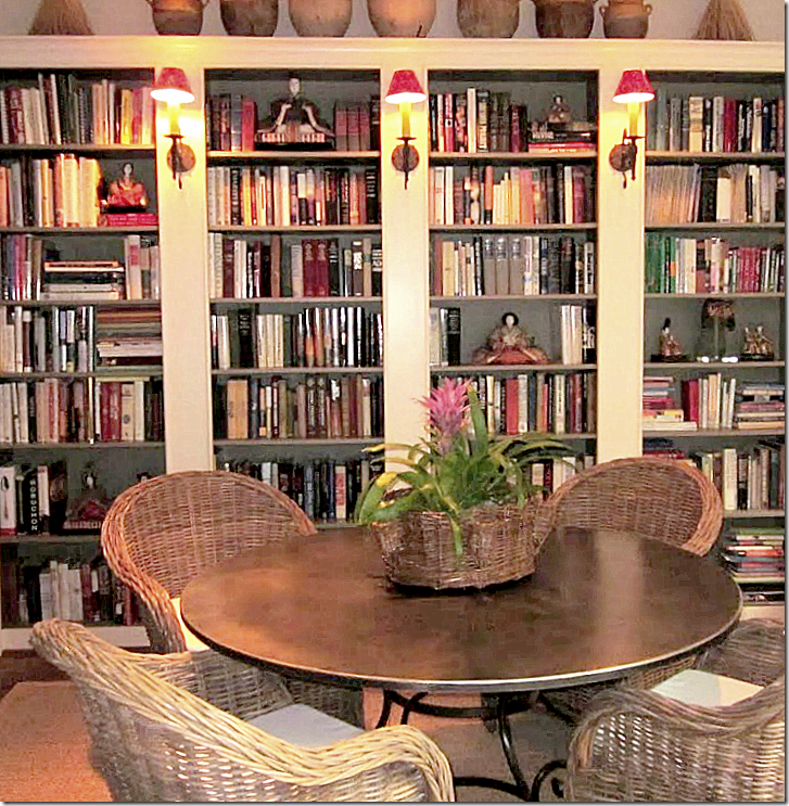
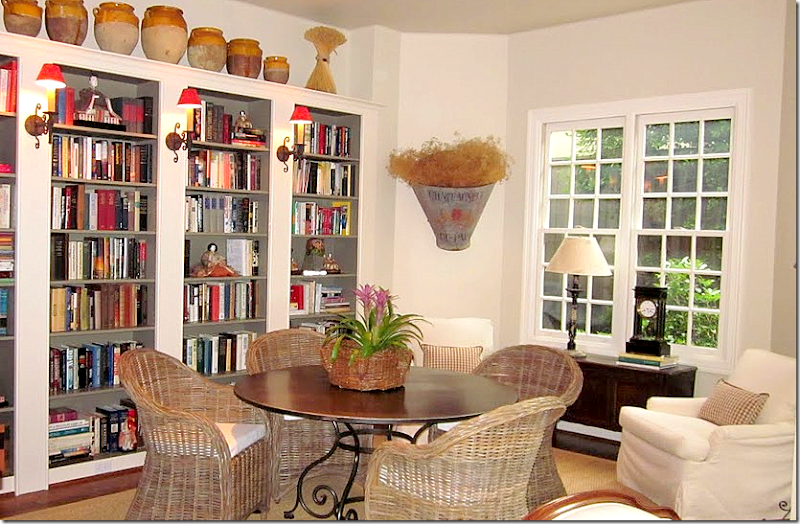
The homeowner lives in a townhouse in the Museum District of Houston. The dining room is also a library and a sitting area. It is open to the kitchen and the living room. The wall of bookshelves is especially striking with its back painted a deep gray and the sconces with their touch of red. The Kooboo chairs from Cost Plus surround a French scrolled iron table.
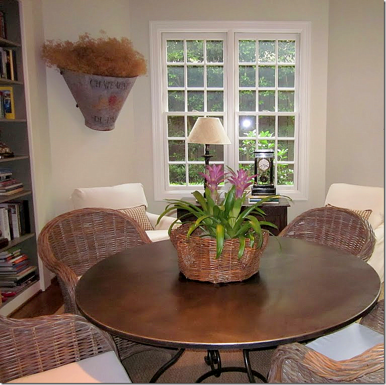
Looking towards the courtyard, there is a small sitting area with two slipped chairs.
Here you can really see how dark the bookshelves were painted. Painting the shelves raises the notch up a bit. It makes them so dramatic and rich looking against the white walls. Great idea to take home!!
SANTA FE:
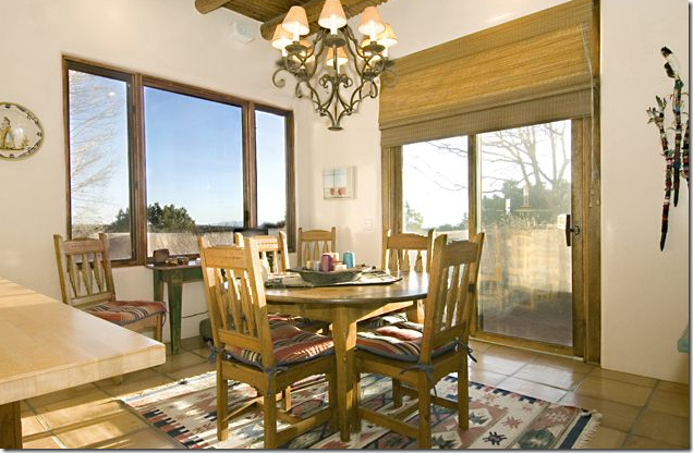
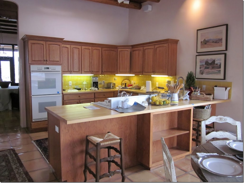
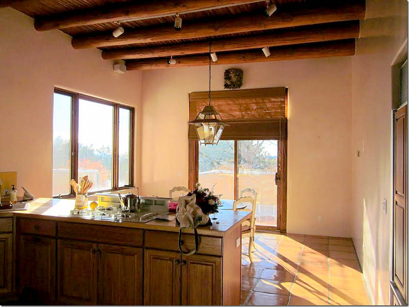
BEFORE: This is how the breakfast room in the Santa Fe house looked under the previous owners. It is true Pueblo style, but the owner loves French and Belgian designs, so everything is going to change!
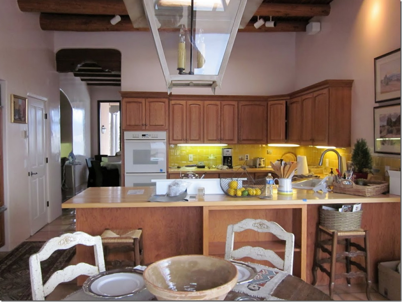
BEFORE: Notice the bright yellow backsplash. The owner really objected to the peninsula with the sink in the corner. This counter does cut off the flow of traffic into the kitchen.
BEFORE: Another view of the kitchen with its long counter.
The breakfast room had out of style slider doors and contemporary windows. The first thing the owner updated was the lantern. Look familiar? It’s the same exact lantern I have in my family room. The homeowner bought the last one from M.Naeve.
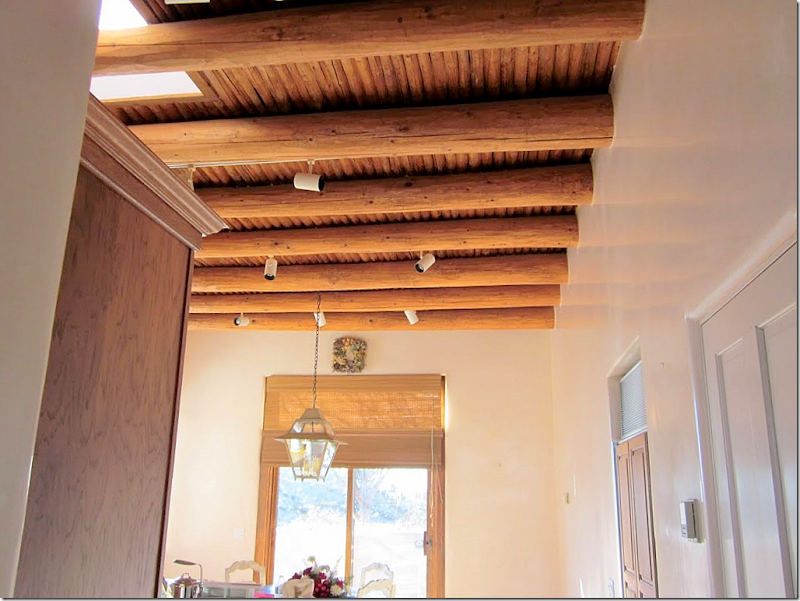
The beautiful ceiling was marred by old fashioned tract lighting. These came down and were replaced with smaller, less noticeable spots. Also, the ceiling’s vigas and latillas were stained darker.
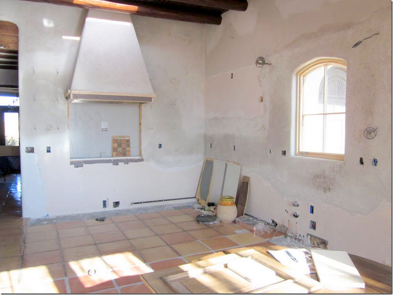
During: the Saltillo tile floor is found throughout the home and it was kept – the only element that remained. Here you can see the new range hood already constructed; the casement window is also new, which will be over the sink. Formerly there were no windows in the kitchen.
More new windows: the sliders were replaced with French doors and the contemporary looking windows on the side were replaced with romantic casements. Notice how dark the ceiling is now.
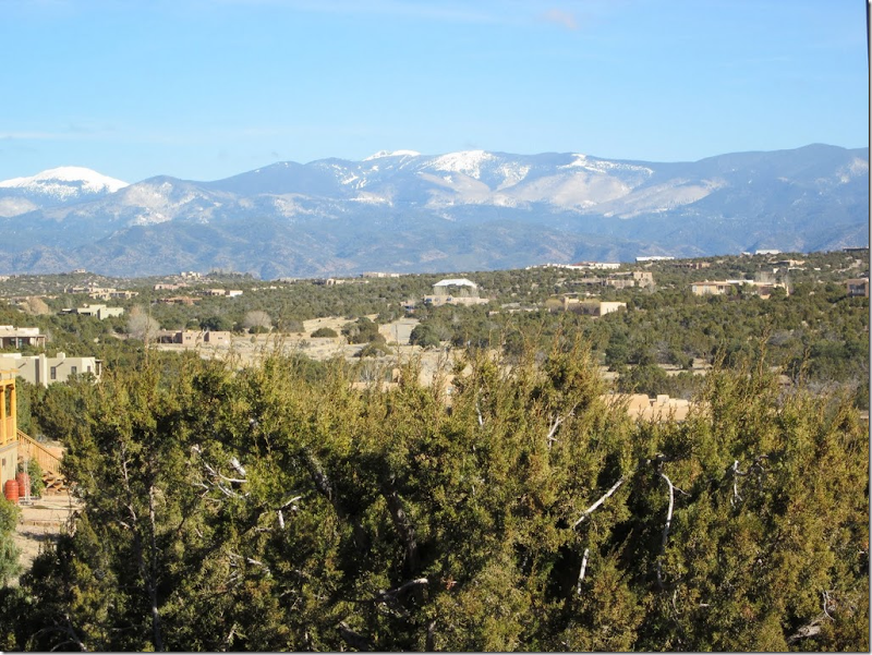
The new windows really bring in the view – here is the winter view of the mountain range – Sangre de Cristo.
And the summer view of Santa Fe.
The cobblestones at the Ralph Lauren store in Paris provided inspiration for the backsplash.
Here is a closeup of the backsplash with its cobbled tile appearance. The tiles are Arto - Normandy Cream. The tiles were purchased in Houston at Materials Marketing.
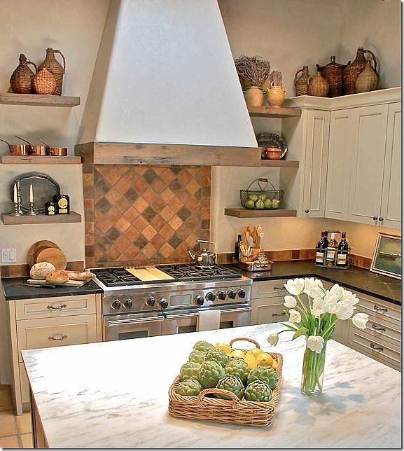
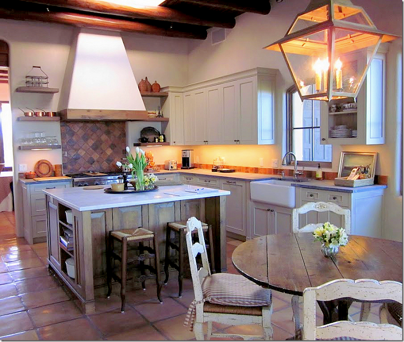
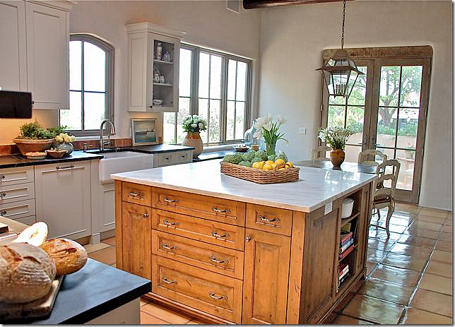
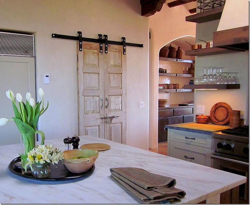
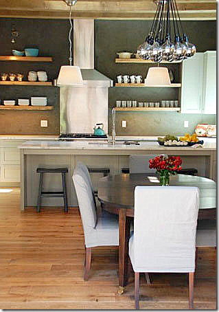
And viola! Here is the finished kitchen. Notice how the long counter was removed and an island was placed there instead. This opened up the kitchen to the breakfast area. The range with its hood is the focal point – it’s backsplash is made of the tiles placed on the diagonal. The cabinets are painted gray - Benjamin Moore’s Revere Pewter. Not sure what the countertops are – they look like matte granite. The homeowner will have to let us know in a comment!
The island is topped with white Carrara Sunrise marble. There are skylights over both the island and the breakfast table. The homeowner’s collection of antique wicker bottles was started after she first saw Carol Glasser’s collection in a magazine.
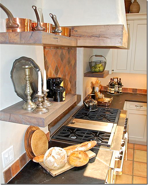
Old timbers were used for the open shelves and to trim the range hood. The homeowner wanted more open shelving but she said it is so dusty in Santa Fe its almost impossible to have all open shelving.
Another view – with the under cabinet lights on.
Looking towards the breakfast room. The island was stained instead of painted – which adds to the array of textures and colors in the room. I love her hardware.
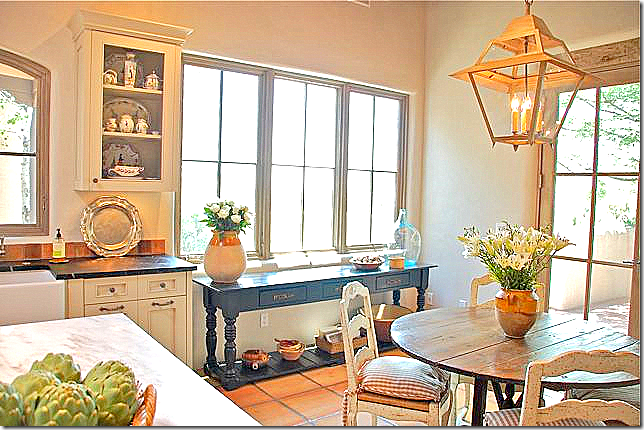
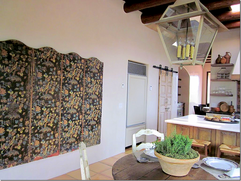
The breakfast room with its antique French wine tasting table. One last thing on the to-do list, the homeowner wants to add linen drapes and shades to the windows in this area.
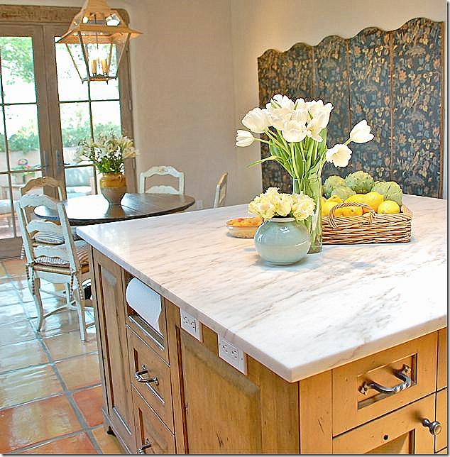
Across from the table is a beautiful large antique screen the homeowner bought in Houston. It has six panels, but she only used five. Does the screen look familiar? The answer to its ownership is at the end of the story!!! I like how the paper towels are open here – so easy!
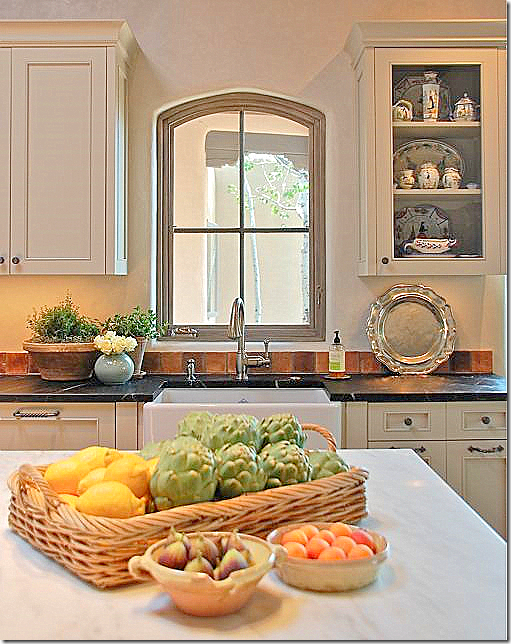
The new casement window over the farm sink brings in the view of the Aspen trees – where there was no view before. This portion of the upper cabinet is wired to show off the owner’s extensive collection of French Quimper. I love her styling!
Here’s a view of the new spotlights – small and black, they disappear as opposed to the older, large white ones that were previously used.
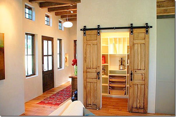
The pantry doors are old doors found by the contractor. They kept the original hardware. The doors really add a great decorative element to the kitchen.
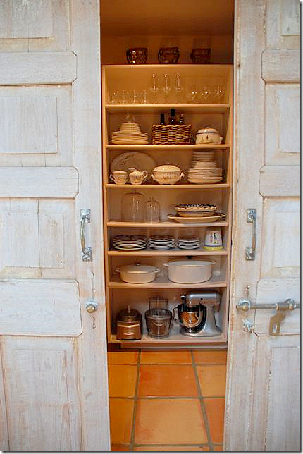
Closeup of the doors and hardware. The pantry has three sides with ceiling to floor shelves.
A look at the back side of the kitchen.
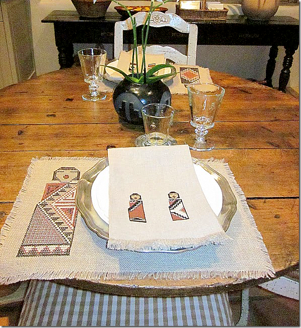
The homeowner says: “Santa Fe meets Provence. I purchased these wonderful placemats and napkins from an 80 year old lady at Indian Market about 4 years ago. The petit point stitching on the napkins are incredible!
These were my inspiration for the house colors--even though I went with a Belgian-French theme”
So, so pretty! I loved seeing a Santa Fe kitchen with an updated look. So, did you recognize the screen?
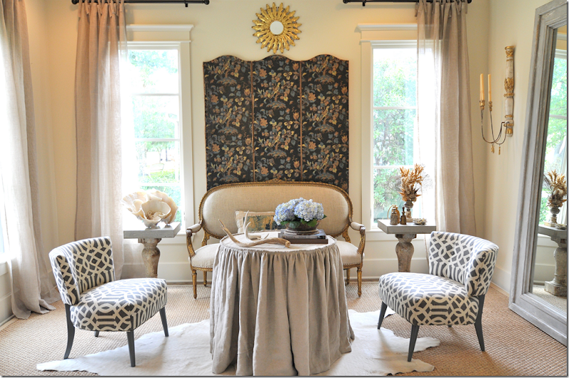
When Sally Wheat decided to remodel her French/Belgian styled living room to its now Hollywood Glam look, she decided to sell her screen. Here she was using only three of the six panels. The homeowner always loved the screen and jumped at the chance to buy it. She shipped it to Santa Fe where it now resides in her breakfast room. Did you recognize it??
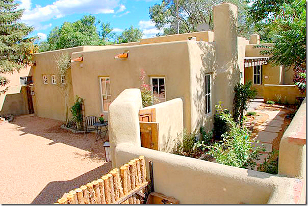
The homeowner’s contractors Casa Solterra are well known in Santa Fe. They also helped the homeowner with picking out design elements. The owner Scott Wong found the pantry door and the barn door hardware. His wife Maika is co owner. This Santa Fe home pictured above was an award winner at last year’s Parade of Homes show in Santa Fe. It’s amazing that this house is new – it looks vintage Santa Fe from the outside.
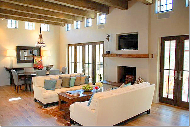
Inside, the ceilings are raised, creating a more modern look.
The living area is open to the kitchen.
The range hood and backsplash are the focal points of this kitchen. I wish I had bigger pictures!
The pantry has a door similar to the homeowners. She used this door as her inspiration.
And finally, the bedroom. I love all the heavy beams – so authentic looking.
To contact the Wongs of Casa Solterra, please visit their website HERE.
I hope you enjoyed Kitchen #3. A huge thank you to the homeowner. So far, the kitchen series has been international: Paris, Canada and Santa Fe. And I bet you thought they would all be from West University-Houston!!!









perfect in every way ... all of it!
ReplyDeleteloved the lecture
Beautiful--such a transformation!
ReplyDeleteWhat a wonderful transformation. Some people just have a talent. I would love to see the rest of this house.
ReplyDeleteWhat a gorgeous kitchen! I love it that the Santa Fe type tile was used as a backsplash and the floors kept retaining the southwest feeling without it being too theme-y. I did recognize that screen but thought...all the way out in Santa Fe? What a beautiful home. Makes me want to take a road trip to Santa Fe right this very minute.
ReplyDeleteI adore all the changes. It truly opened it up, the kitchen looks "huge" now. The pantry doors are so unique, I'm sure they are so thankful the contractor found them. Thank you to the homeowner for allowing us a tour of her lovely kitchen.. Like you I wish the pictres were larger, hopefully at some point we'll see more of this lovely home. hugs ~lynne~
ReplyDeleteAbsolutely sublime.
ReplyDeleteOne of the most dramatic and beautiful makeovers I have seen in a long time!! Can't believe its the same space...AMAZING!!!! Love the colors, the combination of textures and woods, so glad she kept the floors, they add so much to the room. Truly fabulous. The pantry doors are especially great looking. Its those little touches that give a kitchen such character.
ReplyDeleteI love this kitchen in Santa Fe! I plan on living in Santa Fe in my next life and this is exactly how I want my house to be there! Talk about a dramatic before and after! They did an amazing job. I especially love the backsplash behind the stove.
ReplyDeleteI'm planning on going to the parade of homes next year. My friend just got back and said it was amazing.
~Delores
Love the kitchen. However, I had saltillo tiles in my kitchen in the 70's and my back hurt all the time from standing on them while cooking for my family. They were beautiful but such a hard surface! I would never do it again. I have pine floors now and it's like standing on a cloud.
ReplyDeleteMelinda
Rough luxe meets modern is my new favorite look. Thanks for a few more ideas. I have a bit of French country rustic and Mid-century modern in my kitchen/great room but nothing I'd show here. :)
ReplyDeleteBeautiful! What wonderful changes! I love the all of the windows and the doors, they make the room so much lighter and open!
ReplyDeleteBeautiful collections and nice to see a melange of decorating styles.
This comment has been removed by the author.
ReplyDeleteThat is a fabulous kitchen! I've always wondered how the "no baseboards" thing works out in the long run....I would love to hear from the homeowner how it's holding up. :) I like the look...seems more modern.
ReplyDeleteI love how beautiful, and yet functional this kitchen is. I love that she had closed cabinets, but added just a hint of exposed shelving to allow for her incredible styling.
ReplyDeleteLove the kitchen series. You know I love the pantry doors.
ReplyDeleteLove that we could see before and after. The island really makes sense. And great pantry doors!
ReplyDeleteThat is very special indeed, great post again as always!
ReplyDeleteLove it love it love it! What a blessing she was to that house!! *winks* Vanna
ReplyDeleteLovely indeed! I'm crazy about those pantry doors with original hardware. Kitchen transformations are so much fun! And I must say, Joni, I really appreciate your opening comments. I don't moderate comments on my blog, but it would be hard for me to handle the heat that a few have thrown your way...especially when the harsh words target a guest who has graciously opened their home. Your words were very appropriate and respectful. Proud of you!
ReplyDeletexo,
Linsey
*** This design approach to living in Santa Fe is soooo much like I was considering doing, if we DO end up with a 2nd place there~~ Of course I'd have to "borrow a cuppa sugar" so I could meet the owner & enjoy any input she might wish to share for our place... Ohhhh, she's GOOOOOD! Soooo gooood! Smiles!!!
ReplyDeleteThis was a treat to see n' read about, especially since we live in the desert, and I TOTALLY avoid ANYthing that looks "southwestern kitchy"!!!!!
Beautifully done, & a lovely write-up, Joni! Many thanks!
Linda in AZ *
bellesmom1234@comcast.net
Stunning! Santa Fe is on my secret "I would move there in a skinny minute" list! Looks like soapstone counters to me.
ReplyDeleteWhat is the room with the curved entrance to the left of the stove??
Inquiring minds?!
i'd love to know where the home owner bought the cabinet hardware! the revere pewter is very beautiful! what a transformation. no negative opinions here! ;)
ReplyDeleteashley
Perfection !!!! I did know those doors as soon as I saw them... Loved everything, great style.
ReplyDeleteThank you for featuring this series. It is so inspiring to see the beautiful transformations.
ReplyDeleteParticularly like the pantry doors and the change/addition of the windows/french doors.
Would still love to hear what the countertop is made of...looks like soapstone to me.
Take care & thanks again.
Santa Fe is such an amazing town and your reader's home is beautiful!
ReplyDeleteOh my! That kitchen is absolutely beautiful!
ReplyDeleteStill wishing I knew how to submit pictures of my kitchen. :(
Joni,
ReplyDeleteHow gracious of you to show my kitchen project and thanks to the many readers for their comments. Maika and Scott Wong were a real joy to work. Special thanks to Sally Wheat for surrendering that great screen to a new home.
As to some of the questions asked, the countertops are soapstone as someone correctly guessed. I had just oiled them for the first time; hence the dark color.
The hardware is Bouvet.
The room through the arched doorway to the left of the range is the dining room--my next project!
For those of you contemplating Santa Fe, it is a charming city with friendly people, but for me it is the views that thrill me each day. Love those special clouds and mountains.
Gorgeous. The windows and doors, the darkened ceiling--and terrific taste. Thanks again. I always look forward to seeing what's next!
ReplyDeletegorgeous kitchen, but I really like how removing the long counter and replacing it with an island makes the whole kitchen seem larger and I'm sure facilitates better traffic flow...love the gray cabinets, too..
ReplyDeletebest,
maureen
Wow - absolutely stunning!
ReplyDeleteBeautiful kitchen! The counters look like soapstone (?). That screen was immediately recognizable from Sally Wheat's kitchen. It looks great it its new home too.
ReplyDeleteThe kitchen is a perfect design for its Southwest location -- love the semi recessed sink and countertop, also the sliding doors.
ReplyDeleteThank you for your 'Lecture Time' -- you expressed the problem very well. As thin as your skin may have grown, it's not fun to read unnecessary, nasty comments from strangers. Too easy to post and exponential in the hurt they can cause. Thank you for putting it out there and you're an example to all.
I spent many summers in New Mexico as a young girl. It was always such a relief to arrive in the Sangre de Cristo's having left the miserable heat in Houston, TX. This kitchen is so lovely it almost made me weep...not quite, but it is beautiful! Love the "lecture" as well. Think before you speak/write, no matter how thick our skin we all have feelings and our homes are personal expressions of ourselves. Be kind to one another!
ReplyDeleteI love this makeover.. From the view I can guess where the home is in Santa Fe.. amazing. I totally love how wonderfully Santa Fe was married with a European influence..so pretty. Grabbed so many good ideas from this!
ReplyDeleteLove love seeing the before and afters!! That BM Revere Pewter is a paint color I am going to check out!!
ReplyDeletexoxo
Karena
Art by Karena
Huge improvement but I wish the owner had toned down the photo shoot staging since the clutter is a bit distracting. I also would have used glass doors to the left of the window over the sink for the sake of symmetry.
ReplyDeleteWhy do so many kitchens still get oversold on cabinets?
ReplyDeleteThe Santa Fe redo, removing the 'L' & putting in an island. YES !
Creates flowing lovely room from 2 ridiculous spaces.
Is your garden drying up? My sister in Katy is HOT & DRY.....
Garden & Be Well, XO T
I hope Maria from Color Me Happy does a post on using cool colors (gray) with the orangey/brown of the backsplash and the floor tiles. Somehow this does not seem to be a good marriage - at least not in these photographs. If the floors were there originally and the owner loved them, then a warmer color for the cabinets would have been a better complement. This is the risk of deciding you want tiles like the ones in front of Ralph Lauren and kitchen cabinets like Sally Wheats in the same room. It's a great kitchen but for the floors and tile. Pine floors would have been so much prettier but perhaps that is not popular in Santa Fe.
ReplyDeleteWhat an amazing transformation! I love that they kept the Saltillo tile and made it work with the homeowner's taste for French and Belgian style. That's a hard feat to accomplish and it's done so well in this Sante Fe home. I'm currently trying to achieve the same marrying of styles in a circa 1891 Southern Greek Revival house. The home is on the north shore of Chicago so it also has elements of Victorian style. Personally, I prefer French style slightly leaning towards English country! I truly appreciate the masterful way this homeowner blended in her personal style, but stayed true to the original home.
ReplyDeleteWe painted our whole first floor, living room, dining room , kitchen, breakfast nook, upstairs hallways, downstairs hallways, all BM Revere Pewter, so I enjoyed seeing that color on the kitchen cabinets. It's a serene, almost 'non-gray' when the afternoon sun hits it. I think I'm still going with white cabinets when we redo our 1960's kitchen.Thanks again Joni for this post.
ReplyDeleteGorgeous and loved the lecture. Mean people suck (!) and need to be reminded from time to time.
ReplyDeletexo
Joni, this is an amazing transformation and beautifully done!!!!!!!!!!! The new kitchen looks enormous! I love the colors, textures, and especially those panrty doors and hardware!!!!!!!! Just beautiful. I am glad she kept the floors too. Maybe we will get to see MORE of this house??? I am sure it will be gorgeous! Please thank the homeowner for allowing you to show us her gorgeous kitchne! XO, Pinky
ReplyDeleteBeautiful redo! Love the creative inset on the island for the paper towels and those fabulous & unique pantry doors. Thanks so much "Turquoise Lover" and Joni for the wonderful tour! xoxo
ReplyDeleteThat's an amazing transformation. So nice to see all the details, the attention to everything. Truly inspiring.
ReplyDeleteOh, I'm 100% with you about the mean comments. Being honest is necessary in my opinion, but being mean is a different story and totally unnecessary!
xo
Luciane at HomeBunch.com
I recently re-did my kitchen and removed a peninsula counter and changed to an island-improved the flow of the kitchen and makes everything feel much more spacious! This kitchen is beautiful! Like many who have posted, I loved Santa Fe when I visited-first time I ever thought I would like to move to someplace other than the beach!!I love the way this owner has combined the Santa Fe "elements with the French/Belgian "look"- someone mentioned that they did not like the combination of the warm tiles with the cool gray cabinets, but "Revere Pewter" is a VERY warm gray with a LOT of depth...I suspect that the pictures do not do it justice...I'll bet the combination with the saltillo tiles is quite lovely. Thanks so much for sharing,
ReplyDeleteMeredith
Stunning!Love everything about the kitchen, especially the pantry doors! I have Revere Pewter in our guest bath, but it looks so much prettier here.
ReplyDeleteWow! What a wonderful change! I wish I had the talent to transform my home like this. Anyone who leaves a negative comment on this post needs to rush to the phone to call their optometrist for an appointment (right after they slap themselves silly for being rude)!! I always enjoy your wonderful posts. So many great ideas.
ReplyDeleteReally beautiful. I love how the rustic elements and finishes they chose compliment the location of the home. I also love it when a house conveys a sense of place without being so literal. And I think the counters in the kitchen are soapstone...I love mine and they look very similar!
ReplyDeleteAs far as people being mean in comments, I guess unhappy people exist everywhere, even is happy sappy blogland! Too bad they spend so much time hating on others instead of enjoying their own lives.
Kat :)
Wow! What a lovely transformation. And interesting to point out that with the popular open shelves look - displayed things do get dusty and grimey (at least if you cook a lot) unless you use them all the time. Good lecture - it's so true. Would you say those things to the homeowner's face? Judicious comments are OK, cutting critiques are not. And remember, not everyone has the same taste or style - and there is no one uniform right way (if that were true, what a dull world it would be).
ReplyDeleteI love that the homeowner respected the Santa Fe style while making it her own and updating it in the process. She brought her own personality and breathed new life in a stunning home. Great job! Thank you for posting such a great variety in this series. I can always learn something and find new ideas! Thanks Joni and homeowner!!! Sarah
ReplyDeleteI think that this is one of the more gorgeous examples of marrying ones personal style with the environment that I have seen. Thank you for this series, I love it and am learning so much!
ReplyDeleteI was so in awe as I looked at this transformation that I had to have my husband take a look as I was drooling over every detail. Beautifully done and so inspiring. Thanks for sharing.
ReplyDeleteI so agree with Lost in Provence about the lovely marriage that honors one's heart and the call of the environment. I think a huge part of the success is attention to the craftmanship and the artistry that infuses so much soul into this kitchen. The view of the mountains is staggeringly beautiful.
ReplyDeleteps: professor your call for civility was thoughtful and insightful.
I can't say I absolutely love this kitchen. I DO, however, love both styles of Santa Fe and Belgian-French. I just don't think the marry as well. BUT, the window over the kitchen is a fantastic addition! The pantry door is very cool! And I truly loved the breakfast table and chairs! And the track lighting from previous marred the beauty of the ceiling. So kudos for changing them out!! Thank you for sharing!!
ReplyDeleteLovely transformation! Thanks to you and the owner for allowing us a generous peak. I actually guessed where I saw the screen before. Yep, I'm a long-time and enthusiastic reader of your blog. And Amen to your lecture. I hate reading mean comments.
ReplyDeleteCC
Beautiful. I love a mix of styles and this is wonderful. I can just imagine getting up in the morning and preparing a lovely brunch in this kitchen and breakfast room - so sunny and open. The “Before” picture looked like a boring weekend get-away. I think this is why I have always loved interior decorating: the Cinderella factor. I’m no longer expecting Prince Charming, but I’m still looking for the perfect paint and fabric.
ReplyDeleteThank you, Joni, and Turquoise Lover for sharing your lovely make over with us. And thanks, Joni, for reminding posters to be kind!
Lauren
Ah! An absolutely gorgeous kitchen! Makes me feel I'm in France- only ermm BETTER hahaha.
ReplyDeleteThis is such a gorgeous makeover, you keep us all in our seats in supense!
And never diappoint either!!
Thanks for this lovely deliciousness!
XOXO
Bea
Joni, It is a beautiful kitchen and I love the owner's collection of demijohns and confit pots.
ReplyDeleteThank you for mentioning mean comments. My dad always told me "if you have nothing nice to say then say nothing at all".
xo,
Sherry
Soooo nicely done! It makes me homesick for my Mom's old house outside of Santa Fe. This new version of the kitchen is such an improvement. And I am very impressed that the homeowner was able to update to a style that mixed her love of European design with the vernacular of the area.
ReplyDeleteThanks Joni for a great series!!!
As a kooboo-lover, I am immediately drawn into the dining room and the kitchen seems a beauty -- functional and pleasurable to be in. Esp applaud the happy marriage of interior and exterior and demonstrating how a sense and love of place can bring together cultures-- the Southwest/Sante Fe, French, Belgium. Hey, even Texan!
ReplyDeleteAnd it's always a pleasure to be a part of the conversation here -- "conversation" not just posts or shout-outs or digs or deal-with-it comments. We're here, as a community, interested in design and eager to learn from each other.
This kitchen is absolutely gorgeous. I love the pantry doors and the stained island. The contrast with the painted cabinets is just what it needed to keeping the space from being boring but they don't jump out at you too much. Charming dishes and pottery work well with the Santa Fe rustic look, I think. Really above and beyond what I would expect in a vacation house. Lucky family.
ReplyDeleteAs for your lecture, you were right on and really very gracious about it. If someone is feeling crabby and just wants to vent she should go ahead and type it up, get it out of her system and then delete it.
Stunning......love it all. I'm bummed out though, it seems that the kooboo chairs are no longer available on line at Cost Plus.........
ReplyDeleteI absolutely love everything about this kitchen! And, Amen to your lecture, Joni.
ReplyDeleteGorgeous! Thanks for sharing!
ReplyDeleteTina
Joni...you are always gracious and courageous to show your work, your home, your opinions of other's works, your sources, your feelings, and even aspects of your personal life. I think it's a shame that the negative commenters get so personal and hateful towards you, as if you've done them an injustice directly. As so many have stated before, why read it if it infuriates you so? Just find another blog that you enjoy or write your own. However, I truly believe some people love to read a blog they actually hate so they can satisfy their need for criticism, insults, and finger-pointing. And that's my little humble opinion! Thank you for educating me on many aspects of decorating and shopping in Houston!
ReplyDeleteBeautiful kitchen, very well done.
ReplyDeleteAs for your lecture on negative comments I think one should mention the opposite of those...the annoying,phoney,overly enthusiast person who has to put a million !!!!!!!!!!!! after every comment they make on your blog. One is enough, we get it.
Just beautiful! I prefer tile floors.
ReplyDeleteI had wood floors in my last house. After three diffenent water disasters I went with tile for our new house. Hard to stand on or not I don't have to worry anymore about wood and water problems.
No more wood, not for me!
Fabulous kitchen - I have soapstone countertops but my sink is also soapstone. Love the white sink & wish I had done that instead. Love your blog. I'm learning so much from you.
ReplyDeleteWow! I love the kitchen and the fusion of different cultures/design. I was just about ready to paint my kitchen walls Revere Pewter, but now I want to paint the cabinets instead. Joni, has the homeowner shared the wall color in the kitchen, or would she be will too?
ReplyDeleteThanks for another great post!
Nancy Williams
Lori, your comments about hateful, hurtful comments were right on target. Some people are just miserable and need to lash our with their jealousy and hurt. Try not to let those who hurt, hurt you. Take those negative comments with a grain of salt. I know it must be hard when you are so willing to open up and share willingly not to take these things to heart.
ReplyDeleteThis was a true transformation. I am always stunned by the things each of us can do to make a house a home--I live in a community where there are only a few home plans offered but each and every home you visit is personal and different--it is hard to believe that they can be the same floor plans! Thanks for continuing to be brave enough to open your heart and share your talents and those of others.
Just beautiful! And unique . . . not "cookie-cutter" - well done! That view . . . gorgeous.
ReplyDeleteJennifer
Love, Love, LOVE this kitchen! And I DID recognize the screen! :)
ReplyDeleteBeautiful, warm and inviting kitchen! I have really been rethinking having tile floor instead of wood in the kitchen (much more practical with 4 kids and big dog). Also, love the cabinet color...last month, I had my music room walls painted Benjamin Moore Revere Pewter! Now, thinking I want to do my kitchen cabs or bathroom cabs that color as well, to carry it over into another room!
ReplyDeleteOur treasure lies in the beehive of our knowledge. We are perpetually on the way thither, being by nature winged insects and honey gatherers of the mind.
ReplyDeleteKnowledge which is acquired under compulsion obtains no hold on the mind.
ReplyDeleteDon't like how brown the table is in the first few pictures.
ReplyDeleteI like this style
ReplyDeleteGood blog! I have found here much useful information for yourself and would like to thank you for done by work.
ReplyDeleteHi,
ReplyDeleteFantastic post you have shared here. this is one of the more stunning cases of wedding ones individual style with the environment that I have seen. The view of the mountains is staggeringly beautiful. Believe this post is very essential for us.
Thanks.
Donald
Never drop your knives into a sink of soapy water, take them one at a time and wash them before rinsing them the same way. You can really cut yourself if you have to dig into a tub of soapy water looking for a kitchen knife to wash. Best Knife Sharper
ReplyDeleteNon- stick pans are a great choice for those who would like to go for healthy eating. The health quotient of your food increases in non-stick pans because these require minimum quantity of oil for cooking. Red Copper Pan Reviews
ReplyDeleteI AM from UNITED STATE, my man was cheating on me since last year with his co_worker, i was upset and confused on what to do, i tried my best to win his heart back but all effort was wasted until on 21 of this February when i came across a spiritual man called DR MACK, i saw a many post about his wonderful work and i contact him via his Email and explained to him and he asked for some information which i gave him and he told me that my heart desire will be granted just in 3 days, i was skeptical but i gave me the chance to help me, to my surprise my Boyfriend called me 5 time to tell that he is so sorry and that he wants me back and wants to marry me, everything happened like a dream but i am so happy that i have my boyfriend back and we are planning to get married soon, if you want to Ex back please don’t hesitate to contact____dr.mack201@gmail. com…..
ReplyDeleteThanks for Sharing
ReplyDeleteLatest Product Reviews
Latest Product Reviews