NOTE: So sorry to have been away so long. I’ve had a rash of computer issues this week including Writers Live blogging issues, a computer virus (which is going around and is very serious!) and a crashed hard drive. Makes me hate Windows and PCs and Sony Vaio. I would love to switch to Apple, but Apple doesn’t support my blogging platform – so, unfortunately, I’m stuck with Mr. Bill Gates, a poor imitation of Mr. Steve Jobs.
So, on now to decorating!
A few weeks ago, I wrote about regional decorating – or, a design look that comes to define a city, an area, a country. Certainly, reading this blog, the “Houston look” of slipcovers and seagrass is well known. I’ll admit it, I am in a rut, stuck deep in a certain “southern” look associated with magazines such as the late Southern Living and Veranda. Some days, the appeal of Faudree and Carithers, et al, seems more rooted in familiarity than approval. In truth, I rarely step outside my box. I look at décor in NYC by all the latest and greatest, still the Southern bred Charlotte Moss holds the most appeal to me of that lot. Design in faraway environs like Seattle leaves me cold, just as mountain décor holds no appeal. I’m a southern girl through and through, but do include the South of France in that equation. So, I was surprised to find the work of a Canadian interior designer so appealing. Canada?
While reading the blog of a fellow Texan, Get Grounded, I was introduced to the work of Jill Kantelberg, a designer who works out of Toronto. Besides design, she also runs a popular décor shop that’s a must stop for all the decorators in her area. Her merchandise is also found on the trendy 1st Dibs, which insures a certain cachet.
Kantelberg’s work is eclectic, it’s rustic mixed with antiques and contemporary shown before a backdrop of rough textures. The cover of this issue of Canadian House and Home features the work of Kantelberg. It’s appeal is immediate. I was instantly drawn to the mix of the cool blue and white stripes against the raw wood walls and beams. Is it a beach house or a country lake retreat? Certainly, it’s not anything familiar rather it’s a totally new look and I find it irresistible. Apparently, so did the Texas blogger Get Grounded and so do the Canadians. Kantelberg is very popular and respected as an innovator with her rough luxe looks that predate the term and Restoration Hardware, both.
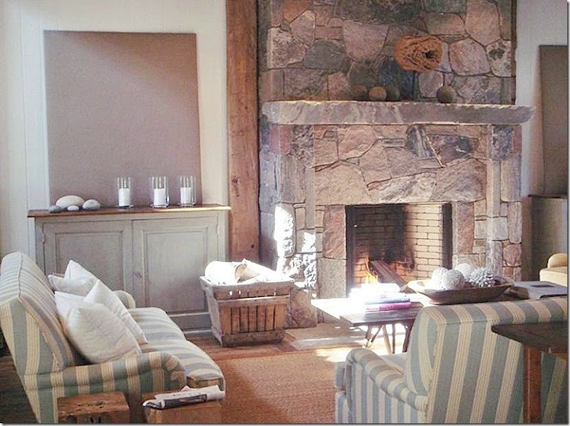
The house is located on the water, but whether it’s a beach or a lake is not specified. This view of the family room with the blue and white striped sofas shows the ceiling is heavily timbered with planks and beams that run down the walls to flank the dark stone fireplace. The walls, in contrast, are painted a stark white. The floors are naturally shaped stone mixed with heavily distressed wide wood planks. A wonderful antique console table divides the family room from the dining area and kitchen.
This view of the family room shows the matching painted cabinets that flank the fireplace. Above each is a canvas painted a soft brown that picks up the color of the stone. Now, if this was a southern decorator, there would be mirrors over those cabinets and the stone fireplace would replaced with a French limestone mantel. Sometimes, it really makes sense to step outside the box, for once.
This view shows the family room with the stairs behind the love seat.
Behind the family room, an oval wood table is matched with wicker chairs. The focal point, though, is the light fixture – a simple iron form with a crown of bleached limbs.
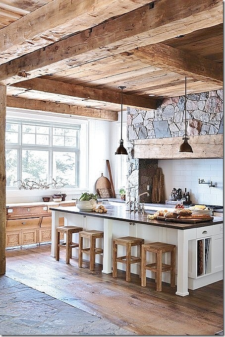
The plank and beam ceiling continues into the kitchen where the range is located under a mantel that resembles the great stone fireplace in the family room. On the left, an antique store counter sits under a bank of windows.
A view looking straight onto the range hood.
In the master bedroom, the wood lined headboard resembles the design of the great fireplace and the range in the kitchen. Brown and white and tan bedding continues the colors found throughout the house. Beams are also found in this room, as is the heavily distressed wide planked wood floor covered in part by a soft cow hide rug. The organic side table with wispy branches adds to the look.
A closer look at the unique headboard.
More rustic wood makes up the mirror and dresser.
The bathroom features bluestone and a white vessel sink. Antlers are made into sconces.
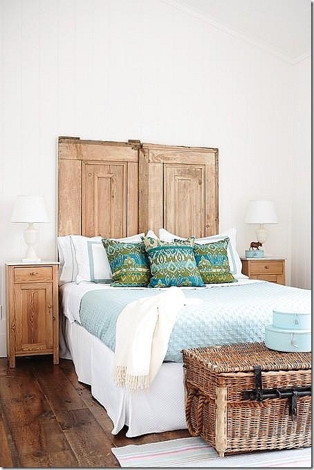
The guest room features a headboard made of old pine doors.
It’s hard to piece together the pictures of Kantelberg’s work found on the internet, as the stories that accompany the photos are no longer available. But, Kantelberg owns a 200 acre property in the Niagara escarpment outside of Toronto – whatever that means!!! This gorgeous house and attached wing I believe is most likely her property. The chateau’s design is influenced by both France and Belgium and it’s utterly charming.
Inside, there is a great room with a gorgeous stone mantel. The room is a living area, a dining area and a kitchen – all in one. A large iron fixture sits over the dining table. Notice the French windows on the right and how on the left it is connected to a hall which links to another building. The ceiling is a mix of timber planks and beams – so beautiful.
Here, a closeup of the wood beams that surround the French doors. A large antique trumeau sits over a makeshift bar. In the mirror’s reflection, an antique armoire is seen.
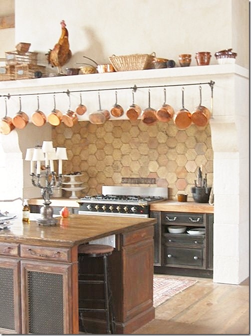
Past the dining table is the kitchen with its own large mantel over the range – which resembles the fireplace at the opposite side of the room. An antique store cabinet acts as the island. The refrigerator is hiding within an armoire on the right.
A close up the range with its backsplash of terra cotta tiles. I love the collection of pots hanging from the mantel.
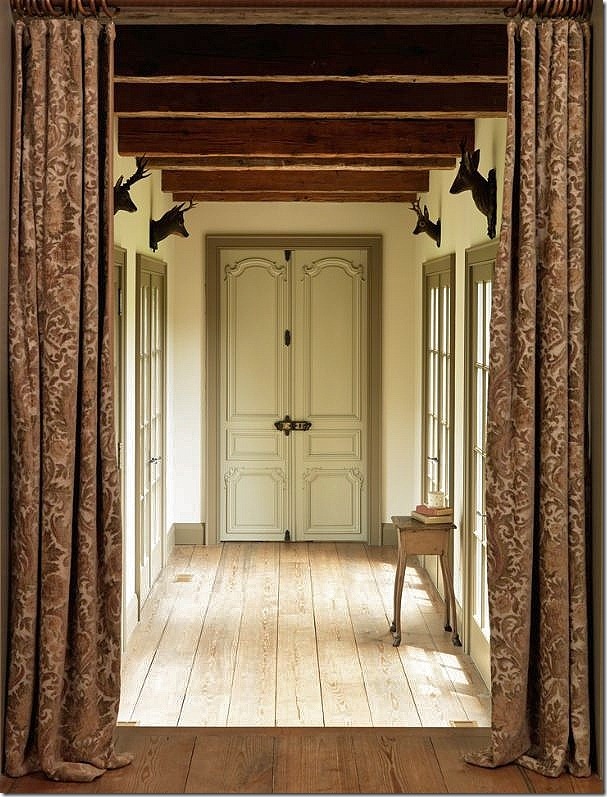
The hallway that leads from the great room to another part of the chateau. Damask portieres divide the two spaces. Notice the faux deer heads that sit above each French window. The door at the end of the hall is beautiful carved. The repeating beams on the ceiling resemble steps. Such a quiet, beautiful space.
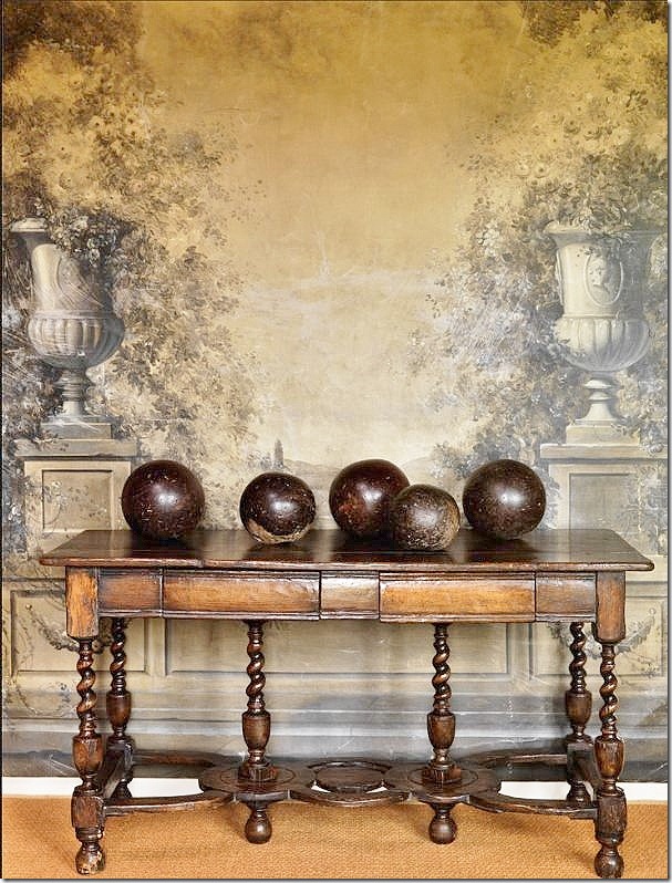
Well, wow. What can I say? This is too pretty for words. The antique console has such a gorgeous patina – its just stunning. Atop is a collection of wood balls. The romantic and feminine mural behind is in contrast to the masculine vignette. I could look at this photograph all day. It must be so gorgeous in real life.
Another gorgeous vignette, an entry hall perhaps with a skirted table and a French armoire. A beamed and wood plank ceiling above with a terra cotta tiled floor below.
The master bedroom has its own fireplace. Again, a beautiful wood and beam ceiling. A dressy antique English dresser mixes with a rustic canopy bed. These two wing chairs are now for sale on Kantelberg’s 1stDibs store.
A terra cotta tile floor, a Persian rug, a wood ceiling, and a large mirror made from an antique door.
Another beautiful bathroom that could be a sitting room. Feminine and rustic at the same time.
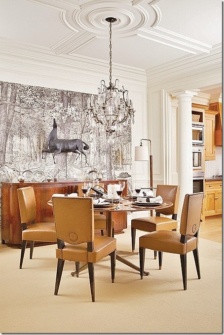
Just when I thought I had Jill Kantelberg’s look down, I spied this wonderful French moderne dining room.
A close up of the wonderful chairs and table, and the triptych hanging behind a horse sculpture. Totally outside my box, I find myself just loving Kantelberg’s aesthetic.
I mentioned before that I had first seen this picture on the blog of a fellow Texan, Get Grounded – where Robin writes mostly about landscaping. Robin had first seen this photograph a few years ago and immediately fell in love with it. In fact, she gasped when she first saw it. I have to admit, I did too. What makes this room so appealing? Robin writes:
“The striped couches! The incredible architectural barnwood ceiling and doors! Sisal rug over wood flooring. My signature aqua colors. Minimal accessories. The rustic, beachy, comfortable feel, oh my.”
Robin contacted Jill Kantelberg who was kind enough to email her back and forth with ideas on how to get this look. Robin lives in a 1979 builder’s tract house in Austin that looks nothing like this expansive lake house in Canada. Yet somehow, she wanted this look for her own. How to emulate it? How to do it on a strict budget? Robin looked at all the elements and decided that rough wood was important to the décor.
And of course, blue and white stripes were very important to the look. Let’s take a look at how Robin is putting together all the decorative elements in order to get the atmosphere of this room in her own home.
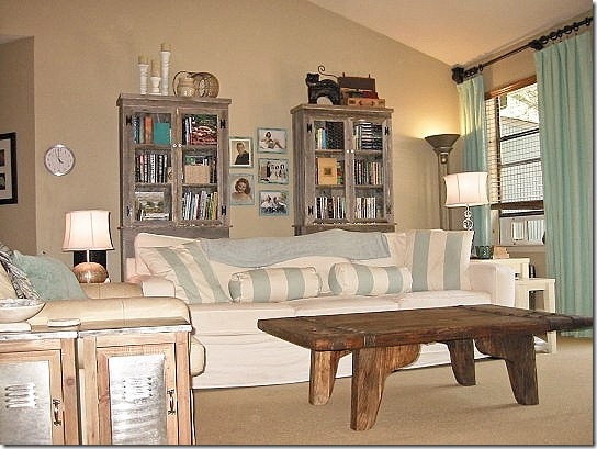
Here is what Robin started with. She loves the Shabby Chic look and had already started decorating in that style.
First, and what I think is a stroke of genius on Robin’s part., she added the two rustic wood bookcases to the back wall. This is how she brought in the wood element into her room! The bookcase doors have chicken wire which further adds to the rustic look. She found them at this store and they were very price friendly. Now, if I was Robin’s designer, I would tell her to add one more cabinet and place them side by side to get more of the look that the wall is paneled. Perhaps she could save up to add one more. I think these cabinets are so very important to the look, I would go the extra distance and add another one. On the floor, she installed Shaw’s sisal look alike carpet to mimic the seagrass look in Jill’s room. Now, you know me, I love the real thing, but Robin told me in person this really looks like seagrass!
Next, Robin needed the striped fabric. She found this striped fabric at Calico Corners, and then found someone on Etsy who made the pillows! So far, she really is getting the look of the lake house. Luckily her curtains match the striped fabric perfectly.
And, here, without her beloved ottoman that she knows has to be replaced to continue on her journey.
And here is the table she bought at Cost Plus which really fits the look perfectly. It almost looks like driftwood. Robin says she wants to get new lamps and blinds which she’ll do soon.
I was really impressed with Robin’s drive. She saw something she loved with all her heart and decided to claim it for her own. Faced with a limited budget, she shopped carefully. The striped fabric is perfect and really brings in the feel of Kantelberg’s room. And, the bookcases with their rough wood and chicken wire doors go a long, long way to further that atmosphere.
Have you ever seen a picture that you loved and then tried to copy it for your own? I did, about 20 years ago. I’ve showed this before, but one more time won’t hurt! I fell in love, really deeply love with this Dan Carithers’ room, which I STILL love to this day!!!
The original inspiration – taupe and white linen fabric, slipcovers, sisal rug, and lots of blue and white porcelains.
I was lucky to be able to get the exact fabric in taupe and white linen stripes. Hey Ben!! Hey Reggie!!(Poor Reggie was run over and died a few months later.
)
I bought this coir rug – they hadn’t heard of seagrass in Ft. Worth at this time. I had the chairs slipcovered in the same fabric. I used to LOVE those candlestick “lamps” that I got at Bombay. Loved them!
I added this wicker chair – the cushions in the striped linen hadn’t come in yet. To the right you can see my two French chairs upholstered in the same striped fabric. Those chairs are still used in my living room today. Instead of blue and white porcelain, I used my budding blue opaline collection. I wish I had a picture of the entire room, it was really kind of cute for its time. I was proud of myself and thought I had come pretty close to my inspiration room – considering that my house lacked any of the gorgeous architectural details of the Carithers house.
Have you ever used a designer’s photograph to decorate a room? Send in the pictures – I would love to see them!!! I think working off an inspiration picture is still a good idea. When I meet with a new client, I always ask them to bring in photos of rooms they love.
I hope you’ve enjoyed seeing Jill Kantelberg’s work and stepping out of the box with me. To see her web site, go HERE, and to visit her 1st Dibs store, go HERE. And a HUGE thank you to Robin of Get Grounded for sharing her newly decorated living room!!! To read her story, go HERE.
Reaching Outside The Box and Getting a Decorating Inspiration
Subscribe to:
Post Comments
(
Atom
)














I am in love with Jill Kantelberg's work. We are all in a rut these days, so thinking outside the box is good. I long for the days when we can go back to individual design and not what a magazine or catalog has dictated we should adhere to. Although, trends have always come and go, it does take talent and courage to develop our own look. Kudos to Jill Kantelberg for having her own vision, and still making those wonderful classic stripes work. We will all be paying attention....
ReplyDeleteRarely have I enjoyed someone's blog like I have enjoyed yours tonight! Thank you for the relaxing look at Jill Kantelberg's mix of chic and rustic. I love it!! Thank you for the wonderful post!!
ReplyDeleteI am so happy that you featured Jill's work. As a Canadian I am happy to see her work featured and also Canadian House and Home magazine, which is now readily available in the US. (publix)
ReplyDeleteThe Niagara Escarpment refers to an area of countryside 1 hour south of Toronto, formed during the ice age. It is basically a ridge of rock many miles long and wide that ends at Niagara Falls. The area is known for it preserved beauty, the Falls and the fabulous vineyards and orchards in the area.
It is always so much fun to see someone get a designer look on a budget, go for it Robin you’re doing a great job! The only thing I would suggest to Robin is to remove some of the knick-knacks if you’ll notice in the pictures Jill kept things streamlined. I had never heard of Jill so thank you for bring her to our attention she does beautiful work. As always another wonderful post and glad to see you’re adding to your mix Joni.
ReplyDeleteI was just reading my latest issues of Atlanta Homes & Lifestyles magazine and there’s a designer in there by the name of Jimmy Stanton who has a similar style as Jill’s. Only Jimmy incorporates your love of sisal and linen covers, he uses linen in gray tones. You might want to have a look the name of the article is Southern Sanctuary. Bringing the natural warmth of wood back into interiors and streamlining the clutter seems to be the new in thing.
ReplyDeleteI love that chandelier that's a countried version of a Sputnik chandelier. It's wonderful.
ReplyDeleteI see Rax has explained the Niagara escarpment. It also extends into New York state and is the original perimeter of Lake Ontario, millions of years ago. If you're rich, you live on the edge of the escarpment overlooking the towns, the lake and Toronto (on a clear day). If you're not, you live below. I grew up at the bottom of it. Artie lives very close to it actually.
Joni what I love the most about this post is how you related Robin's process to Jill's design. I think it is important to get inspiration from all kinds of sources, but if you find a designer you love and don't know where to start, emulating them is a good idea. Stripes are a constant in my life and always have been. I never tire of their crisp clean look. I am not a rustic gal, but I can so appreciate the beauty of Jill's design. It is gorgeous, thank you for sharing her images and I always love reading what you have to say!! Thanks for your hard work on each and every post that you do. It does not go unnoticed by me and many others, xo Kathysue
ReplyDeletejoni!!!
ReplyDeletethis is definitely out of the box....
but Jill Kantelberg's dining room.
is impeccable.
xxx
There is something about that room that makes you want to curl up, read a book, and linger a while. I will forever love slipcovers, sisal, peanut butter and jelly, apple pie, and my hideous peach Victoria's Secret terry cloth robe from the 80's that I like to call "vintage". In my book they're all classics! Sorry to hear about poor Reggie though, but I loved this post!
ReplyDeleteGreat post and so timely as I have a friend who is purchasing a home that speaks to this decor. I have forwarded this link to him knowing that there is more inspiration here than one can absorb in a single setting. I love it when comfort and beauty marry so well.
ReplyDeleteTAYH
Thanks for a wonderful post. I have been trying to emulate Paula Deen's living room ever since I first saw it a few year's ago. Luckily she has such a down-to-earth-homey style that it's easily copied. I believe her designer was Carolyn Hultman - who also designed the Daufuskie Island house of Kay Stanley - featured on your blog a few months back. Love her style. Also, check out designer Thurston Boyd from Laguna Beach, CA.
ReplyDeleteThat taupe stripe sofa is a blast from the past. It was my family room sofa in the 80's too! I must say, it's pretty timeless. Lovely work and a beautiful post.
ReplyDeleteLike always Joni, great post. Love all the raw wood mixed with the white fabrics. Shoot! Now I want to add some raw woods to my living room. I seem to never be satisfied. Always changing.
ReplyDeleteJoni, I Love Jill's design works and Robin did a great job! The blues really spoke to me and the calmness of her designs.
ReplyDeleteI think we all see a room and take inspiration from at least parts of it, I do for sure!
xoxo
Karena
Art by Karena
Well, Joni, as always so much beautiful. I am so sad to learn about the dog.
ReplyDeleteI love the kitchen and the sofa in the last image especially. The headboard is amazing and so different, which I love.
As for the PC, I don't think I could ever leave Mac. I fell in love instantly with the computer. I now have a iPad and am thinking about leaving my Blackberry for an iPhone. That is not certain yet, as I love my Crackberry. Maybe it will become compatible for you soon.
Thank you for sharing this and have a nice Sunday!
Terea
xoxo
Gorgeous post Joni--I love the rough wood elements that seem to weave through the house--the wood keeps the look light but gives so much character to each room--Have a great week! Barbara
ReplyDeleteLOVE Jill Kantelberg's look! I've always loved rustic, especially old-looking wood and organic elements, and I can't resist blue. I have a log cabin with lots of wood - walls, ceiling, beams, floors - and stone, so I could particularly relate to the ski chalet on her website. As much as I love it, though, I can't really do spare. Too much stuff creeps in. (For a contrast, look at Charlotte Moss's "Winter House" ski chalet. I fall somewhere in between, more casual and rustic than Charlotte, with more collected 'smalls' than Jill. There's that schizo thing again!) It's easier, though, if you don't live there full time. Of course that chateau of Jill's was to die for, but then how many of us have houses like that? So, I was glad to see Robin's efforts to do her version of the 'on the water' look on a real budget in a typical American builder house. As much as we like to dream, most of us don't have mega-million homes and unlimited decorating budgets or extremely valuable antiques. Thanks, Joni, for this. I have more fun drooling over your blog posts and following the links.
ReplyDeleteThis gives me so much inspiration for mountain interiors. Light but still warm with all the reclaimed wood and iron. Bookmarking another of your posts!
ReplyDeleteP.S. I think it's interesting how this rustic/organic look of Jill's is big in the catalogs now; e.g. Restoration Hardware (Belgian + industrial), Sundance (mountain), and Pottery Barn. I'm also wondering when the supply of old hand-hewn re-purposed beams will run out. They're so de rigueur now. I've always loved them, but supply and demand are making them more expensive than ever.
ReplyDeleteJoni..As a born and bred Torontonian, (now living in Arizona), I felt an immediate sympatico with these homes. The Niagra Escarpment having already been described, may I add it is also some beautiful wine country..Ontario's version of Napa! One hour southwest of Toronto, and 10 minutes north of Niagra Falls, (ugggh), by a town called Niagra-on-the-Lake, which is a most charming, (if somewhat touristy) town filled with Victorian cottages and bed'n'breakfasts...a favorite weekend get-away..bicycle rides through some exquisite landscape, theatre,& fine dining.
ReplyDeleteAs for the rustic home designed by Jill, I would venture a guess that it is located in Muskoka; Ontario's "cottage country, 2 hrs. north of Toronto, and also home to the hideaways of many Hollywood folks. Filled with lakes and pine trees, you wind through roads carved between hills of granite as you make your way north to what is, to my mind, one of the most heavenly spots on earth. The rustic decor of this cottage, well reflects the aesthetic of the area.
The french moderne dining room is entirely in keeping with what one might find in a sophisticated, Toronto, city home. Seems to me these 3 designs from Jill's portfolio express the 3 dominant design influences in Ontario decor.
Thanks for a great post!!
P.S. Canadian House & Home is one of the few remaining print shelter mags that is routinely devour-worthy!
P.P.S. That Dan Carrither's room has been in my inspiration portfolio lo these many years..love it as much now as I did then.. :)
"Ontario Decor"? So pretentious. I'm glad you "felt an immediate sympatico" with Jill's work but really it's a rip off of a rip off or a rip off. As an Torontonian (unfortunately) I must say that this city is so pretentious, full of sheep with their noses up the bums of the ones in front. Posturing, silliness, bland. The lake house, for example, was so dull. In Canada, this is good enough to be featured on the cover of a national decor mag. That should be telling enough. Sad situation here.
DeleteI use Linux and it supports blogger just fine if you'd like to look into it. There are of course differences but those are easily over come. A local computer store might be able to help you with this more. Good luck. Sorry to hear about the computer issues.
ReplyDeleteThe bedroom fireplace photo with the wing chairs and bookcases is my favorite! As well, loving Robin's two rustic bookcases. Jill's talent is sensational. Thanks Joni for the beautiful post. xoxo
ReplyDeleteI absolutely love this post, I have just logged on and picked up my email and had to skim through but the picks are great, I love the ones of Robins place and will be back later with a cup of tea and have a good look.
ReplyDeleteThanks, a lot of work has gone into this post, so much appreciated.
Lee
Great post, Joni! Fantastic the way Robin is duplicating the look she loves.
ReplyDeleteThank you for posting about this Toronto designer. It makes sense that her house in the Niagara escarpment is Belgian and French influenced as this remarkably fabulous area is famous for its vineyards. The weather conditions created by the shield that the escarpment provides are conducive to growing fruit and wine grapes. It is the main icewine producing region. (If you're not familiar with icewine, it's wine produced from grapes harvested frozen on the vine in winter.) It produces the most delectably sweet nectar on earth! Sorry to digress but I am from the Niagara escarpment region and we often take day trips there. You can see where Jill would be greatly influenced by the spectacular scenery!
ReplyDeleteNice to re-visit Jill Kantelberg's charming designs on your page. Some of it featured in print over 3 years ago, and it still looks fresh, rustic and cozy. Those unfamiliar with Canadian design are missing out on a treasure trove of inspiration. The current October issue of Canadian House & Home Magazine is loaded with beautiful spaces. Drool-worthy? Definitely. You can peek via video tours at a gorgeous show home featured in the mag: http://houseandhome.com/showhome-2011/video It was designed by the founding editor, Lynda Reeves. It's a must-see. Am I the least bit surprised? Not at all. Enjoy.
ReplyDeleteJoni- Sometimes it is even better to do it in reverse, meaning you have an idea in your head of how you want a space to look and you start decorating and then you find professional photos that support and validate your direction. Does the way I have written that make sense to you? I love when I find an image and think "yes, that is exactly what I meant to do!" All that being said, I have a number of people struggling with big builder houses, namely in Atlanta and Texas, and this post will be a huge inspiration for them. You have this way of picking out what can be done to spaces I consider almost unmanageable (NYC and Tokyo being all about the tiny sq. footage) and making them human and comfortable.
ReplyDeleteThis was such fun to see, Joni, and I still love what you did in your first home. And those lamps, too. And the striped fabric. Ben looks so young in that picture, doesn't he?
ReplyDeleteYour friend is really getting her look down, too. I like those cabinets a lot.
I copied a color scheme in one home from an article in House & Garden and pretty well nailed it. But I don't have pictures. It's funny, but I catch myself using the same colors over the years. I've always loved taupes and blues. Oh, and I finally settled on a color for my upstairs study. Funny thing is, I noticed this same color in the room of a famous designer. But I really didn't pick it from him. All the other colors I tried didn't work, and I was talking to my painter who said he thought he had exactly what I wanted. Amazingly, he did! It's a great shade of mocha. I'm in here now and loving it. Now, if I can just get finished with this!
XO,
Sheila
I have pictures of my living room, which was inspired by...YOU! (The Albans House). Where do I send them to?
ReplyDeleteGreat post as usual. I lean from you every time. I agree with what Tokyo Jinja said...sometimes it is better to do it in reverse, meaning you have an idea in your head of how you want a space to look and you start working on it and then you find professional photos that support and validate your direction. I adore it when I find an image and think "yes, that is the look I was aiming for!"
ReplyDeleteOMGoodness, Kantelburgs work is absolutly GORGEOUS!!!!! THANK YOU for introducing me to her work! I loved EVERY picture and think her reader did a wonderful job! I, too, would get the 3rd bookcase! They are fabulous. XO, Pinky
ReplyDeleteHi Joni - I think perhaps you are surprised that unique talent such as Jill's exists here in Canada. She is absolutely one of our best but there are others, too - world class, one-of-a-kind. Americans and Canadians are not so different - all that separates us is a border.
ReplyDeleteDebra
Interesting comment above (Debra). I agree, we have so many great talented designers here in Canada, but they don't get as much media as the Americans. Still, honestly speaking, I think the really talented ones aren't on TV. It's "easy" to have perfection on a TV show, hard it to decorate w/ a budge and make it really happen.
ReplyDeleteFantastic post, as always, Joni!
Have a blessed week!
xo
Luciane at HomeBunch.com
Lovely post as always! I particularly liked the hallway that leads to the great room, its all about those rococco doors!
ReplyDeleteI really did enjoy the look of that living room and kitchen! This is a popular look now that I am seeing in many designs. It's all about the balance between the natural elements in the room and the furnishings. No over the top pieces either. Honestly I like the couch with the pillows the way Robin did it even better. Much more subtle and less costly to change it up if she wants. The stripped couches were the only thing from Jill's design that I didn't care for as much.
ReplyDeleteJoni, you are so complimentary in your post about my budget restricted living room. Thank you!
ReplyDeleteAbout the bookcases: yes, I did realize they look too small on that wall. However, since I bought them online sight unseen, when the 2 came in they weren't quite as good as I'd hoped. The wood actually leaves splinters in my hands, and they aren't as substantial in size as what I thought I was ordering. So I chose not to get another one. Perhaps I should anyway? Or eventually get something different?
One of your readers had a great idea: get a few boards of reclaimed wood and make a bridge over the top between the two, connecting them and making them visually bigger.
I didn't want to put any chotskis on the top, but they looked so small on that wall that I felt I had to increase their height. I really want Jill's minimal version of the room, but am not there yet.
I did all this for less than $1100, including the new coffee table. And that was more than I should have spent right now, so you can see my budget is very tight!
I'd love some ideas from y'all about how to improve the bookcase wall without spending more money, because it bugs me that it isn't quite right...help!
Thanks again, Robin
Gorgeous interior! Loved the furniture and most of all the interior is simply amazing! Check out also 3D Rendering
ReplyDeletei love how your room turned out! susie from maddie g designs let me know about this post and it's too funny - i just posted about a room that i have in my house which is a complete copy cat of a room i saw in coastal living! here is the link if you're interested :)
ReplyDeletehttp://viewfrommyheels.blogspot.com/2011/09/copy-cat.html
looking forward to reading more of your blog!
I am from Seattle...home to Bill Gates, can't believe you bashed us here not once, but twice!
ReplyDeleteThere is some great design here, I love reading your blog, feel a bit out in the cold now.
You should look up Great Jones Home, Maison Luxe, Red Ticking (on 1st Dibs)Susan Wheeler Home..many more!
We are grounded in Seattle with Microsoft,Nintendo,Boeing Aircraft and Starbucks Coffee, to name a few.
You'll find us very proud of our locals, sorry you don't get us!
As for your loving this style or that, you always publish these fabulous homes you try to emulate.Problem #1: your house does not have the great bones and architecture to carry off the likes of Pam Pierce (for example).
Problem #2: You should get INSPIRATION from seeing others work and design...not try to be a carbon copy of it..also..add some life and personality, it makes it much more interesting, specially when you add something a tad "off" into the mix.
I adore "Canadian House and Home!" I literally "skip" down the lane when it arrives anticipating "new" and ingenious decorating ideas. Those Canadians are HOT in the design field. franki
ReplyDeleteAnon- sorry about bashing Bill GAtes, but you try buying TWO computers in TWO days and both don't work. ok? MS sucks. it just does. why does apple not get viruses? only pcs do. whatever. if i could switch i would in a heartbeat.
ReplyDeleteI just don't care for the Seattle contemporary fusion look with all the woods, etc. it's jsut personal. just like you don't care for southern design.
i have nothing against washington at all,nor seattle. and i love red ticking and maison luxe.
and, i'm the first to admit my house is nothing to write home about. at all.
Hi! I appreciate the Kantelberg designs - English, French, Rustic - very elegant mix. Living in the hellhole of interior design -
ReplyDeleteS. Illinois - I see so much BAD. It is so sad, really. Around here, Wall Words are hot, leather sets (any set or suites), brand new black - cheap furniture. Gray cabinets are unheard of, new homes feature "hickory" with horrible busy brown/peach tones granite. Antiques are usually not mixed in - you get all or nothing. Wallpaper is unheard of - I cannot get anyone to wallpaper a Powder Room! No Beregere, No Louis anything that I have seen except in my own home. No Slipcovers - the local furniture ordered my sofa special (white slip covered) 6 years ago and have not sold any since. They seem to get it but they have to make money and sell what the public desires. They told me last year their best seller was a Nascar Recliner....WTF. Sorry, I just can't stand it! Lucky for me, my Grandma, Mom, and Aunts had wonderful TASTE. This does not cost anything, by the way! MY Aunt went on to become a designer in LA and did beautiful work. I learned so much from her - she is passed now. I do think, good taste is passed down and you either get it or you don't. I cringe going into some of the newly built, more exclusive???, lake homes in our area...I just want to scream...such poor design - well, no design really. I think also, the builders, it is just cookie cutter and people follow along like sheep. Thanks Joni, I love this post, and this gives me a chance to vent about my own design woes around here. I mean, as a designer, I have to tread so lightly, not to insult anyone...but oh, what messes I do see! They just do not get it - I have suggested books, BLOGS, magazines (what is left of the magazines!) -however, they do listen to the old contractors who haven't a clue, drives me nuts!!! Sorry so long a comment, but wow, feels good to get it out!!!
In response to Anon
ReplyDeleteActually Joni I LUUUUUUUVVVVVV Southern Decorating/design. I didn't mean to sound harsh. I have turned on so many friends to your blog, I just enjoy so much what you write about and your point of view.
We have other style here besides the modern fusion look...not enough of it, I'll agree. But there are alot of us that want/have the sea grass, slip covers, and nuetral layers. To me it feels like home! I am not a modern minimalist at all. I'm always trying to declutter, but truth is "I love stuff!"
Love Oly Studio, Noir La Furniture wholesale, vagabond Vintage wholesale, of course the new REstoration Hardware. we don't have enough retail therapy here though.
Wish I was down South to do a little shopping and check out all the goods!
I can relate to Illinois..
Yummy! I'm getting a decidedly Scandinavian vibe from this designer. One question, though -- is this a summer vacation home? Because it definitely feels beachy and summery, and I can't imagine it would feel as welcoming in a Canadian winter without some seasonal redecorating. I'd be curious to see the home in winter mode as well. Thanks for sharing yet another beautiful home -- and sorry to hear about Reggie.
ReplyDeleteJoni, I am not at all personally into southern design but I happen to love looking at it (which is why your blog is bookmarked!). I agree that Charlotte Moss is fantastic, and after listening to her interview with you guys on TSR, I like her even more.
ReplyDeleteMy own apartment in Chicago is a mix of mid-century and sleek contemporary furniture. But the interior design books on my shelves are Billy Baldwin, Albert Hadley, Bunny Williams, etc. I love living in a very modern setting but I prefer looking at photos of much more elaborately decorated rooms.
Loved seeing this post. As is often the case, we have to design for the space and the context. Some great elements just don't translate. I am facing that problem with New Mexican architecture. The chateaux look just doesn't work given the kiva fireplaces and saltillo tile.
ReplyDeleteI thank you for highlighting the work of others in different regions.
Joni, great post and the best part was highlighting a real life transformation like Robins and seeing it come to life. I have been buying (a subscription is pricey in US) House and Home for about a year now and am constantly inspired by some great Canadian designers!
ReplyDeleteHi again, Joni -Some very interesting comments here. Guess you pushed one or two buttons this time. I just want to say good on you. You stick your neck out on a regular basis with this blog and do a teriffic job. And you are in fact, original - I don't think of you at all as a copier - you've demonstrated in myriad ways that your creativity is alive and well and doing just fine, thank you very much. Keep up the great work. Debra
ReplyDeleteI agree with what Market Decor says... good taste is passed down and you either get it or you don't. Like her, I too had a Grandmother Mother and an Aunt who all had wonderful TASTE. I learned from all of them. I recently toured a newly rebuilt home - 6,000 sq feet - it had been a fire
ReplyDeletevictim's home that was re-done totally. The house itself was well done but the furnishings and decor-ugh- they had matching "sets" of stuff that looked
like it came from SEARS. Horrible-! A dining room "set" and a living room "set" and a master bedroom "set". No style - no creative thought and no sense of who the people are that live there.
I had not visited your blog in some time ad thought I would come back today. Guess I will just stay away. First you insult Microsoft and now Seattle. Sorry I came back, guess I am not missing much after all.
ReplyDeleteHoly Wow! I think I am in heaven. Visiting this store is a MUST. Too bad I can only pick one item, because there are quite a few I would like to scoop up and bring home with me. So, I just happen to pick chandelier photo #015. There is nothing I love more than a beautiful chandelier hanging in every room. Yes, really...Every room. Makes me a happy girl! Thanks, rikoshaye@yahoo.com
ReplyDeleteAll I can say is still my beating heart. would have been very disappointed if I had missed this post. I'm in love with this decor. Mona
ReplyDeleteI love your site, BTW, and I'm now in love with Brown. I looked at the Light Brown section because Hubby and I just bought a house. Looking for lighting, and I saw no. 020 ff. It really spoke to me because it reminds me of a triangle. I played percussion in high school/college. It brought me back to the glory days. It's striking. All of her pieces are indeed.
ReplyDeleteThose chairs really caught my attention.
ReplyDeleteQuestion for you Joni _ what size chicken wire mesh did you use on you cabinets ?? I am doing some built ins and am unsure the cell size to go with - Thanks for your help
ReplyDelete
ReplyDeleteYour site is very helpful
https://oali78313.wixsite.com/website
http://publish.lycos.com/noranamro
https://antiinsectsss.blogspot.com.eg/
https://www.prokr.net/ksa/jeddah-water-leaks-detection-isolate-companies/
http://alalamiahh.com
Congratulation for the great post. Those who come to read your Information will find lots of helpful and informative tips. List of granite factories in ongole
ReplyDelete