This next kitchen in our series comes from reader Susie Bohnsack, who has an interior design service – Pearhouse Designs - HERE. Although Susie lives in New Jersey, her town, Delran, is actually a suburb of Philadelphia. The kitchen shown today was completely gutted and expanded – it originally was 25 x 10, but an additional 19 x 6 was added on. It’s a stunning redo that I think you will really enjoy!
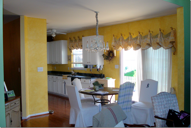
Here is the original kitchen – all bright yellow. Where the chairs are located, in back of the table, is the family room, which has a very high ceiling.
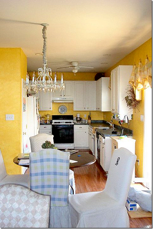
The kitchen was originally U-shaped. The counter on the right is where the kitchen was bumped out 6 ft. Here is what it looks like today. Are you ready?
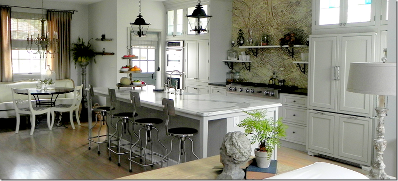
Yes, this is the same kitchen – with an extra 6 ft on the right and 19 ft long. Wow. I told you it’s an amazing difference!!
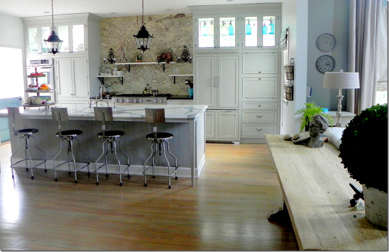
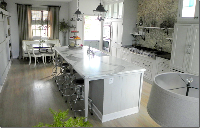
Backing up a bit, this picture was taken in the family room looking into the kitchen. The island is a very large 10’ x 4’. Susie searched a long time to find a Calacutta Ora slab, but gave up when instead, she fell in love with this honed Statuary marble slab with its striking veining. The pieces of slab left over were cut to make the shelves over the cooktop. The island is clad in old barn wood flooring that was leftover from one of Susie’s job. She saw the bar stools on the blog, Velvet and Linen, and its writer Brooke Giannetti provided the source – a medical supply company! The entire kitchen flooring is hardwood, stained a much lighter color than it was before.
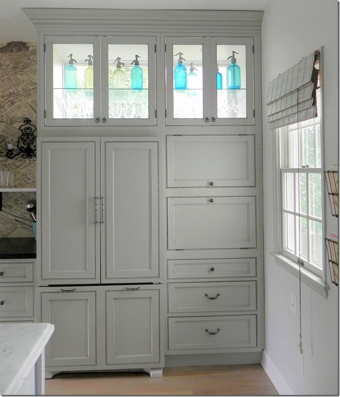
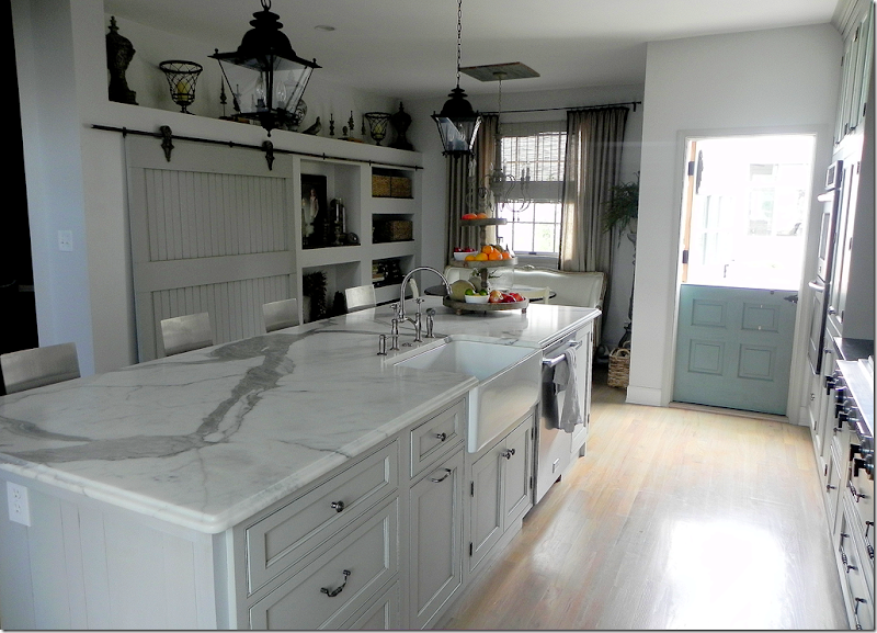
Susie wanted the kitchen flooded in light, but the neighbors are close by. The solution was to install windows behind the custom cabinets on the back wall. Light now streams in from three sides and their privacy is preserved. The turquoise found in the antique seltzer bottles is repeated in the Dutch door at the left, which is also painted turquoise.
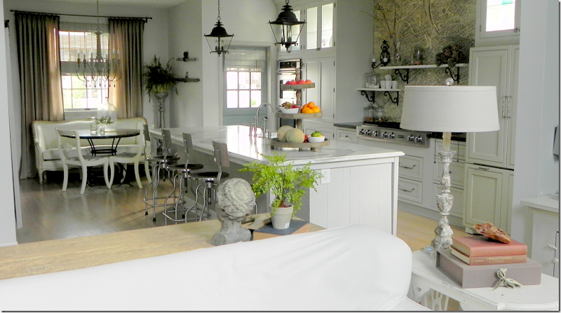
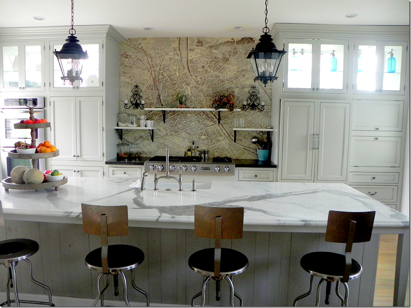
One of the more unusual details in the kitchen is the Turgot plan de Paris map found above the cooktop. Susie says she had first seen the map on a blog and ordered it – all 24 sections of it. It was installed with wallpaper paste and several coats of poly. If Susie ever tires of the map, it can easily be replaced and tiled instead. In this picture you can see close up the medical supply bar stools and the beautiful veining of the marble. Also, you can see the wood flooring that was used to clad the island. For information on obtaining the map, see Pigtown Design’s story on it, HERE.
The refrigerator is hiding behind these custom cabinets. To the right of the refrigerator are more hidden things…
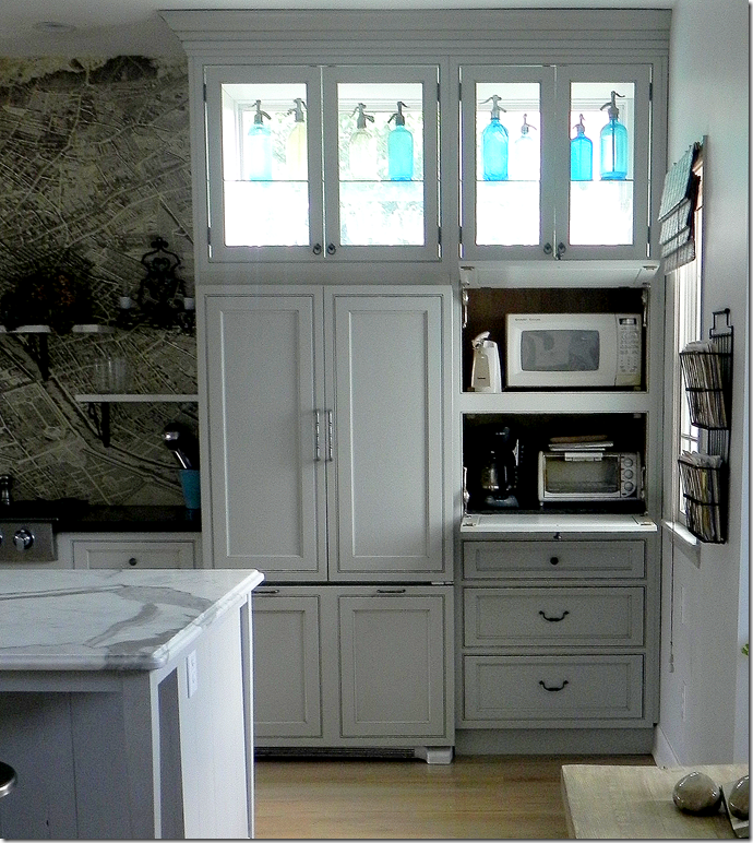
Here, behind doors that swing up, are the microwave, toaster and coffee pot. The door when pulled down actually provides the work surface for the appliances. Hiding all of these frees up the countertop of space and clutter.
A closeup of the Paris map and the marble shelves. The sconces are vintage French and the brackets came from E-Bay.
Looking towards the side door is Susie’s Italian Greyhound, Luna. Since growing up with a Dutch door, Susie really wanted one and found this old one which she refinished – painting it Turquoise to match the seltzer bottles. Susie says the only problem with Dutch doors is there is no screen.
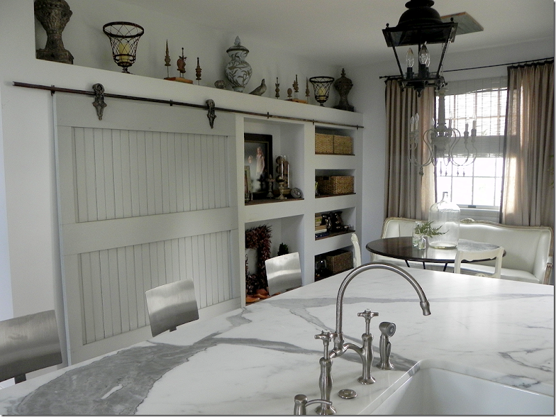
Looking across the island is the pantry – hiding behind an old barn door with its original track and hardware. Susie says she loves the sound it makes when the door rolls open and she can always tell when the children are sneaking a snack! From this view, you can see there is a farm sink and two lanterns from Troy Lighting which brighten up the island. The lanterns are actually for the outside – which is a great way to go when buying lanterns. For some reason, most made for the outdoors are less pricey than those made for the inside.
A closer view of the pantry with the built in shelves to its right. That marble slab is sooo gorgeous!!!
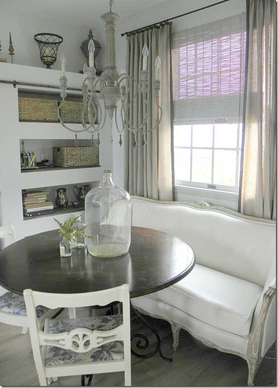
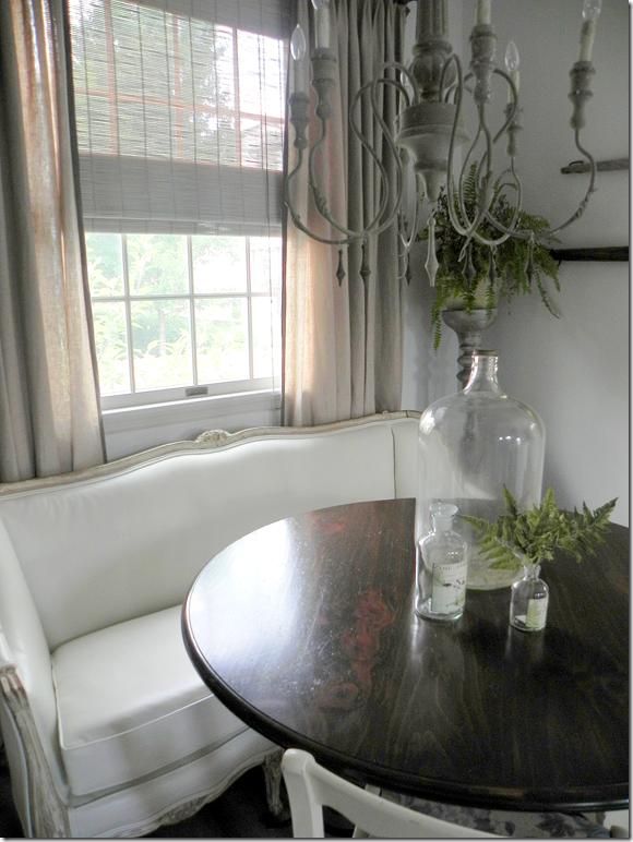
Next to the pantry is the breakfast area with an Aidan Gray light fixture.
Susie found the antique French settee upholstered in a “hideous pink damask that looked like it had spent many nights in a frat house.” Besides the fabric, it was painted tan. She sanded it down to the original gilt and natural wood. Next it was upholstered in white leather – a great alternative to slipcovers and a great idea for kids! Susie says she wants to replace the table with a more industrial one. The chairs, her grandmother’s, will be replaced with Kooboo ones to bring more texture into the kitchen.
The view looking from the breakfast area into the family room with its tall ceiling. I love the limed wood console table that divides the two spaces.
This picture, taken with the lights on, shows up the colors better – especially the Dutch door and the linen curtains.
Susie, thank you so very much for sharing your beautiful kitchen with us!!!
To contact Susie Bohnsack, see her web site Pearhouse Designs HERE.
Readers Kitchens Series #4
Subscribe to:
Post Comments
(
Atom
)





Wow! Nothing not to totally love, its just fabulous and what a before and after!! I love everything from the beautiful pale gray cabinetry, the black lanterns, of course that gorgeous marble, her settee in the dining nook, the map of Paris, which is pure genuis to the beautiful bottle collection. It is all truly spectacular, thank you both for sharing!
ReplyDeleteWhat a wonderful kitchen. The meals coming from that space must be awesome. The function and form are a perfect blend. It reminds me of Ina Garten's barn kitchen, just on a smaller scale.
ReplyDeleteKaren
This is just beautiful. I have had my eyes on those lanterns from Troy Lighting for quite some time. I knew that is what they were as soon as I saw them. Love the brackets of the shelves that look like the shutter holders for shutters on the outside of the house. May have to check those out.
ReplyDeleteThere are so many details about that kitchen that I LOVE. Great feature!
ReplyDeletethe first thing that caught my eye was the map above the cooktop...it's my favorite element because it's so unique and surprising...I love the transformation..extending the kitchen 6ft made such a difference as well as lightening up the color palette..totally significant changes...
ReplyDeletebeautiful decor...
best,
maureen
Beautiful!
ReplyDeleteThat map is such a clever idea! I also loved the seltzer bottles and the ones on the table. I have been hunting the flea markets for them and I just love how she used them in her kitchen. Beautiful!
ReplyDeletehttp://bjdhausdesign.blogspot.com/
Fascinating to see what 6 feet can do!
ReplyDeleteThanks.
Gorgeous transformation! I love everything about this kitchen and the map is a wonderful addition.
ReplyDeletexo,
Sherry
What a fabulous renovation! Bravo to Susie. My favorite idea is the map of Paris. Just love that feature.
ReplyDeleteJoni as always you bring to me my favorite moment of the day...wow I do believe I have found my favorite all time kitchen. BTW I'm here with every post just so darn busy I don't get a chance to say hi and how much you are appreciated for all your efforts to make me gasp with excitement from every post.
ReplyDeleteAmazing the difference 6' additional feet makes! Love the barn door cabinet - have looked high and low to find that door tracking - does anyone have a source for that?
ReplyDeleteit isn't often that i get totally stopped in my tracks. blogland has so many beautiful rooms, kitchens etc. but this one, this one is a gem! i'm in awe. complete awe. do we know the colors? especially of the dutch door! ahhh, obsessed.
ReplyDeleteashley
Susie has exquisite taste. If this were my kitchen, I'd close down the rest of the house, and simply live in this room. This kitchen will long live as a model of perfection. The industrial incorporation is goose-bump worthy. Joni, you've done it again, girl!
ReplyDeletejoni
ReplyDeletea dutch door
and a sliding barn door in the kitchen?
i am in heaven.
xx
What a transformation! Love the barn door look on the pantry and I have always wanted a dutch door. She did a great job.
ReplyDeleteThis kitchen is stunning! so much of what we are looking for in our spaces- light and air!! To the anon above....barn door hardware like that can be found at Tractor Supply.
ReplyDeletealso, the photographs are really wonderful- I just had professional pictures taken of two kitchens I finished and the photos are great, but these are really beautiful.. I am so glad she sent these in to you!
Cheers!
Meredith
This may be my all time favorite kitchen! She did a fabulous job, and her vision for reinventing the space is genius. The windows in the upper cabinets is a stellar idea. I am usually turned off by a kitchen that is too big. This one is just right! Love the floors--they look like they were pickled with a white stain to me. The combination of subtle gray, white and natural textures and colors with just a hint of the RIGHT shade of turquoise is magnificent. Just a beautiful, beautiful space.
ReplyDeleteSigh....absolutely beauiful!!!!!!! I see some things in there that give me ideas for my own kitchen:)
ReplyDeleteGood Morning,
ReplyDeleteFirst I want to thank Joni for featuring my kitchen, to say that I am honored to have her like my kitchen is an understatement.
Thank you for all the wonderful comments. As I did not go to school for interior design I sometimes struggle with confidence issues, so your positive input is amazing to me and gives me the desire to push forward with my business.
The paint colors:
BM White Wisp-kitchen walls
BM Sea Haze- Pantry door
BM Revere Pewter- window trim
BM Sea Star - Dutch Door
BM FieldStone - Family room
Thanks,
Susie
Susie - you've got talent in spades! Love the rolling barn door on the cabinet - clever, clever! Thanks, Joni, for making Saturday mornings fabulous with these delightful creative photos! Happy weekend! xoxo
ReplyDelete*** F*A*B*U*L*O*U*S*O, Joni!!! ***
ReplyDeleteI can't get OVER this TRANSFORMATION~~~ quite honestly, for me, it's just tooooo wonderful!!!
... ANNNNND, that MARBLE... annnnd the MAP... annnnd the DUTCH DOOR... annnnnd THE BARN DOOR.... Me thinketh there's really no need to actually C*O*O*K in here~~~ IT'S A VIRTUAL "FEAST FOR THE EYES", and is SOOOOO OPEN-ARMS-WELCOMING!!!
Please THANK THE GRACIOUS OWNER for sharing the warmth & beauty of her DEEEELIGHTFUL kitchen!!!
Happy day~~~
Linda in AZ *
bellesmom1234@comcast.net
What a great job! The whole kitchen is so well thought out. I just love it.
ReplyDeleteJoni I adore this kitchen. the size, the floors, the lanterns, the bar stools, that shade Sea Star, wow!!
ReplyDeleteGreat job Susie, Bravo!
xoxo
Karena
Art by Karena
One of the best kitchen redo that I have seen featured here. The owner did a great job and used clever techniques to make this a truly personal space. She could have had a screen on the Dutch door if it had been feasible to open to the inside. I love the color and the effective use of repeating it in the seltzer bottles and the use of the upper cabinets as a light source. Very well thought out indeed.
ReplyDeleteIn several recent posts, barn doors were either used in a foyer or in a kitchen. This post shows the most beautiful use of barn doors. It is a unique asset to the kitchen and seems perfectly chosen and placed. They don't often visually compliment the space as we have seen in the past, but this one surely does. I think the beautiful hardware and the painted and unstressed finish is the key here.
ReplyDeleteI like the little kitchen too, the yellow was cheerful. I love the new kitchen. The map is fun and the sliding bead board door is divine. I think this person has a lot of style and made this kitchen, useful and fun as well as beautiful. Great post. Richard from My Old Historic House.
ReplyDeleteI love these before and after stories...what vision and how beautiful the outcome.
ReplyDeleteKaren
Seriously jaw dropping gorgeous transformation!
ReplyDeleteLOVE the use of the huge map .... just think of all of the possible maps/photos/artworks that could be used like this!
susie, thanks for posting the colors! i asked and received! don't second guess your talents. i know how that can be. but truly you did an amazing job. won't be shocked if i see it in a magazine!
ReplyDeleteashley
What an unusual kitchen and I mean that in a very good way. I didn't even realize the lack of windows till you pointed it out. I love the solution they came up with. The map of Paris makes a very different sort of blacksplash...I like it. And love those shelves over the stove. Only thing I would do different is darker floors but I'm guessing the rest of the house has floors this color. This all looks fantastic. Love that marble too. This kitchen is so open and bright. I even like the hidden fridge. Usually, I don't like built ins...I think a frig should look like a frig....I'm very old school about that stuff...but in this case...it is perfect in the design. What and excellent job!
ReplyDeleteAbsolutely beautiful!! I absolutely love the map of Paris, very clever!! I also love that this kitchen shows you can have clean lines without white subway tiles on the backsplash. I am not dissing white subway tiles, but it seems that every kitchen now has them!! I love this unique space BRAVO Susie!!!
ReplyDeleteEverything has a "WOW factor"! I'm drooling over this kitchen and I so wish I could see it in person. Love every detail!!!
ReplyDeletexo
Luciane at HomeBunch.com
Wow! That's like a best of the best kitchen...with so many of the elements we've all grown to love here in blog land: the turquoise dutch door, lanterns, marble, industrial mixed with elegance, the barn door, the chandelier, the linen panels layered over the roman shade, the metal table, the soft grays. My favorite element is the map. I think it's what makes this space most unique! I use the same three-tiered stand as a fruit stand in my kitchen. :)
ReplyDeleteThanks for sharing such beauty!
Happy Saturday!
Linsey
Oops...not a metal table, but lovely nonetheless. Round is cozy (and makes it easier to get in and out of the settee I bet!
ReplyDeleteGreat idea, the map, Marble, barn door all around a grand kitchen. xxpeggybraswelldesign.com
ReplyDeleteBeautiful! Love those barstools. Can you give me some more info on where to get them?
ReplyDeleteWow! What a beautiful kitchen. Love the barn door, dutch door and the cabinets with windows. Especially love the marble island and the MAP. Which version of the map did you order? (Yours appears to be tinted or colored, and the versions on the Pigtown site seem more monochrome) Thanks so much, great work. Cate
ReplyDeleteOh what an innovative and beautiful, practical kitchen!
ReplyDeleteThe glass-backed cabinets were a real inspiration! They remind me of my favorite house-museum in Gloucester, Mass. Beauport! Henry Sleeper used the most amazing ways to bring light to the house !!
Those bring in the light and no privacy is lost!
Also, that is the perfect and appropriate place for a sliding barn door!
The map makes the room!
ReplyDeleteOnce again thanks to all for the comments. I have been walking on air all day!
ReplyDeleteTo answer a few more questions:
The stools were from www.medexsupply.com
I believe that I ordered the map in the sepia tone and then when I did the poly coats it gave it a more tea stained apppearance.
Hi Susie...
DeleteBeautiful job on your kitchen...I love all of it! Where did you get the fabulous 3 tiered fruit stand??? Thanks...Paula (mutzel@earthlink.net)
This is BEAUTIFUL! I gasped out loud when I saw the second photo - the first "after" picture. AMAZING! I love the window/cabinets! The dutch door! The map! IT all goes together so beautifully. Gorgeous job! LOVE IT!
ReplyDeleteWhat a transformation. Love the doors and the map.
ReplyDeleteLove that she can travel, while standing in her own kitchen.
I like how the marble veining sort of looks like the curvy roads (and rivers maybe) on the wonderful map! This kitchen is SO creative. The barn door, the windows behind the cabinets, the white leather (GENIUS, so practical in a kitchen but so pretty on that little sofa) all very, very creative. I like the dark wood of the breakfast table, think I might like that better than a more industrial one that is going to replace it, but the kooboo chairs will definitely be a nice touch. Only think I would do differently, I would not staggert the shelves on the map, but would just have put them one above the other, but that is just a personal preference I think. It is all just so wonderful!
ReplyDeleteI did not see that coming! Gorgeous beyond belief. The windows behind the top cabinets made my jaw drop. I can not help but think there is no way this kitchen could ever be " dated" but I probably thought the same about the "before" kitchen? Thank you for sharing. PS I still giggle every time I click on and see you Jacquline picture:)
ReplyDeleteLove love love. Thanks for sharing.
ReplyDeleteI am quite impressed with the work of this Pearhouse interior designer. It is quite fortunate that I found this site since I am searching for an interior designer and based upon these examples, I'm going to try to get Susie. I imagine she is quite a busy designer, but I'm willing to wait. This work is fabulous. Just fabulous.
ReplyDeleteI giggle too..You look totally adorable.........and we giggle because we love and admire you!
ReplyDeleteWhat an amazing transformation! We love all the white and that gorgeous marble and the little French settee is so sweet at the table. So great! Thanks for the inspiration.
ReplyDeletexo E + J
Now this was excellent design!!!! It flowed, was cohesive, and had lovely elements of surprise. Like everyone else who has posted....it took my breath away. That is saying a lot considering all of the beautiful homes you show us.
ReplyDeleteI do have to agree with Terri on the previous post......I was starting to feel like I was hearing all about the emperor's new clothes..until Terri.
Although a lovely home, it was also created by a designer, so we expect more..right? It takes talent to do eclectic...otherwise it is a mishmash....
Joni, you are the best! Thank you for all that you do to bring so many beautiful, and provocative posts.
Amazing what a few feet will do to a space....love the re-do! Susie - off to see your site.....
ReplyDeletepve
I think I just shed a tear this is probably one of the best kitchen renovations I’ve ever seen. Bravo Susie! I’m totally jealous but in a good way. We gutted our kitchen two years ago and I wanted to shove the back wall out but the husband wouldn’t let me, a little thing like money. I love all the light that’s infused into the room without sacrificing their privacy. I was able to hid appliances but prefer Susie’s lovely cabinets better. Great renovation that I really need to show the husband!
ReplyDeleteWhat a stunning kitchen rennovation! Many thanks for the links to the map sources. I have checked them out and plan to order. I did a double take when I saw the white settee in the kitchen. Thanks for mentioning it was leather. Makes it believable, practical and an idea worth copying.
ReplyDeleteThis is simply breathtaking! The map of Paris is incredible...and how smart to put the windows behind the cabinets! I love all the lightness and whiteness. Gorgeous isn't a strong enough word!
ReplyDeleteCindy @ Notes in the Key of Life
Fantastic job Susie!
ReplyDeleteLove all of the storage ideas and those lanterns...
Just beautiful.
xo
Brooke
Joni... thanks so much for the shout-out on the Paris map.
ReplyDeleteI have the whole map in JPG format if anyone wants it. I've just printed out a couple of copies and am getting ready to paper my guest bathroom with it.
xoxo
meg
Absolutely gorgeous! One of the best kitchens I have ever seen. Using the map is so original, and the windows within the upper cabinets is pure genius! Incorporating the banquette & barn door give it so much character.
ReplyDeleteLove, love, love it!
Catherine
Stunning!!! Love the map idea! Thanks for inspiring my day!
ReplyDeleteVery much in "like" with this kitchen, but not "love". Kudos to the designer; it's an incredibly difficult job designing from scratch. But I've never renovated anything without wishing I could do-over some of my choices, and in the spirit of respectful design discussion (I have no desire to hurt anyone's feelings), I might point out:
ReplyDelete1) This kitchen never met a trend it didn't like: Dutch door and barn door, lanterns and Italian wood chandelier, seltzer bottles and Turgot map, French settee and wine bottle, industrial chairs (and table to come), rustic thick shelving (left side), and kooboo chairs to come. The only thing missing is a zebra rug and feedbag pillows. First, not all trends work seamlessly together, and second, this kitchen risks looking dated (not classic) in a few years if overly trendy.
2) Cover up the left side of the kitchen (i.e. barn door side) in the last photo. Doesn't the kitchen work so much better? Turgot map (genius) with its fine, flowing lines, iron brackets and lanterns continue the airy pattern, French settee and table/chairs are all leggy and light, ditto for the kitchen island legs, the cabinet paint and marble top are light and lustrous. Overall mood? Classic, romantic, Frenchy, feminine, light and airy. Even the industrial chairs, unexpected in context, add a bit of zing because they're leggy, curvy, and feminine, and tie into the stainless steel appliances.
However, I'm not sure the other "design twists" work nearly as well. The Dutch door is too casual compared to the rest (I'd prefer a French door). And the entire left side of the kitchen is jarring. The cabinetry is a completely different height than the right side, appears radically different (the shelving is too thick/heavy compared to the thinner, more elegant marble shelves and countertops on the other side, there's a rustic barn door (why?), and too much open space giving rise to too many flea market-y accessories (compared to the elegant pared down look on the right).
I would respectfully suggest that the left and right sides belong in two different kitchens. Pam Pierce did thick open shelving in her kitchen, but paired it with very rustic cabinetry and heavy stone countertops. Barn doors are fun, but are tricky and need to be successfully incorporated into the design. If you look at Martyn Lawrence Ballard's blue barn door in Joni's recent post (Ozzie Osbourne house), you'll see its presence is balanced with chunky coffee table legs and a comfy substantial sectional, all giving a very casual feel to the space.
If I were tweaking this beautiful kitchen (and it still is, despite my issues), I'd prefer the cabinetry on the left side to resemble more the right side in height and feeling (with perhaps an armoire or a built-in that resembles one?). I wouldn't purchase an industrial table (another trend that doesn't belong here) and would forget about the kooboo chairs (why block the sight line to the settee and its lovely curves?). I'd also uncover the center of the Turgot map (keep shelving to either side). The cabinetry on the right side also feels a little "block-ish" to me -- perhaps exposing the stainless steel fridge (rather than making a heavy cabinet out of it) could improve this? Maybe, maybe not (perhaps it's just the photo angle).
Just an opinion, on an already very lovely kitchen.
Anon 8:48: Interesting thoughts, but I have to disagree with a couple of them. The barn door and the french door were personal choices for her, and to me that's what gives a space some character. Having something unexpected and a little bit different from the design scheme are, to me, what make it look more personal and not a catalog idea book showplace. I'll bet those chunkier shelves make it feel more incorporated into the existing home, so it doesn't look like a completely added-on extension that doesn't connect to the home at all. And the bones of this kitchen are really good, and the things that might seem too trendy and dated are things that are easily changed as time goes on.
ReplyDeleteI respect your nicely worded critique, just offering my differing viewpoint of it.
Absolutely lovely kitchen. I think that the barn door and the dutch door are great complements to the kitchen and work well together. Love the color selections of the doors!
ReplyDeleteThat marble is divine -- just stunning!
One question for Susie -- would you mind divulging the source for the 3-tier cake stand you have the fruit on? It's great!
Thanks!
...perfectly beautiful...but oh susie...keep your gandma's chairs...no one else in the whold world will have them but you...
ReplyDeleteAnon 8:48, while you make valid points about the use of trends, it is very difficult to remodel a room, particularly a kitchen, and not use some trends. Otherwise, kitchens would never look dated and there would be no desire to change a look from time to time.
ReplyDeleteI disagree about the Dutch door being trendy. Dutch doors have been used for hundreds of years in Europe and in fact I have double dutch doors with balconies in the upstairs of my 20 year old home. It was not a trend then and it isn't now. Clearly, there was not room for a French door.
Yes, the barn door is trendy but in this case, it is a unique look which can easily be changed in a few years to doors that match the right side of the kitchen. The cabinets are the same height but do not look like it because of the open shelving - another issue that can be easily modified.
I love the use of the industrial looking bar stools. They are light, airy and don't take up a lot of floor or visual space. I agree with you that Kaboo chairs will be over kill and I certainly would not use them in this situation as the space will begin to look crowded. I also agree that open shelving does beg for flea market finds that don't always do justice to the space in which they are displayed and there are quite a few there already. Here again, the opportunity to modify this is easily accomplished if the owner decides to do so. None of the trends used here are permanent fixtures. What is not trendy is the bones of the kitchen and that is where I think the owner spent her money well and did a good job thinking it through. I tend to agree about the center shelf over the stove only because it obscures what is a very lovely and unique addition to this kitchen.
TAUH
Is there a downdraft behind the cooktop? Just wondering how cooking smells/smoke are vented as I don't see a range hood.
ReplyDeleteAlso...how hard is it to keep the items on the shelves above the cooktop clean? Seems like they would pick up a lot of aerosolized grease during cooking.
Stunning!! This is one of the prettiest kitchens I've ever seen! I will be refering back to it constantly and have added this post to my favorites. Bravo on a beautiful and amazing kitchen design! Vanna
ReplyDeleteHi just wanted to answer some questions.
ReplyDeleteIn response to Anon 8:48 Thank you for the honest critique. I would like to respond to the trend comment though. I would like to point out that my kitchen was completed almost 2 years ago and most of the design elements were planned almost 3 years ago. I also like imperfection in design, I tend to always like something alittle off instead of perfect.
I don't feel that a dutch door is trendy, but is classic. I have loved and wanted a dutch door since I was a little girl, my grandmother had one and I remember opening the top and playing shop with my siblings. So my choice was from my heart and as Anon 1:59 commented there is not room for a french door.
I found the old barn door almost 3 years ago and fell in love with the hardware and finish. I was in the initial stages of designing the kitchen and knew I wanted to incorporate it into the room. It actually was the inspiration for my palatte. Our intention is to one day put a fireplace in one of the larger center cubbies, so I felt the wall needed some weight. While I agree that barn doors are trending now, at the time I decided to use it they were not.
As for my grandmother's chairs you will be happy to know that I had already decided to keep them. As you stated I don't want to interfere with the sight lines of the settee and they are sentimental. I do however want to get a more industrial or simple table to contrast with all of the curves in this nook.
The 3 tier stand was from Vagabond Vintage. However I believe that I recently saw it in Restoration Hardware
The cooktop has a downdraft and I have had no issues with grease buildup, although I do have a problem with my fire alarm going off when I use the grill.
Once again thanks to all for the comments.
Susie
Very nice..
ReplyDeleteThese are wonderful ideas to decorate the living places with different stuff and ways..
Scavenger Hunt Ideas
a wonderful renovation! I love the map as wallpaper and the window shelves... so pretty.
ReplyDeletejoan
WOW! I rarely comment on things I see on blogs, but WOW! Susie, I love your kitchen. You did an unbelievable job. Bravo!!
ReplyDeleteI rarely comment either but WOW! I do love this kitchen!
ReplyDeleteAfter completely renovating my own kitchen just 2 years ago I now see a couple things I would love to do over but that may have to wait a decade now. lol
So many elements in this kitchen just take your breath away, what a transformation! Also, there is no trend here that can't be easily fixed. No tile to have to change out as the map is very original and can be replaced if she ever wanted. The shelves could be removed or changed out also if they dated. The only thing I think that would be costly to replace would be the island top but hey, that is so beautiful who would ever want to replace it?!?
Very nice job Susie!
That is a wonderful example of combining traditional and modern design. The kitchen is so livable. I love the chairs. TY for sharing!
ReplyDeleteTheresa Strickland
http://www.brandwave.org
@ChiefHomeDesign
Beautiful . . . thank you for sharing with us!
ReplyDeleteJennifer
p.s. comments were especially interesting to read as there was a healthy discussion . . . so nice of Susie to jump in and explain some of her design choices.
i agree about anon - he has really been adding great commentary to the discussion. i felt like you did about all the trendy items, the comment about the zebra rug made me snort. but, i'm such a trend hog myself, i can't judge. interesting that this is 3 years old so that some were't trends then. i do see what you mean about the left and right sides of the kitchen - maybe it's because the left side doesn't have cabinetry at all?
ReplyDeletestill, despite the trendy items, i think it's a beautiful, very unique kitchen - not cookie cutter at all. its very original and it's total eye candy.
Wow, there is so much effective info above!
ReplyDeleteBeautiful kitchen! thank you for posting the paint colors. however, unless I just missed it, I don't see the pain color for the cabinets and the island. Would you mind telling us those colors? Thank you so much, and great job on your kitchen! It's stunning!
ReplyDeleteThat jug seems so random to me.
ReplyDelete
ReplyDeleteتيم كلين
شركة تيم كلين
شركة تنظيف بالدمام
شركة مكافحة حشرات بالدمام
شركة تنظيف فلل بالدمام
شركة تنظيف فلل بالرياض
شركة تنظيف شقق بالرياض
شركة مكافحة حشرات بالرياض
شركة نقل اثاث بالرياض
شركة تنظيف بالرياض
شركة تنظيف بجده
شركة تنظيف بالدمام
تنظيف منازل
Beautiful kitchen.
ReplyDeleteLove the Dutch Door.
Interesting comments...