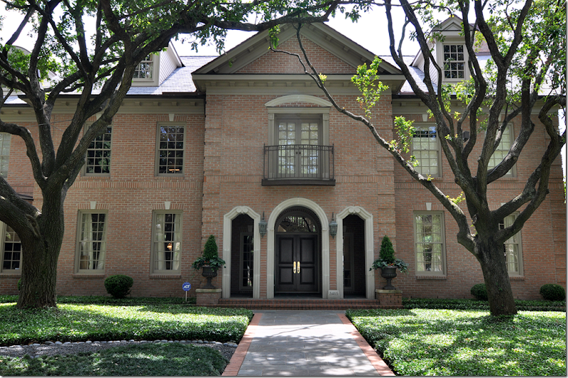
After previously showing a few of the homes on this year’s West University Home Tour – I am so excited to show you one more! I had to wait a while on this one because the house was published in a magazine. But, I have more photographs than they do – maybe not as GOOD as their photographs, but I have MORE!!! As you can see, this is a large house – especially so for West University. The L shaped house sits on a double lot therefore, it is wide and very spacious, another rarity in this neighborhood. The owners moved here from New Orleans after Katrina devastated their town. Their first house in Houston was on a much smaller lot, but even then, it wasn’t a typical West U floor plan – it was very original and also very beautiful. After a few years there, the family wanted more room to spread out – so they moved here, just a few blocks away. The homeowner, Laurie Pearson, is an interior designer and she remodeled many areas – the kitchen was completely redone under her hand. The Georgian house is very sophisticated, yet warm and family friendly. Contemporary art work is found throughout, providing a nice mix to all the French antiques. I hope you enjoy this latest installment from the W.U. Homes Tour!
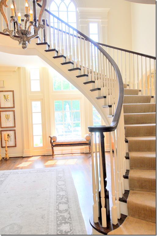
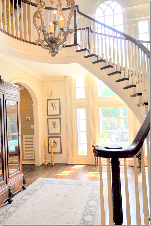
The striking double height entry hall with its floating staircase sets the tone of the house, filled with antiques mixed with contemporary art, it overlooks the backyard pool.
Through graceful arches, the living room is to the right, while the dining room and the family room are to the left.
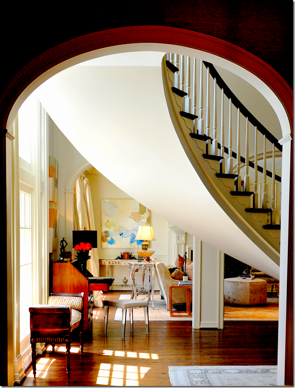
This picture, taken from the family room’s hall, looks into the living room. You can partly see the dividing wall between the entry and the living room with its three graceful arches. I love the way the curve of the stairway looks from this angle. The stairs are so gorgeous, they are truly the focal point of the entire house.
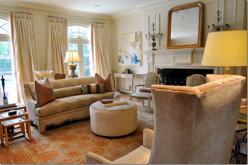
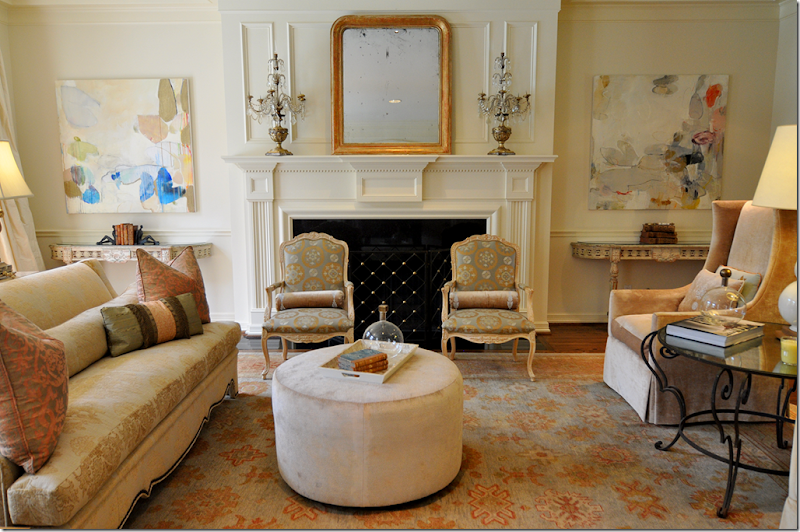
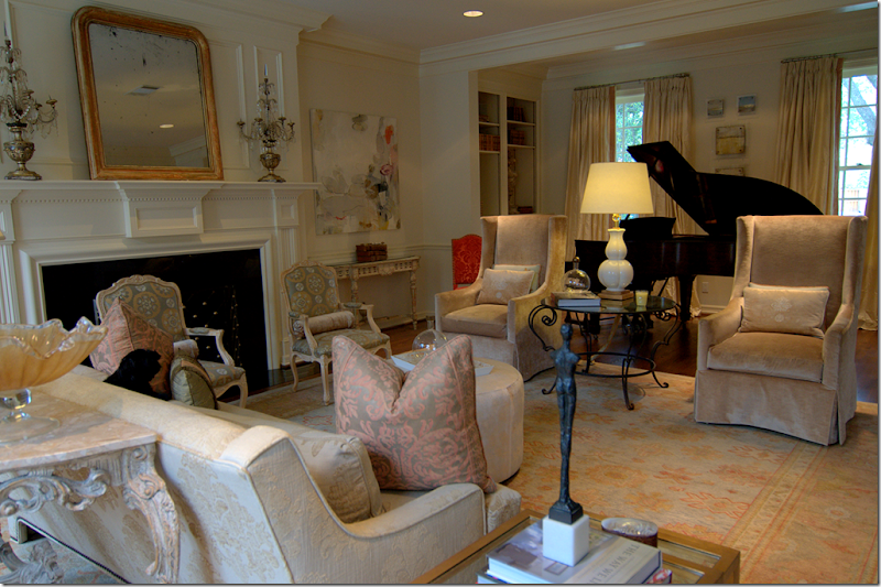
The living room is filled with soft colors taken from the Oushak rug. Fortuny pillows mix with luscious silk curtains and velvet clad chairs.
Flanking the gracious mantel are painted antique consoles topped by contemporary artwork. A velvet ottoman takes the place of a coffee table.
There is an alcove, with a piano and bookshelves, that faces the front street.
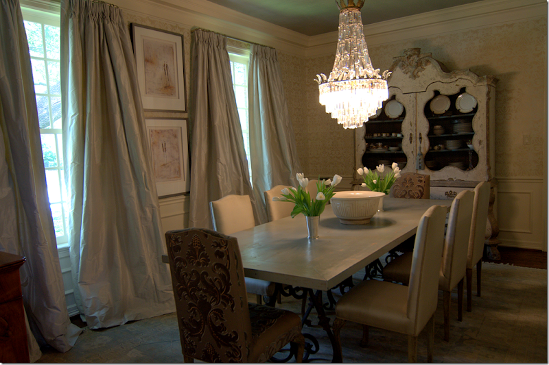
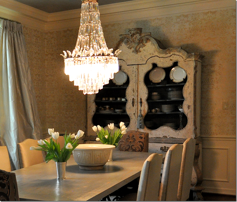
Across the entry hall is the large dining room. This is one of my favorite rooms in the house. The silk curtains are fabulous – I love the way they drape and fall, just slightly, very slightly in a short puddle on the floor. The wood topped table has a French scrolled iron base. Again, there is a muted rug underfoot.
Here’s a closeup of the most gorgeous painted armoire! I absolutely LOVE this piece with its screened doors and curvy lines and just a hint of blue paint. I want to steal it!
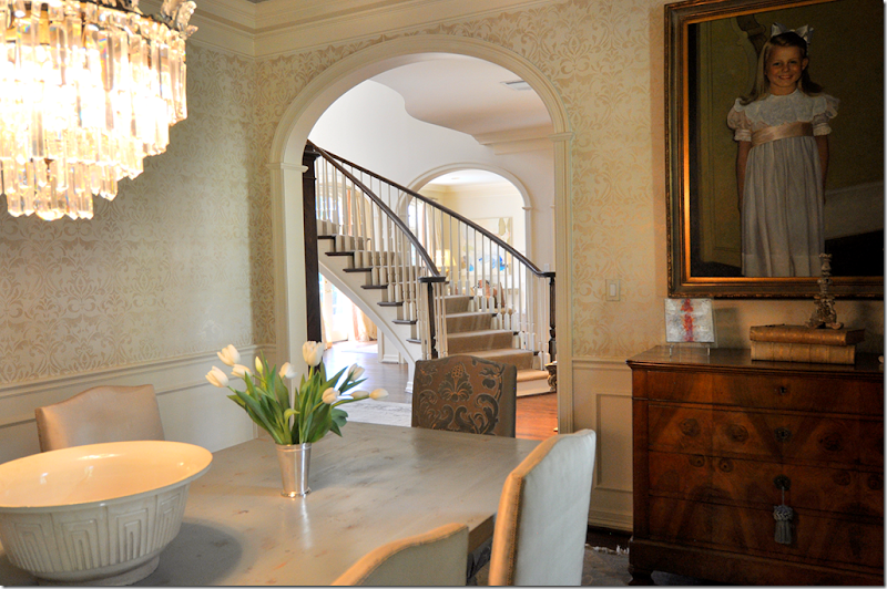
The view back towards the entry hall and into the living room. A daughter’s portrait sits over the chest.
Another view showing the icy blue curtains.
Here is a close up of the wall treatment. Not wallpaper, the walls were handpainted in a damask pattern by Segreto Finishes HERE, the ceiling was done by Imago Dei, HERE.
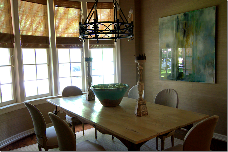
Past the dining room is another eating area off the kitchen. This room faces the front street, you can actually see my car in the glare of the painting! Sorry there is such a glare (I guess that’s why you need a professional photographer!)
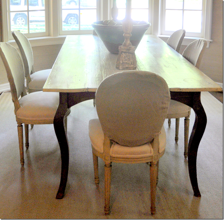
Notice the way Laurie slipcovered her chairs, just the back is covered in a linen. It’s subtle, soft, and pretty! The walls are a grasscloth paper and underneath is a textured, herringbone patterned rug.
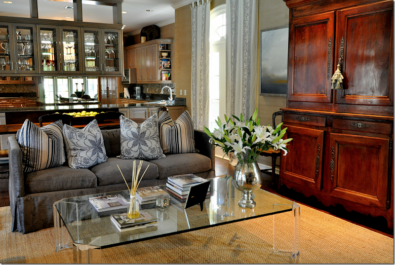
The kitchen was completely redone by Laurie. The cabinets are stained a light color and the glass in the upper cabinets opens the kitchen to the family room.
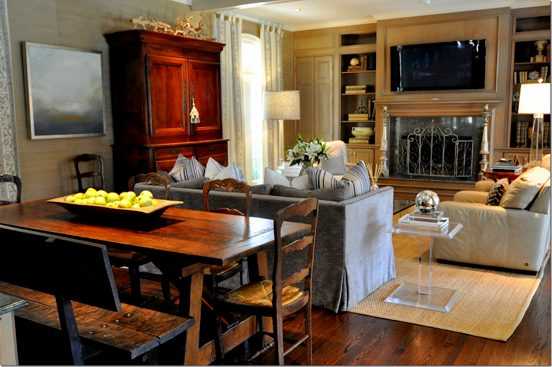
The family room is done in a soft gray blue with touches of cream, a color scheme that flows throughout the house. There’s another eating area behind the sofa. The focal point is the gorgeous antique Buffet a deux corps.
The sofa is filled with a mass of patterned pillows.
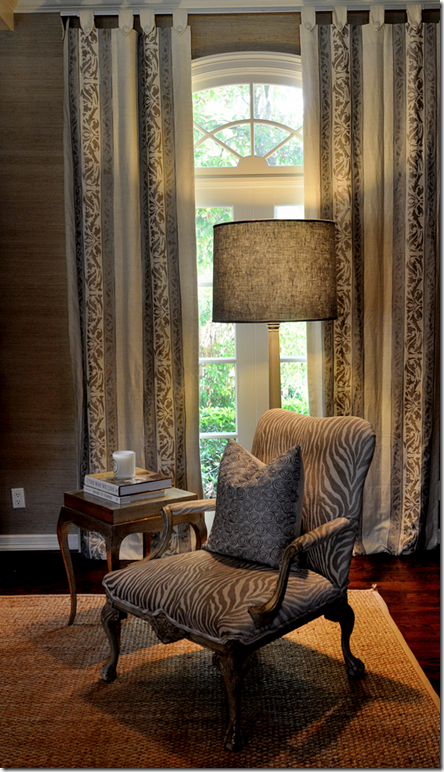
Here is a closeup of the linen curtain fabric.
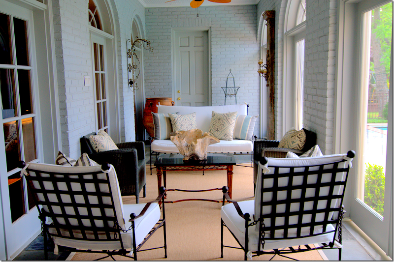
Off the family room is this large screened porch which overlooks the pool.
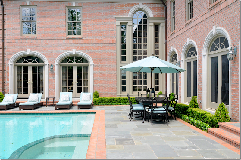
The back yard has a slate terrace along with a large swimming pool. Box surrounds the windows. In this picture, you can see the distinct L shape of the house. The living room is at the far left, then the two story entry hall is at the corner. To the right is the screened in porch which is parallel to the family room. All main bedrooms are upstairs.
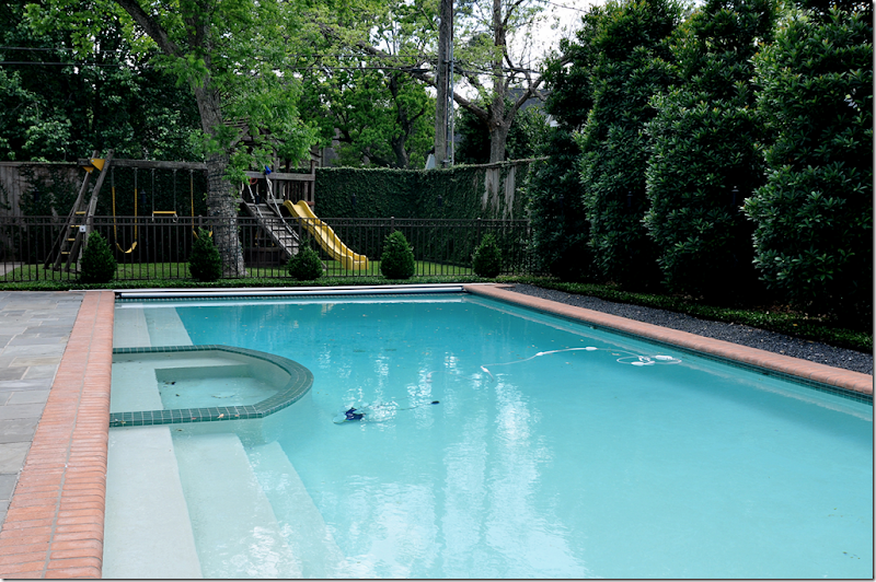
Behind the swimming pool is a large play area, nice!
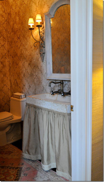
Off the family room wing is the powder room with its concrete sink. The skirt is trimmed with a Greek trim pattern.
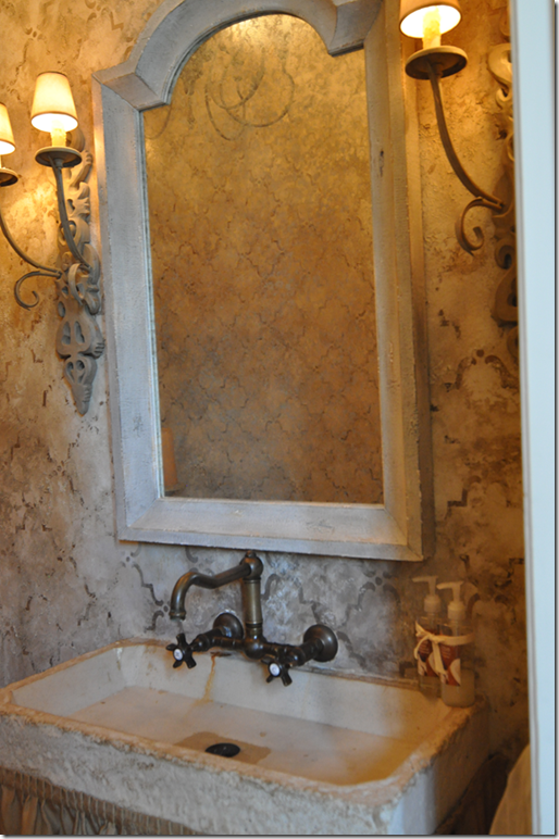
Close up of the hand painted wall treatment by Imago Dei. Love the wall hung fixtures.
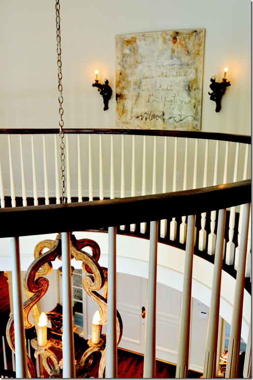
Going up the stairs, you can see part of the wall to the living room with its three graceful arches.
The curved landing overlooks both the back and front yard.
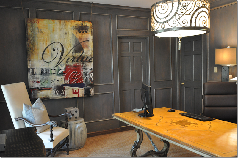
Upstairs, the man’s office is done in the same gray blue found throughout the house, but the shade is much deeper here. The Italian styled desk mixes with the contemporary art work and light fixture.
The art work, Virtue, is perfect for a man’s office. Now, if only all executives had those words in their office! Love the oversized die on the garden stool.
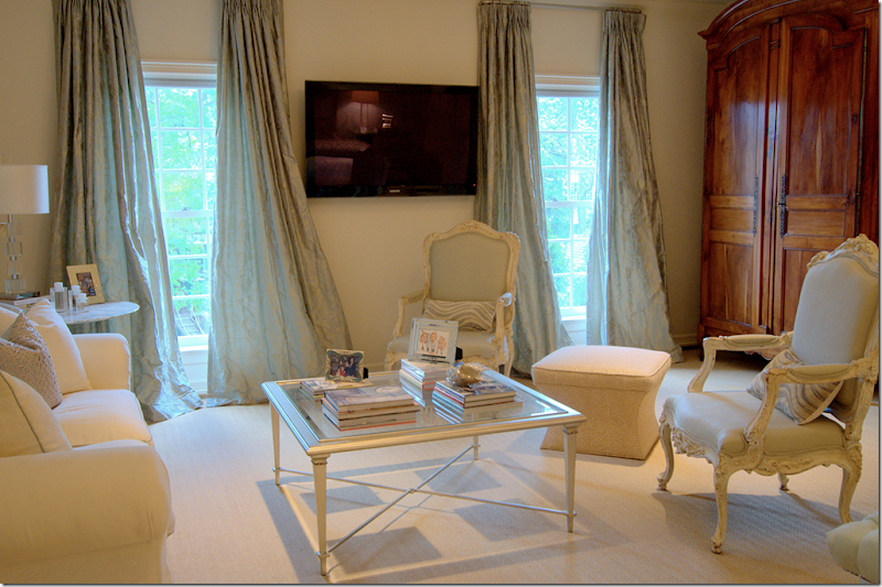
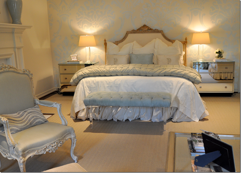
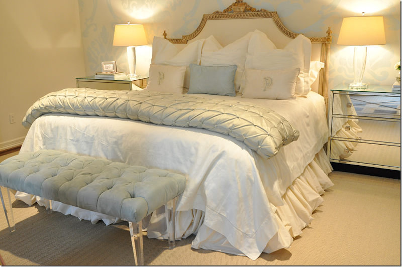
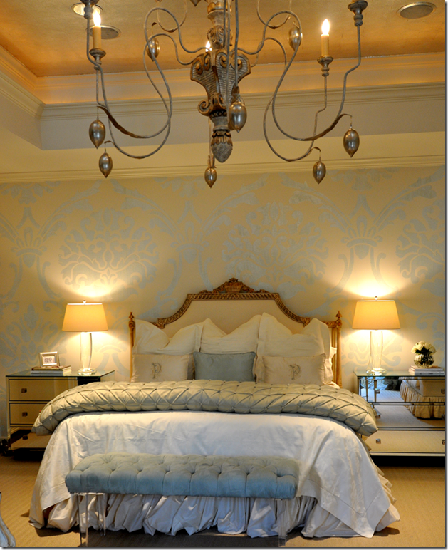
The master bedroom with its sitting area is another favorite space of mine. The antique French armoire mixes with contemporary furniture – a marble topped Saarinen table, mirrored nightstands and an acrylic bench. The light blues and creams are so soft and restful – perfect for a bedroom. The cream sofa is trimmed in the same blue as the silk curtains.
Beautiful! The walls are hand painted in a large damask pattern by Imago Dei. Love the bench!
Closeup of the gilt headboard and linens. The headboard is so gorgeous. Just gorgeous!!!
A glimpse of the Italian wood chandelier hanging from the vaulted ceiling.
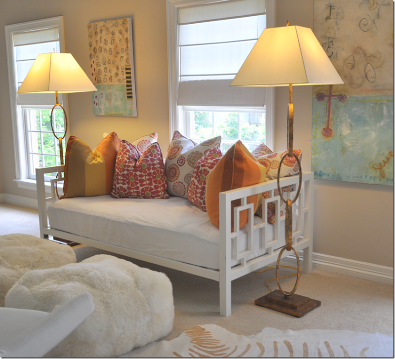
Off the children’s rooms is their playroom – with its day bed filled with colorful pillows. Great lamps!
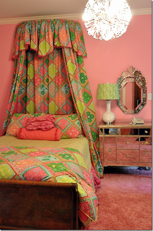
This deep pink bedroom with shag carpet mixes an antique bed with mirrored chests.
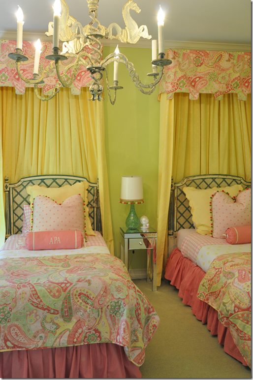
This bedroom has a matching color scheme, with the lime green on the walls.
Classic caned beds are mixed with bright contemporary colors. Cute bobble trim.
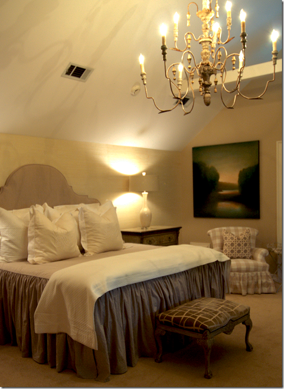
Of course there’s a guest room with a wood chandelier hanging from the vaulted ceiling over a slipped covered headboard and bedspread.
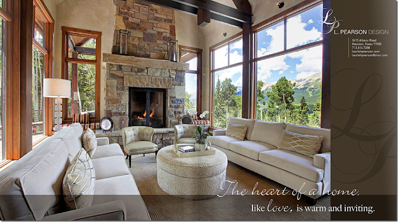
Finally, an ad featuring a mountain house designed by L. Pearson Design, Laurie’s company. To see her web site, go HERE.I hope you enjoyed touring this beautiful house in West University, a tiny town inside the city of Houston. Laurie’s house is certainly different than the typical slipcovered/seagrass look of many Houston houses. Hers is gracious and sophisticated and shows how beautifully antiques mix with contemporary art and furniture. Notice how almost each room has one large antique piece, an armoire, a console, a buffet a deux corps – showing that a lifetime of slowly collecting antiques will provide a great backdrop that will move from house to house. I thoroughly enjoyed visiting with Laurie in her house. She is a friendly host and a warm personality, with an obvious love of family. Thanks again so much Laurie!
AND….The new book by Leslie Sinclair – arrived today at my house, brought by an elf!
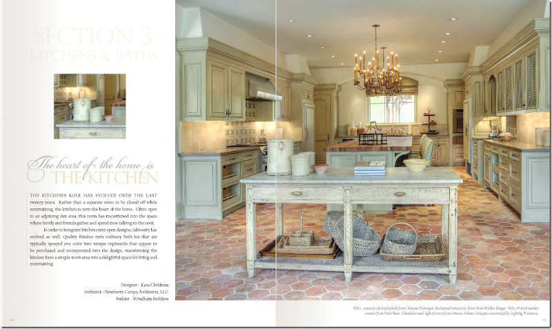
A page from Sinclair’s new book, here featuring a kitchen by Cara Childress. Gorgeous!!!!!!OMG, OMG – Leslie Sinclair surprised me today with a copy of her new book and I was floored. It is without a doubt the prettiest design book I’ve seen in ages!!! Prettier than any other design book I could name. I HIGHLY, HIGHLY recommend it. Get a small taste of the book to whet your appetite HERE. To order the book, go HERE. Check out the preview for yourself, you will love this!
West U Home Tour–One More!
Subscribe to:
Post Comments
(
Atom
)








This is the best house I've seen in a while. It is such a lovely mix of antiques a modern art and accessories. But those STAIRS!!!
ReplyDeleteBreathtaking home. Any idea when it was built?
ReplyDeleteThanks so much for sharing your photos.
I think what is so impressive to me is the art work. This home had some beautiful original art. Also the hand painted walls. I am an artist and appreciate original art.
ReplyDeleteBy the way Joni, I am almost done with my living room. I did give in a little to my husband. I will send you the pictures.
I love love love all of the color in this house... thank you for sharing..
ReplyDeleteBreath taking! Thank you for sharing, going to scoot over and check out the book. Thnsk you for sharing.. hugs ~lynne~
ReplyDeleteDIVINE....that is the first thing that comes to my mind!! This is all simply and elegantly divine!!! I could live here happily ever after!! Thanks so very much for sharing! I'm almost praying my daughter and her husband get transferred to Texas!!! No matter...I will be visiting before too long!!! You have way too much to offer us in the way of design, furnishing and definitely blogging!!!
ReplyDeleteCarolyn Bradford
mulberryheightsantiques.com
I LOVE the room with the piano and the mirror! Such beautiful rooms, Joni.
ReplyDeleteThank you for sharing.
Teresa
xoxo
Hi Joni,
ReplyDeleteFor some reason I am not feeling the Laurie Pearson house. She is obviously very talented and that staircase is stunning, but the decor seems a little schizophrenic. I feel bad saying that - somehow the balance does not seem quite right, with too many mixed metaphors - modern, rustic, french country, elegant traditional, edgy, neoclassical. I dunno. I think the abstract painting hanging from a picture rail looks a bit ridiculous, too affected.
This is eclectic gone wrong somehow despite all her beautiful things. The kitchen light fixtures are so wrong for this house...
But what do I know. I live in a modest house and don't have nearly as much money to spend as she clearly has.
So many beautiful elements and a lovely foundation, but it just seems too mishmashed. I do like the vignette of the animal print Louis chair with the linen drapes.
Cheers Terri
I'm really digging that dapper gentleman's study.
ReplyDeleteVirtue indeed....good stuff.
Cheers, Alcira
nerochronicles.com
I am a big fan of your blog. I love the design and the images are large and clear. And not to mention the quality of your articles. More power.
ReplyDeleteTerri,
ReplyDeleteThis home belongs to a woman who has graciously opened the doors and invited us in to be a guest. Would you go to someones house and tell them that you don't particularly like their home? I am sure you wouldn't. It's not appropriate here either.
My favorite aspect of the house is its architecture, beautifully proportioned, elegant and very inviting. thanks for the tour. truly enjoyed it
ReplyDeleteThis is my favorite home I've seen you post! :)
ReplyDeleteLovely! I preordered Leslies book can't wait for it to arrive! Wish Pam Pierce would do one!
ReplyDeleteTina Ramer
This is a gorgeous home and I noticed there was almost every design element in it and it works! Leslie did a wonderful job of making a very inviting and what looks like comfortable home I could move right in and be happy. Lucky you to have received her book already that was a very thoughtful gift!
ReplyDeleteWow wee...so much to love! I was taken with the mix of styles used in the home and in particular the living room and how successful it was. Love that master bedroom..totally dreamy and all the bedrooms in fact. Living and dining are both exquisite as is the actual architecture of the home, pool setting included.
ReplyDeleteI must get her book being the design book junkie that I am, looks like a good one!
Will go to Amazon now..thanks for the intro!
My favorite was the artwork. I found the mixture of antiques, contemporary art and furniture so interesting. A beautiful home and even better since the pictures are so large to view.
ReplyDeleteGreat post.
I have to agree with Terri. No offense to the homeowner, but it's just not my (or Terri's) taste.
ReplyDeleteKat
I have the same headboard as the one in the master bedroom although mine is stained. I have considered removing the basket of flowers at the top and having the stain either painted or glazed to soften the weight of the piece. My upholstery on the headboard is tufted. When I bought the headboard many years ago I stored it until time to redo my bedroom and by that time my taste had changed and I wasn't as enthralled with it as before. For anyone interested, the headboard is from Louis J. Solomon & Sons. Beautiful home, especially the entry and foyer.
ReplyDeleteThe Anon you Hate
thank you so much for bringing this to us. LOVED it!
ReplyDeleteThe gorgeous silk drapes belong in your infamous curtain post...PERFECT. The first thing I noticed in the pictures.
ReplyDeleteThank you for sharing!
Hi Joni, BEAUTIFUL! Here's what I love about this house, unlike Pamela Pierce's rooms - which are drop dead gorgeous - you can tell a family lives here! You can feel the warmth, it is beautiful but feels "real". Thanks for sharing all these beautiful homes with us!
ReplyDeleteLovely house! It's warm, inviting and very unique. I particularly love the wooden chandeliers in the bedrooms. Must find one!
ReplyDeleteSo in love with the Master bedroom Joni! Luscious! Oh and the screened porch is another favorite room.
ReplyDeletexoxo
Karena
Art by Karena
another fabulous home tour..and I can't get over how well designed this home is with the stunning bollowy curtains and gorgeous furnishings..love the powder room on the main floor...the wall treatment is divine...
ReplyDeletebest,
maureen
This house is beautiful but is it just me or does it seem excessive?? Where are these people getting so much money? I usually love these pictures and they are inspirational but this seems like too much stuff.
ReplyDeleteI absolutely love that house! From the stairway, to the bedrooms, to the screened in porch (which I want), to the pool (which I want too)! A very very nice combination of styles and textures. And Joni you are right, that headboard is gorgeous!
ReplyDeleteThe staircase design is divine! Yes - the painted armoire in the dining room is sensational! What I like the most about this home is the homeowners use of monochromatic rooms as well as the liberal use of colors in others. The play area for the children in the backyard confirms family living with substance and style. Thanks, Joni & the gracious family for sharing. xoxo
ReplyDeleteHi Joni,
ReplyDeleteI LOVE this house it's just beautiful!
Whenever you don't post I really miss you, five days of my checking 2-3 times a day ;) This house was worth the wait!
I would love to know where to buy the floor lamps in the children's playroom. Does anyone know?
My bedroom reading area is begging from them....Help!
Interesting that after so many pictures and comments about painted kitchen cabinets that this owner/designer chose to do a stain. I recently was reading an old post about design magazines showing pictures of houses that failed to impress or were a mismatch hodge-podge...this house really shows how to do the mixing well, i think. I thought it was beautiful and most of all-personal! I especially love all the finishes and textures....thank you for giving us a glimpse! Cheers!
ReplyDeleteMeredith
I must agree with Terri. Too much going on. Too many styles mixed together. The house is pretty and personalized to the owner's taste. It doesn't work for some of us.
ReplyDeleteI really love the Virtue artwork. Is this an original art work or is this something that you have information about? I would love to know where it came from.
ReplyDeleteAlso I love the pink paisley in the little girls room. One of my girls rooms is done in that same color green with the pink paisley fabric covering her upholstered daybed. What a coincidence.
So I need to know where to get the fabric for those curtains! I'm remodeling my parents home and love the fabric and style! Was it in Houston?
ReplyDeleteThe perfection of the imperfect antique mirror over the mantle pales only to the gorgeous silk curtains. I found a pair in ice house blue that are on my gotta have it list.
ReplyDeleteBeautiful examples as always.
Best regards,
Darleen~Places In The Home
The curtains are almost comically bad. The look like MC Hammer pants.
ReplyDeleteLovely home - so elegant yet looks comfy and liveable.
ReplyDeleteThanks-you thank-you once again for a fabulous post!
I too want to know where you can find those floor lamps in the children's playroom - also the DAYBED. Anyone know?
One of the best living rooms ever. Love seeing the modern artwork. BTW Joni, speaking of artwork, your shot of the LR from the FR hall is beautifully composed! Great job.
ReplyDeleteJoni thank you for such an extensive tour of this beautiful home. I love all the touches and her use of color upstairs. It looks like a well designed home that a family can live in, not a show house, I love that!! That is what I call great design!! The book looks very interesting!! xo kathysue
ReplyDeleteAnon 12:08, I would agree with you that the curtains are overly full for the size of some of the windows or either they were fluffed and allowed to fall in place as you see them for the photos.
ReplyDeleteThe one thing that is more distracting is how they look as you approach the outside of the home. In the case of one of the windows on the left, a portion of the glass is almost entirely closed off while the upper portion is more open. Then the window treatments of the upper windows are not consistent. When selecting how to design your window treatments, it just as important how things look from the outside as on the inside. Consistency always looks better especially for the front of a home.
WOW, beautiful! Where did you get that beautiful light fixture in the office??? AMAZING! I love mixing some modern touches in a home. Beautiful!
ReplyDeleteI agree with you Joni the cabinet in the dining room is TDF. I love real. old painted pieces. They just add something special to a home. So hard to find. I think the owner has a great eye and a love of a lot of different styles and mixes them well. I have never had that nack. It takes a special person to pull it off. It certainly does not leave you bored. So much fun. Richard from My Old Historic House.
ReplyDeleteThat is just a beautiful home. The stair case is a show piece. I love how it swirls and creates an architectural piece. The little girls room with the paisley is sweet. TY for sharing.
ReplyDeleteTheresa Strickland
http://www.brandwave.org
@chiefhomedesign
Joni, I could surely take that armoire home also. Fabulous. Beautiful home. Also would like to relieve them of the concrete sink. Do you think they would miss either? I so appreciate them opening up their home for us to see. The homes you post may or may not be our taste but we need to remember that these homes are decorated to the owner's taste, not ours. We need to appreciate and value the time, money and effort the owner goes into decorating each space and keep your very critical comments to yourself. It isn't necessary for us to live in it, just appreciate it and have a respect for the owner's feelings. Thanks for the great post.
ReplyDeletedeanie
A lovely home designed by a lovely lady! My favorite detail is probably one of the simplest: the monogrammed pillows in the master. I love those thoughtful finishing touches!
ReplyDeleteSo happy for Leslie! Can't wait to see her book! We have some awesome talent here in our hometown, don't we?!?!
xo,
Linsey
Joni, thank you for the tour of this beautiful home! I like so much that it seems REAL and lived ion and not staged. I like her taste, it may not be for everyone but neither would my house:):) I love people who do what THEY love in their home and don't follow fads or trends. Thanks again. XO, Pinky
ReplyDeleteIt's a whole lotta house with good bones. I love the staircase! There are some great pieces throughout, and it looks warm, lived-in, collected over time, relatively kid-friendly, and tied together in its current decorative state.
ReplyDeleteThe icy blue color makes an appearance in all of the common areas that Joni showed. Laurie's "collection" may be why some feel that the decor is random/busy/mish-mashed. Maybe she likes different styles and this is her way of combining them so that she is surrounded by that which she loves. If so, then good for her! No need to please the masses. Just pour the wine, stick the straws in the juiceboxes, relax, and enjoy!
As a side note, I don't think that it is any more "sinful" to criticize a home tour than it is to criticize a designer's body of work. Even Joni isn't a fan of every aspect of every space that she blogs about. Laurie and her home aren't sharing the "stage" today, so the comments do seem more personal (although I doubt that they are personal). However, many samples of Pam Pierce's work were featured in the previous post, including...get ready for this...RESIDENTIAL PROJECTS (= individuals' homes). And there were "ooh's" and "boo's" that followed. So, those comments were more widely distributed and seemed less personal (again, I don't think that they were personal at all). When you really break it down, are the two scenarios any different???
I say "horses for courses," keep it constructive, and keep it moving.
Absolutely stunning house. I loved it. However, and this is only a photo-styling issue, I could not get past all of those karate-chopped down pillows! I just wanted to go around and pull the upper corners and fluff them up again. I could just picture someone going around and giving them a good "Hi-Yah!" It just doesn't seem natural for pillows. Beautiful house though.
ReplyDeleteHonestly? Not really my taste. I like many things about this house, especially that master bedroom. That's my very favorite room in the house. But other than that, I think I'd feel a bit too tired of all of that fabric (everywhere). It feels heavy too me. I like places I feel I can breathe... too much of heavy fabrics makes the air feel dusty, just too much. Some balance would be necessary.
ReplyDeleteHaving that said, I need to see that book! Whoa! That kitchen is fabulous!!!! SOLD! :-)
Have a blessed weekend!
xo
Luciane at HomeBunch.com
Hi Joni,
ReplyDeleteNow you have these lovely big posts with bigger pictures than just about anyone and NOW we have to read all the comments as they are almost as entertaining as the post...my goodness girl how do you do it?!
The staircase is gorgeous...the exterior very soothing, the rugs...ah to not have a bunch of dogs...loads of great ideas...people should just enjoy the aspects they like...all the best until the next!
Thanks to Joni and the home owner, I very much enjoyed the tour, it's a feast for the eyes.
ReplyDeleteThat house is gorgeous, and I especially covet the staircase, curving gracefully through the centre of important spaces. It's like a giant sculpture.
ReplyDeleteI LOVE the artwork in the living room. Would love to know the artist.
ReplyDeleteSo much to love about this home. Enjoyed their choice of art and lighting. The master bedroom is perfectly luscious. Thanks for what you do, Joni.
ReplyDeleteSo much to take in and fall in love with ... the dining room is beautfiul and I love the chairs in the additional eating area ~ would love them for my home. The master bedroom colors are so soothing ... a perfect wait to start and end a day.
ReplyDeleteJo
Wow, love your design aethetic, your use of luxurious fabrics. The kids rooms near the bottom are a liitle bright for me however and the bed heads are not quite scaled correctly.
ReplyDeletei like you decors its Royal look
ReplyDeleteGoodness, there's a great deal of useful info in this post!
ReplyDeleteThose children's bed are marvelous.
ReplyDeleteLoved the glass uppers separating the kitchen from the family room!
ReplyDelete