Continuing with the series Readers Kitchen, today we have a newly remodeled one to show. Enjoy!
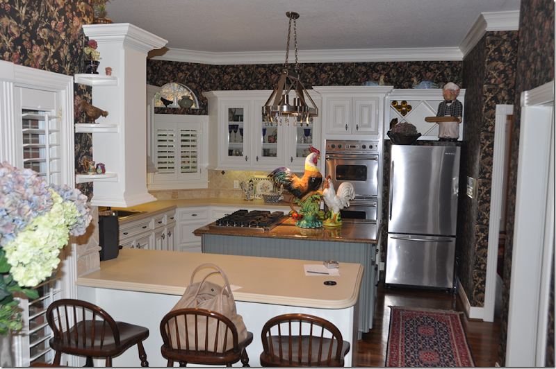
BEFORE: This kitchen had lots going on creating a busy looking design. Elements that added to the business include: dark wallpaper, ivory countertops mixed with the dark stone topped island, and a collection of brightly colored roosters. More business comes from the angled wall – with three arched windows. While the wallpaper seems dated, I do like the painted beadboard island and the tumbled tile backsplash. But, the homeowner wanted something totally different – something quieter and more sophisticated.
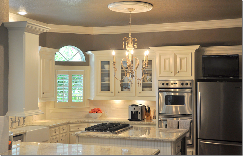
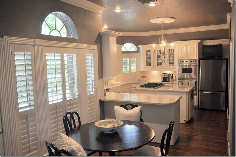
AFTER: Wow, it’s hard to believe it’s the same space. It looks so sophisticated now. The different countertops were replaced with granite. I love this light colored granite. It’s a great substitute for those who desire the white marble look but want the ease of granite. Granite is one of nature’s hardest stones, so it really takes a beating in a hard working kitchen. The backsplash was replaced with a cream colored subway tile, simplified from all the different sized tumbled tile of before.
In this view, you can see the angled wall with the three arched windows. All the appliances were stainless before, so those didn’t need to be changed. Nor did the cabinetry. Not changing out these two things was a huge savings in the overall cost of the remodeling. The biggest change after the countertops is the dark painted walls, replacing the even darker wallpaper.
Looking from the breakfast room, another change is the wine rack above the refrigerator was removed and a flatscreen was placed there instead. Over the island, a wooden Italian styled chandelier was added. This one looks like it might have come from Aidan Gray – they make a number of these in several different styles. With all the roosters gone, the kitchen is sleeker looking and less country.
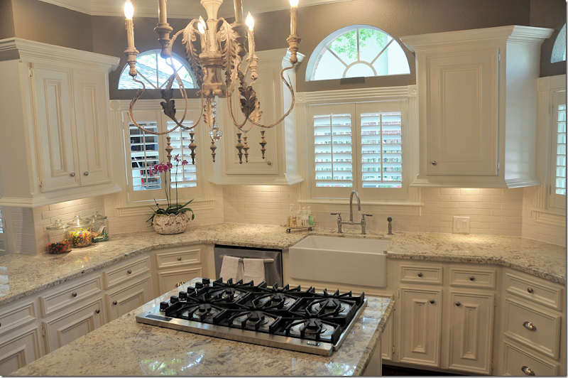
Another big change was the addition of the farm sink with a new plumbing fixture. New pulls – a combination of round and bin pulls were added. In this picture, you can see the granite up close.
Along the back wall, the butlers panty was updated with the granite and subway tile.
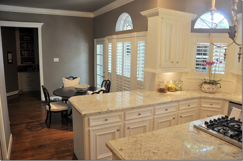
This view shows the adjoining breakfast room.
A few last changes are the counter was extended in between the kitchen and breakfast room, allowing for bar stools and the row of small shelves next to the counter was removed – further streamlining the look.
This kitchen was certainly usable and not that dated in the before picture. The main problem was the dark wallpaper which made it seem like it was designed in another decade. The homeowners probably could have just replaced the wallpaper and called it a day, but they went a step further and replaced the Corian with granite and the tumbled tiles were replaced with subway ones. These changes made a huge difference in the design. Luckily, the appliances and the cabinetry didn’t need replacing, which kept costs down. The only changes to the cabinetry were the removal of the wine rack and the small shelves that ran up the wall in between the breakfast room and kitchen. The sink was a costly change, but again it really updated the kitchen and ties it in with the beadboard island. Finally a trendy light fixture is an unexpected touch, yet it adds to the new look of sophistication in this once busy, but now much quieter kitchen!
A huge thank you to the homeowner who graciously agreed to share her new, beautiful kitchen with us!
More Readers Kooboo Chairs:
I still get pictures from homeowners showing off their Kooboo wicker chairs. Not that I blame them! I like to show mine off too. Below, are two homeowners with their newly purchased Cost Plus World Market Kooboo chairs:
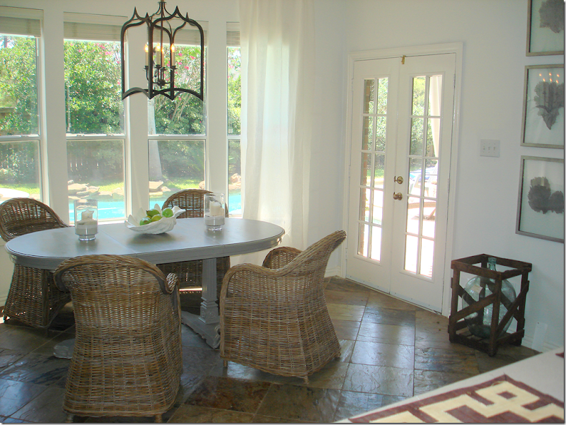
This homeowner used four Kooboo chairs around a gray painted table. I love the lantern mixed with it and the soft linen curtains. It’s such a mixture of textures, which creates the interest.
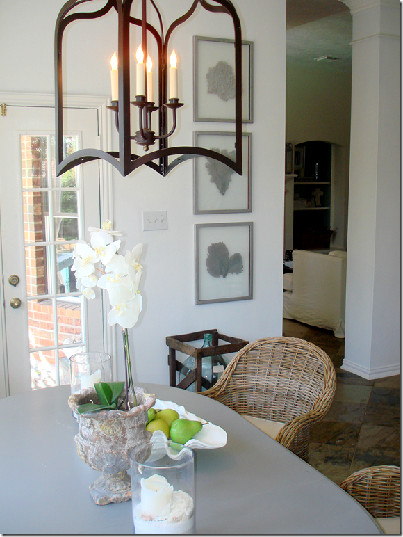
Looking the other way – I love the set of framed leaves.
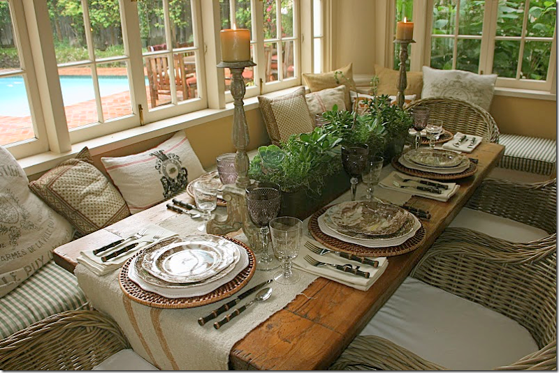
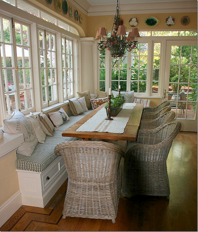
Delores Arabian who writes the wonderful blog Vignette Design recently bought her Kooboo chairs for her breakfast room. I love the way she styled her table with the linen runner. Sooo pretty!!!!
Her house is so beautiful. She’s lucky to own two – this, her main home and her vineyard home in Sonoma. Delores is really talented and her houses show this. Her blog is very interesting – highlighting her two different lifestyles – one in the city and one in the country. If you don’t read it, you should HERE.
READERS KITCHEN SERIES #5
Subscribe to:
Post Comments
(
Atom
)




I am a big fan of Delores's blog and beautiful home, I just love her style! That kitchen transformation you showed us WOW stunning! LOVE the new chandelier over the island. Martina
ReplyDeleteLove Delores' room the most....that table is fabulous. Of course the round rattan place mats and faux bamboo silver ware are great finishing touches! Would love to see some of my new Europhile pillows in there!
ReplyDeleteI'm lovin' Delores's seating area.
ReplyDeleteAmazing difference here, Joni! Fabulous job! Love the kitchen and the chandelier!
ReplyDeleteThank you for sharing and have a wonderful day.
Tereas
xoxo
Love the kitchen transformation! I am definitely one who is nervous about marble in the kitchen, so I enjoyed seeing her use of the light granite. Such a timeless design, and the chandelier is fabulous. I would love to show you my kooboo chairs, but not after seeing the two beautiful dining areas featured here! Off to check out Delores' blog... Thanks, Joni!
ReplyDeleteThat sunroom is is to die for! I assume from looking at the windows, that this is a relatively older home?
ReplyDeleteGreat kitchen updating for sure~loved the changes! I also think that Delores sunporch with table and chairs is to die for!!
ReplyDeleteThe kitchen looks amazing with very few changes. I love the uncluttered look the owner has now achieved. I suspect she and the family now spend more time there because it's such a light and airy space. Great job.
ReplyDeleteGorgeous! Do you know the name of the granite? I love marble,but it's not practical for me.
ReplyDeleteThe kitchen looks wonderful! So clean and streamlined like you said. She did a great job without having to replace to much, but I know the counters were probably the most costly. Least now they will stand the test of time.
ReplyDeleteLove the look of the Kooboo chairs but I have cats and I know they would claw at them in no time so I won't be using this trend in my home. Thank you for the post, I can enjoy them from afar.
Joni: I think the most difficult thing about approaching a remodel is deciding what to keep and what to get rid of. The homeowner of the kitchen you showed today proved that you don't have to "gut" and start all over. I love that. Some things are worth keeping--even if they aren't brand new. It would have been madness to have destroyed the kitchen cabinets. The new paint replacing the dark wallpaper and the new countertops and backsplash redeemed this kitchen.
ReplyDeleteI would love to know the name of the granite as well! I am in the process of a major remodel and have selected a granite called Bianco Romano (available at Dal Tile) but I love this one...could you find out the name?
ReplyDeleteThe kitchen redo is amazing. Love the granite and the chandelier. By the way, posted a picture from your blog and linked it back to you. the post is on barn doors. Thanks
ReplyDeleteI would love to know the name of the color gray that is. It also appears to have a texture????? Gorgoeous and sophisticated!
ReplyDeleteWhat an impressive update. It's jaw dropping gorgeous, I love the addition of the 'slice' windows, and that chandy is over the top fabulous!
ReplyDeleteAll arrangements of dining table is looking very nice.. Thanks for sharing these tables decorated ideas.
ReplyDeleteGames For Young Children
Another great kitchen-related post!!
ReplyDeleteJodi, I'd love your opinion - are built-in wine racks "out"? I am contemplating a kitchen re-do and trying to decide if the small wine rack above our fridge should go.
What a wonderful kitchen transformation! Would LOVE a couple of the Kooboo chairs for my sunroom. I guess a girl can dream. There's no Cost Plus World Market near me and they don't ship this chair. Boo hoo, no Kooboo for me.
ReplyDeleteGASP! What an amazing kitchen transformation... WOW, that was so fun to see. As always i love your commentary, and you totally have me lusting after those Kooboo chairs!
ReplyDeleteCindy
Fabulous transformation of the kitchen. I DO like that granite - so lovely - all of it.
ReplyDeleteThe color of the granite is Bianco Romano, we went to the granite yard and picked the lightest pieces and the color of the walls is Stardust by Benjamin Moore, you have to be careful with this color because it can pull a bit purple in some lighting. Thanks for all the great comments, and thanks to Joni for featuring my kitchen!!!
ReplyDeleteI love what people are able to do without breaking the bank that kitchen is fabulous now and so clean looking. I would have never thought of placing such a wonderful chandelier in a kitchen, I should think more!
ReplyDeleteLoved seeing this. What a fun series, Joni! That kitchen is really good looking, and Ashley was sweet to share it with us. I'm crazy about her granite. I wish I could re-do the granite in ours (it came with the house), because I would definitely go with a lighter shade like hers.
ReplyDeleteThose Kaboo chairs look super, too. You really started something, Joni! :-)
XO,
Sheila
Just wondering what she did with those big chicken statues? I sure would like to buy them! Richard from My old Historic House.
ReplyDeleteWhoa! What a difference. The kitchen is definitely sophisticated and elegant. And as has been mentioned, this is not a break-the-bank makeover, but what a difference paint and a little decluttering can make. Very lovely.
ReplyDeleteJan
What a surprising difference was made in the first kitchen by a relatively few updates. Of course, Delores's kitchen is smashing. Have a great day, Joni.
ReplyDeleteBest...Victoria
Joni, Oh.. how fun. Can you find out what Aidan Gray fixture it is (if it is), or what it is? And the color of the granite? I want to copy this and would so... appreciate the help. Thank you so much for posting this.
ReplyDeleteCathy
I love those kooboo chairs. And that kitchen remodel is amazing. It's great too see them preserving the cabinetry and making a completely new space.
ReplyDeleteIt's fan coral.
ReplyDeletethe chandelier can be bought here: http://www.shadesoflight.com/je-t-39-aime-chandelier-6-light.html
ReplyDeletejust $399 I would have never thought that chandelier was such a great price. I love the redo and that gray wall color is dark but really calming. Love it! thanks for sharing.
A beautiful re-do. I had a honed granite-topped table island in my last house and loved it.
ReplyDeleteLove Delore's homes!
Hi Joni,
ReplyDeleteWhat a coincidence: I just got back from two hours at the natural stone warehouse, debating about honed carrara vs. honed calacatta vs. honed absolute black granite vs. honed soapstone! You encouraged me a while back to go for it. Just rip out the old granite! Well, I'm going to do it! This post is very timely, indeed. Love the homeowner's choice of granite, and now I'll have to add it to my list.
Then, I scroll down and there is my kitchen! What a surprise! Thank you for featuring me and the "shout out!" I'm still loving my Cost Plus wicker chairs! Coincidently, I'm working on a post right now about the Cost Plus makeover I'm doing for my married daughter. They do have some great deals there!
Thanks again Joni for featuring my breakfast room!
~Delores
The kitchen is amazing and I love the chandelier.
ReplyDeleteJoni, Delores is very special, I love seeing her beautiful breakfast room and Kooboo Chairs.
xoxo
Karena
Art by Karena
This kitchen is stunning! Love that farm-style sink and gorgeous breakfast nook. Enjoy the fabulous day, Kellie xx
ReplyDeleteGreat post. This homeowner knew not to go too trendy ! A job well done, so timeless. I love it. Love seeing my friend Delores on as well. She is a style maker at it's best. Thanks
ReplyDeleteP.S. I don't think my comment ever went through on your beautiful dining room... it is beautiful, love the fabrics and the colors are perfect.
Isn't it wonderful to see what talent and taste can do without spending a fortune.
ReplyDeleteOne of your respondents has two homes. I used to think wow, they must be really wealthy. Now, a working women (me) actually has three homes. The formula for this was modesty. My city home is a standard 1950 rancher, weekends I go to my log cabin in the woods the third is another 1950 rancher with a pool in Tucson Arizona where I go in the winter to escape the dreariness of Washington DC.
The Tucson place was a HUD house that had been a rental and was in deplorable shape. I've so enjoyed fixing it up especially the kitchen and bath.
Your blog is an inspiration to those of us who want to make the most of our homes. Ann
Thank you for the chandelier source Designfabulous and thank you, Joni, for your wonderful posts. Your dining room is beautiful, too, btw!
ReplyDeleteAshley - LOVE your kitchen! May I ask what color your cabinets are? I can't tell if they are wood or thermafoil. Thank you!
ReplyDeleteBeautiful kitchen Ashley, so well done and very inviting and cozy while being elegant. Love the kooboo chairs too...especially Delores's setting, its picture perfect with an outrageous view to boot!!
ReplyDeleteGreat post....
Beautiful re-do! I'm inspired by the light granite, as I'm hoping to replace our old countertops with something natural and light.
ReplyDeleteThanks for sharing!
Jennifer
Lovely and well thought out changes. They must be very pleased with the end result. Love it!
ReplyDeleteWhat a great kitchen transformation! I love that granite what a great alternative to white marble. Now this kitchen is a stunner.
ReplyDeleteHi Joni! This is a beautiful kitchen transformation. I love the color of the walls and the lighter granite. Delores's breakfast room is wonderful and she has great style.
ReplyDelete~Sherry
I love the belgium ruffled linen duvet. The luxurious feel of linen!
ReplyDeleteCarrie
carrie.crowley@gmail.com
Beautiful kitchen. A light ceiling would give the illusion of a taller ceiling - easy to repaint!
ReplyDeleteBeautiful kitchen! Would you mind sharing what the back splash tiles are? Thanks!
ReplyDeleteI love the Shabby Ruffled Romance White Cotton PomPom Tablecloth.
ReplyDeleteThanks for the giveaway, you have a lovely Blog too.
Oh Brooke what a wonderful post! I adore the Giannetti Home style and so enjoyed seeing Steve's fabulous drawings. I think my favourite views of your design are the 2nd photo' of the sitting room and that fabulous library, so elegant
ReplyDeleteIs there any chance you could find out where the owner of that lovely kitchen purchase the fabulous lantern?
ReplyDeleteHi- I'm a newcomer to your blog and I have to say, I am in LOVE!! I have truly been inspired and once I've received the lights, which is the finishing touch in my kitchen- I'll definitely be sending photos of the remodel for you to peruse. I'd like to put in my entry for the French Country contest. I loved the chalkboard canisters as well as the antique wine caddy. They'd be a great addition to my new kitchen!
ReplyDeleteLooking forward to your future posts-
Rani
Essex, CT.
"The butler's panty"?! Rrrrr!
ReplyDeleteOtherwise, such comfort to look at so much beauty, a little peace and quiet in this ugly, hectic world. !
I second Kristi's inquiry above -- would love to know the source for that fabulous lantern. Could work so well in my dining area and that's where I have 4 kooboo chairs! love these chairs and the linen table runner is a lovely complement.
ReplyDeleteWell,OK.I have to say,what a wonderful blog it is.thank you for your sharing so good articles in the website.I like it very much.
ReplyDeleteamazing!
ReplyDeletethat chandelier was a great choice
I admire how the designer utilizes natural light into the interior. It is not only economical but therapeutic as well. This kitchen is an inspiration. I think you should don’t trust your own judgment; do research, ask your friends and than take a suitable home decoration idea for your kitchen. Well I get help from your blog because each type requires get a different skill or solutions so a person must decide what path he wants to follow.
ReplyDeletedo you have a name for the granite?
ReplyDeleteNot really feeling the twine chairs.
ReplyDeleteLOVE LOVE LOVE it!
ReplyDeleteWow. This is just wonderful. I absolutely love the kitchen marble countertops. They absolutely look dazzling. The transformation really is very appealing and catchy. This is one great makeover. Thank you for sharing.
ReplyDeleteI can't believe there is no mention of the plantation shutters. I know the shutters were installed before the latest transformation, but they really complete the space. Nice job.
ReplyDeleteI would have taken out those two cabinets on either side of the sink and it would have really opened up the room.
ReplyDeleteSherry
The kitchen is among the most important parts of a house and it would be nice to have a great looking and functional kitchen to come home to. If you love to cook, it would be better if all the fixtures including the flooring and countertops fit your standards of comfort so that you can prepare food and feel at ease. I love the given samples in this post, they are inspiring.
ReplyDeleteI absolutely LOVE this post!! Did anyone ever find the name of the granite used in the kitchen remodel?? It's beautiful!!
ReplyDeleteFantastic post. Yeah I also want to know the name I guess its clouded granite, ut am not sure about it.
ReplyDeleteWhat a beautiful kitchen remodel! Very similar to what we are planning to do in our kitchen. I also absolutely love those chairs and the light fixture above that grey table! Do you happen to know where the light is from?
ReplyDeleteA Chandelier on top of the stove? Well, if you employ cleaning staff…
ReplyDeleteWow what a lovely post.I am inspired from here.Can you more share at here.I will be back as soon.
ReplyDeleteadvertising | top advertising agencies in Pakistan | Marketing Agency | Advertisement
Kitchens have such a big amount of style choices that they're virtually ne'er ending. room style ideas embody options like carpentry, tiles, counter crack, appliances, hardware and fixtures. every feature on its own contains a multitude of style choices and therefore the doable combos area unit endless.
ReplyDeleteWhat is the color used on the walls grey valspar???
ReplyDeleteWhere was this granite purchased from and what was the name of it?
ReplyDeletePosting this late in the game. Just came across your blog on Pinterest. Amazing redo! What color grey did you use on the walls and ceiling?
ReplyDeleteThank you so much for sharing this information, it's been a really interesting read, Thanks for the great tips.Custom Renovations Toronto
ReplyDelete