If you read this blog, you know the story well. A few years ago, after replacing my kitchen’s tile countertop with white marble, my yellow walls looked horrible. Since all the rooms downstairs open up to each other, I was forced to paint them all a new color - Feathered Gray by Pratt and Lambert – which is a warm gray shade that looks taupe in certain light. But after the walls were repainted, nothing went together anymore. My yellow silk curtains looked terrible against the new paint color, as did all my other fabrics.
For the past two years, I’ve been slowly changing out the curtains and the fabrics so it looks more like a decorator with some sense of color lives here. The last room that finally got its new fabrics was the dining room. Thinking back on all the dining rooms I’ve ever had – starting with my first single girl apartment - I realized that I’ve always had a skirted dining table. This actually surprised me, I hadn’t been aware that I’ve been using the same design element over and over and over again. Was there a lesson in this? I suppose if you really love something, you should go for it, regardless of what the current trend is. If I listened to trends, I would have replaced my skirted table with a Rough Luxe unstained wood table that so many of the young are buying these days.
So, today, I thought I would bore you to death by looking at the evolution of my dining rooms through the years. Actually, I probably should say the non-evolution of my dining room skirted table. Enjoy!!
The Rough Luxe table by Restoration Hardware that everyone under 40 wants to buy.
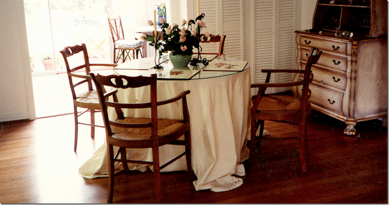
Twenty two years ago, right after we were married, Ben and I rented this cute, tiny cottage. For the dining room, I brought my skirted table that had been in my pre marriage apartment. I updated it with a new, cream faux silk poly-something fabric with a huge puddle that I spent hours arranging “just right.” I added the set of French chairs that my aunt gave me and a painted secretary from my parents house. We happily lived here for two years - Elisabeth was born while we rented this house. We loved the two bedroom, one bathroom house, but mostly we were thrilled to be living in West University – our dream location. I had gone to look at this house after seeing an ad in the paper and when the landlord answered the door, I said “I’ll take it” without even stepping inside. Not that there was much to tour, you could see everything from the front door. The rent was $600. We were so excited to live in our doll house. My father though, was less so. He took one look at it and said “I worked my whole life to get you out of a house on concrete blocks.” He didn’t see the charm of living in a house without a solid foundation like we did. We left this house to move to Ft. Worth – which was supposed to be for a lifetime. Instead, we only lasted 1 1/2 years away from friends and family before we moved back to Houston.
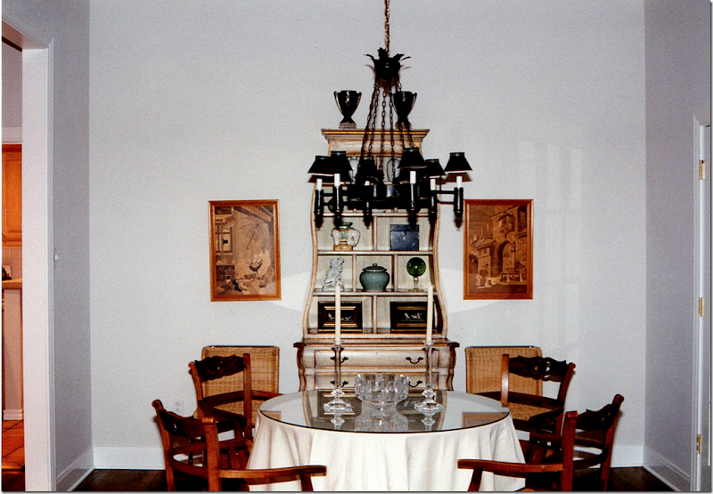
In Ft. Worth, we bought our first house – a brand new patio style home. While I copied Dan Carithers taupe and white linen living room, I used my old dining room set up. I did add an antique chandelier from my parents house and two woodcuts also borrowed from them. I don’t think we ate one meal in this room, instead we always used the breakfast room where we had a French wood farm table.
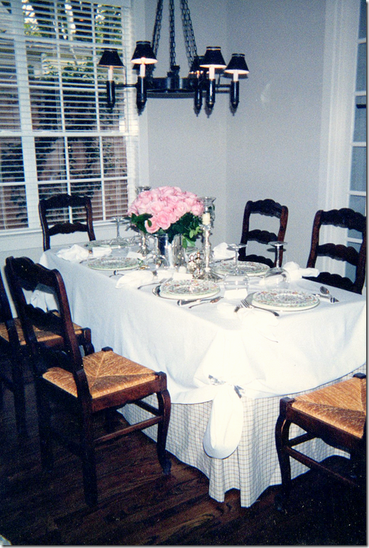
And finally, we ended up in our present house in West University. I don’t have a picture of the round skirted table with the draping cream cloth, but I know I used that same set up when we first moved into this house. I do have an early picture of a party tablescape. I had Shabby Slips make up a table skirt out of taupe and white plaid linen to fit over a conference table for when we entertained. I topped that with a white tablecloth. Those French chairs were actually from my breakfast room. Overhead we used the same chandelier. And here, you can see there used to be a window in this room instead of the French door that we installed a few months after we moved in. It looks so strange to see the old window there!
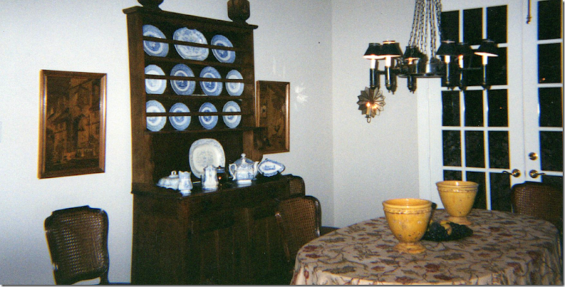
A few years later and I’m still using the conference table for entertaining. The French door is now in place instead of the window and by then, I had bought that antique hutch to hold my newly acquired collection of blue and white transferware. Of course I stole that idea from design great Carol Glasser. I bought those vintage cane chairs from Lewis and Maese. Still no curtains and no rugs. Elisabeth is modeling her outfit of the hour – my bathing suit sarong which she turned into a long skirt. NOTE: After this party, everyone went home with red knees from the cotton table cloths! Be sure to wash those cottons that come from India first.
Sorry all these pictures are no bad! I had no idea I would have a design blog when I took these photographs all those years ago. Here, I had finally started to get somewhat serious about my dining room. I had an oval table custom made to fit the room and seat 8 – so, now I could finally quit dragging out the conference table whenever I entertained. For the skirt I splurged on a Bennison fabric which cost more than a dining room table would have. But, as you can see, I’ve always just preferred a skirted table in the dining room over a wood one. There something so romantic and soft about a beautiful skirted table – and I’ll probably never have a proper wood table. Over the years, the puddling hem was drastically shortened, and the glass top was eliminated. When this picture was taken, I was still using those old German woodcuts which I later replaced with more plates. And, I had put up sconces – that today are in my office.
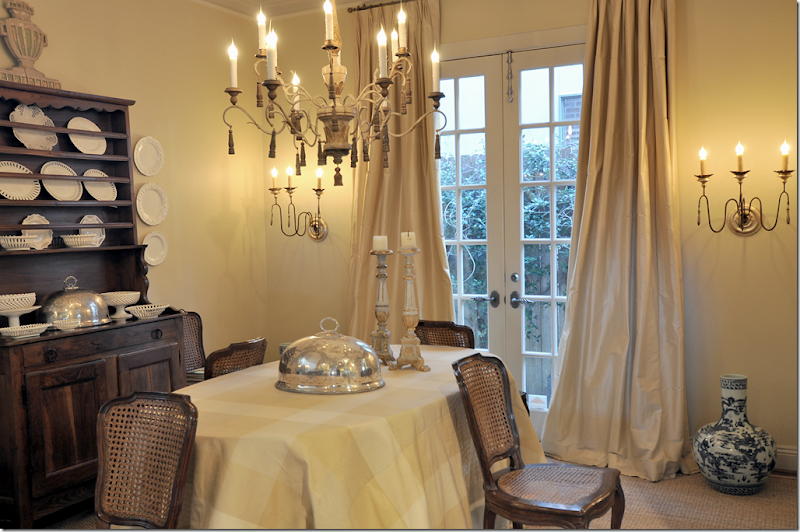
About six or seven years ago, I decided to change the Bennison cloth out for this silk plaid in yellow. At this time, I also painted all the walls a soft golden yellow with gray trim. Along with the paint, we finally got silk ticking curtains in the living room and dining room and custom cut seagrass throughout. The curtains and the seagrass made a huge difference (as did a new camera.) My parent’s antique chandelier went to the breakfast room and I bought this fixture from a friend who was redecorating her house from English country manor to Swedish. New sconces from Tara Shaw were added.
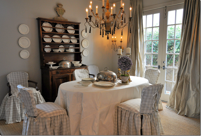
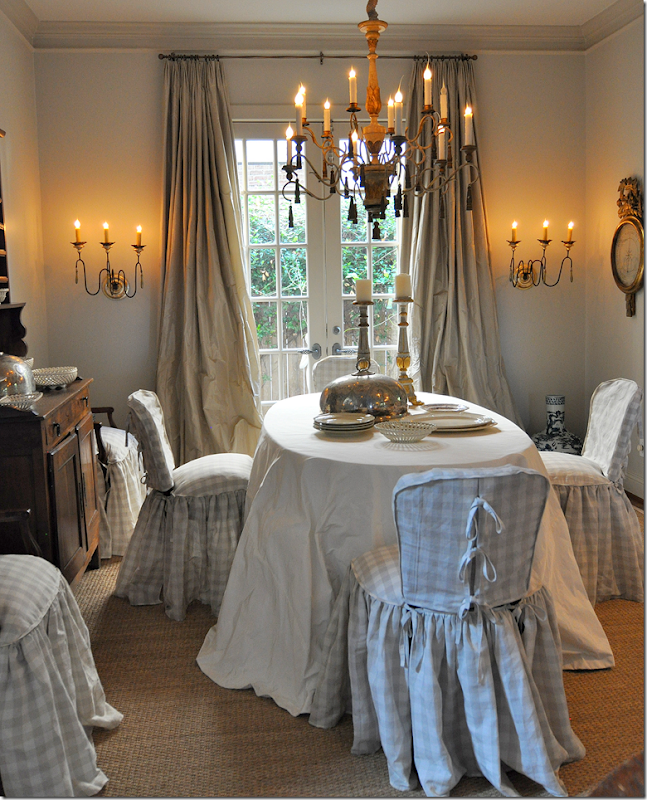
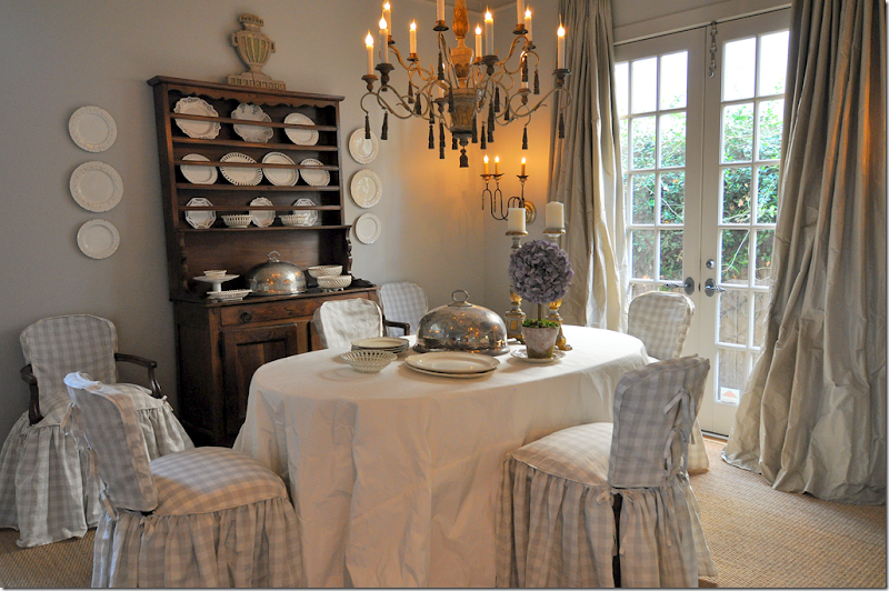
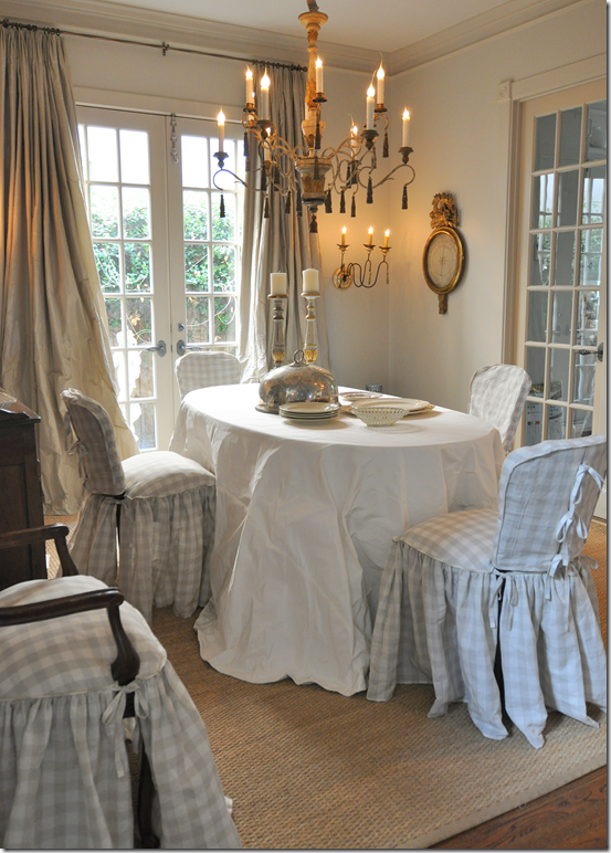
Finally, I changed out my blue and white transferware for some creamware – trying for a quieter look. I honestly thought I would keep this dining room setup forever. I still love the way it looks, but the yellow just didn’t go with the gray walls or the new ivory linen slipcovers in the living room or the white marble in the kitchen. So, new curtain and tableskirt fabrics were ordered to tie it all together. Here’s how the dining room looks today:
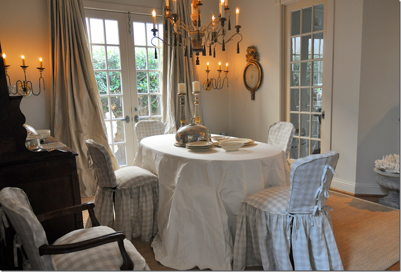
The biggest change to the room were the new fabrics – gray taffeta for the curtains and a white matte taffeta for the table. The only expensive fabric was for the table – from Rogers and Goffigon - but the draping and the matte look were important to me and I couldn’t get that look with a cheaper fabric. The silk taffeta at the windows is Schumacher and that fabric was very reasonable.
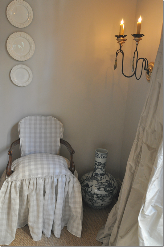
The chair slips are actually two pieces, one piece covers the back and one covers the seat. There is a down cushion inserted into the bottom slip to make the chairs look and feel softer. Ties run down the back of the slips. The skirts are double pleated for extra frill. The checked linen is Chelsea Editions and is very, very reasonable.
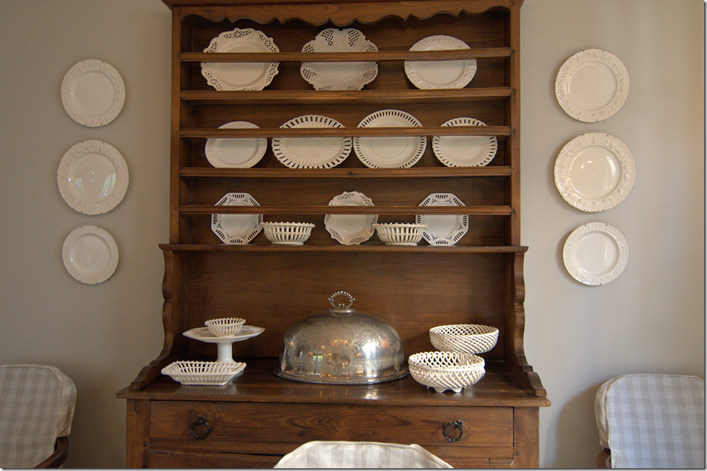
The view of the hutch with the creamware collection. I wonder if I should trade this out for a gray painted Swedish hutch. Maybe in a few years!
A closeup of the back of the slip with the ties.
Here you can see how pretty the seat crowns with the attached down cushion.
We left the wood arms exposed on the host chairs. I like that small touch of wood showing through.
On the table, I added some creamware plates to make it look casually styled. Where is Eddie Ross when you need him????
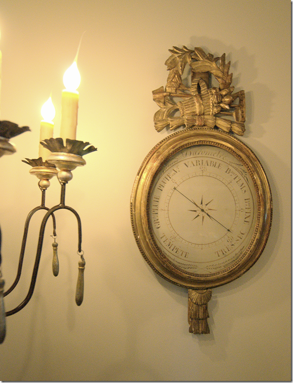
Two of my favorite things in the room – the sconces from Tara Shaw and the antique barometer I got for a steal on 1st Dibs.
While all the changes made a big difference, the slipcovers made a huge, huge difference. I am really happy with the way they turned out. They make the room look dreamy and feminine and so soft. Right now, I am in love with them!!!
So, that’s it. It took a while to update all the fabrics downstairs. They always say, when you change one thing in your house, it all dominoes and that was true with me. The white marble countertops dictated the way my entire downstairs looked – something I hadn’t really thought about when we made that initial change, but truthfully, I probably was just in denial. Changing out the fabrics room by room made is easier on the pocketbook. Plus, Ben wasn’t really aware of what it all cost in the end since it was such a drawn out process. He loves the way it all looks now, but if I would have come to him and said – I’m redoing every room next month, he would have had a heart attack and had me committed. It was more subtle this way. He likes my decorating style, he just doesn’t like what it costs. AND, he is under the misguided impression for some unknown reason that slipcovers are cheap! SSSSHHH – let’s keep it a secret, ok? Thanks!
I’m wondering if I’m alone out here, using the same design element over and over and over again – like the skirted table? That’s really the only thing I can think that I’ve used since I had my first apartment up until my current house – over 30 years of using skirted dining room tables. Do you have an element or style you use over and over again? Something you have loved since you left college, married and had children? Let me know what it is – I would love to hear what you are addicted to!!!
FINALLY:
If you are a Rachel Ashwell fan, you will love her new book. It’s really beautiful – filled with flowers everywhere and gorgeous shabby chic styling. It features the home of many European friends this time – a switch for the Californian Rachel. It also shows her new Texas property, The Prairie. It’s totally heavenly. So, if you are a Shabby Chic lover, I highly recommend it HERE.






joni, it looks gorgeous. thank you so much for sharing. I for one love the hutch in the wood. I think that it adds a warmth that would otherwise be missing in the room. Can't wait until I make my millions and we can get to work together!
ReplyDelete- Elizabeth
Your dining room looks wonderful - the latest version is definitely the best! I might have to copy those slipcovers on the chairs....
ReplyDeleteJoni your dining room is stunning! I love the new gray and white ck slipcovers and the chandelier and sconces are gorgeous! Martina
ReplyDeletelove the check fabric on the dining chairs...they make the room
ReplyDeleteLove!
ReplyDeleteThis is a room I can also see you adding some pink to~you love pink and never use it. I do love those slipcovers!
ReplyDeleteJoni, I love this room. I love your stunning curtains and that table fabric is gorgeous too. You are right - that crisp tousled look can only come from the fabrics you chose. Gorgeous. The chairs look like something from Napoleon's house in Malmaison - very stuffed and delightful, like those old beds they had that were very poofy in the middle. The whole room makes me smile. I want a barometer too and will be sad until I get one.
ReplyDeleteIf only Ben knew. If they all knew...
xo Terri
Love your design growth and transitions . . . your checkered dining room chairs are to die for!
ReplyDeleteLove the room.
Mary Anne ox
Your dining room is simply gorgeous. Enjoyed the evolution.
ReplyDeleteThe slipcovers & skirts do it for me and the sconces. Love that you stick with what speaks to you...trendy or not. And that it didn't all happen overnight. I can relate to that! I seem to be drawn to the contrast of dark and light...most of our rooms have some form of that.
That and I'm crazy for medallions.
Monica
Joni, The dinning room is so elegant and breath taking. I just know you have to go into the room often and just stare in delight. It warms the spirit. It is how I am when I finish a project that I am so proud of. One question. Do you have glass on top of the tablecloth? Also I could see a very pretty white rectangular platter on each side of the hutch. I love your style and wish I could change over to all-white but have invested in much color accessories at this point. Your blog is my absolute favorite on a page full of blogs. Keep them coming. I do appreciate all the wonderful stories.
ReplyDeleteJudy English
*** Well, the computer just "ate" my comments, so I'll try again!
ReplyDelete*** This was such a FUN blog to read n' enjoy tonight, Joni~~~ as someone who has moved 28+ times, and created a "new home" each time, I reeeally enjoyed it!!!
And oh my GOODNESS how our homes DO change (!)... actually, they simply (or sometimes, NOT-so-simply) evolve to truly represent us, our families, our wants, needs, dreams, accomplishments, etc.
Thanks for such a delightful look back, look forward AND look at the present!!!
Warmest KUDOS, kiddo!
Linda in AZ*
bellesmom1234@comcast.net
Ever changing...always elegant!
ReplyDeleteYour dining room looks beautiful. I think it's great that you keep going back to something you love and incorporate it into your home again and again. I have this thing for slick modern lighting. My dining room has a frisbi light fixture which was one of my first real purchases many years ago. After all, a home is a reflection of your own personal taste and style.
ReplyDeletei love this room very nice....
ReplyDeleteJoni, I think you should keep the hutch. Its lovely and a gray Swedish one might make the room too theme-y.
ReplyDeleteThe picture with little Elisabeth is darling. Those sweet little years slide by awfully quickly, don't they?
I love your dining room now it’s quiet and peaceful and so elegant. Don’t ever invite me to your home because your barometer and sconces would have to come home with me. I’m not under 40, heck I’m not under 50 but I do like the rough luxe that everyone is so crazy about. I have an RH table in my studio for working and an antique table we bought eons ago in my dining room. I’m a klutz so anything skirted is out for me since I’m afraid of tripping over fabrics….and I’m an antique textile dealer, go figure. I don’t have a style that has stuck with me every few years I have to change things up because my tastes keep changing but if I ever get it right my house will never change again!
ReplyDeleteJoni, so beautifully done!! I love it and it was fun to see the evolution come full circle! That beautiful cream and gray check is so elegant and of course the neutral billowy drapes make it feel so French and elegant. The lighting is goregous as well...I love every single thing about the new and improved room!! Thanks for sharing it.
ReplyDeleteJoni,
ReplyDeleteI do love your dining room as it is now!!! The seat slipcovers, the draperies, the sonces, the chandelier, the decoration and...your skirted table!!!
So charming and cozy!! One of the most pretties dining rooms ever! And I mean this!!
xx
Greet
I love seeing the transformation Joni. I have always loved the simplicity of long silk panels at the windows. The Tara Shaw sconces and the antique barometer are showstoppers. It all looks gorgeous!
ReplyDeletexoxo
Karena
Art by Karena
Oh and it was funny while reading your post, in the corner my daily Restoration Hardware email popped up!
ReplyDeletexoxo
Karena
Art by Karena
truthfully, Joni, as much as I like the soft yellow that you had previously, the soft gray is stunning...I'm in the midst of planning some rooms and can't decide whether to go towards taupes or grays...well, after seeing your dining room, I'm choosing gray...
ReplyDeletethanks for the inspiration..
best,
maureen
Beautiful! I had to laugh when I saw the down cushions on your dining chairs. Every time I fluff up down seats before people come over my husband asks if we're expecting guests who have hemorrhoids. Men!
ReplyDeleteMaureen in Atlanta
Wow, your new dining room is a stunner. So pretty and fresh. Everything looks beautiful and cozy. Great work, Joni (as usual)!
ReplyDeleteDeborah
Hi Joni! I grew up in Clear Lake, and have always loved West U. I live in Nashville now with my family, but get back to see my folks often!~ Luv your candid, honest blog and your opinion. It is reality and i love it! Crazy bout your new dining room! I just painted my pine hutch a soft warm gray. Love how it turned out, but I gotta say. I REALLY like how your pine hutch looks in your gray dining room. It gives it a slightly more "collected" original look. I say stick w/ the brown pine! Happy Texas Fall!
ReplyDeleteOh my gosh, oh my gosh, oh my gosh! Joni, I never thought I love a dining room more than your pale yellow/and light grey one, but this new version is to die for! J'adore!!!!!
ReplyDelete-linda,ny
love this post! I am literally looking for someone to do some slipcovers. I live in Katy. Who do you use? I would love a recommendation since you seem to slipcover a lot ;}. I adore your blog, I always get excited when i see you pop up in my reader! Thanks!
ReplyDeleteJoni, It looks beautiful. The slipped chairs bring everything together. Love it!
ReplyDeleteYour dining room is so beautiful and serene, Joni! Thank you for sharing your decorating evolution with us; it is always so much fun.
ReplyDeleteJan
Heaven contained within four walls! Such a beautiful transformation! The skirts on those slipped chairs are perfection. Everything here makes my heart go pitter-patter! Are you selling your old silk drapes?
ReplyDeleteThat yellow was so fabulous...but this new gray is so soft and welcoming. Great job!!!
Joni, you did a wonderful job redecorating your dining room, those slipcovered chairs are adorable, and I love your choice of colors and fabrics, very soft and romantic.
ReplyDeleteJoni, all beautiful changes in your dining room even though I thought your former one beautiful as well. Schumacher really does have a fabulous selection and color range of silks. Unfortunately, I recently selected one for my dining room from their offering only to find that when I ordered the swatch from which I would make my final order, the dye lot were slightly off and was pulling a color that I did not want in the room.After several attempts, I selected another fabric. I am glad you got a good match. I too love skirted tables but have to wonder how many clumsy feet are going to step on that pretty skirt of yours when you entertain. Good Luck! Enjoyed the post.
ReplyDeleteLove it, especially the checked linen chair slips! But I went to Chelsea Editions and they had no checked linen whatsoever! Joni where did you get that fabric?
ReplyDeleteThis is exactly what I've been dreaming of doing to our dinning chairs. Now I just need to find someone in my area to recreate the look. Your new room is warm and welcoming ~ just lovely!
ReplyDeleteJo
I had wondered when you were going to unveil this space ... now the only think that we haven't seen - and I'm dying to know what it looks like is your foyer table adjacent your living room. I don't think you've shown that since the birdcage was on the top with all the baskets and books on the bottom.
ReplyDeleteLove this collection of fabrics, the soft, muted palette, and the feminine quality of the volume in the curtains and tablecloth, even the skirt on the chairs.
LOVE. LOVE. LOVE.
You know, I (with my limited budget) decided that we too, needed a new dining room table, and I bought a round one that for parties can extend to a 12' oval. It's an antique, in need of some veneer repair and refinishing, so I took inspiration from your old dining room (and I guess this new one, too!) and skirted it. I used the burlap with the fringe from Ballard Designs. Couldn't be happier!
I'll eventually spend the money on an overlay for the burlap, maybe trading out the whole thing for a cream or honey colored suzani, but the skirted table is here to stay for a long time!
Thanks for inspiring us all, Joni!
wow--LOVE your dining room - I have some similar tall candle holders--gee whiz - those slip covers are dreamy! I don't have ONE particular design element that i have stuck by over the years but
ReplyDeletei learned about 2 years ago that i like "organic" elements - sea grass & sisal, neutral layers...monochromatic decorating in either
soft mushroomy colors or taupes, white dishes, seashells, rustic [ or distressed ] wood tables, rattan chairs, things that have texture and that are natural.
I have always loved slip covers!
Joni - or anyone - what is the best way to mount plates on the wall? With those little brackets that affix to the wall? Where is the best place to buy those? Thanks
Shelley
Joni-
ReplyDeleteIt's romantic, soft and welcoming. You did a beautiful job, friend!!!!!
I love your newly expanded collection of the reticulated creamware. SO beautiful!
xoxo,
Andrea
I really love the latest look! The soothing grey and those comfy looking chairs! How fun to see your evolution in there and your whole house!
ReplyDeleteThinking back - I think I have 2 consistent elements I've used in my homes. They are large paintings and lots of fabrics. It takes a lot of self control to not purchase every fabric I love!
Joni,
ReplyDeleteYou really nailed it! Your dining room is just gorgeous! Thanks for the tour!
Joni, What a gorgeous dining room! The slip covers are some of the prettiest I have seen and I love the skirted table. I have been looking for an antique barometer but have yet found one anywhere near as wonderful as yours.
ReplyDelete~ Sherry
Man have you come a long way. I love, love, love your dining room... in fact so much I feel inspired to make some of my own changes. It's beautiful and fresh, just gorgeous!
ReplyDeleteJoni, it's just breathtaking, jaw dropping gorgeous! The fabric adds such depth to the room, I love all your choices.
ReplyDeleteThose chair slips, the curtains and the tablecloth must be the prettiest I have ever seen! EVER! Nooo don't change out your hutch, it is classic now, and has warmth. it really would be in the realm of "something everyone under 40 wants" if you changed it to greyed painted Swedish.
ReplyDeleteIf that hutch was mine I would finish it like the Restoration Hardware table, that matte natural look. All of your fabric choices are pale, the hutch isn't. That aside, you have done a fabulous job and deserve all the praise that you get.
ReplyDeleteKeep up your wonderful blog. You bring so much good taste and considered thinking to us poor mortals. Ann
Joanie -
ReplyDeleteBeautiful, elegant, dreamy, classy, tasteful, surreal. A place I would love to serve a comfort meal for family and friends and linger in those gorgeous down filled cushioned chairs. You did a terrific job!!!!
Elements I always use are - draping material - candles - religious artifacts. Like and appreciate lots of styles but always gravitate back. Makes me feel warm & cozy!!
Thanks for this fun blog - you should be proud of the space you've created. It's sooo lovely!!!
Janice
Love your room and keep your hutch the wood breaks up the softness a bit. Oh by the way the reviews on Amazon about Rachel's book aren't good. Only 2 though !
ReplyDeleteLove the slips on the chairs. Reminds me of cotillion and pretty young girls with white gloves.
ReplyDeleteStunning and beautiful!
ReplyDeleteJoni, what a beautiful space. Downside, your guests will never want to leave. Thanks so much for sharing the transformation. I love that you stay true to yourself and with that, inspire the rest of us. Love it, love it.
ReplyDeleteLovely dining room, and you've stayed true to your style while evolving it. Gorgeous white silk taffeta skirt - it looks like a ball gown! Couldn't see my family of guys eating there - some sauce would definitely end up on the tablecloth. I'm also over 50 and do happen to love the Rough Luxe dining table from Restoration Hardware, but then I have a rustic log cabin mountain home I'd put it in. Certainly not the right look for every home. Ralph Lauren had the same look several years ago out of re-used pine, but his was yellower, not gray. BTW, I just got this encyclopedia of a catalog from Restoration Hardware in the mail today. I guess they consider me worthy since I ordered a light fixture from them. The thing is 615 pages!!!
ReplyDeleteJoni, so glad you did not go with the Restoration Hardware look. It's only a matter of time before those over sized massive pieces will be a trend of the past. You stayed true to yourself and to your design aesthetic by using the skirted table and restyling your chairs.
ReplyDeleteRestoration Hardware has made a big mistake, in my opinion, by investing so much of their inventory to this new look. The scale of many of the furnishings is simply too large for the average home to accommodate and it's simply hard to give credence to the Belgian style when you know it was manufactured in China. Stay with your classic approach and you will not grow tired of it. As often spoken, a gallon of paint can change a look entirely.
Restoration Hardware table is too big+made in China! There I have said it-(been thinking it for a long time). Grand job you did on the dining room. Kudos to Joni! xxpeggybraswelldesign.com
ReplyDeleteSo beautiful. Like walking into a giant pillow! Is it hard to keep those beautiful fabrics clean? What's your secret to living in fabulous style?!
ReplyDeleteYour current dining room takes my breath away, it is so charming! It just got better and better over the years, and the final shots were amazing! This is a room i'd love to copy...
ReplyDeleteCindy
LOVE, LOVE, LOVE!!! You have such incredible tastes and such a great eye for beauty. I loved seeing the transformation and I adore the way it looks today! GORGEOUS!
ReplyDeleteQuestion: Do you have your table skirt dry-cleaned after dinner parties? How do you keep it clean?
I've never commented before, but this room is so gorgeous I just had to! Love it love it love it -- and I agree with keeping the hutch in the natural wood tone. Painted wood is beautiful, but this just adds such richness to the room. Beautiful job!
ReplyDeleteThe new color looks more sophiticated. It's very nice. Whatever happened to the black tole light fixture?
ReplyDeleteI was in one of the local Restoration Hardware stores in the San Diego area last Friday. The place was empty.
ReplyDeleteNo shoppers at all!
The walls were all painted a dusky gray and the place had these massive tables that just looked odd to me.
This is one of my favorite posts of yours. I love the new dining room and it's great to see the evolution. The slipcovers you had made for those chairs are BEAUTIFUL. Too often slipcovers are just an excuse to run to Pottery Barn for a wrinkly piece of cotton... sigh.
ReplyDeleteYour creamware collection is great.
Love your dining room! One of the prettiest I have ever seen! Keep the wood, it is a nice contrast. Thanks for your wonderful posts.
ReplyDeleteBarbara
thanks to all of you for your kind comments -
ReplyDeletethe skirted table top:
ok, I don't use glass anymore. I hate the way it looks. I just dust it lightly with a very very very damp cloth or a dry cloth.
when we eat there - here's what I do:
i buy a waterproof table liner from bed bath and beyond. I cut it to drape slightly over the top. then i put a white tablecloth over it. that way if anyone spills something - it wont ruin the skirt, just the table cloth. the trick is the water proof liner - you HAVE to use that!
and that's why the skirt is in the dining room where it doesnt get much use. its really too much trouble for everyday use. but, for entertaining - it's not that big of a deal to lay down the waterproof liner.
thanks again everyone for your great comments!
anon 11:31
ReplyDeletei too had a house full of colored accessories. about six or seven years ago i slowly started weeding them out in favor of lighter access. it can be done in time, slowly. it was a real gradual process. but it can be painful. i have a storage room filled with colorful accessories. :(
Joni,
ReplyDeleteI love it...how fun to see the various incarnations. I love the end result...but I truly loved your blue and white transfer-ware. The cream ware is calming and lovely too.
Thanks for the tour...been there done that. I'm afraid my photos would prove too embarrassing...French country everything took over at one time. :-)
Karen
I used Hien Lam for my slipcovers. she isn't the cheapest at all, but she is the best i think. no one makes them as pretty as she does. i hardly even tell her what to do, she just knows.
ReplyDeletehttp://www.hienlamupholstery.com/e
my old curtains went to my mother in law. we cut them down and they fit beautfully and look great. i need to show you her house. it's so adorable!
ReplyDeleteW.W.P.P.D.? Be in awe of your new dining room! Elegant, timeless and true to your style which we ALL love!
ReplyDeleteYour dining room is dreamy, whimsical and elegant all at once. Thank you so much for showing how your style has evolved over the years! It is so rare to see that process and it really made me appreciate your current dining room so much more.
ReplyDeletePersonally, I love your skirted dining tables, and although I am under 40 (for two more years, anyway) I can't stand that "rough luxe" thing at Restoration Hardware. I predict that in a few years there will be a lot of young people regretting making such a trendy choice for their dining room.
So, what am I addicted to design-wise? TRIM! Give me tassel fringe, or give me death. I have a client who is addicted to pillows even though she's transitioning to a more contemporary aesthetic in her newest home. We tried to slim down on the pillows, and once everything was installed she said it was beautiful but didn't feel like home without her throw pillows. At last count, my drapery workroom has made over 70 custom throw pillows for this client's home. I say, embrace what you are drawn to for your home, regardless of trends. Trends come and go, but great style like yours will last forever!
I just read your comment about the waterproof liner and white table cloth topper...
ReplyDeleteOkay, so I'm a total lunatic for even thinking about this, but I have a hexagonal pedestal dining table in my breakfast room, used for everyday meals, homework and school projects by my destructive young sons, and I harbor secret fantasies of putting a table skirt on it because I love the look. I haven't indulged this whim so far because, like you, I have expensive taste in fabric, and my 8 and 10 year old sons have some kind of disability that prevents them from wiping their hands on NAPKINS instead of on my FURNITURE. I wonder, do I dare to try a table skirt in there for everyday with a washable topper and waterproof liner??? I'm SO tempted...
Joni:
ReplyDeleteWhat happened to your kobu chairs that you had this summer?
the kubu chairs are in my breakfast room - not the dining room!
ReplyDeleteRebecca - you know if you used a washable skirt - like a really cute ticking stripe linen, prewashed, then put down a liner - and top it with a washable table cloth, you could even use the same fabric - for the topper -
then when company comes you just remove the top two layers. it sounds complicated, but it's NOT. the liners are cheap, cheap - you cut them to drape over about 5 inches down.
the key for a breakfast room would be washable - denim, cotton or linen - just like a slipcover. it sounds like you hate your table and want to cover it. this could be an alternative until you buy the table you love????? i aay go for it if you really are unhappy with the glass look!
At the risk of sounding terribly redundant, I must say the new incarnation of your dining room is beautiful. IMO, keep the hutch you have now. While the Swedish grays are lovely, I am afraid they are too trendy right now and won't have the collected look your current piece has.
ReplyDeleteAren't you lucky your neighbor changed her chandelier; this one, along with Tara Shaw's sconces, is perfect for your vision of a quiet, elegant space. The barometer is fabulous.
Thanks for the time capsule. It was such fun.
My Calacotta Oro marble countertop gets installed in three weeks. I hope I won't have to change everything.
Best...Victoria
LOVE the new look. (Although I have to say I also loved the old one, too.) My home is similar colors to your new grey and I find it so soothing. Only thing I haven't yet been able to do is all the white/light colored textiles ~ 3 boys + 2 big (slobbery) dogs + pale linen = BIG UGLY MESS :(( . Someday..... Love, love, love it!!
ReplyDeleteJoni, I absolutely loved the post. What fun to see the evolution of your dining room over the years. You must know that I am in love with your chair slips, but even more than the slips, I'm in love with your barometer. If it goes missing, you won't have to look far.
ReplyDeleteGood for you for getting it at a steal, but I can tell you this, if I had seen it first, it would be on my wall. LOL!
XO,
Sheila
P.S. Are those your aunts antique chairs that are slipcovered? I love the slips. They look like party dresses. That fabric is wonderful, too.
P.S. Just wrap up the whole room... I'll take it! :-)
ReplyDeleteJoni: I cannot EVER show the evolution of my house (in all the different locations) as that would mean admitting to "mauve" love seats. The one thing I know for sure is that beautiful dark wood antiques like your hutch will be back (just like your barometer will never go out). You have lovely taste and the slipcovers feel like party dresses. I was trying to explain Blanc d'Ivoire to a client today and searched online and an old post of yours showed up...don't you feel your dining room is that style? Trés belle.
ReplyDeleteAlways enjoy reading your blog! What happened to your aunt's chairs? I have 4 exactly like them and purchased them on ebay several years ago. I can't help but wonder if they are yours. Believe it or not, I had them around a skirted round table until recently when I purchased an oval. - Cindy
ReplyDelete5stars Joni !!!!! Beautiful, I agree with most everyone else about the hutch. Keep it as is.
ReplyDeleteThank you for your kind comments about me selling our house, I wish I was asking too little , it's all relative I guess , we are asking a lot compared to the other houses here but that are standard outdated , but I think it is worth it , so much is done , its ready to just move right in and relax , I am sure hoping someone thinks so anyway .
ReplyDeleteI wish we could bring the bunkie , but moving it would be like moving a house and we'd have to tear down about 4 houses fences to get it out, I hope someone else will enjoy it .
Always loving your blog , so inspiring.
Chris Kauffman
I'm still in the process of evolution! This is our 3rd house, but the kids still small. I guess the only thing I know I want to change soon is our couch. It's still pretty, but I'm tired of it.
ReplyDeleteYour dining room is simply gorgeous! But I'd feel scared to have something like that at my home w/ my kids! I'll have to wait to have all that much fabric around my house. Although I'd love to have a place like that here.
Enjoy your day!
xo
Luciane at HomeBunch.com
Well..
ReplyDeleteIts looking very nice.. All arrangements are looking very nice..
Games For Young Children
hmmm, this room has me pondering. On one hand I am smitten by the muted colors and the inviting softness of the room, and the gorgeous details of the slipcovers... on the other hand, it reminds me just a tiny bit of a room in an old mansion where all the furniture has been covered up while the owners are away... i miss seeing the beautiful canework on the chairs... but overall, its still delightful!
ReplyDeleteI always find your blog inspiring. Your room has evolved but never seemed dated along the way...
ReplyDeleteThe one thing I have used over and over through first apartment, marrriage and kids is decorating my walls with plates.
Delicious! Keep your hutch. It's a classic.
ReplyDeleteI am really digging this whole evolution of your dining room. Great post.
ReplyDeleteJoni, you always inspire! I love the look of a skirted table and have used them since I was in high school!! My fabric selection has changed, but the look is consistent! Don't change the hutch, like the Restoration Hardware table, the Swedish Hutch, while beautiful, makes your room too trendy. This hutch makes this room YOURS! I was just in a RH this past weekend and I do love it all, but I have finally reached an age that I can appreciate it and maybe bring in a piece or accessory or two, but keep my own personality.
ReplyDeletePicture perfect and so classic! love the skirted table and new dresses for the chairs! Great choices-
ReplyDeleteBTW- I had the honor of meeting Rachel Ashwell at her new B&B this past week!! She is so inspirational and sweet! If you have a chance to visit her B&B you won't be dissappointed it's like pages out of her new book! It's lovely! And did I mention she is sweet! xo Nancy
blah, sorry but your dinning room looks rumpled, disheveled and uncomfortable.
ReplyDeleteB.
I love the colors, the lighting, the accessories - however, there is way too much fabric. I can't see dinner guests feeling comfortable dining there. The chairs are lovely, but don't look comfortable anymore.
ReplyDeleteYour dining room is stunning. I love everything that you have done. I love the addiction to a skirted table. This is something that I have wanted for many years. I love your style. I love my dining room furniture but I don't like the colour. Your style would fix all of the problems that I have with my dining room at the moment. Thank you so much for sharing.
ReplyDeleteKim
http:kim-lettersfromtheshore.blogspot.com/
What a journey!
ReplyDeleteWith each era, the room always was pretty.
Wisdom and experience guides you now, with beautiful results.
LOVE it!
xo xo
Well that was a fun tour! I'm so impressed that you have photos of your dining room for the last 30 years!
ReplyDeleteI love the changes you've made over time, especially the way your room looks today.
I probably would say that displaying majolica is my one constant. I just can't seem to put it away! That, and skirted side tables.
"blah, sorry but your dinning room looks rumpled, disheveled and uncomfortable. B.
ReplyDeleteOctober 4, 2011 7:11 PM"
Yep, my opinion too. Bulges of fabric in a pretense of chic.
This article was written well ,I like…I will keep your new articles.
ReplyDeletewhat a beautiful dining room. love your chandelier, look amazing with the new chair covers
ReplyDeleteUsually I do not post comments on blogs, but I would like to say that this blog really forced me to do so! Thanks, for a really nice read.
ReplyDeleteI'm late to this Joni party but I'm loving your blog - I'm reading all of it at once!
ReplyDeleteMy family moves about every two years. I've painted four (now five with this latest one) houses the same interior color to make it easy on myself - Concord Ivory by Benjamin Moore. That might sound off-white, but it is truly a yellow. I've painted it in Sugar Land and in Atlanta (twice in each city). Now we find ourselves in San Antonio - and I don't like the Concord Ivory here. Maybe the sun is a little different? Maybe those new-fangled lights make the paint look different (it has a greenish hue)? And my latest decorator mentioned that, if I've painted FIVE houses this color, maybe it is time to MOVE ON.
So I'm thinking about gray or taupe - I, too, am ready for a less-colorful palate. I originally painted my house yellow because my blue and white transferware looked so good in front of the yellow. I have a green love seat and a blue sofa (different rooms, but open to each other). Not quite a primary color crayon box, but certainly "cheerful" instead of "tranquil."
Any words of advice? I need to keep the big furniture pieces and I'd like to keep some of the blue and white on display.
Thanks so much for your blog - I really love it!
Libby
Sheets, sheets everywhere.
ReplyDeleteReally beautiful room you organized it in perfectly updated way...loved it.
ReplyDeleteSpandex Chair Bands
Hi Joni,
ReplyDeleteMy taste has evolved too. it's an interesting process. You start out loving a certain look, and then as you get older / more sophisticated, you like different things.
i also think its a chance to feel as though you have a 'new' house when you redo your rooms:)