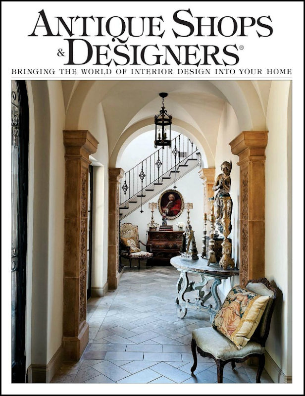
The new issue of Antiques Shops and Designers is out – and if you live in Houston, I’m sure you’ve seen it already, but I wanted to discuss a feature story in the new issue. As always, the issue is online – which I love. The magazine is always great with wonderful articles and even better advertisements from local designers. Lately, I’ve been in a bit of a malaise – I look at all the design magazines, printed and online, and hardly anything seems to strike me. I’m not really sold on all the bright interiors that the younger decorators love so much. And I don’t get all the interiors where everything is so mismatched. Maybe it’s my age. Mostly when I look at magazines these days, it’s just one boring house after another – or it’s decorating that I just don’t understand. I don’t’ know if I’m being picky now that I am older, or if the quality of interiors aren’t what they used to be. Only a very few magazines really grab my attention. So, when this new issue came, I flipped it open – and almost started foaming at the mouth over the very first house. Seriously. I didn’t make it past this house for days. I left my issue open out on the kitchen island and just looked at it each time I passed by. Sick, I know. But this house really, really moved me. I’m almost embarrassed to tell you whose it is, because I feel like an obsessed fan girl – just loving everything she does. So, care to guess? No? OK, it’s Pamela Pierce.
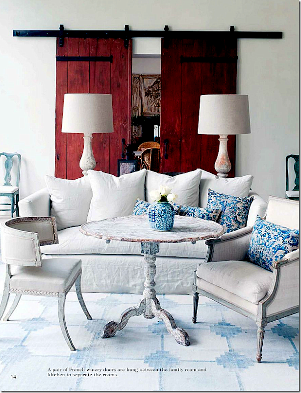
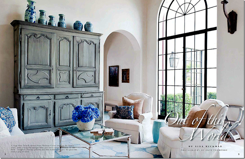
Whoa. I could just crawl in this picture and move right in. I’m not alone in being overwhelmed by this house – the writer, Nina Wickman, had a similar experience. Nina writes “We have all heard about near death experiences and I think I just had one. I went into a house that made me think I had died and gone to heaven.” Glad to know I’m not the only idiot around here. Nina – I can totally relate! The owners recently built this house – moving from a much larger one. They hired Pamela Pierce to do the interiors, while Robert Dame is the architect, and Dan Parker is the builder. The house is done in white, with touches of blue, red, and lilac. Some things came from their former house, repurposed, and others were bought for this house. The walls and ceiling are the famous Segreto plaster (is there any beautiful house Leslie hasn’t done?) and the floors are limestone. The windows are steel. This room pictured above is the family room – done in white with a faded antique blue and white dhurri rug. The only pattern comes from the blue and white Fortuny pillows, which also add an understated elegance. The blue painted French cabinet, with a collection of Oriental vases atop it, comes from Watkins Culver. I love the all white room – I can only imagine how gorgeous the sophisticated stucco wall treatment looks.
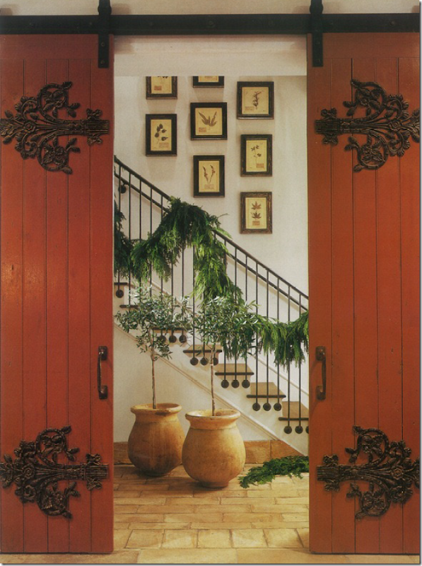
But, what do you do when the homeowner tells you that red is her favorite color????
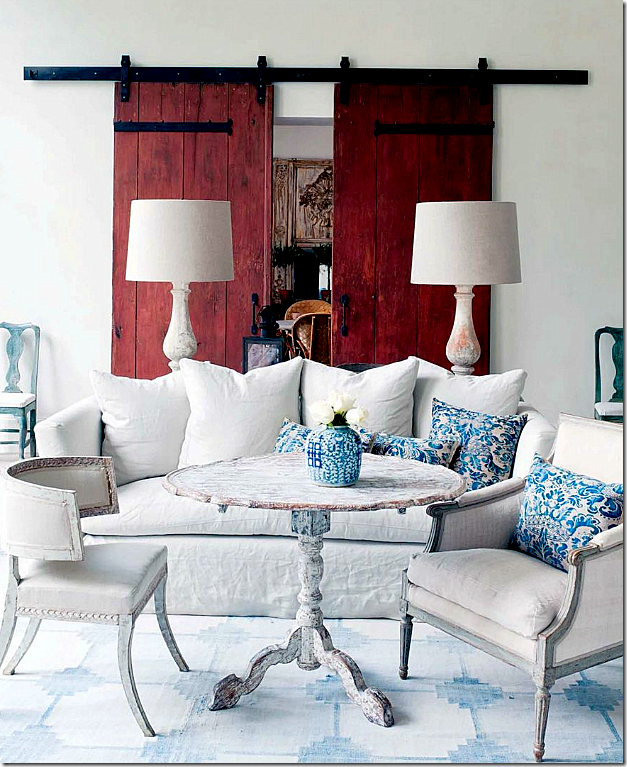
You shop around until you find a pair of oversized doors from a French winery – painted oxblood red. Stunning. Absolutely stunning and genius. Fall over dead gorgeous. When you look at this – it’s like you are inside an antique Oxblood vase – paired with Oriental blue and white plates. I can’t imagine how this came to be – was Pierce scared? Was she worried? Or did she forge ahead and know it would look as jaw dropping fabulous as it does? How was she so sure it would look this absolutely amazing? Add Swedish antique chairs and tables to the mix, along with a pair of white washed wood balustrade lamps with perfect white shades. That table! Is there a prettier, crustier table anywhere????? And finally, flank a pair of blue painted chairs next to the winery doors. I imagine there’s a fireplace here somewhere – I wish there was another picture or two to see, but beggars can’t be greedy. Do you understand now why I couldn’t get past this house to finish the magazine? I might just have to blow it up and frame it to get over it.
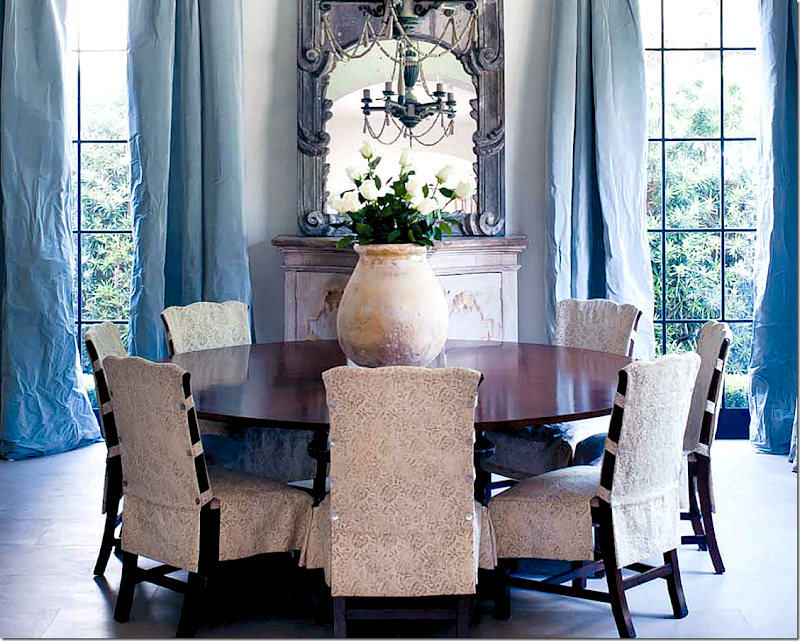
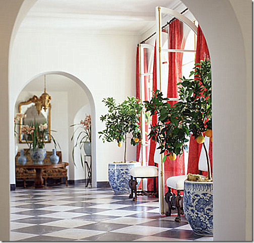
The dining room is reached through a tall arched doorway. A large round table is set with chairs slipped in Rose Tarlow fabric. The silk taffeta curtains carry the blue into this room from the family room. The chandelier looks almost delicate with beading hanging in arches. A mirror over a painted piece reflects it all.
.A closer view for your enjoyment. And there is the French pot filled with white roses, of course.
Through the winery doors is the kitchen – done in the homeowner’s favorite color. The backsplash is antique French floor tiles from Chateau Domingue. Shades made out of ticking cover the windows. Notice the lights on the side of the sink. A wonderful lantern hangs above the marble topped island, while an antique cow’s head is above the wood mantel. Pierce knew exactly how much red to use – on the island and the stove cabinets. The others are white. How did she know that too much red would be too much?
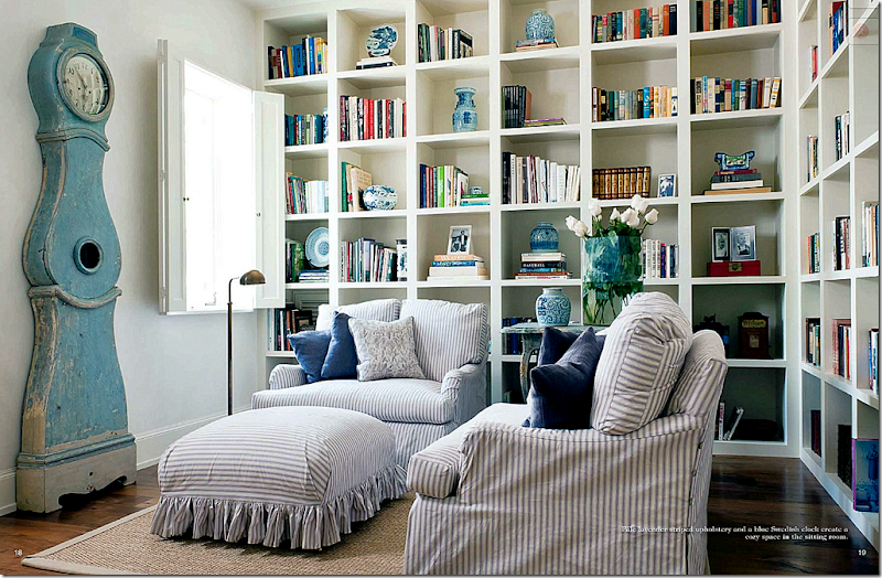
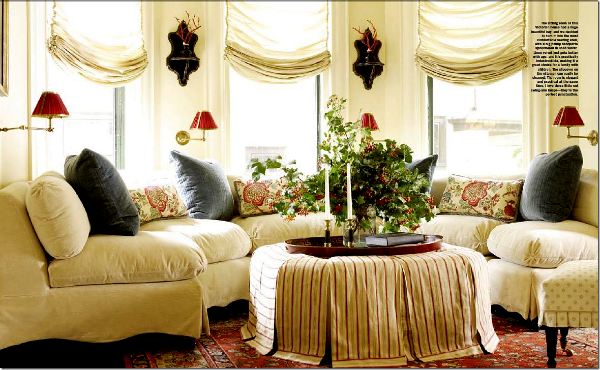
The study has comfortable seating, slipped in lilac and white ticking. The ottoman is just darling, with its ruffled hem. Pierce always has best slipcovers, ever. The shelves hold a collection of blue and white porcelains. And watching over it all is a blue painted Swedish antique Mora clock.
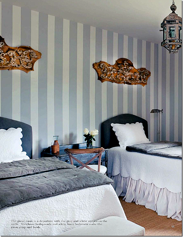
A guest room is done in bluish gray and white strips, with gray and white bedding. The wall hangings add a touch of whimsy.
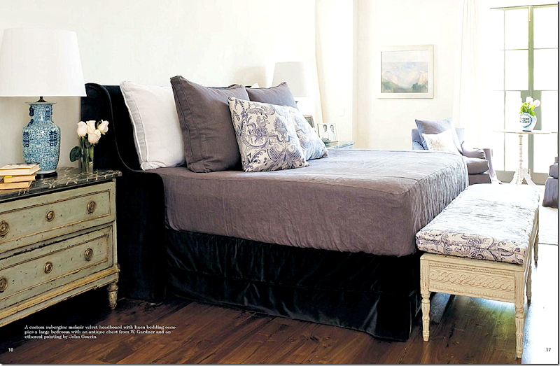
The master bedroom has a custom mohair velvet headboard in aubergine. Fortuny fabric adds the only pattern here, as it does elsewhere in the house.
Using heavy doors in that house isn’t a first for Pierce. In another house, shown in Veranda, she used these doors off the foyer – not Peking Red, these are more Persimmon – but are just as stunning. Still, the red color is a surprise and is extremely successful in this mostly neutral house.
White rooms with touches of blue and red aren’t unique. The trick is to not make it look like a star spangled banner interior. Several popular designers frequently use red and blue and white together. Lynn Van Kersting mixed Oxblood with blue and white oriental porcelains in this creamy white room.
Mary McDonald uses red mixed with blue a lot. Here, red curtains are flanked with huge blue and white pots.
Allesandra Branca often mixes blue in with her reds. She is famous for decorating with vibrant reds.
Pamela Pierce is known for more sedate interiors – often almost minimalistic. Fabrics are textures, not patterns. And antique furniture is the focal point.
I wish there were more pictures from this room. Eventually I did move on from this story – and finished the magazine. There are other beautiful houses in it – and wonderful stories about artisans and designers to read. If you live in Houston, pick one up, if not – read Antique Shops and Designers online, HERE.
Can you get the look of Pierce’s room on a budget? Maybe. Sort of. She used almost all pricey antiques in this room, but there are some ways you could get the look at a more reasonable price. First, paint the room a white – a cool white, not one with yellow undertones. If you have a wood floor – consider painting it white or a light bluish gray. The object is to get the feel of the room – and that feel is mostly white. Another idea for the floor would be to cover the wood with custom cut seagrass and then layer the dhurri rug over it.
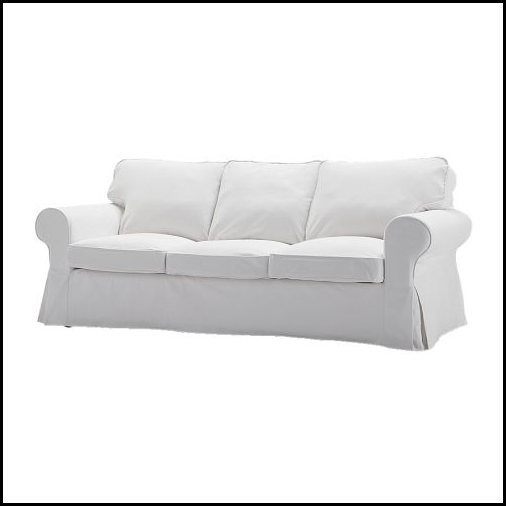
The easiest way to start is with the upholstery. Ikea’s white slipcovered sofa is just $399. Now, you could always upgrade the slipcover with beautiful white linen. Bemz makes linen slips for Ikea’s sofa HERE. I must admit that linen is more refined than denim or cotton – it looks so much richer.
Copying the antique dhurri rug is hard, but not impossible. Pottery Barn sells this dhurri.
Overstock.com had this dhurri – which is nice – but really, the background should be white with blue, not the other way around.
Shades of Light sells this white with blue dhurri, which might be a good substitute.
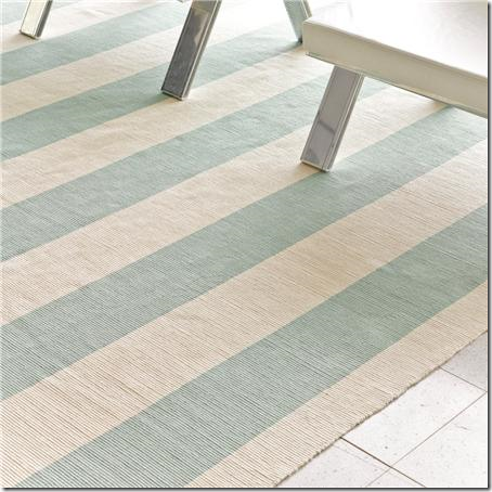
And Shades of Light sells this one too. The stripes might be too beachy for the look, but google dhurris – there are a lot on the market.
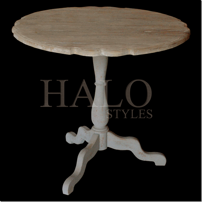
The gorgeous Swedish coffee table was harder to source. I found this white washed one at HaloStyles.com – which is a wholesale company. I would probably add more white paint to this to make it look closer to Pam’s table. It should be crusty with layers of paint to get the same look.
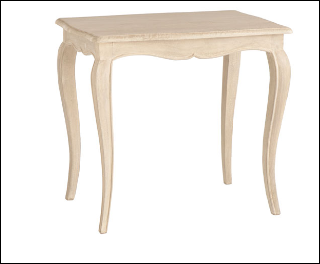
Not the right shape, but Wisteria has this Swedish inspired table which is very reasonable. Again, it would have to have white paint added to it.
The Swedish barrel chair was hard to source. The Tara Shaw reproduction was the only one I could find – it is not cheap, but it would be worth the money if you wanted to achieve the same look. An antique Swedish barrel chair is so very expensive – this copy would be worth it. To be more authentic, the larger decorative nail heads could be removed for plain nails.
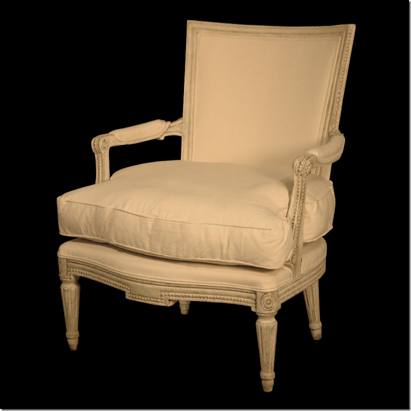
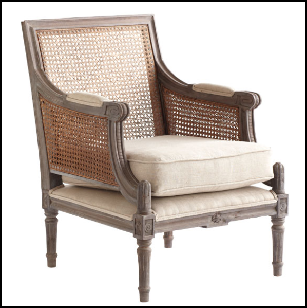
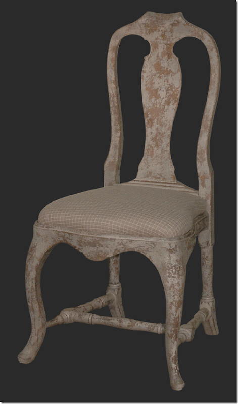
For the side chair, Halo Styles has this Swedish chair that would be a good copy.
Wisteria has this, while different, would fit in with the décor.
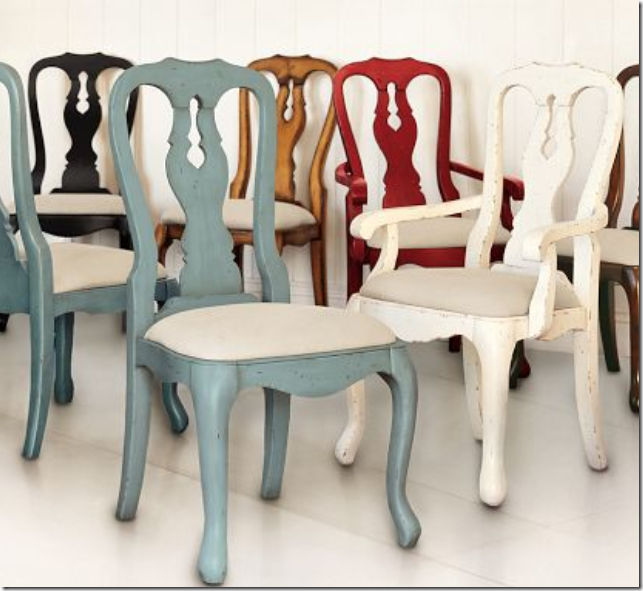
For the two chairs flanking the red doors – Halo Styles has this beautiful chair – not blue, but you could paint it or just leave it white.
Or, Pottery Barn has these copies.
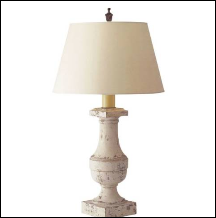
Visual Comfort sells these balustrade lamps which would be great – but I would get a round, white paper shade instead of this shape.
Copying the armoire from Watkins Culver is hard. But, you could always find one like this at Ballard Design. It comes in this blue painted finish.
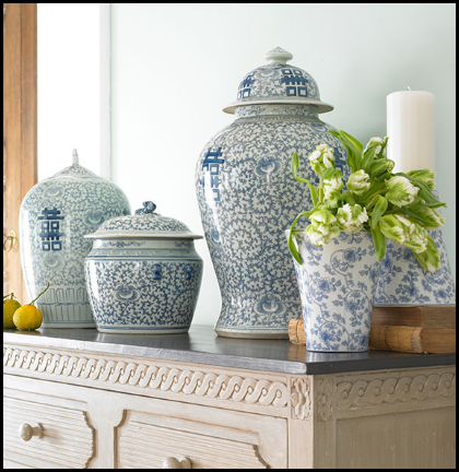
Blue and white porcelains are probably the easiest thing to find. This set is from Wisteria. I actually have it myself and for the money, it’s great. You could buy two sets of 3 and mix them up to make a mass of color.
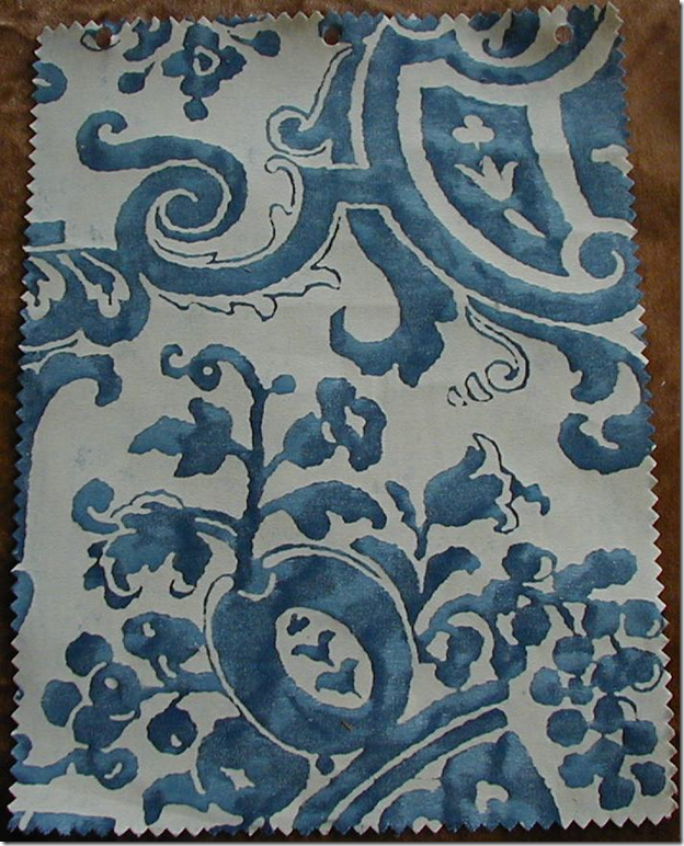
Another hard item to copy is the Fortuny pillows. There are a few companies that make copies of Fortuny, Brunschwig and Fils for one. And you could search Ebay and Google for someone who sells original Fortuny. Myself, I wouldn’t skimp on this design element. It’s too important. You could buy one or two yards of the fabric and make just two pillows. With one yard, you could cover the front with the Fortuny and the back with white or blue linen. The problem is though, I’m sure there is a limit on yardage of Fortuny! Still, this is something I wouldn’t copy.
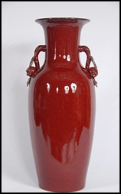
The red in the room is another hugely important element. Copying the barn doors is probably not realistic, but it could be done. You could always go simple and buy a few oxblood vases. The deep blue-red is the important element, there can’t be any orange in the color. Another idea would be to buy red silk taffeta and make a pair of portieres to flank a doorway into the room.
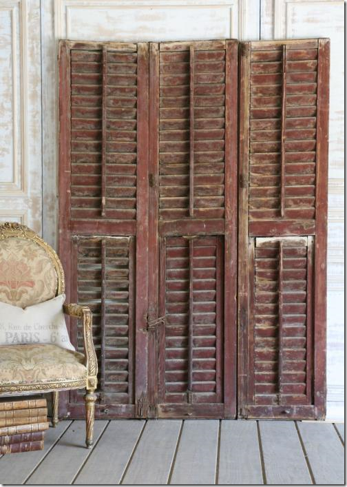
Or, you could always buy old shutters like these – and paint them in the proper red tone – placing these next to a doorway or around a fireplace.
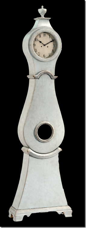
Lastly, though the Mora clock was in the study, I couldn’t resist. This copy from Halo Styles would be perfect in the room in place of the armoire, especially if space is an issue. And the price is much much less than an antique.
So, there it is! While it doesn’t have the fabulous antiques, I do think you can get a family room with the feeling of Pam Pierce’s gorgeous room. I’m sure she wouldn’t agree and is probably vomiting right now if she is reading this!!! I’m sorry Pam – I can’t help myself!!! Like I said, I can’t remember seeing a room this year that has made me so crazy with lust!! Actually, not sure I have ever seen a room Pam has done that I haven’t been crazy about. I need a shrink.
To read all about this house and many other gorgeous ones, be sure to get the new issue of Antique Shops and Designers – or read it online HERE.








That was fun!
ReplyDeleteI know what you mean about the magazines just not catching your eye lately. Can recent publications rub any more salt in the wound caused from the loss of Southern Accents, and quite frankly, from the consistent top-notch beauty that Veranda used to be (IMO)?
ReplyDeleteThis gorgeous house caught my eye too when I first picked up the magazine. You should have heard me gushing to my husband about what a grand "find" this was among the relative dullness on the magazine stand. Anyway, another beautiful post!
-Keri
I always look to your posts Joni because, apart from showing us beautiful images, we learn from you, and I love that.
ReplyDeleteThis post was great in showing people how to get a great look for a lesser price.
Thank you.
Its a very nice home but did not have quite the same effect on me, a little too rustic for my taste, the wrinkled drapes would make me nuts, ditto the heavily distressed furniture though of course I totally "get" thats the look. It is well done for that style naturally and thats what make the world go round, why there is chocolate and vanilla and pistachio and butter pecan and well you get the picture:)
ReplyDeleteThis post was several posts down but when I saw the name Pamela Pierce I skipped the others but will go back. I can’t get past those red doors can you say serious love? Love, love, love the French olive pot Pamela always uses and I purchased one for my birthday because of her. As for the original antique Fortuny…I HAVE IT! Ok it’s because it’s my business but I have that pattern and it looks fabulous in that home. Like you I can’t get through some of the magazines lately everything looks the same and there isn’t any character in the rooms. What ever happened to European traditional style? I hope this home is going to be photographed by another magazine because I really need to see the angel hanging in that hallway.
ReplyDeleteThanks for doing the high/low sourcing. I always love that.
ReplyDeleteYou are right! Pam is masterful. So much to ponder...
ReplyDeleteI liked seeing what you came up with for options to get this look. I think your house is prettier though!
ReplyDeletePP is the best ! I love everything she does and I don't even like the color blue... I too am finding I am not interested in the new looks the magazines are giving us today. I just got my Veranda, looked at it once and tossed it. I remember the days when I would look for hours and then save for years. What is going on, is it me or them?
ReplyDeleteDitto on the new more colorful mis-matched design so popular in the magazine. My eye is just not comforted by these--in fact, they sort of make me crazy.
ReplyDeleteToo bad the few design magazines are less interesting.
HB and Veranda latest issues were just un-interesting.
Thank goodness, Joni, for your blog! Better than the magazines these days.
Beautiful, beautiful, beautiful, Joni!\Thank you for the sources. The red doors are amazing. Great idea.
ReplyDeleteTeresa
xoxo
I don't doubt that one could do a similar look on a budget..but good architecture is a must...without the good bones, the antiques and decor wont stand up...love the rugs you selected..very appropriate and stunning in other design styles as well..
ReplyDeletemaureen
Joni- I thought I was the only on who has been disappointed with the interiors our design mags have been featuring lately. Where once I'd be excited to grab a cup of tea and settle in for the visual feast, now not so much.
ReplyDeleteI also don't get all the hodge podge. I find it dissonant and uncomfortable. But I guess edgy and one of a kind, bizarreness trumps classic and lovely.
It looks so beautiful, the color are both sweet and original!
ReplyDeleteVery beautiful and relaxing.
You are really talented.
Joni you are too much fun. I agree with you, as I'm not a red person, the way she added just the doors in the living room (for example) was so great!
ReplyDeleteFun post!
x
Maria
I agree with you Joni, in fact I just posted about my lack of interest in what I'm seeing in the design world lately. This home is absolutely drool worthy....ah, inspiration does exist out there!
ReplyDeletexo~
T
If I didn't have to sell my English Tudor...I'd start "that look!!!" immediately! Just a fantastic visual...thanks! franki
ReplyDeleteJoni, you hit the nail on the head. I hate all of the desperately quirky and contrived rooms the mags are showing these days. Really, who would want to live in those?
ReplyDeleteAnd I am very happy that I saved all of my issues of Veranda from before the editorial change. Every issue was a visual treat and the homes were gorgeous. Now, not so much.
Love your high/low feature. That's not my particular style and my home is done (for now) but it's fun to play along.
Hi Joni. First, I have to say how utterly thrilled i am to hear someone else in the industry does not understand the design asthetic that we see in most magazines. I honestly thought that maybe it was me. Maybe I am not doing my clients justice by grabbing everything I see that is mismatched, out of scale and totally unrelated, multiply that, throw it in the room and call it a day! I have to say that I would love to walk through the design process of one of these designers and try to understand the design process that they create for a client. (i'm being serious) I know everyone does not like abstract art but it is still fascinating to try and understand what the artist was thinking.
ReplyDeletePam Pierce home - I gasped and gaped for an extremely long time. Thank you for the post!
Sigh...that dining room with the Rose Tarlow fabric! And the kitchen with the striking backsplash. I love the more budget conscious alternatives that you found. Groves Brother's makes a good Venetian style fabric, too.
ReplyDeleteThanks for this post! Her designs are always amazing and like you, I am disappointed in all design magazines. The new Veranda issue is the worst issue I have ever seen them do! What are they thinking? I wish you would do a post on Veranda because maybe they will see the post and realize they are on the wrong track before it is too late. Barbara
ReplyDeleteAarggh - Google just ate my comments. I'll try again. Absolutely love Pam Pierce's design - that blue is heavenly and the red doors give it a nice pop (tho' if it were mine I'd want old rustic wood doors, as if). As someone else noted, the design is dependent on the fabulous architecture first and the costly antiques second. But I love the way you've made budget friendly suggestions. Fun! I totally agree about the current design trends. I just threw my new Veranda in the recycle bin after thumbing through it only once. Either the aesthetics don't appeal to me or an enormous European castle or chateau is featured which is so beyond my lifestyle that it's totally unrelatable. (Yes, I know, they can be inspiring to look at, but more for the architectural and decorative arts history than for the way I really live.) So much of current contemporary design in the shelter magazines leaves me cold. Is it because of our age? It reminds me of the "mod" stuff and bold graphics of the late sixties and seventies, which now I think are just ugly, but at the time I thought were really cool! The younger generation always has to mix things up.
ReplyDeleteYour comments about the magazines really hit home with me. I'm thinking about not renewing Veranda. The new issue is horrible! I just pitch them, nowadays. I know there is a new editor but haven't they gone a bit far in the other direction?
ReplyDeleteI find myself looking back through old issues of Country Home. I wish I had saved more of them! Is it just us old folks that dislike what we are seeing lately?
Thanks for showing more of Pam Pierce's work. Fantastic!
Where do I mail the check? What you did, turning the room into something to be recreated.
ReplyDeleteExactly why you do get paid for what you do.
And, yes, I did notice the pretty views into their garden.
XO T
OMG...think I just seized looking at
ReplyDeletethis spread! Finally, drool worthy
decorating on the newsstand. Thanks
for sharing.
Are the two photos of the living rom from the same magazine? The first photo shows a low coffee mirrored coffee table (which is really interesting) and the second photo shows the higher pedestal table with two chairs that aren't at all in the other photo? I have to assume that's the same sofa we're looking at. It does annoy me a little bit when a stylist moves things so drastically from photo to photo. It's hard to judge the designer's original intention.
ReplyDeleteI do love the dark red doors as it highlights the shape of the lamps.
Beautiful room though.
Love this magazine! BUT...did you know there is a 25% off furniture sale at Cost Plus? I just brought my Kooboo chairs home, and I LOVE them! Thanks for the inspiration Joni. You should get a commission!
ReplyDeleteThank goodness some real eye candy! Love that dining room with all the ethnic furniture and the patina on those red shutters is to die for. You couldn't replicate that no matter how hard you tried, though. Thanks for this one! Teddee
ReplyDeleteJoni, I live in Houston and I cannot find the magazine. I looked at two Barnes and Noble stores and my local grocery stores. Im in north Houston and our Borders on market street has closed. Where do I find it?
ReplyDeleteKelley
Always love a Lynn Von Kersting room.
ReplyDeleteDon't think I could live for long with that big blue Armoire. I would need to paint or strip it. Too much big pale hulking blue in one spot. I'm sure it's really expensive and it will be out of style so quick.
Joni, I am with you 100% on Pam Pierce. She always pulls it off and always outdoes herself. If my ship ever comes in...
ReplyDeleteAnd I thought it was just me.
ReplyDeleteThe latest design mags, especially the online mags, all seem the same to me with lots of perky designs and just a tad of sophistication.
Off to read Antique Shops and Designers...
Thanks, Joni, for your honesty!
Just beautiful! And thoroughly enjoyed your sourcing - thank you!
ReplyDeleteMy latest Veranda in already in the recycle pile, flipped through just once.
Jennifer
Hmmm... Everyone's comments about not liking the designs featured in shelter magazines are interesting -- are the editors paying attention? All the mags are panicking about their audience declining due to alternative sources (including design blogs like yours) and blaming the internet, the economy... Maybe they ought to take a look at their content instead of wringing their hands. I agree, I've seen a lot of featured interiors lately that underimpress, especially when it's a celebrity home or a bare-naked, white interior full of Picassos (AD is the worst offender there -- are we showcasing interior design and architecture, or Who Owns the Most Expensive Artwork?).
ReplyDeleteI love to read your blog and while I like light and white interiors, the gray and gray blue (my whole top floor is that colour)I love colour. Wouldn't it be boring if everyone had the same house?
ReplyDeleteAnd also, while we like the way many of these rooms look now, don't you think that 20 years from now we will look at them the way we do avocado green kitchens and appliances?
I can remember when one of THE looks in the top magazines was a colonial look with Windsor chairs and pieces that some People would call "Early American". Now, people would never decorate that way. Do you really just like this one look? Just curious - and again, I am a regular reader who loves your blog.
Once again Joni, these images are stunning. Lots of great information and tips! Your blog makes my day!
ReplyDeleteRuthie
I welcome any colour, the white ikea lounges are done so much, but they look lovely with colour, thank you for the links too, they are very helpful, love your blog !
ReplyDeleteJoni:
ReplyDeleteThank you for showing another Pam Pierce designed home. She is a fabulous talent. Wonderful info for alternatives to the expensive antiques which demonstrates your great eye for design. I agree about the magazines - the only thing I've seen that has caught my eye (other than this) is an article in the Nov/Dec Traditional Home. The feature is on a Dallas Tudor belonging to Katie and Scott Reynolds decorated by Lisa Luby Ryan. It's lovely!! Think I need to move to Texas. When I see a home I love it's often in Texas or Europe.
Thanks Joni for all your posts - they are constantly great!
Janice
Joni, I've never seen this magazine & am loving all these images, especially the blue puddling drapes.
ReplyDeleteBut, everything is beautiful. Thank you for the head's up on this. Sending love, sweet lady...
I picked up a copy of the magazine at The Urban Market a few weeks ago. When I read this story about the Pamela Pierce decorated home, my first thought was, I wonder if Joni has seen this? Not kidding!
ReplyDeleteI do not have any magazine subscriptions anymore. I would much rather read your posts and look at your beautiful pictures than any of the magazines I used to receive.
Another great post! Hope you are enjoying this beautiful fall day in Houston.
I have learned so much in the past year or so from following your blog. I love those blue drapes and the red doors were to die for. Thanks for the sources. I have found ebay seller fortuny1 has great price points on her pillows and I am lucky enough to live near Atlanta and can get to Scotts to shop June Laval's tapestries and pillow so I have been able to splurge on pillows per your advice....I have let my magazine subscriptions expire and just follow your blog and all the other wonderful blogs you have links to...thanks!
ReplyDeleteWell I am sooo glad I have lots of company with my unhappiness with what magazines are coming out with!! Should we start a movement? LOL.....I MISS MY SOUTHERN ACCENTS!! Whats so hard about putting together a magazine filled with gorgeous traditional interiors with elegant European influences? It seems like a no brainer to me! Why is there this disconnect? Its making me crazy and I have ZERO subscriptions now becuase I found they were just clutter and there were so few worth keeping..yes its that bad.
ReplyDeleteGlad I have company but now the question is what are we going to do about it!
Just an idea, but it would be interesting to know how the publishers of this magazine got their start, who they are, etc. It really seems to be a ground-up project. I enjoy this magazine very much and look forward to every issue. It's beautifully produced. The other magazines are leaving me cold these days...
ReplyDeleteThis is a beautiful project. Thanks for the peek, Joni. I love the restraint. It's so hard to get clients to do that. What a great high/low segment too. You really know your sources!
ReplyDeleteHi Joni,
ReplyDeleteI've been receiving your blog posts via email for a long time. Suddenly I'm not - I didn't receive this post and I'm not receiving any others I subscribe to. I have AOL. Have you heard this from anyone else?
I opened a new Gmail account and I'm receiving everything just fine, but I'd really like to figure this out. BTW, you were the first blog I began reading (3 or 4 years ago)and now I subscribe to 50+. They've all disappeared - poof!
This home is beautiful - I love Pam Pearce! Love the blue and red - it must be stunning in person.
Kerry
Dear me, what a collection! I feel like I've just been transported. Clearly this post was a labor of love and it's absolutely divine.
ReplyDeleteJoni--Thank you so very much for this feature. The first picture took my breath away.
ReplyDelete@Urban Cottage: it is the same room, but not the same sofa. Look at the lighting. I imagine there is another beautiful window beside the one in the first picture and that it is to the left of the picture with the doors. I think the red doors are opposite the blue cabinet: that way the blue cabinet is the focal point of the room from the entrance. Can you imagine that view--the cabinet with the doors flanking it--with the lamps to draw your eye? That would be so gorgeous.
I think that Pamela Pierce, who I was introduced to through your blog, is my all-time favourite. I swoon at all her work. Swoon!
ReplyDeleteThe only design magazines I buy now are American House Beautiful, American Elle Decor and Veranda. The first two magazines haven't been the same since Margaret Russell & Stephen whatsisname left. Ironically I enjoy Veranda more now with the new editor.
This looks really wonderful, the colors match perfectly together!
ReplyDeleteYou are really talented!
You pose some very interesting questions. I am rather fed up with wasting money on the shelter magazines still publishing.
ReplyDeleteThere are some regional ones and foreign ones that are OK -- sometimes.
There are some seasonal ones out right now, most of which are just rehashed old tired stuff.
I wonder if we are all on overload because of the blogs and Pinterest, not to mention this godawful economy. When we look around and see the level of misery all around us and the genuine pain of so many, "cutting edge design" seems a bit trivial in comparison to the very real troubles of so many. I just read that the disapproval of Congress is now over 80% -- and look at all the stooges on the Republican side who want to be President!
I miss the times when we could go to the mailbox and find a new issue of a favorite magazine, and the worst thing we had to worry about was getting our work done so we could sit down with that new issue and our favorite beverage and get lost for a few hours in another world which someone had made beautiful.
ETS
How very talented Pam Pierce is! And very fortunate she is to design for ONLY fabulous manses with incredible bones, with deep pockets to shop!
ReplyDeleteI am not jealous..maybe a tad?... but with such opportunity, wouldn't any of us design so well?
OK, with that said, LUUUVE the silk ballgown curtains in the dining room,cerulean blue, impossibly imperfect.
Such ironies make the statement of Old World Luxe.
Mela
Hi Joni!
ReplyDeleteI love some of Pam's choices of painted furniture and those cerulean blue taffeta curtains in the dining room are just gorgeous.
I'm fortunate enough to like many different decorating styles, so I'm still enjoying all the shelter magazines. That said, I have noticed a trend towards more discordant styling and look-at-me- I'm-trying-so-hard-to-be-different rooms. I suspect that the magazine editors are trying to appeal to a younger demographic. So it's up to us to write to them and ask them not to forget their "more mature" readers who just don't get the current tendency to throw a bunch of different stuff into a room and call it decorating. Because if we all just cancel our subscriptions without saying anything, pretty soon there will be no more decorating magazines. And that would be very sad.
Very exclusive photo and article thanks for sharing.
ReplyDeleteOh! Lovely, lovely, lovely! Love that house every bit!
ReplyDeleteI think I have seen the chest under the mirror in the dining room! (can't place it)!
One of my absolute favorite things of all NO CAN lights!!!!!!!!
I cannot stand them! They make swiss cheese of the ceilings; they are horrific light and they are taking over the world!
What a relief to see a whole new house without any! Beautiful lamps and lanterns....sconces and chandeliers! Be still my heart!
Thank you!!
I read pamela pierce does it again on my iphone and jumped out of bed to come read. honestly does anyone do taffeta drapes any better?! her drapes are just sick. we should try to find out how she makes them look so thick and full yet messy. you know I'm right there with you on the P squared girl crush. i'm not kidding about christmas coming early when she finally launched a website. love you joni girl! hope all is well! xo
ReplyDeleteThank you to everyone who clicked the voting link for TYLER & ANNIE at the bottom of Joni's wonderful post! We appreciate every single vote and the amazing support from Cote De Texas...now if I could just make my kitchen look like this one....hmmm. :)
ReplyDelete-Annie
I voted and got my brother and 2 friends to vote for Annie & Tyler. I hope they win.
ReplyDeleteI have always loved blue and white together, but I think it depends on the kind of house you have. It always makes me think of the seaside. The splash of deep red in the doors and shutters is an effective addition and there are quite a few mediterranean touches going on. I can't decide about the taffeta curtains...the overall look is very impressive but can't help but think I'd want to iron them!
ReplyDeleteLovely post and great site :)
That one white picture of the couch looks so funny to me for some reason.
ReplyDeleteHi Joni!
ReplyDeleteI just returned from the EAST for a week with our other daughter (sister of the Montecito new house "before"...I am so happy you are excited about the during/....(I lost 15 pounds...and it is really interesting and informative.........I just have to recover and I will post! you are so cute!)
Fascinating your post on the Ojai "dream house" (mine) It kinda makes me sad. I think that real estate agents (you know I went through this)......I have to post the funniest thing ever on when we took it "off the market" and why"....and "why we put it on the market"..I can tell you our being published in House Beautiful had NOTHING to do with it!
House Beautiful (did I die and go to heaven? yes!) called and it was Newell......Turner.......(he is now the editor) he was , I think the "style editor"! He wanted to photograph it; and he called back and asked......"is that vine on your loggia 'deciduous'"?
That is when I knew I would LOVE him......and I was in "Good hands!" I had no idea about ever putting this house on the market ever! we built it with the idea we would stay here always! "feet first" is what I said!
Then I started searching for our daughter Jacqueline.......(and I saw all these houses )
Anyway; we put it on the market. It was a mistake. Lucky for us it didn't sell.
I am going to do a brief blog about why! (you will just die! what a story!!!) It was not a "bait and switch" at all! Perhaps Kathryn's was not either. In California......and especially surrounding actresses......there are rumours and gossip! I would just be careful believing any of this.......it is gossip.
As you know; I did not like the redo of Kathryn's house by the Beverly Hills person. I loved it as it was! I thought it turned into "pablum" with Reese.......and I cannot remember the decorator. I just thought it lost it's "spirit" and it's "soul!"
(we can agree to disagree......I never read if you published my comment......it doesn't matter)
I completely agree with you that a few months later the damn thing is on the market for double what she paid for it........; it makes me think exactly what you think!
This is some spec thing! No; it is not about the children, the ponies, the dogs........EWWWWWWW! My Mommie (who was from the South) said......."movie stars.......yuck" She said that in 1956 or something! There were some great ones........she was talking about the not so great ones!
Reese is disappointing.....
you are so right about the photos..........real estate agents better wake up!
they should just read your blog post!
DUH!!!
Fake! All of it!!! Horrific pictures!
YUCK!
It has, as you say, been stripped of all the spirit and its soul. (I almost burst into tears when I saw that upstairs library with the flatscreen (please hide them!)
I have no idea what is going on here. I think you are on to something.......and it makes me kinda sick. We have seen this recently here in Montecito. People pretended that houses were "theirs" and they were not!
This bothers me!
I am so glad you love the "before" of the house in Montecito!!
and then I will do the "during"! The "during" is still going on......and there are so many lessons there for old houses!
"Old" is relative; I just came from Marblehead, Massachusetts! Our daughter who lives there lives on the "cove"! They built their house; and right around the corner there are houses that were built in 1680! and many in that era!
I find it fascinating!
Penelope
I am learning so much from your blog about what I like and what I don't like, and how to identify it, it will hugely help me guide the decorator with the decor for my upcoming renovations, thank you Joni!
ReplyDeleteSounds good, you have done awesome work, i am glad to check out the pics here and looking forward for more updates.
ReplyDeleteRta cabinet store
Dear customer, first ensure yourself if you collect any call that is related to KBC lottery that either it’s real or bogus. To make you attentive, information is accessible on KBC official website associated to diverse type of fraud that people are doing by means of the name of KBC. Nowadays’ inhabitants are getting a lot of fake calls from the unidentified numbers so, if you collect any call or lottery number then notify at our kbc head office number right away.
ReplyDeleteKBC Official winner is a place for KBC Lottery Winners List to check their Prize. Contact KBC Official Head Office Number Mumbai for Getting a chance to participate in KBC Game Show to Win KBC Lucky Draw & claiming your Cash Prize. Check our Website for KBC Lottery Winners List 2018, 2019.
ReplyDeleteKBC Lottery Winners List