This latest kitchen in the Readers Kitchens Series is located in Hudson, in upstate New York. When the homeowner forwarded me these pictures, I emailed her back asking for the “before” pictures of this renovation. Imagine my shock when she said it was new construction! Wow, the kitchen really has that old house look. Apparently the owners live in a 1930s bungalow and when the time came to remodel the kitchen, they opted to build an entirely new space. But, who wants a brand new, white marble and granite temple when you live in an older, more casual house? The homeowner actually designs kitchens in her area, so she knew exactly what she wanted. In this design she tried to use as many vintage and antique items, along with salvaged materials that she could. Enjoy!
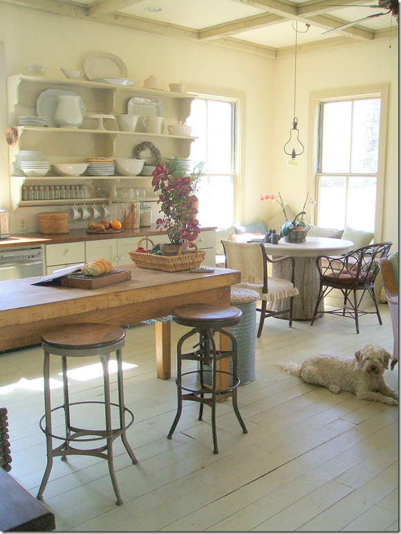
I love the painted wood planks used in the addition. They really set the tone that this is a casual room – not a slick, modern kitchen. In the middle is an old, wood island that acts as the focal point. Be sure not to miss the ceiling – a grid of darker painted beams that create a mass of interesting squares.
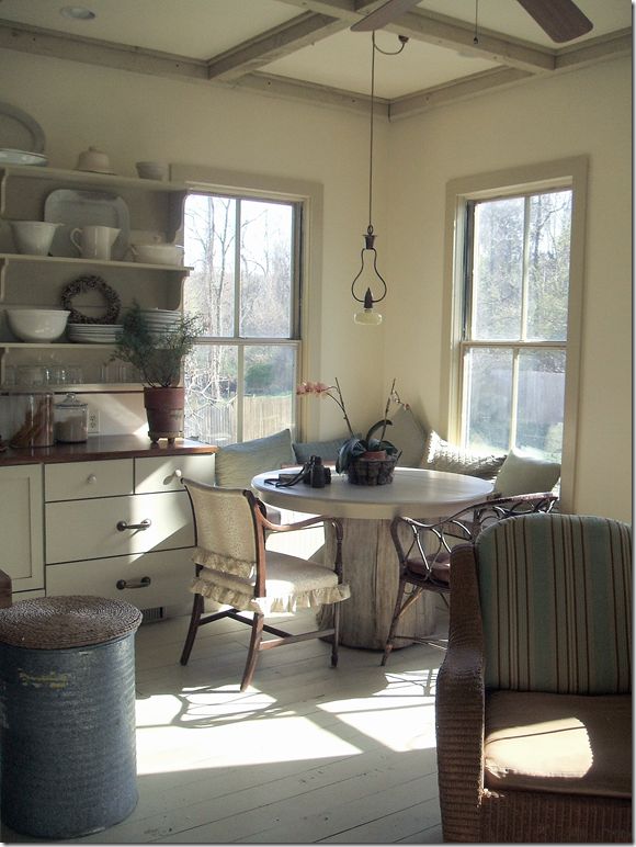
The corner becomes a banquette for the breakfast table, with its rustic wood base. Notice the charming light fixture that hangs above the table. I love how the sun streams through the windows here. And, don’t miss the recycling bin – an old metal can topped with a round, straw mat.
The countertops are wood. Instead of upper cabinets, a series of shelves holds all the dinnerware. Notice the mixture of hardware, two heavy brass handles are mixed with smaller round white ones.
Along one side of the kitchen, a railing overlooks a stairwell, while two octagon shaped windows break up a blank wall. The appliances are found mostly on one side, while an extra oven is built into the end of the island. The refrigerator uses the fool-the-eye trick of appearing built in by bringing the cabinet above it all the way out.
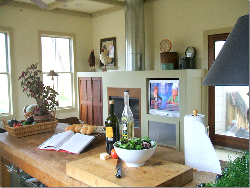
And finally, looking at the opposite wall, a fireplace is built in, along with a television. The chimney becomes an architectural element in this clever design. It’s truly hard to believe this is new construction! It is as seamless an addition that I’ve ever seen. I think this kitchen has an important lesson – just because you can build it new, doesn’t mean you have to build a monument to yourself. This homeowner chose to build a kitchen that is truly keeping in with the style and age of the house.
To contact the homeowner for design work in the upstate NY area, please email her at dsrd@mhcable.com
Next: The comment section on the last blog story, Pamela Pierce Does It Again, was more interesting than the story, something that happens a lot! I love reading your comments and it is always interesting to see where you are coming from. This week, a lot of you commented on the new Veranda magazine. I have really been enjoying Veranda lately, especially with the new editor, whom I really didn’t think I would like! Instead, I’ve found that I have enjoyed the direction she has taken. I do have to agree with you though, that this month was not a stellar issue. Many of you said you got your issue and tossed it out after one quick look. At the time I hadn’t received my Veranda yet, but I have now.
Well – there were a few houses I enjoyed, the Swedish one for example. But I have to say, if you are looking for a replacement for Southern Accents – this issue isn’t it. This month, Veranda looks more like Elle Décor and I can’t understand why. I find it strange because other issues have not been like this. So, I’m going to just say this was not their best and wait until the new one comes. Because what else is there? I’ve gotten where I can barely tolerate Elle Décor – I just don’t understand it anymore. House Beautiful has never really recovered after Stephen Drucker left. The biggest turnaround has been Architectural Digest since Margaret Russell landed there. I’ve found that this is one magazine I really enjoy. Mostly though, I wait for Lonny and Rue – the two biggest online magazines. They are more interesting and filled with more décor than most of the printed ones. Hopefully, now that the economy seems to be heading slowly upward, more advertisers will return to magazines and we will have something to look at again.
This library was my favorite image from this month’s Veranda. I would die to have a room like this!
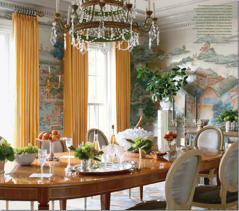
I liked the dining room of this house and thought the styling was pretty. The yellow curtains were a pleasant surprise.
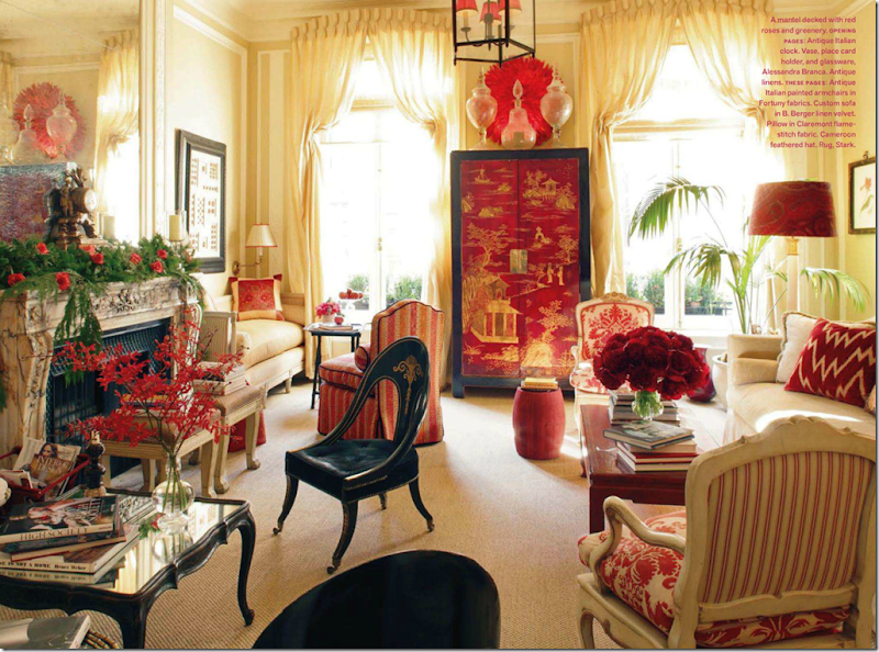
No one loves Alessandra Branca more than me, but really – how many times are we going to see her NYC apartment? I was shocked that it was shown in this month’s Veranda. Why??? This is probably the 3rd or 4th time this apartment has been published.
Last month’s issue was a keeper for me. The Windsor Smith house shown on the cover – drool worthy.
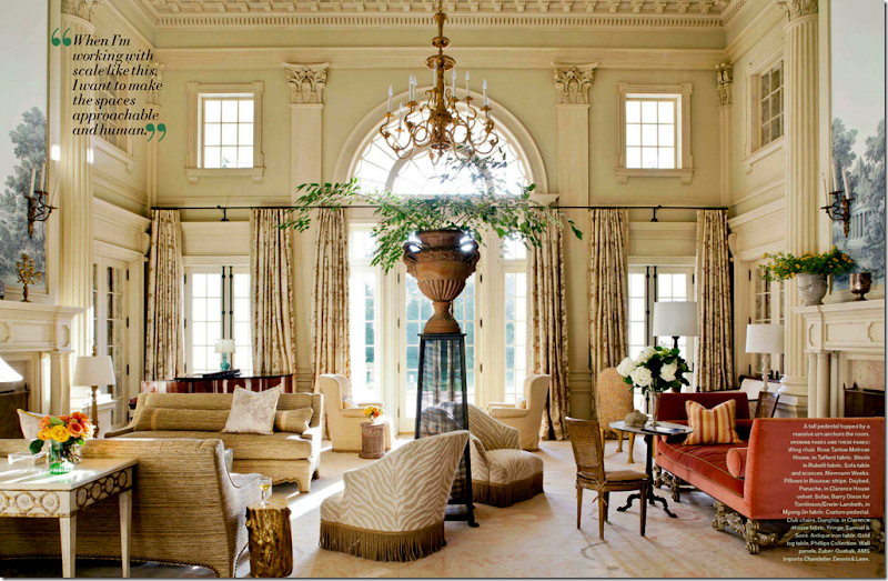
I know we can’t see an entire issue of dreamy houses like this Barry Dixon one, but I do think each issue should have at least one like this – totally decorated to the nines. Where else can you get ideas?
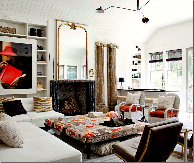
Windsor has become one of my favorite designers – I’m crazy for her style. That ottoman!! Gorgeous!
I’m not sure anyone does a better kitchen than Windsor. This one is beyond incredible! The walls of marble, the silver accents, the pendants, the island table topped with more marble, the refrigerator columns flanking the door, the marble sink – how does she think of all this? Amazing!!!!!
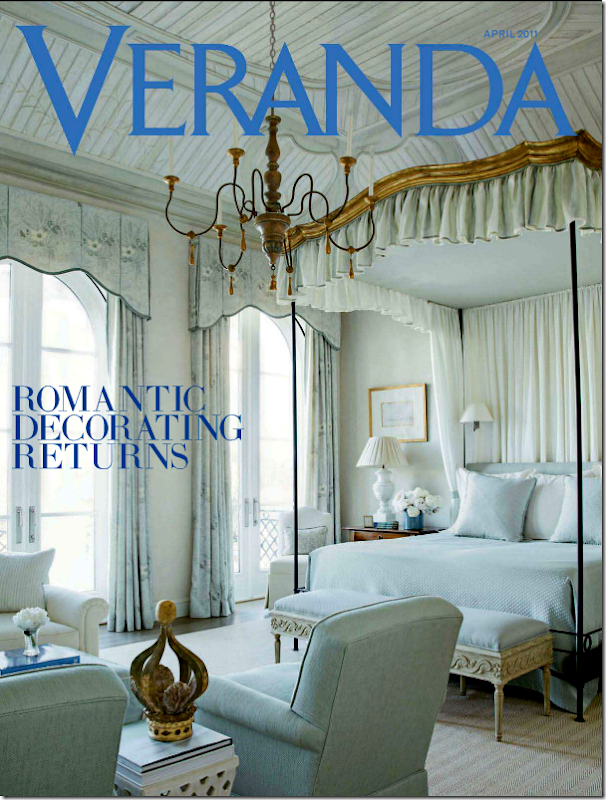
As long as Veranda can come out with issues like this one in April, I’m willing to forgive issues like the newest one. April’s issue was one of the prettiest in memory. It was called “Romantic Decorating Returns” – why would anyone want their house to not be romantic, beautiful and endearing? Who wants a house that isn’t romantic??? I don’t get that.
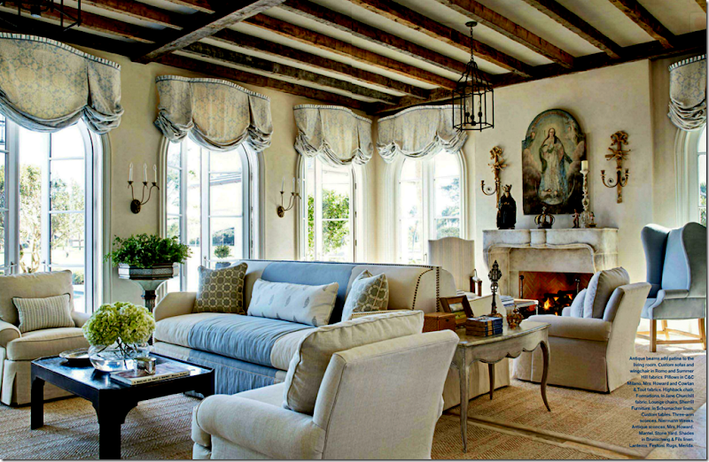
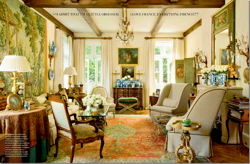
This house by Jim Howard was beyonod beautiful. But is there anything that he or his wife does that isn’t?
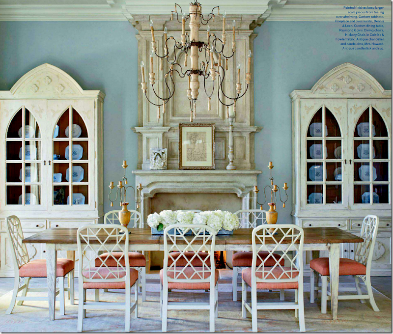
I love the dining room in blue with touches of peach.
This house by Peggy Stone was reminiscent of Southern Accents and older Verandas. Can’t we get more of this each month? It’s what we want, isn’t it? I just hope Veranda realizes its readers don’t want another Elle Décor – we want Veranda, like it always was.
And finally, I have a favor to ask of you today. My niece’s friend Annie (who is also a reader) is trying to win a contest that will pay for her and her fiancé Tyler’s entire wedding! Wouldn’t that be nice??? Tyler and Annie are looking for votes and asked if you could be so kind and vote for them.
The website Entwined is hosting the contest for a wedding worth over $100,000. Can you imagine? What a dream come true. The wedding will take place in Blanco, a tiny town in the Hill Country outside of Austin, Texas. Out of all the entrants, 11 were chosen as finalists and Tyler and Annie are amongst them. If they win, they have pledged to donate $3,000 to the Houston Humane Society – as they are huge animal lovers.
If you have the time and don’t mind – I know they would so much appreciate your vote!
To vote for Tyler and Annie, just go HERE
And a huge thank you to the homeowner who so graciously allowed us a peek into her new kitchen addition! If you have a kitchen you want to show off – just email me the pictures at mrballbox329@aol.com. Hopefully, I’ll be running this series for a few more months!
READERS KITCHENS SERIES #6 AND THIS MONTH’S VERANDA
Subscribe to:
Post Comments
(
Atom
)





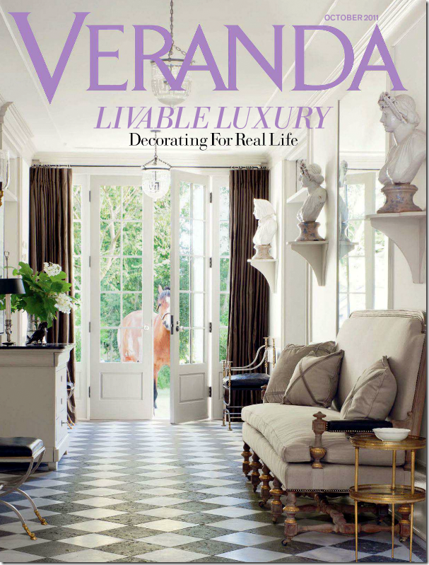



That library looks sad to me rows and rows of brown books, it looks like the books were purchased because of how they look. I do not get that at all. I love things to look nice but books are off limits, books should be chosed based on what they say, not what they look like. Love that horse looking through the door! Love the ceiling in the Jim Howard living room.
ReplyDeleteI'm crazily obsessed with Windsor Smith and her kitchens, that one in particular. (And I'm going to see her speak at DCOTA this week, hurray!!)
ReplyDeleteLove the reader's kitchen! I would never in a million years guess that was an addition. The recycle bin and very interesting dining table are my faves. Nice work!
I wish I could comment on the current state of magazines, but I have 953 of them piled up on a forgotten chair in the corner. Boo.
I loved the table in the nook/banquet of the reader's remodel. Enjoyed the post. I too don't care for books that are just there for "decor". I will vote for Annie!
ReplyDeleteI LOVE books for decor! Not meaning to be adversarial, but books are just plain beautiful and have powerful decorative qualifies, as well as the power of the written word. Seeing books as only functional is limiting their potential, and they fill a house with soul. I love reading, and I love libraries, but I also love their inherent beauty.
ReplyDeleteI also love Windsor Smith's kitchen. Just fantastic!
www.saylesranch.com
Voted for your friends, how wonderful for the lucky couple! The first kitchen is well done, I appreciate the care and effort that was put into making it an approrpriate kitchen for that house, it is warm, cozy, inviting and very functional looking. Well done!
ReplyDeleteSo agree about the whole magazines in a slump, nothing is exciting me (my friends homes are way more exciting than whats being featured in these mags..haha) And I agree much of whats online blows it away but being a lover of classic traditional interiors, most of the online mags, though great looking and full of inspiration do cater to a more transitional look. So, its a bummer for people like me still in mourning over Southern Accents!
Veranda was hitting a few home runs then this last issue just fell flat. I went throgh it literally in 3 minutes and threw it away. I think their April issue was the best yet. They need to hear what we are saying....loud and clear. There is a great gap that needs to filled!
That first picture of all the old books is such a wonderful picture:)
My personal opinion is that Dara can't help but be influenced by her Domino roots, but she and her staff should realize that their Veranda audience wants - adores - the old Veranda style! I so don't want to see this magazine fall by the wayside, which it may, if it continues to be on again/off again! I like Domino, too, but Veranda has a different audience, or at least a different esthetic.
ReplyDeleteAlso, I voted for your niece and her fiance - both adorable - and hope you'll post some pictures of the flowers & decor, if they win!
Very pretty kitchen from the reader, looks functional, lived in cozy and full of personality. They did a great job. Windsor Smith's kitchen is so beautiful - is truly a "heart of the home" kitchen. Hope Veranda and other shelter magazines can keep on publishing. Would not be fun to live in a world without beautiful home magazines full of eye candy to hold and savor over and over.
ReplyDeleteAlso voted for Tyler & Annie! Good luck to them.
Thank you for another great post.
Janice
I love this site and it will surely be one that I Bookmark for the future. What is encouraging to me is that I see in the photographs many of the things I am doing in my own home, on a smaller scale of course, but none the less I am already implementing. I love the variety and choices. It is letting me know what the value is in some of the objects I already possess and how to use them. I would have to say the cowhide ottoman caught my eye and the original paint Dutch clock.
ReplyDeleteI hope the compost ends up in my house.
Thanks for this great offer.
Kindest regards,
Barbara Collins†
@madreminutes
Thanks Joni--I loved seeing the new "old" kitchen and as always, I learn from whatever you show us. On the other comment section I think it was squeak
ReplyDeletewho wrote about the trend towards more discordant styling and look-at-me- I'm-trying-so-hard-to-be-different rooms. I agree. The quirky things
Elle Decor has been featuring leave me cold. I am letting both my Elle Decor & house Beautiful subscriptions expire - with no renewal.
I pored over those issues! You identified all my favorite rooms, brava!
ReplyDeleteAgree with you about Elle Decor and Veranda. I finally subscribed in May instead of buying them issue by issue, and have been disappointed ever since, other than a few pages here and there - mostly the ones that you show here. Barry Dixon's decor is great as always, and I love the room you are displaying by Peggy Stone. Regarding Windsor's kitchen: just not a fan of cold, hard metal chairs, no matter how good they look, but that's me.
ReplyDeleteYour reader's kitchen is great. It feels stylish but not styled and timeless and the nook is so inviting.
ReplyDeleteLove the shelving in the Windsor kitchen and how about those lush fabrics in the Dixon living room???
Voted for Annie and Tyler.
The new old kitchen was a huge success. I like all of it. very functional, not overdone, and fun to use and live in. Hat's off to the owner for a job well done. Richard from My Old Historic House.
ReplyDeleteWOW! I love that library...I have an obsession with old books!!
ReplyDeleteJoni, Thank you SO much for including us in the post about the Entwined 2012 wedding contest. We are beyond thankful and thankful to each reader who votes! The voting ends this Tuesday at midnight...please help us win so we can make our donation to the Humane Society! Heartfelt thanks, Annie :)
The reader who sent in her kitchen did a wonderful job! I love when people stay in the style of their homes rather then trying to go mainstream. I totally agree with what you said about Veranda, please don't go the direction of Elle Decor!
ReplyDeleteJust wanted to put in my two cents on the lack of good magazines as I couldn't agree more! I used to LOVE House & Garden which is gone along with Southern Accents. However, you didn't mention Traditional Home! That one is great.... and considering your taste I am surprised you don't get it. You never get the modern/retro looks that you get in an Elle Decor or a Metropolitan Home and I find that most of my tear sheets have been from Traditional Home. Check it out, I think you'd like it!
ReplyDeleteSheila
Loved the readers kitchen. I could cook in this kitchen. Loved the light fixture over the round table. As the discussion goes about Veranda magazine, I have been disappointed with the magazine for quite some time now, among others also. It has slowly gone mostly modern, trying each month adding a story or two on modern trying to suck us in. It did not work on me. Also big corporations get rid of top editors when they reach a certain age, and bring in the young editors thinking they are fresher. There is nothing like experience and know how. Joni, your blog is a great sounding board for our dislike of these new styled magazines that we have been reading for so many years and have helped them grow to success, and I feel that they would be more successful in this hard economical time if they would just give us what we had before they changed the format. I will trash this months edition of Veranda also. Thank you for your effort and time. Veranda needs to hire you, Joni. You would get it back on track. I love your blog and check everyday to see if there is a new blog.
ReplyDeleteJudy English
joni
ReplyDeletethe windsor kitchen is amazing in all regards.
and as far as Alessandra Branca...
i love her work soooooo much too.
her liv rm with the red, blacks , golds and creams?????
omg!!!! I LOVE!!!!
just put me in that room and lock me in.
i would never come out except to walk madison ave on sundays after brunch.
xxx
The kitchen addition took my breath away .. embodied everything I love in design.
ReplyDeleteImagine my delight during a visit to my son in Atlanta when I opened one of the Atlanta Journal newspaper sections, looked down and saw YOUR name!
I voted and I agree.
ReplyDeleteGreetings from Santa Barbara!
ReplyDeleteI LOVE the first kitchen you featured from Hudson, NY.
It's perfectly charming. I love their dog too.
I do not have a subscription to Veranda magazine so I cannot weigh in on the conversation there.
I too love old books, in fact I adore them, even the smell, but a library that looks entirely decorative and not functional feels too "staged" for me.
Lastly, the Windsor room with the huge ottoman and that burnt orange colour-Bold & wonderful!
The Hudson Valley kitchen is really great. Finally, a post that features a kitchen and living space that is truly tasteful, created with a custom eye. It presents only what it needs to be and the accessories have been thoughtfully and carefully chosen.
ReplyDeleteMay it be a shining example to those who tend to "over decorate" and seem to strive for affectation.
Ditto on Elle Decor and House Beautiful.......I'm disappointed in both. I too miss Stephen Drucker. Elle Decor never did anything for me. I'm letting my subscriptions go unrenewed........I hope some of the magazine mogols will read some of these commentaries and do an overhaul. Also throw Traditional Home in with the "disappointment". Totally unimaginative..........
ReplyDeleteMiss Mary Jane Ryburn's influence. She was on staff at Southern Accents a decade ago, and then went to Veranda. Mary Jane was a true genius at styling and some of my favorite articles were produced by her. She collaborated with Tara Shaw on several articles and together they were great! Would love to see more articles from Tara, as she still gets the old Veranda world!
ReplyDeleteI feel the same way about Elle Decor and this month's Veranda was a big ole miss for me. I think House Beautiful has done a really good job transitioning from Stephen to Newell. The past few issues have been pretty good in my opinion. But in all honesty while I enjoy and find inspiration in all of these over the top interiors shown in magazines what I would really like to see more of is modest homes with stylish interiors.
ReplyDeletelike you joni, i continue to count on verandah, our last best hope
ReplyDeletei voted, cannot wait to hear!
debra
Think you were being kind to say this issue of Veranda wasn't their most stellar! After reading it I commented to my husband that there was only ONE article showing any Holiday decoration at all. ( the one by Carolyn Roehm) I used to so look forward to beautiful homes lavishly and beautifully decorated for Christmas. This was certainly a disappointment! And I too have already passed it on.
ReplyDeleteSome nice rooms there.
ReplyDeleteThe person who made a square hole in the mantle to hold the old t.v. is going to be surprised if she ever goes to buy a new one though because they don't come in that shape anymore. I guess it could be a bookshelf, though.
Hi, Joni,
ReplyDeleteI voted for Annie and Tyler and wish them the best of luck.
I was pleasantly surprised to see the article on the new old kitchen in Hudson, NY. I lived in Hudson for thirty years. No surprise to me that there are people there with great taste. This designer/home owner did a lovely job. This kitchen is very practical without sacrificing style. Well done.
As for Veranda, I agree. I do love Windsor Smith's kitchen, although I would pass on a marble sink, because of staining. I love the hanging shelves. I called her office to get info on them but, alas, they are too pricey for me.
While Lonny and Rue are interesting for the linking capabilities, I am old enough to prefer a magazine you can hold, read and reread. The number of magazines that have interesting articles I haven't seen before, is fast fading. This month's Veranda was a real snore and House Beautiful regurgitates features and photos ad nauseum. I hope that situation changes.
At least we have blogs like yours, Joni. Thanks for having such high standards.
Best...Victoria
Joni, Another amazing blog post- and thank you for supporting ANNIE & TYLER! They need everyone's vote to make their dream come true!-- Please vote if you are reading this out there in blog land- www.helpuswinourwedding.blog.com
ReplyDeleteYou're the BEST, Joni! xo, Lauren Teare
(Annie's sister and Brooke's #1 fan!)
Hello Joni...I am loving Windsor Smith too ... I have put the sitting room up... Thanks for the inspiration... xv
ReplyDeleteIt's so lovely!
ReplyDeleteI love the color, these rooms look so bright and fresh!
As you can see everyone is pretty much in agreement about the sad state of affairs with the current crop of magazines. Hopefully the editors will catch wind of this sentiment before it's too late. I am also a little wistful about HGTV, which used to have some wonderful shows in the early years showing beuatiful homes and gardens. And now it it filled with silly little contests and shows about how to decorate with 500 or less ( and it looks like it too. !!! ouch)Thankfully, blogs have been filling this void. Thank you for your lovely blog.
ReplyDeleteI made sure to vote for your friends.
I too loved every page of the April issue of Veranda. I loved the June/July article on Furlow Gatewood's incredible home. Veranda was always my favorite publication and now you never know what you are going to get. I hope that they are reading these comments and they take it to heart.
ReplyDeleteThe reader's kitchen is fabulous. I voted for your niece! Best wishes to them and hope they win!
ReplyDeleteI too will not be renewing my subscriptions to HB & veranda, however, I still love Traditional Home. That library looks way too fake & boring, besides i need COLOR and I love how my library looks with all the different book covers. That is what nakes it so interesting.
ReplyDeletethank you to everyone who took the time to vote !!!!!! it is much appreciated!!!!
ReplyDeleteI hope they win - I think they are currently in first place.
Terry - you are SO right about hgtv. What happened to it? why not show beautiful shows. Remember Joe Ruggerio's show - about gorgeous homes and he had another one that talked about beautiful streets in america! what happened to hgtv? I used to watch it 24/7.
ReplyDeleteI do love House hUnters - esp. the International one. I think that is their highest rated show. I watched one last night - a high and low and couldn't believe how awful it was.
I read the reader comments and couldn't agree more- I will no longer renew my subscriptions to Trad Home and Veranda- I still find some value in House Beautiful but its not as good as the old House and Garden and Southern Accents. I also agree the AD is the best now and enjoy every issue.
ReplyDeleteBravo Joni for sharing the upstate NY kitchen- thats my cup of tea. Keep up the great blog
Kris in Seattle
Love your reader's kitchen; it speaks of her identity and taste rather than just another builder's special.
ReplyDeleteI agree 100% with all the comments on the magazines being so disappointing. Veranda remains my true love but I feel it is beginning to leave me cold; too many issues that just don't produce.
Your niece and fiancee are adorable; happy to cast a vote their way.
And yes, yes! Where are all the good old decorating shows; quite frankly they are all so tacky anymore I barely turn on my tv.What has happened to America's taste?
Lonny and Rue....me too....smiles
ReplyDeleteVoted for the kids, hope they win!
ReplyDeleteTraditional Home seems to have filled
the void somewhat after Southern
Accents left, it's fairly consistent.
Agree that this month's Veranda is
uninspiring.
Joni,
ReplyDeleteSome of us just want Southern Accents back. I miss that magazine. Veranda is a hit or miss with me, as are most design magazines.
I voted, I hope, for your niece and her fiance.
karen
LOVED joe Ruggiero's shows. I don't even see them on repeat now. (Sad face.)
ReplyDeleteDecorating for real life was the caption on the cover of Veranda's October issue and they have a horse loose near the front door. This is real life? Hmmm....
ReplyDeleteJoni -
ReplyDeleteI used to buy up to $50 of magazines a month for decorating and crafts.
Upon finding decorating and crafting blogs I have stopped.
Obviously the price is a driver for that...but the biggest driver is the "personal conversations" you can get daily and weekly from bloggers.
Regarding the personal conversations, they are varied...very personal...or like talking to a acquaintance...or rudimentary...it is all there at my fingertips.
I enjoy your blog in the mix.
We dearly miss Southern Accents and the old Veranda way of publishing. Thanks for posting this!
ReplyDeletePurchase discount & luxury kitchen lights to give your kitchen a lighting effect that is natural, warm, modern and relaxing. Creating the perfect kichen lights setting is necessary especially if you have a dining section in the kitchen.
ReplyDeleteKitchen Lights
So many similarly colored books! Are those all just copies of the encyclopedia or something?
ReplyDelete