Last year’s January issue of House Beautiful remains one of my favorites. It’s cover story was Jill Sharp Brinson’s house in Atlanta – a wonderful example of Rough Luxe as seen through the eyes of its owner, a highly talented designer. Jill holds the quite impressive title of Creative Director at Ballard Designs- one of the better home décor catalogues available. I immediately feel in love with her unique house – the quirky architecture, the interiors, the steel windows, the green gardens – it remains at the top of my all time favorites!
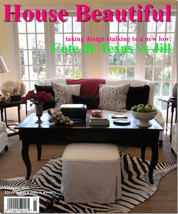
In fact, much of blogland went crazy for the house too. Valorie of Visual Vamp created a faux magazine cover copying Jill’s cover which spurred me on to create my own faux cover of House Beautiful ala Cote de Texas. Well? Do you think my cover looks like Jill’s? ha!
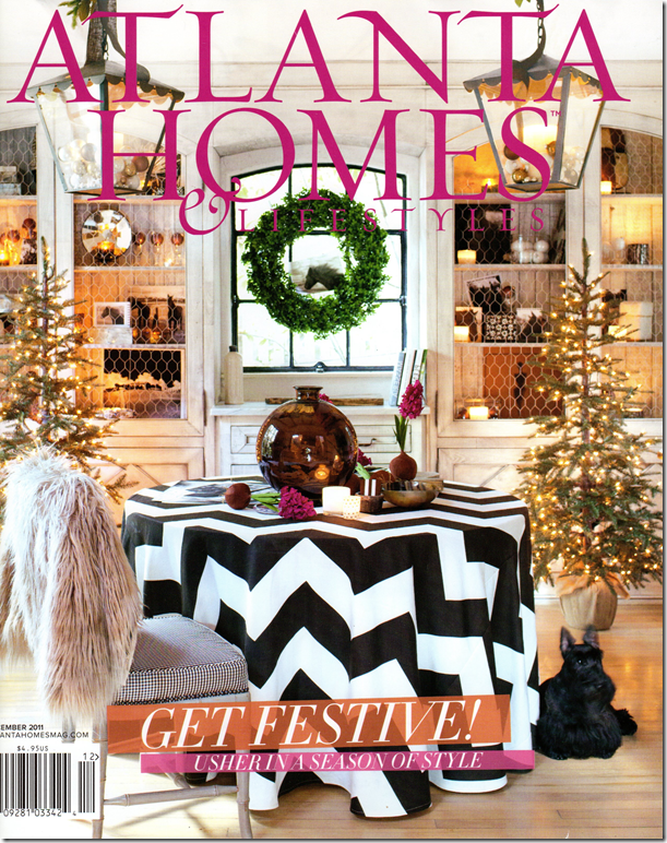
Over these past two years – Jill and I have exchanged emails – she is really so sweet and giving. Today, I was shocked to get a Fed Ex envelope from Jill with the new Atlanta Homes & Lifestyles magazine in it. The cover is of Jill’s dining room, styled for Christmas.
I thought I was share the pictures with you since most of you won’t be seeing this local Atlanta magazine, which is a shame because it is a great one.
Jill Sharp Brinson’s dining room made the cover of this month’s Atlanta Homes & Lifestyles. No, I don’t think I’ll be styling my dining room for a faux cover again – but I do have a skirted table too – in all white! Jill husband Rob Brinson took all the photographs for this story.
Is it fair that someone so talented should also be so gorgeous? Jill, with the blonde hair, is pictured with another beauty, Suzanne Kasler, an interior designer from Atlanta who worked on the styling with Jill. Kasler has a developed a line of furniture and accessories for Ballard Designs. Here Jill and Suzanne pose in front of the fireplace in the main living space.
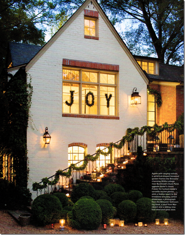
The front entry is decorated for the season with greenery and candles. I love how she lined her steps with the votives. But, the “Joy” is what really makes it all so special! Jill and Rob’s house was built in the 1930s – inside, ceilings reach up 20 feet.
The entry door is glass and steel, as are the windows throughout. Here a small Frasier Christmas tree designed by Kasler for Ballard sits in a bucket planter. On the wall is a large photograph that is from Jill and Rob’s upcoming book. Can’t wait for that one!
Steel doors and windows are so gorgeous! I wish they weren’t so pricey because they really make a house special.
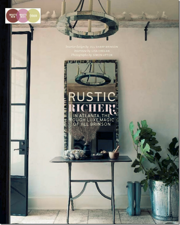
Here, is the entry hall as shown last year in House Beautiful. Notice the collection of white birds sitting on the high shelf.
The main living room with garland around the sconces and paper whites. I am loving the new all muted white and khaki colors.
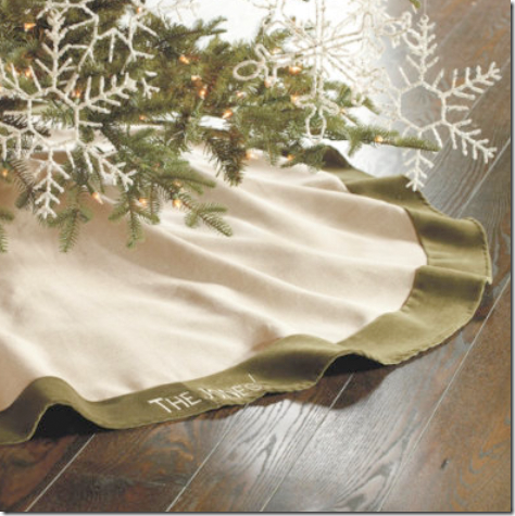
Throughout, Jill and Suzanne used Christmas decorations that Suzanne designed for Ballard, such as linen tree skirts with velvet trim, glass ornaments, and others.
Across from the sofa, votives lead up to the library loft. Notice the glass ornaments in the tree – these ornaments come from Suzanne’s collection for Ballard Designs.
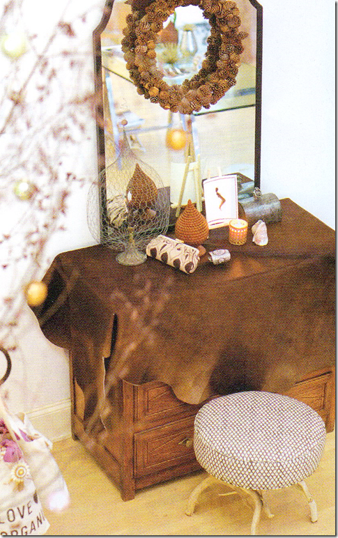
And, at the bottom of the stairs, a brown cowhide covers an antique chest, while a pinecone wreath hangs from the contemporary mirror.
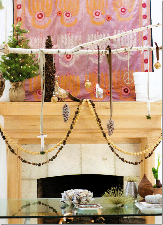
Above the fireplace, a pink suzani hangs – adding just a touch of pink to the room. Notice the branch over the dining room table – Jill says she hangs different things from the branch – depending on whatever catches her eye.
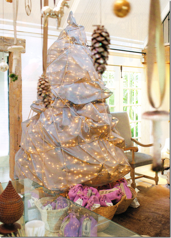
The focal point of the Christmas decorations is this tree. Jill, inspired by the artist Christo, wrapped it in 8 yards of gray matte silk. Jill says the tree is “modern, pretty, and a little bit of wow.” Just as she likes to live, she elaborates. In the background, you can see another cowhide that sits under the sofa and chairs.
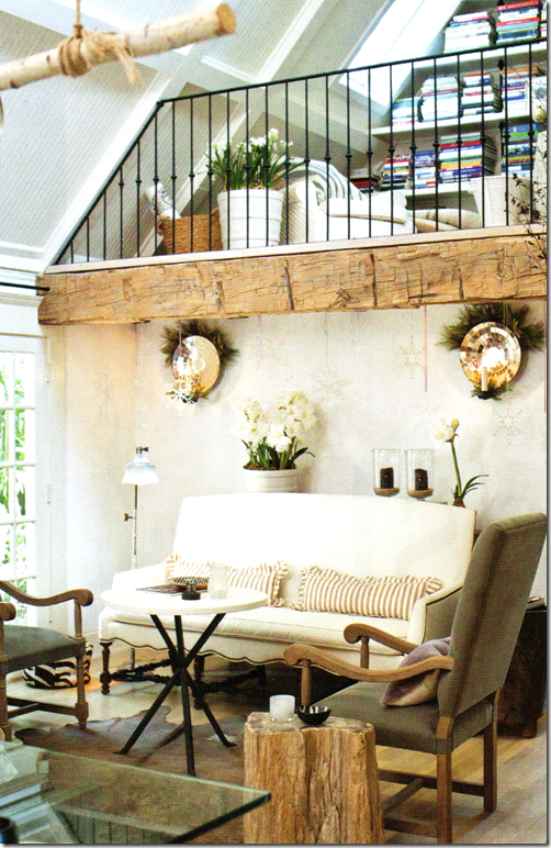
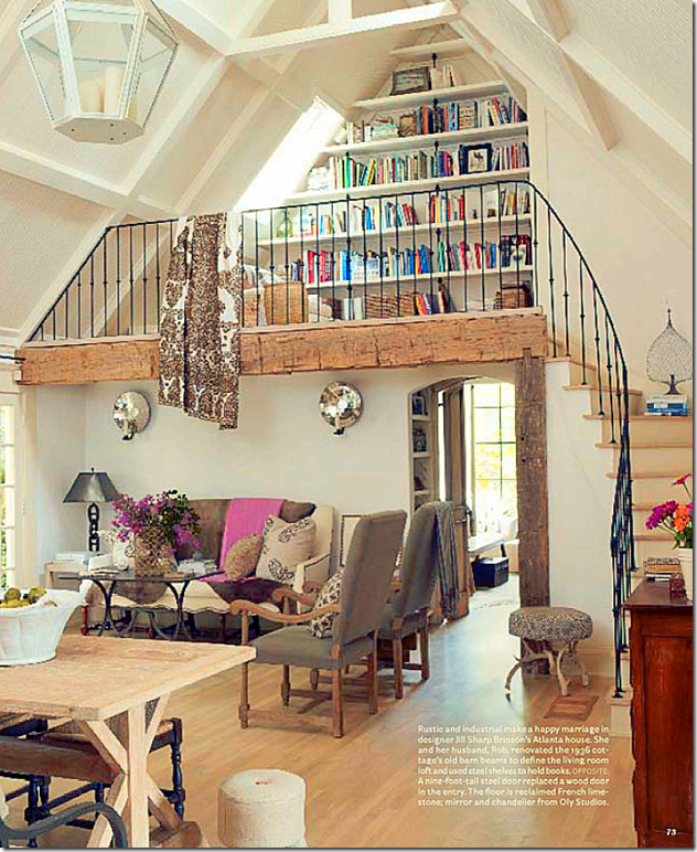
Here’s a glance back at the living room as seen in the House Beautiful spread. I still love the textile hanging from the loft and those covering the sofa! Maybe this is the “summer” décor. It looks like she got a new dining room table with a glass top – here the table is more of the Belgian look so popular today. The room past the living area is the master bedroom.
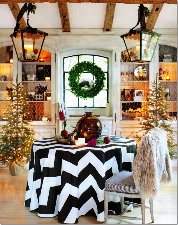
In the dining room – two more Kasler trees flank the window with its hanging wreath. Notice the photograph of the horse inside it. Kasler ornaments were added to the lanterns. And, the biggest change is the skirted table with its bold chevron black and white pattern. To create an instant change of tables like Jill did, check out the party tablecloths available at Ballard Designs HERE.
The Dining Room as seen last year in House Beautiful.
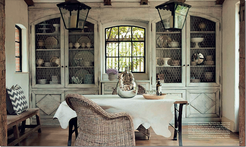
Probably my favorite room in Jill’s house is this one with the fabulous double lanterns and gorgeous shelves with chicken wire. I swear – one day soon I am going to have a carpenter build me doors like this to cover my own family room book shelves. And, notice the Kooboo chairs and white cowhide – two things I did copy straight from Jill! Is there a prettier room anywhere?
In Jill’s beautiful kitchen, she put 3 of Suzanne’s mirrors for Ballard Designs in the windows, then garland was added to the vignette. Jill says the mirrors look like jewelry. Notice her adorable farm sink and the sconces above it. Love, love love this!
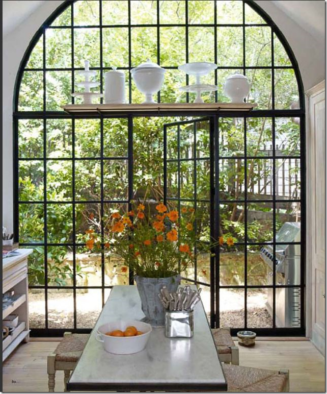
From the House Beautiful story – look at this arched steel door leading from the kitchen – it is phenomenal, it takes a utilitarian space and turns it into an art gallery- like space.
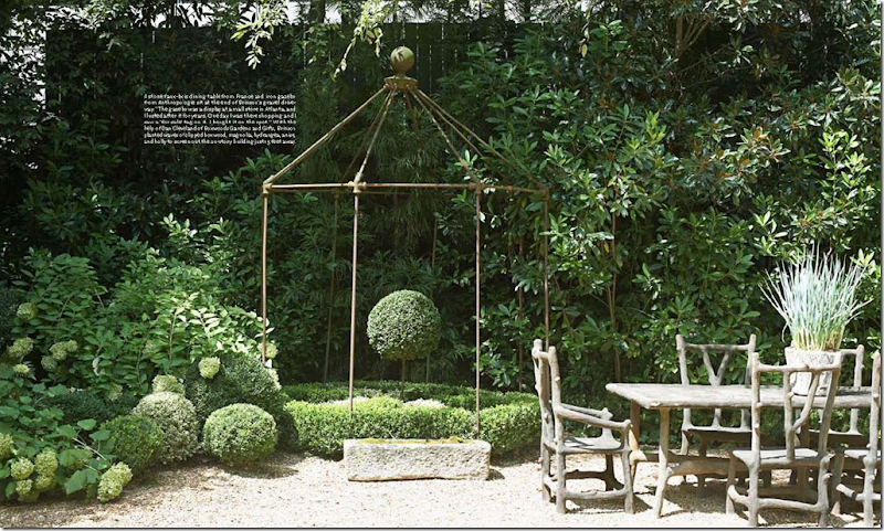
And, from House Beautiful, Jill’s yard – all greenery and gravel – it looks like it a garden in Provence.
Suzanne Kasler’s Collection for Ballard Designs includes an assortment of Christmas merchandise. Besides several trees, there are linen skirts with velvet trim in different colors that can be monogrammed.
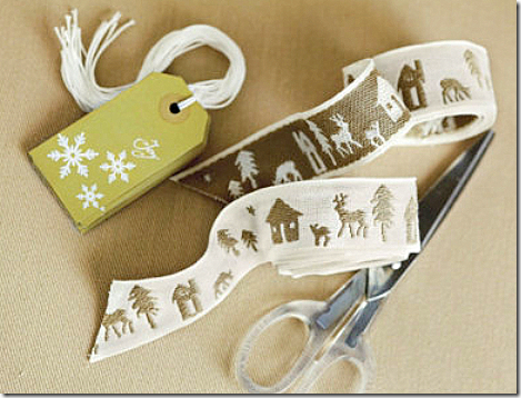
There are gift tags and ribbon.
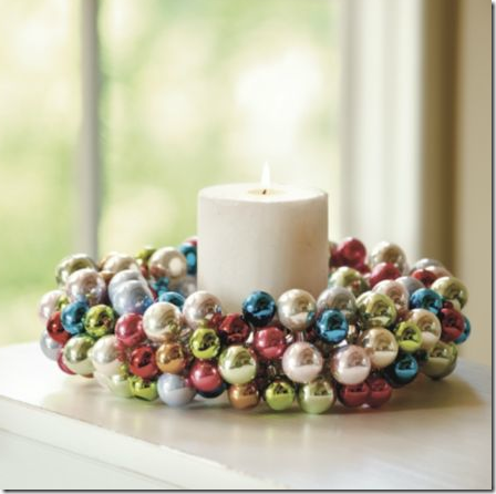
And, there are glass ornaments and wreaths, among other items. See the Suzanne Kasler Collection for Ballard Designs HERE. If you visit the web site – check out Suzanne’s gourd lamps – I’m going to order a few for a client of mine. They look wonderful, especially for the price.
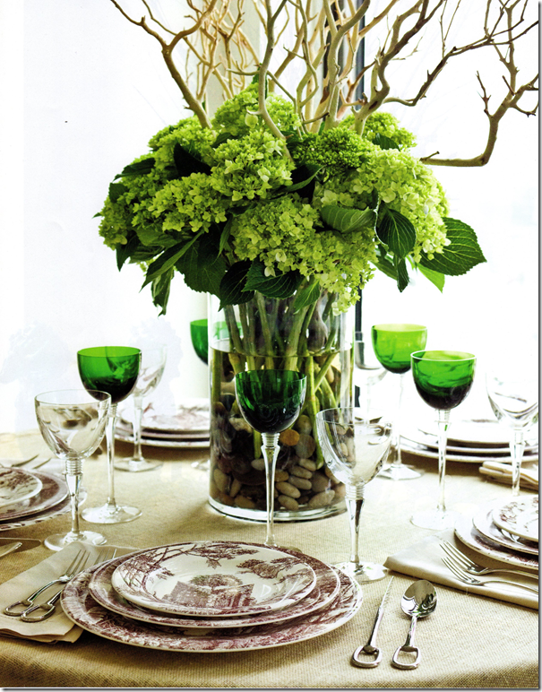
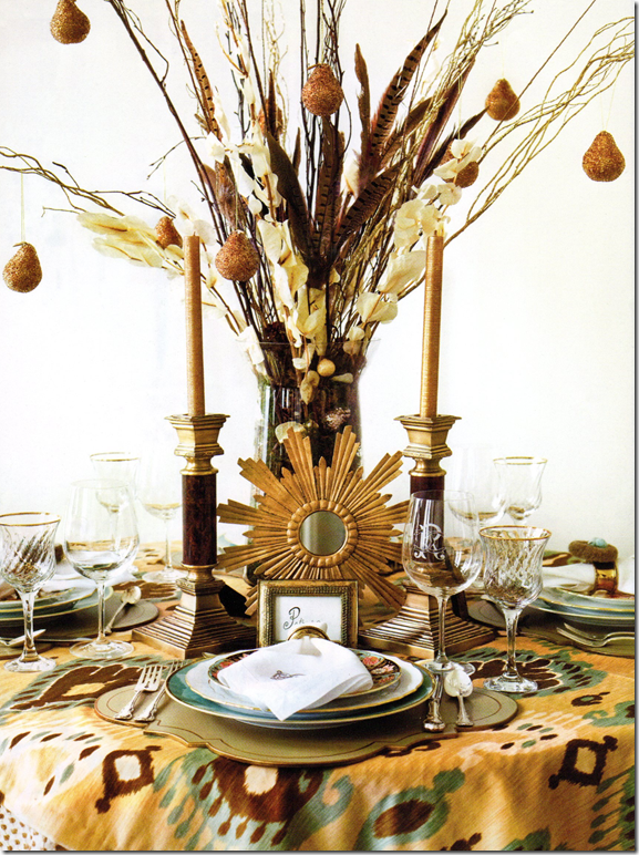
The entire December issue of Atlanta Home & Lifestyles is pretty. I loved this story on tablescapes created by different chic shops in Atlanta. My eye went to this table – I have green glasses I bought at Pottery Barn a decade ago that I could use to try to recreate this tablescape. Brown and white transferware could be substituted too. What I like about this is it’s not too over the top that you couldn’t actually set a table just like it.
Sunny ikats, feathers, and beaded pears, along with gilt mirrors were used to create this table. Love it!
I think this would be a great Hanukkah tablescape with the blues and the whites of the rock quartz. If you had different colored Foo dogs, you could use those instead of the blue – the main idea would be to match the vase and the dogs. Now, where are the dreidles?
The magazine’s web site is HERE – digital issues are available although the current issue isn’t loaded yet – so you may have to wait a few weeks if you want to view it online.
And finally, a huge thank you to Jill and Rob for sharing this latest photoshoot of their wonderful home. A very Merry Christmas and Happy and Healthy New Years to you both!!
Christmas at Jill’s- Fabulous!
Subscribe to:
Post Comments
(
Atom
)








Joni That cover is one off the best this season!! Bravo Atlanta Homes! I remember when you featured Jill's home before, so much talent!
ReplyDeleteOur Friend Vicki from French Essence has offered her duo of books to 2 winners! We are on our 5th day of Holiday Giveaways with 4 of the events still open!
xoxo
Karena
Art by Karena
Joni - stunning! I loved that pictorial last year of the Brinson house...I was obsessed with the issue and couldn't stop looking at the photos. Her house this year looks even more stunning. I am a big fan of Suzanne's and Ballard - they have beautiful stuff! Thanks for sharing the issue Joni! Happy Hanukkah!
ReplyDeleteSuzanne Kasler's lovely starburst mirror just arrived at my Indiana home this week.It is for my teenage daughter's bedroom and is a Christmas gift. The mirror looks flat on Ballard's website. Imagine my delight when it arrived and I discovered it is convex! It is equal in beauty to one's I have seen for six hundred dollars. Kudos to all for sharing!
ReplyDeleteYes! I love Jill's house and her aesthetic! Just really creative things done with an approachable piece of architecture---not some over the top McMansion.
ReplyDeleteWe can do it pretty good down here, can't we?
ReplyDeleteBeautiful Atlanta.
have you noticed the wealth of talent in atlanta?!
ReplyDeletei adored the story in house beautiful and love seeing christmas through jill's eyes, and the view is magical.
thanks joni for such a visual treat
debra
It's interesting... Like you, I don't really relate to most of the design magazines these days. But Atlanta Homes? Fabulous! Yes, I agree with Pamela: they do it right in Atlanta!
ReplyDeleteAnother beautiful post.
Wishing a Beautiful, Happy, and Healthy Holiday.
xo
Brooke
The J O Y in the windows is fun and I adore the starburst mirrors in the kitchen windows.
ReplyDeleteGood Good Good stuff.
*** Joni, I FEEL like I just celebrated the most ENCHANTING CHRISTMAS EVER, right HERE!!! WHAT AN INCREDIBLY "DELICIOUS" home...
ReplyDeleteWhat blessings they share, to live in these magnificently simple, yet elegant, creative, warm and welcoming spaces...
Yessireebob, now THAT'S what "I" want for Christmas (Santa can keep the teeth!!! Grins!)...
Holiday's hugs, and Happy Hanukkah!!!
Linda in AZ *
bellesmom1234@comcast.net
Hey Joni, maybe its time for a new magazine...YOURS!! Goodness knows we need a new one, one with fresh eyes and new vision......ever since Southern Accents left, no one has filled the void, hint hint.
ReplyDeleteThis home is very charming...like you my favorite room is the room with the built in hutches and two lanters, loads of charm and character and love her "JOY" wreaths outside, talk about curb appeal!
Hello I searched on various types of dogs beds but trendy dog beds is very interesting and amazing in shape. dogs feel easiness and relax in this type of beds.
ReplyDeleteI love that house too!!! So glad you wrote about it. The best dining room hutches ever!!
ReplyDeleteI remember when you made over your family room for the magazine cover, and at the time I was just ho hum about the original cover....but seeing it again, I LOVE it. Clearly my taste has gotten much better over the last year. :-) I liked her space better with the color!! I can however appreciate that so many of the same elements are still there...I often wonder when people's homes are featured repeatedly, do they really buy all new furniture every year???
ReplyDeleteBut I LOVE all her Christmas decor, I can't wait to stalk Ballard for after Christmas sales. I'm going all boxwood next year and nobody's gonna stop me.
I like the Brinson home. it is so approachable and fresh looking. Seeing it at Christmas is a treat.
ReplyDeleteI must admit those steel doors are fabulous! Wish I lived in a climate where those were practical.
Great post, Joni.
I haven't received my issue yet in the mail and now I'm chomping at the bit! People have so much talent and I love how Jill has changed things up in her home. I can't wait to see!
ReplyDeleteFabulous post as always!
Debra
Omg, I was thinking the same thing for Hanukkah. I got my inspiration from House of Turquoise a few days ago: herehttp://www.houseofturquoise.com/2011/12/tobi-fairley-beverly-wells.html
ReplyDeleteI love the blues, greens and white.
BTW, thanks for sharing the magazine photos. I was going to pick one up. Now I don't have to.
Maureen in Decatur, GA
The chevron cloth has possessed me. Trying to have one made by Christmas is possessing my head! Thanks, Joni, for sharing this wonderful home with us. Again, you have thoroughly tempted us and given us ideas to keep!
ReplyDeleteStunning, Southern Christmas decor, and wonderful to see it come alive on your blog.
ReplyDeleteEverything was perfect, but am left wondering if the wrapped tree is meant to be opened, or enjoyed as is? Intrigued, but not in love with the main tree-it could work with small trees in urns.
With the downfall of so many shelter magazines, last year I resorted to subscribing to metro mags such as Santa Barbara, Atlanta & others. When I received this issue last week, I knew the cover photo was familiar. I was pleasantly surprised when turning the pages to find the beautiful photo of Jill and Suzanne. What fun to style your home for Christmas. Inspirational! Blessings to Jill, Rob, Suzanne & you, Joni, this holiday season for sharing of yourselves to delight others. xoxo
ReplyDeleteI love Jill Brinson's home, and that issue of HB was one of my favorites. I've always adored the charm of those Tudor and French eclectic cottages of the 20's and 30's, and as long as I can remember that is the image I conjure when picturing my ideal dream house. Just seeing the exterior of hers makes me drool, and I love the rustic European vibe she gave to the interior. It's fun seeing it all decked out for Christmas. I think I may have to buy this issue just so I can hold it in my hands! However, she lost me on the silk-wrapped Christmas tree. Whether a nod to Christo or not, it looks like the way one of my sons would wrap an odd-shaped package. As another commenter said, maybe on a small accent tree, but not on the main one. What about some of Suzanne's gorgeous ornaments actually on the tree? Is that just too traditional? Enjoyed the post!
ReplyDeleteI am so going to wrap my Christmas tree this year! love that! Jill's home is gorgeously wonderful everywhere the eye rests... and of course Suzanne Kasler is brilliant for Ballard, so nice to see her things so beautifully used here...
ReplyDeletexoxo
Kit
Lets hear it for grits! + Atlanta Magazine- A Home Run. So many ideas!thank you,Joni. xxpeggybraswelldesign.com
ReplyDeleteHer kitchen has to be my favorite...that bank of steel windows!!! Those green goblets really caught my eye...I have red ones just like those that I will pull out for the holidays.
ReplyDeleteI am a traditionalist! Didn't like any of it!
ReplyDeletelove the magazine they manage to have something interesting every issue...Atlanta has some beautiful neighborhoods and getting a peak at some of the houses is such a treat even if somewhat depressing.. Ballard Designs is a a treasure ... there is an outlet in Roswell and you can imagine how it is shopped hard to find anything
ReplyDeleteTree is just plain awful
ReplyDeleteThanks again Joni for an inspiring post. Loved the natural greenery, but I am a nuetralist and would love it more with out the color splashes, liked her dining room before, but with greenery, etc.
ReplyDeleteLoved the kitchen. In a state of confusion over her tree! I have seen this elsewhere and don't love the look. I agree it would look more appropriate on small trees in urns. A missed opportunity to amp-up a tree full of Susans ornaments.
In a way it kinda disturbs me when some one is so far reaching to make a statement they end up creating an ultimate FAIL.
Mela
Like the "JOY" but that tree........what's the point? just awful!
ReplyDeleteI LOVE that Christmas tree, it is a fresh, creative and fun idea. Thankfully there are people like Jill who bring new ideas to a festive time of year. And that tablecloth makes me want to celebrate the season with a smile on my face, just sensational.
ReplyDeleteWhat a beautiful post! Thank you for sharing. I don't have a subscription to "Atlanta Homes" (yet) so can you pass your's along when you're finished?!
ReplyDeleteI visited NYC when Christo wrapped the trees in Central Park, and I'll really give away my age by admitting I also walked the Pont Neuf in Paris when he wrapped it (umm-let's say I took in the view from my baby carriage!)
The "wrapped" Christmas tree is a wonderful homage to Christo!
In my humble opinion, as much as I love and honour tradition, I say "Bravo" to those who dare to try different things.
I don't care what you say about Cristo and the wrapped tree...I still hate it!!
ReplyDeleteBravo what ever..just like some one trying to make statement art..its plain ugly
This made me want a chevron tablecloth. The table settings you've shown provide a ton of inspiration.
ReplyDeleteJoni, I've not been to blogland in a long while....so glad to be here today and to be viewing this gorgeous post! The black and white chevron table cloth reminded me of your black and white accents in your own home that you have so graciously shared... I think your faux House Beautiful cover could rival anyone!!! Happy Holidays!
ReplyDeleteI loved the new dining room look. Very festive and cute! Loved the living room, both years pictured. I liked it with the blankets even more, it felt warm and cozy yet so beautiful as well. Everything was beautiful ACCEPT that wrapped up tree! It looks just odd and ugly. I understand wanting to be different but that I must agree is a big fail. Hopefully she will unwrap that thing and enjoy it and that was just for the photos. Other than that, the place is beautiful!
ReplyDeleteThanks for sharing this gorgeous home with us Joni - it is truly fabulous! I am in love with the steel doors and windows! Cheers, Tracey xx
ReplyDeleteWOW!
ReplyDeleteI thought my tree looked bad.
Wow!
ReplyDeleteAnonymous sure has the holiday spirit! Some people only dwell on the negative, so sad. Guess they will be getting coal and switches for xmas. I want that suzani under my tree, it brings that whole room such holiday color and makes a great impact. The comparisons of the rooms from issue to issue is such a wonderful way to see how her house was transformed for the holiday season, great job!
This fell a little flat for me . . . though I do love the dining room! I really like Jill's house, and I can appreciate Ballard Designs . . . I guess in this case the article felt a bit like an advertisement, albeit a beautiful one! Love the JOY letters (noticed those in the catalog a few days ago.) I'm intrigued by the tree - - it probably looks more beautiful in person?
ReplyDeleteJennifer
I think we are all in agreement that Jill is FAB and her home is off the chain. However I can't say I was in love with the wrapped tree. It sort of gave me a bad feeling, like something/someone being suffocated. Was curious if anyone else felt the same. Just a little over the top for me. But that's what makes the design world interesting and the BEST. xoxo
ReplyDeleteI like so much about her house, but I think Christo would be very upset to think he inspired that awful tree.
ReplyDeleteThere are so many beautiful things that she could have done with it that would go with her lovely house!
Cluny
Yes the tree all wrapped up bothered me too. Just did not give me a good feelings.
ReplyDeleteJoni-
ReplyDeleteYour story has great spirit and pizzazz. Love both of the designers--who work with such bravado and life and energy--and experimentation.
I hope you will be posting your family holiday celebrations--unwrapping gifts, gathering, dining, playing at your house. Love it.
cheers, DIANE
www.thestylesaloniste.com.
I love, love, love the white distressed cabinets with the chicken wire inserts and the chevron tablecloth (I had been coveting B&W chevron of late anyway!
ReplyDeletewow, I really like the design of this room.
ReplyDeleteHey I just wanted to say that I really enjoyed reading your blog. You have good views, Keep up the good informative info.Good Quality and very informative Blog!!Find local architects and get prices for architect plans – residential & commercial designs.Thanks for all of your time & work. .................. http://www.wilsonandhart.com.au/
ReplyDeleteBuilders Perth
Feels cold and warm at the same time, very awesome!
ReplyDeleteI love the dining room with the double lanterns and chicken wire in the curved top cabinets - so pretty!
ReplyDeleteI loved your post, Its excellent,click here
ReplyDelete