Today, I have two different kitchens to show in our Readers Kitchens Series. They are both inspired by French design, so I thought they looked good together in one post!
Kitchen #1
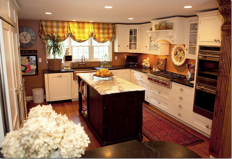
The first kitchen is by interior designer Kim Macumber who lives in New England, though she grew up in the south. When looking for a new house – Kim wanted to buy an 18th century farmhouse, but unfortunately, none were available. Although she loves old houses, she settled for one built in 1968 – a typical Colonial. In order to create some architectural interest, Kim gutted the living area and kitchen to make room for her family of six and three dogs. She calls her kitchen her own version of French Country in New ‘England:
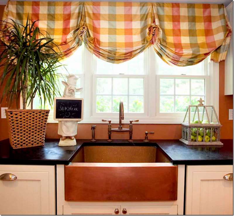
Kim mixed two countertops – black stone and white marble which is on the counter. The appliances are stainless, but the refrigerator is hidden behind beadboard doors, as is the dishwasher. The walls are painted a warm copper, which matched the silk plaid at the windows.
The copper farm sink is the focal point in the kitchen. What a unique choice!!! It matches the walls – not sure which came first, the paint color or the sink.
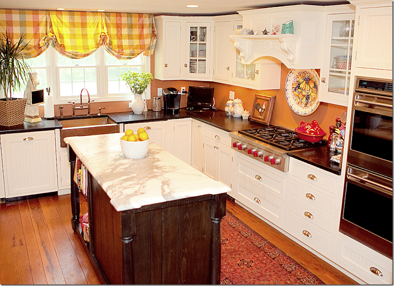
In this view, you can see the wood hood over the stove. Notice the island is stained dark to contrast with the white beadboard cabinets and the white marble.
Looking from the breakfast room into the kitchen, a dining bar was created out of counter space – which ends with a set of glass fronted cabinets. Here, you can see the refrigerator on the left with its white beadboard doors.
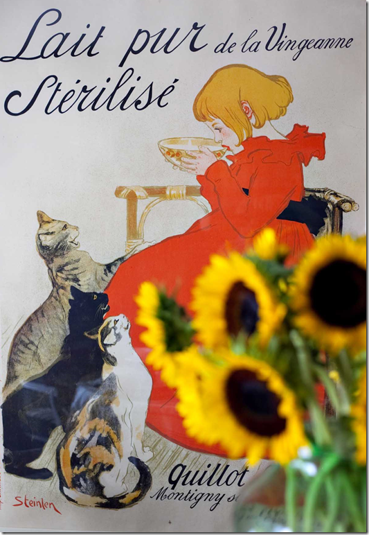
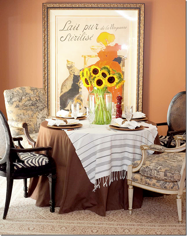
The breakfast table is skirted with different chairs surrounding it. Two have zebra skin fabric and the other two mismatched chairs have a French toile fabric. A large vintage French poster hangs in the space.
Kim Macumber Interiors provides “New England styling with Southern panache!” Here is a sampling of her portfolio. To reach her web site and blog, go HERE.
Kitchen #2
This kitchen was designed by Dallas interior designer Melissa Woody. Melissa has been practicing interior design for over 20 years and she is also known around Dallas for her fine antiques which she shows at several locations including Lovers Lane Antique Market and The Mews. The kitchen shown today is a charming French inspired space that I think you will enjoy!
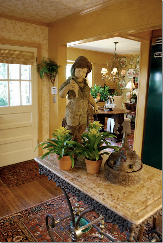
The focal point of the kitchen is the bakers rack island with a large statue on it! Notice the rug it sits atop. Be sure to take a peek into the breakfast room – which is wallpapered in a different design.
I love bakers racks and even have one myself. Mine is an antique that I was lucky enough to inherit. It was my mom’s which she had had forever and used as a bar. Then, my sister used it as a media center. Next, she passed it on to my aunt who later passed it on to me when Ben and I moved into our first house – the one on concrete blocks! Now, it sits in my kitchen and hopefully, I will pass it on to someone else in the family when we move on.
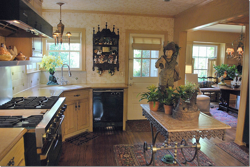
The walls are wallpapered in a yellow and white pattern. The floors are hardwood – with scattered rugs around. Notice the adorable tole light fixture over the sink and the tiled backsplash. This kitchen is so warm and inviting. Oh! I just noticed the dog bowl underneath the bakers rack! It looks like majolica!!!! Too cute!
Check out that range! Viking. Wow. That is gorgeous. It is the dark green color. The dishwasher looks like it is Viking also. Nice. Notice the collection of antique hen baskets over the stove.
Here you can the tole fixture over the sink and another large hen in a basket on the bakers rack. Also, notice the hanging shelf - an antique French piece filled with more antiques!
Notice the ceiling is wallpapered too – which is a great way to envelope a room in warmth and coziness – two words to describe this kitchen! Here you can see the border of the breakfast room wallpaper above the beams.
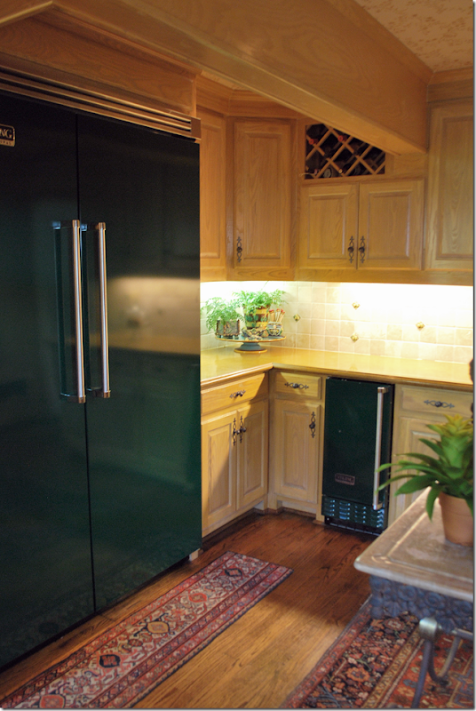
And finally - check out the Viking refrigerator and ice maker – two appliances you don’t see too often! These are gorgeous. I love the small runner in front of the refrigerator. It’s obvious this kitchen was decorated by someone who loved French design and antiques!
The ceiling and rafters make the room look so cozy – that word again! And I love the antique fabric used for the coverlet and pillows. Sooo cute!!!!
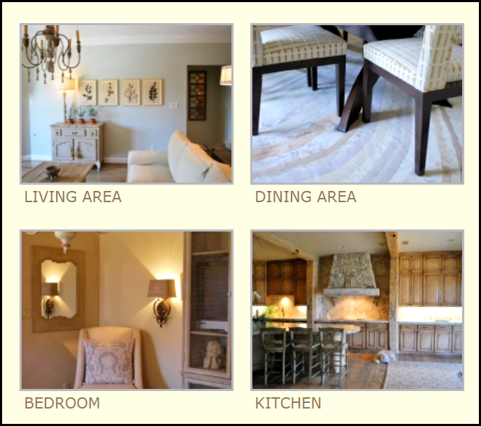
These pictures taken from Melissa Woody’s web site show the range of her designs – from Contemporary and Traditional to French inspired. Be sure to stop by and visit her booths at The Mews or on Lovers Lane in Dallas if you are into antiques. Dallas has the best antique shops. To learn more about Melissa Woody 0r to contact her, be sure to peruse her web site HERE.
A huge thank you to our two designers today – Kim Macumber and Melissa Woody who graciously shared their French inspired kitchens.
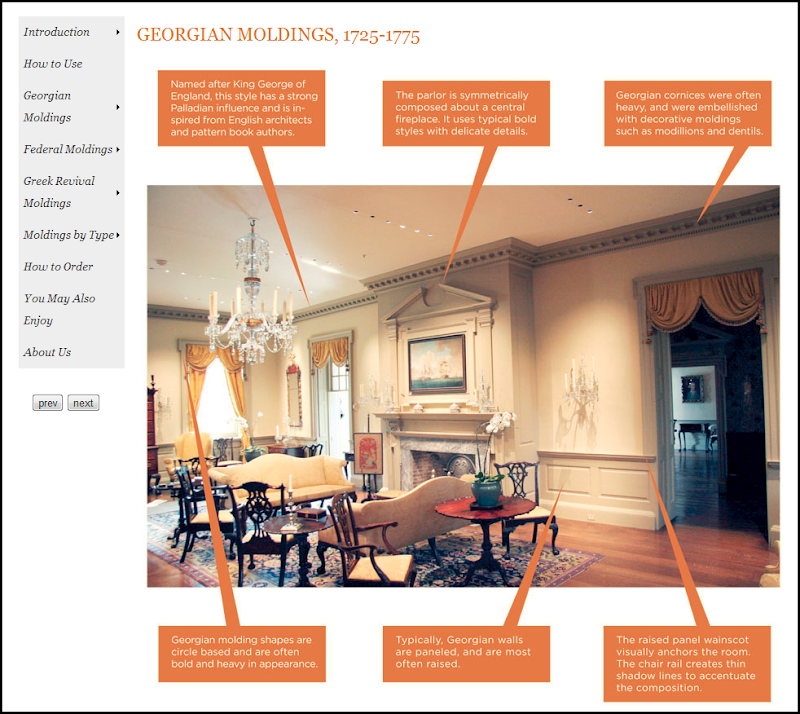
Looking at all things French today, I would like to introduce you to a new Cote de Texas sponsor – Hull Historical Architectural Molding.
The Brent Hull Companies are three companies in one: homebuilding, historic millwork, and consulting. Hull Historical produces architecturally and historically correct moldings – everything from wall paneling to doors, staircases, cabinetry and more. Their web site is an intellectual feast, showing all different types of moldings and how to use them correctly and in what context. There are several online catalogues to browse through.
Hull Historical has a library of over 2000 historic books and catalogs that they use in their research and for inspiration in creating new product. Every piece they create is architecturally correct and historically accurate. Recently, Hull Historical contacted me to say that they are coming out with a French Millwork catalogue. This will be a comprehensive endeavor, highlighting different styles by showing the woodwork in situ.
“No one built and designed architectural interiors and furnishings like the French. As the accepted leaders of European style for centuries, French designers left a legacy instantly recognizable and unique in complexity and craftsmanship. It often takes up to five sets of knives to reproduce an individual French molding; so intricate is the woodwork. Using historic pattern books and designs for inspiration, we are proud to continue in this passionate tradition of unparalleled skill and dedication to quality.”
I think we all agree that the French are the leaders of European style – and have been for centuries. So, I am excited to see the new catalogue. Here are a few pictures of a house recently built – using the moldings from the French collection:
Leading into the master suite – showing the French collection of historically accurate moldings. Notice the scalloping along the archway.
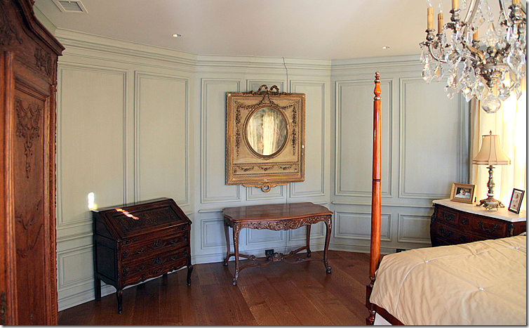
Inside the bedroom, an octagon shaped room. The paneling continues around all sides.
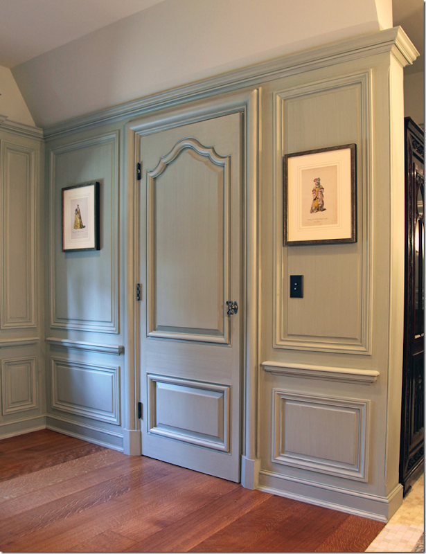
The doorway leading into the bathroom. I love the color the wood was painted. Subtle, and so pretty!
The collection includes cabinets, staircases, moldings, paneling – and more!
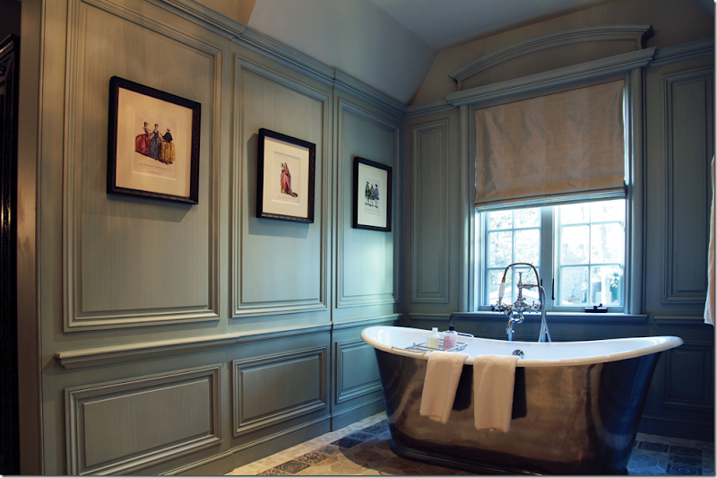
The paneling continues into the bath area. That tub!
Hull Historical’s catalogues are like textbooks! Everything you need to know about moldings is right here, online.
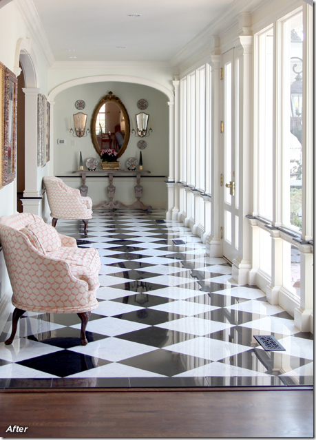
I especially loved seeing the befores and afters on their web site – here, a modern edition with terrazzo floors and plate glass windows needed to be more in keeping with the original style of the house. (This reminds me of my house in Meyerland growing up – we had the same exact floors and windows!)
AFTER: AMAZING!!!!!!!!!!!!!!!! Black and white marble replaces the terrazzo, creating a classic look. The opening to the dining room is made much smaller – with an arch and moldings. An additional arch and moldings is added to the end of the hallway - making it appear shorter. The plate glass wall was replaced with doors and windows surrounded by molding. This is so beautiful!!
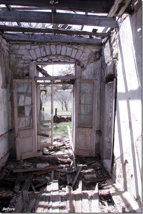
BEFORE: A stone house built in the 1800s had fallen to ruin.
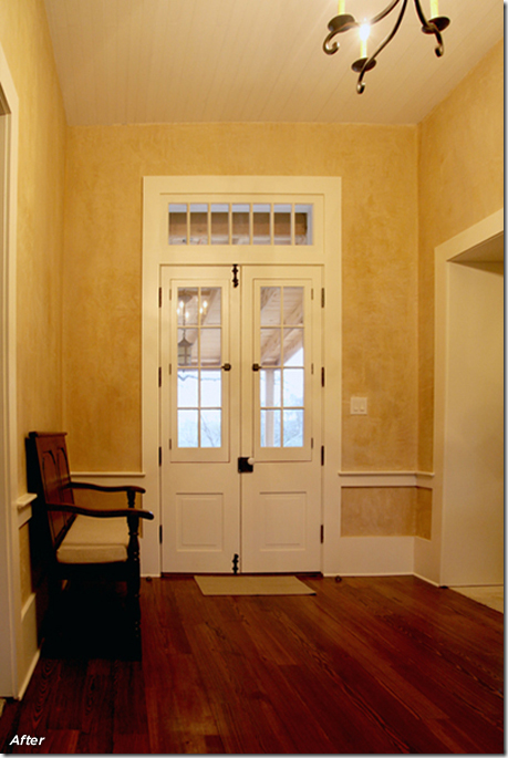
AFTER: Using historically correct woodwork and doors – the house was renovated and added onto. Again, an amazing transformation.
Be sure to take the time to look at the Hull Historical web site. It’s a treat and a lesson at the same time! To see the web site, go HERE.
READERS KITCHENS SERIES #8–Two French Inspired Designs
Subscribe to:
Post Comments
(
Atom
)









Great kitchens...oodles of charm and character in each. Love those "non traditional" touches that make it unique.
ReplyDeleteBeautiful cabinet work from Hull as well, as someone who is just coming out of about a year and a half of woodworking, I have a true apprecation for the craft when executed really well. Beautiful work.
In my next life I am coming back FRENCH and petite and restoring a French or Italian farm house. I'm not partial. It will have a modern minimal look but lots of incredible historical boiserie paneling. Will you come visit me?
ReplyDeletepve
Darling kitchens! Normally I prefer neutrals for decorating, but I definitely appreciate all of the color and charm these kitchens offer!
ReplyDeleteLeigh
These kitchens are wonderful! They look "lived in...and loved! Doesn't get much better than that. franki
ReplyDeleteThe kitchens are wonderful love the copper sink and that bakers table in the second kitcchen is fabulous! I'm going to have to check out Hull woodwork since we're trying to give our fireplace a little more character.
ReplyDeleteEnjoy your weekend!
Debra
Thanks so much for sharing my kitchen Joni! Melissa's is fabulous! The bakers rack is beautiful and unexpected in the middle ... love! Congrats on your new sponsor Hull ... it is nice to now have a source for such beautiful moldings!
ReplyDeleteWEll, Joni, you have been busy this week!
ReplyDeleteLove these kitchens, and the statue and the rugs are amazing. I can only dream of having a full line of Viking in my kitchen!
Beautiful work by your sponsor. Thank you for sharing.
Have a nice weekend.
Teresa
xoxo
What beautiful inspiration pics! So much eye candy!
ReplyDeleteI have a client that would love that French Chicken Kitchen. Thank you + Both kitchens are just beautiful. Trotting over to Hull now. Have a great weekend. xxpeggybraswelldesign.com
ReplyDeleteJoni so many exquisite elements!! I love the copper sink, then that gorgeous French Doorway moulding!! Oh and the bathtub! It is all in the details!!
ReplyDeleteWe are on the 3rd of the 12 Days of Holiday Giveaways.It is very exciting and includes very special gifts!
xoxo
Karena
Art by Karena
What charming kitchens! Each one has a "soul" and a unique personality!
ReplyDeleteGreat kitchens. I have a great appreciation for the art of historical moulding and the visual impact on the space...Hull's mouldings & website are really great but you forgot to mention one of the most gorgeous things on their website...Brent!
ReplyDeleteGreat kitchens, but the real star of this post are those moldings! That fluted archway was so unique and beautiful, and it was fascinating to see how that plain gallery was completely transformed. Love before and afters!
ReplyDeletebig, big....big missunderstanding....
ReplyDeletethese two kitchens should stay behind closed doors.....
Bravo! To me, both designers have created a warm and inviting atmosphere in their kitchens, which is hard to do.
ReplyDeleteSincerely,
Debra F. from NC
Anon. 9:50pm, I could not agree more. Joni is clearly at the bottom of the stack on the readers' kitchen series. Both kitchens look dingy and the roosters and hens would be better served hanging out in the attic. There is nothing to see here and certainly nothing to emulate.
ReplyDeletenothing better than french inspired kitchens full of charm!congrats on the new sponsor!
ReplyDeleteashley over @
{hooked on hickory}
Hull Historical looks like a wonderful resource.
ReplyDeleteLove both kitchens!!! Especially loved the copper sink and the wall color and curtains that match the sink!!! Fabulous!!! I am a new follower and can't wait to see what you post next!
ReplyDeleteBeautiful to look at--but I know I'd knock over that big statue.
ReplyDeleteI've been finding lots of inspiration on your blog--thanks esp for featuring Mimmi O'connell, whose work I've loved for a long time and from very infrequent gilmpses.
I love this style! It looks so authentic!
ReplyDeleteJoni,
ReplyDeleteI really liked elements of both of the kitchens. Thanks for the images of the Hull Historical millwork. You do find the most interesting design work to share with us. Thank you.
Karen
Hi Joni;
ReplyDeleteEnjoyed these kitchens... both lovely,homey and "approachable" to those of us in the 'Maisonettes'of suburbia!Personally, the wallpapered ceiling makes the second my favorite, as well as the bakers table( have always coveted one of these!)sigh...
As I was unable to comment previously on the House Beautiful post.... may I add here that I loved your "comparisons".... and your daughters redone bedroom is still the lovliest! That Angel figure on the table is Perfect.... (who wouldn't love having their very own angel?.... and that voluptuous, sumptuous bedding?) Just gorgeous.... one of my faves now.
thanks for your great blog!
Alice
PS. PVE- when you figure out how to do both.... I'm right there with you!
Bon chance!
Ugh, sorry, both kitchens are absurd to me. The first for its horrible mix of colours and materials, absurdly low ceiling height paired with an overload of moldings and detail, cabinets that finish just 3 inches form the ceiling (how is that space ever cleaned?), the second for the multiple tiny rigs and runners and that ridiculous configuration in the center of the room, does anyone ever actually cook there? I'd be knocking over objects and bumping on the corners. the appliances are impressive but the rest of the kitchen does not live up to their implied use and quality. I can't believe that these were designed by professionals.
ReplyDeleteIMHO hideous the both. I see quite a disparity in comments so I guess, each to his own. I have laid out the reasons why these kitchens do not appeal to me. French inspired style can be lovely but not if the function of the room is lost in the process.
Great photos from Hull Historical!
ReplyDeleteGreat kitchens..Love the all pictures of this post..
ReplyDeleteThanks for showing us Joni, particularly all the beautiful images of French Panelins! And thank you for pointing us to the source of these mouldings! I need to use them on a project!
ReplyDeleteWe specialize in packing & moving, loading & unloading, transportation, packing & unpacking and rearranging. Abi Packers and movers Chandigarh also offer other related services like Car Carrier & Transportation Services, Cargo Services, Warehousing Services, Insurance Coverage and other related services to meet your ever-changing relocation needs.
ReplyDeletepackers n movers ludhiana
Kitchen #2 - Clearly Melissa had her design challenges cut out for her! It is apparent that her client had exisitng appliances and chatkas she wanted used in the space. Love the French Wall Shelf! (Have seen them at the Whimsey Shops in Dallas and they are on my personal wish list.) However, all the tiny little collectibles on the shelf detract from its beauty. It needs to be re-staged and most of the tiny objects put somewhere else.
ReplyDeleteToo many competing metal finishes - brushed chrome, polished brass, antique brass, rust and then the painted metal on the appliances and hanging light above the sink. Brushed chrome is too contemporary for the space. I would have all the brushed chrome replaced or refinished in oil-rubbed bronze or antique brass. I would also remove the brushed chrome back splash and replace it with a stone or tile backsplash to harmonize with the rest of the backsplash around the room.
There are also too many different wood finishes. Looks like the cabinets are blond oak or pickled oak. The floor is a medium oak. The trim around the windows appears to be painted yellow. The kitchen door is painted white as are the kickplates at the bottom of the cabinets. Someone spent extra money to put "feet" on the bottom of the cabinets to make them look like furniture. Consequetly, the kickplates should be black or a dark chocolat to make the "feet" stand out.
Finally, the color scheme. Yellow is the dominant color. The woods seem to have a yellow undertone. (Another reason to get rid of the brushed chrome fixtures.) Since the wallpaper is so busy, why add such busy rugs on the floor? I understand the need to have a bit of cushioning underfoot while cooking, but those are not French style rugs! Except for the wall shelf, the "island" and the French statue, nothing in that kitchen is really French. Besides, the French do not use that dark green color. That is more typical of an English or New England American country kitchen. I would have used the cream or soft yellow which Viking offers. Since it is probably too costly to replace or repaint the appliances, either ditch the redish rugs or find something that is mostly yellow, cream and dark green in a french pattern. The room has too many florals. I would find a rug with a relatively simple, lattice pattern to echo the wine rack. Or, if the cook simply needs padding on the floor, find a small rug that is the same color as the floor.
Meeting the needs of the client are never easy. However, please don't offer us such a mishmash of color and design then suggest that it is Country French. Melissa should know better.
kudos to designers...great work... :)
ReplyDeleteKitchen Copper Sinks
That statue of the kid holding the fish is a little offsetting.
ReplyDeleteKitchen interior design look so entire with different designs. Bright color, attractive design furniture designs are so architectural to increase the beauty in the home.
ReplyDeletekitchen showrooms
Thanks for this outstanding blogsite and your renovation ideas.
ReplyDeleteFrench designs are one of the best in architecture and interiors as portrayed by this photos.
ReplyDeleteYou know what I like both of the designs for French kitchens. Second one gives a perfect look of old style kitchens. Keep posting, looking for more.
ReplyDeleteI want to be able to have a home like this! I love it! I bet I could afford it if I were to buy from a warehousing services in Dallas, TX. It would be really nice to have my house look so great, specially when my family wants to come over! http://www.deltalogistics.com/services/warehousing/
ReplyDelete