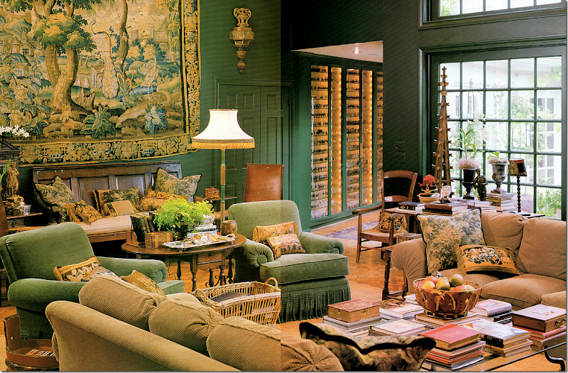
The last post on Jane Moore’s townhouse in Veranda garnered many comments and I thought it might be interesting to address two of the more popular topics discussed. First, there were some questions about how to properly hang a large tapestry like this one which Jane first used in the family room in her former house.
Once Moore moved to her new townhouse, the tapestry was one piece that passed her editing process. Who can blame her? This piece is gorgeous and is probably the focal point of her public spaces. Actually, gorgeous? It’s stunning.
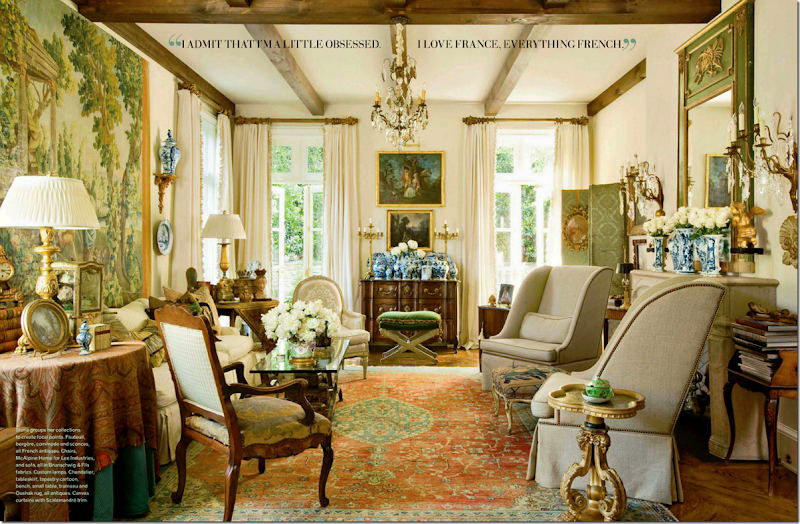
The interest in the tapestries got me thinking of how many other designers in Houston and elsewhere use these large tapestries in their design.
But first, a quick and very simplified history. While fragments of tapestry have been discovered from the 3rd century BC, it wasn’t until the 15th century during the middle ages that tapestries became more widespread. Portable, they were used mostly to cover and insulate damp stone walls of castles and the houses of the upper class. Additionally tapestries protected beds against drafts and were used as internal doors to stop cold winds. These tapestries were quite large and required big looms which in turn required large work forces to produce. In short, tapestries became an important and vital commodity. During the 1500s Flanders was the primary place tapestries were made. They were quite costly and only royalty and the wealthiest and most privileged owned one (which is still true today!) Another place that used tapestries were churches, which brought them out on certain holidays and occasions. These tapestries most often depicted biblical scenes.
The earliest tapestries were the millefleurs – here one person or a small group of people stood before a background of plants and flowers. Next, battle scenes and architectural scenes became popular. During the late 16th century – people commissioned themselves into their tapestries – showing them hunting or their peasants at work (sometimes the patrons would be disguised as the peasant.) Following, the Verdure tapestry came into favor. This rich, green plant and floral background showed large bucolic estates in the foreground. By this time, northern France and Flanders were the two major centers of tapestry making along with Les Gobelins in Paris, which was established in the late 17th century.
The industrial revolution and the new mechanical Jacquard looms brought about huge changes in traditional tapestry making which had became prohibitively expensive. Flanders was the center of the Jacquard looms and these tapestries produced here are still considered the finest Belgian export.
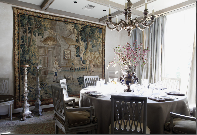
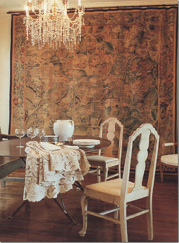
Here, a large antique tapestry is used in this Houston dining room decorated by Eleanor Cummings and Babs Watkins. Again, what a focal point! The thick texture of the tapestry plays off the silk taffeta on the window and the skirted table. Just beautiful!
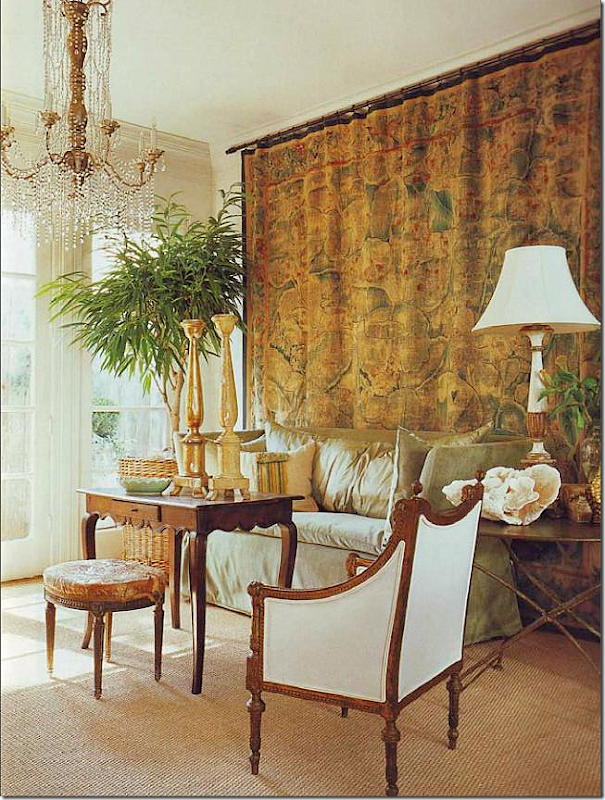
Popular Houston antique shop owner Donna Brown of The Gray Door used this unique tapestry from the 16th century in her townhouse. She changes up her furniture arrangements a bit, as you will see. Here this area is used a living room. She has two matching chandeliers on both sides of this large space. Isn’t the chandelier gorgeous? It’s like a dripping waterfall of diamonds.
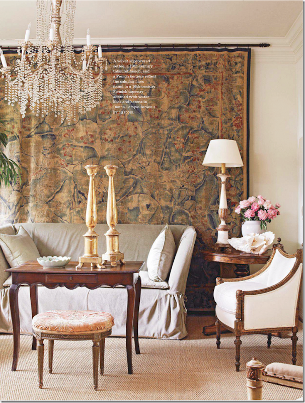
A head on view of the 16th century Flemish tapestry which depicts water lilies and herons. I’ve never seen a tapestry like this before. It is quite large and is probably one of her most prized possessions.
And here, she uses this same space as a dining room. Great juxtaposition of fine and rustic antiques, metal and crystal.
England? NO, it’s Santa Fe designed by Houstonian great Beverly Jacomini. Besides using a plethora of Bennison, she also used a smaller tapestry. Love this!!!!
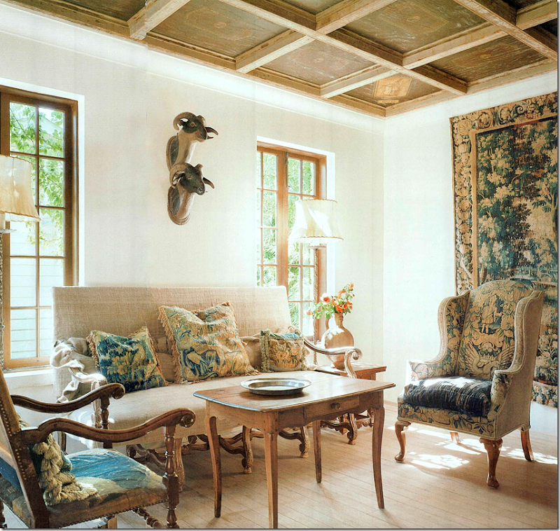
In this charming vintage San Antonio, Texas house, a large antique tapestry hangs in the living room of designer Linda Keenan. Another tapestry covers the wing chair and the French chair. All the pillows are tapestry remnants. Too much? NO!!!!! This is beyond gorgeous in my opinion! LOVE!!! The blog Ivy Clad wrote a great story about this beautiful house HERE.
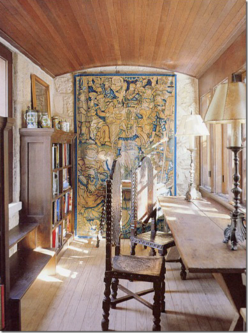
More? Another tapestry covers a stone wall in the study.
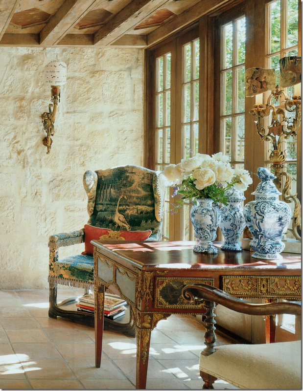
And, just one more. Another wing chair covers an antique wing chair. And notice her Delft jars – whoa. GORGEOUS!
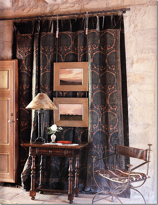
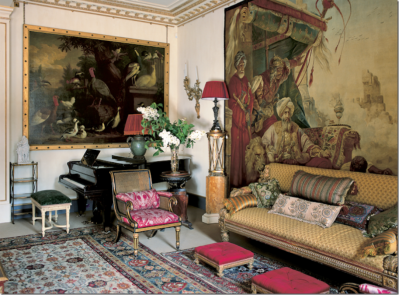
John Saladino is the king of using tapestries. He usually layers his with mirrors and art work on top of them.
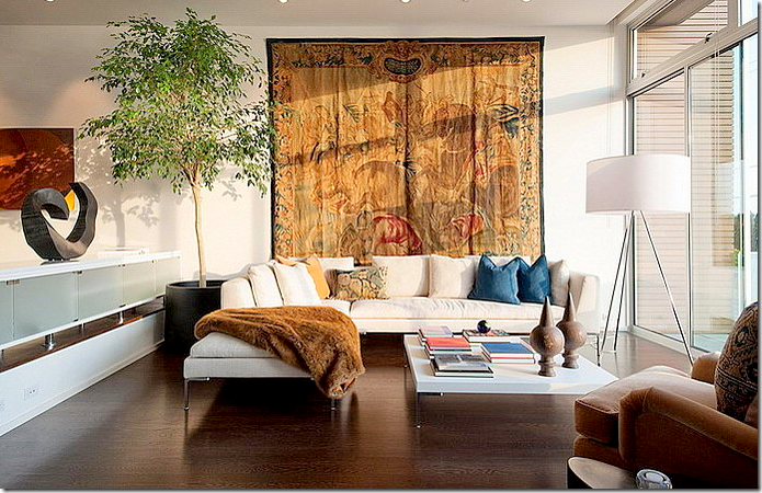
Here a very contemporary setting with an antique tapestry.
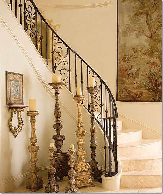
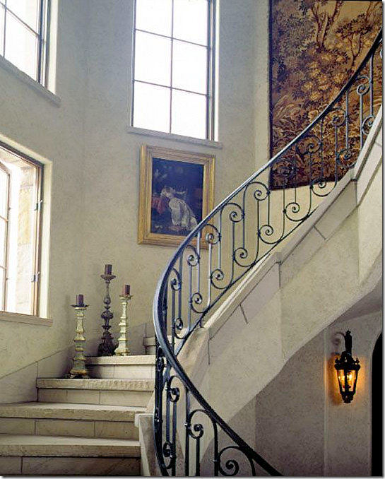
Here, in a Dallas house – a limestone staircase and an antique tapestry. Stairs are a popular place for one.
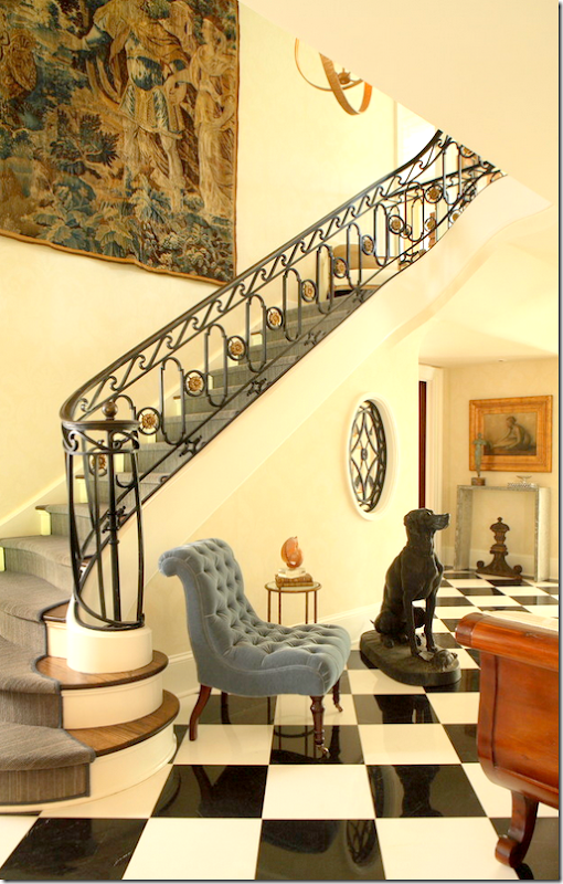
Another stairway, but doesn’t the runner’s color fight with the tapestry? Strange choice.
Another stone stair and tapestry: made for each other
Again, a gorgeous tapestry, but the collection of prints takes away from the beauty of the piece! Why?
I think the wall color and furniture color is too matchy matchy for this tapestry. Again, it takes away from the piece – makes it just blend in instead of standing out!
A vivid tapestry which covers almost the entire wall.
Can’t afford a pricey Belgian Verdure? Why not hang a needlepoint rug instead?
Or hang an ethnic tapestry? I love this bedroom – the spread, the pillows, the tapestry.
Or hang a new Suzani. Ebay has a lot of them for sale for very reasonable. You don’t have to get a bright one, there are some that are more pastel. This is from an interesting blog HERE. Looks very Kathryn Ireland-y with the red lampshade.
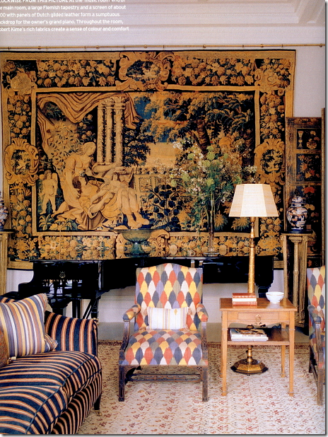
OK, someone asked for some Robert Kime. Here you go!
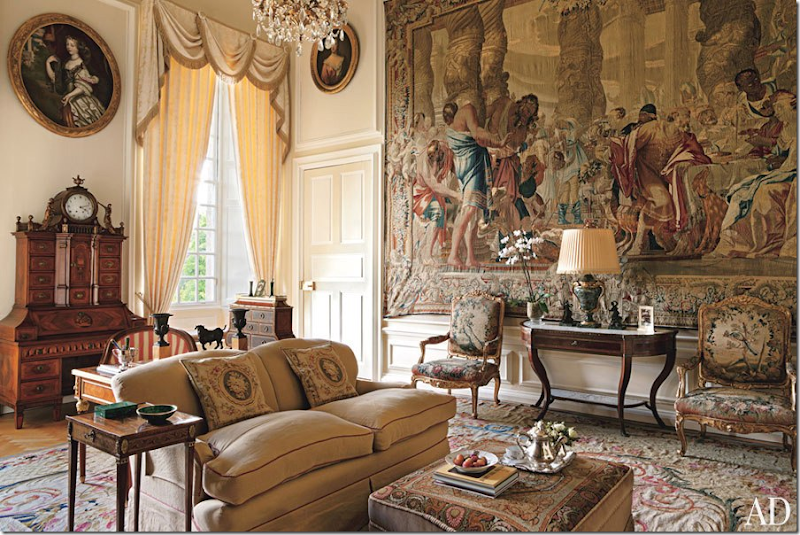
It seems like England has a lot more houses with tapestries than the U.S. Look at this one! Amazing! But, I’m afraid this is way too busy for Houston decorators. They prefer the much quieter tapestries – less detailed.
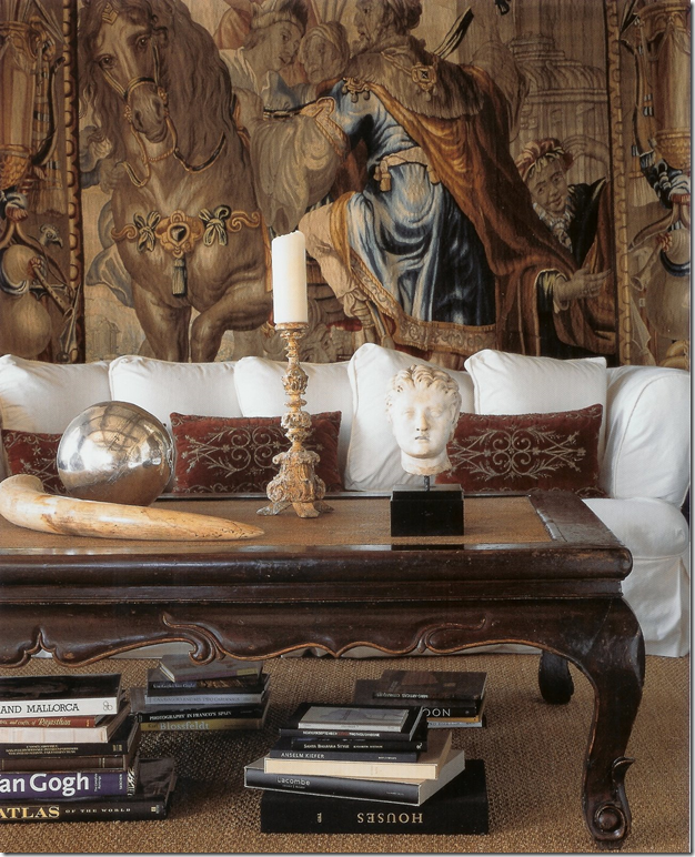
One of my favorite photographs ever! Notice how the slipcover makes the tapestry just pop out against the white. The brown table echoes the browns in the tapestry. And I love the way the coffee table is accessorized. It’s done without using anything trendy. Diandra Douglas.
The designer Suzanne Kasler uses a lot of tapestries. Here, she puts a long one behind a cabinet.
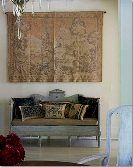
At this entry hall, she used an antique Swedish sofa underneath a tapestry.
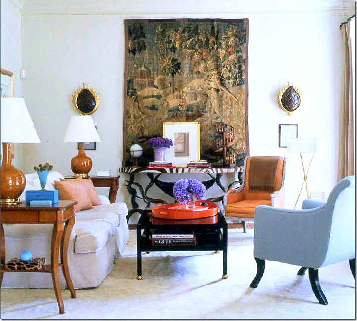 |
In her former family room, this large Verdure tapestry is the focal point. Love this room. The lamps – that orange leather chair, the zebra console, beautiful.
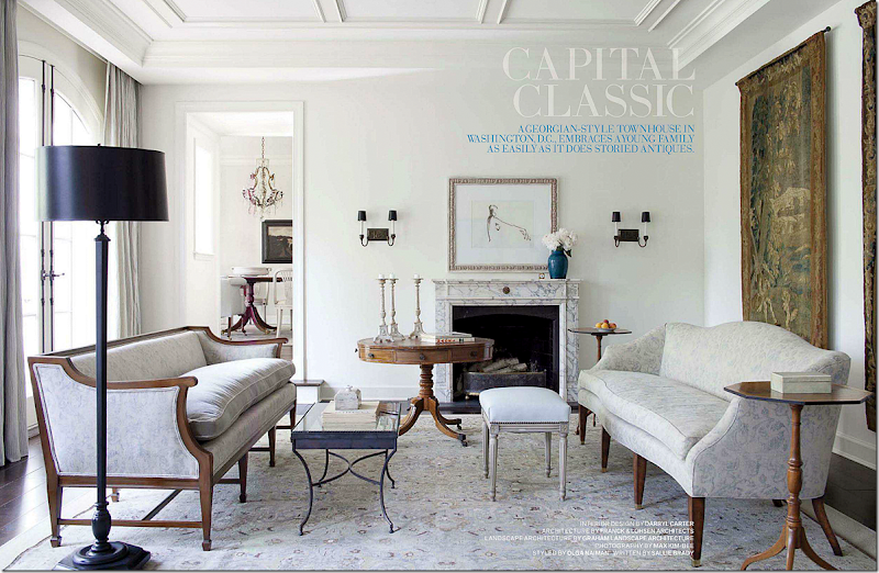
Another favorite room – by Darryl Carter. He uses two matching tapestries! That is a first! Notice how the blue of the vase picks up the exact blue in the tapestry. That vase wasn’t chosen by chance.
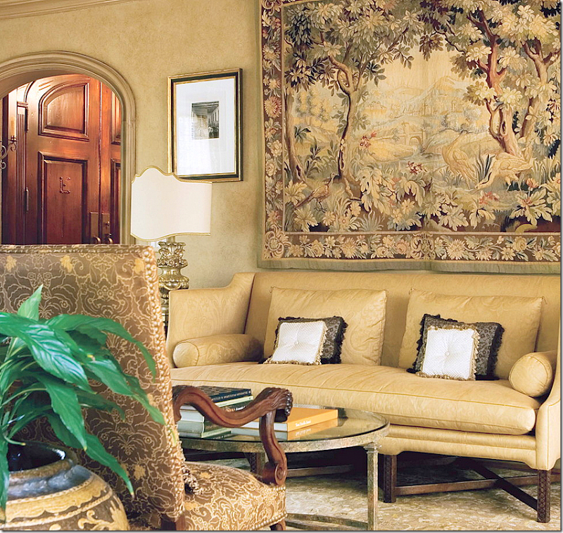
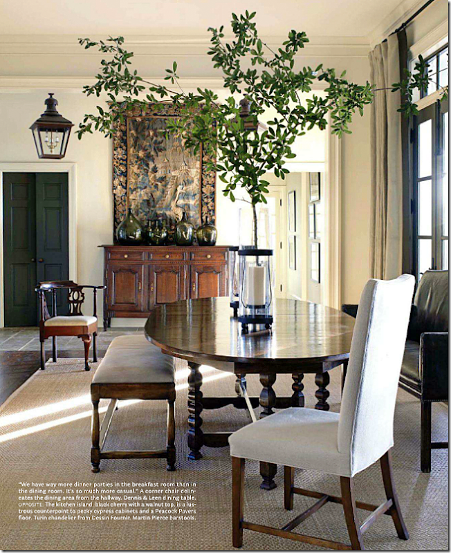
All antiques and antique reproductions but this quiet space has a modern quality to it. Large tapestry hangs over a French buffet.
Kathryn Ireland used a tapestry with reds and browns to go with this dining room. Notice the white walls make the tapestry pop. Any other shade and it would have become muddled.
An alternative to pricey tapestries are the cartons or cartoons that were used the create the tapestry. It’s really a painting, but somewhere there is a tapestry that looks exactly like it. Cartoons can be less expensive than an actual tapestry, but they are not cheap. Another room I love!
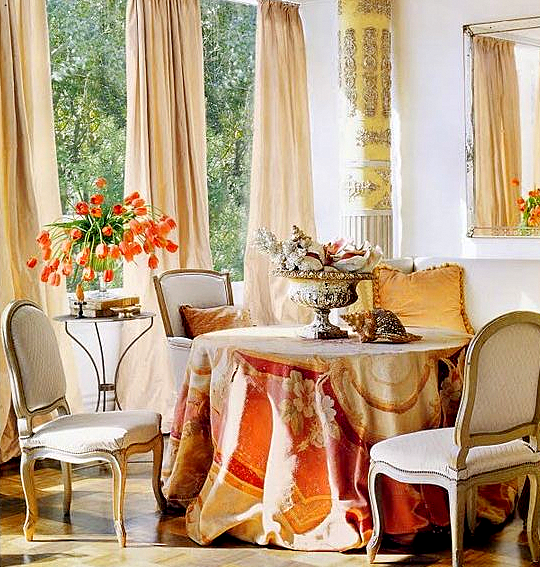
Houstonian Kay O’Toole placed an antique tapestry on her table. One of the prettiest Veranda covers ever! I love the styling of the photo with the soft peach taffeta curtains, the orange tulips, the pink shells. Gorgeous!!
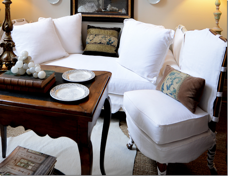
Can’t afford a tapestry at all? Do what I did! Buy a pillow created with tapestry remnants. I made those two pillows backed with brown velvet on the chairs. Forgot about those burned out light bulbs!!
But the beauty on the sofa – with antique gold trim – came from Maison Maison. She used a much deeper brown velvet – I should redo mine that way too. I will say, that these remnant pillows aren’t cheap either. You can spend anywhere from $500 to $2000 depending on the size. That’s why I made those two pillows myself. I found the remnants at antique mall for dirt cheap. Maison Maison is now located in Jane Moore’s former space. They have great pillows. Another place that has the best pillows – new, not old, is Boxwood. OMG – the best pillows ever!!! So big, so stuffed with great down. Fabulous.
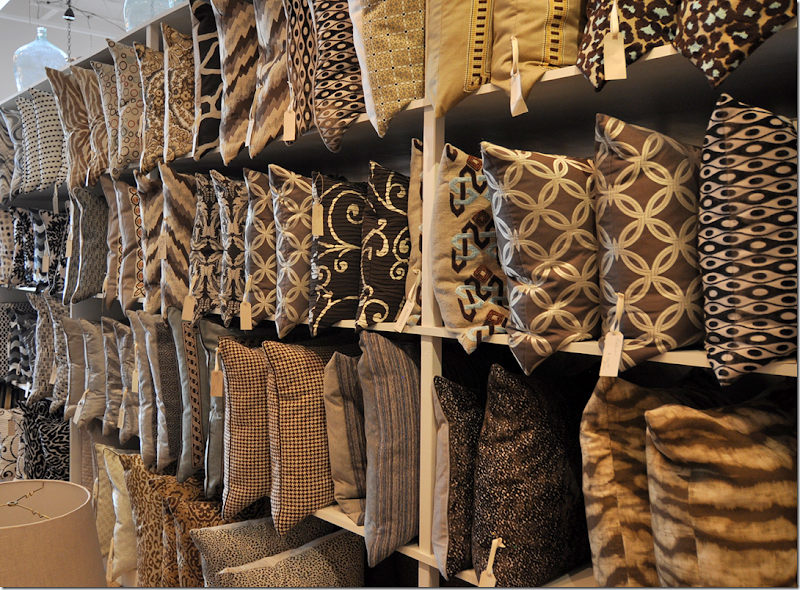
These are just Boxwood’s brown pillows – to give you an idea. OK, back to tapestries.
We had the discussion on the last blog – if you bought a new repro – could you make it look old? I thought maybe you could just get it wet and put it out in the sun for a month or two to try to fade it. Popular commenter Miss Charlotte thought that was a bad idea. I guess if you pay a lot for a repro, it wouldn’t be worth taking a chance on fading it. Any ideas of how to make a new tapestry look old?
This company HERE looked like they have good reproductions, but even so, they run from $1,ooo on up. Even owning a reproduction is not cheap!!! Nothing has changed in the tapestry business during the past five centuries. Only the very wealthy and royalty are able to afford one!!!!
On 1st Dibs, I went looking for pretty ones that were inexpensive. SNORT. This beauty was one of the cheaper ones at $9800! HERE.
Another one just under $10K HERE. The rest were outrageous. Some were over $50K!! I will say this though, I usually ask if the 1stDibs dealer will give a discount and most do. So, if you are buying online – don’t be afraid to ask, all they can say is NO!
About the question asked on the comments on how to properly hang a tapestry. People were worried that they way Jane’s was hanging was incorrect and would pull the threads out. Someone said the proper way is to attach a board to the wall and then attach the tapestry with velcro. This opinion was seconded. But, another person chimed in and said there were special rods made for tapestries that alleviated the pulling of the threads.
If you do buy one, at these prices I am sure a professional hanger would come to the house to properly affix it.
Next most commented on the Veranda townhouse was the kitchen!!
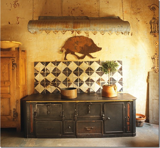
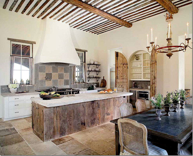
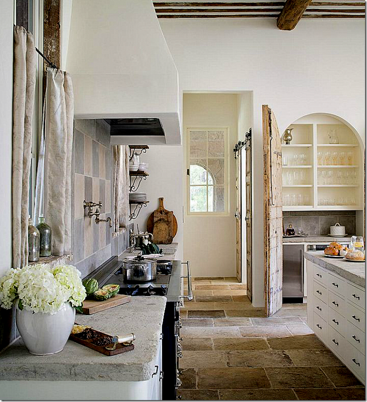
Many people in Houston are creating unusual kitchens that look more like one found in Provence than in Texas. Thanks to Chateau Domingue who import architectural and decorative elements – it’s easy to find antique tiles and stones for a backsplash or a floor or countertops. Look at this charming range they imported! Designers can cull together different items from their inventory and create a space that looks and feels as if it came from the other side of the globe – because many of the building parts did. Chateau Domingue has been a large influence over designers in Houston – the ease of shopping on West Alabama and the abundance of their supplies adds to this look becoming more popular.

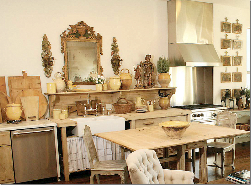
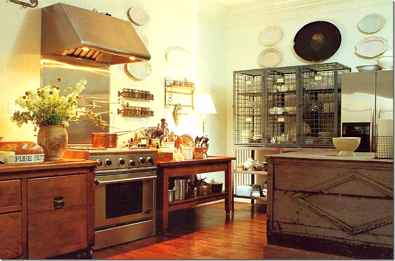
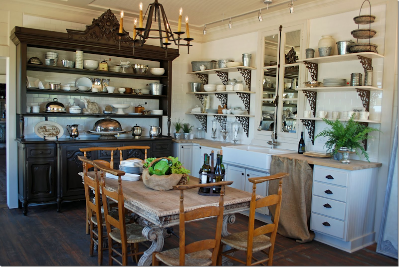
There were quite a few comments about Jane Moore’s kitchen which is unfitted. The cabinets were removed and she installed an antique architect’s desk to house her sink. A marble counter houses her dishwasher and the range is freestanding. There were those that loved it and those that questioned the ability to cook in this kitchen. Well…as a single mother with grown children, I doubt she cooks up a storm in here. But why not? She probably uses her dining table as a counter. Her pots are in the basket – just like they would be in a drawer. I don’t see why cooking would be that difficult here! But what do I know – I don’t cook. What I DO love is how the woods are all the same tones – the desk, the table, the chairs – which are from Found For The Home (who have a new address btw at 3433 West Alabama, Suite B.) Even the bread boards pick up the limed wood look. The mirror reflects back the family room with its own limed woods of the etagere and the old doors and the yellow ware pots.
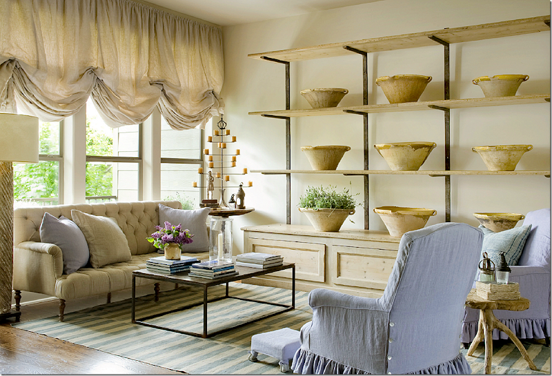
The adjoining family room picks up the same woods as the unfitted kitchen – in the etagere, the small wood table, the color of the linen, the old doors (unseen here) and the yellow ware bowls. Even the lamp picks up this color. The lavender makes it a pop of soothing accent color.
Here’s another look at Moore’s kitchen. Here the chairs were different – this was taken a while ago – notice how much the new chairs add – the tone of the wood, the industrial feel to the stools – they make a huge difference.
All the comments got me thinking – how many other Houston kitchens similar to this have been published in magazines?
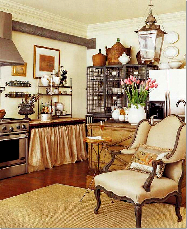
For example, another unfitted kitchen that is similar to Moore’s is again, Donna Brown’s of The Gray Door. Pam Pierce helped Donna design this space and I love it! In the back is an old French wire piece that holds dishes and glasses. Her sink and dishwasher are in an antique counter – behind that chair. Her stove is free standing. An antique lantern hangs above it all.
The wire piece that hold plates and glasses.
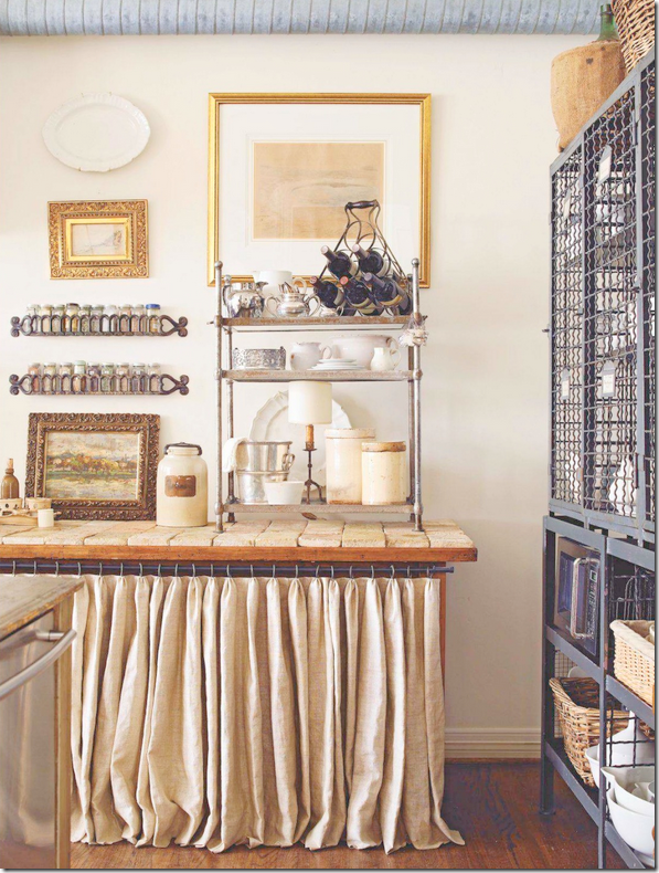 Notice the tiled counter with the linen skirt underneath. Here you can see her dishwasher to the left.
An earlier shot before that table was skirted and tiled. The counter on the right holds her dishwasher and sink. Notice how this publication photoshopped out the vent that leads from her range!
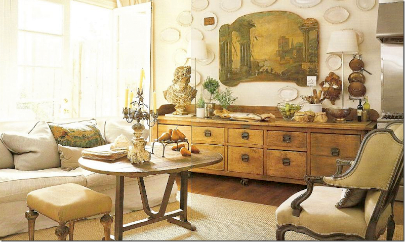
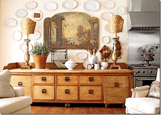
Donna’s family room is right off the kitchen. A large antique filing cabinet is to the left of her range. I love that painting! The wine table doubles as her coffee table and a place to grab a meal.
Here is a closeup view of the family room – you see that chandelier? I actually bought that from Donna for a client’s dining room! We went to her house to see it and bought it right from her house. And notice the tapestry pillow on her slipped sofa. A garden is out the French doors.
Since Donna’s house has been published several times – there are always changes in the styling. Here is one more newer shot with different accessories. There is a different chair and the lamps are different with large Fortuny shades.
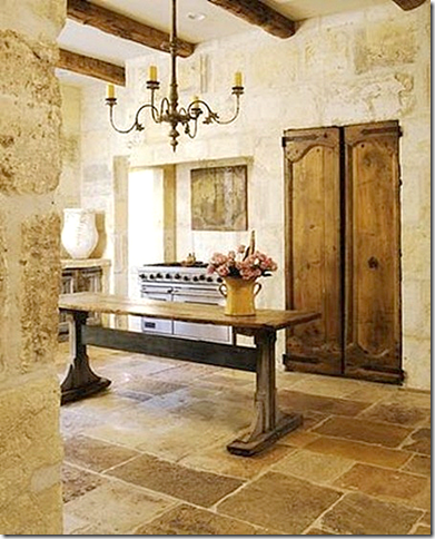
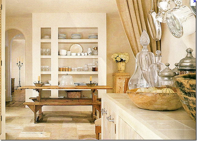
This kitchen is pictured on Chateau Domingue’s web site. Here is another example of a rustic kitchen in Houston – old doors hide the pantry. The range stands alone in its own hearth. The floor is antique stones as are the walls – all of which Chateau Domingue stocks. They also produce new building materials that replicate the old. It’s a candy store for designers and builders.
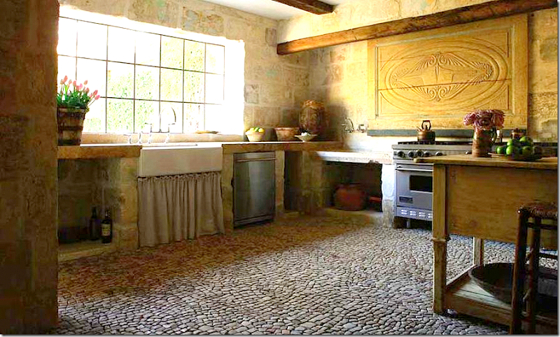 |
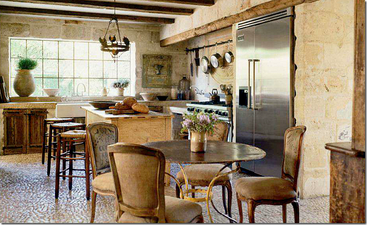
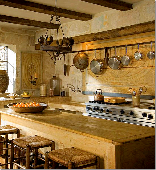
Ruth Gay who owns Chateau Domingue has completely renovated her house with materials from her company. Pam Pierce also helped with the design of her rustic kitchen. Ruth has two sinks – one farm sink with a linen skirt underneath it and the other a trough, to the left of her range.
The house started out as just a regular house, but after Pierce renovated the kitchen, every room in the house eventually was totally changed, a process which took over three years. This house was featured in Veranda earlier this year. The floor is actually 17th century cobblestones that were installed tiny piece by tiny piece.
Her island is also an antique shop cabinet. You see the trough sink next to the range?
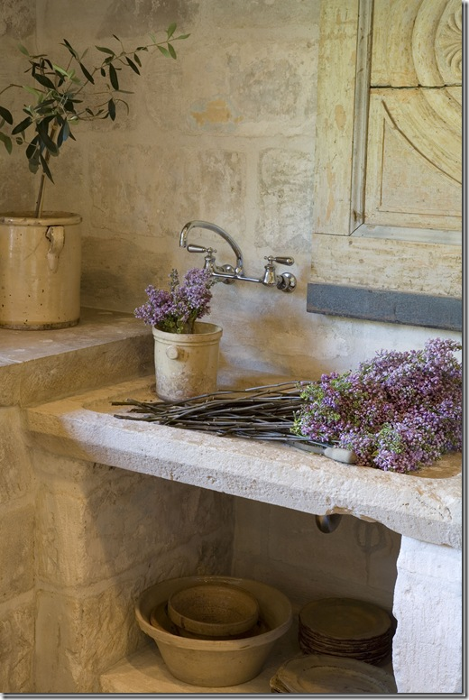
A close of the trough sink and notice the sconce. That has now been replaced as you can see in the earlier picture.
Another close up of the trough sink. Notice the limestone counters and walls. What a great sink for flowers and filling up big pots of water. Her kitchen/house is phenomenal.
Her farm sink. Look at those counters – I love them!
And here is the close up of the cabinet right next to the sink. The doors are antique – nothing faux about these. The gate closes off the kitchen to the outside doorway.
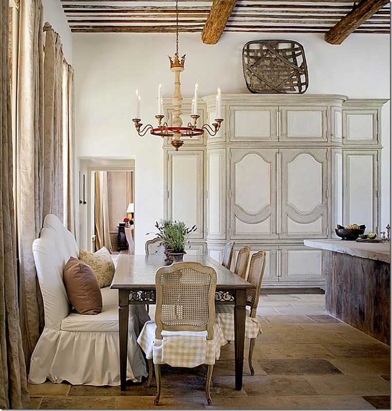
And, here is the breakfast area in the kitchen. The family dining room is seen to the left. Plus there is a more formal dining room – but it’s not really formal in the typical sense. Her house truly looks like it is in Provence, probably because all the building materials came from there.
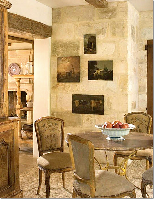
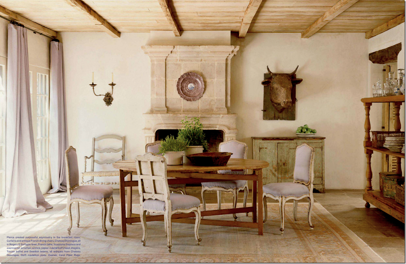
Can’t stop showing more and more! Here is her family dining room with the lavender fabric. The plates and glasses are stored on the shelves at the right. Notice the fireplace. Chateau Domingue has the most amazing collection of different fireplaces.
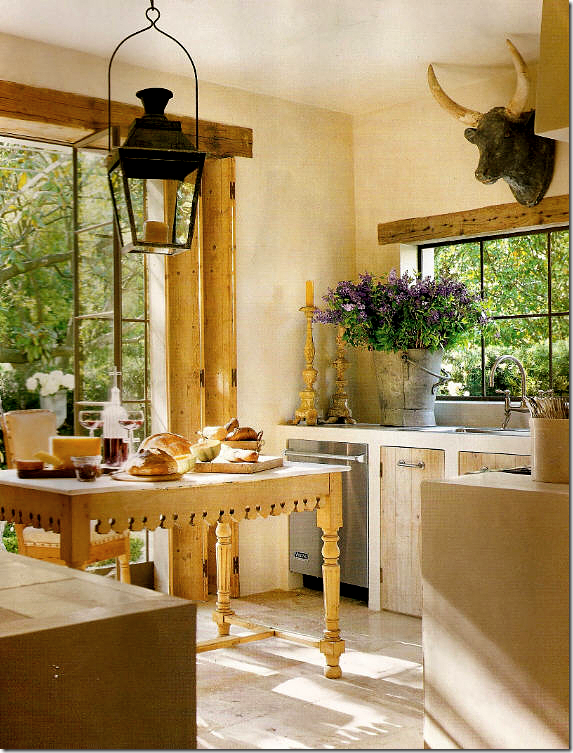
Before designing other’s Provençal kitchens, Pam Pierce had her own to contend with. A small space, she used only bottom cabinets, again with old doors. An antique butcher’s table serves as the island. Steel doors lead to a gorgeous garden. And the bull’s head!!!!
Restyled for a different photoshoot – a French rack is used as the island and the lantern is gone! I miss that lantern!
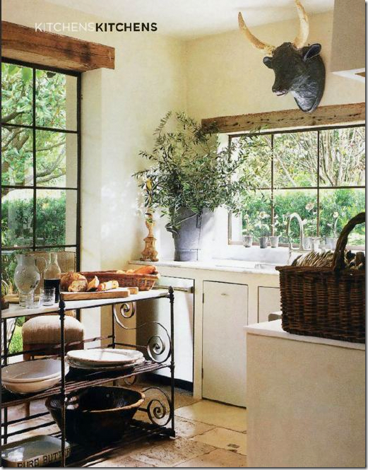
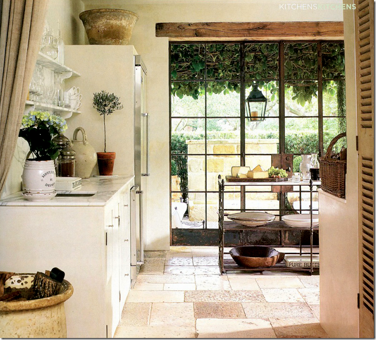
Well, there’s the lantern – it moved outside. Showing another side of Pierce’s kitchen, she has marble countertops and open shelving. Linen portieres divide the spaces.
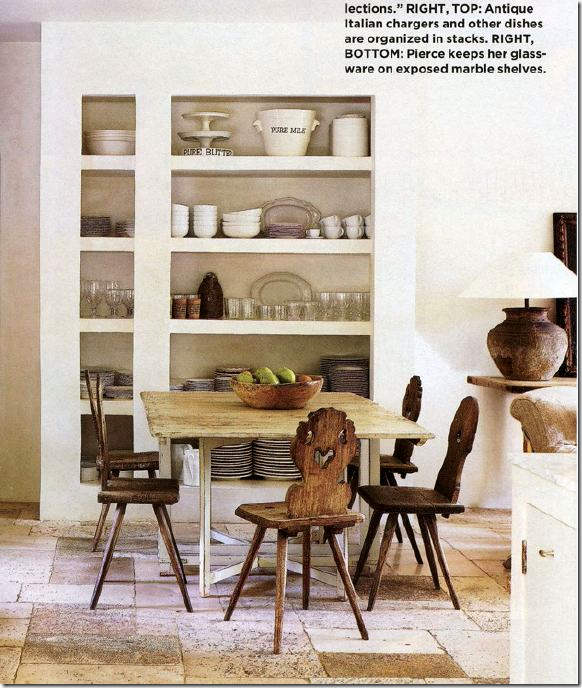
Off the kitchen is the breakfast area where shelves store the essentials.
Another photoshoot with different table and chairs.
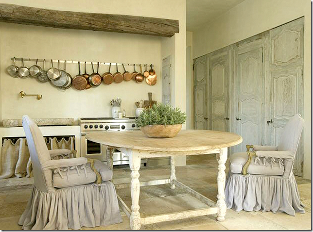
Still, another kitchen with a trough sink next to the range. It looks like an antique stone or vessel of some kind. Notice how instead of cabinetry there is a frame with a linen curtain. Beautiful pots – hanging in a row – resemble charms on a necklace. And notice the alcove that the range sits in: an old beam defines the space. Beautiful set of old doors hide the pantry. It’s amazing how much an old door adds to a room. Again, Chateau Domingue. Nobody does slips as pretty as Pam. No one.

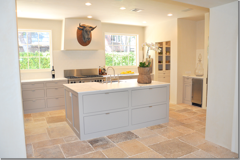
Not only does Pierce do rustic Provencal kitchens, she also does contemporary ones like this. But, by adding an antique chest she brings warmth, texture and a bit of a surprise to the sleek edges of this space. A simple row of white pots and old wooden bowls and plates provide synergy with the smooth marble. And that lamp!!!
Another view of the contemporary kitchen. Where do these fabulous bull heads come from???? And those huge apothecary jars? I want both!!!
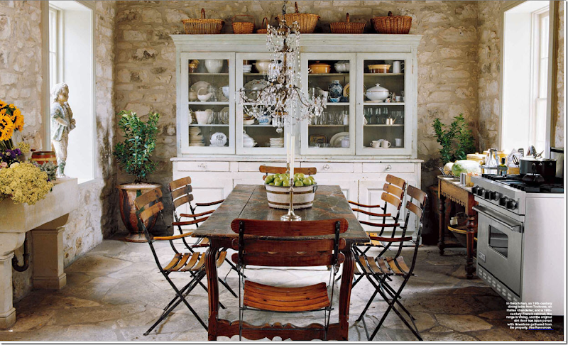
Outside of Houston is a second home furnished in a French way. A huge antique cupboard takes the place of built in cabinets along with open shelves. Again, the dining table does double duty as an island. The subway tiles go up to the ceiling – a look I love.
This second home in Fredericksburg, Texas for Houstonian Julie Greenwood is again, an unfitted Provencal styled kitchen. The large cupboard takes the place of built in cabinets. An antique wood table serves as counter space. The dining table doubles as the island. The range is freestanding and the sink on the left is like a trough. Original stone walls and floors and the chandelier above sets it all off. Julie, who owns a successful real estate business in Houston – also has a gorgeous antique shop in Fredericksburg called The Garten. Looking for wonderful antiques – peruse the web site HERE.
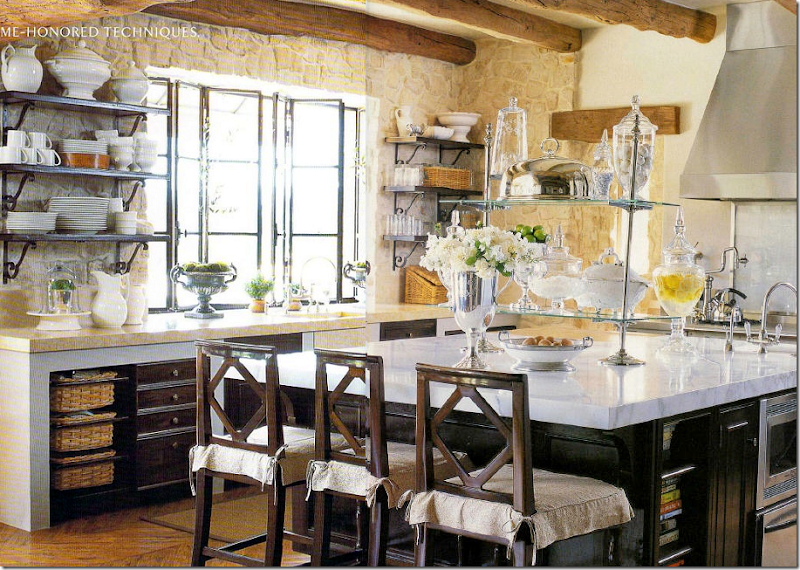
Another Houston designer Renea Abbott of Shabby Slips chose a rather French approach to her cabinets for this kitchen located in California. Notice the bottom cabinets are open with a wood frame built around them. No upper cabinets – instead there are shelves on the stone walls. Again, there are the gorgeous steel windows. The only American look here is the large marble topped island. But the glass shelf etagere looks like a Parisian pastry shop.
This Provencal inspired kitchen is in Cynthia Davis’ house – a decades old bungalow she shares with her architect husband. Notice instead of cabinets on one side, there is an antique butcher’s block. And also notice how the range’s hood extends over the entire side of the kitchen. The cow head came from a shop in France. Baskets take the place of cabinet doors. Davis is the shopowner of Indulge, one of Houston’s most popular destinations for French styled home decorative pieces. The shop itself is like visiting one in Provence with its thick stucco and stone walls.
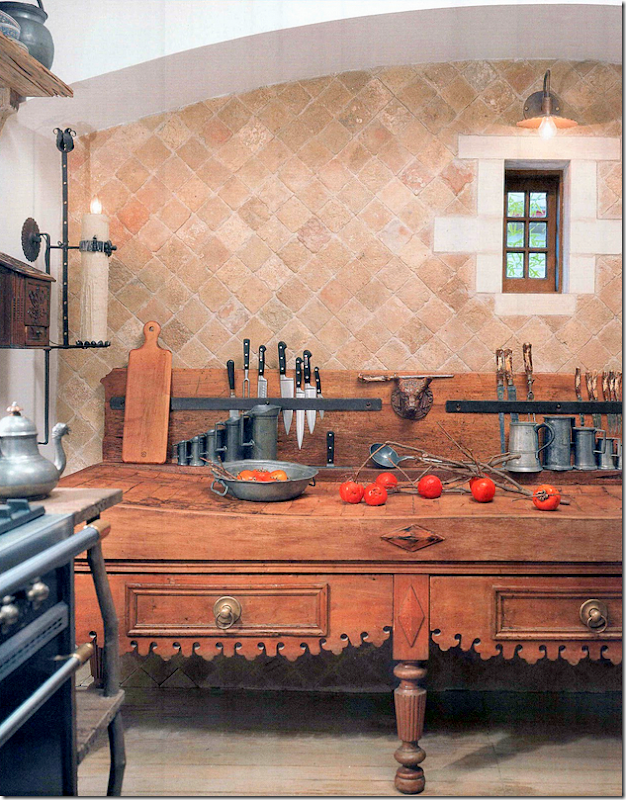
In Linda Keenan’s San Antonio home, this butcher block came from, where else but Chateau Domingue. It is used instead of a row of cabinets. The arch and tiny window are so charming. Tiles are also from….all together now…Chateau Domingue!
Remember this house in Mississippi designed by Kevin Harris HERE and Annelee Primos HERE ? House is loosely used term here, castle might be better! Though not in Houston, Chateau Domingue sourced many of the building elements, including those in the kitchen: the counters, the beams, the floors. Chateau Domingue though located in Houston is an international company – shipping their products everywhere. Though the designer did use cabinets, the look is still unfitted with the rustic island and stone counter tops. And notice those doors!
Those countertops are unreal. Behind the doors is a drinks station.
The pantry looks like a huge armoire. Just beautiful!
Now, there is nothing wrong with this kitchen. It’s quite lovely with granite and wood cabinets and stainless appliances. But, after seeing all these unfitted kitchens – or kitchens filled with rustic architectural elements, it’s hard to get excited by a kitchen like this. So, yes, maybe the Veranda kitchen isn’t the easiest one to cook in, it sure is a good looking one!
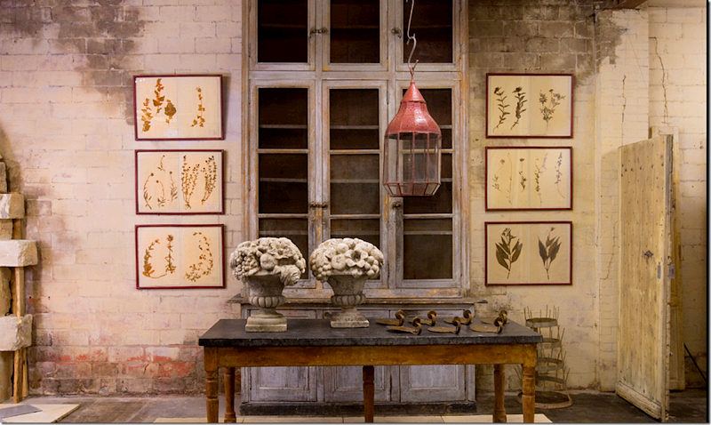
Visiting Houston? Be sure to go visit Ruth Gay at Chateau Domingue, pictured above. If not – visit their web site HERE.
AND finally, just tooting my horn!
Styleblueprint, a lifestyle blog just recently named Cote de Texas to their list of Top Ten Design Blogs!! Wow! I was stunned and quite humbled. A huge thank you to Styleblueprint and to all the readers who have made this endeavor so rewarding and fun over the past five years! Without the readers – I am nothing. A million thanks.
Read the article HERE.















Charlotte Des Fleurs De Mal recommends shopping at Tapestries 'n' Things, out next to Radio Shack and the Courtyard Marriott.
ReplyDeletethe courtyard marriott was a genius touch.
DeleteAnon always adds a spark of genius to your posts.
DeleteCongratulations, Joni! I have been reading your blog for about three years now and it is by far, my favorite blog! I have learned so much from you and your readers! A million thanks to you!
ReplyDeleteWell of course you're one of the Top Ten Design Blogs!
ReplyDeleteThis post is an example of why!
Marvelous, Joni.
xo,
p
thank you so much. and to everyone else who commented below, thank you so very much, i truly appreciate your good wishes about the blog.
DeleteAmazing post. Gosh, it must take you hours to load all your photos. The tapestries are amazing and I like the pillows you have. I wish I had an issue with having to hang tapestries...
ReplyDeleteI don't care for the unfitted kitchen myself. I find it a little weird to fake the look of an old french farmhouse from 1800 or something in a contemporary house. It is just trying to hard for me. But then I look around at all the faux finishes on every accessory and furniture these days and realize it is all a remake of something old, so I should shut up now. Those kitchens though - they just seem awkward or something to me...large expanses of smooth surfaces are the most wonderful for those of us who cook, but then again, I use about 4 feet of space in my kitchen to do 90% of cooking, so maybe the simple weird cobbled-together kitchen is just as good as a slick new one...
xo Terri
The effort and beauty of THIS posts is amazing!! Thanks so much. YOU ARE AWESOME.
ReplyDeleteCongratulations! I read several blogs and Cote de Texas is a favorite! I love that you sewed your own pillows, too! I used to hate tapestries. I had a medium size one (old) and sold it dirt cheap years ago...I kind of regret it now. I do think you need to have "fresh" things around a old tapestry - like the white slipcovers or things could end up looking rather murky (not in a good way). Fine architecture and furniture helps too! I do appreciate the unfitted kitchens - I would like some built in cabinets and some pieces unfitted - a combo. I don't like the french style kitchens though...the look is just so washed out - not enough contrast for my taste. Good post!
ReplyDeleteHi., I saw all your articles and the pictures,It was really wonderful pictures and thought right be seen her.Thanks for sharing this Wonderful pictures.hope you people share more pictures like this.
ReplyDeletelaser hair removal bc
As a young woman, I bought a derelict stone and thatch cottage which I renovated. By the time I got to the kitchen, the budget had gone so, undeterred, I cobbled together an unfitted kitchen made out of reclamation. To date, it is still the most attractive kitchen I owned albeit not the easiest to work in. However, I still yearn for the open shelves that "forced" me to keep my clutter tidy and made everything accessible, not to mention opening up the room! P.S. That family dining room/breakfast room of Pam Pierce with the lavender hue never fails to make my heart miss a beat - EXQUISITE!! Thanks Joni x
ReplyDeleteJoni, I enjoyed the tapestry section of this post so much. I have an antique Verdure tapestry that has been in our family for over a century. It's only a remnant of one, and measures about 7' x 2' feet, so it looks like a runner. Because it had already been cut from a larger tapestry, someone folded it and sewed it over on both ends so that a small rod with finials could insert thru the folds, (which is how it's hung.) Ours is fairly faded now, likely because of the amount of indirect sunlight that comes through the windows. But the fading and scenery in the tapestry make it all the more beautiful. I'm sure if you found a reasonable newer tapestry and wanted it faded, sunlight will do the trick. I also found a huge antique tapestry pillow from Amy Howard on Gilt. It was half price at $200!...one of my best finds! Congratulations on the new honor.
ReplyDeleteGreat post! Tapestries are a very tricky item in decoration, they can look fantastic or they can just look cheap - and when they look cheap, they look VERY cheap (imitation 18th century bucolic scenes) The very best European new and old tapestries can be found here: http://www.dewit.be/Manufacture-Wit-Home-DesktopDefault.aspx?tabid=1&lg=en. Not cheap I'm afraid!
ReplyDeleteAn unrelated question: On your living room tea table you have two plates which look like the dining service my grandmother used daily and which my mother stowed away somewhere she can't remember. She says they were "Boch wartime faience" (and I want them!). Are yours Boch??
Absolutely gorgeous! Your blog is always such a gift. Where to begin? Tapestries, Pillows, Provencial Kitchens and Your Well Deserved Success! Thank you for sharing your talent with all of us. Congratulations!
ReplyDeleteWhat a fabulous post! I truly enjoyed seeing all of the tapestries. When I lived in NYC one of my friends was the director of Modern Master Tapestries on W. 57th Street. It was always thrilling to see the gigantic tapestries being hung for shows. I remember she used the double faced velcro, one side afixed to the wall and the other on the tapestry. It worked like a charm.
ReplyDeleteAnd those kitchens! So inspiring. Love, love everything you've posted today, Joni. I love Cote de Texas!
I have learned so much this morning by reading this post. All of those kitchens are leaving me speechless in how to describe them. The detail is them is incredible. Thanks so much for sharing all of this with us.
ReplyDeleteCongrats on your top 10 blog award - you deserve it!!
Hi Joni,
ReplyDeleteThank you for the information on the tapestries. I love the one in Jane Moores dining room. I like it much better against the lighter walls compared to where it was in her other home. I would love to renovate my kitchen to look like the old world kitchens, The pictures of Jane Moor, Donna Brown and Ruth Gay's are just breath taking. I really love the fact that they look like the have been there for years and have a history. They are so much nicer than most kitchens that are just full of cabinets. Did you ever find out where Jane Moore's refrigerator is hiding?
no, but apparently she has a huge pantry that hides more pots and stuff. but no hint on the refrigerator. it might be in the pantry too - like that bobby mcapline house i showed a few weeks ago.
DeleteThe warmth that the textures of these kitchens brings out is what is so inviting. I know that the theory is 'go big or go home' with rooms built and styled like this. But if you are not brave enough to build every inch to this style, adding some of the elements to a traditional space can add an element of charm.
ReplyDeleteI personally love it all. I wouldn't build my entire house around a theme......... I'd rather move to Provence {who wouldn't}.
I've been reading the post for 10 minutes........ great post.
Beautiful tapestries and Farm kitchens- I am rethinking mine. I am waiting for the day that Interior designers will start using quilts as focal points to do their interior decorating. Hope it will still happen in my life time.
ReplyDeleteWell, Joni. You did it again. You are the reason I am still in my jammies at 9am. Between devouring this blog and pinning so many images, I need a nap. I am, admittedly, a kitchen freak, having just completed mine after 15 long months, so I loved this post. Again, thanks for all the time and detailed information you put into every post you do, but this one wins the best-in-show prize for me.
ReplyDeleteXO Victoria
Joni, I studied design and have always loved tapestries! On my first trip to Brussels, (when I was 24) I was able to purchase a beautiful reproduction for less than $1000. It is one of my most prized possesions! If you can buy one in Belgium, they are so much more affordable.
ReplyDeleteI feel as though I've just taken a couple of on-line introductory courses: one on tapestries and another on unfitted kitchens. It is in reading information such as this that I continually refine my tastes and opinions. Thank you for sharing these lovely photos, and congratulations on your well-written blogs.
ReplyDeleteWell deserved accolades Joni !
ReplyDeleteYour blog is a never ending source of inspiration. Your multifaceted, intellectual depth, and incredible sourcing combined with your humor and gifted writing result in GREAT reads. ALWAYS something interesting in the genre of design or otherwise at CDT. Opening your blog provides the anticipation of opening a new book by an admired and favorite author. The amount of information CTD provides over just one week is astounding - and very much appreciated.
Best of The Best!
Joni,
ReplyDeleteYour posts are just amazing, so full of beautiful images and information and I love your funny chatting writing style. I never tire of reading Cote de Texas! Keep up the great work!
Thanks Joni, This was a great post.
ReplyDeleteI love tapestries and a few years ago scored a fairly good deal on one on ebay (verdure, about 1800sish). When I got it I realized it was water damaged and FULL of dust. Instead of returning it, I had it repaired. Another investment but the restorer confirmed its age and valued at much higher than I paid for it. But it weights literally a ton and it still kind of smells old and dusty so I can't hang it. I'm trying to figure out if I should just make pillows out of it (lots and lots of them) or remove the backing and frame it. Might look odd but wouldn't stink. Ahh, which all of my problems were like this one!
As for the farmhouse kitchens, well, yes they are pretty (Pam Pierce's especially, the others don't do much for me) but I still think on the whole they are silly. I can't imagine coming home to something like that an not feeling a little pretentious and embarrassed. Also, I assume most have pantries, as of course there is no fridge, place for plates (a few pots in a basket is not enough),cutlery, food etc. I don't mind and in fact like the unfitted look but the old farmhouse kitchens were actually functional and not especially pretty - it's funny, a lot of the old kitchens in France and Italy I've seen are hardly showrooms. They were where great food was and is produced and that's it. And, the "regular" kitchen you chose wasn't really the nicest but hey whatever floats your boat.
Thanks Joni.
wow. ebay. if it still smells, i would think about having it restored again - cant believe you cant hang it. what a shame. try again. wow - you are so lucky.
DeleteIt's fairly delicate - I suppose I could have it restored again but it's getting pricey. I think my husband will explode with annoyance if I try that. Having said that, framing it might took odd and would probably be expensive. Do you have any pictures of framed tapestries? I suppose it's not very common but I guess most don't stink like mine.
DeleteEbay - yes it's the best. Who needs to shop elsewhere - many times now I've wanted something and haven't bought it and then a few weeks/months later seen it show up for many times the price on 1st dibs or OKL.
Thanks again for the post Joni.
Hi Anon,
DeleteIt makes me really sad to think that you found a lovely tapestry on Ebay, spent the money to have it repaired and STILL cannot use it. Based on what you said about removing the backing, it sounds like that is where most, if not all, of the mold damage occured. Have you considered removing the backing, vacuuming it outside (so you don't spread mold spores around your house) and then seeing how it smells? If you do nothing, the problem will not get better and, if you live in a humid climate, may get worse.
You might also consider contacting the company that makes this EPA registered fungicide to learn if it would be safe to use on your tasptry. It is not expensive, and at this point, you probably do not have much to lose.
http://www.biocidelabs.com/Mold_Bomb_Fogger.html
Best wishes, Charlotte
Joni.....love all of these kitchens. I should of been born in Texas! The design trends are so different in California.
ReplyDeleteHi Joni! Wow what an amazing post...loved every detail and all of the information. The tapestries are really wonderful and I would suspect that many have been handed down through the years to family members, just like great art work or beautiful antiques. I have never hung a tapestry but have hung quilts which are similar in size. We made a series of long wood clips, almost like a large paperclip, which attatched to the wall. It doesn't hurt the fabric and allows the textile to be supported, and they actually look nice too. I love all of the deconstructed kitchens you showed. If you really think about it most professional kitchens have shelving and freestanding cooktops with everything easy to reach and see....so it really is practical too! Your blog is hands down my favorite and you deserve all the recognition you are receiving....congrats Joni!
ReplyDeletebest, Kelley
Joni, Joni, Joni...Would have been very disappointed had I missed this post...Every favorite image I've saved and so many more in one place...My favorite post EVER...So much beauty and talent...I can't wait to come back this weekend when I have more time and savor each one and read all of your commentary. A million thanks for what you do. Mona
ReplyDeleteLovely post, Joni. I love the look of tapestries, and the real deal antique ones are simply fabulous. I have a repro one made in Belgium, but it doesn't have that wonderful faded aged look. (Should I leave it in the sun?) I had been wondering if it looked a bit dated and granny-ish hanging over my sofa and if I should put some artwork there instead. This post has me re-thinking.
ReplyDeleteAs for the kitchens - since I love anything that looks old European and practically medieval, I do love the look of the unfitted kitchens with raw or limed well-worn wood pieces. They look like they came out of a French farmhouse; better yet if it was a French farmhouse. And, yes, I had clipped these kitchens from the magazines. But, on the other hand, it seems a bit pretentious. I imagine only a few can afford that whole Chateau Domingue look. And I still don't think it's very practical. What really got me was that silk Fortuny lamp shade placed directly beside the range. What were they thinking? Don't they cook? Gotta admit, though, I love the look. And that's what it's about, isn't it? The look.
Loved this post! You never fail to educate and entertain me! I just pulled my tapestry remnant pillow out of the closet and placed it front and center once again! I love to shop at home. Congrats on the recognition! Very well deserved!
ReplyDeleteThe thin, "bucolic" tapestries made in Italy during the 50's, 60's, 70's and 80's and the thin, mass produced tapestries from China have certainly given "new" tapestries a bad name. As Victoria pointed out, thank goodness there are still good quality new tapestries being made.
ReplyDeleteThank you, Joni, for showing us the beautiful uses of tapestries. If I were currently in the market for a tapestry, I would look at it as "investment dressing". Just like a classic scarf, coat or handbag, buy the best quality you can afford with the intention of keeping it a very long time. When you think about it on a cost per square foot, tapestries are really not any more expensive than a good painting.
If you have more time than money, private sellers, estate sales and consignment shops offer the best value for the money. And, even top-notch design shops buy products from these sources and from warehouses in the less-than-tony parts of town. You may have to hunt for a while, but armed with the information Joni provides, when you find the right one, you will have the confidence to buy it!
"Chance favors the prepared mind."
As with so many of your posts, I will be coming back to this one over and over again! Drool-worthy! I'm still laughing at my own reaction while slowly scrolling down through the pictures and the granite/builder's kitchen appeared---I literally recoiled from the computer! I agree, it's a perfectly nice kitchen if that's what you like, but in comparison to every single other kitchen you showcased.......you'll have to excuse me, as I'm going to reread your post. I'm not finished drooling.
ReplyDeleteO-M-G you made my heart sing with all the tapestries! I personally have several in my home and sleep under a tapestry of 15th century angels. I have the tapestries because I deal in them and I know how to properly hang them. Velcro should never ever be used and it won’t support the weight of the tapestries they’re to heavy. Only a professional hanger should be used please don’t ever try to hang them yourself. John Saladino’s hanging isn’t really a tapestry but a very old and rare cotton Fortuny hanging that I would kill to own. As for all the kitchens I would take any one of them and be extremely happy! I need a bull’s head like the one in Pam Pierce’s home it wonderful!
ReplyDeleteEnjoy your long weekend!
XX
Debra~
I just read Carolyn's comment above and NO Carolyn do not hang your tapestry in the sun you'll only fade it and ruin it. The patina you're looking for can only be achieved over centuries. Make sure you hang your tapestry on an inside wall as well so it doesn't get the hot/cold cycle from the seasons from an outside wall.
ReplyDeleteXX
Debra~
Thanks, Debra.
DeleteI knew you would know! so dont put a new repro out in the sun????? ok.
DeleteJoni - I really love the look of a tapestry hung by tiny clip rings from a rod. I noticed that Jane Moore's was hung the same way. There seemed to be some rope or wire involved up there at the top but the picture was cut off. Do you have a larger picture that shows the entire top of the tapestry? Would love to know how Jane solved the "hanging" problem.
ReplyDeleteMy favorite room is the one that has antiques and reproductions but has a modern quality to it; white dining chairs and seagrass rug. I noticed the doors are painted black in this room. I am thinking about painting the interior doors black in my home also. I know you have black doors in your house, do you have any advice you could give me about doing this?
ReplyDeleteProfessor Webb, you have done it again. A lovely way to spend a rainy (yes, finally, rain!) day. Keep this up and we'll have to pay tuition! Of course I love the unfitted kitchens. The tale of the tapestries was formidable! Well done on your latest honor.
ReplyDeleteDonna Brown's family room is just my style. I couldn't stop looking at the detail. Thanks for a great post.
ReplyDeleteYou must have read my mind!! I just came back from Pelican Hill Resort, and gained a new appreciation for vintage tapestries . I wondered why I dont see them used as often as they could be! I think this post really made it clear that when they are hung properly in the right setting, and of course the quality of the tapestry itself..they can be fabulous! I love them and the photos you chose where dead on!!
ReplyDeleteKarolyn
The Relished Roost
Thanks, Joni, for the extensive post and glorious kitchen images, all of which I will be pinning this weekend. The tapestries though, hrmmmm..., I just can't get past memories of pastoral velvet wall hangings and DayGlo Elvises in the discount stores. But I'm ready to rip out my factory-installed cabinets and install an old armoire in the breakfast room. Great inspiration! Best wishes!
ReplyDeleteWow, I'm exhausted after that post so I don't know how Joni must be feeling! Half of the unfitted kitchens I wasn't keen on but the ones that I liked I really really loved and this does change my mind about them. As far as tapestries go, I like the old faded, botanical ones. The rustic pebbled kitchen floor from Provence just fascinates me. I couldn't stop looking at it.
ReplyDeleteThe tapestries in the Eleanor Cummings and the one that Jane MOore owns both came from www.mattcamronrugs.com take a look at their great inventory!
ReplyDeleteI can already tell I'll be coming back to this post again to read and stare more thoroughly. I love seeing all those unusual kitchens. I'm so glad you took the time to pull them all together and show. Really, lots of people are doing these in Houston? They are so amazing. As beautiful as any room in the house. Now..as for tapestries....I just do not like them. I try to but just can't get myself to embrace them. They just seem like they would be full of dust and smell. And I love old stuff but I just can't embrace tapestries. I actually think my Mom has a pretty large one packed away that used to be my Grandmother's. I'll have to ask her about it.
ReplyDeleteThanks for pulling this great post together with all this fabulous kitchen inspiration.
Tapestries: I own three Belgian tapestries, one wool, one silk and one a combination of wool and silk. When we built our home a number of years ago we bought these on a trip abroad with the idea that they would work in our French architecture. The largest one was hung over an Indiana Limestone fireplace in our library and one hung in our dining room. While I really loved them at first, after a few years I began to feel they no longer fit my design and I opted for paintings to take their place. I have to say that I find paintings have more life than the tapestries. I also believe that much of what give tapestries their inherent beauty is what you put in a room with them. In each case pictured here, the rooms appear to be in harmony with the tapestries hung there. I think that should be the foremost consideration when deciding whether to use a tapestry or not. Does it really harmonize with its surroundings? In the case of the one I hung in my library, it did. However, I just needed a change - something new to rest my eye on.
ReplyDeleteKitchens, After seeing more of the deconstructed kitchens, I can appreciate why homeowners choose to design them. I also believe that the traditional kitchen shown in this post was perhaps a deliberate attempt to put traditional kitchens in an inferior light vis a vis the deconstructed ones as it was not in the same class as the other kitchens shown. While beautiful, kitchens are truly meant to function and I am not certain without seeing in person the layout of some of these kitchens one can say they truly function in the same way a traditional kitchen would be designed.
Joni, thanks for a wonderful post, once again! It's no wonder you are on a 'top ten best design blog' list. (Congratulations) The time and effort you put into everyone of your posts is amazing. You are so detailed and do so much research. It's always a joy to read and I love your sense of humor. THANK YOU!
ReplyDeleteIn this site their are so many latest and attractive offers available, And I really impressed from all these images, so really thankful to you for posting this blog. New windows and doors
ReplyDeleteOf course you're one of the top 10 design blogs. Bravo and thank you for your in depth articles! The Jane Moore piece was amazing and I was tickled to see more when I came back today. Her kitchen is amazing but the showstopper for me was the picture of her dining room. It restored my faith in tapestries - I have one that I inherited from my grandmother that has been following me through my myriad moves from right out of college to now. I always wondered if it was too granny-ish for my aesthetic but kept hanging it nevertheless b/c it is a very sentimental piece. And I am so glad that I have. It just proves that if you stick with things that you love or that have meaning - they will always work in spite of what look is trending at the moment. As one of those younger readers that tows the line btwn of-the-moment looks and classic spaces, I always appreciate the education that I get when I visit with you. I did a follow up post the other day about you and your article and my tapestry but it looks like you get a lot of spam links so I will refrain from sharing here. You can duck over to Chez V if interested. Great work, as always!
ReplyDeleteBest, Emily
Love the tapestry, Joni! Your posts are the best. Congratulations on the mention!
ReplyDeleteHave a great weekend.
Teresa
xoxo
Sending you the bill as I now want to bulldoze my house and start from scratch...curse you! ;-)
ReplyDeleteKat
Hi Joni,
ReplyDeleteI'm now ready to tear out my kitchen. I'm sure you've heard THAT before. Thanks for the shout-out!
Keri
First of all congratulations on the award and well deserved. The tapestries are all so beautiful and I especially love them going up the staircases and oh my, the Kay O'Toole image is an absolute favorites - a stunning use of a tapestry and an amazingly beautiful room. I adored Jane Moore's kitchen, but maybe it's because I don't cook much anymore - I love it all!! Heading over to Chateau Domingue...
ReplyDeleteSorry meant to say one of my absolute favorites -
ReplyDeleteCongratulations on your Top Ten honor! I am a native Houstonian living in Virginia, and your posts always make me a touch homesick. I have been saving the photos of Kay O'Toole's home since that edition of Veranda was published. I love it. If you are ever in Richmond, Virginia, be sure to visit the beautiful tapestries at the Virginia Museum of Fine Arts. Kind regards.
ReplyDeleteI'm not a fan of either tapestries or gimmicky kitchens, but I really appreciate all the research you did for this post. I find these "let's pretend we live in 18th century France even though we actually live in North America" kitchens just too pretentious for words. I love mixing a few beautiful objects from the past with a beautifully designed traditional kitchen (or any other room for that matter), but a fake French farmhouse kitchen, circa 1750, but complete with Viking range, just looks silly.
ReplyDeleteThank you so much, this has to be one of my all time favorite posts. You have incorporated many of my favorite designer's and favorite homes, Jane Moore, Pam Pierce, Ruth Gray, Donna Brown, Eleanor Cummings,Babs Watkins, John Saladino, Kay O'Toole, your own, Joni and many more. Loved the pictures of tapestries and love the unfitted kitchens, homey - full of personality - not a carbon copy of everyone else.
ReplyDeleteAlso have enjoyed the reference sites - so much to see and so much info. Thank you again for your wealth of knowledge.
Janice
I'm happy to see so much wood that is NOT painted. True, I'm more into English or several other types of traditional, but I really feel like the Swedish/Belgian look is already tired and pretty much over. It just isn't a trend that can hold on for long in my opinion. (Don't like the last kitchen, though. Dark and dated looking with no real personality. Ironic, I guess, that I prefer painted kitchens, but not the painted Swedish/belgian furniture.)
ReplyDeleteLove the tapestries.
Love you and your blog.
Sheila
ReplyDeleteForgot to say congratulations on your award! Much deserved and I have a feeling you will receive many more!!
Janice
WOW what a great set of images, Joni. Congratulations on the Top Ten! For the tapestries, the trick is to back them with fabric that will bear the weight of the tapestry so that the threads of the tapestry themselves do not get pulled. We bought ours at a local antiques dealer and I backed it and sewed the border on by hand by myself. Love the images of all the kitchens and have to come back to re-read....have often longed for a trough sink but you will often end up with a lot of splash and less sink space, though I love the look!
ReplyDeleteFor the last year and a half I have been building a log cabin. Decorating this cabin has been a joy. But the kitchen is what occupied my interest the most. I opted out of the cabinet parade. The room is 16' x 24 with one wall of glass and three walls of rough sawed, unfinished wood. I wanted to look out that glass curtain wall so a 12' island htovar the stove, sink and dishwasher. Behind that on an interiowarehouse are two 108" tall French doors that close over shelves. A pot rack made from tree branches hangs over the stove. The floor is also rough sawed unfinished wood. I didn't want to have to worry about the finish being ruined in a log cabin. The thing isn't done yet but I moved in anyway and am sleeping on the floor and looking at all the log, all of which came from my own land. It smells so good when you come inside, all woodsy. I am so lucky.
ReplyDeleteThank you for siding with those of us who want to step outside the lines. You do a terrific job with your blog, I never miss reading it and learning from it. Ann
...i loved reading this because i could hear the smile in your heart as you spoke about your home...that is what our homes should do...put smiles in our hearts...blessings laney
Delete...do antique turkish prayer rugs count...if so i have one...and it has been everywhere over the past 42 years...floors...walls...and now over a side table...i always wonder about who wove it...and how it ended up in my little home...tapestries and rugs have more to offer than beauty...they have stories to tell...if we will just listen...laney
ReplyDeleteI am late in reading these recent two posts... though I have to say, LOVED them both! I totally love the rustic kitchens, they seem more lived in and not so pristine. Thanks so much for sharing all the photos and different versions of the same space, it was remarkable to see how different pieces, like a table or chairs or lantern can change the feel of a space.
ReplyDeleteLiz
Fantastic post. Thanks for sharing all this information and the beautiful images. I'm off to visit the link to the San Antonio home........Sarah
ReplyDeleteAppreciation for great content. I’m certainly glad I had taken the time to learn this.
ReplyDeleteA follow up to veranda article is shared on the post here. Read to know more
ReplyDeleteA follow up to veranda article is given here. Have a look at it
ReplyDeleteLove your post spotlighting tapestries! This probably doesn't come as a surprise though- we're Tapestries, Ltd and about to turn 40! (www.tapestriesltd.com)
ReplyDeleteThe love affair Americans have with everything french will never go away! And what a wonderful way to warm a home and let your walls tell a story... we'll keep following!
Terrific post.I really like your post....
ReplyDeleteI would also motivate just about every person to save this web page for any favorite assistance to assist posted the appearance. Appliance Repair Houston Service. Call us at (281) 764-6293.
ReplyDeleteI surprise how much effort you put to create such a great informative website!
ReplyDeleteWall Decor Tapestry
What is your 2018 opinion o. Tapestries? Yay or may? Thanks! I have a couple that we aren't using but love them.
ReplyDeleteI like your blog so much, because you use valuable things as I need. Visit our page for responsive website designing services and digital marketing.
ReplyDeletePPC Company in Delhi
One of the great works you done in this blog, thank you so much for sharing with us. Visit Mutualfundwala to know about the best Mutual Fund Advisor and Distributor.
ReplyDeleteMutual Fund Distributor
see article
ReplyDeletehttps://alldiamondpainting.com