I was thrilled when I was contacted by a representative from Veranda asking me if I would like to show pictures from the new issue of Veranda. Of course I would! Who can pass up real photographs – not scans from the magazine? Trust me I like to do my part for Pinterest.
Seriously though, I was honored to be asked and I do love putting these beautiful images on the internet where they will be enjoyed forever.
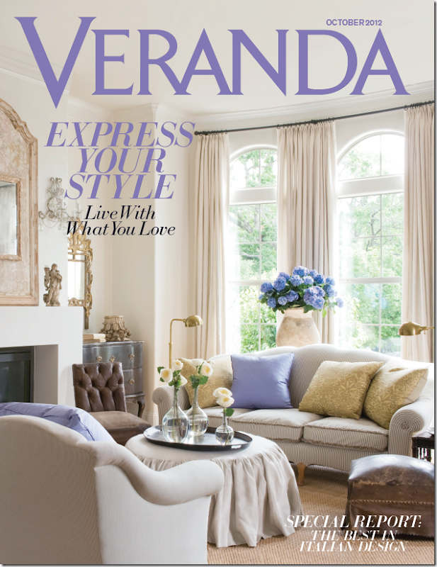
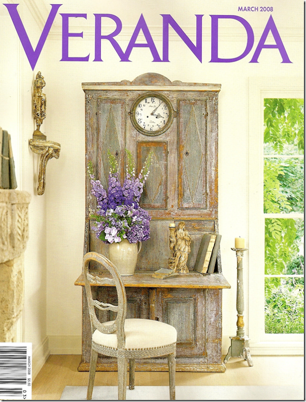
The gorgeous cover! I love the touches of lavender. All photographs shown today are by the great Peter Vitale.
This month Veranda magazine honors Houston interior designer Jane Moore with a cover story. Is this her third cover for Veranda? I believe so. I know her work has been published in the magazine at least 4 or 5 times. Additionally, her work was included in the new The Houses of Veranda book by former Veranda editor Lisa Newsom. Jane and Veranda are related – in laws of a sort. You probably know the connection, but if not, Jane’s daughter Shannon is married to Lisa’s son Andrew. Lisa started Veranda magazine over 25 years ago and just recently handed over the editorship to Dara Caponigro. Andrew and Shannon Newsom own the fabulous Wisteria catalogue and Jane has helped out all these years – providing her great eye and picking out antiques to be reproduced by the company.
Jane Moore was a long standing designer and antiques importer when she became known to Houstonians in the late 90s after opening a shop near River Oaks with fellow designer Joe Shaffer. Called Moore & Shaffer, it was filled with decorative items and antiques – mostly small accessories. I know all this because I used to haunt the shop. I remember getting a $500 check from my parents for my anniversary and heading right over there to buy a set of large antique books that I still have today. The next year, with the same anniversary check, I splurged on a tiny red tole tray. It was a real extravagance for me then. Actually it still would be today!
When that shop closed, Jane moved to her own space in a darling shingled house that looked more like Nantucket than Houston. Several features in Veranda and Southern Accents helped make Jane a very popular figure in the antiques and design business. It was around this time, after a trip to Sweden, that her aesthetic changed dramatically. She became one of the first in Houston to show these gorgeous Swedish and French painted pieces. Along with Babs Watkins, Donna Gray, and Margaret Naeve – these ladies – all with impeccable taste – introduced lighter woods to Houston - creating what I now call the Houston Look.
The Nantucket styled shop has recently closed and Jane’s moved on to a new home, a nearby townhouse which Veranda shows this month. The townhouse is a total departure from her last house which was shown in Veranda in 2000. It’s amazing how much design in Houston has changed in the past ten to twenty years. Where once Jane’s house was English inspired, filled with dark woods and fashionably cluttered, today her townhouse is bright and airy with mostly limed and painted antiques. Jane says she was ready to completely edit her look when she moved. The new townhouse is filled with only what she wants in it – no one else. And she loves it – she looks forward to coming home each day to a place that is filled with pieces she carefully selected from a lifetime of collecting.
Today, I will show photographs of both her townhouse today and also her house in the 90s so that you can see how her style has evolved over years.
Enjoy!
VERANDA: 2012
The living room in Jane Moore’s new townhouse is filled with antique furniture and accessories. The Louis XVI period gilt console on the left is a prized piece from her former home, as is the set of vintage upholstered furniture. She added Fortuny pillows along with pops of lavender. Notice the two worn 19th century leather chairs – these also came from her previous house. My favorite? The gilt console. The slipped ottoman. I just love that! And the macaroni beaded sconces and the olive jar filled with hydrangeas.
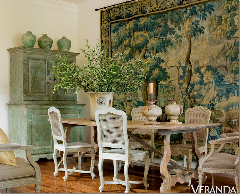
Here a gorgeous 18th century tapestry hangs on the dining room wall, another piece that came from her former house. The cane chairs are vintage while the fabulous dining table is 18th century French. Be sure to notice the beautiful 18th century Swedish cupboard. I love the way the tapestry is the main focal point and how it makes the room comes alive. It is so large – what a find this was! And I love how the green paint of the cupboard picks up the greens in the tapestry.
Jane’s kitchen is remarkable. She completely stripped out all the cabinets and put in a combination of tables and chests to make up her antique styled kitchen. I don’t think I would be brave enough to do this – but I LOVE the way it looks! Donna Gray is another Houston antique dealer who did something similar in her townhouse kitchen. Notice the farm sink is in the limed cabinet which is actually an old French architect’s desk, and the dishwasher is in a marble topped built-in. Above it all is a delicate 18th century gilt mirror and sconces. Pots and pans are stored in the laundry baskets beneath the cabinet. Notice how she pairs the antique table with industrial styled chairs.
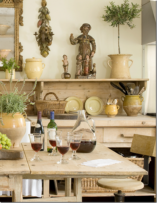
Here’s a close up of the styling I love all her French yellow ware and confit pots. The pots hold her kitchen utensils. Dishes and glasses are stored in the Swedish cupboard in the dining room. The table is an antique gate leg which doubles as a working island.
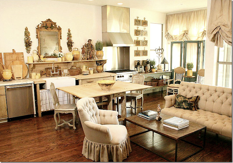
Now don’t kill me Veranda, but this photograph came from a different magazine – Antique Shops & Designers. It shows a little more of the kitchen that I wanted you see. Notice the oven is off to the right of the sink. And to the right is a sitting area with a large tufted sofa. What a cozy room! Since this picture was taken, there have been changes in this room as you will below. You can tell that the photographer pulled out the sofa to get it in the same shot as the kitchen, but in reality – the sofa is in its own room. Also, the industrial styled chairs weren’t being used back then – I think they are really a great addition. Wonder where the refrigerator is hiding?
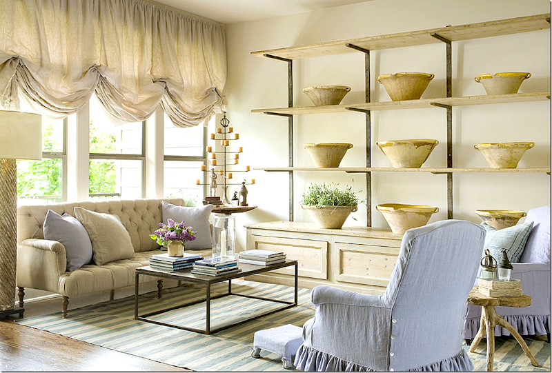
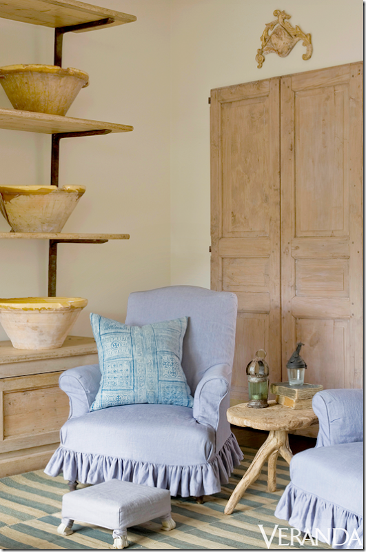
Here is what the family area looks like today – the chairs have been slipped in a lavender linen which matches the pillows in the living room. A blue and white striped dhurrie is from Carol Piper Rugs, who has a great collection of flat striped rugs at her shop. Along the wall Jane has added a 19th century étagère which is filled with her collection of French bowls. The repeated bowls are so eye catching – this simple, utilitarian object becomes the focal point of the room. The tufted sofa is also 19th century. Notice the billowing linen shades which softens the room. I love the modern, industrial touches – here the Belgian brick layer coffee table – mixeddddr with all the antique upholstered chairs and sofa creating an updated, fresh look.
Across from the sofa is a pair of old doors from Chateau Domingue.
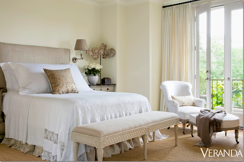
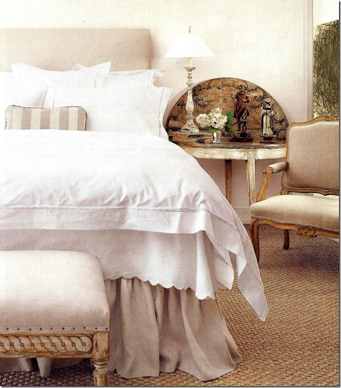
In her bedroom, Jane continues the use of bleached, painted woods – shown here in the bench which came from the Wisteria catalogue. The chair is antique – I love all antique upholstered chairs and sofas!!! The headboard is slipcovered in linen. Her bed is made with an assortment of white cottons and linens – but she adds a feminine touch of lace and a Fortuny pillow. At the side of the bed is a painted Swedish chest. What a pretty view of the treetops outside the balcony!!
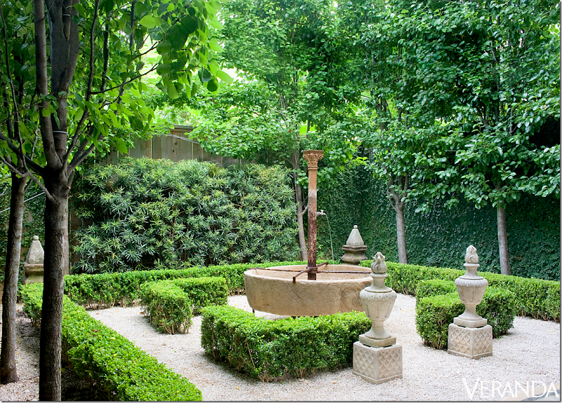
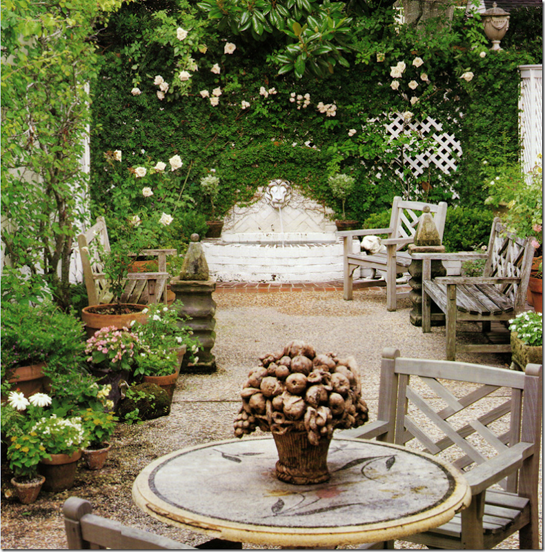
This might be my favorite part of her townhouse – the Belgian inspired garden. All green with just box and ivy and bushes. The pear trees are planted in rows to give an architectural feel to the space. Doesn’t it look like an outside room within a room? I love the old fountain and the two urns that stand at the “door” to the room. And the white gravel…fabulous!!! At the back – two obelisks stand at the corners of the garden. Landscape design by Glauser McNair.
VERANDA 2000:
In the new Veranda article Jane says how happy she was to edit all her old possessions and take just what she, and she alone, wanted. What a dream that must be!!!
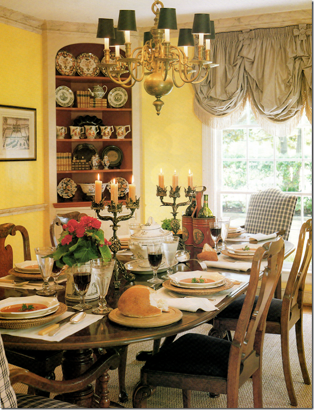
Before she moved to the townhouse, she lived in a Georgian styled home – which was decorated in the English country style – clutters of books and accessories and lots of red and yellow walls with black accents. As I said earlier, it’s so fascinating to see how different design is today compared to 10 and 20 years ago when Jane first decorated her house. This article originally was shown in Veranda in
Photography is again by Peter Vitale. And notice who produced this? Carol Glasser! I do miss these old days of Veranda. Almost every month – or every other issue – there would be a fabulous Houston house. If there wasn’t a Houston house, there would be a Texas one. Glasser produced articles as did other designers. Now, Veranda is more of an international magazine which is why it is so exciting that a Houston house is again on its cover!
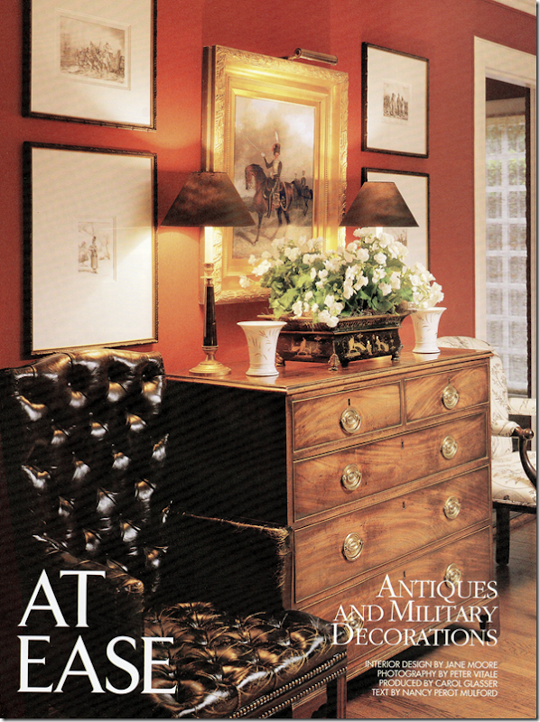
Here, the entry hall into the Moore’s house. You can feel the English vibe – right away! Moore’s husband at the time collected antique toy soldiers – a hobby that Jane indulged him in. Together they collected historical antiques – like this painting of a soldier on horseback. Don’t think he has just a few toy soldiers – his collection was over 6,700 when this article was written and is considered the largest one in the country!
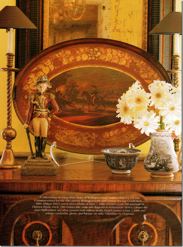
Notice the gorgeous French gilt console? It’s in Jane’s townhouse, in the living room! The console is period Louis XVI with its original marble top. The walls are yellow striped wallpaper. On the console is a statue of the Duke of Wellington mixed in with beautiful tortoise shell boxes. The bow was tied to resemble a soldier’s epaulet.
The seagrass covered living room holds a collection of vintage furniture. Notice this is the same collection that Jane is using in her living room today. Another bust of the Duke of Wellington stands in the corner. Red walls and black and white ticking fabrics. These colors black and white were taken from military uniforms worn, while red came from national flags. The colors were chosen to blend better with all the military memorabilia around the house. Notice the gorgeous shades!!! I remember back when this was my ideal decorating. I tried to recreate this look in my own house until I got bit by the all white bug. The house also reminds me of Carol Glasser’s former house before she redecorated it. Ginger Barber’s houses from this time also were more colorful than they are today. It was around this time that Renea Abbott opened up her Shabby Slips – making it easy for everyone to get white slipcovers. Babs Watkin’s store was another huge influence on this switch from dark to light – just as Margaret Naeve’s is. Another influential antique store was Skelton St. John. The switch from English to Swedish and Belgian and French designs really made a huge difference in the way our houses looked.
Houston designers of this era used seagrass – before many had even heard of it in the states. Creative Flooring is rumored to sell more seagrass than anyone else in the country.
Another Duke of Wellington (Jane was really very patient!) and a beautiful red tole tray mixes with transferware. All must-haves in an English styled house.
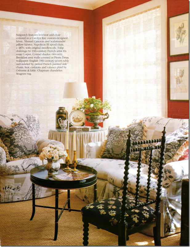
The red sunporch had a skirted table – who didn’t have 2, 3, and 4 skirted tables in a house. I covet that Napoleon 3rd period spool chair. I wonder where that went to? And a tole tray coffee table, another must-have as was the English tea tin.
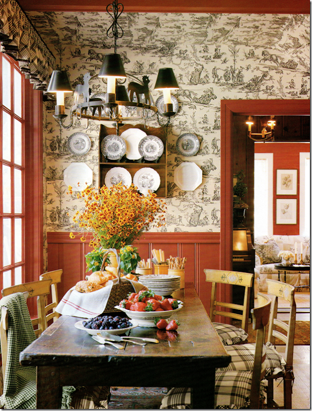
The breakfast room has a charming black and white toile mixed with red paneling. Rustic table, more transferware mixed with creamware.
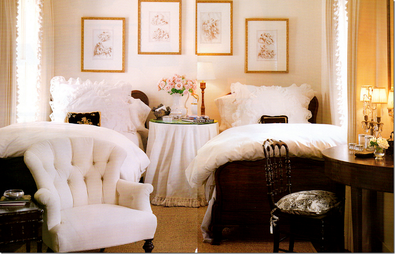
Sorry for the bad scans – but the magazine is over 12 years old! I remember at the time that I just loved this bedroom. I thought it was so beautiful - probably because it was white!! Another skirted table. I used to have one skirted table in each room too. I‘ll bet Jane still have this antique upholstered chair somewhere in her new house!
And another darling bedroom with an antique tole bed, painted. Pine desk.
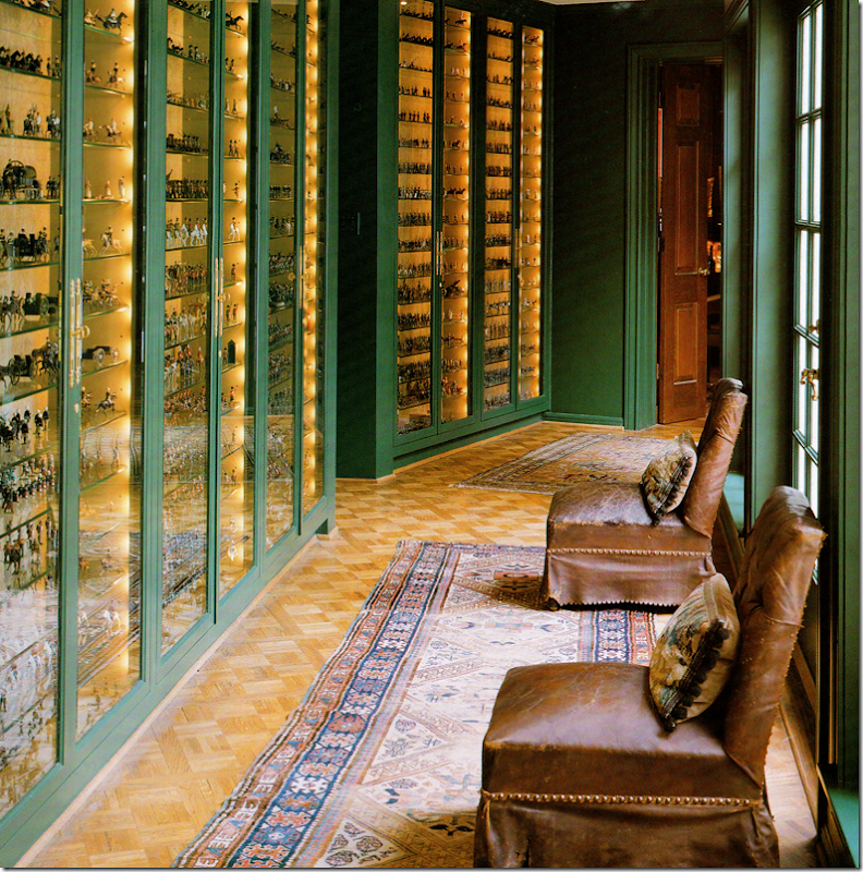
The highlight of the house was the family room which was added on to the back. The connecting hall was built to hold the largest collection of toy soldiers in the country! Notice the two 19th century leather chairs. These are in Jane’s living room today.
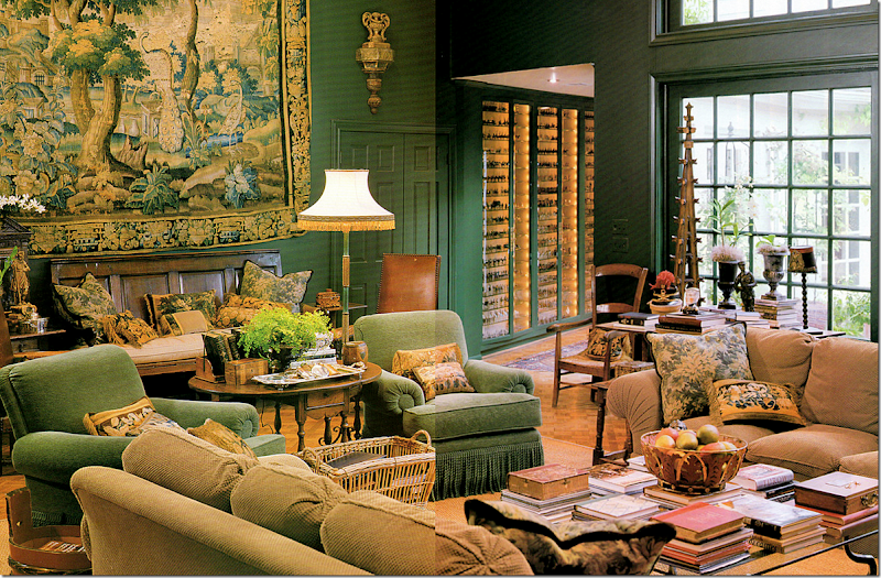
And the fabulous family room! It was filled with comfortable chenille covered furniture. Remember how popular chenille used to be. No longer. Whatever happened to it? I thought this room was stunning – and it truly is. You think you are in a country house in England, not Houston Texas! Notice the tapestry – Jane uses this in her new dining room.
Her patio back then is similar to hers today – but while that garden is Belgian inspired, this is all English with the roses and fountain and teak furniture.
Four years later, Jane had another house in Veranda – in the foyer was a burlap covered settee – showing the new direction that Jane was going in. It took a trip to Sweden to change her aesthetic – and change it did. Unfortunately I had torn out that article for my collection of tearsheets and I can’t find it to show!!! If anyone has this magazine – email me!!!
This photograph is on the Veranda web site – I wonder if this is a guest room in the townhouse? It is the iron bed from her former house, but it looks like there are two now? Notice the beautiful chinoiserie table and black mirror. Mystery solved?
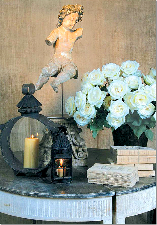
Here are a collection of ads that Jane created to run in Antique Shops & Designers. This one shows a gorgeous Swedish demilune with tied books and a santos.
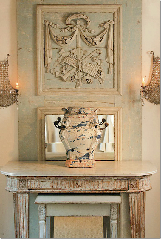
A gorgeous, tall trumeaue sits behind a painted console. That mirror!!
Another gorgeous mirror mixed with a painted chest. Can you see what a difference a real antique is compared to a faux antique. I love those candlesticks and that capital.
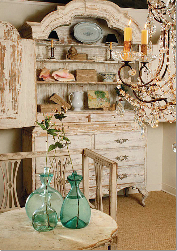
And this Swedish armoire and settee. You can really see the difference in Jane’s aesthetic from her English inspired house to her Swedish inspired townhouse. Her store’s ads reflect that change.
If there was any doubt of Jane’s changing aesthetic, this article was all the proof. It was one of Veranda’s most popular houses – evidence of this is it is included in The Houses of Veranda book. The house is owned Jane’s daughter and Veranda’s Lisa Newsom’s son. Shannon had also become a huge fan of Swedish furniture and when they purchased this new house, Jane filled it with antiques that are priceless today.
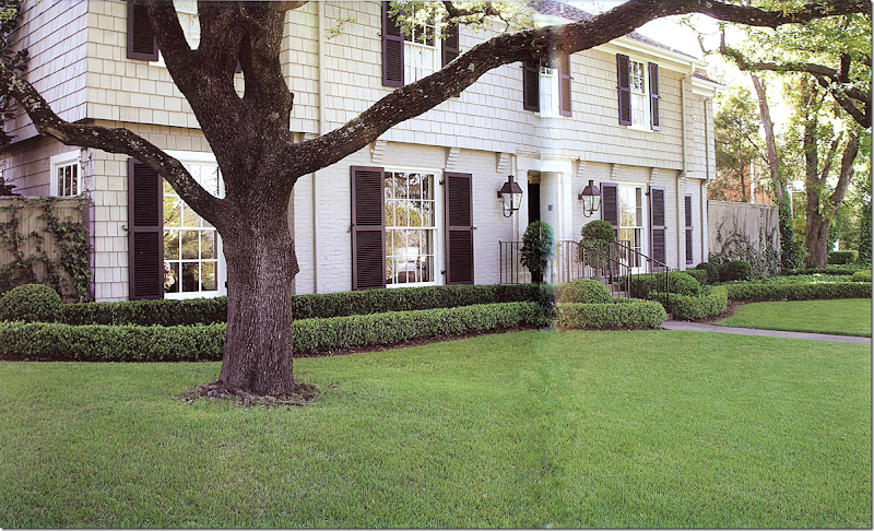
Here’s how the Shannon and Andrew’s house looks on the outside. Box and more box. Not a hint that the inside is pure Swedish!
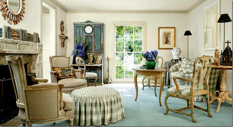
I adore this house and have shown it a million times, but I had to add it here in this story of Veranda and Jane Moore. The story would not be complete without showing this wonderful Swedish inspired house. French chairs mix with Swedish chairs and tables. I love the checked ottoman. Underneath, Jane put a flat dhurrie with no pattern but a light shade of blue.
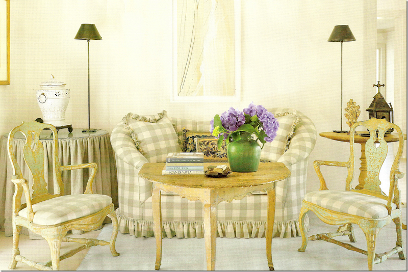
The sofa in the living room and the Swedish chairs and table. Notice how Jane mixed in contemporary lamps!
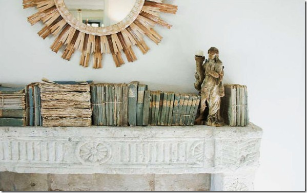
Was this the first time we saw these kind of books used as decoration? Probably. Wisteria produced a faux book box that resembled this collection. And the reproduced that mirror.
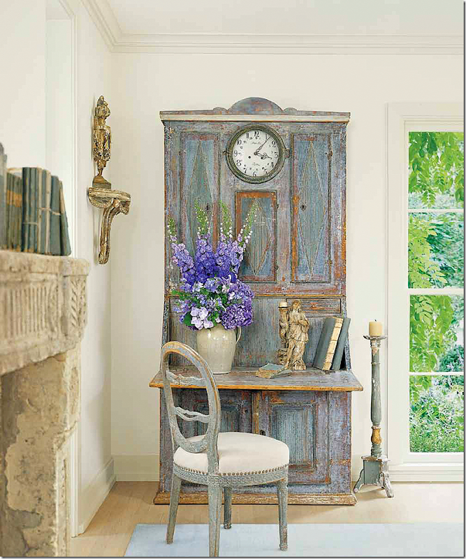
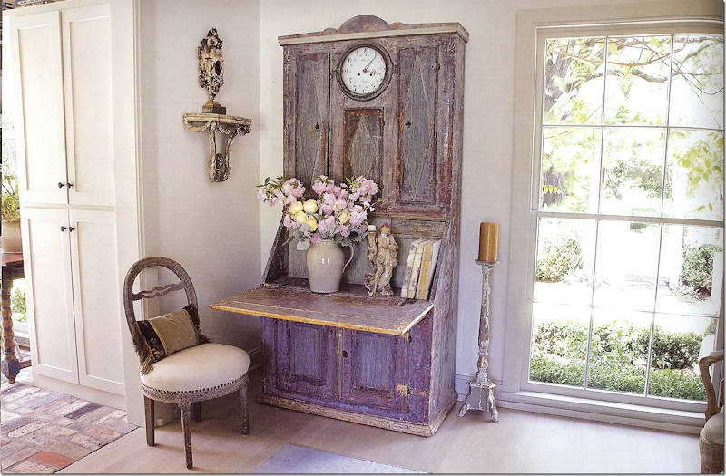
And in another corner, notice the Swedish desk with the built in clock!!! No wonder this picture made the cover – it’s stunning. I love the lone candlestick standing next to the desk.
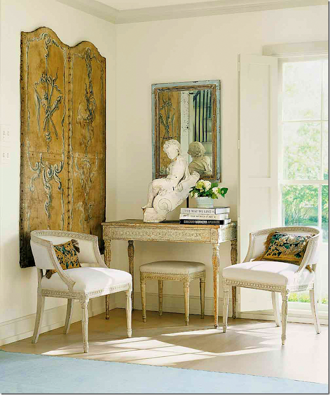
Another gorgeous corner in the living room. Swedish chairs and console and bench. A leather screen and a statue finishes it out. This is such a beautiful vignette. Is there anyone that doesn’t like this? No!!! I don’t believe you!!!!
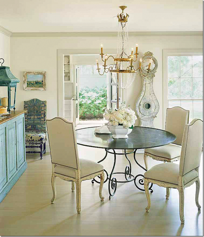
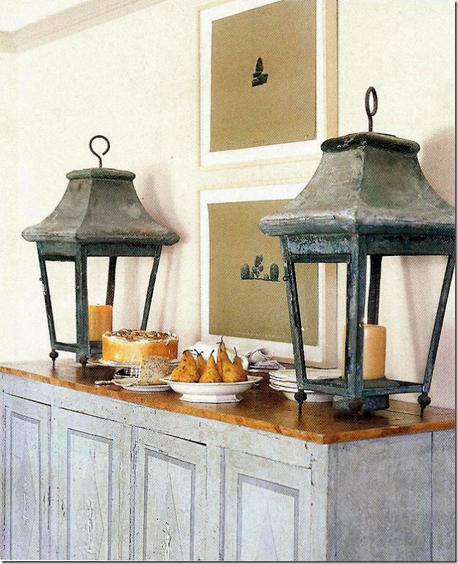
This might be my favorite all time dining room. It inspired me – that’s for sure. I bought a similar table and a similar chandelier after seeing this picture!!! And I had to have a Mora clock. Thanks Jane!!! I love the lanterns on the cabinet. This started me on my love of lanterns too. So many things in this picture really influenced me. I didn’t realize how many things inspired me from it until just now.
Antique lanterns on the Swedish painted cabinet. Later, Wisteria reproduced these for a while, but no longer. Why not?
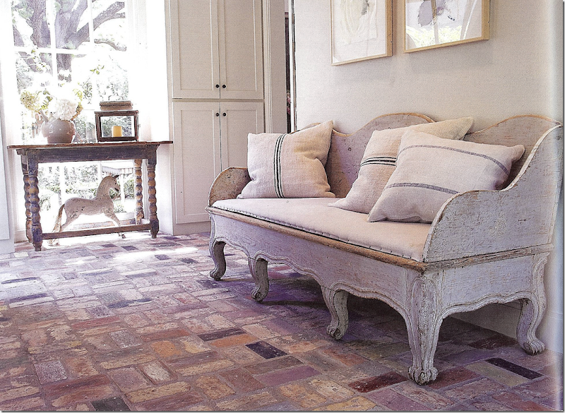
Off the living room is the brick floored sunroom, on the left.
Here is an antique Swedish sofa with feedbag pillows –years before we all had to have those! And notice the horse – a must-have in a Swedish house.
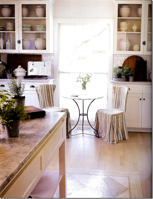
Off the dining room is the kitchen with white marble and subway tile and a collection of white confit pots.
Their seagrass bedroom has the prettiest flip top table!!!! White cotton and linens on the bed – just like mom’s bedroom. And a bench with tiny nails that sits at the end.
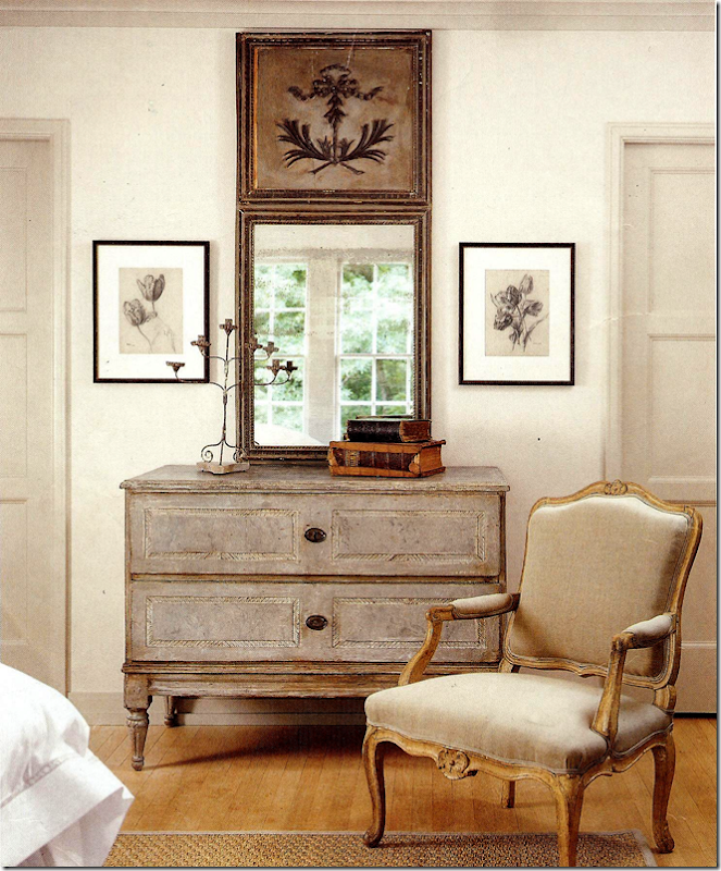
A trumeau and a Swedish antique chest sit next to a French chair.
Their gorgeous marble bathroom. Notice the way the marble is carved behind the sinks.
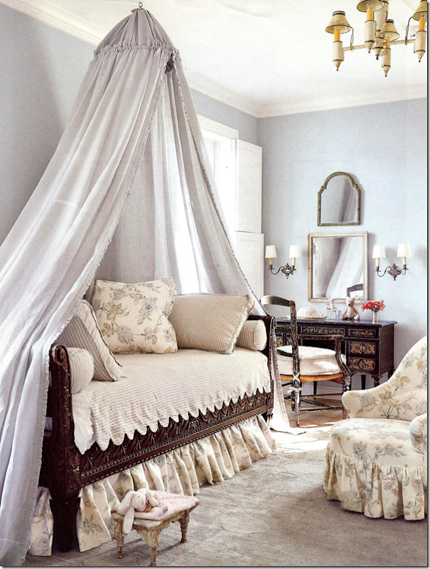
The prettiest little girl’s room ever. Bennison fabric and scalloped ticking bedspread. Who could ask for anything more?
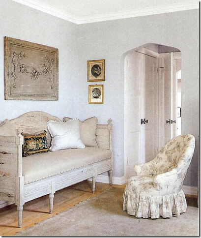
Well, you could ask for an antique Swedish sofa!!! To die for!
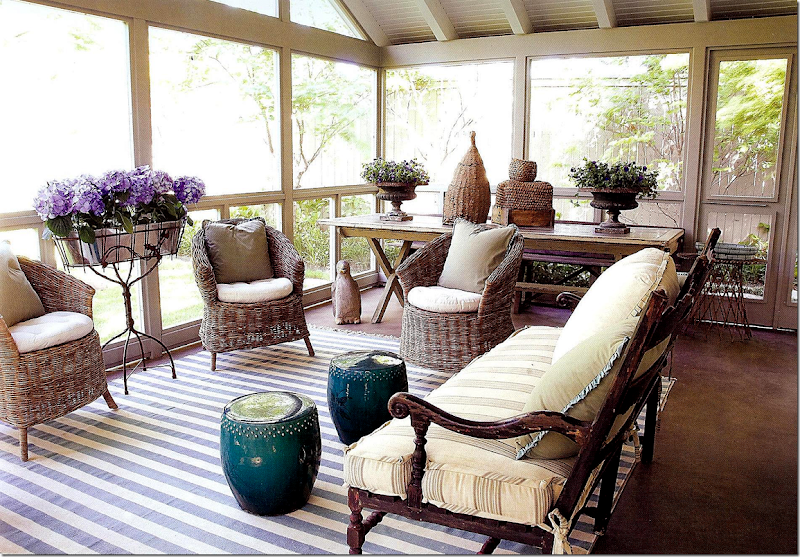
Out back is the Newsom’s charming screened in porch – filled with Kooboo chairs before we knew what they were! Blue and white striped rug, just like moms. I love this porch – I would be here all the time.
And if you love the Wisteria catalogue, Paper City announced their new flea market located behind their store and warehouse in Dallas. Go HERE for info on times and address. I wish I lived in Dallas!!!! I would be here all the time. Notice the horse – reproduced by Wisteria – inspired by their own horse.
Pictures of the Newsom’s house are located in both these books below. If you would like to order them, just click on the picture.
When Jane Moore recently moved out of her Nantucket inspired shop, Suzanne Duin moved right in. Duin owns Maison Maison where she sells French and European antiques. 2922 Virginia Street. More information HERE.
For a charming story about Jane Moore and the Newsom’s house, go HERE to The Indulge Décor blog.
And here is an interview with the Newsoms on Shabbynest’s blog HERE.
And many years ago, I wrote a story of how to copy a Swedish room (from the Newsom house) on a budget – unfortunately many of the sources aren’t available anymore!! But some still are. HERE.
To contact Jane Moore for interior design work and antiques, email her: jmooreinte@aol.com
A huge thank you to Veranda for the gorgeous pictures!!!
I hope you enjoyed this look at Jane Moore’s work.
Houstonian Great Jane Moore
Subscribe to:
Post Comments
(
Atom
)











Thanks Joni! I enjoyed this post very much!
ReplyDeleteLOVE Jane Moore! Thank you Joni and Thank you Jane
ReplyDeleteThanks, great post. Both gardens are to die for and that tapestry! So interesting to see the evolution of her style. Although I just don't get the kitchen. Can you influence Wisteria to bring back the "santos niche" they used to carry, I procrastinated on buying one and then it was unavailable.
ReplyDeleteTrish who write Trouvais has one! I love that too. why do they quit making their best things?
DeleteThanks Joni, I knew I had seen one in a blogger's decor. Seriously I bet you could convince them to bring it back:) Too bad they don't do a top 10 limited edition of all time favorite items every year or so. After seeing this post I can see you using the lavender in your study, although I still don't get the kitchen!
DeleteLord, I must be getting old; I remember all these old photographs. Best wishes!
ReplyDeleteI enjoyed so much this post, just like I use to enjoy favorite magazines. It is so wonderful. I am soaking up every little detail. I was just wondering how hard it was for Jane to depart with her English antiques? I was also thinkig maybe she stored them, but usually if a style comes back it is changed color wise and the shapes are changed somewhat also. For example the wing chair that was so popular for generations, has gotten more sleek and the legs are different. I loved this post!! I would love to see Veranda do more of this style and not so much modern and contemporary. I like a touch of modern at times. For me modern and contemporary are somewhat cold and the eye does not wander in a room. One's eye gets the total picture at once. This is how I view it. Thanks for your hard work Joni. We apprciate you so much.
ReplyDeleteJudy W
Joni I may have said this before; however I will again. I have never seen so many gorgeous rooms in one post or magazine!! Utterly fabulous!
ReplyDeletexoxo
Karena
Art by Karena
2012 Artists Series
Except for the kitchen, Jane's interpretation of Swedish design is far superior to her interpretation of English. Interesting linked articles as well except the windbag at Indulge Decor - just how "me centric" can one be? Jane's living room is both soothing and fresh, bedroom is so so, a bit too thrown together and the kitchen is clearly not meant to be used except for preparing light meals. The idea of storing cookware in wicker baskets tells me Jane eats out a lot.
ReplyDeleteOh Anon - Cynthia is the cutest, sweetest, most fun shop owner in Houston. She is this well bred northern married to this architect from Israel, I believe! Ruggedly handsome, dark, she is all lithe and blonde. They are the cutest couple. He designed their store and I wish I could live in it. Its so fabulous!! She has quit posting and i miss her voice. I think she wrote a great blog.
DeleteHave visited the shop on line and it looks like most of what she sells are reproductions which is fine. They are simply painted and distressed pieces suitable for many parts of the home. This did not appear to be an antique store. She does carry lovely high end tabletop, serveware, etc.
DeleteHave read a number of old blog entries. For some reason every other sentence seems to end in "wink, wink".
DeleteCynthia doesn't sell antiques - i never said she does. she is a decor and bedding/kitchen shop, one of the more popular places in Houston. she is largest imported of the Blanc d Ivoire line from France in the US. They are French reproductions. I used a Blance dI mirror in the last family room - the large one on the mantel. they make great mirrors, chairs, tables, headboards. The chair and ottoman in my guest room is BdI as is the small table in there. She has great lines - and every Christmas I get a majority of gifts for the family from there. I adore Cynthia and the sad fact is her beloved brother passed away from pancreatic cancer - which is why she quit blogging. She just didnt have it in her anymore after she went through that with her family. ONe interesting factoid about her gorgeous shop is that she started with a TABLE in lunch place - she sold orchids!! Then she slowly started adding imported bath goods to the orchids at her table. eventually her table at the lunch place got so big, she was forced to find her own space. She moved to this small shop which she quickly outgrew after a few years. She has a great business story - how you can start so small and then build your clientele over the years and end up with a big, wonderful store that everyone shops at. She, Thompson Hansen, and 2620 were some of the first in the new West Alabama shopping district which today is the hot spot to be.
Delete"She is this well bred northern ". . .
DeleteWhat exactly does this mean?
The shop is lovely and she appears to have a thriving on-line business as well. Her brother must have been quite young as Cynthia appears to be from her picture. Her loss and that of her family is really sad and I can understand how grief would cause one to completely shut down. I am sincerely sorry for her loss.
DeleteShe seems to have more Blanc d'Ivoire in her shop than the company has on their own website. I remember the mirror you placed in the clients family room. It really was perfect and gave the fireplace greater importance in the room than the flatscreen that once hung there.
Thanks for the explanation.
Oh my gravy!!!!!!!!!! I am running out to get this issue ASAP!!! Miss Moore has impeccable taste! The kitchen that you showed the bigger picture of is my favorite...I am such a fan of the desaturated palatte. Thanks for giving me my morning fix of CdT and coffee!
ReplyDeleteI remember all of these pictures of Jane's former homes. When my Veranda magazine showed up last week I thought the front picture was done by Pam Pierce. I also noticed a lot of the September magazine issues were neutral with touches of lavender, love the mix. Jane does a wonderful job and I'm in love with her home. Yep, you did your part with pinterest!
ReplyDeleteXXX
Debra~
I probably have the magazine you are looking for...I will start digging! I remember so many of those photographs but it is so fun to see them again. Her new townhouse is absolutely lovely but me thinks Jane does not cook!
ReplyDeleteMarvelous, Joni!
ReplyDeleteLavender, Bennison and that gorgeous black iron bed.
Sigh.
xo,
p
Jon, beautiful, beautiful post, I pinned away. You always do such an extensive amount of research on your post. I so enjoy your observations, critique and writing. Thank you for always giving us food for thought and inspiration. Happy Sunday,
ReplyDeleteKathysue
Beautiful home, actually homes, though different styles..they are all exquisite. She is one talented lady. Lots of eye candy here that warrants more than a few scrolls up and down! Well done...enjoy your Sunday.
ReplyDeleteThese images and homes are lovely. The gardens are beautiful as is the tapestry. BUT and this is a big but for me, they are cold and lifeless decorated anonymous rooms. Yes, the pieces individually (at least some of them) are stunning, others are fine and I'm sure blindingly expensive. I expect a decorator's work to evolve but to jump wholeheartedly from Texan "English country" (Texan because of the chenille a fabric which I'm sure has never seen the inside of an English estate) to Texan "Swedish" (French/Belgian and whatever mixed in) is a sign of someone who is more of a stylist than an decorator/innovator. I'm not saying the rooms are not lovely, but they are generic and anyone with the money would be able to reproduce them fairly easily (and judging from certain blogs and mags they often do). They look like sets not homes (and yes I know they've been styled for the magazine but really - that kitchen? Anyone ever actually cook in there?) Just MHO though.
ReplyDeleteThanks, you summed up what I thought but couldn't capture in words. Anon 0942
DeleteFurniture built by farmers not craftsmen. I am certainly not an Anglophile, but I would never trade a fine English antique for some of the absolute junk people are putting in their homes under the guise of Swedish design. While Moore's English design appeared dated generally because of the contrived window treatments, the over use of red and far to many objects vying for attention, she seems to have gone completely in the opposite direction on quality as well. The LR is the only room that remotely exudes quality (excluding the bathroom) and that may only be good photography. The one thing this post does indicate and that is how easily one can get published if one has a personal inroad as does Moore. I doubt that this design nor Moore's English one would otherwise rise to the expectations of Veranda.
ReplyDelete"Furniture built by farmers not craftsmen."
DeleteI actually like that quality in the wood furniture. It's the fussy upholstery that looks geriatric.
Which upholstery looks geriatric the Swedish or English?
DeleteWhat an incredible post Joni. No surprise Veranda asked you to post these spectacular photos! When I pulled my Veranda out of my mailbox, I literally said, "This looks like Joni Webb" - it's perfect! I love reading your take on the gorgeousness..
ReplyDeleteXO
Jan
Is there a link for the interview with the Newsom's on Shabbynest's blog? I can't click?
ReplyDeleteJan
Wow! I loved seeing all of this. That kitchen!!!! Oh...I love her new kitchen...makes me want to rip out all my cabinets although that look would never work in my house. Loved seeing all her homes....love the new one best. Another great post - Joni!
ReplyDeleteAnother great post, Joni!
ReplyDeleteBTW,I have the March-April 2004 Veranda issue....I emailed you.
Nancy W.
God I loved this post Joni :) So inspiring and uplifting. It's 6.30am on a monday in Sydney and I am ready to start my week with a big smile on my face :)
ReplyDeleteThank you,
Anna :)
So much to look at... thank you Joni... my fave qre the lilac slipcovers...droool!!
ReplyDeleteI just cannot picture a real family living comfortably in any of these Swedish styled rooms. Pretty to look at, but where are the three teen aged boys and their Dad supposed to watch football and play the xbox? They would certainly make a beautiful backdrop for prom pictures though.
ReplyDeleteTapestries, especially the "Verdure" style, add texture and depth to almost any decor. Joni has shown us how easily a Verdure style tapestry transitions from English style to the nearly all white, minimalist Houston style. Wouldn't this provide an intersting backdrop for mid-century modern decor! This is one of those classic pieces that never goes out of style.
ReplyDeleteWhile innocently checking out Craig's list this morning, I found this French Verdure tapestry for sale in the Newport Beach area of Southern California. The ad says it is wool but nothing about its age. It does not appear to be an antique, but it is pretty. It is also quite large - 7 1/2 feet tall by 12 1/2 feet wide - probably best suited for rooms with at least a 10 foot ceiling. For those who may wonder, I have no connection to the seller. However, thought one of Joni's readers in Southern California might be on the hunt for something like this!
http://orangecounty.craigslist.org/hsh/3204860780.html
Warm wishes from Charlotte
For some reason, I thought that you didn't like mid-century modern design?
DeleteYou are correct. It is not my favorite style. However, as you may recall, I actually suggested that a few touches would have been appropriate for the Mid-Century Modern, Meisen-inspired Houston condo Joni featured a few weeks ago.
DeleteOf course, now I remember!
Deleteit looks new but i wonder if you washed it and set it out in the sun if it would start to look old?
DeleteIf it was MY tapestry, I would hesitate to wash it. The stitching that holds the main piece and the "frame" might shrink. Also, you never know if the dyes are colorfast. Some of the colors might bleed together. Better to just leave it out in the sun if it looks too "new" for your taste. Besides, it is bigger and heavier that most area rugs. How would you wash it unless you laid it out on your driveway and washed it with a hose! Wouldn't do that on a concrete driveway because the colors might bleed into the concrete.
DeleteOh Mme. Des Fleurs, you are so considerate, thinking of the concrete.
DeleteIf you have a tapestry which bleeds its dyes together or onto concrete, you have one cheap ass tapestry. For general cleaning purposes all you need to do is vacuum it. No one but an idiot would wash a tapestry and set it in the sun unless of course you bought it at WalMart. Old tapestries are very pliable and soft. Washing as well as the heat from the sun would stiffen the fibers and the sun would never bleach the colors consistently. OMG, I cannot believe someone would suggest this.
DeleteJoni was talking about a way to "age" a new tapestry not a way to clean one. (You are correct, there should never be the need to do so.) However, personally, I would not buy a tapestry if I did not like the way it looks just as it is.
DeleteOh, Charlotte Des Fleurs With the Golden Jaguar is from Orange County. That explains everything.
DeleteFor those of you who wonder what this discussion of cars has to do with design, it came, as I recall, from a stream of comments relating to Joni's post about decorative floor mats for cars. This poor Anon must have a lot of free time on its hands to be fixated on MY cars. OMG, how envious this poor Anon must be! Orange County is a lovely place with many right-minded, hard-working, family-oriented people. And, yes, Irvine was just listed as one of the 10 Best Places to Live. However, I do not live in Orange County. :)
DeleteI imagine you and Vicki Gunvalson would be the best of friends!--such good, family-oriented ladies! And thank you for explaining how cars work, Lady Des Fleurs dans la Ville Petite. I only have a mere shopping cart, to which I have affixed a tiny motor I pried out of an electric can opener. You were most gracious to describe your Soft Golden Sedan, mi'lady.
Delete"However, I do not live in Orange County. :)"
DeleteOne day you may be able to afford it.
Lady Des Fleurs dans la Ville Petite. stop. i am cracking up. that is just too funny!
Deletehmmm. i dont remember that about the cars? I drive an old jeep commander that i dont want to give up because they dont make them anymore. i like square cars myself.
BUT, i was just saying about the tapestry. it is new. brand new. and if you wanted it to look older, i guess you could wash it put it out in the sun, but maybe like Miss Ville Petite said - why wash it? just put it out in the sun to fade it a bit.
charlotte, im just teasing you, you know that, right? couldnt resist the miss ville petite. you have to admit that is funny.
I sent a post very early this morning but I guess it got lost somehow out there in e-space. I just wanted to say that I subscribe to Veranda and was thrilled when I received this issue on Friday last. In my humble opinion, it is one of the best issues yet.
ReplyDeleteCongratulations! I know you are pleased to be asked to post the pics on your site. Your site is top of my list and lots of other folks as well, to be sure, and that fact has not gone unnoticed. Thanks for all the work and time you put into preparing the blog.
Mimilynn
My absolutely favorite room is the screened porch! Gorgeous!
ReplyDeleteIt's the only one that doesn't look staged. It is beautiful and inviting.
DeleteAlthough I went through a major magazine purge a few years ago, and once again when I moved last year, for some reason I have kept just about every issue of Veranda since 2000 (with the exception of 2005, when I didn't renew my subscription for some inexplicable reason).
ReplyDeleteI just looked through the Moore house in the March-April 2004 issue, and it is a beauty. The living room and library - so, so gorgeous - a bit more 'you' than this new house! I am not sure why Veranda picked the room on the cover for the 2004 article, it is my least favorite room from the house!
Great post - love knowing the stories behind the designers and the houses.
I thought the comment on the 'lavender' trend was interesting. My 9 year old requested lavender for her room, and it is so beautiful - lavender walls, crisp white bedding, a lavender and white lattice rug, a Swedish chest between two twin beds. All lavender and white and cream, so contrasting color (I wanted a bit of gray, but she didn't want it!). I put my grandmother's marble top telephone table next to a small scale chair from the old house. My daughter is very much a minimalist, so will not allow any accessories at all, and is extremely picky about anything that comes into the room or goes on the walls - so it is a bit bare, but still - so pretty!
- Holly
Oh how we suffer through all this. So shocked that you didn't mention your esteemed architect and designer, but I guess everyone is entitled to a slip up occasionally. Holly, this blog is not about you and the piggybacking that you do here is obnoxious to say the least. Post your daughter minimalist taste and whatever yours may be at the moment on your own blog, but don't use this one as an additional blog post. It's getting old for Joni's readers.
DeleteSTOP! STOP! What is with you and Holly? Holly is so sweet. She is a good friend of mine and you must just be jealous that she can afford SK becuase you bring her up all the time. I am really sick of it. JUST STOP!!!! If you have a problem with Holly, please take it up with her directly. Don't drag me into your issues. OK????
DeleteIf you only knew the truth you wouldn't say a word. ok? There's more to a story than it appears. Now, please stop.
No one is jealous in the least of SK. Holly never makes a comment here that she doesn't segue into what become a post of her own design aspirations and achievements. She is totally smitten with the look at me, me,me disease.
DeleteSorry!
Look away people, it's getting ugly!!! LOL
Delete
Delete"If you only knew the truth you wouldn't say a word. ok? There's more to a story than it appears."
It appears to be an insatiable desire for recognition generally associated with people who are not achieving it in their private lives. As a result, they use social media, blogging, etc. to draw attention to themselves.
There are many sites in blogland where the author writes about renovations, redoing a room here and there and even building a new home. What I find different in TTI is the "tone" and the "attitude".
Then don't read TTI! As for insatiable desire for recognition, you must have it too as do other commenters who are always nagging on Charlotte. Does it make you feel better about yourself to be so ugly and nasty to these women? In the scheme of things what effect does someone's comment on Joni's blog, no matter how silly or self absorbed have on your life? Try reading the 4 Agreements: be impeccable with your word, don't take anything personally, don't make assumptions and always do your best.
DeleteI apologize Joni, I know this has nothing to do with the post which was lovely and reflects your time and effort.
no - that is fine, i agree. i like your 4 agreements used here.
Deletebut, i really like that your recognize the misogyny that is prevalent in the anon posts. they are by men against women. these anon really hate women and it shows with their comments.
Again, you show your complete ignorance, Joni. This has absolutely nothing to do with men vs. women. It's simply an assessment based on weeks of reading these boring posts like: "what should I do (little damsel that I am) should I design my windows to roll out or in?; should I hang towel bars in the guest bath or put hand towels on the vanity; what kind of flooring should I choose for my laundry/doggie room? whatever shall I do? (do be said in your best Scarlet accent) It sounds more like a replay of Gone With the Wind than a modern day design blog. It's perfectly clear that in each instance the decision has been made, but there is a desire to write a blog entry that focuses on the author. She could care less what her readers think. Her choice has been made. The entire series is a sham and you know it!!!
DeleteNot only a sham, but an attempt to use a design blog to tout her building project, her architect, her designer, her decisions as though the rest of the world was waiting with baited breath on her every word. As stated earlier in your comment section, these kinds of blog entries are a CRY for attention which attention is not forthcoming in real life but can be attained in a virtual life on a design blog. Really sad, actually.
DeleteHmmmm Joni if it is a man perhaps he has a secret crush on Holly, he seems to have all her posts memorized! Is that a cry for attention: "she could care less what her readers think. Her choice has been made."' Sounds like unrequited love. It has been an absolute treat today to revel in your comments, thank you so much for not moderating. And Anons, I am not a designer just a boring civil servant but I enjoy reading design blogs to get ideas on how to make my little milieu beautiful and inviting. I quit reading TTI for the very reasons you set forth but now I am going to have to go revisit her posts because I am so gauche as to hang my hand towels on common round towel bars. You just increased her traffic. Cheers!
DeleteWhat an absolutely ignorant assumption that Anons. hate women,Joni. You most likely have a larger readership of women than men yet you speak with such absolute authority out of your back side. As someone stated, when you assume your reader is a female and disagrees with you that's a discussion. When you make an assumption that the reader is male, that's considered misogyny - again because you spoke it with authority out of your back side.
Deletesjr - I hope you find the post so that you get your hand towel story straight. The question was whether to hang them or place them on the powder room vanity. It had nothing to do with round towel bars; however, I suspect TTI could write six paragraphs on that as well and give us all the back stories about her architect and dezaagner while declaring with a straight face that whatever she ultimately chose, no one else on this planet at least had one (you have to remember the story about her very special window in her very special roof line to appreciate that analogy). You said you were a civil servant which tells me you have a lot of time on your hands but you also say you quit reading TTI for the same reasons enumerated above, but have decided to go back for more. Perhaps you should get a "receiver" to download and print the blog for you. After all, aren't most civil servants use to having others do their work?
Delete
DeleteIf you only knew the truth you wouldn't say a word.
And what might that truth be? Let me guess. Total Self-absorption?
I am begging you to stop. I am this close to erasing these. Stop. If you have an issue with another blog lease take it up on that blog, not here.
Deletesjr. 8:54 surely you jest? Crush on Holly? Get real.
DeleteYou have your innocent little head stuck in some of the same reading material that Joni spends her evenings reading. "Sounds like unrequited love" - this could only be written by someone who is still in love with Rhett Butler. This is too funny, seriously, absolutely the funniest line of this entire blog series.
By your own admission you stated that you stopped reading TTI for the reasons stated and then you launch an unrequited love theory - only a civil servant could be capable of such logic. Don't worry, Obama will fix all your problems.
Holly appears to be a sweet woman who is fortunate enough to build her dream home, I have nothing negative to say about her and used to read her blog, when it took a direction that I had no interest in, I quit reading it. That doesn't mean I have to make it personal beause she chose to write about things that are important to her but not me.
DeleteAs for me being a government worker or what my politics are: no comment. But I will say on behalf of those workers who come to work and enthusiastically enforce the laws of the United States, no matter the budget cuts or the public negativity, there is no finer group of men and women. When you go back on your meds thank a government agent who is insuring it isn't counterfeit and protecting the supply chain. When you get in your car, I imagine the last thing you are thinking about is if your air bag is counterfeit, but some government worker is making sure it isn't, ditto for counterfeit parts in our military supply chain. Or when you throw around the word pedophile, there is someone out there identifying and working to get him/her arrested. Or maybe they are taking down drug trafficking organizations, dismateling human smuggling/trafficking organizations. And when I cast my vote this November it will be for the man I feel who will best protect the rights of people like you who do not have the balls or ovaries to sign your name and cast aspersions on someone who chooses to chronicle her home building and has the freedom to do so on the internet.
"Holly appears to be a sweet woman who is fortunate enough to build her dream home,"
DeleteAnd believes that she alone is the only person who has ever done so. A little "Blandings Complex" for the mere mortals.
You mean you don't really believe she is the only woman to build a home with a slate roof, copper gutters, painted brick (not very French but she and her architect don't seem to know that), limestone floors, a Dutch door, landscape positioned on a central axis, etc, etc. Just read the blog and you will be thoroughly convinced that Marie Antoinette could not have done it better. It is a lovely home. It is also a barf worthy narrative of how it got there. The blog would be better titled: Full of It and Ready to Unload.
DeleteAnonymous 8:21 - I spit my coffee halfway across the room when I read "The blog would be better titled: Full of It and Ready to Unload"! Thank you so much for the best laugh of the day!
DeleteIt looks like the name "The Daily Windbag Eruption" was already taken.
DeleteI AM loving all the pale lavender with the blue grey. Joni your blogs are so extensive. It's a good thing Mr Slippersox likes to eat cereal every night!!!
ReplyDeleteWhy does everyone in Houston want to pretend they live in a Disney-fied France? Or an AARP version of Sweden?
ReplyDeleteBecause we are tired of living on faux ranches with cows and horses????? I don't know why. But we do have a very distinctive look here. Someone should write a book about it, it would be fascinating. I sometimes wonder if Babs didn't start the look with that gorgeous house that is shown in the Veranda book. I remember when that house was shown in Veranda - I stared at it for months. When she was partners with Bill Gardner and they got a new shipment in, people would be lined up outside at opening - like they were giving something away!! It was amazing. The two of them together picked the most exquisite pieces. Everyone wanted to be able to design like that. Then there was Pam P. and Margaret Naeve. I only wish I had the money to buy out Margaret's store or Kay's or S Skelton's or Joyce Horn - these women just had an eye and they all fed of each other.
DeleteCome on! Isn't ALL interior design a fantasy? People have visions of how they want to live and they do it or hire someone to help them do it.
DeleteBut, don't worry, there are plenty of people in Houston who do not have a stick of French or Swedish inspired furniture in their homes. There are plenty of big iron Texas stars and Longhorn cattle horns hanging around in entryways and familyrooms. However, this is Joni's blog and this is Joni's fantasy look.
"Because we are tired of living on faux ranches with cows and horses?????"
DeleteI respect that, I do, but is there NO other way to do justice to Texas, no way to be inspired by the local history and landscape without being tacky? Aren't decorators supposed to be creative? Inventive?
There's nothing new in these rooms. We've seen it all a thousand times.
Those are the ONLY alternatives you can think of, Lady Charlotte Des Les Fleurs de Lis? Either Fake Swedish/French or Texas stars? That's IT?
DeleteSpeaking of fantasy...
DeleteComment by "Charlotte Des Fleurs":
"I once had a beautiful, soft golden color Jaguar sedan with a real wood dashboard and fold out trays behind the front seats that serviced the back seat passengers."
from: http://the236.net/2012/01/13/so-this-happened-last-night/
"We've seen it all a thousand times" is right. Twenty years ago I subscribed to about two or three home design magazines that were published monthly. Now I read five or six design blogs daily. When someone does come up with something original it spreads quickly through out the blog world and soon becomes cliche. Trends in the design used to last for several years. Now they are over in a matter of weeks.
DeleteAARP version of Sweden - LOL. This certainly may apply to Jane's kitchen since you would not likely remember where you put anything. Bet there are frying pans hidden under those linen bed skirts.
DeleteWow, Anon 11:05 pm. You must be fascinated by me to go back so far back into the comment stream! You probably don't know anything about Jags, but just in case, it was a 1989 XJ6 Vanden Plas Sedan in Gold. We traded it in for a Jeep much like the one Joni drives because the Jag was too delicate to haul the things I was buying at the time - sod and plants for our yard.
DeleteA small correction, Mme. Des Fleurs Pours Les Enfants Pauvre: It was not mere "Gold." It was a "beautiful, soft golden color."
DeleteCharlotte also left this comment, replying to a blogger's very first post:
Delete"Best wishes for the success of your new blog. You might want to have your upholsterer correct the fabric on the corner of your gray chair before featuring it again. Lovely chair but the upholstery really detracts. Details, Dahling, details."
from: http://nuburylane.com/2012/04/22/hello-world/
Charlotte lives in an alternate universe. Those fold out trays serviced the back seat no less. One has to wonder what else was serviced there. Charlotte is truly the gift that keep on giving - so dang much material to work with.
DeleteYes, I did say that to the blogger at Nubury Lane. While it wasn't meant to be so, in retrospect, I can see that it sounds snarky. Ms. Nubury Lane, if you are reading, I apologise.
DeleteHappily Ms. Nubury Lane is an adult with a design business to promote. Her blog seems to be prolific and well executed. She is happily designing and blogging along as we speak. Brava!
"Charlotte is truly the gift that keep on giving"
DeleteOh god, yes. She is performance art.
The Oscar is truly passe' given that we could have The Charlotte Des Fleurs Award for Windbag Excellence.
DeleteI hate to pipe in with all the negative comments directed at Charlotte, but, when I read that comment on Nubury Lane, I was appalled! It was her very first blog post! IMO, it was just down right cruel and I should have called her out on it... but I didn't.
DeleteI especially enjoyed this: "You probably don't know anything about Jags..."
DeleteAnd this: "I think you are sophisticated enough to know this, but do not mix your arches!"
DeleteAnd this: "while INNOCENTLY checking out Craig's list this morning". Does one declare their innocence because they looked at Craig's List? Chances are this was about those famous fold down service trays in the backseat of her Jag.
Deleteok, lets stop googling old charlotte comments. truce.
Deleteback to design. someone mentioned sweden for example. have you ever looked at a swedish blog? talk about all the same. its just white furniture and white fabrics and gold frames. ad nauseum.
isn't that what design is about - you see your neighbor's house and you want the same thing for yourself? I find it with my clients. they see what i do for one client and want it for their and then it all starts to look alike, i get that.
and what about the north eastern look with its dark woods and chintz? Or the coastal look with its white wicker and big floral fabrics? Why say the Houston look is boring when design everywhere can be just as boring?
but then again i cant stand originality just for the sake of it- like in elle decor all these nyc apartments with fabrics that truly dont go together, but ooh, how chic! ughh. i like matching fabrics to a degree - but this new style where nothing goes together, forget it.
as for texas design - there is good design that is borne out of the environment. people who live in the hill country tend to use the white limestone that comes from the ground. it's a beautiful look that resembles the provenceal farmhouse. they will use hardwood floors or stone floors and a lot of black iron. it's a distinctive look, the hill country look, and many around texas use it whether they live in austin or kerrville or not.
"...but this new style where nothing goes together, forget it."
DeleteOh Joni, you sound about 86 years old.
And when did Joni get out of Houston long enough to see Northeastern design ? She has no clue what people in the northeast do in their homes. It would have been a good question for Alexa Hampton, but Joni didn't think to ask.
Delete"it's a distinctive look, the hill country look, and many around texas use it whether they live in austin or kerrville or not."
DeleteExcept you're describing MATERIALS, not style.
Do these materials require "hill country people" to fabricate imitation French or Swedish furniture?
"ok, lets stop googling old charlotte comments. truce."
DeleteOh, but the comic relief is so irresistible.
Joni,
DeleteI post anonymously because I have a job and life and don't want my employers and acquintences potentially seeing my name allover the design blogosphere. I know it's considered 'sneaky' to post anonymously but I find it odd that people put their names allover everything on the net. Having said, that, I'm not one of the above snarky anons and I don't know what they're talking about actually.
I do enjoy your blogs and think you are a very good writer and storyteller. I have to say, though, that I'm a little perplexed when you compare the similarity of design in Sweden (normal, even likely partially for the reasons you list and partially for many others) and the wholesale importation of a "style" which is then disneyfied and elevated to the pinnacle of class. I just do not get it. There is no originality here, just sheep following each other. Yes, some of these pieces are beautiful, but all together this look is tired and will soon be dated.
I do believe in collected, careful design based on a sense of place and a consideration of architecture and landscape. I don't know - there are genius designers out there - Robert Kime (my favourite), Charolette Moss, Bunny, Alexa Hampton etc etc. I'd love to see you going back to posting a wider variety of styles (I love rereading your older posts) instead of rehashing this Texas/Swedish thing over and over. JMHO of course.
well - I love Robert Kime too. but truthfully, no one ever sends me houses that he designs. ok? im from houston and i get a lot of local designers emailing me. thats why there are blogs from all over the country and the world. im sure kime presents his work to someone from London? hehe i doubt that! but you know what i mean. there's a lot of other stuff in houston besides the work of the ones i like, but i dont like it as much usually. so, all i can say if you are unhappy with my blog, then dont read it, i wont get hurt. im just not sure what you want me to say. even when i do show other's work, it will still usually be something i like about it. a southern look - charlotte moss or a cluttered or collected look - bunny. also, i do try to show things that are different than the magazines. thats why i included the other house of jane's which is totally different than the houston look - and i still get complaints. sometimes i feel like i cant win from losing!!!
Deleteok, like if it was going to show something, it wouldn't be something so out of what i post - because i have to like it first. i do get a lot of things submitted that i dont show because i dont like it. if i don't like it, i can't lie that i do.
i did just show the kathryn ireland house vs. the reese house and those both weren't the houston look. i spent a long time on that post. a lot of people did the same thing, but only spent a few hours on theirs. i try to give you something extra to think about, or read. not something that you would just look at for a few seconds and then move on to another blog. i mean, i can post pictures from elle and hb all day long. each day too. i can post pictures of how clothes and interiors have the same colors in them that a lot of blogs do. like green - here are a few green interios and look, here is a green dress an dpurse. but that is just not me.
so again, thanks for reading, but maybe you need to find someone else who you like better. im not being snarky, im being honest. there are a million blogs out there and this blog probably just isnt for you. no big deal. i used to follow some blogs that arent for me anymore either. things change. times change. there is a lot of competition out there posting the same things over and over and its hard to try to be original and provide something that is interesting.
Anon. 9:33, great comment. There was a time that in almost every post of a design featured here that we saw railroad clocks. They hung in kitchens, family rooms, hallways, etc. There cannot really be that many antique railroad clocks around so my assumption was that many were knock offs. The same is now true of Mora clocks. They are everywhere. My instinct tells me that while I have no doubt that there are some antiques around, many of the clocks are being produced in Europe because of the demand of this market that is caught up in the Swedish look and they are laughing all the way to the bank. There is a lot of fraud in the antiques market. While some of these Swedish pieces may be old that are being shown in this post, I suspect that many of them are reproductions and the owners may not even know it.
Delete"all together this look is tired and will soon be dated."....
DeleteThis "look" is a style that has been in Houston for decades. It is only now becoming well-known throughout the blogosphere and design world; it may be a trend elsewhere, but in its original location, it is a style that denotes place. It may become dated in other parts of the country, but Joni is a Houston blogger. It's not her fault that Houston styles have become prevalent everywhere and you are sick of seeing it. Give it time, other locations will drop it and this blog will be unique again.
Mora clocks - yeah I think a lot of them are fakes. but you can really tell if the insides are there if it is real or not. it's obvious. my mora clock has new insides. the box seems old but maybe it's just vintage old, like 50 years? BUT I cant afford a real mora clock with the original insides. so, I have one, that has the lines that i love. One day if I have 10,000 and want to spend it on an antique mora i will, but i doubt that day will ever come.
DeleteClearly, you bought it for "a look" not for an "investment" which is fine. The problem I see is that much of this stuff is being touted as of a certain period without the caveat "in the style of . . ." to indicate that it is not a period piece. This is about honesty above all else.
DeleteI guess it's pleasant, but there's not a single original idea here.
ReplyDeleteI wonder what happened to the Duke of Wellington and all the toy soldiers?
ReplyDeleteThey're at Waterloo, silly
DeleteI must admit, this most recent house stuck me as rather...I don't know... too staged. Yes, this is a photo shoot and this is Veranda "style" - all of the homes they do are really styled to perfection - it is just too cold for me. I do like that she did a different sort of kitchen - that is interesting. We all , through the years edit and get rid of things or put things in storage, etc... But, making such a drastic change is always kind of weird to me - one would think there would be the odd nod to her old look here or there. People do go through life changes and I think that can really change ones perspective about how they want to live. I guess that is all right sometimes. Oh well! This left me feeling mixed up somehow! Anyway, thanks Joni for all the hard work and good work you do in writing your blog. I am waiting for your BOOK. I noticed Young House Love has a book now. Yours would be great - all this writing and research warrants a book!
ReplyDeleteIn the story it said she was divorced so I think that accounts for the drastic change, plus she probably wanted a look that was in her shop and in her daugther's house. I can relate. Once I decided to go with whites, I just didnt want anything else. The soldiers are probably with the husband, who knows - he might still live int hat house - I have NO idea!!! I love her new look - i love her new house. Its so bright and airy and I love the touch of lavender. The kitchen really brings it all down a notch. It's really just Jane. I doubt she cooks much so it's probably all she needs. just like Donna's kitchen.
DeleteThis explains a lot. It seems she has reverted back to her dollhouse days. That's not such a bad thing. Every woman needs to have one room that expresses her whimsy. Come to think of it, that kitchen reminds me of my play kitchen when I was a child.
DeleteHi stranger! Loved this post. Hope you are doing well. xo Dianne
ReplyDeleteNice living home working and it is very beautiful post.Keep on updating the blog.
ReplyDeleteshot for slim
Thanks for the pictures - each one is beautiful. You might be interested in this little "tid bit " of information. The third image down has a beautiful tapestry. I have a very very old French tapestry very similar to this hanging in my dining room. I did lots of homework trying to find the best way (and best person ) to hang this beauty as it is 1. beautiful and 2. quite an important piece. Apparently you aren't supposed to hang them on a rod with rings like the one in the image as it will lead to stretching and eventually tearing of the tapestry. I found a wonderful lady to hang mine whom actually hangs antique tapestries for the museum. She has found that the best way is to attach a very sturdy piece of wood (it cannot be treated with certain stain or paint as this may leach ont the tapestry) to the wall nearly the same length as the tapestry then - believe it or not attach velcro to the lining of the tapestry and then onto the wood. Hmmm, it was a bit of a process but worth it. :)
ReplyDeleteThere are also special tapestry rods that are very thin metal that make the tapestry hang flush to the wall.
DeleteI recently bought a tapestry at Scotts and the seller recommended hanging with velcro. Haven't done it yet because I wasn't sure of the process, thanks for your insight.
DeleteYou are done great job.I enjoy your post very much. I like your classical furniture photos. Best wishes for you.. I like your post. Keep sharing your work and ideas it is very important and informative for us.
ReplyDeletefort worth furniture store
office furniture fort worth
leather furniture fort worth
Hi Joni,
ReplyDeleteThank you for sharing all the beautiful photos. I love Jane Moor's style. What amazing Swedish antiques.
Joni, I subscribe to Veranda Magazine because of your blog and the many posts in which you have mentioned it. I loved the new issue, but seeing the pictures on your blog makes it even better. This particular issue has so many things to inspire me! Thank you so much for Cote de Texas...it's the best!
ReplyDeleteI really enjoyed this post! Love how you showed Jane Moor's house now and then!!
ReplyDeletewww.donnaviningblog.com
Great post. I have this latest issue of Veranda, but it was fun to see the photos here with Joni's comments. I know a lot of staging goes on with a photo shoot--and often personal items (which might make a house look more lived in) are removed. I liked the kitchen, but agree that little cooking is done there. Perhaps Jane has been there and done that and has other interests now. For many people, life changes and they decide to concentrate on what they really love doing--and that may not include cooking. (I love to cook, but not everyone does.)
ReplyDeleteI live in Dallas and go to the Wisteria outlet from time to time. While there is a lot to see there, I've always been disappointed with the quality of the reproductions. And, even at the outlet they are priced high enough to make you think twice about buying something that is just a trend and that you might own for just a few years. I think the outlet is great for accessories though. It IS very much fun to go there and peruse.
This was a great post Joni. I enjoyed it immensely.
I must be the only one out there that prefers the old house to the new! If you replaced the 80's elements - the red and yellow walls, the overblown window treatments, the skirted tables and fussy upholstery, I think you would still have some beautiful rooms. I do like Swedish antiques and Moro clocks, but not room after room of bleached furniture, white walls, white slipcovers, neutral rugs and accessories. To me it all looks sterile and rather "blah". I still love English fabrics and antique furniture, and I do have some chenille on my contemporary furniture. I love a mix. When I updated my own 80's decor, I changed the wall colors, the draperies and the upholstery, but kept the English style wood furniture, the floral and patterned fabrics and my antique collectibles. And I live in Miami!
ReplyDeleteLove the post, as I do all of your post! I always look forward to receiving them. I am looking at designs for my backyard to include a pool and outdoor kitchen. I always love the landscape pictures you post and discuss. Would you consider doing a post on outdoor living and landscape?
ReplyDeleteI have enjoyed several of your posts however I am very excited about this one in particular. A few years ago I saw the Veranda issue that had published Jane's daughters house I fell in love with the brick floors in the sunroom. I am currently building a house and have been looking for that brick floor. I would love to use it in my mudroom and laundry room area. Do you know where they purchased the brick flooring? Any help would be great appreciated. Thank you!
ReplyDeleteThank you, Joni!
ReplyDeleteYou are THE best. Loved this post and every detail and back story that you included. This is what I love so much about your blog--so thorough, big photos and your "voice" which is my favorite in blogland. (Sweetness is a wonderful quality but give me nice with a strong point of view any day!!)
Loved both the English look and the Swedish. Can see the beauty in both. My favorite part of this post was seeing how Jane incorporated her favorite pieces into her new house even though the aesthetic is so different. I also loved the ex-husband's toy soldier collection as evidence of a person's passion! That gives an interior special meaning to me.
Enjoy the end of summer!
Joni, Can you please kick out Anonymous's rude comments?
ReplyDeleteI cook a lot (recently prepared a dinner for 64 people at my house) and am not sure that one needs to have pots and pans scattered all over the kitchen. All 10 of my pots and pans nest and, along with their lids, are happily stored in a 21" wide x 22" deep slide out drawer. My blenders and accessories are stored in another slide out drawer directly above the pots and pans. One could easily accomplish the same thing with several baskets. Besides, it is a long standing tradition in Europe to have pots and pans stored behind curtains or in baskets.
ReplyDeleteAs with many other things in life, it is not a matter of how MUCH you have, but rather how well you use what you DO have.
DeleteAs with many other things in life, it is not a matter of how MUCH you have, but rather how well you use what you DO have.
Your own blog would be a good start, Charlotte. Perhaps you could call it "MUCH to DO about Nothing"
I am afraid she cannot respond; she is out in her Beautiful Soft Golden Sedan That Services People in the Back Seat.
DeletePerhaps it more accurately called: The Daily Windbag Eruption
DeleteJoni, love the Vansihing Threshold pics. Will be reposting them !
ReplyDeleteHow could anyone bash our dear Holly?
I think the Houston weather has much to do with its interior decorating. Can't believe I grew up on Galveston Bay AND was a competitive tennis player.
Sure couldn't do it now. Mom has been telling me about the horrible mosquitos this season. And with the rains her garden has exploded to eat her house.
You carry it all in stride. Thanks for your work.
Garden & Be Well, XO Tara
Another great post, Joni. I remember the English house from Veranda - I was crazy for all her lovely antiques. If you find pictures of that other house of hers, I'd love to see it.
ReplyDeleteHi Joni, Once again, another superb post. I love witnessing how a creative aesthetic develops. This is ONE AMAZING WOMAN! Love those Italian tole beds and just about everything else. Thanks. Mary
ReplyDelete
ReplyDeleteFantastic article on a woman with fantastic style. Could you find a like the 2000 Veranda home of Ms. Moore?
Sorry, I thought the second home was from the 90's. I remember her husband's lead soldier collection from the magazine. I have saved a photo of a kitchen that she designed which is filled with wonderful french yellowware.
ReplyDeleteI would love to see the photos of Shannon's home several years back where the living room was sunken. Could you find those? It was probably before Wisteria. The previous home before the one of Shannon's that you published was wonderful, too, but the one I remember was at least two homes back!
i think that was only one house back. i think they moved from that house that was published southern living??? i think ??? to this one!!! i dont have the beofre images - of their new house. wish i did though. and that kitchen? that was from the issue i am trying to find!!!
DeleteJane's new townhouse is so, so pretty. The tapestry is my favorite thing and it works for both decorating schemes. Love the green cupboard with it. And I also love the touches of lavender blue in the other rooms. However, I much prefer the more English garden to the ivy and box formality. I gotta have flowers! I did wonder what happened to the hubby and his toy soldier collection but from reading your comments above, I see they're divorced. I didn't think that kitchen would work well at all. I can't imagine digging in a basket for a pot or pan. I remember the earlier houses from Veranda and I did clip the Newsom house, even though I still wonder if those children were allowed any popular 'normal' (i.e. bright plastic Fisher-Price or TV inspired cartoon or Disney movie of the moment) toys to enter their rooms, or if other children were allowed to play in there with all those lovely antiques. Didn't then and still doesn't look like a family with young children really lives there. (Though of course I know these rooms are staged for the magazine photos, but still . . .)
ReplyDeleteI also miss the old Veranda. Since Ms. Caponigro took over I got disappointed with every issue until I cancelled my subscription. Now I'm hunting for those old Veranda issues that somehow I'm missing.
ReplyDeleteI think this style is attractive because it's clean and calming, but yet romantic and elegant. It has been around for years and I doubt it will completely go away any time soon. And I don't even live in Texas!
All your hard work pays off + Thanks,Joni xxpeggybraswelldesign.com
ReplyDeleteJoni, thank you for this post! Jane Moore helped me with my house in Houston many years ago, before I moved to the Hudson Valley. She is a gifted designer and a charming person with great individual style. Perhaps revealing my age, and the fact that I now live with winter snow and ice, I have to admit that I love Jane's old house with the red rooms as much as her new designs. If only I could evolve as successfully as Jane!
ReplyDeleteAs always, I enjoyed Cote de Texas this morning with my coffee. Most of Joni's posts are not my style, but I still enjoy the pictures, text, and reader comments because I learn from them. I also appreciate the time and effort Joni puts into these posts. My personal style is far different from anything I've seen here. I have a Victorian house filled with Victorian antiques. Other than the parlor, my home is comfortable. I even had a Marvin window repairman comment to me on how warm and inviting my home is, and he services much larger homes than mine on both coasts of Florida. Needing to do some updating in the kitchen and family room, I contacted a designer. She visited and told me her ideas: white slips, seagrass carpets instead of the Orientals, removing a lot of the accessories, etc. I smiled and thought of Joni! As it turned out, this sweet lady is from Texas. I asked if she were familiar with the blog, Cote de Texas. She exclaimed, "Yes, that is exactly what I have in mind for your house!" lol! I have struggled for months with what to do, and I know I must be true to myself. The Houston look is very nice, but it is not for me. After a recent visit to Savannah, I know that I am in love with that Victorian look, although parred down considerably. We can appreciate various looks, but we must be true to ourselves.
ReplyDeleteAnd in regard to that, why would we criticize someone else for their own opinions or lifestyle? This is America (still) and we do have freedom of speech, but shouldn't it be seasoned with grace, tolerance, and politeness? I do love reading the comments, but am so dismayed by hateful thoughts. Why even read the blog or comments if you are irritated by them?
Thank you, Joni, and don't let the negativity bother you.
omg! that is hysterical!!!!!!!!! i am dying. don't feel bad if you like oriental carpets. i mean, i do too! how you decorate is so personal, no one can really tell you what you should do, if you have a particular style that you love. if you love your house then find the decorator that loves it too and together you can do the work that needs to be done. that decorator wasn't right for you. keep looking.
Deletethanks for your sweet comment!
Like West Nile, it's a disease that has already reached Florida. Currently getting out my DDT.
DeleteI am hyperventilating!!!
ReplyDeleteSometimes when I read these comments, I read Anon's as if it's Joni's alter ego and it is hilarious!LMAO..... Yes, nothing to do with the post, sorry. I'm not a huge Veranda fan, too stuffy for me, but I appreciate it.
DeleteThanks for the giggle though!!!
Joni has never been this funny.
DeleteJoni has a great sense of humor. She reins it in for the blog, but believe me, she knows funny when she sees it.
DeleteSeriously? Wish we could see more of it.
Deleteseriously - do you honestly not think i am not funny? believe me, i would love to be snarky too sometimes, but i can''t. I used to be more snarky in the beginning. the lines have blurred now and i just can't write about bad design. if the blog was smaller i would. i just cant be hurtful.
DeleteNot even remotely.
DeleteGreat post! My first thought was that on some level I am so surprised that it has taken this long for this look to get to Texas. With the year-round heat and humidity it is a welcome visual reprieve! I remember all of Jane's houses in Veranda and especially remember thinking "thank goodness my husband doesn't collect toy soldiers";) when I saw that feature! I believe it is natural that our tastes change as we age and as we travel, or are just exposed to more and different, and as we figure out what makes us happy to live with. Years ago my personal look was very English also, until a trip to France totally changed how I looked at scale and color which in turn changed the look of my home. I think Jane's new home is lovely. I love how she kept many of the items from her old house.
ReplyDeletexjoan
joan, you are from texas - you know that we all had that english vibe going for so long. and then it changed to france over night. now its swedish and belgian and a sort of rough luxe. i still love the french look though. that will never change.
DeleteGreat post! It's going to take me an hour to really go through and look at every detail. I LOVE the Wisteria store in Dallas. I go every time we make a trip down from OKC.
ReplyDeleteAnother fabulous post Joni. Loved all the gorgeous, huge photos. Just got the new Veranda and was wanting more of Jane Moore's house, but especially that kitchen. I told my husband last night that if we ever move, I'm gutting a kitchen and doing exactly what Jane Moore did. Love that unfitted look...
ReplyDeleteThanks for the inspiration on a very un-inspiring Monday! ~Delores
I hope you will have your kitchen posted here. I too like unfitted kitchens; however, you still have to plan for some kind of convenient storage either in a walk-in pantry or closet. Hopefully, you won't be storing your pots and pans in laundry baskets.
ReplyDeleteI haven't received my copy of Veranda yet, so I read your commentary while skipping over the pictures from the current issue (I don't want to spoil the surprise). I love the "Houston look", so I'm sure I'm going to enjoy this article in Veranda.
ReplyDeleteI love all the posts you do on French/Belgian/Swedish/Houston style. But my absolute favourite part of the post is the know-it-all comments by Charlotte des Fleurs and the childish responses by the various anons. It reminds me of high school.
yes, charlotte has become the star of the blog. i will miss her when she quits posting. the anons that tease her are hysterical. i hope she realizes it is all i good fun. at least i hope it is!!!
DeleteCharlotte will never quit posting as that well of knowledge she carries around will always produce some rarefied wisdom that the rest of us are not capable of comprehending.
DeleteCharlotte Des Fleurs De Ma Tante, is out today in her Soft Golden Sedan with the Real Wood Dashboard, rounding up more wisdom and sod.
Delete"these anon really hate women and it shows with their comments."
ReplyDeleteOh please. This is just a way of pretending that people aren't in fact criticizing your taste and your talent, and the taste and talent of the decorators you post. It's a facile, lazy argument. It's hollow.
And what about the hatred of men we see embodied in all these homes full of ruffles and bows in every room?
What about your laughable idea that a master bedroom is a woman's, and must be decorated to her taste, even if she shares it with her husband?
And most sexist and hateful of all, Joni: Your claim that "the husband gets no say in how the house is decorated. He should only show up to pay the bills." Is it 1951 where you live?
And a kitchen designed so that no one can cook in it. Pots and Pans stored in laundry baskets. Can we all take a moment and laugh out loud = Really???. I agree, Joni should take some ownership that she does have both male and female readers and just because she drags Ben around by the nose, doesn't mean that other men are so subservient.If you believe Joni, you have to accept that every man wants to come home, fix a martini and sit back comfortably with his favorite reading material in a ruffled skirted boudoir chair. Sound like a real relationship starter to me. The question was asked earlier where the Duke of Wellington was? I doubt that the question needs much thought based on that ridiculous kitchen.
DeleteJoni is sheltered. She lives in a "Leave It to Beaver" world where the husband goes to an office and the wife takes care of the house. She won't acknowledge, or is too sheltered to believe, that taste and talent have nothing to do with gender. So if a man says a woman decorates without wit or creativity or imagination, he must "hate women." Instead of "he must hate lack of talent."
Deleteoh God, please! I was talking about the anons who torture Charlotte and me. It is so obvious you are all men. admit it. come on. the anons who leave charlotte all those messages - are you really women??????
Deleteand poor ben. you know he is sick, right? he is practically an invalid. he has migraines 3 and 4 days a week, so he doesnt get to the office all that much and i don't sit at home cleaning up while he is gone. and he doesnt drink a martini when he comes home. he is bed most of the time if you must know.
and that quip about the master bedroom was charlotte moss!!! the one you are always touting so much. so take that up with her. and yes, working as a designer, the husband is usually the bane of my existence. i have had very few men who ever offered anything positive about the job, except for my current cients where the husband is so sweet, he says, do whatever you want. he is actually just like ben which is why i adore him.
you should be so lucky to have a partner like ben. he is nicest person in the world. generous to a fault. humble. sweet. never makes a spectacle out of himself. i only wish everyone would have a ben in their lives. there is nothing he wouldn't do for me or elisabeth. he has never looked at another woman since we met. he adores his pets. i could write a book about how wonderful the man is.
Delete"and that quip about the master bedroom was charlotte moss!!! the one you are always touting so much."
You must be confused. I wouldn't let Charlotte Moss in my house, let alone have her do a design job. The woman is a bona fide ball buster. I have a friend who interned at Parish Hadley during the period Charlotte was working there. She says the same thing - the woman is greedy, haughty and bitchy. Apparently, that sweet Mr. Hadley had little influence on her personality. I can understand why some men don't like her bedrooms. She smothers them in patterns that are very effeminate rather than striking a balance between soft and pretty for a woman, but also inviting and comfortable for a man.
Charlotte Moss is talentless. She's a schmatte-peddler.
DeleteJoni: Your description of your perfect man ("practically an invalid," "has never looked at another woman," "so sweet, he says, do whatever you want")--You need to listen to yourself.
DeleteReally, really listen to yourself.
"i have had very few men who ever offered anything positive about the job"
DeleteIs it possible they don't like your work? For reasons that have nothing to do with gender?
He probably says do what you want but do it with the money you earn - not the money I earn. That's how most of those conversations go. If we believe Joni, the only kind of husband worth having is the one Anon. 12:58 described above. In short a rag. "He's never looked at another woman"??? Whose word, his or Joni's?
Delete"I have had very few men who ever offered anything positive about the job"
DeleteWell, maybe a check and an invitation to visit the exit door.
i knew you all would have fun with this one! i was a freebie. i wanted to give you something to do last night other than looking at 1st dibs and one kings lane for a new trash can for the powder room.
DeleteWhen I said Ben is an invalid. He is. He is a terrible migraine sufferer. He is sick more days than he is well. Doesn't have a great quality of life because it is spent in so much pain. I can't even imagine how much he suffers.
As for money- sure, he wants me to spend what I make rather than use his money! Who wouldn't? But he has never, ever, ever told me no if i wanted to get something. he's just not like that. did you read where I said he was generous? He is to a fault.
He is not a limp rag. He is a quiet man, very good natured, very kind. You really would be lucky to have someone so nice as a partner.
Now, as for Charlotte MOss - I wonder if your description wouldn't fit a majority of the upper echelon of female (and male) designers? Doesn't cash seem to be all of their's driving force? This huge office and the the huge overhead and the constant drive to make payroll - isn't that how they all work? These designers who have interior design a business instead of an art, or a passion - isn't that most of them? Who doesn't fit that description - I would love to know. I'm serious now. There are even bloggers who are designers who act like these design divas yet their work is so mediocre, terrible even. (And, yeah, I know you think my work is terrible too, but I don't act like a design diva, I can assure you of that.)
But who are the nice ones in the big business end of design? Speaking of Albert H. I've always heard how nice he was. Who else is nice?
My friend says Bunny Williams was, but I would have no idea if time has changed that. I agree that there are some very mediocre designers who are design divas and I would agree with you from every indication through your writing which is all I can judge that you are not one. No matter how much money I had to spend on design, I just could not give it to someone with a personality so big that they could not interact well with their client. I know when you interview many of these people on the SRT, they always try to imply that their client's budget is their first and foremost consideration. I don't believe that for a second. I also remember Suzanne Kasler answering a question you posed to her about doing just one room for a client and she quickly responded she didn't do rooms, she needed to do the entire home. You are right, there are some big ass attitudes out there and whether you need to make a payroll or not, there is no excuse for the haughty attitude.
DeleteMany designers treat their clients as "know nothings". That may have been the case years ago, but on average any man or woman who has even a moderate interest in design can obtain quite a bit of knowledge from reputable and talented design bloggers who either show their own or the work of other designers. This must drive the heel clickers like Charlotte Moss nuts. Homeowners want to collaborate now on the design of their home - not go play tennis while some little wanna be fills their home with stuff the previous client refused to pay for. Believe me, it happens.
DeleteAnd yet you brag about taking away Ben's very few comforts: his overhead ceiling fan, a nice big bed in the guest room where he could escape from you and recover from his headaches; a coffee table he could put his feet up on comfortably when he watched TV.
DeleteYou keep making him feel more and more uncomfortable in his own house. Taking away the few pleasures he has. You're a decorator: surely you could have found a ceiling fan that looks good and wouldn't offend the rest of your fake-French decor?
You sound, frankly, like you like men to be emasculated. Sickly, weak, unassertive, feeble, mousy, meek, silent, afraid to voice any opinion....
"It is so obvious you are all men."
DeleteWhat do you base that on, Joni? Be specific.
Go on. We're waiting.
"you should be so lucky to have a partner like ben."
Delete"You really would be lucky to have someone so nice as a partner."
Why keep using "partner"? Do you call Ben your "partner," Joni?
I always thought Ben was a guy, but with the generic use of "partner", who knows????
DeleteThere are no anons torturing you, Joni. It's part of the act here that gets your readership up in arms so you can play the victim.
DeleteJoni and Ben are a couple of elderly lesbians? That is darling! And it explains why Joni only wants to deal with women!
Delete"and that quip about the master bedroom was charlotte moss!"
DeleteYou have quoted it numerous times, and have never once disagreed with it.
Now's your chance: Do you disagree? Do you believe a room shared by a man and a woman should reflect both the man and the woman?
yea, ben is really a woman. i say partner so as not to offend the men who comment here. i just think the funny ones that torment charlotte are men. woman arent that mean or funny generally. come on confess, the one who is talking french to charlotte - male or female? honest.
Deleteand you are right, i have taken away a lot of comfort for him - had never thought about that before. he DOES have a fan in the bedroom & the family room - just not overhead in the family room. And he does have a little stool for for his feet, but he really does hate that coffee table. and yeah, he could use a larger bed in the guest room for when he is sick. how do you KNOW all this??? jeez. i really am horrible. but i am NOT throwing out that lantern or the coffee table. sorry. ive given up a lot - he owns the tv. i never get to watch anything i want, don't even ask. wouldn't ask. never. if i want to watch something, i just look at the tiny one in the kitchen. he owns the tv and the couch. and he has all those crazy things he collects. fossils, minerals, coins, watches, now its knives. gorgeous knives. i should do a post on his collections. they built all these display shelves the office for his collections, its like a museum up there. so, trust me, he does exactly what he wants except put up his feet on the coffee table.
and yea, i do love that quote from charlotte about inviting a man into the bedroom. its sexy.
so, no one has any gossip on big name designers? all the big name designers in houston don't do rooms either. just houses. that's how i get work. their leftovers. not really, im not even good enough to get those.
ok, quit commenting so i can finish the new post. you will hate it. dont know why i even bother.
ok, quit commenting so i can finish the new post. you will hate it. dont know why i even bother.
DeleteYou have so little confidence.
"and yea, i do love that quote from charlotte about inviting a man into the bedroom. its sexy."
DeleteYes, if you're an 86-year-old lady who reads Barbara Cartland romance novels.
And when was the last time Charlotte Moss invited any man into a bedroom? I'm guessing in the early 1940s. She is about as sexy as Golda Meir.
Joni, I appreciate you and respect you for "telling your story." My own sense of design doesn't necessarily align with yours or what you post, but that's absolutely fine with me, since I read your blog (and others) to learn, to challenge my assumptions, to stretch beyond what is most comfortable for me. I have a hard time understanding the many anonymous comments and their relevance to anything worth discussing, nor do I know why you don't just delete or disapprove oppositional, cantankerous post. But it's your blog, your point of view, and because you're you, not needing to put anyone down, I respect that.
Delete"ive given up a lot - he owns the tv"
DeleteTHAT's your big sacrifice? You let him operate one TV in that whole house?
Oh, how I love Jane Moore and her gorgeous design aesthetic and the new Veranda did not disappoint. Maybe since I am not a gourmet cook, I love her kitchen more than others here, but I think it is amazing - warm, inviting and simple -just the way I like it. And with the beautiful boxwood garden, I know would spend a lot of time outdoors...simply gorgeous!
ReplyDeleteAll these comments have been somewhat amusing. And, I find myself wondering what a room that meets the standards of the naysayers would look like. Any chance one of you might post a link to what you consider to be a beautifully designed room?
ReplyDeleteAnd, the comment that the negativists are Joni's alter ego struck me as funny. It must be late...
yeah that is actually funny. i agree. i have written about rooms that i love but that is a good idea. i'll try to do that
Delete...i love all these rooms (especially that much talked about kitchen)...and charlotte...i think our charlotte has our number...and i also think she is probably the most fun person in the world to be around...blessings laney
ReplyDeleteTo Laney - thank you for your kind words. I hope I am fun to be around because I sure receive a lot of emails and phone calls to do things with my friends. When I was 14, I came down with an extremely severe case of Mono. Terribly disappointing because while it was called the "Kissing Disease", I had not yet kissed anyone. Even though I was quite sick, my friends would come over and tease me mercilessly. (Looking back, I know they were just trying to cheer me up.) For over a year the doctors thought I might be in the early stages of Hodgkin's Lymphoma - very scary! At that point I decided to learn as much as I could and to enjoy life with whatever time I had left. So far so good!
ReplyDeleteI am sorry if my desire to share my zest for living and learning with others offends some people. However, I have received plenty of emails from people, including Joni, who like my comments. If it provides entertainment for you and the rest, even better!
Best wishes, Charlotte
omg ME TOO!!!!!!! I got mono when I was 14 one summer and had never kissed anyone! it was soooo embarrassing!!!! I spent the whole summer in bed!!!!
DeleteJoni,
ReplyDeleteI loved this post. I still fall more on the English decor side than the Swedish but I appreciate both looks, especially when they are done as well as the images you've shared. Good design is good design.
I crack up at some of the outrageous comments your wonderful blog garners.
Karen
Joni, thank you for this post and the storytelling behind it. Personally, I would love this palette and aesthetic if I was living alone. Perhaps for a future "ma'am cave"; one room I can call my own. Bath/closet/office comes to mind, like Aerin Lauder had!
ReplyDeleteAnon 8:20, do you mean Disney-fied as in Mickey Goes to Paris or the new norm - Minnie Goes to Sweden?
ReplyDeleteOne of my favourite rooms is your living room Joni, it's so gorgeous!!! I love the black and white, wish mine could look like yours.
ReplyDeleteCindy
The zanies and the crazies have come out to play. WOW! I, too, come to Cote de Texas for the writing, the well-researched posts, and please help me, for the comments. Always nice to see the evolution of a life. I, however, think I'll stay happily stuck in the colorful era. What I usually take away from all of the blogs I read, is how much people love their homes. While I'm not a Belgium/Sweedish kind of girl, if it makes someone over the moon, I think that is good.
ReplyDeleteOn Peak of Chic today there is a wonderful Atlanta home that appeals to my sense of family and history. Most of the readers here would just shake their ideas and declare it old fashioned. To me, it says a life—several generations actually—where the things hold stories and memories.
ps Your Ben sounds absolutely perfect. Sorry to hear about the intense migraines. That is hell on earth. Glad you two have each other!
Peak of Chic always has wonderful posts, many about the past but always continually related to the present. The blog is very unique. While I get the point of the post, this home with all of its personal treasures would soon grow tiresome for me given there is no space upon which to rest the eye. I had a neighbor once who traveled extensively and her home was wall to wall, table to table full of stuff - none of it cheap, but just too much. There is a time when less is definitely more.
ReplyDeleteI love this post, the pictures are awesome. I love Swedish design
ReplyDeleteand I just loved the pictures! Got a few ideas for my house from them. :)
I especially love the fireplace with all of the books with blue edges!
Re Ben's migraines. I worked with an attorney who had migraines and she was relieved with Botox injections. Botox keeps the nerves from communicating with each other. Had to have injections repeated every so often, but she swore by them.
ReplyDeleteAmazing post! I love the first few images, that place looks so cozy! I have been a big fan of your blog for quite some time, great posts! I also love how big your images are, thanks so much for sharing!
ReplyDeleteLove, Jamie Herzlinger
HI Joan love the townhouse, she certainly has gorgeous things and a wonderful eye! I am a big fan of the kitchen, I love the casual, unfitted and ready for use vibe it gives.. and no big ugly island with all the fittings and trappings.. this is very refreshing look... and I am sure there is a large pantry lurking nearby anyway! :)
ReplyDeleteThanks for a great post, entertaining comments! I too have migraines so I can relate to Ben's dilemma.. you cannot always know when they will arrive, bedeviling things that they are...
lots of love to you in Texas!
Kit
What a coup and wonderful compliment, Joni! Another great post, of course ;->
ReplyDeleteThat kitchen is simply to die for, and that tole bed...!
As to nice designers, everyone around here raves about how wonderful and gentlemanly Paul Vincent Wiseman of the Wiseman Group is. I've never heard even a breath of anything other than high praise for him.
All you negative Anons, why are you bothering to post here? If you don't like the posts and comments, why even read them??
Thanks for this wonderful informative informations to us.Share more informations,
ReplyDeleteentrepreneur social network
Gorgeous Post, Joni. It doesn't surprise me that Veranda asked you to share, it's a wonderful compliment! Thank you for always putting so much effort into each and every post you do for us. I could happily live in any one of these homes. I have to say I truly adore the current home in Veranda, stunning!
ReplyDeleteVeranda has always been, and continues to be, my absolutely favorite magazine.....I cherish each issue. And take special pleasure in reading it cover to cover. (As I do each of your posts) xo Lidy