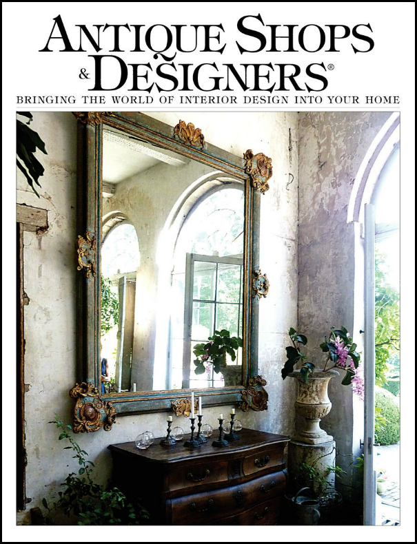
A few weeks ago, I wrote about the latest issue of Antique Shops & Designers magazine. The magazine profiled the wonderful townhouse of the beautiful and gracious Barbara Carlton of Shabby Slips – one of Houston’s prettiest antiques and décor shops. To read the magazine article, go HERE. To read the original Cote de Texas story, go HERE.
Barbara Carlton along with her daughter Renea Abbott opened Shabby Slips in 1992 and it continues to get better and better each year. A visit to the shop is such a treat to the eye. Everything is beyond gorgeous – it’s so hard to leave empty handed. Both Barbara and Renea are interior designers with similar aesthetics, but there are unique differences. Renea doesn’t do only white slipcovers any more, today she mixes in a lot of gray and black and gilt to her sophisticated designs. Barbara admits she still loves white and every place she has ever lived is designed around white linen. She grew up watching old western movies and says that also still influences her decor.
The magazine showcased Barbara’s latest home, a 1963 contemporary townhouse in tony Tanglewood. The photographs were beautiful, but as space in a magazine is limited, you couldn’t see as much of the house as you might have liked. Until now that is! A reader emailed me that she had toured a house for sale and thought I would love. She hadn’t read the story of the townhouse or didn’t connect it with the space she saw in person. I have to say that I love readers, especially those bearing tips like this! A quick note to the listing agent, Rosie Meyers and I was in business. The photographer, veteran TK Images (more about them below) sent over the luscious, huge, HiRes photos of the townhouse and here they are today.
I totally understand why the reader didn’t recognize the house – missing from the magazine due to space constraints are the focal points of the house- the soaring, high ceilinged stair hall and the two atriums, around which the house was designed. My jaw dropped at the stair hall. It is stunning.
The townhouse is just over 3220 sq ft., with 2 atriums, an elevator, and 2 bedrooms/2 1/2 bathrooms. As you will see, it has been completely updated while retaining the original mid-century modern feel.
Enjoy!!!
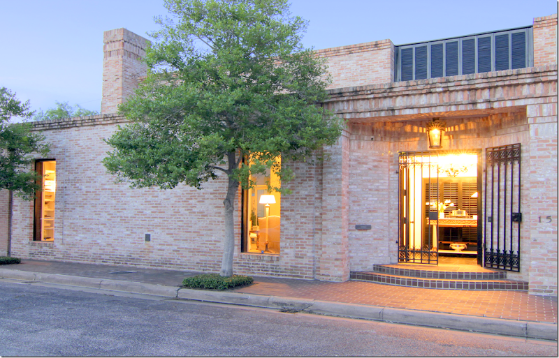
Located in a small gated community, a stone’s throw from the Galleria AND the home of a former United States President (beat that!) – the streamlined exterior says Mid Century Modern.
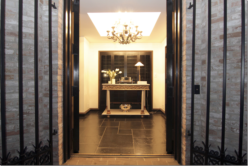
The black painted front doors open onto a space with black slate floors and black baseboards. The walls are all painted white throughout. The antique gilt and cream console rests in front of the black painted shutters – allowing the atrium beyond to be a surprise that unfolds as you walk further into the house.
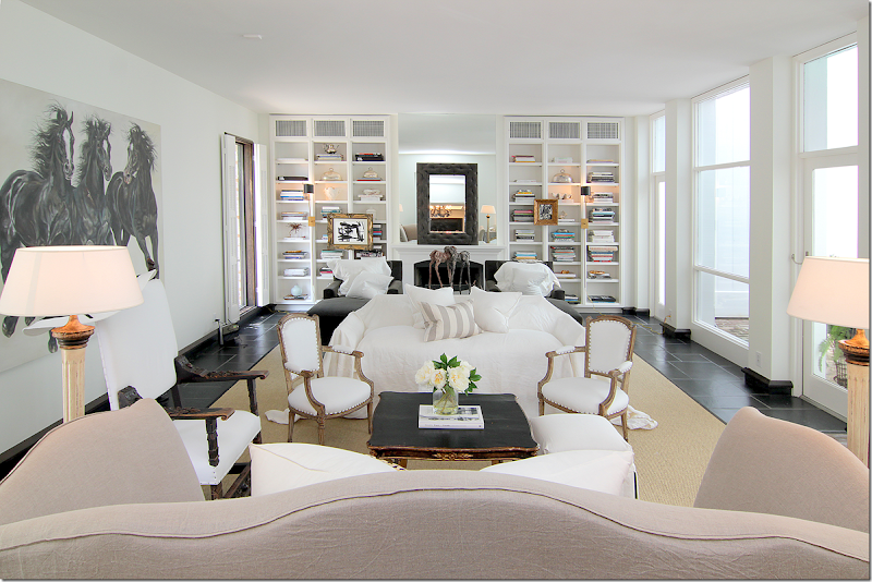
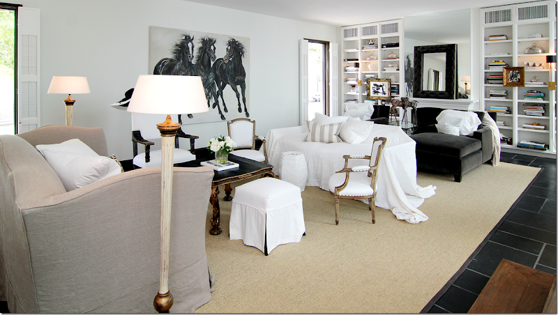
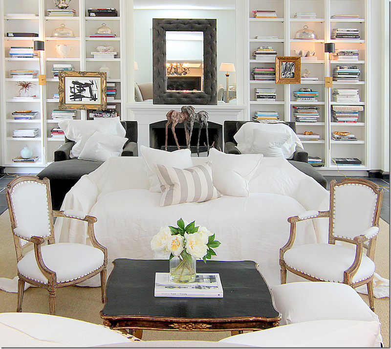
Directly to the left of the foyer is the large, main living room with its black slate floors. The room is large enough (28x18) for two seating areas. The two windows on the left overlook the street, while the row of windows and doors on the right lead to the brick floored atrium. Two sofas, one in linen, another with a white slip casually placed over it, face each other. Towards the back of the room is the fireplace, flanked by bookcases. There, two chaises upholstered in dark gray velvet sit next to each other. A large canvas of horses faces the first sitting area.
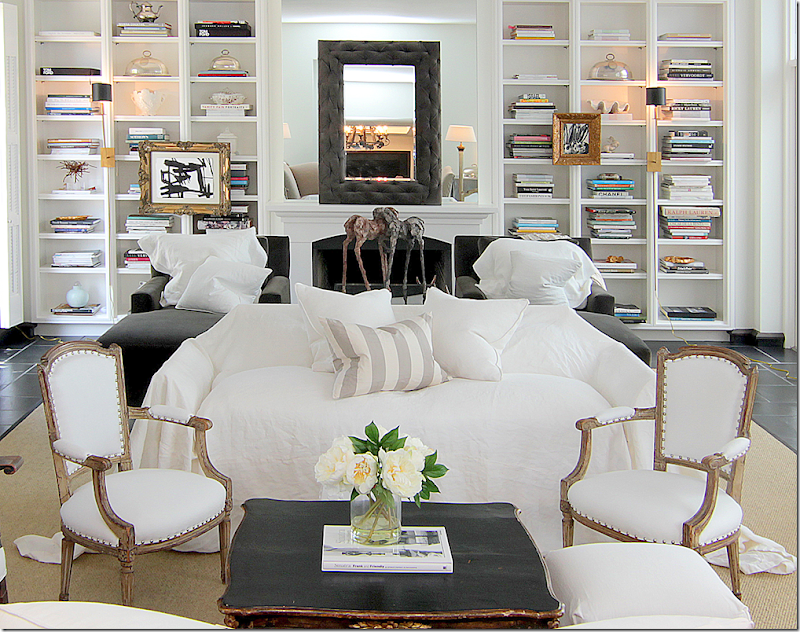
Can I say how much I LOVE the way this room looks? I love the mix of antique chairs, a large Spanish chair mixed with two smaller French armchairs. The silk stripe pillow is the only pattern in the room, which I love. Anchoring the two areas is a large seagrass rug. Notice the beautiful coffee table in black with gilt accents. Love!
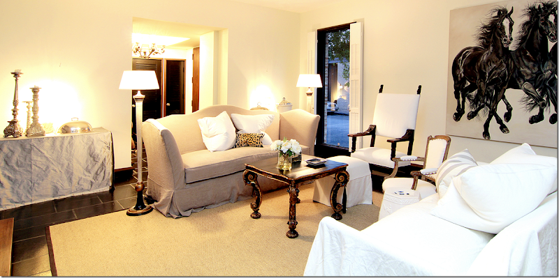
A close up view – Carlton says she puts loose slips on sofas and chairs at a whim. I love this look!!!
The linen sofa has a scalloped back and arms which creates interest when walking into the room. Here you can see the two chaises that flank the fireplace. Darling little slipped ottoman with black lining peeking out. And I love the two floor lamps. It’s amazing how the large painting of the horses creates movement in the room, isn’t it????
Looking the other way – you can see back into the foyer. To the left is the atrium, and then – you can see the stair hall off to the back left. This stairhall overlooks the second atrium – or the large one. Notice flanking the entrance to the room are two rectangular skirted tables in silk taffeta. On the gray velvet chaises are white linen pillows – Shabby Slips makes the MOST gorgeous pillows!! In between the chaises is a glass coffee table.
And a view of the fireplace with its mirrored mantel, with a second mirror on top of it – is that tufted velvet on the frame??? Gilt framed pictures hang from the bookshelves, while a large horse sculpture sits on the coffee table.
A night view of the first seating area, with the gorgeous coffee table. Notice how pretty the back and the arms of the linen sofa are. I love how Barbara puts the pillows in the middle of the sofa. Much better than having to move them when you sit down – they are already moved!! The silk velvet pillow pops the two white linen pillows.
Now, for the magazine shoot for Antique Shops & Designers, Carlton brought in two club chairs instead of the loose slipped sofa. Plus, she removed the two taffeta covered skirted tables.
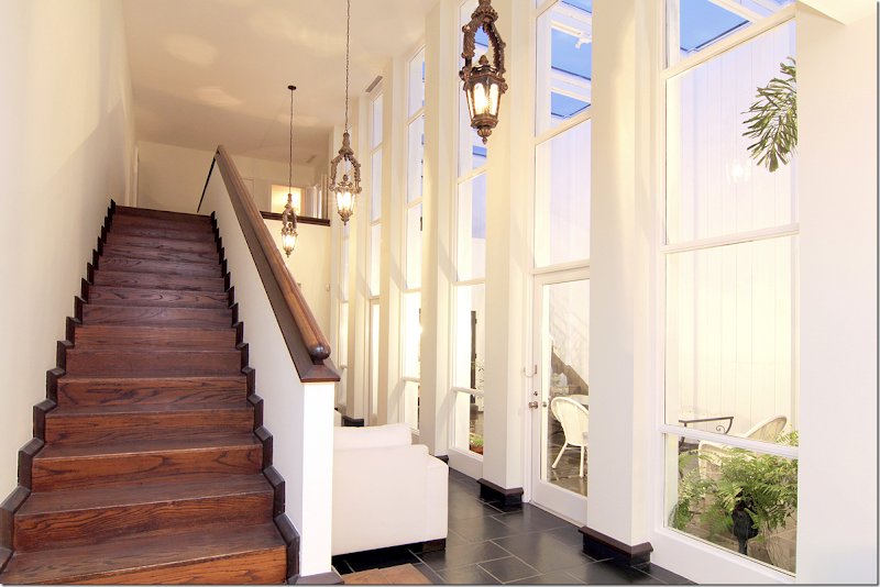
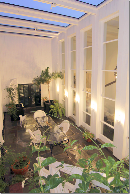
Leading off the living room is the stairhall, with the larger atrium on one side. Is this not GORGEOUS???!!!! OMG!! This room wasn’t seen in the magazine article due to space constraints and my eyes popped when I saw it! Those tall windows, 4 stacked to the ceiling, the antique lanterns, the gorgeous wood staircase – just stunning. Notice the black molding that connects the slate and wood with the white walls. And notice the beautiful railing. It doesn’t say who did the renovation, but they really did a fabulous job. The two bedrooms are both upstairs and there’s an elevator for easy access. Remember the shutters in the entry? They hide this fabulous atrium and stair hall so that it becomes a gift for the eyes that reveals itself the further inside the house you walk. The kitchen and dining room are on the other side of the house and look over both this atrium and the one in the living room. To reach the back rooms, the doors are at the end of this hall. This hall is wide enough to be another furnished space. Here, Carlton has put two arm chairs along the stair wall.
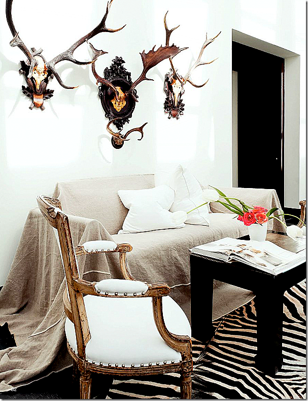
From the magazine Antique Shops & Designers – this photograph shows the stair hall as it was decorated for the shoot. In real life, Carlton actually keeps the two club chairs here – but I LOVE this look, especially with the French gilt chairs and the zebra! On the right is the entrance into the dining room.
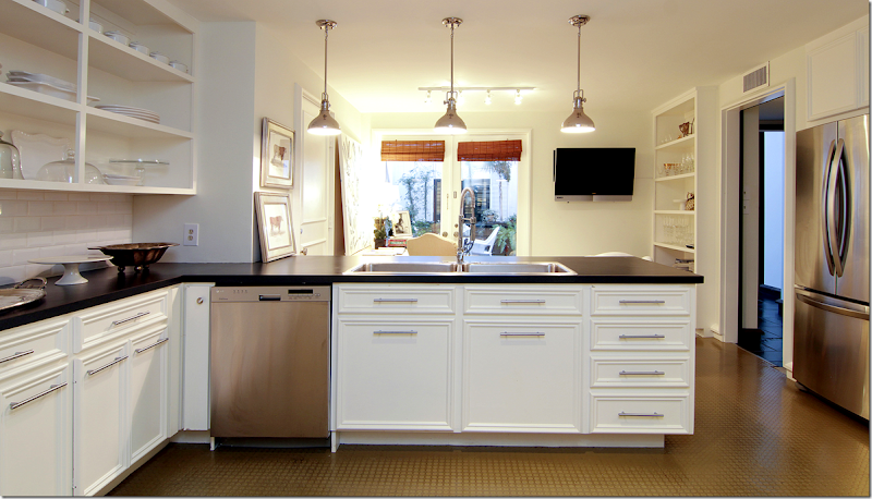
Here is the kitchen and the breakfast room – with the doors overlooking the larger, front atrium. You can see through to the black shutters in the entrance hall. At the open door on the right is the stair hall.
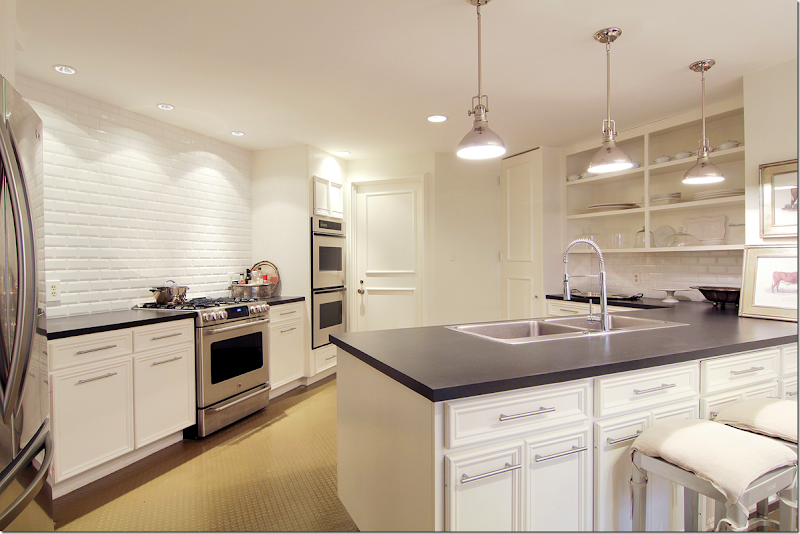
Looking the other direction into the kitchen. All overhead cabinets are gone. Three open shelves hold glasses and dishes. Notice the beautiful wall of white subway tile over the stove and oven. There are two more ovens to its side. Not sure what the counter is – it could be matte black granite, but not sure.
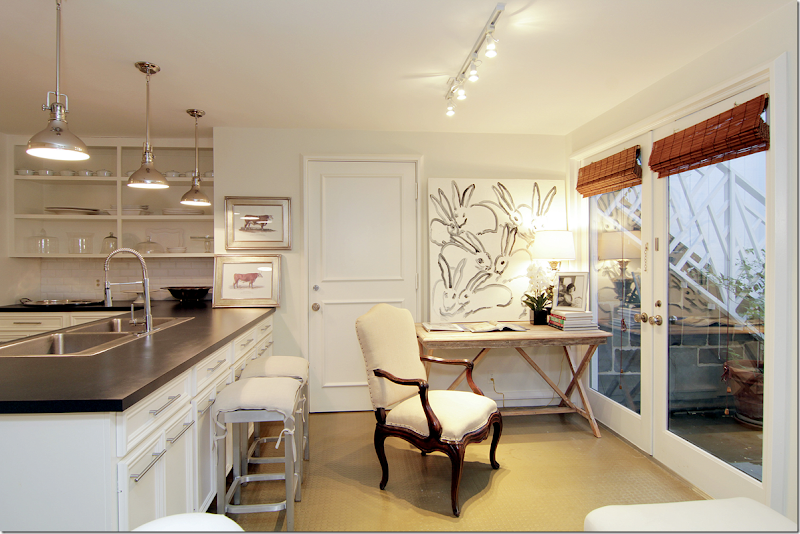
Carlton’s breakfast room doubles as her office. Love the photograph of Jackie Kennedy. And those bunnies! Too cute. Pretty French chair. The door leads to the slate floored atrium. Notice the stairs through the windows? Let’s look at the front atrium, ok?
The front atrium serve as an outside dining area. You can see the black shutters which lead to the entry hall. To the right is the stairhall. On the wall inside – you can see the sitting room off the stairs. The sitting area measures 29x7 which allows for the two club chairs. Antique horns hang off the wall. In the atrium, Carlton has black slate floors which make the room seem outside/inside. White wicker and black iron continue the décor theme from the inside. If you had a party – you could throw open all the doors and let the crowd meander from the inside to out. You can see into the living room from the window.
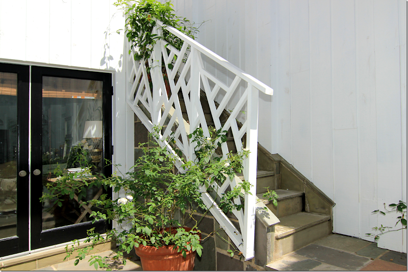
At the back of the atrium is the door that leads to the breakfast room and kitchen. Look at the Chippendale styled stair railings!!! GORGEOUS! The stairs lead to the balcony off the master bedroom.
Looking down from the balcony onto the front atrium. Here you can really see how beautiful the wall of windows is.
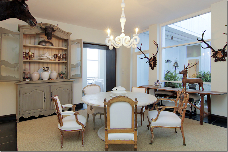
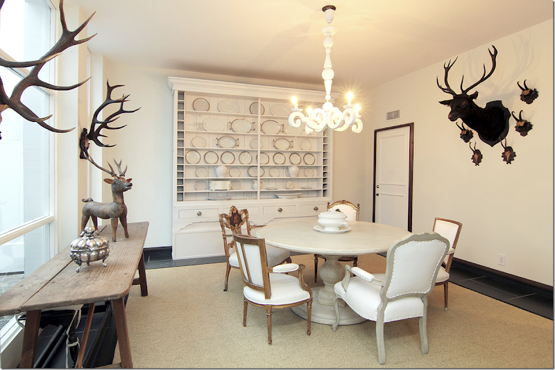
Off the end of the stair hall – the kitchen is to the right, and the dining room is to the left. Through the black doors (notice how the threshold on top of the doors is painted too) is the large dining room (17x15) – which sits across from the second, smaller atrium. This atrium is directly between the dining room and the living room. You can see the stair hall and the windows to the first atrium through the black doors. I love the antique armoire filled with Carlton’s silver collection. Notice how the chairs are all mixed around the dining table. No two are alike. One chair on the right – the gilt one – is beautiful!!
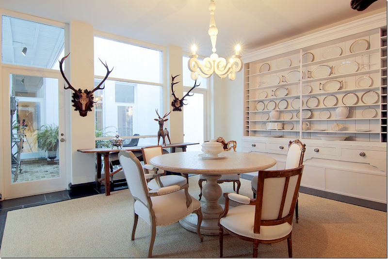
Along the atrium window is a console. Antique horns are on the walls. And along the back wall is this fabulous cabinet filled with white ironstone. The French plaster light fixture is the same one that Sally Wheat has in her dining room. Remember?
Along the wall are more horns. Notice how the floor molding continues up around the door.
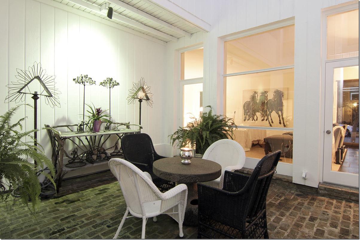
The second, smaller atrium is set up with a faux bois table and black and white wicker – again, continuing the black and white décor scheme outside. The floor here is brick. Against the wall is a faux bois console.
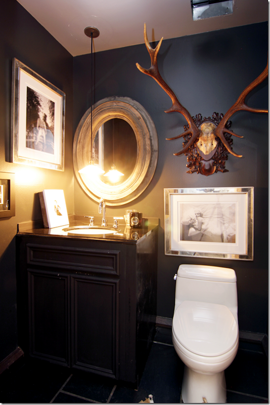
The powder room – I’m going to guess this is off the foyer, with its black painted walls and cabinet. Notice how Carlton hung the pendant low, over the sink. Horns mix with photographs of Marilyn.
Ready to go upstairs?
Any excuse to show the stair hall again! Here, the floor changes to hardwoods which run throughout the upstairs. There are two bedrooms and two baths upstairs.
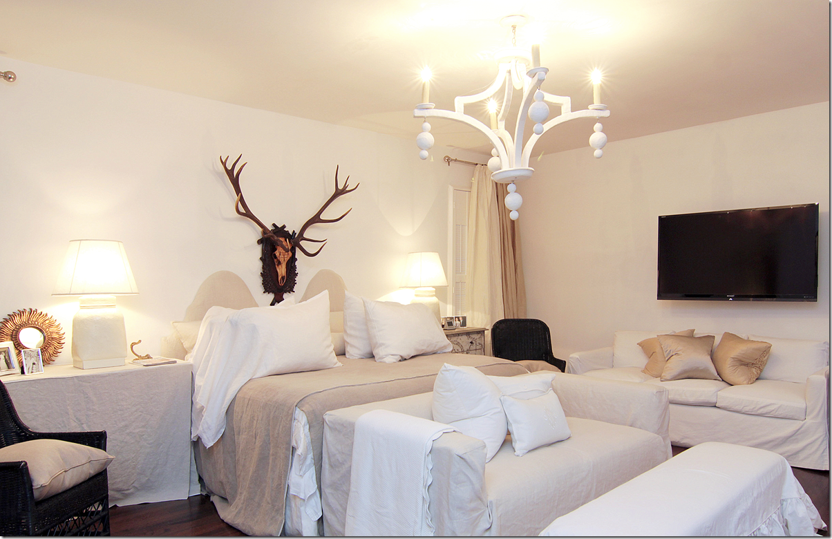
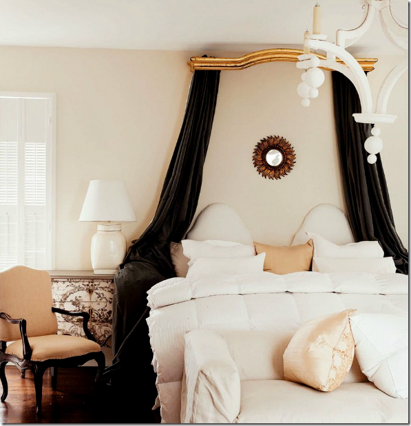
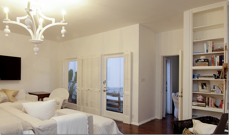
The master bedroom doubles as a sitting area for Carlton. Loose slips cover all the furniture. Another plaster lighting fixture similar to the one downstairs hangs here. Love the black wicker here. And again, more horns, which are a definite decorative element used throughout the house.
For the magazine photoshoot – an antique cornice was brought in, along with more dark, gray velvet. The nightstands were exchanged. It’s interesting to see how different a magazine photoshoot can be from how the owners really live. So much more attention is paid to the décor! I do really love this canopy though, and wished she had kept it!!! It adds a romantic touch to the room.
More built in shelves here. Through the glass you can see the outdoor balcony that overlooks the large atrium, which the Chippendale styled stairs lead to.
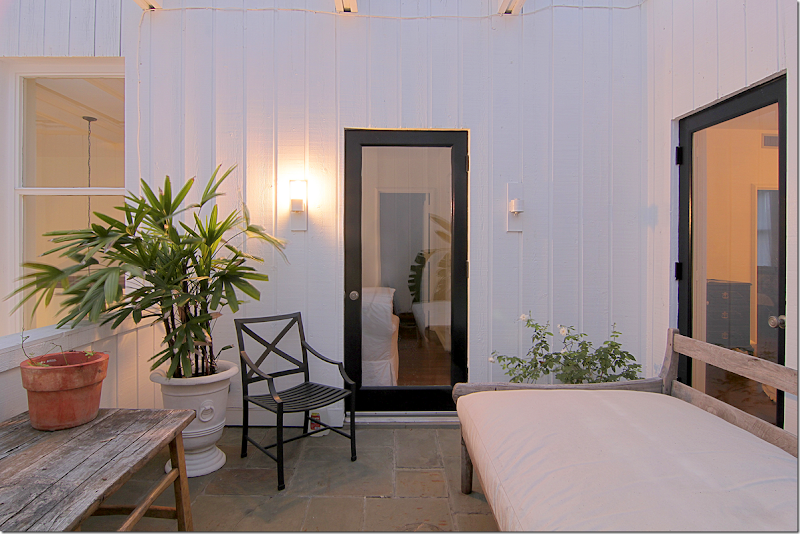
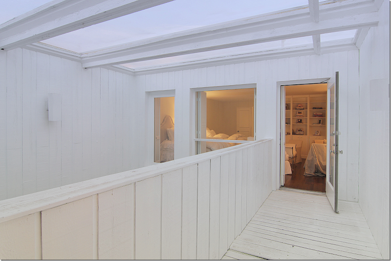
The master bedroom is over the kitchen area. Here you can see through this door the landing off the stairs. This balcony overlooks the large atrium. There’s a day bed out here and if I lived here – I would sleep here on nice nights!!!!
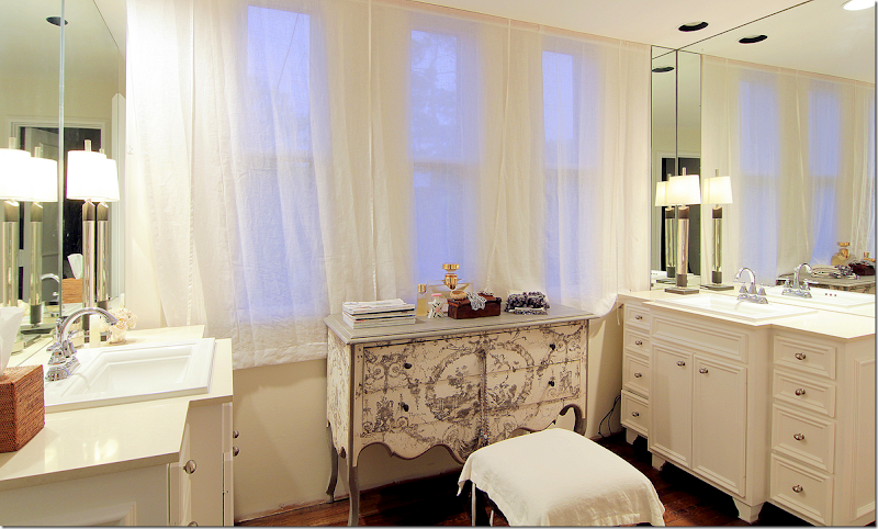
The master bath vanity area has his and her sinks in cabinets that look like furniture. Sheer curtains cover the windows, while a painted chest acts as a vanity. Cute!
A view into the bathroom with its tiny mosaic tiled floors – very mid century modern.
Whoa! I love this closet! First, I like how Carlton wears mostly black or white. Love the stole hanging. The mirror at the end is a great tool to make the large closet even larger. This door leads to the balcony over the smaller atrium. I wonder if this floor is original to the townhouse? Interesting.
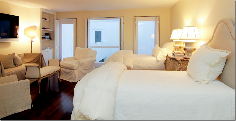
The guest room has twin beds and its own sitting area. Through the windows is the balcony that is over the smaller atrium.
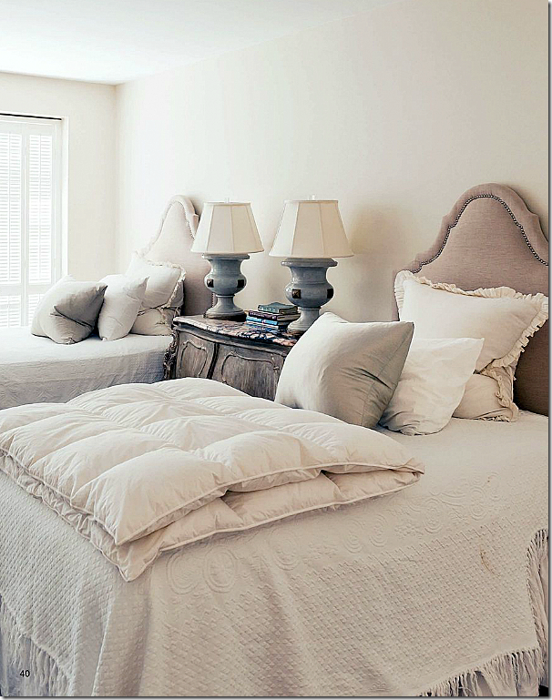
For the magazine photoshoot – more attention was paid to the bed pillows, of course. Plus you can see the beautiful marble topped night table.
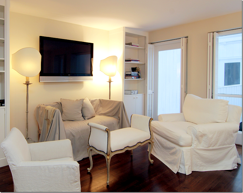
Twin bookshelves become an alcove for the bench. Love that white settee with gilt accents – beautiful!!! And those shades really made the lamps so important. What a difference they make over just a regular round shade. They look like sculptures now.
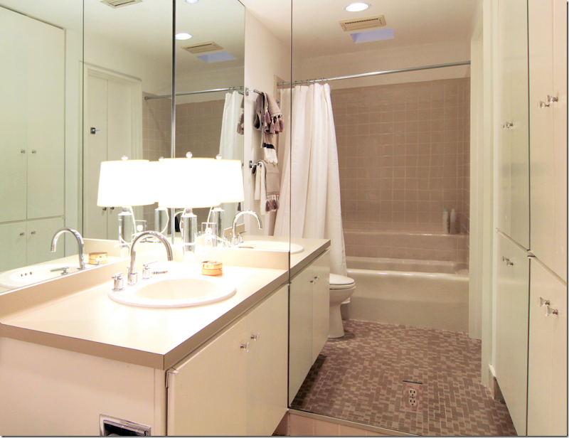
The guest room bath. This was probably updated some but the mid century feel was left. The cabinets look streamlined and original. Carlton probably just added the mirrors and new sink, countertops, and hardware.
The balcony that leads from the guest room over the smaller atrium.
I hope you enjoyed this extended look at this wonderful townhouse since we only got a short look before! To read the story in Antique Shops & Designers, go HERE. To reach Rosie Meyers about this house or to see the listing, go HERE.
A huge thank you to TK Images for letting me use their beautiful hi-res images of this house! TK Images is quite a company. They take pictures of every kind – and they specialize in real estate photography. The owner, Julie Pistone Krampitz, was once a real estate agent herself and she truly understands the art of taking photographs of the house. TK Images has a team of photographers and editors who use wide angle lenses and lighting to take really great interior photographs. On their web site, they have a check list that shows what to do to get a house ready for a shoot.
Here is the list – which I think would be useful for anyone taking pictures of their house:
- Turn on all lights and lamps. Replace burned out light bulbs
- Turn off ceiling fans
- Check house for cleanliness
- Bathrooms - put away toiletries, toothbrush, toothpaste, towels, shampoo, soap
- Kitchen - remove dishes from counter, garbage from trash can, clutter, magnets from refrigerator, and pet bowls
- Remove clutter throughout the house
- Put away high chair, booster seats, toys, etc.
- Store all workout and medical equipment
- Make sure items stored under beds are not visible
- Put pets away, out of photography areas
- Have the yard mowed. Trim trees. Make sure leaves are blown.
- Put away all outside trash cans, recycle bins, water hoses, security signs
- If there is a security fence around pool and you do not want it seen in photo, please remove security fence before photo shoot. Remove pool equipment from pool
- If homeowner does not want child's name or personal photos shown, please take down before photo shoot
- Take down holiday items so photos are not dated
- For dusk shoot, please make sure there is a water hose at the property
While some items on the list may seem obvious, I can’t tell you the number of houses on HAR, and other real estate sites, that look TERRIBLE. Hooked on Houses often shows real estate listings that are so truly bad – they are funny. Why would anyone even look at some of these houses to buy? A professionally taken photoshoot for a real estate listing is vital.
TK Images have won awards for their image and it shows. It makes such a difference to show your house to its best advantage when either selling it or when showing it to an editor for publishing.
To go to TK Image’s web site, go HERE.
AND FINALLY – WOW. THAT’S ALL I WILL SAY!!
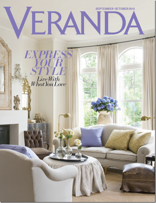
Well, ok, I’ll say a little more: A birdie sent me this preview cover of the new Veranda. OMG!!! I want to crawl in this picture and live in it for eternity, as long as I can have those hydrangeas, along with the purple title!!!
Can you guess whose house this is???
The issue will be out soon. Soon. Start looking for it in a week or two.
OK, I do have to brag, I have those same sconces. Hehe.








Thank you for another great post! I enjoy your comments & observations of the rooms. Although you didn't comment on the kitchen floor, it is a nice change from the usual choices.
ReplyDeleteThis is a beautiful home, Joni. I enjoyed seeing the rest of it. It is very well done, of course, but I don't understand the current interest in antique horns and large horse paintings. Maybe it is me. I have an aversion to whimsy. The kitchen would not have enough cabinetry for a dish-a-holic like me, and I wonder how they deal with smoke and grease from the stove without a hood. I do love the table surrounded by different gilded chairs though. I agree with you that I prefer the gilded canopy in her master used for the photo shoot, but I am a fancy girl and the owner seems to be much less formal. Thanks again for all the detail you put into this and every post. By the way, the Alexa Hampton podcast was fascinating.
ReplyDeleteBest...Victoria
Stunning townhouse!! I bought that issue of Antique Shops & Designers specifically to see the pics of this townhouse. I love how original the floor plan and design is. Thanks so much for showing us the rest of the rooms! Love it!!!
ReplyDeleteKat
Great post, Joni! This is such a comfortable home.
ReplyDeleteCant wait to get the next issue.
Happy Monday.
Teresa
xoxo
Joni I knew I should have gotten a fresh cup of coffee before starting this post!
ReplyDeleteWow, a woman who has made her dream house completely a reflection of her style and taste!
The black, white, tan and gilded gold theme is so elegant yet her pieces are obviusly comfortable to curl up in and read! The soaring atrium's take my breath away!
xoxo
Karena
Art by Karena
2012 Artist Series
Karen - that's my favorite part - my jaw dropped when i saw that picture! gorgeous
DeleteThat townhouse is very pretty. In reading this each picture I looked at I thought, " pretty but I could not live with it". It struck me that so many interiors that I think are gorgeous would not work for the way my family lives, which is not necessarily ugly just different.
ReplyDeleteObviously with only one picture of the front, it is difficult to determine the relationship between the townhouse and the street, but from the photo, it appears to have only a sidewalk separate it from the street. The modern architecture and its site relative to the street makes it look more like a retail space than a residential space. Inside, the furnishings seem to be out of sync with the stark interior walls. The outdoor dining space was lovely and the kitchen was nice although short on storage space. Hopefully, a buyer will have a love for modern, clean lines which the architecture calls for rather than the haphazard appearance of the decor as it currently appears in these photos.
ReplyDeleteHi Anon, You and I were thinking along the same lines. When I saw the first picture, I, too, thought it was of Carlton's store front - not the front of her home!
DeleteMuch as I personally dislike mid-century modern, this building absolutely cries out (maybe even weeps and pleads) for mid-century decor. I kept hoping to see some pops of orange (and I don't even like orange), white leather, angular chrome and glass furniture and abstract art.
This post is "Proof Positive" that architecture is at least half of the design mix. So many of the gorgeous homes Joni shows us are gorgeous because of the architecture. Many of them would be gorgeous without a stick of furniture. The furnishings are the frosting on the cake but they have to be the right furnishings.
the complex was built in 1960. its one street wide, 2 blocks long approx. the townhouses are on both sides. the garages are in the back. it's very contemporary. barbara doesn't LIKE color, she likes white. she says that plainly in the article. she doesn't have to apologize for that. i'm the exact same way. and i think her choice of furniture is perfect. if she did only mid century furniture, it would be like a museum to that time. this way, she shows how you can live with mid century architecture and furniture from today. i think it's a perfect mix.
DeleteWow, I love how you post so many different styles. You can see the owner's personality so clearly in many of them. It's always interesting to imagine how people live their day to day lives in their spaces. After looking at everything I think I like the photos from the magazine shoot better. I like slipcovers but not to the extent that they obliterate the furniture and look more like king size sheets thrown around. I wonder about so many antlers throughout the house and then nothing above the stove. The wall of white tile seems so sterile in the kitchen. I wonder about having bar stools in front of a row of drawers & doors and no extended counter. I wonder about some color accents & patterns~nothing overdone but something for the eye land on (like the blue lamps in the guest room, best seen in the magazine photo). I love the atriums and all of the glass so there is an abundance of light and nature. The shallow built-in display is wonderful in the dining room. Thanks again Joni!
ReplyDeleteI wondered about the faux antler overkill as well. I think the trend is dead almost everywhere except in this townhouse. The stark white toilet standing alone in the all black powder room was another jarring photo which would be better left off the sale's brochure. The wall of white tile does seem sterile and at first glance I wondered if it was painted brick. An altogether better staging job could have been done for the seller.
DeleteI liked that powder room! It was unexpected.
DeleteA truly heroic decorating effort but the mid-century modern architecture is still a Sow's Ear. Seriously, used brick and ship-lapped wood on a mid-century modern facade??? What a disconcerting mish-mash of styles.
ReplyDeleteI could only look at half the pictures because it seemed impossible to breath in that closed box sitting right on the street. I REALLY did try to like it, but even "cute" details could not save it. No wonder she wants to sell.
JMO. Sorry!
"No wonder she wants to sell" - Remember Charlotte, she actually bought it and decorated it. It didn't just land in her lap in the middle of the night. The owner is not a victim except perhaps of her own judgment.
DeleteYes, I know. That is why I called it an "heroic decorating effort". Sad.
Deletecharlotte, please. come on. the house isn't on the street - it's in a gated complex where ALL the houses are exactly like this. if you don't like it, fine, but don't judge why she wants to sell. you have no idea. the duo of Carlton and Abbott are incredible. I suggest you google their shop to see their abilities. it is truly one of the prettiest decor shops in houston. cutting edge. glamorous. they are both highly respected in their field and very well liked. let's try to keep this civil now that the anon has left. no need to take his place. i will predict this house will sell in a month's time. it's fabulous for a single person or an empty nest couple, or a newly married couple w/o children.
DeleteVery pretty house. I love the black slate floors and the contrast they provide for all of the furnishings.
ReplyDeleteITA. they are beautiful - esp against the white.
DeleteAnon, I have a collection of vintage decorating books and I can assure you that displayed antlers are not a "trend". They have shown up in every decor book I own from the 60's, 70's, 80's and so on. We may have seen a spike in their popularity, but they are far from trendy. As for the Veranda cover, I'm guessing John Saladino? Just because of the lavender accents.
ReplyDeleteI hope you can share the names of your books as I would certainly like to research these. Are you speaking of antlers as wall hangings much like "real hunters" would have a trophy room to display their animal heads or are you speaking of fragments used in calligraphy or paint brushes or just large fragments alone. Perhaps these antlers shown here are just part of a hobby the owner has in collecting antlers, but they all appear to be quite similar and not very unique if that was the purpose. It has become a bit too cliche' as a design element, however.
Deletethe specimens she has are antiques from europe. she has chosen to spread her incredible collection around the house - but it they were all together on one wall, they would make an incredible statement. why judge what someone chooses to collect? i'm sure not many would like my blue opaline collection. its highly personal. and remember - in the article carlton states what an early influence western movies had on her aesthetic. the horns fits perfectly into that scheme. she uses the horn like some use sconces (snort, me for instance!) or mirrors, or art work.
DeleteCharlotte Des Fleur, I checked out your profile & notice that you have do not have any training whatsoever in design (yet you're writing a book on French design?!!!). I think you should not give your uneducated opinion on what the house should be designed with (style) based on the exterior. Personally, I think the interior is a terrific, unexpected surprise. You don't expect it from seeing the exterior. There are no real "rules" to decorating the interior of a home to match it's exterior. Check out Lauren Liess' home on Pure Style Home blog as a perfect example of this.
ReplyDeleteLove how people who do not have any experience in design feel free to give their opinions on what they think works/doesn't work?!!!
Lisa
Anon.10:56, if I understand your comment correctly, you are implying that only people who have attended design school need comment here, REALLY!!!
DeleteSome of the most erudite collectors of artwork and antiques have never stepped foot into a design studio much less a design class and yet their own personal libraries and acquired knowledge from travel make them as well equipped to speak with confidence about design, art, architecture as many who have only acquired their knowledge in a classroom setting. In most instances, architecture or style does in fact set the tone for what one can expect to see inside. Unfortunately, in your effort to compliment Lauren Liess, you seemed to have leveled a fairly direct insult at her house.
There are also those individuals who not only have traveled extensively and are well connected to the design world, but also have innate talent, particularly a sense of scale, balance, and color. I have read enough of Charlotte's comments to know that she is qualified on all accounts.
Now go hang your post graduate degree from Sherwin Williams on your bathroom wall where it belongs.
Correction: The above post at 12:17 was in response to Lisa, the Anon who posted at 11:02.
DeleteFirst of all, I did say it was just my opinion. However, hmmm... seem to recall numerous posts on THIS blog (many by Joni herself) stating that one must be BORN a designer. No one has ever stated how many "years of training" or experience are required. After all, the great Mark Hampton trained as a lawyer! "No wonder Alexa Hampton is such a great designer - she inherited the designer gene."
ReplyDeleteHowever, it doesn't take much training to notice that used brick and wood siding are completely out of synch with mid-century modern. It also doesn't take much training to notice that this featured house would be airless since the glass panels on the top of the atrium are fixed panels.
I have no problem if people want to decorate the inside in a completely different style from the outside. Just makes me wonder why one would buy a home with a distinctive exterior and then decorate the interior in a different style. However, it does create "planned obsolescence" because the owners are never quite comfortable with the "design job" and after about 10 years can no longer stand it. That provides another designer with work and / or the homeowner has to buy another house. Either way, it keeps money flowing into the Design World and the Real Estate World. Nice gig!
By the way, Dahling, I am in Sales and Marketing so I DO understand how these things work!
why do you think there are fixed glass panels? where do you get that from? i don't think you are right - i think they are both open to the elements becuase the doors close it off - otherwise, the doors would be open. and why are you cutting down the architecture so much? it is what it is. it IS mid century modern by every definintion of the word. It was built in the 1960s. it's contemporary. of course they used wood. what else would they have used? and don't say brick. the atrium would be hot as hell if the walls were made of brick. plus i love the look of the wood and the windows. the owner IS the designer and she wants to decorate it with antiques not mid century modern. she didn't want a laboratory look or a museum. there is nothing wrong with mixing antiques and contemporary. nothing. i don't get where you are coming from at all.
DeleteHi Joni, I got the idea that the panels were fixed because of the picture of the small balcony connected to the guest room. Don't those look like fixed panels to you? If not, my bad. I certainly HOPE the main atrium is open to the sky, because, you are right, it would be hot as you know where in the summer. What do they do for air movement in the summer? AND, I did not say I did not like the furnishings, I called it an Heroic decorating effort for Heaven's sake! I just do not like "used" brick and tongue and groove wood on a modern house. Those materials seem very Early American to me. (JMO)
DeleteBy the way, I do not mind mixing modern and antique at all. I just prefer things to be mostly modern or mostly antique not an equal balance of the two. It is the same reason you use mostly light tones with an occasional punch of black. If you used half dark and half light, your interiors would not look as nice as they do. Again, JMO.
In looking more closely at the atriums, they all appear to be enclosed, including having looked at the aerial map on the website of the real estate listing. If my observation is correct, then perhaps they are air conditioned or cooled by other means. Just a "minor oversight" by those famous Houston architects who planned this eye sore. Perhaps if the owners were allowed to paint the exterior brick and chose a nice soft gray or warm white they would make a better impression.
DeleteThis house is absolutely stunning! We love the clean white look. The bookcase, stairwell, and closet are my favorite elements of this design. So inspiring! Great post!
ReplyDeletewww.laurau.com/blog
Please, PLEASE: Does anyone know where I can find that chandelier pictured in the master bedroom photos? I have been dying for it ever since Joni posted this townhouse the last time. I've looked through thousands of chandeliers on line, and haven't come up with it. Love it; LOVE IT!!!!
ReplyDelete713.521.3898
Deletehttp://shabbyslipshouston.com/
http://www.myshabbyslips.com/
i just realized I forgot to link Shabby Slips!!!
Call them to ask about the light fixture - they might sell it. I THINK< think> that Sally got hers there too. not positive though.
but call them!!!
good luck!
JOni
Love the easy casualness and the blend of different styles. A beautiful home!
ReplyDeleteI don't think the exterior or architecture scream mid-century modern at all, at least not with the distinguishing characteristics. It's a modern design and it was built mid-century, but that's not necessarily "mid-century modern," just as we've all seen interiors from Santa Fe or Cape Cod that don't play to stereotype. It reminds me a little of Elise and Pete du Pont's house and gardens, recently profiled in Dominique Browning's always interesting blog, and of the house of some relatives - built in the 1960s but also able to accommodate a wide range of design. The du Pont house, which I remember seeing from House & Garden (or a similar magazine) during my childhood, remains home to antiques from America and Europe, and gave me the reinforcement I needed to think beyond simple equations like "French country demands French country" and start to look at design for what it is.
ReplyDeleteKRIS!!!!!!!!!!!!!!!!! That was my favorite house when I little!!! i used to draw those floor plans and copy them for my own house. omg!!!! i love that house. going to read the blog right now!
ReplyDeleteJoni, I wish I had ultimately saved that issue. I only saw the house once, in that magazine, and loved the squares and atrium and brickwork. Seeing Dominique Browning's column brought back a ton of memories for me. Did you save the floor plans? I can't remember all of it, and haven't had luck yet sifting through piles of 40+ year old magazines.
DeleteA blogger wrote about that house a few years ago but i searched and can't find it!!! i was prob in junior high when that article came out- 40 years ago? i didn't save clippings back then, but i know i did save THAT one for a long time. but it's gone.
DeleteCheck out Dominique Browning's piece on "Patterns," April 12, 2011 - it's magnificent. I remember the house well. I can recall the paper that such magazines were printed on, the font and the photography. I knew then it was a special house. The exteriors will remind you of this house.
DeleteI don't see this house needing to be decorated in a mid-century modern style. I think the house requires a MODERN touch. Modern and Mid-Century Modern are not the same thing at all. I do see a modern touch in the art and sculpture, and in some other elements, and then the owner added classic furniture shapes. This combination is seen often in the design world, and its reverse, classic architecture with ultra modern furniture. I too, see John Saladino in this work, and who would argue with him!
ReplyDeleteCharlotte Des Fluers- I have become so curious to see some of your work. Do you have a blog? Even if its on a small or personal scale I would love to see what you have done. If not, I think you should start a blog. I am saying this because it annoys me when you hijack this blog, and give actual design advice to people rather than commenting on what you see. You also get into protracted conversations about your personal design philosophies....I want to read more about Joni's ideas here. Please...................start you own blog. Stop piggy-backing this one!
So, a bit of design knowledge really intimidates you, ugh? Why should Charlotte take your advice? Who are you that you should decide who comments and who gives advice? What are your credentials? Yea, I thought so -NONE.
DeleteHe's back......
DeleteNo, not intimidted at all.......just wondering about someone who feels entitled to give almost constant advice that is unsolicited . It seems intrusive. Why doesn't Charlotte write her own blog so that we may seek out her knowledge directly.....and so that we may also seek Joni's wisdom without Charlotte's constant ,annoying, pesky preaching.
Deleteno, he would NEVER take up for Charlotte! haha!!! never!!! i think he's gone because he is scared I"ll out him to his boss and in his line of business, he has to be nice to people, not rude. he is rude here because he thinks no one knows him. but not anymore.
DeleteBlowing smoke again, Joni????
DeleteJoni, at some point in time you will need to put up or shut up. Your readers have to be pretty gullible to buy this any longer.
DeleteJoni - Always love reading your posts - you are so good at what you do. OMG - can't wait for next Veranda - It's Jane Moore - love her style almost as much as Pam Pierce - saw that room on her web site. I'll be checking the mail early everyday for my copy of Veranda. Thanks for the head's up. Can't wait!!!!
ReplyDeleteJanice
I can't find Jane Moore's website! Can you send me the link??
DeleteThanks so much!
Kristi
kripley75@yahoo.com
Kristi
DeleteI'm sorry it's not her website. It's Pinterest.com, Designer Jane Moore. There's great pictures of her work on there. Enjoy and you are most welcome!
Janice
no comment. hehe.
DeleteThank you for directing to me towards Pinterest for her! I love her and Pam Pierce's style so much I can admire their work for days and days....ahh...
DeleteLove all you post Joni so much! I get so excited when I see your blog pop up in my email! You do a marvelous job!!!
Have a wonderful day!!!
Kristi
Have you seen the new September Elle Decor with Reese Witherspoon's home featured? Isn't that Kathryn Ireland's home? I rushed home to look up her book Creating A House and I swear its the same home. Check it out when you have a moment. Bye the Bye, Whoa, loved Carlton's work! So refreshing and the atrium! I would probably never come inside! Thanks for a great blog each and every time! Hugs.
ReplyDeleteYes, that is the same house! :)
DeleteReally! :) R u Reese or Kathryn?
Deletei am writing about that right now!!!! comparing the two!!! omg i am dying, i LOVE that house plus Rpattz is staying there, so.....
DeleteI knew I could count on you! Either my question would spur a post, or better yet, you would have one in the make! Can't wait. I did a little reseach by looking at Kathryn's book on line at amazon and they are both the Libby house so.....? Waiting for your blog! Goooooo Joni! PS, Rpattz? is that Reese?
DeleteHa! I only knew they were the same house because I happened to recently see they were the same at hookedonhouses.blogspot.com (in the celebrity home category). Joni, I look forward to your post about this because you always do such a great job and I know we'll get to compare all the details with your insight!
DeleteDo you know if they are going to do another season of Million Dollar Decorators? (Kathryn Ireland was my favorite.)
I thought this house was very thoughtful and interesting. I just love what the owner/designer did with it. I love that she made her bedroom so cozy and suited to her needs. I think it looks comfortable, stylish and beautiful. I love the outside-- so different! And I love all the different spaces created with the balconies and atrium, etc. I feel like you can see the care and thought she put into creating her home. As other people have stated, I think it is totally unnecessary to stick to a particular period-- you should make your home reflect you and your taste. WHen people stick to one style it looks theme and staged. This home has character and style. Thanks for the great pictures!!
ReplyDeleteWhat a beautifully decorated house! I love the painted chest in the bathroom, the faux bois console in the small atrium, the antlers and the pillows in the middle of the sofas. I love many of her paintings and the horse sculpture in the living room. I love that Barbara has real books on her bookshelves - not books with the covers torn off, or books papered in white, or books with their spines facing the wall or "books-by-the-yard" - just real books with (gasp!) mismatched covers. But what I love most is that she had the courage to decorate the way she wanted, not the way she "should" decorate. I live in a vaguely Victorian-style home, but have chosen to decorate it with painted French furniture, some interesting Oly Studio pieces, modern art and lots of seashells, minerals, fossils, antlers and other items from nature. I'm sure Charlotte des Fleurs would criticize me for my decorating style, but it's what I like and it makes me happy. And that's the only thing that's important.
ReplyDeleteIf you read my first post, you would see that I called it an Heroic decorating effort. That was meant as a compliment to Carlton. I just thought it was the wrong style for this particular house. (JMO) I was not the only one who said that. I suspect many people thought it but did not have the courage to say so.
DeleteHowever, my primary criticisms were of the building itself not of Carlton's interior design.
Since a lot of "vaguely Victorian" houses share many design motifs with French style homes, I am sure you have lovely home. Besides, collecting items from nature was a very Victorian past time. And, I, too, like real books with their real spines showing. How else can you find the one you want to read!
You were correct to point out that prospective buyers will be influenced by "curb appeal" - we all are when we are in the market for a home. Sometimes potential buyers cannot move beyond the current decor to get a vision of what they would like to see in the home. Because this decor is so out of sync with the architecture, I believe that potential buyers will first have to get beyond it in order to latch onto their own vision. This is probably the ugliest building externally that I have ever see on this blog. It is literally sitting in the street and it doesn't matter whether gated or not. The brick is ugly with a capital "U", the windows are ugly with a capital "U" and the decor looks like someone threw it into the space and decided wherever it landed, would be sufficient. The kitchen looks like an after thought - no personality whatsoever. Perhaps the owners eat out. The kitchen looks like it's there because it had to be. Perhaps if we had a wide angle view of the neighborhood, the home would appear different, but from the photos we have to look at, it leaves a lot wanting.
DeleteJoni,
DeleteFirst I love your blog and all of your posts - even the ones where we disagree - are a great joy to read, very well written and researched. I must say they give me a few minutes to pause and forget my worries and I am thankful for that.
As for this house and the comments, I sincerely don't understand why everyone is being so mean to Charlotte? I don't "know" her but I have to agree, this house is a bit of a mess. It's way to overly decorated and pretentious yet confused.
I'm sure your friends have a lovely shop and are very talented (that's clear from the slips they have in their home and the ones you've featured in your own work ) but in the case of this house, they've lost the plot. JMHO...
Joni, thank for this great post! I have just purchased a mid-century mod in Southwest Houston and this post has helped me visualize my home's potential. First, go all white on the walls and bookcases. Second, it's okay to use muted gold... much more my taste than polished chrome. Third, don't use window treatments on the walls of windows facing my own much more modest courtyard. Lastly, learn how to make slip-covers!
ReplyDeleteI don't even know where to start. What a wonderful home with so many of my favorite elements. I am so drawn to the dark half bath with the rustic mirror and antlers, and the stairway with the gorgeous lanterns in front, the crisp white kitchen...oh Joni, I just love it all!!
ReplyDeleteIn deference to Charlotte or anyone else who finds this post a bit of an over reach on good design and architecture, why is it necessary to become the defense extraordinaire on behalf of the owner of a condo or home you feature. I suggest that you take the salt with the sugar. If your readers embrace it, fine. If not, stop defending it by trying to intimidate your readers and commentors. You really are not the last word, Joni even though I believe you have somehow decided that you are. Who cares what the owner's retail establishment looks like? The townhome looks like crap from the curb all the way to the back door - get over it.
ReplyDeleteYou forgot the 1970s bathrooms.
DeleteI think the purpose of publishing home decor photography is to share and inspire. There are hits and misses in every case, and the idea is to decide what is pleasing to the eye for each individual, and to learn what appeals to others as well. Negativity should be expressed with civility and without personal attack. Sometimes people are so rude in their comments that it only seems like Joni is defending a designer, when I think she is merely reacting to the harshness of the tone of the comment. The knowledge is put out to use or dismiss. Why the need to tear down with such venom?
DeleteWhy should there be a special deference to Charlotte and her special, special expertice? Who is Charlotte, and why do her observations dominate this blog?
Sick of Charlotte Des Fluers
DeleteGloria, there is not and has not been a special deference to Charlotte. I don't see that her observations dominate this blog. You can comment as many times as you so choose. No one is stopping you and certainly Charlotte isn't.
DeleteI DO get defensive!!!! because when someone is selling their house, it's not photoshopped for a magazine. you can see the difference in the gorgeous pic of the stairhall with the zebra rug that was in the magazine, yet irl, it's not like that at all. plus the bedroom.
Deletei do get defensive because if you just hate something, keep it to yourself, or be constructive. truthfully, as far this is concerned, i would die to have barbara or renea come here and give me pointers. i think they are extremely talented and am a lot in awe of them both. plus they are two of the nicest - barbara is soooooooo sweet and nice. and lastly, i LOVE what she did with this house and when a few say they don't it makes me defensive about my own opinions. for instance, i seriously hyperventilated over the pictures and could not WAIT to post them, so of course i want everyone to share in it with me. haha!!!
Hey! The corect spelling is Charlotte Des Fleurs. However I think of her as Lottie Flowers.
Delete:)
DeleteAnon, 9:16, isn't time for mommy to pick you up from pre-school?
DeleteHey anon 9:16 am, what do your friends call you? Let's see, maybe Lotta Gasey, or maybe Ima Fartiva?
Deletei decided to look up this complex because i figured it was designed by some big name architect. and it was. Preston Bolton (google him) designed the small complex for himself and a few friends. Some of the townhouses were designed by architects who lived there themselves. President George Bush and Barbara lived in the complex before they built their own townhouse right down the street. Owners of the complex are trying to get national recognition for the unique complex. Apparently it is a very hip place to live considering the provenance.
ReplyDeleteHere are a few links if you care to read more about this complex:
5000 Longmont -- I live at this development and you all seem to have several misconceptions about the place. First, your appraisal is wrong, house 10 is a double lot house so the appraisal is twice what you show, and yes these mid century townhomes are selling for just around the list prices. Your average buyer does not buy here....they don't understand the Meisian esthetic, as seems to be the case with the person who said it looked like a dental office. Read some books on Mesian courtyard homes before you look here, because then you'll have a reference for what you're looking at. The untrained eye does not "get it." That's the whole point of the place. Although older (as in mid century mod) these Mesian style courtyard homes are considered important national landmarks in Architecture. See Stephen Fox's guide to places of historical importance in Houston. Built by Preston Bolton and several other noted local archtects, there is lots of literature on the numerous state and national architectural awards they won after development...see literature from the 60's and 70's... for their outstanding design, which was typical of the genre.
ReplyDeleteSobel, Brown, Bolton and several other architects actually built thier own personal mod dream homes on the street, and sold lots only to other knowledgable friends. The quality of the materials is spot on Mesian meets Texas. That's why they are historically unique.
Many famous people lived here over the years. These homes seldom come up on the market because many are still beloved by original owners. Estate sales are the most common means one can get a unit in somewhat original condition. It takes a knowledgable eye to turn back the clock and restore any transitory changes made over time. Its a small community, but we try to maintain the original look and feel of the development and the list price is mostly determined by location, location, location.
Comparable sized new (stucko yucko and tyvek) homes next door to the one you mention above, at the same time of your posting, go for 1.5 million plus, so under a million is considered a bargain for these homes....however the good news is that most buyers don't understand mod architecture and go for the newer properties. Only those who know what they are getting can see how to put back the original bones and have a work of art to live in that WAS the esthetic of Mesian architecture...less IS more. That's why the property you mention was listed in the Wall Street Journal real estate section....not many available in the nation and very special to Houston.
Best well kept architectural secret in town. Privledged to be able to live here. Don't tell anyone who does not understand the modern esthetic....there's plenty of contractor built homes out there to keep them happy. Not many of these gems left in town.
"Don't tell anyone who does not understand the modern esthetic . . . there's plenty of contractor built homes out there to keep them happy". I hate to break this bit of bad news to you , but there are plenty of examples of modern "esthetic" (your spelling), that have stood the test of time and have been built with more interesting and beautiful materials than this complex. When you say "stucko yucko", and tyvek I am bit confused as tyvek is a form of insulation not an exterior building material. Perhaps you meant that they must be used together. As to the point, however, orange brick and ship lapped siding are not timeless elements. Perhaps these esteemed architects should have stretched the budget a bit more and gone for Texas limestone.
Deletehe Longmont homeowners association is working on a project with knowledgable experts that may lead to the street being listed as a National Place of Historic Importance on the 50th birthday of it being platted...in 2010. Therefore now is a good time for someone who's passionate about important mid century modern to become a part of this unique, important and wonderful niche of modernism. The association is working with Preston Bolton and there may be a book published on this location. Bolton just recieved the AIA award at the MFAH in December and recently visited the development to visit with owners and talk about the project.
ReplyDeleteAs for the question raised about modern furniture, these homes were always planned as an eclectic blend of tastes and esthetics ranging across the board depending on owners tastes. You'll note that original articles on the owners and architects who built the homes often mention original owners non-modern antiques or art work as part of the design constraint...that's part of the original esthetic blend. These houses live with time and are not so limited to be exclusively "retro"....they never were that way in the first place. The blend remains, and you'll find plenty of mid-modern esthetics blended with a wide spectrum of tastes....in the esthetic of each current owner, inside thier home. Living history....not museum history. Nobody actually "lives" in a retro world....we all want microwaves. We simply want the best part from each human achievement that has gone before us. As for architecture...Longmont has some of the best bones Houston has to offer, in my humble opinion. :rolleyes: It's worth preserving.
Here's an article that talks about the complex in Cite - HOuston's esteemed architectural magazine:
ReplyDeletehttp://citemag.org/wp-content/uploads/2010/03/TheHoustonTownhouse_Fox_Cite49. pdf (remove the space before pdf to read)
another townhouse for sale in the complex - built by the architect as his own home:
http://realestate.chron.com/sales/detail/185-l-2789-45304475/5000-longmont-great-uptown-houston-tx-77056
Thank you so much for this information, Joni. Everyone......this is what I'm talking about! Observe, listen, and learn. Come away with expanded knowledge
DeleteYikes Joni! What hast thou done? I think you lit a bonfire with today's post! When I said you can see the owner's personalities in their homes I intended to add that just like the owner had pops of color in her closet (to set off all of the black and white) I think her personality would really shine with additional pops of color in her home. I would really love to share my home with you (I'm in the process of painting all of the doors black~thank you so much for that inspiration & guidance) but after reading the scathing remarks of some of the "experts" I'm scared to expose myself or my home to that kind of scrutiny! Thanks again Joni ;-)
ReplyDeletedawn unless you live in a million or 1/2 million dollar home, don't worry about it. the more expensive and decorated a house is, the more negative comments it gets! people who decorate their own house and universally admired. it's weird, but true!! don't be scared!!! i promise you won't get bad comments.
ReplyDeleteTotally untrue, Joni as evidenced by the recent post on the Houston Federal House which was "truly stunning".
DeleteGREAT POST:)
ReplyDeleteYour blog is so wonderful..I asked you a while ago if you have fb to follow with??
If you want some cute swedish decor inspiration..check out my blog:)
Have a great week dear
LOVE Maria at inredningsvis.se
(sweden)
Joni, I've long admired Shabby Slips here in Austin and love their aesthetic. Thanks for showing this unique and historical place; obviously photos don't give the exterior the context it needs as part of a gated community. I can take some interesting ideas from it, but moreso, I noticed that this place feels very liveable, human scaled, and comfortable. That's not always the case with some designers' homes that you feature. I have one question; Why does one need access to a water hose if you are photographing at dusk?
ReplyDeleteJoni,
ReplyDeleteThank you for another great post. The house has a unique design and i love the stark contrast of black and white. I like how the architecture is contemporary yet the decor reflects a nice blending of contemporary and classical elements. One thing I personally did not like is the position of the antlers right above the bed. I can just picture someone sitting up abruptly in the middle of the night and getting injured. I preferred the gold cornice/canopy with the dark gray curtains used for the photoshoot--it looked beautiful. Thank you again for showing your readers a variety of interiors. Great job!
Ashley in Houston
Dear Gloria (Aug 6 @ 8:04 pm),
ReplyDeleteIn answer to some of your burning questions:
1. I have chosen not to have a Blog at this time because I am writing a book on French Design. No point in people "buying the cow when they can get the cream for free".
2. As you can tell from my comments, I am very detailed and meticulous. I have a full time job, a home, family (and sick hubby) to care for so don't have the time to do all this AND write a properly comprehensive Blog. Perhaps later I will.
3. Not in my "bio", I worked for an architectural firm for 3 years. I am trained in drafting, architectural rendering and in CAD. My husband and I have owned and / or built over 7 houses. I know the electrical, plumbing and many other building codes quite thoroughly. (What I do not know, I know exactly where to find it.)
4. I also attended a prestigious academy near Hollywood where I was trained in Set Design and Costume Design. I also took graduate classes in Tailoring. I can create anything from a man's suit to a wedding gown AND I do mean trapunto work! Naturally, upholstery is a snap!
5. In one of your comments later in this section, you not so subtly suggested that those of us who post contrary opinions should "shut up" - watch, listen and learn. Perhaps that is how things are done in your world. In my world of thinkers, discussion and debate are time-honored methods to refine ideas.
I am not trying to piggyback or take over this site. Joni does a wonderful job! We have all learned amazing things from her and from the other designers she brings into our lives. I LOVE when she takes a single topic and covers it in depth. Her Skirted Roundtable discussions are so revealing and insightful.
My comments should have no more power than anyone else's do. However, if my words DO have any power on this site, I hope it is the power to make people analyze and think about what they see. None of us should be slaves to fashion or be pressured into liking something simply because it was owned or created by someone famous or "with a great portfolio". Every great artist has created more than a few duds in their careers. This includes interior designers. Someone has to have the courage to say, "But, the Emperor has no clothes."
French country design peaked many years ago. There must be literally hundreds of books ,magazines, and publications out there on the subject. With all those materials out there to research, I think I shall too become an expert on french country.....and write a book! Easy to do since the subject has been beaten to death. Even the designers who once specialized in french country have moved on to other things. It is telling that Pierre Deaux (sp.?)could not stay in business.
DeleteNot really French country, but just French Design. Still, I think I will defer to better known French design experts. Your comments on this latest post make me question your overall knowledge of architecture, even though you profess to be quite a pro on the subject. Many wanna-be experts out there feeling they are qulified to write books these days. Good luck with that!
DeletePierre Deaux went out of business because their products were hideously overpriced. Why pay $100 per yard for toile when you can get virtually the same thing for $20 per yard or less? Same with their furniture.
DeleteI guess you will just have to see what MY take on French (and / or Country French)Design will be. Some will like it. Some will not - no big!
Thank you, but no.
DeleteCharlotte, see .....all the time you spend commenting extensively and promoting yourself, you could and should write your own blog. Seems you have all the time in the world to do so, if the time you spend writing on Joni's site is any indication... and I am afraid that you are piggy-backing in the most obvious way. I am gratified to see that i am not the only one who is annoyed by this. It is so much more than just making observations. There are many people who disagree with what they see and are able to comment without piggy-backing.
Deleteso,"piggybacking" is a form of stealing in the blog world ? Or highjacking? An interesting topic that merits more discussion. Any opinions? In addition to Charlotte's of course!
DeleteMaybe jealousy would be a better word used here since Charlotte clearly intimidates many of you. No one is making you read her comments so simply pass them up if you feel so strongly. Most of you are a bunch of quacking ducks that follow every word you read here and plant it in your design brain as the divine revelation of the author. It's opinion folks and Charlotte's is as good as any other I have seen on this blog, including by the author.
DeleteYou spent 3 yrs at an architect's firm, but you missed the Mesian architecture and it's quirkiness in Joni's post? Why, I thought 3 yrs might make you an expert. Kind of like that research done on books people have already already mentioned. I learned so much more from Joni's information than anything you had to say. I would say that is generally the case.
DeleteYou don't seem to understand that architecture school is about design - not history. Indeed, one must study the best of the past, also the worst I'm sure, in order to develop their own skills. Until you read Joni's comment, did you know Mesian? Doubtful. Unless your courses led you into the direction of modern design you probably would not have had more than a passing mention. If this is your proving ground for what you are learning about design, you live in a small universe. What exactly do you do and what is your educational background and expertise that allows you to be place into question the accomplishments of others. Let me guess, it would fill half a page double spaced.
DeleteYou mean to say that architectual history is not extensively addressed in architecture schools? You must be joking!
DeleteA good book on Architecture will include Mesian. Don't need to attend A-school to learn new things.
DeleteOn second thought, I will look forward to Charlotte Des Fleurs comprehesive tome on Architecture! Hahahahaha
and......, her books on gardening, buying and selling real estate, set design and .......wait for it..... wait...... making friends and influencing people!
DeleteAnon. l:47pm, actually very little history is addressed per the architects I know. It seems that it is a point of consternation in some because it is so relevant. Another in depth study that is now rarely part of the study is engineering principles.
DeletePerhaps people are put off by Charlotte's self-important writing style. By now her comments are so predictable, fatigue has taken over. A whole book of this? No.
ReplyDeleteAnonymous 11:56, you've hit the nail on the head! Perhaps she doesn't mean to, but she comes across as a self-important know-it-all.
DeleteAnon, 11:56 am, do you happen to read the blog "Reggie Darling"? It takes pedantic to an all new level. It is also why I personally love it. Reggie is full of a wealth of knowledge about antiques, history, houses, you name it. He writes in a style you would consider arrogant and self-important, but he is also gracious, kind and enormously funny. We all have our style. Can't you just live and let live a little?
DeleteBut the issue as I'm understanding it, is that Reggie writes his own blog.
DeleteYou are correct. Reggie writes his own blog. He also comments occasionally on several others. So if I understand you correctly, Charlotte can comment here, limit her words, try to add a spoon full of sugar to make the medicine go down and everyone will be happy? So far today I haven't read a single comment by Charlotte attacking anyone, suggesting that anyone should limit their content nor attacking their writing style. It has become so childish that some are now attacking her name. I have to assume these same people are not yet potty trained, but who knows. Isn't this all a bit silly? It's not my blog nor yours. I suppose Joni will decide or comment on Charlotte's writing and commentary. I some how believe not much of it will really matter to her. I could be wrong. After all, she has advertisers and advertisers like the traffic so it's not hurting her. Unfortunately for the content of the story, that was lost quite a few comments ago.
DeleteI agree. I want to say that I found todays post to contain many useful ideas. I love the size and quality of the pictures on this site,whether they are taken by Joni or others. I look forward to these posts, and know I will come away with something to think about. This is the point, after all? Keep up the great work, Joni. You are admired greatly.
Deletewhoa. this trend scares me. i didn't realize the intelligence of so many anons. seriously. i feel so tupid here. i'm not kidding!!! thanks for reading the blog. i know there are lots more better written ones and those with more highbrow subject matters. I will try to catch up. i'm really, really spooked. who are you anons???
Delete"lots more better", Joni? No wonder you are surprised to have so many intelligent anons and you feel so "tupid". The best writers are your readers, not the author of this blog. hehe! Charlotte actually elevates the content here.
DeleteI suppose the next thing we hear is that the owner will have received a call from a national design magazine wanting to do a cover story and photo shoot - channeling Toni of course. It's amazing the props that are used here to puff up bad styling and/or ugly architecture. Look at the listing website and the attached google map if you want to see how these town homes are built and situated.
ReplyDeleteI am dying to see your house!
DeleteWho's Toni?
DeleteA reader's house featured here a few weeks ago that makes this post look like the Palace of Versailles. It too had riderless horses galloping across the walls and a picture of Clint Eastwood hanging in the bedroom. I won't opine on what that's likely to be about, but who knows. After much ado about nothing, it was announced that a national publication was interested in doing a feature. You have to suspend disbelief to buy it, but who knows?
DeleteAnon. 1:12pm, It looks similar to your double wide, but just in a prettier color - LOL
ReplyDeleteI want to make sure the difference between dissent, negative comments, and calling people names (???!!!) as contrasted with piggy-backing is understood. There is also a difference between giving helpful tips and additional information to disscussion from piggybacking. Piggybackers appear extensively on an individuals' blog writing long copy of their own,often taking the subject at hand and directing it toward themselves and their pursuits. I know this is often seen elsewhere, but when it is annoying and the p-backer becomes a "character" in their own right....in effect more of a distraction and an annoyance, piggy-backing has begun. The "backing" part of the word also indicates the feeling that Charlotte is stalking Joni's work, just waiting to jump on her back and point out every little thing Charlotte considers an affront to her sensibilities. That is what is tedious. I can DEPEND on Charlotte. Again, this is what is tedious.
ReplyDeleteNo pressure, Joni, but how do you see the issue that has come up here?
ReplyDeletewhat issue, Charlotte?
Deletei agree she is a piggybacker, but i don't mind. i find she does insert very helpful comments. if you don't like her, just skip over her comments - it's pretty easy. there are others just like her - not on this blog, but one in particular that i'm thinking about did end up writing her own blog.
the ONLY thing that really bothers me is that we can't have a discussion without the snarky, mean comments. i hate it. i really do. especially knowning that the comments make people cry. i know of four times where people called me crying over the remarks about their houses here. i hate that - it's no unnecessary. i mean - go out and find houses to show that won't get negative comments, i'll wait.
If Charlotte wrote her own blog, perhaps piggybacker would be an appropriate description occasionally. I also get it that you don't mind. Perhaps you do mind when one other blogger whose site I will not mention comments here in three paragraphs or more and drones on and on about conversation with her designer (SK) blah, blah, blah. She somehow has convinced herself that she is the only person who has ever built a home and we all need to read about her brain swelling, back breaking rigors in selecting nuts and bolts and toilet paper. Once she gets it off her chest, she doesn't show up for weeks at a time until the piggybacking urge bites her again. That's piggybacking - not to be compared to Charlotte. On more than one occasion, I have seen features on her blog that were done a week earlier on this one.
DeleteSo people cry when they read negative comments about their house. Poor babies. Perhaps their big egos need a reality check occasionally. After all, they decided to put their private spaces in the public domain. What do they expect?
Deletehonestly? yeah. they do. yep. makes me feel like a piece of shit to be honest.
Deleteok -you know who was fabulous and mature about it and took ALLL the criticism with a huge grain of salt and i was SO relieved because I had had the worst weekend of my blogging life reading all the negative comments? the woman in the big gorgeous house that was all white and didn't have a lot of clutter - except for her fabulous library. i was horrified by the mean comments and when i talked with her, she was very supportive. i was shocked by her attitude. she was really a stand up person. i have to say. she's so intelligent and mature (all those things i'm not and am intimidated by.)
but others, yeah, there have been some tears. i'm would never cry over negative comments about my house because believe me, i know all my flaws and its shortcomings, but a few people really feel upset when they read people making fun of them. it's truly horrifying to me that i'm the cause of the upset. you have no idea how upsetting it all is. days like that i really wish i could delete the negative commnets - the ones that get so personal. on those days, i wish everyone who leaves a negative comnment would have to show their own house to get some of that negative commentary themselves. oh well....
For every house you could ever show on this blog, there will be negative comments (most probably more positive ones, however). I suppose it shocks me that people are not expecting some of that when they decide to publish pictures of their houses. It seems very naive to think that no matter how beautiful a home may be, no two people will view it the same way. It seems that many of these people live in some bubble of praise that they get from their friends and family on their decorating skills only to have a rude awakening when their homes get a virtual walk through by hundreds of people. This is the reason real estate agents don't want owners in the house when they take a potential buyer in for a viewing. I am truly stunned that people don't think this through more carefully. I suppose it's too easy to blame the readers than blame oneself for being naive and stupid.
DeleteGloria, there have been times that Charlotte has added a lot of useful, additional information to the discussion. I do not remember the exact name of the post, but it was about a movie, the set, location, etc. Charlotte who has worked in costuming and set design added some interesting side commentary to what Joni posted and Joni seemed appreciative of the input. I don't believe that's piggybacking. I also believe that this is the only post that I can remember where Charlotte voiced any real criticism of its content. Perhaps I have missed something, but I don't think so. You throw out that word stalking quite easily and it truly detracts from what real stalking is unfortunately. It seems she enjoys the conversation so why does that bother you? Simply ignore it and move on. It's one person's opinion. It is as good, and often better at times, than most that are posted here.
ReplyDeleteWhat would be another word to use besides stalking? I agree that Charlotte comments a great deal and at length, with an overt and stern quality that someone else called a know it all quality. Is it known if Charlotte regularly writes on any other blog? If not, sure seems like she is a lurker here. A blog of her own might be of benefit to her.
DeleteStalking is a criminal activity. I don't think that posting/commenting here rises to the level of using that word which when used diminishes the seriousness of real "stalkers". It only adds emotional content which takes away from the discussion. You, anon. 2:31 are free to write a two sentence comment or an essay. Has anyone here ever put a limit on the number of words you can use? The answer is "of course not". Many of you are annoyed because Charlotte actually is well educated, well read and informed. She brings more to the discussion than most of those who comment here and can actually write more than "such eye candy" used by so many.
DeleteCriminal stalking is criminal stalking. But, A hunter may stalk a deer. I stalk bargains. Lets not dramatize verbs or any other words for that matter.
Delete"Let's not DRAMATIZE verbs or any other words for that matter". Physician, heal thyself!
Deletethink I'm getting this. Pesky Anon highjacks. Charlotte des la la la Fluers piggybacks. Is this correct?
ReplyDeleteBy George, I think you've got it you pesky little anon you.
DeleteFleurs. Sorry. la la la
ReplyDeleteI love this house! I love the black slate floors, that antrium, everything! About the only thing I would change is turning those chaises around to face the fireplace so you could see a roaring fire. I'd love to see the MLS listing, did I miss that? Lucky you to have real estate people in your back pocket!
ReplyDeleteOK that has to be Pam Pierce's house right? It's the olive jar that gave it away and those sconces are from Liz Spradling's? Liz told me Pam Pierce is now besides Liz's shop. Ugh, I need to fly to Houston!
XX
Debra~
Dear Anon Aug 7 - 1:08 pm. I am well aware of the works and style of Mies Van Der Rohe. In fact, I referenced him in a comment on this Blog a few weeks ago. Last year, when I was in Chicago, I even paid a visit to his grave at Graceland Cemetary. Didn't mention it earlier because I am trying to shorten and dumb down my comments.
ReplyDeleteYou are suffering fools Charlotte. None of these also rans need to have an explanation from you or anyone else. This attack on you today has been totally uncalled for. It's born out of pure jealousy and ignorance - nothing less. I hope you will continue to comment and by all means ignore the ignorant as that will certainly keep you busy otherwise. Sheeple, the only name you can give to the cult following here that have no opinion unless it is approved by the majority. It's sad indeed, but fairly indicative of our society today. Pursue your dreams and don't be deterred by the naysayers.
DeleteThank you! I will, however, in the future, use utmost discretion when commenting on one of Joni's friend's or sponsor's home or shop. Joni is a nice person and does not deserve the silly firestorm we had today.
DeleteNow, time to go out to my herb garden to enjoy a lemonade among the roses and lavender. Wishing everyone a pleasant evening, as well.
:)
Oh yes, do pursue your dreams, Charlotte! The first step would be your very own blog, where you would not have to dumb down your comments and all of us sheeple would not have to feel so ashamed of our ignorance. Thank you, thank you, for finally revealing your contempt for this audience. We sheeple will keep it in mind in the future when you grace our pitiful lives with your esteemed wisdom.
DeleteAMEN!!!
DeleteWhy last weekend Mies and I had a robust debate about the direction of moderne design at tea after attending a reading of verse by my good friend William Shakespear, read by Wills himself!
DeleteCharlotte at 8:03.........passive-aggresive.
DeleteAnon. 9:48 pm, And what were you doing last week-end? I suspect writing your telephone number on the walls of the bathroom in a gay bar.
DeleteHaahahhahahahahahhahahahahahahahahaha!
DeleteYes! I wrote my number next to your Dad's. And then I called him.
DeleteSo, let me get this straight. You are that high pitched voice on the other end of the phone that keeps calling the rescue squad every time his little squeeker gets caught in the bathroom door keyhole. Yea, Dad told me all about you. I have pictures too. I would say that necessity is indeed the mother of invention, but you take to an all new level.
Deleteanon 9;18 Not very good. Try again. Too long and cumbersome.(Your Dad Said)
DeleteCharlotte, why is your visit to his grave significant in this disscusion? Are you implying that you are super special because you did that?
DeleteANON 9:18
DeleteARE YOU SAYING YOU HAVE PICTURES OF ME AND YOUR DAD? COPIES PLEASE!
Anon. 10:38, word has it YOURS ISN'T 'LONG AND CUMBERSOME'.
DeleteSorry Anon 7:35 Not original, you're just echoing my words. You just don't have it.
Delete" he said"
DeleteLong and cumbersome was your Freudian slip - not mine. I think you catch my drift.
DeleteNo Freudian Slip intended my friend. Purely intentional, if you get MY drift.
DeletePitiful lives, indeed!!! and obviously very insecure ones in addition.
ReplyDeleteMy addition is fine ! Subtraction, multiplication, division, fractions, percentages, algebra, geometry.....are good too. Trig......welllllll, what can I say? Bwahaha.
DeleteTrying out for the matinee at your local comedy club? You're going to have to be a bit more clever than that silly play on words.
DeleteI went back and counted eleven posts by Charlotte alone, on this one day. I tried to match her, but will only end up with a total of seven. I have not commented on this blog before today, but have been a long time reader, and I guess I finally lost patience with with Charlotte's tone. Reading all the comments, and adding my own today took a lot of time and I could only accomplish seven......and have anything like a normal day. So I can't help thinking that Charlotte actually does put a lot of time and effort into monitoring Cote De Texas and writing extensive responses. Writing her own blog would not be such a stretch and I don't understand why she thinks it is alright to dominate disscussions here. Not just to add to.....but preach in a belittling way that is sometimes unpleasant and yet revealing at the same time. I know nothing will change as evidenced by her closing remarks. I can only conclude that Charlotte is completely tone deaf in her writing and has no concern about being diplomatic (unless it serves or advances her opinions). It's too bad we can't just skip over her comments because then the train of conversation is lost. Oh well, I suppose we can look upon and consider Charlotte as an eccentric and haughty buzzing presence. hovering around or heads, like a pesky insect.
ReplyDeleteGloria, so now you have acquired a bit more time to put your nose in the business of others and have stooped to counting comments. It appears that the only haughty and buzzing presence felt here today was yours - not Charlotte's. What damn business is it of yours how many times she comments? Seriously, grown up! No one is making you read this blog nor read the comments. You obviously feel Charlotte adds to the conversation otherwise you would not read her comments. You are having a bad day obviously and need to bitch at someone or about someone. Take your crappy attitude somewhere else.
DeleteHey Gloria, why all the counting? It looks like you have enough time to be writing your own blog. Go for it. You may be able to hire the unemployed to spend time reading and commenting under assumed names.
DeleteWhen I was a teenager long ago, the worst and most overused phrase we used to hurt each other was " you're so conceited". Today, the phrase seems to be "you must be insecure". This remark is so overused and is a fall back when someone does not know how to respond to an opposing opinion. Several people who expressed displeasure with Ms. Des Fleurs were dismissed as simply being insecure, or worse, ignorant. This was not right. Agreement or disagreement is just what it is.
ReplyDeleteInsecure as in a feeling of inadequacy compared to something or someone else. It's clear that the sychophants that show up here to babble the usual comments can never speak with any specificity about a design. Because Charlotte can, she has become the object of attack today. I stand by my comment. It is both insecure and ignorant.
DeleteLet's look on the bright side and count our collective blessings here. We have learned several new decorating elements in the Houston style from this post. Who knew that one need only buy a king size linen sheet and throw it over a sofa in lieu of slips, or have atriums without ventilation, more antlers hanging on the walls than are roaming the Canadian Rockies,duvets without covers on Colonial bedspreads from the 60s, chairs that have their backs to the fireplace and a collection of chairs sitting around a breakfast table in a non functioning kitchen. So much time and energy focused on Charlotte was a godsend to Joni. Otherwise, she would have spent a great deal of time defending yet another tacky decor.
ReplyDeleteStill want to see Charlotte's house. C'mon pony up the pictures and write some commentary! Joni- interview her about what she's done. It would be great! Step up to the plate, Charlotte and let's see what cha got! Put yourself and your home out there, since you feel so free to comment so freely and often. Find out what it feels like!
ReplyDeleteAnon 6:43, put your adobe hut or double wide up for review and perhaps Charlotte will accommodate you. You really have the gall to demand and expect that someone should click their heels in deference to your commands. Where did you get your training. Oops, let me guess. You can comment as much as you like and as often. No one is stopping you. You just aren't smart enough to write more than one comment and that one is full of IT!
ReplyDeleteCharlotte Sheeple at anon 8/9 7:59PM,
DeleteYou sure are angry! All I'm sayin is that for all we know Charlotte is the one in the doublewide. There's a lot of stuff like that going on these days. It's like those people who write about French style and culture and we find out they live in rural somewhere USA like I do, or they went there once for 5 days, or they know someone who went. Or they bought a book,and they're reinventing who they are. All kins of fake resumes out there.
No Charlotte sheeple at all, anon.
DeleteCharlotte has been posting here for a long time and this is not the first time I have read her comments. If you had any kind of memory whatsoever, you would recall numerous comments where Joni thanks her for additional information that she added to the feature that Joni posted. I don't think that people who are living in doublewides are likely to have the fluency that Charlotte has, nor the knowledge of design history. Yes, people on the internet can invent fake resumes, but in this instance, I believe that would have already been revealed. Be happy where you are in rural America and let Charlotte be happy in Southern California and it's not likely your paths will cross except here. If you don't like her comments, don't read them. If you believe Charlotte to be a flake and a fake, ignore her. We have enough of both to go around on this blog that we need not single out just one. The better path would be just mind your own business, state your opinions and move on. There is no need to denigrate anyone unless that makes you feel superior.
I"ll repeat, I don't mind Charlotte commenting, a lot of times she leaves great ideas for people. if you don't like to read her comments, just skip them. anyway, she won't be here for long. i suspect she get bored with this blog and move on to another one in the next few months. it's interesting to go back a few years and see who used to comment really don't anymore. people get bored reading the same blog and they find a new one that interests them more. that happens to me, but there are many that i have been reading for 4 or 5 years now.
DeleteAlright then. With any luck, she'll get bored pretty soon!
DeleteAnonymous at 9:10
DeleteCharlotte....Charlotte, is that you?
Anonymous at 11:04
DeleteJerk. . . . Jerk, is that you?
Charlotte does more than offer an opinion or give helpful advice. She lets you know how much better she is than you are. She implies her special status in her activities, her posessions, her travels, her background. It has been part of her wrting for as long as I can remember. Go back and read it yourself, if you care to. I think that is what grates on people.
ReplyDeleteLots of people comment, but no one irritates quite like Charlotte des Fleurs. I hope she's working with a great editor on that book of hers.
Any number of people who comment here do the same thing - go back and read it yourself. It obviously grates on you because you don't travel, you don't have her education, you are not engaged in interesting activities and you are not happy with the possessions you have. As said much earlier by someone in this debate, jealousy is the root of what is driving this issue regarding Charlotte. If she irritates you, skip her comments. It's simple. You don't want to do that obviously because something drives you to read them. Perhaps you should ask yourself "why". Maybe you find her life a lot more exciting than the one you are living.
DeleteHow can you really know any of this about Charlotte....her education.....her travels....etc, unless YOU ARE CHARLOTTE writing as an anon? Conversly, how can you possibly know anything about the other comment writer. There is a pattern of hysteria in some of these defenses of Charlotte that is remakable. Either Charlotte is writing them, or a close family member. They have the emotional quality of , perhaps, a teenage daughter or an irate husband.
DeleteHey -some one beat me to it! How do you know anything about me?
DeleteBesides, you're missing the whole point. Frankly, most people probably don't care a bit about what Charlotte has, or has done or will do. I think people are talking about her attitude.
I also agree that people who site her travels and accomplishments so emotionally do sound as if they are very close to her to have such information. Very, very close!
I don't know Charlotte from Adam's house cat. I am defending Charlotte's right to voice an opinion. I am not defending anything else about her because I don't know her. If you detect some emotional content, it is of your own paranoia. As stated clearly, and as some of you nit wits don't seem to be able to understand, Charlotte's opinion here is as good (usually better) as anyone else. Her right to speak here is no different than yours. It is truly amazing to me that you feel empowered to control the content of this blog - truly amazing.
DeleteI believe if you have read this blog and Charlotte's comments from time to time it would not take a mental giant to remember that she refers often to her travels, her work experience and her current interests. You don't have to be a friend or relative to know that. There really are people who study subjects of interest and spend their time pursuing these interests rather than sitting on the couch with a bag of munchies watching the Kardashians which is probably what you are doing with your life. Sadly, you are beginning to sound like a shriveled up old prune who works a day job you hate, comes home to a home you hate, eat a dinner of frozen whatever with a 32oz soft drink, belch and go to bed. That's not Charlotte's life and you hate it. That's really your issue - that and being a complete control freak.
DeleteYou're not kidding! As if Charlotte would let us forget about how special she is!
DeleteAnon 2:00pm
DeleteYou make my point perfectly. See the deterioration of thought process as you continue, finally reaching a point of near hysteria at the end. Teenage child, I'm guessing. If not, counseling might be in order.
Anon 3:45, no hysteria. Just an honest assessment of the kind of worm you indicate you are from your pathetic comments. Hope dinner is better tonight and by all means, don't beat your wife. You seriously sound like you have the capacity if the "little woman" didn't toe the line. By the way, the next time please sign your name. A few suggestions were given earlier in the commentary, but I kinda like Lotta Farts the best.
DeleteJust to let you know how stupid and uninsightful you are, I am the wife.
DeleteI'm very insightful and think I called it correctly when I used the term "wife" in your case, Lotta.
DeleteCome On! I like Charlotte! She reminds me of Thurston Howell III
ReplyDeleteZing!
ReplyDeleteDoes anyone know what she looks like? That tiny picture looks like it was taken long ago.
ReplyDeletecan we please move on to something else? please.
ReplyDeleteActually, Joni did. It's the Charlotte control freaks who can't give it up. This is after all Joni's blog and I think she has spoken clearly about Charlotte's right to speak here. That should be enough.
DeleteHey Lotta, if your "wife" leaves you, I understand Janet Napolitano is available. Bahahahaha
ReplyDeleteI'm surprised at some of the comments that have gay-bashing inuendo. What in the world does someone's sexual preference have to do with the discussion at hand? I thought the caliber of Cote De Texas readers was much higher than this dialogue would indicate.
DeleteI happen to be straight, but all kinds of people work in the design industry, and it's surprising and dissapointing the turn this conversation has taken.
Gay bashing - get serious. Bullying a reader of this blog - yes. That doesn't seem to bother you now does it? We heard nothing from you until your tiny ears picked up what you thought was gay bashing. Three quarters of the comments aimed at attempting to humiliate a regular reader and commenter here doesn't phase you apparently.
DeletePerhaps you might want to consider the caliber of the readers here who seem to be so intolerant of the opinions of others before you start harping on gay bashing.
I think everyone is bullying everyone else. With a few exceptions here and there, this thread has been especially nasty. I wish all comments had to use names-no annons. I'd like to use my name, but after what I've read, I would be afraid to. Please bring civility back to this blog. I believe in free speech of course! But anonymous comments leave the door open for all kinds of bad behavior. I don't think using our names would hinder anynone from expressing their opinion of design or execution............but it would deter people who just want to stir up trouble. You've probably heard this all before Joni, but the kind of stuff that's gone on in this post certainly detracts from all your hard work and from the intelligent and thoughtful commentary that most of your readers look forward to. I wish you would consider ending anonymous posting. Then, I will be more than happy to sign my name again.
DeleteWere you willing to sign your name when you were attacking Charlotte? I didn't think so. Now you want civility- you hypocrite.
DeleteHere is a new problem.New thing to argue about.End anon comments.All problems sovlved.
DeleteGood idea anon. You identify yourself first ????
DeleteIs it too late to say somthing about the house? It is different...and that's ok. I like seeing unusual properties mixed in among the more expected. I will say that there is a lot of furniture in this place, almost like a furniture warehouse! Especially in the master bedroom. The seating area just looks like a place where lots of surplus chairs are being stored. No rug, no pillows. no art. Looks very strange and cold.
ReplyDeleteHello, I just came across here and I appreciated the effort you've put in your blog. big thanks for sharing this with us.
ReplyDeleteWow! What an idea! What a concept! Beautiful .. Amazing
ReplyDeleteI just wanted to add a comment here to mention thanks for you very nice ideas. Blogs are troublesome to run and time consuming thus I appreciate when I see well written material. Your time isn’t going to waste with your posts. Thanks so much and stick with it No doubt you will definitely reach your goals! have a great day! electric contractors
ReplyDeleteHi
ReplyDeleteThis is very beautiful house.
Stoves For Sale
This post is very helpful. If you need online services of house architectural designs, digital twins, retesting your building or projects you can try onsite3D, they are best 3d scanning services Houston, Texas provider.
ReplyDeleteI definitely enjoying every little bit of it. It is a great website and nice share. I want to thank you. Good job! You guys do a great blog, and have some great contents. Keep up the good work.
ReplyDeletehttps://designeroutletsales.com/