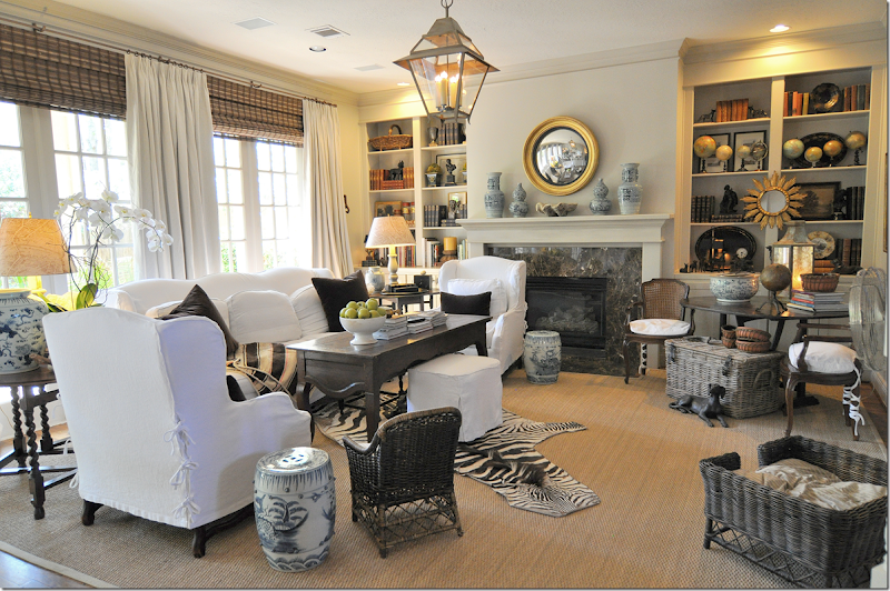
Before picture of the busy looking bookshelves.
Since we were working on the library and having our master bathroom painted, I asked Raul – my painter and all around construction man – if he could do another small job for me. Now that the library is almost finished, I am so excited about getting all the extra books from around the house corralled into one place. I’m trying, really trying to edit things and the books are a good start. One other thing that has been bothering me is my family room shelves. They are just too full, too cluttered, just too-too much. For the first ten years I tried to fill up the bare-looking shelves with things I bought at Round Top and at HADA. And, now, for the last 10 years, I’m trying to edit it all. The picture above is how it looked a few months ago.
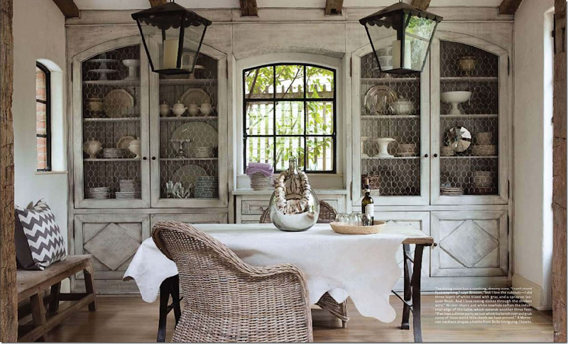
And then there is this photograph. Ever since I saw this picture of Jill Brinson’s dining room with the arched cabinet doors, I’ve been obsessed with them. I kept thinking how much I would love to have those cabinet doors too. They would give my family room some sorely lacking architectural detail, plus the chicken wire would tone down the cluttered look of the shelves. Of course, Jill’s cabinets have a gorgeous paint job and cute lower doors – and the two lanterns make this vignette look even better. Besides all the details that make this room uniquely Jill’s, you can see how the contents of the shelves look muted behind the doors. So, after lusting for these doors for over two years, I asked Raul if he could make them. God knows, I couldn’t ask the carpenter who worked on the library. He was soooooooo sloooooooow. It would have been Christmas before he finished them. Raul took two days.
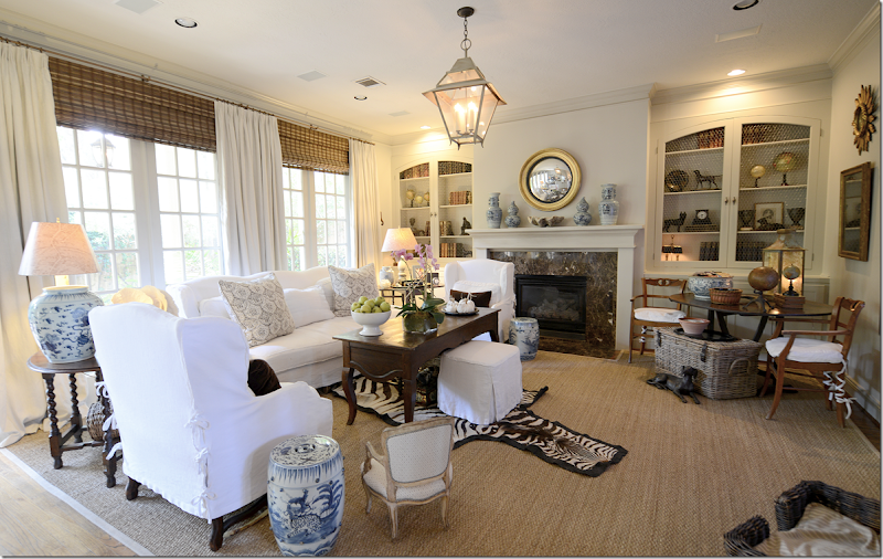
AFTER:
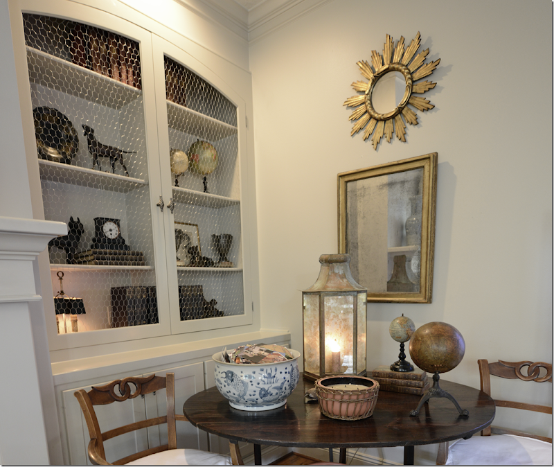
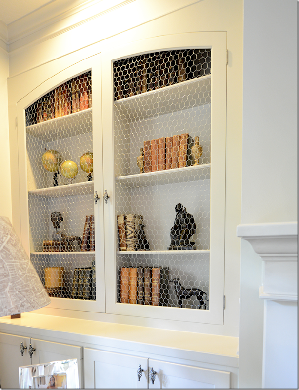
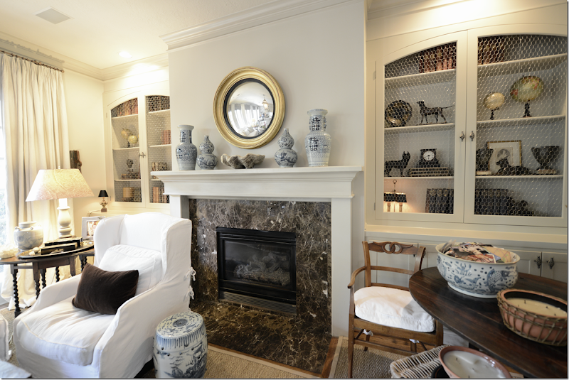
And here is how they look! Raul made two sets of doors and placed chicken wire inside the arched frames. The effect is very subtle, but I do think it makes the shelves look so much more quiet and less cluttered.
Plus, with all the shelves emptied out for the first time in years and years, I could really edit the contents. I removed all the new design books to put them up in the library, and I tried to keep the shelves airy and not so jammed packed and full of accessories.
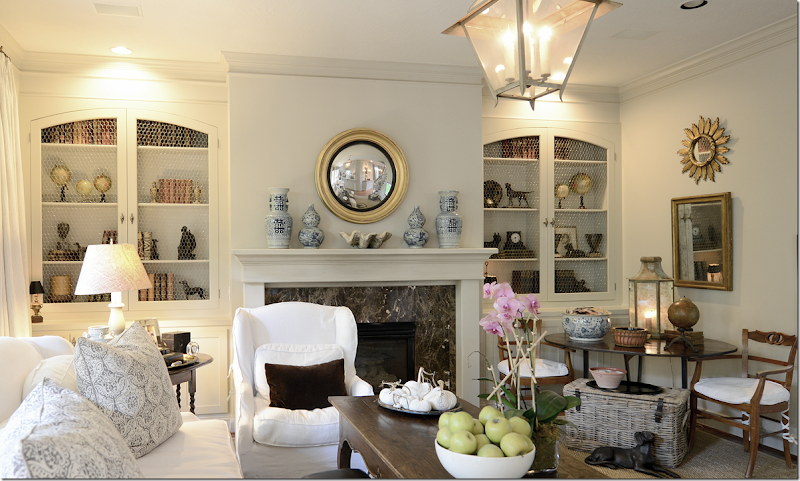
Here’s the right side of the fireplace.
Looking straight on at the right side.
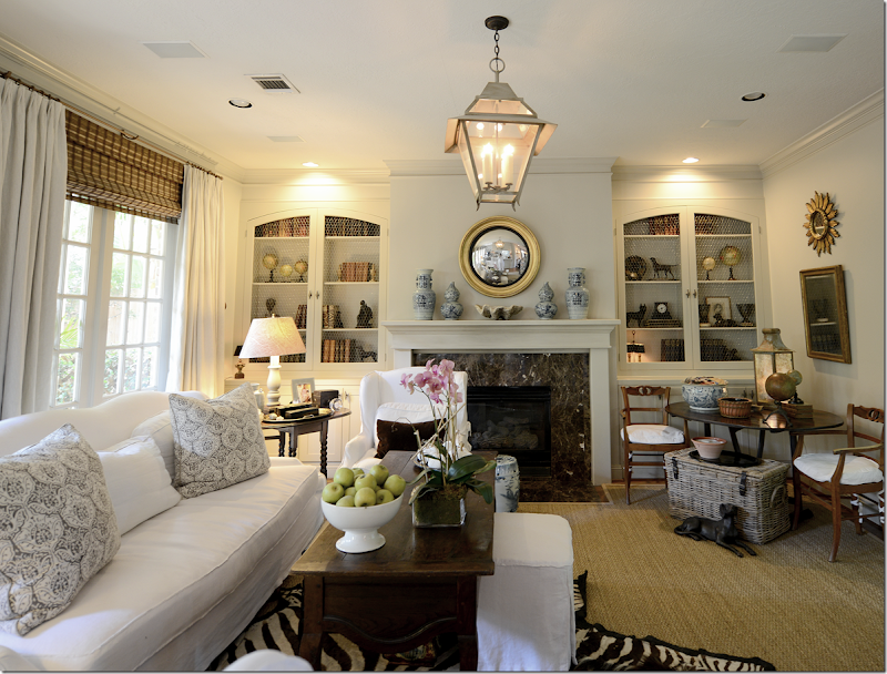
And here’s the other side. Hard to get a photograph from the front of the cabinet.
I like the arches and think they add a bit of interest that wasn’t there before.
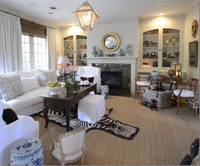
And looking from the side of the room at the left side shelves.
The change is very subtle and I doubt anyone would even notice it. But the room just seems so much neater and less cluttered.
Looking at these pictures, I do see other areas I need to work on and will probably do that this weekend – like moving that basket out of there – it’s holding a bunch of books now, which will soon be emptied. And I probably should put back out the brown velvet pillows now that summer is over, even though I do like the lighter Les Indiennes ones for a change.
And finally, one day, on my probably-never-going-to-happen wish list, I would love to get a new limestone mantel and get rid of the brown marble. I think it would really update the room, and again, it would be so much more streamlined looking.
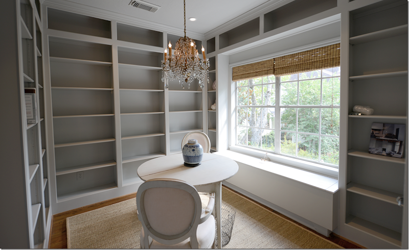
And, here’s a sneak peek at the library. I hate to show anything that isn’t totally finished, but, the room looks so pretty without the books!
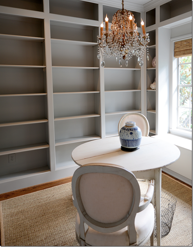
So, here it is! I am slightly in love with it. And now I kind of wish all the colorful books weren’t going in here – there is something so quiet and restful with all the empty gray shelves. But, it’s a library and the books are going in later today. I have a teenaged girl who is coming to help me get organized. She wants to earn a little extra money for her senior year – the prom, the class ring – all those things really add up, which works out perfectly for me. She’ll help me move all the books to this room and then alphabetize them, which is my plan right now, but that might be too time consuming. We’ll see. I want to put all the Beta Plus books on the that shelf to the far right, but the rest of the books will be in order by author.
I ended up getting the small demi lune tables and chairs from the Lone Ranger Antiques who is in Round Top right now. If one day I find I miss having a desk, I can always move things around and put one in here instead of the table, but right now, I think the table will be perfect.
And, I still need to remove the old bamboo shades because Monica is making me a fabric balloon one out of mauve silk taffeta. I have a cushion going on the window seat – which will be covered in the Chelsea Editions large mauve check. The chairs will be slipped in that pattern too. The chandelier that I got from 1st Dibs ended up being the perfect size – not too small. I was a little worried about that, but all is good. Bennett Fans installed four new lights in the room since I decided against lights on the shelves – the room is so small I thought they would look too cluttered. The Bennett brothers are the best, by the way. I’ve added their phone number to the list of “favorites” on the left hand side of the blog, just in case you need a great sconce or chandelier installer. I highly recommend them!
I did end up replacing the doors with these French ones. This one that leads to the storage closet has frosted glass panes so you can’t see into it. After getting a quote from Home Depot for frosted glass doors, Raul just sprayed them for a fraction of the cost and they look pretty professional. And look at that Swedish clock! The Lone Ranger sent that to me as a surprise gift! I was stunned and thrilled. Now, I need to find a working key for it. Also going in the room is something from Ballard Designs – which I can’t tell you about yet! But it’s really an exciting blogger project. As soon as it’s all done, I’ll put up more pictures.
Also this will be going in the library:
I’m getting this darling antique French painter’s ladder that I found online. Most of these ladders are really tall, so I am thrilled I found this one at just over two feet which should be tall enough for me to reach the top shelves to get a book down without having to lug out an ugly old step ladder. Isn’t it the cutest??
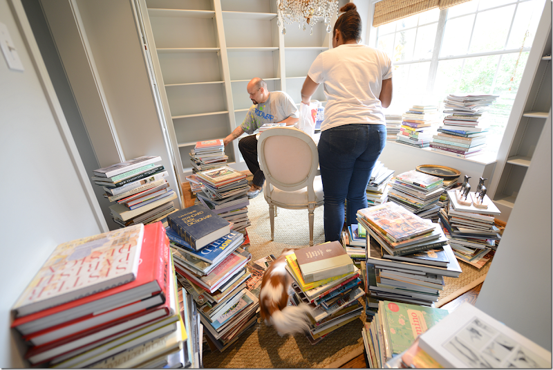
And this is what was going on at my house today. My helper brought HER helper, her uncle James, who works for Ben. We got all the books from downstairs moved upstairs. And then, we put them on the shelves, alphabetically. Next weekend we’ll move the ones from the landing in here – as many as we can. Then, we’ll space them all out. Looks like fun doesn’t it? Can you find the puppy Lucy in the middle of the piles?
So, that’s it for now. Hope you have a great weekend!!!
6,Oct2012
A Few Changes At Home
Subscribe to:
Post Comments
(
Atom
)




Absolutely stunning!!! Brilliant and totally noticeable by the way! You never cease to amaze me!!! Did I mention beautiful????
ReplyDeleteJoni -
ReplyDeleteI love the new arched doors w/ the chicken wire grill. Subtle and very beautiful. And, I like how they complement the curves of the convex mirror. I noticed the new little child's chair....charming! Can't wait to see more of the library.
Cheers,
Loi
Joni, the new arched doors look wonderful and they are the perfect compliment to your newly edited shelves. And the library is looking equally as beautiful, I can't wait to see it when you're all done in there.
ReplyDeleteEnjoy the rest of your weekend.
Kat
Hi Joni, You have great taste and I love your posts. Thanks for the inside peek into your lovely home.
ReplyDeleteI agree with everyone before me. I love the doors on the shelves too and your library is very pretty in its before state. Cannot wait to see the finished room.
ReplyDeleteJoni I think the new arched doors and the more edited look is wonderful. I have always love a well edited room and the lighter bright look is lovely. Your library is great, can't wait to see it brimming with books, you are going to love it!!
ReplyDeleteKathysue
I love the colors in the room what color are the shelves and room?
ReplyDeleteThe arched doors are perfect! They really do add so much to the room. The shelves look much better now that they've been edited down. Good job! Also, loving the chandy in the library. Can't wait to see it all finished. Thanks for the sneak peek!
ReplyDeletethe doors, the library, the macaroni chandelier, and the adorable step ladder. BEYOND gorgeous Joni.
ReplyDeleteThose doors are very, very pretty-subtle, yet they soften the shelves so much :)
ReplyDeleteThis past year I did all my books by color-and I am loving it.
I believe you have a few more books than me, so alpha order would make sense.
Can't wait to see the library in full dress!
I love the arched doors! It is a subtle difference, but really wonderful! Your new library is looking lovely. I am looking forward to seeing it with the new fabrics you've described,
ReplyDeleteSo jealous that you are getting a library! That would be my dream come true!
ReplyDeleteJoni you make interior design look so effortless , and it is all of the small changes that all up! Love the arched cases downstairs and chicken wire..you almost do not notice it! The editing is perfect. I agree with changing out pillows and accessories!
ReplyDeleteI do hope you will come enter the last weekend of my Giveaway of Velvet Pumpkins from Love Feast!
Xoxo
Karena
Art by Karena
Very very nice!
ReplyDeleteI would kill for a library like you have created. But, OMG, what a collection of books you have! Can't wait to see how it all gets styled. It's going to be fabulous!
ReplyDeleteAlso, the chicken wire doors are a nice addition to your family room. Such a nice addition.
Ugh, If I didn't love you so much I would hate you. I can't stand that you keep changing all your rooms and mine stay ugly, unfinished messes. Oh to have you vision and talent I would give my eye teeth.
ReplyDeleteSo gorgeous, Joni! I'm loving the new doors and so jealous of your library too!!
ReplyDeleteYou can NEVER move now and leave that library. Your family room shelves look just lovely...I think I see a Boston Terrier on the right...I like the dog motif (and we have a Boston). Your photography has come such a long way from the early days when I first started reading your posts. Very professional.
ReplyDeleteYour new cabinet doors are so beautiful and Raul did an amazing job! I have 3 questions about this post:
ReplyDeleteWhat is Raul's contact info?
What is the paint color you used in your new Library? (it's beautiful)
fyi: I tried to click on the box you've created for the Bennett fan guys, on the left of your site, and it takes you to a blank page on your blog. Would you please let me know their contact info as well?
I always look forward to your posts and love your blog! You are a talented designer and have a way of educating us about good design. Thank you!
Bennett's number is on the ad - there is no click through.
DeleteRaul's number is 7132981525
I need to look up the paint name, I forgot it. It's a BM though.
The library empty is sooo soothing..... and I envy you the clean slate to corral the books.... be sure and take a picture of the books you decide are not going into the library.... for "full disclosure", LOL. The pictures of the process are going to be a great reminder of how much work this was and how much the project has changed how you live. Enjoy, I sure am.
ReplyDelete
ReplyDeleteDear Joni
First of all: Love your blog ! But have you ever considered to get rid of all the corbeille stuff ? It is so dated and fills the room without purpose. And why not less on and under your beautiful table de vin ? It's not the shelfs but that corner is far too much decorated.
Greeetings from France
Ingris
what corbeille stuff? help me here? the baskets?
Deleteanyone know what she means - lord knows i don't want anything dated!!!!!
and take even more from that table? ok, i might be able to do that. hmm...
thanks for the help!!!
Corbeille - a sculptured basket of fruit or flowers used as design element.
DeleteShe could be referring to the bowl of green applies on the coffee table or the white pumpkins.
DeleteI looked it up too - not sure that is what she means, maybe baskets???? it def. says baskets in the translation. oh well. i'll get rid of the corbeille, if i only know what it is!!!
DeleteCorbeille or vannerie in french simply means "wicker". I was too lazy to look it up in the dictionaire...Sorry for the misunderstanding.
DeleteI referred to all this wicker (!) in the room: under the vine table, for the dog, for extra seating. I believe the room would look much raffinée (refined ???) without them.
Greetings from Ingris
Oh what fun! It all looks so charming. Add a coffee pot to the library and I will take my vacation at your house. LOL!
ReplyDeleteKaren
joni, isn't it a wonderful feeling? of course, I am crazy for all the gray in your new library but just as much, I like your new family room shelves with wire inserts. you have inspired me.
ReplyDeletedonna
Very pretty! Both rooms are beautiful. Thanks for sharing. My favorite posts are all about your house and your work!
ReplyDeleteJust stunning Joni! you are a brilliant designer! I love that you fill your rooms with things that you love! also love following you on instagram and getting all the previews :) perhaps I just missed this but what colour and brand of paint do you use for all your woodwork? its delightful! ~Leslie Sullivan
ReplyDeletei really need to go look it up. it's a BM, all one color only. i'll look for it in the garage.
DeleteWow all kinds of pretty going on over there!! Love the arched bookcases with the wire, what a major improvement. I kept scrolling up and down to see the other subtle changes in the room and anything you did I love, the pillows, the small chair....its all so fabulous!
ReplyDeleteAnd the library is going to be dreamy too......love the color. Look forward to its big reveal:)
yeah, the chair. that was a major purchase. oy. total impulse with lots of buyers remorse.
DeleteJoni I love what you did to your bookcases in your living room! What a great idea to bring in an architectural detail. We’re fixing an open hutch in our dining room to make it less formal, the husband is making doors out of reclaimed wood and I can’t wait for it to be done. As for your fireplace have you thought of simply retiling it? We’re doing the same thing to our fireplace to give it an updated look. As for your library it looks fabulous and I can’t wait to see the after pictures. You’re very lucky to have so much light in a small room love the windows.
ReplyDeleteEnjoy your Holiday weekend!
XXX
Debra~
retiling, that's a good idea!!!
Deletethanks!!
I have always loved this room. The changes to the bookcases look great. After looking at the photo, I think if you removed everything from the mantle (keeping the mirror above), you would get that uncluttered look you are after. Also there would be no competition with the bookcases. Just a friendly suggestion. Love your work! Martha
ReplyDeleteiknow, that's a good one, but........i love how it looks now!!!!!!!!!!!! so many good suggestions.
Deletethank you!
LOVE your family room bookcases...so relaxed and subtle. Library looking great, too!
ReplyDeleteHi Joni,
ReplyDeleteThat's funny I have also been obsessing about Jill Brinson's dinning room ever since I saw that same photo. I have it pinned on my bulletin board by my desk, and also a copy in my purse. I have been trying to figure out if I could have a cupboard built like that in my dining room, or in my family room. I love how yours turned out. The only thing I was thinking I would change about your room was the brown marble on the fireplace, and them you mentioned that you wanted to change it. Yes, I agree that it needs to go. I love your library room. Someday I would love a space to do something like a library in.
What a difference in the bookshelves! The arches and wire really add to them. Love your chandelier and the frosted french door, thanks for the idea of just spray painting it! Is your step stool one of a kind, if not, can you advise where you found it?
ReplyDelete1st dibs!
Deletetruthfully, i doubt they are antique though. i will have to wait to see it in person. just seems a little too trendy with the paris written on it to be antique. that's not how parisians spell paris. sooooo.....ok, i just totally realized it's a fake! haha! i don't care - hopefully it will be sturdy since it's a repro.
DeleteYes, I agree that this is clearly a reproduction. A 100-yr. old French painter's stool would no doubt be covered in a multitude of paint color drips. I doubt that the word "Paris" would be painted on with stenciled letters. It will be a cute addition to your library, but thank you for correcting your description.
Deletei know! actually there are some "paint" spatters i believe. i didn't even think about it until i wrote 'paris' - what a joke!!!!! omg. so stupid.
DeleteI too have always loved your family room. The doors look so beautiful! I have always been a fan of chicken wire on doors, so country French. Can't wait to see the finished library and love your step ladder.
ReplyDeleteJoni I ALWAYS LOVE to see your family room and the pared down look is SO FABULOUS! I feel I must say, I LOVE the brown marble fireplace too (it suits your style, the room and the house) and I LOVE the "Les Indiennes" pillows for any season (please feel free to throw them my way when you are finished with them!). The library is beautiful and I love all the "new" pieces......envious.com!!! xx
ReplyDeleteJoni, such a marvelous eye you have to envision how the subtle bookcase update would improve an already-extraordinary space. Can't wait to see more of the new library... it is so peaceful and inviting now. Love the chandelier. Is the fabric on the chairs a pale blush? (I've been considering doing a living room in soft, pale grey with touches of ballet slipper pink).
ReplyDeleteno, it's just thin muslin. it definitely needs to be redone.
DeleteYour new doors with the chicken wire look great!I love your library and can't wait to see the finished product!
ReplyDeleteBeautiful and comfortable at the same time. And, love the color you've used in your library. xx's
ReplyDeleteJoni,
ReplyDeleteThis turned out beautifully. First, I love, love the arched doors on the book case in the family room. Wow! What a difference and such a talent Raul has for doing such a great job and installing them in such a short time frame. I love the "uncluttered" look, although I confess the shelves never looked cluttered to me.
Your library is so great, I wish I could do that to my little sitting room/library. I will save these images for my "wish list". I really like the sea grass rug and round table and chairs. The little library ladder is perfect. Be sure to share the room once you get all the books put away. Your house is one of my favorites and it just keeps looking fresh and chic.
xo,
Karen
I love the chicken wire doors. We should all edit from time to time. It is too easy to keep adding new goodies; it becomes too much before we realize it. You have given me food for thought now. The library is looking fabulous. I NEED a chandelier just like yours. Once the soft window treatments and slips are installed, the room will be a feminine delight. Cannot wait to see it.
ReplyDeleteXO, Victoria
Joni, the room looks great, I really like the doors on the bookcases, adds a nice architectural touch - and your library, well, that is a very necessary room, wish I had one!! Looking forward to the finished product! ;-))
ReplyDeleteJoni,
ReplyDeleteI am loving everything here! What beautiful changes! The arched bookcases with chicken wire are so pretty & definitely noticeable, love the less cluttered look. Your new pillows are so pretty..I like the lighter softer look on your sofa. Your new library is coming along beautifully, can't wait to see the new slips & roman shades. Your chandy is perfect & I think the Demi lunes are such a great choice....
Heidi
Such great improvements. Love the library even with empty shelves and the chandy is so perfect. Can't wait to see the infusion of the mauve fabric. Your editing in the family room made a huge difference so keep at it. Love the curve of the doors. Wish we all could have a Raul.
ReplyDeleteJoni, I read this post with as much excitement as I would have felt if it were happening to me! Getting proper storage for all of my precious books has been such a challenge, and of course, I keep buying more! BTW, if you haven't purchased the new Fortuny book, you MUST. It's fabulous.
ReplyDeleteThe new arches and chicken wire are a perfect touch to your room. Being one that has difficulty editing the beautiful things I love, I didn't think your bookshelves were cluttered, but I do agree the change is nice.
And that library! A dream come true! I put a chair and ottoman in mine so I could curl up with a book. My library is not nearly so nice, but it gives me something to strive for!
Good job all around!
I do not think your room was cluttered 'before' BUT those doors are stunning! You have been decorating for some time now and I can see that you are noticing the abundance of a certain sized accessory, this makes the room feel cluttered to you. That is why someone suggested clearing off the mantel. It becomes a visual overload to have too many pieces similar in size and placement around the room (for us with trained eyes, we notice). They become the only element that brings our eye around the room in a sense, we look and pick up all similar sized or displayed items. Sometimes it is good to get another set of hands to do a table top or a wall display to change out the feel in a small way.
ReplyDeleteMy IDEAS: Just suggestions because of course they reflect my taste, and you have your own visions, but thought I would share. I thought of the subtle arch in the center with two side plain pilasters for an over mantel and then distressed mirror in the center. That way you have reflection (some designers think you should have a mirror in every room). And a clean mantel. I am going to layer my over-mantel with a mirror hanging in front, or a nice carved piece (I was motivated by your new clock in your library). This reflective layer is good when you don't have too much glass as in a chandelier (which you don't).
And your living room is evolving into quite the layered work of a master!
Now for the To-Kill-For Library! LOVE is not a strong word for how I love that room! I am so happy for you that you will have that room to peruse for a book you need to view! WOW I think I would put a day bed in there and NEVER leave it! I too have had books 'take over' the house, I purged down to half and need to halve again. For a lover of books, you really made a beautiful place to honor them, and to have them within an arm's reach.
I enjoyed reading about how that room came about and how you are so close to its completion! Thanks for sharing!
Thanks so much!! yes, I would kill for an over mantel. if we ever did change up the fireplace, i would probably do one, but not a fancy one, just a plain one.
DeleteJ
Love it all and beyond jealous of all your bookshelves. I think the new arched shelves with the chicken wire in the living room are a subtle yet lovely improvement.
ReplyDeleteWonderful job Joni! Your new doors are the perfect additon to your bookshelves. And your library! It is beautiful just as it is. I can't wait to see the new fabrics in place. It will be a dream room!
ReplyDeletePlease send Raul my way!! I need so much done at my house. Love the new door on the shelves. I have also been looking at my rooms from different angles and am not thrilled with all the stuff I have out and on shelves, so I am doing a bit of uncluttering as well.
ReplyDeleteLove your library. Can't wait to see it all done. I first found your site when you did a post a few years ago on living with books, and I've been a follower of your blog ever since. The inspiration photos were amazing and I still have the page bookmarked for reference.
oh i love the changes. please tell us the name of the gray paint used for the family room and the study. i understand how colors can look different in different light. i'm in western new jersey in a old farm house on a farm with lots of farm acreage around me (but still only an hour from nyc) . and you are in in sunny texas. i need a gray that is restful but not gloomy.
ReplyDeleteand mauve check window seat. i can't think of anything more perfect.
in the sprit of someone who appreciates all the effort you put into blog-and i looked forward to reading it while i was living in rome for 3 months last summer and i mean really looked forward to stave off homesickness- i want to say i think the table in the corner of the right hand side is too styled. and the zebra rug is so predictable.
thanks for everything. for all the hard work and taking your readers seriously.
I agree with several of the other comments. Your zebra rug needs to go into storage for a while or, perhaps sojourn with your neice or your daughter. It no longer adds the panache it once did.
Deleteantyhing to the room.
no!!!! no!!!! not the zebra!!!! I loveit! haha.
Deleteno one likes the wine tablescape. not sure what i can do with it.
Disagree with you, Lorraine and Charlotte. I love the zebra rug. You may both find it predictable or lacking panache for yourselves. But is is C L A S S I C in this room and should be left alone. And why always look to replace? Some loves affairs last. I hate our throw away society.
DeleteB
I love the new cabinet doors...and I DO hope you get your limestone mantle some day!!
ReplyDeleteJoni,
ReplyDeleteLove, love, love what you have done. Those arched doors add so much. Coupled with the editing, looks fabulous. Eagerly awaiting the finished library. Can you remind us again, what paint color you used?
Ciao.
Joni,
ReplyDeleteI love, love, love it!! I too have been looking at that same picture and want to do that not exactly but similar in a room in our home. You continue to inspire me.
Joni,
ReplyDeleteYou have a gift for creating a room that is elegant yet inviting and comfortable, interesting and collected every room you create seems to have a history. I adore your style. The change to the bookshelves in your living room is brilliant; they add yet another layer of texture while also created as you said "architectural interest". I miss the cane chairs in the corner, flanking the round table I thought they grounded the lamp table opposite between the sofa and chair and the zebra perfectly. Its amazing how you can make such subtle changes to a space and give it a different feel -
Andi
HMMMN. didn't even notice that!!!! they are in my entry hall now - because those got slipped awhile ago. wow. that's funny, i didn't notice that!
DeleteI agree with everyone else. The new arched doors with chicken wire look great! And, I agree with another poster about the color or your current fireplace surround. I like it! I think Dark Emperador (sp) is always elegant.
ReplyDeleteI know I am probably alone in this, but I think removing the zebra rug would make the room less cluttered.
The library is beautiful.
I love the zebra rug.
DeleteI really like the edited shelves! Each item becomes more important. I wonder if you've ever considered painting the backs of the bookshelves a midvalue taupe? It might nicely balance the marble on the fireplace which I think is a nice masculine counterpoint to more the room. I'm also wondering if you've tried placing the furniture using the fireplace as the focal point rather than blocking it. The round table in the corner could sit between the two chairs opposite the sofa. I think that would be nice for winter.
ReplyDeleteLove the color of the new bookshelves!
Painting the backs of the bookshelves is a great idea provided it does not obscure the items on the shelves and keep them from standing out individually as they do now. I find the fireplace surround a bit "jarring" against the white of the furniture, light walls and window treatment. It's also quite busy. If you are going to install a limestone mantel, why not use a limestone surround?
DeleteI would do the limestone surround. the chairs - I would love to do the arrangement like that - but ben's afraid it would block the tv that way. i might try it though soon! it would look best that way, I know.
DeleteIt is going to look wonderful Joni.... the library already does... Can't wait to see it all finished... I love your renovations... it always inspires me... Every time I look at our slip covered chairs in the sitting room.. I think of you... :)
ReplyDeleteEverything is simply lovely! The new doors in the family room, the editing of the shelves, the library and all the choices you're making there. And thanks for sharing it all with us -- I know it takes a lot of time to compose such wonderful blog postings.
ReplyDeleteBy the way, can you share the color of the paint used in the library? It's beautiful.
Anne at meadzmail@aol.com
Anne, the paint color is grey.
DeleteYes, I can see that. In an earlier post, Joni mentioned that she was thinking of going with two Farrow and Ball greys - a lighter for the walls, a darker for the shelves. I was hoping to know what her final choices were and the specific paint names -- she's usually doesn't mind sharing specifics.
DeleteJoni, I can't really add anything that others haven't said but I wanted you to know that the I just kept saying "stunning" as I looked again and again at the doors and chicken wire added to your bookshelves...Your house is already so beautiful but with each change it becomes, well, "stunning"! Can't wait to see the finished library - it is so beautiful now that I know with your expert hand I will once again be awed..Thanks so much for inspiring so many of us with your talent.
ReplyDeleteHugs,
Sharon
It all has come together beautifully, Joni! Love the chandelier in the library. I'm a huge fan of a touch of crystal elegance. The new arched cabinet doors are stand alone accents in their own right, but the addition of the chicken wire raises the bar. I have been contemplating reworking a small primitive Cypress bookcase with chicken wire doors to place on top of a formal marble top sideboard. As you have shown, It's a great look!
ReplyDeleteCaspar & Susan---I agree! Keep the fireplace as is. It really grounds and warms the room! I'd paint the insides of those newly-doored shelves a slightly darker color to add some depth. As for the vintner's table: I'd remove all the accessories except the lantern, the large basket and the blue & white bowl, and I'd fill that bowl full of fragrant, white flowers. But then, that's me. Don't get me wrong---I think what you have done is gorgeous!
ReplyDeleteJoni, everything looks beautiful! How much fun for you... Question. Where did you get your chicken wire???? Thanks and have a great Sunday
ReplyDeleteAll the best,
Pam
Home Depot I think. it was hard to do - to get it lay straight. they put it on and it was wavy and then had to pull it even tighter and renail it.
DeleteFor those of you who prefer warmer tones in your decor, Van Dyke Restorers offers chicken wire made from brass. Now THAT would make some classy chicken coop!
Deletehttp://www.vandykes.com/s3380-sol-br-chick-wire/p/203921/
Everything looks wonderful, Joni! My favorite thing I've ever done in my home is to update my bookcases as well. We replaced them with ones made from Pecky Cypress and they also have the chicken wire doors but on the bottom. It has added so much warmth and architectural detail in that room! It's the room we live in constantly so I love that WE actually get to enjoy it! I think your doors and wire added SO much to your beautiful room! And I'm also wondering if your Raul is MY Raul who we can't find anymore! LOL! We had the most wonderful man named Raul and he did marvelous work and was very reasonable! If it is…please tell him to give us a call! We've got lots for him to do…especially at my shop! I'm like Loi, I noticed the wonderful child's chair and loved it but where is the wicker one? I hope you kept it! It was great too! i have mine out in our family room as well! Love it! Love the library and know it will be well loved! Thanks for showing us your beautiful home! Hope you have a fabulous weekend!
ReplyDeleteRaul in HOuston? the painter? i left his number several comments earlier . call him.
Deletethe wicker chair, yeah, i love that. i can't even talk about it. the baby - Lucy, Lulu, the terrorist who chewed up the zebra, the dog bed, half my books, and that baby wicker chair. she would just chew everything. and tucker and riley too. i have another cute wicker chair upstairs and might bring that down and put the new one in the library. which is probably my plan.
The bookshelves in the family room looks amazing!! A subtle but huge difference in that room! I am in love with the library as well!! Very happy for you! Well done!
ReplyDeleteI love those cabinets with the chicken wire! And can't wait to see the finished library....I'm glad the book jackets will be original and not a bunch of white or gray ones....my eyes would just glaze over if I had to look at hundreds of similarly toned books! That chandelier is GORGEOUS!!!
ReplyDeleteI agree with everyone - lovely, beautiful, gorgeous.....Can't wait to see the unveiling of the library when it is finished! By the way, I love the Les Indiennes pillows on the sofa, even for winter. I noticed them immediately and really like the change. They help to enlarge that space to me, as not as dark and bold. Just thought I would toss that in.....I know once you get all of your books arranged, you will be having fun downstairs in the all areas where you previously housed your books (under the tables and all.... I know the feeling!). One thing always leads to another. Congratulations, and I know you will enjoy that library 24/7.
ReplyDeleteThe cabinets look wonderful Joni! It is a subtile change but you did the right thing!
ReplyDeleteAnd oh yes your library will be a cozy place to read!! Love that light paint color you used here!! And I can't wait to see the balloon window treatment Monica made!
Have a great Sunday Joni!
xx
Greet
Looks great! I also noticed your white pumpkins are out! I definitely need to get some for myself!
ReplyDeleteReagan
I love it all! Please share your paint colors!
ReplyDeletePaula, The living room is white and the library is gray.
DeleteThe arched cabinet doors look fabulous! Your home is so beautiful! Can't wait to see the final reveal of the library!
ReplyDeleteHave a GREAT Day!
Fabulous! You have the inate ability to achieve my dreams.
ReplyDeletePlease share your slipcover source and the dimensions of the library room
Joni, The room is looking wonderful! I love the little ladder too.
ReplyDeleteWhere is the fall scene on the side table you showed us a few weeks ago? Another bait and switch? For the purpose of plugging your sponsors? Not really how you live in the space?
ReplyDeletesnarky snarky. yes, I explained that the company sent me those pumpkins so i could show them off in my house. but i really wanted the white ones. so i took the pictures - as i was asked to do so that i could get the giveaway for the readers - and then ordered and bought and paid for the white ones. i gave the colorful ones to my sister whose house is more colorful than mine. i already told you all this!!! remember? I know you do....
Deleteif i had something to hide, don't you think i would have left that table like that ???? I guess it was a bait and switch in a way - but the truth is - i didn't even think about the getting white pumpkins instead until after i took the picture and wrote the article and saw the white ones in their catalogue.
Joni, you don't have to explain yourself. Ignore Anony like you would ignore a noisey toddler. Give them too much attention and it only incourages them.
DeleteB
Hi Joni!
ReplyDeleteThe new arched doors with the wire inserts look gorgeous. I think if you edit the family room a bit more - remove some of the objects on the wine table, the coffee table and the mantle, and move the large basket to another room - it will indeed look wonderful.
Your library is absolutely perfect. I love that you decided to furnish it with demilune tables and French chairs. The curved furniture balances all the straight lines in the room (shelves, books, windows, doors, etc.). The chandelier is perfect. And that amazing little ladder - I want one!
Joni, I love the doors!!! I don't think I'd leave my house if my home looked like yours. :) I love your living room and know that you have that fantastic courtyard so close....Ahhhhh!!!! (Not to mention your kitchen!)
ReplyDeleteI can't wait to see your library. It's beautiful already!!!!!
OMG OMG OMG- Joni - J 'adore all the changes- chicken wire doors and the office is To Die For Gorgeous!!!!!
ReplyDelete-linda,ny
Joni - Those curved doors are fabulous. Love how you changed the styling of the shelves. Streamlined but still interesting. Can't wait to see the finished library.
ReplyDeleteHow exciting! Love the cabinet doors in the living room, and I like your Emperador marble there, too. The library is SO EXCITING!!! Can't wait to see how it all comes together in the end for you.
ReplyDeleteI am not a decorator, but I am a Texan (which means living in a very warm climate). Even so, we make our fireplaces the focal point in our rooms. I think it makes for a better arrangement, even if you seldom light a fire. That being said, we have a fire in our fireplace today! It's that cool! Yay!
ReplyDeleteThe doors look great and I am lusting for the library with all the shelves!! You have inspired me with an idea for the small room which I am planning to make "mine".
ReplyDeleteAmazing-simply amazing. I loved the "before" because I loved all your artifacts. Editing-
ReplyDeleteless is more" worked in this case. I am going to do this in my den-smaller scale of course. The arch in the cabinets-the wire-just love it. The room is sooooo BEAUTIFUL! Now if only I could decide on a great color for the den to begin- I would be on my way. Thanks for sharing your talents. Classy-classy- taste! Blessings.
Very lovely -- all of it! Looking forward to seeing the finished library. Thanks for inspiring us to edit!
ReplyDeleteI am always so happy when I open my email and there is a post from you! I love the new doors Raul made for you, they are beautiful and they make the room! I also love your new library, wow, stunning!! At first I thought "How dare she..." but I have to agree with the comment made about the zebra rug, I would remove it, they have become so predictable. (I imagine it's because everyone is copying you!!) I love your style and your generous sharing with others.
ReplyDeleteYou are amazing and I so appreciate your posts! JoAnn
...simply wonderful...i especially love the beautiful clock in your library...and the sweet little chair in the family room...i agree with others...it would be very hard to move from this pretty place...blessings laney
ReplyDelete...simply wonderful...i especially love the beautiful clock in your library...and the sweet little chair in the family room...i agree with others...it would be very hard to move from this pretty place...blessings laney
ReplyDeleteJoni - this answers the question I was asking in my Dear Miss Cote de Texas letter! How to redo my shelves - I think I even included that photo of Jill Brinson’s dining room with the arched cabinet doors! I think you've done a beautiful job with the cabinets in the living room and am excited to see your finished library!! Gorgeous!
ReplyDeletewow! it just looks so nice. you make such a fine example of going slowly and doing the right thing for each spot.
ReplyDeleteI love the newly edited version of your lr shleves. They look FABULOUS!!!it really makes the room so much more airy and sophisticated. It is hard to edit our own spaces, I think. The library will be gorgeous as well.
ReplyDeleteLove the new doors! I want to copy them in my dining room. Good luck with the library!
ReplyDeleteVery pretty, subtle changes. Have you considered finding another spot for the large slipped chair that partially obstructs the view of the fireplace? I think it would look so lovely and open without that visually heavy piece there. I agree with another commenter that the giant basket under your lovely table to the right might look better in another spot. Love that you have switched out the pillows on the sofa. Looking forward to seeing the completed library.
ReplyDeleteI'm loving the changes.So fresh! I like the sofa pillows, but I know what you mean about darker colors for fall.I am liking a bit of pumpkin color here and there myself.Just a touch ,with a hint of animal print thrown in.
ReplyDeleteLove your library, your new cabinet doors and your style in general! I always enjoy my emails from Cote de Texas. Looking forward to seeing the mauve curtains - I know lavender is going to be popular, so is mauve, I suppose. I'm still keeping the neutrals, though the taupe color I just painted my front door has purple undertones. Have a great week!
ReplyDelete-revi
www.revisionarylife.blogspot.com
I love the new doors made by Raul! He did a beautiful job. Also love the new Les Indiennes pillows! I prefer these over the dark velvet ones. They are a departure from the ones on your two chairs yet tie everything together. Keep them for the Fall/Winter!
ReplyDeleteKat
Raul did a wonderful job with the doors. It's just what was needed and I really like how you've rearranged the shelves. Personally I felt it was too cluttered before but we change our styles as time goes by. I know my shelves were overdone before and I've weaned myself of having less on the shelves now also. Please don't change the mantle or the stone because it's so elegant looking.
ReplyDeleteI along with the others are looking forward to what color you used in the library. I love the chandelier in there...excellent choice.
This comment has been removed by the author.
ReplyDeleteok, i am having a major anxiety attack. the books are freaking colorful!!!!!!!!!! the pretty gray library is now - one huge colorful place!! yikes!!!!!!!!!
ReplyDeletei think i made a mistake with the mauve/lilac. i think i should just do it with an ivory shade an gray checks instead. just really quiet. i could always do the guest room with the mauve silk - so.
OR - should i make curtains for the shelves like Pam Pierce did in her house?????? i could cry right now.
where is Dear Miss Cote de Texas when I need her?????
Okay, Joni, don't freak out and don't cry! Here's what you do - just live with the book-laden shelves for a few days. You're not used to seeing so much stuff in the room. It's been empty for awhile and you got used to the emptiness. Then the shelves were built and painted and you got used to the room with only the shelves. Now you just have to get used to the books on the shelves.
DeleteNo, do not hang curtains on the shelves. They won't look right. Also, wait until you're used to the shelves filled with books before you make any decisions regarding the upholstery/curtain fabric. One thing at a time.
I think it will all be fine. You just have to get used to it.
Joni, first, get a good night's rest. Then tack your mauve check fabric up on the window to see if you like it. If not, use it in another room. Yes, books are colorful, but that's ok. Get some rest and you'll know what to do.
DeleteJoni, I know the feeling when you spend so much time, money and effort and have a vision in your mind's eye but the reality turns out differently. Before spending money on a lot of fabric to drape the shelves, hang some sheets up to see if you like the look. The fabric, though pretty, would be dust catchers which is why I don't have bed hangings which I would love to have. Another thing you could do is reorganize the books according to color rather than author and title. While you would still have the color, you would also have a more orderly look. I agree with you that if the books stay in place, a quieter fabric would be better.
Deletethanks y'all. i think i am going to change the fabric color. i've thought about those colors from the start. and i'm thinking i will use the lilac in the guest room. it could use new curtains anyway. if not, then i'll just sell it or something. but i am thinking the room just needs the ivory shade and the gray checks, kind of like my dining room. just really quiet. i refuse to do the books according to colors because the whole point was to be able to find a book easily. like - the other day, i couldnt find the kasler book and i looked for it for an hour. that happens a lot. now it will be much easier if they are alphabetize by author or subject matter - like, all house beautiful books together, all vogue books together, all bath books together, all bedroom books together - for those books who the author is an unknown. thanks for listening.
DeleteJoni, for what it's worth, I LOVE the bamboo blinds so you don't NEED to buy any more fabric! I have always loved the continuity of seagrass and bamboo blinds throughout the "Houston houses". Historically, books were always protected from the sunlight and you don't want to get too hot when you are working in there in high Summer? Libraries seem to suit simplistic decoration rather than too much fussy/pretty decoration, I suppose the "colourful" books provide the adornment, as you found out when you were stressed out at 6.44pm on the 7th LOL!!
DeleteI want to reply to your last comment Joni. When you live with black,white, beige and white for so long, color seems such an INVASION! Let it sit, live with it, and I hate to say this(because it is work), but you can always make vellum book covers for them, softening the harsh colors if you need them softer. You can always add the mauve as a wall paint behind the books (a softer tone) if you want to carry the color around the room.
ReplyDeleteI painted my walls in pale aqua when I got to my house in Florida. I almost freaked when I saw how 'much color' I was going to live with! Circumstances made it so I could not paint again... so after 2 yrs living with this color, I love that I gave color a chance!
Your design books are not going to be quiet! Design is all about excitement and passion for interiors, a bit of color noise seems appropriate to me.
I just want to say that I am envious of your book collection!! The "purging" of your shelves looks fantastic and I love the new door and wire on the doors. Looking beautiful! xo
ReplyDeleteJoni...I love the post about your house more than any other post you do. Yes...I do love the super detailed post that you go to great lengths to prepare but to see what YOU do is the best!!!!
ReplyDeleteJoni- chill- your books wil be part of the charm! The room cannnot be swedish/belgian totally empty, silly girl!Wait until all is done. Take a deep breathe and have a good night's sleep. I concur with Stacy's comment-love your house posts best as well!
ReplyDelete-linda,ny
I love the new doors. They really add extra charm to the room. And the library, swoon! Love that you put a table in there instead of a desk.
ReplyDeleteThe anticipation of your library is just killing me! I can't wait to see the finished results and I agree....those shelves are simply stunning...empty
ReplyDeleteLove the library
Joni....I live for your posts and am so glad that you posted a house update- they're my favourite! Have you considered colour co-ordinating the book binds? I recently helped my mum style her library and we put all the red,blues, blacks and white book binds together and it's such a cohesive look. I can't wait to see the library updates...please don't leave it too long (p.s in case your wondering how long is too long.....anything over 24 hours is too long) I love the chickenwire and the library.
ReplyDeleteI have a library and I love it - my favorite room in the house. Your library looks lovely! Books are glorious, colorful, and weighty - you may find yourself adding a dark small pillow to the window seat or some other darker touch to that area to even out the room. I always have a touch of black in every room and have had for decades. I learned that early on! I think going with grey is good - you can always add the mauve or lilac somewhere in another way. Grey is a good base. I really like the new cabinet fronts with the wire - good idea that makes a real difference. I like all you accessories - I don't think anything looks trite or trendy - it all looks very classic. Thanks for sharing the process and pictures - decorating is so fun!
ReplyDeleteJoni. I enjoy reading your blog very much. Would you please do a huge favor for all of your devoted readers and just try putting the sofa facing the fireplace? Right now the room feels so heavy on the left side I am afraid your foundation is going to crack. I think that's also why you have so many accessories on the wine table; you are trying to balance the visual weight of the room.
ReplyDeleteAs for the library, before you do anything ridiculous like covering the books in white parchment, go back and look at all the incredible library photos you posted. A library should have a certain degree of authenticity don't you think?
I agree. It looks like all of the furniture was moved to one side of the house to paint the opposite side.
DeleteReally fantastic designs and looking very stylish.. This blog is really a worth sharing.
ReplyDeletehttp://www.kadrium.ca/
Soooo Beautiful! Will you tell us the paint color of the library? And where you got the precious little child chair in your living room? Thank you!!
ReplyDeleteLove the shelves! I learn so much from your posts. I also enjoy reading other comments: sometimes agreeing and sometimes not. One of the comments suggested moving the sofa. No, I think that for winter, move the white chairs to the opposite side of the sofa with a table between, opening the view to the fireplace (which I think was your own advice when commenting on another house??). Perhaps the round table would fit opposite the fireplace, but then again, not sure how much room it would require. At any rate, leaving it as is is perfectly beautiful. Isn't it fun to "play" with rearranging furniture?!
ReplyDeleteHugs.
Why is it that I am always drawn to your family room? Perhaps it's because it is comfortable and elegant at the same time. Would you share your paint color with us. It's time to paint my family room and would love it to be painted the color you used. YOU HAVE INSPIRED ME. By the way, I would really enjoy you doing a version of HIGH/LOW of your room for us budget conscience followers. The sofa, tables and lantern are all to die for.
ReplyDeleteWhat was the BM color used for the shelves?
ReplyDeleteJoni, the cabinets look fabulous. You have great taste. My only recommendation is that you seriously edit. If you had less stuff, everything could breathe. Space and air are the ultimate luxuries.
ReplyDeleteAbout the books: I saw on a blog somewhere where the person arranged her books by color. That's an idea. Another alternative is covering the books in kraft paper for a cohesive look. You'd have to label the spines.
First, I LOVE the bookshelves! The doors, chicken wire and editing really quieted the space - - well done!
ReplyDeleteI second previous comments . . . I think the table on the right could use more editing. The chairs and table themselves are lovely, and to my eye the table only needs a few objects on it.
I also adore the library! The ivory shade/grey check fabric changes sounds wise. Thanks for sharing your frustration with all the color once the books went it . . . it helps to know that someone as experienced as you has those kind of moments! Seems that happens to me with every project, sadly.
Can't wait to see the finished product!
Jennifer
Hi Joni,
ReplyDeleteThis problem with the colorful books is so funny! I wondered when that was going to hit you. Normally, I think it is an awful idea to have covered books in neutral dust jackets as props because it suggests that you don't really read them. However, in this case, I think it is imperative to cover them.
Here is why. The use of colorful, printed dust jackets is a relatively modern invention. Even in the early 1900's, most people did not have enough money to buy books. Hence, the "need" for any civilized American town to have a public library. People who did have the money to have a library at home, also had the money to have books covered in leather in their choice of color.
You have a library designed to emulate a French libary in the 1700's or 1800's. There would have been no dust jackets on books in such a room and it is probable that all the books would have been matched or at least in matching sets.
My suggestion: Cover your books in a neutral color of your choosing - perhaps even a mauve to compliment the other colors in the room. Then purchase pre-made labels with a gold border to pick up the gold in your chandelier. Have one of your teen-age computer gurus compile an Excel file of all your book titles with author's last name. These names and titles can easily be printed on the labels and affixed to your books. You will know what you have because it will be alpha by author. AND, you will have the calm, soothing look you wanted for this room.
Since the books will be arranged by author, simply removing the existing dust jackets should suffice to calm down the look. The titles will still be easily read, the colors will be mostly muted leathers or cloth, but not identical which would look terribly boring imo. Books are special and unique with personalities of their own, no need to homogenize.
DeleteLOVE LOVE LOVE all the changes!
ReplyDeletexo xo
Beautiful Joni...details always make a difference and keep us going when we can't always do a entire room! What did your painter use to paint the french doors to look like frosted glass? Thanks! Kelly
ReplyDeleteDear Joni,
ReplyDeleteLove all the work. You mentioned that you don't like the marble around your fireplace. It's pretty easy to hammer out and replace if you want a more neutral stone. You can do it inexpensively and put some pale travertine or honed calacatta tile. I stacked calacatta in a straight brick pattern around mine and am pretty happy with it. I like it better than a slab look. It took less than a weekend to do. That way you have a fresh look without sinking $$$$$ into a limestone fireplace. You could also use white cobblestone (made from limestone) like a cotswold fireplace also for a more rustic look (perhaps do some restyling to the wood trim)
Joni that is such a subtle but nice change. I especially like the arches because the light falls in an arc above the shelves. I have a question - do you have a plug for that one small lamp on the shelf to the right of the fireplace?
ReplyDeleteI think that is so clever, and I love the look of a lamp instead of overhead lights inside the shelving. Layers of lighting.
The library is coming right along and I can't wait to see the finished room! I can't redecorate right now so I shall live vicariously through you!
Best,
~Pam
Joni, those new arched cabinets and the chicken wire inserts in the doors are gorgeous! Jealous! But not really, just happy that you are getting what you want and that I can have my very talented hubby copy them eventually! Just kidding! But not really. I have been planning on creating a similar look in my dining room with a built in sideboard and two cabinets on either end similar to your bookshelves. Just beautiful! And the library! Amazing! You never fail to delight and surprise. Love!
ReplyDeletePlease share the name of the wonderful color you painted the bookcases in the library. I am dying to know because I think it is the perfect shade to salvage my dated black hutch. I am trying to get the hutch painted before the family from both sides comes for Thanksgiving. Many thanks!
ReplyDeleteGinger Webster
Loved the changes made by the arched doors and the mesh (?) over them. Such a pretty transformation, subtle and very effective.
ReplyDeleteYour home is just lovely! I am inspired by your shelving ... such a soft, beautiful look! A few questions... how tall are your ceilings? I would love to find a lantern just like yours, do you know where I could find the closest match? I also love your rug ... how can I find one like it? Love the curve on your sofa back too ... love it all!!!
ReplyDelete