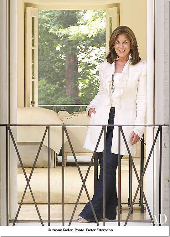
Hooked on Houses recently got a hot tip about a house for sale in Atlanta’s tony Buckhead neighborhood. A Sotheby’s listing, the house is notable for being designed by the much respected Suzanne Kasler. Kasler is at the top of her game these days, with a design book out:
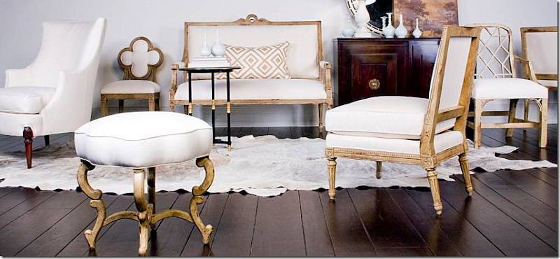
And her furniture line at Hickory Chair:
Her new fabric line at Lee Jofa:
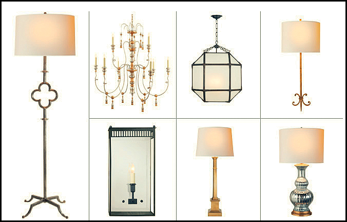
And, her lighting designs at Visual Comfort:
Then, there is her art work at Soicher-Marin:
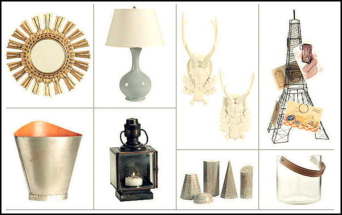
And her cute designs for Ballards:
And finally, there are her rug designs for Safavieh:
Whew. Kasler, if you couldn’t tell is an extremely talented Type A personality. She is also somewhat shy and quiet, as we discovered on the Skirted Roundtable HERE. She had an interesting childhood. Her father was a captured Prisoner of War during the Vietnam War, and he, along with Senator John McCain, was held captive at the Hanoi Hilton, tortured there for over seven years. Her father Colonel James Kasler is a true American hero.
I love this picture of Kasler running to greet her newly released father after all those long years. At the time we interviewed Suzanne, we had no idea about this part of her history – and she didn’t speak of it to us. Still, the experience surely shaped her personality.
Kasler obviously inherited many qualities from her father – you don’t reach her level without being tenacious and determined and singularly focused on your tasks. She is based in Atlanta, and earlier in her career, she was featured in southern magazines such as Veranda and Southern Accents. But as her career took off, so did her exposure, with features in House Beautiful, Architectural Digest, and Elle Décor, amongst others.
It was her cover story in House Beautiful in 2008 that caused a lot of chatter on the design blogs. The house she designed was beautiful – a mix of traditional and Swedish furniture, with youthful accents such as sunburst mirrors and linen fabrics. When Hooked on Houses showed the real estate pictures – I was thrilled to finally get a chance to see more of the house because the cover story was so limited in its scope.
When it first came out, Holly from Things That Inspired and I tried to figure out the layout of the house from the pictures. In fact, Holly wrote a story about the house, trying to piece together the floorplan – armed with then new photographs from the architect’s web site. Read her story HERE. Now, with all these real estate pictures, the guesswork is over.
And, as with the recent Reese Witherspoon real estate photographs, it is fun (for me, that is, and I hope for you too!) to see the key differences the stylists made to the actual house. Again, it is a real lesson to see how talented the magazine photographers truly are. Frances Janisch took the beautiful photographs for House Beautiful. Additionally, it is interesting to see how much of the house Kasler decorated, and how much of the large house that she didn’t.
Spitzmiller and Norris were the architects. It has six fireplaces, an elevator, 6 bedrooms, 8 baths and 2 half baths, a full basement with a recreation room and a wine cellar. There is also a full kitchen, exercise room, and teen suite down there (must be nice.) The house is about 9500 sq. ft. and was built in 2005.
The dining room, one of the prettiest rooms in the house, made the cover. Not sure if this was Kasler’s first national cover – but it was certainly a huge honor.
The house, a Normandy inspired brick beauty sits behind wooden gates. Notice how cute the gateposts are with their own roofs!
A close up of the façade. On Hooked on Houses, the commenters had an issue with the shutters being only on one side. Gravel drive. House Beautiful said the owners also were the builders of the house. While the house looks like a two story – there is a huge surprise out back.
It is actually three stories – with a huge basement. This really is strange to me in flat Houston. We don’t have this style of house here, though it does appear normal for hilly Buckhead. The master and 3 other bedrooms are on the top floor, while a large guest suite is on the main floor, right off the balcony and a teen suite is on the basement level. All three rooms are on top of each other – on the left side of the picture where the bay windows are.
This image of the front entry didn’t make the magazine, but you can see how Kasler styled it. She pulled the beautiful Swedish chairs next to the door and added a series of prints.
And today. The major change throughout the house is the art work. Obviously the owners collect modern art – and Suzanne didn’t display that. OR the owners have just added onto their collection throughout the past four years. Still, I miss the four prints next to the door – and the two Swedish chairs, which have now been moved across the hall. To the left is the library and staircase hall, and to the right is the dining room.
For the magazine, a tight shot of the dining room which is a beautiful room with a fireplace and tin sconces. The story that Suzanne told the magazine is that they found only three Swedish antique chairs so they added three others. Yet you will see that really isn’t how it is now. The chairs and curtains are in Clarence House – “Arts and Crafts” in the green colorway. The Swedish chairs are in leather.
And today – this is really a pretty real estate picture. It is a wider shot and shows the front window and the hall to the kitchen on the right. Everything appears almost exactly as it was back then – except there are now four chairs instead of three. Do you like the mix of chairs or not? I do – now, the three Swedish chairs seem kind of lost hanging around the perimeter of the room. Plus, it was quirky and unexpected with the mixture of chairs. Still, it is a very beautiful room.
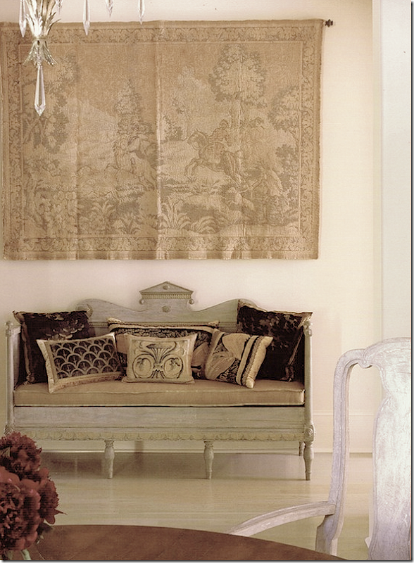
This photograph also didn’t make the magazine - only House Beautiful’s web site – but it shows the cross hall with a gorgeous antique Swedish sofa sitting underneath a tapestry.
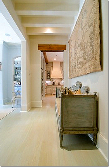
And today, it remains the same. I love how the cross hall has the beams on the ceiling. The butler’s pantry is to the left and the kitchen is straight ahead.
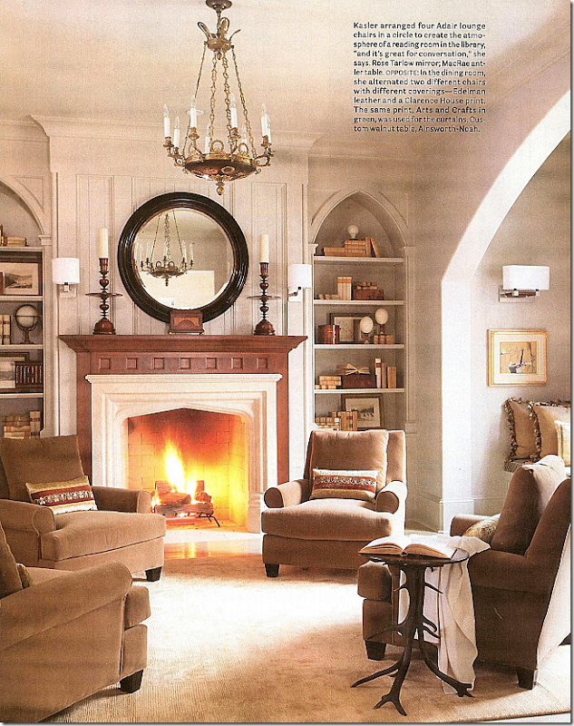
For House Beautiful, the library was shot with a roaring fire, and an open book and throw. Another beautiful room. In this picture, it is so closely cropped – you miss the window seat and the staircase. Gorgeous light fixture, BViz pillows, and Rose Tarlow mirror. And notice how beautifully Kasler filled the gothic styled shelves.
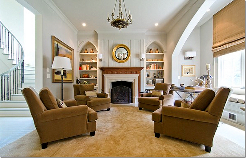
A wider shot shows the graceful staircase and the window seat – in the front window. Notice the black Rose Tarlow mirror is now gone, as is the antler table. Notice how the scale of the mirror was better before. The interesting candlesticks are missing too, along with the beautiful BViz pillows. Sad, the BViz pillows looked wonderful on the chairs. All the shelves are different, too. Kasler probably bought the pillows and mirror and table to the photoshoot and then styled the shelves purely for the magazine shoot. Not to be obnoxious, but I will bet that the standing lamp didn’t come from Kasler either. I must say here, that if I was paying Kasler to decorate, I would let her do the shelves in such an important room as this – the first room you see when entering the house. Her shelves are masterfully designed – why hire a designer and not have her do your shelves? And no one makes pillows like BViz – they are always the perfect accent, it’s a shame they are all gone. And that fire screen – again! I guess that magazines don’t’ like to shoot a room with a fireplace screen. The real estate photographer should have lit the fireplace, but it was probably too hot outside! Despite all the changes, the room is still very pretty and well designed.
A never been seen before photograph of the main staircase. The railing is graceful, simple and elegant. And I love the wood floor.
The cross hall – that leads off the entry way – runs from the staircase on one side to the kitchen and family room at the other end. This central hall is marked by the beamed ceilings – I love that detail. Here, Kasler brought in a Mora clock for the pictures, and she borrowed a chair from the living room. I miss the clock. Notice how wonderful the stained, solid wood doors look – a detail that only the finest houses have these days.
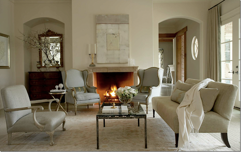
The living room is at the end of the entry hall – it leads to the terrace that overlooks the swimming pool. The room is quiet in soft neutrals and a mix of antiques and reproductions. Kasler and the stylist worked magic here: the softly lit fire, the barely blue 19th century French bergeres, the branches in a beautiful glass vase that are reflected in the mirror, and – that painting by Dusty Griffith. I love his work, Kasler has used his paintings many times before, with good reason. I think the painting makes the room! Notice how the smaller Oushak rug is layered over a textured sisal rug – the same sisal rug is found in the dining room. And notice the pretty blue velvet BViz pillows with just a touch of gold that look perfect in the blue linen chairs. Finally, notice how simply, yet elegantly, the fireplace mantel is accessorized with a sculptural candelabra and crystal obelisks – again, a mark of a good designer. To the right of the photograph you can see the family room off the kitchen. Note: the family room looks completely different here than it does now as seen in pictures below.
And across the room is a second seating area, with an interesting black coffee table and side tables all by Dessin Fournir, a Rose Tarlow chair, black lamps, another BViz pillow – and a collection of sunburst mirrors. To their left is a row of framed prints to balance out the mirrors. Now, I like symmetry – and I remember how much these mirrors bothered me because they weren’t hung symmetrically! Still – the mirrors were a huge hit with the design blogs. The vintage sunbursts were just coming into full trend back then and they really caught so many people’s eyes. And, the addition of the mirrors gave the room a fun vibe – as if the owners were a young, vibrant couple.
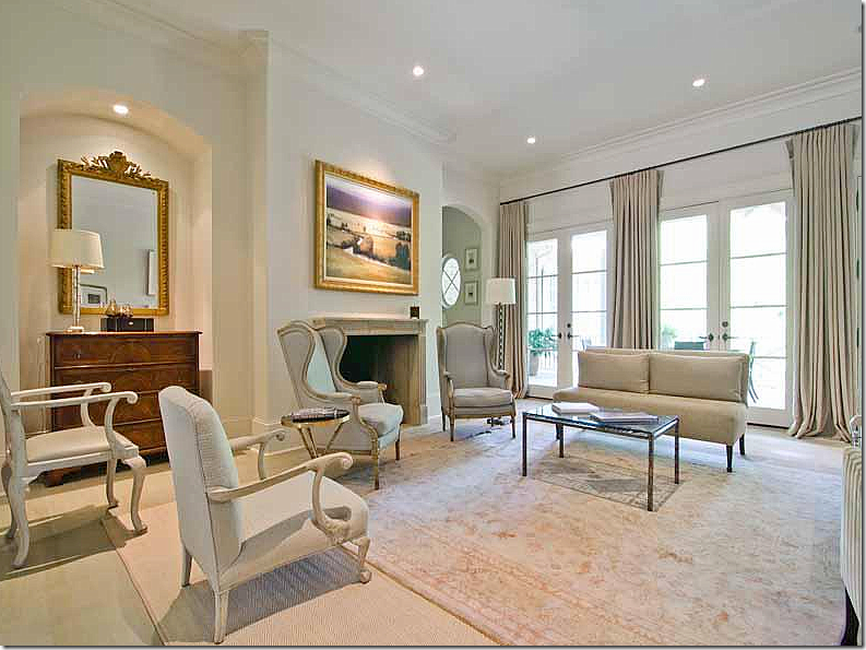
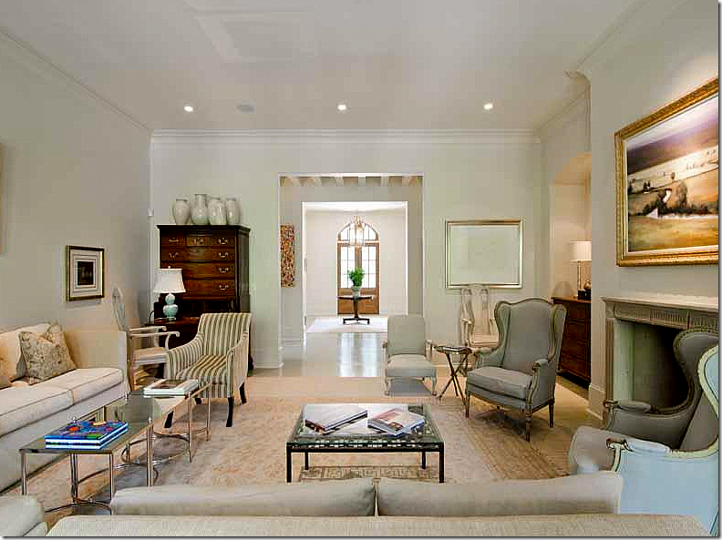
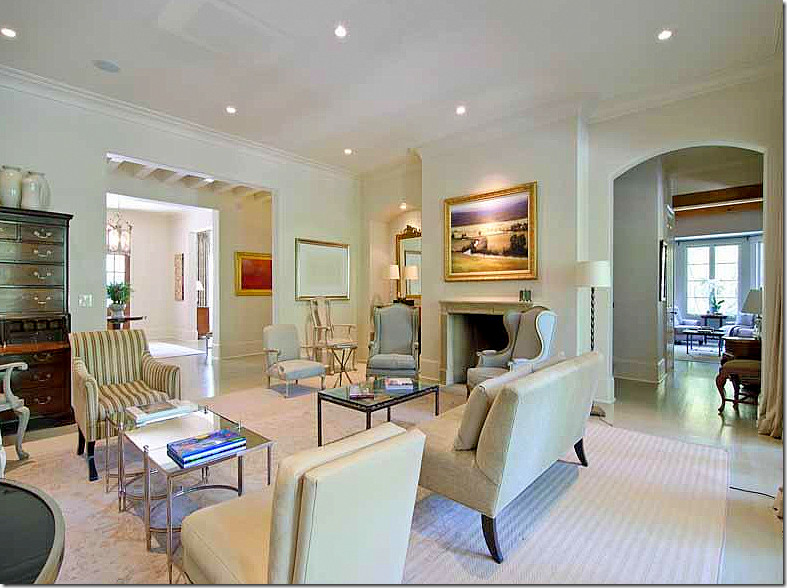
And here is how the room looks today. It is mostly the same, except for Kasler’s and the stylist’s touches. The Griffith painting is long gone – and boy, do I miss it! I loved how the painting was neutral like the room that Kasler designed. And all the gorgeous BViz pillows are sorely missed too. I loved how the light blue velvet of the pillows picked up the soft blue linen on the bergeres. The armless sofa is also missing its accent pillow. Can you see how important those accent pillows can be? And, on the chest, all new styling, along with the fireplace mantel. The owners also added another lamp.
And here you can see how the living room leads off the entry hall – and the cross hall where the beamed ceiling runs left to right. At the cross hall – the staircase is one side and the kitchen/family room is at the opposite end. Well, the interesting black coffee table is gone, as are the black lamps. You can see the highboy – with a collection that Kasler placed on top to raise its profile and another work of pale contemporary art that did stay. It looks so different now, than in the magazine. And all the sunburst mirrors are gone too. I believe those are from Kasler’s personal collection. The room is still elegant as shown here, but I do realize that everything Kasler added – all the accessories, etc. - looked great and it’s made more obvious by their absence. But then again, if hiring a talent like Kasler – use her taste to tackle all the accessories, not just the furniture and curtains.
And one other view with the new glass table. I do miss the black one. Again, you can see how talented the photographer for House Beautiful was. It’s not that the room is so different – minus the furniture, pillows, and painting – but the lighting and staging is so important when taking pictures. And why do real estate photographers always add the huge expanse of ceilings in their photographs? Still, the house is gorgeous. I love the layout of it – the way the rooms flow together off the cross hall. Just beautiful! Whomever buys it will be very lucky to have such a beautifully designed house.
A point to consider: It is said that you shouldn’t buy art to match the décor. You should buy what you love or what speaks to you – without consideration of the furnishings. Do you agree? I know that my view isn’t popular, but I do love when paintings relate to the décor. For example, I miss the muted Griffith which was replaced with a bright landscape that is probably beautiful and quite valuable.
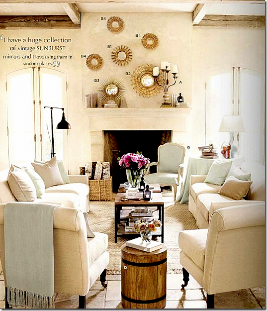
An ad for Ballard Design
Detour: The year after the house was photographed, Kasler became a designer for Ballard Designs – and she included a collection of sunburst mirrors in her line. Looking at this ad, they seem so similar to the collection in the living room – you can definitely see where she got her inspiration for the collection from. And, notice they are hung asymmetrically here too! The reason why I think those sunburst mirrors came from her personal collection is from the quote included in the ad!

And in one more detour: In Kasler’s new, fabulous house featured in Architectural Digest – notice the painting. It appears to be the same Griffith, but it may be a different one. Love her orange leather chair – and those lamps? Whoa. Love them!
Back to the house:
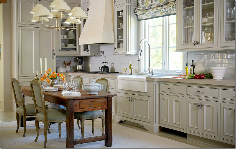
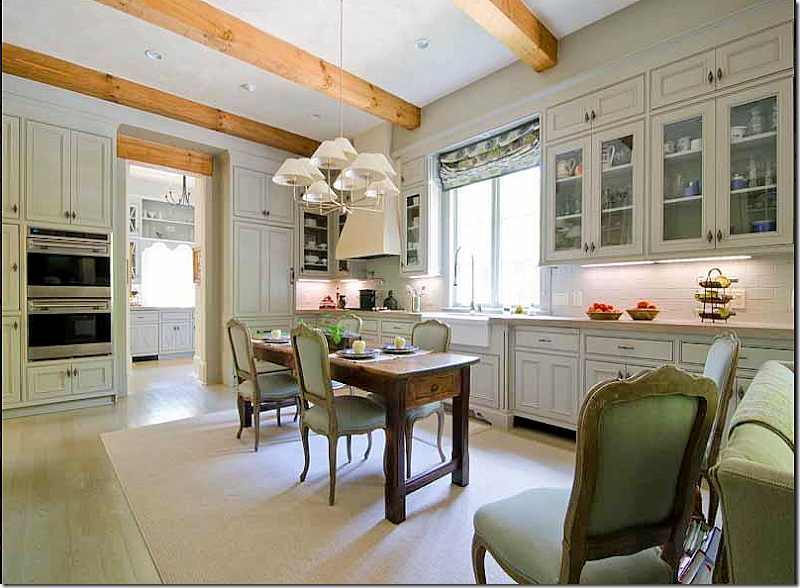
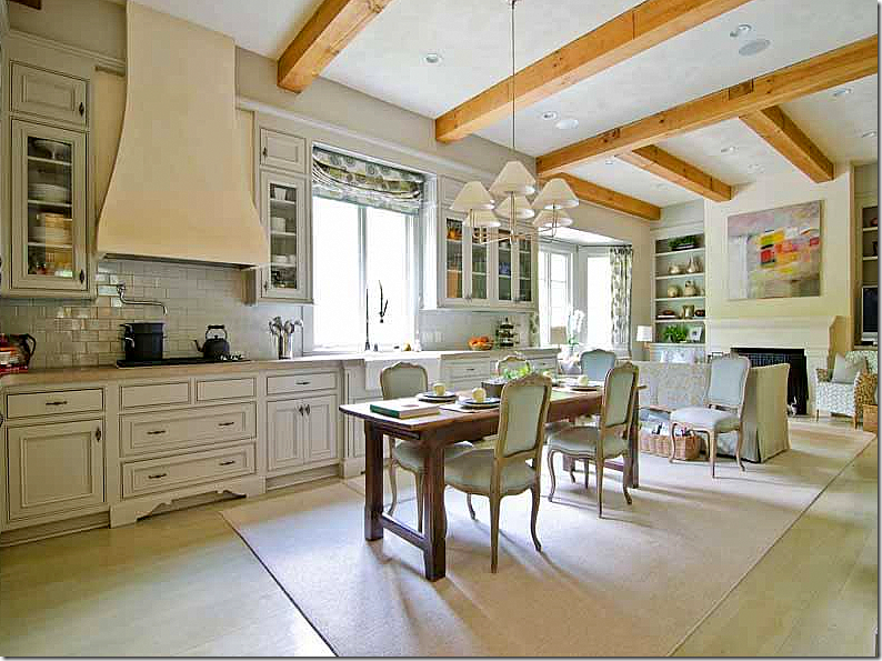
The kitchen,as seen in House Beautiful, is a large room that includes a wonderful walk in pantry and a family room at the opposite end. Of course, this picture is perfectly styled. The table has an assortment of dishes, not too much, not too little. The light fixture is from Niermann Weeks and the fabric found here and in the family room is by Galbraith and Paul. Both the light fixture and fabric add a youthful vibe to the room.
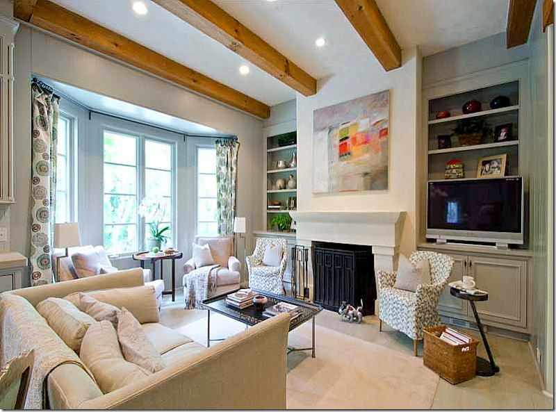
Here you can see the family room which wasn’t visible in the magazine. Such a great room – but it is a little odd that with such a large house that there isn’t a dedicated breakfast room.
Kasler designed the family room with a pair of club chairs in the bay window, and another pair that flank the fireplace. I’ll be that TV has gotten larger over the years. I would guess this is a popular room in the house.
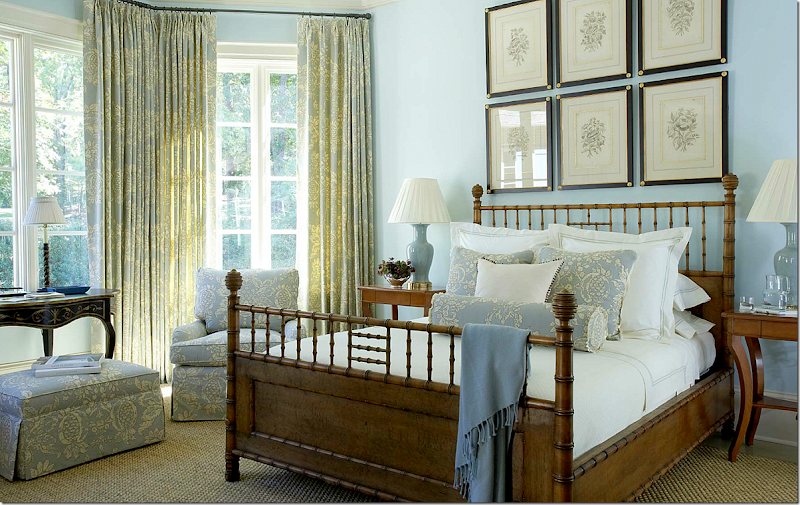
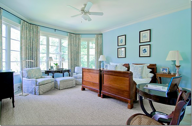
In the magazine, the guest room on the main floor looked like this. Kasler said she mixed the owners furniture – their chairs and desk with items bought for the house, like the envy inspiring Michael Smith bamboo bed. The fabric is by Hinson. Seagrass carpeting, finally! haha! Notice how pretty the set of prints are framed. Such a pretty bay window which overlooks the back yard swimming pool.
And in this shot from the magazine, a close up of the chinoiserie styled desk – overlooking the backyard.
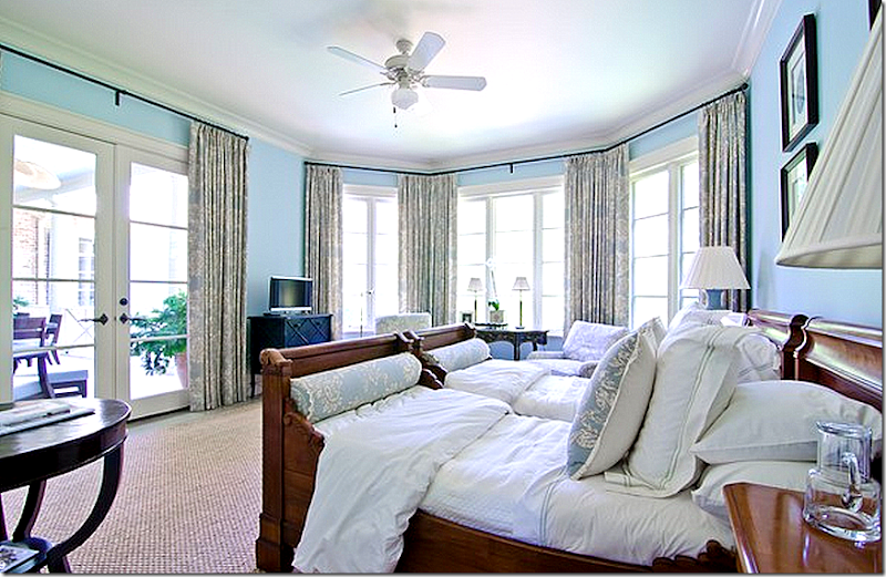
Well, knowing how much that Michael Smith bed costs, I can relate to why its gone! The prints didn’t make the cut either. Still, a pretty room. I think I would make this the master bedroom – on the main floor. The real master bedroom is on the top floor with the kids bedrooms, which is probably why it’s there.
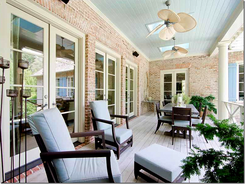
Another view, showing how the room connects to the back balcony.
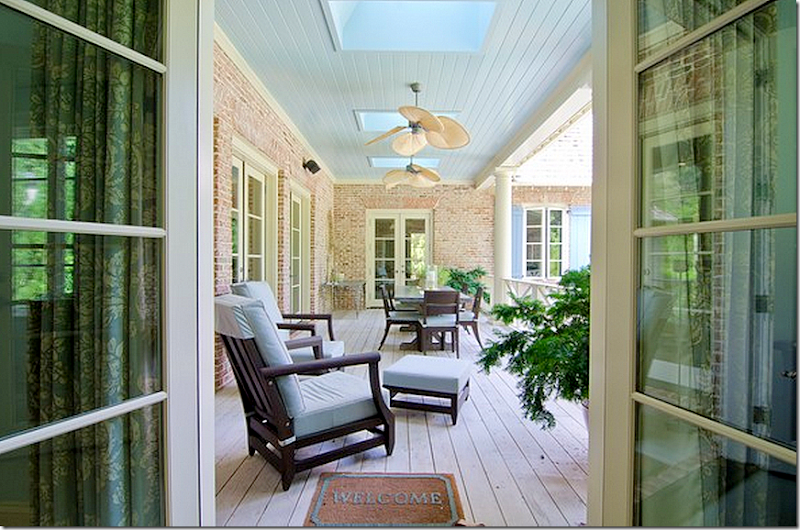
The back balcony that leads off the guest room, the living room and the family room. This would be a great place for morning coffee if the guest room was the master suite. The door at the far end leads into the family room/kitchen.
And another view of the balcony – with the table right off the family room. I would suspect that Kasler did decorate the balcony for the owners. The light blue plays off the light blues found in the adjoining living room through the French doors on the left. And the blue fabric picks up the color of the shutters and the balcony’s ceiling.
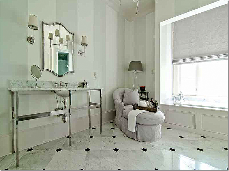
Not sure if this is the guest room’s bathroom or the master’s, but I will guess that it’s the guest room’s, decorated by Kasler in lilacs and painted, striped green walls.
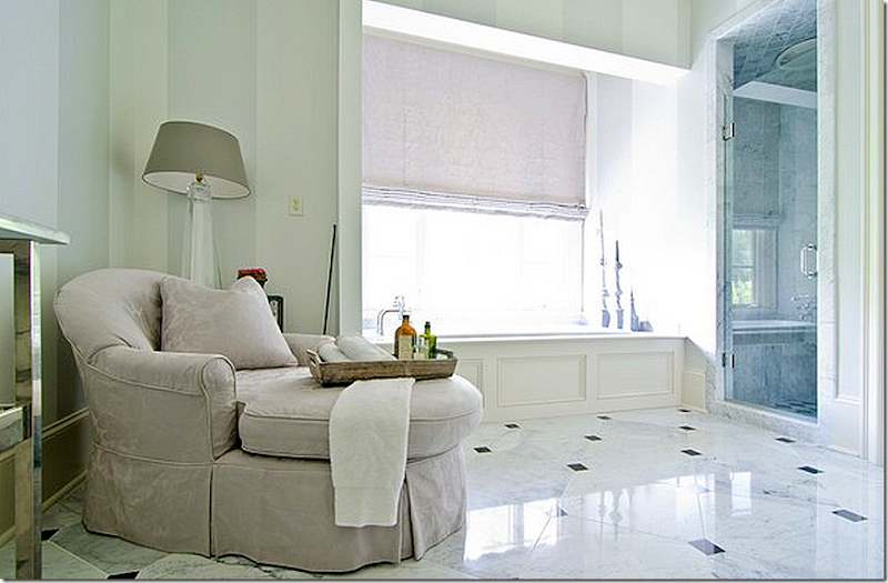
And another view – love having a chaise in the bathroom, especially one in lilacd.
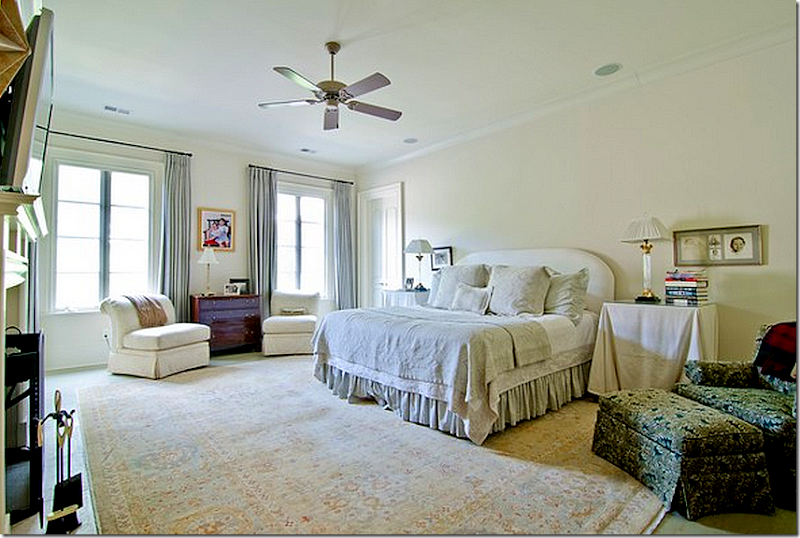
This is the master bedroom – with its own fireplace, nice! I would kill to have a fireplace in mine. I will guess that Kasler didn’t decorate this room.
And yet another large bedroom. This bedroom is located on the basement level. The bedrooms are all really spacey. Someone is going to be getting a great house. Again, Kasler didn’t decorate this.
On the basement level, the family office – it looks like maybe Kasler designed the space with the colorful pillows.
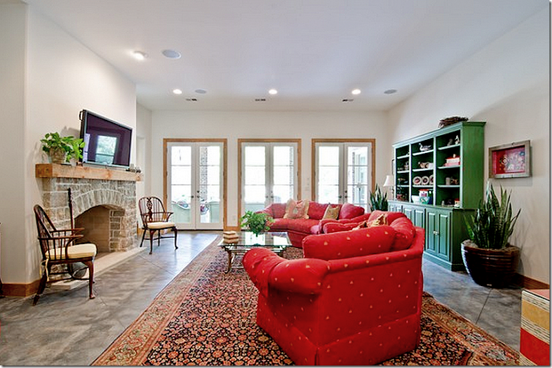
The basement is a teen’s paradise with a media room, a rec room, a full kitchen, an exercise room and a teen bedroom suite. Someone was a very happy teen here. Plus there is a wine room for the adults. Again, no - Kasler didn’t decorate this. The doors lead out to the back terrace.
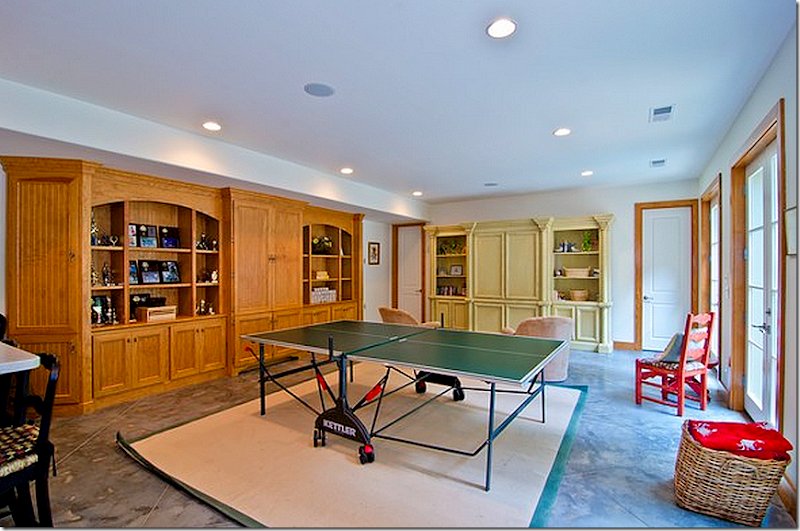
The rec room.
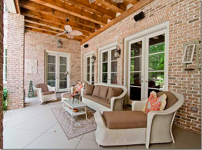
The terrace off the basement.
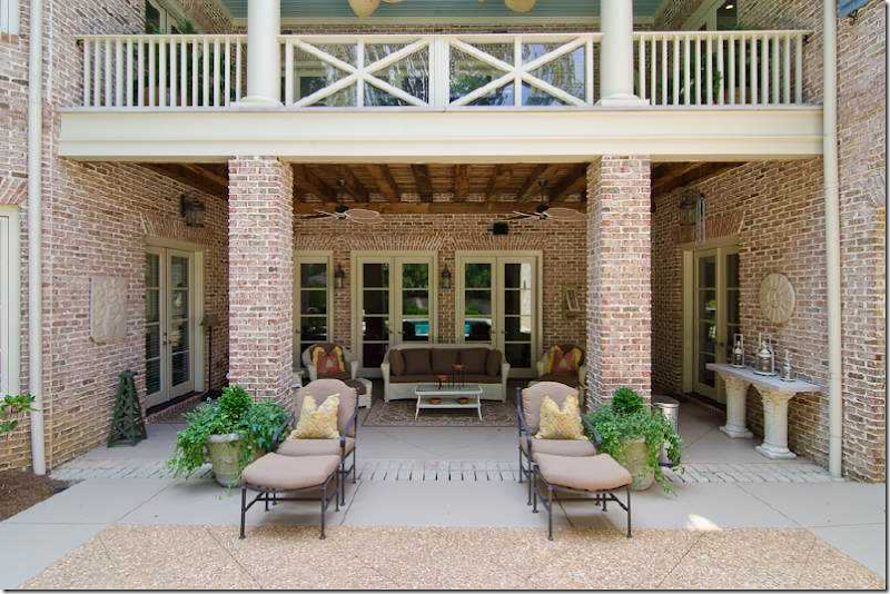
The again back terrace with the pretty main floor balcony above it.
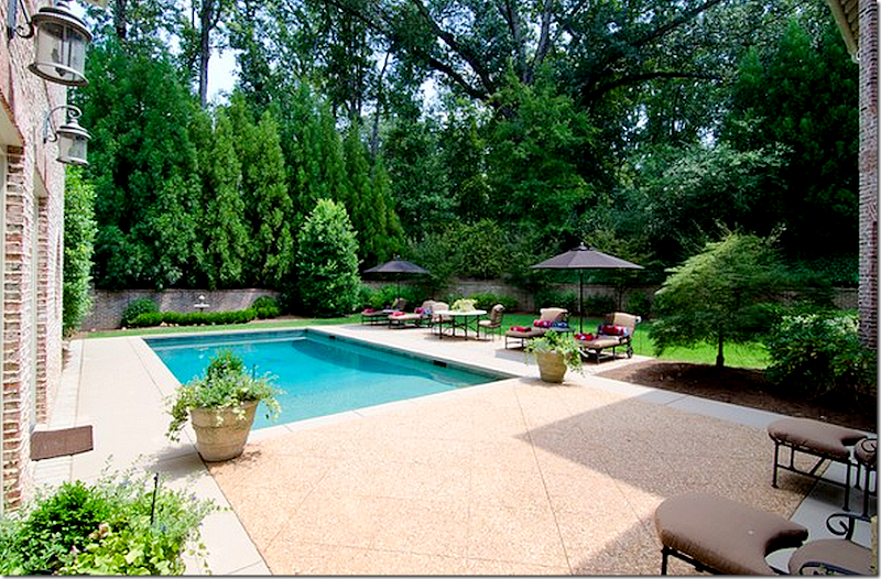
The pool – I would guess Kasler coordinated this area with the cushions and furniture. The area is so woody!
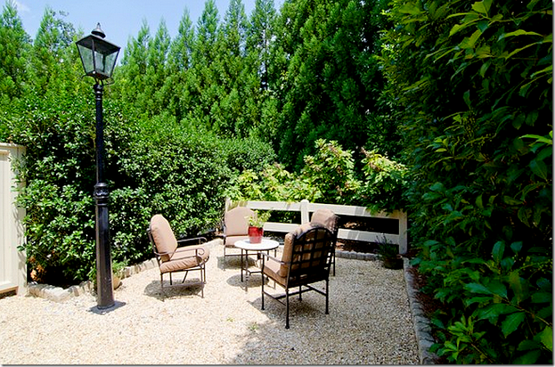
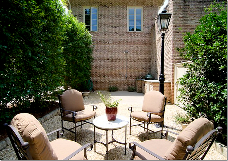
A hidden garden.
And from the other side!
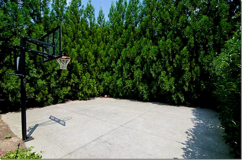
And the bball court – hidden by large hedges. Of course!
Wow! What a great family home. It’s like having two homes in one. The main floor, all sophistically decorated by one the best in the biz, and the basement – room after room – decorated probably by the owners. The whole huge basement is so strange to me because we don’t have them in Houston. But it really is like having a second house. What do people do with all that space? Seems like such a huge expense to heat and cool what is essentially a second house! Not sure how anyone could actually use all those rooms, but I suppose if you have a lot of kids like the Duggars, it would be heaven sent.
Ahhhh. After looking at all those basement rooms, I needed to be reminded of what Kasler created! AND, what the photographer and stylist did too. These past two stories – first Reese’s and now this house – have been such lessons in the art of styling and the art of interior photography. I would love to do an internship with a photographer with this kind of talent to learn how it is all done - the lighting tricks and the cropping choices. But, I am not sure you can learn it, it might just be a God given talent.
To contact the realtor, go HERE.
To read Hooked on Houses story about the house, go HERE.
To order Suzanne Kasler’s beautiful design book, click on the picture below. This house is included in the book:
And, to order the biography of Suzanne’s father, Tempered Steel, click below:













I always thought of Suzanne Kasler's rooms as real-estate ads.
ReplyDeleteYes, her success is something I don't comprehend. Generic "nice" but a top designer? Don't get it.
DeleteI couldn't agree more.
DeleteShe's "Better Homes and Gardens"-caliber. (She just gets jobs with bigger budgets.)
DeleteLooking at that picture of her (above), I could see her being a spokesperson for Chico's.
DeleteCheckmate. That three quarter coat has been around a long time. Perhaps she will let Holly have her hand me downs, including a suitable chandelier to tie her over until that piece of perfection she is longing for comes her way. Barf!
DeleteOh my gosh Joni, you had me at that photo of them welcoming Dad home! Tears flying out of my eyes. What a moment captured. I'm going to gather myself now and finish reading the rest of this treat with coffee and breakfast! THANK U!!!
ReplyDeletexoxo
Jennifer
This happens when we get old. Nothing else to do but cry at the site of old photos and sit around all day reading blogs and drinking coffee. I love that most of the people that read this blog is as old as I am...or should I say as old as the hills. :)
DeleteWell Jennifer is younger Jean, but there are a lot of seasoned citizens that read this. I am probably the oldest one here, though.
DeleteThat picture~ ! I know. Doesn't it kind of change the way you think of Suzanne? It did me. She said that she lived in a constant state of fear for her father during that time. i can't imagine how awful that was. Did you notice how bone thin her father was after his rescue?
As someone who now has an in-law living with her, I have an excellent plan for that basement!
ReplyDelete(Usually these houses have multiple HVAC zones, so that you aren't heating or cooling spaces that you aren't using. There was an article in the Times about thermostats that sense motion over time and develop patterns for heating/cooling based on when the technology predicted you'd be home and in a space over a week or weekend.)
Wow; another treat, Joni! Thanks for putting this together! I love seeing the difference between the picture-perfect magazine shots versus the way people really live in their homes.
ReplyDeleteYou asked what we thought about choosing art to match one's decor -- I think that the art NEEDS to be harmonious with the rest of the interior design, but matching art to decor is going about it all backwards. Ideally, the artwork comes first and the rest of the space is designed to complement the artwork without overpowering it, particularly if the clients have a valuable collection and/or pieces that are meaningful to them. Of course, what goes in a magazine needs to have the broadest appeal possible, and needs to show off the interior designer's personal aesthetic, and the All-Suzanne version is stunning in its elegance and soothing simplicity. I do suspect that the clients purchased and added all of their contemporary artwork after Suzanne had finished their home, which is a shame, because I'm sure she would have done a few things differently for them to make the artwork look more at home if she had the opportunity to do so.
I couldn't agree more. As an artist, I believe that artwork should be chosen to enhance the living space. The artwork chosen by the homeowners seems incongruous with the entire design of the house which is a shame. Suzanne has flawless taste and I am sure that even though they appear to lean towards very contemporary and colorful artwork she could have helped select pieces that would have blended more with the overall design rather than be so bold and out of place. I have seen many rooms where Kasler uses contemporary art in her rooms and they are amazing. She will always be one of my favorites!
DeleteITA. Kasler always picks just the perfect piece for the room. These canvases look jarring to me.
DeleteSuzanne's taste is impeccable....her designs flawless...I am truly looking at one of her chairs in her Hickory Chair line to place in my living room...i just love her design and her fabrics are stunning! What an amazing story about her father..Thanks for presenting this!!
ReplyDeleteMy dad was test pilot in the Air Force & I was born at Wright-Patterson. Rare in my decades to see Wright Pat mentioned anywhere. Glad you mentioned the fact about SK. A very big deal, her dad.
ReplyDeleteRobert Norris' garden is on the front of my Garden Path's book. His private garden is AMAZING.
If you think multi-story houses are big in pictures you must come to Atlanta! Will never forget seeing the back of my mother-in-law's house. 1 story from the front, 3 at the back. Growing up on the ubiquitous Texas slab I had to learn how to walk in these Atlanta houses without 'clomping'.
Garden & Be Well, XO Tara
OK, I have a lot to say about this house! It was on the 2012 Cathedral Tour of Homes in January, and I wrote the home profiles so I got an in depth tour of the house from the home owner and the architects. Here are some of the pictures taken for the tour, by Emily Followill - you will see that the dining room in its every day state is more like the magazine shoot. http://www.thingsthatinspire.net/2012/01/four-beautiful-homes2012-edition.html. I looked at my personal pictures, and I do feel that the real estate photos moved things in different places than the owners usually had them - I saw the house as it is used every day, and mainly felt that the accessories and art were the biggest change, although the guest bedroom and living room were certainly different in significant ways.
ReplyDeleteWhen I toured the home, it was one of the few homes I have seen in recent years that I felt I could actually love living in - I looked at many, many houses over the years and eventually decided to build because nothing really felt 'right' to me. This house feels very right to me. I love the way the architecture is designed, how the rooms flow. It is a wonderful, wonderful house. I also noticed right away how there were some major differences between styling in the magazine shoot and the house. Like you, I really missed the mora clock - I asked Suzanne about it, and she said it was from her collection (same with the mirrors, and the Dusty Griffith was probably lent by the artist).
(I have to break this comment into two because blogger is telling me it is too long)
Understandably, when building a house and putting so much in to the build, and starting with mostly new furniture (the old furniture went into the basement), at the very end of the project when the styling should happen, the project and the budget sometimes runs out of steam. Often it is when there is a photo shoot that the really intensive styling takes place. If I were the owners, I probably would have bought or replicated all of the items that were brought in for the photo shoot! But sometimes it doesn't work with that in real life when real budgets are a fact. But your comments have given me a lot to think about as I decide what to do in phase II of my decor, which SK is spearheading early next year.
ReplyDeleteAnyway, back to the house. The family office that you identify as being in the basement is actually on the second floor. It is at the top of the back stair well - which is not the curvy stair, but the stairs that are tucked between the living room and the kitchen keeping room at the back of the house. The guest room on the main floor is actually a fairly common thing in Atlanta - when you put the master on the main, it really expands the footprint of the main floor because of the master bathroom size and the closet size. So, when the lot is 100' wide or less, often (even in new houses) the master is put on the second floor, and a small guest room with small bathroom and closet are put on the main floor. It can certainly be used as a main bedroom if there are future mobility issues (although there is an elevator in this house), but in this house the bathroom is very small and the closet is very small too. The picture of the bathroom that you show, guessing it might be on the main floor, is part of the master suite on the 2nd floor. There are his and hers bathrooms - the lilac accented bathroom is the hers.
Basements - it seems to be unusual not to have a basement in Atlanta (speaking mainly of Buckhead), particularly in new houses. The topography is quite hilly, so it is quite common to have houses set up like this one - with a flat front yard, and the main floor on level with the front - and where the basement is walk out, and the main floor has a terrace or a deck as the outside space. It creates a bit of a disjoint with the indoor/outdoor connection in the back, but it is a fact of life here. The other common arrangement is a hilly front - so a steep driveway - with a flat back yard and a subterranean basement, or the basement opening to the side of the house with a basement well.
Some people only finish a small amount of their basement and keep the rest unfinished - for ample storage, HVAC, water heater, and electronic equipment. Some people just have a media room and an exercise room and in the peak of the real estate boom, a bar and wine cellar (that is less common with newer construction). But basements are very common and very desirable in Buckhead - some people won't even consider a house if it doesn't have a basement. Because they are mainly subterranean, they stay a fairly constant temperature all year long - usually high 60s - so they barely cost anything to heat and cool. Although there are certainly exceptions to this rule, many people use their older furniture or previous home furniture in their basements, because they are mainly used as man caves, teenage hangouts, or casual spaces - not for adult paries. I recall that in this house, the owners used their old house furniture exclusively in the basement, and it was meant to be a comfortable hang out place for their teenage children and the occasional overnight guest.
- Holly
Piggybacking once again Holly.
Delete"When I toured the home, it was one of the few homes I have seen in recent years that I felt I could actually love living in - I looked at many, many houses over the years and eventually decided to build because nothing really felt 'right' to me."
Poor, poor baby. How can we help?
Just ignore the anon,not sure what his problem is.
Deletethanks for your great comment - i should have called you , i didn't find those other pictures and now i am so mad at myself!!!! i wish i had! i guessed there was another staircase between those two rooms, but was wrong on the study and bathroom! drats!!!!!
be sure to take a lesson here Holly - the shelves, esp. if you cant afford what she brings out then take a picture and copy it using less expensive accessories. the shelves are so important - and so are the accessories in the major areas, the mantels, the dining room console, the living room coffee tables, the foyer. don't let the opportunity to with kasler go to waste!!! she has excellent taste, let her do her thing. you can tell her what you like, and then let her to it right. those owners missed a big opportunity imo.
You actually expect someone to take photos of accessories who has lived a year and a half with a bare bulb in their dining room ceiling? Seriously? It seems the opportunity has gone to waste with an empty house and no chandelier in the dining room. Truly laughable!
DeleteWhat's your point? They haven't finished the decorating process. First they built they house - now they are going to decorate it. YOu have an issue with that? And why? Who are you to judge how someone lives their lives or how they choose to budget?
DeleteA good designer would insist for the sake of his or her reputation that some form of lighting be hung there if only temporarily. They might even be willing to loan one out of their cache. Most people building a house are also decorating it at the same time - not waiting a year and a half later.
DeleteA good designer? So, you are now saying Kasler is not a good designer. Add her to your list, I guess. Boy, it's a loooooooong list you've going.
DeleteMost people? well, I guess they aren't most people, because they chose to do it in stages. Tres horrible.
Kasler is above average as a designer. There are more creative ones which we have seen featured on this blog. That said, Kasler is well known in her region and therefore it would be expected that she encourage a client to opt for another solution other than a naked bulb sticking out of the ceiling. While it looks utterly ridiculous that a homeowner would do this, it looks even more ridiculous that a designer would let a client do it and then post pictures on a blog as though bulbs sticking out of the ceiling a la Soviet Union is the designer's taste. Go back and read your own comment on the posts about the light bulb. I recall you were sufficiently appalled as well.
Deleteappalled? ha! well, myself I could never so that, but that's me. i would rather have a chandelier from target for 2 years than a light bulb. but maybe, she has much more patience that i have? imo she is doing the right thing, if you can't do it all at once, then wait a year and do it right. i was always to impatient for that - my friend (who's house was on the cover of HB) used to beg me to decorate that - hence my love of the ikea sofa. get it now and have something that looks decent and upgrade when and if you can. my friend would take theh $349 the sofa cost and save it up for a good antique. i always say, well for the cost of an expensive meal that ends up in the bathroom, you can have something for your house.
DeleteIs this why you don't cook?
DeleteHolly, there probably isn't enough bandwidth in the world to accommodate your verbosity nor your need for recognition.
DeleteAs always, Joni, an education in a blog posting. What I always want to know about professional interiors photographers is how they actually seem to capture "atmosphere". Something that seems to be always vacuumed out of real estate photographs. It does take talent, indeed, and I suspect alot of practice! I had seen the real estate listing on Curbed and thought is that a Suzanne Kasler house; the one from the House Beautiful cover? What happened? Thanks for the spot-on analysis! Like you, I was also peeved at the editorial fantasy that was created for Ms. Witherspoon's monetary benefit. The cult of celebrity still sells magazines!
ReplyDeleteThis house was on the Cathedral Antique Show tour last January, or maybe it was the year before... I'm not certain of the date, but I do remember it being my favorite house of that tour!
ReplyDeleteWhile all of this house was lovely, the first floor was absolute perfection. It had the most wonderful combination of exquisite visual interests and total tranquility. Before seeing this house, no one could have convinced me that I'd adore pale turquoise stained floors!
We visited it immediately after touring a house which overloaded all the senses, and not in a good way. The peace and calm of this beautiful house was felt viscerally; I didn't want to leave it! As I write this, I realize that my most vivid memory of visiting there is how it felt. I can't think of another house that's had that effect on me.
Thank you for showing it today!
Joni, magnificent, a lot of Kansas City homes have large walk our lower levels that are completely used and decorated.
ReplyDeletePhotographers and designers please, please always light the fireplaces for the shoot, even if it is hot, otherwise you are looking into a dark hole.
Pillows and art make a huge difference. Buy art you love and it probably will complement your space.
Lastly I do not understand why the owners of these very expensive homes cannot purchase some of the furnishings such as that fabulous black coffee table! Do they have that choice? (unless like Suzanne's Starburst mirrors, that may be the designers personal collection)
I am having an amazing Giveaway of Plush Velvet Pumpkins from Love Feast!
xoxo
Karena
Art by Karena
Oh great, Karena and her giveaway spam are back. PS: Joni beat you to the "Plush Velvet Pumpkins" giveaway, Karena.
Deletei think every design blog gave away the pumpkins! i am having two more of them - i think - so get ready.
DeleteWhat an incredible photo of the family reuniting- I have seen it many times in various publications and am astounded it is of Suzanne Kasler and her family. It truly is heart-wrenching.
ReplyDeleteGorgeous house and so many talents involved!
I really enjoy how you compared this home and the one last week. It really is the finishing and the experienced hand of a designer that makes the difference in having a home that is perfection.
ReplyDeleteReal Estate photos are shot differently than interior design photos. With interior design the photograph is taken closer to the subject and the concept is more of a vignette, lighting is controlled to create a mood, and focus is upon the furnishings and accessories. With real estate the photos are taken further back to showcase the room itself, the architecture, space, and hopefully reference one space to another allowing the buyer an opportunity to understand the layout or floor plan of the home. It is important to remember today, buyers make their lists of homes they wish to visit by perusing real estate websites; photos can bring an offer or lose one. Keep in mind as well that often in real estate items are removed, rooms are left sparse on purpose, to focus a buyer upon the room itself rather than the furnishings and design. I’ve experienced buyers who couldn’t recall details of a home; exposed beams, hand hewn floors, yet they could remember the throw pillows on the sofa, in these instances the agent failed. While design can play an important part in engaging a buyer to view a home, there is a very subtle and fine line between showcasing the property and showing casing the interior design. I believe that you and others who have commented on budget are correct; I can only imagine that budget restraints affect the final design of a home. I agree as well that if a designer had an opportunity to be showcased in a national publication they would tweak their work to their full vision, in that instance there would be no client influence. Something I can appreciate! Comparing real estate photos to design photos; is difficult, somewhat like trying to compare a mac to a pc, both are computers but their operating systems are very different. Noting most comments you receive are from a design view point, I am a realtor and thought it might be interesting if you had feedback from a real estate point of view – Adore your blog, I’ve been a follower for years and enjoy your unique contents and perspective. Andi
ReplyDeletethanks for the info. i realize all that, but am fascinated at how gorgeous a house can look, yet not actually look that way irl. i love to see what they did to make it look good, yet then didn't keep it!!! i wish i had a story like this once a week. i'd be happy blogger.
DeleteMy goodness, that photo of seeing her father after 7 years in a pow camp made me misty eyed. This was a great post Joni. I enjoyed Kasler's more pastel, serene rooms immensely.
ReplyDeleteDoes anyone know the manufacturer of the dining room chandelier? It's in the room with the mixed Swedish chairs and Clarence House upholstered chairs. I've been looking for a chandelier for ages and this one is just gorgeous. I hope it's not an antique. Thanks so much if you can help me!
ReplyDeleteWhat a great post--but the owners seem to have had a case of design schizophrenia (their interior design taste and their art taste just do not go together comfortably). If you put aside the art collection, I almost feel like crying to see the missing elements that had been present during the magazine shoot. If I were the owner, I could never go back after seeing the perfection of the main floor interiors as styled by Suzanne Kasler. I would have had to purchase or otherwise replicate the elements that were brought in for the shoot.
ReplyDeleteAnother thought--I read the article in House Beautiful when it came out and loved the house but feel like I have "seen" it with new eyes through your narrative. Thanks for the time you put into your blog!!!! It is such a pleasure for me to read your perspective and I feel so much as you do about the harmony that Kasler achieved in her Magazine version of this house.
I love your eagle eye and enjoyed seeing all the beauty in this post, but the most beautiful photograph by far was the one of the family running toward their father. I cant imagine a moment like that. Thanks for sharing that part of her story. Surely it has influenced her profoundly.
ReplyDeleteLovely house. I love Suzanne Kasler's work. Met her once at Hickory Chair at Furniture Market and she was very friendly and chatty (didn't come across as shy to me, and I'm shy!). Appreciated Holly's background info and agree with Anonymous 9:45 that magazine photography and real estate photography are intended for different purposes and you should not judge one by the other. Enjoyed re-visiting this - I'm sure I have the HB article in my files. Thanks for the tour.
ReplyDeletePerhaps it is the photography, but the stain on the window and door casings and the doors in the basement look entirely different than the richness of the stain upstairs. Normally, I think of stained doors and trim as passe', but in this case, they almost act like a ground to the soft muted tones of the decor. This home is lovely until you look at the back of it. While the grounds are beautiful, the architecture of the back is lacking the elements consistent with French Normandy design. It does have, however, one of the prettiest kitchens I have seen in any home featured here.
ReplyDeletei am sure they are different. the basement is another house than the 1st floor. it's like two houses, totally and completely different. im sure the doors are not the same down there as on that 1st floor. those doors looked gorgeous.
DeleteJoni, I know it may be difficult, but could you please delete the mean posts from Anonomous. She leaves me feeling sick with her catty, rude and mean posts. They don't belong here. Please cut them out.
ReplyDeleteLiz
(I'm not the mean Anonomous)
DeleteI second that.
i don't moderate the comments. if they do offend you, just don't read them. i really can't in good conscience only publish the positive, glowing comments and erase the negative ones as if they didn't exist. it just seems so fake to me. that said, i wish the anons would try to be more civil and less personally hateful to others. i have asked you this a million times but you jsut cnat help yourselves, i guess. just try ok. if not, why not read another blog that you do like? maybe habitually chic? or slim paley would be more to your liking?
DeleteI don't feel habitually chic has enough self-esteem, do you?
DeletePlenty of blogs publish comments after owner approval. I don't think it's a bad thing. When you feed the troll ( answering their comments), they always come back to stir the pot even further.
DeleteThe trick is to totally ignore them.
It is kinda creepy that you seem to have a stalker troll :(
SJ
well, it's easy to moderate is the comments stay around 10 or 20, but over that, it becomes unmanageable. you would be a slave to the comment section and have to be online 24/7 just to ok the comments.
Deleteit's ok. just ignore or quit reading the comments when they go snarky. i do wish though that the anons would be more respectful of other's feelings.
And to the anon 1:25 pm
why don't you go to Habitually Chic or Slim Paley? They have much more tasteful and upscale blogs that I am sure would be more suited to your taste level. not sure what you mean about self esteem or what that has to do with a blog.
Joni: Interesting recommendations. I notice your blog roll includes Slim Paley but not Habitually Chic. Why not?
Deleteyou noticed that? that's a loooong, old, story. if we were friends, i'd tell you to email me and i'd give you all the details, but since you hate me so much....
DeleteGoogle Visual Vamp - Habitually Chic and you may possibly find your answer. I suppose Joni approves of people who post the picture of other bloggers and refer to the way their clothing fits as "camel toe". Joni came up on the wrong side of this one.
DeleteI think it's because the doughy Habitually Chic has made private references to her competition as "housewives in flyover states." She's a nasty piece of work herself, believe me.
Delete"Joni came up on the wrong side of this one."
DeleteNo, Joni went on the record saying that what the Vamp did was wrong and hurtful. VV has a history of going after younger women she is envious of. It's an old, ugly pattern.
Some of the background on this I was not aware of. I only became aware when VV was forced to take down her post. I have never seen this pattern in VV, but that's not to say it hasn't happened before I started reading her blog. I have no ax to grind on behalf of the author of Habitually Chic, but let's face it, most of the design blogs are written by housewives in flyover states who believe that the rest of the world is interested in every little pie plate and dish towel they find at a flea market. One actually made a curtain out of a flimsy piece of sheer linen and hung it on a small branch from a tree and called it cottage chic. I don't read HC a on regular basis, but when I have, I have thought it was well presented with interesting articles on design rather than the "this is my life" sort of stuff that clogs the arteries of many sites in blogland. I suppose the question which was initially asked was why HC is not on Joni's blog roll and so far we don't have an answer.
Delete"HC" is almost all photos from Ralph Lauren ads, etc. Heather should rename the blog "I Wish I Was Thin, Pretty, and Popular."
DeleteI'm totally cool with housewives from flyover states, little pie plates, dish towels, etc. That's mostly what life is. I would vomit at trying to whip those things up into some merchandising theme called "cottage chic," yeah. But the minutiae of people's lives can be a great part of the Internet experience, as long as the writer is a decent storyteller and brings some humor or charm or something to the material to distinguish herself.
DeleteHeather's posts mostly read like advertisements. "Here's yet another model in $2,000 shoes. Oooooh!" All that emerges is a sad portrait of envy.
How do you get from "here's yet another model in $2000 shoes" to envy? Did it ever occur to you that she may be able to afford $2000 shoes. Even if she can't, does showing them on her blog indicate envy or admiration? There really is a difference. It's doubtful that you know her motives, including whether she wishes she was thin, pretty and popular. She does garner a lot more traffic than VV and many other blogs.
DeleteI'm sure she can buy $2,000 shoes, or if not, she can write yet another fawning blog post and get the maker to send her a free pair.
DeleteHow do I know she wants to be thin, pretty and popular? Read her blog. Look at her pictures.
Seriously? I read her blog and it's about 50/50 design and fashion. So I have seen her pictures and so have you apparently except the difference is that you have paranormal abilities the rest of us don't have. You seem to have discerned that she want to be thin, pretty and popular. Your arguments are vacuous and actually down right ignorant.
DeleteI absolutely was not on the wrong side of the vamp story. I thought it was horrible and said so at the time. irrc. there was once a terribly snarky anon blog around that time and no one knew who wrote it. I was snarked quite a bit. it stopped very suddenly. then another started and they had a field day putting down my slipcovers and seagrass style. it was very, very funny. but it too stopped. i liked the second one a lot, it was very well written and very funny. the first one wasn't really funny = it was just mean. everyone went nuts over it. another blogger actually accused me of writing it. he was convinced it was either me or vamp. i can't speak for vamp, but i can assure you it wasn't me. i can barely keep up with my own blog, much less a second secret one. i don't mind the snarky blogs, i wish there were more of them - or at least one. it's good to laugh at yourself. i could post what that second blog said about me, if i can find it, if you want to read it. you would probably enjoy seeing me put down. haha!! let me see if i can find it.
DeleteI'm sorry I touched a raw nerve.
DeleteWhen a woman looks like Heather Clawson but only posts pictures of women who look like Carolyn Bessette, the agenda is clear: Envy and self-loathing.
But have it your way: Heather is happy being stumpy, plain, and widely disliked.
Joni: I remember you being clear on your stand on the "Camel Toe" thing. I also remember that the "Girl World Decor" blog disappeared during the same week that VV was begging people for money because of her husband's heart condition.
Delete(I mean: I remember you being clear in stating that the Camel Toe post was cruel.)
DeleteAnon 10:29, no raw nerves have been touched. It is clear, however, that you need to put down Heather based on your perception of her personal appearance rather than the content of her blog. If you want to play the envy and self-loathing card, it says a lot more about your psychological state than it does about Heather. It makes perfect sense that if you have a blog that writes about fashion, you aren't going to be showing pictures of plus size women - no magazine or blog does that unless that is the market they want to focus on. There are plenty of plus size women in the design field as well as entertainment. They interact with the anorexic ones on a daily basis. Does that mean it's self loathing? You have run out of arguments, you know it, so give it up. You have a perfect right not to like Heather's blog, but for heaven's sake choose a good reason not all your psycho babble. Based on your assumptions, however, I would like to pose one question to you. Is the reason Joni post so many great designers who do fabulous work on her blog evidence of envy and self loathing because she doesn't measure up? Just think of the logic.
DeleteAnd on what authority anon. do you have that Heather is stumpy, plain and widely disliked? You are posting on a blog of someone who is stumpy and plain so why are you here? Does someone have to look like a runway model to have a valid voice in design, fashion, etc?
DeleteMultiple raw nerves, sounds like.
Delete"Is the reason Joni post so many great designers who do fabulous work on her blog evidence of envy and self loathing because she doesn't measure up? Just think of the logic."
Here's the flaw in your "logic." Joni has also shown her own house literally hundreds of times on her blog. She is doing so right now, on the current post. And she posts her design work regularly, in detail. Literally dozens of pictures per job. Plus her portfolio is online.
Heather? I believe she showed her own design work exactly once. As for her online portfolio? Go here:
http://www.habituallychicdesign.com/
I truly hate to disappoint you, but you have hit no raw nerves. I have no skin in this game whatsoever. I do not know Heather nor am I a regular reader of her blog. I do contend, however, that you are using very sexist and specious reasoning to discredit her. If you want to go there, we can address the physical attributes of the author of the blog we are currently commenting on. Have you seen pictures of her lately and I don't mean the glamor shot in the left hand corner of the blog, but the real ones with the dyed black hair, the black eyeliner, the menopausal extra 30 lbs - do I need to continue. You are willing to make the same kinds of comments about Heather because for whatever personal vendetta you have with her, the only straw you have left is her appearance. On the other hand, you excuse some of the same physical attributes in this author because she shows her work. You are just too, too easy to see through and it's pathetic. I don't know why Heather doesn't show her portfolio. It certainly could be that she works for a design firm that prohibits her from doing so. It could also be that her clients will not give her permission. Perhaps your time would be well spent in convincing Joni to take down the phony glamor shot, put up a current full body photo unless you are afraid of too much envy and self-loathing - lol.
Delete" It certainly could be that she works for a design firm that prohibits her from doing so."
DeleteNope. She's freelance. Has been for years.
"It could also be that her clients will not give her permission."
Right.
Another hypothesis: It could be Joni Webb who is writing the anon comments that are so unflattering to Heather????
DeleteJoni, what a lovely post just full of information and wonderful images, thank you for all your hard work pulling together this post for your readers. I truly appreciate it,
ReplyDeleteKathysue
PS back from Paris and we stayed in an apartment from Paris perfect that YOU unknowingly helped me find, it was a magical 2 week stay!! xo
I agree with Liz about the snarky remarks...it wrecks the relaxing and enjoyable feel of your space. I was thinking that the starburst mirrors needed symmetry but then I thought "they are like stars in the sky." That could be the intent. So, heart warming to see Suzanne's family running to her father.
ReplyDeleteI agree as well. That lousy obnoxious anony poster has got NO shame-! Does she pay to read this blog? No, she does not. Does she have one of her own that others can visit & take potshots at and insult HER on personally ?
Deletey'all, it's two men, not women!! can't you tell?
Deletei saw phoebe do the mirrors like that but hers were symetrical. i just liked that some much better.
Beautiful home, although I do think shutters should be on both sides of house, but really the exterior is so charming. Amazing kitchen.
ReplyDeleteThese real estate and magazine photo comparisons are very interesting to me. I prefer smaller room, I like cozy not cavernous, and to me large rooms generally do feel cavernous as opposed to impressive. I find it interesting that in magazines the rooms are staged and photographed as a rule, to appear tight and cozy and warm. In real estate ads it is all about showing the space, even making a room or home appear more spacious than it is. Wonder why that is, the magazine people obviously know what they are doing, do people in general like to look at cozy spaces but want to own or live in large ones?
Love Susan and will be buying her book. So interesting to know about her father also. Lovely post!
ReplyDeleteP.S. I also agree with Liz and classic casual home about deleting the jerks that cyber bully on your site and how it "wrecks" the feeling of your blog. Yes, I admit it used to be entertaining, but not anymore. I think I had enough when one Anonymous was being extremely rude about your talent as a designer and you basically agreed with them (this was in the post about your beautiful makeover of a clients house). I think you are EXCEPTIONALLY talented in interior design and you should give your self more credit. I do imagine it could be quite a hassle to delete them, so if you decide not to, I'll still come to your blog and try hard to give there stupid comments the time of day. :)
correction- I meant "NOT" to give their comments the time of day.
DeleteLove Susan and now I love her even more bc of her father!!!! Wow!!!! Such an incredible story! Gonna have to buy that book of hers now!!!!!!!!! Thanks for this peek into this beautiful home and her beautiful work :)
ReplyDeleteSUZANNNNNNE not Susan :( I feel stupid !!!!!
ReplyDeleteI do think that this kind of post needs to be handled with care otherwise they can simply appear a little mean. I have been lucky enought to have my house(s) photographed for UK style magazines over the years and my goodness they do scrub up well but bear absolutely NO resemblance to how they look day to day! Bit like me really! You can't expect real estate pics to look like professionally styled ones - otherwise why would stylist and sought after photographers exist? Let me think, who would I prefer to take the next snap of me....Testino or my husband? Hmmmm tough call but I think Mario might just edge it!
ReplyDeletei know. i did try not to be mean or snarky. i hope i wasn't. i think i said how gorgeous the house was about a million times. i even went back and deleted some of the gorgeous tags because it was too much. well, when you put your house in a national magazine you do invite criticism and praise. and saying a room was designed by kasler and this one wasn't = isn't mean, it's just a fact. i don't think the owners have anything to be upset about. they have a beauitful house that is beautifully furnished by a top rate decorator.
DeleteWhat a beautifully decorated home by such a talented designer! And what a thoroughly researched post by you, Joni!
ReplyDeleteI suspect that the modern art was added in the years following Ms. Kasler's efforts. I also suspect the owners decided to spend money where it would be the most appreciated - living room, dining room, kitchen, etc. There was no point in them buying beautiful, expensive things for rooms that the kids would occupy or play in. It makes more sense to buy inexpensive, tough-wearing, brightly coloured furniture and accessories for kids' rooms.
I'm scratching my head over why you still don't understand why real estate pictures are so different from magazine pictures. You mention it in just about every post of this kind. Numerous readers, myself included, have explained the different points of reference for the two types of pictures. In addition to the different points of reference, I can't imagine real estate firms/agents wanting to spend money on good photographers - money that would come out of their commissions.
squeak, i DOOOOO understand the difference. i'm not an idiot. i just like to see the differences and point them out. plus there ARE fabulous real estate photographers - look at the pictures of john salidino's house for one. there is a company in california that take great photos for the real estate companies and it really helps sell the house, im sure.
Deletebut yes, i do understand. what i didn't understand until recently was how talented the major photographers in the magazine really were. i kind of thought, well, with the right camera and tripod, anyone can do that. but i don't believe that anymore.
Opps! I called her Susan too. Suzanne Kasler......got it now. ;)
ReplyDeleteI have seen that photo many times over the years and it always gets to me - I had no idea it was Suzanne Kasler's family. As far as some of the anonymous comments - I rather like it that Joni lets anyone say anything on her blog. Yes, at times the comments are very mean and other times it is downright comical. So many blogs are just so squeaky clean - you feel like you've landed in some fairy land. This blog does keep it real and that takes some courage on Joni's part. This is not a boring blog!
ReplyDeleteI like Suzanne Kasler's work - however, it is somewhat mainstream/safe. Again, where is the wabi sabi - the thing that makes you think twice and take another look?
thanks, i am glad you get it .
Deletebtw - take a look at the house she had in veranda a few months ago = it had a lot of deep blues - i think it was stunning. esp. the library and the living room. it was a deeper palette than she usually works with, but it is genius imo.
her new house in ad is also quite beautiful. i have seen some of her work that seemed a little trendy, but mostly, i do love her style.
To be fair, in looking again over the photos of Kasler's work , I did see some evidence of that Wabi-sabi vibe - the old table in the kitchen, the wild branches in vase in the main living room, the old tapestry above the interesting Swedish sofa with the gorgeous pillows, the wood floors...so maybe I like her work better than I originally thought!
ReplyDeleteLow cost web design is now more famous with http://www.flashwebz.com/ cause it's quality work with lot's of best designer's ....
ReplyDeleteJoni, I always, ALWAYS love reading your commentary, and you are the most observant person I know. Thanks for this! She is one terrific designer. I enjoyed seeing this house so much. And I like the mix of chairs in the DR.
ReplyDeleteOut of all of her rooms I have seen in the magazines the one that stuck in my mind was either a DR or a library that had chairs done in a striped linen, and she had turned the stripes to run horizontally. Do you remember that room? It was fabulous. She is really, REALLY talented. I have thought about ordering some of her pieces from Ballard's. Love her sconces and could really use those. The bed in that first shot of the BR looks like one we have.
And that story about her father is killer. I have to tell you I cried seeing that picture. Look how excited they all are to see her dad! I cannot imagine the horrors those men endured. I had a friend in college who was a POW, and he was back going to school on the GI Bill. I won't go into the details he shared, but I'm so thankful these men survived. And yes, they are real heroes.
I haven't had a chance to try and fix the situation with my blog. Lots of insanity going on here, but I hope to get to it this weekend.
Thanks again for another fun, insightful post. You ought to call these columns, "Design Detective"! You're the best!
XO,
Sheila
Sheila, it was the dining room in her old house with pink taffeta curtains and linen skirted table. the chairs had railroaded stripes. it was one of my all time favorite dining rooms!!
DeleteHi Sheila!
DeleteIf the dining room you're referring to was pink and taupe, I believe that was actually her own dining room in a previous home. It was gorgeous!
A great post and you are one of the few to give credit to the photographers - unsung heroes!
ReplyDeleteGreat post! I love these magazine vs Realtor comparisons... I like knowing that the house may be beautiful but the photographer and stylist really make a difference.
ReplyDeleteLiz
I enjoy occasionally reading your blog and the time you put into your home tours. As a real estate photographer, however, I think these house comparison posts are interesting but written in a rude way. Real estate photographs are different from magazine photographs for a number of reasons. One reason is time. A magazine shoot could take a day or two to photograph a few rooms of a home. I have to photograph a whole house in about an hour... maybe a little longer if it was a large property. Magazines send teams of stylists with accessories. Real estate photographers are PHOTOGRAPHERS. While I do more than most people as far as moving items, I'm not hired to style a room. I show up by myself. I shoot what is there. I'm not bringing a horse out of a barn for a perfect shot. I'm not lighting the fireplace that may or may not be functioning properly. I don't have better throw pillows for the couch. I can't control if it is sunny on the day I am sent out to photograph the property. Owners are often at work and just want the listing up. Sometimes homeowners hire a stager which is great but most real estate agents aren't going to pay for staging. The other huge difference is that I am suppose to show the whole room and the whole house. I'm not suppose to be focusing on a really lovely styled bed because the bed isn't being sold. There can be a lot of ceiling in the shots because if you are far back in the room the wide-angle lens is going to include the whole room left to right but also a lot of either the floor or the ceiling. I usually try to get more floor into the shot. If anything, your comments should be focusing on appreciating the huge difference it makes when homes are styled by a talented stylist/designer and shot to capture a particular mood or a feeling instead of going on and on about what you perceive as untalented real estate photographers.
ReplyDeletewell, dont take it personally, it wasn't intended that way. just curious, do you think you could take pictures as beautiful as the ones in the magazines?? i bet you could. do you think they are really talented or is it something you can learn? i would love to take photos like they do, they are just gorgeous works of art. i wonder if it is a true talent, and i am starting to think it is.
Deleteno offense. btw, i said earlier that in CA, there are real estate photographers that are jsut as talented and their houses really shine. they are like magazine spreads!!!
and i get that you aren't styling the rooms. but you do show how a room really looks and its interesting to compare real life with what the magazines show.
Is it possible to only accept comments from named people ? Not Anonymous contributors . ( yes I realise this us a anonymous comment! ..... I m just too lazy to sign into my account)
ReplyDeleteZoeB
I suggested that to Joni over a year ago. She won't do it and I do not see what the big deal is. Many blogs will not accept anonymous comments.
Deleteyes, i could decline anons but an anon would only have to sign in with a fake name. so that solves nothing. also, a LOT of people don't have accounts and dont' know how to sign up for accounts and go anon.
Deleteagain, i don't want to moderate the comments. 1) there are way too many to that 2) on most occasions it does give people the confidence to be able to speak their mind and give their opinions freely - not always what i or you want to hear, but it's better than just reading a lot of only positive comments. that said, i have asked for civility a million times. I think we have lost a long time anon and have just one to go. i am hoping he will leave soon too. which i am sure he will. most trolls get bored and move on quickly. this one though has stuck around for awhile. i suspect he is getting bored and will leave soon.
"She won't do it and I do not see what the big deal is."
DeleteThe "big deal," Shelly, is that this is Joni's blog, not yours.
I don't think all negative comments should be deleted. Just the nasty ones that offer nothing constructive.
ReplyDeleteThere is a place for disagreement and constructive criticism.
OF COURSE. Not saying only positive, uncritical remarks should be posted. But really now, who cares to reads bitchy little swipes that these two MEN who are anonymous write? They do not ADD to the discussion - they DETRACT from it. And it's so OLD now - it's been going on forever. Enough already.
I agree with shell: No MEN allowed.
DeleteThen perhaps joni should change the name of the blog to: Hags de Texas
DeleteYou better leave me and Joni alone you mean anons. We might only have a few good years left so why not let us enjoy them? Thanks for your great posts Joni.
DeleteIt totally CREEPS me out that 2 nasty old men are trolling on here leaving sarcastic nasty remarks. UGH. Can you imagine what empty lives they have got to have to be doing THAT?
DeleteI never said NO MEN - just no obnoxious creepy negative snarky men!
DeleteWell, at least one of the hags has shown up tonight. Shell, any member of the opposite sex would creep you out considering you haven't had any contact with one is years.
DeleteOMG. I think Shell is married! Why am I even responding to such nonsense.
DeleteI know what you are saying. Do you know that one of the anons, who has commented in this convo - can quote things I have said from a few years ago? things that even I don't remember, of course that is because I have Alzheimers now, due to my advanced hag age.
It sounds like stalking to me. Very creepy!!!
DeleteActually Joni, people who read a lot or have jobs that require a lot of concentration do often also have pretty accurate recall of things they have read. I suppose this person pays close attention to what you say or it also might be that what you said was so illogical that one would be more likely to remember it.
DeleteI am with Shell. No obnoxious creepy negative snarky men! Only obnoxious creepy negative snarky women!
Delete12:55 - no, i think you are highly intelligent. that's why you can recall things i've said that i can barely remember saying. don't put it off on your job. and it wasn't illogical why i didn't go to high point. same reason i didn't go to my college reunion this weekend. i don't like being herded around and told where to go, when to be there, etc. drives me insane. that it probably the read reason. plus the others you stated.
DeleteLow cost website design dallas is for make website design in very lost perhaps their working quality is awesome and they can make creative work very much so can join with http://www.flashwebz.com/
ReplyDeletewhew is right.... what talent!!! xx
ReplyDeleteThis blog is one of the few that allow all comments which is refreshing. A person doesn't need to read every comment and if one is offensive, overly sweet or too long then just skip it. It's really no big deal to say pass once in awhile.
ReplyDelete@anyon 7:45-what are you ADDING to the discussion ? calling me a "hag" and saying I've not had any contact with the opposite sex--really? Like YOU would know? Holy cow-you make yourself into such an ASS speculating on my personal life. My gawd I'm married over 30 years ! I'm sick to death of you and your moronic remarks are beyond tiresome. Enough already.
ReplyDeleteJoni, last I recall (tho I certainly don't remember everything you've ever written), you said that the next time the snarky anon started calling names and being his usual self, you were going to "out" him and name him on this blog and where he works.
ReplyDeleteMaybe that person was the one who has gone away. Or perhaps that person is YOU. Nevertheless you are a NON-PERSON. You have made yourself irrelevent to the current blog topic at hand. NO ONE really cares about what you have to say....unless we're just looking for laughs.
Deleteand so who are YOU then anonymous 7:54? are you not a "non-person" as well? ha ahhahah
DeleteShelly: Roughly how many times a day do you check back here?
Deletei think that anon went away or he is just behaving himself better. i haven't checked his url lately. its very very hard to get an accurate url on the blog because people click on and off a lot during the day and night. i just got really lucky that one time that i was able to catch him. it takes a lot of time and work when a blog is busy. otherwise i would check it now, but there is no way to be catch him. there were a few reasons it worked that one day, which i won't say because then he'll know! haha!
Deleteyeah right!
DeleteI didn't know that Suzanne Kasler's father was a POW. That photo is unforgettable.
ReplyDeleteThanks to you I'm gaining a greater appreciation of photographers and stylists. I remember seeing this home when it was published and am a little shocked at the way it looks in its non-magazine mode. Perhaps the owners never owned the painting or the starburst mirrors and accessories. They might have only ever been there for the photo shoot but it does make you wonder why they would spend big bucks hiring Suzanne Kasler and then only half-heartedly following through with the end result. Maybe they had budgetary issues. Unlike you I have no appreciation for the landscape painting, it's awful and belongs in the 1980s.
No serious art collector looks at paintings and dates them as in "it's awful and belongs in the l980s".
DeleteWould you describe a Picasso, Renoir, etc. as belonging to a certain era. No you would not because they are timeless. Serious collectors purchase art they love, not art that looks great with the sofa. I am assuming from your comment that you are no collector.
Wow!new house in ad is quite beautiful,what a wonderful sharing really liked it thanks for the same!!
ReplyDeleteSod off Anonymous. Anyone can see that it looks jarring and wrong in that beautiful room. I like the fact that you are defending it, this tells me a bit more about you and it's not good.
ReplyDeleteI am defending the right of the owner to hang paintings they love. What may be jarring or wrong to you, may feel right to them. I never said I liked the painting. There isn't enough of it showing to evaluate it. I do collect art and I don't buy pieces to match my fabrics. You apparently buy your art in the parking lot of your local gas station.
DeleteI totally agree with "jlonit"! Hey Anon, why don't you expose yourself, create a blog and invite us all to critique your first post?
DeleteI have to agree that art is personal, sometimes I don't like or understand "modern" art and what people collect but then again I have been described as plain jane vanilla and my art is "safe and predictable." I probably would have shunned Picasso or Rothko in their debuts:) I imagine the entry art and the painting over the mantel is worth a small fortune. Anon 0810 it tells me alot about your character that you defended the owners right to hang what they love in their house and its all good.
DeleteWhile I am not assuming that SK does this, many designers fill walls with art the way they fill shelves with stuff. It is meaningless in context and character. Often the artwork is commercially done and sold in gift and design shops. Every piece of art I own has meaning to me because it evokes an emotion in me when I look at it, I remember why I was drawn to it in the first place and purchased it, and no matter how long I have owned it, I could not imagine my current home or future home without these pieces. Art should never be confused with accessories when decorating a home.
DeleteGreat post as always Joni! Love the Michael Smith bamboo bed...! and that lilac chaise in that fabulous bathroom..swoon! This is an excellent post/reminder that styling is important. Sometimes less is not always more.... Have a WONDERFUL weekend..free of "Anons"... :)
ReplyDeleteOn the basement terrace, there is a small wooden shutter in a frame in the right side of the photo, is that just something decorative, or is there something underneath the shutter?
ReplyDelete~Pam
Jaypee Kristal Court provides its citizens all kind of high-class and actions, a modern individual can define for, within the substance of the venture. These actions include outdoor and inside actions including Cricket Grounds, golf ball court, Ping pong arena, crush court, lawn tennis court, Jaypee Golf Hotel and many others. This is not just it as it also provides actions and exercises for fitness gurus, as within the substance of Kristal Court Noida are available features a running monitor operating through the abundant natural grass marked with organized water bodies, well equipped exercise, spa, spa, regularly, riding a bike monitor etc.
ReplyDeleteThe most gorgeous I've ever seen yet!
ReplyDeleteThis comment has been removed by the author.
ReplyDeleteThank you for your comment. It is nice to know someone is reading.
ReplyDeletereal estate photography business
real estate media
Thanks alot your blog is so good and it gives me a good knowledge this info i use my future.Thanks a lot.........Melbourne Land For Sale
ReplyDelete